the metropolitan museum of art bulletin v.30 #5 april may 1972
DESCRIPTION
ÂTRANSCRIPT

The Metropolitan Museum of Art Bulletin April/May 1972
: f-:i

Contents
Introduction Thomas Hoving
Rembrandt A. Hyatt Mayor
Sculpture from Oceania
35 Photographs by Edward Weston
Jean Arp
Selected Manuscript Paintings
Italy, Too Late to Be Saved?
Chinese Calligraphy Richard Barnhart
Gerard David
France in Color
Two American Wing Exhibitions
A Famous Persian Manuscript
Calligraphy West of China and Japanese Screens
Outstanding Recent Accessions
Frontispiece The character ch'ih, signifying "imperial order," inc in the current exhibition Chinese Calligraphy, and available silkscreened on a wall hanging of natural ra silk, approximately 72 x 52 inches. Hemmed with spa for rods at top and bottom. $50 (Museum members re a twenty-five per cent discount), plus state and local
This illustration is after an ink rubbing of the 13th century in the collection of Wan-go H. C. Weng, repr ing the calligraphy of Wang Hsi-chih (4th century).
On the covers Front: An important recent gift, described on the insi back cover: The Dance Lesson, by Edgar Degas (1834-1917), French. About 1879. Pastel on paper, 26 23 1/16 inches. Anonymous gift, The H.O. Havemey( Collection, 1971.185 Back: A remarkable miniature combining naturalism mystic spirituality, discussed on page 228: John the Baptist with scenes from his life. Ghent-Bruges, abou 1515-1520. Tempera on parchment, 6/2 x 458 inches. Bequest of George D. Pratt, 48.149.16
The Metropolitan Museum of Art Bulletin Volume XXX, Number 5 April/Ma Published bimonthly. Copyright ? 1972 by The Met tan Museum of Art, Fifth Avenue and 82 Street, New N.Y. 10028. Second class postage paid at New York Subscriptions $7.50 a year. Single copies $1.50. Sent Museum members. Four weeks' notice required for of address. Back issues available on microfilm from I sity Microfilms, 313 N. First Street, Ann Arbor, Mi( Volumes I-XXXVII (1905-1942) available as a clotl reprint set or as individual yearly volumes from Arno 330 Madison Avenue, New York, N.Y. 10017, or fr Museum, Box 255, Gracie Station, New York, N.Y. Photographs, unless otherwise noted, by the Metro Museum's Photograph Studio. Editor of the Bulletin. arine H. B. Stoddert; Assistant Editor: Susan Gold Writer: Linda Sipress. Art Director: Stuart Silve signer: G. Woodford Pratt.
W hat do trustees of the Metropolitan Museum actually do? Their importance and 209 their worth have had, I feel, too little public recognition, and perhaps a bit too much
public notoriety in some of today's broadbrush journalistic enterprises. You may have heard that trustees pay all our bills out of their own pockets or dabble in internal affairs with Machiavellian intrigue. Is this true? The trustees are indeed our most generous and consistent donors - of works of art and money, but even more significantly they are the
221 most avid and effective donors of experience (from a wide range of human endeavor) and of judgment. While the professional Museum staff carries out executive and
224 managerial functions as well as everyday operations, the trustees' chief duty is to set the
225 institution's policy, taking into consideration its mission to the public it must serve and enlighten. This is an enormously complex task, particularly today when museums are
226 quickly changing from silent repositories to aggressive educational centers. Also on their
229 minds is the urgent call for community participation in cultural life: a museum must reach beyond its walls to bring art into every aspect of daily life. This obligation was
230 outlined over a hundred years ago in the Metropolitan's founding charter, and it has taken on greater and greater immediacy over the years.
242 Establishment of the Museum's policy and confirmation of its mission are accom-
plished not only by meetings of the entire Board, but also in subcommittee deliberations 244 that concentrate on single areas of Museum activity: education, finance, architecture,
and the collecting and disposing of works of art. In 1969 a committee was formed to deal
creatively and positively with the Museum's role in New York's community life. Its prime 250 purpose was to study how the Metropolitan might meet local cultural needs and become
the five-borough institution its charter intended it to be. Inspired by the committee's
findings, the Museum has undertaken community programs in every borough, relying on the counsel and criticism of hundreds of people interested in improving the cultural
256 resources of the entire city. Although city concerns are voiced on the Board through voting trusteeships of the
Mayor, the Comptroller, and the Administrator of Parks, Recreation, and Cultural
luded Affairs, it was felt that an even stronger relationship could be created by establishing five full elective trustee positions, one to represent each borough of the city. Accordingly, the Board passed a resolution to set aside these seats for borough participation and immedi-
.ceive ately began a search for qualified candidates. The main criterion was long experience of taxes
leadership in local affairs, including, of course, cultural affairs. roduc- Recently, Douglas Dillon, President of the Museum, announced the election of five
new trustees, four representing the boroughs and one a respected leader in civic and
ide financial affairs: Arnold P. Johnson, a recipient of the Congressional Medal of Honor, is President of the Small Business Chamber of Commerce, Chairman of the Haryou-Act ~? x
er2 x Education Committee, and Co-Chairman of the Unity Council of Harlem Organizations; Muriel Rosoff Silberstein, educator and artist, is a resident of Staten Island; Sol Shaviro
wt is Chairman of the Committee for The Bronx Museum of the Arts and a board member it of the Bronx Council on the Arts; Henry Saltzman, President of Pratt Institute in
Brooklyn, is also Director of the Office of Educational Affairs in New York's Human Resources Administration; and David T. Schiff, a general partner of Kuhn, Loeb & Co., is actively involved in the Greater New York Councils. The fifth borough trustee
ay 1972 will be elected in the near future. tropoli- Today public institutions like the Metropolitan must set standards based not purely
No.rk, upon tradition but on innovation as well, on creative ideas of concerned individuals. free to With new emphasis on cooperation and communication, the Metropolitan Museum is cniver- seeking to become as truly "metropolitan" as its name implies. chigan. hbound Thomas Hoving, Director ) Press, om the 10028.
politan : Kath- Ismith; r; De-
The Metropolitan Museum of Artis collaborating with JSTOR to digitize, preserve, and extend access to
The Metropolitan Museum of Art Bulletinwww.jstor.org
®

REMBRANDT FROM
Prints
&Peope | A. HYATT MAYOR
"It is hard to describe the greatest painter of the north and the greatest printmaker of them all, because Rembrandt is so many people. Try to
pigeonhole him anywhere, and he escapes. Call him a Dutchman, and he shows a deeper understanding of the essentials of the Italian High Renaissance than any northerner. Call him a master of shadows, and he draws a figure with three or four lines. Call him spiritual, and he throws
grossness at you...." These lines, and the text on the following pages, are taken from
Prints & People: A Social History of Printed Pictures, by A. Hyatt Mayor, the Metropolitan's Curator Emeritus of Prints. What is unusual about this book - which a reviewer called "an incomparable record of a
great art and a complex craft" - is that it not only interprets prints as aesthetic creations but as a social force that has long had considerable
impact on our lives. Beginning April 25, the Museum will exhibit a selec- tion of prints singled out by Mr. Mayor in his book, giving you a chance to see works by renowned masters as well as by lesser known but
pioneering figures in the field of printmaking.
1. Detail of Figure 4
The Metropolitan Museum of Artis collaborating with JSTOR to digitize, preserve, and extend access to
The Metropolitan Museum of Art Bulletinwww.jstor.org
®

II
1
a I
N1
I
N
I
N
I
j
-
1
i
ii

.7i A X
. , ..' , , I
2. The Annunciation to the Shepherds. 1634. The Sylmaris Collection, Gift of George Coe Graves, 20.46.14
REMBRAN DT'S
TECHNIQUES
About a decade after Rembrandt's death, the Florentine critic Baldinucci marveled at "Reimbrond Vanrein's astonishing style of etching, which he originated and which has never been practiced before or since. With scratchings and scribblings and no outline, he achieved a rich and powerful light and shade, here totally black, and there baring the paper." This well describes the range of Rembrandt's effects. But by subor- dinating his skill to an imagination that developed more subtlety than any, he makes one forget that he was also the greatest copperplate technician. While most artists perfect a single manner, Rembrandt varied to suit each subject, now dropping a tried and proven way of working to revert to an earlier one, now inventing something new. Each fresh vision dictated its own line and tone, the way each play dictated its own syntax and vocabulary to Shakespeare.
Rembrandt and Goya found release from insistent painting commissions by making prints that they could treat as they pleased while being challenged to juggle indirect manipula- tions for an always surprising outcome. Rembrandt must have started to etch in his late teens, for he was no novice at twenty-two when he signed and dated a plate, his needle, like a quill, already weaving lively lines. During his twenties
3. Detail of Doubting Thomas. 1650. Gift of Felix M. Warburg and his family, 41.1.43
he limbered his fingers by etching mostly full-length beggars and heads of himself and his household in about 150 little exercises - half his total etchings in number but far less than half in interest. At about twenty-eight he began to mat lines thickly to rival painting. Rembrandt's Annunciation to the Shepherds (Figure 2) is a brilliant melodrama of fugitives and stampeding cattle. The glory in the clouds (probably sug- gested by a translucent stage backdrop) spotlights the night.
After Rembrandt tired of making etching imitate painting and drawing, he used it to explore a third way of seeing. No brush or pencil could explode just like the single rough bite of acid (as economical as an etching by Manet) that suggests the silent shattering in the upper room (Figures 3, 7, 8). Simi- lar spontaneous jottings probably underlie the intricate rework on Rembrandt's later etchings. At one time he varied a calm open etching (Figures 1, 4) by painting ink on the copper itself (Figure 5). Such printings of tone could have prompted Castiglione to invent the monotype, in which he painted the entire subject on an unworked copperplate and then printed it as for an etching. Rembrandt usually reworked the copperplates of his late spontaneous etchings by using the graver unconventionally for medium tones and the dry-

4. The Entombment. 1645. First state, clean-wiped impression. The Sylmaris Collection, Gift of George Coe Graves, 20.46.17
point needle for the blacks. In his early forties he thus com- bined his range from outline etching to total shading by giving equal emphasis to the light and dark halves of the Hundred Guilder Print (Figure 6), his bravura blend of etching, en- graving, and drypoint, one of his most complex works in any medium. Christ beats his radiance at the haunted shadows, out of which the sick and ignorant grope their way toward his illumination. Drypoint creates this furnished and inhabited darkness in one of those modulations of deep tone that must have suggested the invention of mezzotint and aquatint in Amsterdam at this very time. Ignoring the machine-made flatness of both these mechanisms, Rembrandt preferred to develop his individual discoveries by etching more scenes of darkness than he painted.
After he was about forty, Rembrandt's impatience led him more and more to attack the copper muscularly with drypoint, slashing with an abruptness that still startles. Since drypoint wears off in a few impressions, it is unfortunate that over seventy-five of Rembrandt's actual plates survived for reprintings until as late as 1906. These last, worn, re- worked impressions show us less of Rembrandt's intentions than do good photomechanical facsimiles of early impressions.
5. The Entombment. Second state, impression with ink tone. Gift of Henry Walters, 23.51.7
6. Christ's Ministry, called the Hundred Guilder Print. 1640s. Bequest of Mrs. H. O. Havemeyer, The H. O. Havemeyer Collection, 29.107.35

Y^
~~ ~ ~ ~ ~ <. ? ix
.' V.~~~~~~~ ^
?^~~~' \%
-rf ^p
I~~~~~~~~~~~~~~~~~~~~~~~~~L~?
*~~~~~~~~~~~~~~~~~~~~~~ .
S ;?~~'

~~~~~~~~~~~~~~~a ~ ~ ~ ~ ~ ~ ~ ~ ~ ~ ~ ~ a
,.Iw~~~~~~~~~~~~~~~~~~~~~~~~~~~~~~~~~~~~r 4 1% 1' ..?k 0 4 .'rA
q d 'r
* ,.s . - . r - . I
-A~~~~~~~~~~~~~~l
~~br r0* r
0 V~~~~~~~~~~~~~~~a N
', ~CL 0 ~ ~, ?
f ~~~~~~~~~~~~~~~~~~~.~~~~g
Ar
I, $ 3j,
IS,~~~~~~~~~~~~~'
r, 0.~~~~~~~~~~~~~~~~~~~~~~~~~~~~~4 r ~~~~~~~~~~~~~~~~~~~~~~~~~~~~~o
i V
if
2
.. ..~~~~~~~~~~~~~~~~~~~~~~~~~~~~O
I t0; 't
Ir C t,
P r I s
t Iik 4j 'i L ?2 P j
P 1, ;P
r + LI
(cy .I, I/` r;t
r. I
..
r I r ii s r 1 r O f1

REMBRAN DT
AND THE BIBLE
Rembrandt may never have read the entire Bible, but he meditated all his life on episodes in which the divine pene- trates the everyday to surprise ordinary people in extraordinary relationships. He returned to the Bible more often than to any other subject and expressed his preoccupation most imaginatively in his etchings. Into his etchings he put as secret a part of himself as into his drawings, adding an effort for public presentation that makes them as effective as his
paintings. He could throw himself into black and white, or brown and white, as wholeheartedly as into painting. Though he was not actually color-blind, his paintings show that he cannot have distinguished colors as vividly as Vermeer or Monet. The comparative monochrome of his eyesight concen- trated his vision on adjusting tones in a mystery of shade that his pen or needle expressed as ably as his brush.
Rembrandt's most ambitious picture in any medium is the Hundred Guilder Print (Figure 6), on whose thirty-eight figures he must have etched for as many weeks as he painted on the twenty-nine figures in the Night Watch, plus injecting i a higher voltage of emotion. The etching sums up Christ's mission by showing him doing many things at once: healing the sick, receiving little children, rebuking the Apostles, and answering the Pharisees.
Though no one but Rembrandt could have welded together such multiplicity, he achieved a more limpid fusion when s ted t t People
^3?n//rI .^ ,^" L _^~ T . actors10. Christ Presented to the People. 1634. Oil he turned to single episodes. Two prints of Christ presented o s atal ally on canvas. National Gallery, London
to the people show how twenty years of reflection deepened
>- I?i.* i.ag v~ _M\his insight into the Bible. When he was twenty-eight he i r ' t t-painted the subject in grays (Figure 10) for reproduction in a
t'^? i\g,t>s0j.,G~ ^~ >~ 'r il ttcopperplate (Figure 11 ) that he copyrighted to emulate Rubens's profitable advertisements during the previous twenty-five years. (Rembrandt, no businessman, gave up copyrighting after two tries.) He or his assistants etched most
A - rJh ^i?^Trn\\ HiS \,/ w .l 7~- ' ~ of the early Christ Presented before filling in the head and torso of Christ himself. He stands alone outdoors, as Dutch
/ prisoners stood when they were being condemned to die,
,e ' k -~.. while, in the darkness below, the scrimmage of his enemies cascades like a tragic carnival. Rembrandt later studied the
//=}>/
'
Christ Presented that Lucas of Leiden had engraved over a /S A-t~5 A century before (Figure 13 ), when medieval miracle plays
were still being acted on platforms as wide as city squares. On
__ fit - 1such a platform Lucas lifted Christ and Pilate above the audience of the chief priests and the rabble, the way Greek actors were lifted above the chorus. (St. John says that Christ was presented on the Gabbatha, actually the praetorium, which translators rendered as "the Pavement.") When Rem- brandt was forty-nine he made a large drypoint (Figures 9, 12) presenting Christ on a stage even loftier than Lucas's to sep- arate still further the principal actors from the chorus. He interwove the rabble and the priests in a linkage more inven-
i / lab [ ~ / v it itive than the cavalcade on the Parthenon. Their mere backs 7 [n7\\ a tell us how they feel toward each other and how they are s
\ ^ e j\\ \jr & 1t , \ sKJ \? reacting to the event that they and we are watching. By amalgamating intense individuals, Rembrandt perfected the
4;8 W Xi, -\ / $ tradition of drawing crowds that was first published by
9. Detail o Figure 12
-'-^ I r ;4
~V~C?~-~;(- \"^,7?~r~c-I ,

11. Etching after Rembrandt's painting shown in Figure 10. 1635/36. Gift of Henry Walters, 17.37.75
13. Christ Presented to the People, by Lucas of Leiden. 1510. Harris Brisbane Dick Fund, 27.54.4
Schongauer in his Road to Calvary. Yet because the very fas- cination of this front row of spectators fences us off from the drama beyond, Rembrandt proceeded to rub out all but the two ends, expunging what alone would have made the fame of anyone else. An amateur artist hesitates to erase for fear he may do worse next time, but the professional shows his mastery by the ruthlessness of his sacrifices. Rembrandt's dele- tion - one of the boldest in all art - paid off, for it perfects the dualism of priests and rabble, Christ and Barabbas, god- head and mankind. He suddenly puts opera glasses to our eyes, pulling us into the void over the twin prison inlets to set us face to face with Christ and Pilate (Figure 14). We now live inside the vision, oblivious to the calculations that went into its making, oblivious to the twenty years needed to get to the bottom of 200 or 300 words of reporting, oblivious even to the paper and the ink.
14. Christ Presented to the People. Seventh state. Gift of Felix M. Warburg and his family, 41.1.36
. - ? k i ^ -
12. Christ Presented to the People. 1655. First state. Gift of Felix M. Warburg and his family, 41.1.34

I
15. Bathers. 1651. Gift of Henry Walters, 17.3 7.6
>,,- \ , ,- . /,
REMBRANDT'S FIGURES
No matter how many kinds of things Rembrandt drew, he never deserted that pivot of Western art, the human being. Unlike Michelangelo, obsessed by the muscular young man, Rembrandt, being an endless person, studied all ages and all conditions. As he developed he saw people as he saw every- thing else, in ever more subtle and complex relationships. He first etched small heads, then small figures in simple poses, sometimes tentatively grouped. Whereas most painters draw nudes when young, he etched almost all of his when he was forty to fifty-five. His male models were certainly apprentices, who were everywhere expected to pose on warm days if they stripped passably (Figure 16). Although Rembrandt painted two anatomical demonstrations, no drawings of dis- sections by him now survive. The engineering of bone and muscle (Leonardo's passion) probably interested him as little as the engineering of buildings. Provided a gesture or a vault looked convincing, it did not bother him if the arm was too short or the dome would collapse if built.
The optical age of the baroque had no more optical painter than Rembrandt. While he was etching his last great land- scapes, he took a copperplate to a swimming hole to sketch the bathers in the open air (Figure 15). He saw them like Cezanne, as bodies fractured in dappled shade or obliterated in sunlight. No such etching occurs again until the 1880s in France. From this noonday glimpse, Rembrandt could plunge deep into Giorgione's twilight for the so-called Negress Lying Down (Figure 20), in a Venetian dusk compacted as thick as aspic with a skill that he alone commanded. It is hard enough to draw a thing to look round, but next to impossible to embed it in a shallow, yet palpable, deposit of air. To print the magic of such drypoint, Rembrandt wiped the copper- plate with a touch almost as rare as the etching itself and
16. Nude Man Reclining. 1646. Gift of Henry Walters, 23.51.4
printed it on Oriental papers that absorbed all the warm ink into their creamy softness. The woman lies in counterswings of hip and shoulder like the Venus that Velazquez was then painting in Madrid, also under Venetian influence.
Italian prints showed Rembrandt how to entwine Abraham, Isaac, and the angel (Figure 17) in a human column as intricately linked as Giovanni Bologna's marble Rape of the Sabines, published in 1584 through three woodcuts. Rem- brandt's expressive invention was to cover the boy's face so that the shivering of his ribs makes us also suffer the goose- flesh of martyrdom. Thus a veteran actor conveys the pang of a crisis by turning his back on the audience.
Rembrandt's mastery of figure drawing appears most vividly in enlargements of details so tiny that he must have drawn them under a magnifying glass. This painter of wall-size dramas could also work like a gem engraver on heads that would not cover your thumbnail. On any scale it would be hard to find a face more expressive than old Simeon's at the temple when he holds the Christ child in his arms and says: "Lord, now lettest thou thy servant depart in peace according to thy word, for mine eyes have seen thy salvation" (Figures 18, 21). When Rembrandt scratched hairlines through the etching ground, he had to calculate just how much the ragged bite of the acid would thicken them. He shaded behind the two heads with the tapering straight lines of the graver. The next year he achieved equal character in as small a head that he incised into the hard metal itself with the jerky, slipping, stiff drypoint needle (Figure 19). Arresting as these details are when enlarged and isolated, they project even more drama in their setting, where, unlike Diirer's ostentatious particu- larities, Rembrandt's details blend like musicians in an orchestra pulling together for an overmastering effect.

17. Abraham Sacrificing Isaac. 1655. Bequest of Ida Kammerer in meniory of her husband, Frederic Kanmmierer, M.D., 33.79.13
18. Detail of Figure 21
- jBW^ ~~ .-? ai'lB20. "Negress Lying Down." 1658. Bequest of 19. Detail of Figure 12 Mrs. H. O. Havemeyer, The H. O. Havemeyer
Collection, 29.107.28
21. Detail of the Presentation "in the dark manner." 1654. Gift of Felix M. Warburg and his family, 41.1.16

3. This figure of an important ancestor
or spirit incorporates representations of
several totemic creatures, including the tail of a crocodile between the legs, an eagle on the torso, and two stylized
profiles of birds above the head. Like
most such carvings, it was probably used in magic for hunting and war. New Guinea (Lower Sepik River). Painted wood, height 771/4 inches. 59.12
X SCULPTURE FROM OCEANIA The realm of the Pacific Ocean, a larger area than all the land in the world, is scattered over with islands. They range from a continent, Australia, to thousands that are mere outcrops of coral. The area is divided by geographers into the greater groups Micronesia, Melanesia, and Polynesia. Inhabited they were, but only sparsely: 9,000,000 is probably a generous estimate for their population before Europeans arrived in the late eighteenth century. These people were incredibly prolific artists in an enormous number of local styles-and this in spite of the fact that all Micronesia produced very little visual art, and some
~ iB other regions none at all. Most of this astonishing legacy was in wood or
~~ i^L even more ephemeral materials, which had to withstand the attacks of climate, insect pests, and hostile missionaries and officials.
Much, however, has survived -far too much, in fact, to be encompassed in one exhibition. As a result, Sculpture from Oceania is limited to the most important theme of Oceanic art: the human image. Except for one figure from Micronesia, all the works are from Melanesia and Polynesia and contrast the styles of the two areas in their treatment.
From the first, the art of Polynesia (Figures 2, 5) was deeply admired in Europe, where eighteenth-century connoisseurs found it tasteful and technically brilliant. This appreciation lapsed during the next century, to be revived only by association with the adventures of Gauguin in the
2. Ceremonial "paddles" (rapas) represent males. They were carried and
a?Hl^^ ^ Istwirled like cheerleaders' batons in
dances held to ward off evil spirits at times when the sweet potato crop was in danger from drought. Easter
Island. Wood, height 327/8 inches. 56.309
The Metropolitan Museum of Artis collaborating with JSTOR to digitize, preserve, and extend access to
The Metropolitan Museum of Art Bulletinwww.jstor.org
®
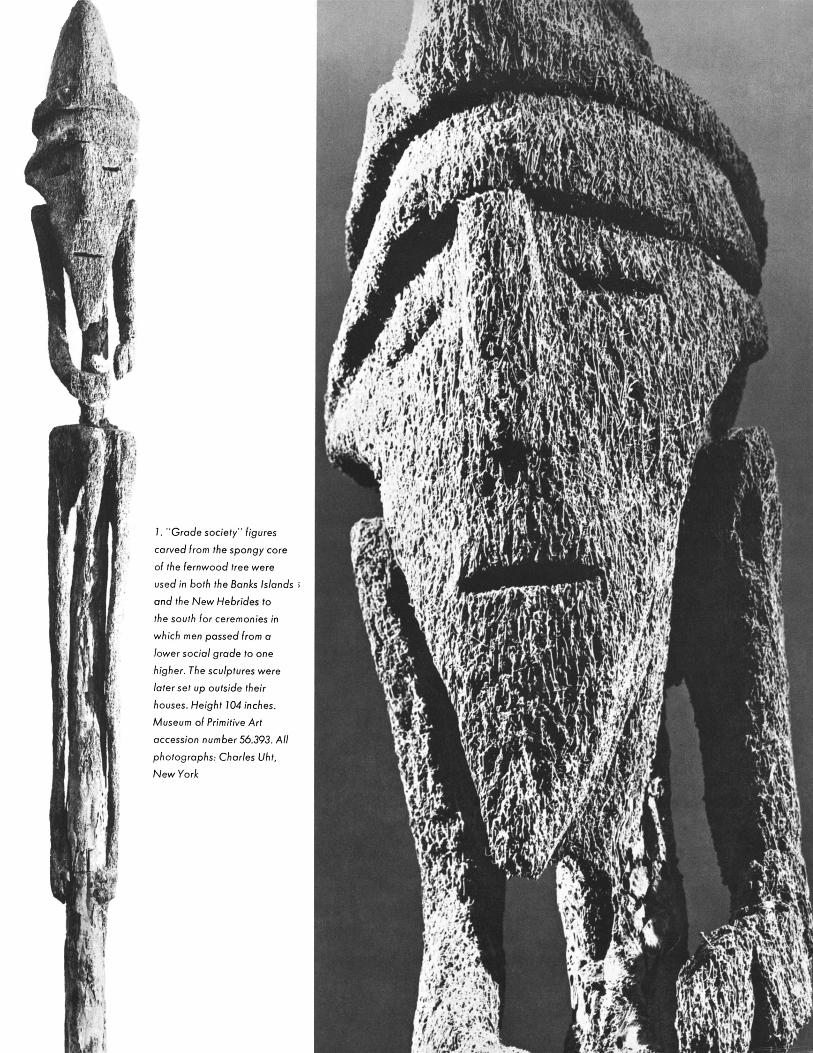
1. Grade society" figures
carved from the spongy core ,
of the fernwood tree were i!: j
V.
used in both the Banks Islands ',
and the New Hebrides to
the south for ceremonies in the~ sou.t f e sii: which men passed from a
/ower social grade to one .' !f!t
higher. The sculptures were
later set up outside their
houses. Height 104 inches.
Museum of Primitive Art
accession number 56.393. All
photographs: Charles Uht,
New York
.*t

South Seas. Rare as Polynesian sculpture is today (much has disappeared owing to European and native iconoclasm), we can admire it not only for the qualities that delighted the age of enlightenment, but for others (equally native to it) that we have learned to appreciate since then. We can see not only the lucidity and calm of the figure of a god from Mangareva, but its controlled tensions, which express a divine power.
The same kind of shift in sensibility also enables us to appreciate the work of Melanesian artists (Figures 1, 3, 4). Here elegance exists as much as it does in Polynesian art: for example, carvings from the Solomon Islands are inlaid or encrusted with bands of minute pieces of shining mother-of-pearl. But their strictly Melanesian character emerges in the shells' setting against a harsh black background that gives great con- trast and drama. Drama is a main feature of New Guinea and New Hebrides figures, sometimes flamboyant in rich coats of paint, and often ramshackle in material and construction-deliberately alarming images that seem to recognize sadly the transitoriness of violent emotion. They are an added testimony to the totality of skill and feeling that were exercised by the people of Oceania.
Since the physical transfer to the Metropolitan of Governor Rockefeller's Museum of Primitive Art must await construction of a new wing, the Metro- politan is presenting a series of small exhibitions drawn from those superb holdings. Sculpture from Oceania is the second of these shows.
Douglas Newton Curator of Primitive Art
4. The villages around Lake Sentani in
northern New Guinea were built over the
water on piles, as were the jetties con-
necting the houses to the shore. Often in
the houses of chiefs and sometimes
on the jetties, the projecting ends of the
piles were carved with ancestral figures such as this mother and child. Wood,
height 367/8 inches. 56.225

5. This figure probably represents the
god Rogo or Rongo, symbolized by the
rainbow, who sent rain to nourish the
breadfruit trees of the Gambier Islands.
It is one of seven known to have sur-
vived a mass destruction of carvings that
took place on April 16, 1835, at the
instigation of missionaries. Mangareva
Island. Wood, height 383?4 inches. 57.97
/

35 PHOTO- GRAPHS BY EDWARD WESTON
Opens April 25,1972
This portrait of Senator Manuel Hernandez Galva'n is from the series Edward Weston called "heroic heads," made in Mexico. On February 3, 1924, Weston and a group including the senator took a trip to El Desierto de los Leones. Entries from Weston's Daybooks tell the rest of the story: "I wanted to catch Galvan's expression while shooting. We stopped by an old wall, the trigger to his Colt fell, and I released my shutter. Thirty paces away a peso dropped to the ground - 'Un recuerdo - a keepsake,' said Galvan, handing it to Tina."
Later Weston quotes the painter Rivera: "Diego, referring to my head of Galvan, said 'Es un retrato - portrait - de Mexico.'"
At the end of July 1926, Weston commented on Galvan's assassina- tion: "He had no chance, - fell dead across the table, shooting as he fell, but shooting with eyes already dead."
Galvain, Shooting, by Edward Weston (1886-1958). Photograph, 858 x 71 inches. David Hunter McAlpin Fund, 57.519.1. Excerpts from The Daybooks of Edrward Weston, Volume I, Mexico (Roch- ; ester, N.Y., The George Eastman House, n.d.), pp. 42, 47, 105,178, 182
A selection of the work of the American photographer Edward Weston will be presented in the Prints and Drawings Galleries. Though few in number, the
Metropolitan's Weston photographs span twenty-three of his most productive years. The earliest one included is a portrait (platinum print) made in 1921; next are those from the Mexican period, 1923-1926. In the late twenties and early thirties, Weston created the Point Lobos group, the plant and rock forms, and the nudes at Oceano. His great Western landscapes date from the late 1930s, while several others were produced on Weston's trip to the East Coast and the South in 1941. The latest photographs in the exhibition were made in Carmel in the middle 1940s. Although most of them were made over thirty years ago, these images of people, natural forms, and the American landscape are timeless and still powerful.
Phyllis D. Massar
The Metropolitan Museum of Artis collaborating with JSTOR to digitize, preserve, and extend access to
The Metropolitan Museum of Art Bulletinwww.jstor.org
®

JEAN
ARP
Jean Arp's importance in twentieth-century European art began during his association with the Zurich Dadaists in 1916. His works dating from the Dada days through the twenties -
primarily collages on paper and wood reliefs - were fragile and poetic. From the early thirties onward, most of his work was three-dimensional. By translating the poetic curves of his previous pieces into more massive form, he earned a secure place in the history of modern art.
The Department of Twentieth Century Art is mounting a small exhibition devoted to this Alsatian-born artist (in German-speaking countries he is known as Hans Arp), timed to coincide with a major gift to the Museum by Arthur and Madeleine Lejwa of Arp's stainless steel sculpture Threshold Configuration, which will stand outside, to the south of the building. Most of the pieces, including twenty-three freestanding sculptures, were lent by the Lejwas, who were friends of Arp's and whose impressive collection of his work contains some of the artist's best-known bronzes dating as early as 1930 and as late at 1965 (he died in 1966). Wood reliefs, several of which are being lent by his widow, Marguerite Arp, are among Arp's most sensitive and personal works. They will be shown along with pieces in marble and duraluminum, a rare set of hand-colored lithographs - embellished in watercolor by the artist - as well as several charcoal drawings that relate to specific pieces of sculpture.
Henry Geldzahler, Curator of Twentieth Century Art
Threshold Configuration was donated to the Museum by Arthur and Madeleine
Lejwa of New York City, in memory of their friend Jean Arp, to honor the citizens
of New York and to celebrate the artist's love of the city. A sister piece from the same series was given by the Lejwas to the
city of Jerusalem. Threshold Configura- tion demonstrates forcibly why Arp is con- sidered a major twentieth-century sculptor: it is at once simple, monumental, and
unforgettable. Arp's precise model, illus- trated here, has the same grace and appeal in approximately twelve inches that the
sculpture has in more than ten feet of stainless steel
The Metropolitan Museum of Artis collaborating with JSTOR to digitize, preserve, and extend access to
The Metropolitan Museum of Art Bulletinwww.jstor.org
®

SELECTED
MANUSCRIPT PAINTINGS FROM THE MEDIEVAL COLLECTION
Opens April 18,1972
1. Washing of the
Apostles' Feet (detail). English (probably London), 1270-1280. 11 8 x 814 inches overall. Rogers Fund, 22.24.1
OPPOSITE
2. The Assumption of the Virgin. Italian (Ferrara), about 1480.17/2 x12 inches. Rogers Fund, 11.50.1
Painting of the Middle Ages is preserved for us almost entirely in illuminated manuscripts, parchment books illustrated with paintings. Unlike stained glass or wall painting, which were exposed to the elements and were as
vulnerable to time and to changes of taste as the buildings that held them, manuscripts were used for study or prayer and then firmly closed, preserving the freshness of the delicate tempera painting. Neither the smallness of scale nor the necessary adherence to a text restrained the medieval illuminator: indeed, both may have been advantageous to him, for visual concentration and narrative subtlety are two of the hallmarks of his art. Manuscript painting was a major art form in its own time, and provided inspiration for monumental painting as well as for sculpture and the decorative arts.
In addition to the four renowned manuscripts at The Cloisters, the Metropolitan Museum possesses a small but significant collection of illuminated manuscripts and single leaves. Mostly the result of occasional gifts rather than systematic collecting, the group has a remarkable calligraphic and historical as well as artistic interest. A selection of the finest works is temporarily on view in an exhibition in the Museum's Gothic Hall.
At the time of its acquisition, the manuscript from which Figure 1 comes was an enigma. It bears no mark of
ownership, but the beautiful miniatures, the fine script, and the thin blond vellum indicated it was specially made for an aristocratic patron. It was further distinguished by a provenance extending with certainty to the abbey of Fontevrault, the famous Benedictine house in western France associated for more than five centuries with the ruling houses of France and England. The abbey's library was destroyed in the nineteenth century; except for
226
The Metropolitan Museum of Artis collaborating with JSTOR to digitize, preserve, and extend access to
The Metropolitan Museum of Art Bulletinwww.jstor.org
®
"T
: :
1' aOil :: ; i
: e I:8
";
-i: ,'i
L x 89:
P-1 I I t I: :
r
ri-- :i c
3 ?i jT iia:
II -i
,Wfl-. ,8vcrarpe;s. I,, q;O?ec'.SP IC?CC-`Crr
;;':;
: :
:s
i ,i p, --? _? ;FP " I s:"-
C*IPL; Y
a: I
B E ^---
C :? ESa ': "is
IBQSWS-
i a'?, ;1-
a: e,l:L, ?a8l)bp

this manuscript, none of those connected with Fontevrault reflect the wealth or importance of the house or the members of its order. Although the elegant, courtly figural style reflects the most avant-garde trends in Parisian
ateliers, recent research shows that the manuscript's patron was a member of the English rather than the French
court, and that the manuscript was painted at a moment when London was especially receptive to French art. The
manuscript, probably made for Queen Eleanor of Provence, may be the earliest known illuminated manuscript made for an English monarch. The queen probably bequeathed it to her charge, Eleanor of Brittany, whom she raised from childhood and who later became abbess of Fontevrault. In both its travels and in the freshness and
vitality of its miniatures, the manuscript vividly brings to life a moment in English and French history seven centuries distant.
In the course of the Middle Ages, specialized books were developed for the performance of the church service.
The miniature in Figure 2 was removed from an antiphonary, a manuscript used by the choir during the Divine
Office, the daily round of public devotional prayer. Here the initial A, marking the beginning of the prayer for the
Feast of the Assumption of the Virgin, is created from fantastic animal and leaf forms vigorously extending up and
down the margin, colored in vibrant green and wine red. Unlike Roman letters, which were above all clearly
distinguishable alphabetic signs, medieval letters both composed a sacred, living text and were thought to be mani-
festations of it, so that the scribe came to value vitality as well as legibility of form. Letters began to assume animate
and organic shapes, and were enlarged to contain decorative motifs or paintings related to the text. By the fifteenth
century, the letters - especially initials - became increasingly elaborate, enframing if not heralding miniatures as
developed as contemporary panel paintings. It is curious that for centuries after the invention of printing,
antiphonaries, more than any other liturgical book, were made with type imitating Gothic script and with initials
embellished by hand.
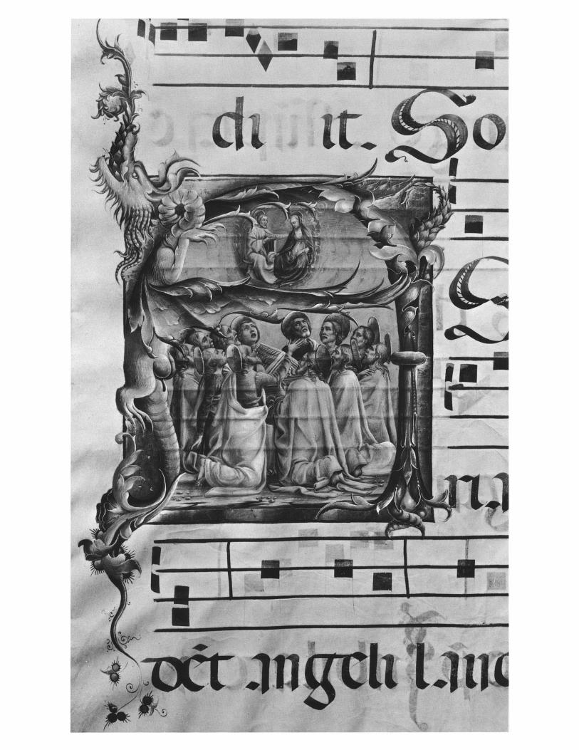
Deproduced on the back of this Bulletin is a single page from an unidentified Book of Hours probably made in
Ghent or Bruges about 1515-1520. The miniature is attributed to Gerard Horenbout, painter at the court of
Margaret of Austria in Malines and later at that of Henry VIII. Its elaborate pictorial system creates a remarkable
fusion of the mystic spirituality of a devotional image and the commonplace naturalism of biblical narrative
in a contemporary setting. Surrounding the central panel depicting John the Baptist are scenes from his life, beginning in the upper left
corner with his baptism of Christ and, reading counterclockwise, his preaching, the story of his death at the hands of
Salome, and finally, in the upper right corner, the burning of his relics. A few decades earlier, a page of text
beginning a prayer to a saint would have been distinguished only by a border painted with floral ornament.
Gradually, tiny scenes such as these replaced the floral border. At first they appeared in separately framed
compartments surrounding the prayer, but soon the compartments disappeared and the several episodes were
rendered in the same, continuous space. Finally, the text itself was replaced by a large-scale image of the saint who
faced and introduced the prayers devoted to him on the opposite page. In the upper part of our miniature, the frame setting off the central panel is like a window molding beyond which
we see to the left and right, for the artist has continued the landscape across the entire page, permitting the border
scenes to expand into a deep, atmospheric space. In the lower part of the miniature, however, the inner frame isolates
the image it encloses and excludes from it the lower scenes, which are of different scale, complexity, and mood.
In the landscape above our eye wanders freely, but in the city below we are firmly guided through the events of the
saint's martyrdom. By balancing two pictorial schemes, which are merged above and imposed one upon the other
below, the artist employs an extraordinary visual device for making explicit the concordance between spiritual and
worldly levels of reality.
Harvey Stahl Assistant Curator of Medieval Art

61E Iiiilra , - rc,--I
'' r;?'i?*i rli r
,::?
iI'1i: ::-i rlUCr r "?b
;? ?? i "'': ?,?1C
?":?:: ?wl.r-crTTc_ "
.[ i II ::: f --? Ia ,r ,isr? ?i?-

b gF6
J;sl
, ?? 1 ?fj-8lr a: iP"IXI: C
t"liP1"
The precarious condi- tion of the Basilica of Sta. Maria della Salute. Photograph: (? Giorgio Lotti
ITALY, TOO LATE
TO BE SAVED
Imagine glorious Venice - the Doge's Palace, Piazza San Marco, the bronze horses - tainted by a major highway stretching across the lagoon, and precious sculptures crumbling from cathedral tops. Or think of the lush Tuscan countryside purged of thousands of its trees, of frescoes chipping off church walls, lost forever. This is not nightmarish fantasy but a realistic fact of Italian life, its cultural and environmental resources trampled - often to death - in the wake of industrial "progress," human neglect, and ravages of time.
As witnessed by the international mobilization of forces during the devastating 1966 floods in Florence and Venice, the age-old artistic and ecological heritage of Italy is the patrimony and concern of all mankind. Italy, Too Late to Be Saved?, a photographic exhibition revealing the startling damage already inflicted, is designed as a crusade to awaken all of us from apathy to action in behalf of Italy's crisis.
Opens May 11, 1972 There are photographs of decaying frescoes, of pilferage of archaeological sites, of abandoned and decaying medieval towns, of eroding landscapes, of traffic-infested Rome, of Venice sinking into the Adriatic, and of Siena, a city that has succeeded in preserving its historic integrity.
Thus the show does not just document works of art and architecture in urgent need of repair or protection, but illustrates the exploitation of an entire urban and rural ambiance while proposing ways of confronting this immense problem. Organized by the Italian Art and Landscape Foundation, the show has toured all over Europe; now its appearance at the Metropolitan will make the American audience sensitive to the Italian emergency not as an isolated incident, but as a tragedy occurring here and now as well, an example of a worldwide phenomenon calling for immediate atten- tion before it is indeed too late.
The Metropolitan Museum of Artis collaborating with JSTOR to digitize, preserve, and extend access to
The Metropolitan Museum of Art Bulletinwww.jstor.org
®

\
CHINESE CALLIGRAPHY'
The Inner World of the Brush
RICHARD BARNHART
Assistant Professor of the History of Art Yale University
Two characters by Chu Yun-ming, from a handscroll also illustrated in
Figure 17
The Metropolitan Museum of Artis collaborating with JSTOR to digitize, preserve, and extend access to
The Metropolitan Museum of Art Bulletinwww.jstor.org
®

I
Fe / 1
rIf f I
I Ie me "" C

1. After Wang Hsi-chih (4th century, exact dates un- certain), Yueh I lun, originally dated A.D. 348. Detail of an ink rubbing. Wan-go H. C. Weng Collection, New York
This essay is an introduction to the art of Chinese calligraphy - the subject of a major exhibition on view at the Museum through May 7- explaining how its stylistic and aesthetic qualities can be enjoyed by Western visitors who do not understand Chinese.
Chinese calligraphers often see brushwork by analogy with natural phenomena, not in any directly representational sense, but in terms of underlying principles of movement, growth, or structure. The stretch- ing branches of a winter tree, the flowing water of a mountain stream, a rock plunging from a high cliff - such images vividly suggest principles of brush form and movement that interact profoundly with the past art of the brush. The sight of boatmen pulling the long oars of a ship on the Yangtze awakened Huang T'ing-chien to a new understanding of the brushwork of the T'ang monk-calligraphers, and became the basis of the long, trailing diagonal strokes of his mature style. Present experience and past thus merge at brushtip. One gradually comes to a realization that the past is alive in the tradition of Chinese artists. The calligraphy of Mi Fu or Huang T'ing-chien or Chu Yiin-ming is as vital and fresh today, and as much a part of the visual experience of an artist now, as it ever was. The formal vocabulary, the material of style, is all that has ever been written, joined to the experience of life.
2. Chao Meng-fu (1254-1322), Title inscription for the Record of the Miao-yen Temple (Miao-yen-ssu chi), about 1310. Anonymous loan, The Art Museum, Princeton University
3. Wen Cheng-ming (1470-1559), Laudatory frontispiece (Yin-shou) for an album of paintings by T'ang Yin (1470-1523), now mounted as a handscroll. Collection of Mr. and Mrs. Earl Morse. Photograph: The Art Museum, Princeton University I
A~

4. Anonymous, Stele of Shih Ch'en (Shih Ch'en pei), dated A.D. 169. Detail of an ink rubbing (17th century) from the original memorial stone. Wan-go H. C. Weng Collec-
tion, New York. In the exhibition Chinese Calligraphy: no. 7 in the catalogue by Tseng Yu-ho Ecke
6. Huang T'ing-chien (1045-1105), Letter to Chang Ta-t'ung. Detail of a handscroll, dated 1100. Anonymous loan, The Art Museum, Princeton University
5. Chao Meng-fu, Record of the Miao-yen Temple. Detail of a handscroll, about 1310. Anonymous loan, The Art Museum, Princeton
University
I;I

Confronted with an example of Chinese calligraphy, the Western viewer may assume that because he does
not read Chinese he will be unable to appreciate the art of brush writing. Usually, however, the aesthetic and expressive qualities of the art are independent of verbal meaning. That is, the artistic effects of a work of calligraphy are fully apparent before one begins to read the characters or words. Insofar as calligraphy is an art, therefore (and to the Chinese it is not merely an art, but the highest graphic art form of their culture), it exists as such outside the realm of verbal content. Nonetheless, there is a large and sophisticated body of principle and theory upon which the art of calligraphy rests, and it is helpful to have some understanding of this framework in approaching it.
THE FIVE
SCRIPT-FORMS nstead of a unitary stylistic basis, such as ideal or naturalistic form, calligraphers rely upon five basic styles that might
be thought of as script-forms. During roughly the first millennium B.C., these script-forms developed in a logical sequence in accordance with the growing use of the flexible hair brush and an increased awareness of the expressive potential of brush writing. Thereafter, they remained the common repertoire of all calligraphers, each used for specific effect or purpose. Two of the five are purely archaic. The hoary Seal script (Figure 2) is the most monumental, and was generally used for commemorative or dedicatory purposes. It is among the oldest forms of the written language, and alone of the common script-forms denies spontaneity, fluidity, and movement, otherwise common attributes of the calli- graphic art. The brush is here used in imitation of a stylus, with which the first writing was done; it is held rigidly upright, the tip of the brush carefully maintained within the center of the stroke, and each stroke is written evenly and
with powerful deliberation, as if inscribing lines in sand with a sharp stick. The tip of the brush, like the tip of the stick in sand, seems to penetrate deep into the paper, losing itself in the round, full impress of the line.
Two essential characteristics of calligraphy are illustrated most vividly by the Seal script. The hidden, or restrained, tip epitomizes an enduring cultural and artistic ideal: virtue, or strength - the sharp tip of the brush - is to be held within, guiding and shaping action, but exposed only rarely. The exterior, bland and mundane, smooth and round, is significant only to those who sense what is within.
Again, although it is historically among the most primitive forms of the language, the Seal script remains a living style, joined by all of the later script-forms and all of the innumerable personal styles within each script-form to create a rich tapestry of meaning and association. It is the beginning of culture, but the ancient beginnings live on in the present. Styles in Chinese art do not fade away; once formed, they remain forever viable alternatives. The majestic and powerful Seal script serves to commemorate and to dignify, but it speaks too of a stylus scratching an oracle bone.
G rowing out of the Seal script historically was the Li (Clerical or Official script, after its use by scribes during
the Han dynasty: 206 B.C.-A.D. 220) (Figures 3, 4), more angular than the Seal script, and emphasizing such potentials of the flexible brush as changing stroke width, long, extended horizontal and diagonal strokes, and occasional sharp rather than round stroke ends. When used very formally, as in the first example illustrated, it has much of the dignity and monumentality of the Seal script, and was used for the same purposes. When used less formally, it may be graceful and even delicate, with an old-fashioned charm and somewhat stilted flavor that limit its use in casual writing. It remained always a deliberately archaic style, at its most effective when written slowly with rich, sooty ink that appears to sink into the paper or silk.
he three remaining script-forms constitute the "modern" written language, although they developed during the
third and fourth centuries. Unlike the Seal and Li forms, the
7. Emperor Hui-tsung (1080-1135, reigned 1101- 1125), Poem. Detail of a handscroll. National Palace Museum, Taipei
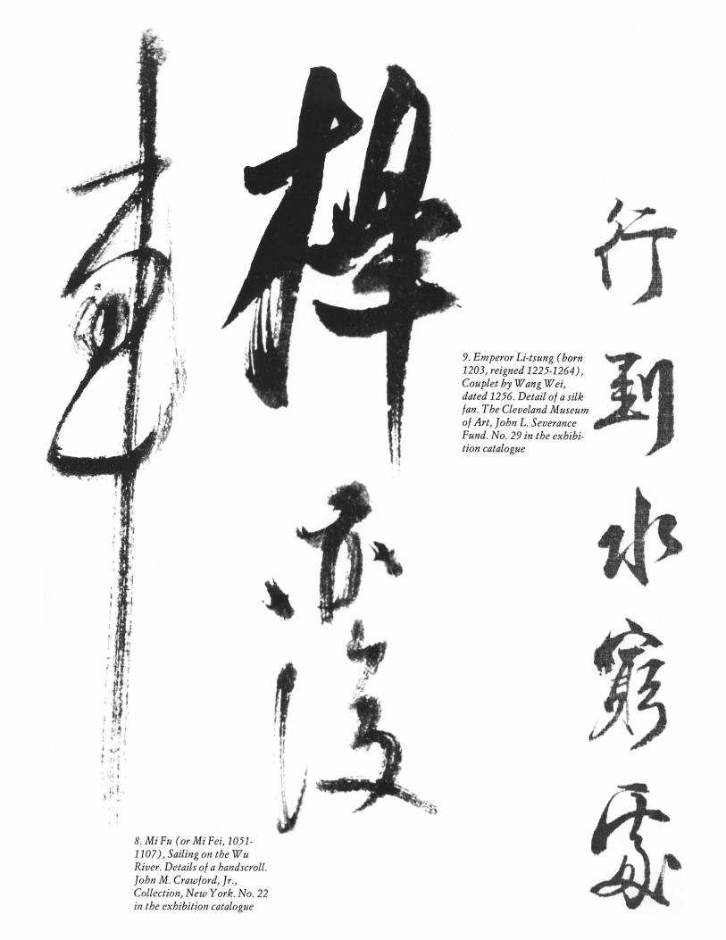
.
9. Emperor Li-tsung (born 1203, reigned 1225-1264), Couplet by Wang Wei, dated 1256. Detail of a silk fan. The Cleveland Museum of Art, John L. Severance Fund. No. 29 in the exhibi- tion catalogue
I
8. Mi Fu (or Mi Fei, 1051- 1107), Sailing on the Wu River. Details of a handscroll. John M. Crawford, Jr., Collection, New York. No. 22 in the exhibition catalogue
F
i3i
definition of each is far from rigid, since one easily becomes the other depending largely upon how quickly an individual character is written. The Regular (K'ai, or Model) script (Figures 1, 5, 13) in its pure form is the standard writing, used nearly always in printed books, and learned by children when they begin to read. It is the first written form that fully utilized the formal capacity of the brush. Nearly every stroke and dot is flexed and modulated in thickness, there are few if any straight lines, and every element in each character is conceived as relating compositionally to another, thus creating a continuous flow of abstract movement that can only be properly read as one mentally follows the process of character formation.
Generally speaking, although Chinese is written from right to left, an individual character is written from left to right, and from top to bottom. The sequence of placement of dots and strokes in forming a given character is quite rigid, and therefore the actual movement of the brush is always apparent: i.e., the top leftmost element is written first, then each element directly below it, followed again from top to bottom by the rightmost portion of the character. If a character is not composed of left and right halves, then it is simply written in sequence from top to bottom. Only when a portion of the left half extends under the right half is the right written first. If there is a falling dot to the right, or a strong central vertical line, that element is usually written last, and it carries the flowing force of the brush into the character below. Because of the precision of line and structure re- quired in writing the pure form of the Regular script, as in the example by Chao Meng-fu (Figure 5), such calligraphy is often admired for its perfect realization of an ideal.
In each of the script-forms, however, virtually limitless personal variety is possible. In contrast to the cool, classical perfection of Chao Meng-fu is the gaunt power of Huang T'ing-chien (Figure 6), whose calligraphy in the large Regular script stands among the towering achievements of Chinese art. He violates every precept of the classical tradition: his lines are often deliberately wavy, trembling slightly, as if driven by some enormous force; they vary arbitrarily from thick to thin; many strokes are seemingly lifeless, without any modulation - blunt, round, heavy, they are the stylus- written lines of the Seal script merged into the structure of the Regular form.
At another extreme, of elegance and fine-drawn beauty, is the Regular script of the Sung Emperor Hui-tsung (Figure 7). Huang T'ing-chien did not object to a laughing description of his writing as "snakes dangling from a tree"; Hui-tsung's writing, on the other hand, is called "slender gold," after its resemblance to gold filament, exquisitely flexed and turned. If there is truth to the Chinese belief that a man's character is fully manifest in his calligraphy, perhaps it is seen here. Hui-tsung was a gifted artist and a weak ruler who watched over the loss of half of China to barbarian invaders, and it is art not strength that characterizes his writing. That fine gold filigree is easily bent and broken, however, only heightens appreciation of its delicate beauty.
hen several strokes and dots in a character are written continuously, without lifting the brush, the Running
(Hsing) script results. It is literally a running together of elements, usually emphasizing the vertical aspect of move- ment. Characters written in the standard Regular script
235
generally occupy a rough square in composition; those written in the Running script are conceived as if in a standing rec- tangle. Essentially, the differences between the Regular and Running scripts are those between a printed and handwritten form.
Few great calligraphers achieved more in the Running hand than Mi Fu (or Mi Fei; Figure 8). His friend, the poet- calligrapher Su Shih ( 1036-1101 ), said that Mi used his brush like a sword, and it is a slashing virtuosity that characterizes his work, especially in the glistening vertical strokes torn down the page with dash and verve. One senses in his work exuberant pride in the freedom that comes only after absolute mastery of all convention, releasing the brush into a realm of sheer joyful creation.
A more delicate and restrained example of the Running script is the Southern Sung Emperor Li-tsung's couplet written on a silk fan (Figure 9), an exquisite, small performance by a distinctive minor master. With none of the brio of Mi Fei, Li-tsung nonetheless achieves a rewarding interplay of hair- like strokes joining elements and broad, strong horizontals and verticals, exhibiting throughout a perfect control of the brush. But whereas Mi Fei's driving force is his arm, Li-tsung's characters are guided by his fingers.
t the extreme of speed and abbreviation in writing is the A Cursive script (Figures 10, 11, 14-17), the form of brush writing that most immediately and dramatically conveys the essence of the appeal of calligraphy as an art form. Perhaps no other traditional art of the world is so excitingly kines- thetic, abstract, and spontaneous. Functionally, the essential principle underlying the Cursive script is to write each char- acter as quickly and simply as possible while still conveying the essence of its form; in other words, to reduce a standard form to an abstraction that can be imparted in continuously flowing movement. In order to allow achievement of the greatest possible creative freedom, masters of the Cursive script frequently chose to write a standard text such as the "Thousand-character Essay" or a passage from the classics or poetry of the kind memorized by schoolboys. The brush was thus freed of virtually all verbal association, often to become pure abstract form.
Some idea of the possible range of Cursive writing is suggested in the contrast between Hsien-yii Shu's classical, controlled Song of the Stone Drums (Figure 14), in which each character is still conceived as essentially a single, coherent unit, and each stroke and dot conforms to the rigorous canons of tradition; and, on the other hand, the abandoned writing of Ch'en Hsien-chang (Figure 10) or the mad genius, Hsii Wei (Figure 11 ). In the two latter examples, there is little sense of individual, separate characters left, but rather an open, sprawling movement over the entire surface, with one character often merging with another, and elements of indi- vidual characters split apart to drift out to a point of the most tenuous relationship with their original form. Individual brushstrokes observe no canons of correctness: Ch'en Hsien- chang uses a coarse, heavy brush that allows no orthodox nicety, and Hsii Wei prefers to let his brush run almost dry of ink, so that it drags and scrapes over the surface like a piece of worn-out charcoal over coarse paper.
Although the five common script-forms are coherent entities, they are regularly intermixed, and a single piece of writing may contain characters written in the Regular, Run-

I///
-_
10. Ch'en Hsien-chang (1428-1500), Song of the Fisherman. Details of a hanging scroll. Center of Asian Art and Culture, The Avery Brundage Col- lection, San Francisco
11 (left). Hsii Wei (1521- % 1593), Poem dedicated
to Mr. Wang. Detail of a handscroll. Wan-go H. C.
,;~J Weng Collection, New York. No. 57 in the exhi- h bition catalogue

ning, and Cursive scripts. For example, the three right-hand characters in the illustration from Mi Fu's Sailing on the Wu River (Figure 8) are done in a running hand, while the single character to the left is a pure cursive form. Only about a third of the characters in Hsien-yii Shu's Song of the Stone Drums (Figure 14) are written in the Cursive form; the majority are in a Running script. It is thus more strictly appropriate to describe both works as combinations of Running and Cursive forms (Hsing-ts'ao). Indeed, from the earliest theo- retical writings on calligraphy we read of the importance of achieving individuality by deriving elements and principles from all of the script-forms. Thus Huang T'ing-chien (Figure 6), in creating his distinctive Regular style, adapted one of the basic concepts behind the archaic Seal form. His wavering strokes, moreover, are of a kind normally found earlier only in the Cursive script.
In Yen Chen-ch'ing's striking Farewell to General P'ei (Figure 12) an unprecedented combination of script-forms and elements are employed to create a unique masterpiece. In the first three lines from the right, all characters but two are written in a powerful, archaic form of the Regular script using certain elements from the Seal and Li forms, while the second character in the first line and the third in the third line are written in a pure Cursive hand. In the next three lines, all but three characters are done in a fully Cursive script, punctuated by the occasional pictograph-like archaic structure. The effect, drawing upon the entire history of the written language, is thoroughly unconventional, almost bizarre, but rich in power and ancient substance.
When it is realized that a competent calligrapher may be at ease in any of the five script-forms (it is a common exercise to write the same text successively in two or more very different styles), it will be apparent how utterly different is the Chinese concept of form from our own. The range from the Seal to the Cursive script is precisely the range, formally, from primitive to abstract art. The implications of this orientation are particularly significant when it is remem- bered that all Chinese artists, whether painter or poet, are first calligraphers, and trained in the traditions of the art of brush writing before turning to other art forms. Thus, it appears likely that a painter, given a coherent individual form, might well conceive it simultaneously as both primitive and archaic, and cursive and naturalistic. In other words, the pictorial image of a pine tree is perhaps subject to the same range of formal interpretation as the written character for pine tree.
The range of script-forms moreover makes it quite difficult to interpret style in the ways suited to Western art. Con- fronted with two examples of writing by Hsien-yii (Figures 13, 14), one Regular, one Cursive, we would seem to have a perfect Wolfflinian dichotomy. In fact, of course, the difference between the "closed" form of the Regular script and the "open" form of the Cursive has nothing whatever to do with chronological development. However, it is likely that art- historical sense could be made of the personal stylistic develop- ment of Hsien-yii Shu if the several script-forms were isolated and analyzed separately. The differences between two works in the Cursive script by Chu Yiin-ming done twelve years apart (Figures 15, 17), for example, are evident if we think in terms of boldness of execution and openness of form and of space.
In the broadest terms, the entire history of a given script- form may be subject to a similar interpretation, although the endurance of ancient models to some extent controls the range of formal variation. Although a stylistic history of calligraphy remains to be written, it is also possible that the changing character of the brushline itself is of more telling historical significance than formal structure per se.
AESTHETIC
CONSI DERATIONS
he theoretical, critical, and technical literature on calligra- phy is the largest and most sophisticated body of writing
on any of the visual arts in China. The work of nearly every calligrapher, major to minor, has been dissected, analyzed, classified, and ranked repeatedly since the beginnings of critical literature nearly two thousand years ago, and the end is not yet in sight. Mao Tse-tung is among the most recent additions to the ranks of capable masters. It is nonetheless exceedingly difficult to generalize about standards of quality.
The art can be broken down into certain technical aspects, each subject to minute analysis and canonical dictum. The calligrapher is concerned with the quality of the brushline, with the formal structure of individual characters, and with the compositional organization of groups of characters. He is keenly conscious of the dynamic interaction between one line or dot and another, of the sense of movement within an individual character and through a line of several, of the tonality and character of his ink - wet, dry, dark, light - and of the overall appearance of a composition when he has finished. But even if one speaks of the "eighty-four laws of calligraphy," as did the fifteenth-century Li Shun, a standard in any of these respects can no sooner be established than it is broken by a creative writer. Above all, therefore, to cut through the minutia of individual idiosyncrasy to a sense of enduring quality, one looks for evidence of total mastery of the brush, for conscious purpose - the venerable adage that "the idea precedes the brush" - and for a personal style, growing from tradition, but growing beyond it. In any case, knowledge of the historical range of styles is helpful. Obviously, to appreciate calligraphy in the classical manner, one should know something of the classical models from which it springs. When one is familiar with the art of Wang Hsi-chih (Figure 1 ), one is aware that a work like Chao Meng-fu's Record of the Miao-yen Temple (Figure 5) is such a precise and painstaking performance in the classical Regular script that scarcely a stroke in the entire long scroll deviates from accepted canon, even though it is done throughout at the topmost level of technical mastery and brilliance. Here we are reminded that it is not necessary to exalt the fine art of calligraphy. It has much in common with music in the sense that there are far more performers than composers, and more minor composers than great ones.
237

12. After Yen
Chen-ch'ing (709- 785), Farewell to General P'ei. Section of an ink rubbing. Field Museum of Natural
History, Chicago. No. 16 in the exhi- bition catalogue
z 9 ;
13 (above). Hsien-yii Shu (1256-1301), Admoni- tions to the Imperial Censor (Yii-shih-chen). Details
of a handscroll, dated 1299. Anonymous loan, The Art Museum, Princeton University. No. 34 in the exhibition catalogue
14 (below). Hsien-yii Shu, Song of the Stone Drums. Detail of a handscroll, dated 1301. John M. Crawford, Jr., Collection, New York. No. 33 in the exhibition catalogue
n the other hand, one would unhesitatingly rank Mi Fu, Huang T'ing-chien, or Chu Yiin-ming among the great-
est creative artists in Chinese history, solely on the basis of their calligraphy. The reasons, however, the standards by which their work can be judged, are utterly different. The
calligraphy of Mi Fu (Figure 8), like that of Chao Meng-fu, is well within the classical tradition emanating from Wang Hsi-chih and his son, Wang Hsien-chih. The two Wangs are credited with creation of the ideal forms of the Regular, Running, and Cursive script-forms, and in the form of copies and engravings from which ink rubbings were made (Figure 1 ) their art endured as the classical ideal throughout the later
history of the art. They must surely rank as the most influen- tial artists in Chinese history. Mi Fu, then, paid homage to this tradition, which stressed elegant grace, strength of brush- line, free-flowing rhythmical movement, and a cool air of balanced restraint. Remarkably, however, driven by an enor- mous ego and perhaps the finest artistic sensibility of his time, he refashioned the by-then genteel and institutional Wang style into a powerfully expressive personal vehicle, bold, daring, exciting, "as exhilarating as sailing in a wind or riding a horse into battle," in the words of Su Shih, his older friend and rival. In Mi's writing, certainly, such concepts as spon- taneity, vitality, rhythm, and spirit are of the essence.
Not least of the admirable qualities of Mi's calligraphy, as of many other great masters, is the impression of a three- dimensional space within which the brush seems to move. He claimed to write "with all four sides of the brush," meaning not only that he utilized all of the physical properties of the brush tip, but evidently that he regarded the paper or silk
upon which he wrote as extending into the space beyond or behind it. This dimension of the art of brush writing is most
apparent when one stroke crosses another, as if moving in front of it, but even single strokes can be seen as turning in and out three-dimensionally. When used with such subtlety, the brush seems to bend and turn in a silent dance in space.
I
I0
1%

When one has come to a perception of such nuances, he has drawn very near to the creative satisfaction of writing. The master calligraphers have written time and again of the inner pleasure that the act of writing imparts. To sit at a clean table in a quiet room by a window, the mind free of all worldly concerns as the brush begins to move over the paper, is to enter a still and isolated world in which nothing exists but black ink in white space.
carcely a single criterion used in evaluating Mi Fu's calligraphy is applicable to that of Huang T'ing-chien
(Figure 6). Seemingly clumsy and halting - especially beside the brilliance of Mi Fu - his brush is more like a club than a sword. Huang was deeply influenced by Yen Chen-ch'ing (Figure 12), and like the great T'ang master eschewed surface beauty in quest of a deeper concept of indelible strength and inner integrity. It is thus difficult to find a single traditionally classical stroke in his work. Every character is written slowly and deliberately, the tip of the brush is rarely visible, and the characters are shaped with a striking originality some- times verging on the grotesque.
Nominally a Confucian, Huang was deeply interested in Taoism and Ch'an Buddhism, and this fascination with the mystical is always implied in his extremely inward and difficult calligraphy. The critical images used to describe the quality of Huang's line are strikingly different from the poetic terms favored in the classical tradition. Not "a drop of dew hanging from a petal," nor "a jade needle," nor "a bank of clouds across the sky," but "the worn cracks in an old wall," and the rusty stain made over many years by rain dripping down a wall from a broken spout. Conveyed in these terms is the sense of a force inevitable and indelible, without discrete shape, without subtlety, but relentless and unshakable. Process is relatively unimportant, since his work throughout seems done with the same slow, halting deliberation.
There could be few contrasts greater, then, than with the kinesthetic excitement of Chu Yun-ming (Figures 15, 17),
the gay genius of Suchow, "well known for his love of wine and flirtation and his enjoyment of excitement and laughter," as Tseng Yu-ho Ecke describes him. Chu admired and was influenced by the art of Huang T'ing-chien, among others, but all that is introspective and difficult in Huang's writing is turned to an exuberant celebration of the joys of life by the later man. Huang liked to wander off to a hidden Buddhist temple in the company of monks or retired scholars; Chu was lionized by the beautiful women and gay blades of the lovely resort city of Suchow, and probably wrote best when perform- ing for the romantic spirits around him. But in his work, performance is lifted to the level of high art, for he was a profound student of ancient art who deliberately chose the wild Cursive form as the vehicle for natural and spontaneous creation.
The calligraphy of Chu Yiin-ming exemplifies an approach to the art far different from that of either Mi Fu or Huang T'ing-chien: namely, the belief that after years of practice and study of techniques and styles one can abandon the hand and brush with full trust to go their unforced way. The element of the accidental or unexpected is here of importance, for one stroke may lead quite surprisingly to another, and the mind does not need to plan far ahead. Ideas subsist in the
239
work because they have been formed over years of study, but not a specific idea here and another there. To look at such calligraphy is to immediately see the calligrapher at work, wielding a great, coarse brush, dripping and splattering ink (being ground as fast as half-a-dozen lovely young women can grind it) as all around him gasp in admiration and surprise at the tremendous creative force the intoxicated old man has become.
Doubtless the aspect of calligraphy most difficult - and at the same time most important - to grasp is the character of the brushline. Comparison of the two examples by Chu Yiin- ming here illustrated may make an appreciation of this facet of the art easier to grasp, since they represent very different stages in his growth as an artist. In the earlier work (Figure 15) his brushwork is quite flat and rather too consistently dry and uninteresting. There is little sense of substance and scarcely any impression of space within which the strokes turn and thrust; they seem slippery and superficial. In the masterpiece of 1519 (Figure 17), however, the lines have an almost corporeal substance and tactile mass; they exist in a broad, deep space because, having substance, they must; they vary from rich, deep ink masses to feathery wisps of move- ment, and thus achieve the sense of movement in space; in short, the brushlines have character and interest in and of themselves.
t is typical of the individual development of a calligrapher as an artist that years and years are spent in mastering form
and technique, but only late in life does the brush achieve character, substance, and individuality; perhaps, in a sense, like the formation of human character. Both Huang T'ing- chien and Chu Yiin-ming were around fifty before they achieved great stature as artists. One looks then at the aston- ishingly fine, strong calligraphy of Hsien-yii Shu (Figures 13, 14), who died at forty-six, and wonders what a towering figure he might have become in ten more years; for his art had already moved to a position of greater eminence than any master since the death of Mi Fu two centuries earlier.
The enormous range in accepted standards of aesthetics and expressive quality does not, of course, make it impossible to recognize bad calligraphy, as the above sketch of Chu Yiin- ming's development may suggest. His work of 1507 is certainly not bad, but it is decidedly inferior to the later example. Outstandingly bad calligraphy on the other hand is not commonly encountered, since it was rarely preserved by collectors. Nonetheless, the work of any number of competent calligraphers past and present rests uneasily on the border between good and bad, subject of continuing controversy, and hence of enormous value in testing perception and judgment. Successive owners of a work by the Ming writer Chang Pi (Figure 16), for example, were constantly pressed into defense of its quality, since most viewers consider it rather vulgar. The flaccid, aimlessly meandering quality of his line is noteworthy, especially the grossly extended horizontal thrusts to the left. The brush appears throughout to slip over the paper, the curves lack interest and bite, and one glimpses nowhere a sense of purpose or distinction.
These considerations of quality aside, there is one respect in which the art of calligraphy is unique among the major
art forms of the world, and that is the vividness with which

the creative process is permanently recorded. In good calligra- phy and bad, one sees almost as surely as if watching the artist at work every movement of the brush in the precise sequence through which it moved. Nothing is hidden, mistakes remain along with daring successes, splattered ink where the hand slipped, worn scrawls where the brush ran dry of ink but moved on to finish a last flourish, even where the writer paused to reload his brush with ink. The changing tempo of the artist's work, too, is apparent. Often, for example, a writer begins a piece slowly and deliberately, as if cautiously feeling his way into it. The characters are relatively small and precise and slowly written, one follows the other in neat procession, and it is evident that careful thought is being given the job. Then gradually, as a rhythm or mood grows with confidence and sureness of purpose, the brush begins to move faster and more boldly, so that the end comes as an exciting, barely restrained climax. Calligraphy in this sense is a veritable record of the process of artistic creation.
15. Chu Yiin-ming (1460-1526),Prose- poem on Fishing. Detail of a hand- scroll, dated 1507. John M. Crawford, Jr., Collection, New York. No. 45 in the exhibition catalogue
BIBLIOGRAPHICAL NOTE
The Western-language literature on calligraphy includes the following:
Tseng Yu-ho Ecke, Chinese Calligraphy (Philadelphia, 1971). The most recent and best introduction and historical survey, by a leading contemporary Chinese painter, calligrapher, and art historian.
Lothar Ledderhose, Die Siegelschrift (Chuan-shu) in der Ch'ing-zeit (Wiesbaden, 1970). A scholarly study of the Seal script and its revival in the Ch'ing period.
Ch'en Chih-mai, Chinese Calligraphers and Their Art (Melbourne, 1966). A historical survey.
Tsuen-hsuin Tsien, Written on Bamboo and Silk (Chicago, 1962). An excellent account of early Chinese writing.
Chiang Yee, Chinese Calligraphy (original ed., London, 1938). The most popular and enduring book on the subject for Western readers.
Lucy Driscoll and Kenji Toda, Chinese Calligraphy (original ed., Chicago, 1935). Still the only survey of critical theory.
$ ') it 16. Chang Pi (1425-1487), Song of the Cursive Script. Detail of a handscroll. Center of Asian Art and Culture, The Avery Brundage Collection, San Francisco
I i
* I
r"

/
17. Chu Yiin-ming, Poem on Flowers. Detail of a handscroll, dated 1519. Anonymous loan, The Art Museum, Princeton University. No. 46 in the exhibition catalogue

GERARD Closes May 9,1972
DAVID Flanders's Last Medieval Master
Although Gerard David was not the greatest artist active in northern Europe at the end of the fifteenth century, he occupies a special place in history. He was the last major figure to work in the tradition of the so-called Flemish primitives, Jan van Eyck and his followers. As a result of David's adherence to the designs of his medieval predecessors, he often seems archaic or even eclectic. Yet he developed a personal idiom - rather child-like in mood, free of violent actions and emotions, and imbued with a quality of dreamy reverie.
As part of the continuing effort to explore the educational
possibilities of the Museum's collections, the European Paintings Department has mounted a special exhibition - augmented by several key works from the Robert Lehman Foundation and an
exquisite manuscript illumination lent by the Morgan Library - to illustrate the nature of David's art and to demonstrate how
1. A follower copied part of David's Rest on the Flight (opposite), changing small details but
capturing the feeling of the original. Flemish, first quarter of the 16th century. Bequest of Michael Friedsam, 32.100.53
we arrive at judgments of quality. An early and a late Nativity reveal his artistic personality, which developed from a naive realism appropriate to his provincial Dutch background to a tech- nical refinement and subdued elegance typical of artists working at Bruges in the late 1400s. In a section devoted to David's al- tarpieces, very few of which survive intact, we have used enlarged photographs of pieces missing from our collection to suggest the original settings of the Museum panels. In another area, David is shown in the context of his time; works by his contemporaries in Flanders and Italy, Diirer, Bellini, and Massys, are juxtaposed with his paintings. Finally, we compare autograph works with copies in order to encourage the visitor to look for differences in quality and to form opinions about David's artistic contribution.
Everett Fahy Curator in charge of European Paintings
2, 3. Compared to the other copy, this panel is awkwardly proportioned and painted - clearly by a poor imitator. Flemish, first quarter of the 16th century. Bequest of Lillian S. Timken, 60.71.28
The Metropolitan Museum of Artis collaborating with JSTOR to digitize, preserve, and extend access to
The Metropolitan Museum of Art Bulletinwww.jstor.org
®
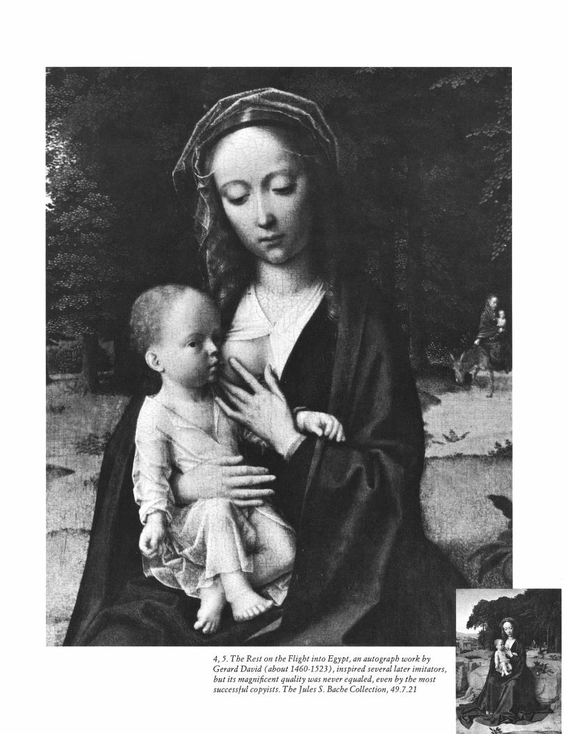
4, 5. The Rest on the Flight into Egypt, an autograph work by Gerard David (about 1460-1523), inspired several later imitators, but its magnificent quality was never equaled, even by the most successful copyists. The Jules S. Bache Collection, 49.7.21

FRANCE
IN COLOR
The Museum has acquired many of its great treasures by gift - either of works of art or of funds for their purchase. A few works have been presented by the artists themselves. But an excep- tional kind of gift is one made by William Keighley, former film director and radio producer. Over the last dozen years, Mr.
Keighley has enriched the Museum's Slide Library with contin-
uing donations of color slides illustrating the history of art, not available from other sources - all of which he has taken himself. Their total is now over fifty thousand.
Mr. Keighley's introduction to the arts was in Shakespearean theater in Philadelphia. From the stage, where he began as an actor and then became a director, he moved in 1930 to direct for Warner Brothers in Hollywood. Among his films were Green Pastures, G Men, The Man Who Came to Dinner, Yes, My Darling Daughter, Each Dawn I Die, No Time for Comedy, and The Fighting 69th. After the Second World War he became
producer and narrator of the popular Lux Radio Theatre. In the fifties, Mr. Keighley, with his wife, actress Genevieve
Tobin, went to live in Paris. He had been an enthusiastic devotee of France - the country, her culture, and her history - ever since he spent three years in Paris as a young man. To give his feeling for France permanent form, Mr. Keighley put his professional knowledge of photography to work again. In 1955 he embarked on an ambitious and dedicated project: a photographic record, in the form of 35-mm. color slides, of the art and architecture that
embody France's history. The subject matter of the slides now also includes Austria, Germany, Italy, England, Spain, and
MONT ST. MICHEL
The Metropolitan Museum of Artis collaborating with JSTOR to digitize, preserve, and extend access to
The Metropolitan Museum of Art Bulletinwww.jstor.org
®

the Crusaders' routes to the Holy Land, as well as France. Mr. and Mrs. Keighley usually make one major trip each year
to photograph a particular region. Mr. Keighley's aim is to cover each monument thoroughly, to show its larger setting as well as its details. He begins taking photographs from a great distance - as soon as the building is visible - advancing to cover all of the exterior; then going inside, he proceeds room by room, taking both general views and close-ups.
Whereas most photographers sent out to do a job normally must go ahead no matter what the weather or light conditions, Mr. Keighley, being his own master, can wait until the next day, or the next, or the next. Not that he ever wasted time or felt that there was any to spare. On the contrary, when he photographs the interiors of private homes, the owners often plan a gracious lunch in an elegant dining room, but Mr. Keighley keeps on
working while his hosts and his wife dine without him. Mr. Keighley began in Provence, an area of France rich in
history, with remains of successive cultures from Roman times onward. He made slides of the Roman monuments in Nimes and Arles; the bridge over the river Gard, testament to Roman
engineering that combines viaduct and aqueduct in a mighty yet graceful three-tiered structure; the old town and early Roman-
esque church of Saint-Gilles; the Palace of the Popes at Avignon, residence of the seven French popes of the so-called Babylonian Captivity of the fourteenth century, who refused to go to Rome; and the seventeenth- and eighteenth-century hotels prives and fountains of the provincial capital, Aix-en-Provence.
Mr. Keighley has described himself as a reporter with a camera. His photographic essay on Mont St. Michel begins with the tide-swept mount seen from a plane; a closer aerial view shows the abbey church and cloister; detail shots offer a forest of rooftop pinnacles and gables, an air view of the cloister court, the great rampart stairs, the cloister arcade, and the vaulting of the Salle des Chevaliers. A screening of the entire series of hundreds of slides offers more detailed knowledge of the site than does the usual quick visit

Auvergne in the center of France, then Normandy and Brittany on the northwestern coast, Poitou and Anjou in the west, Alsace-Lorraine in the east - over the next few years Mr. Keighley continued his documentation of churches, chateaus, palaces, and other notable monuments, always proceeding methodically, persevering until he got just what he wanted.
He followed the route of the French pilgrims to Santiago de Compostela in northwestern Spain, and the slides he has given the Metropolitan of the pilgrimage sites amount to several thousand; they are the basis for a group of lectures being given at the Museum this spring. Later he went farther afield, tracing the route of the eleventh-century Crusaders, and doing a thorough study of the Norman occupation in Sicily. In 1965 he came to New York to photograph French art in collections here.
Because Mr. Keighley is not a commercial photographer and must meet only his own requirements, he has been able to take pictures of more obscure sites and more details of well-known monuments than can be found in the usual photographic archives. The fact that the slides are in color adds to their documentary value; in many cases it makes them unique. During his profes- sional career Mr. Keighley developed the technical proficiency and high standards that he brings to this work: the composition of his slides is always handsome, and Mr. Keighley has climbed on many ladders and roofs to get a particularly appropriate shot. It seemed to him that a documentation of Mont St. Michel ought to include some views from the air, so he chartered a small plane on a clear day and produced some truly stunning views of
the island church and town against the huge expanse of gray sand uncovered by the low tide. But clarity has never been sacrificed to drama, nor an accurate impression given up for the sake of photographic effect.
For the ultimate aim of Mr. Keighley's work is educational. Many of his slides have been the basis of illustrated lecture series given at the Musee des Arts Decoratifs in Paris. Nevertheless, he chose to give the collection to the Metropolitan rather than any other institution, because through the Museum's Slide Library - whose 283,000 slides cover architecture, sculpture, painting, and the decorative arts and are not restricted to objects belonging to the Museum - it will be accessible to the widest possible audience, including teachers, students, scholars, and the general public. The slides are carefully catalogued with numerous cross references for maximum retrievability. Not unim- portant either in Mr. Keighley's selection of a repository are the optimum conditions of temperature and humidity in the Slide Library, as well as the precise method of mounting the slides, which helps preserve them.
In honor of his work, the French government has made Mr. Keighley a Chevalier of Arts and Letters and a Chevalier of the Legion of Honor; in Spain he was made a Commander of the Legion of Merit. Not unexpectedly Mr. Keighley is making plans for his next photographic expedition - to Belgium and the Netherlands during this summer.
Renata Villein, Freelance writer
CHARTRES
A distant view of the cathedral on its hill above the Eure River; the west facade with its
strikingly dissimilar towers; a doorway, its magnificent tympanum with Christ of the Last Judgment surrounded
by symbols of the Apocalypse, and a detail of Christ, astonishing in the depth of its powverful carving
tLang^^^Nave and angel from Rheims Cathedral; , ? i' ,a Virgin and Child from Troyes's Muse'e _','[M l Historique; and Albi Cathedral stairs
AUXERRE
The Church of St. Etienne dominates the town of Auxerre in central France; strength and dignity are united in its west facade. A sculptured detail from the north portal depicts the creation of Adam and Eve. The lofty interior vibrates with light coming through the windows above the altar

Tea urn, by Paul Revere (1735-1818). American (Boston), 1791. Silver, height 22 inches. Lent anonymously, L69.79
Two AmericanWing Exhibitions
Open May 17, 1972 - i. ' i : ' t iV0 -, 7 W i
j.,-. - . .. ."'.;: 1B1. , j 4i ?~~~~~~~~~ePs~
The Metropolitan Museum of Artis collaborating with JSTOR to digitize, preserve, and extend access to
The Metropolitan Museum of Art Bulletinwww.jstor.org
®

A s this country emerged from the Revolution, the decorative arts of the new republic shed the rococo style with its shells and
scrolls and adopted the classical style of light, symmetrical shapes and
straight, pure lines symbolizing the highest qualities of the great republics of Greece and Rome. Among the silver forms that became
popular, one of the most graceful was the tea or coffee urn. This is the
only one listed as a tea urn in Paul Revere's ledgers between the
years 1763 and 1797. It was made for Hannah Speakman Rowe, widow of John Rowe, a prominent merchant and landowner of Boston, and is stamped -REVERE in a rectangle on the front and back of the base. This urn will be displayed in Rarities in Early American Silver, a loan exhibition in the silver gallery of the American Wing. The show consists of objects not represented in the Museum's American silver collection but that combine with it to illustrate the wide variety of forms and the superb quality of early American silver design.
Mary Glaze Associate Curator, The American Wing
n the cabinetmakers' price books of the early Federal period (1790-1810), this piece would have been described as a "square
card table with ovolo corners." Although derived from late eighteenth- century English neoclassical furniture designs, as published by Hepplewhite, Sheraton, and Shearer, it is a distinguished and distinctive regional American interpretation. Part of an exhibition entitled Baltimore Federal Furniture in the American Wing, it displays a number of Baltimore decorative characteristics: light wood cross-
banding that frames the three panels of the apron, oval figural paterae of oak leaf and acorn, and, on the legs, veneered light wood panels inlaid with a Baltimore version of the classical husk or bellflower, with an elongated center petal. In the exhibition, a splendid array of decorative veneering and inlaying, metal or ivory embellishments, painting on glass or wood, and carving and turning reveals the sophisti- cated craftsmanship of the prosperous port cities of the young nation.
Marilynn Johnson Bordes Assistant Curator, The American Wing
Card table. American (Baltimore), 1795-1810. Mahogany with satinwood, sycamore, and holly inlays, height 2812 inches. The
Sylmaris Collection, Gift of George Coe Graves, 32.55.4
II
AiIfiinA?1AJ i~i~iUA~A~tXtiihUAIiii*`Ii1II.IIi&~iiAA&i&iiA&iAiAiiAA~ IiiI* illiAfi.iI

A FAMOUS
PERSIAN
MANUSCRIPT
The Subject of an Exhibition, a Book, and a Film
Exhibition Opens May 4,1972
Like many museums throughout the world, the Metropolitan is happy to celebrate the 2500th anniversary of the founding of Iran. We are commemorating the
anniversary with an exhibition centered around the country's classic epic -
Firdowsi's Shah-nameh ("The Book of Kings"), written around A.D. 1000 - which describes many legendary and historical events under the leadership of
early Persian kings. No version of the poem could better form the subject of such an exhibition than the magnificent one made for the celebrated Iranian shah,
Tahmasp, who reigned from 1524 to 1576. Seventy-eight minatures from this Shah-nameh have been presented to the Museum by Arthur A. Houghton, Jr.; the finest of these, together with others still in his collection, constitute the main feature of the exhibition. The years in which this manuscript with its 258 miniatures was illuminated were among the most splendid of Persia's artistic
history and represented the culmination of the development of its painting. To
provide a proper setting for the manuscript, other works of art from sixteenth-
century Iran in the Museum's collection are also included in this special show.
Enchanting as these miniatures are, they nevertheless need further clarification to bring out their special quality. For this reason the Museum, especially its
Departments of Education and Islamic Art, has made two special educational efforts. The first is a richly illustrated book dealing with the historical and aesthetic qualities of the manuscript. Its author, Stuart Cary Welch, has studied the Shah-nameh for many years and treats it in a way that will appeal to expert and
layman alike. In addition, we have made a film recounting the stirring but unfamiliar tales of the epic. Because the making of such a film, based as it is on
static, two-dimensional illuminations, is an undertaking that may puzzle many per- sons when they first hear about it, I shall tell you about our reasons for launching such an unusual project.
A figure of phenomenal strength and bravery, Rustam, the hero of the Shah-nameh, spent his life fighting the enemies of Iran. His feats of superhuman might, endurance, and daring thread their way through much of this great epic poem.
Before the episode depicted here, the king of Iran, Kay Kavus, had invaded Mazanderan, land of all manner of devils and witches. There he and his retainers had been defeated by magic, rendered blind, and held in cap- tivity by the White Div, leader of the divs (devils), on behalf of the devil king of Mazanderan. Although Kay Kavus had acted against the advice of Rustam's father, the king's most renowned paladin, the crown and fortune of Iran had to be saved, so Rustam, with his loyal horse, Rakhsh, was sent off by his father to rescue the foolish shah and seek vengeance for Iran. From the borders of Mazanderan to the final rescue Rustam was subjected to seven perilous adventures, known as the Seven Courses.
In the Fourth Course, illustrated here, Rustam, after a long day's ride over desert terrain, saw an inviting stream with grass and trees. A delicious meal - a feast for some sorcerers who vanished at his approach - was laid out beside a spring. Rustam began to sing about the trials of his life, accompany- ing himself with a lute that he found lying in the grass. This attracted a witch, who turned herself into a beautiful damsel. Hold- ing out a cup of wine to his comely guest, Rustam thanked God for such fortune, whereupon the witch's visage blackened. Rustam immediately caught her in his lasso and demanded that she show herself in her true form - and a hideous hag appeared in his snare. At that he cleaved her in two and struck terror into the hearts of all sorcerers.
The miniature closely follows the text, al- though the Persian artist could not resist adding a few plants to the background as well as the ones naturally in the oasis, since the unremitting starkness of a true desert would be inadmissible in a painting de- signed to give pleasure. The sorcerers over the horizon give the mise en scene, and the climax of the story is explicitly depicted.
Marie L. Swietochowski
Gift of Arthur A. Houghton, Jr., 1970.301.17, fol. 120v
The Metropolitan Museum of Artis collaborating with JSTOR to digitize, preserve, and extend access to
The Metropolitan Museum of Art Bulletinwww.jstor.org
®

?a~~~~~~~~~~~~~~~~s~~~' ....\ ' ~,' ~ ~ ~ 'L:?~.,~, '-~ ..... :.4 ~.~,~ '9~ '~ZZ~ ~ ~' ~, ~ ~' ....~~~~~~~~~~;
~:~'i ?~ ~ ~p;.', L .
! l~. .)? ,~--~ ~ ~ ~ ~ ~ ~ f r P' '
..',~~:~ ~ . . ,i~~~ :,~, ~~!?'?:" :9~ r' ,.~i?i ~~ (I;b~~ .....: I~~BIPP ','.
V S

*1-I - 'A."
1 | 4 At ... f ; ./ ,* i (- k 0 f : -* ^ : - ,- XIL
* - A. F F .
6 A f g < . . i
I i
I I
f i
' l
I I ~,*22 3
I' 1a ' v ' I I ' ' .
Rustam lassos the horse Rakhsh from his father's herd. Lent by Arthur A. Houghton, Jr., fol. 109r
THE SHAH-NAMEH FILM
When miniatures from a Shah-nameh, or, for that matter, from any Persian manuscript, are exhibited, the accompanying labels usually state that such-and-such a hero battles an identi- fied opponent or slays a certain monster or makes love to a beautiful lady.
While such designations are certainly improvements on those that merely call these miniatures a "battle scene," "hunting scene," or "love scene," they still leave the viewer uncertain, if not frustrated, in his attempt to understand what is depicted. Why did the battle occur, how did the hero manage to overcome a powerful monster, was the amatory union socially approved, and what future was in store for the lovers? Bulletin articles and learned books usually bypass these questions in analyzing the artists involved and the characteristics of their style, but such facts, although they are interesting and significant, do not help to interpret the scenes. All these labels and identifications fail to take into account the artist's basic intention: illustrating a story.
The dilemma of the Museum - how to present such book illustrations - and that of the viewer - how to respond to them
- is, of course, not wholly because of their Persian origin. The same problem occurs with any illustrations, Eastern or Western, whose subject the viewer cannot be assumed to know intimately or respond to immediately. With the secularization of schools, this situation exists even for Bible stories, especially the less well known incidents.
Our forthcoming film tries to fill this gap by interpreting the Shah-nameh's illustrations. Naturally, we would like to have based the film on paintings that are contemporary with the epic, that is, from the decades shortly after the year 1000, but no manuscript with miniatures is preserved from this period, nor is it even known with certainty if poetic accounts were extensively illustrated at the time. The earliest known illus- trated Shah-nameh is at least 200 years later than the original text. In view of this, it is perfectly valid to use the Houghton Shah-nameh of about 1527/1528 as the basis for the film. Out- standing for its artistic quality and wide range of stylistic approaches, it is a masterpiece of pictorial endeavor that is representative of one of Iran's most creative periods. By telling the story and showing how the artist managed to portray it, the
-'k J
The Metropolitan Museum of Artis collaborating with JSTOR to digitize, preserve, and extend access to
The Metropolitan Museum of Art Bulletinwww.jstor.org
®

6?`-???-- - ? ,---
:s'i ; n- i*h? g ":4; ?bi: .L
p Jp?r
,? 4. L \ni C
.I r C t. .vr'
e
::: .:_s "" "-r
LBg-a 1?'"' """ a??
,4i?
a, \??
15 jk:)P1.S?a? L ag3 d9 ca
r?- ,.I ;E ba
.*Y p :a ;ra j?d:
Frightened onlookers from the miniature that shows Rustam
killing his father's mad elephant. Collection of Arthur A. Houghton, Jr., fol. 92v
film captures the viewer's attention, increases his understand-
ing, and offers him the chance to enjoy a dramatic tale: its evolution and, after due suspense, its climax. A film, by the very fact that it moves, can lead the viewer almost physically around the manuscript and into the story by focusing on the key events and actors in the proper sequence, rather than leaving him to his own devices about which part to look at first in the richly decorated ensemble of many figures.
Such a film has another asset. Because, perhaps, of the
prevalence of poster painting and large-scale composition in modern art, we are no longer accustomed to poring over
minutely painted scenes; the modern eye has become jaded. But refined yet expressive details form one of the major quali- ties of Persian art, particularly of the sixteenth century, and the
ordinary museum visitor, unaided by a magnifying glass, is seldom able to appreciate the special flavor of these paintings. Museum curators who are concerned about the relationship between object and visitor have, of course, been trying to cope with the predicament: their usual method has been to put blow-ups and transparencies next to the actual object. Attractive
as such a presentation may be, it doesn't really solve the prob- lem. The viewer will often find, particularly in the case of
paintings, that the enlargements or brilliantly lit transparen- cies are of charming but incidental elements such as background figures, architectural details, and landscape, all of which enrich the composition without actually elucidating the story. A film, on the other hand, can dynamically and meaningfully show how such components relate to each other and to the whole. The film maker, instead of losing himself in appealing details, exploits the medium's ability to move rapidly from one figure to the next to help us understand the vital aspects of the story - to look deeper and more knowingly when we return to the minia- tures themselves.
A film like this is a most valuable means of increasing our appreciation of an art practiced in a distant country a long time ago, and of seeing and experiencing it with the consciousness of a member of that particular civilization. We hope the film of the Shah-nameh will be successful in introducing us to an ex- traordinary manuscript and lead to films of other works of art that have a story to tell.
Richard Ettinghausen Consultative Chairman, Department of Islamic Art
I \
; - I
*, ,:--
I. . I 1 I
I ,

CALLIGRAPHY
WEST OF
CHINA
Closes May 7,1972
Felicitous phrases and sentences from the Koran decorate a diverse range of objects in the exhibition, including gilded and painted manu- script pages, inlaid brass candle- sticks, glass mosque lamps, ceramic tiles and vessels, a stone tombstone, a prayer rug, and a banner. The inscription on this bowl, which was excavated by Museum archaeolo- gists in 1939, reads: "He who talks a lot falls a lot." Iranian (Nisha- pur), late 9th-early 10th century. Slip-painted earthenware, diameter 10 13/16 inches. Rogers Fund, 40.170.25
n China calligraphy is revered as the highest form of graphic art. Written images are appreciated as abstract creations
that embody both lasting aesthetic principles and an artist's vitality and sensitivity. Calligraphy West of China, a small exhibition presented by the Department of Far Eastern Art in conjunction with the Islamic, Medieval, and Drawings De- partments, illustrates the significance of calligraphy in Middle Eastern and Western artistic traditions, where writing is
essentially functional or decorative while still governed by rules that are varied according to the sensibilities of the scribes.
In the Islamic world deity cannot be represented by images, and writing, as the vehicle of the divine word, is a major form of religious and artistic expression. Writing, in a variety of script forms, also decorates objects of daily life.
Examples of European calligraphy demonstrate how writing evolved from the angular "Gothic" scripts of the Middle Ages into the more cursive baroque styles whose flamboyant spirals and flourishes were codified in handbooks as the "art of penmanship."
Maxwell Hearn Curatorial Assistant, Far Eastern Art
The Metropolitan Museum of Artis collaborating with JSTOR to digitize, preserve, and extend access to
The Metropolitan Museum of Art Bulletinwww.jstor.org
®

Persimmon Tree, by Sakai Hoitsu (1761-1828), Japanese. Signed and dated late autumn, 1816. Two-fold
C JA |-^ l ^ BPA N E S E screen, ink and colors on paper, height 6514 inches. Rogers Fund,
SCREENS 7156
The twisted trunk and curling leaves of this persimmon enfold an ambiguous space of swirling wind and serene stillness recalling Nature's changeable character as the
last fruits of autumn verge on winter's emptiness. The delicacy of pale greens and ripe orange-reds that tint the leaves and fruit contrasts with the sureness and strength in the brushwork of branches and trunk. The daring decorative simplicity of the flat, two- dimensional ground plane and asymmetrical composition are balanced by the intricate and graceful complexities of tree, plants, and tassled grass. Everything in the picture epitomizes a poignant moment of observation and understanding by the artist Sakai
Hoitsu, who painted the screen in the late autumn, 1816. The Persimmon Tree is one of twelve screens that can be seen in the newly installed
gallery of Japanese decorative arts, which also includes ceramic pieces and basketry.
M.H.
The Metropolitan Museum of Artis collaborating with JSTOR to digitize, preserve, and extend access to
The Metropolitan Museum of Art Bulletinwww.jstor.org
®

Fanfan Playing with Polichinelle and Friends, by Honore Fragonard (1732-1806) with Marguerite Gerard (1761-1837), French. 1782. Etching, 10 x 7,3 inches. Louis V. Bell Fund, Rogers Fund, and Roland L. Redmond Gift, 1972.539.1
OUTSTANDING RECENT ACCESSIONS
I-Ionore Fragonard and his young sister-in-law, Marguerite Gerard, shared in making this family "snapshot" of his son, her nephew, two-year-old Alexandre-Evariste Fragonard. "Fanfan" (a French term of endearment for children) is caught scurrying by, clutching his toy dolls and hotly pursued by two little dogs. Vibrating with the lively touch of the rococo master, this is one of a group of prints by and after Fragonard newly acquired by the Department of Prints and Photographs. They were originally part of the personal collection of Mlle Gerard, Fragonard's pupil and, in this case, his collaborator.
Colta Ives
-.It .." ,.:.
The Metropolitan Museum of Artis collaborating with JSTOR to digitize, preserve, and extend access to
The Metropolitan Museum of Art Bulletinwww.jstor.org
®
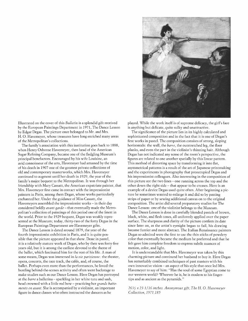
Illustrated on the cover of this Bulletin is a splendid gift received
by the European Paintings Department in 1971, The Dance Lesson
by Edgar Degas. The picture once belonged to Mr. and Mrs. H. O. Havemeyer, whose treasures have long enriched many areas of the Metropolitan's collections.
The family's association with this institution goes back to 1888, when Henry Osborne Havemeyer, then head of the American
Sugar Refining Company, became one of the fledgling Museum's
principal benefactors. Encouraged by his wife Louisine, an avid connoisseur of the arts, Havemeyer had amassed by the time of his death in 1907 one of the greatest private collections of old and contemporary masterworks, which Mrs. Havemeyer continued to augment until her death in 1929, the year of the
family's major bequest to the Metropolitan. It was through her
friendship with Mary Cassatt, the American expatriate painter, that Mrs. Havemeyer first came in contact with the impressionist painters in Paris, among them Degas, whose works particularly enchanted her. Under the guidance of Miss Cassatt, the
Havemeyers assembled the impressionist works - in their day considered boldly avant-garde - that eventually made the Metro-
politan's collection of paintings of this period one of the finest in the world. Prior to the 1929 bequest, Degas was weakly repre- sented at the Museum; today, thirty-two of the forty Degas in the
European Paintings Department are Havemeyer gifts. The Dance Lesson is dated around 1879, the year of the
fourth impressionist exhibition in Paris, and it is quite pos- sible that the picture appeared in that show. Done in pastel, it is a relatively mature work of Degas, who by then was forty-five years old, but it is among the earliest devoted to the theme of the ballet, which fascinated him for the rest of his life. A man of some means, Degas was immersed in la vie parisienne: the theater, opera, concerts, the race track, the cafes, and, of course, the ballet. Perhaps even more than the performances, he loved the
bustling behind-the-scenes activity and often went backstage to make studies such as our Dance Lesson. Here Degas has portrayed at the barre a ballerina - sparkling in her white tutu and sash, head crowned with a little red bow - practicing her grands batte- ments en avant. She is accompanied by a violinist, an important figure in dance classes who often instructed the dancers as he
played. While the work itself is of supreme delicacy, the girl's face is anything but delicate, quite sulky and unattractive.
The significance of the picture lies in its highly calculated and sophisticated composition and in the fact that it is one of Degas's first works in pastel. The composition consists of strong, sloping horizontals: the wall, the barre, the outstretched leg, the floor planks, and even the part in the violinist's thinning hair. Although Degas has not indicated any sense of the room's perspective, the figures are related to one another spatially by this linear pattern. This method of distorting space by transforming it into flat, asymmetrical patterns is a result of the art of Japanese printmaking and the experiments in photography that preoccupied Degas and his impressionist colleagues. Also interesting in the composition of this picture are the two lines - one running across the top and the other down the right side - that appear to be creases. Here is an example of a device Degas used quite often. After beginning a pic- ture he sometimes wanted to enlarge it and did so by pasting strips of paper or by sewing additional canvas on to the original composition. The artist did several preparatory studies for The Dance Lesson: one of the violinist belongs to the Museum.
The Dance Lesson is done in carefully blended pastels of brown, black, white, and flesh tones, all uniformly applied over the paper surface. The sharpness and clarity of the picture confirm its date since later on, as the artist's eyesight began to fail, his drawing became fuzzier and more abstract. The Italian Renaissance painters Degas so admired were the first to use the thin sticks of powdery color that eventually became the medium he preferred and that he felt gave him complete freedom to express subtle nuances of motion, color, and light.
It is understandable that Mrs. Havemeyer was taken by this charming picture and convinced her husband to buy it. Here Degas has remarkably combined techniques of past masters with his own innovative vision - an aspect of his style that once led Mrs. Havemeyer to say of him: "Has the soul of some Egyptian come to our western world? Whoever he is, he is modern to his finger- tips and as ancient as the pyramids."
261^ x 23 1/16 inches. Anonymous gift, The H. O. Havemeyer Collection, 1971.185