the field guide typography - random house · pdf filebodoni poster 256 bottleneck 258 broadway...
TRANSCRIPT
THE FIELD GUIDE TO TYPOGRAPHY
TYPEFACES IN THE URBAN LANDSCAPE
PETER DAWSON
P R E S T EL M U N I C H · LO N D O N · N E W YO R K
THE FIELD GUIDE TO TYPOGRAPHY
TYPEFACES IN THE URBAN LANDSCAPE
To my parents, John and Evelyn Dawson
Published in North America by Prestel, a member of Verlagsgruppe Random House GmbH
Prestel Publishing900 Broadway, Suite 603New York, NY 10003Tel.: +1 212 995 2720Fax: +1 212 995 2733E-mail: [email protected]
© 2013 by Quid Publishing
Book design and layout: Peter Dawson, Louise Evans www.gradedesign.com
All rights reserved. No part of this book may be reproduced or transmitted in any form or by any means, electronic or mechanical, including photocopy, recording, or any other information storage and retrieval system, or otherwise without written permission from the publisher.
Library of Congress Cataloging-in-Publication Data
Dawson, Peter, 1969– The field guide to typography : typefaces in the urban landscape / Peter Dawson. pages cm Includes bibliographical references and index. ISBN 978-3-7913-4839-11. Lettering. 2. Type and type-founding. I. Title. NK3600.D19 2013 686.2’21—dc23 2013011573
Printed in China by Hung Hing
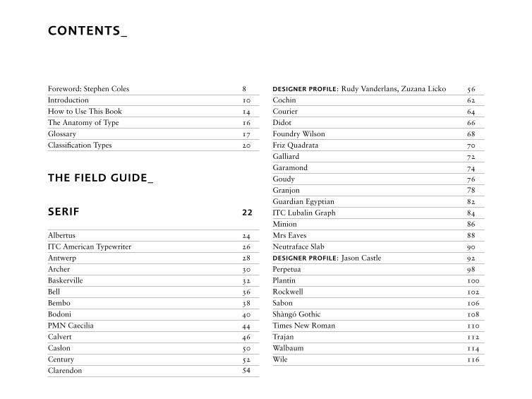
CONTENTS_
Foreword: Stephen Coles 8
Introduction 10
How to Use This Book 14
The Anatomy of Type 16
Glossary 17
Classification Types 20
THE FIELD GUIDE_
SERIF 22
Albertus 24
ITC American Typewriter 26
Antwerp 28
Archer 30
Baskerville 32
Bell 36
Bembo 38
Bodoni 40
PMN Caecilia 44
Calvert 46
Caslon 50
Century 52
Clarendon 54
DESIGNER PROFILE: Rudy Vanderlans, Zuzana Licko 56
Cochin 62
Courier 64
Didot 66
Foundry Wilson 68
Friz Quadrata 70
Galliard 72
Garamond 74
Goudy 76
Granjon 78
Guardian Egyptian 82
ITC Lubalin Graph 84
Minion 86
Mrs Eaves 88
Neutraface Slab 90
DESIGNER PROFILE: Jason Castle 92
Perpetua 98
Plantin 100
Rockwell 102
Sabon 106
Shàngó Gothic 108
Times New Roman 110
Trajan 112
Walbaum 114
Wile 116
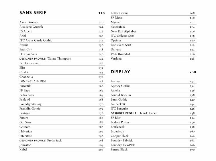
SANS SERIF 118
Aktiv Grotesk 120
Akzidenz Grotesk 122
FS Albert 126
Arial 128
ITC Avant Garde Gothic 132
Avenir 136
Bath City 138
ITC Bauhaus 140
DESIGNER PROFILE: Wayne Thompson 142
Bell Centennial 148
Bliss 150
Chalet 154
Channel 4 156
DIN 1451 / FF DIN 158
Eurostile 160
FF Fago 162
Fedra Sans 164
Fenland 168
Foundry Sterling 170
Franklin Gothic 174
Frutiger 176
Futura 180
Gill Sans 186
Gotham 188
Helvetica 192
Interstate 196
DESIGNER PROFILE: Freda Sack 198
Johnston 204
Kabel 206
Letter Gothic 208
FF Meta 210
Myriad 212
Neutraface 214
New Rail Alphabet 216
ITC Officina Sans 218
Optima 220
Rotis Sans Serif 222
Univers 224
VAG Rounded 226
Verdana 228
DISPLAY 230
Aachen 232
Agency Gothic 234
Amelia 236
Arnold Böcklin 238
Bank Gothic 240
A2 Beckett 244
ITC Benguiat 246
DESIGNER PROFILE: Henrik Kubel 248
FF Blur 254
Bodoni Poster 256
Bottleneck 258
Broadway 260
Cooper Black 262
Foundry Fabriek 264
Foundry Flek/Plek 266
Futura Black 270
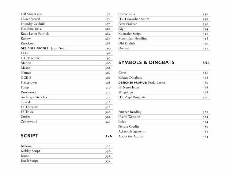
Gill Sans Kayo 272
Glaser Stencil 274
Foundry Gridnik 278
Headline 2012 280
Kade Letter Fabriek 282
Kakaw 286
Knockout 288
DESIGNER PROFILE: Jason Smith 290
LCD 296
ITC Machine 298
Mahou 300
Mason 302
Namco 304
OCR-B 306
Princetown 308
Pump 310
Rosewood 312
Architype Stedelijk 314
Stencil 316
FF ThreeSix 318
FF Trixie 320
Umbra 322
Zebrawood 324
SCRIPT 326
Balloon 328
Bickley Script 330
Bruno 332
Brush Script 334
Comic Sans 336
ITC Edwardian Script 338
Fette Fraktur 340
Gigi 344
Kuenstler Script 346
Macmillan Headline 348
Old English 350
Owned 352
SYMBOLS & DINGBATS 354
Carta 356
Kakaw Dingbats 358
DESIGNER PROFILE: Frida Larios 360
FF Netto Icons 366
Wingdings 368
ITC Zapf Dingbats 370
Further Reading 372
Useful Websites 373
Index 374
Picture Credits 380
Acknowledgements 382
About the Author 384
FOR
EW
OR
D8
_9
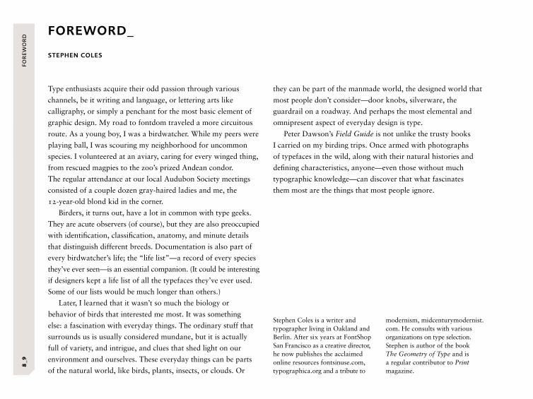
FOREWORD_
STEPHEN COLES
Type enthusiasts acquire their odd passion through various
channels, be it writing and language, or lettering arts like
calligraphy, or simply a penchant for the most basic element of
graphic design. My road to fontdom traveled a more circuitous
route. As a young boy, I was a birdwatcher. While my peers were
playing ball, I was scouring my neighborhood for uncommon
species. I volunteered at an aviary, caring for every winged thing,
from rescued magpies to the zoo’s prized Andean condor.
The regular attendance at our local Audubon Society meetings
consisted of a couple dozen gray-haired ladies and me, the
12-year-old blond kid in the corner.
Birders, it turns out, have a lot in common with type geeks.
They are acute observers (of course), but they are also preoccupied
with identification, classification, anatomy, and minute details
that distinguish different breeds. Documentation is also part of
every birdwatcher’s life; the “life list”—a record of every species
they’ve ever seen—is an essential companion. (It could be interesting
if designers kept a life list of all the typefaces they’ve ever used.
Some of our lists would be much longer than others.)
Later, I learned that it wasn’t so much the biology or
behavior of birds that interested me most. It was something
else: a fascination with everyday things. The ordinary stuff that
surrounds us is usually considered mundane, but it is actually
full of variety, and intrigue, and clues that shed light on our
environment and ourselves. These everyday things can be parts
of the natural world, like birds, plants, insects, or clouds. Or
they can be part of the manmade world, the designed world that
most people don’t consider—door knobs, silverware, the
guardrail on a roadway. And perhaps the most elemental and
omnipresent aspect of everyday design is type.
Peter Dawson’s Field Guide is not unlike the trusty books
I carried on my birding trips. Once armed with photographs
of typefaces in the wild, along with their natural histories and
defining characteristics, anyone—even those without much
typographic knowledge—can discover that what fascinates
them most are the things that most people ignore.
Stephen Coles is a writer and typographer living in Oakland and Berlin. After six years at FontShop San Francisco as a creative director, he now publishes the acclaimed online resources fontsinuse.com, typographica.org and a tribute to
modernism, midcenturymodernist.com. He consults with various organizations on type selection. Stephen is author of the book The Geometry of Type and is a regular contributor to Print magazine.
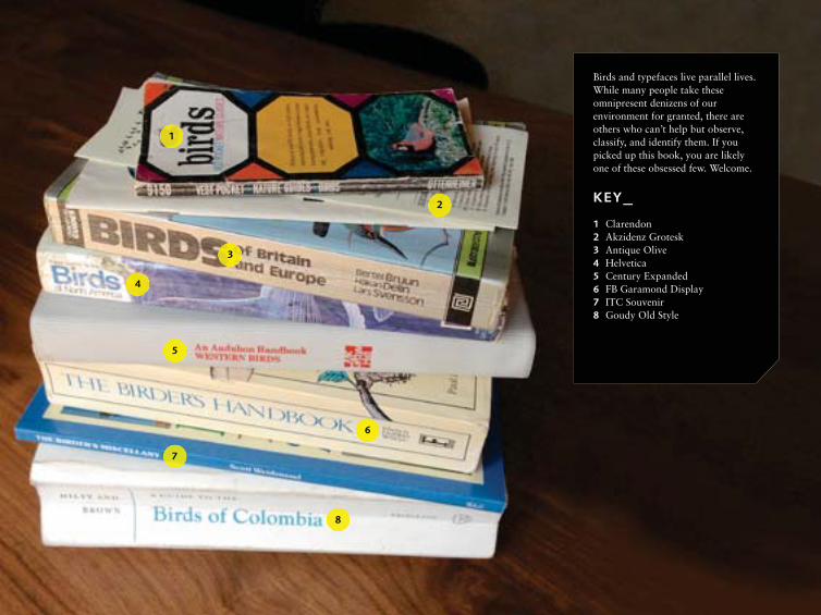
Birds and typefaces live parallel lives. While many people take these omnipresent denizens of our environment for granted, there are others who can’t help but observe, classify, and identify them. If you picked up this book, you are likely one of these obsessed few. Welcome.
KEY_1 Clarendon2 Akzidenz Grotesk3 Antique Olive4 Helvetica5 Century Expanded6 FB Garamond Display7 ITC Souvenir8 Goudy Old Style
1
2
3
4
5
6
7
8
INT
RO
DU
CT
ION
10
_11
INTRODUCTION_
What is that typeface? This is a common and recurring question
heard among design professionals, the budding typographic
enthusiast and the general public alike.
As modern society and technology reinvents and expands
the ways in which we communicate, we are increasingly
confronted with a vast array of messages, be they printed,
online, or surrounding us in the built environment. The words
we want and need to read (and on occasion don’t wish to read)
are now styled in such an array of differing typefaces that
interest and enthusiasm in all things typographical is at an
all-time high. The number of fonts available, in all styles
and categories, is now well over 150,000, and rising by the
day. The task of navigating this ocean of letterforms, separating
and identifying one typeface from another, can be bewildering.
The Field Guide to Typography identifies and provides
context to over 125 typefaces commonly used and seen today.
In this book, I hope to help the “spotter” identify the familiar—
and not so familiar—typefaces that we see around us in our
day-to-day lives. The book will also explain the thinking behind
their design, the stories of their development, and the impact
they have had on people, organizations, communities, and even
countries. Taken as a whole, it is a comprehensive celebration
of our ever-expanding typographic world.
Each typeface has varying permutations, known as fonts.
These include Light, Roman, and Bold—or even Extra Light
and Extra Bold—often with Condensed and Extended variants
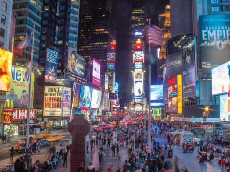
OPPOSITE: New York’s Times Square, where visitors are confronted with a vast array of messages and the right choice of typeface provides not only clear communication but also context for the message.
thrown into the mix. And that’s before we’ve discussed the
overall “classifications” of typefaces. It is a vast and complex
picture. So where do we begin?
A basic appreciation of the origins of typefaces can aid
our understanding, providing strong clues to their design and
appearance. Many of the typeface designs we see today have
been created from or influenced by, or are revivals of, historical
references, with the majority born from principles and forms
created centuries ago by our Roman ancestors.
Their appearance has also been influenced by a wide variety
of other factors. Key to many are technological developments,
from the earliest letterforms carved in stone, through to the
invention of movable type with the Gutenberg Press in the
mid-fifteenth century, and on to the advent of the computer and
the early digital experimentation starting in the 1960s with OCR
(Optical Character Recognition) typefaces. The 1980s brought us
DTP (desktop publishing) and the advent of the Macintosh
computer, which revolutionized and expanded the way type

INT
RO
DU
CT
ION
12
_13
could be drawn and created. Innovations in printing presses,
paper manufacturing, and the mixing of ink have also played
a major part in type evolution. As technology has moved on,
so have the abilities and skills required to design a typeface.
The parameters dictated by the medium allowed for a wider
freedom of creative expression and opportunity for designers.
Within the design community, trends have certainly played
their part in innovating type design, either through creative
experimentation or by happy accident. Additionally, art
movements have provided inspiration and been a driving force.
Along with the Art Deco and Art Nouveau movements, the
German Bauhaus School pioneered and rationalized modernism
in all areas of design including type design and typography.
The International Typographic Style, more commonly known
as the Swiss Style, emerged in the 1950s and still has great
influence to this day.
Finally, let’s not forget instances of a designer answering a
client’s brief to deliver a typeface for a specific function. Through
the ages, commercial organizations large and small have relied
on the printed word to communicate their products, message,
and/or services to a wider market. This, too, has contributed
to the development of typeface design. One example is the bold
and heavy “Fat Face” and Wooden Block types (now known as
Egyptian or Slab Serif typefaces) produced for use in posters
and flyers in the late eighteenth and early nineteenth century.
Today, many companies and charities commission bespoke,
contemporary typefaces to reflect their personality and brand
to the consumer.
Despite the diverse impact of history, design, and application,
one constant that we will always come across—since the dawn
of our recognized letterforms—is the passion (and often
frustration!), love, and skill that go into a font’s development.
The creation of a typeface family for a specific task requires an
understanding of a great number of issues. A designer who is
asked to create a typeface that has to work on both an airplane
livery and on a handheld PDA—or, even grander, a typeface for
use on an entire national road network’s signage system—faces
an even greater challenge. To explore this aspect of typefaces,
the book includes interviews with some of the world’s leading
type designers, sharing their insights into this highly skilled and
exhaustive craft.
The selection of typefaces included within the book was, of
course, much deliberated upon and subject to several limitations.
There are plenty of “designer favorites,” but a more varied
collection—old and new, common and uncommon—has been
chosen in order to reflect the diversity of our rich typographic
world. Within the Serif section alone, we have long-established
classics from the fifteenth century alongside a number of less
well-known contemporary designs. As the decades pass, these
will also become iconic as their employment becomes more
widespread. The good, the bad, and the ugly are all here—the
much loved as well as the equally loathed. And just as typefaces
communicate messages to us in a literal sense, so all of the
typefaces shown here have their own stories to tell.OPPOSITE: The number of fonts that are now available, in all styles and categories, is well over 150,000, and rising by the day.
HO
W T
O U
SE
TH
IS B
OO
K1
4_1
5
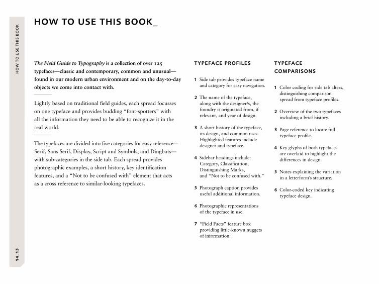
HOW TO USE THIS BOOK_
TYPEFACE PROFILES
1 Side tab provides typeface name and category for easy navigation.
2 The name of the typeface, along with the designer/s, the foundry it originated from, if relevant, and year of design.
3 A short history of the typeface, its design, and common uses. Highlighted features include designer and typeface.
4 Sidebar headings include: Category, Classification, Distinguishing Marks, and “Not to be confused with.”
5 Photograph caption provides useful additional information.
6 Photographic representations of the typeface in use.
7 “Field Facts” feature box providing little-known nuggets of information.
The Field Guide to Typography is a collection of over 125
typefaces—classic and contemporary, common and unusual—
found in our modern urban environment and on the day-to-day
objects we come into contact with.
Lightly based on traditional field guides, each spread focusses
on one typeface and provides budding “font-spotters” with
all the information they need to be able to recognize it in the
real world.
The typefaces are divided into five categories for easy reference—
Serif, Sans Serif, Display, Script and Symbols, and Dingbats—
with sub-categories in the side tab. Each spread provides
photographic examples, a short history, key identification
features, and a “Not to be confused with” element that acts
as a cross reference to similar-looking typefaces.
TYPEFACE
COMPARISONS
1 Color coding for side tab alters, distinguishing comparison spread from typeface profiles.
2 Overview of the two typefaces including a brief history.
3 Page reference to locate full typeface profile.
4 Key glyphs of both typefaces are overlaid to highlight the differences in design.
5 Notes explaining the variation in a letterform’s structure.
6 Color-coded key indicating typeface design.
1
2
3
4
5
6
1
2
3
4 6 7
5
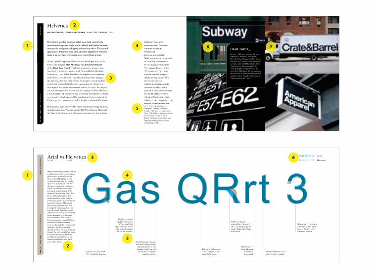
FIELD FACTS_In 2007, Helvetica became the only typeface to become a movie star. The self-titled film, directed by Gary Hustwit and released to international acclaim, celebrated Helvetica’s 50th anniversary with commentary by leading graphic designers from all over the world about the phenomenon that also led to Helvetica being voted number one in FontShop Germany’s “Best Fonts of All Time.”
HE
LVE
TIC
A1
5_1
95
S
AN
S S
ER
IF ·
GR
OT
ESQ
UE
HE
LVE
TIC
A1
5_1
95
S
AN
S S
ER
IF ·
GR
OT
ESQ
UE
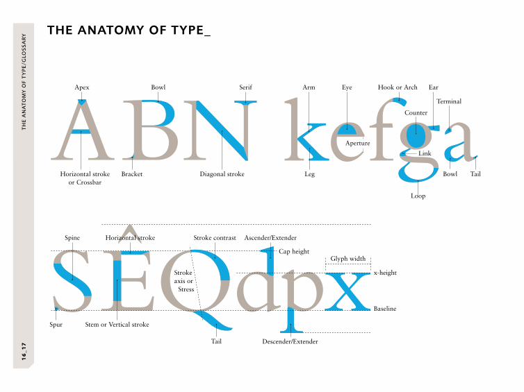
THE ANATOMY OF TYPE_T
HE
AN
AT
OM
Y O
F T
YP
E/G
LOS
SA
RY
16
_17
Apex Arm Eye Hook or Arch
Terminal
Ear
Counter
Diagonal strokeBracketHorizontal stroke or Crossbar
Bowl Serif
Leg Bowl
Link
Loop
Tail
Spine
Spur
Strokeaxis or
Stress
Glyph widthCap height
x-height
Baseline
Aperture
Stem or Vertical stroke
Horizontal stroke Stroke contrast Ascender/Extender
Tail Descender/Extender
GLOSSARY_
Antiqua
Serif types with calligraphic
Old Style letterforms.
Ball terminal
A circular form at the end of
a stroke.
Bitmap
Character or form defined by
pixels set within a grid.
Blackletter
A form of heavy calligraphic
script employing broad-
nibbed strokes. Seen from
the Middle Ages onward.
Bold
A heavier variation of the
Regular weight of a typeface.
Calligraphy
Letterforms written by hand
(with a writing implement).
Capital (Cap) height
The height of capital letters
from the baseline to the
capital’s top.
Character
Used to describe any
individual letter, number,
punctuation mark, or symbol
within a typeface.
Color (typographic)
The density of tone seen when
a block of text is set on a page.
Usually referred to in shades
of gray.
Condensed
Typeface design with a
narrow character width.
Constructivist
Twentieth-century art and
architectural movement.
Major influence on Bauhaus.
Contrast
The difference between the
thick and thin strokes of a
character.
Cursive
Type reminiscent of, or
imitating, handwritten
letterforms.
Didone
A Serif family that possesses
very high stroke contrast with
unbracketed serifs.
Dingbat
Nonalphabetical typeface
consisting of symbols, shapes,
or other pictorial elements.
Display type
Typefaces designed for title or
headline applications rather
than for reading texts.
Drop shadow
Offset replication of letterform
positioned behind character
to provide the impression of
three dimensions.
Egyptian
Serif typeface with low stroke
contrast and large, heavy,
squared serifs.
English round hand
Calligraphic, connecting script.
Often elaborate and having
a degree of refinement over
other Script typefaces.
Expanded
A font with an “expanded”
character set containing
nonaligning numerals,
fractions, and other characters.
Extended
A typeface whereby the
letterforms are “stretched”
on the horizontal axis with
wider character widths than
the Regular.
Family
Generic description of a
collection of fonts of varying
weights and styles sharing a
common design approach
and construction features.
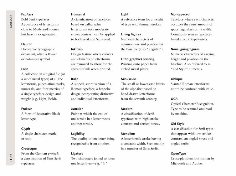
Fat Face
Bold Serif typefaces.
Appearance of letterforms
close to Moderns/Didones
but heavily exaggerated.
Fleuron
Decorative typographic
ornament, often a flower
or botanical symbol.
Font
A collection in a digital file (or
a set of metal types) of all the
letterforms, punctuation marks,
numerals, and font metrics of
a single typeface design and
weight (e.g. Light, Bold).
Fraktur
A form of decorative Black
letter type.
Glyph
A single character, mark
or icon.
Grotesque
From the German grotesk;
a classification of Sans Serif
typefaces.
Humanist
A classification of typefaces
based on calligraphic
letterforms with moderate
stroke contrast; can be applied
to both Serif and Sans Serif.
Ink trap
Design feature where corners
and elements of letterforms
are removed to allow for the
spread of ink when printed.
Italic
A sloped, script version of a
Roman typeface; a bespoke
design incorporating distinctive
and individual letterforms.
Junction
Point at which the end of
one stroke in a letter meets
another stroke.
Legibility
The quality of one letter being
recognizable from another.
Ligature
Two characters joined to form
one letterform—e.g. “fi.”
Light
A reference term for a weight
of type with thinner strokes.
Lining figures
Numeral characters of
common size and position on
the baseline (also “Regular”).
Litho(graphic) printing
Printing onto paper from
etched metal plates.
Minuscule
The small or lower-case letters
of the alphabet based on
hand-drawn letterforms
from the seventh century.
Modern
A classification of Serif
typefaces with high stroke
contrast and vertical stress.
Monoline
A letterform’s stroke having
a constant width. Seen mainly
in a number of Sans Serifs.
Monospaced
Typeface where each character
occupies the same amount of
space regardless of its width.
Commonly seen in typefaces
based around typewriters.
Nonaligning figures
Numeric characters of varying
height and position on the
baseline. Also referred to as
“Old Style” numerals.
Oblique
Slanted Roman letterforms;
not to be confused with italic.
OCR
Optical Character Recognition.
Type to be scanned and read
by machine.
Old Style
A classification for Serif types
that appear with low stroke
contrast, an angled stress and
angled serifs.
OpenType
Cross-platform font format by
Microsoft and Adobe.
GLO
SS
AR
Y1
8_1
9
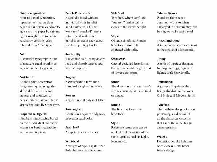
Photo-composition
Prior to digital typesetting,
typefaces existed on glass
negatives and were exposed to
light-sensitive paper by shining
light through them to create
hard copy versions. Also
referred to as “cold type.”
Point
A standard typographic unit
of measure equal roughly to
1/72 of an inch (0.351 mm).
PostScript
Adobe’s page description
programming language that
allowed for vector-based
layouts and typefaces to
be accurately rendered. Now
largely replaced by OpenType.
Proportional figures
Numbers with spacing based
on their individual character
widths for better readability
within running text.
Punch/Punchcutter
A steel die faced with an
individual letter in relief
hand-carved in. This die
was then “punched” into a
softer metal with other
punches to create page layout
and form printing blocks.
Readability
The definition of being able to
read and absorb typeset text
when composed.
Regular
A classification term for a
standard weight of typeface.
Roman
Regular, upright style of letter.
Running text
Continuous typeset body text,
as seen in textbooks.
Sans Serif
A typeface with no serifs.
Semi-bold
A weight of type. Lighter than
Bold, heavier than Medium.
Slab Serif
Typefaces where serifs are
“squared” and equal (or
close) to the stroke weight.
Slope
Oblique simulated Roman
letterforms, not to be
confused with italic.
Small caps
Capital designed letterforms,
but with a height roughly that
of lower-case letters.
Stress
The direction of a letterform’s
stroke contrast, either vertical
or angled.
Stroke
The line that forms the
letterform.
Style
Reference terms that can be
applied to the varieties of the
same typeface, such as Light,
Roman, etc.
Tabular figures
Numbers that share a
common width so when
employed in columns they can
be aligned to be easily read.
Thicks and thins
A term to describe the contrast
in the stroke of a letterform.
Titling
A style of typeface designed
for large settings, typically
lighter, with finer details.
Transitional
A group of typefaces that
bridge the distance between
Old Style and Modern Serifs.
Typeface
The aesthetic design of a font
possessing a collection of
all the character elements
that share the same design
characteristics.
Weight
Definition for the lightness
or thickness of the letter
form’s design.
CLA
SS
IFIC
AT
ION
TY
PE
S2
0_2
1
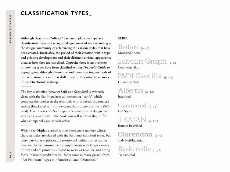
CLASSIFICATION TYPES_
Although there is no “official” system in place for typeface
classification there is a recognized agreement of understanding in
the design community of referencing the various styles that have
been created. Invariably, the period of their creation within type
and printing development and their distinctive visual appearance
dictates how they are classified. Opposite there is an overview
of how the types have been classified within The Field Guide to
Typography, although alternative and more exacting methods of
differentiation do exist that drill down further into the nuances
of the letterforms’ makeup.
The key distinction between Serif and Sans Serif is evidently
clear, with the Serif typefaces all possessing “serifs” which
complete the strokes at the terminals with a flared, pronounced
ending (bracketed serif) or a rectangular, squared-off form (Slab
Serif). From these core Serif types, the variations in design can
greatly vary and within the book you will see how they differ
when compared against each other.
Within the Display classsifications there are a number whose
characteristics are shared with the Serif and Sans Serif types, but
these particular typefaces are positioned within this section as
they are deemed unsuitable for employment with larger extents
of text and are primarily created to work as headline and titling
fonts. “Ornamented/Novelty” fonts come in many guises, from
“Art Nouveau” types to “Futuristic” and “Distressed.”
SERIF
[p. 40]
Modern/Didone
[p. 84]
Geometric Slab
[p. 44]
Humanist Slab
[p. 24]
Inscribed
[p. 74]
Old Style
[p. 112]
Roman Inscribed
[p. 54]
Slab Serif/Egyptian
[p. 32]
Transitional
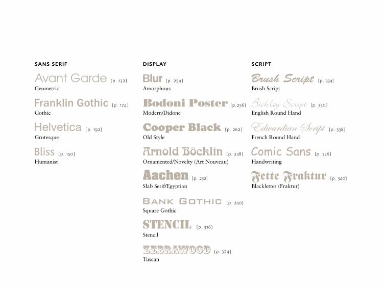
SANS SERIF
[p. 132]
Geometric
[p. 174]
Gothic
[p. 192]
Grotesque
[p. 150]
Humanist
DISPLAY
[p. 254]
Amorphous
[p.256]
Modern/Didone
[p. 262]
Old Style
[p. 238]
Ornamented/Novelty (Art Nouveau)
[p. 232]
Slab Serif/Egyptian
[p. 240]
Square Gothic
[p. 316]
Stencil
[p. 324]
Tuscan
SCRIPT
[p. 334]
Brush Script
[p. 330]
English Round Hand
[p. 338]
French Round Hand
[p. 336]
Handwriting
[p. 340]
Blackletter (Fraktur)

SE
CT
ION
ON
E2
2_2
3
SE
RIF
SerifOPPOSITE: Century (see p. 52) in use as retailer branding for designer furniture shop Forma 5, London, UK.
SECTION ONE
24
_25
S
ER
IF ·
IN
SCR
IBED
ALB
ER
TU
S2
4_2
5
SE
RIF
· I
NSC
RIB
EDA
LBE
RT
US
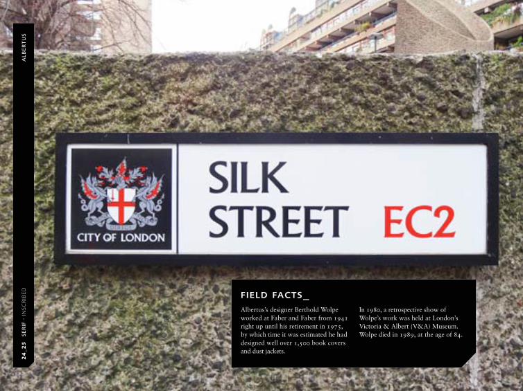
FIELD FACTS_Albertus’s designer Berthold Wolpe worked at Faber and Faber from 1941 right up until his retirement in 1975, by which time it was estimated he had designed well over 1,500 book covers and dust jackets.
In 1980, a retrospective show of Wolpe’s work was held at London’s Victoria & Albert (V&A) Museum. Wolpe died in 1989, at the age of 84.
OPPOSITE: Albertus employed on street signage within the “City of London” district.
CATEGORY: Serif
CLASSIFICATION: Inscribed
COUNTRY OF ORIGIN: Germany
DISTINGUISHING MARKS:
Bold simple strokes with
subtle, minimal flaring
terminals; asymmetrical
crossbar on “E” and “F”;
descender on upper-case “J”
FURTHER SIGHTINGS: The
Bitstream foundry version is
referred to as Flareserif 821
NOT TO BE CONFUSED WITH:
Friz Quadrata (p. 70); Optima
(p. 220)
Named for the thirteenth-century German philosopher and
theologian Albertus Magnus, Albertus was inspired by letterforms
that had been carved into bronze.
Commissioned by Stanley Morison of the Monotype Corporation
type foundry, German typographer and type designer Berthold
Wolpe initially began designing Albertus as titling capitals in
1932, launching in 1935. Over time, the typeface evolved, with
a lower-case Roman set being added, followed by an italic and
a lighter weight in later years. The family was completed in
1940. An extremely popular typeface due to its ease of use and
strong legibility, Albertus is often used for display purposes on
items such as book covers, packaging, and signage systems.
Berthold Wolpe originally started out as an apprentice metal
engraver at the Klingspor foundry in Offenbach (later a strong
influence on Albertus’s visual aesthetic). He then went on to
study at Offenbach’s Kunstgewerbeschule (school of arts and
crafts) before moving to England in 1935. When World War II
broke out, he was sent, along with many other German nationals
living in Britain, to an internment camp in Australia. He returned
in 1941 and joined the production department of book publisher
Faber and Faber. As well as designing several other typefaces,
it was there that he established his reputation as a leading book
jacket designer of the time, employing Albertus and hand-lettering
in many of his cover designs.
AlbertusBERTHOLD WOLPE · MONOTYPE · 1932–1940

ITC
AM
ER
ICA
N T
YP
EW
RIT
ER
OPPOSITE: For US retailer OfficeMax, the use of ITC American Typewriter Bold as their logotype is an ideal choice to communicate their area of expertise and range of business products.
26
_27
S
ER
IF ·
SLA
B S
ERIF
CATEGORY: Serif
CLASSIFICATION: Slab Serif
COUNTRY OF ORIGIN: USA
DISTINGUISHING MARKS:
Pronounced rounded serifs
and terminals, appearance
of typewriter letterforms
FURTHER SIGHTINGS:
OfficeMax; Dorset Cereals;
“I love NY”; Budgens food
retailers, UK
NOT TO BE CONFUSED WITH:
Clarendon (p. 54); Courier
(p. 64);
With a touch of nostalgia, ITC American Typewriter is a tribute
to those early letter-writing machines, the predecessors to our
digital age. Whether used to format the classic business letter
or employed in a more varied, contemporary manner, ITC
American Typewriter has, since its release, been used in a whole
host of different applications. Its success can be attributed to
the friendliness and immediacy of its presentation.
It was launched by International Typeface Corporation (ITC) in
1974 to celebrate the 100th anniversary of the office typewriter.
The brief was to create a typeface family that, while emulating
the classical appearance of typewriter letterforms, nonetheless
broke away from their monospaced appearance to create a
proportionally spaced font. This meant creating letterforms
that vary in width like a conventional text typeface rather than
employing a standard space for all characters—a feature that
allowed the typeface to work much better in text settings,
increasing its readability.
Never created to be formatted for metal type, its first use was in
photocomposition machines. Only later was it produced as the
digital font that is now a standard on all PC operating systems.
ITC American TypewriterJOEL KADEN/TONY STAN · ITC · 1974
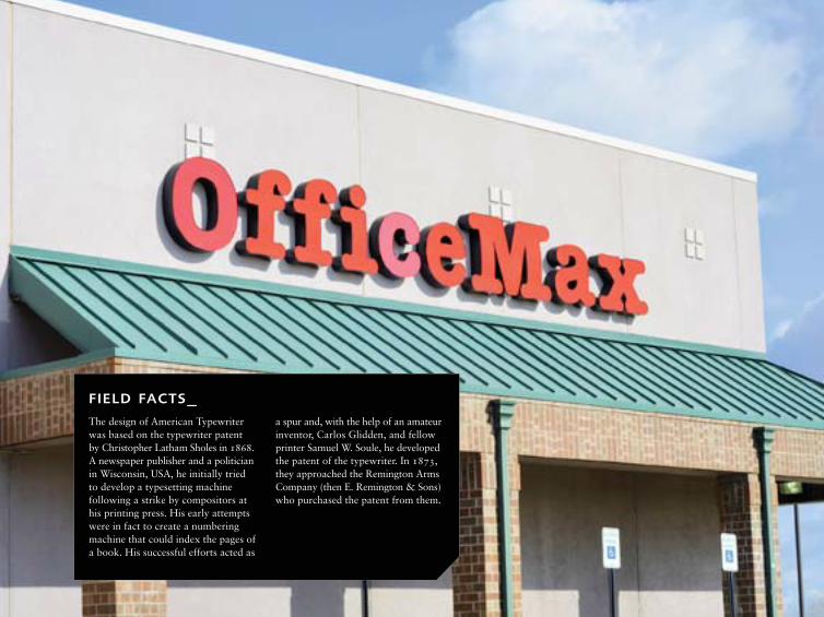
FIELD FACTS_The design of American Typewriter was based on the typewriter patent by Christopher Latham Sholes in 1868. A newspaper publisher and a politician in Wisconsin, USA, he initially tried to develop a typesetting machine following a strike by compositors at his printing press. His early attempts were in fact to create a numbering machine that could index the pages of a book. His successful efforts acted as
a spur and, with the help of an amateur inventor, Carlos Glidden, and fellow printer Samuel W. Soule, he developed the patent of the typewriter. In 1873, they approached the Remington Arms Company (then E. Remington & Sons) who purchased the patent from them.
AN
TW
ER
P2
8_2
9
SE
RIF
· C
ON
TEM
POR
AR
Y S
ERIF
AN
TW
ER
P
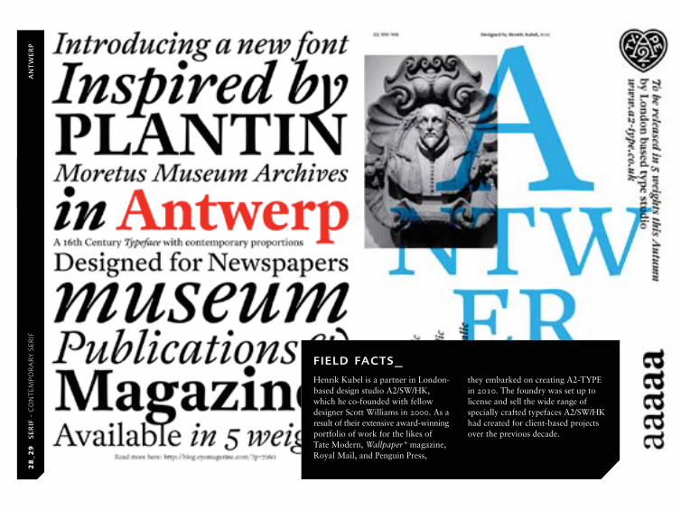
FIELD FACTS_Henrik Kubel is a partner in London- based design studio A2/SW/HK, which he co-founded with fellow designer Scott Williams in 2000. As a result of their extensive award-winning portfolio of work for the likes of Tate Modern, Wallpaper* magazine, Royal Mail, and Penguin Press,
they embarked on creating A2-TYPE in 2010. The foundry was set up to license and sell the wide range of specially crafted typefaces A2/SW/HK had created for client-based projects over the previous decade.
28
_29
S
ER
IF ·
CO
NT
EMPO
RA
RY
SER
IF

OPPOSITE: A2-TYPE promotional design for their sixteenth-century influenced typeface, Antwerp.
CATEGORY: Serif
CLASSIFICATION:
Contemporary Serif
COUNTRY OF ORIGIN:
Belgium/UK
DISTINGUISHING MARKS: Large
x-height; large counters on
lower case “a” and “e”;
increased angle of italic at
19º; pronounced ink traps;
open counter on upper-case
“P”; pronounced ear on
double-story “g”
FURTHER SIGHTINGS: Ideal for
applications where authority
and elegance are both required
NOT TO BE CONFUSED WITH:
Plantin (p. 100)
A contemporary design inspired by sixteenth-century typefaces,
this recent family of text typefaces was inspired by the many
archives of type on display in the Plantin-Moretus Museum,
Antwerp, Belgium.
In 2010, Danish graphic designer Henrik Kubel was awarded
the prestigious three-year artist and designer working grant from
The Danish Art Foundation. As part of his grant and his studies
at the Expert Class Type Design course at the Plantin Institute of
Typography, Kubel developed the concept and design of Antwerp
over a ten-month period, applying the many years of type design
experience he had gained while designing bespoke typefaces for
commercial graphic design projects.
He worked traditionally, creating initial sketches from his
research before transferring to a digital medium (using Fontlab
software) to complete the design. Antwerp encompasses many
of the qualities of Dutch typography of the early period but with
a larger x-height than its ancestors to aid legibility and reflect
twentieth-century aesthetics and requirements.
The resulting typeface, with its broad range of weights (Light,
Regular, Medium, Semibold, and Bold, all with italic styles), is
particularly elegant and warmer than some of its contemporaries,
making it ideal for use in print and on-screen reading applications.
AntwerpHENRIK KUBEL · A2-TYPE · 2011
30
_31
S
ER
IF ·
GEO
MET
RIC
SLA
B
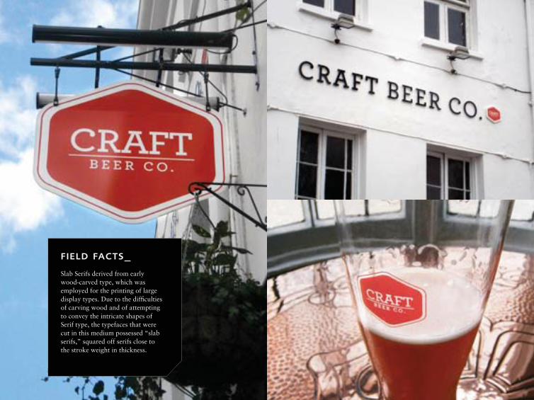
OPPOSITE: Archer used in the identity, and as signage, for The Craft Beer Co., UK.
CATEGORY: Serif
CLASSIFICATION:
Geometric Slab
COUNTRY OF ORIGIN: USA
DISTINGUISHING MARKS: Ball
terminals on lower-case “a,”
“f,” “g,” “j,” “r,” and “y”;
slab serif on descenders of
“p,” “q”; open, rounded
counters; horizontal slab
serif on apex of upper-case
“A”; long ascenders; short
descenders; low x-height
FURTHER SIGHTINGS: San
Francisco Chronicle; Passion
for Business magazine;
Central Park development
in Sydney, Australia; Wells
Fargo; Quaker Oats
NOT TO BE CONFUSED WITH:
ITC Lubalin Graph (p. 84);
Rockwell (p. 102)
Created exclusively for cookery and interior design guru
Martha Stewart’s Living magazine, this elegant Slab Serif
combines the geometry of a Slab design with a softer, humanist
quality, making it ideal for texts that require a lighter and
accessible tone of presentation.
Eminent New York type foundry Hoefler & Frere-Jones’s Archer
typeface was commissioned to meet the extensive demands of
modern editorial and publishing requirements. In a magazine
such as Living, the content is highly varied, ranging from tables
and diagrams to calendars, reading texts, and headlines, all of
which require a typeface that is flexible and possesses enough
typographic variation to create differentiation between the many
hierarchies of information. In addition, the typeface’s appearance
had to be one of innocence and friendliness, inviting the reader
into the subject matter and conveying the Martha Stewart brand
as credible and straightforward.
Hoefler & Frere-Jones’s innovative design incorporates details
drawn from typewriter faces, such as ball terminals and slab
serifs, to create a note of “honesty” within the design. Married
with the mathematical purity of a geometric approach, the Slab
Serif design is not only hard-working and legible, but also warm
and approachable.
AR
CH
ER Archer
HOEFLER & FRERE-JONES · 2008
FIELD FACTS_Slab Serifs derived from early wood-carved type, which was employed for the printing of large display types. Due to the difficulties of carving wood and of attempting to convey the intricate shapes of Serif type, the typefaces that were cut in this medium possessed “slab serifs,” squared off serifs close to the stroke weight in thickness.
UNVERKÄUFLICHE LESEPROBE
The Field Guide to Typography
Gebundenes Buch, Pappband, 382 Seiten, 20,0 x 15,0 cm400 farbige AbbildungenISBN: 978-3-7913-4839-1
Prestel
Erscheinungstermin: September 2013