the care of patients with severe chronic illness
TRANSCRIPT

Center for the Evaluative Clinical Sciences Back
The Care of Patients with Severe Chronic Illness: An Online Report on the Medicare Program by the Dartmouth Atlas Project
The Dartmouth Atlas of Health Care 2006
The Center for the Evaluative Clinical SciencesDartmouth Medical School
Center for the Evaluative Clinical Sciences
Dartmouth atlas of health Care ii
Back
Library of Congress Cataloging-in-Publication Data
Dartmouth Medical School Center for the Evaluative Clinical Sciences.
The Care of Patients with Severe Chronic Illness/The Center for the Evaluative
Clinical Scienes, Dartmouth Medical School.
ISBN 0-9785301-0-1
Medical care – United States – Marketing – Maps. 2. Health facilities – United
States – Statistics. I. Title.
Copyright 2006 The Trustees of Dartmouth College
All rights reserved. The reproduction or use of this report in any form or in any
information storage or retrieval system is forbidden without the express written
permission of the publisher.

Center for the Evaluative Clinical Sciences
Dartmouth atlas of health Care iii
Back
Principal Investigator: John E. Wennberg, M.D., M.P.H.
Co-Principal Investigator: Elliott S. Fisher, M.D., M.P.H.
Lead Analyst: Sandra M. Sharp, S.M.
Editors: Megan McAndrew, M.B.A., M.S., and Kristen K. Bronner, M.A.
and other members of the Dartmouth Atlas of Health Care Working Group
Thomas A. Bubolz, Ph.D.
Vincent J. Fusca III, M.M.S.
David C. Goodman, M.D., M.S.
Daniel J. Gottlieb, M.S.
Jia Lan, M.S.
Zhao Peng, M.S.
Stephanie R. Raymond, B.A.
Jonathan S. Skinner, Ph.D.
Dean T. Stanley
Dongmei Wang, M.S.
Phyllis Wright-Slaughter, M.H.A.
Atlas design byJonathan Sa’adah and Elizabeth Adams
Intermedia Communications

Center for the Evaluative Clinical Sciences
Dartmouth atlas of health Care iv
The Center for the Evaluative Clinical Sciences
Dartmouth Medical School
Lebanon, New Hampshire 03766
(603) 653-0826
http://www.dartmouthatlas.org

Center for the Evaluative Clinical Sciences
Dartmouth atlas of health Care v
Back
This report is dedicated to
James R. Knickman, Ph.D.
in grateful recognition of his steadfast support and championship
of the Dartmouth Atlas Project

Center for the Evaluative Clinical Sciences
Dartmouth atlas of health Care vi
Back
The research on which the Dartmouth Atlas Project is based was made possible by grants from
The Robert Wood Johnson Foundation
in association with a funding consortium including
The Wellpoint Foundation
The Aetna Foundation
The United Health Foundation
The California Healthcare Foundation

Center for the Evaluative Clinical Sciences
Dartmouth atlas of health Care vii
Back
Table of Contents
Preface ...................................................................................................................................................................x
Chapter 1: Chronic Illness and the Problem of Supply-Sensitive Care ...........................................................1
Is More Better? ..................................................................................................................................................................3
Implications for Evaluating Efficiency in Managing Chronic Illness ............................................................................5
Why We Are Interested in Measuring Care at the End of Life .......................................................................................6
Chapter 2: Variations Among States in the Management of Severe Chronic Illness .....................................8
Introduction .....................................................................................................................................................................8
Part One: Care During the Last Six Months of Life ............................................................................................................9
Days Spent in Hospital per Decedent During the Last Six Months of Life ...................................................................9
Days Spent in Intensive Care Units per Decedent During the Last Six Months of Life .............................................10
Physician Visits per Decedent During the Last Six Months of Life .............................................................................11
Percent of Decedents Seeing Ten or More Physicians During the Last Six Months of Life ........................................12
Part Two: Medicare Spending and Resource Inputs During the Last Two Years of Life ................................................15
Inpatient and Part B Spending per Decedent During the Last Two Years of Life .......................................................15
Standardized FTE Physician Labor Inputs per 1,000 Decedents During the Last Two Years of Life .........................16
Comparing Labor Inputs of Primary Care Physicians and Medical Specialists..........................................................17
Associations Between Physician Labor Inputs and Hospital Use ................................................................................18
Comparing Labor Inputs of Primary Care and Medical Specialists ............................................................................19
The Primary Care - Medical Specialist Mix and Variation in Cost, Use and Quality of Care ....................................20

Center for the Evaluative Clinical Sciences
Dartmouth atlas of health Care viii
Back
Chapter 3: Treatment of the Chronically Ill at Academic Medical Centers ....................................................21
Introduction ...................................................................................................................................................................21
Part One: Variations in Utilization Among COTH Integrated Academic Medical Centers ..........................................22
Average Number of Days in Hospitals ..........................................................................................................................23
Average Number of Days in Intensive Care Units ........................................................................................................24
Average Number of Physician Visits ..............................................................................................................................25
Academic Medical Centers and the Capacity Effect .....................................................................................................26
Hospital Days per Decedent with Cancer and with Congestive Heart Failure ...........................................................27
Physician Visits per Decedent with Cancer and with Congestive Heart Failure .........................................................28
Hospital Days per Decedent for Black and Non-Black Patients ..................................................................................29
The Capacity Effect During Earlier Periods of Illness ..................................................................................................30
Part Two: Variations in Medicare Spending and Resource Inputs and Benchmarking Relative Efficiency .................32
Variations in Medicare Spending and Resource Inputs ...............................................................................................32
Inpatient and Part B Medicare Spending ......................................................................................................................33
Physician Labor ..............................................................................................................................................................34
Use of Intensive Care Unit Beds ....................................................................................................................................35
Comparing UCLA to the UCSF Benchmark ................................................................................................................36
The Medical Care Cost Equation...................................................................................................................................38
Part Three: Benchmarking Physician Labor Inputs.........................................................................................................40
Allocation of Medical Specialists ...................................................................................................................................41
Allocation of Primary Care Physicians ........................................................................................................................42
Ratio of Primary Care to Medical Specialist Labor ......................................................................................................43
Benchmarking Workforce Need ...................................................................................................................................44

Center for the Evaluative Clinical Sciences
Dartmouth atlas of health Care ix
Back
Chapter 4: How to Use the Dartmouth Atlas to Compare Performance in Managing Chronic Illnesses ...46
Part One: Graphic Representation of Variation: the Distribution Graph ......................................................................47
Part Two: Hospital-Specific Performance Reports ...........................................................................................................49
Part Three: The Medical Care Cost Equation ...................................................................................................................55
Part Four: Hospital-Specific Reports for Large Hospital Networks ................................................................................58
Chapter 5: The Problem of the Overuse of Acute Care Hospitals in Managing Chronic Illnesses .............60
Part One: Illness, Medicare Spending, Volume, and Price ...............................................................................................62
Illness and Medicare Spending ......................................................................................................................................62
Medicare Spending, Volume and Price .........................................................................................................................64
Utilization and Equity ....................................................................................................................................................65
Part Two: Two Reasons Why the Nation Needs to Focus on Reducing the Overuse of the Acute Care Sector .................66
Variation in Volume of Supply-Sensitive Care Is Not Just a Medicare Problem ........................................................66
Trends in Resource Inputs and Utilization: 2000-03 ...................................................................................................67
Part Three: Breaking the Growing Dependency on Acute Care Hospitals .....................................................................69
Appendix 1: Supplemental Figures...................................................................................................................72
Appendix 2: Methods .........................................................................................................................................98

Center for the Evaluative Clinical Sciences
Dartmouth atlas of health Care x
Back
The Care of Patients with Severe Chronic Illness: A Report on the Medicare Program
This edition of the Dartmouth Atlas reports on the last two years of life among Medicare enrollees with severe chronic illnesses—the services received by Medicare enrollees who died between 1999 and 2003 and who had at least one of 12 common chronic conditions. The most prevalent conditions in this cohort were congestive heart failure, chronic obstructive pulmonary disease, and cancer. It concentrates on inpatient acute care hospitals and physician services under Medicare Part A and B. Other services provided under traditional Medicare will be reported in upcoming editions of the Atlas. Medicare Part C data are not available.
■ In the state studies (Chapter Two), the study populations were all resident enrollees with one or more of the 12 chronic illnesses, whether or not they were hospitalized during the last two years of life.
■ In the hospital-specific studies (Chapters Three and Four), Medicare enrollees with one or more of the 12 chronic illnesses were assigned to the hospital most frequently used during the last two years of life. Only decedents who had had one or more medical hospitalization for one of the 12 chronic illnesses were included. (Surgical practices will be the subject of a subsequent Atlas.) Although the focus is on acute care hospitals, the measures of physician services include all care paid for under Medicare Part B, whether provided inside or outside of the hospital.
■ In the regional studies (Chapter Five), the study populations were grouped by residence in hos-pital referral regions (306 tertiary-care markets defined in the Dartmouth Atlas Project). The database for state and regional studies includes records for all Medicare enrollees with one or more of the 12 chronic illnesses who died between 2000 and 2003, whether or not they were hospitalized during the last two years of life.
Several dimensions of care are examined: per decedent Medicare spending for hospital and phy-sician care; FTE physician, hospital bed, and ICU bed inputs; physician visits; hospitalizations and stays in intensive care; and selected quality measures.
Preface

Center for the Evaluative Clinical Sciences
Dartmouth atlas of health Care xi
Back
The chapters document extensive variation in the amount, as well as the quality, of care given to chronically ill Medicare beneficiaries—among states, regions, and from one hospital to another, even within the same region.
Chapter One provides an overview of the problem of “supply-sensitive” care. It first reviews the evidence that the supply of resources is closely associated with the frequency of use of physician visits, hospital admissions, and diagnostic tests. The chapter then summarizes the evidence that populations exposed to more frequent use of supply-sensitive care do not have better—indeed, might have worse—health outcomes. It then examines the implications of evaluating efficien-cy in the management of chronic illness, introducing “best practice” benchmarks—areas where resources and care intensity are low, but quality is high—to evaluate efficiency.
Chapter Two looks at variations among the states and the District of Columbia and examines important relationships among resources, utilization, and quality. States that rely more on primary care physicians than on medical specialists in managing chronic illness tend to have lower Medi-care spending and use fewer hospital beds, less physician labor, and fewer referrals to multiple specialists—and have better quality scores (measured by CMS’s Hospital Compare database). Residents of these states spend less time in intensive care units and have fewer physician visits.
Chapter Three reports on the remarkable variation in managing chronic illnesses among promi-nent academic medical centers. It illustrates the use of best practice benchmarking in evaluating the performance of the University of California Medical Center Los Angeles and the University of California Medical Center San Francisco, two academic medical centers that belong to the Uni-versity of California Hospital System. The two medical centers differ substantially in per decedent spending, resource inputs, and utilization. UCLA uses many more ICU beds and medical special-ist labor inputs; UCSF relies on primary care labor and uses many fewer physicians of all other types. UCLA patients have, on average, many more physician visits and, especially, many more days in ICUs than patients at UCSF. The “medical care cost equation” is introduced as a tool for evaluating the relative contribution of price (reimbursements per day in hospital or per physician visit) and volume (patient days or physician visits per enrollee) in determining total Medicare reim-bursements. Volume is far more important than price in accounting for total reimbursements.

Center for the Evaluative Clinical Sciences
Dartmouth atlas of health Care xii
Back
The final section of Chapter Three illustrates the use of benchmarking to evaluate current and future need for physicians. Depending on the benchmark selected for comparison, very different conclusions can be reached about the adequacy of the physician workforce. Benchmarks based on academic medical centers and regions where large group practices dominate indicate that the country has a surplus supply of physicians. The use of other, more highly resourced areas, such as Manhattan, indicates an inadequate current supply and a critical future scarcity.
There are simply too many hospitals in the United States to make it feasible to report on each one in a printed version of the Atlas. Chapter Four introduces the tools available on the Dartmouth Atlas web site to graphically display variation and generate reports comparing hospital, regional, and state performance. The chapter provides an example that describes variation in performance among hospitals located in the Fort Myers, Florida hospital referral region. It also illustrates the use of the medical care cost equation report on hospitals in Miami, using the volume and price benchmarks of the Fort Myers hospital referral region as the standard for comparison. While each of the 25 Miami hospitals exceeded the Fort Myers benchmarks for spending and volume, there was considerable variation in efficiency among the hospitals; inpatient spending and volume var-ied by a factor of about two.
Chapter Five focuses on the problem of overuse of supply-sensitive care during the last two years of life. The first section shows that, contrary to a common assumption, variation in overall Medi-care spending per beneficiary is not driven by variation in the prevalence of chronic illness. What really matters is how much is spent on a per patient basis for those with severe chronic illness: almost two-thirds of the variation in overall Medicare spending is explained by how much is spent during the last two years of life, while virtually none of the regional variation in reimbursements is explained by the prevalence of severe chronic illness. Moreover, it isn’t the price per episode of care that matters most, but the volume of supply-sensitive care, including hospitalizations and physician visits.
The chapter presents evidence that variation in use of hospitals for treating people with chronic illnesses is not just a Medicare problem; it affects those under 65 as well. The problem of overuse is growing. Care intensity, measured by the frequency of use of physician visits and intensive

Center for the Evaluative Clinical Sciences
Dartmouth atlas of health Care xiii
Back
care units, increased over the four-year period 2000-03; and the rate of increase was greater in regions that were already spending more and had higher utilization rates in the baseline year. The final section of the chapter illustrates how benchmarking can be used to estimate the savings that would accrue if the utilization rate of acute inpatient hospital care and physician visits were reduced to the benchmarks provided by regions served by efficient health care systems. Sav-ings of more than 32% in inpatient reimbursements and 34% in physician reimbursements would have accrued if the efficiency of the Salt Lake City region had been achieved in other regions. But realizing such savings—and reallocating resources to population-based management of chronic illness—will require new models of financing care. It will also require accountability for system integration. Because they are the only locus of organized care that is available throughout the country, perhaps acute care hospitals could serve as the focus for integrating providers into orga-nized, community-based systems for managing chronic illness.
Information on the database, construction and definition of measures, methods of analysis, and aggregation of populations into regions and hospital-specific cohorts is available in the Appendix on Methods.

Center for the Evaluative Clinical Sciences
Dartmouth atlas of health Care ChroniC illness and the Problem of suPPly-sensitive Care �
Back
Chronic Illness and the Problem of Supply-Sensitive CareChapter One
For patients with chronic illnesses, the frequency of certain types of care varies extensively among geographic regions and health care organizations, and that care varies in close association with the supply of medical resources — it is “supply-sensitive.” Supply-sensitive care includes visits to primary care physicians and medical specialists, hospitalizations and admissions to intensive care units, as well as diagnostic testing and imaging exams. Supply-sensitive care accounts for well over 50% of Medicare spending, though there is remarkable variation in the per-person use of these services. Among the 306 hospital referral regions defined in the Dartmouth Atlas Project, the frequency of primary care visits per enrollee varied by a factor of about three, visits to medical specialists by more than six, and hospitalizations for congestive heart failure and chronic obstructive pulmonary disease by more than four.
The use of supply-sensitive care for the treatment of chronic illnesses is particularly intense during the last few months of life, but again, the variations among regions and providers is striking. On average, patients with chronic illnesses living in the region using the least supply-sensitive care spent 6.5 days in hospitals during their last six months of life, while those living in the region using the most supply-sensitive services spent an average of 19.4 days as inpatients during the last six months of their lives. Physician visit rates also varied substantially. In the highest-intensity region, terminal patients had an average of more than 50 visits during their last six months; in the lowest-intensity regions, the average was about 15.7 visits.
Evidence-based medicine plays virtually no role in governing the frequency of use of supply-sen-sitive services. Medical textbooks contain few evidence-based clinical guidelines concerning when to hospitalize, admit to intensive care, refer to medical specialists or, for most conditions, when to order diagnostic or imaging tests for patients at given stages in the progression of chronic illness. As an example, the 2003 edition of the British Medical Journal’s Clinical Evidence Concise — which describes itself as “the international source of the best available medical evidence for effective health care” — contains not a single reference as to when to hospitalize patients with cancer, chronic lung disease, or heart failure, or when to schedule them for physician visits and revisits.

Center for the Evaluative Clinical Sciences
Dartmouth atlas of health Care ChroniC illness and the Problem of suPPly-sensitive Care �
Back
0.0
50.0
100.0
150.0
200.0
250.0
300.0
350.0
400.0
0.0 1.0 2.0 3.0 4.0 5.0 6.0
Hip Fracture
R2 = 0.06
All MedicalConditions
R2 = 0.54
R2 = 0.490.0
0.5
1.0
1.5
2.0
2.5
0.0 2.0 4.0 6.0 8.0 10.0 12.0 14.0
In the absence of theories and evidence about what constitutes best practice, other factors drive clinical decisions. Foremost among them is the generally held assumption, common to both doctors and patients, that more frequent intervention constitutes better care — that whatever resources are available should be fully utilized in managing difficult illnesses. When providers and patients are work-ing under this assumption, utilization is inevitably driven by the available supply of resources. There is good evidence that this is what is going on in health care markets; the Dartmouth Atlas Project has consistently shown a positive association between the per capita supply of staffed hospital beds and the hospitalization rate for medical (non-surgical) conditions (Figure 1.1). The effect of hospital bed supply on hospital use is so well recognized that it is referred to as “Roemer’s law.”a
There are some exceptions. Hospitalization for hip fracture is one of the few clinical events that varies with the incidence of illness. The explanation is straightforward; hip fracture is a serious, life-threat-ening condition. It is easily diagnosed, and everyone — physicians, patients, families and insurance companies — agrees on the need for hospitalization. The incidence of hip fracture, not the per capita supply of beds, drives the demand for hospitalization. Unfortunately, very few conditions correspond to the model where demand is determined by the incidence of disease and drives medical practice.
The relationship between the supply of physicians and physician visit rates, particularly in those spe-cialties focused on treating chronic illnesses, is similar to the relationship between bed supply and hospitalization rates. About half of the variation in the number of Medicare visits to cardiologists is associated with the per capita number of cardiologists in the region (Figure 1.2). Such a relationship makes arithmetic sense: on average, regions with twice as many cardiologists per capita will have twice as many available visit hours, since appointments to see physicians are fully booked—very few hours in the work week go unfilled. Available capacity governs the frequency of visits.
Figure 1.1. The Association Between Hospital Beds per 1,000 Residents (1996) and Discharges per 1,000 Medicare Enrollees (1995–96)
Figure 1.2. The Association Between the Supply of Cardiologists per 100,000 Residents and Visits to Cardiologists per 1,000 Medicare Enrollees (1996)
Acute Care Beds per 1,000 Residents (1996)
Dis
char
ges
per
1,0
00 M
edic
are
En
rolle
es (
1995
–96)
Cardiologists per 100,000 Residents (1996)
Car
dio
log
ist V
isit
s p
er 1
,000
M
edic
are
En
rolle
es (
1996
)

Center for the Evaluative Clinical Sciences
Dartmouth atlas of health Care ChroniC illness and the Problem of suPPly-sensitive Care �
Is More Better?
Back
The bottom-line question is whether the ‘more is better’ assumption is valid: do populations receiving more supply-sensitive care have better outcomes? Do they live longer? Do they have better quality of life? Are they more satisfied with their care? Such questions have received virtually no attention from academic medicine or from federal agencies, such as the National Institutes of Health, that are responsible for the scientific basis of medicine. With the exception of a few studies of chronic disease management, patient-level studies that might shed light on the question simply have not been done. The appropriate quantity of supply-sensitive care is only now beginning to emerge as a topic for gen-eral discourse at scientific meetings, at medical rounds, and in medical textbooks.
In the absence of detailed patient-level data, comparing resource inputs and outcomes among popu-lations living in the 306 hospital referral regions (tertiary care markets) in the United States has been the focus of the Dartmouth Atlas Project. The studies consistently show that more resource inputs and utilization do not result in better outcomes. For example, in a recent study, researchers in the Dart-mouth Atlas group examined outcomes for three patient cohorts: people who had had hip fractures, heart attacks, or colectomies for colon cancer. The patients were followed for up to five years after their initial events. The study’s major finding was that regions with greater care intensity had increased mortality rates.b
The results are summarized in Table 1.1, which compares the level of resource inputs and mortality among cohorts living in hospital referral regions in the highest and lowest quintiles of Medicare end of life spending. The high input rate regions had 32% more hospital beds per capita, 31% more phy-sicians, 65% more medical specialists, 75% more general internists, 29% more surgeons—and, of course, more Medicare spending (61% higher, on a price-adjusted basis). The low input rate regions had 26% more family practice physicians.
Although the hip fracture, heart attack, and colon cancer cohorts were comparable in baseline mor-bidity over the five-year period of follow-up after the index event from which the diagnosis was made, those living in the high-rate regions had higher mortality rates: 1.9% higher for hip fracture patients, 5.2% higher for colon cancer patients, and 5.2% higher for heart attack patients.

Center for the Evaluative Clinical Sciences
Dartmouth atlas of health Care ChroniC illness and the Problem of suPPly-sensitive Care �
Back
To address questions about functional status and patient satisfaction, the researchers used a fourth data set, the ongoing Medicare Current Beneficiary Survey. The results indicated no difference between regions in functional status or satisfaction, but lower perceived access to patient care in high-rate regions.
Resource Inputs Cohort Health Outcomes
Resource Ratio, Q5 vs. Q1
Condition Relative risk of death, Q5 vs. Q1
95% CL
Per-capita Medicare spending 1.61 Hip fracture 1.019 (1.0007-1.0386)
Hospital beds per 1,000 1.32 Colon cancer 1.052 (1.0123-1.0936)
Physician supply per 10,000 Heart attack 1.052 (1.0177-1.0884)
All physicians 1.31
Medical specialists 1.65
General Internists 1.75 Functional status: same
Family practitioners/GP 0.74 Satisfaction: same
Surgeons 1.29 Perceived access to care: worse
Table 1.1. Per Capita Resource Inputs and Health Outcomes: The Ratio of High to Low Quintiles of Spending (1996)
The study of regional outcomes was repeated, restricting the analysis to patients who received their initial care at academic medical centers. The results were similar: academic medical centers in high input rate, high spending regions provided more supply-sensitive services than those in low input rate, low spending regions. For example, during the first six months following hip fracture, patients using academic medical centers in high-spending areas had 82% more physician visits, 26% more imaging exams, 90% more diagnostic tests, and 46% more minor surgery. Nevertheless, patients in high-intensity regions had higher mortality rates and worse quality scores.c

Center for the Evaluative Clinical Sciences
Dartmouth atlas of health Care ChroniC illness and the Problem of suPPly-sensitive Care �
Implications for Evaluating Efficiency in Managing Chronic Illness
Back
The evidence that the outcomes and quality of care tend to be better in regions with low resource use and low care intensity has important policy implications. Health care organizations serving such regions are not rationing care; rather, they are relatively more efficient, achieving equal and possibly better outcomes with fewer resources. This concept of relative efficiency can be useful in evaluating performance using benchmarking, a comparison among regions or providers in per-person spending, resource inputs, and quality measures.
For example, the Dartmouth Atlas Project recently compared the performance of hospital referral regions in California in managing chronic illness over the last two years of life.d On an illness, age, sex and race adjusted basis, providers in the Sacramento region were relatively more efficient than those in the Los Angeles region. On a per-person basis, Medicare spending was 69% higher in Los Angeles for patients with similar illnesses and levels of severity. Providers in Los Angeles used 61% more hos-pital beds, 128% more intensive care beds, and 89% more FTE physician labor in the management of chronically ill patients during the last two years of life. The quality of care given to heart attack, conges-tive heart failure, and pneumonia patients was uniformly worse in Los Angeles than in Sacramento. The quality of terminal care was also quite different; 33% of Medicare deaths in Los Angeles involved an admission to intensive care, compared to 19% in Sacramento. Moreover, 57% of Los Angeles hospitals were rated below average by patients who had used them, while only 13% of Sacramento hospitals were rated below average by patients who had been admitted to those hospitals.
On the basis of its lower spending, lower resource inputs, lower utilization rates, and its relatively sat-isfactory quality measures, the Sacramento region’s performance provides a benchmark of relative efficiency for evaluating Los Angeles providers. While there was more than a twofold variation among hospitals within the Los Angeles region, none was lower in per-person spending, resource allocation, or utilization than the Sacramento regional average. If Sacramento practices were adopted by provid-ers serving the Los Angeles region, the savings would be substantial. For example, had Los Angeles hospitals provided care at the rate of the Sacramento benchmark over the five years of our study (1999-2003), savings from care during the last two years of life for Medicare patients with chronic ill-nesses would have been approximately $1.7 billion.
The legitimacy of the Sacramento benchmark depends on the evidence that, at the population level, more intensive use of supply-sensitive care — more frequent physician visits, hospitalizations, and stays in intensive care among the chronically ill — does not result in better health outcomes. It can be
Center for the Evaluative Clinical Sciences
Dartmouth atlas of health Care ChroniC illness and the Problem of suPPly-sensitive Care �
Back
argued that what is needed is evidence-based specification of the proper processes of care in order to identify efficient practices. We agree that this should be the goal. But scientifically validated, detailed evidence defining efficient clinical pathways — for example, whom to hospitalize, when to schedule a revisit, or when to refer to a medical specialist, home health agency, or hospice — does not exist. It will take a long time and a major reorientation of the academic research agenda to provide such clini-cal evidence. In the meantime, we must rely on the results of natural experiments: population-based studies comparing overall quality and outcomes for similarly ill patients exposed to different levels of care intensity. So far, these studies indicate no marginal gain from greater resource use across the range of practice in the United States. Given the critical need to address practice variations, the use of high quality/low resource regions and hospitals as benchmarks for evaluating efficiency seems a fair and prudent policy.
The emphasis in this edition of the Dartmouth Atlas is on care delivered during the last two years of life. There is growing concern about the way chronic illness is managed in the United States, and about the possibility that some chronically ill and dying Americans might be receiving too much care — more than they and their families actually want or benefit from. Our emphasis on this period of life is also motivated by our interest in developing measures of performance that minimize the chance that variations can be explained by differences in the severity of individuals’ illnesses. By looking at measures over fixed intervals of time prior to death, we can say with assurance that the prognosis of all the patients in the cohort is identical — all were dead after the interval of observation. By further adjusting for differences in the age, sex, race and relative frequency of chronic illness in the cohort, we believe that we have developed fair measures of the relative intensity of care provided to equally ill patients — comparisons for which differences among patients are an unlikely explanation.
We also address the question of how the variations in intensity of care observed during the last six months of life compare to variations in care intensity during previous periods. What we found is that care during the last six months of life is consistent with the patterns of practice in previous periods (Chapter Three, Figures 3.7 and 3.8). The frequencies of days spent in hospitals and physician visits during the last six months of life are highly correlated with hospitalization and visit rates in previous periods, even though the average rates during the earlier periods are much lower (reflecting the lower average illness severity of the patients further from death). The hospital, medical center, or physician practice providing the care has an effect on resource consumption and utilization throughout the course of chronic illness, not just in its terminal phase.
Why We Are Interested in Measuring Care at the End of Life

Center for the Evaluative Clinical Sciences
Dartmouth atlas of health Care ChroniC illness and the Problem of suPPly-sensitive Care �
Back
a Milton I. Roemer first posited Roemer’s law around 1960. In 1993, he reiterated this observation in National Health Systems of the World, Volume Two (Oxford University Press): “The optimal supply of hospital beds needed by each country, for planning purposes, has been a subject of study and debate everywhere. If there is an assured payment system, it seems that almost any additional hospital beds provided will tend to be used, up to a ceiling not yet determined.”
b Fisher ES, Wennberg DE, Stukel TA, Gottlieb DJ, Lucas FL, Pinder EL. The implications of regional variations in Medicare spending. Part 1: The content, quality, and accessibility of care. Ann Intern Med. 2003 Feb 18;138(4):273-87.
Fisher ES, Wennberg DE, Stukel TA, Gottlieb DJ, Lucas FL, Pinder EL. The implications of regional variations in Medicare spending. Part 2: Health outcomes and satisfaction with care. Ann Intern Med. 2003 Feb 18;138(4):288-98.
c Fisher ES, Wennberg DE, Stukel TA, Gottlieb DJ. Variations in the longitudinal efficiency of academic medical centers. Health Affairs web exclusive, 7 Oct 2004.
d Wennberg JE, Fisher ES, Baker L, Sharp SM, Bronner KK. Evaluating the efficiency of California providers in caring for patients with chronic illness. Health Affairs web exclusive, 16 Nov 2005.
Center for the Evaluative Clinical Sciences
Dartmouth atlas of health Care variations among states in the management of severe ChroniC illness �
Back
Introduction The Dartmouth Atlas has traditionally presented its geographic performance measures by local and regional health care markets. While local and regional patterns of practice are reflected in variations in resources and utilization, the amount of care, and the kinds of care used, are also influenced by factors associated with state-level policies, particularly the financing and regulation of care. All states play an active role managing the Medicaid program, which, because of its role in financing much of long term care, has a direct impact on the costs and quality of the care delivered to the chronically ill.
States are also increasingly concerned about rising health care costs because of their responsibilities as payers for their employees and retirees. States routinely regulate, and through such regulation influence, the practice of medicine. In some states, government involvement includes a role in determining the distribution of resources through certificate of need programs. This is a potentially important role because, as the Atlas project has demonstrated, clinical decisions governing the frequency of use of physician visits, referrals to specialists, hospital care and use of diagnostic testing are strongly affected by local capacity. Capacity strong-ly influences both the quantity and per capita cost of care provided to patients with chronic illnesses.
Some states are seizing leadership roles in the reform of health care; to help inform the process, this edition of the Atlas includes a comparative analysis of state-level data. We believe that significant progress in the redesign of health care will demand close attention to the practice variation phenomenon, as well as attention to the opportunities to reduce waste and improve quality described by the Dartmouth Atlas Project.
This chapter focuses in particular on the levels of spending and resource inputs, and the quality of care, for Medi-care enrollees with severe chronic illnesses, and explores important relationships between resources, utilization and quality. The population is comprised of a 20% sample of individuals who were enrolled in traditional Medi-care, died over the four-year period 2000-03, and who were diagnosed with at least one of 12 chronic illnesses. The measures are adjusted for differences in age, sex, race and prevalence of the 12 chronic illnesses.
Because we are comparing populations with identical prognoses — all were dead at the end of the two-year period — we believe it is extremely unlikely that differences in illness explain the variation we observe among states (or among regions within states or among hospitals within a region, as discussed in subse-quent chapters).
Variations Among States in the Management of Severe Chronic IllnessChapter twO

Center for the Evaluative Clinical Sciences
Dartmouth atlas of health Care variations among states in the management of severe ChroniC illness �
Back
13 or More (6)11 to < 13 (21)
9 to < 11 (17)Fewer than 9 (7)
Days Spent in Hospitalper Decedent During theLast Six Months of Life
by State (Deaths 2000-03)
Days Spent in Hospital per Decedent During the Last Six Months of Life
The average number of per decedent days spent in hospitals during the last six months of life, by state, ranged from 7.3 to 16.4. (Total days are the result of both the admission rate and the average length of stay.) The U.S. average was 11.7 days per patient. Some of the Mountain states and the Pacific Northwest states had low rates, compared to residents of Hawaii (16.4), New York (16.3), the District of Columbia (15.8) and New Jer-sey (15.2). Residents of Mississippi (14.2) and South Carolina (13.1) also had high rates. Residents of Utah (7.3), Oregon (7.8 days) and Idaho (8.2) had rates about half the average among residents of Hawaii and New York.
Part One: Care During the Last Six Months of Life
Map 2.1. Variation, by State, in Average Numbers of Hospital Days During the Last Six Months of Life
AL 12.1 IL 12.2 MT 8.6 RI 11.4AK 10.9 IN 10.0 NE 9.7 SC 13.1AZ 9.4 IA 10.0 NV 10.3 SD 10.1AR 12.5 KS 10.5 NH 9.7 TN 12.1CA 11.7 KY 11.7 NJ 15.2 TX 11.1CO 8.6 LA 11.6 NM 9.5 UT 7.3CT 11.4 ME 10.6 NY 16.3 VT 10.1DE 12.4 MD 12.1 NC 11.8 VA 11.9DC 15.8 MA 11.5 ND 9.0 WA 8.5FL 11.3 MI 10.8 OH 10.1 WV 12.1GA 11.3 MN 9.5 OK 11.4 WI 9.7HI 16.4 MS 14.2 OR 7.8 WY 9.1ID 8.2 MO 11.0 PA 11.6 US 11.7
Center for the Evaluative Clinical Sciences
Dartmouth atlas of health Care variations among states in the management of severe ChroniC illness �0
Back
4 or More (3)3 to < 4 (16)2 to < 3 (23)Fewer than 2 (9)
Days Spent in IntensiveCare per Decedent Duringthe Last Six Months of Life
by State (Deaths 2000-03)
Map 2.2. Variation, by State, in Average Numbers of ICU Days During the Last Six Months of Life
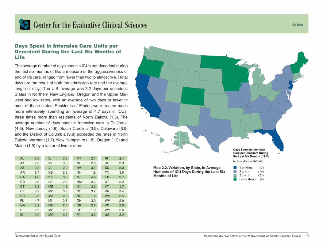
Days Spent in Intensive Care Units per Decedent During the Last Six Months of Life
The average number of days spent in ICUs per decedent during the last six months of life, a measure of the aggressiveness of end of life care, ranged from fewer than two to almost five. (Total days are the result of both the admission rate and the average length of stay.) The U.S. average was 3.2 days per decedent. States in Northern New England, Oregon and the Upper Mid-west had low rates, with an average of two days or fewer in most of these states. Residents of Florida were treated much more intensively, spending an average of 4.7 days in ICUs, three times more than residents of North Dakota (1.5). The average number of days spent in intensive care in California (4.6), New Jersey (4.6), South Carolina (3.9), Delaware (3.9) and the District of Columbia (3.8) exceeded the rates in North Dakota, Vermont (1.7), New Hampshire (1.8), Oregon (1.9) and Maine (1.9) by a factor of two or more.
AL 3.0 IL 3.6 MT 2.1 RI 2.4AK 2.8 IN 3.0 NE 2.6 SC 3.9AZ 3.3 IA 2.0 NV 3.4 SD 2.0AR 2.7 KS 2.3 NH 1.8 TN 3.5CA 4.6 KY 3.0 NJ 4.6 TX 3.7CO 2.0 LA 2.8 NM 2.7 UT 2.2CT 2.8 ME 1.9 NY 3.0 VT 1.7DE 3.9 MD 3.3 NC 3.2 VA 3.4DC 3.8 MA 2.3 ND 1.5 WA 2.5FL 4.7 MI 2.8 OH 3.0 WV 2.9GA 3.2 MN 2.0 OK 2.2 WI 2.0HI 2.9 MS 2.5 OR 1.9 WY 2.6ID 2.0 MO 3.1 PA 3.3 US 3.2

Center for the Evaluative Clinical Sciences
Dartmouth atlas of health Care variations among states in the management of severe ChroniC illness ��
Back
30 or More (12)25 to < 30 (18)20 to < 25 (12)Fewer than 20 (9)
Physician Visits perDecedent During theLast Six Months of Life
by State (Deaths 2000-03)
Physician Visits per Decedent During the Last Six Months of Life
The average number of physician visits per decedent during the last six months of life, a measure of intensity of end of life care, ranged from fewer than 20 to more than 40. Vermont, the Mountain States and states in the Pacific Northwest had the lowest rates, with an average of fewer than 20 visits. Residents of New Jersey had the highest number of physician visits (41.5) during the last six months of life, 2.4 times more than residents of Utah (17.0). Rates exceeded Utah’s by a factor of two in New York (35.3), Florida (34.9) and California (34.9).
Map 2.3. Variation, by State, in Average Number of Physician Visits During the Last Six Months of Life
AL 27.7 IL 31.1 MT 19.0 RI 24.0AK 18.4 IN 24.5 NE 25.6 SC 27.7AZ 26.6 IA 22.5 NV 33.1 SD 22.4AR 29.0 KS 24.5 NH 21.3 TN 29.7CA 34.9 KY 27.5 NJ 41.5 TX 30.9CO 23.1 LA 31.0 NM 20.7 UT 17.0CT 25.4 ME 20.3 NY 35.3 VT 19.1DE 32.3 MD 29.4 NC 24.3 VA 26.1DC 34.2 MA 26.8 ND 19.9 WA 20.0FL 34.9 MI 28.3 OH 26.3 WV 25.7GA 26.5 MN 20.6 OK 25.7 WI 22.0HI 34.5 MS 28.3 OR 17.9 WY 19.6ID 18.1 MO 26.3 PA 31.9 US 29.0

Center for the Evaluative Clinical Sciences
Dartmouth atlas of health Care variations among states in the management of severe ChroniC illness ��
Back
30% or More (11)25% to < 30% (10)20% to < 25% (16)Less than 20% (14)
Percent of Decedents SeeingTen or More Physicians Duringthe Last Six Months of Life
by State (Deaths 2000-03)
Percent of Decedents Seeing Ten or More Physicians During the Last Six Months of Life
The propensity for multiple physicians to be involved in the care of patients was measured by calculating the percent of patients who saw ten or more different physicians during their last six months of life. So many different physicians being involved in the patient’s management could indicate problems with conti-nuity of care. The proportion of decedents who had seen ten or more physicians during their last six months of life ranged from 10.8% among residents of Wyoming to 38.7% among resi-dents of New Jersey. Rates were high in the Mid-Atlantic states, including Delaware (35.8%), New York (35.6%) and Maryland (34.2%), as well as in Florida (34.6%) and Massachusetts (34.2%). Rates were substantially lower in the Western and Pacific Northwestern states, including Montana (12.0%), Idaho (13.3%), and Oregon (14.5%).
Map 2.4. Variation, by State, in the Percent of Decedents Seeing Ten or More Physicians During Their Last Six Months of Life
AL 23.5 IL 28.2 MT 12.0 RI 31.2AK 16.7 IN 23.1 NE 20.2 SC 27.9AZ 28.5 IA 18.9 NV 32.1 SD 17.6AR 20.5 KS 18.6 NH 24.2 TN 26.4CA 27.4 KY 22.5 NJ 38.7 TX 25.2CO 23.1 LA 26.3 NM 18.7 UT 15.0CT 29.2 ME 19.5 NY 35.6 VT 19.2DE 35.8 MD 34.2 NC 24.3 VA 28.7DC 35.1 MA 34.2 ND 16.6 WA 20.1FL 34.6 MI 30.7 OH 27.9 WV 21.6GA 24.3 MN 23.0 OK 17.6 WI 21.4HI 20.8 MS 20.7 OR 14.5 WY 10.8ID 13.3 MO 23.0 PA 34.1 US 27.5

Center for the Evaluative Clinical Sciences
Dartmouth atlas of health Care variations among states in the management of severe ChroniC illness ��
Back
20.0% or More (11)17.5% to < 20.0% (15)15.0% to < 17.5% (10)Less than 15.0% (15)
Percent of Deaths OccurringDuring a Hospitalization withan Admission to Intensive Care
by State (Deaths 2000-03)
Map 2.5. Variation, by State, in the Percent of Deaths Associated With an Admission to Intensive Care
AL 20.0 IL 18.4 MT 13.0 RI 15.4AK 17.9 IN 17.1 NE 14.8 SC 21.2AZ 15.5 IA 13.2 NV 19.2 SD 11.7AR 18.0 KS 16.0 NH 13.4 TN 20.5CA 21.8 KY 18.6 NJ 25.1 TX 19.7CO 12.2 LA 18.2 NM 17.5 UT 13.8CT 17.1 ME 14.7 NY 19.8 VT 13.5DE 22.4 MD 20.2 NC 19.0 VA 20.1DC 24.8 MA 16.6 ND 11.8 WA 15.9FL 20.7 MI 16.9 OH 17.0 WV 18.6GA 19.5 MN 13.3 OK 16.6 WI 13.6HI 21.3 MS 18.1 OR 13.6 WY 14.0ID 13.4 MO 18.4 PA 18.5 US 18.5
Percent of Deaths Associated With an Admission to Intensive Care
Given the expressed wish of many patients to avoid aggressive care at the end of life, our measure of terminal care intensity — the percent of all deaths that occurred during a hospitaliza-tion involving one or more stays in intensive care — is useful in evaluating the quality of the end of life. Nationally, over the four-year period of our study, about one death in five was associated with one or more stays in an intensive care unit. However, the manner of managing the final days of life differed from state to state. In some, care was much more aggressive than in oth-ers. Among New Jersey residents, 25.1% of all deaths were associated with an ICU stay, compared to only 11.7% among residents of South Dakota. “High tech” deaths were less com-mon in Northern New England, the Upper Midwest and Pacific Northwest, and more common in California and the Southeast-ern states.

Center for the Evaluative Clinical Sciences
Dartmouth atlas of health Care variations among states in the management of severe ChroniC illness ��
Back
30% or More (13)25% to < 30% (10)20% to < 25% (19)Less than 20% (9)
Percent of DecedentsEnrolled in Hospice Duringthe Last Six Months of Life
by State (Deaths 2000-03)
Map 2.6. Variation, by State, in the Percent of Decedents Enrolled in Hospice During the Last Six Months of Life
AL 30.5 IL 29.9 MT 20.3 RI 22.9AK 6.7 IN 24.7 NE 24.5 SC 24.8AZ 44.7 IA 28.8 NV 31.1 SD 14.6AR 23.3 KS 28.3 NH 20.4 TN 19.3CA 25.0 KY 24.8 NJ 23.5 TX 33.8CO 39.3 LA 25.5 NM 31.6 UT 36.6CT 21.9 ME 12.6 NY 18.7 VT 17.9DE 27.9 MD 25.5 NC 23.9 VA 22.4DC 18.9 MA 20.9 ND 19.4 WA 25.7FL 37.9 MI 34.3 OH 32.7 WV 20.2GA 31.6 MN 23.7 OK 34.4 WI 24.2HI 20.4 MS 24.5 OR 34.0 WY 16.3ID 23.5 MO 26.7 PA 25.6 US 27.2
Percent of Decedents Enrolled in Hospice
The proportion of decedents who were enrolled in hospice care during their last six months of life ranged from less than 7% to more than 40%. Higher proportions of patients were enrolled in hospice during their last six months of life in the Western states, Michigan, Ohio, and Florida than in New England and the Upper Midwest. The proportions enrolled in hospice in Arizona (44.7%), Colorado (39.3%) and Florida (37.9%) were substan-tially higher than the proportions enrolled in Alaska (6.7%), Maine (12.6%), South Dakota (14.6%), Wyoming (16.3%) and Vermont (17.9%). The national average rate was 27.2%.

Center for the Evaluative Clinical Sciences
Dartmouth atlas of health Care variations among states in the management of severe ChroniC illness ��
Back
1.15 to 1.37 (5)1.00 to < 1.15 (6)0.85 to < 1.00 (32)0.81 to < 0.85 (8)
Ratio of Rates of Inpatient & PartB Spending During the Last TwoYears of Life to the U.S. Average
by State (Deaths 2000-03)
Part Two: Medicare Spending and Resource Inputs During the Last Two Years of Life
Inpatient and Part B Spending per Decedent During the Last Two Years of Life
The amount of money the Medicare program spent per patient with severe chronic illness varied substantially. The distribu-tion was highly skewed; 13 states and the District of Columbia accounted for half of Medicare’s spending, even though they accounted for only 45% of chronically ill Medicare patients. New Jersey had the highest level of spending during the last two years of life – almost $40,000 per person – followed by the District of Columbia ($39,637), California ($38,573), New York ($38,369) and Maryland ($36,337). These states had spending levels that were 24% to 33% above the national average. In forty states, spending was below the national average, and 27 states had spending levels between 10% and 20% below the national average. Among the lowest-spending states were Idaho, Iowa, West Virginia, North Dakota, Indiana, Utah, South Dakota and New Mexico, all with average spending of less than $25,000 per decedent.
Map 2.7. Variation, by State, in Inpatient and Part B Spending During the Last Two Years of Life
AL 25,344 IL 31,197 MT 25,056 RI 29,028AK 31,957 IN 23,874 NE 25,838 SC 27,095AZ 27,843 IA 23,746 NV 27,950 SD 24,072AR 25,724 KS 25,740 NH 25,706 TN 26,464CA 38,573 KY 25,012 NJ 39,810 TX 28,466CO 25,888 LA 26,830 NM 24,616 UT 23,936CT 32,636 ME 25,196 NY 38,369 VT 27,050DE 28,450 MD 36,337 NC 25,829 VA 25,435DC 39,637 MA 31,985 ND 23,855 WA 27,698FL 29,604 MI 28,427 OH 25,005 WV 23,789GA 26,267 MN 27,411 OK 25,227 WI 25,343HI 33,518 MS 25,705 OR 25,509 WY 25,173ID 23,697 MO 25,681 PA 28,487 US 29,199

Center for the Evaluative Clinical Sciences
Dartmouth atlas of health Care variations among states in the management of severe ChroniC illness ��
Back
24 or More (5)21 to < 24 (10)18 to < 21 (27)Fewer than 18 (9)
Standardized FTE Physician LaborInputs per 1,000 Decedents Duringthe Last Two Years of Life
by State (Deaths 2000-03)
Standardized FTE Physician Labor Inputs per 1,000 Decedents During the Last Two Years of Life
Standardized full-time equivalent physician labor inputs during the last two years of life averaged 21.6 physicians per 1,000 decedents nationally over the period 2000-03. Labor inputs, however, varied substantially from state to state. States with relatively low FTE physician workforce inputs included Maine and several states in the Upper Midwest. Physician labor inputs in New Jersey (27.5), the District of Columbia (26.6), Florida (26.3) and California (25.9) were more than 20% above the national average. Health care organizations serving New Jer-sey used 27% more than the national average and 70% more than Alaska (16.1). States using the fewest FTE physician labor inputs included North Dakota (17.1), Utah (17.2), Idaho (17.3), and Wyoming (17.4).
Map 2.8. Variation, by State, in Physician Labor Inputs During the Last Two Years of Life
AL 20.5 IL 23.1 MT 17.5 RI 19.1AK 16.1 IN 19.0 NE 19.6 SC 19.9AZ 21.2 IA 20.7 NV 23.1 SD 18.3AR 19.6 KS 18.8 NH 18.3 TN 20.7CA 25.9 KY 19.9 NJ 27.5 TX 22.6CO 19.8 LA 20.7 NM 17.9 UT 17.2CT 19.2 ME 17.6 NY 24.6 VT 18.4DE 22.0 MD 23.2 NC 19.1 VA 19.4DC 26.6 MA 21.2 ND 17.1 WA 18.4FL 26.3 MI 22.3 OH 19.9 WV 18.5GA 19.2 MN 18.3 OK 18.5 WI 18.2HI 23.4 MS 19.1 OR 17.5 WY 17.4ID 17.3 MO 19.9 PA 22.1 US 21.6

Center for the Evaluative Clinical Sciences
Dartmouth atlas of health Care variations among states in the management of severe ChroniC illness ��
Back
R2 = 0.200.0
4.0
8.0
16.0
0.0 4.0 8.0 12.0 16.0
12.0
Primary Care FTE Labor Inputs per 1,000 Decedents During the Last Two Years of Life
Med
ical
Sp
ecia
list
FT
E L
abo
r In
pu
ts p
er 1
,000
Dec
eden
ts D
uri
ng
th
e L
ast T
wo
Yea
rs o
f L
ife
Comparing Labor Inputs of Primary Care Physicians and Medical Specialists
The management of chronic illness is for the most part the responsibility of primary care physicians and medical special-ists. Over the four-year period 2000-03, the workload appears to have been almost evenly divided between the two disciplines; during the last two years of life, the national average labor input from primary physicians was 8.7 per 1,000 decedents, and medical specialist labor inputs averaged 8.4 per 1,000.
There was, however, considerable variation among the states, particularly in the supply of medical specialist labor. There was a more than twofold range of variation in rates of medical spe-cialist labor input, from 5.2 per 1,000 decedents in Alaska to 13.2 in New Jersey. Primary care physician labor inputs varied by only 60%, from 6.6 per 1,000 decedents in Utah to 10.6 in New York.
If medical specialist labor were substituting for primary care labor, we would expect to find an inverse relationship between the two. In fact, states with higher input rates for primary care physicians tended to have higher rates of medical specialist inputs as well. Figure 2.1 gives the relationship between labor input per 1,000 decedents for primary care physicians (horizon-tal axis) and medical specialists (vertical axis). The rates are correlated (R2 = .20).
Figure 2.1. The Relationship Between Primary Care and Medical Specialist Physician Labor Inputs (Deaths Occurring 2000-03)

Center for the Evaluative Clinical Sciences
Dartmouth atlas of health Care variations among states in the management of severe ChroniC illness ��
Back
0.0
1.0
2.0
3.0
4.0
5.0
6.0
0.0 4.0 8.0 12.0 16.0
R = 0.152
R2 = 0.65
1.0
2.0
3.0
4.0
5.0
6.0
0.0 4.0 8.0 12.0 16.0
0.0
Associations Between Physician Labor Inputs and Hospital Use
We examined the relationships between physician labor input and the use of hospitals. Perhaps contrary to expectation, pri-mary care labor input was positively correlated with Medicare spending for inpatient care (R2 = .27) (Appendix Figure 2A), hospital days (R2 = .39) (Appendix Figure 2B), and days in inten-sive care (R2 = .15) (Figure 2.2). There were similar positive associations with medical specialist labor; greater inputs were associated with more inpatient spending (R2 = .36) (Appendix Figure 2C) and more hospital days (R2 = .29) (Appendix Fig-ure 2D). The association between specialist labor inputs and days decedents spent in intensive care units during the last six months of life was particularly strong: R2 = .65 (Figure 2.3).
Ironically, the quality of technical processes of care, measured by a composite quality score (based on CMS measurements of the quality of care for patients with heart attacks, heart failure, and pneumonia) was inversely associated with medical special-ist labor inputs: r =-.34, (p value = 0.02).
Figure 2.2. The Relationship Between Primary Care Physician Labor Inputs and Average Number of Days in Intensive Care (Deaths Occurring 2000-03)
Figure 2.3. The Relationship Between Medical Specialist Labor Inputs and Average Number of Days in Intensive Care (Deaths Occurring 2000-03)
Primary Care FTE Labor Inputs per 1,000 Decedents During the Last Two Years of Life
ICU
Day
s p
er D
eced
ent
Du
rin
g
the
Las
t S
ix M
on
ths
of
Lif
e
Medical Specialist FTE Labor Inputs per 1,000 Decedents During the Last Two Years of Life
ICU
Day
s p
er D
eced
ent
Du
rin
g
the
Las
t S
ix M
on
ths
of
Lif
e

Center for the Evaluative Clinical Sciences
Dartmouth atlas of health Care variations among states in the management of severe ChroniC illness ��
Back
1.4 or More (8)1.2 to < 1.4 (15)1.0 to < 1.2 (16)Less than 1.0 (12)
Ratio of Primary Care to MedicalSpecialist FTE Labor InputsDuring the Last Two Years of Life
by State (Deaths 2000-03)
Comparing Labor Inputs of Primary Care and Medical Specialists
Another way of looking at workforce allocation in managing chronic illness is to examine the mix between primary care and medical specialist labor. In care models that emphasize primary care, specialists serve primarily in a referral capacity; in those that depend on medical specialists, specialists are responsible for care management. We have used the ratio of primary care to medical specialist labor inputs to develop a summary index of variation in practice patterns along this dimension.
States most favoring primary care in managing chronic illness included South Dakota (ratio of primary care to medical spe-cialist inputs = 1.67), Wyoming (1.49), Maine (1.47), Minnesota (1.47), and Missouri (1.45). 35% of the Medicare decedents resided in states where the ratio was less than 1.0 — where primary care physician labor input was less than the medical specialist labor input. These included the District of Columbia (0.69), New Jersey (0.70), Florida (0.77), Nevada (0.77) and California (0.83).
Map 2.9. Variation, by State, in the Ratio of Primary Care to Medical Specialist Labor Inputs
AL 1.09 IL 1.07 MT 1.24 RI 1.20AK 1.44 IN 1.01 NE 1.41 SC 1.01AZ 0.91 IA 1.20 NV 0.77 SD 1.67AR 1.35 KS 1.37 NH 1.32 TN 1.17CA 0.83 KY 1.19 NJ 0.70 TX 0.95CO 1.06 LA 1.03 NM 1.37 UT 0.98CT 1.13 ME 1.47 NY 1.17 VT 1.37DE 0.93 MD 0.95 NC 1.21 VA 1.06DC 0.69 MA 1.23 ND 1.32 WA 1.07FL 0.77 MI 1.30 OH 1.04 WV 1.41GA 0.89 MN 1.47 OK 1.19 WI 1.15HI 1.22 MS 1.24 OR 1.27 WY 1.49ID 1.29 MO 1.45 PA 0.97 US 1.04

Center for the Evaluative Clinical Sciences
Dartmouth atlas of health Care variations among states in the management of severe ChroniC illness �0
Back
R2 = 0.480.0
1.0
2.0
3.0
4.0
5.0
6.0
0.0 0.5 1.0 1.5 2.0
The Primary Care – Medical Specialist Mix and Variation in Cost, Use and Quality of Care
In examining the association between the ratio of primary care to specialist labor inputs and performance measures in manag-ing severe chronic illness, we find that states that relied more on primary care tended to have lower Medicare spending, lower overall physician labor input, lower utilization and better quality of care. Figure 2.4 provides an example. It shows that states with more primary care labor inputs relative to medical special-ists (a higher ratio) also had lower rates of use of intensive care units during the last six months of life (R2 = .48).
R2
Lower Medicare spending:
Inpatient reimbursements .13 view
Part B payments .52 view
Lower resource inputs:
Hospital beds .03 view
ICU beds .38 view
Total physician labor .49 view
Primary care labor .00 view
Medical specialist labor .75 view
Lower utilization rates:
Physician visits .40 view
Days in intensive care units .48 view
Days in the hospital .09 view
Percent seeing 10 or more physicians .42 view
Better quality of care
Fewer deaths involving the ICU .39 view
Composite quality score .11 view
Figure 2.4. The Relationship Between the Ratio of Primary Care Inputs to Medical Specialist Inputs and Average Number of Days in Intensive Care (Deaths Occurring 2000-03)
Ratio of Primary Care to Medical Specialist FTE Labor Inputs During the Last Two Years of Life
ICU
Day
s p
er D
eced
ent
Du
rin
g
the
Las
t S
ix M
on
ths
of
Lif
e
Table 2.1 summarizes the associations. States that rely more on primary care physicians in managing chronic illness have:
Table 2.1. The Relationships Between the Ratio of Primary Care Inputs to Medical Specialist Inputs and Measures of Medicare Spending, Resource Input, Utilization, and Quality of Care (Deaths Occurring 2000-03)
Center for the Evaluative Clinical Sciences
Dartmouth atlas of health Care treatment of the ChroniCally ill at aCademiC mediCal Centers ��
Back
Introduction
Treatment of the Chronically Ill at Academic Medical Centers
It is widely recognized that academic medical centers, particularly those closely affiliated with medical schools, have special responsibilities. They educate medical students and other health professionals, they provide postgraduate specialist training, and they play a leading role in continuing education for professionals. These activities constitute the clinical environments and role models that are essential for creating professional identity. Academic medicine is also responsible for establishing the scientific basis of the medical care provided to aging Americans, most of who will die from costly chronic ill-nesses that must be managed but can’t be cured.
This chapter looks at how academic medicine is managing Medicare patients with severe chronic ill-nesses. The patterns of practice of the nation’s most prestigious academic medical centers — those that appear on the Council of Teaching Hospitals’ list of integrated academic medical centers* — are compared. The use of care is shown to differ remarkably from one institution to another. The first part of the chapter documents the extensive variations in the utilization of hospitals, intensive care units and physician visits. The second part examines variations in resource inputs — physician labor and hospital beds — and illustrates the use of benchmarking to evaluate the efficiency of academic medical centers. The variation in the numbers and types of physicians used by academic medicine in managing chronic illnesses calls attention to the problem of forecasting the numbers of physicians needed to meet the needs of an aging U.S. population. The final section demonstrates that the fore-cast depends on which academic medical centers (and regions) are used as the benchmarks when estimating need.
Chapter three
*Integrated academic medical center hospitals are those which are under common ownership with a college of medicine, or have the majority of medical school department chairmen serve as the hospital chiefs of service; are a non-Federal member of the AAMC’s Council of Teaching Hospitals and Health Systems (COTH), and provide short-stay, general hospital service. See http://www.aamc.org/data/ocd/fielddefinitions.htm

Center for the Evaluative Clinical Sciences
Dartmouth atlas of health Care treatment of the ChroniCally ill at aCademiC mediCal Centers ��
Back
The study population for this chapter is the cohort of Medicare Part A and B enrollees who expe-rienced at least one medical hospitalization for chronic illness during the last two years of life and received most of their inpatient care at a COTH integrated academic medical center. Hospital and ICU day rates during the last six months of life and inpatient Medicare spending and hospital resource inputs during last two years of life are based on enrollees who died between January 1, 1999 and December 31, 2003. Part B spending and physician resource inputs during the last two years of life and physician visit rates during the last six months of life are for enrollees who died between January 1, 2000 and December 31, 2003.
In the figures that follow, the rate at each academic medical center that meets the minimum patient population size requirement (400 deaths over the five-year period 1999-2003) is represented by a dot. The ten academic medical centers that were the highest-ranked hospitals on U.S. News & World Report ’s list of “honor roll”a hospitals — those with the highest quality as determined by the magazine’s selection process — have been selected for emphasis. They are among the most prestigious hospitals in the United States — indeed, the world.
aU.S. News and World Report: Best Hospitals 2005: http://www.usnews.com/usnews/health/best-hospitals/honorroll.htm
Part One: Variations in Utilization Among COTH Integrated Academic Medical Centers

Center for the Evaluative Clinical Sciences
Dartmouth atlas of health Care treatment of the ChroniCally ill at aCademiC mediCal Centers ��
Back
8.0
13.0
18.0
23.0
28.0
33.0
Figure 3.1. Average Number of Days in Hospital per Decedent During the Last Six Months of Life Among Medicare Part A and B Decedents (1999-2003) Who Received Most of Their Inpatient Care at a COTH Academic Medical Center
Selected Academic Medical Center Data
New York-Presbyterian Hospital 23.9
UCLA Medical Center 19.2
Massachusetts General Hospital 17.7
Barnes-Jewish Hospital 17.3
Johns Hopkins Hospital 17.1
Cleveland Clinic 14.6
University of Washington Medical Center 14.5
Duke University Hospital 14.0
UCSF Medical Center 13.2
Mayo Clinic (St. Mary’s Hospital) 12.9
Chronically ill Medicare enrollees who were patients at New York University Medical Center had the highest average num-ber of days in hospitals during their last six months of life (32.1 days per decedent) of all cohorts treated at COTH integrated academic medical centers. Enrollees treated at Scott & White Memorial Hospital, in Temple, Texas, had the lowest average number of days (9.2), less than one-third the rate among patients of NYU Medical Center. Other academic medical centers with more than 24 hospitalized days during the last six months of life included Westchester County Medical Center (27.2), Uni-versity Hospital of Brooklyn (26.0), the Robert Wood Johnson University Hospital (24.6) and Mt. Sinai Hospital (24.3). Aca-demic medical centers where patients averaged fewer than 11 hospitalized days during their last six months of life included University Medical Center in Tucson, Arizona (10.2 days per decedent), the University of New Mexico Hospital (10.3), and the University of Colorado Hospital (10.7). Among the U.S. News & World Report honor roll hospitals, the average number of hospitalized days during the last six months of life ranged from 12.9 days per decedent at St. Mary’s Hospital (the princi-pal hospital of the Mayo Clinic in Rochester, Minnesota) to 23.9 at New York-Presbyterian Hospital.
Average Number of Days in Hospitals
Ho
spit
al D
ays
per
Dec
eden
t D
uri
ng
th
e L
ast
Six
Mo
nth
s o
f L
ife

Center for the Evaluative Clinical Sciences
Dartmouth atlas of health Care treatment of the ChroniCally ill at aCademiC mediCal Centers ��
Back
0.0
2.0
4.0
6.0
8.0
10.0
12.0
UCLA Medical Center, one of U.S. News & World Report ’s hon-or roll hospitals, had the highest average number of days in intensive care units during the last six months of life (11.4 days per decedent). Patients at Thomas Jefferson University Hospi-tal had almost as many days (11.2); both hospitals’ rates were three times higher than the national average rate of 3.6 days. Other academic medical centers where the numbers of days spent in intensive care were higher than average included the Robert Wood Johnson University Hospital (9.8) and the Univer-sity of Medicine and Dentistry of New Jersey University Hospital (9.1), both in New Jersey; the Memorial Hermann-Texas Medical Center (8.7) in Houston, Texas; and the University of California-Irvine Medical Center (8.2). At other academic medical centers, end of life care was much less aggressive; the average numbers of days in intensive care at Scott & White Memorial Hospital (1.5 days per decedent) and the Westchester County Medical Cen-ter (1.5) were less than half the national average. The University of Vermont Medical School’s Fletcher Allen Hospital (1.9) and Dartmouth Medical School’s Mary Hitchcock Memorial Hospital (2.0) also had less aggressive patterns of end of life care than the academic medical centers serving downstate New York and New Jersey.
Figure 3.2. Average Number of Days in ICU per Decedent During the Last Six Months of Life Among Medicare Part A and B Decedents (1999-2003) Who Received Most of Their Inpatient Care at a COTH Academic Medical Center
Selected Academic Medical Center Data
UCLA Medical Center 11.4
New York-Presbyterian Hospital 5.0
Barnes-Jewish Hospital 4.5
Johns Hopkins Hospital 4.3
Mayo Clinic (St. Mary’s Hospital) 3.9
Cleveland Clinic 3.5
Duke University Hospital 3.3
UCSF Medical Center 3.3
University of Washington Medical Center 3.2
Massachusetts General Hospital 2.8
Average Number of Days in Intensive Care Units
ICU
Day
s p
er D
eced
ent
Du
rin
g t
he
Las
t S
ix M
on
ths
of
Lif
e

Center for the Evaluative Clinical Sciences
Dartmouth atlas of health Care treatment of the ChroniCally ill at aCademiC mediCal Centers ��
Back
10.0
20.0
30.0
40.0
50.0
60.0
70.0
80.0
Medicare enrollees who were patients of the New York Uni-versity Medical Center had an average of 76.2 physician visits during their last six months of life, almost one-third more than patients at the next-highest rate academic medical center, the Robert Wood Johnson University Hospital (57.7 visits per dece-dent). Patients of the University of Kentucky Hospital had slightly more than half as many (18.6) physician visits as the national average (33.5). Among the U.S. News & World Report honor roll academic medical centers, the average numbers of physi-cian visits during the last six months of life varied by a factor of more than two, from 22.6 visits per decedent at the University of Washington Medical Center to 52.1 among patients at the UCLA Medical Center.
Selected Academic Medical Center Data
UCLA Medical Center 52.1
New York-Presbyterian Hospital 42.5
Massachusetts General Hospital 42.0
Cleveland Clinic 32.1
UCSF Medical Center 30.4
Johns Hopkins Hospital 29.8
Barnes-Jewish Hospital 29.5
Mayo Clinic (St. Mary’s Hospital) 23.8
Duke University Hospital 23.3
University of Washington Medical Center 22.6
Figure 3.3. Average Number of Physician Visits per Decedent During the Last Six Months of Life Among Medicare Part A and B Decedents (2000-03) Who Received Most of Their Inpatient Care at a COTH Integrated Academic Medical Center
Average Number of Physician Visits
Phy
sici
an V
isit
s p
er D
eced
ent
Du
rin
g
the
Las
t S
ix M
on
ths
of
Lif
e

Center for the Evaluative Clinical Sciences
Dartmouth atlas of health Care treatment of the ChroniCally ill at aCademiC mediCal Centers ��
Back
Academic Medical Centers and the Capacity Effect
The extensive variation in the use of hospitals, intensive care units, and physicians’ services among academic medical centers is prima facie evidence that there is no consensus based on medical science guiding decisions about the use of resources in managing patients with severe chronic illnesses. In the absence of consensus based on clinical science, and under the assump-tion that more health care is better, an important determinant of variation is the quantity of the supply of resources relative to the size of the population (see Chapter One). Academic medical centers, like other health care organizations, have varying levels of capacity — per-capita physi-cians, beds, and imaging equipment — relative to the size of their loyal populations.
The capacity effect influences clinical decisions about which patients to hospitalize or admit to intensive care, as well as the timing of those admissions. It also influences decisions about scheduling revisits and referrals to medical specialists, and ordering diagnostic tests. The capac-ity effect of the place where care is obtained — the specific hospital and its associated physicians — is often more important in determining the amount of care provided than are illness factors (the nature of the chronic illness and the severity of disease) or demographic factors (race, age, and sex).

Center for the Evaluative Clinical Sciences
Dartmouth atlas of health Care treatment of the ChroniCally ill at aCademiC mediCal Centers ��
Back
0.0
10.0
20.0
30.0
40.0
0.0 10.0 20.0 30.0 40.0
R2 = 0.85
The hospital where care was received had an important effect on utilization, independent of the nature of the disease. Hospital-ized days per decedent among patients with cancer (horizontal axis) and congestive heart failure (vertical axis) at academic medical centers with more than 400 deaths for each condition were highly correlated (R2 = .85). CHF patients spent slightly more days in hospitals than cancer patients (demonstrated by the predominance of dots in the graph above the 45-degree line). The hospital where care was given explained most of the almost threefold variation in utilization rates.
Figure 3.4. The Relationship Between Hospital Days per Decedent with Cancer and Hospital Days per Decedent with Congestive Heart Failure During the Last Six Months of Life Among Decedents (1999-2003) Who Received Most of Their Inpatient Care at a COTH Integrated Academic Medical Center
Hospital Days per Decedent with Cancer and with Congestive Heart Failure
Cancer Patients’ Hospital Days per Decedent During the Last Six Months of Life
CH
F P
atie
nts
’ Ho
spit
al D
ays
per
Dec
eden
t D
uri
ng
th
e L
ast
Six
Mo
nth
s o
f L
ife

Center for the Evaluative Clinical Sciences
Dartmouth atlas of health Care treatment of the ChroniCally ill at aCademiC mediCal Centers ��
Back
0.0
20.0
40.0
60.0
80.0
100.0
0.0 20.0 40.0 60.0 80.0 100.0
R2 = 0.76
The variation in use of physician visits at academic medical cen-ters was also largely independent of the nature of the disease being treated. At the same academic medical centers, visit rates for CHF patients tended to be slightly higher than visit rates for cancer patients (the predominance of dots in the graph are above the 45-degree line). However, the visit rates for cancer and CHF varied by a factor of more than three, and the propensity of aca-demic medical centers to schedule physician visits was similar for cancer and CHF patients, as indicated by the high correlation between cancer and CHF visit rates (R2 = .76).
Figure 3.5. The Relationship Between Physician Visits per Decedent with Cancer and Physician Visits per Decedent with Congestive Heart Failure During the Last Six Months of Life Among Decedents (1999-2003) Who Received Most of Their Inpatient Care at a COTH Integrated Academic Medical Center
Physician Visits per Decedent with Cancer and with Congestive Heart Failure
Cancer Patients’ Physician Visits per Decedent During the Last Six Months of Life
CH
F P
atie
nts
’ Phy
sici
an V
isit
s p
er D
eced
ent
Du
rin
g t
he
Las
t S
ix M
on
ths
of
Lif
e

Center for the Evaluative Clinical Sciences
Dartmouth atlas of health Care treatment of the ChroniCally ill at aCademiC mediCal Centers ��
Back
0.0 5.0 10.0 15.0 20.0 25.0 30.0
0.0
5.0
10.0
15.0
20.0
25.0
30.0
R2 = 0.74
At the same hospitals (controlling for differences in age, sex, and illness), black patients tended to receive slightly more inpa-tient care than non-blacks, as evidenced by the predominance of points above the 45-degree line in Figure 3.6. What really mattered in determining the risk of hospitalization was not race, but the hospital where most of the care was received. Hospital days among blacks, as among non-blacks, varied by a factor 2.5, and the rates among blacks and non-blacks were highly correlated (R2 = .74).
At the clinical level, there is an explanation for the behavior reflected in Figures 3.4-3.6. Patients with congestive heart fail-ure and cancer are quite sick, particularly during the terminal phases of their illnesses, and physicians find it easier to manage these patients’ often-complex care in the hospital. Meanwhile, hospitals (and regions) with greater numbers of hospital beds per number of loyal patients have more opportunity to admit sick patients and to keep them in the hospital for longer periods. While blacks had slightly higher use rates than non-blacks (perhaps reflecting blacks’ relative lack of alternatives to hospital care), the effect of the place where care was given on the propensity to hospitalize was much stronger than the effect of race.
Figure 3.6. The Relationship Between Hospital Days per Decedent for Black and Non-Black Patients During the Last Six Months of Life Among Decedents (1999-2003) Who Received Most of Their Inpatient Care at a COTH Integrated Academic Medical Center
Hospital Days per Decedent for Black and Non-Black Patients
Non-Black Patients’ Hospital Days per Decedent During the Last Six Months of Life
Bla
ck P
atie
nts
’ Ho
spit
al D
ays
per
Dec
eden
t D
uri
ng
th
e L
ast
Six
Mo
nth
s o
f L
ife

Center for the Evaluative Clinical Sciences
Dartmouth atlas of health Care treatment of the ChroniCally ill at aCademiC mediCal Centers �0
Back
0.0
5.0
10.0
15.0
20.0
25.0
30.0
35.0
0.0 1.0 2.0 3.0 4.0 5.0 6.0 7.0
R2 = 0.74
R2 = 0.670.0
20.0
40.0
60.0
80.0
0.0 5.0 10.0 15.0 20.0
The capacity effect influences more than just the care for the desperately, terminally ill. Capacity influenced the frequency of use of care during periods when patients were less ill — earlier in the course of their diseases — the same way it drove the use of care when patients were very sick and nearing death. This is evident in the correlations (Figures 3.7 and 3.8) between patient days in hospitals and physician visits during the last six months of life (when average severity was great) and utilization rates during the 19th-24th months prior to death (when severity was less) according to the academic medical center where the patients received most of their care. The hospital where most care was obtained had a consistent effect on the risk of hospi-talization and physician visits that was independent of disease severity.
Figure 3.7. The Relationship Between Hospital Days During the Six Months and 19th-24th Months Prior To Death Among Decedents (1999-2003) Who Received Most of Their Inpatient Care at a COTH Integrated Academic Medical Center
The Capacity Effect During Earlier Periods of Illness
Figure 3.8. The Relationship Between Physician Visits During the Six Months and 19th-24th Months Prior To Death Among Decedents (2000-03) Who Received Most of Their Inpatient Care at a COTH Academic Medical Center
Hospital Days per Decedent During the 19th-24th Months Prior to Death
Ho
spit
al D
ays
per
Dec
eden
t D
uri
ng
th
e L
ast
Six
Mo
nth
s o
f L
ife
Physician Visits per Decedent During the 19th-24th Months Prior to Death
Phy
sici
an V
isit
s p
er D
eced
ent
Du
rin
g t
he
Las
t S
ix M
on
ths
of
Lif
e

Center for the Evaluative Clinical Sciences
Dartmouth atlas of health Care treatment of the ChroniCally ill at aCademiC mediCal Centers ��
Back
The effect on utilization was consistent across a series of dis-ease and demographic factors. Table 3.1 gives the R2 measure of the association between disease and demographic factors and hospital days and physician visits, which are measures of utilization. Clicking on the Appendix figure number accesses the graphic display of these associations.
R2
Hospital days
Physician visits
R2 Numbers Link to Appendix Figures:
Chronic pulmonary disease vs. congestive heart failure patients 0.96 0.92 3A 3B
Chronic pulmonary disease vs. cancer patients 0.89 0.81 3C 3D
Younger* vs. older** Medicare patients 0.88 0.80 3E 3F
Medicaid buy-in vs. all other patients 0.91 0.74 3G 3H
Male vs. female patients 0.93 0.82 3I 3J
*age 65-74 **age 85+
Table 3.1. The Relationship Between Other Disease and Demographic Characteristics and Numbers of Hospital Days (Deaths Occurring 1999-2003) and Physician Visits (Deaths Occurring 2000-2003) During the Last Six Months of Life Among Medicare Part A and B Decedents Who Received Most of Their Inpatient Care at a COTH Integrated Academic Medical Center
Center for the Evaluative Clinical Sciences
Dartmouth atlas of health Care treatment of the ChroniCally ill at aCademiC mediCal Centers ��
Back
Academic medical centers differ in per-person Medicare spending and in the amounts of resourc-es they allocate to the management of chronic illnesses. This section first examines the variation in Medicare spending and resource inputs — physician labor and hospital beds — among patient populations that received most of their care from the Council of Teaching Hospitals’ integrated hospitals. The University of California at Los Angeles (UCLA) and University of California at San Francisco (UCSF) are used as an example of how benchmarking can be used to evaluate the rel-ative efficiency of academic medical centers. An example of a management report demonstrates a useful way of evaluating the relative contribution of variations in the volume of care (patient days per person) and the price of care (average spending per day in hospital) to variations in per-person spending at hospitals belonging to hospital networks that have been organized by COTH integrated academic medical centers. The example uses the nine hospitals of the New York-Pres-byterian Healthcare System, which includes the major teaching hospitals of the Columbia and Cornell medical schools.
Variations in Medicare Spending and Resource Inputs
Although per-person Medicare spending over a fixed period of time for patients with similar ill-nesses might be viewed as the gold standard for comparing resource use, per-person spending involves price, and price does not necessarily correspond to a hospital’s actual cost of provid-ing care. Cost shifting between service lines and among payers, variations in the proportions of patients with outlier payments, and Medicare subsidies for indirect medical education and dis-proportionate share payments distort price as an accurate summary of resource input per unit of care per person. This problem is particularly acute when comparing academic medical centers because they are in different regions of the country (with different labor costs) and because there are differences in indirect medical education and disproportionate share payments. Claims-based measures of resource inputs — hospital beds, intensive care beds and FTE physician labor inputs — estimate real differences in the amounts of resources allocated to similarly ill patients, indepen-dent of price. Benchmarks of resource use should be directly relevant to management decision making, because they provide information about capacity that should play an important role in decisions about building new facilities or hiring additional physicians.
Part Two: Variations in Medicare Spending and Resource Inputs and Benchmarking Relative Efficiency

Center for the Evaluative Clinical Sciences
Dartmouth atlas of health Care treatment of the ChroniCally ill at aCademiC mediCal Centers ��
Back
20,000
40,000
60,000
80,000
100,000
120,000
Inpatient and Part B spending per decedent for patients with chronic illnesses who received most of their inpatient care from COTH academic medical centers varied from less than $30,000 at Scott & White Memorial Hospital ($27,429) to more than $100,000 at Hahnemann University Hospital ($109,846). Per-decedent spending among patients of the UCLA Medical Center averaged $72,793, 28% more than average per-dece-dent spending among patients of the UCSF Medical Center ($56,859), although the hospitals are members of the same sys-tem. Spending among patients of the Mayo Clinic’s St. Mary’s Hospital ($37,271) and the Cleveland Clinic ($35,455) was only about half the rate at UCLA and New York-Presbyterian Hospi-tal ($69,962).
Selected Academic Medical Center Data
UCLA Medical Center 72,793
New York-Presbyterian Hospital 69,962
Johns Hopkins Hospital 60,653
UCSF Medical Center 56,859
University of Washington Medical Center 50,716
Massachusetts General Hospital 47,880
Barnes-Jewish Hospital 44,463
Duke University Hospital 37,765
Mayo Clinic (St. Mary’s Hospital) 37,271
Cleveland Clinic 35,455
Figure 3.9. Part A and Part B Medicare Spending per Decedent During the Last Two Years of Life Among Medicare Enrollees Who Received Most of Their Care at a COTH Academic Medical Center (Deaths Occurring 2000-2003)
Inpatient and Part B Medicare Spending
Inp
atie
nt
+ P
art
B S
pen
din
g p
er D
eced
ent
Du
rin
g t
he
Las
t Tw
o Y
ears
of
Lif
e

Center for the Evaluative Clinical Sciences
Dartmouth atlas of health Care treatment of the ChroniCally ill at aCademiC mediCal Centers ��
Back
10.0
15.0
20.0
25.0
30.0
35.0
40.0
45.0
50.0
55.0
The amount of physician labor used in managing patients with severe chronic illness over the last two years of life at COTH integrated academic medical centers varied from fewer than 15 standardized FTE physicians per 1,000 decedents at the Medi-cal Center of Louisiana at New Orleans (13.8) and the Parkland Health and Hospital System in Dallas (14.8), to more than 50 at the New York University Medical Center (52.2). FTE physi-cian labor inputs varied by a factor of two among the U.S. News & World Report ’s honor roll hospitals, from 20.3 FTEs at the Mayo Clinic’s St. Mary’s Hospital to 40.6 FTEs at the UCLA Medical Center.
Selected Academic Medical Center Data
UCLA Medical Center 40.6
Massachusetts General Hospital 31.5
New York-Presbyterian Hospital 31.0
Johns Hopkins Hospital 27.7
Barnes-Jewish Hospital 25.7
UCSF Medical Center 24.5
Cleveland Clinic 24.1
Duke University Hospital 21.1
University of Washington Medical Center 20.7
Mayo Clinic (St. Mary’s Hospital) 20.3
Figure 3.10. Standardized FTE Physician Labor Input During the Last Two Years of Life for Medicare Part A and B Decedents (2000-03) Who Received Most of Their Inpatient Care at a COTH Academic Medical Center
Physician Labor
Sta
nd
ard
ized
FT
E P
hysi
cian
Lab
or
Inp
uts
per
1,0
00
Dec
eden
ts D
uri
ng
th
e L
ast T
wo
Yea
rs o
f L
ife

Center for the Evaluative Clinical Sciences
Dartmouth atlas of health Care treatment of the ChroniCally ill at aCademiC mediCal Centers ��
Back
0.0
5.0
10.0
15.0
20.0
25.0
30.0
35.0
40.0
45.0
50.0
55.0
Academic medical centers differed remarkably in the numbers of ICU beds they used in treating chronic illnesses during the last two years of life. UCLA Medical Center used almost five times more (50.4) intensive care beds per 1,000 decedents than the Massachusetts General Hospital (10.5). UCLA used four times more ICU beds than its sister hospital in the Universi-ty of California system, UCSF Medical Center (12.2 ICU beds). Thomas Jefferson University Hospital in Philadelphia used 48.1 ICU beds per 1,000 decedents, eight times more than were used at Scott & White Memorial Hospital (5.8).
Selected Academic Medical Center Data
UCLA Medical Center 50.4
New York-Presbyterian Hospital 18.9
Barnes-Jewish Hospital 18.1
Mayo Clinic (St. Mary’s Hospital) 17.8
Johns Hopkins Hospital 16.7
Cleveland Clinic 13.5
Duke University Hospital 13.4
University of Washington Medical Center 13.3
UCSF Medical Center 12.2
Massachusetts General Hospital 10.5
Figure 3.11. Intensive Care Unit Bed Inputs During the Last Two Years of Life for Medicare Part A and B Decedents (1999-2003) Who Received Most of Their Inpatient Care From a COTH Academic Medical Center
Use of Intensive Care Unit Beds
ICU
Bed
Inp
uts
per
1,0
00 D
eced
ents
D
uri
ng
th
e L
ast T
wo
Yea
rs o
f L
ife

Center for the Evaluative Clinical Sciences
Dartmouth atlas of health Care treatment of the ChroniCally ill at aCademiC mediCal Centers ��
Back
Comparing UCLA to the UCSF Benchmark
The use of best-practice benchmarks in evaluating the relative efficiency of regions or hospitals in their management of chronic illnesses was described in a recent study of California hospitals pub-lished in Health Affairs.* Briefly, the process identifies providers that have achieved reasonably high quality (according to reputation and to available objective measures) and lower Medicare spending and resource inputs. The Medicare spending and/or resource input levels of these pro-viders are used as benchmarks for quantifying overuse in less efficient regions and/or hospitals. Overuse is quantified as the difference in the level of spending or resource inputs per person at the less efficient hospital compared to the benchmark, multiplied by the number of patients who received care at the less efficient hospital. While it would be preferable if the evaluation of efficien-cy could be based on detailed information on cost effectiveness, such evidence is not available. Evidence at the population level, however, indicates no marginal gain from greater resource inputs across the range of practice observed among the nation’s academic medical centers or among regions within the United States (Chapter One). Regions and academic medical centers with lower costs and fewer resource inputs, and relatively good quality measures, were more efficient because they achieved the same or better outcomes using fewer resources and less spending.
The Health Affairs article measured performance in managing chronic illnesses among academic medical centers belonging to the University of California system. Performance was measured along four dimensions: Medicare spending, resource inputs, utilization, and quality. Although both hospitals were highly acclaimed by U.S. News & World Report ’s reputation-based ranking, objec-tive quality measures indicated that the quality of care was as good — and on some measures better — at the UCSF Medical Center. For example, a survey of patients’ ratings of their hospital experiences conducted by the California Healthcare Foundation showed that patients gave higher ratings to UCSF (“above average”) than to UCLA (“average”). Chronically ill Medicare patients who were loyal to the UCLA Medical Center had higher spending levels and their physicians used many more resource inputs on a per-patient basis than did physicians treating patients loyal to the UCSF Medical Center. On the basis of its quality and efficiency, UCSF provides a reasonable benchmark for evaluating resource management at UCLA.
*Wennberg JE, Fisher ES, Baker L, Sharp SM, Bronner KK. Evaluating the efficiency of California providers in caring for patients with chronic illness. Health Affairs web exclusive, 16 November 2005. (http://content.healthaffairs.org/cgi/content/abstract/hlthaff.w5.526)

Center for the Evaluative Clinical Sciences
Dartmouth atlas of health Care treatment of the ChroniCally ill at aCademiC mediCal Centers ��
Back
Table 3.2 illustrates the use of benchmarking to estimate the savings in resource inputs that would have been achieved during the study period among the 1,761 patients who were assigned to UCLA, had UCLA used the same amount of resources per person as UCSF. The last column in the table indicates the number of beds and FTE physician labor inputs that would have been saved. For example, the estimate of a saving of 28.3 FTE physicians was made by calculating the dif-ference between per-person use of physician labor at UCLA and UCSF (.0406 - .0245 = .0161) and multiplying this differ-ence by the number of patients served by UCSF (.0161 x 1,761 = 28.3 FTE physicians).
The biggest differences in management practices between UCLA and UCSF were in the use of medical specialists and intensive care unit beds. Had UCLA followed UCSF’s care man-agement style, it would have used 67.2 fewer intensive care beds — a reduction of 76% — and 24.5 fewer standardized FTE medical specialists, a reduction of 61%. To reach the UCSF benchmark, UCLA would have needed 2.6 additional FTE pri-mary care physicians, a 16.1% increase. Table 3.2. Benchmarking Resources for Medicare Patients With Severe Chronic Illness (N = 1,761)
Assigned to the UCLA Medical Center to Rates at the UCSF Medical Center. Estimates are resource inputs during the last two years of life. Per decedent utilization rates for hospital inputs are estimated based on deaths occurring January 1, 1999 through December 31, 2003. Physician inputs are based on deaths occurring January 1, 2000 through December 31, 2003. (See text comparing how the quantity of resources used and UCLA over- or under-use compared to UCSF were calculated.)
Use rate per 1,000 decedents
(Ratio UCLA/ UCSF)
Resource quantity
used
Over/ Underuse
Hospital bed inputs
UCLA Medical Center 93.5 (1.52) 164.7 56.5
UCSF Medical Center 61.4 82.9
Intensive care bed inputs
UCLA Medical Center 50.4 (4.14) 88.7 67.2
UCSF Medical Center 12.2 16.4
Standardized FTE physician labor inputs
Total
UCLA Medical Center 40.6 (1.66) 71.5 28.3
UCSF Medical Center 24.5 33.1
Medical specialists
UCLA Medical Center 22.9 (2.55) 40.4 24.5
UCSF Medical Center 9.0 12.1
Primary care
UCLA Medical Center 9.3 (0.86) 16.4 -2.6
UCSF Medical Center 10.8 14.6

Center for the Evaluative Clinical Sciences
Dartmouth atlas of health Care treatment of the ChroniCally ill at aCademiC mediCal Centers ��
Back
The Medical Care Cost Equation
Medicare spending for inpatient care and for physician visits varied extensively among regions and hospitals. Spending has two components, volume and price.
Inpatient spending per person = patient days per person x average spending per day in hospital
Physician spending per person = physician visits per person x average spending per visit
There are variations in both volume and price, but the volume component is usually of more importance than the price per unit of care in accounting for variation in per-person spending. The following describes the hospital-specific variation in per-decedent spending for inpatient care, and evaluates the contribution of both price and volume to Medicare spending at hospitals belonging to the New York-Presbyterian Healthcare System. Table 3.3 gives the cost equation for inpatient spending expressed as ratios to the benchmarks. (The actual data is in Appendix Table 3A.) The columns on the left are the ratios to the average for the United States. The highest rate of Medicare inpatient spending per decedent was not at the major academic medical center, New York-Pres-byterian Hospital, which ranked third among the system’s nine hospitals; spending was highest at Wyckoff Heights Hospital ($69,734 per Medicare enrollee), where the rate was 2.85 times higher than the national average. The rate was high because the volume of service delivered — the aver-age number of days per decedent — was 2.06 times higher than the national average, and the price of care — the average inpatient reimbursement per day — was 1.38 times higher (2.85 = 2.06 x 1.38). The comparison on the right is to the average for the New York-Presbyterian Health-care System. Wyckoff Heights Hospital’s per-capita spending was 34% higher than the system average, the product of 17% more hospital days per decedent and 14% higher reimbursements per day than the system average. By contrast, the New York United Hospital Medical Center had the lowest reimbursements in the system: its reimbursements were 30% higher than the national average, the product of volume that was 37% higher than the average and a price per day 5% lower than the national average. Reimbursements at the next-to-lowest ranked hospital, the New York Westchester Square Medical Center, were 47% above the national average, but 31% below the average for the New York-Presbyterian Healthcare System.

Center for the Evaluative Clinical Sciences
Dartmouth atlas of health Care treatment of the ChroniCally ill at aCademiC mediCal Centers ��
Back
A similar report has been generated to evaluate the contribution of volume of physician visits (number per decedent) and the average price (Medicare reimburse-ments per visit) to variation in Medicare spending for physician visits (Appendix Table 3B).
The data in Table 3.3 and in Appendix Table 3A can be used to estimate the system-wide savings if the vol-ume benchmark and/or the price benchmark had been achieved by hospitals belonging to the system whose rates were higher than the benchmark. Compared to the U.S. average, inpatient reimbursements per person for the New York-Presbyterian system as a whole were 2.13 times greater because hospital days were 1.76 times greater and reimbursements per day were 1.21 times greater. If the volume of care – patient days per decedent – had been equal to the U.S. average at each hospital in the system, the savings would have been
Hospital Name Ratios to U.S. average Ratios to New York-Presbyterian Healthcare System average
Inpatient reimb.
= Hospital days
x Reimb. per day
Inpatient reimb.
= Hospital days
x Reimb. per day
Wyckoff Heights Hospital 2.85 = 2.06 x 1.38 1.34 = 1.17 x 1.14
Brooklyn Hospital Center 2.72 = 1.89 x 1.44 1.28 = 1.08 x 1.18
New York-Presbyterian Hospital 2.33 = 1.71 x 1.36 1.09 = 0.98 x 1.12
New York Methodist Hospital 2.33 = 2.02 x 1.15 1.09 = 1.15 x 0.95
New York Community Hospital of Brooklyn 2.05 = 1.85 x 1.11 0.96 = 1.05 x 0.91
New York Hospital Medical Center of Queens 1.82 = 1.51 x 1.21 0.85 = 0.86 x 0.99
Palisades General Hospital 1.62 = 1.82 x 0.89 0.76 = 1.04 x 0.74
New York Westchester Square Medical Center 1.47 = 1.64 x 0.89 0.69 = 0.93 x 0.74
New York United Hospital Medical Center 1.30 = 1.37 x 0.95 0.61 = 0.78 x 0.78
Table 3.3. Disaggregation of Inpatient Reimbursements per Decedent During the Last Two Years of Life into Contributions of Volume and Price. The data are for Medicare decedents with one or more hospitalizations for chronic illness during the last two years of life who received most of their inpatient care from a hospital listed in the table. The data are for deaths occurring January 1, 1999 to December 31, 2003.
$458.3 million, or 43.2% of the $1.06 billion Medicare spent for the inpatient care of those chronically ill patients who received most of their care from these nine hos-pitals over the five-year period 1999-2003. It is important to note that this volume-related saving could have been achieved by reducing overuse of hospitals without reducing the higher unit price (much of which is influenced by the high cost of labor in New York and not directly under the control of hospital management). If the price had been equal to the national average, but the volume had remained the same, the savings would have been $186.7 million, or 17.6%. If both volume and spending had equaled the national average, the savings would have been 53.1%, or $562.8 million.
Either the system average or the rate at any hospital within the system can be used to benchmark. For example, if inpatient spending in system hospitals with rates above the system average had been reduced to the system average, Medicare reimbursements would have been $89.0 million, or 8.4%, lower. If spending had been reduced to the level of the hospital with the second-lowest spending in the system, New York Westchester Square Medical Center, the savings would have been $334.4 million, or 31.5% of total reimbursements for inpatient care.

Center for the Evaluative Clinical Sciences
Dartmouth atlas of health Care treatment of the ChroniCally ill at aCademiC mediCal Centers �0
Back
Over the next 20 years, the size of the elderly population — those age 65 and older — is forecast to increase by more than 50%. To meet the health care needs of this population — primarily the management of their chronic illnesses — the Association of American Medical Colleges has recently called for a 15% increase in total U.S. medical school enrollment. This recommendation, and the projections of need on which it is based, has yet to take into account the evidence that that there is no consensus among academic medical centers about how the present-day physi-cian workforce should be allocated (much less how it should be constituted in the future). This section first examines the variation in the labor inputs of physicians primarily responsible for man-aging chronic illnesses, primary care physicians and medical specialists. It then considers how many physicians will be needed in 2020, based on projections using benchmarks from academic medical centers and regions that meet the low resource and high quality criteria for the efficient use of the physician workforce discussed in the previous section.
Part Three: Benchmarking Physician Labor Inputs

Center for the Evaluative Clinical Sciences
Dartmouth atlas of health Care treatment of the ChroniCally ill at aCademiC mediCal Centers ��
Back
2.0
6.0
10.0
14.0
18.0
22.0
26.0
30.0
Academic medical centers varied in the numbers of medical specialists they allocated to the management of patients with severe chronic illnesses. New York University Medical Center used the most medical specialists in managing chronic illness (28.4 FTEs per 1,000), almost seven times more than the aca-demic medical center with the lowest rate, Parkland Hospital in Dallas (4.8). UCLA, the University of Tampa, the Robert Wood Johnson Medical Center, Mt. Sinai and Hahnemann University hospitals all had medical specialist input rates of at least 15 FTEs per 1,000 decedents. Academic medical centers with the lowest FTE medical specialist inputs included the Medical Col-lege of Louisiana (5.7), Creighton University Medical Center (6.1), Mary Hitchcock Memorial Hospital (6.3), and the Univer-sity of Rochester’s Strong Memorial Hospital (6.4). Among the U.S. News & World Report honor roll academic medical cen-ters, use of medical specialist labor varied from 8.4 per 1,000 decedents receiving most of their care at the Mayo Clinic’s St. Mary’s Hospital to 22.9 per 1,000 decedents receiving most of their care at UCLA Medical Center. Selected Academic Medical Center Data
UCLA Medical Center 22.9
New York-Presbyterian Hospital 13.0
Massachusetts General Hospital 11.9
Barnes-Jewish Hospital 10.3
Cleveland Clinic 9.4
UCSF Medical Center 9.0
Duke University Hospital 8.8
Johns Hopkins Hospital 8.7
University of Washington Medical Center 8.6
Mayo Clinic (St. Mary’s Hospital) 8.4
Figure 3.12. Standardized FTE Medical Specialist Labor Inputs for Medicare Part A and B Decedents (2000-03) Who Received Most of Their Inpatient Care at a COTH Academic Medical Center
Allocation of Medical Specialists
FT
E M
edic
al S
pec
ialis
t In
pu
ts p
er 1
,000
D
eced
ents
Du
rin
g t
he
Las
t Tw
o Y
ears
of
Lif
e

Center for the Evaluative Clinical Sciences
Dartmouth atlas of health Care treatment of the ChroniCally ill at aCademiC mediCal Centers ��
Back
3.0
6.0
9.0
12.0
15.0
18.0
Some academic medical centers used much more primary care physician labor in caring for chronically ill patients over the last two years of life than others. The University of Iowa Medical Center’s standardized primary care physician FTE labor input per 1,000 decedents (16.7 FTEs) was almost four times greater than the rate at the University of Mississippi Medical Center (4.3). Primary care inputs were high for patients loyal to the University Hospital of Brooklyn (15.8); Mt. Sinai Hospital (15.2); New York University Medical Center (14.0); and Wayne State University’s Harper University Hospital (14.0). Primary care labor inputs per 1,000 decedents were much lower at Wake Forest University’s North Carolina Baptist Hospital (4.6), the Medical Center of Louisiana at New Orleans (4.9), and the Oklahoma University Medical Center (5.1). Among the U.S. News & World Report honor roll academic medical centers, primary care physician labor inputs varied from 6.4 FTEs per 1,000 decedents at Duke University Hospital to 12.0 per 1,000 at the Massachusetts General Hospital.
Selected Academic Medical Center Data
Massachusetts General Hospital 12.0
New York-Presbyterian Hospital 11.6
UCSF Medical Center 10.8
Johns Hopkins Hospital 10.3
UCLA Medical Center 9.3
Barnes-Jewish Hospital 8.9
Cleveland Clinic 8.4
University of Washington Medical Center 7.1
Mayo Clinic (St. Mary’s Hospital) 7.0
Duke University Hospital 6.4
Figure 3.13. Standardized FTE Primary Care Labor Input During the Last Two Years of Life for Medicare Part A and B Decedents (2000-03) Who Received Most of Their Inpatient Care at a COTH Academic Medical Center
Allocation of Primary Care Physicians
FT
E P
rim
ary
Car
e In
pu
ts p
er 1
,000
Dec
eden
ts
Du
rin
g t
he
Las
t Tw
o Y
ears
of
Lif
e

Center for the Evaluative Clinical Sciences
Dartmouth atlas of health Care treatment of the ChroniCally ill at aCademiC mediCal Centers ��
Back
0.25
0.50
0.75
1.00
1.25
1.50
1.75
2.00
2.25
The ratio of primary care to medical specialist labor input is an indicator of the relative dependency of academic medical centers on primary care physicians or medical specialists in managing chronic illnesses. A high ratio indicates greater reli-ance on primary care, while a low ratio means more reliance on medical specialists. Primary care dominated at the University Hospital of Brooklyn (ratio of 2.14); the University of New Mexi-co Hospital (1.69); the University of Kansas Hospital (1.62); the University of Rochester’s Strong Memorial Hospital (1.41); the University of Iowa (1.29); and at the University of Minnesota’s Fairview Medical Center (1.28). The academic medical centers with ratios indicating more reliance on medical specialist labor in managing their chronically ill patients included Hahnemann University Hospital (ratio of .37); the Robert Wood Johnson University Hospital (.44); North Carolina Baptist Hospital (.44); Albany Medical Center (.49); and New York University Medical Center (.49). Among the U.S. News & World Report honor roll hospitals, the extremes in dependency on primary care and on specialty care were between two hospitals belonging to the Uni-versity of California system. UCLA Medical Center relied heavily on medical specialists in managing its chronic patients (ratio of .41) while at the UCSF Medical Center, workforce policy favored the use of primary care labor (1.20).
Selected Academic Medical Center Data
UCSF Medical Center 1.20
Johns Hopkins Hospital 1.18
Massachusetts General Hospital 1.01
New York-Presbyterian Hospital 0.90
Cleveland Clinic 0.89
Barnes-Jewish Hospital 0.86
Mayo Clinic (St. Mary’s Hospital) 0.84
University of Washington Medical Center 0.83
Duke University Hospital 0.73
UCLA Medical Center 0.41
Figure 3.14. Ratio of FTE Primary Care Labor Input to FTE Medical Specialist Input During the Last Two Years of Life for Medicare Part A and B Decedents (2000-03) Who Received Most of Their Inpatient Care From a COTH Academic Medical Center (Derived from data displayed in figures 3.12 and 3.13)
Ratio of Primary Care to Medical Specialist Labor
Rat
io o
f P
rim
ary
Car
e to
Med
ical
Sp
ecia
list
Phy
sici
an
Lab
or
Inp
uts
Du
rin
g t
he
Las
t Tw
o Y
ears
of
Lif
e

Center for the Evaluative Clinical Sciences
Dartmouth atlas of health Care treatment of the ChroniCally ill at aCademiC mediCal Centers ��
Back
Benchmarking Workforce Need
A recent article evaluated workforce need through 2020 using benchmarks provided by efficient regions and academic medical centers.* The researchers concluded that the current training pipe-line would be sufficient to meet needs through 2020, if integrated multidisciplinary group practices were the standard of practice throughout the United States.
This section provides an overview and an update of this analysis, using data from 2000-03. The focus is on physician workforce inputs over the last two years of life at U.S. News & World Report ’s honor roll hospitals, as well as two other COTH integrated academic medical center hospitals, the Mary Hitchcock Memorial Hospital (MHMH) in Lebanon, New Hampshire, and the Scott & White Memorial Hospital (SWMH) in Temple, Texas. We added these hospitals to the list because, like the Mayo Clinic, they are staffed by affiliated multidisciplinary group practices.
Table 3.4 describes total physician inputs allocated by each academic medical center to the treat-ment of patients with chronic illnesses during the last two years of life. It gives the rate per 1,000 patients and the number of standardized FTE physician inputs. For example, at UCLA Medical Center, the input was 40.6 FTEs per 1,000 decedents; the total number of physicians used was 71.5 standardized FTEs. The table also estimates the number of physicians in excess of the amount predicted by the experience of the benchmark academic medical centers. For example, had the workforce inputs of the Mayo Clinic’s St. Mary’s Hospital been the standard at UCLA Medical Center, UCLA would have used 50% fewer physicians than it actually did. The MHMH and SWMH benchmarks predict the need for even fewer physicians — 54.7% and 57.0% fewer, respectively.
Predicted need for physicians depends on the benchmark used in making the projections.
*Goodman DC, Stukel TA, Chang CH, Wennberg JE. End-of-life care at academic medical centers: Implications for future workforce requirements. Health Affairs 2006;25(2):521-31. (http://content.healthaffairs.org/cgi/content/abstract/25/2/521)

Center for the Evaluative Clinical Sciences
Dartmouth atlas of health Care treatment of the ChroniCally ill at aCademiC mediCal Centers ��
Back
Academic medical center labor input was closely associated with the FTE physicians input per enrollee in the surrounding region (R2 = 0.64); regions have physician workforces that closely resemble pat-terns in academic medical centers within the region. Using various regions as benchmarks for estimating physician requirements concludes that the current workforce represents either a shortage or surplus. If Manhattan is the standard by which to judge the ade-quacy of supply, there is a current national shortage of 27,274 standardized FTE physicians. If Rochester, Minnesota, is the benchmark, then there is a cur-rent surplus of 30,163 FTE physicians. The physician workforce in Lebanon, New Hampshire predicts an even larger surplus — 34,298 FTE physicians.
Assuming a 56% projected growth in the number of Americans over age 65 by 2020 and current train-ing rates of physicians, the Manhattan benchmark predicts a national deficit in 2020 of 44,162. But the benchmarks from regions where group practice is
Table 3.4. Benchmarks of the Management of Chronic Illness During the Last Two Years of Life Among Medicare Enrollees who Received Most of Their Inpatient Care at COTH Academic Medical Centers on the U.S. News & World Report’s Honor Roll (Estimates are for deaths occurring January 1, 2000 to December 31, 2003)
dominant predict a surplus. The Rochester benchmark predicts a surplus of 49,917 physicians; the Lebanon, New Hampshire benchmark predicts a surplus of 56,692; and the Temple, Texas benchmark predicts a surplus of 38,692.
If all regions were as efficient as the group practice model, the current workforce would be sufficient to meet both current and future needs for managing chronic ill-ness. This suggests that the nation needs to learn how to better organize care, particularly for those with chronic illnesses, instead of addressing the pseudo-scarcity that arises from the wasteful uses of resources. The bottom line is that it matters what doctors do, not how many doctors there are doing it.
Hospital Name Physician inputs per
1,000
Est. FTE physicians
used
Overuse compared to
Mayo
Overuse compared to
MHMH
Overuse compared to
SWMH
# % # % # %
UCLA Medical Center 40.6 71.5 35.7 50.0% 39.1 54.7% 40.7 57.0%
Massachusetts General Hospital 31.5 120.6 42.9 35.6% 50.2 41.6% 53.8 44.6%
New York-Presbyterian Hospital 31.0 188.1 64.8 34.4% 76.4 40.6% 82.1 43.7%
Johns Hopkins Hospital 27.7 52.9 14.1 26.6% 17.7 33.5% 19.6 36.9%
Barnes Jewish Hospital 25.7 114.3 23.9 20.9% 32.4 28.3% 36.6 32.1%
UCSF Medical Center 24.5 33.1 5.7 17.1% 8.2 24.9% 9.5 28.8%
Cleveland Clinic 24.1 69.8 10.9 15.6% 16.4 23.5% 19.2 27.5%
Duke University Hospital 21.1 70.4 2.5 3.5% 8.9 12.6% 12.1 17.1%
University of Washington Medical Center 20.7 16.9 0.3 1.8% 1.9 11.0% 2.6 15.6%
Mayo Clinic (St. Mary’s Hospital) 20.3 87.6 8.2 9.4% 12.3 14.1%
Mary Hitchcock Memorial Hospital 18.4 35.9 1.9 5.2%
Scott & White Memorial Hospital 17.5 32.1
Total Excess 200.7 22.5% 259.4 29.0% 290.5 32.5%

Center for the Evaluative Clinical Sciences
Dartmouth atlas of health Care how to use the dartmouth atlas to ComPare PerformanCe in managing ChroniC illnesses ��
Back
How to Use the Dartmouth Atlas to Compare Performance in Managing Chronic Illnesses
Chapter FOur
All health care is ultimately local. It is delivered in local and regional health care markets, for the most part to local residents and by local providers. Since both the supply and the use of resources can vary substantially among providers within a given community, it is important to have information specific to individual hospitals and their associated physician staffs.
The Dartmouth Atlas Project is able to report on Medicare spending, resource inputs, utilization and quality measures for over 4,300 hospitals and associated physicians in 306 hospital referral regions. Given the large number of providers, these reports cannot be contained within a single printed edition of the Atlas. However, reports and tables similar to those presented in this chapter can be generated using data and data analysis tools available on the Dartmouth Atlas web site.
In this chapter, we provide examples of graphs and hospital-specific reports. The hospitals in the Fort Myers and Miami hospital referral regions are used in examples of reports comparing providers within a region and of benchmarking to evaluate relative efficiency. In the final section, we suggest that per-formance reporting and benchmarking has a place in the evaluation of hospitals belonging to hospital networks or chains.

Center for the Evaluative Clinical Sciences
Dartmouth atlas of health Care how to use the dartmouth atlas to ComPare PerformanCe in managing ChroniC illnesses ��
Back
10,000
30,000
50,000
70,000
90,000
110,000
Since 1996, the emblematic display of Dartmouth Atlas data has been the distribution graph (which, because its shape often resembles an outline of the root vegetable, is sometimes referred to as a “turnip graph”). The principal advantage of this graph is that large numbers of observations (for example, the 306 hospital referral regions) can be represented. The individual regions and values represented by the points on the graph can be identified and labeled on the interac-tive Dartmouth web site. Graphs generated on the web site can be custom-designed for use in presentations or in written reports.
Figure 4.1 illustrates the use of the distribution graph to describe variation at three levels of aggregation: the state, the region, and among the cohorts of patients assigned to individual hospitals. It describes Medicare inpatient and Part B spending per decedent dur-ing the last two years of life for patients with chronic illnesses among the states (left); among regions within three selected states (middle); and among the hospitals within two hospital referral regions in each of the three states (right). The figure shows that variation is a local phenomenon. While there is considerable variation among states, it is a weighted average of the variation among regions; within states, there is considerable variation among constituent hospital referral regions; and within regions, what really matters in determining the amount of health care people receive are the providers from which care is obtained.
Part One: Graphic Representation of Variation: the Distribution Graph
Figure 4.1. Inpatient and Part B Medicare Spending During the Last Two Years of Life Among States, Selected Regions Within States and Hospital-Specific Cohorts Within Selected Regions (Deaths Occurring 2000-03)
Inp
atie
nt
and
Par
t B
Sp
end
ing
per
Dec
eden
t D
uri
ng
th
e L
ast T
wo
Yea
rs o
f L
ife
NY FL PA Man-hattan
Rochester, NY
Miami Fort Myers
Phila-delphia
Danville, PA
States Hospital Referral Regionsin Selected States
Hospitals in Selected HRRS

Center for the Evaluative Clinical Sciences
Dartmouth atlas of health Care how to use the dartmouth atlas to ComPare PerformanCe in managing ChroniC illnesses ��
Back
0.1
1.0
10.0 The rates displayed in the distribution graph can be standardized to any desired reference point, which allows comparison among multiple variables. For example, in Figure 4.2, variations in ICU bed inputs are displayed on the left side of the figure, and physician inputs are displayed on the right side of the figure; in this case the measures are standard-ized to the U.S. average. Each of the six plots in the figure displays the range of variation in these resource measures among hospitals serving the Manhattan and Rochester, NY hospital referral regions (on the left of each pair) and Philadelphia and Danville, PA hospital referral regions (on the right of each pair). There was considerable variation among hos-pitals within regions. While every hospital in the Rochester and Danville hospital referral regions used fewer ICU beds and less physician labor in managing chronically ill patients than the national average, some hospi-tals within the Rochester and Danville regions used considerably more resources than others. There was similar variation among hospitals in the Manhattan and Philadelphia hospital referral regions, except that most were well above the national average.
Figure 4.2. Inputs of Intensive Care Beds (Deaths Occurring 1999-2003) and FTE Physician Labor per Decedent (Deaths Occurring 2000-03) During the Last Two Years of Life Among Hospitals Located within the Manhattan, Rochester NY, Philadelphia and Danville PA Hospital Referral Regions
Sta
nd
ard
ized
Rat
io (
Lo
g S
cale
)
Man-hattan
Rochester, NY
Phila-delphia
Danville, PA
Intensive Care Beds Standardized FTE Physician Labor
Man-hattan
Rochester, NY
Phila-delphia
Danville, PA

Center for the Evaluative Clinical Sciences
Dartmouth atlas of health Care how to use the dartmouth atlas to ComPare PerformanCe in managing ChroniC illnesses ��
Back
We have developed a series of reports that characterize variation among states, regions, and hos-pitals. They can be generated for hospitals, regions or states selected by the user. The following example is for specific hospitals located within the Fort Myers hospital referral region, limited to the eight hospitals with 400 or more deaths between 1999 and 2003.a It consists of Tables 4.1-4.6. The patients assigned to the included hospitals had at least one medical (non-surgical) inpatient stay for chronic illness.
Part Two: Hospital-Specific Performance Reports
Hospital Name City State
Number of deaths among chronically ill patients assigned to
hospital, 1999-2003
Percent of enrollees’ medical
inpatient days at assigned hospital
Cape Coral Hospital Cape Coral FL 2,841 90.3
Charlotte Regional Medical Center Punta Gorda FL 1,629 88.9
Fawcett Memorial Hospital Port Charlotte FL 2,129 89.8
Lee Memorial Hospital Fort Myers FL 4,345 89.9
Lehigh Regional Medical Center Lehigh Acres FL 484 86.5
Naples Community Hospital Inc. Naples FL 6,280 94.9
Southwest Florida Regional Medical Center Fort Myers FL 1,873 85.8
St. Joseph Hospital Port Charlotte FL 1,999 88.9
Table 4.1. Hospital Information for Selected Hospitals in the Fort Myers Hospital Referral Region (Deaths Occurring 1999-2003)
Table 4.1 provides the name, location, and number of deaths in the cohort assigned to the hos-pitals in the Fort Myers hospital referral region, as well as the percent of inpatient days among cohort members that occurred at the assigned hospital. There was a high loyalty to the hospitals in the hospital referral region among the cohort of chronically ill patients: between 85.8% and 94.9% of hospital days were at the named hospital, indicating that the observed practice patterns accurately reflect hospital and physician practices.

Center for the Evaluative Clinical Sciences
Dartmouth atlas of health Care how to use the dartmouth atlas to ComPare PerformanCe in managing ChroniC illnesses �0
Back
Table 4.2. Medicare Reimbursements per Decedent for Inpatient Care (1999-2003) and Reimbursements for Part B Care (2000-03) During the Last Two Years of Life Among Selected Hospitals in the Fort Myers Hospital Referral Region
Inpatient reimbursements varied from $16,379 per decedent at Cape Coral Hospital to $22,556 at Fawcett Memorial Hospital. Average price per day ranged from $846 at Charlotte Regional Medical Center to $1,030 at Southwest Florida Regional Medical Center. Part B reimbursements varied from $9,732 among patients at Lehigh Regional Medical Center to $13,885 among patients at Fawcett Memorial Hospital. 11.1% of reimbursements for inpatient care to the Southwest Flor-ida Medical Center were outlier payments, but only 2.8% of Cape Coral Hospital’s per-decedent reimbursements were outlier payments.
Hospital Name Inpatient reimbursements Part B reimbursements
Total Outlier % outlier Per day Total E&M
Fawcett Memorial Hospital 22,556 2,169 9.6% 948 13,885 4,925
St. Joseph Hospital 22,212 1,633 7.4% 940 12,583 4,708
Charlotte Regional Medical Center 21,527 1,152 5.4% 846 12,674 5,001
Naples Community Hospital Inc. 20,543 1,642 8.0% 972 13,312 4,899
Lee Memorial Hospital 19,086 919 4.8% 1,027 11,121 4,011
Southwest Florida Regional Medical Center 19,070 2,123 11.1% 1,030 10,453 3,826
Lehigh Regional Medical Center 18,409 1,503 8.2% 1,002 9,732 3,838
Cape Coral Hospital 16,379 463 2.8% 951 10,381 3,735

Center for the Evaluative Clinical Sciences
Dartmouth atlas of health Care how to use the dartmouth atlas to ComPare PerformanCe in managing ChroniC illnesses ��
Back
Table 4.3. The Medical Care Cost Equation: Disaggregation of Medicare Reimbursements per Decedent for Inpatient Care (1999-2003) and Physician Visits (2000-03) During the Last Two Years of Life into Contributions of Volume and Price Among Selected Hospitals in the Fort Myers Hospital Referral Region
Table 4.3 provides the medical care cost equation — the disaggregation of per-person spending into the contribution of volume (patient days or visits per person) and price (average reimburse-ments per day in hospital or per physician visit). In this example, the table is standardized to the average for the Fort Myers hospital referral region.* Cape Coral Hospital, the lowest in rates of inpatient reimbursement, had a rate that was 82% of the Fort Myers hospital referral region aver-age, realized because its volume (patient day rate) was 84% and its reimbursement rate per day was 98% of the Fort Myers benchmark. The hospital with the highest spending level, Fawcett Memorial Hospital, was reimbursed at a rate 13% higher than the hospital referral region average because, although its reimbursement rate per day was 2% lower than the Fort Myers average, its average number of days per decedent was 15% higher than the average.
* Hospitals with fewer than 80 deaths among their assigned populations were not included in the weighted average inpa-tient reimbursement calculation; hospitals with fewer than 400 deaths among their assigned populations were not included in the weighted average physician reimbursement calculation. The medical care cost equation is standardized to the Fort Myers weighted average.
Hospital Name Inpatient reimb.
= Hospital days
x Reimb. per day
E&M reimb.
= Physician visits
x Reimb. per visit
Fawcett Memorial Hospital 1.13 = 1.15 x 0.98 1.11 = 1.21 x 0.92
St. Joseph Hospital 1.11 = 1.15 x 0.97 1.06 = 1.15 x 0.92
Charlotte Regional Medical Center 1.08 = 1.23 x 0.87 1.13 = 1.20 x 0.94
Naples Community Hospital Inc. 1.03 = 1.02 x 1.00 1.10 = 1.06 x 1.04
Lee Memorial Hospital 0.95 = 0.90 x 1.06 0.90 = 0.88 x 1.03
Southwest Florida Regional Medical Center 0.95 = 0.90 x 1.06 0.86 = 0.83 x 1.03
Lehigh Regional Medical Center 0.92 = 0.89 x 1.03 0.86 = 0.83 x 1.04
Cape Coral Hospital 0.82 = 0.84 x 0.98 0.84 = 0.84 x 1.00

Center for the Evaluative Clinical Sciences
Dartmouth atlas of health Care how to use the dartmouth atlas to ComPare PerformanCe in managing ChroniC illnesses ��
Back
Table 4.4. Hospital Resource Inputs (Deaths Occurring 1999-2003) and Physician Labor Inputs (Deaths Occurring 2000-03) per 1,000 Decedents During the Last Two Years of Life Among Selected Hospitals in the Fort Myers Hospital Referral Region
Hospital bed inputs were lower than the Fort Myers hospital referral region average at Cape Coral Hospital, Lehigh Regional Medical Center, Southwest Florida Regional Medical Center and Lee Memorial Hospital. Naples Community Hospital used the fewest ICU beds in managing patients during the last two years of life. Physician labor inputs were lowest among patients managed pri-marily at Cape Coral Hospital and Southwest Florida Regional Medical Center.
Hospital Name
Resource input rates Ratios to U.S. average
Hospital beds
ICU beds
Standardized FTE physician labor
Hospital beds
ICU beds
Standardized FTE physician labor
Total Primary care
Medical specialists
Ratio PC/MS
Total Primary care
Medical specialists
Fawcett Memorial Hospital 65.2 33.0 31.9 11.7 14.6 0.80 0.99 2.19 1.29 1.17 1.50
St. Joseph Hospital 64.8 14.3 31.3 10.7 14.8 0.73 0.99 0.95 1.26 1.07 1.52
Charlotte Regional Medical Center 69.7 16.6 32.0 12.3 12.1 1.02 1.06 1.10 1.29 1.23 1.24
Naples Community Hospital Inc. 57.9 7.0 30.5 9.6 14.5 0.66 0.88 0.46 1.23 0.96 1.49
Lee Memorial Hospital 50.9 22.0 24.6 7.2 11.7 0.62 0.78 1.46 0.99 0.72 1.20
Southwest Florida Regional Medical Center 50.7 13.5 23.3 6.7 11.5 0.59 0.77 0.89 0.94 0.67 1.18
Lehigh Regional Medical Center 50.3 12.7 24.6 9.8 9.0 1.09 0.77 0.84 0.99 0.98 0.92
Cape Coral Hospital 47.2 18.0 22.3 7.5 10.2 0.73 0.72 1.20 0.90 0.75 1.04

Center for the Evaluative Clinical Sciences
Dartmouth atlas of health Care how to use the dartmouth atlas to ComPare PerformanCe in managing ChroniC illnesses ��
Back
Table 4.5. Utilization of Hospital Resources (Deaths Occurring 1999-2003) and Physician Visits (Deaths Occurring 2000-03) per Decedent During the Last Six Months of Life Among Selected Hospitals in the Fort Myers Hospital Referral Region
Chronically ill Medicare patients who received most of their care at Fawcett Memorial Hospi-tal, St. Joseph Hospital, and Charlotte Regional Medical Center tended to be hospitalized more often and receive more physician visits than those treated at Southwest Florida Regional Medical Center, Lehigh Regional Medical Center, and Cape Coral Hospital. Those at Fawcett Memorial Hospital were admitted much more often to intensive care than those assigned to other hospitals in the Fort Myers hospital referral region.
Hospital Name
Utilization rates Ratios to U.S. average
Hospital days
ICU days
Physician visits
Ratio MS/PC visits
Hospital days
ICU days
Physician visits
Fawcett Memorial Hospital 14.8 8.0 46.7 1.43 1.06 2.24 1.39
St. Joseph Hospital 14.1 3.6 39.8 1.52 1.01 1.02 1.19
Charlotte Regional Medical Center 15.2 4.1 46.8 0.98 1.09 1.14 1.40
Naples Community Hospital Inc. 12.1 1.7 36.4 1.45 0.87 0.49 1.09
Lee Memorial Hospital 11.0 5.0 29.0 1.65 0.79 1.41 0.87
Southwest Florida Regional Medical Center 10.7 3.1 28.5 1.82 0.77 0.88 0.85
Lehigh Regional Medical Center 10.6 3.1 26.4 0.75 0.77 0.87 0.79
Cape Coral Hospital 10.2 4.3 27.4 1.42 0.73 1.20 0.82

Center for the Evaluative Clinical Sciences
Dartmouth atlas of health Care how to use the dartmouth atlas to ComPare PerformanCe in managing ChroniC illnesses ��
Back
Table 4.6. Quality of Care Among Selected Hospitals in the Fort Myers Hospital Referral Region
There were few differences among the hospitals in the percent seeing ten or more physicians during the last six months of life. Compared to patients using other hospitals in the region, those treated at Fawcett Memorial Hospital had an increased risk of experiencing a high-intensity death (death that occurred in association with an admission to intensive care). Fawcett Memorial Hos-pital also had the lowest percentage of decedents enrolled in hospice care. CMS quality scores varied substantially. Charlotte Regional Medical Center, Southwest Florida Regional Medical Cen-ter, Lee Memorial Hospital and Cape Coral Hospital achieved better overall scores than Fawcett Memorial, Naples Community and St. Joseph hospitals.
Hospital Name
% seeing 10 or more physicians
Intensity of terminal care CMS technical process quality measures
% of deaths with ICU
% admitted to hospice
Composite score
AMI score
CHF score
Pneumonia score
Fawcett Memorial Hospital 41.8 28.9 31.6 76.6 82.3 58.0 79.7
St. Joseph Hospital 37.8 19.0 32.9 74.4 74.8 74.5 73.7
Charlotte Regional Medical Center 44.0 19.4 35.7 85.9 94.0 90.5 69.3
Naples Community Hospital Inc. 38.9 15.6 39.6 73.7 87.8 69.5 53.0
Lee Memorial Hospital 43.4 21.2 47.9 82.4 91.0 91.5 62.0
Southwest Florida Regional Medical Center 43.5 16.2 48.7 83.6 90.2 83.0 73.0
Lehigh Regional Medical Center 28.2 21.0 43.0 n/a n/a n/a n/a
Cape Coral Hospital 36.6 19.4 49.6 84.7 89.5 92.5 71.3
% seeing 10 or more physicians in during the last six months of life is for deaths occurring 2000-03.
Intensity of terminal care variables are for deaths occurring 1999-2003.
CMS quality measures are for the first and second quarters of 2004. All eligible patients at reporting hospitals are included.

Center for the Evaluative Clinical Sciences
Dartmouth atlas of health Care how to use the dartmouth atlas to ComPare PerformanCe in managing ChroniC illnesses ��
Back
Spending has two variable components: volume and price (Chapter Three). Variations in the vol-ume of care — the amount provided over a given period of time — is usually more important than price in determining per capita reimbursements for inpatient care and physician visits. Among hospital referral regions, variation in inpatient days per person was correlated with per-person spending but less correlated with average price per day. Per person spending for physician visits was strongly associated with volume and less strongly correlated with price per visit.
The associations between volume, price and spending for inpatient care and for physician services among hospitals in the Miami and Fort Myers hospital referral regions reflected this phenom-enon:
Inpatient spending vs. volume (patient day per decedent): R2 = .63 (Appendix Figure 4A)
Inpatient spending vs. price (reimbursements per day): R2 = .23 (Appendix Figure 4B)
Physician spending vs. volume (physician visits per decedent): R2 = .94 (Appendix Figure 4C)
Physician spending vs. price (reimbursements per visit): R2 = .26 (Appendix Figure 4D)
(For a graph showing these relationships click on the figure label.)
The medical care cost equation table focuses on the relative importance of variations in volume of care and price of care in determining institutions’ reimbursements for inpatient care and physician visits. The medical care cost equation can be standardized to a benchmark region or hospital.
Part Three: The Medical Care Cost Equation: Miami Hospitals Benchmarked to the Fort Myers Hospital Referral Region (Decedents with One or More Medical [Non-Surgical] Hospitalizations for Chronic Illness During the Last Two Years of Life)

Center for the Evaluative Clinical Sciences
Dartmouth atlas of health Care how to use the dartmouth atlas to ComPare PerformanCe in managing ChroniC illnesses ��
Back
Table 4.7. Medical Care Cost Equations for Inpatient Spending and Spending for Physician Visits: Selected Miami Hospitals Benchmarked to the Fort Myers Hospital Referral Region
Hospital Name Inpatient Spending Physician Spending
Inpatient reimb.
= Hospital days
x Reimb. per day
E&M reimb.
= Physician visits
x Reimb. per visit
Jackson Memorial Hospital 2.27 = 1.55 x 1.47 1.15 = 1.06 x 1.09
Westchester General Hospital 2.19 = 1.87 x 1.17 2.23 = 1.88 x 1.19
South Shore Hospital & Medical Center 2.11 = 2.77 x 0.76 3.04 = 2.73 x 1.12
Cedars Medical Center Inc. 2.03 = 1.59 x 1.27 2.12 = 1.75 x 1.21
Hialeah Hospital 1.94 = 1.61 x 1.20 1.97 = 1.86 x 1.06
Mount Sinai Medical Center 1.92 = 2.02 x 0.95 2.02 = 1.76 x 1.15
Pan American Hospital 1.88 = 1.65 x 1.14 1.88 = 1.70 x 1.11
Palmetto General Hospital 1.86 = 1.46 x 1.27 1.80 = 1.54 x 1.17
Coral Gables Hospital 1.77 = 1.47 x 1.20 1.68 = 1.57 x 1.07
Palm Springs General Hospital 1.76 = 1.69 x 1.04 1.83 = 1.72 x 1.06
Kendall Medical Center 1.76 = 1.34 x 1.31 1.81 = 1.56 x 1.16
Mercy Hospital Inc. 1.74 = 1.49 x 1.17 1.53 = 1.34 x 1.14
North Shore Medical Center 1.72 = 1.50 x 1.15 1.79 = 1.74 x 1.03
Lower Keys Medical Center 1.70 = 1.27 x 1.33 1.12 = 0.95 x 1.18
Larkin Community Hospital 1.64 = 1.52 x 1.08 2.05 = 1.63 x 1.25
South Miami Hospital Inc. 1.58 = 1.42 x 1.11 1.51 = 1.38 x 1.10
Parkway Regional Medical Center 1.54 = 1.45 x 1.07 1.81 = 1.66 x 1.09
Baptist Hospital of Miami Inc. 1.50 = 1.38 x 1.08 1.57 = 1.42 x 1.10
Healthsouth Doctors Hospital 1.48 = 1.48 x 1.00 1.82 = 1.61 x 1.13
Homestead Hospital Inc. 1.42 = 1.09 x 1.30 1.28 = 1.12 x 1.14
Memorial Hospital Pembroke 1.38 = 1.29 x 1.07 1.41 = 1.37 x 1.03
Aventura Hospital & Medical Center 1.33 = 1.33 x 1.00 1.83 = 1.75 x 1.04
Memorial Hospital West 1.28 = 1.28 x 1.00 1.39 = 1.31 x 1.06
Memorial Regional Hospital 1.22 = 1.26 x 0.97 1.32 = 1.33 x 0.99
Hollywood Medical Center 1.22 = 1.29 x 0.95 1.75 = 1.83 x 0.96
Table 4.7 provides an example of Medicare reimburse-ments among the hospitals in the Miami hospital referral region, using the weighted average of hospitals in the Fort Myers hospital referral region as the benchmark.
The data are limited to the 25 Miami hospitals with 400 or more Medicare deaths occurring between 1999 and 2003. Columns 2-4 list the medical care cost equations for inpatient spending; columns 5-7 list the cost equations for physician spending for evaluation and management services (visits and consultations). The price/volume rela-tionships of inpatient and physician spending at each hospital are computed as ratios to the weighted average of the hospitals in the Fort Myers region. The data for inpatient reimbursements are for deaths occurring 1999-2003. For Part B E&M spending, the data are for deaths occurring 2000-03.
The hospitals are ranked by inpatient spending, which ranged from $24,394 per decedent at Hollywood Medi-cal Center to $45,479 at Jackson Memorial Hospital. Reimbursements for inpatient care at every Miami hos-pital exceeded the Fort Myers hospitals’ average (ratios greater than 1.0 in column 2). Inpatient spending at Jack-son Memorial Hospital was 2.27 times greater than the average of the Fort Myers region’s hospitals. This was the result of a patient day rate at Jackson Memorial Hospital that was 1.55 times higher than the Fort Myers hospitals’ average rate, and a price per day that was 47% higher than the average of the Fort Myers hospitals. While the price per day was below the average of the Fort Myers hospitals at four of the hospitals, the patient day rates

Center for the Evaluative Clinical Sciences
Dartmouth atlas of health Care how to use the dartmouth atlas to ComPare PerformanCe in managing ChroniC illnesses ��
Back
exceeded the benchmark by a large enough margin that per decedent spending exceeded the average of the Fort Myers hospitals in every example.
In all but two Miami hospitals, reimbursements per physician visit were higher than the average of the Fort Myers hospitals, but the visit rate played a more important role in determining per decedent spending for evaluation and management services during the last two years of life. For example, spending per decedent was 3.04 times higher at South Shore Hospital than the aver-age of the Fort Myers hospitals, because the volume of care (visits per decedent) was 2.73 times higher and the price per visit was 1.12 times higher than the benchmark.
The Medicare program would have spent less if the per decedent volume and/or the price of care in the Miami hospitals included in Table 4.7 had been equal to that of the average of the Fort Myers hospitals. For example, had the number of inpatient days per decedent (1999-2003) been at the level of the average of the hospitals in the Fort Myers region, Medicare reimburse-ments for inpatient care would have been $717.9 million, rather than the actual spending level of $1,091.5 million — $373.6 million, or 34.2%, less. Had the price per patient day been the same in the Miami hospitals as the Fort Myers hospitals’ average, the net saving would have been only 8.6%. Reducing the volume of physicians’ evaluation and management services (2000-03) in the Miami hospitals to the level of the Fort Myers hospitals’ average would have resulted in a saving of 37.4%; reducing the Miami hospitals’ price per unit of service to the Fort Myers hospitals’ average price per unit of service would have saved much less — 9.4%.

Center for the Evaluative Clinical Sciences
Dartmouth atlas of health Care how to use the dartmouth atlas to ComPare PerformanCe in managing ChroniC illnesses ��
Back
Over the past decade or so, many hospitals have organized into networks. Hospital networks, par-ticularly those that view themselves as integrated health systems, are logical places to establish accountability for managing resource allocation and for implementing population-based approach-es to managing chronic illness. There are striking variations between hospital systems as well as
Part Four: Hospital-Specific Reports for Large Hospital Networks
10,000
20,000
30,000
40,000
50,000
60,000
70,000
80,000
90,000
Figure 4.3. Inpatient Medicare Spending During the Last Two Years of Life (Deaths Occurring in 1999-2003) Among Decedents who Received Most of Their Care from a Hospital Belonging to One of Twelve Hospital Systems
HCA Tenet Healthcare
Corporation
Community Health
Systems, Inc.
Ascension Health
Health Mgmt.
Associates
Triad Hospitals,
Inc.
Catholic Health
Initiatives
Catholic Healthcare
West
Catholic Health
East
Trinity Health
Adventist Health
System Sunbelt
Catholic Healthcare
Partners
Maximum 45,322 88,661 35,025 46,417 33,966 27,202 27,420 54,416 51,449 32,661 31,339 28,041
75th percentile 25,479 39,218 24,002 23,432 24,243 22,183 21,585 34,385 30,346 22,008 24,075 20,100
System average 22,934 34,139 21,921 22,424 21,830 19,716 20,174 29,238 25,775 21,416 22,483 19,635
25th percentile 19,915 25,533 18,885 18,796 20,127 17,536 17,704 22,873 21,602 17,772 20,255 17,199
Minimum 15,738 20,106 12,123 15,558 16,005 13,637 14,382 19,972 16,645 15,491 17,997 15,807
among hospitals within systems.
Figure 4.3 summarizes variations in inpatient Medicare spending among hospitals that, according to the Amer-ican Hospital Association’s Annual Survey Database 2003, belonged to networks. The data are limited to hos-pital systems comprising 20 or more hospitals, with 400 or more deaths at each hospital, between 1999 and 2003. There was extensive varia-tion among hospitals belonging to systems. For example, the weighted average inpatient reimbursement of hospitals belonging to the Hospital Corporation of America was about $23,000 per decedent. Among the 151 HCA hospitals with more than 400 deaths, inpatient reimbursements varied by a factor of almost three, from $15,700 per decedent to $45,300. Per decedent spending during the last two years of life varied by a factor of 1.28 between the hospital at the 75th per-centile ($25,500) and the hospital at the 25th percentile ($19,900). There was even more variation among the
Inp
atie
nt
Med
icar
e S
pen
din
g p
er D
eced
ent
Du
rin
g t
he
Las
t Tw
o Y
ears
of
Lif
e

Center for the Evaluative Clinical Sciences
Dartmouth atlas of health Care how to use the dartmouth atlas to ComPare PerformanCe in managing ChroniC illnesses ��
Back
hospitals belonging to the Tenet Healthcare Corporation; the hospitals with the highest per dece-dent spending in the systems hospital cohort were members of this group.
Figures similar to Figure 4.3 that compare other performance measures are available in the appendix and can be accessed by clicking on the label:
Appendix Figure 4E. Medicare Reimbursements for Part B Care
Appendix Figure 4F. Hospital Bed Inputs
Appendix Figure 4G. ICU Bed Inputs
Appendix Figure 4H. Standardized FTE Physician Labor Inputs
Appendix Figure 4I. Hospital Days
Appendix Figure 4J. Days in Intensive Care
Appendix Figure 4K. Physician Visits
Appendix Figure 4L. Percent of Decedents Seeing Ten or More Physicians
Appendix Figure 4M. Percent of Deaths Associated with an Admission to Intensive Care Unit
Endnotes:
a The excluded hospitals are Cleveland Clinic Hospital (253 deaths) Gulf Coast Hospital (314 deaths) and Hendry Region-al Medical Center (259 deaths)

Center for the Evaluative Clinical Sciences
Dartmouth atlas of health Care the Problem of the overuse of aCute Care hosPitals in managing ChroniC illnesses: a regional analysis �0
Back
The Problem of the Overuse of Acute Care Hospitals in Managing Chronic Illnesses: A Regional Analysis
Chapter Five
Most of Medicare’s spending for the chronically ill pays for admissions to acute care hospitals. The dominant role of the acute care hospital is not an historic accident. Three things fostered the ascendancy of acute care hospitals in the second half of the 20th century. First was the growth of teaching hospitals as the source of clinical innovation and biomedical science. Second were the increases in the supply of physicians, particularly those specialists whose professional work was based at hospitals. The third influence was a combination of massive federal subsidies to promote the expansion of hospitals through the Hill-Burton program, easy financing of expansion projects through tax-free bonds and the stock markets, strong philanthropic support, and generous reim-bursements from public and private sector insurers.
The clinical justification for the emphasis on “rescue” care and the use of admissions to acute care hospitals to manage patients with chronic illnesses is the assumption that more intensive man-agement of these patients results in better health outcomes. That assumption is being challenged by the hospice and palliative care movement, the growing chronic disease management industry, and by community-wide, population-based models of chronic illness management. The assump-tion that more is better is also under scientific assault by health care epidemiology (Chapter One). It can no longer be assumed that people with severe chronic illness who live in communities with more intensive use of inpatient care have improved survival, better quality of life, or better access to care. What is clear is that people with severe chronic illnesses have a greater chance of dying in an intensive care unit, rather than elsewhere. It is also clear that, over the course of their lives, the care of people with severe chronic illnesses living in high-resource, high-utilization areas costs a lot more than the care that is provided to equally sick people who live in areas where resources such as hospital beds and medical specialists are more scarce and care is much less aggressive and intensive.
This chapter focuses on the need to address the problem of the overuse of inpatient services in acute care hospitals. The first section examines why the Medicare program should be concerned about the role its reimbursement policies play in sustaining and supporting the growth of regional variation. Medicare Parts A and B pay for utilization under the assumption that Medicare’s spend-ing per beneficiary in a given region is driven primarily by the prevalence of disease (its illness rate) and the local price of care (which reflects local labor costs, a factor that is out of the control of local providers). These assumptions are incorrect. Regional variation in Medicare spending has

Center for the Evaluative Clinical Sciences
Dartmouth atlas of health Care the Problem of the overuse of aCute Care hosPitals in managing ChroniC illnesses: a regional analysis ��
Back
little correlation with the prevalence of chronic illness or with variations in the price of services. What really matters is the volume of hospital and physician services provided to those with chron-ic illnesses. As a result of Medicare’s reimbursement policies, taxpayers and Medicare enrollees living in regions with lower spending are subsidizing the greater intensity of care — more frequent hospitalizations, diagnostic tests, and physician visits — provided to those living in high-spending regions.
The second section addresses why the nation — not just the Medicare program — needs to focus on the overuse of acute care hospitals. First, the problem is almost certainly not confined to Medicare; it is a “system effect,” related to capacity, that affects the care the chronically ill receive, whether uninsured or insured by private insurers, Medicare, or Medicaid. Second, and more important, the care intensity problem is getting worse. The overuse of acute care hospitals in managing chronic illness is increasing rapidly. Ironically, this increase is occurring more rapidly in regions with already high rates of use than in regions with low rates. Over the four-year period 2000-03, this trend was particularly alarming.
The final section of the chapter illustrates the large savings that could be realized if the rates of admissions to acute care hospitals and physician visits in all regions of the United States could be reduced to the level of regions served by the Mayo Clinic and Intermountain Healthcare, and of Portland, Oregon. (Portland is the largest and most metropolitan region in a state that has made improvement in end-of-life care a public policy goal.) In these regions, health care quality is better than average and resource inputs and utilization, particularly the use of acute care hospitals and medical specialists, is lower than in most other regions of the country.
Realizing these savings is not easy. First, we would need a reimbursement policy that supported the transition from the current dependency on the acute care sector (where most of the money now flows) to a stable, well-financed system that supported all sectors of care essential for the population-based management of chronic illness. Second, we would need to establish account-ability for efficiency in managing chronic illness, including the integration of preventive, ambulatory, long-term, home health, and hospice care.
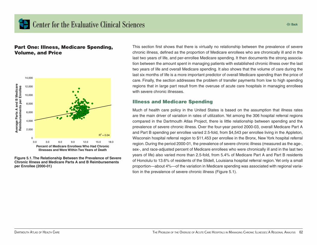
Center for the Evaluative Clinical Sciences
Dartmouth atlas of health Care the Problem of the overuse of aCute Care hosPitals in managing ChroniC illnesses: a regional analysis ��
Back
R2 = 0.040
2,000
4,000
6,000
8,000
10,000
12,000
14,000
0.0 3.0 6.0 9.0 12.0 15.0 18.0
This section first shows that there is virtually no relationship between the prevalence of severe chronic illness, defined as the proportion of Medicare enrollees who are chronically ill and in the last two years of life, and per-enrollee Medicare spending. It then documents the strong associa-tion between the amount spent in managing patients with established chronic illness over the last two years of life and overall Medicare spending. It also shows that the volume of care during the last six months of life is a more important predictor of overall Medicare spending than the price of care. Finally, the section addresses the problem of transfer payments from low to high spending regions that in large part result from the overuse of acute care hospitals in managing enrollees with severe chronic illnesses.
Illness and Medicare Spending
Much of health care policy in the United States is based on the assumption that illness rates are the main driver of variation in rates of utilization. Yet among the 306 hospital referral regions compared in the Dartmouth Atlas Project, there is little relationship between spending and the prevalence of severe chronic illness. Over the four-year period 2000-03, overall Medicare Part A and Part B spending per enrollee varied 2.5-fold, from $4,543 per enrollee living in the Appleton, Wisconsin hospital referral region to $11,453 per enrollee in the Bronx, New York hospital referral region. During the period 2000-01, the prevalence of severe chronic illness (measured as the age-, sex-, and race-adjusted percent of Medicare enrollees who were chronically ill and in the last two years of life) also varied more than 2.5-fold, from 5.4% of Medicare Part A and Part B residents of Honolulu to 13.6% of residents of the Slidell, Louisiana hospital referral region. Yet only a small proportion—about 4%—of the variation in Medicare spending was associated with regional varia-tion in the prevalence of severe chronic illness (Figure 5.1).
Part One: Illness, Medicare Spending, Volume, and Price
Figure 5.1. The Relationship Between the Prevalence of Severe Chronic Illness and Medicare Parts A and B Reimbursements per Enrollee (2000-01)
Percent of Medicare Enrollees Who Had Chronic Illnesses and Were Within Two Years of Death
Ave
rag
e P
arts
A a
nd
B M
edic
are
Rei
mbu
rsem
ents
per
En
rolle
e

Center for the Evaluative Clinical Sciences
Dartmouth atlas of health Care the Problem of the overuse of aCute Care hosPitals in managing ChroniC illnesses: a regional analysis ��
Back
R2 = 0.61
2,000
4,000
6,000
8,000
10,000
12,000
14,000
0 10,000 20,000 30,000 40,000 50,000 60,000 70,000
0
Figure 5.2. The Relationship Between Medicare Part A and Part B Spending per Decedent During the Last Two Years of Life (Deaths Occurring 2000-03) and Average Part A and Part B Spending per Enrollee (2000-03)
Overall Medicare spending was closely related to how much was spent on those with severe chronic illnesses. For deaths occurring from January 1, 2000 to December 31, 2003, Medicare spending for inpatient and Part B care during the last two years of life varied from less than $21,000 per decedent with chronic illness living in Grand Junction, Colorado, Wichita Falls, Tex-as, and Columbus, Georgia to almost $60,000 per decedent in Manhattan and the Bronx. Among the 306 hospital referral regions, per decedent spending for chronic illness during the last two years of life was highly correlated (R2 = 0.61) with total Part A and Part B spending per enrollee (Figure 5.2).
Medicare Part A and Part B Spending per Decedent During the Last Two Years of Life
Med
icar
e P
art
A a
nd
Par
t B
S
pen
din
g p
er E
nro
llee

Center for the Evaluative Clinical Sciences
Dartmouth atlas of health Care the Problem of the overuse of aCute Care hosPitals in managing ChroniC illnesses: a regional analysis ��
Back
R2 = 0.380
2,000
4,000
6,000
8,000
10,000
12,000
14,000
0.0 5.0 10.0 15.0 20.0 25.0
R2 = 0.640
2,000
4,000
6,000
8,000
10,000
12,000
14,000
0.0 10.0 20.0 30.0 40.0 50.0 60.0
Medicare Spending, Volume and Price
The volume of services provided to patients with established chronic illnesses is a more important contributor to overall Medicare spending than the average price of those services. The number of days spent in hospital per decedent with chronic illness during the last six months of life varied from 6.5 days in the Grand Junction, Colorado hospital referral region to 19.4 days in the Manhat-tan hospital referral region. The volume of hospital care (patient days per decedent) during the last six months of life was highly correlated (R2 = 0.38) with overall per capita spending for traditional Medicare among regions (Figure 5.3).
There is an even stronger relationship between the volume of physician visits during the last six months of life and total per-enrollee Medicare spending. Over the four years 2000-03, the number of physician visits and consultations per decedent during the last six months of life varied from fewer than 18 visits per decedent in the Lebanon, New Hampshire, Salt Lake City, La Crosse, Wisconsin, and Mason City, Iowa hospital referral regions to about 50 visits per decedent in the Los Angeles, Figure 5.3. The Relationship Between Hospital Days per
Decedent During the Last Six Months of Life (Deaths Occurring 2000-03) and Average Medicare Part A and Part B Reimbursements per Enrollee (2000-03)
Figure 5.4. The Relationship Between Physician Visits per Decedent During the Last Six Months of Life (Deaths Occurring 2000-03) and Average Part A and Part B Reimbursements per Enrollee (2000-03)
Physician Visits per Decedent During the Last Six Months of Life
Med
icar
e P
art
A a
nd
Par
t B
S
pen
din
g p
er E
nro
llee
Med
icar
e P
art
A a
nd
Par
t B
S
pen
din
g p
er E
nro
llee
Hospital Days per Decedent During the Last Six Months of Life
Newark, New Jersey, and New Brunswick, New Jersey hospital referral regions. The variation in the number of physician vis-its during the last six months of life was highly correlated (R2 = 0.64) with overall Medicare spending (Figure 5.4).
Variations in price contributed much less to per-capita Medicare spending. Region-ally, there was little correlation (R2 = 0.06) between variations in the price of hospital care (reimbursements per day) during the last six months of life and overall Medicare Part A and Part B spending. There was a similar (R2 = 0.07) correlation between variations in the price of physician visits (reimbursements per visit) and total per- enrollee Medicare reimbursements.

Center for the Evaluative Clinical Sciences
Dartmouth atlas of health Care the Problem of the overuse of aCute Care hosPitals in managing ChroniC illnesses: a regional analysis ��
Back
Utilization and Equity
Medicare’s reimbursement policy is based on paying for brief episodes of care, such as hospital-izations, physician visits, diagnostic tests, and medical procedures. The amount Medicare spends per enrollee is the sum of the various bills submitted by providers. Utilization contributes substan-tially more than price per unit of care to variations in per enrollee spending.
In previous publications, we have raised concerns about distributional equity, pointing out the subsidies (or transfer payments) resulting from taxation and patient co-payments that are not adjusted for local spending patterns. The cross-market subsidies are sometimes very large. For example, based on regional Medicare spending data and analysis of taxation policies, we esti-mate that Medicare will reimburse about $50,000 more for health care services during the lifetime of a 65-year-old in Miami than it will reimburse for a 65-year-old living in Minneapolis. In total, the difference would be enough to purchase a Lexus for everyone over 65 in Miami. But the money doesn’t purchase cars. Nor, as we have shown elsewhere, does it purchase elective surgery, including interventions that might improve the quality of life, such as knee replacements or the removal of cataracts.1 On average, elective surgery rates are just about the same in low-cost Min-neapolis, Salt Lake City, and Portland, Oregon, as they are in high-cost Manhattan, Los Angeles, and Miami. The transfer payments principally purchase more hospitalizations, more stays in ICUs, and more physician visits for those with chronic illness. The most important “system” factor deter-mining whether a community is a net importer or exporter of Medicare dollars is the size of its acute care sector relative to the number of chronically ill patients who need treatment. Miami and Manhattan have over-built their acute care sectors; Minneapolis and Portland, Oregon, have been more frugal, using fewer hospital beds, less physician labor, and fewer expensive technologies such as intensive care beds and medical imaging devices.
The problem is getting worse. While care intensity is increasing everywhere, growth in medical specialist visits and ICU stays has been more rapid in the high-cost regions that historically have been net importers of Medicare dollars. Financial disparity among regions thus can be expected to increase. Ironically, from the perspective of clinical equity, regions with less dependency on acute care hospitals appear to be better off; they have better outcomes and less overuse of services.
1Wennberg JE, Fisher ES, Skinner JS. Geography and the debate over Medicare reform. Health Affairs web exclusive, 13 February 2002.
Feenberg D, Skinner JS. Federal Medicare transfers across states: Winners and losers. National Tax Journal. Vol. LIII, No. 3, Part 2.

Center for the Evaluative Clinical Sciences
Dartmouth atlas of health Care the Problem of the overuse of aCute Care hosPitals in managing ChroniC illnesses: a regional analysis ��
Back
This section first illustrates that the problem of supply-sensitive care is not just a Medicare prob-lem. It reviews Atlas studies comparing Medicare and Michigan Blue Cross Blue Shield utilization showing that the variation among regions in the Medicare population is highly predictive of varia-tion among the population insured through Michigan Blue Cross. Moreover, hospital capacity has the same strong association with hospitalization rates in the Blue Cross population that it has in the Medicare population. The chapter then examines trends in the intensity of care provided to Medicare enrollees during the last two years of life among those whose deaths occurred between 2000 and 2003. Over this period of time, acute care sector intensity, measured in terms of resource inputs and utilization of ICUs and physician services, increased in all parts of the United States, but more so in regions which in 2000 were at the high end of the national distribution.
Variation in Volume of Supply-Sensitive Care Is Not Just a Medicare Problem
Like Medicare, commercial health plans have focused on controlling price as their principal strat-egy for cost containment, while ignoring utilization. They do this by obtaining discounts on the price of care—the amount they pay per hospital day, medical procedure, or physician visit. To assess the effectiveness of this strategy, it would be useful to conduct studies similar to those we have done for the Medicare populations to compare the relative importance of price and volume in driving overall per capita spending. Unfortunately, commercial health plans rarely conduct such studies. Most commercial plans regard information on the unit prices they pay a given provider (and per capita spending among regions) as proprietary. Moreover, most commercial plans do not have a large enough share of the commercially insured population to support population-based analysis of utilization rates. The exception is Blue Cross Blue Shield. In the recent Dartmouth Atlas of Health Care in Michigan, we compared rates of hospitalization for chronic illnesses among Medicare Part A and Part B enrollees and Blue Cross Blue Shield members between 21 and 65. The patterns of hospitalization among the Medicare population were highly predictive of what happened to the commercially insured population. Figure 5.5, adapted from the Michigan Atlas, compares the hospitalization rates for Medicare enrollees and Blue Cross Blue Shield members in Michigan hospital service areas with at least 10,000 adult Blue Cross Blue Shield members. Hospitalization rates for medical conditions varied more than twofold for both populations, and the rates were highly correlated (R2 = 0.75). Medicare hospitalization rates were also correlated, although not so strongly, with hospitalization rates for those under age 21 (R2 = 0.36).
Part Two: Two Reasons Why the Nation Needs to Focus on Reducing the Overuse of the Acute Care Sector

Center for the Evaluative Clinical Sciences
Dartmouth atlas of health Care the Problem of the overuse of aCute Care hosPitals in managing ChroniC illnesses: a regional analysis ��
Back
R2 = 0.750.0
10.0
20.0
30.0
40.0
50.0
60.0
0.0 100.0 200.0 300.0 400.0
The common denominator appears to be the supply of hospital beds. The supply of acute care beds per 1,000 residents among the Michigan hospital service areas with at least 100,000 residents in 1996 was correlated with both the hospitalization rates for Medicare enrollees (R2 = 0.29) and for Blue Cross Blue Shield members age 21-65 (R2 = 0.53). Capacity has a strong effect on clinical decision-making about hospital admissions, irrespective of the insurer or the patient’s age.
Trends in Resource Inputs and Utilization: 2000-03
Because Medicare spending is rising at what many believe is an unsustainable rate, it is important to ask what treatments and services are contributing most to the increases. A comprehensive answer would require a thorough scan of the database, including trends in surgical interventions, which will be added to our analyses in subsequent publications. We have, however, examined changes in care intensity in managing chronic illness over the four-year period 2000-03 and found some alarming trends. Nationally, the per capita amount of resources allocated to manag-ing chronic illness during the last two years of life increased steadily each year (Table 5.1). By 2003, the nation’s health care providers were using 13.6% more ICU beds than they did in 2000. The amount of physician labor used to manage chronic illness over the last two years of life also increased by 13.4% for medical specialists and 7.7% for primary care physicians.
Figure 5.5. The Association Between Medicare Medical Discharges (1996) and Medical Discharges of Adult Blue Cross Blue Shield of Michigan Members (1997) Among Michigan Hospital Service Areas
Medicare Medical Discharges per 1,000 Enrollees
Med
ical
Dis
char
ges
per
1,0
00
Ad
ult
BC
BS
M M
emb
ers
Table 5.1. Increases in the Average Inputs of Intensive Care Beds, Medical Specialist Physicians, and Primary Care Physicians per 1,000 Chronically Ill Medicare Enrollees (2000-03)
Resource 2000 2001 2002 2003 % increase in 4 years
Intensive care beds 12.4 12.9 13.5 14.0 13.6%
Medical specialists 7.9 8.1 8.5 8.9 13.4%
Primary care physicians 8.4 8.6 8.7 9.0 7.7%

Center for the Evaluative Clinical Sciences
Dartmouth atlas of health Care the Problem of the overuse of aCute Care hosPitals in managing ChroniC illnesses: a regional analysis ��
Back
Rates of utilization of ICUs and physician visits during the last six months of life also increased rapidly, particu-larly among regions that at baseline (2000) were already providing the most care. In other words, the disparity in utilization between high and low rate regions grew over the four years. In this study, regions were aggregated into five groups ranked on spending for inpatient care and Part B services per decedent during the last two years of life among those whose deaths occurred in 2000 (Table 5.2). Each group had approximately equal patient populations. Average Medicare spending for deaths occurring in 2000
Table 5.2. Increases in the Use of Intensive Care Beds, Medical Specialist Physicians, and Primary Care Physicians per Chronically Ill Medicare Enrollee by Quintile of Spending (2000-03)
Quintile Patient Days in Intensive Care Medical Specialist Visits Primary Care Visits
% increase in 4 years
Ratio to Q5 % increase in 4 years
Ratio to Q5 % increase in 4 years
Ratio to Q5
2000 2003 2000 2003 2000 2003
1 ($37,622) 15.8% 1.76 1.86 12.0% 2.14 2.21 8.8% 1.24 1.29
2 ($27,774) 14.1% 1.38 1.43 11.8% 1.52 1.56 6.7% 1.05 1.08
3 ($25,272) 11.6% 1.28 1.30 11.0% 1.29 1.32 6.8% 1.08 1.10
4 ($23,774) 10.2% 1.14 1.15 9.2% 1.13 1.13 3.7% 1.03 1.03
5 ($21,599) 9.7% 1.00 1.00 8.6% 1.00 1.00 4.4% 1.00 1.00
in the lowest-ranked quintile was $21,599; in the highest-ranked quintile it was $37,622 per dece-dent, or 74% higher. The growth in utilization rates was proportionate to the baseline spending level: the greater the spending in 2000 the greater the percent increase in utilization over the four-year period 2000-03. For example, use of intensive care grew 15.8% in the highest-spend-ing regions, 11.6% in the median-ranked regions, and 9.7% in the lowest-ranked regions. The range in variation in per decedent days in ICUs increased from 1.76 for deaths occurring in 2000 to 1.86 for deaths that occurred in 2003. Medical specialist visits per decedent grew 12% in the high-spending regions and 8.6% in the low-spending regions, with corresponding increases in the range in variation. The growth rate in primary physician care visits per decedent in the high-spend-ing regions was 8.8%, twice that of the low-spending regions. The disparity between the highest and lowest quintile regions increased from a factor of 1.24 to 1.29.

Center for the Evaluative Clinical Sciences
Dartmouth atlas of health Care the Problem of the overuse of aCute Care hosPitals in managing ChroniC illnesses: a regional analysis ��
Back
Most of Medicare’s spending for services for the chronically ill is provided in hospitals during acute exacerbations of underlying illnesses. However, some regions and health care organizations had less reliance on acute inpatient care than others. Regions dominated by organized care, whether group practices or integrated health care systems, tended to manage chronic illness using fewer acute care beds and fewer physician visits. Notable examples are the Mayo Clinic, which is the predominant provider serving the Rochester, Minnesota hospital referral region, and Intermoun-tain Healthcare, an integrated system serving the Salt Lake City hospital referral region. Some states, notably Oregon, have made concerted efforts, through public debate and professional action, to improve the quality of end-of-life care. In these areas, the quality of care tends to be relatively high, reflected in process quality measures that are above average. Medicare enrollees in these areas are less likely to die “high-tech” deaths — including admissions to intensive care — than Medicare enrollees who live in other parts of the country. The Mayo Clinic and Intermoun-tain Healthcare have reputations for excellence and are noted for their leading research efforts in rationalizing the clinical pathways for managing chronic illness.
Because they provide higher quality care at lower cost, the utilization rates in Salt Lake City, Rochester, Minnesota, and Portland, Oregon are useful benchmarks for estimating the potential savings from a successful national effort to improve efficiency in managing chronic illness.
Part Three: Breaking the Growing Dependency on Acute Care Hospitals

Center for the Evaluative Clinical Sciences
Dartmouth atlas of health Care the Problem of the overuse of aCute Care hosPitals in managing ChroniC illnesses: a regional analysis �0
Back
Table 5.3 illustrates the savings in Medicare spending that would have accrued if the utilization rates — hospital days and physician visits — in the efficient regions had been the standard of practice during the four-year study period 2000-03. Price is held constant, and it is assumed that regions with lower utilization rates did not increase their rates. (See footnote 2 for an example of how the Manhattan hospital referral region was benchmarked to the Rochester, Minnesota hos-pital referral region.) The Salt Lake City benchmark results in the greatest estimated reduction in acute care hospital spending. If, over the four years of our study, hospital utilization rates had been at the level of Salt Lake City, Medicare spending for inpatient care would have been reduced by $34.3 billion — a saving of 32.4%. If physician visit rates had been at the level of Salt Lake City, spending would have been $5.8 billion less — a saving of 34%. Smaller but still substantial reduc-tions in acute care hospital and physician spending were estimated using the Portland, Oregon and the Rochester, Minnesota hospital referral regions as the benchmarks.
We believe that the evidence speaks clearly to the need to address the inadequacies in the way chronic illness is managed. A major challenge is to develop reimbursement policies that facili-tate the transition from the current over-reliance on inpatient hospital care to a population-based
Table 5.3. Estimated Reductions in Spending Had All Regions of the United States with Higher Volume (Hospital Day and Physician Visit Rates) Been as Efficient as Three Benchmark Regions (2000-03)
Hospital Days Physician Visits
Benchmark Region
Benchmark Patient
Day Rate
Sum of Estimated Spending Reduction
(billions)
Percent of U.S.
Spending
Benchmark Physician Visit Rate
Sum of Estimated Spending Reduction
(billions)
Percent of U.S.
Spending
Rochester, MN 17.3 $14.0 13.2% 40.6 $5.1 30.4%
Portland, OR 13.6 $32.4 30.6% 39.3 $5.5 32.7%
Salt Lake City, UT 13.2 $34.3 32.4% 38.5 $5.8 34.0%
2 In Manhattan, inpatient spending per decedent over the last 2 years of life was $46,443; the patient day rate per decedent was 30.3; the average reimbursement per day in hospital was $1,532. The Rochester, Minnesota benchmark for patient days was 17.3 days. If the volume of inpatient care in Manhattan had been equal to the Rochester region (but price remained as it was in Manhattan), per decedent spending in Manhattan during the last two years of life would be 17.3 days x $1,532 = $26,573, a savings of $19,870 per decedent. Since there were 59,395 Medicare deaths in Manhattan during 2000-03, the savings in Medicare outlays by reducing utilization of hospitals to the level of Rochester would be $ 1.18 billion. The savings in hospital beds would be 2.1 million, a 43% reduction in beds allocated to managing chronic illness over the last 2 years of life.

Center for the Evaluative Clinical Sciences
Dartmouth atlas of health Care the Problem of the overuse of aCute Care hosPitals in managing ChroniC illnesses: a regional analysis ��
Back
model based on the integration of the various services and providers of care. As illustrated in Table 5.3, the substantial savings could be redirected toward building integrated systems. Tradi-tional reimbursement policies do not allow for this kind of reallocation. When payment is based on utilization, reducing hospitalization rates results in financial loss to hospitals and gain to payers. We need to develop community-wide integration and new models for financing the longitudinal care of patients over the course of their chronic illnesses. The Dartmouth Atlas data, because it measures spending, resource allocation, and utilization over fixed periods of time in the progres-sion of chronic illness, is useful for estimating the actuarial costs of managing chronic illness according to where care is provided, either on a geographic (regional) or hospital and associated provider-specific basis.3 This information should be useful to providers and payers in planning pay-for-performance reimbursement experiments such as Section 646 of the Medicare Modern-ization Act of 2003.
About 30% to 35% of Medicare dollars are spent on patients who are in the last two years of their lives; most are suffering from one or more chronic illnesses. With so much money at stake and so many parties involved in an individual’s care, it is important to ask who is in charge. Unfortunately, for many at this stage of life, the answer is nobody. In addressing the inadequacies in the way chronic illness is managed, a major challenge is to establish who accepts accountability. Which organization is responsible for integrating the various sectors of care and developing the clinical guidelines and clinical pathways that define responsibilities among providers and assure the con-tinuity of care? Large group practices such as the Mayo Clinic and integrated delivery systems such as Intermountain Healthcare provide examples of how it can be done. But large group prac-tices and integrated delivery systems are available only in some communities, and they are hard to replicate. The only locus of organized care that is available throughout the United States is the acute care hospital. Perhaps the acute care hospital could evolve from its present orientation on acute inpatient care toward a new mission: to serve as the focus for integrating its associated pro-viders into systems of care for managing chronic disease. The Dartmouth Atlas hospital-specific data, because it documents the contribution of the full complement of providers who provide care to patients using a hospital — including those who are not formally associated with the hospital — could serve as a useful tool for such an expansion of mission.
3 The data release associated with this edition of the Atlas is restricted to inpatient care and physician and hospice ser-vices; subsequent releases will include long-term care, home health care, and medical devices.

Center for the Evaluative Clinical Sciences
Dartmouth atlas of health Care appenDix one: supplemental figures ��
Back
Supplemental Figuresappendix One

Center for the Evaluative Clinical Sciences
Dartmouth atlas of health Care appenDix one: supplemental figures ��
Back
R2 = 0.270
5,000
10,000
15,000
20,000
25,000
30,000
35,000
0.0 4.0 8.0 12.0 16.0
0.0
4.0
8.0
12.0
16.0
20.0
0.0 4.0 8.0 12.0 16.0
R2 = 0.39
Appendix Figure 2A. The Relationship Between Primary Care Labor Inputs and Medicare Reimbursements for Inpatient Care Among States (Deaths Occurring 2000-03)
Appendix Figure 2B. The Relationship Between Primary Care Labor Inputs and Average Number of Days in Hospital Among States (Deaths Occurring 2000-03)
Primary Care FTE Labor Inputs per 1,000 Decedents During the Last Two Years of Life
Med
icar
e R
eim
burs
emen
ts p
er
Dec
eden
t fo
r In
pat
ien
t C
are
Du
rin
g
the
Las
t Tw
o Y
ears
of
Lif
e
Primary Care FTE Labor Inputs per 1,000 Decedents During the Last Two Years of Life
Ave
rag
e H
osp
ital
Day
s p
er D
eced
ent
Du
rin
g t
he
Las
t S
ix M
on
ths
of
Lif
e

Center for the Evaluative Clinical Sciences
Dartmouth atlas of health Care appenDix one: supplemental figures ��
Back
R2 = 0.290.0
4.0
8.0
12.0
16.0
20.0
0.0 4.0 8.0 12.0 16.0
Appendix Figure 2D. The Relationship Between Medical Specialist Labor Inputs and Average Number of Days in Hospital Among States (Deaths Occurring 2000-03)
0
5,000
10,000
15,000
20,000
25,000
30,000
35,000
0.0 4.0 8.0 12.0 16.0
R2 = 0.36
Appendix Figure 2C. The Relationship Between Medical Specialist Labor Inputs and Medicare Reimbursements for Inpatient Care Among States (Deaths Occurring 2000-03)
Medical Specialist FTE Labor Inputs per 1,000 Decedents During the Last Two Years of Life
Med
icar
e R
eim
burs
emen
ts p
er
Dec
eden
t fo
r In
pat
ien
t C
are
Du
rin
g
the
Las
t Tw
o Y
ears
of
Lif
e
Medical Specialist FTE Labor Inputs per 1,000 Decedents During the Last Two Years of Life
Ave
rag
e H
osp
ital
Day
s p
er D
eced
ent
Du
rin
g t
he
Las
t S
ix M
on
ths
of
Lif
e

Center for the Evaluative Clinical Sciences
Dartmouth atlas of health Care appenDix one: supplemental figures ��
Back
R2 = 0.130
5,000
10,000
15,000
20,000
25,000
30,000
35,000
0.0 0.5 1.0 1.5 2.0
R2 = 0.520
2,000
4,000
6,000
8,000
10,000
12,000
0.0 0.5 1.0 1.5 2.0
Appendix Figure 2F. The Relationship Between the Ratio of Primary Care Inputs to Medical Specialist Inputs and Medicare Part B Reimbursements Among States (Deaths Occurring 2000-03)
Med
icar
e R
eim
burs
emen
ts p
er
Dec
eden
t fo
r In
pat
ien
t C
are
Du
rin
g
the
Las
t Tw
o Y
ears
of
Lif
e
Ratio of Primary Care to Medical Specialist FTE Labor Inputs During the Last Two Years of Life
Appendix Figure 2E. The Relationship Between the Ratio of Primary Care Inputs to Medical Specialist Inputs and Medicare Reimbursements for Inpatient Care Among States (Deaths Occurring 2000-03)
Ratio of Primary Care to Medical Specialist FTE Labor Inputs During the Last Two Years of Life
Med
icar
e P
art
B R
eim
burs
emen
ts
per
Dec
eden
t D
uri
ng
th
e

Center for the Evaluative Clinical Sciences
Dartmouth atlas of health Care appenDix one: supplemental figures ��
Back
R2 = 0.030.0
20.0
40.0
60.0
80.0
100.0
0.0 0.5 1.0 1.5 2.0
R2 = 0.380.0
5.0
10.0
15.0
20.0
25.0
0.0 0.5 1.0 1.5 2.0
Appendix Figure 2G. The Relationship Between the Ratio of Primary Care Inputs to Medical Specialist Inputs and Hospital Bed Inputs Among States (Deaths Occurring 2000-03)
Ratio of Primary Care to Medical Specialist FTE Labor Inputs During the Last Two Years of Life
Ho
spit
al B
ed In
pu
ts p
er
1,00
0 D
eced
ents
Du
rin
g t
he
Las
t Tw
o Y
ears
of
Lif
e
Appendix Figure 2H. The Relationship Between the Ratio of Primary Care Inputs to Medical Specialist Inputs and Intensive Care Bed Inputs Among States (Deaths Occurring 2000-03)
Ratio of Primary Care to Medical Specialist FTE Labor Inputs During the Last Two Years of Life
ICU
Bed
Inp
uts
per
1,0
00 D
eced
ents
D
uri
ng
th
e L
ast T
wo
Yea
rs o
f L
ife

Center for the Evaluative Clinical Sciences
Dartmouth atlas of health Care appenDix one: supplemental figures ��
Back
R2 = 0.000.0
4.0
8.0
12.0
16.0
0.0 0.5 1.0 1.5 2.0
R2 = 0.490.0
5.0
10.0
15.0
20.0
25.0
30.0
35.0
0.0 0.5 1.0 1.5 2.0
Appendix Figure 2I. The Relationship Between the Ratio of Primary Care Inputs to Medical Specialist Inputs and Total Physician Labor Inputs Among States (Deaths Occurring 2000-03)
Ratio of Primary Care to Medical Specialist FTE Labor Inputs During the Last Two Years of Life
Tota
l FT
E P
hysi
cian
Lab
or
Inp
uts
p
er 1
,000
Dec
eden
ts D
uri
ng
th
e L
ast T
wo
Yea
rs o
f L
ife
Ratio of Primary Care to Medical Specialist FTE Labor Inputs During the Last Two Years of Life
Pri
mar
y C
are
Phy
sici
an F
TE
Lab
or
Inp
uts
per
1,0
00 D
eced
ents
Du
rin
g
the
Las
t Tw
o Y
ears
of
Lif
e
Appendix Figure 2J. The Relationship Between the Ratio of Primary Care Inputs to Medical Specialist Inputs and Primary Care Physician Labor Inputs Among States (Deaths Occurring 2000-03)

Center for the Evaluative Clinical Sciences
Dartmouth atlas of health Care appenDix one: supplemental figures ��
Back
R2 = 0.750.0
4.0
8.0
12.0
16.0
0.0 0.5 1.0 1.5 2.0
R2 = 0.400.0
10.0
20.0
30.0
40.0
50.0
0.0 0.5 1.0 1.5 2.0
Ratio of Primary Care to Medical Specialist FTE Labor Inputs During the Last Two Years of Life
Med
ical
Sp
ecia
list
Lab
or
Inp
uts
p
er 1
,000
Dec
eden
ts D
uri
ng
th
e L
ast T
wo
Yea
rs o
f L
ife
Ratio of Primary Care to Medical Specialist FTE Labor Inputs During the Last Two Years of Life
Ave
rag
e N
um
ber
of
Phy
sici
an
Vis
its
per
Dec
eden
t D
uri
ng
th
e L
ast
Six
Mo
nth
s o
f L
ife
Appendix Figure 2K. The Relationship Between the Ratio of Primary Care Inputs to Medical Specialist Inputs and Medical Specialist Labor Inputs Among States (Deaths Occurring 2000-03)
Appendix Figure 2L. The Relationship Between the Ratio of Primary Care Inputs to Medical Specialist Inputs and Average Number of Physician Visits Among States (Deaths Occurring 2000-03)

Center for the Evaluative Clinical Sciences
Dartmouth atlas of health Care appenDix one: supplemental figures ��
Back
R2 = 0.480.0
1.0
2.0
3.0
4.0
5.0
6.0
0.0 0.5 1.0 1.5 2.0
R2 = 0.090.0
4.0
8.0
12.0
16.0
20.0
0.0 0.5 1.0 1.5 2.0
Appendix Figure 2M. The Relationship Between the Ratio of Primary Care Inputs to Medical Specialist Inputs and Average Number of Days in Intensive Care Among States (Deaths Occurring 2000-03)
Appendix Figure 2N. The Relationship Between the Ratio of Primary Care Inputs to Medical Specialist Inputs and Average Number of Hospital Days Among States (Deaths Occurring 2000-03)
Ratio of Primary Care to Medical Specialist FTE Labor Inputs During the Last Two Years of Life
Ave
rag
e N
um
ber
of
ICU
Day
s p
er D
eced
ent
Du
rin
g t
he
Las
t S
ix M
on
ths
of
Lif
e
Ratio of Primary Care to Medical Specialist FTE Labor Inputs During the Last Two Years of Life
Ave
rag
e N
um
ber
of
Ho
spit
al
Day
s p
er D
eced
ent
Du
rin
g t
he
Las
t S
ix M
on
ths
of
Lif
e

Center for the Evaluative Clinical Sciences
Dartmouth atlas of health Care appenDix one: supplemental figures �0
Back
R2 = 0.390.0
5.0
10.0
15.0
20.0
25.0
30.0
0.0 0.5 1.0 1.5 2.0
Appendix Figure 2O. The Relationship Between the Ratio of Primary Care Inputs to Medical Specialist Inputs and the Percent Seeing Ten or More Physicians During the Last Six Months of Life Among States (Deaths Occurring 2000-03)
R2 = 0.420.0
10.0
20.0
30.0
40.0
50.0
0.0 0.5 1.0 1.5 2.0
Ratio of Primary Care to Medical Specialist FTE Labor Inputs During the Last Two Years of Life
Per
cen
t o
f D
eced
ents
See
ing
Te
n o
r M
ore
Phy
sici
ans
Du
rin
g
the
Las
t S
ix M
on
ths
of
Lif
e
Appendix Figure 2P. The Relationship Between the Ratio of Primary Care Inputs to Medical Specialist Inputs and Hospitalized Deaths With an Admission to ICU Among States (Deaths Occurring 2000-03)
Ratio of Primary Care to Medical Specialist FTE Labor Inputs During the Last Two Years of Life
Per
cen
t o
f H
osp
ital
ized
Dea
ths
Wit
h a
n A
dm
issi
on
to
ICU

Center for the Evaluative Clinical Sciences
Dartmouth atlas of health Care appenDix one: supplemental figures ��
Back
R2 = 0.1170.0
74.0
78.0
82.0
86.0
90.0
0.0 0.5 1.0 1.5 2.0
Appendix Figure 2Q. The Relationship Between the Ratio of Primary Care Inputs to Medical Specialist Inputs and the Composite Quality Score Among States (Deaths Occurring 2000-03)
Ratio of Primary Care to Medical Specialist FTE Labor Inputs During the Last Two Years of Life
Co
mp
osi
te Q
ual
ity
Sco
re

Center for the Evaluative Clinical Sciences
Dartmouth atlas of health Care appenDix one: supplemental figures ��
Back
= 0.960.0
10.0
20.0
30.0
40.0
50.0
0.0 10.0 20.0 30.0 40.0 50.0
R2
0.0
20.0
40.0
60.0
80.0
100.0
0.0 20.0 40.0 60.0 80.0 100.0
R2 = 0.92
0.0
10.0
20.0
30.0
40.0
50.0
0.0 10.0 20.0 30.0 40.0 50.0
R2 = 0.89
0.0
20.0
40.0
60.0
80.0
100.0
0.0 20.0 40.0 60.0 80.0 100.0
R2 = 0.81
Appendix Figure 3D. The Relationship Between Physician Visits per Decedent with Chronic Obstructive Pulmonary Disease and Physician Visits per Decedent with Cancer Among COTH Integrated Academic Medical Centers (2000-03)
Appendix Figure 3C. The Relationship Between Hospital Days per Decedent with Chronic Obstructive Pulmonary Disease and Hospital Days per Decedent with Cancer Among COTH Integrated Academic Medical Centers (1999-2003)
Appendix Figure 3B. The Relationship Between Physician Visits per Decedent with Chronic Obstructive Pulmonary Disease and Physician Visits per Decedent with Congestive Heart Failure Among COTH Integrated Academic Medical Centers (2000-03)
Appendix Figure 3A. The Relationship Between Hospital Days per Decedent with Chronic Obstructive Pulmonary Disease and Hospital Days per Decedent with Congestive Heart Failure Among COTH Integrated Academic Medical Centers (1999-2003)
COPD Patients’ Hospital Days per Decedent During the Last Six Months of Life
CH
F P
atie
nts
’ Ho
spit
al D
ays
per
Dec
eden
t D
uri
ng
th
e L
ast
Six
Mo
nth
s o
f L
ife
COPD Patients’ Physician Visits per Decedent During the Last Six Months of Life
CH
F P
atie
nts
’ Phy
sici
an V
isit
s p
er D
eced
ent
Du
rin
g t
he
Las
t S
ix M
on
ths
of
Lif
e
COPD Patients’ Hospital Days per Decedent During the Last Six Months of Life
Can
cer
Pat
ien
ts’ H
osp
ital
D
ays
per
Dec
eden
t D
uri
ng
th
e L
ast
Six
Mo
nth
s o
f L
ife
COPD Patients’ Physician Visits per Decedent During the Last Six Months of Life
Can
cer
Pat
ien
ts’ P
hysi
cian
V
isit
s p
er D
eced
ent
Du
rin
g t
he
Las
t S
ix M
on
ths
of
Lif
e

Center for the Evaluative Clinical Sciences
Dartmouth atlas of health Care appenDix one: supplemental figures ��
Back
0.0
10.0
20.0
30.0
40.0
0.0 10.0 20.0 30.0 40.0
R2 = 0.88 R2 = 0.800.0
20.0
40.0
60.0
80.0
100.0
0.0 20.0 40.0 60.0 80.0 100.0
0.0
5.0
10.0
15.0
20.0
25.0
30.0
0.0 5.0 10.0 15.0 20.0 25.0 30.0
R2 = 0.910.0
10.0
20.0
30.0
40.0
50.0
60.0
70.0
0.0 10.0 20.0 30.0 40.0 50.0 60.0 70.0
R2 = 0.74
Appendix Figure 3E. The Relationship Between Hospital Days per Decedent for Younger and Older Medicare Patients During the Last Six Months of Life Among COTH Integrated Academic Medical Centers (1999-2003)
Appendix Figure 3F. The Relationship Between Physician Visits per Decedent for Younger and Older Medicare Patients During the Last Six Months of Life Among COTH Integrated Academic Medical Centers (2000-03)
Appendix Figure 3G. The Relationship Between Hospital Days per Decedent for Medicaid Buy-in and All Other Medicare Patients During the Last Six Months of Life Among COTH Integrated Academic Medical Centers (1999-2003)
Appendix Figure 3H. The Relationship Between Physician Visits per Decedent for Medicaid Buy-in and All Other Medicare Patients During the Last Six Months of Life Among COTH Integrated Academic Medical Centers (2000-03)
Younger Patients’ Hospital Days per Decedent During the Last Six Months of Life
Yo
un
ger
Pat
ien
ts’ P
hysi
cian
V
isit
s p
er D
eced
ent
Du
rin
g t
he
Las
t S
ix M
on
ths
of
Lif
e
Old
er P
atie
nts
’ Ho
spit
al D
ays
per
Dec
eden
t D
uri
ng
th
e L
ast
Six
Mo
nth
s o
f L
ife
Older Patients’ Physician Visits per Decedent During the Last Six Months of Life
Medicaid Buy-In Patients’ Hospital Days per Decedent During the Last Six Months of Life
All
Oth
er P
atie
nts
’ Ho
spit
al
Day
s p
er D
eced
ent
Du
rin
g t
he
Las
t S
ix M
on
ths
of
Lif
e
Medicaid Buy-In Patients’ Physician Visits per Decedent During the Last Six Months of Life
All
Oth
er P
atie
nts
’ Phy
sici
an
Vis
its
per
Dec
eden
t D
uri
ng
th
e L
ast
Six
Mo
nth
s o
f L
ife

Center for the Evaluative Clinical Sciences
Dartmouth atlas of health Care appenDix one: supplemental figures ��
Back
0.0 10.0 20.0 30.0 40.0
R2 = 0.930.0
10.0
20.0
30.0
40.0
0.0 20.0 40.0 60.0 80.0 100.0
R2 = 0.820.0
20.0
40.0
60.0
80.0
100.0
Appendix Figure 3I. The Relationship Between Hospital Days per Decedent for Male and Female Medicare Patients During the Last Six Months of Life Among COTH Integrated Academic Medical Centers (1999-2003)
Appendix Figure 3J. The Relationship Between Physician Visits per Decedent for Male and Female Medicare Patients During the Last Six Months of Life Among COTH Integrated Academic Medical Centers (2000-03)
Male Patients’ Hospital Days per Decedent During the Last Six Months of Life
Male Patients’ Physician Visits per Decedent During the Last Six Months of Life
Fem
ale
Pat
ien
ts’ H
osp
ital
D
ays
per
Dec
eden
t D
uri
ng
th
e L
ast
Six
Mo
nth
s o
f L
ife
Fem
ale
Pat
ien
ts’ P
hysi
cian
V
isit
s p
er D
eced
ent
Du
rin
g t
he
Las
t S
ix M
on
ths
of
Lif
e

Center for the Evaluative Clinical Sciences
Dartmouth atlas of health Care appenDix one: supplemental figures ��
Back
0
10,000
20,000
30,000
40,000
50,000
60,000
0.0 10.0 20.0 30.0 40.0 50.0 60.0
R2 = 0.63 R2 = 0.23
0 500 1,000 1,500 2,000
0
10,000
20,000
30,000
40,000
50,000
60,000
Appendix Figure 4A. Relationship Between Inpatient Days and Reimbursements per Decedent During the Last Two Years of Life (Deaths Occurring 1999-2003) Among Selected Hospitals in the Miami and Fort Myers Hospital Referral Regions
Appendix Figure 4B. Relationship Between Reimbursements per Patient Day and Inpatient Reimbursements per Decedent During the Last Two Years of Life (Deaths Occurring 1999-2003) Among Selected Hospitals in the Miami and Fort Myers Hospital Referral Regions
Inpatient Hospital Days per Decedent
Inp
atie
nt
Rei
mbu
rsem
ents
per
Dec
eden
t
Reimbursements per Patient Day
Inp
atie
nt
Rei
mbu
rsem
ents
per
Dec
eden
t

Center for the Evaluative Clinical Sciences
Dartmouth atlas of health Care appenDix one: supplemental figures ��
Back
R2 = 0.940
2,000
4,000
6,000
8,000
10,000
12,000
14,000
16,000
0.0 50.0 100.0 150.0 200.0 250.0
R2 = 0.260
2,000
4,000
6,000
8,000
10,000
12,000
14,000
16,000
0.0 20.0 40.0 60.0 80.0 100.0 120.0
Appendix Figure 4C. Relationship Between Physician Visits and Part B Reimbursements for Evaluation and Management per Decedent During the Last Two Years of Life (Deaths Occurring 2000-03) Among Selected Hospitals in the Miami and Fort Myers Hospital Referral Regions
Appendix Figure 4D. Relationship Between E&M Reimbursements per Physician Visit and E&M Reimbursements per Decedent During the Last Two Years of Life (Deaths Occurring 2000-03) Among Selected Hospitals in the Miami and Fort Myers Hospital Referral Regions
Physician Visits per Decedent
Par
t B
Rei
mbu
rsem
ents
for
E&
M
E&M Reimbursements per Physician Visit
Par
t B
Rei
mbu
rsem
ents
for
E&
M

Center for the Evaluative Clinical Sciences
Dartmouth atlas of health Care appenDix one: supplemental figures ��
Back
2,000
6,000
10,000
14,000
18,000
22,000
Appendix Figure 4E. Medicare Reimbursements for Part B Care During the Last Two Years of Life (Deaths Occurring in 2000-03)
Med
icar
e R
eim
burs
emen
ts fo
r P
art
B C
are
per
D
eced
ent
Du
rin
g t
he
Las
t Tw
o Y
ears
of
Lif
e
HCA Tenet Healthcare
Corporation
Community Health
Systems, Inc.
Ascension Health
Health Manage-
ment Associates
Triad Hospitals,
Inc.
Catholic Health
Initiatives
Catholic Healthcare
West
Catholic Health
East
Trinity Health
Adventist Health
System Sunbelt
Catholic Healthcare
Partners
Maximum 18,672 19,896 11,816 13,423 12,674 12,017 10,483 20,032 14,751 13,275 12,063 10,003
75th percentile 11,214 15,089 9,046 9,379 9,801 8,634 8,341 13,118 12,237 9,415 10,667 8,649
System average 10,469 12,267 8,047 9,334 8,637 7,783 8,023 11,236 11,030 8,935 10,241 8,490
25th percentile 8,197 9,741 6,701 7,525 7,001 6,981 5,927 9,537 9,697 6,422 8,242 7,461
Minimum 5,250 6,413 4,328 4,438 3,443 5,669 4,647 6,409 7,015 4,758 5,943 5,516

Center for the Evaluative Clinical Sciences
Dartmouth atlas of health Care appenDix one: supplemental figures ��
Back
20.0
30.0
40.0
50.0
60.0
70.0
80.0
90.0
100.0
110.0
120.0
Appendix Figure 4F. Hospital Bed Inputs During the Last Two Years of Life (Deaths Occurring in 1999-2003)
Ho
spit
al B
ed In
pu
ts p
er 1
,000
Dec
eden
ts
Du
rin
g t
he
Las
t Tw
o Y
ears
of
Lif
e
HCA Tenet Healthcare
Corporation
Community Health
Systems, Inc.
Ascension Health
Health Manage-
ment Associates
Triad Hospitals,
Inc.
Catholic Health
Initiatives
Catholic Healthcare
West
Catholic Health
East
Trinity Health
Adventist Health
System Sunbelt
Catholic Healthcare
Partners
Maximum 99.8 110.9 91.0 102.0 102.2 89.3 74.7 101.8 113.5 70.5 79.3 74.9
75th percentile 71.4 82.9 65.6 70.9 77.1 67.5 60.1 74.3 77.5 61.4 68.1 60.9
System average 64.6 74.4 60.8 64.6 67.8 61.6 57.2 62.0 71.4 56.8 62.0 57.6
25th percentile 57.3 64.7 51.6 55.8 60.0 53.4 43.8 50.0 63.3 47.7 55.2 53.6
Minimum 38.1 51.7 34.1 43.4 45.5 38.9 38.6 40.2 53.2 35.8 43.7 40.4

Center for the Evaluative Clinical Sciences
Dartmouth atlas of health Care appenDix one: supplemental figures ��
Back
3.0
13.0
23.0
33.0
43.0
53.0
63.0
Appendix Figure 4G. ICU Bed Inputs During the Last Two Years of Life (Deaths Occurring in 1999-2003)
Inte
nsi
ve C
are
Bed
Inp
uts
per
1,0
00 D
eced
ents
D
uri
ng
th
e L
ast T
wo
Yea
rs o
f L
ife
HCA Tenet Healthcare
Corporation
Community Health
Systems, Inc.
Ascension Health
Health Manage-
ment Associates
Triad Hospitals,
Inc.
Catholic Health
Initiatives
Catholic Healthcare
West
Catholic Health
East
Trinity Health
Adventist Health
System Sunbelt
Catholic Healthcare
Partners
Maximum 47.5 61.9 28.6 30.2 35.9 36.5 26.2 44.5 42.1 27.3 34.6 33.1
75th percentile 26.8 36.5 14.3 18.5 18.5 14.2 12.4 27.5 27.6 18.1 22.0 16.8
System average 20.9 28.3 13.7 14.1 16.2 12.2 11.8 22.4 18.5 16.4 22.1 14.7
25th percentile 11.5 19.0 9.6 8.5 9.6 8.4 7.8 17.4 9.5 11.0 15.0 10.1
Minimum 6.0 6.6 3.7 4.9 6.1 5.5 4.4 5.7 4.4 4.6 6.9 5.2

Center for the Evaluative Clinical Sciences
Dartmouth atlas of health Care appenDix one: supplemental figures �0
Back
10.0
20.0
30.0
40.0
50.0
60.0
Appendix Figure 4H. Standardized FTE Physician Labor Inputs During the Last Two Years of Life(Deaths Occurring 2000-03)
FT
E P
hysi
cian
Lab
or
Inp
uts
per
1,0
00 D
eced
ents
D
uri
ng
th
e L
ast T
wo
Yea
rs o
f L
ife
HCA Tenet Healthcare
Corporation
Community Health
Systems, Inc.
Ascension Health
Health Manage-
ment Associates
Triad Hospitals,
Inc.
Catholic Health
Initiatives
Catholic Healthcare
West
Catholic Health
East
Trinity Health
Adventist Health
System Sunbelt
Catholic Healthcare
Partners
Maximum 53.4 57.6 36.4 37.0 32.0 26.8 29.0 45.6 45.0 33.8 36.9 26.9
75th percentile 30.3 40.9 24.0 26.4 25.5 22.8 22.1 33.3 32.0 25.0 27.9 24.3
System average 27.5 33.3 22.3 25.0 23.5 20.9 22.1 28.4 29.2 24.3 27.9 23.3
25th percentile 21.7 24.9 18.7 20.5 20.1 18.7 17.8 22.4 25.2 19.8 22.9 20.9
Minimum 14.7 16.9 14.1 14.1 15.5 16.0 12.6 18.6 18.4 15.6 19.6 17.3

Center for the Evaluative Clinical Sciences
Dartmouth atlas of health Care appenDix one: supplemental figures ��
Back
9.0
13.0
17.0
21.0
25.0
Appendix Figure 4I. Hospital Days per Decedent During the Last Six Months of Life(Deaths Occurring 1999-2003)
Ho
spit
al B
ed D
ays
per
Dec
eden
t D
uri
ng
th
e L
ast
Six
Mo
nth
s o
f L
ife
HCA Tenet Healthcare
Corporation
Community Health
Systems, Inc.
Ascension Health
Health Manage-
ment Associates
Triad Hospitals,
Inc.
Catholic Health
Initiatives
Catholic Healthcare
West
Catholic Health
East
Trinity Health
Adventist Health
System Sunbelt
Catholic Healthcare
Partners
Maximum 23.0 23.9 18.6 21.9 20.3 18.7 16.0 20.6 23.0 15.4 15.8 16.4
75th percentile 15.1 18.0 13.9 15.5 15.8 14.0 12.7 15.3 16.7 13.0 14.4 12.7
System average 13.8 16.0 12.8 13.9 14.3 12.8 12.0 13.1 15.3 12.1 13.3 12.1
25th percentile 12.1 14.2 10.9 11.7 12.9 11.3 9.1 10.6 13.6 9.6 11.5 11.3
Minimum 7.3 10.4 6.6 9.6 9.6 7.8 7.4 8.6 11.5 7.0 9.4 8.2

Center for the Evaluative Clinical Sciences
Dartmouth atlas of health Care appenDix one: supplemental figures ��
Back
0.0
2.0
4.0
6.0
8.0
10.0
12.0
14.0
Appendix Figure 4J. Days in Intensive Care per Decedent During the Last Six Months of Life(Deaths Occurring 1999-2003)
Day
s in
Inte
nsi
ve C
are
per
Dec
eden
t D
uri
ng
th
e L
ast
Six
Mo
nth
s o
f L
ife
HCA Tenet Healthcare
Corporation
Community Health
Systems, Inc.
Ascension Health
Health Manage-
ment Associates
Triad Hospitals,
Inc.
Catholic Health
Initiatives
Catholic Healthcare
West
Catholic Health
East
Trinity Health
Adventist Health
System Sunbelt
Catholic Healthcare
Partners
Maximum 11.8 13.2 6.1 6.9 8.0 8.0 6.1 10.9 9.3 6.4 7.8 7.5
75th percentile 6.2 8.8 3.4 4.4 4.6 3.5 3.0 6.2 6.5 4.1 5.3 3.8
System average 5.0 6.7 3.2 3.4 3.9 2.9 2.8 5.1 4.5 3.7 5.1 3.4
25th percentile 2.8 4.7 2.4 2.0 2.4 2.2 1.8 4.1 2.4 2.4 3.6 2.1
Minimum 1.6 1.9 1.0 1.3 1.6 1.2 0.9 1.2 1.2 1.1 1.8 1.4

Center for the Evaluative Clinical Sciences
Dartmouth atlas of health Care appenDix one: supplemental figures ��
Back
10.0
20.0
30.0
40.0
50.0
60.0
70.0
80.0
90.0
100.0P
hysi
cian
Vis
its
per
Dec
eden
t D
uri
ng
th
e L
ast
Six
Mo
nth
s o
f L
ife
Appendix Figure 4K. Physician Visits per Decedent During the Last Six Months of Life(Deaths Occurring 2000-03)
HCA Tenet Healthcare
Corporation
Community Health
Systems, Inc.
Ascension Health
Health Manage-
ment Associates
Triad Hospitals,
Inc.
Catholic Health
Initiatives
Catholic Healthcare
West
Catholic Health
East
Trinity Health
Adventist Health
System Sunbelt
Catholic Healthcare
Partners
Maximum 69.3 92.8 46.2 53.4 46.8 42.3 46.1 74.0 64.5 44.5 46.8 40.6
75th percentile 42.2 63.4 32.3 35.9 34.8 33.5 30.5 48.1 49.7 33.6 39.1 35.0
System average 38.0 48.9 30.0 33.8 32.3 29.5 28.9 38.2 43.8 30.0 38.4 33.2
25th percentile 29.4 34.8 23.4 26.7 27.1 24.8 19.9 26.2 38.6 20.8 31.5 27.6
Minimum 16.3 21.9 14.3 18.3 17.9 18.9 16.0 17.4 22.7 16.3 25.6 21.5

Center for the Evaluative Clinical Sciences
Dartmouth atlas of health Care appenDix one: supplemental figures ��
Back
3.0
13.0
23.0
33.0
43.0
53.0
63.0
73.0
Appendix Figure 4L. Percent of Decedents Seeing Ten or More Physicians During the Last Six Months of Life(Deaths Occurring 2000-03)
Per
cen
t o
f D
eced
ents
See
ing
Ten
or
Mo
re P
hysi
cian
s D
uri
ng
th
e L
ast
Six
Mo
nth
s o
f L
ife
HCA Tenet Healthcare
Corporation
Community Health
Systems, Inc.
Ascension Health
Health Manage-
ment Associates
Triad Hospitals,
Inc.
Catholic Health
Initiatives
Catholic Healthcare
West
Catholic Health
East
Trinity Health
Adventist Health
System Sunbelt
Catholic Healthcare
Partners
Maximum 64.1 69.9 50.9 53.2 47.2 44.0 49.4 54.0 68.3 51.2 51.0 49.1
75th percentile 41.5 50.8 27.1 40.8 33.5 30.3 35.4 37.9 52.6 40.7 42.2 36.4
System average 36.8 42.6 24.6 36.5 27.0 24.8 31.3 31.9 48.7 34.9 39.0 34.1
25th percentile 27.5 34.2 13.2 25.4 16.0 16.7 11.7 26.5 44.6 20.2 28.8 25.4
Minimum 7.2 12.3 6.2 7.1 6.4 5.6 7.1 13.4 20.2 9.2 16.9 13.2

Center for the Evaluative Clinical Sciences
Dartmouth atlas of health Care appenDix one: supplemental figures ��
Back
5.0
15.0
25.0
35.0
45.0
55.0
Appendix Figure 4M. Percent of Deaths Associated with an Admission to Intensive Care Unit(Deaths Occurring 1999-2003)
Per
cen
t o
f D
eath
s A
sso
ciat
ed W
ith
an
Ad
mis
sio
n t
o IC
U
HCA Tenet Healthcare
Corporation
Community Health
Systems, Inc.
Ascension Health
Health Manage-
ment Associates
Triad Hospitals,
Inc.
Catholic Health
Initiatives
Catholic Healthcare
West
Catholic Health
East
Trinity Health
Adventist Health
System Sunbelt
Catholic Healthcare
Partners
Maximum 40.2 50.0 29.7 31.8 37.1 29.6 27.3 40.3 33.3 29.2 29.4 29.2
75th percentile 27.2 32.6 23.0 20.2 24.9 22.4 19.7 27.5 25.5 21.1 24.6 20.4
System average 23.4 27.2 20.4 19.1 21.9 19.9 17.7 23.5 21.6 19.9 22.3 17.7
25th percentile 18.8 22.0 15.4 15.3 18.6 17.1 14.7 19.9 18.1 15.8 18.3 13.5
Minimum 11.2 16.1 6.2 10.7 11.5 11.5 9.3 11.2 10.1 8.5 14.3 11.0

Center for the Evaluative Clinical Sciences
Dartmouth atlas of health Care appenDix one: supplemental figures ��
Back
Hospital Name Number of deaths
Inpatient reimbursements
Hospital days Inpatient reimbursements
per patient day
Part B payments for evaluation & management
Physician visits
E&M payments per physician
visit
Wyckoff Heights Hospital 1,093 69,734 49.3 1,413 7,967 112.4 71
Brooklyn Hospital Center 1,710 66,605 45.3 1,470 5,831 87.2 67
New York-Presbyterian Hospital 6,072 57,079 41.0 1,392 5,927 84.2 70
New York Methodist Hospital 3,208 56,978 48.4 1,178 7,753 112.5 69
New York Community Hospital of Brooklyn 974 50,115 44.2 1,135 9,339 139.2 67
New York Hospital Medical Center of Queens 3,360 44,582 36.1 1,235 5,751 85.9 67
Palisades General Hospital 1,516 39,751 43.5 914 6,883 109.4 63
New York Westchester Square Medical Center 1,478 35,910 39.2 915 8,470 119.1 71
New York United Hospital Medical Center 916 31,902 32.9 970 6,434 93.4 69
New York-Presbyterian Healthcare System average 20,327 52,179 42.0 1,242 6,730 98.2 69
United States average 4,692,623 24,491 23.9 1,023 3,901 66.7 58
Appendix Table 3A. Medicare Spending and Utilization per Decedent During the Last Two Years of Life Among Chronically Ill Patients Receiving Most of Their Inpatient Care at Hospitals in the New York-Presbyterian Healthcare System
The data are for Medicare decedents with one or more hospitalizations for chronic illness during the last two years of life who received most of their inpatient care from a hospital listed in the table. The data for inpatient reimbursements, hospital days, and reimbursements per day in hospital are for deaths occurring 1999-2003. The data for Part B payments for evaluation and management services, physician visits, and payments per physician visit are for deaths occurring 2000-03.

Center for the Evaluative Clinical Sciences
Dartmouth atlas of health Care appenDix one: supplemental figures ��
Back
Hospital Name Ratios to U.S. average Ratios to New York-Presbyterian Healthcare System average
E&M reimb.
= Physician visits
x Reimb. per visit
E&M reimb.
= Physician visits
x Reimb. per visit
New York Community Hospital of Brooklyn 2.39 = 2.09 x 1.15 1.39 = 1.42 x 0.98
New York Westchester Square Medical Center 2.17 = 1.79 x 1.22 1.26 = 1.21 x 1.04
Wyckoff Heights Hospital 2.04 = 1.68 x 1.21 1.18 = 1.14 x 1.03
New York Methodist Hospital 1.99 = 1.69 x 1.18 1.15 = 1.15 x 1.01
Palisades General Hospital 1.76 = 1.64 x 1.08 1.02 = 1.11 x 0.92
New York United Hospital Medical Center 1.65 = 1.40 x 1.18 0.96 = 0.95 x 1.00
New York-Presbyterian Hospital 1.52 = 1.26 x 1.20 0.88 = 0.86 x 1.03
Brooklyn Hospital Center 1.49 = 1.31 x 1.14 0.87 = 0.89 x 0.98
New York Hospital Medical Center of Queens 1.47 = 1.29 x 1.14 0.85 = 0.87 x 0.98
Appendix Table 3B. Disaggregation of Part B Payments for Evaluation & Management Services per Decedent During the Last Two Years of Life into Contributions of Volume and Price.
The data are for Medicare decedents with one or more hospitalizations for chronic illness during the last two years of life who received most of their inpatient care from a hospital listed in the table. The data are for deaths occurring January 1, 2000 to December 21, 2003.

Center for the Evaluative Clinical Sciences
Dartmouth atlas of health Care appenDix two: methoDs ��
Back
Methodsappendix twO
The methods used in the current report, “Variations in the Management of Severe Chronic Illness: A Report on the Medicare Program,” were developed over the course of several years and have been described in detail in peer-reviewed publications. a,b This appendix provides a summary of these methods.
Databases used in the Analysis
The primary database is derived from five CMS research files for traditional (fee-for-service) Medicare: the Denominator File (which provides information on all Medicare beneficiaries’ demo-graphic data, eligibility status, and date of death); the MEDPAR File (which contains a record for each acute care discharge for Medicare beneficiaries); and three Standard Analytic Files (SAFs): Physician/Supplier Part B (a 20% sample of claims submitted by physicians), Outpatient (which contains a record for each bill submitted by an outpatient facility), and Hospice.
Study Populations
The follow-back from death studies reported in this edition of the Atlas are for two study popula-tions, one based on assignment of decedents to the hospital they most frequently used in the last two years of life (Chapters Three and Four), the other on place of residence at time of death (Chapters Two and Five). To allow for two years of follow-back for all patients, the populations are restricted to those whose age on the date of death was 67 to 99 years.
Populations assigned to specific hospitals. We used claims data for Medicare beneficiaries who died over the five-year period 1999-2003 and who were hospitalized at least once during the last two years of life for a medical (non-surgical) condition. The reason we did not rely on surgical admissions to assign patients to hospitals is that we wanted to avoid the effect of selective refer-ral on assignment to hospital; for example, patients with elective bypass surgery who might not use that specific hospital as their usual source of care. (This also served to reduce the likelihood that a surgical complication was the cause of death.) We further restricted the analysis to patients who had one or more of 12 chronic illnesses associated with a high probability of death.c Claims data were used to assign each patient to the hospital the patient used most often during the last

Center for the Evaluative Clinical Sciences
Dartmouth atlas of health Care appenDix two: methoDs ��
Back
two years of life. In the case of a tie, patients were assigned to the hospital associated with the discharge closest to date of death. Because seriously ill patients are highly loyal to the hospital where they receive their care – as is shown elsewhere d – utilization rates reflect the approach to chronic disease management of the physicians who practice in association with that hospital. Missing data for a specific hospital and specific measure indicate that there were too few deaths at that hospital to support measurement. The minimum population size for reporting measures at the hospital level is 80 deaths for the MEDPAR and Hospice files. For the Part B file the minimum sample size is 64 deaths. We arrived at this number according to the following method. Each hospital must have had 400 deaths reported in the denominator file during the entire period 1999-2003. Since we had only a 20% sample (80 deaths) and were missing data for the year 1999 (losing approximately 16 deaths) we were left with a minimum of 64.
Populations grouped by place of residence. The allocation rules for assigning patients to state or hospital referral region are much simpler than those for hospitals, because they are based on the patient’s ZIP code of residence rather than the hospital to which they were admitted. The sample is limited to those who were residents of a given geographic area at the date of death. Data are a 20% sample of deaths occurring over a four-year period, January 1, 2000 to December 31, 2003 (i.e., those deaths that were included in the CMS 20% sample of Part B claims). While the hospital-specific analysis excludes isolated surgical procedures (as noted above), these are included in the state and regional analysis because these procedures typically take place within the geographic area. The analysis is similar to the hospital-specific study in that the sample is limited to patients who had one or more of the 12 chronic illnesses. However, we were also able to include non-hos-pitalized patients living in the region, those identified with one or more of the 12 chronic conditions who had two or more encounters with health providers more than two weeks apart.
Note that the sample size of the hospital-specific database is larger than for the region-based data. This is because the hospital-specific measures are limited only to those who were actually admitted to the hospital in question, allowing us to use the larger 100% inpatient sample. In order to identify non-hospitalized patients with chronic illness (as we do for the regional analysis), the Part B data on diagnoses associated with physician visits are necessary, which requires the 20% sample.

Center for the Evaluative Clinical Sciences
Dartmouth atlas of health Care appenDix two: methoDs �00
Back
Appendix Table A provides information on the number of decedents according to diagnosis for the hospital-specific chronic illness cohort and the geographic chronic illness cohort. Appendix Table B describes the characteristics of all decedents who were hospitalized, according to their cause of hospitalization (and thus whether they are included in the hospital-specific chronic illness cohort). Appendix Table C describes the characteristics of all decedents with chronic illness and their hospitalization status.
Appendix Table A. Number of Decedents According to Diagnosis and Database.
Diagnosis Hospital-Specific Chronic Illness Cohort
Geographic Chronic Illness Cohort
Decedents 1999-2003 Decedents 2000-2003
Cancer (solid tumors) 1,102,381 356,277
Lymphoma and Leukemia 196,384 45,114
Chronic Pulmonary Disease 1,559,954 435,529
Coronary Artery Disease 2,014,793 422,613
Congestive Heart Failure 2,484,373 565,371
Peripheral Vascular Disease 564,389 328,963
Severe Chronic Liver Disease 94,981 20,458
Diabetes w/ End Organ Damage 109,513 125,329
Chronic Renal Failure 330,115 148,753
Nutritional Deficiencies 748,756 194,176
Dementia 1,310,840 371,708
Functional Impairment 454,753 149,127
Total Number of Decedents 4,692,623 1,003,554
Note: The Geographic Database is smaller in size than the Hospital-Specific Database because it relies exclusively on the Part B (20%) data sample.

Center for the Evaluative Clinical Sciences
Dartmouth atlas of health Care appenDix two: methoDs �0�
Back
Appendix Table B. Hospitalized Decedents (1999-2003) According to Cohort Membership Status.
The hospitalized chronic illness cohort includes only those hospitalized with at least one medical admission and a diagnosis of one of the 12 chronic illnesses listed in Appendix Table A on at least one admission. Data are based on a 100% sample of Medicare enrollees.
1999-2003 Hospitalized Decedents
Number of Decedents Percent of Decedents
Hospital Specific Cohort 4,692,623 69.7
Chronic Illness, Surgery Only 371,678 5.52
Other Medical Illness 442,625 6.57
Other Surgery 89,202 1.33
(Assigned to non-US hospitals) -608 -0.01
All Hospitalized Decedents 5,596,736 83.13
Appendix Table C. Decedents (2000-2003) According to Cohort Membership Status.
The chronic illness cohort includes all decedents with one of the 12 chronic illnesses listed in Appendix Table A. The hospital-specific chronic illness cohort corresponds to the cohorts described in Table A and B, but is smaller due to (a) the use of a 20% sample of beneficiaries, and (b) restriction to the period 2000-2003 rather than the 1999-2003 database.
2000-03 Geographic Database
Number of Decedents Percent of Decedents
% of Chronically Ill % of All Decedents
Chronic Illness Cohort 1,003,554 93.26
Hospital Specific Cohort* 753,878 75.12 70.06
Chronic Illness, Surgery Only 58,884 5.87 5.47
Other Medical Illness 52,755 5.26 4.9
Other Surgery 10,343 1.03 0.96
Not Hospitalized 127,694 12.72 11.87
All Other Decedents
Hospitalized Decedents 20,620 1.92
Not Hospitalized 51,887 4.82
Total Decedents 1,076,061 100

Center for the Evaluative Clinical Sciences
Dartmouth atlas of health Care appenDix two: methoDs �0�
Back
Measures of Resource Inputs
Measures of resource inputs, including physician labor, hospital beds, intensive care beds and Medicare program spending (reimbursements) are presented as summary measures over the last two years of life. Bed input rates were calculated by summing patient days and dividing by 365. Physician labor inputs were measured by summing the work relative value units (RVUs) on a spe-cialty-specific basis and dividing by the average annual number of work RVUs produced by that specialty per physician. The measure was used to estimate the standardized full-time equivalent (FTE) physician labor input. Both bed and FTE physician resources are expressed as inputs per 1,000 decedents. Inpatient reimbursements were calculated by summing Medicare reimburse-ments from the MEDPAR record and reflect total reimbursements, including indirect costs for medical education, disproportionate share payments and outlier payments. Part B payments were for all services included in the Part B Physician Supplier File. Inpatient reimbursements and Part B payments were measured as spending per decedent. All resource input rates were calculated based on the total experience of the population over the given period of time, not only from the care received at the assigned hospital or physicians associated with that hospital. In the case of the geo-graphic studies, it includes care given by providers located out of region as well as within region.
Measures of Utilization
The measures of utilization are for inpatient care and physician services. We calculated hospital days, intensive care unit days, and physician visits (overall and separately for primary care phy-sicians and medical specialists) for each patient over the last six months of life. Utilization rates were calculated on the total experience of the cohort, not just the services provided by the hospital and the physicians associated with the hospital to which the decedent was assigned. The propor-tion of total hospital care provided by the assigned hospital (loyalty) was high, so the variations in utilization among hospital cohorts primarily reflect clinical choices made by physicians associ-ated with that hospital. Similarly, in the geographic studies, most care was provided by hospitals and physicians located within the state or region. The measures of utilization — patient days in hospital, patient days in intensive care units and physician visits — are traditional epidemiologic, population-based rates of events occurring over a designated period of time.

Center for the Evaluative Clinical Sciences
Dartmouth atlas of health Care appenDix two: methoDs �0�
Back
Quality of Care Indicators
Two claims-based quality of care measures were used. The percent of patients seeing ten or more physicians is a measure of the propensity to refer patients. High scores on this measure could indicate lack of continuity of care. The percent of deaths occurring during a hospitalization that involved one or more stays in an ICU is an indicator of the aggressiveness with which terminal patients were treated. In light of the evidence that more aggressive care in managing patient populations with chronic illness does not lead to longer length of life or improved quality of life, higher scores on this measure can be viewed as an indicator of lower quality of death.
We also report quality measures regarding the processes of care, specifically the under-use of effective care derived from the consensus measures set of the Hospital Quality Alliance (HQA), the first initiative to routinely report data on U.S. hospitals nationally. Data are posted on the CMS web site. e We provide summary scores on five measures for managing acute myocardial infarction (AMI); two for congestive heart failure (CHF); and three for pneumonia, for all reporting hospitals located within each hospital referral region. In addition, we report a composite score, which is the weighted average of the three condition-specific summary scores. For individual hospitals, summa-ry scores are based on measures for which there were 25 or more eligible patients.f In this edition of the Dartmouth Atlas the data are for the CMS release covering the first two quarters of 2004.
Statistical methods
We compared measures of resource inputs, utilization and quality at fixed intervals prior to death among geographic regions and hospitals. All utilization and resource input measures were further adjusted for differences in age, sex, race and the relative predominance of the 12 chronic condi-tions, using ordinary least squares for Medicare spending variables and over-dispersed Poisson regression models for all other variables. 95th percentile confidence limits were calculated for all variables. The HQA technical process quality of care measures were not adjusted for differences in case mix among hospitals, as they are specifically restricted to those patients eligible for the specific treatment and do not, therefore, need adjustment.

Center for the Evaluative Clinical Sciences
Dartmouth atlas of health Care appenDix two: methoDs �0�
Back
Caveats and Limitations
Certain limitations of our measures need to be mentioned.
Sample sizes and data issues. The data are for traditional Medicare (Part A and Part B) program and do not include Medicare enrollees enrolled in managed care organizations under Medicare Part C. The measures of physician resource input and utilization are based on a 20% sample, reducing the precision of our estimates. For hospital-specific cohorts, we addressed this by limit-ing reporting for these services to hospitals with 400 decedents (expected 20% sample size for four years = 64 deaths). Data fields for measures based on Part B are left blank for hospitals with less than 400 decedents. Approximately 6% of hospitals failed to report on their use of intensive care beds and for these hospitals, this measure is left blank. Our measure of the propensity to use multiple physicians —the percent of decedents seeing ten or more physicians — depends on the accuracy of the coding of individual physician encounters using the UPIN number. If a given patient was seen by multiple physicians but only one UPIN was recorded, this would have resulted in an underestimate of the number of individual physicians seen.
Denominator for hospital-specific cohorts. The hospital-specific studies are based on Medi-care decedents with one or more medical hospitalizations during the last two years of life (as shown in Appendix Table B). Because we had no reliable method for assigning non-hospitalized patients with chronic illness to hospitals, decedents who were not hospitalized were not included in the denominator used in calculating population-based resource input and utilization rates for the hospital-specific cohort. This limitation does not exist at the regional level, where patients were assigned to regions on the basis of their place of residence, making it possible to identify patients who were not hospitalized.
To estimate the impact of not including non-hospitalized patients with chronic illness in the denominator for calculating rates for the hospital-specific cohort, we compared rates for regions calculated without the inclusion of non-hospitalized chronically ill decedents in the denominator (Hospitalized Cohort Denominator Method) to rates calculated with the inclusion of non-hospital-ized decedents (Full Cohort Denominator Method). This analysis compared rates under each of these two methods, which were calculated for the 306 hospital referral regions for deaths occur-ring in 2000-03. The key findings were:

Center for the Evaluative Clinical Sciences
Dartmouth atlas of health Care appenDix two: methoDs �0�
Back
R2 = 0.390.0
10.0
20.0
30.0
40.0
0.0 10.0 20.0 30.0 40.0 50.0
R2 = 0.49
0.0 10.0 20.0 30.0 40.0 50.0
0.0
5.0
10.0
15.0
20.0
25.0
30.0
n The proportion of Medicare decedents with severe chronic illness who were not hospitalized at least once for a medical (non-surgical) admission varied substantially from region to region — from less than 15% to more than 35% among regions.
n Regions with lower percentages not hospitalized tended to have higher per capita utilization rates. The correlation among regions between the percent of chronically ill decedents who were not hospitalized during the last two years of life and patient days per decedent calculated under the Hospitalized Cohort Denominator Method had an R2 = .39 (Appendix Figure A); and the same correlation using the patient days calculated under the Full Cohort Denominator Method had an R2 = .49 (Appendix Figure B).
Figure A. The Relationship Between the Percent Not Hospitalized and Hospital Days per Decedent During the Last Two Years of Life (Hospitalized Cohort Denominator Method) Among Hospital Referral Regions (Deaths Occurring 2000-03)
Figure B. The Relationship Between the Percent Not Hospitalized and Hospital Days per Decedent During the Last Two Years of Life (Full Cohort Denominator Method) Among Hospital Referral Regions (Deaths Occurring 2000-03)
Percent of Chronically Ill Who Were Not Hospitalized During the Last Two Years of Life
Ho
spit
al D
ays
per
Dec
eden
t D
uri
ng
th
e L
ast T
wo
Yea
rs o
f L
ife
Cal
cula
ted
usi
ng
Ho
spit
aliz
ed
Co
ho
rt D
eno
min
ato
r M
eth
od
Percent of Chronically Ill Who Were Not Hospitalized During the Last Two Years of Life
Ho
spit
al D
ays
per
Dec
eden
t D
uri
ng
th
e L
ast T
wo
Yea
rs o
f L
ife
Cal
cula
ted
u
sin
g F
ull
Co
ho
rt D
eno
min
ato
r M
eth
od

Center for the Evaluative Clinical Sciences
Dartmouth atlas of health Care appenDix two: methoDs �0�
Back
R2 = 0.970.0
5.0
10.0
15.0
20.0
25.0
30.0
35.0
0.0 10.0 20.0 30.0 40.0
0.5
1.0
2.0
n In examining the estimates of patient days per decedent obtained by the two methods, it became apparent that (1) the correlation between rates generated using the two methods was very high: R2 = .97 (Appendix Figure C); and (2) variation was less (measured by the extremal range, interquartile ratio and coefficient of variation) when the rates were calculated using the Hospitalized Cohort Denominator Method (Appendix Figure D).
Figure C. The Relationship Between Hospital Days per Decedent During the Last Two Years of Life Among Hospitalized Cohort and Full Denominator Cohort Among Hospital Referral Regions (Deaths Occurring 2000-03)
Figure D. Hospital Days per Decedent During the Last Two Years of Life Among Hospitalized Cohort and Full Denominator Cohort Among Hospital Referral Regions (Deaths Occurring 2000-03)
Sta
nd
ard
ized
Pat
ien
t D
ay R
atio
(l
og
sca
le)
Hospital Days per Decedent During the Last Two Years of Life Calculated using Hospitalized Cohort
Denominator Method
Ho
spit
al D
ays
per
Dec
eden
t D
uri
ng
th
e L
ast T
wo
Yea
rs o
f L
ife
Cal
cula
ted
usi
ng
F
ull
Co
ho
rt D
eno
min
ato
r M
eth
od
Hospitalized Cohort Denominator Method
Full Cohort Denominator Method
Extremal ratio 2.50 2.53
Interquartile ratio 1.19 1.23
Coefficient of variation 15.9 17.2

Center for the Evaluative Clinical Sciences
Dartmouth atlas of health Care appenDix two: methoDs �0�
Back
These studies show that the Hospitalized Cohort Denominator Method (which we use for our hospital-specific analyses) underestimates the “true” population-based rates to a greater extent in regions with lower utilization rates. A reasonable inference would be that our hospital-specific analyses underestimate the variations among hospitals, and that those hospitals with lower patient day rates would actually be even more conservative (have even lower rates) than we report if we were able to include all decedents cared for by the hospital and its associated physicians.
Exclusion of isolated surgical hospitalizations. The hospital-specific follow-back studies of the chronically ill were designed to require at least one medical (non-surgical) hospitalization to qualify for inclusion. This was done to avoid confusing (1) a surgical referral as evidence that a given hospital was involved in the medical management of chronic illness and (2) a surgical death as a death from chronic illness. In the regional analyses, our interest in accounting for all Medicare spending and utilization in patients with chronic illness led us to include all Medicare hospitalizations (and Part B services) in the rates. A surgical edition of the Dartmouth Atlas now under development will provide details on the variations in the use of surgery during the last two years of life.
Limitations of spending data. The data in the current release are restricted to inpatient reimburse-ments and Part B physician services. Data from the remaining CMS files (e.g., home health care, long term care) are currently being added to the hospital-specific and regional databases; upon completion of this work, estimates of total Medicare spending, resource inputs and utilization under the Part A and B programs for the chronically ill during last two years of life will be available.
Endnotesa Wennberg JE, Fisher ES, Stukel TA, Skinner JS, Sharp SM, Bronner KK. Use of hospitals, physician visits, and hospice care during last six months of life among cohorts loyal to highly respected hospitals in the United States. BMJ. 2004;328:607-610.
b Wennberg JE, Fisher ES, Baker L, Sharp SM, Bronner KK. Evaluating the efficiency of California providers in caring for patients with chronic illness. Health Affairs web exclusive, 16 November 2005.
c See L.I. Iezzoni, T. Heeren, S.M. Foley, J. Daley, J. Hughes, and G.A. Coffman, “Chronic Conditions and Risk of In-Hospital Death. Health Serv Res 29(1994):435-60. Over the five-year period, 6,741,645 deaths
Center for the Evaluative Clinical Sciences
Dartmouth atlas of health Care appenDix two: methoDs �0�
Back
occurred among Medicare beneficiaries who were enrolled in Medicare Parts A and B. The vast majority (87.2%) had serious chronic illnesses, defined as the presence of one or more of the 12 conditions speci-fied by Iezzoni. Almost 90% of these were hospitalized at least once (86.5%). Our study population for the hospital-specific analyses was comprised of 4,692,598 beneficiaries who had one or more non-surgical admissions for chronic illness during the five-year period.
d J.E. Wennberg, E.S. Fisher, T.A. Stukel, and S.M. Sharp, “Use of Medicare Claims Data to Monitor Pro-vider-Specific Performance Among Patients with Severe Chronic Illness,” Health Affairs 2004;Suppl Web Exclusive:VAR5-18.
e http://new.cms.hhs.gov/HospitalQualityInits/25_HospitalCompare.asp
f The five performance measures for acute myocardial infarction are the percent of eligible patients receiving (1) aspirin at time of admission; (2) aspirin at time of discharge; (3) ACE inhibitor for left ventricular dys-function; (4) Beta-blocker at admission; and (5) beta-blocker at discharge. The two congestive heart failure measures are percent of patients with (1) assessment of left ventricular function and (2) ACE inhibitor for left ventricular dysfunction. For pneumonia, the three measures are percent of patients with (1) oxygenation assessment; (2) pneumococcal vaccination; and (3) timing of initial antibiotic therapy. The summary scores are equally weighted average for the items in each category. Hospital-specific summary scores are given only for those hospitals for which 4 of the 5 heart attack and all of the congestive heart failure and pneumonia measures were based on 25 or more patients. See A.K. Jha, Z. Li, E.J. Orav, and A.M. Epstein, “Care in U.S. Hospitals–the Hospital Quality Alliance program,” N Engl J Med 353, no. 3(2005 Jul 21):265-74. (Regional scores in this study are based on the average for each measure, obtained by summing numerator and denominator information across all reporting hospitals.)