task 4 final images landscape review work sheet
TRANSCRIPT


Unit 57: Photography and
Photographic Practice Selection of final images & review (P4, M4, D4)Image No:Paste image here
Image 1
Image 2
Image 3
Image 4 Image 5
Image 6
Image 7 Image 8
Image 9
Image 10

Theme or focus of image & reasons for choice
Image 1: This photo focuses on a bridge which is featured at Salford Quays, the bridge has a very unique look and I think it goes well with the surroundings. I chose to take this photo because it shows how modern and lively Salford quays are. This is one of the very first shots I took when going round the Salford Quays area, it doesn’t give off the best impression when concerning the picture but I think it captures the moment and shows how real the area is.Image 2: This is one of my favourite photos that I took, the theme and focus of the image is too show what really nobody looks at when visiting Salford Quays. The bridge is a very complex design and I’d thought I’d capture the things you don’t really see when you are walking through a bridge, I chose to capture this because I thought it was a very weird thing to look at; this meaning the structure as a whole was very interesting and appealing to photography because of it’s uniqueness from the surrounding area. Image 3: I liked this photograph a lot this is because it shows you a wide range of Salford Quays for example the canal, the building surrounding it and also some of the life that goes on there. The focus of this image was to show the viewer of the photo to see how big and vast this location is and how much colour and vibrance it has and shows also how beautiful the area can be. A reason for picking this photo is because I like how it shows of how modern and simple the buildings are and it gives off a sort of futuristic look that I think looks great. Image 4: I think by far this is the photograph which I like the most, the main focus of this photo is to show the modern build of the structure but also to show off the metallic colours which were used. I also tried to focus the photo on just one bit of the building so their isn’t too much in the photo, I think it quite a simple photo but works really well. I think capturing all the building would just give to much away in the photo and maybe it wouldn’t have worked as well as it did. A reason for taking this photo would be that this building has quite a unique look and not many buildings have this same shape and form. Image 5: This photo is very similar to image 2 but different in many ways, it shows off the structure of another bridge in the Salford Quays area. This again has a very unique look, my style of photography was attempting to try and show the original and different approaches to the location at where the shoot was held. This meaning standing at the weirdest angles to take a good picture and I think this photograph shows for it. The focus of this photo for me was to capture the hidden beauty of Salford Quays, this meaning to capture the small but interesting things about the area and I think I did this on this photo. Image 6: When it comes to this photo I think it shows a lot of Salford Quays and the beauty that comes with it, there is so much to look at and to take in its very unreal. There is a lot going on in this picture because it’s shot at a very wide angle but I think it works because compared to my other pictures so far they are very close up. The reason for taking this photo was because I didn’t have much like it when looking through my camera at the time, so I’d thought I’d snap this picture to change that.
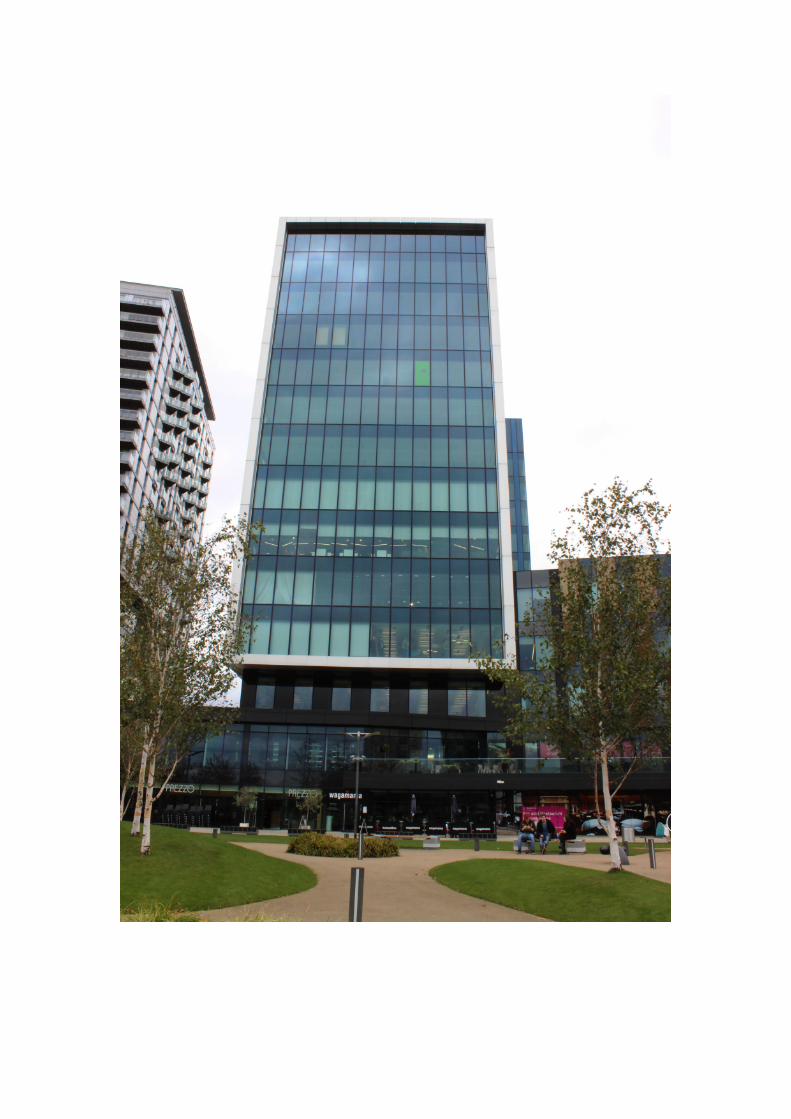
Image 7: This is one of my favourite buildings in the Salford Quays area so I decided to snap this picture because I thought it had an interesting look and shape to it. The focus of this image was to capture the modern building from a usual angle to give off a very unique look; the colour of the building also grabbed my attention because it is quite a sandy colour and I think its not like many buildings. The modern style also

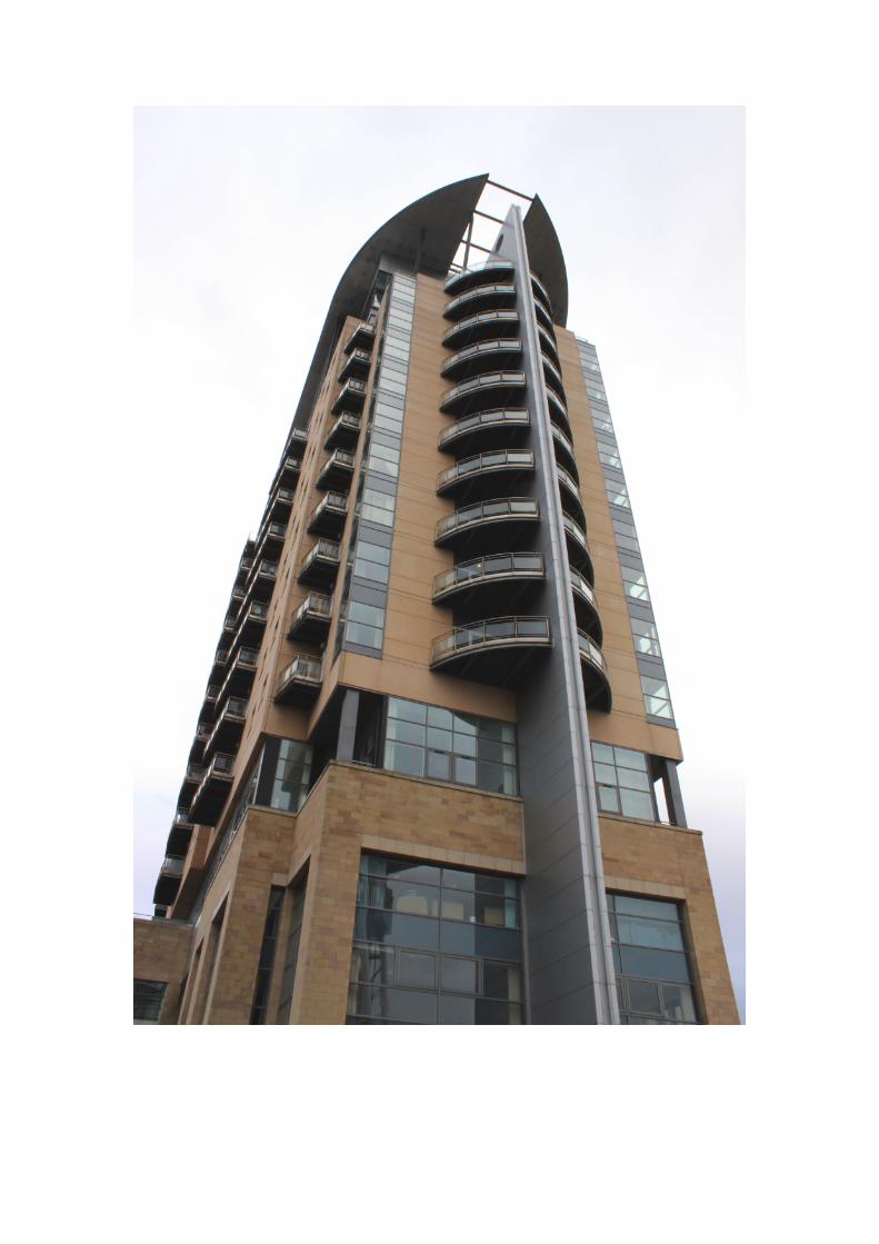
caught my eye and how symmetrical it is made me want to photography it and choose it for my final 10 photos. Image 8: This photo shows another amazing building at Salford Quays, the focus of the image was to try and capture some of the natural landscape behind the building so it comes across a lot different compered to the other photographs. The photo also shows off the BBC logo that is very popular when it comes to the Salford Quays and the Media City area. The reason that why I took this photo was because it gave a different side to the location I was shooting at, I think it showed the differences between the photos I have took previous. Image 9: This photo was taken in the Media City area of Salford Quays which features many modern looking buildings such as this one. The focus of this photo was too show how clean and clear the buildings look in the area, showing off the structural work which has been was my main goal with this photo shoot. The reason for taking this image was also to show how it looks from a person standing on the ground perspective so to achieve this instead of focusing on just the building I got in the photo of what is happening at the bottom for example people doing their day to day things. Image 10: I think this photo came out really well and is also another favourite of mine, this was taken near the Lowry building and I personally think it is an unusual and unique building to photograph. The focus of this image was mostly to capture the cylinder type shape from a different perspective, this meaning by the angle I chose to take the photo at. I also tried to focus the photo on the design of the building for example the rectangular gaps in the middle of the structure and also the beamed roof, I tried to make these to stand out so when it came to editing I would make these features more noticeable.
Techniques used
Image 1: When it comes to the photographic terminology of this photo I would say I only used a few of the techniques one of them being depth of field. Depth of field is where the camera will only focus at one point and the point of the photo is the rail right through the middle of the image. I used this technique because i thought it gave the photo some more too look at other than it just being in focus and being plain to look at, I think this definitely works and makes the photo a lot better. Another technique which I thought helped was the white balance; I had this setting on cloudy because the weather on this day of the shoot was overcast. I think this helped a lot and made the picture come out better compared to another white balance setting. Image 2: This photo because it was shot in an unusual position and because of the lighting scenes I had to use two techniques when shooting this image. First of all was the exposure I had this setting on automatic so that the photo came out with a good brightness and not over or under exposed, I did this because from my experience of photography I didn’t think I was capable of making it perfect like having it on manual exposure. Second of all was the ISO setting, like I mentioned previous the lighting situation was not very well suited and so I had to mess around with the settings to get it right. Because of this some adjustment had to be made so I decided to take a few pictures with different ISO and pick which one came out best for my final 10 photos. Image 3: I used a lot of techniques when it came to taking this photo, I had to keep in mind what I was capturing, how much was in the frame, how bright or dark the location was and also what my main focus was on. First of all I kept the rule of thirds technique in mind so I could get everything in the image and make the key points in the photo stand out. Another technique I focused on was white balance I mentioned this in image 2, white balance defines what the colour white looks like in specific lighting conditions which also affects the hue of all other colours, so having this in mind I had to pick a good white balance setting. Because on the location shoot day is was overcast and cloudy I chose the cloudy option in the camera

settings to get a good quality photo. Image 4: When it came to taking this photo I had to be cautious because of the lighting change the photo was taken towards the end of the shoot when it started to get darker. I kept in my mind about the ISO and thought about the right setting that I needed it on, I kept it on a higher number because of how dark and dull the lighting was doing this gave the photo enough light and didn’t over expose or under expose the photo. I also applied the technique of wide depth of field so that everything in the photo is clear and focused for example the building and then the sky slightly unfocused.Image 5: Like many of the other photos I had to keep in mind of the lighting situations when taking each photo because it was becoming the end of day for example and also when shooting in different angles like in this photo I was pointing the camera at the sky the it would of came across as over exposed if the correct settings were not applied. Liked I mentioned the angle of this photo could of lead to over exposure so ISO and shutter speed took great part in this photo. Shutter speed took a part in this photo also, I kept it at an average settings o it let enough light in to give it a good exposure and not produce noise on the image.Image 6: Only a few techniques were used when taking this photo them being shutter speed, rules of third and ISO. First of all the shutter speed was the first technique that I needed to sort out so I could take the photo, I had the shutter speed on an average to slightly fast speed to capture enough light for it not to be over or under exposed. Still on the subject about lighting etc, I set the ISO to just below high because it was a dull and overcast day with not much bright light. The last technique I used was the rules of third; this gave me the guideline to pick out the main points in the image. Image 7: In this photo techniques used were not as frequent as I used them in the other images but some do still apply. For example the first one being manual and automatic exposure, with this image I thought best that I’d use automatic because it allows me to get the photo the way I want it instead of coming back with over or underexposed photos; I used this because allows me not be as pressured when using manual exposure. Image 8: This photo and the techniques I used were very basic, I applied all the general techniques some of these including shutter speed, ISO and white balance. Shutter speed is a big deal when it comes to taking photos, so when it came to mine I had to get them perfect. 1/125 sec was the setting I had the shutter speed this was perfect for the lighting situation and worked well because of how well the photo turned out. ISO was similar because this has an effect on the lighting; I had the setting high because of the lighting situation on the day of the shoot. Last but not least was the white balance, like I mentioned above the lighting situation on the day took a big part of the photos so too correct it I used a white balance option which was cloudy and I think helped the image a lot.Image 9: This image which I have taken is not a personal favourite of mine but I still think the techniques that were applied were used correctly. For example the exposure on this photo isn’t too over or underexposed and because of this it works well with the rest of the image. I also applied the rule of third technique to allow the picture to have a central main point so it stand out a lot more; my main aim when looking at this photo was to focus more on the repetitive patterns with the windows.Image 10: The techniques used within this image were pretty much the same as the images above and what I taken during the whole photo shoot. This is because on the day of the shoot the weather and lighting was the same throughout the day and didn’t need much adjustment. Like I mentioned above because of the overcast weather I changed a setting called white balance and set this to cloudy so that the setting matched the location in which I was shooting.
Strengths & suggested improvements

Image 1: One strength with this photo for me is that when taking the image I had the depth of field in mind and thought about photographic terminology. Improvement which I can definitely improve on in the positioning of the photo for example I think there is too much going on in the photo and it would look more effective if it was cropped or less of a open space in the photo.Image 2: One of a few strengths within the photo was the angle of the photo, I especially like this one because it’s quite unusually positioned and I love that idea. Another strength was the brightness and contrast of the image, if it would have been anymore brighter or darker I think the photo wouldn’t of came out as good as it did. An improvement for the image would definitely come to the editing process and this is not as noticeable but is when I added a few clothes in the background I slacked in making it perfect so this would have to be an improvement when it comes to this photo. Image 3: One thing I love about this photo is how is shows you everything of Media City and the Salford Quays area, what I definitely think is a strength is how a lot of things are in the frame and how it works so well and it doesn’t look to overcrowded or anything. Also another strength would be how I made it to be a much nicer day when it came to the editing process, I did this because the original photo was very dull and boring to look at. An improvement would definitely to be maybe use a tripod next time to get a real steady and perfect shot. Image 4: This is one of my definite favourite photos by far, a strength of this photo to me is how the photo is taken, for example how only so much of the building is in frame and because of this I think it looks really well. Another good point about this photo would be the colours, the building has quite a metallic tone and the sky gives off a soft blue and I think with these two colours they contrast really well. An improvement would have to be going back to taking the photo and trying to maybe get a bit more in the frame like the edges of the building. Image 5: This would be another favourite of the photos I have taken on this shoot, a strength would be the contrast between the bridge structure and the sky, I love how different the two colours are and how well they word together this was the same thought for the image 4. Another strength would be the positioning and angle of the photo in which it was taken because I think it works well with the unusual structure of the bridge. An improvement would maybe capturing more of the bridge to show where it was for example Salford Quays but I think this would be only change I would make.Image 6: This image is an extreme wide-angle shot and captures a lot of the location that is Salford Quays; because of this I like how it can fit so much landscape within the photo. Strength of this photo I would say is how rich the colours are, this would be the contrast between the sky and the buildings and how they look like from a wide angle shot. When it comes to an improvement I would change a few things when it comes to the editing process of the image and maybe edit the clouds to look smaller.Image 7: One thing I love about this image is that it has a soft touch to it, for example the photo isn’t sharp as it could be and I think this works really well with the photo. Strength with this photo would definitely be the angle and framing and the way the photo is shot I think it gives the building more shape and form allowing you to see more of the structure. Improvement with this image would be when taking the photo step and back and capture more of the location so you can see where the building is located. Image 8: What I like about this photo is that it shows where media city is and also shows you surrounding area like for example the trees and smaller building behind the large building which the image is focusing on. There are also a lot of improvements when it comes to this photo the first of them being the colours; the colours which are in this photo are very dull and bland and nothing really pops from the photo, when I

came to editing I could of added something to give it that pop. Another improvement would be where I shot the building from, it doesn’t really give the photo much justice to me personally its quite an amateur photo. Image 9: One thing I most definitely like about this photo is how rich the colours are within the grass and the building’s tinted windows; they almost work well off each other and give the photo some vibrance. Moving onto improvements it would definitely benefit the image by using some sort of tripod to give the photo a more even and balanced look because looking at this photo I noticed it wasn’t even and would of looked much better with support. Image 10: This was one of the last photos I had taken on the photo shoot and this is one I quite enjoy looking at. The angle and the shape of the building works well with the way the photo is taken. I found more improvements than strengths from this photo one of them being the colours, this would be the building. When looking at the photo now I wish it had more of a golden tone to it other than the rusty look.
Editing details
Image 1: When it came to editing this photo I changed the basic adjustments for example like the brightness and contrast, doing this made the photo look better by bringing the photos colours out. The clone stamp is a tool which I used a lot, I used this when making things look neater in the photo, for example I got rid of some people and marks that were on the pavement to make it look nice and presentable. Image 2: Brightness and contrast is the first thing I adjust when it comes to editing a photo, I did the same to this one. I learnt a technique when I was messing around and this was too add clouds onto the photo, to do this I found a photo of grey clouds to match the lighting and then pasted it on as a new layer. After doing this I then used the rubber tool and started to rub of the original image of the bridge and this made the bridge clearer leaving a cloudy sky on my photo. I used this technique because I think it helps define the photo and also adds something to it another than just a bridge with a plain old sky. Image 3: A lot was done when editing this photo, first of all I changed the brightness, contrast and virbrance to lighten the photo and make it less dull like it was on the day for the photo shoot. I used the clone tool to a minimal on this photo only fixing a few minor issues within the photos. Now that the photo was brighter I then decided to add more colour by adding blue layer on the sky and the water, this gave the image more of a natural tone. To finish it off I then added a few clouds to make the photo more natural and complete. Image 4: Only a tiny bit of editing was done to this photo this is because I already like how the photo came out but it just needed a little retouching. I adjusted the brightness and contrast like I do with every photo just to make it that little bit better and to stand out more, then I added a blue overlay layer over the sky just to give more colour to the photo other than the bold metallic colour of the building. Image 5: When it came editing this photo their wasn’t much that needed doing only small adjustments were made this including the brightness, contrast, vibrance, levels and curves. I did this to make the photo stand out and look a lot more stronger when it came to the colours and details.Image 6: When editing the original image for this photo all I had it mind was making it brighter and presentable so to do this I adjusted the brightness and contrast giving the photo more richer colours rather than dull like it was before. I added a blue sky and clouds to give the photo more detail and depth so people have more to look at when view the photo; I also added a blue over layer on the water so it looks more realistic when reflecting off the sky. Image 7: This photo was very simple to edit when it came to the editing process as I do with every photo I start off with changing some adjustments for example brightness, contrast, levels and vibrance. Another small change I did with this photo

was using the clone tool to clean up some of the windows on the building; I did this to make it more presentable and clear. Image 8: This photo wasn’t the very best photo I had taken within the 10 final photos so I slacked in the editing quite a bit. I did apply the normal the things I do to a photo this including brightness and contrast and other than that just used the clone tool to clean up the surrounding area and try to make it half decent. Image 9: The editing process once again was quite simple with this photos as of others, in this image I used the clone tool to get rid of some imperfections within the photos this including like leaves on the grass patches I did this because I wanted to give a good representation of Salford Quays. Apart from them changes the only other changes for this picture were brightness, contrast, vibrance, levels and saturation. Image 10: This photo when it came to editing had a lot to do with the adjustments tab this included the brightness, contrast, levels, vibrance and saturation. Saturation took a part in this photo because I wanted the building to give off more of a golden colour rather then just a rusty orange. I managed to get the colour I wanted by messing around with these settings until I found the right one. Moving on I also added a blue layer over the sky to give it more colour and contrast when compared to the building; another slight change was using the clone tool to get rid of some unwanted blemishes within the photo.
Capture Log
Setting Shutter Speed ISO Aperture
1. Manual 2. Manual 3. Manual 4. Manual5. Manual6. Manual7. Manual8. Manual9. Manual 10.Manual
1/125 sec.1/125 sec.1/1600 sec. 1/125 sec.1/125 sec.1/125 sec.1/125 sec. 1/125 sec.1/801/80
800800800800800800800800800800
f/20f/20f/8f/20f/20f/20f/20f/20f/20f/20