statistics for managers using microsoft® excel 5th edition two-da… · 5 statistics for managers...
TRANSCRIPT
1
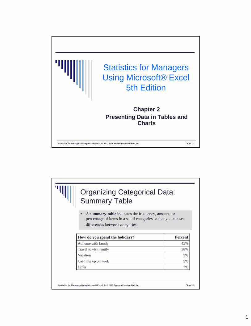
Statistics for Managers Using Microsoft Excel, 5e © 2008 Pearson Prentice-Hall, Inc. Chap 2-1
Statistics for ManagersUsing Microsoft® Excel
5th Edition
Chapter 2Presenting Data in Tables and
Charts
Statistics for Managers Using Microsoft Excel, 5e © 2008 Pearson Prentice-Hall, Inc. Chap 2-2
Organizing Categorical Data:Summary Table A summary table indicates the frequency, amount, or
percentage of items in a set of categories so that you can see
differences between categories.
How do you spend the holidays? Percent
At home with family 45%
Travel to visit family 38%
Vacation 5%
Catching up on work 5%
Other 7%

2
Statistics for Managers Using Microsoft Excel, 5e © 2008 Pearson Prentice-Hall, Inc. Chap 2-3
Organizing Categorical Data:Bar Chart In a bar chart, a bar shows each category, the length of
which represents the amount, frequency or percentage ofvalues falling into a category.
How Do You Spend the Holidays?
45%
38%
5%
5%
7%
0% 5% 10% 15% 20% 25% 30% 35% 40% 45% 50%
At home w ith family
Travel to visit family
Vacation
Catching up on w ork
Other
Statistics for Managers Using Microsoft Excel, 5e © 2008 Pearson Prentice-Hall, Inc. Chap 2-4
Organizing Categorical Data:Pie Chart The pie chart is a circle broken up into slices that represent
categories. The size of each slice of the pie varies accordingto the percentage in each category.
How Do You Spend the Holiday's
45%
38%
5%
5%7%
At home with familyTravel to visit familyVacationCatching up on workOther

3
Statistics for Managers Using Microsoft Excel, 5e © 2008 Pearson Prentice-Hall, Inc. Chap 2-5
Organizing Categorical Data:Pareto Diagram
Used to portray categorical data
A bar chart, where categories are shown in
descending order of frequency
A cumulative polygon is shown in the same graph
Used to separate the “vital few” from the “trivialmany”
Statistics for Managers Using Microsoft Excel, 5e © 2008 Pearson Prentice-Hall, Inc. Chap 2-6
Organizing Categorical Data:Pareto Diagram
cumulative %
invested(line
graph)
% in
vest
ed in
eac
h ca
tego
ry (b
argr
aph)
0%
5%
10%
15%
20%
25%
30%
35%
40%
45%
Stocks Bonds Savings CD0%
10%
20%
30%
40%
50%
60%
70%
80%
90%
100%
Current Investment Portfolio

4
Class Exercise 1
Statistics for Managers Using Microsoft Excel, 5e © 2008 Pearson Prentice-Hall, Inc. Chap 1-7
Class Exercise 2
Statistics for Managers Using Microsoft Excel, 5e © 2008 Pearson Prentice-Hall, Inc. Chap 1-8
5
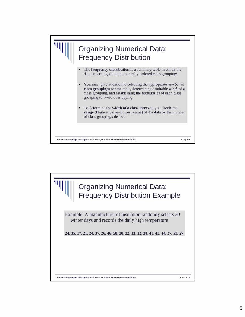
Statistics for Managers Using Microsoft Excel, 5e © 2008 Pearson Prentice-Hall, Inc. Chap 2-9
Organizing Numerical Data:Frequency Distribution The frequency distribution is a summary table in which the
data are arranged into numerically ordered class groupings.
You must give attention to selecting the appropriate number ofclass groupings for the table, determining a suitable width of aclass grouping, and establishing the boundaries of each classgrouping to avoid overlapping.
To determine the width of a class interval, you divide therange (Highest value–Lowest value) of the data by the numberof class groupings desired.
Statistics for Managers Using Microsoft Excel, 5e © 2008 Pearson Prentice-Hall, Inc. Chap 2-10
Organizing Numerical Data:Frequency Distribution Example
Example: A manufacturer of insulation randomly selects 20winter days and records the daily high temperature
24, 35, 17, 21, 24, 37, 26, 46, 58, 30, 32, 13, 12, 38, 41, 43, 44, 27, 53, 27

6
Statistics for Managers Using Microsoft Excel, 5e © 2008 Pearson Prentice-Hall, Inc. Chap 2-11
Organizing Numerical Data:Frequency Distribution Example
Sort raw data in ascending order:12, 13, 17, 21, 24, 24, 26, 27, 27, 30, 32, 35, 37, 38, 41, 43, 44, 46, 53, 58
Find range: 58 - 12 = 46 Select number of classes: 5 (usually between 5 and 15) Compute class interval (width): 10 (46/5 then round up) Determine class boundaries (limits): 10, 20, 30, 40, 50, 60 Compute class midpoints: 15, 25, 35, 45, 55 Count observations & assign to classes
Statistics for Managers Using Microsoft Excel, 5e © 2008 Pearson Prentice-Hall, Inc. Chap 2-12
Organizing Numerical Data:Frequency Distribution Example
Class Frequency
10 but less than 20 3 .15 1520 but less than 30 6 .30 3030 but less than 40 5 .25 2540 but less than 50 4 .20 2050 but less than 60 2 .10 10
Total 20 1.00 100
RelativeFrequency Percentage

7
Statistics for Managers Using Microsoft Excel, 5e © 2008 Pearson Prentice-Hall, Inc. Chap 2-13
Organizing Numerical Data:The Histogram A graph of the data in a frequency distribution is
called a histogram.
The class boundaries (or class midpoints) areshown on the horizontal axis.
The vertical axis is either frequency, relativefrequency, or percentage.
Bars of the appropriate heights are used to representthe number of observations within each class.
Statistics for Managers Using Microsoft Excel, 5e © 2008 Pearson Prentice-Hall, Inc. Chap 2-14
Organizing Numerical Data:The Histogram
Class Frequency
10 but less than 20 3 .15 1520 but less than 30 6 .30 3030 but less than 40 5 .25 2540 but less than 50 4 .20 2050 but less than 60 2 .10 10
Total 20 1.00 100
RelativeFrequency Percentage
Histogram: Daily High Temperature
01234567
5 15 25 35 45 55 More
Fre
qu
ency

8
Statistics for Managers Using Microsoft Excel, 5e © 2008 Pearson Prentice-Hall, Inc. Chap 2-15
Organizing Numerical Data:The Polygon
A percentage polygon is formed by having themidpoint of each class represent the data in that classand then connecting the sequence of midpoints attheir respective class percentages.
The cumulative percentage polygon, or ogive,displays the variable of interest along the X axis, andthe cumulative percentages along the Y axis.
Statistics for Managers Using Microsoft Excel, 5e © 2008 Pearson Prentice-Hall, Inc. Chap 2-16
Organizing Numerical Data:The Polygon
Frequency Polygon: Daily High Temperature
01234567
5 15 25 35 45 55 More
Freq
uenc
y
Class Frequency
10 but less than 20 3 .15 1520 but less than 30 6 .30 3030 but less than 40 5 .25 2540 but less than 50 4 .20 2050 but less than 60 2 .10 10
Total 20 1.00 100
RelativeFrequency Percentage
(In a percentage polygonthe vertical axis wouldbe defined to show thepercentage ofobservations per class)
9
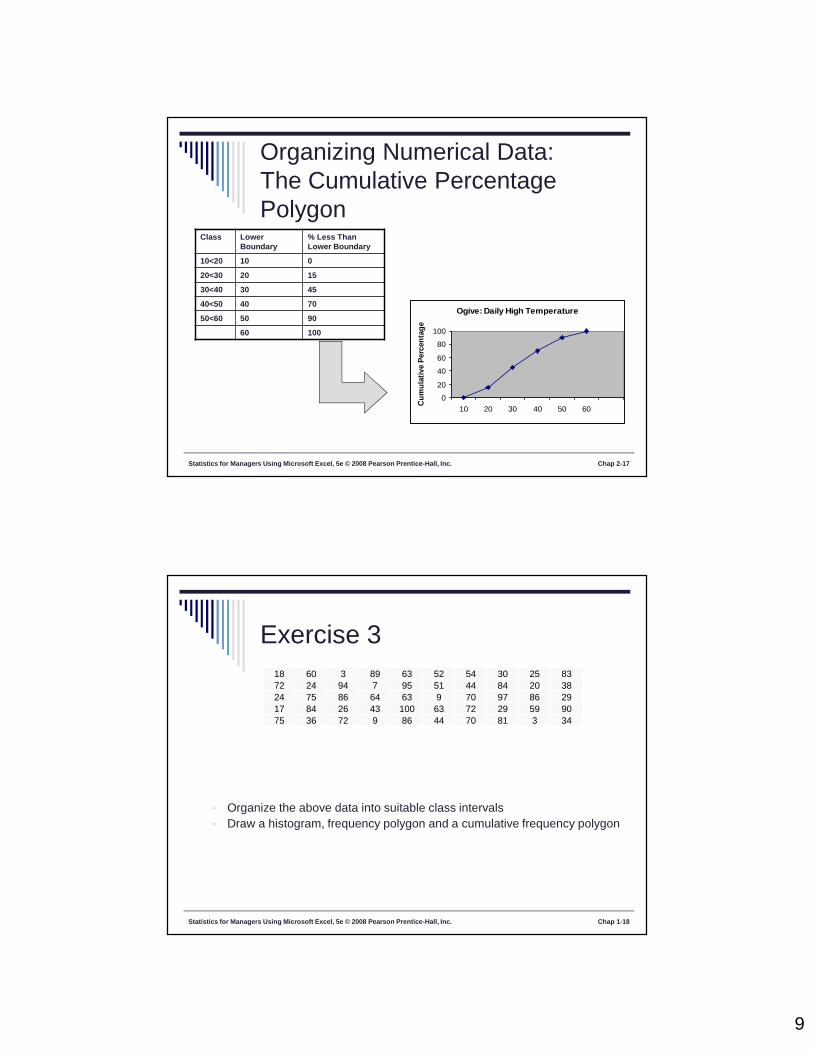
Statistics for Managers Using Microsoft Excel, 5e © 2008 Pearson Prentice-Hall, Inc. Chap 2-17
Organizing Numerical Data:The Cumulative PercentagePolygon
Ogive: Daily High Temperature
0
20
40
60
80
100
10 20 30 40 50 60Cu
mul
ativ
e Pe
rcen
tage
Class LowerBoundary
% Less ThanLower Boundary
10<20 10 0
20<30 20 15
30<40 30 45
40<50 40 70
50<60 50 90
60 100
Exercise 318 60 3 89 63 52 54 30 25 8372 24 94 7 95 51 44 84 20 3824 75 86 64 63 9 70 97 86 2917 84 26 43 100 63 72 29 59 9075 36 72 9 86 44 70 81 3 34
Statistics for Managers Using Microsoft Excel, 5e © 2008 Pearson Prentice-Hall, Inc. Chap 1-18
• Organize the above data into suitable class intervals• Draw a histogram, frequency polygon and a cumulative frequency polygon

10
Exercise 4
Statistics for Managers Using Microsoft Excel, 5e © 2008 Pearson Prentice-Hall, Inc. Chap 1-19
Statistics for Managers Using Microsoft Excel, 5e © 2008 Pearson Prentice-Hall, Inc. Chap 2-20
Principles of Excellent Graphs
The graph should not distort the data.
The graph should not contain unnecessaryadornments (sometimes referred to as chart junk).
The scale on the vertical axis should begin at zero.
All axes should be properly labeled.
The graph should contain a title.
The simplest possible graph should be used for agiven set of data.
11
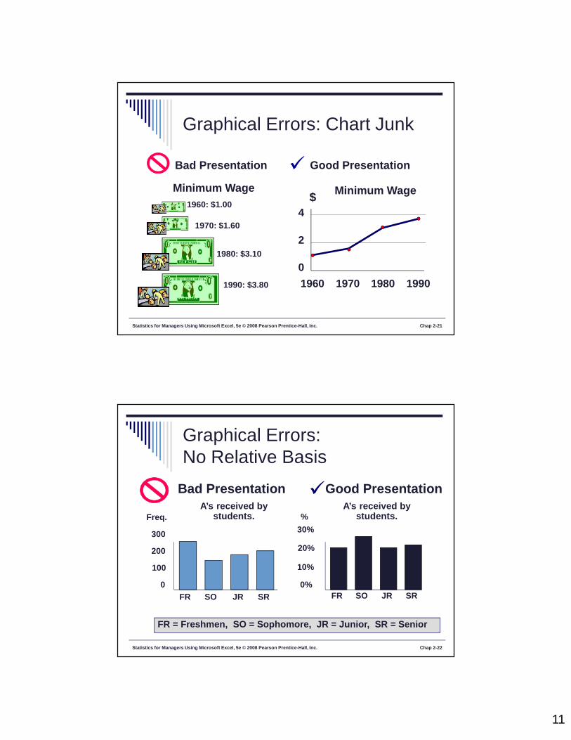
Statistics for Managers Using Microsoft Excel, 5e © 2008 Pearson Prentice-Hall, Inc. Chap 2-21
Graphical Errors: Chart Junk
1960: $1.00
1970: $1.60
1980: $3.10
1990: $3.80
Minimum Wage
Bad Presentation
Minimum Wage
0
2
4
1960 1970 1980 1990
$
Good Presentation
Statistics for Managers Using Microsoft Excel, 5e © 2008 Pearson Prentice-Hall, Inc. Chap 2-22
Graphical Errors:No Relative Basis
A’s received bystudents.
A’s received bystudents.
Bad Presentation
0
200
300
FR SO JR SR
Freq.
10%
30%
FR SO JR SR
FR = Freshmen, SO = Sophomore, JR = Junior, SR = Senior
100
20%
0%
%
Good Presentation

12
Statistics for Managers Using Microsoft Excel, 5e © 2008 Pearson Prentice-Hall, Inc. Chap 2-23
Graphical Errors:Compressing the Vertical Axis
Good Presentation
Quarterly Sales Quarterly Sales
Bad Presentation
0
25
50
Q1 Q2 Q3 Q4
$
0
100
200
Q1 Q2 Q3 Q4
$
Statistics for Managers Using Microsoft Excel, 5e © 2008 Pearson Prentice-Hall, Inc. Chap 2-24
Graphical Errors: No ZeroPoint on the Vertical Axis
Monthly Sales
36
39
42
45
J F M A M J
$
Graphing the first six months of sales
Monthly Sales
0
394245
J F M A M J
$
36
Good PresentationsBad Presentation

13
Statistics for Managers Using Microsoft Excel, 5e © 2008 Pearson Prentice-Hall, Inc. Chap 3-25
Statistics for ManagersUsing Microsoft® Excel
5th Edition
Chapter 3Numerical Descriptive Measures
Statistics for Managers Using Microsoft Excel, 5e © 2008 Pearson Prentice-Hall, Inc. Chap 3-26
Summary Definitions
The central tendency is the extent to whichall the data values group around a typical orcentral value.
The variation is the amount of dispersion, orscattering, of values
The shape is the pattern of the distribution ofvalues from the lowest value to the highestvalue.

14
Statistics for Managers Using Microsoft Excel, 5e © 2008 Pearson Prentice-Hall, Inc. Chap 3-27
Measures of Central TendencyThe Arithmetic Mean The arithmetic mean (mean) is the most common
measure of central tendency
For a sample of size n:
nXXX
n
XX n21
n
1ii
Sample size Observed values
Statistics for Managers Using Microsoft Excel, 5e © 2008 Pearson Prentice-Hall, Inc. Chap 3-28
Measures of Central TendencyThe Arithmetic Mean The most common measure of central tendency
Mean = sum of values divided by the number of values
Affected by extreme values (outliers)
0 1 2 3 4 5 6 7 8 9 10
Mean = 3
35
155
54321
0 1 2 3 4 5 6 7 8 9 10
Mean = 4
4520
5104321

15
Statistics for Managers Using Microsoft Excel, 5e © 2008 Pearson Prentice-Hall, Inc. Chap 3-29
Measures of Central TendencyThe Median
In an ordered array, the median is the “middle” number (50%above, 50% below)
Not affected by extreme values
0 1 2 3 4 5 6 7 8 9 10
Median = 4
0 1 2 3 4 5 6 7 8 9 10
Median = 4
Statistics for Managers Using Microsoft Excel, 5e © 2008 Pearson Prentice-Hall, Inc. Chap 3-30
Measures of Central TendencyLocating the Median The median of an ordered set of data is located at the
ranked value.
If the number of values is odd, the median is themiddle number.
If the number of values is even, the median is theaverage of the two middle numbers.
Note that is NOT the value of the median,
only the position of the median in the ranked data.
2
1n
2
1n
16
Statistics for Managers Using Microsoft Excel, 5e © 2008 Pearson Prentice-Hall, Inc. Chap 3-31
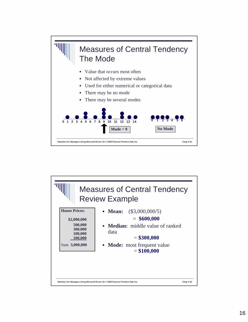
Measures of Central TendencyThe Mode Value that occurs most often
Not affected by extreme values
Used for either numerical or categorical data
There may be no mode
There may be several modes
0 1 2 3 4 5 6 7 8 9 10 11 12 13 14
Mode = 9
0 1 2 3 4 5 6
No Mode
Statistics for Managers Using Microsoft Excel, 5e © 2008 Pearson Prentice-Hall, Inc. Chap 3-32
Measures of Central TendencyReview Example
House Prices:
$2,000,000500,000300,000100,000100,000
Sum 3,000,000
Mean: ($3,000,000/5)= $600,000
Median: middle value of rankeddata
= $300,000 Mode: most frequent value
= $100,000
17
Exercise 5
Statistics for Managers Using Microsoft Excel, 5e © 2008 Pearson Prentice-Hall, Inc. Chap 1-33
Statistics for Managers Using Microsoft Excel, 5e © 2008 Pearson Prentice-Hall, Inc. Chap 3-34
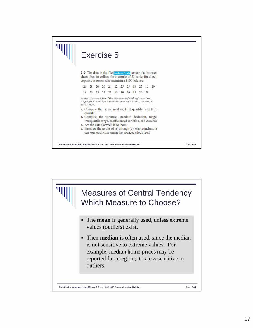
Measures of Central TendencyWhich Measure to Choose?
The mean is generally used, unless extremevalues (outliers) exist.
Then median is often used, since the medianis not sensitive to extreme values. Forexample, median home prices may bereported for a region; it is less sensitive tooutliers.

18
Statistics for Managers Using Microsoft Excel, 5e © 2008 Pearson Prentice-Hall, Inc. Chap 3-35
Quartile Measures
Quartiles split the ranked data into 4 segments withan equal number of values per segment.
25% 25% 25% 25%
Q1 Q2 Q3
The first quartile, Q1, is the value for which 25% ofthe observations are smaller and 75% are larger Q2 is the same as the median (50% are smaller, 50% arelarger) Only 25% of the values are greater than the third quartile
Statistics for Managers Using Microsoft Excel, 5e © 2008 Pearson Prentice-Hall, Inc. Chap 3-36
Quartile MeasuresLocating Quartiles
Find a quartile by determining the value in the appropriateposition in the ranked data, where
First quartile position: Q1 = (n+1)/4 ranked value
Second quartile position: Q2 = (n+1)/2 ranked value
Third quartile position: Q3 = 3(n+1)/4 ranked value
where n is the number of observed values

19
Statistics for Managers Using Microsoft Excel, 5e © 2008 Pearson Prentice-Hall, Inc. Chap 3-37
Quartile MeasuresGuidelines Rule 1: If the result is a whole number, then the
quartile is equal to that ranked value.
Rule 2: If the result is a fraction half (2.5, 3.5, etc),then the quartile is equal to the average of thecorresponding ranked values.
Rule 3: If the result is neither a whole number or afractional half, you round the result to the nearestinteger and select that ranked value.
Statistics for Managers Using Microsoft Excel, 5e © 2008 Pearson Prentice-Hall, Inc. Chap 3-38
Quartile MeasuresLocating the First Quartile Example: Find the first quartile
Sample Data in Ordered Array: 11 12 13 16 16 17 18 21 22
First, note that n = 9.
Q1 = is in the (9+1)/4 = 2.5 ranked value of the ranked
data, so use the value half way between the 2nd and 3rd
ranked values,
so Q1 = 12.5
Q1 and Q3 are measures of non-central locationQ2 = median, a measure of central tendency

20
Exercise 5
Statistics for Managers Using Microsoft Excel, 5e © 2008 Pearson Prentice-Hall, Inc. Chap 1-39
Statistics for Managers Using Microsoft Excel, 5e © 2008 Pearson Prentice-Hall, Inc. Chap 3-40
Measures of Central TendencyThe Geometric Mean Geometric mean
Used to measure the rate of change of a variable over time
Geometric mean rate of return
Measures the status of an investment over time
Where Ri is the rate of return in time period i
nnG XXXX /1
21 )(
1)]R1()R1()R1[(R n/1n21G

21
Statistics for Managers Using Microsoft Excel, 5e © 2008 Pearson Prentice-Hall, Inc. Chap 3-41
Measures of Central TendencyThe Geometric Mean
An investment of $100,000 declined to $50,000 at the end ofyear one and rebounded to $100,000 at end of year two:
The overall two-year return is zero, since it started and endedat the same level.
000,100$X000,50$X000,100$X 321
50% decrease 100% increase
Statistics for Managers Using Microsoft Excel, 5e © 2008 Pearson Prentice-Hall, Inc. Chap 3-42
Measures of Central TendencyThe Geometric MeanUse the 1-year returns to compute the arithmetic mean
and the geometric mean:
25.2
)1()5.(
X
Arithmeticmean rateof return:
Geometricmean rate ofreturn: %0111)]2()50[(.
1))]1(1())5.(1[(
1)]1()1()1[(
2/12/1
2/1
/121
nnG RRRR
Misleading result
Moreaccurateresult

22
Statistics for Managers Using Microsoft Excel, 5e © 2008 Pearson Prentice-Hall, Inc. Chap 3-43
Measures of Central TendencySummary
Central Tendency
ArithmeticMean
Median Mode Geometric Mean
n
XX
n
ii
1
n/1n21G )XXX(X
Middle valuein the orderedarray
Mostfrequentlyobservedvalue
Statistics for Managers Using Microsoft Excel, 5e © 2008 Pearson Prentice-Hall, Inc. Chap 3-44
Measures of Variation
Variation measures the spread, or dispersion,of values in a data set. Range
Interquartile Range
Variance
Standard Deviation
Coefficient of Variation
23
Statistics for Managers Using Microsoft Excel, 5e © 2008 Pearson Prentice-Hall, Inc. Chap 3-45
Measures of VariationRange
Simplest measure of variation
Difference between the largest and the smallest values:
Range = Xlargest – Xsmallest
0 1 2 3 4 5 6 7 8 9 10 11 12 13 14
Range = 13 - 1 = 12
Example:
Statistics for Managers Using Microsoft Excel, 5e © 2008 Pearson Prentice-Hall, Inc. Chap 3-46
Measures of VariationDisadvantages of the Range
Ignores the way in which data are distributed
Sensitive to outliers
7 8 9 10 11 12Range = 12 - 7 = 5
7 8 9 10 11 12Range = 12 - 7 = 5
1,1,1,1,1,1,1,1,1,1,1,2,2,2,2,2,2,2,2,3,3,3,3,4,5
1,1,1,1,1,1,1,1,1,1,1,2,2,2,2,2,2,2,2,3,3,3,3,4,120
Range = 5 - 1 = 4
Range = 120 - 1 = 119
24
Statistics for Managers Using Microsoft Excel, 5e © 2008 Pearson Prentice-Hall, Inc. Chap 3-47
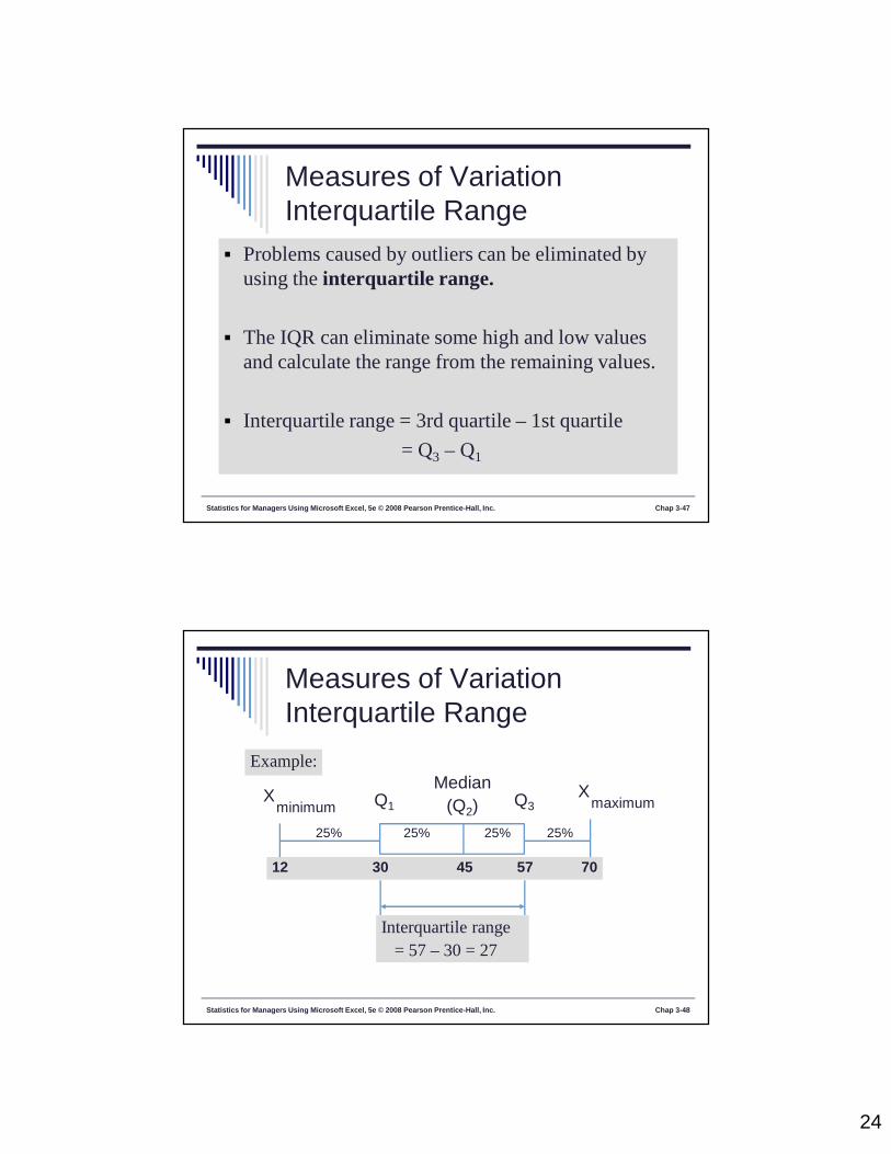
Measures of VariationInterquartile Range
Problems caused by outliers can be eliminated byusing the interquartile range.
The IQR can eliminate some high and low valuesand calculate the range from the remaining values.
Interquartile range = 3rd quartile – 1st quartile
= Q3 – Q1
Statistics for Managers Using Microsoft Excel, 5e © 2008 Pearson Prentice-Hall, Inc. Chap 3-48
Measures of VariationInterquartile Range
Median(Q2)
XmaximumX
minimum Q1 Q3
Example:
25% 25% 25% 25%
12 30 45 57 70
Interquartile range= 57 – 30 = 27

25
Statistics for Managers Using Microsoft Excel, 5e © 2008 Pearson Prentice-Hall, Inc. Chap 3-49
Measures of VariationVariance The variance is the average (approximately) of
squared deviations of values from the mean.
Sample variance:
Where = arithmetic mean
n = sample size
Xi = ith value of the variable X
X
1-n
)X(XS
n
1i
2i
2
Statistics for Managers Using Microsoft Excel, 5e © 2008 Pearson Prentice-Hall, Inc. Chap 3-50
Measures of VariationStandard Deviation
Most commonly used measure of variation
Shows variation about the mean
Has the same units as the original data
Sample standard deviation:1-n
)X(XS
n
1i
2i
26
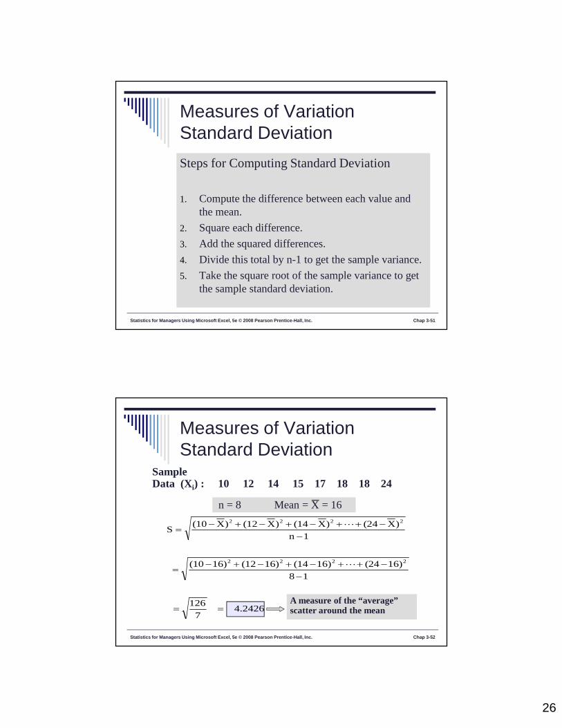
Statistics for Managers Using Microsoft Excel, 5e © 2008 Pearson Prentice-Hall, Inc. Chap 3-51
Measures of VariationStandard DeviationSteps for Computing Standard Deviation
1. Compute the difference between each value andthe mean.
2. Square each difference.
3. Add the squared differences.
4. Divide this total by n-1 to get the sample variance.
5. Take the square root of the sample variance to getthe sample standard deviation.
Statistics for Managers Using Microsoft Excel, 5e © 2008 Pearson Prentice-Hall, Inc. Chap 3-52
Measures of VariationStandard Deviation
SampleData (Xi) : 10 12 14 15 17 18 18 24
n = 8 Mean = X = 16
4.24267
126
18
16)(2416)(1416)(1216)(10
1n
)X(24)X(14)X(12)X(10S
2222
2222
A measure of the “average”scatter around the mean

27
Statistics for Managers Using Microsoft Excel, 5e © 2008 Pearson Prentice-Hall, Inc. Chap 3-53
Measures of VariationComparing Standard Deviation
Mean = 15.5S = 3.33811 12 13 14 15 16 17 18 19 20 21
11 12 13 14 15 16 17 18 19 2021
Data B
Data A
Mean = 15.5
S = 0.926
11 12 13 14 15 16 17 18 19 20 21
Mean = 15.5
S = 4.570
Data C
Exercise 5
Statistics for Managers Using Microsoft Excel, 5e © 2008 Pearson Prentice-Hall, Inc. Chap 1-54
28
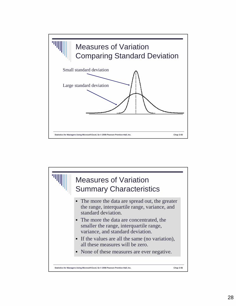
Statistics for Managers Using Microsoft Excel, 5e © 2008 Pearson Prentice-Hall, Inc. Chap 3-55
Measures of VariationComparing Standard Deviation
Small standard deviation
Large standard deviation
Statistics for Managers Using Microsoft Excel, 5e © 2008 Pearson Prentice-Hall, Inc. Chap 3-56
Measures of VariationSummary Characteristics The more the data are spread out, the greater
the range, interquartile range, variance, andstandard deviation.
The more the data are concentrated, thesmaller the range, interquartile range,variance, and standard deviation.
If the values are all the same (no variation),all these measures will be zero.
None of these measures are ever negative.
29
Statistics for Managers Using Microsoft Excel, 5e © 2008 Pearson Prentice-Hall, Inc. Chap 3-57
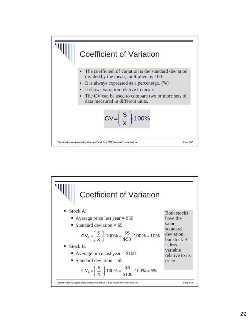
Coefficient of Variation
The coefficient of variation is the standard deviationdivided by the mean, multiplied by 100.
It is always expressed as a percentage. (%) It shows variation relative to mean. The CV can be used to compare two or more sets of
data measured in different units.
100%XSCV
Statistics for Managers Using Microsoft Excel, 5e © 2008 Pearson Prentice-Hall, Inc. Chap 3-58
Coefficient of Variation
Stock A:
Average price last year = $50
Standard deviation = $5
Stock B:
Average price last year = $100
Standard deviation = $5
10%100%$50$5100%
XSCVA
5%100%$100
$5100%
X
SCVB
Both stockshave thesamestandarddeviation,but stock Bis lessvariablerelative to itsprice

30
Exercise 5
Statistics for Managers Using Microsoft Excel, 5e © 2008 Pearson Prentice-Hall, Inc. Chap 1-59
Exercise 6
Statistics for Managers Using Microsoft Excel, 5e © 2008 Pearson Prentice-Hall, Inc. Chap 1-60

31
Statistics for Managers Using Microsoft Excel, 5e © 2008 Pearson Prentice-Hall, Inc. Chap 3-61
Numerical DescriptiveMeasures for a Population Descriptive statistics discussed previously described
a sample, not the population.
Summary measures describing a population, calledparameters, are denoted with Greek letters.
Important population parameters are the populationmean, variance, and standard deviation.
Statistics for Managers Using Microsoft Excel, 5e © 2008 Pearson Prentice-Hall, Inc. Chap 3-62
Population Mean
The population mean is the sum of the values in
the population divided by the population size, N.
N
XXX
N
XN
N
ii
211
μ = population mean
N = population size
Xi = ith value of the variable X
Where

32
Statistics for Managers Using Microsoft Excel, 5e © 2008 Pearson Prentice-Hall, Inc. Chap 3-63
Population Variance
N
XN
1i
2i
2
μ)(σ
The population variance is the average of squareddeviations of values from the mean
μ = population mean
N = population size
Xi = ith value of the variable X
Where
Statistics for Managers Using Microsoft Excel, 5e © 2008 Pearson Prentice-Hall, Inc. Chap 3-64
Population Standard Deviation
The population standard deviation is the mostcommonly used measure of variation.
It has the same units as the original data.
N
XN
1i
2i μ)(
σ
μ = population mean
N = population size
Xi = ith value of the variable X
Where

33
Statistics for Managers Using Microsoft Excel, 5e © 2008 Pearson Prentice-Hall, Inc. Chap 3-65
Sample statistics versuspopulation parameters
Measure PopulationParameter
SampleStatistic
Mean
Variance
StandardDeviation
X
2S
S
2
Statistics for Managers Using Microsoft Excel, 5e © 2008 Pearson Prentice-Hall, Inc. Chap 3-66
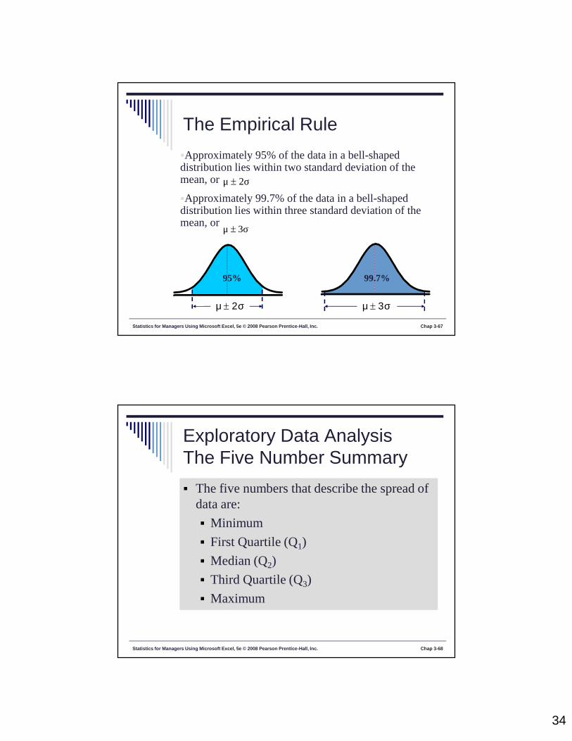
The Empirical Rule
The empirical rule approximates the variation ofdata in bell-shaped distributions.
Approximately 68% of the data in a bell-shapeddistribution lies within one standard deviation of themean, or 1σμ
μ
68%
1σμ
34
Statistics for Managers Using Microsoft Excel, 5e © 2008 Pearson Prentice-Hall, Inc. Chap 3-67
The Empirical Rule
2σμ
3σμ
Approximately 95% of the data in a bell-shapeddistribution lies within two standard deviation of themean, or
Approximately 99.7% of the data in a bell-shapeddistribution lies within three standard deviation of themean, or
3σμ
99.7%95%
2σμ
Statistics for Managers Using Microsoft Excel, 5e © 2008 Pearson Prentice-Hall, Inc. Chap 3-68
Exploratory Data AnalysisThe Five Number Summary The five numbers that describe the spread of
data are:
Minimum
First Quartile (Q1)
Median (Q2)
Third Quartile (Q3)
Maximum

35
Statistics for Managers Using Microsoft Excel, 5e © 2008 Pearson Prentice-Hall, Inc. Chap 3-69
Pitfalls in NumericalDescriptive Measures
Data analysis is objective Analysis should report the summary measures that best
meet the assumptions about the data set.
Data interpretation is subjective Interpretation should be done in fair, neutral and clear
manner.
Statistics for Managers Using Microsoft Excel, 5e © 2008 Pearson Prentice-Hall, Inc. Chap 3-70
Ethical Considerations
Numerical descriptive measures:
Should document both good and bad results Should be presented in a fair, objective and neutral
manner Should not use inappropriate summary measures to
distort facts