sadae_9-4 interpretive sign
TRANSCRIPT

▪ Pedestrian visitors entering a conservation reserve in the Colorado Plateau
Audience
▪ Encourage staying on the designated path
▪ Teach that there is life in the crusty brown soil surface of this desert
Goal
▪ Walking off the path kills biological communities living in the desert crust
Message
▪ Walk With CareTitle
▪ Interpretive SignCSE 615


▪ The title was meant to consider the goal and encourage visitors to read the what “care” meant.
▪ Putting the title between curving lines mimicked a path, suggesting visitors what walking with care would stay within the path
Considering Goals
▪ I had trouble keeping the text boxes down to 50-70 words. But cutting it down helped me to focus on information that was only related to the message of the biological communities surviving or not surviving a footstep.
Fine-tuning the Message
▪ I used the background color of the dessert crust to create visual harmony and unity with the environment
Considering Audience
▪ First Design

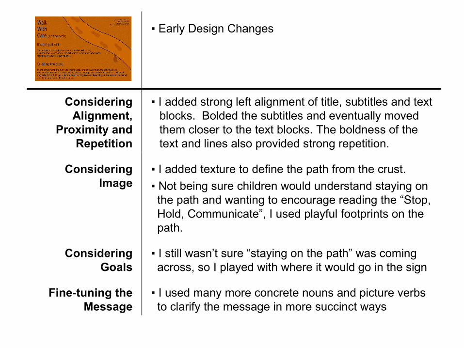
▪ I added texture to define the path from the crust.
▪ Not being sure children would understand staying on the path and wanting to encourage reading the “Stop, Hold, Communicate”, I used playful footprints on the path.
Considering Image
▪ I added strong left alignment of title, subtitles and text blocks. Bolded the subtitles and eventually moved them closer to the text blocks. The boldness of the text and lines also provided strong repetition.
Considering Alignment,
Proximity and Repetition
▪ I still wasn’t sure “staying on the path” was coming across, so I played with where it would go in the sign
Considering Goals
▪ I used many more concrete nouns and picture verbs to clarify the message in more succinct ways
Fine-tuning the Message
▪ Early Design Changes


▪ The title felt like an image that would attract the audience so I gave it more significance in size and boldness and added space and horizontal alignment. In a later design, adding perspective to the path helped even further with the path lines being a
Considering Images
▪ I still wasn’t sure “staying on the path” was coming across, so I continued to keep it in the design
Considering Goals
▪ I played with color at great length but was only able to move from monochromatic to analogous in minute ways.
Considering Color
▪ Demonstrated in an even later design, I found a better balance and alignment using white space, as I felt myself losing my vertical alignment
Considering
White Space
▪ Later Design Changes


▪ Contrast, image and type were significant changes that came about from considering color and fonts. I wanted to add green for the “life” in the message, however everywhere I added it, it worked against the reader recognizing an important underlying part of the message – living doesn’t need to show green, and brown dirt doesn’t mean dead and unimportant. Reflecting back on standing in the dessert, I remembered the beauty of the blue sky against the horizon line, which had me adding the skyline (again with repetitive bold lines and deep reds and stronger contrasts, and giving even the path more life. Even alignment and proximity seemed to be enhanced by the title with the horizon line and subtitle lines. With the size of the title I returned the left margin alignment back de-emphasizing the undesired center alignment. Kerning and italics were also empoyed.
Considering All Design
Concepts
▪ Final Design