responsive wed design : an emerging technology archana jain
TRANSCRIPT

Responsive Wed Design : An Emerging Technology
Archana Jain

Purpose of a Research talk
Study report on mobile internet usage Issues with multiple web designs Need for responsiveness What is Responsive Web Design Advantages of using RWD Challenges for RWD Possible Solutions for the RWD Challenges
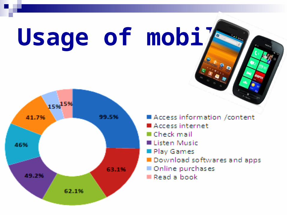
Usage of mobile
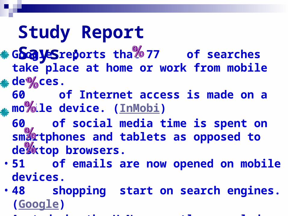
Study Report Says : • Google reports that 77 of searches take place at
home or work from mobile devices.60 of Internet access is made on a mobile device. (InMobi)60 of social media time is spent on smartphones and tablets as opposed to desktop browsers.
• 51 of emails are now opened on mobile devices. • 48 shopping start on search engines. (Google)
A study by the U.N. recently revealed around 3 billion of the 7 billion people on earth have access to mobile phones.
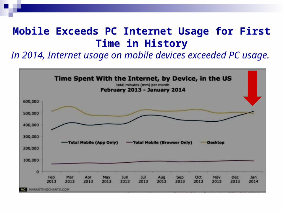
Mobile Exceeds PC Internet Usage for First Time in History
In 2014, Internet usage on mobile devices exceeded PC usage.

They mean that every aspect of our online marketing efforts – content, email, search, and social – is affected by mobile. People are reading content, opening emails, performing searches, and engaging with brands on social media – all on their mobile devices.
What do these statistics mean?

Users navigate with their fingers,
which is a vastly
different exercise
from navigating precisely
with a mouse.
Users zoom in and out
to read portions of
the web page.

Need for ResponsivenessScreen size can make quite a difference compare a little 4-inch smart phone to a
10-inch or even a 7-inch tablet screen or 18 inch desktop. And landscape vs.
portrait.

Websites
Mobile Websites
Responsive Websites
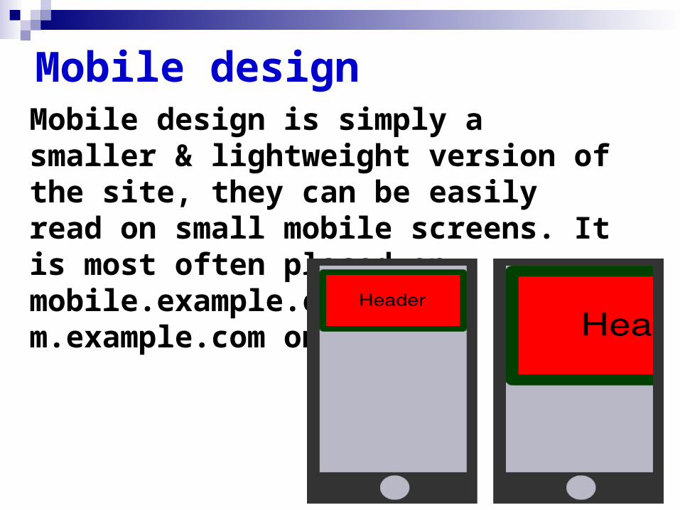
Mobile design Mobile design is simply a smaller & lightweight version of the site, they can be easily read on small mobile screens. It is most often placed on mobile.example.com or m.example.com on the domain.

Issues with multiple web designs
Money : Need to spend more money for the multiple web designs .
Effort : More efforts are required to maintain each of the version and run separate SEO.
Internet marketing campaigns: These need to run on every version that is very difficult to keep track off.
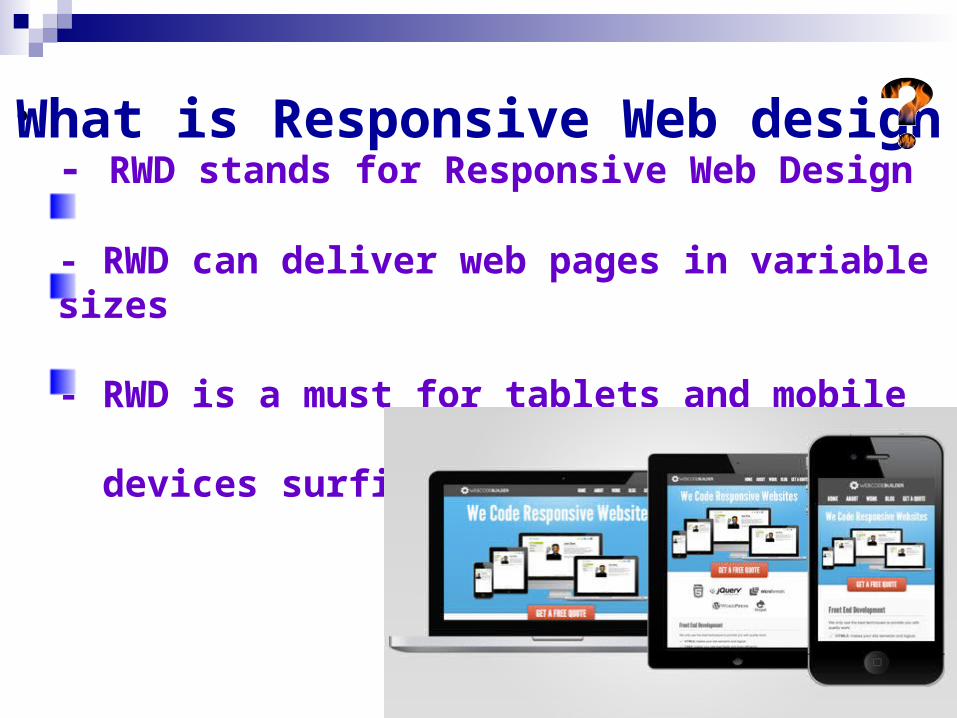
•- RWD stands for Responsive Web Design
- RWD can deliver web pages in variable sizes
- RWD is a must for tablets and mobile devices surfing
What is Responsive Web design

RESPONSIVE WEB DESIGNING
Website design which changes its appearance and layout based on the size of the screen, the website is displayed on. It has screen sensor codes . The layout changes based on the size and capabilities of the device.

• A Fluid grid system uses percentages
to define column or div widths instead of
pixels
Fluid Grid
• Media queries enable
custom CSS based on the
min-max width of a browser
Media Queries
• Responsive images don’t
have fixed widths but
instead have a max-width
Responsive images

Tools to create RWD site Use a content management
system like WordPress Use Responsive templates
on services such as IM-Creator, Wix and Weebly
Twitter Bootstrap and Foundation is a fantastic toolset for quickly building responsive sites.
Net Magazine’s top 50 tools for Responsive Word press Design is also very effective.

Advantages of RWDFlexibility Increased Sales Saves Time
Cost effective Enhances SEO efforts
Easy Updation & Maintenance
Analytics are easier to track
Increase Conversions and
earnings from ads
Optimal user experience
Google Recommendation
Enhance user's offline browsing
experience
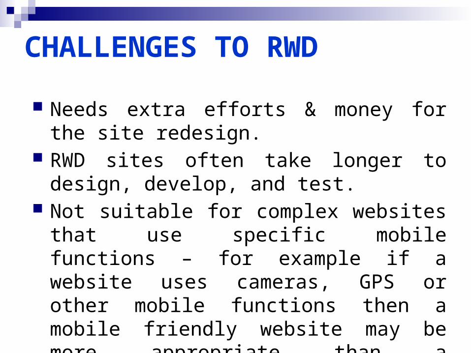
CHALLENGES TO RWD
Needs extra efforts & money for the site redesign.
RWD sites often take longer to design, develop, and test.
Not suitable for complex websites that use specific mobile functions – for example if a website uses cameras, GPS or other mobile functions then a mobile friendly website may be more appropriate than a responsive website.

Responsive web sites do not work on Internet Explorer 8 and below.
Don’t always rely on media queries in CSS because browsers will load and parse all of the selectors and styles for all devices (mobiles, desktop, tablet). All content is downloaded whether it is used or not.
Responsive sites take more time to load due to their complex structure and screen sensor codes.
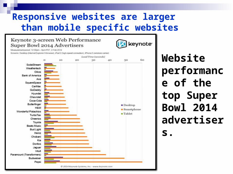
Responsive websites are larger than mobile specific websites
Website performance of the top Super Bowl 2014 advertisers.
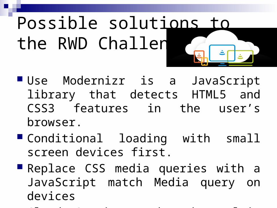
Possible solutions to the RWD Challenges
Use Modernizr is a JavaScript library that detects HTML5 and CSS3 features in the user’s browser.
Conditional loading with small screen devices first.
Replace CSS media queries with a JavaScript match Media query on devices
Cloud Services Make the Multi-Device Web Easier.

Responsive sites can evolve step-by-step, saving owners a lot of time and effort in the long run. they are also better candidates for gradual change and natural evolution
While there is no silver bullet and no solutions that can be applied to every type of document, we can use a couple of tricks to improve our existing responsive solutions and maximize performance:
Mobile devices do not use IE8. we can specifically target these browsers to include the polyfills. We can do that with IE-only conditional comments.

Adoption Rate of RWD Responsive web design has been gaining
popularity and is now considered to be one of the best ways to design websites that look great on any device, from smart phones to smart TVs.
According to Forrester report highest adoption report by vertical is less than 20% but the number is growing every month.
According to Guy Podjarny’s research, 72% of responsive websites deliver the same number of bytes regardless of screen size, even on slow mobile network connections. Not all users will wait for your website to load.

RWD vs NOT RWDRWD
NOT RWD
The chart and graphic below show the percentage of responsive websites amongst the top 100, 1,000 and 10,000 websites. As you can see, the adoption rate is quite substantial, reaching 18.7% adoption rate in the entire data set.
Conclusion Modern day design needs to be balanced
with effective content, navigational considerations, loading time, usability and SEO elements in your technical and information architecture. Implementing flat, clean, and simple design principles means that engaged visitors spend more time on your site because they enjoy it.
Modern day web design success requires a multi-function, multi-skilled approached to ensure maximum impact for your business.