receiver operating characteristic curves: a case study of
TRANSCRIPT

1
Comparison of classification methods with “n-class”
receiver operating characteristic curves:
a case study of energy drinks
Anita Rácz1,2
, Dávid Bajusz3, Marietta Fodor
2, Károly Héberger
1,*
1 Plasma Chemistry Research Group, Research Centre for Natural Sciences, Hungarian Academy
of Sciences, H-1117 Budapest XI., Magyar tudósok körútja 2, Hungary
2 Corvinus University of Budapest, Faculty of Food Science, Department of Applied Chemistry,
H-1118 Budapest XI., Villányi út 29-43, Hungary
3 Medicinal Chemistry Research Group, Research Centre for Natural Sciences, Hungarian
Academy of Sciences, H-1117 Budapest XI., Magyar tudósok körútja 2, Hungary
* To whom correspondence should be sent:
E-mail address: [email protected] (Károly Héberger)

2
Abstract
Four classification methods were compared using receiver operating characteristic (ROC)
curves to identify the best one: two common ones (linear discriminant analysis, LDA and partial
least squares, PLS) and another two (random forest, boosted tree) that are not applied as
frequently as LDA or PLS yet. A dataset with 90 commercially available (in Hungary) energy
drink samples were studied. Near-infrared (NIR) spectra were utilized for the classification of the
energy drinks into three “natural” groups based on their sugar content. Another dataset, which
contained the first ten principal components (PCs) was also used because of the limitation in the
number of variables for LDA. The models were validated using n-fold cross-validation and
randomization test. A new practice was elaborated to compare the pattern recognition methods
with ROC curves. This new methodology was designed to provide an easy and straightforward
way for the calculation of ROC curves for multi-class classification problems.
In each case the energy drink samples could be classified to the appropriate groups very
accurately. The best ROC curve belonged to the boosted tree method, but all of the studied
methods were able to classify the samples to a great extent of correctness. The use of AUC
values instead of correct classification rates can be a viable option for method comparison and
also as a classification parameter.
Keywords: classification, ROC curves, PCA, LDA, PLS, Random forest, Boosted tree, method
comparison

3
Introduction
Originating from the field of radar detection [1,2], ROC curves (and area under the ROC
curve, or AUC values) have become standard evaluation tools of classifier methods in several
fields [3,4] (of which virtual screening is the one that inspired us to apply it in the present work)
[5]. Probably the greatest advantage of the concept is that it encapsulates the whole set of
solutions (i.e. classifier thresholds) to a binary classification problem, and thus gives an overall
picture of the performance of the classifier method. Its greatest limitation however, is that it
cannot be readily applied to problems related to multiclass classification.
Recently, much effort has been dedicated to introducing ROC curves and AUC values to
the domain of multiclass classification. Some of these extensions are referred to as ROC
hypersurfaces, and similarly, the generalization of AUC becomes the volume under the ROC
hypersurface (VUS). To our knowledge, the earliest implementation is Mossman’s three-way
ROC surface for three-class problems. [6] In his approach, the VUS value corresponds to the
probability that a randomly chosen trio of items (one from each class) is classified correctly. The
VUS concept was further elaborated by Ferri and coworkers, who identified the trivial
classifiers, minimum and maximum VUS values and their polytopes for an arbitrary set of binary
classifiers [7]. For the visualization of higher-dimension ROC surfaces, many alternatives exist
as detailed by Fieldsend and Everson [8], such as parallel coordinated graphs [9], self-organising
maps [10], or the recently introduced cobweb representation of Diri and Albayrak [11]. Most
approaches to the generalization of the ROC concept involve the deduction of the many-class
problem to a set of two-class problems and summarizing the results. In 2001, Hand and Till
elaborated a deduction method based on averaging the results of pairwise comparisons [12].
Their approach was later further elaborated by Landgrebe and Duin [13,14]. Also in 2001, a

4
slightly different approach was taken by Provost and Domingos [15]: they calculated a weighted
average of the AUC values obtained by taking each class as the reference (positive) class in turn,
where the weight of a class’s AUC value was that class’s frequency in the dataset. A significant
advantage of this method over pairwise ROC analysis is the computational cost: O(n) vs. the
O(n2) cost of pairwise analysis. A comparison of ROC generalization approaches for three-class
problems was carried out in 2005 by Patel and Markey [16].
In this work, we have applied and elaborated on the one-versus-all approach of Provost
and Domingos [15]. We provide an easy visualization method based on the formula of Hanley
and McNeil for “ROC-like” curves [3], and apply the formula of DeLong and coworkers [17]
and the law of error propagation [18] to estimate the total variance that is associated with the
given classifier method. We believe that the methodology presented here is widely applicable for
the quick, easy and statistically correct ROC analysis and visualization of multi-class
classification problems.
In the chemometrics field user friendly tutorials are available e.g. in ref. [19]. They have also
shown how to determine confidence intervals on the various measures. The authors of reference
[20] use different conventions and the positive-negative encoding of classes is straightforward.
(It contains some errors in formulas though).
Our approach is similar to the basic concept of a chemometric technique called soft independent
modeling of class analogy (SIMCA) where each class is modeled one at a time and
independently from each other [21]. SIMCA belongs to the group of class modeling techniques;
some authors term it one-class classification. [22]
“The application of an algorithm to different types of data may result in diverse outputs, and in
general, no single algorithm is optimal for solving all problems. Each set of chemical data

5
therefore requires the choice of an optimal (or a near-optimal) algorithm for that particular data
set” [23]. Therefore a variety of supervised pattern recognition techniques is worth to be tested
[24].
Our aims were to (i) classify the groups of energy drinks, (ii) make good models for further
prediction and most importantly (iii) find a new way to compare the pattern recognition methods
with ROC curves. For this purpose we had to develop a new methodology for creating ROC
curves for more than two classes, which can be useful in other similar cases too.
Materials and methods
Principal component analysis (PCA)
Principal component analysis is one of the most common pattern recognition techniques
nowadays and it has had great success since the ‘80s and ‘90s. As an unsupervised technique, it
cannot be used as a typical classification method, but it helps to identify some patterns
(groupings, outliers, etc.) in the dataset without the classification of the samples.
PCA works as a dimension reduction method and the basic idea is that “latent variables”
are created by the linear combination of the original variables. In other words the original data
matrix can be decomposed to the product of two matrices: the score (T) and loading (PT)
matrices, which are orthonormal. Here we calculated principal components (scores vectors). The
principal components (scores) with larger eigenvalues contain the most important information
from the original data matrix and with the use of these components, dominant patterns and
groupings can be revealed. [25]
Linear discrimant analysis (LDA)

6
Linear discriminant analysis is a very useful and well-known classification method; it is a
supervised technique (i.e. we have to know the class membership before the analysis). It is
similarly a dimension reduction technique like PCA, but here we calculate canonical variables
(latent variables, roots). Ellipsoids (or hyperellipsoids) can be plotted around the scattered points
and the discriminant function is given by the line (or space), which is defined by the intersection
of two ellipses. It is assumed that the variances of all classes are equal. In the case of N classes,
the number of the canonical variables will be N-1.
There are several opportunities to choose the important or informative variables for the
model building. In this study all variables, forward stepwise, backward stepwise and best subset
selection methods were used for this purpose. The algorithm is described in detail in ref. [26].
Random forest [27]
Random forest is a tree-based method, which can be used for classification and regression
problems alike. The basic idea is that it builds many trees and each of them predicts a
classification. The final classification is made by a voting of the sequences of trees. The training
algorithm for random forests applies the general technique called “bagging”, which is actually an
aggregating technique. The trees are weak predictors, but together they produce an ensemble;
with the vote of each tree, the method can make good predictions. The two main parameters that
are to be optimized are the number of predictor variables and the number of trees. In this work,
we have generally selected the lowest predictor number where the inclusion of more predictors
did not visibly change the CC% rates (i.e. where the CC% reached a plateau). The number of
trees was determined afterwards for the given predictor number in a similar manner.

7
Boosted tree
Boosting was originally defined for classification problems and later extended to regression
ones. Boosted trees also build binary trees similarly to bagging trees: i.e. they partition the data
into two parts at each split node. At each step of the boosting a simple (best) partitioning of the
data is determined, and the deviations of the observed values from the respective means
(residuals for each partition) are computed. While this is quite straightforward for regression, in
the case of classification problems, the task is split into n sub-tasks (where n is the number of
classes) and a logistic transformation is carried out to compute the (weighted) misclassification
rates for subsequent boosting steps, and later, the final misclassification rates. [28] An important
feature of boosted trees is the weighting of the samples based on the difficulty of correct
classification: misclassified samples will be penalized in subsequent steps.
In case of stochastic gradient boosting: Each consecutive simple tree is to be built for
only a randomly selected subsample of the full dataset (“training set”). The introduction of a
certain degree of randomness into the analysis in this manner can serve as a powerful safeguard
against overfitting (since each consecutive tree is built for a different sample of observations),
and yield models (additive weighted expansions of simple trees) that generalize well to new
observations, i.e., exhibit good predictive character. The algorithm is described in detail in ref.
[28].
PLS-DA
Partial least squares projections to latent structures or more commonly partial least
squares is a regression method developed for many collinear variables: it works even if the
number of variables exceeds the number of samples considerably. PLS can be thought of as a
8
generalization of multiple linear regression, and it is statistically more robust. PLS provides
regression coefficients, predicted Y values, and a set of scores and loading plots for better
interpretation of models. The performance parameters providing a measure about the goodness
of models are similar to those of MLR (square of the correlation coefficients, root mean squared
error for calibration and validation). PLS forms new, so-called latent, variables as linear
combination of the original ones (including the independent variable, Y) and used the new latent
variables (scores) as predictors for Y [29]. The PLS algorithm can be easily understood from the
tutorial: [30]. PLS can be used for solving discrimination problems [31] but the enhanced
possibility of random classification should be kept in mind [32].
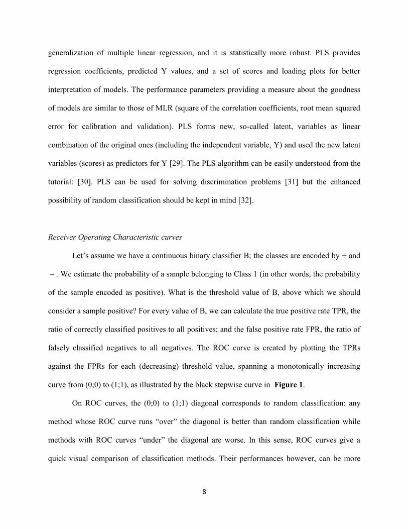
Receiver Operating Characteristic curves
Let’s assume we have a continuous binary classifier B; the classes are encoded by + and
– . We estimate the probability of a sample belonging to Class 1 (in other words, the probability
of the sample encoded as positive). What is the threshold value of B, above which we should
consider a sample positive? For every value of B, we can calculate the true positive rate TPR, the
ratio of correctly classified positives to all positives; and the false positive rate FPR, the ratio of
falsely classified negatives to all negatives. The ROC curve is created by plotting the TPRs
against the FPRs for each (decreasing) threshold value, spanning a monotonically increasing
curve from (0;0) to (1;1), as illustrated by the black stepwise curve in Figure 1.
On ROC curves, the (0;0) to (1;1) diagonal corresponds to random classification: any
method whose ROC curve runs “over” the diagonal is better than random classification while
methods with ROC curves “under” the diagonal are worse. In this sense, ROC curves give a
quick visual comparison of classification methods. Their performances however, can be more

9
accurately quantified with the area under the ROC curve value (AUC). By definition, the AUC
value is a number between 0 and 1 and corresponds to the probability that a randomly chosen
positive sample is ranked higher than a randomly picked negative. It has been shown by Hanley
that the AUC value is equivalent to the Mann-Whitney-Wilcoxon statistic (often termed U-
statistic) [3] . Variances of the AUC values can be calculated based on the formulas by DeLong
and coworkers [17]:
𝑉𝑎𝑟𝑇𝑜𝑡𝑎𝑙 =𝑉𝑎𝑟(𝑝𝑝𝑜𝑠𝑖𝑡𝑖𝑣𝑒)
𝑁𝑝𝑜𝑠𝑖𝑡𝑖𝑣𝑒+
𝑉𝑎𝑟(𝑝𝑛𝑒𝑔𝑎𝑡𝑖𝑣𝑒)
𝑁𝑛𝑒𝑔𝑎𝑡𝑖𝑣𝑒 (1)
𝑉𝑎𝑟(𝑝𝑝𝑜𝑠𝑖𝑡𝑖𝑣𝑒) =1
𝑁𝑝𝑜𝑠𝑖𝑡𝑖𝑣𝑒−1∑ (𝑝𝑖,𝑝𝑜𝑠𝑖𝑡𝑖𝑣𝑒 − 𝐴𝑈𝐶)2𝑁𝑝𝑜𝑠𝑖𝑡𝑖𝑣𝑒
𝑖=1 (2)
𝑉𝑎𝑟(𝑝𝑛𝑒𝑔𝑎𝑡𝑖𝑣𝑒) =1
𝑁𝑛𝑒𝑔𝑎𝑡𝑖𝑣𝑒−1∑ (𝑝𝑗,𝑛𝑒𝑔𝑎𝑡𝑖𝑣𝑒 − (1 − 𝐴𝑈𝐶))2𝑁𝑛𝑒𝑔𝑎𝑡𝑖𝑣𝑒
𝑗=1 (3)
Here, Var means variance, N denotes sample sizes, while [pi,positive/pj,negative] are the (posterior)
probabilities of each [positive/negative] scoring higher than a randomly chosen
[negative/positive]. (The formulas are reproduced from ref. [33]).
By design, ROC curves are “stepwise”, i.e. they consist of horizontal and vertical steps.
Their unique and somewhat deceptive characteristic is that no independent variable is shown on
them: TPR and FPR both depend on the classifier threshold B, which is “hidden”. While
methods exist for the fitting of ROC curves [34,35], they imply the use of advance curve-fitting
techniques and are relatively scarcely used. On the other hand, production of “ROC-like” curves
with a predefined AUC value is easily done with the formula presented recently by Nicholls [33]
based on the work of Hanley and McNeil [3]:
𝑌 = 𝑋1−𝐴𝑈𝐶
𝐴𝑈𝐶 (4)
The colored curves in Figure 1 are ROC curves calculated with the Hanley formula. In contrast
to “real” ROC curves, they are not stepwise, nevertheless their shapes resemble “typical” ROC

10
curves and thus they can make a handy tool for the quick visualization of classifier methods
whose performances cannot be captured on a single ROC curve (such as multiclass classification
methods).
Figure 1
n-Class ROC curves
Our approach to the multi-class ROC analysis of the three-class classification problem presented
in this article is based on the one-versus-all method of Provost and Domingos [15]. Thus, we
calculate AUC values by taking each class as positives (and all the others as negatives) in turn.
The weighted average of these AUC values gives the overall AUC of the given classifier
method:
𝐴𝑈𝐶̅̅ ̅̅ ̅̅ =∑ 𝑁𝑖𝐴𝑈𝐶𝑖𝑛𝑖=1
∑ 𝑁𝑖𝑛𝑖=1
(5)
The weights Ni are the sample sizes of each class. We can visualize an overall ROC curve
for a classifier method by plotting a “ROC-like” curve with the overall AUC value using the
Hanley formula. The variance of the overall AUC value can be calculated with the law of error
propagation [18]:
𝑉𝑎𝑟(𝐴𝑈𝐶̅̅ ̅̅ ̅̅ ) =∑ 𝑁𝑖
2𝑉𝑎𝑟(𝐴𝑈𝐶𝑖)𝑛𝑖=1
∑ 𝑁𝑖2𝑛
𝑖=1
(6)
When comparing more classifier methods, ROC-like curves with AUCs corresponding to
either confidence limits or the mean ± one SD of the overall AUC can also be plotted to decide
whether the performances of the methods differ significantly. In this work, we plot curves
corresponding to the mean ± one SD for the comparison of the methods.
Throughout this work, the classifiers that were used for ROC curve generation are class
membership probabilities for LDA, Random forest and Boosted tree (the higher the better). For

11
PLS-DA, we have calculated for each sample the absolute differences between the predicted
class (continuous) and the current “positive” class (discrete): here, a lower value is better. For
example if we’re plotting the ROC curve where we take “class2” objects as positives, an object
with a predicted class of 1.8 will score better than another with a predicted class of 2.4, as the
absolute difference will be abs(1.8 – 2) = 0.2 for the first one and abs(2.4 – 2) = 0.4 for the
second one. For the other classes, ROC curves are generated in an identical manner, and
afterwards the overall ROC and AUC are calculated from the class-specific ROC curves/AUC
values as detailed above.
Results and discussion
Two datasets were applied for the further statistical analysis: the first one contained the 90
energy drink samples’ spectral data and the second was calculated from the spectral data with
principal component analysis. The results are discussed in two parts based on the used dataset.
Both of the matrices had a categorical variable with the classes of the sugar contents. Usually,
energy drinks contain sugar between zero and 15 g/100ml concentration. The reason of the splits
is that there are commonly used amounts (for example 7,9 or 10,9 g/100ml) which are sometimes
assigned to different blends, moreover it was interesting to notice that most of the producers tend
to avoid sugar contents around 4-5 g/100ml and around 9 g/100ml. Thus we could split the
dataset into three classes, which can be termed low, medium and high sugar content classes. The
classification of the energy drinks with different methods was based on the three sugar content
classes. As we can see later, not just the classification was the final purpose, but the comparison
based on the predictive performance of each method with the use of probability values and ROC

12
curves. In the plots the classes will be labeled as follows: class 1 = under 5 g/100ml; class 2= 5-
10 g/100ml; class 3= above 10 g/100ml. The classification is somewhat arbitrary but it
corresponds to the “natural” groupings of the samples.
I. Spectral dataset
In first case the dataset contained 90 samples and 649 spectral variables. The FT-NIR
spectra were used between the range of 9000 and 4000 cm-1
. The spectra were recorded in
transmission mode. Randomization test (Y-scrambling) and a systematic threefold cross-
validation were used as validation methods in each case. Standardization was used as data
pretreatment.
Results of partial least-squares discriminant analysis (PLS-DA)
For the proper comparison with other methods, the predicted values were used for the creation of
ROC curves. First we wanted to determine the appropriate amount of PLS components (scores)
for the classification. Five components were sufficient for the evaluation based on the PRESS
values (predictive error of sum of squares, see Supplementary Figure S1). Though the three
classes are close to each other (Figure 2), they can be separated with only a few samples being
misclassified.
Figure 2
For the comparison of the correct classifications in the case of PLS-DA, all number of
PLS components were used between one to ten to illustrate how the predictive capability changes
with the use of more PLS scores. Thus, the ROC curves were created based on the predicted
values in the case of each PLS component number. The creation of ROC curves was the same as

13
described in the Materials and methods part. For every PLS component number, an average ROC
curve was made with the use of the average AUC value of the three classes. Figure 3 shows the
final results of PLS-DA, where these average ROC curves for the ten PLS component numbers
are plotted, along with the average curve of the ten cases. This latter curve can be a good option
for the selection of the number of PLS components.
Figure 3
As we can see on Figure 3, the average of the ten ROC curves is near the curves for 4-5
components, which means that if we use five PLS components in this case, it will contain most
of the predictive capability of our dataset and it won’t provide an overfitted or an underfitted
result, either. This component number is the same as given by PRESS values.
As we mentioned earlier, the predicted values for each sample were used for plotting
ROC curves. This case was a little more specific than the cases of other methods. Here we use
the predicted values in the following form: for each of the three classes we checked the nearest
predicted value to the current exact class number, for instance for group three, the nearest one to
three was searched. Then we continued with the second nearest one and so on, until we ordered
all of the samples based on their distance from class three (see also the “n-class ROC curves”
section). We have repeated it with the other two classes. Finally three ROC curves were created
and for better comparison, the average of the AUC values of the three curves was used for the
final evaluation. For plotting the latter one, the Hanley formula was applied, using the average
AUC value. This average ROC curve can be used for the comparison with other methods’ ROC
curves. The five PLS component ROC curve was used for the comparison with other techniques.
Random forest (RF)

14
In the case of random forest, there were two parameters which could be optimized for better
classification, namely the number of trees and the number of predictors. For this purpose the
correct classification rates were calculated for each class in each combination of the parameters
in the following way: first the number of trees was set to ten. It was smaller than the optimum,
but we wanted to find the best predictor number with a smaller number of trees. Afterwards we
have also optimized the number of trees for the determined predictor number. The most robust
predictor number (based on the stabilization of classification rates for each group) was forty,
where the correct classification rates (CC %) for groups 1, 2 and 3 were 0.96; 0.8077; 0.8718
respectively. We have selected the lowest predictor number where the inclusion of more
predictors did not visibly change the CC% rates (i.e. where the CC% reached a plateau, see
Supplementary Figure S2). It is also worth to note that there are some other options to determine
the number of predictor variables, e.g. √M or log2(M+1) – where M is the total number of
variables –, but these definitions work particularly for a smaller number of variables. Then the
optimal number of trees was also determined. The best number of trees was thirty, after that the
correct classification rates did not change (see earlier description and Supplementary Figure S3).
The use of thirty trees leads to an increase of the CC % in the case of group 3 (0.8718 to 0.9487).
Randomization and cross-validation were used for the validation of the classification model.
Instead of the correct classification rates, the probability values for each sample and
group were used for plotting the ROC curves. The probability values were ordered by decreasing
magnitude. The ROC curves of the three groups were averaged here too for the comparison with
the other methods. Figure 4 shows the ROC curves of the groups and the average of them.
Figure 4

15
Boosted tree
The boosted tree method is quite similar to the random forest technique, but here we had to
optimize the number of trees and the number of tree size. For this purpose Figure 5 clearly
shows the global minimum of the average of multinomial deviance (calculated from the
multinomial deviance loss function), which helped to choose the best parameter values for the
classification.
Figure 5a,b
In our case the optimal number of the trees was 41 based on the average multinomial
deviance of the test data (Figure 5a). The test set was randomly generated by bootstrapping a
subset proportion of 50% (from the whole dataset) at each consecutive step. The maximum
number of tree size was three. Cross-validation and a randomization test were also used in the
validation step of the classification model building. Figure 5b clearly shows the difference for
the randomized dataset, because the average multinomial deviance for the test data becomes
larger with the use of more trees. (Usually a global minimum area should appear around the
middle of the graph.)
As in the previous case, the probability values were used for the creation of ROC curves.
Figure 6 shows the three-group ROC curves and the average of them. It is really conspicuous
that this method provides an almost perfect classification model. For better visibility, a
magnified version of the ROC curves was used here.
Figure 6
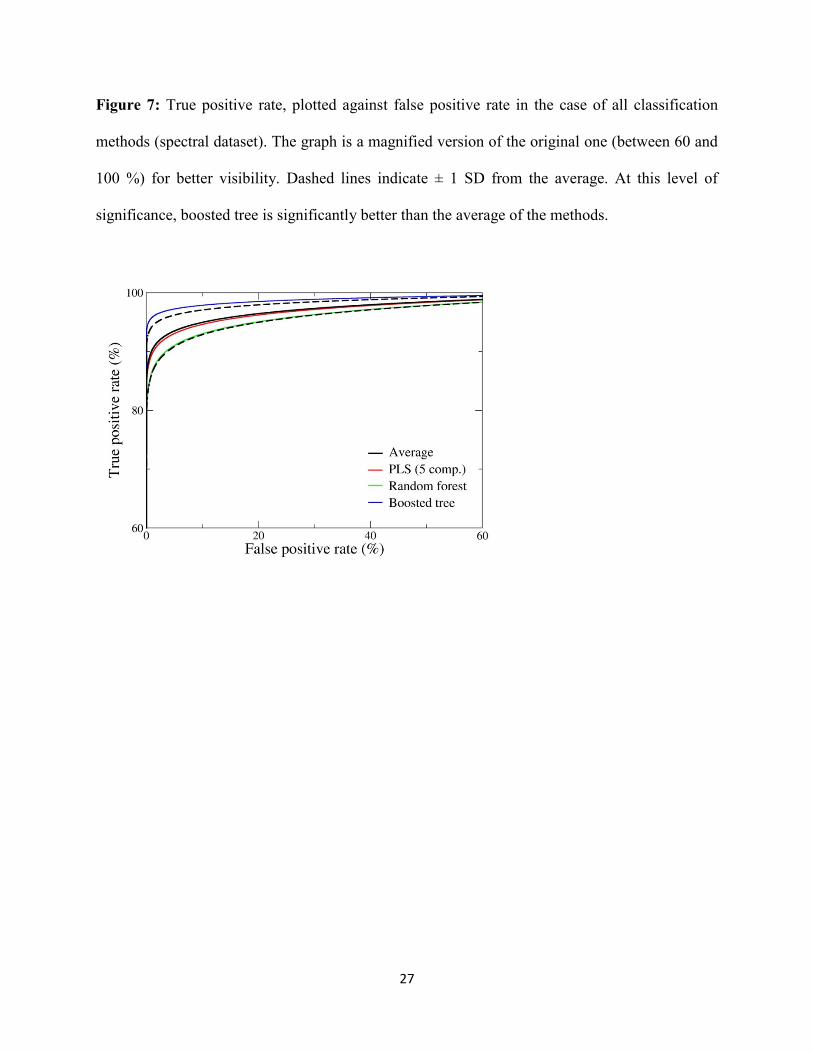
Finally the average ROC curves of the three classification methods were plotted on the
same figure to compare the final results and choose the best one. Five PLS components ROC

16
curve, and the ROC curves for random forest and boosted tree are plotted on Figure 7, along
with their average. Boosted tree was definitely the best one for the energy drink classification
based on the sugar concentration.
Figure 7
Although the other two methods had worse outcomes, we can conclude that all of the
used method can be good choices for the classification of energy drinks, their ROC curves are
much better than the one for random classification. On the other hand it is worth to stress, that
despite being not so frequently used, boosted tree can give reliable results, even improving upon
those for LDA or PLS.
II. PCA scores dataset
In the second case the first ten scores of the principal component analysis were used for the
classification and method comparison to overcome the problem of overfitting in LDA. These ten
components were sufficient for the further evaluation, because they explained more than 99.7 %
of the total variance in the dataset. This version was a more compressed one compared to the
spectral dataset. In the following part we could see that it helped to improve all of the
classification models and open new ways, because linear discriminant analysis (LDA) was also
used with these datasets for the classification and method comparison. In the previous section we
had to omit LDA, because the spectral dataset contained too many variables, and we did not want
to leave out any of them.
Results of PLS-DA

17
In this section the main part of the evaluation was the same as in the spectral data’s PLS-DA
analysis. With the use of ten PCA scores, the plot of the R2 and PRESS values was really simple.
After two PLS scores, the values haven’t changed much. It means that the first two PLS scores
were sufficient for the statistical evaluation. On the other hand we wanted to see, whether it has a
difference, if we plot all of the ten components on ROC curves. For this purpose, the predicted
values in each case were used in the same way as for the spectral dataset and PLS-DA analysis.
Randomization test and cross-validation were also used for the validation of the classification
model. Figure 8 shows the ROC curves with the use of different numbers of PLS scores. It is
interesting to see that the curves do not change after two PLS components, which is also verified
by the selection of the first two PLS components by PRESS values.
Figure 8
Random forest
For the selection of an appropriate number of trees and predictors, the number of predictors (1 to
8) and the number of trees (10 to 80) were plotted with the correct classification rates in each
case. 3D surface plot was used for this with distance weighted least squares fitting. On Figure 9
we can see this 3D graph, which clearly shows that the correct classification rates are increasing
with the use of more trees and predictors, but only for a while. It is being quite constant around
the middle of the plot and after seventy trees it has a little decrease. The selected parameters
were thirty trees and five parameters, which can be seen on the beginning of the “acceptable
region”. These are the smallest parameters that we can use to get a good classification in the
further evaluation. The correct classification rates were one of the highest in this case for each
group.

18
Figure 9
With the use of appropriate parameters the classification model was built and the
probability values for each groups and samples were applied for plotting the ROC curves.
Figure 10 shows the ROC curves of each groups and their average. All of the curves are far
better than the use of random numbers, and if we take a look at the results, there is not much
difference between using spectral data or principal component scores for random forest.
Figure 10
Boosted tree
In this section, two important parameters, namely the number of trees and the maximum tree size
were optimized, as for the previous dataset. Here Figure 11 shows the average multinomial
deviance for train and test data as a function of the number of trees. It can be seen that the global
minimum of the average multinomial deviance was 190 trees. This result suggests that there is an
inverse relationship between the number of trees and the number of original variables, because
for the spectral dataset the used number of trees was much lower (41) than here. Randomization
test and cross-validation were used in the validation step.
Figure 11
After creating the classification model, ROC curves were plotted for the groups of energy
drinks and their average AUC value. Probability values were used for the ROC curves (as for
random forest). Figure 12 shows the curves in a magnified version for better visualization. The
plot is really interesting because it can be seen that both the average curve and the ROC curves
of the groups had very high AUC values (almost 1.0), thus the classification in this case was
outstanding.

19
Figure 12
Linear discriminant analysis (LDA)
The important variables for linear discriminant analysis were selected with backward and
forward stepwise and best subset selection. Also, another model was built with all of the ten PCA
scores. For best subset selection the limit of the variable number was five and Wilks’ lambda
statistic was used as the objective function. For forward stepwise and backward stepwise variable
selection, we included/removed a variable if its inclusion/removal had a significant effect on the
model at the 5% significance level (p to enter/remove = 0.05). Generally we can conclude that
the three groups were classified quite well in all cases (forward stepwise, backward stepwise,
best subset selection and all variables), which can be seen on Figure 13, where the two canonical
scores (roots) are plotted against each other with the use of all of the ten original variables. The
plot shows that LDA analysis with the PCA scores could compress the groups in comparison
with PLS-DA with the spectral dataset. There are some misclassified samples, but their number
is really low.
Figure 13
The results with the different selection methods were compared with the use of
probability values in each group. The ROC curves were created based on the probability values
as in the other cases, and plotted along with their average on Figure 14. The average values were
also calculated with the same procedure as in the previous cases: The best classification model
was created with the use of all variables, best subset selection was the second one and the
forward and backward selections were the last one, but they also had very good AUC values.
Figure 14

20
In the final step a comparative plot with the average ROC curves of each classification
model was plotted, which can be seen on Figure 15. All classification methods have very high
AUC values, but the best one is without doubt the boosted tree method. It was also the best one
in the case of the spectral dataset.
Figure 15
Conclusion
The application of the n-class ROC curves with the Hanley formula and weighted means can be a
really good option for the comparison of classification methods. This approach can replace the
correct classification rates as it can be applied in such cases when they are not available or
require subjective input. Area under the ROC curve (AUC) values can be a good candidate as a
correct classification metric; because they can be used anytime we have probability values or
predicted values for each classified group members. Moreover the improved method can be
applied for as many classes as one has, and the weighted average ROC curves will always give a
good visual feedback and opportunity for comparison.
In the case study we could see that for both the spectral and the PCA scores datasets,
boosted tree was the best method, but all of the methods can be used for the classification of
energy drinks by their sugar content. Nowadays LDA and PLS-DA are more commonly used
techniques than random forest and boosted tree, and a better result for instance with LDA was
expected. In this point view we can conclude that one should try the less commonly used
methods too (such as boosted tree), because they can give as good results as the common
techniques, or even better if they are properly validated.

21
References
[1] W. Peterson, T. Birdsall, W. Fox, The theory of signal detectability, Trans. IRE Prof. Gr.
Inf. Theory. 4 (1954) 171–212. doi:10.1109/TIT.1954.1057460.
[2] W.P. Tanner Jr., J.A. Swets, A decision-making theory of visual detection., Psychol. Rev.
61 (1954) 401–409. http://psycnet.apa.orgjournals/rev/61/6/401 (accessed July 1, 2015).
[3] J.A. Hanley, B.J. McNeil, The meaning and use of the area under a receiver operating
characteristic (ROC) curve., Radiology. 143 (1982) 29–36.
doi:10.1148/radiology.143.1.7063747.
[4] J. Swets, W.P. Tanner, T.G. Birdsall, Decision processes in perception., Psychol. Rev. 68
(1961) 301–340. doi:10.1037/h0040547.
[5] A.N. Jain, A. Nicholls, Recommendations for evaluation of computational methods., J.
Comput. Aided. Mol. Des. 22 (2008) 133–9. doi:10.1007/s10822-008-9196-5.
[6] D. Mossman, Three-way ROCs, Med. Decis. Mak. 19 (1999) 78–89.
doi:10.1177/0272989X9901900110.
[7] C. Ferri, J. Hernández-Orallo, M.A. Salido, Volume under the ROC Surface for Multi-
class Problems, in: Mach. Learn. ECML 2003, Cavtat-Dubrovnik, Croatia, 2003: pp. 108–
120.
[8] J.E. Fieldsend, R.M. Everson, Visualisation of multi-class ROC surfaces, in: ICML 2005
Work. ROC Anal. Mach. Learn., Bonn, Germany, 2005.
https://ore.exeter.ac.uk/repository/handle/10871/11691.
[9] C.M. Fonseca, P.J. Fleming, Genetic Algorithms for Multiobjective Optimization:
Formulation, Discussion and Generalization, in: Proc. Fifth Int. Conf. Genet. Algorithms,
Morgan Kauffman, 1993: pp. 416–423.
http://citeseer.ist.psu.edu/viewdoc/summary?doi=10.1.1.48.9077 (accessed July 3, 2015).
[10] T. Kohonen, Self-organising maps, Springer, 1995.
[11] B. Diri, S. Albayrak, Visualization and analysis of classifiers performance in multi-class
medical data, Expert Syst. Appl. 34 (2008) 628–634. doi:10.1016/j.eswa.2006.10.016.
[12] D.J. Hand, R.J. Till, A simple generalization of the area under the ROC curve to multiple
class classification problems, Mach. Learn. 45 (2001) 171–186.
[13] T. Landgrebe, R. Duin, A simplified extension of the area under the ROC to the multiclass
domain, in: 17th Annu. Symp. Pattern Recognit. Assoc. South Africa, 2006: pp. 241–245.

22
http://scholar.google.com/scholar?hl=en&btnG=Search&q=intitle:A+simplified+extensio
n+of+the+Area+under+the+ROC+to+the+multiclass+domain#0.
[14] T.C.W. Landgrebe, R.P.W. Duin, Approximating the multiclass ROC by pairwise
analysis, Pattern Recognit. Lett. 28 (2007) 1747–1758. doi:10.1016/j.patrec.2007.05.001.
[15] F. Provost, P. Domingos, Well-Trained PETs: Improving probability estimation trees,
2001. doi:10.1.1.33.309.
[16] A.C. Patel, M.K. Markey, Comparison of three-class classification performance metrics: a
case study in breast cancer CAD, in: M.P. Eckstein, Y. Jiang (Eds.), Med. Imaging,
International Society for Optics and Photonics, San Diego, CA, USA, 2005: pp. 581–589.
doi:10.1117/12.595763.
[17] E.R. DeLong, D.M. DeLong, D.L. Clarke-Pearson, Comparing the Areas under Two or
More Correlated Receiver Operating Characteristic Curves: A Nonparametric Approach,
Biometrics. 44 (1988) 837–845.
http://www.jstor.org/stable/2531595?seq=1#page_scan_tab_contents (accessed June 23,
2015).
[18] H.H. Ku, Notes on the use of propagation of error formulas, J. Res. Natl. Bur. Stand. Sect.
C Eng. Instrum. 70C (1966) 263–273. doi:10.6028/jres.070C.025.
[19] C.D. Brown, H.T. Davis, Receiver operating characteristics curves and related decision
measures: A tutorial, Chemom. Intell. Lab. Syst. 80 (2006) 24–38.
doi:10.1016/j.chemolab.2005.05.004.
[20] S.A. Shaikh, Measures Derived from a 2 x 2 Table for an Accuracy of a Diagnostic Test,
J. Biom. Biostat. 2 (2011) 128. doi:10.4172/2155-6180.1000128.
[21] S. Wold, Pattern recognition by means of disjoint principal components models, Pattern
Recognit. 8 (1976) 127–139. doi:10.1016/0031-3203(76)90014-5.
[22] R.G. Brereton, One-class classifiers, J. Chemom. 25 (2011) 225–246.
doi:10.1002/cem.1397.
[23] D.H. Wolpert, W.G. Macready, No free lunch theorems for optimization, IEEE Trans.
Evol. Comput. 1 (1997) 67–82. doi:10.1109/4235.585893.
[24] P.S. Gromski, E. Correa, A.A. Vaughan, D.C. Wedge, M.L. Turner, R. Goodacre, A
comparison of different chemometrics approaches for the robust classification of
electronic nose data, Anal. Bioanal. Chem. 406 (2014) 7581–7590. doi:10.1007/s00216-
014-8216-7.
[25] S. Wold, K. Esbensen, P. Geladi, Principal component analysis, Chemom. Intell. Lab.
Syst. 2 (1987) 37–52. doi:10.1016/0169-7439(87)80084-9.

23
[26] T. Hastie, R. Tibshirani and J. Friedman, Linear Discriminant Analysis, in: Elements of
Statistical Learning. Data Mining, Inference, Prediction, Springer, New York, NY, USA,
2009: 2nd
.ed., Chapter 4.3, pp. 106-119.
[27] L. Breiman, Random Forests, Mach. Learn. 45 (n.d.) 5–32.
doi:10.1023/A:1010933404324.
[28] T. Hastie, R. Tibshirani and J. Friedman, Boosting trees, in: Elements of Statistical
Learning. Data Mining, Inference, Prediction, Springer, New York, NY, USA, 2009:
2nd
.ed., Chapters 10.5 and 10.6., pp. 345-350.
[29] R.G. Brereton, G.R. Lloyd, Partial least squares discriminant analysis: taking the magic
away, J. Chemom. 28 (2014) 213–225. doi:10.1002/cem.2609.
[30] P. Geladi, B.R. Kowalski, Partial least-squares regression: a tutorial, Anal. Chim. Acta.
185 (1986) 1–17. doi:10.1016/0003-2670(86)80028-9.
[31] M. Barker, W. Rayens, Partial least squares for discrimination, J. Chemom. 17 (2003)
166–173. doi:10.1002/cem.785.
[32] K. Kjeldahl, R. Bro, Some common misunderstandings in chemometrics, J. Chemom. 24
(2010) 558–564. doi:10.1002/cem.1346.
[33] A. Nicholls, Confidence limits, error bars and method comparison in molecular modeling.
Part 1: the calculation of confidence intervals., J. Comput. Aided. Mol. Des. 28 (2014)
887–918. doi:10.1007/s10822-014-9753-z.
[34] J.A. Hanley, The robustness of the “binormal” assumptions used in fitting ROC curves.,
Med. Decis. Mak. 8 (1988) 197–203. http://www.ncbi.nlm.nih.gov/pubmed/3398748
(accessed July 2, 2015).
[35] C.J. Lloyd, Fitting Roc Curves Using Non-linear Binomial Regression, Aust. N. Z. J. Stat.
42 (2000) 193–204. doi:10.1111/1467-842X.00118.

24
Caption to figures
Figure 1. A “real” ROC curve (black stepwise line) and four artificial ROC curves based on the
Hanley-formula. (Note that the blue curve with AUC = 0.5 is identical to the diagonal.)
Figure 2: The second PLS component, plotted against the first PLS component.

25
Figure 3: True positive rate plotted against false positive rate in the case of PLS-DA (spectral
dataset). The graph is a magnified version of the original one (between 60 and 100 %) for better
visibility. The AUC values increase with the number of PLS components from down to top.
Figure 4: True positive rate plotted against false positive rate in the case of random forest
(spectral dataset). Dashed lines indicate ± 1 SD from the average.

26
Figure 5a,b: The average multinomial deviance plotted against the number of trees for the
original evaluation (a) and the randomized dataset (b). The optimal number is marked with a
vertical line.
Figure 6: True positive rate, plotted against false positive rate for the boosted tree method
(spectral dataset). The graph is a magnified version of the original one (between 60 and 100 %)
for better visibility. Dashed lines indicate ± 1 SD from the average.
27
Figure 7: True positive rate, plotted against false positive rate in the case of all classification
methods (spectral dataset). The graph is a magnified version of the original one (between 60 and
100 %) for better visibility. Dashed lines indicate ± 1 SD from the average. At this level of
significance, boosted tree is significantly better than the average of the methods.

28
Figure 8: True positive rate plotted against false positive rate in the case of PLS-DA (PCA
scores dataset). The graph is a magnified version of the original one (between 60 and 100 %) for
the better visibility. The curves are really close to each other most of the time, thus they can’t be
differentiated in each case.

29
Figure 9: 3D plot of correct classifications, number of the trees and number of the predictors for
the parameter selection for random forest. Distance weighted least squares fitting was used for
the plot.
Figure 10: True positive rate plotted against false positive rate for random forest (PCA scores
dataset). Dashed lines indicate ± 1 SD from the average.

30
Figure 11: The average multinomial deviance was plotted against the number of trees in the case
of boosted tree method (PCA scores dataset). The optimal number of trees is marked with
vertical line.
Figure 12: The true positive rate plotted against the false positive rate for boosted tree (PCA
scores dataset). The plot is the magnified version of the original one for better visualization.
Dashed lines indicate ± 1 SD from the average.

31
Figure 13: The LDA canonical scores (roots) are plotted against each other. The three examined
energy drink groups are clearly separable.

32
Figure 14: Comparison of the ROC curves with different variable selection methods. True
positive rates are plotted against false positive rates. The plot is the magnified version of the
original one for the better visualization. Dashed lines indicate ± 1 SD from the average. At this
level of significance, using all variables performs significantly better than the average of the four
approaches.

33
Figure 15: The final comparison of the four used classification methods for the PCA scores
dataset. The plot is the magnified version of the original one for better visualization. Dashed
lines indicate ± 1 SD from the average. At this level of significance, boosted tree is significantly
better than the average, while all other methods can be considered equivalent.