r 2.13-six sigma-with_r_-_a_tutorial-en-us
TRANSCRIPT

R 2.13
Six Sigma with R - A TutorialAn introduction to using R for Six Sigma
John McDonough

Six Sigma with R - A Tutorial Draft
R 2.13 Six Sigma with R - A TutorialAn introduction to using R for Six SigmaEdition 0
Author John McDonough [email protected]
Copyright © 2011 The Fedora Project.
The text of and illustrations in this document are licensed by Red Hat under a Creative CommonsAttribution–Share Alike 3.0 Unported license ("CC-BY-SA"). An explanation of CC-BY-SA is availableat http://creativecommons.org/licenses/by-sa/3.0/. The original authors of this document, and Red Hat,designate the Fedora Project as the "Attribution Party" for purposes of CC-BY-SA. In accordance with CC-BY-SA, if you distribute this document or an adaptation of it, you must provide the URL for the originalversion.
Red Hat, as the licensor of this document, waives the right to enforce, and agrees not to assert, Section4d of CC-BY-SA to the fullest extent permitted by applicable law.
Red Hat, Red Hat Enterprise Linux, the Shadowman logo, JBoss, MetaMatrix, Fedora, the Infinity Logo,and RHCE are trademarks of Red Hat, Inc., registered in the United States and other countries.
For guidelines on the permitted uses of the Fedora trademarks, refer to https://fedoraproject.org/wiki/Legal:Trademark_guidelines.
Linux® is the registered trademark of Linus Torvalds in the United States and other countries.
Java® is a registered trademark of Oracle and/or its affiliates.
XFS® is a trademark of Silicon Graphics International Corp. or its subsidiaries in the United States and/orother countries.
MySQL® is a registered trademark of MySQL AB in the United States, the European Union and othercountries.
All other trademarks are the property of their respective owners.
Six Sigma projects typically involve a significant amount of statistical anaysis. Black Belts commonlyuse Minitab or JMP to perform these analyses. These products are fairly limited in capability and quiteexpensive. This document provides an overview of using the very capable open source application R toperform those analyses common in Six Sigma projects.

Draft Draft
iii
Preface v1. Document Conventions ......................................................................................................... v
1.1. Typographic Conventions ........................................................................................... v1.2. Pull-quote Conventions .............................................................................................. vi1.3. Notes and Warnings ................................................................................................. vii
2. We Need Feedback! ............................................................................................................ vii
1. Introduction 1
2. An Example R Session 3
3. Getting Data into R 53.1. Reading tabular data ......................................................................................................... 53.2. Reading delimited data ...................................................................................................... 53.3. Header Rows and Columns in Tabular Data ........................................................................ 63.4. Using Database Data ......................................................................................................... 7
4. A Simple Look at Data 94.1. Plotting ............................................................................................................................ 104.2. Simple Statistics .............................................................................................................. 154.3. Checking for Normality ..................................................................................................... 16
5. Customizing Plots 195.1. Adjusting the Background Color ........................................................................................ 195.2. Changing the Color of Plot Elements ................................................................................ 205.3. Annotating Graphs ........................................................................................................... 215.4. Changing the Plotting Character ....................................................................................... 255.5. Graphics Devices ............................................................................................................. 255.6. Even More Customization ................................................................................................. 27
6. Scripts and Functions in R 316.1. Using R in Parallel with an Editor ..................................................................................... 316.2. Scripts with R .................................................................................................................. 326.3. Functions in R ................................................................................................................. 34
7. Control Charts 377.1. The qcc package ............................................................................................................. 387.2. XBar Charts ..................................................................................................................... 387.3. Tailoring qcc charts .......................................................................................................... 407.4. R Charts ......................................................................................................................... 427.5. Other types of control charts ............................................................................................ 44
7.5.1. The xbar.one chart ................................................................................................ 447.5.2. The S chart .......................................................................................................... 447.5.3. The p chart ........................................................................................................... 447.5.4. The np chart ......................................................................................................... 447.5.5. The c chart ........................................................................................................... 447.5.6. The u chart ........................................................................................................... 44
7.6. Autocorrelation ................................................................................................................. 447.7. EMWA Charts .................................................................................................................. 447.8. Cusum charts .................................................................................................................. 44
8. Process Capability 45
9. Hypothesis Testing 47

Six Sigma with R - A Tutorial Draft
iv
10. Gage R&R 49
11. Comparing Groups 51
12. Pareto Charts 53
13. Ishikawa Diagrams 55
14. Regression Modeling 57
15. Logistic Regression 59
16. Experimental Design 61
17. Principal Component Analysis 63
18. Simulation 65
19. Conclusion 67
A. Revision History 69
Index 71

Draft Draft
v
Preface
1. Document ConventionsThis manual uses several conventions to highlight certain words and phrases and draw attention tospecific pieces of information.
In PDF and paper editions, this manual uses typefaces drawn from the Liberation Fonts1 set. TheLiberation Fonts set is also used in HTML editions if the set is installed on your system. If not, alternativebut equivalent typefaces are displayed. Note: Red Hat Enterprise Linux 5 and later includes the LiberationFonts set by default.
1.1. Typographic ConventionsFour typographic conventions are used to call attention to specific words and phrases. These conventions,and the circumstances they apply to, are as follows.
Mono-spaced Bold
Used to highlight system input, including shell commands, file names and paths. Also used to highlightkeycaps and key combinations. For example:
To see the contents of the file my_next_bestselling_novel in your current workingdirectory, enter the cat my_next_bestselling_novel command at the shell promptand press Enter to execute the command.
The above includes a file name, a shell command and a keycap, all presented in mono-spaced bold andall distinguishable thanks to context.
Key combinations can be distinguished from keycaps by the hyphen connecting each part of a keycombination. For example:
Press Enter to execute the command.
Press Ctrl+Alt+F2 to switch to the first virtual terminal. Press Ctrl+Alt+F1 to returnto your X-Windows session.
The first paragraph highlights the particular keycap to press. The second highlights two key combinations(each a set of three keycaps with each set pressed simultaneously).
If source code is discussed, class names, methods, functions, variable names and returned valuesmentioned within a paragraph will be presented as above, in mono-spaced bold. For example:
File-related classes include filesystem for file systems, file for files, and dir fordirectories. Each class has its own associated set of permissions.
Proportional Bold
1 https://fedorahosted.org/liberation-fonts/
Preface Draft
vi
This denotes words or phrases encountered on a system, including application names; dialog box text;labeled buttons; check-box and radio button labels; menu titles and sub-menu titles. For example:
Choose System → Preferences → Mouse from the main menu bar to launch MousePreferences. In the Buttons tab, click the Left-handed mouse check box and clickClose to switch the primary mouse button from the left to the right (making the mousesuitable for use in the left hand).
To insert a special character into a gedit file, choose Applications → Accessories→ Character Map from the main menu bar. Next, choose Search → Find… from theCharacter Map menu bar, type the name of the character in the Search field and clickNext. The character you sought will be highlighted in the Character Table. Double-clickthis highlighted character to place it in the Text to copy field and then click the Copybutton. Now switch back to your document and choose Edit → Paste from the geditmenu bar.
The above text includes application names; system-wide menu names and items; application-specificmenu names; and buttons and text found within a GUI interface, all presented in proportional bold and alldistinguishable by context.
Mono-spaced Bold Italic or Proportional Bold Italic
Whether mono-spaced bold or proportional bold, the addition of italics indicates replaceable orvariable text. Italics denotes text you do not input literally or displayed text that changes depending oncircumstance. For example:
To connect to a remote machine using ssh, type ssh [email protected] at ashell prompt. If the remote machine is example.com and your username on that machineis john, type ssh [email protected].
The mount -o remount file-system command remounts the named file system.For example, to remount the /home file system, the command is mount -o remount /home.
To see the version of a currently installed package, use the rpm -q package command.It will return a result as follows: package-version-release.
Note the words in bold italics above — username, domain.name, file-system, package, version andrelease. Each word is a placeholder, either for text you enter when issuing a command or for textdisplayed by the system.
Aside from standard usage for presenting the title of a work, italics denotes the first use of a new andimportant term. For example:
Publican is a DocBook publishing system.
1.2. Pull-quote ConventionsTerminal output and source code listings are set off visually from the surrounding text.
Output sent to a terminal is set in mono-spaced roman and presented thus:
books Desktop documentation drafts mss photos stuff svn
Draft Notes and Warnings
vii
books_tests Desktop1 downloads images notes scripts svgs
Source-code listings are also set in mono-spaced roman but add syntax highlighting as follows:
package org.jboss.book.jca.ex1;
import javax.naming.InitialContext;
public class ExClient{ public static void main(String args[]) throws Exception { InitialContext iniCtx = new InitialContext(); Object ref = iniCtx.lookup("EchoBean"); EchoHome home = (EchoHome) ref; Echo echo = home.create();
System.out.println("Created Echo");
System.out.println("Echo.echo('Hello') = " + echo.echo("Hello")); }}
1.3. Notes and WarningsFinally, we use three visual styles to draw attention to information that might otherwise be overlooked.
Note
Notes are tips, shortcuts or alternative approaches to the task at hand. Ignoring a note should haveno negative consequences, but you might miss out on a trick that makes your life easier.
Important
Important boxes detail things that are easily missed: configuration changes that only apply to thecurrent session, or services that need restarting before an update will apply. Ignoring a box labeled'Important' will not cause data loss but may cause irritation and frustration.
Warning
Warnings should not be ignored. Ignoring warnings will most likely cause data loss.
2. We Need Feedback!If you find a typographical error in this manual, or if you have thought of a way to make this manual better,we would love to hear from you! Please submit a report in Bugzilla: http://bugzilla.redhat.com/bugzilla/against the product R.

Preface Draft
viii
When submitting a bug report, be sure to mention the manual's identifier: Six_Sigma_with_R_-_A_Tutorial
If you have a suggestion for improving the documentation, try to be as specific as possible whendescribing it. If you have found an error, please include the section number and some of the surroundingtext so we can find it easily.

Draft Chapter 1. Draft
1
IntroductionSix Sigma projects typically involve a significant amount of statistical anaysis. Black Belts commonlyuse Minitab or JMP to perform these analyses. These products are fairly limited in capability and quiteexpensive. This document provides an overview of using the very capable open source application R toperform those analyses common in Six Sigma projects. R is a free and open source software tool. Often,individuals wishing to perform the types of analysis employed in Six Sigma are frustrated by the limitationsof the tools at their disposal, and the cost of more capable tools. R avoids those frustrations.
R is an extremely versatile and powerful statistical tool. However, unlike the commercial desktop tools,R is a command-line application. The command line makes it easier to replicate analyses, make subtlechanges to analyses in a controlled fashion, and use revision control tools to manage those analyses.There are a number of graphical user interfaces available for R, however this paper will not address them.
This paper does not attempt to teach the reader to become a Six Sigma Black Belt. Becoming aneffective Six Sigma Black Belt requires far more than a little statistics, and should be achieved under thementorship of an experienced Master Black Belt. Rather, this article discusses how common analysesused in Six Sigma may be performed using R.

2
Draft Chapter 2. Draft
3
An Example R SessionThis chapter needs to be replaced
This section is essentially the same as the example in the R introduction shipped with R. It needs tobe replaced with an example more germane to Black Belts.
R is invoked from the command line by issuing the command R. After a rather lengthy header, the user ispresented with a friendly > prompt:
[jjmcd@Cimbaoth R]$ R
R version 2.13.0 (2011-04-13)Copyright (C) 2011 The R Foundation for Statistical ComputingISBN 3-900051-07-0Platform: i386-redhat-linux-gnu (32-bit)
R is free software and comes with ABSOLUTELY NO WARRANTY.You are welcome to redistribute it under certain conditions.Type 'license()' or 'licence()' for distribution details.
Natural language support but running in an English locale
R is a collaborative project with many contributors.Type 'contributors()' for more information and'citation()' on how to cite R or R packages in publications.
Type 'demo()' for some demos, 'help()' for on-line help, or'help.start()' for an HTML browser interface to help.Type 'q()' to quit R.
>
In R, objects may be scalars, vectors or matrices. Since in statistics, vectors and matrices are far morecommon than scalars, scalars are actually matrices with only one element.
The rnorm() function will generate a vector of length n of normally distributed random numbers wheninvoked with n. If invoked with a vector, it will return a vector of the same length.
> x <- rnorm(50)> y <- rnorm(x)
Typing the name of an object will cause its value to be displayed.
> x [1] 1.243876970 0.547453690 -1.727531027 -0.436034735 0.065133143 [6] 0.006555023 0.083376593 -0.244198944 0.552114137 -0.313153977[11] -1.121540146 0.270685664 2.039779745 -0.317617995 -0.092834160[16] -1.324416196 -1.233351161 -0.398695870 0.381098559 -0.309624353[21] -0.989753419 1.933498742 0.852212695 -0.439848456 -0.787993018

Chapter 2. An Example R Session Draft
4
[26] 0.036423778 -0.892993553 -1.293365984 1.889555924 -1.353371853[31] -0.278990118 -0.223675247 -0.032193785 -0.022817147 -0.593560036[36] -0.559268340 -0.649698205 -0.088174802 -0.305720902 1.423407354[41] -1.891622767 -0.626292425 1.209976820 -0.011212683 -1.538639608[46] -0.225681919 -1.994199547 1.253415763 -0.410275599 0.721677157>
A simple scatter plot of the data is easily generated with the plot() function:
> plot(x,y)
Figure 2.1. Test Plot
Although this plot is fairly crude, the plot() function has many options permitting great control over thegenerated plot.
The objects currently in memory can be viewed simply using the ls() function:
> ls()[1] "x" "y"
And similarly, objects no longer needed may be simply removed by means of the rm() function:
> rm(x,y)

Draft Chapter 3. Draft
5
Getting Data into RThe first order of business when preparing for any sort of analysis is collecting the data and gettingit into a usable form. R can use data in many different forms. Data are commonly available in tabularform, separated either by spaces or tabs, or delimited by some character, typically a comma, from aspreadsheet or similar application.
3.1. Reading tabular dataTabular data may be read into an array with the read.table() function. Suppose, for example, we havea file containing data in columns, each column separated by a number of spaces, such as the following:
1 10 1002 20 2003 30 3014 31 399
Assuming the file has the name Spaces.txt, the file can be read into R as follows:
> data <- read.table("Spaces.txt")> data V1 V2 V31 1 10 1002 2 20 2003 3 30 3014 4 31 399>
The data are read into an array we have named data and as before, simply by typing the name of theobject we can see it's value.
Notice that the <- symbol is used as an assignment operator. In this case it means take the result from theread.table() function and assign it to the object data. Since read.table() results in an array, datais also an array.
The = symbol may also be used as an assignment operator, however, it is more easily confused with theequality operator, so it is generally prefereble to choose the <- symbol.
Had the columns been separated by tabs rather than spaces the result would have been the same.
3.2. Reading delimited dataData are often available separated by some special character, most commonly a comma. Theread.table() function can read this data too, however, we must specify the delimiting symbol with thesep parameter.
Using the same data but this time formatted with commas:
1,10,100

Chapter 3. Getting Data into R Draft
6
2,20,2003,30,3014,31,399
Assuming the file has the name Csv.txt, the file can be read into R as follows:
> data <- read.table("Csv.txt",sep=",")> data V1 V2 V31 1 10 1002 2 20 2003 3 30 3014 4 31 399>
Notice that the result is the same, Other applications might use a semicolon, slash or other character as adelimiter; with R we merely specify the delimiter to be able to use the data.
3.3. Header Rows and Columns in Tabular DataBy default, R assumes the input file contains only data, and it names each column with the creative namesV1, V2, V3, etc. However, your data may contain a row of column names. In this case, you can use theheader parameter on the read.table() function to notify R to treat the first row as column names.
For example, suppose you had the following data:
Moe Larry Curly1 10 1002 20 2003 30 301
Then a command like:
> myData <- read.table("SpacesH.txt",header=TRUE)
would read the data this time using names from the first row:
> myData Moe Larry Curly1 1 10 1002 2 20 2003 3 30 3014 4 31 399>
Similarly, the row.names parameter identifies the column which contains the row names. With a file like:
When Moe Larry CurlyToday 1 10 100

Draft Using Database Data
7
Yesterday 2 20 200Tomorrow 3 30 301Someday 4 31 399
each observation will have an associated name:
> a <- read.table("ColNames.txt",header=TRUE,row.names=1)> a Moe Larry CurlyToday 1 10 100Yesterday 2 20 200Tomorrow 3 30 301Someday 4 31 399>
3.4. Using Database DataWhen multiple people are working on a dataset, individual text data files can become unweildy. Also, largeamounts of data can be difficult to work with in text files. The answer, of course, is to use a database.
R supports connections to most of the popular databases. For each database there is a package that mustbe used to add the commands for the particular database to R's skill set. For our example, we will use thevery popular MySQL database, but connections to other databases, and to ODBC data sources are verysimilar.
The first step is to include the library for the database:
> library(RMySQL)
Next, a connection to the database must be established. This requires providing the database name andoptionally the user, password and perhaps even host name:
> con <- dbConnect(dbDriver("MySQL"), dbname = "myDB",+ user="R", password = "mypass" )
Once the connection is established, a table may be read not unlike a tabular text file. Notice that we mustprovide not only the name of the table, but also the connection which identifies the database (we couldhave connections to multiple databases):
> d1 <- dbReadTable(con,"table3")> summary(d1) alpha beta gamma delta Min. : 5.004 Min. : 86.85 Min. : 744.1 Min. :3.013 1st Qu.:152.649 1st Qu.:1755.42 1st Qu.: 6191.1 1st Qu.:3.125 Median :292.579 Median :3081.68 Median :10907.9 Median :3.349 Mean :306.351 Mean :3210.23 Mean :11417.2 Mean :3.464 3rd Qu.:485.733 3rd Qu.:4902.08 3rd Qu.:17295.0 3rd Qu.:3.743 Max. :685.431 Max. :6962.24 Max. :24607.4 Max. :4.882 >

Chapter 3. Getting Data into R Draft
8
Of course, the database offers additional functionality. Key among the database capabilities is the abilityto select a portion of a particular table for analysis. From R, a simple SQL query can be passed to thedatabase:
> d2 <- dbGetQuery(con,paste(+ "SELECT alpha, beta FROM table3 WHERE gamma<10000"+ ))> summary(d2) alpha beta Min. : 5.004 Min. : 86.85 1st Qu.: 66.554 1st Qu.: 836.53 Median :132.986 Median :1489.23 Mean :140.027 Mean :1548.73 3rd Qu.:214.739 3rd Qu.:2357.75 Max. :274.571 Max. :2783.47 >
Notice that whenever we retrieve data from the database, the columns are named with the database fieldnames, instead of the V1, V2, V3 names.

Draft Chapter 4. Draft
9
A Simple Look at DataWhen first encountering a set of data, one first wants to get a "feel" for the data. R has a number of waysto do this. We have already seen that, when the dataset is small, an obvious thing to do is simply list thedata:
> a <- read.table("ColNames.txt",header=TRUE,row.names=1)> a Moe Larry CurlyToday 1 10 100Yesterday 2 20 200Tomorrow 3 30 301Someday 4 31 399>
R includes a number of sample datasets which can be accessed through the data() function. Typingdata() with no arguments will display a list of the available datasets. We will use the ChickWeight dataset in the examples in this section.
When there is more data, the summary() function can give us a good overview:
> data(ChickWeight)> summary(ChickWeight) weight Time Chick Diet Min. : 35.0 Min. : 0.00 13 : 12 1:220 1st Qu.: 63.0 1st Qu.: 4.00 9 : 12 2:120 Median :103.0 Median :10.00 20 : 12 3:120 Mean :121.8 Mean :10.72 10 : 12 4:118 3rd Qu.:163.8 3rd Qu.:16.00 17 : 12 Max. :373.0 Max. :21.00 19 : 12 (Other):506 >
Notice that the weight and Time columns are shown differently than the Chick and Diet. That isbecause the first two are numerical data, and the second two categorical. For the categorical columns Rdisplays the number of observations for each category.

Chapter 4. A Simple Look at Data Draft
10
4.1. PlottingR can easily give us plots, too. We can plot specific pairs of variables:
> plot(ChickWeight$Time,ChickWeight$weight)
results in a simple scatter diagram:
Figure 4.1. Scatter Diagram

Draft Plotting
11
If there are only a few columns in the dataset, specifying the entire array will produce a grid of scatter plotsof each column versus every other:
> plot(ChickWeight)
Figure 4.2. Multiple Scatter Diagram

Chapter 4. A Simple Look at Data Draft
12
If the X axis is a categorical, rather than numerical, variable, R will produce a box plot of the data.
> plot(ChickWeight$Diet,ChickWeight$weight)
yeilds:
Figure 4.3. Box Plot
There is also a boxplot() function with parameters specific to box plots.
Draft Plotting
13
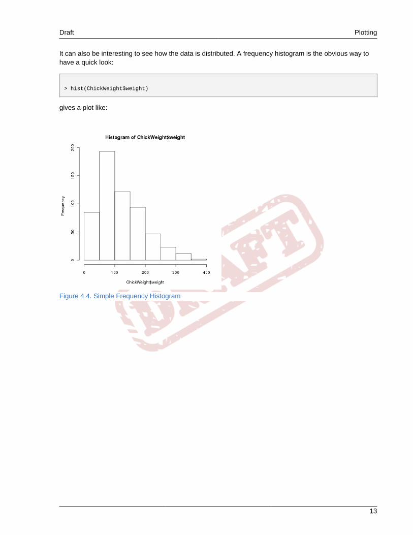
It can also be interesting to see how the data is distributed. A frequency histogram is the obvious way tohave a quick look:
> hist(ChickWeight$weight)
gives a plot like:
Figure 4.4. Simple Frequency Histogram

Chapter 4. A Simple Look at Data Draft
14
The histogram can be enhanced in a number of ways. The breaks parameter can adjust the number ofbars, a density() line can be plotted with the lines() function, and rug() can show individual ticmarks along the X axis for each observation.
> hist(ChickWeight$weight,breaks=20)> lines(density(ChickWeight$weight,bw="SJ"))> rug(ChickWeight$weight)
(although in this particular case the density line is not especially useful.)
Figure 4.5. Customized Frequency Histogram
Draft Simple Statistics
15
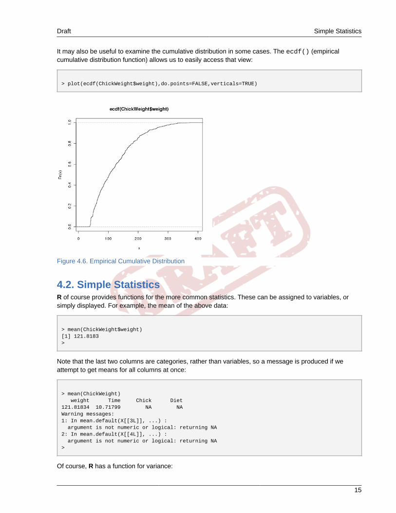
It may also be useful to examine the cumulative distribution in some cases. The ecdf() (empiricalcumulative distribution function) allows us to easily access that view:
> plot(ecdf(ChickWeight$weight),do.points=FALSE,verticals=TRUE)
Figure 4.6. Empirical Cumulative Distribution
4.2. Simple StatisticsR of course provides functions for the more common statistics. These can be assigned to variables, orsimply displayed. For example, the mean of the above data:
> mean(ChickWeight$weight)[1] 121.8183>
Note that the last two columns are categories, rather than variables, so a message is produced if weattempt to get means for all columns at once:
> mean(ChickWeight) weight Time Chick Diet 121.81834 10.71799 NA NA Warning messages:1: In mean.default(X[[3L]], ...) : argument is not numeric or logical: returning NA2: In mean.default(X[[4L]], ...) : argument is not numeric or logical: returning NA>
Of course, R has a function for variance:

Chapter 4. A Simple Look at Data Draft
16
> var(ChickWeight$weight)[1] 5051.223>
The sd() function computes the standard deviation:
> sd(ChickWeight) weight Time Chick Diet 71.071960 6.758400 14.568795 1.162678 >
Skewness can be determined with the cum3() function which is part of the boot library.
> library(boot)> cum3(ChickWeight$weight)[1] 345997.7>
4.3. Checking for NormalityA distribution-comparison plot gives a quick feel for how close to normal the data are. The values areplotted against expected values were the data normal. A straight line is generally added to the pointsshowing the normal expectation.

Draft Checking for Normality
17
This plot is actually two plots, one over the other. The first plots the data, and the second plots theexpected normal line:
> qqnorm(ChickWeight$weight)> qqline(ChickWeight$weight)
resulting in:
Figure 4.7. Distribution-Comparison Plot
A more formal test for normality is the Shapiro-Wilk test:
> shapiro.test(ChickWeight$weight)
Shapiro-Wilk normality test
data: ChickWeight$weight W = 0.9087, p-value < 2.2e-16
Setting up a Kolmogorov-Smirnov test is slightly more involved (and it turns out it doesn't work well for thisdata).
> ks.test(ChickWeight$weight, "pnorm",+ mean=mean(ChickWeight$weight),+ sd=sqrt(var(ChickWeight$weight))+ )
One-sample Kolmogorov-Smirnov test
data: ChickWeight$weight D = 0.1202, p-value = 1.108e-07alternative hypothesis: two-sided

Chapter 4. A Simple Look at Data Draft
18
Warning message:In ks.test(ChickWeight$weight, "pnorm", mean = mean(ChickWeight$weight), : cannot compute correct p-values with ties>

Draft Chapter 5. Draft
19
Customizing PlotsSix Sigma is all about making the data, and the decisions, visible. Visible usually means graphical, and itis often important to have visually appealing graphics. So far, all the plots we have examined have beendull, black on white plots. While these may be fine for academic papers, they typically aren't the kinds ofplots we would like for a Six Sigma storyboard.
However, R provides an almost endless variety in the way plots may be customized. In this section someof the more common customizations are examined.
5.1. Adjusting the Background ColorMost of the plot customizations may be applied directly on the plot(), hist(), qqnorm() or otherplotting function. However, the background color can only be adjusted with the par() function. (There isa background color parameter on the plot() function, but it affects the background color of the symbols,rather than the plot as a whole.)
The par() function sets "permanent" plotting parameters. Most of the plot customizations may be appliedin the par() function and they will apply to all subsequent plots. This includes the bg parameter, which isunique in that it cannot be applied to the plotting functions.
The following sequence:
> data(ChickWeight)> par(bg="aliceblue")> plot(ChickWeight$Time,ChickWeight$weight)
will yeild the following image:
Figure 5.1. Scatter Plot

Chapter 5. Customizing Plots Draft
20
5.2. Changing the Color of Plot ElementsThe color may be adjusted for any part of the plot. For example, if we wanted the plotted points to be adifferent color:
> plot(ChickWeight$Time,ChickWeight$weight,+ col="steelblue")
Figure 5.2. Scatter Plot
Draft Annotating Graphs
21
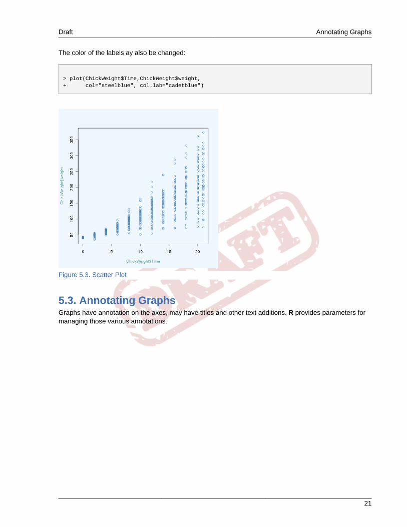
The color of the labels ay also be changed:
> plot(ChickWeight$Time,ChickWeight$weight,+ col="steelblue", col.lab="cadetblue")
Figure 5.3. Scatter Plot
5.3. Annotating GraphsGraphs have annotation on the axes, may have titles and other text additions. R provides parameters formanaging those various annotations.
Chapter 5. Customizing Plots Draft
22
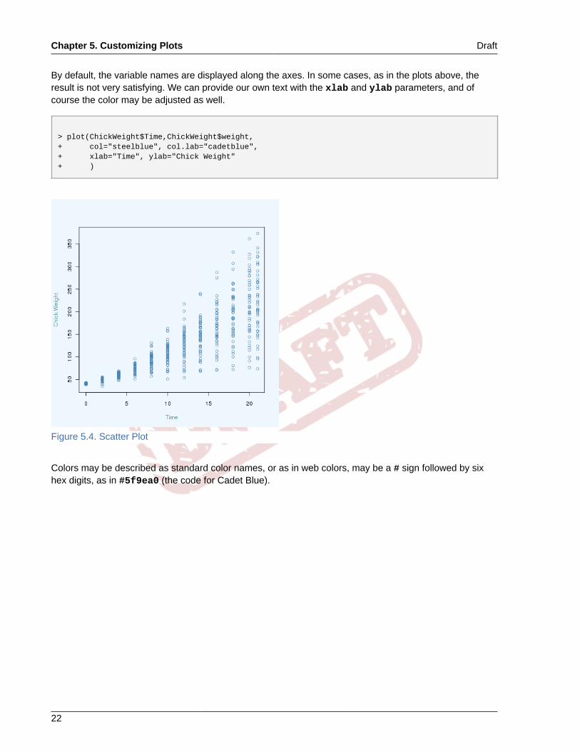
By default, the variable names are displayed along the axes. In some cases, as in the plots above, theresult is not very satisfying. We can provide our own text with the xlab and ylab parameters, and ofcourse the color may be adjusted as well.
> plot(ChickWeight$Time,ChickWeight$weight,+ col="steelblue", col.lab="cadetblue",+ xlab="Time", ylab="Chick Weight"+ )
Figure 5.4. Scatter Plot
Colors may be described as standard color names, or as in web colors, may be a # sign followed by sixhex digits, as in #5f9ea0 (the code for Cadet Blue).

Draft Annotating Graphs
23
A title may also be assigned to the graph:
> plot(ChickWeight$Time,ChickWeight$weight,+ col="steelblue", col.lab="cadetblue",+ xlab="Time", ylab="Chick Weight",+ main="Chick Diet Study", col.main="navy"+ )
Figure 5.5. Scatter Plot

Chapter 5. Customizing Plots Draft
24
A subtitle may also be placed at the bottom of the graph:
> plot(ChickWeight$Time,ChickWeight$weight,+ col="steelblue", col.lab="cadetblue",+ xlab="Time", ylab="Chick Weight",+ main="Chick Diet Study", col.main="navy",+ sub="Chick weight vs. time with different diets", col.sub="lightsteelblue"+ )
Figure 5.6. Scatter Plot

Draft Changing the Plotting Character
25
5.4. Changing the Plotting CharacterBy default, points are shown as small circles (actually, only true on most devices). However, one may wantto select a different character for many reasons. The pch parameter (plot character) controls this.
> plot(ChickWeight$Time,ChickWeight$weight,+ col="steelblue", col.lab="cadetblue",+ xlab="Time", ylab="Chick Weight",+ main="Chick Diet Study", col.main="navy",+ sub="Chick weight vs. time with different diets", col.sub="lightsteelblue",+ pch=19+ )
Figure 5.7. Scatter Plot
The plotting symbol selected may be in the range of zero to 127. Symbols from zero to 18 are compatiblewith the older S language. Symbols 19 to 25 are newer symbols, and may be filled with a backgroundcolor when bg= is specified. Symbols 32 through 127 are displayed as their ASCII equivalents, and mayalso be represented as a quoted letter (e.g.pch="x").
Figure 5.8. Plotting Symbols
5.5. Graphics DevicesWhen R generates a plot, it writes on some logical "device". There are a number of available devices, andthe user may use a variety of these devices in a single session.
By default, the plotted image is drawn on the X11() device (Window() on Windows). The user may opena new plotting space, leaving the previous plot open, merely by typing X11().

Chapter 5. Customizing Plots Draft
26
Figure 5.9. Multiple Plot Windows
However, there are plenty of options for the new workspace. Most commonly specified are the width andheight parameters. The command:
> X11(width=5,height=4)
will open a new workspace 5 inches wide and 4 inches tall. The user may also specify the backgroundand canvas colors, the display on which to place the workspace (assuming the user has multiple logicaldisplays attached), the default font size and font, the window position and title, etc.
However, X11() isn't the only device available. Most of the other devices write to files. Some devices ofinterest are:• bmp()
• jpeg()
• pdf()
• png()
• postscript()
• tiff()

Draft Even More Customization
27
Sizes for bmp(), jpeg(), png() and tiff() are specified in pixels, while pdf() and postscript()are specified in inches. pdf() and postscript() also have parameters for positioning the plot onstandard sized pages, which the other devices lack.
The devices which write to a file each have a default filename, but the user may specify a file=parameter. If the first parameter is not named it is assumed to be a filename:
> png("myPlot.png",width=640,height=480)
5.6. Even More CustomizationAdditional elements may also be added to the graph. We saw earlier with the qqline() how anadditional line could be added to the plot. That was a specialized case, but the lines() and points()functions allow additional lines or points to be added to an existing plot. Of course, plotting characters,colors, etc. may be applied.
Often it is desireable to plot multiple variables on the same plot, and display the variables in differentcolors. The plot() function can generate the plot window, scales, etc., possibly with one variable, thenthe lines() or points() function may be used for additional variables.

Chapter 5. Customizing Plots Draft
28
Consider the following commands (a different internal dataset is used in this case):
data(USArrests)plot(USArrests$UrbanPop,USArrests$Rape,col="red",pch=16, ylab="Rapes (red), Murders (blue) per 100K", xlab="Percent Urban Population", main="Arrests versus Urban Population", col.main="steelblue")points(USArrests$UrbanPop,USArrests$Murder,col="blue",pch=15)
The first call to plot() sets up the axes, labels, etc. and provides the first set of data points, while the callto points() adds the second set:
Figure 5.10. Different Color Data
At times it can be helpful to generate the plot frame with axes, labels, etc., with no data. In the previousexample, we needed to use the plot() function for rapes first, because the number of arrests for rapewas higher than for murders. Had we plotted murders first, many of the rape points would have fallen offthe chart.

Draft Even More Customization
29
Also, we may frequently want to repeatedly generate plots of data across a consistent scale, or, as in theabove case, may want to manage the scale manually. By creating short vectors with the minimum andmaximum for each scale, and plotting them with a type="n", an empty plot will result:
x=c(0,100)y=c(0,10)plot(x,y,type="n")
Figure 5.11. Empty Plot Frame

30

Draft Chapter 6. Draft
31
Scripts and Functions in RThe command line nature of R lends itself to scripting and customizations through scripts. This chapterhighlights some of the kinds of things that may be accomplished with scripts.
6.1. Using R in Parallel with an EditorOne of the simplest, and most convenient, ways to use R interactively is to have an editor open whileperforming an analysis. Many popular editors and IDEs (emacs, gedit, and geany to name a few)recognize R commands and can provide syntax highlighting which can reduce errors.
Figure 6.1. Using emacs with R

Chapter 6. Scripts and Functions in R Draft
32
With both windows open, the user may cut and paste between them. Commands may be recalled forediting with the up arrow in R, but this can get unweildy if there are multiple lines or commands involved.While the above figure shows emacs, many other popular editors have similar features.
Figure 6.2. gedit
6.2. Scripts with ROften there are sequences of command we execute frequently; perhaps we grab some data from adatabase, perhaps we look at a particular collection of statistics from whatever data we are evaluating,perhaps we like our plots to look some particular way. We can put those commands into a file and thencall that file into R with the source() function. This can be a great time saver, and can also assure thatwe are consistent in how we perform certain analyses.
Imagine a case where data are being routinely entered into a database, perhaps by manufacturingoperators, or perhaps automatically by a process. We may wish to periodically review that data, forexample each morning.
In that case, we need to connect to the database, extract some data from the database, perhaps viewsome scatter plots, and then depending on what we see perhaps dive deeper into the data. In a case likethis, we might begin by executing the following sequence of commands:
library(RMySQL)con <- dbConnect(dbDriver("MySQL"), dbname = "myDB", user="R", password = "mypass", host="cimbaoth" )d1 <- dbReadTable(con,"table2")d4 <- dbGetQuery(con,paste( "SELECT alpha, beta FROM table3 WHERE gamma<10000" ) )X11(width=3, height=3, xpos=30, ypos=50)plot(d1$alpha,d1$beta, main="Alpha-Beta", xlab="Alpha", ylab="Beta", pch=24,

Draft Scripts with R
33
col="IndianRed", bg="hotpink" )X11(width=3, height=3, xpos=330, ypos=50)plot(d4,main="Frogs vs. Turtles", xlab="Frogs", ylab="Turtles", pch=25, col="SaddleBrown", bg="Yellow" )
This might get tedious to do every morning. However, if we put those commands into a file, they may berecalled with the source() function. In this case notice that we have opened two plot windows so we canview the scatter diagrams. Since we are only interested in an overview, we have specified smaller plotwindows, and we have adjusted the position of those windows so we don't need to move windows aroundto view both plots.
If the name of the file was getData.R, the result might look something like the following:
Figure 6.3. Executing a script
Notice that when the script has completed the data is available for further analysis.
A script isn't only useful for initialization. Consider a situation where we would like to look at plots in someparticular way, perhaps over a variety of data sets. If we put our plot command in a script with our defaults,and perhaps some easily remembered names for the variables, we could re-use all that typing.

Chapter 6. Scripts and Functions in R Draft
34
If we had a script like the following
X11(height=4.0,width=7.0)par(bg="lemonchiffon")plot(x,y, col="darkred", fg="peru", bg="darkgoldenrod1", col.axis="saddlebrown", type="b", pch=23, cex=2, lwd=2 )
then we could assign x and y to the variables we are currently examining, and easily see the plot how wewould like.
Figure 6.4. Plotting with a script
6.3. Functions in RWe have already examined dozens of functions that are included in R, but it is also possible to createcustom functions. Adding customized functions to the repitoire is arguably the most useful feature ofscripts.

Draft Functions in R
35
For those that aren't familiar with programming languages such as Python or C, creating your own functionmay seem a bit daunting at first. But actually, it is quite straightforward.
First, you give your function a name, and then you assign (with the <- assignment operator) it to thefunction function(). The function() declaration is then followed by the statements you wish toexecute, surrounded by curly-braces. Something like the following:
myFunction <- function( x ) { plot(x) }
The parentheses following function list parameters you wish to pass into the function. The indentationisn't required, it simply makes it a little easier to read.
You may then call the function like any other R function:
myFunction(ChickWeight$weight)
You may pass a number of parameters, separated by commas. For example, we might extend the abovefuntion to show a title.
myFunction <- function( x, title ) { plot(x,main=title) }
You may also add a default value to your parameters. For example, if you wished to show a default title foryour plot:
myFunction <- function( x, title="My Plot" ) { plot(x,main=title) }
the calling the function like:
myFunction(ChickWeight$weight)
would yield a plot with the title "My Plot", but you have the option of providing your own title withsomething like:
myFunction(ChickWeight$weight,title="Chick Weights")
Of course, once the function has been defined, we might use it a number of times. And, we wouldprobably be a little more inclined to tweak our plot (or whatever) a little more, since we only have to typeonce to use the features many times.
Chapter 6. Scripts and Functions in R Draft
36
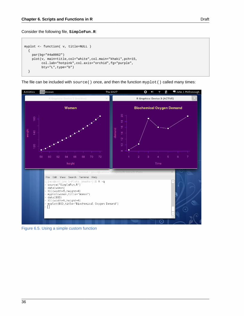
Consider the following file, SimpleFun.R:
myplot <- function( v, title=NULL ) { par(bg="#4a0062") plot(v, main=title,col="white",col.main="khaki",pch=15, col.lab="hotpink",col.axis="orchid",fg="purple", bty="L",type="b") }
The file can be included with source() once, and then the function myplot() called many times:
Figure 6.5. Using a simple custom function

Draft Chapter 7. Draft
37
Control ChartsDuring the Measure phase, one of the first things the Back Belt wants to do is to determine whether theprocess is in control with respect to the major 'Y'. The primary tool for this is a control chart. In manycases, the process may already keep control charts; many do. But there are large number of way in whichcontrol charts are produced, and a great many pitfalls, so the Black Belt would be well advised to examinethe procedures used for the control chart and ensure they are appropriate for his purposes.
The simplest control chart consists of a simple plot of the observed variable versus time, with the controllimits marked on the chart, and sometimes, the specification limit.
The control limits are typically set at +/- three standard deviations. It is important to remember that thecontrol limits should not be recalculated each time the control chart is redrawn. Rather, they should be setonce, and then changed because of a change in the process.
Presuming we have a series of observations, v, with v$V1 representing some observation number, time,etc., and v$V2 the value of the observation, the control limits may be easily calculated.
> lcl <- mean(v$V2) - 3.0 * sd(v$V2)> ucl <- mean(v$V2) + 3.0 * sd(v$V2)
Because there are a number of lines on the control chart, generating the chart involves a number of steps.First, we will generate the plot frame. We would like the plot frame to cover all the data, and allow thecontrol limit lines to be displayed. This value could be set at four standard deviations which will almostalways cover the data, or set manually. Depending on the use, the Black Belt may also prefer to set theheight of the plot frame manually, keeping it consistent so that operators are accustomed to looking at thesame chart.
> ymin <- mean(v$V2) - 4.0 * sd(v$V2)> ymax <- mean(v$V2) + 4.0 * sd(v$V2)> xgr <- c(0,dim(v)[1])> ygr <- c(ymin,ymax)
The X range is calculated based on the number of observations in the data set. The plot frame may thenbe drawn, in this case, on a window that is selected to be wider than it is high:
> X11(height=4,width=8)plot(xgr,ygr,type="n",xlab="Observation",ylab="Density", main="Density Control Chart",col.main="darkblue")
The parameter type="n" causes the plot frame to be drawn and no points plotted.

Chapter 7. Control Charts Draft
38
Finally, we can draw the control limits, center line, and the actual observations on the chart:
> lines(xgr,c(lcl,lcl),col="#bfbfcf",lty=2)> lines(xgr,c(ucl,ucl),col="#bfbfcf",lty=2)
m <- (ucl + lcl) / 2.0lines(xgr,c(m,m))
lines(v,col="firebrick",lwd=2)
Figure 7.1. Example Control Chart
7.1. The qcc packageR has many, many add-on packages available, some of which we have already mentioned. The qccpackage contains many functions useful in Six Sigma, especially around control charts.
The qcc package provides:• Shewhart charts; XBar, R, S, p, np, c, u• Cusum charts• EWMA charts• Operating characteristic curves• Process capability analysis• Pareto charts• Ishikawa diagrams
7.2. XBar ChartsOften, control charts are produced by taking several samples from the process and plotting the mean(XBar) and range (R) of the samples. The qcc package expects a data frame containing samples in therows and the individual observations in the columns.

Draft XBar Charts
39
Frequently, however, all the observations are in one column with some sort of sample identifier in anothercolumn. qcc provides a function to deal with this; qcc.groups(). qcc.groups() accepts two vectorsas input and returns a data frame properly formatted for qcc. The first vector contains the individualobsevations and the second, the sample identifier.
The dataset pistonrings included in qcc has three columns labeled diameter, sample and trial. Thereare 40 values for sample with five observations each. A Shewhart XBar chart may be drawn from thatdataset as follows:
library(qcc)data(pistonrings)attach(pistonrings)Diameter <- qcc.groups(diameter,sample)obj <- qcc(Diameter)
resulting in the following graph:
Figure 7.2. Default XBar Chart
Notice that points beyond the control limits are drawn in red. Points that participate in a run of dataviolating any of the seven Shewhart rules are marked in orange.

Chapter 7. Control Charts Draft
40
7.3. Tailoring qcc chartsqcc() does not accept most of the common plot() parameters. Many parameters can be passed inthrough the par() function. The various qcc functions create plots in multiple steps, however, so not allthe parameters have the expected effect. qcc provides a special object, qcc.options() for some of thecustomizations that are likely to be needed.
The parameters to the qcc() function allow some control over annotation, but mostly affect thecalculation. Below are some of the more commonly used parameters. See help(qcc) for a complete list:• type - Type of plot to produce: "xbar", "R", "S", "xbar.one", "p", "np", "c", "u", "g".• center - Value specifying the process target• std.dev - Standard deviation to be used• limits - A two-value vector specifying the control limits• data.name - String specifying display name for the variable to be plotted. If not provided is taken from
the object given as data.• labels - A character vector of labels for each group• nsigmas - The number of sigmas to use for calculating control limits• confidence.level - An alternative way to specify control limits• title - Title string for the plot• xlab, ylab - X-axis, Y-axis label
Parameters to the par() function that are likely to be useful are:• fg - Foreground color for the plot. This affects the lines, points, inner box and tic marks.• col - Color - the same as fg, except that it does not affect the tic marks. If issued before fg, will be
overridden.• col.axis - Color to be used for the numbering along the axes• col.main - Color to be used for the plot title• col.lab - Color to be used for the annotation along the axes• lwd - Line width• lty - Line type. (0=blank, 1=solid (default), 2=dashed, 3=dotted, 4=dotdash, 5=longdash, 6=twodash)
or as a character string ("blank", "solid", "dashed", "dotted", "dotdash", "longdash", "twodash").• bty - Box type. Note that a box is always drawn around the plot area using the selected lty, lwd andfg. This box will be drawn later using the col and lwd. For many selections, this second box will not bevisible.
• cex.axis, cex.lab, cex.main - Multiplier to the character size of the axis numbers, labels, and plottitle respectively.
qcc.options() can accept the the following parameters which affect the appearance of the plots:• bg.margin - background color used to draw the margin of the charts.• bg.figure - background color used to draw the figure of the charts.• beyond.limits$pch - plotting character used to highlight points beyond control limits.• beyond.limits$col - color used to highlight points beyond control limits.• cex - character expansion used to draw plot annotations (labels, title, tickmarks, etc.).• cex.stats - character expansion used to draw text at the bottom of control charts.• font.stats - font used to draw text at the bottom of control charts.• violating.runs$pch - plotting character used to highlight points violating runs.• violating.runs$col - color used to highlight points violating runs.
And the following parameters affect the calculation:

Draft Tailoring qcc charts
41
• exp.R.unscaled - a vector specifying, for each sample size, the expected value of the relativerange (i.e. R/σ) for a normal distribution. This appears as d2 on most tables containing factors for theconstruction of control charts.
• se.R.unscaled - a vector specifying, for each sample size, the standard error of the relative range(i.e. R/σ) for a normal distribution. This appears as d3 on most tables containing factors for theconstruction of control charts.
• run.length - the maximum value of a run before to signal a point as out of control.
The above parameters can provide considerable control over the appearance and calculatons used in thecontrol chart. By way of example, the following:
library(qcc)data(pistonrings)attach(pistonrings)Diameter <- qcc.groups(diameter,sample)qcc.options(bg.figure="goldenrod", bg.margin="lightgoldenrod")par( fg="red", col="darkred", col.axis="sienna" )par( col.main="darkolivegreen", col.lab="saddlebrown" )par( lwd=2, lty=3, bty="L" )par(cex.axis=1.2, cex.lab=1.4, cex.main=2)obj <- qcc(Diameter[16:40,], limits=c(73.99,74.02), data.name="Ring Diameter", xlab="Sample ID", ylab="Diameter")
produces the following control chart:
Figure 7.3. Customized Control Chart

Chapter 7. Control Charts Draft
42
7.4. R ChartsXBar charts are often plotted alongside R charts, which plot the range of each sample, rather thanthe mean. In some cases, R charts are used alone. qcc() can display an R chart merely by addingtype="R" to the parameters:
Figure 7.4. R Chart

Draft R Charts
43
Often the experimenter wishes to periodically review the control charts, and typically wishes to see theXBar and R charts next to each other. As shown earlier, a little scripting to properly position the plots onthe screen can make this a simple task. The following lines:
library(qcc)data(pistonrings)attach(pistonrings)Diameter <- qcc.groups(diameter,sample)X11(width=8,height=3,xpos=200,ypos=420)obj <- qcc(Diameter,type="R",add.stats=FALSE)X11(width=8,height=4,xpos=200,ypos=40)obj <- qcc(Diameter,type="xbar")
will yeild a pair of plots. Note that the specific values chosen depend on screen size and resolution so theanalyst will need to experiment with the position and size of the windows.
Figure 7.5. XBar and R Charts

Chapter 7. Control Charts Draft
44
7.5. Other types of control chartsqcc() can produce a number of other types of control charts for specialized circumstances. Like theR chart, these alternative control chart types are invoked by addint the type= parameter to the qcc()invocation.
7.5.1. The xbar.one chartIn a continuous process it doesn't always make sense to group observations into samples. Whentype="xbar.one is specified, qcc() expects a single vector of observations.
7.5.2. The S chartSometimes it is desireable to follow the sample variation by standard deviation rather than (or in additionto) the range. type="S" will create a chart of sample standard deviations.
7.5.3. The p chartWhen type="p" is specified, the proportion of nonconforming units is plotted. The control limits arecalculated based on the binomial distribution.
7.5.4. The np chartWhen type="np" is specified, the number of nonconforming units is plotted. The control limits arecalculated based on the binomial distribution.
7.5.5. The c chartThe number of defectives per unit are plotted for type="c". This chart assumes that defects of the qualityattribute are rare, and the control limits are computed based on the Poisson distribution.
7.5.6. The u chartWhen type="u" is specified, the average number of defectives per unit is plotted. The Poissondistribution is used to compute control limits, but, unlike the c chart, this chart does not require a constantnumber of units
7.6. Autocorrelation
7.7. EMWA Charts
7.8. Cusum charts

Draft Chapter 8. Draft
45
Process Capability

46

Draft Chapter 9. Draft
47
Hypothesis Testing

48

Draft Chapter 10. Draft
49
Gage R&R

50

Draft Chapter 11. Draft
51
Comparing Groups

52

Draft Chapter 12. Draft
53
Pareto Charts

54

Draft Chapter 13. Draft
55
Ishikawa Diagrams
Figure 13.1. Example Ishikawa Diagram

56

Draft Chapter 14. Draft
57
Regression Modeling

58

Draft Chapter 15. Draft
59
Logistic Regression

60
Draft Chapter 16. Draft
61
Experimental Design

62

Draft Chapter 17. Draft
63
Principal Component Analysis

64

Draft Chapter 18. Draft
65
Simulation

66

Draft Chapter 19. Draft
67
Conclusion

68

Draft Draft
69
Appendix A. Revision HistoryRevision 4 Sat Jul 23 2011 John McDonough [email protected]
Complete section on control charts
Revision 3 Tue Jul 19 2011 John McDonough [email protected] typo correctionsAdditional content
Revision 2 Tue Jul 5 2011 John McDonough [email protected] to book
Revision 1 Mon Jul 4 2011 John McDonough [email protected] chapters
Revision 0 Sat Dec 25 2010 John McDonough [email protected] creation of book by publican

70

Draft Draft
71
Index
BBackground Color, 19bg, 19, 25bmp(), 26boot, 15Box Plot, 12breaks, 14
CCause and Effect
Diagram, 55ChickWeight, 9col, 20col.lab, 21, 22col.main, 23col.sub, 24cum3(), 15Cumulative Frequency, 15
DData
Database, 7Delimited, 5Tabular, 5
data(), 9, 27Dataset
ChickWeight, 9USArrests, 27
dbConnect(), 7dbGetQuery(), 7dbReadTable(), 7density(), 14Distribution-Comparison Plot, 16
Eedcf(), 15
Ffeedback
contact information for this manual, viiFishbone
Diagram, 55
Hheight, 26hist(), 13, 19
Histogram, 13
IIshikawa
Diagram, 55
Jjpeg(), 26
KKolmogorov-Smirnov, 17
Llines(), 14, 27
Mmain, 23Mean, 15mean(), 15MySQL, 7
NNormality, 16
OODBC, 7
Ppar(), 19pch, 25, 25pdf(), 26plot(), 10, 19, 27png(), 26points(), 27postscript(), 26
Qqqline(), 16, 27qqnorm(), 16, 19
Rread.table(), 5RMySQL, 7rug(), 14
SS, 25Scatter Diagram, 10

Index Draft
72
sd(), 15Shapiro-Wilk, 17Skewness, 15Standard Deviation, 15sub, 24summary(), 7, 9
Ttiff(), 26type, 28
Vvar(), 15Variance, 15
Wwidth, 26
XX11(), 25xlab, 22
Yylab, 22