quarterly energy dynamics q1 2018 - aemo.com.au · dynamics q1 2018 may 2018 author: market...
TRANSCRIPT
Quarterly Energy Dynamics Q1 2018
May 2018
Author: Market Insights │Markets
Important notice
PURPOSE
AEMO has prepared this report to provide energy market participants and governments with information on the market
dynamics, trends and outcomes during Q1 2018 (1 January to 31 March 2018). This quarterly report compares results
for the quarter against other recent quarters, focussing on Q1 2017 and Q4 2017. Geographically, the report covers
the National Electricity Market – which includes Queensland New South Wales, the Australian Capital Territory, Victoria,
South Australia and Tasmania – and the gas markets operating in the same states (except Tasmania).
DISCLAIMER
This document or the information in it may be subsequently updated or amended. This document does not constitute
legal or business advice, and should not be relied on as a substitute for obtaining detailed advice about the National
Electricity Law, National Gas Law, National Electricity Rules, the National Gas Rules, or any other applicable laws,
procedures or policies. AEMO has made every effort to ensure the quality of the information in this document but
cannot guarantee its accuracy or completeness.
Accordingly, to the maximum extent permitted by law, AEMO and its officers, employees and consultants involved in
the preparation of this document:
make no representation or warranty, express or implied, as to the currency, accuracy, reliability or completeness of
the information in this document; and
are not liable (whether by reason of negligence or otherwise) for any statements or representations in this document,
or any omissions from it, or for any use or reliance on the information in it.
© 2018 Australian Energy Market Operator Limited. The material in this publication may be used in accordance with
the copyright permissions on AEMO’s website.
© AEMO 2018 | Q1 2018 3
Quarterly Energy Dynamics – Q1 2018
Highlights for Q1 2018 include:
Australia experienced its second hottest summer on record but compared to Q1 2017 the impact was mixed. In Sydney and
Brisbane the weather was less hot than the record heat experienced in Q1 2017. In Adelaide, it was hotter than in Q1 2017,
while in Melbourne it was warmer than average and unchanged year-on-year. The above contributed to a 1.5% reduction in
average electricity demand. Victoria was the one region to increase electricity demand compared to Q1 2017, driven by warm
summer conditions and increased industrial load.
Mixed results for wholesale electricity prices, with relatively higher prices in the southern states (Victoria, South Australia and
Tasmania, at $102, $117 and $91/MWh, respectively) when compared to the northern states (Queensland and New South
Wales, at $70 and $72/MWh, respectively).
Queensland and New South Wales experienced very low price volatility1 despite record high demand in Queensland on
14 February 2018. Drivers of limited price volatility compared to Q1 2017 included: the return to service of Swanbank E
(385 MW); increased generation from black coal-fired power stations (by 382 MW); and fewer periods of coincident hot
weather and high demand in the contiguous regions.
The key driver of comparatively higher prices in Victoria and South Australia was the return of weather-driven price
volatility: almost all price volatility in these regions occurred on three days of coincident hot weather, high demand and low
wind output.
Electricity Futures prices generally decreased and remained in backwardation, indicating a market expectation that wholesale
electricity prices will continue to fall over the next two years. For example, the Victorian 2018 price fell by 17% to $86.70/MWh
as Q1 prices came in lower than expectations and the 2019 price declined by 8.5% ending at $79.71/MWh. Over Q1, the
large-scale generation certificate (LGC) forward prices for 2020 fell sharply by 42% ($59 to $34), as the market factored in
growing supply of renewable generation and an expectation that the Large-scale Renewable Energy Target (LRET) will be met.
Key changes in the electricity supply mix compared to Q1 2017 included:
The current coal fleet2 generated at its highest level since Q3 2008. Whilst there was less brown coal-fired generation on
an absolute basis due to the retirement of Hazelwood, the remaining brown coal-fired plant increased average output by
198 MW and black coal-fired generation increased by 382 MW on average.
Hydro generation increased by 335 MW (30%) when compared to Q1 2017 and wind output increased by 239 MW.
Continued growth in rooftop PV generation, with the amount of rooftop PV generated during the daily maximum increasing
from 2,794 to 3,240 (+16%) between Q1 2017 and Q1 2018. Over 2017 more than 1 GW of rooftop capacity was
installed.
Gas prices across AEMO’s gas markets rebounded from Q4 2017, with the largest increase recorded in the Victorian DWGM
from $6.36/GJ to $8.98/GJ. Oil prices continued to climb during the quarter with Brent ending the quarter at A$89.25/bbl.
Longford gas production decreased to its lowest Q1 levels since 2015 which contributed to a change in net gas flows, with
prevailing flows south from Queensland.
Power System issues included: periods of low demand and high wind resulted in operational issues and directions in South
Australia. In total, there were 19 separate unit direction notices for a total of 476 hours, with the majority of these occurring in
March 2018.
High demand on 19 January 2018 led to capacity being dispatched under the Reliability and Emergency Reserve Trader
(RERT) mechanism.
Frequency control ancillary service (FCAS) market costs were 57% ($32.7 million) lower than in Q4 2017, with a key driver being
the introduction of new technology (Hornsdale Power Reserve and demand-side response).
1 Price volatility measured as cap returns for electricity prices above $300/MWh
2 Historical data adjusted to exclude power stations that have closed, such as Hazelwood Power Station.
© AEMO 2018 | Q1 2018 4
Quarterly Energy Dynamics – Q1 2018
Executive Summary 3
1. Electricity market dynamics 5
1.1 Weather 5
1.2 Electricity demand 5
1.3 Electricity generation 7
1.4 Wholesale electricity prices 9
1.5 Inter-regional flows 15
2. Gas market dynamics 16
2.1 Gas demand 16
2.2 Wholesale gas prices 17
2.3 Gas supply 18
2.4 Pipeline flows 20
Abbreviations 22
© AEMO 2018 | Q1 2018 5
Quarterly Energy Dynamics – Q1 2018
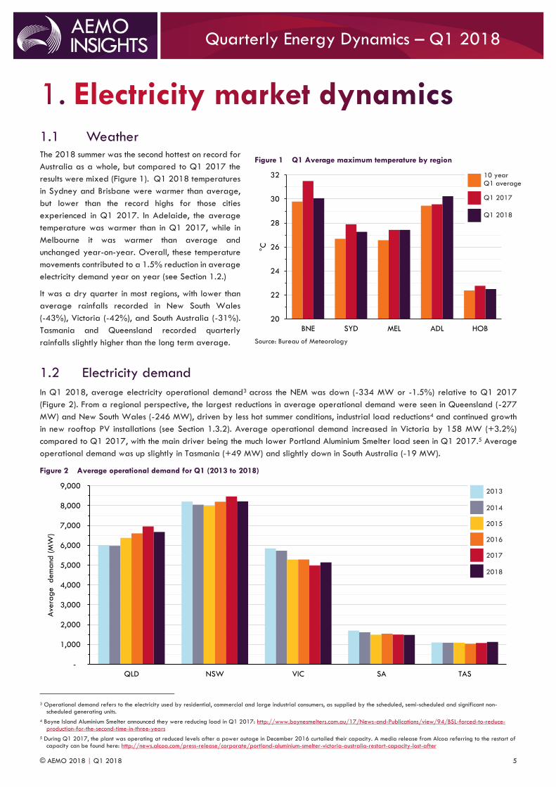
1.1 Weather The 2018 summer was the second hottest on record for
Australia as a whole, but compared to Q1 2017 the
results were mixed (Figure 1). Q1 2018 temperatures
in Sydney and Brisbane were warmer than average,
but lower than the record highs for those cities
experienced in Q1 2017. In Adelaide, the average
temperature was warmer than in Q1 2017, while in
Melbourne it was warmer than average and
unchanged year-on-year. Overall, these temperature
movements contributed to a 1.5% reduction in average
electricity demand year on year (see Section 1.2.)
It was a dry quarter in most regions, with lower than
average rainfalls recorded in New South Wales
(-43%), Victoria (-42%), and South Australia (-31%).
Tasmania and Queensland recorded quarterly
rainfalls slightly higher than the long term average.
1.2 Electricity demand
In Q1 2018, average electricity operational demand3 across the NEM was down (-334 MW or -1.5%) relative to Q1 2017
(Figure 2). From a regional perspective, the largest reductions in average operational demand were seen in Queensland (-277
MW) and New South Wales (-246 MW), driven by less hot summer conditions, industrial load reductions4 and continued growth
in new rooftop PV installations (see Section 1.3.2). Average operational demand increased in Victoria by 158 MW (+3.2%)
compared to Q1 2017, with the main driver being the much lower Portland Aluminium Smelter load seen in Q1 2017.5 Average
operational demand was up slightly in Tasmania (+49 MW) and slightly down in South Australia (-19 MW).
Figure 2 Average operational demand for Q1 (2013 to 2018)
3 Operational demand refers to the electricity used by residential, commercial and large industrial consumers, as supplied by the scheduled, semi-scheduled and significant non-
scheduled generating units.
4 Boyne Island Aluminium Smelter announced they were reducing load in Q1 2017: http://www.boynesmelters.com.au/17/News-and-Publications/view/94/BSL-forced-to-reduce-production-for-the-second-time-in-three-years
5 During Q1 2017, the plant was operating at reduced levels after a power outage in December 2016 curtailed their capacity. A media release from Alcoa referring to the restart of capacity can be found here: http://news.alcoa.com/press-release/corporate/portland-aluminium-smelter-victoria-australia-restart-capacity-lost-after
-
1,000
2,000
3,000
4,000
5,000
6,000
7,000
8,000
9,000
QLD NSW VIC SA TAS
Ave
rage dem
and
(M
W)
Figure 1 Q1 Average maximum temperature by region
Source: Bureau of Meteorology
20
22
24
26
28
30
32
BNE SYD MEL ADL HOB
°C
Q1 2018
Q1 2017
10 year Q1 average
2013
2014
2015
2016
2017
2018
© AEMO 2018 | Q1 2018 6
Quarterly Energy Dynamics – Q1 2018
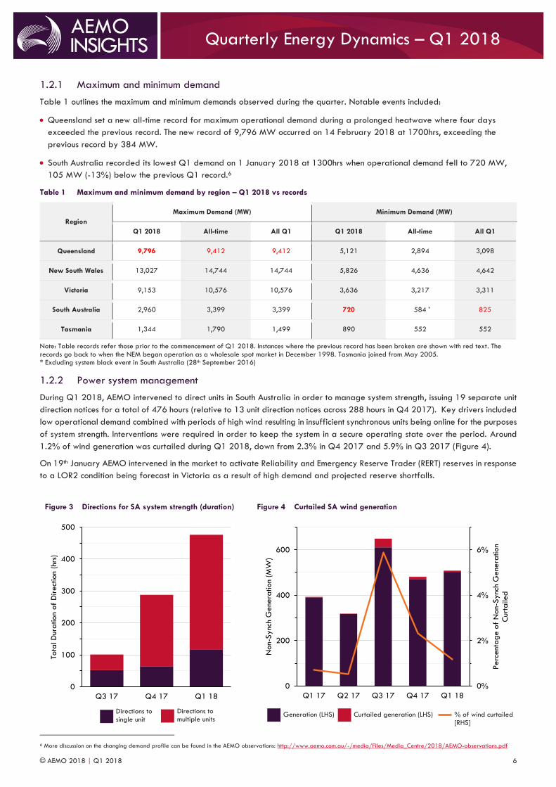
1.2.1 Maximum and minimum demand
Table 1 outlines the maximum and minimum demands observed during the quarter. Notable events included:
Queensland set a new all-time record for maximum operational demand during a prolonged heatwave where four days
exceeded the previous record. The new record of 9,796 MW occurred on 14 February 2018 at 1700hrs, exceeding the
previous record by 384 MW.
South Australia recorded its lowest Q1 demand on 1 January 2018 at 1300hrs when operational demand fell to 720 MW,
105 MW (-13%) below the previous Q1 record.6
Table 1 Maximum and minimum demand by region – Q1 2018 vs records
Region
Maximum Demand (MW) Minimum Demand (MW)
Q1 2018 All-time All Q1 Q1 2018 All-time All Q1
Queensland 9,796 9,412 9,412 5,121 2,894 3,098
New South Wales 13,027 14,744 14,744 5,826 4,636 4,642
Victoria 9,153 10,576 10,576 3,636 3,217 3,311
South Australia 2,960 3,399 3,399 720 584 * 825
Tasmania 1,344 1,790 1,499 890 552 552
Note: Table records refer those prior to the commencement of Q1 2018. Instances where the previous record has been broken are shown with red text. The records go back to when the NEM began operation as a wholesale spot market in December 1998. Tasmania joined from May 2005. * Excluding system black event in South Australia (28th September 2016)
1.2.2 Power system management
During Q1 2018, AEMO intervened to direct units in South Australia in order to manage system strength, issuing 19 separate unit
direction notices for a total of 476 hours (relative to 13 unit direction notices across 288 hours in Q4 2017). Key drivers included
low operational demand combined with periods of high wind resulting in insufficient synchronous units being online for the purposes
of system strength. Interventions were required in order to keep the system in a secure operating state over the period. Around
1.2% of wind generation was curtailed during Q1 2018, down from 2.3% in Q4 2017 and 5.9% in Q3 2017 (Figure 4).
On 19th January AEMO intervened in the market to activate Reliability and Emergency Reserve Trader (RERT) reserves in response
to a LOR2 condition being forecast in Victoria as a result of high demand and projected reserve shortfalls.
6 More discussion on the changing demand profile can be found in the AEMO observations: http://www.aemo.com.au/-/media/Files/Media_Centre/2018/AEMO-observations.pdf
Figure 3 Directions for SA system strength (duration)
Figure 4 Curtailed SA wind generation
0
100
200
300
400
500
Q3 17 Q4 17 Q1 18
Tota
l D
uration
of
Direct
ion
(hrs
)
0%
2%
4%
6%
0
200
400
600
Q1 17 Q2 17 Q3 17 Q4 17 Q1 18
Perc
ent
age o
f N
on-S
ync
h G
ene
ration
Cur
taile
d
Non-S
ync
h G
ene
ration
(MW
)
Directions to single unit
Directions to multiple units Generation (LHS) Curtailed generation (LHS) % of wind curtailed
[RHS]
© AEMO 2018 | Q1 2018 7
Quarterly Energy Dynamics – Q1 2018
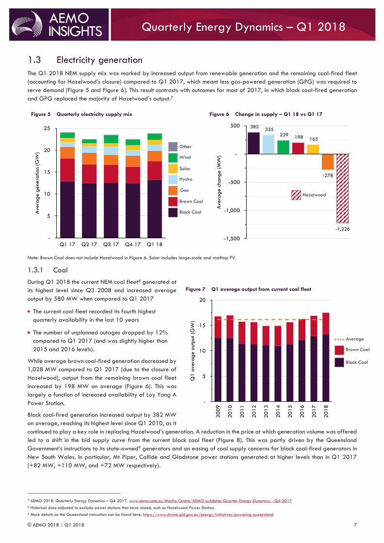
1.3 Electricity generation
The Q1 2018 NEM supply mix was marked by increased output from renewable generation and the remaining coal-fired fleet
(accounting for Hazelwood’s closure) compared to Q1 2017, which meant less gas-powered generation (GPG) was required to
serve demand (Figure 5 and Figure 6). This result contrasts with outcomes for most of 2017, in which black coal-fired generation
and GPG replaced the majority of Hazelwood’s output.7
Figure 5 Quarterly electricity supply mix
Figure 6 Change in supply – Q1 18 vs Q1 17
Note: Brown Coal does not include Hazelwood in Figure 6. Solar includes large-scale and rooftop PV.
1.3.1 Coal
During Q1 2018 the current NEM coal fleet8 generated at
its highest level since Q3 2008 and increased average
output by 580 MW when compared to Q1 2017
The current coal fleet recorded its fourth highest
quarterly availability in the last 10 years
The number of unplanned outages dropped by 12%
compared to Q1 2017 (and was slightly higher than
2015 and 2016 levels).
While average brown coal-fired generation decreased by
1,028 MW compared to Q1 2017 (due to the closure of
Hazelwood), output from the remaining brown coal fleet
increased by 198 MW on average (Figure 6). This was
largely a function of increased availability of Loy Yang A
Power Station.
Black coal-fired generation increased output by 382 MW
on average, reaching its highest level since Q1 2010, as it
continued to play a key role in replacing Hazelwood’s generation. A reduction in the price at which generation volume was offered
led to a shift in the bid supply curve from the current black coal fleet (Figure 8). This was partly driven by the Queensland
Government’s instructions to its state-owned9 generators and an easing of coal supply concerns for black coal-fired generators in
New South Wales. In particular, Mt Piper, Callide and Gladstone power stations generated at higher levels than in Q1 2017
(+82 MW, +110 MW, and +72 MW respectively).
7 AEMO 2018. Quarterly Energy Dynamics – Q4 2017. www.aemo.com.au/Media-Centre/AEMO-publishes-Quarter-Energy-Dynamics---Q4-2017
8 Historical data adjusted to exclude power stations that have closed, such as Hazelwood Power Station.
9 More details on the Queensland instruction can be found here: https://www.dnrme.qld.gov.au/energy/initiatives/powering-queensland
-
5
10
15
20
25
Q1 17 Q2 17 Q3 17 Q4 17 Q1 18
Ave
rage g
ene
ration
(GW
)
382 335
239 198 165
-278
-1,226
-1,500
-1,000
-500
-
500
Ave
rage c
hang
e (M
W)
Figure 7 Q1 average output from current coal fleet
-
5
10
15
20
20
09
20
10
20
11
20
12
20
13
20
14
20
15
20
16
20
17
20
18
Q1 a
vera
ge o
utput
(G
W)
Black Coal
Brown Coal
Gas
Hydro
Solar
Other
Wind
Hazelwood
Black Coal
Brown Coal
Average
© AEMO 2018 | Q1 2018 8
Quarterly Energy Dynamics – Q1 2018
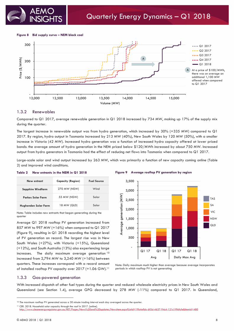
Figure 8 Bid supply curve – NEM black coal
1.3.2 Renewables
Compared to Q1 2017, average renewable generation in Q1 2018 increased by 734 MW, making up 17% of the supply mix
during the quarter.
The largest increase in renewable output was from hydro generation, which increased by 30% (+335 MW) compared to Q1
2017. By region, hydro output in Tasmania increased by 213 MW (40%), New South Wales by 120 MW (50%), with a smaller
increase in Victoria (42 MW). Increased hydro generation was a function of increased hydro capacity offered at lower priced
bands: the average amount of hydro generation in the NEM priced below $120/MWh increased by about 750 MW. Increased
output from hydro generators in Tasmania had the effect of reducing net flows into Tasmania when compared to Q1 2017.
Large-scale solar and wind output increased by 263 MW, which was primarily a function of new capacity coming online (Table
2) and improved wind conditions.
Table 2 New entrants in the NEM in Q1 2018
New entrant Capacity (Region) Fuel Source
Sapphire Windfarm 270 MW (NSW) Wind
Parkes Solar Farm 55 MW (NSW) Solar
Hughenden Solar Farm 18 MW (QLD) Solar
Note: Table includes new entrants that began generating during the quarter
Average Q1 2018 rooftop PV generation increased from
857 MW to 997 MW (+16%) when compared to Q1 2017
(Figure 9), resulting in Q1 2018 recording the highest level
of PV generation on record. The largest rise was in New
South Wales (+27%), with Victoria (+15%), Queensland
(+12%), and South Australia (13%) also experiencing large
increases. The daily maximum average generation 10
increased from 2,794 MW to 3,240 MW (+16%) between
quarters. These increases correspond with a record amount
of installed rooftop PV capacity over 2017 (+1.06 GW).11
1.3.3 Gas-powered generation
With increased dispatch of other fuel types during the quarter and reduced wholesale electricity prices in New South Wales and
Queensland (see Section 1.4), average GPG decreased by 278 MW (-11%) compared to Q1 2017. In Queensland,
10 The maximum rooftop PV generated across a 30 minute trading interval each day averaged across the quarter.
11 CER. 2018. Household solar capacity through the roof in 2017. [online].
http://www.cleanenergyregulator.gov.au/RET/Pages/News%20and%20updates/NewsItem.aspx?ListId=19b4efbb-6f5d-4637-94c4-121c1f96fcfe&ItemId=480
-
100
200
300
12,000 12,500 13,000 13,500 14,000 14,500 15,000
Price
($/M
Wh)
Volume (MW)
Figure 9 Average rooftop PV generation by region
Note: Daily maximum much higher than average because average incorporates periods in which rooftop PV is not generating
-
500
1,000
1,500
2,000
2,500
3,000
3,500
Q1 17 Q1 18 Q1 17 Q1 18
Avg Daily Max Avg
Ave
rag
e g
ene
ration
(MW
)
Q1 2017 Q2 2017
Q1 2018
Q3 2017 Q4 2017
At a price of $100/MWh, there was on average an additional 1,100 MW offered when compared to Q1 2017
A
A
QLD
NSW
VIC
SA
TAS

© AEMO 2018 | Q1 2018 9
Quarterly Energy Dynamics – Q1 2018
Swanbank E operated for its first full quarter since it was mothballed12 in 2015 (it returned to service in November 2017), adding
237 MW of supply on average to the region. However, this increase was offset by reductions at Darling Downs and Braemar
power stations (-183 MW and -139 MW, respectively), with Queensland’s overall GPG output reducing by 216 MW (-18%).
Similar GPG reductions occurred in New South Wales, where output fell by 224 MW (-66%), making Q1 2018 the lowest GPG
recorded in New South Wales since 2009. This was driven by the changed operating regime of Smithfield Energy Facility13 as
well as significant reductions in generation from Uranquinty (-101 MW). South Australia experienced an increase in average GPG
of 138 MW due to Pelican Point operating at full capacity14 when compared to Q1 2017, while Victoria’s and Tasmania’s GPG
output remained steady.
1.4 Wholesale electricity prices During Q1 2018, average wholesale electricity prices were comparatively higher in Victoria, South Australia and Tasmania ($102,
$116 and $91/MWh, respectively) than in Queensland and New South Wales ($70 and $72/MWh, respectively) (Figure 10).
Overall, average prices were generally higher than Q4 2017, but lower than Q1 2017. Table 3 provides a summary of price
drivers during the quarter.
Figure 10 Average wholesale electricity price by region
Note: The average quarterly price is broken up into two parts, energy and volatility. Volatility refers to the contribution of high priced events (above $300/MWh) to the average price more commonly known as cap returns. Energy is therefore the remainder.
Table 3 Wholesale electricity price drivers in Q1 2018
Lower prices in
QLD and NSW
Lower electricity demand – milder summer conditions in Queensland and New South Wales compared to Q1 2017
contributed to a total 523 MW reduction in electricity demand (see Section 1.2).
Increased black coal-fired generation and availability – see Figure 5 for further details.
Greater availability of lower priced hydro capacity – compared to Q4 2017, the average amount of hydro
generation in New South Wales priced below $120/MWh increased by 394 MW.
Return of Swanbank E in Queensland – an additional 237 MW of supply was provided by Swanbank E, which
returned to service after being mothballed for three years.
Higher prices in
VIC and SA
Weather driven price volatility – see Section 1.4.1 for further details.
Physical limits on importing lower price electricity from New South Wales into Victoria. Over the quarter, Victoria’s
wholesale electricity price was 43% higher than New South Wales’ and physical flows south on the VIC-NSW
interconnector were constrained 30% of the time (averaging 527 MW over these periods).
A shift of the supply curve in Victoria – Q1 2018 represents the first summer since closure of Hazelwood Power
Station, which provided an average 1,225 MW of low-priced capacity in Q1 2017.
12 Press Release on Swanbank E return to service can be found here: http://www.stanwell.com/news/press-releases/swanbank-e-power-station-return-service/
13 It closed in July 2017, but was brought back into service with up to 109 MW of capacity available. Despite this, it has only generated at very low levels since July 2017.
14 Press release on Pelican Point return to full capacity can be found here: http://www.gdfsuezau.com/media/newsitem/Pelican-Point-to-return-to-full-capacity
173
72 70
116
79 72
79 84
102
127
81
116
98
84 91
-
25
50
75
100
125
150
175
200
QLD NSW VIC SA TAS
$/M
Wh
Volatility
Energy
Q1
17
Q4
17
Q1
18
Queensland’s prices stabilised following the region’s highest average price on record in Q1 2017 (second highest in NEM history) Victoria’s highest Q1 price on record (second overall)
A
B
A
B
© AEMO 2018 | Q1 2018 10
Quarterly Energy Dynamics – Q1 2018
1.4.1 Price volatility
During Q1 2018 there was high wholesale electricity price volatility in Victoria and South Australia, but low price volatility in New
South Wales and Queensland (Table 4).
Low volatility in
QLD and NSW
Combined Q1 2018 quarterly cap returns15 for New South Wales and Queensland were only $0.85/MWh,
compared to $90.78/MWh in Q1 2017. Prices in Queensland and New South Wales were above $300/MWh for
two hours during the quarter compared to around 100 hours in Q1 2017, driven by:
Fewer periods of coincident hot weather and high operational demand in the two regions. In Q1 2018
there were only eight hours where the combined demand exceeded 21,500 MW, compared to 32.5 hours
in Q1 2017.
The Queensland Government’s instruction to its state-owned generators to “undertake strategies to place
downward pressure on wholesale prices”.16
High volatility in
VIC and SA
Combined Q1 2018 cap returns for Victoria and South Australia increased to $45.89/MWh from $30.70/MWh in
Q1 2017. This volatility largely occurred on three days of coincident hot weather, high demand and low wind
output in the two regions.
On 18 January, 19 January and 7 February 2018 the maximum temperature in both regions exceeded 37
ºC and combined demand exceeded 11,800 MW, while wind capacity factors were low (less than 20%
during peak, compared to typical capacity factors of 30-40%).
An unplanned outage of one unit at Loy Yang B Power Station on 18 January 2018 contributed to price
volatility – high prices on this day made up 41% of total cap returns in these regions for the quarter.
Table 4 Quarterly cap returns by region ($/MWh)
Quarter Queensland New South Wales Victoria South Australia Tasmania
Q1 2017 $70.06 $20.72 $0.59 $30.11 $0.25
Q4 2017 $0.11 $0.00 $0.27 $0.47 $1.83
Q1 2018 $0.85 $0.00 $18.76 $26.68 $3.37
Note: Cap returns are expressed as $/MWh.
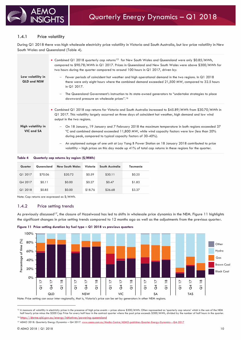
1.4.2 Price setting trends
As previously discussed17, the closure of Hazelwood has led to shifts in wholesale price dynamics in the NEM. Figure 11 highlights
the significant changes in price setting trends compared to 12 months ago as well as the adjustments from the previous quarter.
Figure 11 Price setting duration by fuel type – Q1 2018 vs previous quarters
Note: Price setting can occur inter-regionally, that is, Victoria’s price can be set by generators in other NEM regions.
15 A measure of volatility in electricity prices is the presence of high price events – prices above $300/MWh. Often represented as ‘quarterly cap returns’ which is the sum of the NEM
half hourly price minus the $300 Cap Price for every half hour in the contract quarter where the pool price exceeds $300/MWh, divided by the number of half hours in the quarter.
16 https://dnrme.qld.gov.au/energy/initiatives/powering-queensland
17 AEMO 2018. Quarterly Energy Dynamics – Q4 2017. www.aemo.com.au/Media-Centre/AEMO-publishes-Quarter-Energy-Dynamics---Q4-2017
0%
20%
40%
60%
80%
100%
Q1 1
7
Q4 1
7
Q1 1
8
Q1 1
7
Q4 1
7
Q1 1
8
Q1 1
7
Q4 1
7
Q1 1
8
Q1 1
7
Q4 1
7
Q1 1
8
Q1 1
7
Q4 1
7
Q1 1
8
QLD NSW VIC SA TAS
Perc
ent
age o
f tim
e (%
)
Black Coal
Brown Coal
Gas
Hydro
Other
© AEMO 2018 | Q1 2018 11
Quarterly Energy Dynamics – Q1 2018
Compared to Q1 2017, the significant reduction of brown coal-fired generation since Hazelwood’s closure has diminished the
role of brown coal in price setting – most evident in Victoria where brown coal price-setting decreased from around 24% of the
time to 1.8% this quarter. This has corresponded with black coal-fired generation setting the price more often in every NEM region,
particularly in Queensland and New South Wales where the percentage of time increased from around 56% to greater than 70%
this quarter. This was a product of increased black coal-fired generation and availability at lower prices.
Compared to Q4 2017, there were only small movements in price setting roles in Q1 2018. The trend of brown coal playing a
minor part in price setting continued. Lower GPG output and availability saw a decrease in its price setting role in all mainland
regions, most notably in South Australia where price setting fell from 35.2% to 30.4% this quarter. GPG’s price-setting role was
replaced by black coal and hydro due to increased availability and generation of these fuel sources.
1.4.3 Electricity futures markets
Over the quarter ASX Energy calendar swap prices for Victorian calendar 2018
and 2019 products fell by 17% and 8.5% respectively. The forward curve remained
in backwardation, as illustrated in Figure 12, which shows that the market expects
falling Victorian wholesale prices out to 2020. Similar trends were observed in New
South Wales and Queensland.
As discussed in Section 1.4.1 there has been an observed reduction in volatility in
New South Wales and Queensland between Q1 2017 and Q1 2018 with lower
cap returns during Q1 2018. Ongoing market sentiment of reduced future volatility
is shown in the price of ASX Energy cap products with Q1 2019 prices reducing an
average of 20% across New South Wales, Queensland and Victoria over the
quarter (Figure 13).
Figure 12 ASX Energy Victorian Cal swap prices 2018-20
Source: ASX Energy
Figure 13 ASX Energy Q1 19 cap prices
Source: ASX Energy
1.4.4 International coal and prices
The average spot price for Australian Newcastle thermal coal remains at comparatively high levels, averaging over $130 per
tonne in Q1 2018. Relatively high prices were driven by strong Chinese demand following the easing of import restrictions,
however prices began to fall toward the end of the month following the end of the Chinese winter (Chinese winter typically sees
70
80
90
100
110
Jan-
18
Feb
-18
Mar-
18
$/M
Wh
10
15
20
25
30
35
Jan-
18
Feb
-18
Mar-
18
$/M
Wh
Table 5 ASX Energy Q1 19 cap prices
Region Change over Q1 18
Queensland $2.25 (14%)
New South Wales $6.17 (32%)
Victoria $3.85 (14%)
South Australia $0.5 (2%)
Cal 19 Victorian Swaps fell $7.42 (8.5%) over Q1 18
A
A
Cal 18 Cal 19 Cal 20 QLD NSW VIC SA
© AEMO 2018 | Q1 2018 12
Quarterly Energy Dynamics – Q1 2018
an increase in demand for coal).18 Strong underlying demand in China also showed in the forward market, where coal futures
prices remain above $100 per tonne beyond 2018 (Figure 14).
High international coal prices do not appear to be directly impacting recent domestic black-coal fired generators electricity price
offers with the quarter recording a continuation of Q4 2017 lower electricity offers (Figure 14). This drop reflects a reversal of
trends throughout most of 2017, where an increase in the price of offers from New South Wales black-coal fired generators
coincided with rising international coal prices.
Figure 14 Quarterly average international black coal spot and futures prices and domestic coal-fired generators’ offers
Source for Newcastle thermal spot and futures prices: Bloomberg * Black coal bids are the volume-weighted average price of bids priced between $40-$120/MWh
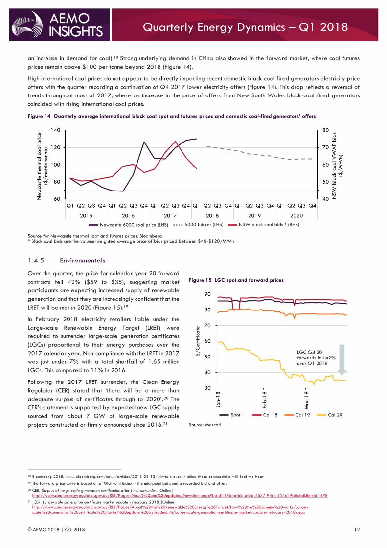
1.4.5 Environmentals
Over the quarter, the price for calendar year 20 forward
contracts fell 42% ($59 to $35), suggesting market
participants are expecting increased supply of renewable
generation and that they are increasingly confident that the
LRET will be met in 2020 (Figure 15).19
In February 2018 electricity retailers liable under the
Large-scale Renewable Energy Target (LRET) were
required to surrender large-scale generation certificates
(LGCs) proportional to their energy purchases over the
2017 calendar year. Non-compliance with the LRET in 2017
was just under 7% with a total shortfall of 1.65 million
LGCs. This compared to 11% in 2016.
Following the 2017 LRET surrender, the Clean Energy
Regulator (CER) stated that ‘there will be a more than
adequate surplus of certificates through to 2020’.20 The
CER’s statement is supported by expected new LGC supply
sourced from about 7 GW of large-scale renewable
projects constructed or firmly announced since 2016.21
18 Bloomberg 2018. www.bloomberg.com/news/articles/2018-03-13/winter-s-over-in-china-these-commodities-will-feel-the-heat
19 The forward price curve is based on a ‘Mid-Point Index’ - the mid-point between a recorded bid and offer.
20 CER. Surplus of large-scale generation certificates after final surrender. [Online] http://www.cleanenergyregulator.gov.au/RET/Pages/News%20and%20updates/NewsItem.aspx?ListId=19b4efbb-6f5d-4637-94c4-121c1f96fcfe&ItemId=478
21 CER. Large-scale generation certificate market update - February 2018. [Online] http://www.cleanenergyregulator.gov.au/RET/Pages/About%20the%20Renewable%20Energy%20Target/How%20the%20scheme%20works/Large-
scale%20generation%20certificate%20market%20update%20by%20month/Large-scale-generation-certificate-market-update-February-2018.aspx
40
50
60
70
80
60
80
100
120
140
Q1 Q2 Q3 Q4 Q1 Q2 Q3 Q4 Q1 Q2 Q3 Q4 Q1 Q2 Q3 Q4 Q1 Q2 Q3 Q4 Q1 Q2 Q3 Q4
2015 2016 2017 2018 2019 2020
NSW
bla
ck c
oal V
WA
P b
ids
($/M
Wh)
New
cast
le the
rmal co
al price
($
/m
etr
ic tonn
e)
Figure 15 LGC spot and forward prices
Source: Mercari
30
40
50
60
70
80
90
Jan-
18
Feb
-18
Mar-
18
$/C
ert
ific
ate
LGC Cal 20 forwards fell 42% over Q1 2018
Spot Cal 18 Cal 19 Cal 20
Newcastle 6000 coal price (LHS) 6000 futures (LHS) NSW black coal bids * (RHS)
© AEMO 2018 | Q1 2018 13
Quarterly Energy Dynamics – Q1 2018
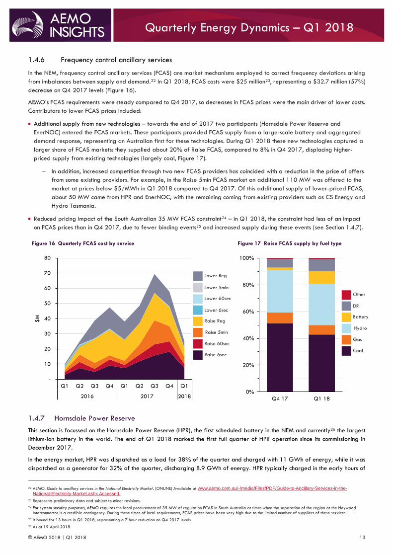
1.4.6 Frequency control ancillary services
In the NEM, frequency control ancillary services (FCAS) are market mechanisms employed to correct frequency deviations arising
from imbalances between supply and demand.22 In Q1 2018, FCAS costs were $25 million23, representing a $32.7 million (57%)
decrease on Q4 2017 levels (Figure 16).
AEMO’s FCAS requirements were steady compared to Q4 2017, so decreases in FCAS prices were the main driver of lower costs.
Contributors to lower FCAS prices included:
Additional supply from new technologies – towards the end of 2017 two participants (Hornsdale Power Reserve and
EnerNOC) entered the FCAS markets. These participants provided FCAS supply from a large-scale battery and aggregated
demand response, representing an Australian first for these technologies. During Q1 2018 these new technologies captured a
larger share of FCAS markets: they supplied about 20% of Raise FCAS, compared to 8% in Q4 2017, displacing higher-
priced supply from existing technologies (largely coal, Figure 17).
In addition, increased competition through two new FCAS providers has coincided with a reduction in the price of offers
from some existing providers. For example, in the Raise 5min FCAS market an additional 110 MW was offered to the
market at prices below $5/MWh in Q1 2018 compared to Q4 2017. Of this additional supply of lower-priced FCAS,
about 50 MW came from HPR and EnerNOC, with the remaining coming from existing providers such as CS Energy and
Hydro Tasmania.
Reduced pricing impact of the South Australian 35 MW FCAS constraint24 – in Q1 2018, the constraint had less of an impact
on FCAS prices than in Q4 2017, due to fewer binding events25 and increased supply during these events (see Section 1.4.7).
Figure 16 Quarterly FCAS cost by service
Figure 17 Raise FCAS supply by fuel type
1.4.7 Hornsdale Power Reserve
This section is focussed on the Hornsdale Power Reserve (HPR), the first scheduled battery in the NEM and currently26 the largest
lithium-ion battery in the world. The end of Q1 2018 marked the first full quarter of HPR operation since its commissioning in
December 2017.
In the energy market, HPR was dispatched as a load for 38% of the quarter and charged with 11 GWh of energy, while it was
dispatched as a generator for 32% of the quarter, discharging 8.9 GWh of energy. HPR typically charged in the early hours of
22 AEMO. Guide to ancillary services in the National Electricity Market. [ONLINE] Available at www.aemo.com.au/-/media/Files/PDF/Guide-to-Ancillary-Services-in-the-
National-Electricity-Market.ashx Accessed.
23 Represents preliminary data and subject to minor revisions.
24 For system security purposes, AEMO requires the local procurement of 35 MW of regulation FCAS in South Australia at times when the separation of the region at the Heywood Interconnector is a credible contingency. During these times of local requirements, FCAS prices have been very high due to the limited number of suppliers of these services.
25 It bound for 13 hours in Q1 2018, representing a 7 hour reduction on Q4 2017 levels.
26 As at 19 April 2018.
-
10
20
30
40
50
60
70
80
Q1 Q2 Q3 Q4 Q1 Q2 Q3 Q4 Q1
2016 2017 2018
$M
0%
20%
40%
60%
80%
100%
Q4 17 Q1 18
Raise 6sec
Raise 60sec
Raise 5min
Raise Reg
Lower 6sec
Lower 5min
Lower 60sec
Lower Reg
Coal
Gas
Hydro
Battery
DR
Other
© AEMO 2018 | Q1 2018 14
Quarterly Energy Dynamics – Q1 2018
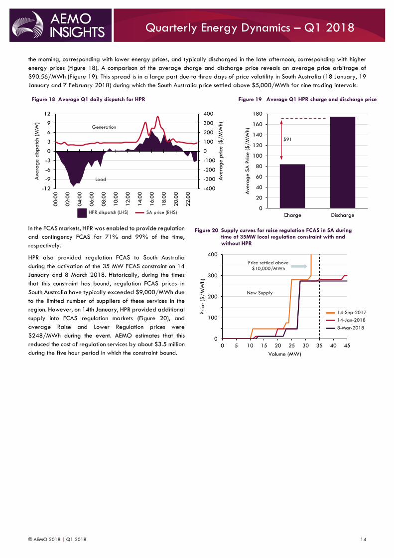
the morning, corresponding with lower energy prices, and typically discharged in the late afternoon, corresponding with higher
energy prices (Figure 18). A comparison of the average charge and discharge price reveals an average price arbitrage of
$90.56/MWh (Figure 19). This spread is in a large part due to three days of price volatility in South Australia (18 January, 19
January and 7 February 2018) during which the South Australia price settled above $5,000/MWh for nine trading intervals.
In the FCAS markets, HPR was enabled to provide regulation
and contingency FCAS for 71% and 99% of the time,
respectively.
HPR also provided regulation FCAS to South Australia
during the activation of the 35 MW FCAS constraint on 14
January and 8 March 2018. Historically, during the times
that this constraint has bound, regulation FCAS prices in
South Australia have typically exceeded $9,000/MWh due
to the limited number of suppliers of these services in the
region. However, on 14th January, HPR provided additional
supply into FCAS regulation markets (Figure 20), and
average Raise and Lower Regulation prices were
$248/MWh during the event. AEMO estimates that this
reduced the cost of regulation services by about $3.5 million
during the five hour period in which the constraint bound.
Figure 18 Average Q1 daily dispatch for HPR
Figure 19 Average Q1 HPR charge and discharge price
Figure 20 Supply curves for raise regulation FCAS in SA during time of 35MW local regulation constraint with and without HPR
-400
-300
-200
-100
0
100
200
300
400
-12
-9
-6
-3
0
3
6
9
12
00
:00
02
:00
04
:00
06
:00
08
:00
10
:00
12
:00
14
:00
16
:00
18
:00
20
:00
22
:00
Ave
rage p
rice
($/M
Wh)
Ave
rage d
ispatc
h (
MW
)
0
20
40
60
80
100
120
140
160
180
Charge Discharge
Ave
rage S
A P
rice
($/M
Wh)
0
100
200
300
400
0 5 10 15 20 25 30 35 40 45
Price
($/M
Wh)
Volume (MW)
Generation
Load
New Supply
Price settled above $10,000/MWh
HPR dispatch (LHS) SA price (RHS)
$91
14-Jan-2018 14-Sep-2017
8-Mar-2018
© AEMO 2018 | Q1 2018 15
Quarterly Energy Dynamics – Q1 2018
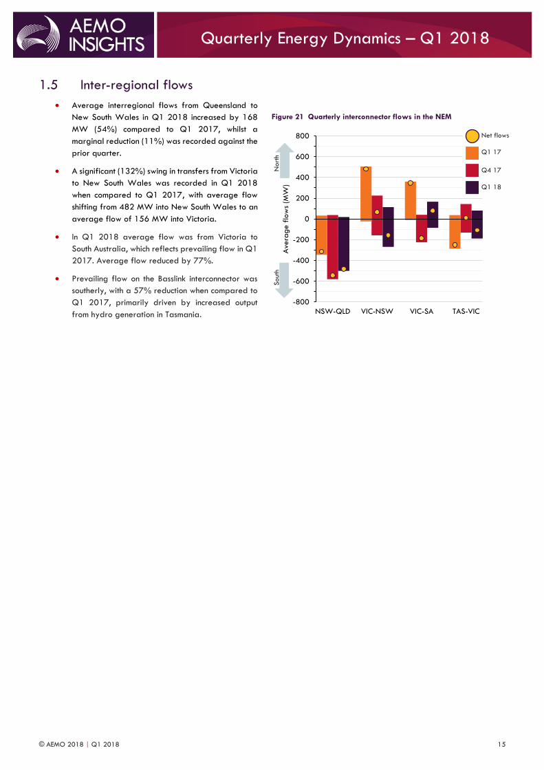
1.5 Inter-regional flows
Average interregional flows from Queensland to
New South Wales in Q1 2018 increased by 168
MW (54%) compared to Q1 2017, whilst a
marginal reduction (11%) was recorded against the
prior quarter.
A significant (132%) swing in transfers from Victoria
to New South Wales was recorded in Q1 2018
when compared to Q1 2017, with average flow
shifting from 482 MW into New South Wales to an
average flow of 156 MW into Victoria.
In Q1 2018 average flow was from Victoria to
South Australia, which reflects prevailing flow in Q1
2017. Average flow reduced by 77%.
Prevailing flow on the Basslink interconnector was
southerly, with a 57% reduction when compared to
Q1 2017, primarily driven by increased output
from hydro generation in Tasmania.
Figure 21 Quarterly interconnector flows in the NEM
-800
-600
-400
-200
0
200
400
600
800
NSW-QLD VIC-NSW VIC-SA TAS-VIC
Ave
rage f
low
s (M
W)
Nort
h Sout
h
Q1 18
Q4 17
Q1 17
Net flows
© AEMO 2018 | Q1 2018 16
Quarterly Energy Dynamics – Q1 2018
2.1 Gas demand Total gas demand27 increased by 4 PJ during the quarter compared to Q1 2017, driven by a 9 PJ increase in pipeline deliveries
for export LNG (Table 6). This increase was partially offset by a 5 PJ (11%) decrease in GPG, influenced by the ongoing
supply-side evolution in the NEM. The largest reductions in GPG demand occurred in Queensland (4.5 PJ or 23%) and New South
Wales (2.7 PJ or 58%) (Section 1.3.3).
Residential, commercial and industrial demand for gas from AEMO’s wholesale gas markets remained consistent at 54 PJ, with
minor quarterly variances between each of the markets.
Table 6 Total Gas Demand – Q1 2018 vs Q1 2017
Total Demand Q1 2017 (PJ) Q1 2018 (PJ) Volume Change (PJ)
AEMO Markets * 54 54 -
GPG ** 47 42 5
QLD LNG 298 307 9
TOTAL 399 403 4
* AEMO Markets demand is the sum of customer demand in each of the Short Term Trading Markets (STTMs) and the Declared Wholesale Gas Market (DWGM). ** Includes demand for GPG usually captured as part of total DWGM demand. Excludes Yabulu as not connected to main gas pipelines.
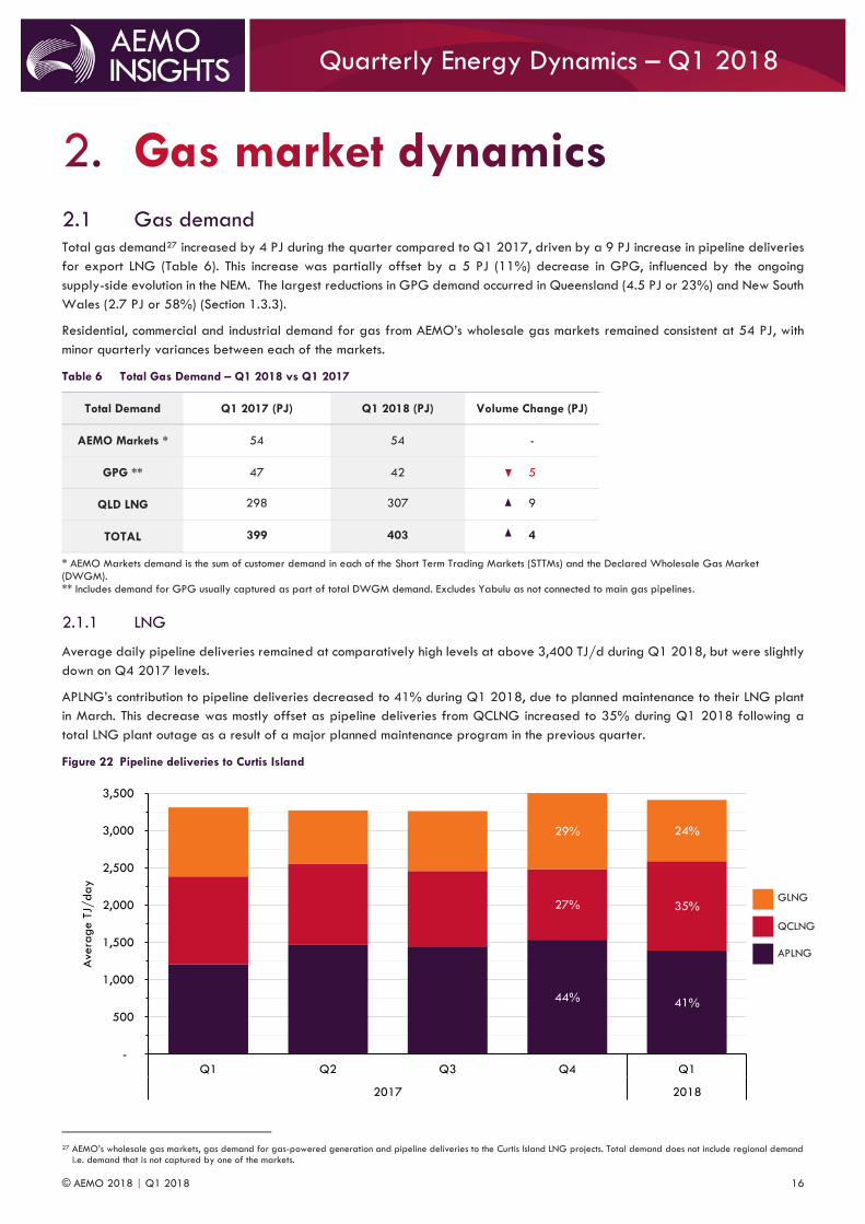
2.1.1 LNG
Average daily pipeline deliveries remained at comparatively high levels at above 3,400 TJ/d during Q1 2018, but were slightly
down on Q4 2017 levels.
APLNG’s contribution to pipeline deliveries decreased to 41% during Q1 2018, due to planned maintenance to their LNG plant
in March. This decrease was mostly offset as pipeline deliveries from QCLNG increased to 35% during Q1 2018 following a
total LNG plant outage as a result of a major planned maintenance program in the previous quarter.
Figure 22 Pipeline deliveries to Curtis Island
27 AEMO’s wholesale gas markets, gas demand for gas-powered generation and pipeline deliveries to the Curtis Island LNG projects. Total demand does not include regional demand
i.e. demand that is not captured by one of the markets.
44% 41%
27% 35%
29% 24%
-
500
1,000
1,500
2,000
2,500
3,000
3,500
Q1 Q2 Q3 Q4 Q1
2017 2018
Ave
rage T
J/day
APLNG
QCLNG
GLNG
© AEMO 2018 | Q1 2018 17
Quarterly Energy Dynamics – Q1 2018
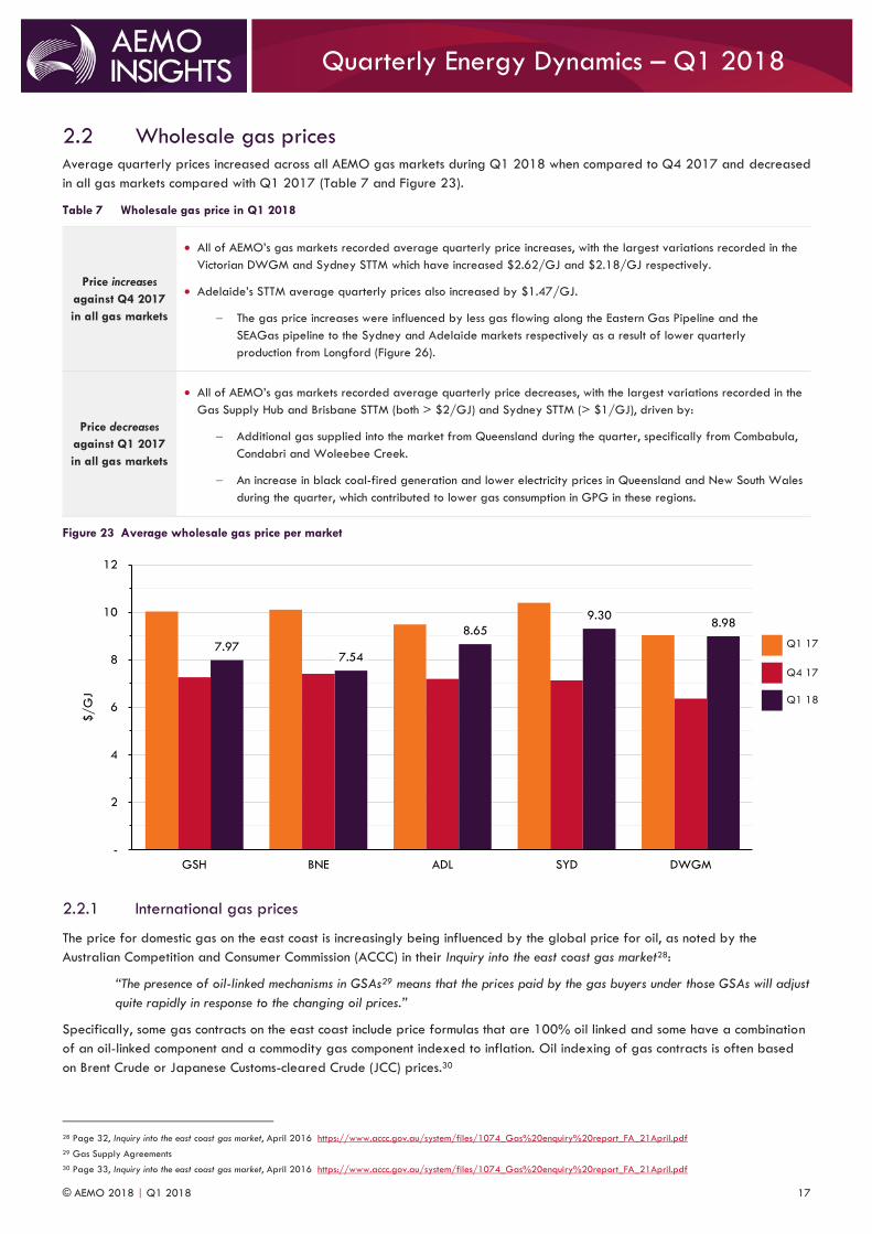
2.2 Wholesale gas prices Average quarterly prices increased across all AEMO gas markets during Q1 2018 when compared to Q4 2017 and decreased
in all gas markets compared with Q1 2017 (Table 7 and Figure 23).
Table 7 Wholesale gas price in Q1 2018
Price increases
against Q4 2017
in all gas markets
All of AEMO’s gas markets recorded average quarterly price increases, with the largest variations recorded in the
Victorian DWGM and Sydney STTM which have increased $2.62/GJ and $2.18/GJ respectively.
Adelaide’s STTM average quarterly prices also increased by $1.47/GJ.
The gas price increases were influenced by less gas flowing along the Eastern Gas Pipeline and the
SEAGas pipeline to the Sydney and Adelaide markets respectively as a result of lower quarterly
production from Longford (Figure 26).
Price decreases
against Q1 2017
in all gas markets
All of AEMO’s gas markets recorded average quarterly price decreases, with the largest variations recorded in the
Gas Supply Hub and Brisbane STTM (both > $2/GJ) and Sydney STTM (> $1/GJ), driven by:
Additional gas supplied into the market from Queensland during the quarter, specifically from Combabula,
Condabri and Woleebee Creek.
An increase in black coal-fired generation and lower electricity prices in Queensland and New South Wales
during the quarter, which contributed to lower gas consumption in GPG in these regions.
Figure 23 Average wholesale gas price per market
2.2.1 International gas prices
The price for domestic gas on the east coast is increasingly being influenced by the global price for oil, as noted by the
Australian Competition and Consumer Commission (ACCC) in their Inquiry into the east coast gas market28:
“The presence of oil-linked mechanisms in GSAs29 means that the prices paid by the gas buyers under those GSAs will adjust
quite rapidly in response to the changing oil prices.”
Specifically, some gas contracts on the east coast include price formulas that are 100% oil linked and some have a combination
of an oil-linked component and a commodity gas component indexed to inflation. Oil indexing of gas contracts is often based
on Brent Crude or Japanese Customs-cleared Crude (JCC) prices.30
28 Page 32, Inquiry into the east coast gas market, April 2016 https://www.accc.gov.au/system/files/1074_Gas%20enquiry%20report_FA_21April.pdf
29 Gas Supply Agreements
30 Page 33, Inquiry into the east coast gas market, April 2016 https://www.accc.gov.au/system/files/1074_Gas%20enquiry%20report_FA_21April.pdf
7.977.54
8.65
9.308.98
-
2
4
6
8
10
12
GSH BNE ADL SYD DWGM
$/G
J
Q1 18
Q4 17
Q1 17
© AEMO 2018 | Q1 2018 18
Quarterly Energy Dynamics – Q1 2018
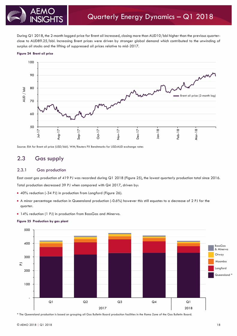
During Q1 2018, the 2-month lagged price for Brent oil increased, closing more than AUD10/bbl higher than the previous quarter-
close to AUD89.25/bbl. Increasing Brent prices were driven by stronger global demand which contributed to the unwinding of
surplus oil stocks and the lifting of suppressed oil prices relative to mid-2017.
Figure 24 Brent oil price
Source: EIA for Brent oil price (USD/bbl). WM/Reuters FX Benchmarks for USD:AUD exchange rates
2.3 Gas supply
2.3.1 Gas production
East coast gas production of 419 PJ was recorded during Q1 2018 (Figure 25), the lowest quarterly production total since 2016.
Total production decreased 39 PJ when compared with Q4 2017, driven by:
40% reduction (-34 PJ) in production from Longford (Figure 26).
A minor percentage reduction in Queensland production (-0.6%) however this still equates to a decrease of 2 PJ for the
quarter.
14% reduction (1 PJ) in production from BassGas and Minerva.
Figure 25 Production by gas plant
* The Queensland production is based on grouping all Gas Bulletin Board production facilities in the Roma Zone of the Gas Bulletin Board.
50
60
70
80
90
100
Jul-1
7
Aug
-17
Sep-1
7
Oct
-17
Nov-
17
Dec-
17
Jan-
18
Feb
-18
Mar-
18
AU
D /
bbl
-
100
200
300
400
500
Q1 Q2 Q3 Q4 Q1
2017 2018
PJ
Brent oil price (2-month lag)
Queensland *
Longford
Moomba
Otway
BassGas & Minerva
© AEMO 2018 | Q1 2018 19
Quarterly Energy Dynamics – Q1 2018
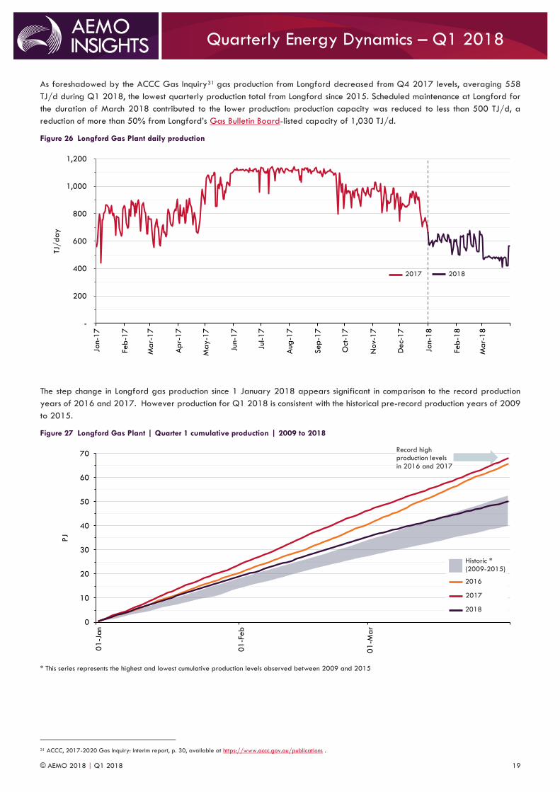
As foreshadowed by the ACCC Gas Inquiry31 gas production from Longford decreased from Q4 2017 levels, averaging 558
TJ/d during Q1 2018, the lowest quarterly production total from Longford since 2015. Scheduled maintenance at Longford for
the duration of March 2018 contributed to the lower production: production capacity was reduced to less than 500 TJ/d, a
reduction of more than 50% from Longford’s Gas Bulletin Board-listed capacity of 1,030 TJ/d.
Figure 26 Longford Gas Plant daily production
The step change in Longford gas production since 1 January 2018 appears significant in comparison to the record production
years of 2016 and 2017. However production for Q1 2018 is consistent with the historical pre-record production years of 2009
to 2015.
Figure 27 Longford Gas Plant | Quarter 1 cumulative production | 2009 to 2018
* This series represents the highest and lowest cumulative production levels observed between 2009 and 2015
31 ACCC, 2017-2020 Gas Inquiry: Interim report, p. 30, available at https://www.accc.gov.au/publications .
-
200
400
600
800
1,000
1,200
Jan-
17
Feb
-17
Mar-
17
Ap
r-17
May-1
7
Jun-
17
Jul-1
7
Aug
-17
Sep-1
7
Oct
-17
Nov-
17
Dec-
17
Jan-
18
Feb
-18
Mar-
18
TJ/day
0
10
20
30
40
50
60
70
01
-Jan
01
-Feb
01
-Ma
r
PJ
2018 2017
Record high production levels in 2016 and 2017
2016
Historic * (2009-2015)
2017
2018

© AEMO 2018 | Q1 2018 20
Quarterly Energy Dynamics – Q1 2018
2.3.2 Gas storage
A gas inventory of 18 PJ was recorded at the Iona Underground Storage Facility (in Victoria) at the commencement of 2018.
Net-injections into Iona of 4 PJ during the quarter were lower than Q1 2017 (by 3 PJ), driven by:
Reduced Q1 2018 production from Longford and Otway.
Volatility in wholesale electricity prices (see 1.4.1 above).
This resulted in a closing inventory of 21 PJ at the end of Q1 2018, a 1 PJ increase compared to 31 March 2017.
Figure 28 Iona Underground Storage Facility – storage levels
2.4 Pipeline flows
2.4.1 Reduced gas exports from Victoria to other states
Decreased Longford gas production has driven reduced Q1 2018 gas exports from Victoria to other states by 24 PJ (43%) when
compared to Q4 2017 (Figure 29). Whilst quarterly deliveries along the Tasmanian Gas Pipeline remained consistent at 5 PJ,
exports via the SEAGas pipeline to South Australia reduced by 53% to 11 PJ. Gas flows to the New South Wales STTM recorded
the greatest decrease from Q4 2017, as deliveries along the Longford-sourced Eastern Gas Pipeline more than halved,
contributing to a quarterly export total to New South Wales of 18 PJ.
Figure 29 Victorian gas exports to other states
10
12
14
16
18
20
22
24
26
Jan-
18
Feb
-18
Mar-
18
Ap
r-18
Sto
rage leve
l (P
J)
-
10
20
30
40
50
60
Q3 Q4 Q1 Q2 Q3 Q4 Q1
2016 2017 2018
PJ
2018
Capacity 2017
To NSW
To SA
To TAS
24 PJ
© AEMO 2018 | Q1 2018 21
Quarterly Energy Dynamics – Q1 2018
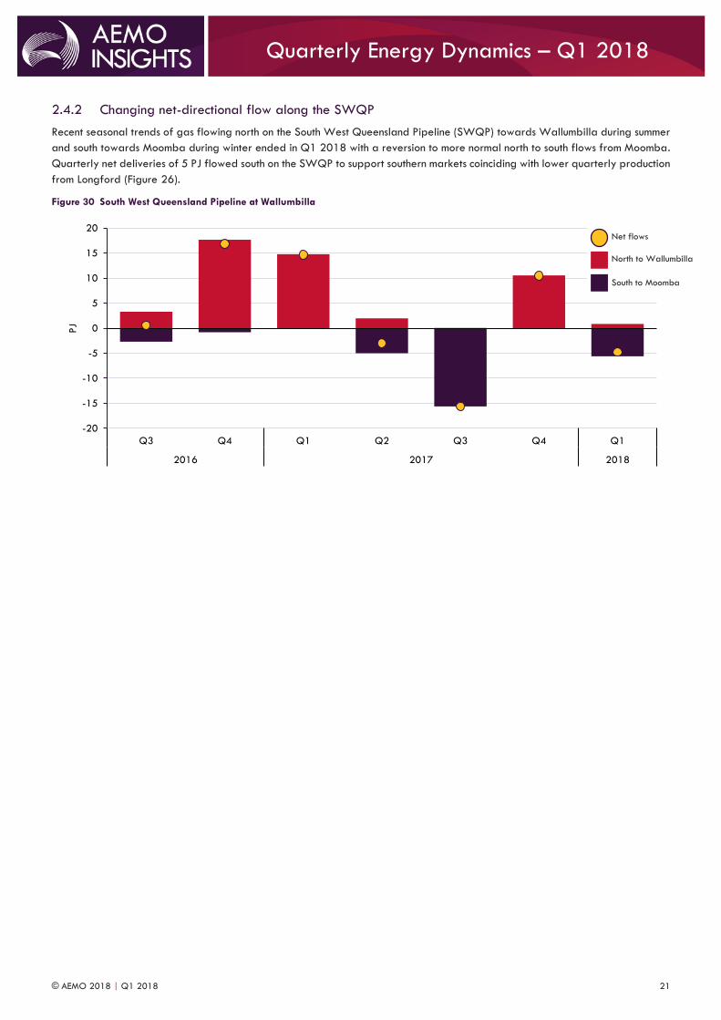
2.4.2 Changing net-directional flow along the SWQP
Recent seasonal trends of gas flowing north on the South West Queensland Pipeline (SWQP) towards Wallumbilla during summer
and south towards Moomba during winter ended in Q1 2018 with a reversion to more normal north to south flows from Moomba.
Quarterly net deliveries of 5 PJ flowed south on the SWQP to support southern markets coinciding with lower quarterly production
from Longford (Figure 26).
Figure 30 South West Queensland Pipeline at Wallumbilla
-20
-15
-10
-5
0
5
10
15
20
Q3 Q4 Q1 Q2 Q3 Q4 Q1
2016 2017 2018
PJ
South to Moomba
North to Wallumbilla
Net flows
© AEMO 2018 | Q1 2018 22
Quarterly Energy Dynamics – Q1 2018
Abbreviation Expanded name
AEMC Australian Energy Market Commission
AEMO Australian Energy Market Operator
BBL Barrel
BNEF Bloomberg New Energy Finance
CER Clean Energy Regulator
CCGT Combined cycle gas turbine
DWGM Declared Wholesale Gas Market
FCAS Frequency control ancillary services
FID Final investment decision
GJ GigaJoule
GPG Gas-powered generation
GSH Gas Supply Hub
HPR Hornsdale Power Reserve (Tesla battery)
LGC Large-scale Generation Certificates
LNG Liquefied natural gas
MW MegaWatt
MWh MegaWatt hour
NEM National Electricity Market
PJ PetaJoule
PPA Power purchase agreement
PV Photovoltaic
RERT Reliability and Emergency Reserve Trader
STTM Short Term Trading Market
SWQP South West Queensland Pipeline
TJ TeraJoule
USD United States dollars