pumadb: data analysis tutorial june 1, 2004. user help: help, tutorials and workshops help & faq...
Post on 20-Dec-2015
223 views
TRANSCRIPT
PUMAdb: Data Analysis Tutorial
June 1, 2004
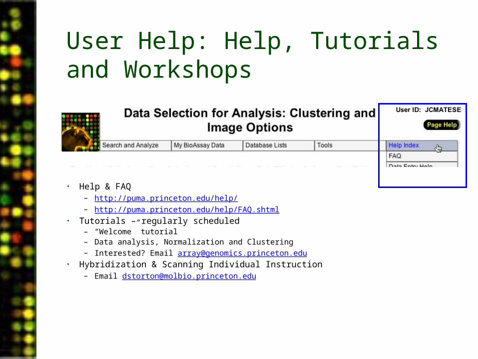
User Help: Help, Tutorials and Workshops
• Help & FAQ– http://puma.princeton.edu/help/– http://puma.princeton.edu/help/FAQ.shtml
• Tutorials – regularly scheduled– “Welcome” tutorial– Data analysis, Normalization and Clustering– Interested? Email [email protected]
• Hybridization & Scanning Individual Instruction– Email [email protected]
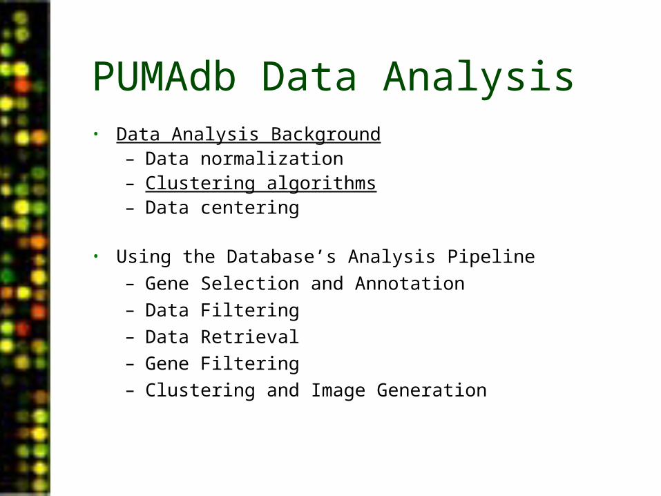
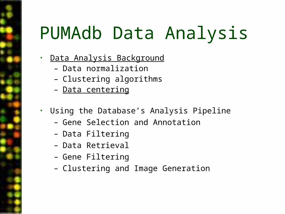
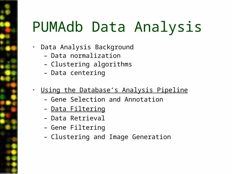
PUMAdb Data Analysis• Data Analysis Background
– Data normalization– Clustering algorithms– Data centering
• Using the Database’s Analysis Pipeline
– Gene Selection and Annotation– Data Filtering– Data Retrieval– Gene Filtering– Clustering and Image Generation
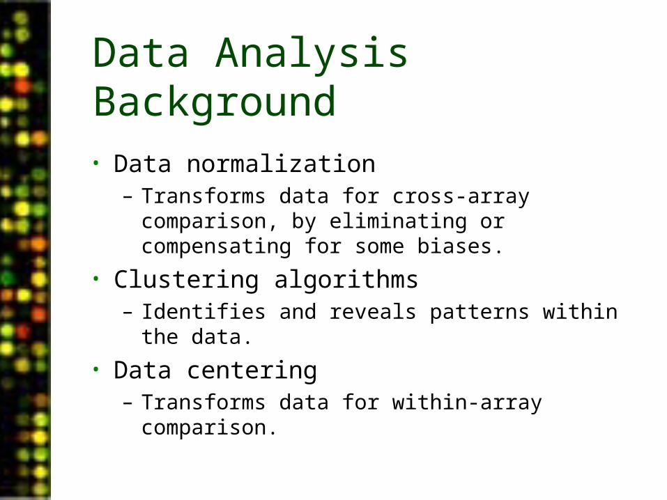
Data Analysis Background
• Data normalization– Transforms data for cross-array comparison, by
eliminating or compensating for some biases.
• Clustering algorithms– Identifies and reveals patterns within the data.
• Data centering– Transforms data for within-array comparison.
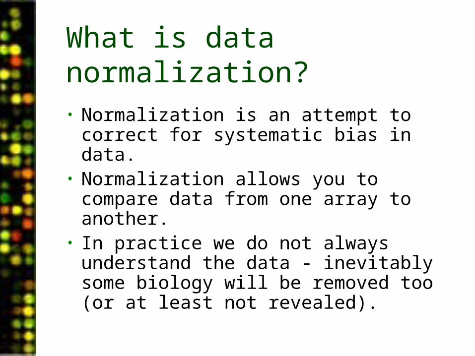
• Normalization is an attempt to correct for systematic bias in data.
• Normalization allows you to compare data from one array to another.
• In practice we do not always understand the data - inevitably some biology will be removed too (or at least not revealed).
What is data normalization?
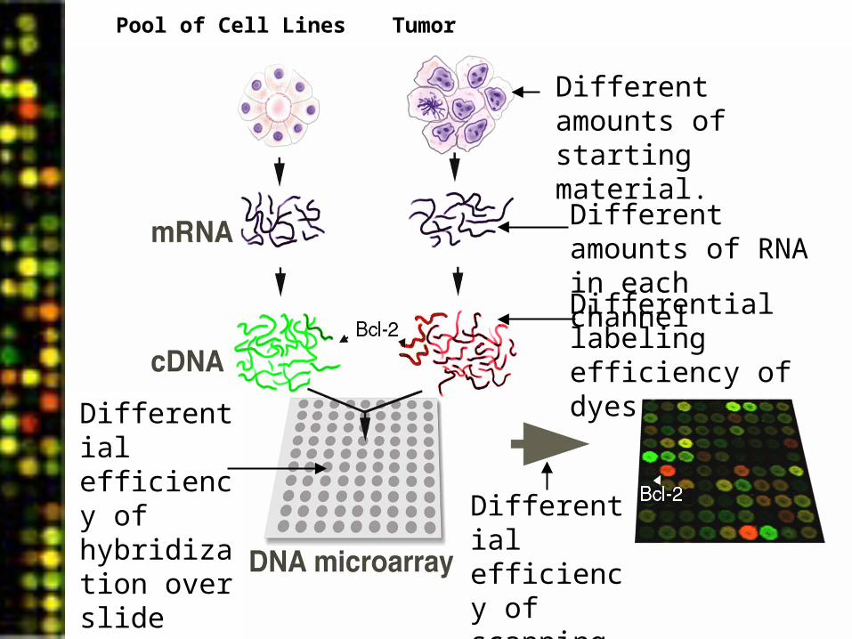
TumorPool of Cell Lines
Differential labeling efficiency of dyes
Different amounts of starting material.
Different amounts of RNA in each channel
Differential efficiency of hybridization over slide surface.
Differential efficiency of scanning in each channel.
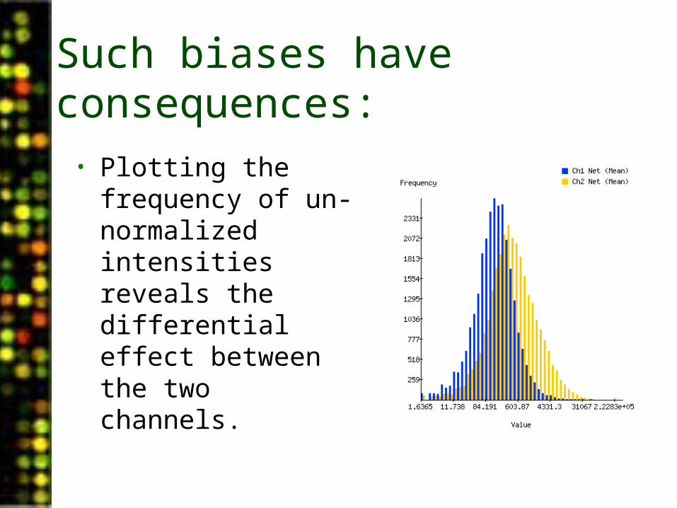
Such biases have consequences:
• Plotting the frequency of un-normalized intensities reveals the differential effect between the two channels.
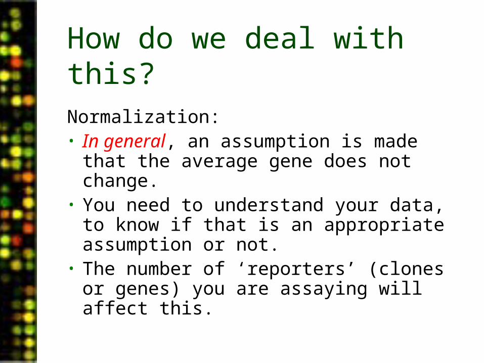
How do we deal with this?
Normalization:• In general, an assumption is made that
the average gene does not change.• You need to understand your data, to
know if that is an appropriate assumption or not.
• The number of ‘reporters’ (clones or genes) you are assaying will affect this.
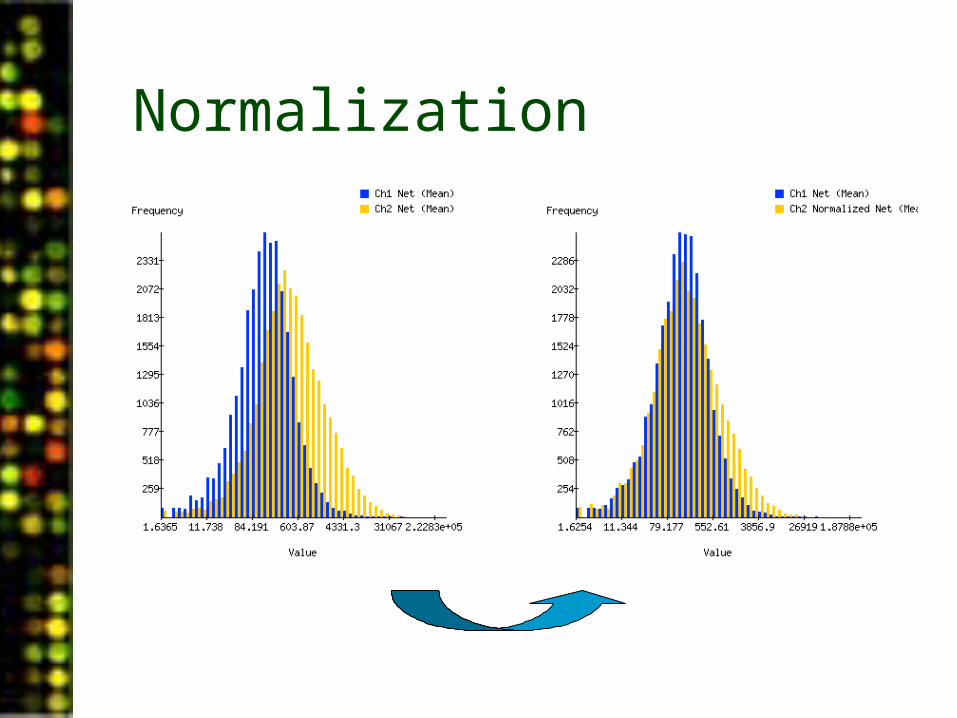
Normalization
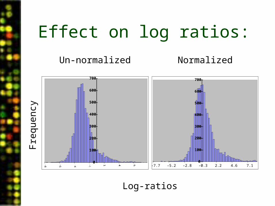
Effect on log ratios:
Un-normalized Normalized
Fre
quen
cy
0
100
200
300
400
500
600
700
0
100
200
300
400
500
600
700
-7.7 -5.2 -2.8 -0.3 2.2 4.6 7.1
Log-ratios
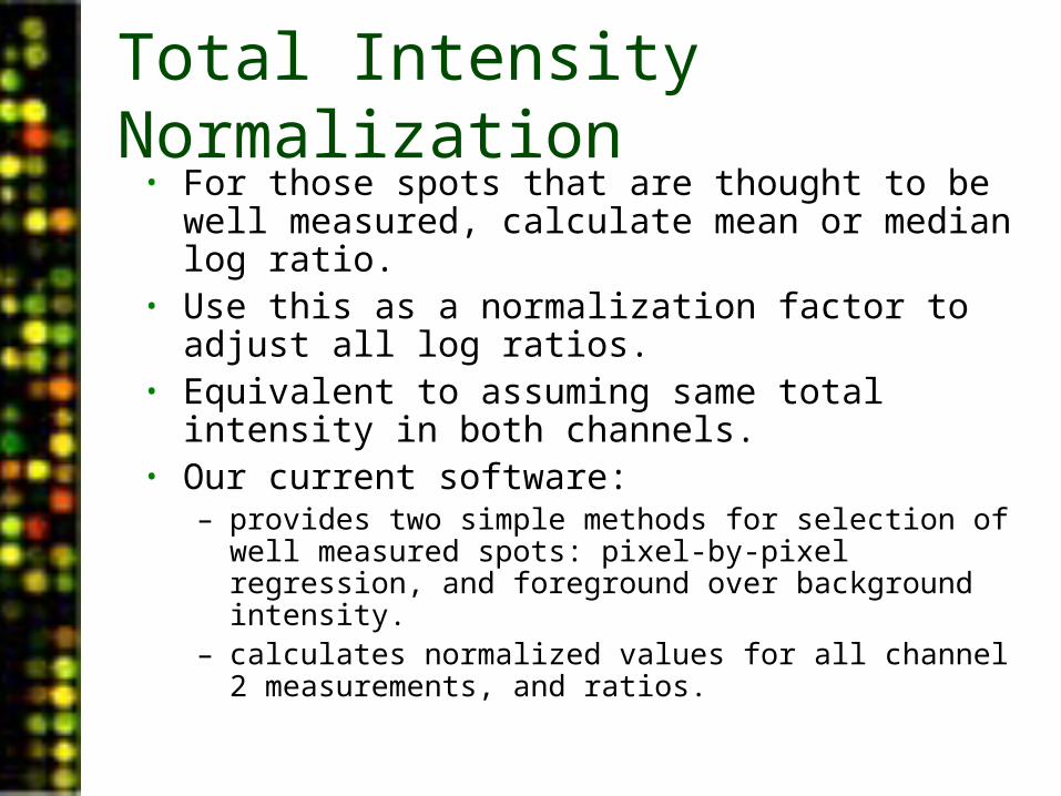
Total Intensity Normalization• For those spots that are thought to be well measured,
calculate mean or median log ratio.• Use this as a normalization factor to adjust all log
ratios.• Equivalent to assuming same total intensity in both
channels.• Our current software:
– provides two simple methods for selection of well measured spots: pixel-by-pixel regression, and foreground over background intensity.
– calculates normalized values for all channel 2 measurements, and ratios.
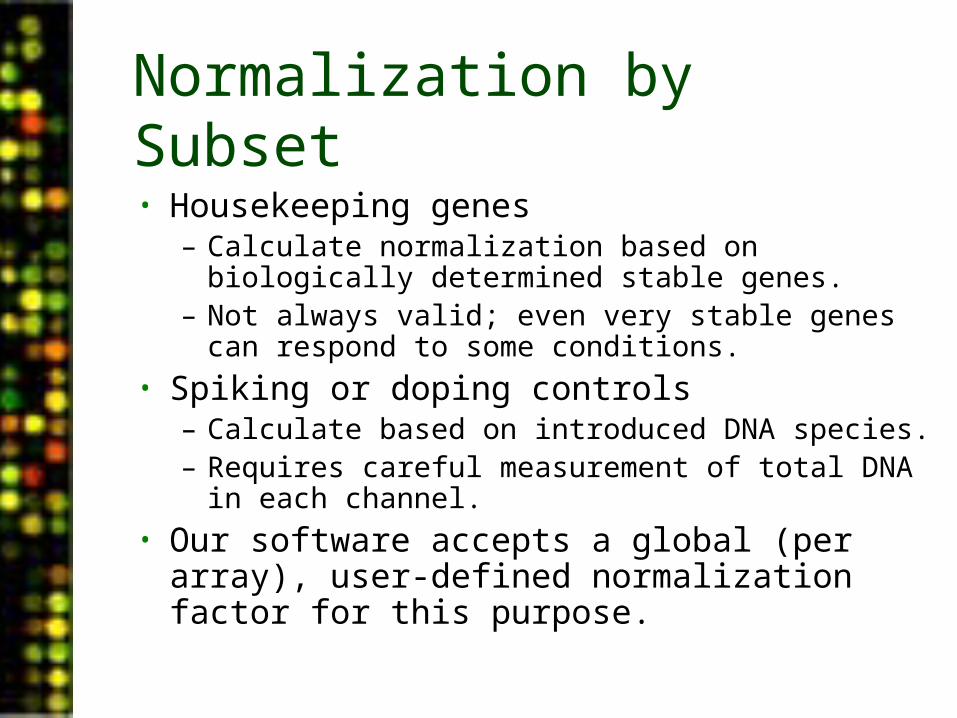
Normalization by Subset
• Housekeeping genes– Calculate normalization based on biologically
determined stable genes.– Not always valid; even very stable genes can
respond to some conditions.• Spiking or doping controls
– Calculate based on introduced DNA species.– Requires careful measurement of total DNA in
each channel.• Our software accepts a global (per array),
user-defined normalization factor for this purpose.
PUMAdb Data Analysis• Data Analysis Background
– Data normalization– Clustering algorithms– Data centering
• Using the Database’s Analysis Pipeline
– Gene Selection and Annotation– Data Filtering– Data Retrieval– Gene Filtering– Clustering and Image Generation
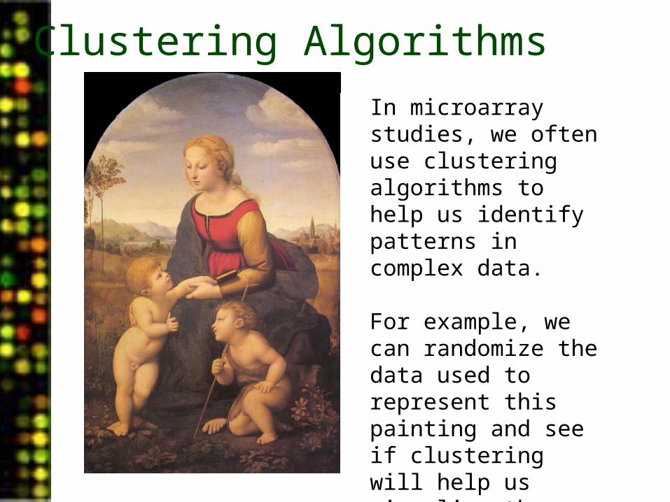
Clustering Algorithms
In microarray studies, we often use clustering algorithms to help us identify patterns in complex data.
For example, we can randomize the data used to represent this painting and see if clustering will help us visualize the pattern.
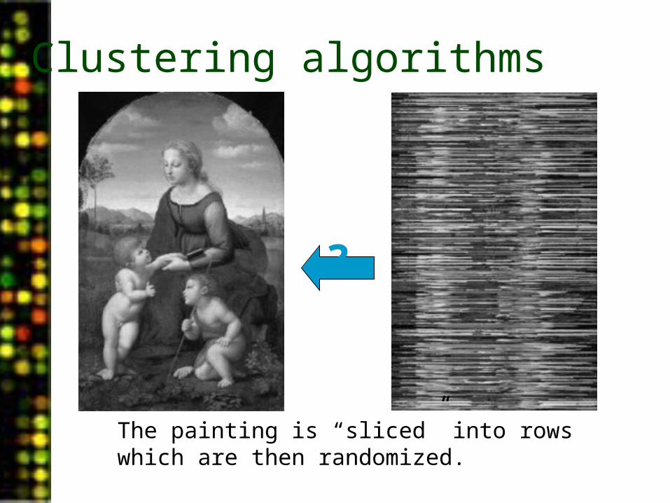
Clustering algorithms
The painting is “sliced” into rows which are then randomized.
?
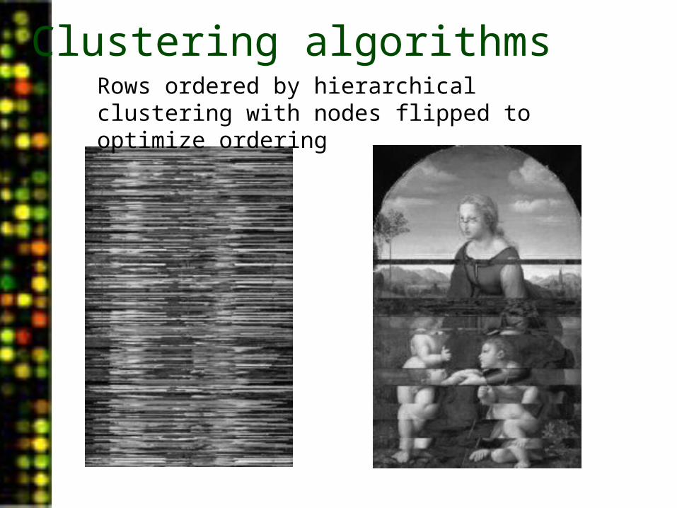
Rows ordered by hierarchical clustering with nodes flipped to optimize ordering
Clustering algorithms
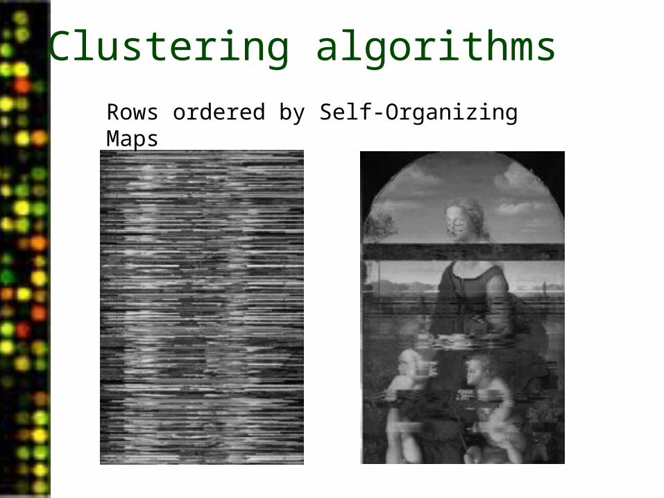
Rows ordered by Self-Organizing Maps
Clustering algorithms

From Eisen MB, et al, PNAS 1998 95(25):14863-8
Clustering Random vs. Biological Data
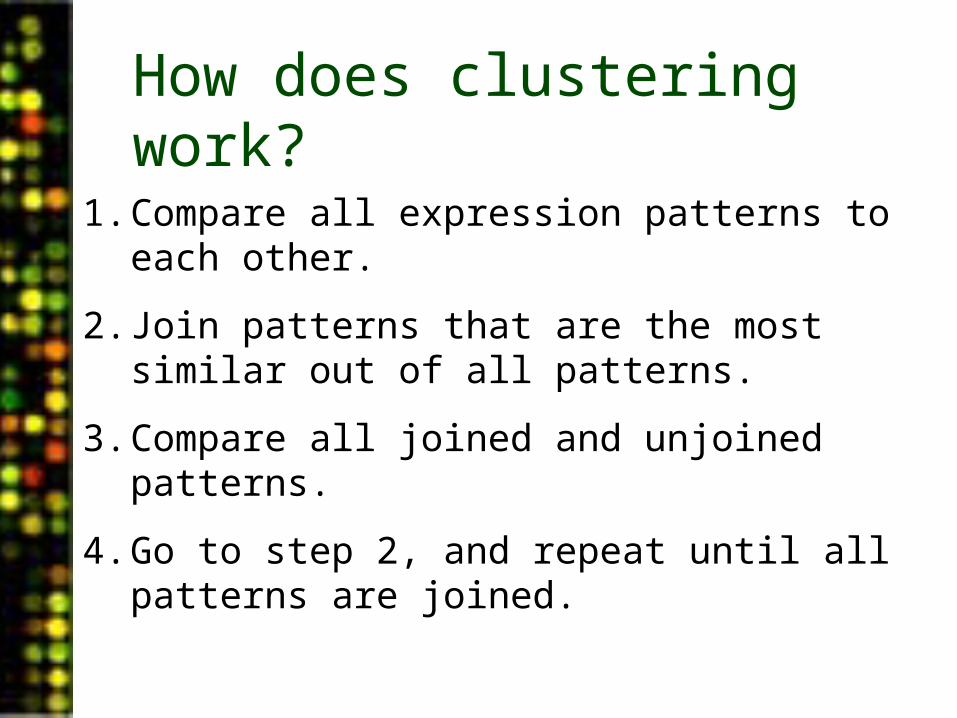
How does clustering work?
1. Compare all expression patterns to each other.
2. Join patterns that are the most similar out of all patterns.
3. Compare all joined and unjoined patterns.
4. Go to step 2, and repeat until all patterns are joined.
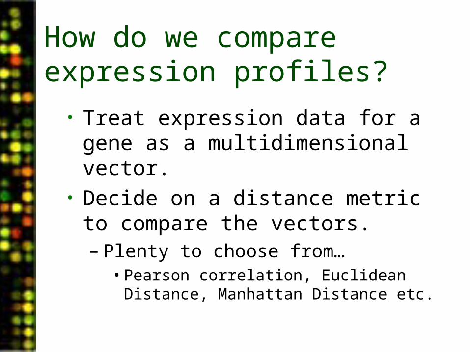
How do we compare expression profiles?
• Treat expression data for a gene as a multidimensional vector.
• Decide on a distance metric to compare the vectors.– Plenty to choose from…
• Pearson correlation, Euclidean Distance, Manhattan Distance etc.
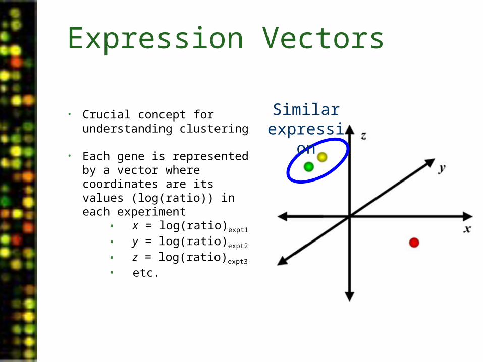
Similar expression
Expression Vectors
• Crucial concept for understanding clustering
• Each gene is represented by a vector where coordinates are its values (log(ratio)) in each experiment
• x = log(ratio)expt1
• y = log(ratio)expt2
• z = log(ratio)expt3
• etc.
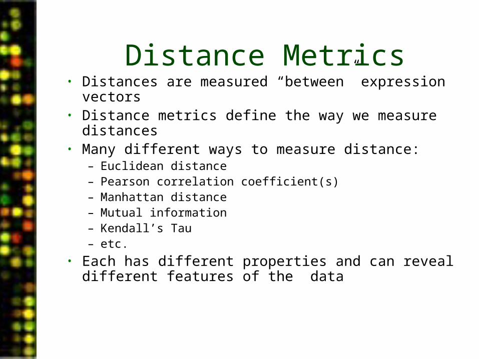
Distance Metrics• Distances are measured “between” expression vectors• Distance metrics define the way we measure
distances• Many different ways to measure distance:
– Euclidean distance– Pearson correlation coefficient(s)– Manhattan distance– Mutual information– Kendall’s Tau– etc.
• Each has different properties and can reveal different features of the data
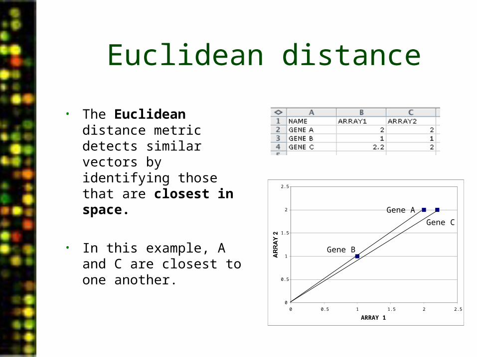
Euclidean distance
• The Euclidean distance metric detects similar vectors by identifying those that are closest in space.
• In this example, A and C are closest to one another.
0
0.5
1
1.5
2
2.5
0 0.5 1 1.5 2 2.5
ARRAY 1
ARRAY 2Gene B
Gene A
Gene C
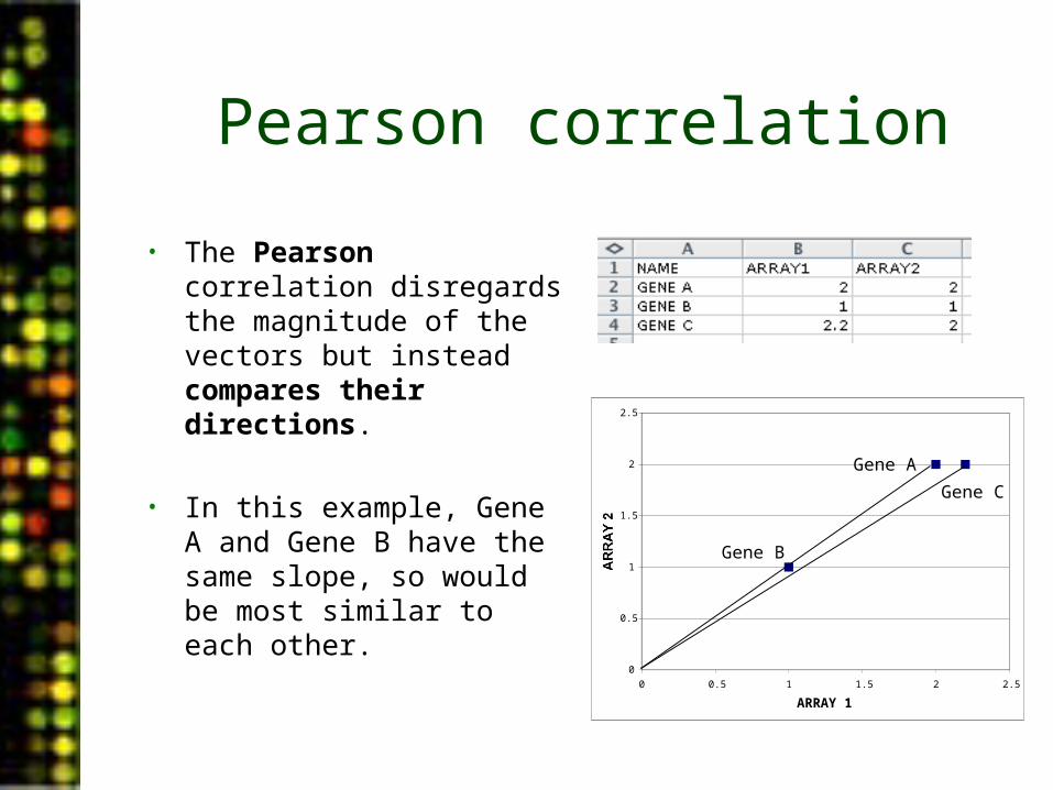
Pearson correlation
• The Pearson correlation disregards the magnitude of the vectors but instead compares their directions.
• In this example, Gene A and Gene B have the same slope, so would be most similar to each other.
0
0.5
1
1.5
2
2.5
0 0.5 1 1.5 2 2.5
ARRAY 1
ARRAY 2Gene B
Gene A
Gene C
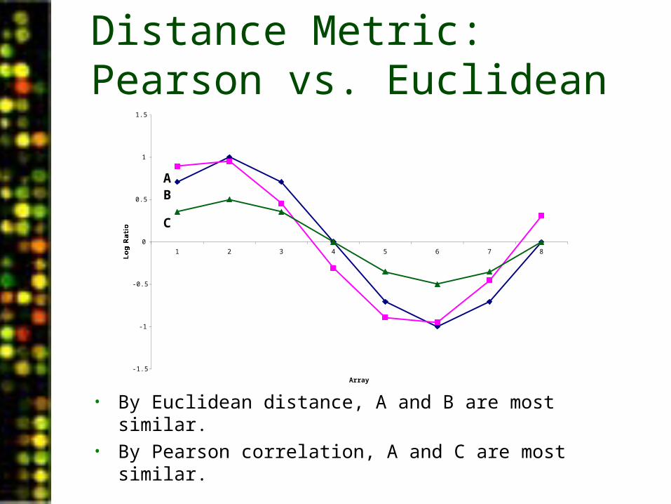
Distance Metric: Pearson vs. Euclidean
-1.5
-1
-0.5
0
0.5
1
1.5
1 2 3 4 5 6 7 8
Array
Log Ratio
• By Euclidean distance, A and B are most similar.• By Pearson correlation, A and C are most similar.
AB
C
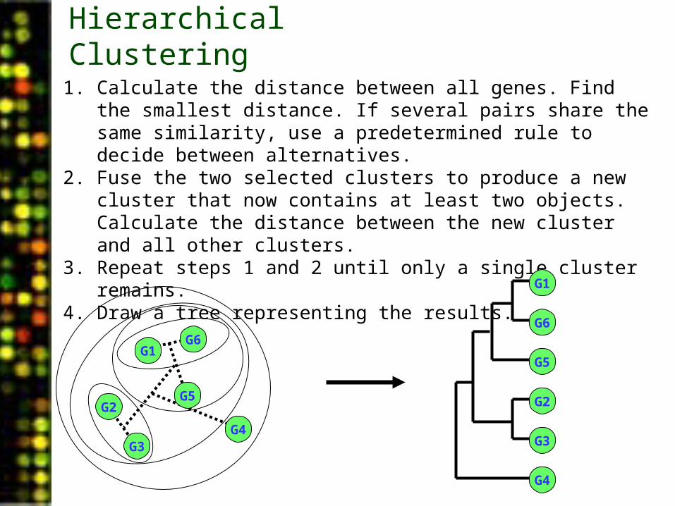
Hierarchical Clustering
1. Calculate the distance between all genes. Find the smallest distance. If several pairs share the same similarity, use a predetermined rule to decide between alternatives.
2. Fuse the two selected clusters to produce a new cluster that now contains at least two objects. Calculate the distance between the new cluster and all other clusters.
3. Repeat steps 1 and 2 until only a single cluster remains.4. Draw a tree representing the results.
G1G6
G3
G5
G4
G2
G1
G6
G3
G5
G4
G2
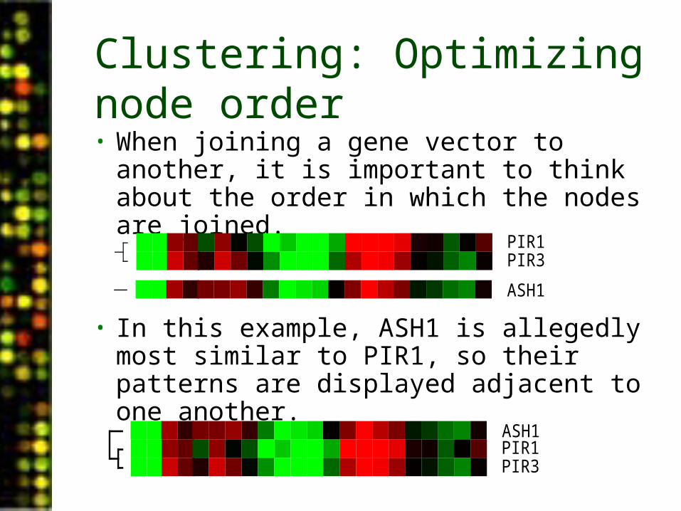
Clustering: Optimizing node order• When joining a gene vector to another,
it is important to think about the order in which the nodes are joined.
• In this example, ASH1 is allegedly most similar to PIR1, so their patterns are displayed adjacent to one another.
PIR1PIR3
ASH1
PIR1PIR3
ASH1
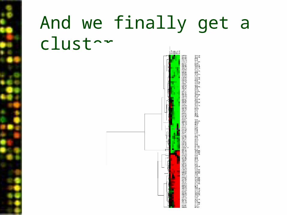
And we finally get a cluster…
Clustering: Two-way clustering
• Just as gene patterns are clustered, array patterns can be clustered.
• All the data points for an array can be used to construct a vector for that array and the vectors of multiple arrays can be compared.
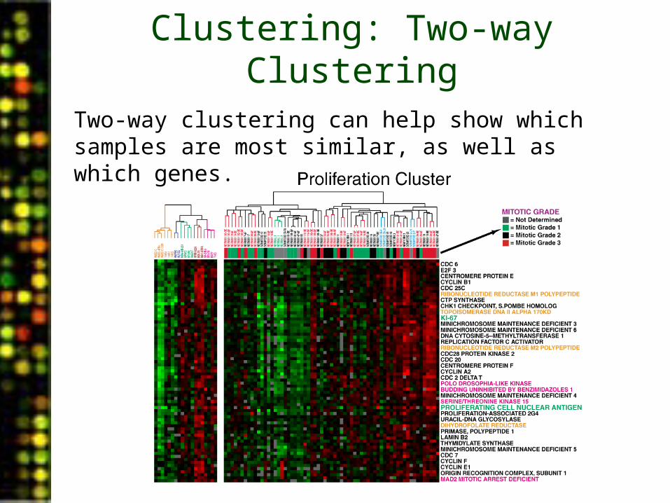
Clustering: Two-way Clustering
Two-way clustering can help show which samples are most similar, as well as which genes.
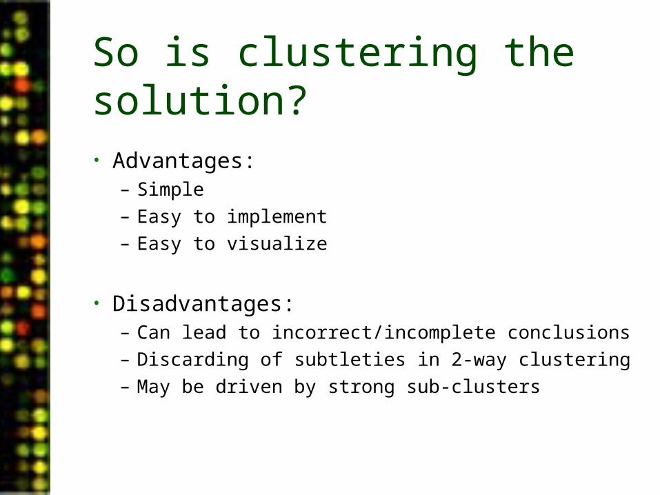
So is clustering the solution?
• Advantages:– Simple– Easy to implement– Easy to visualize
• Disadvantages:– Can lead to incorrect/incomplete conclusions– Discarding of subtleties in 2-way clustering– May be driven by strong sub-clusters
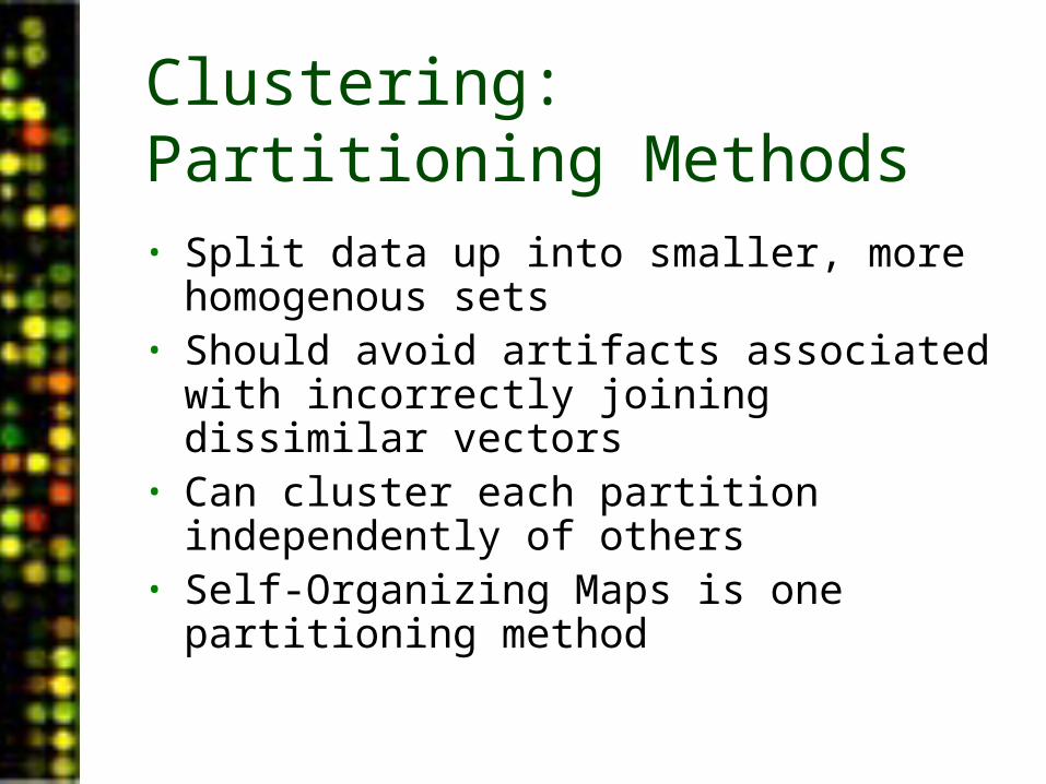
Clustering: Partitioning Methods• Split data up into smaller, more homogenous
sets• Should avoid artifacts associated with
incorrectly joining dissimilar vectors• Can cluster each partition independently of
others• Self-Organizing Maps is one partitioning
method
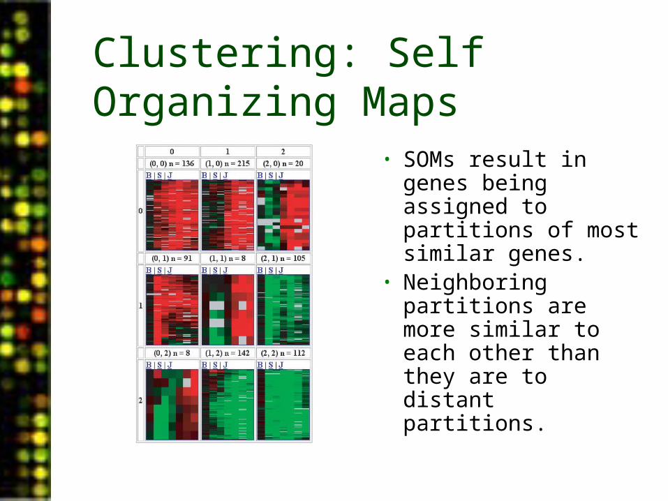
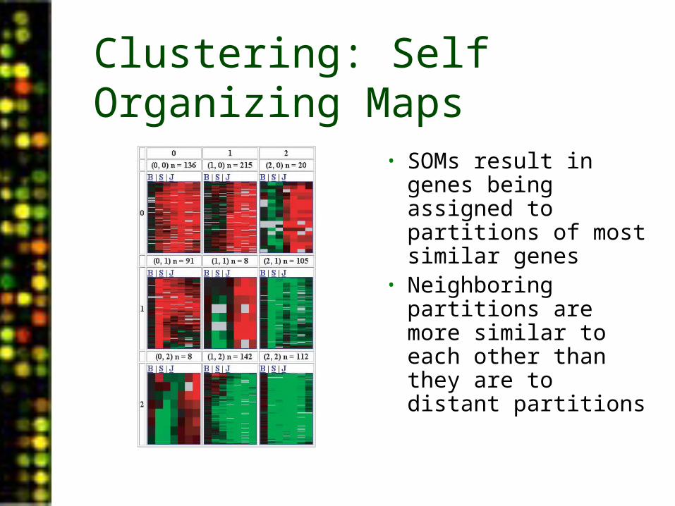
Clustering: Self Organizing Maps
• SOMs result in genes being assigned to partitions of most similar genes.
• Neighboring partitions are more similar to each other than they are to distant partitions.
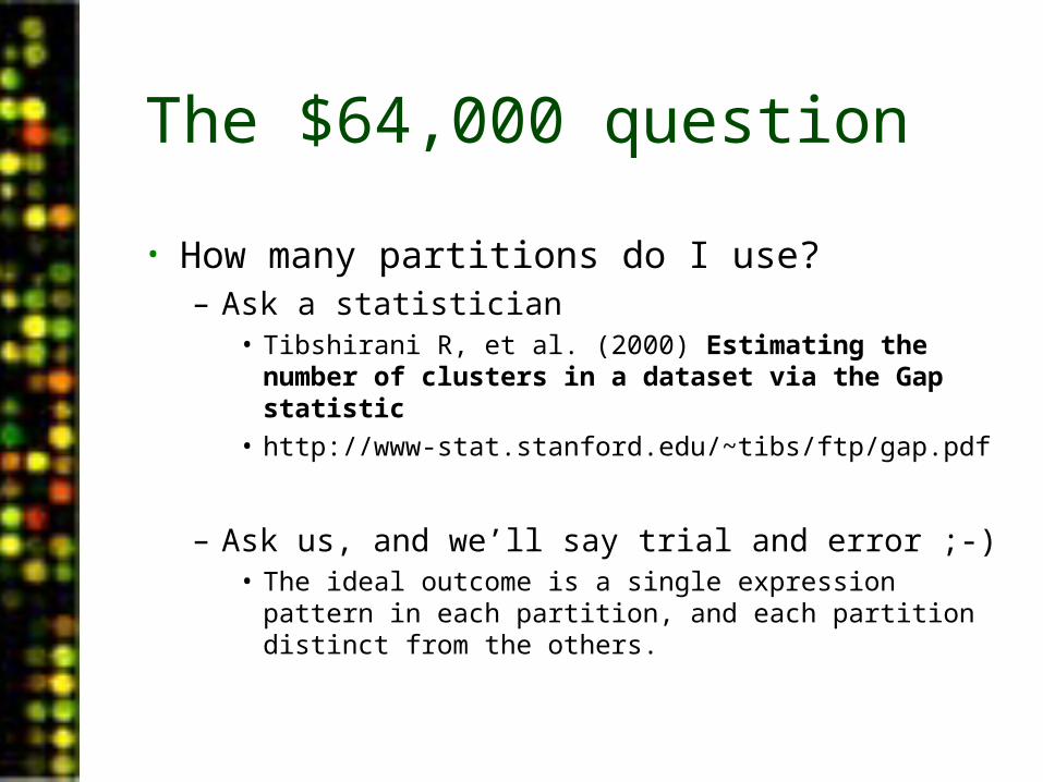
The $64,000 question
• How many partitions do I use?– Ask a statistician
• Tibshirani R, et al. (2000) Estimating the number of clusters in a dataset via the Gap statistic
• http://www-stat.stanford.edu/~tibs/ftp/gap.pdf
– Ask us, and we’ll say trial and error ;-)• The ideal outcome is a single expression pattern in each
partition, and each partition distinct from the others.
PUMAdb Data Analysis• Data Analysis Background
– Data normalization– Clustering algorithms– Data centering
• Using the Database’s Analysis Pipeline
– Gene Selection and Annotation– Data Filtering– Data Retrieval– Gene Filtering– Clustering and Image Generation
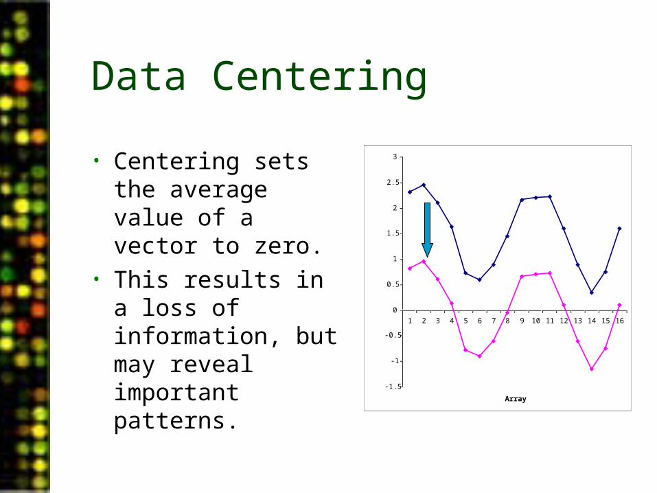
Data Centering
• Centering sets the average value of a vector to zero.
• This results in a loss of information, but may reveal important patterns.
-1.5
-1
-0.5
0
0.5
1
1.5
2
2.5
3
1 2 3 4 5 6 7 8 9 10 11 12 13 14 15 16
Array
log(ratio)
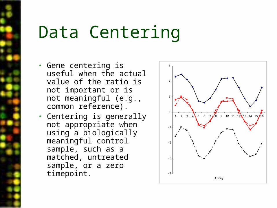
Data Centering
• Gene centering is useful when the actual value of the ratio is not important or is not meaningful (e.g., common reference).
• Centering is generally not appropriate when using a biologically meaningful control sample, such as a matched, untreated sample, or a zero timepoint. -4
-3
-2
-1
0
1
2
3
1 2 3 4 5 6 7 8 9 10 11 12 13 14 15 16
Array
log(ratio)
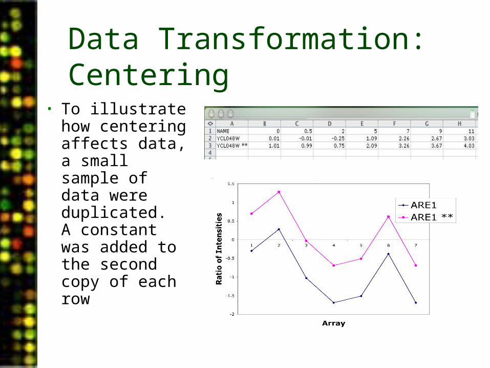
Data Transformation: Centering
• To illustrate how centering affects data, a small sample of data were duplicated. A constant was added to the second copy of each row

Data Centering: Effects of Different Centering Strategies
Uncentered Data, No Centering Metric During Clustering
Uncentered Data, Centering Metric During Clustering
Centered Data, No Centering Metric During Clustering
Centered Data, Centering Metric During Clustering

PUMAdb Data Analysis• Data Analysis Background
– Data normalization– Clustering algorithms– Data centering
• Using the Database’s Analysis Pipeline
– Gene Selection and Annotation– Data Filtering– Data Retrieval– Gene Filtering– Clustering and Image Generation
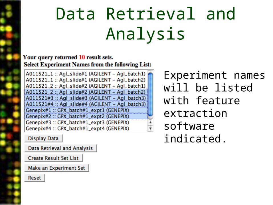
Data Retrieval and Analysis
• Experiment names will be listed with feature extraction software indicated.
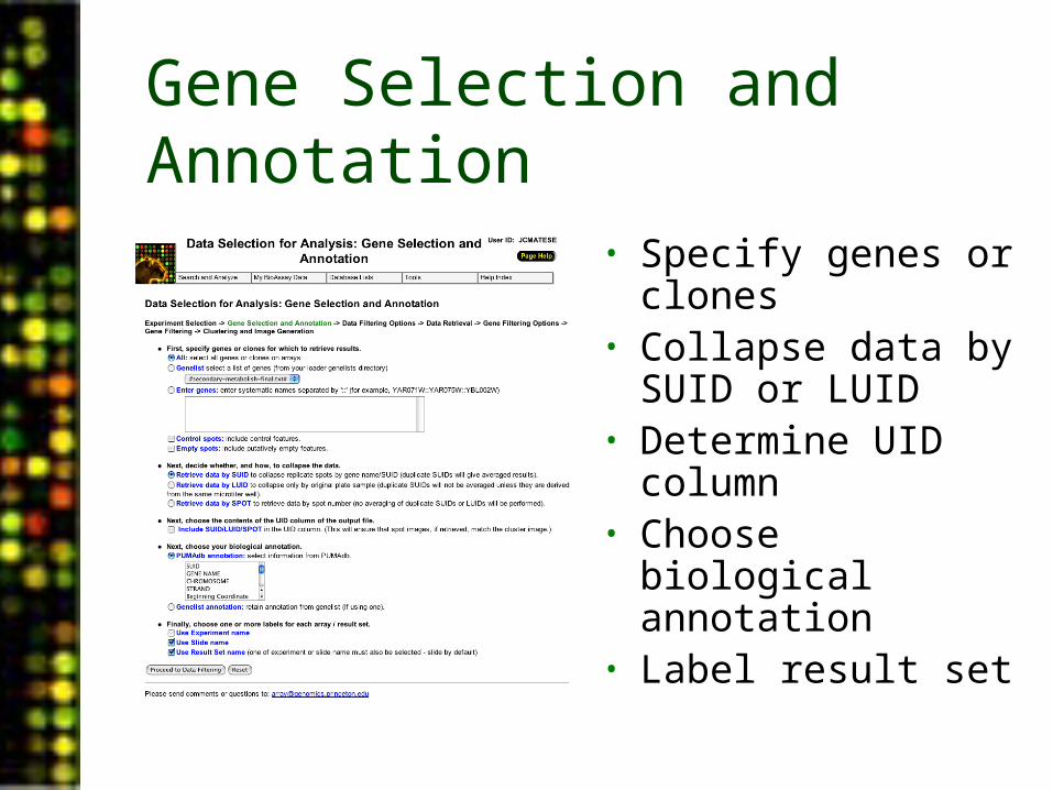
Gene Selection and Annotation
• Specify genes or clones
• Collapse data by SUID or LUID
• Determine UID column
• Choose biological annotation
• Label result set
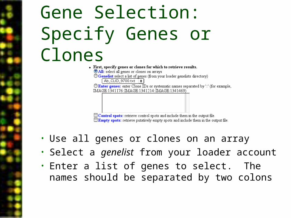
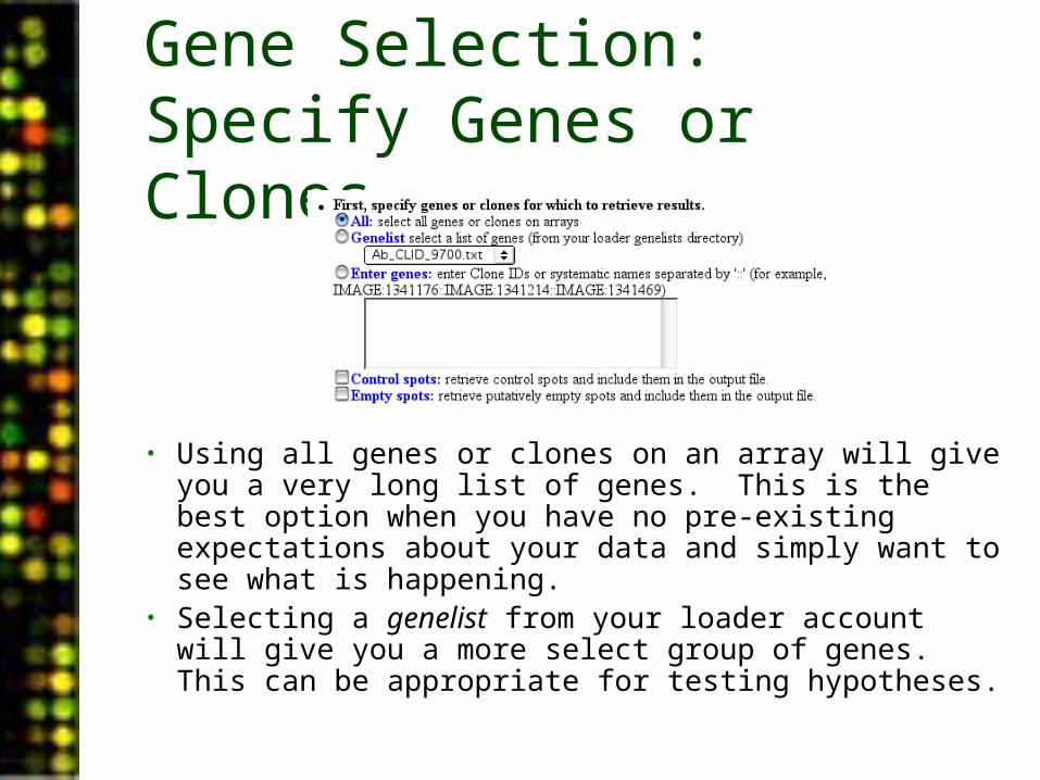
Gene Selection: Specify Genes or Clones
• Use all genes or clones on an array• Select a genelist from your loader account• Enter a list of genes to select. The names
should be separated by two colons
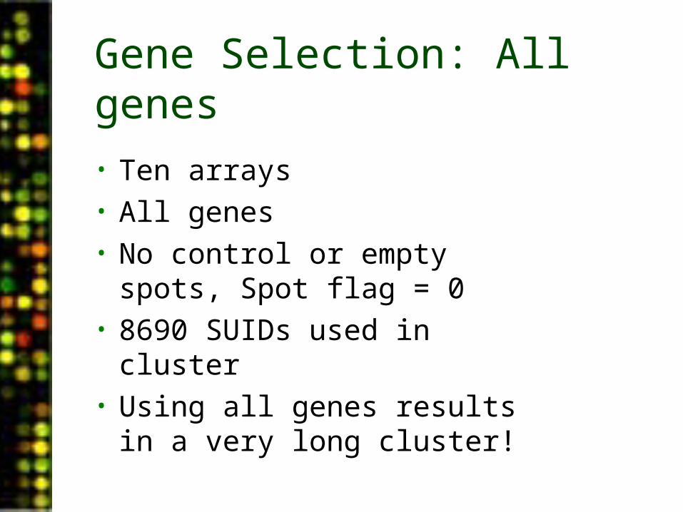
Gene Selection: All genes
• Ten arrays• All genes• No control or empty spots,
Spot flag = 0• 8690 SUIDs used in cluster• Using all genes results in a
very long cluster!
QuickTime™ and aTIFF (Uncompressed) decompressorare needed to see this picture.
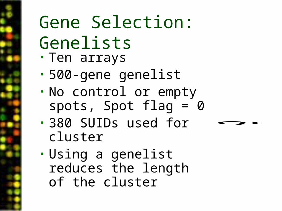
Gene Selection: Genelists• Ten arrays• 500-gene genelist• No control or empty
spots, Spot flag = 0• 380 SUIDs used for
cluster• Using a genelist reduces
the length of the cluster
QuickTime™ and aTIFF (Uncompressed) decompressorare needed to see this picture.
Gene Selection: Specify Genes or Clones
• Using all genes or clones on an array will give you a very long list of genes. This is the best option when you have no pre-existing expectations about your data and simply want to see what is happening.
• Selecting a genelist from your loader account will give you a more select group of genes. This can be appropriate for testing hypotheses.
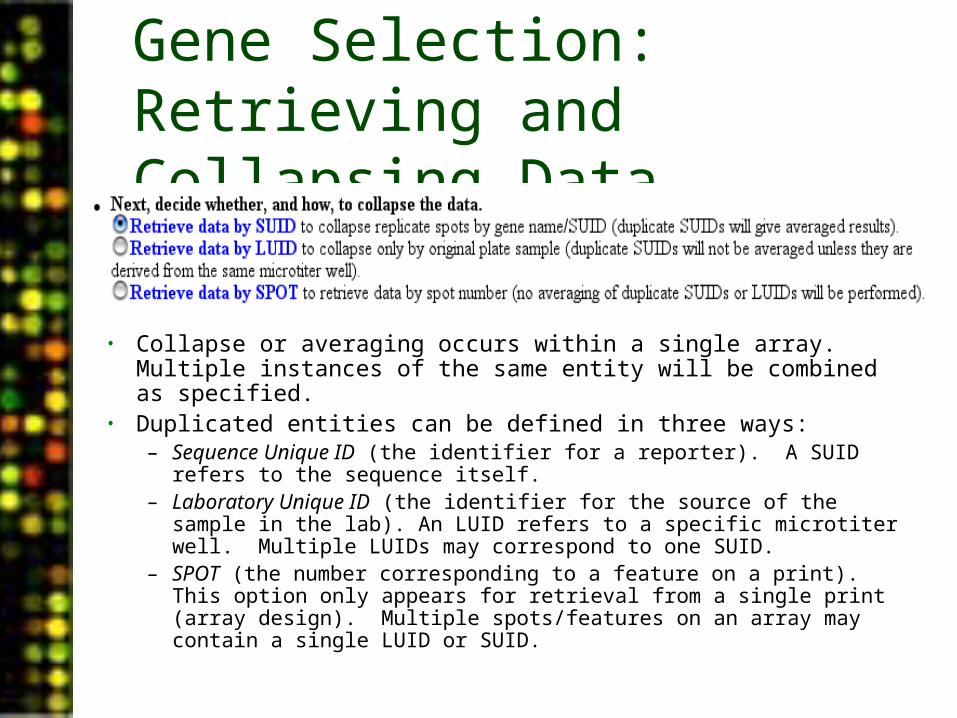
Gene Selection: Retrieving and Collapsing Data
• Collapse or averaging occurs within a single array. Multiple instances of the same entity will be combined as specified.
• Duplicated entities can be defined in three ways:– Sequence Unique ID (the identifier for a reporter). A SUID refers to
the sequence itself.– Laboratory Unique ID (the identifier for the source of the sample in
the lab). An LUID refers to a specific microtiter well. Multiple LUIDs may correspond to one SUID.
– SPOT (the number corresponding to a feature on a print). This option only appears for retrieval from a single print (array design). Multiple spots/features on an array may contain a single LUID or SUID.
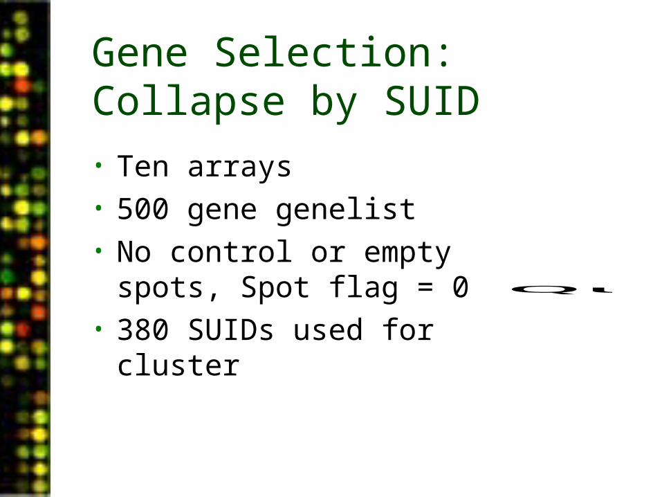
Gene Selection: Collapse by SUID
• Ten arrays• 500 gene genelist• No control or empty spots,
Spot flag = 0• 380 SUIDs used for cluster
QuickTime™ and aTIFF (Uncompressed) decompressorare needed to see this picture.
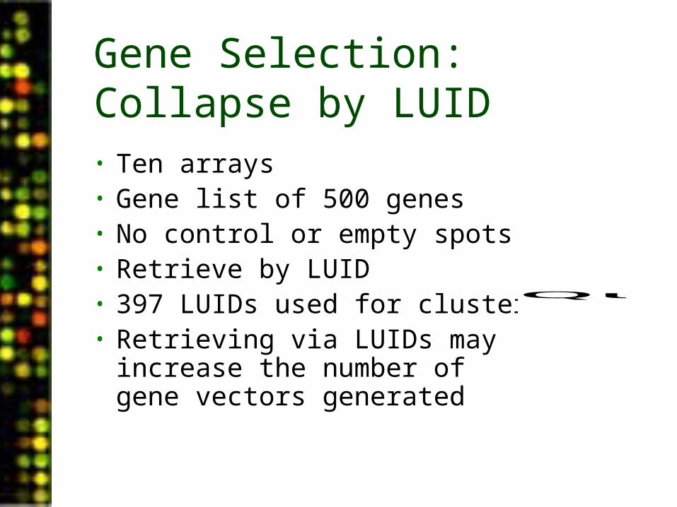
Gene Selection: Collapse by LUID• Ten arrays• Gene list of 500 genes• No control or empty spots• Retrieve by LUID• 397 LUIDs used for cluster• Retrieving via LUIDs may
increase the number of gene vectors generated
QuickTime™ and aTIFF (Uncompressed) decompressorare needed to see this picture.
Gene Selection: Collapse Data
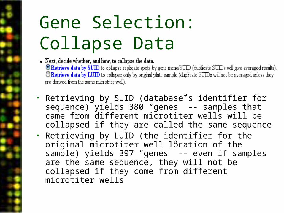
• Retrieving by SUID (database’s identifier for sequence) yields 380 “genes” -- samples that came from different microtiter wells will be collapsed if they are called the same sequence
• Retrieving by LUID (the identifier for the original microtiter well location of the sample) yields 397 “genes” -- even if samples are the same sequence, they will not be collapsed if they come from different microtiter wells
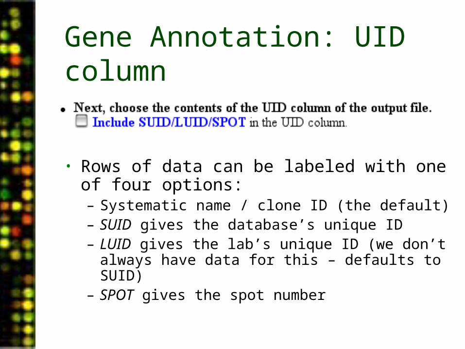
Gene Annotation: UID column
• Rows of data can be labeled with one of four options:– Systematic name / clone ID (the default)– SUID gives the database’s unique ID– LUID gives the lab’s unique ID (we don’t always
have data for this – defaults to SUID)– SPOT gives the spot number
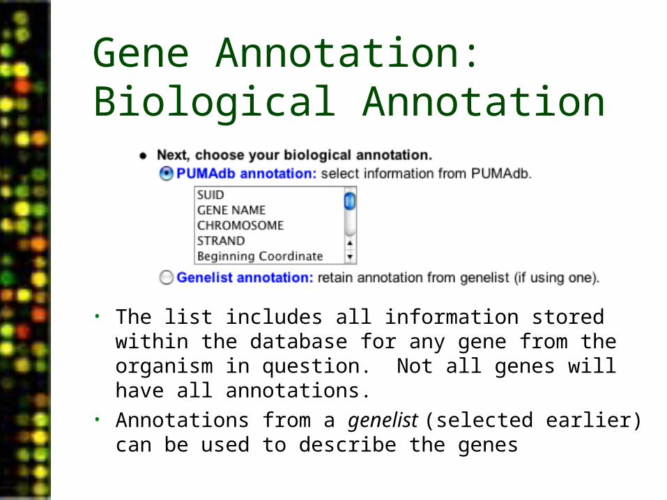
Gene Annotation: Biological Annotation
• The list includes all information stored within the database for any gene from the organism in question. Not all genes will have all annotations.
• Annotations from a genelist (selected earlier) can be used to describe the genes
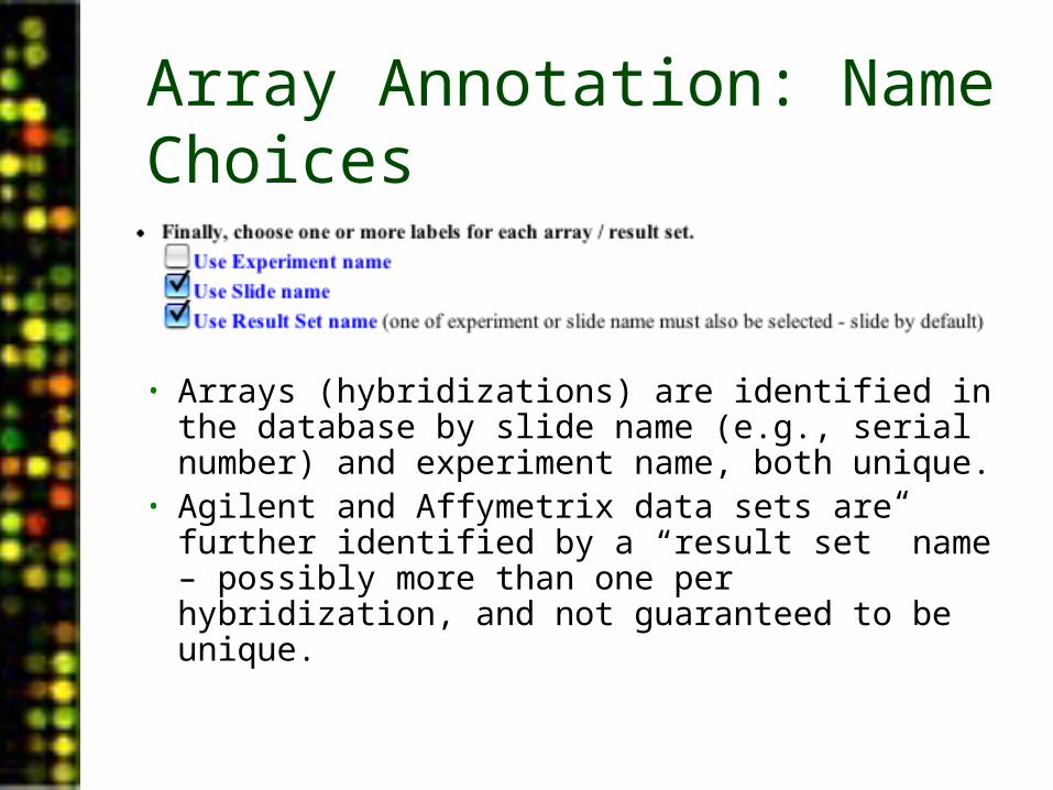
Array Annotation: Name Choices
• Arrays (hybridizations) are identified in the database by slide name (e.g., serial number) and experiment name, both unique.
• Agilent and Affymetrix data sets are further identified by a “result set” name – possibly more than one per hybridization, and not guaranteed to be unique.
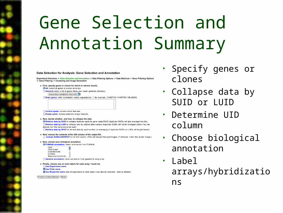
Gene Selection and Annotation Summary
• Specify genes or clones• Collapse data by SUID
or LUID• Determine UID column• Choose biological
annotation• Label
arrays/hybridizations
PUMAdb Data Analysis• Data Analysis Background
– Data normalization– Clustering algorithms– Data centering
• Using the Database’s Analysis Pipeline
– Gene Selection and Annotation– Data Filtering– Data Retrieval– Gene Filtering– Clustering and Image Generation

Data Filtering
• Choose data column to retrieve
• Elect to invert reverse dye replicates
• Elect to filter by spot flag
• Select spot criteria for filtering
• Define image presentation options
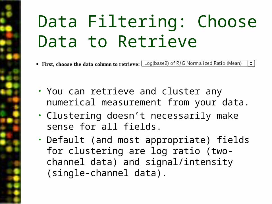
Data Filtering: Choose Data to Retrieve
• You can retrieve and cluster any numerical measurement from your data.
• Clustering doesn’t necessarily make sense for all fields.
• Default (and most appropriate) fields for clustering are log ratio (two-channel data) and signal/intensity (single-channel data).
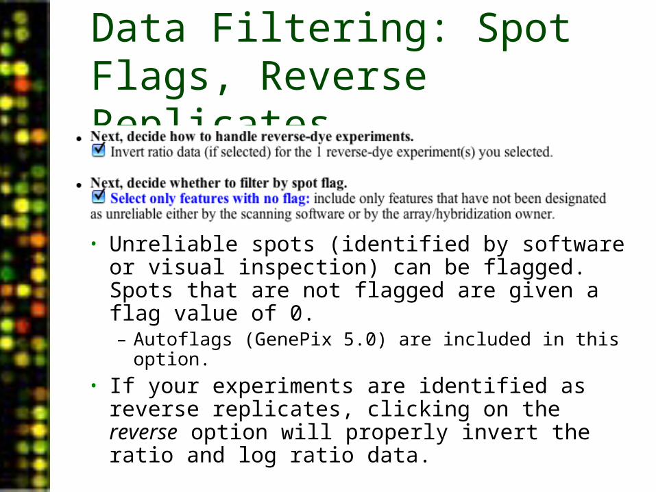
Data Filtering: Spot Flags, Reverse Replicates
• Unreliable spots (identified by software or visual inspection) can be flagged. Spots that are not flagged are given a flag value of 0.– Autoflags (GenePix 5.0) are included in this
option.• If your experiments are identified as reverse
replicates, clicking on the reverse option will properly invert the ratio and log ratio data.

Data Filtering: Selecting Filtering Criteria
• Each spot will be individually assessed as specified, prior to any averaging or collapse.
• Each filter can be made active and customized as desired.• Filters can be combined using logical operators (filter string),
defaulting to a logical AND.• Filters available will be appropriate to the feature extraction
software used. The exception is ScanAlyze and older versions of GenePix, which get (but can’t use) all options for GenePix.
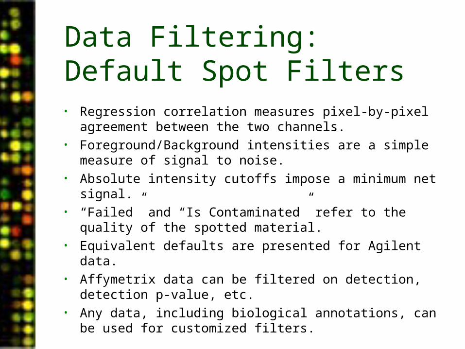
Data Filtering: Default Spot Filters• Regression correlation measures pixel-by-pixel agreement
between the two channels.• Foreground/Background intensities are a simple measure of
signal to noise.• Absolute intensity cutoffs impose a minimum net signal.• “Failed” and “Is Contaminated” refer to the quality of the spotted
material.• Equivalent defaults are presented for Agilent data.• Affymetrix data can be filtered on detection, detection p-value,
etc.• Any data, including biological annotations, can be used for
customized filters.
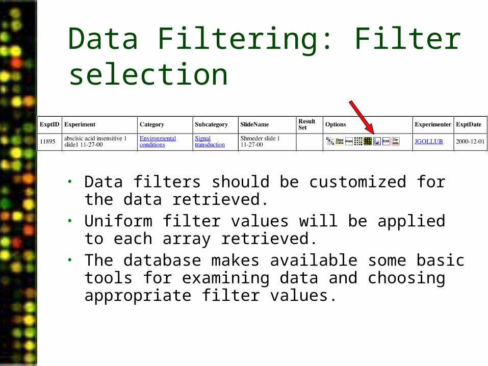
Data Filtering: Filter selection
• Data filters should be customized for the data retrieved.
• Uniform filter values will be applied to each array retrieved.
• The database makes available some basic tools for examining data and choosing appropriate filter values.

Data Filtering: Filter Selection• Any numerical field
can be plotted against any other (or none), in a scatter plot or histogram.
• This is useful for quality assessment, and for selecting filters.
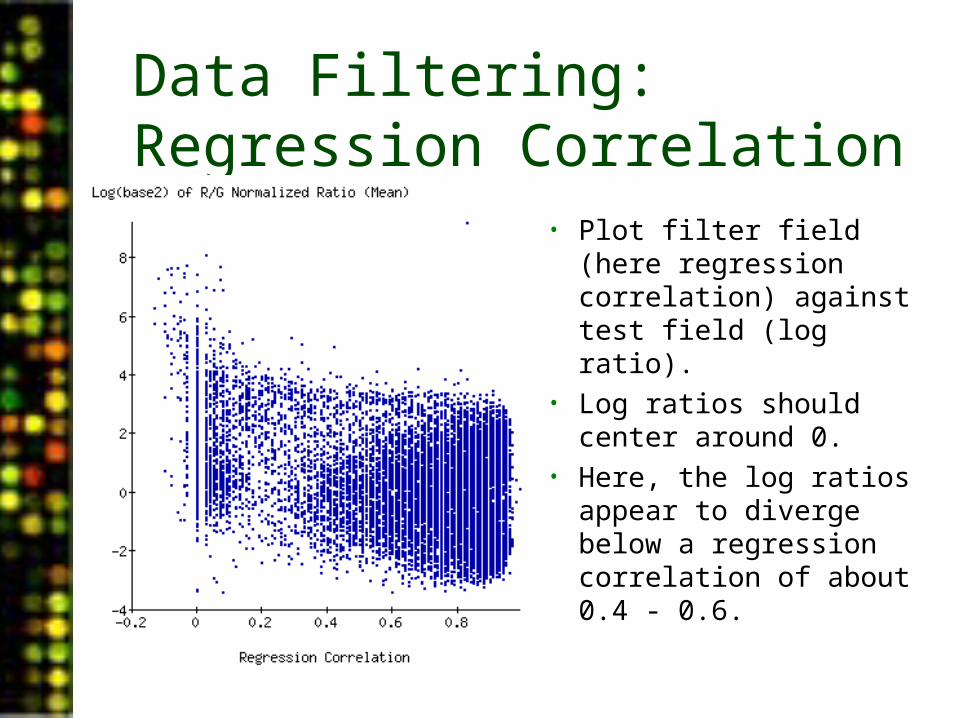
Data Filtering: Regression Correlation
• Plot filter field (here regression correlation) against test field (log ratio).
• Log ratios should center around 0.
• Here, the log ratios appear to diverge below a regression correlation of about 0.4 - 0.6.
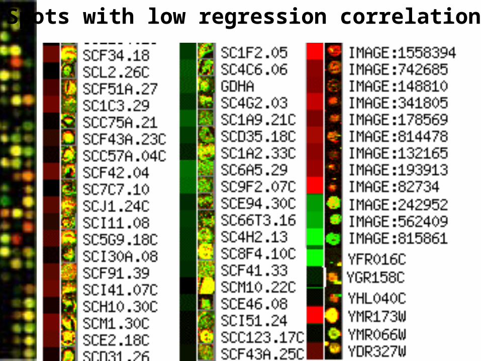
Spots with low regression correlation
Data Filtering
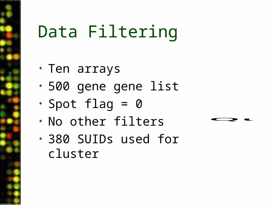
• Ten arrays• 500 gene gene list• Spot flag = 0• No other filters• 380 SUIDs used for cluster
QuickTime™ and aTIFF (Uncompressed) decompressorare needed to see this picture.
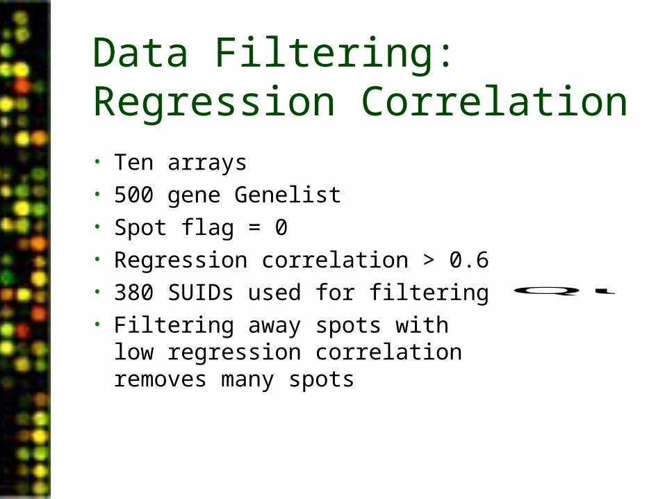
Data Filtering: Regression Correlation• Ten arrays• 500 gene Genelist• Spot flag = 0• Regression correlation > 0.6• 380 SUIDs used for filtering• Filtering away spots with low
regression correlation removes many spots
QuickTime™ and aTIFF (Uncompressed) decompressorare needed to see this picture.
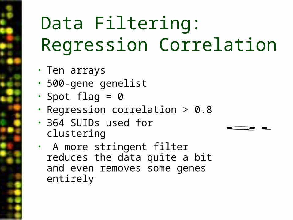
Data Filtering: Regression Correlation
• Ten arrays• 500-gene genelist• Spot flag = 0• Regression correlation > 0.8• 364 SUIDs used for clustering• A more stringent filter reduces
the data quite a bit and even removes some genes entirely
QuickTime™ and aTIFF (Uncompressed) decompressorare needed to see this picture.
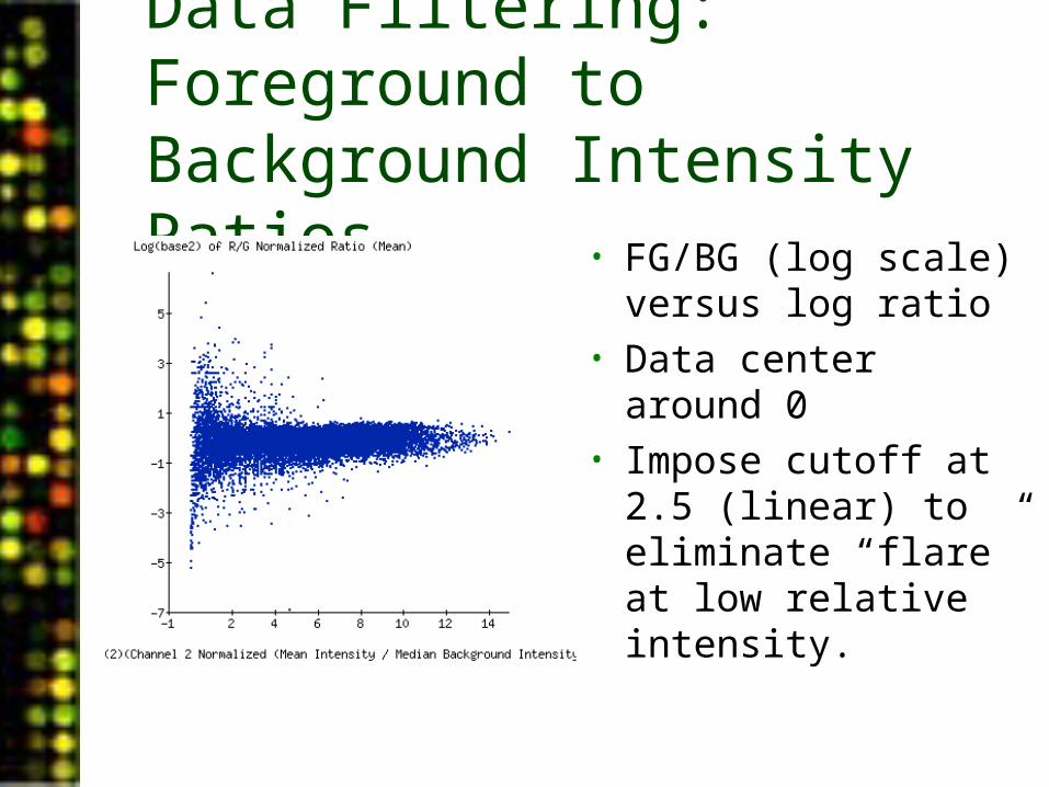
Data Filtering: Foreground to Background Intensity Ratios
• FG/BG (log scale) versus log ratio
• Data center around 0• Impose cutoff at 2.5
(linear) to eliminate “flare” at low relative intensity.
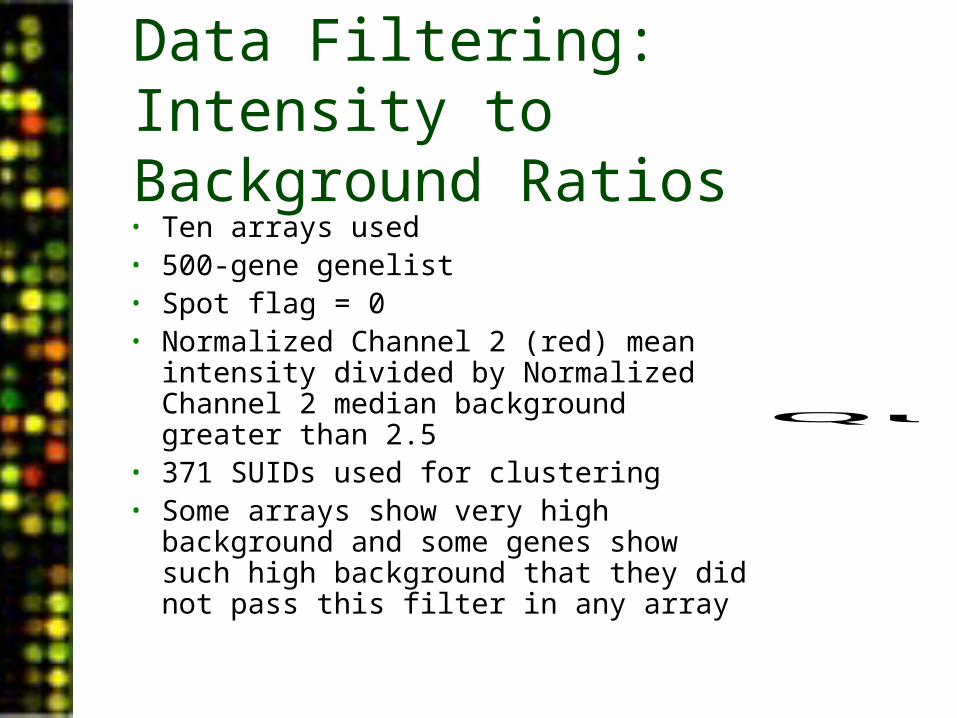
Data Filtering: Intensity to Background Ratios• Ten arrays used• 500-gene genelist• Spot flag = 0• Normalized Channel 2 (red) mean
intensity divided by Normalized Channel 2 median background greater than 2.5
• 371 SUIDs used for clustering• Some arrays show very high background
and some genes show such high background that they did not pass this filter in any array
QuickTime™ and aTIFF (Uncompressed) decompressorare needed to see this picture.
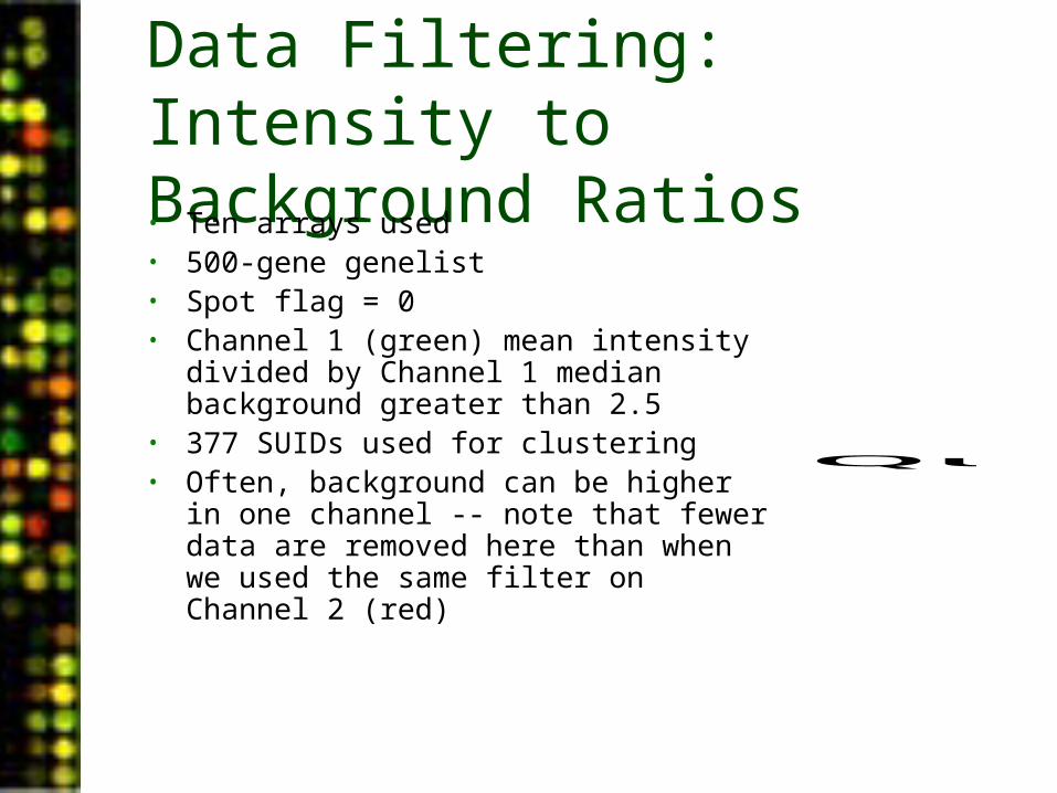
Data Filtering: Intensity to Background Ratios• Ten arrays used• 500-gene genelist• Spot flag = 0• Channel 1 (green) mean intensity divided by
Channel 1 median background greater than 2.5
• 377 SUIDs used for clustering• Often, background can be higher in one
channel -- note that fewer data are removed here than when we used the same filter on Channel 2 (red)
QuickTime™ and aTIFF (Uncompressed) decompressorare needed to see this picture.
Data Filtering: Intensity to Background Ratios
QuickTime™ and aTIFF (Uncompressed) decompressorare needed to see this picture.
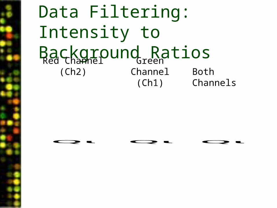
Red Channel (Ch2)
QuickTime™ and aTIFF (Uncompressed) decompressorare needed to see this picture.
Green Channel (Ch1)
QuickTime™ and aTIFF (Uncompressed) decompressorare needed to see this picture.
Both Channels
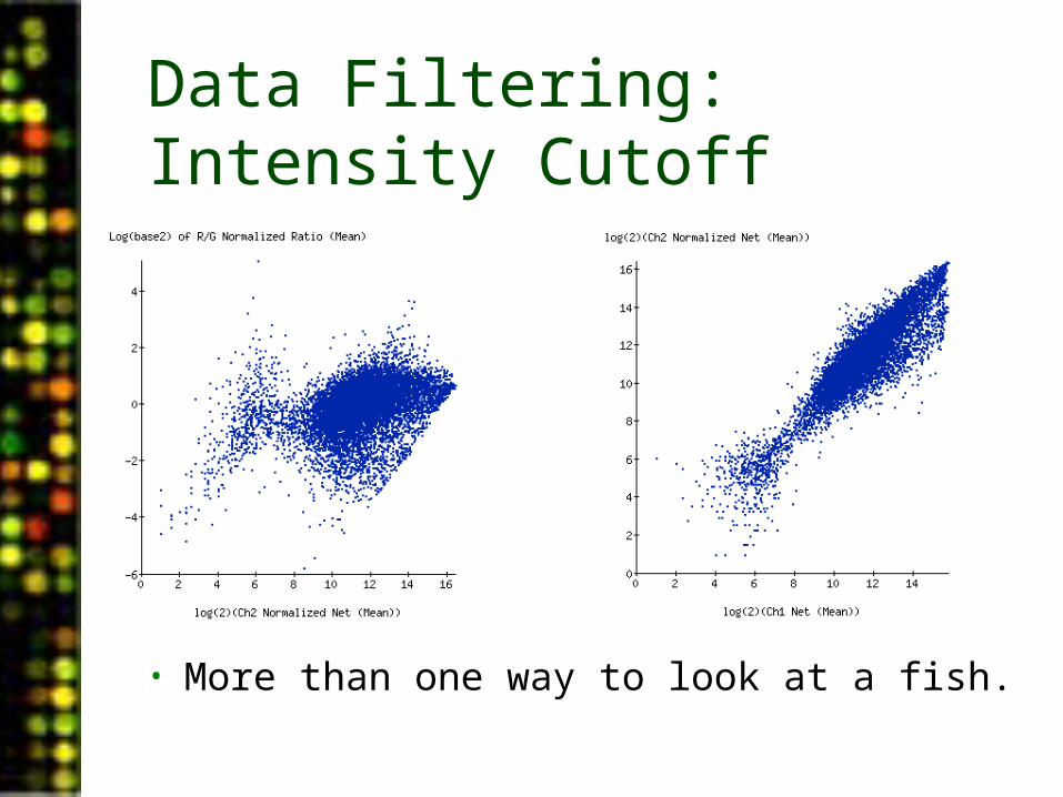
Data Filtering: Intensity Cutoff
• More than one way to look at a fish.
Data Filtering: Combinations of Filters• Ten arrays• 500-gene genelist• Spot flag = 0• Regression correlation > 0.6• Net intensity in either channel >= 350• 374 SUIDs selected for clustering• This data set was formed by
selecting spots that are good quality (via the regression correlation) and good intensity in at least one channel
QuickTime™ and aTIFF (Uncompressed) decompressorare needed to see this picture.
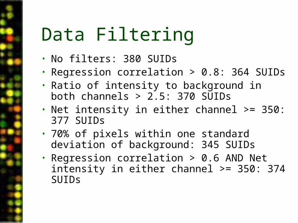
Data Filtering• No filters: 380 SUIDs • Regression correlation > 0.8: 364 SUIDs• Ratio of intensity to background in both
channels > 2.5: 370 SUIDs• Net intensity in either channel >= 350: 377
SUIDs• 70% of pixels within one standard deviation of
background: 345 SUIDs• Regression correlation > 0.6 AND Net
intensity in either channel >= 350: 374 SUIDs
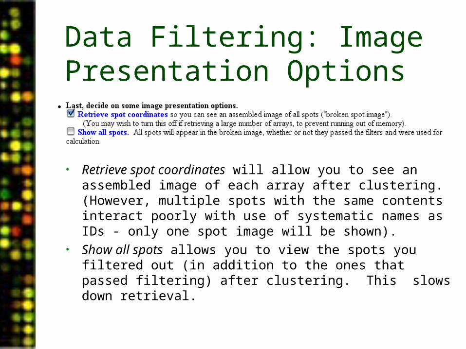
Data Filtering: Image Presentation Options
• Retrieve spot coordinates will allow you to see an assembled image of each array after clustering. (However, multiple spots with the same contents interact poorly with use of systematic names as IDs - only one spot image will be shown).
• Show all spots allows you to view the spots you filtered out (in addition to the ones that passed filtering) after clustering. This slows down retrieval.
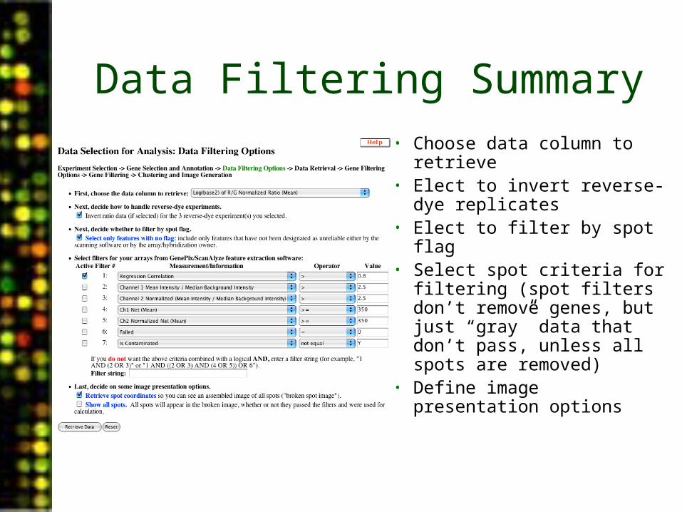
Data Filtering Summary• Choose data column to
retrieve• Elect to invert reverse-dye
replicates• Elect to filter by spot flag• Select spot criteria for
filtering (spot filters don’t remove genes, but just “gray” data that don’t pass, unless all spots are removed)
• Define image presentation options

PUMAdb Data Analysis• Data Analysis Background
– Data normalization– Clustering algorithms– Data centering
• Using the Database’s Analysis Pipeline
– Gene Selection and Annotation– Data Filtering– Data Retrieval– Gene Filtering– Clustering and Image Generation
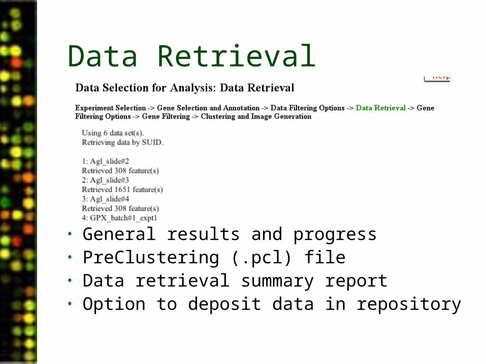
Data Retrieval
• General results and progress• PreClustering (.pcl) file• Data retrieval summary report• Option to deposit data in repository
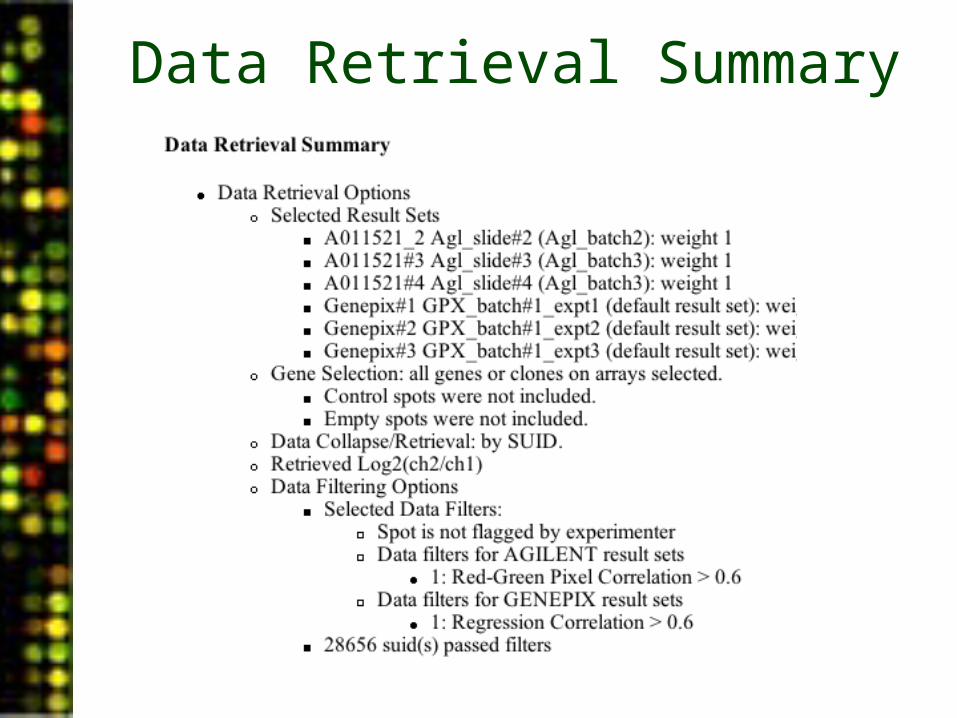
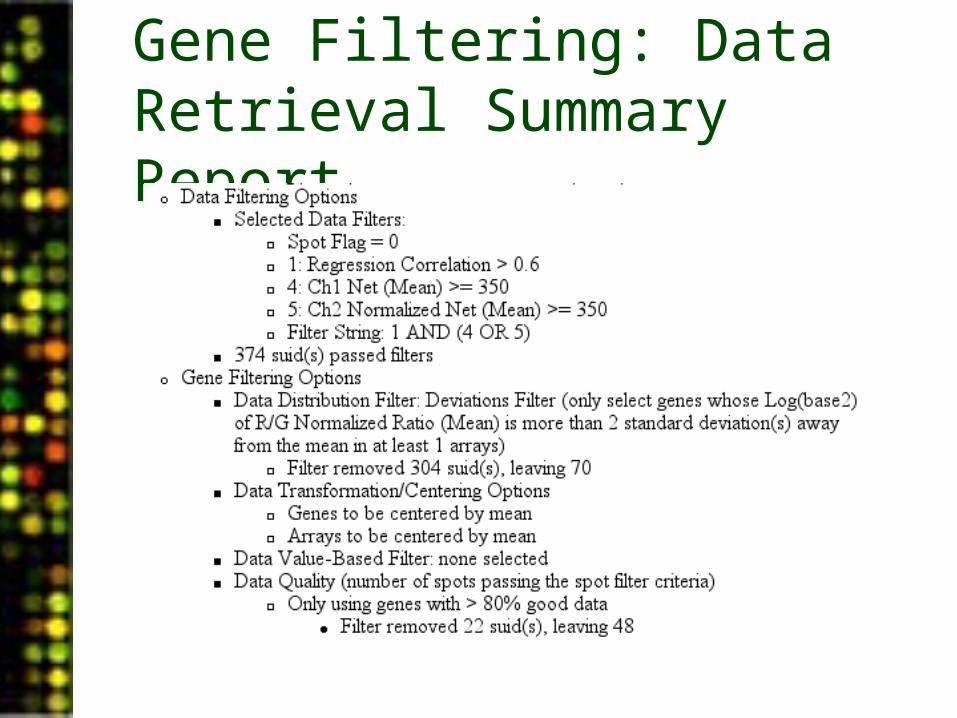
Data Retrieval Summary
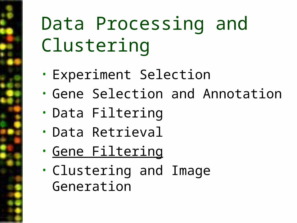
Data Processing and Clustering
• Experiment Selection• Gene Selection and Annotation• Data Filtering• Data Retrieval• Gene Filtering• Clustering and Image Generation
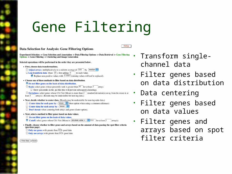
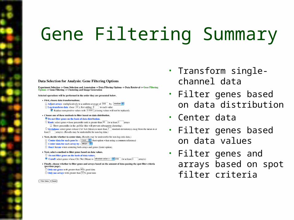
Gene Filtering
• Transform single-channel data
• Filter genes based on data distribution
• Data centering• Filter genes based on
data values• Filter genes and arrays
based on spot filter criteria
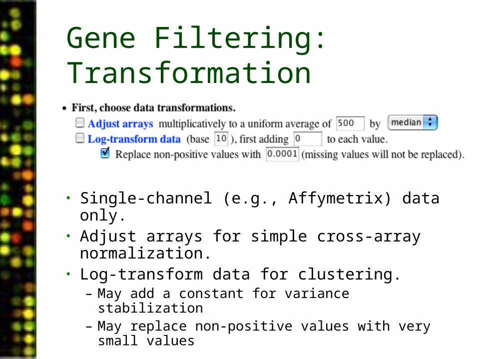
Gene Filtering: Transformation
• Single-channel (e.g., Affymetrix) data only.• Adjust arrays for simple cross-array
normalization.• Log-transform data for clustering.
– May add a constant for variance stabilization– May replace non-positive values with very small
values
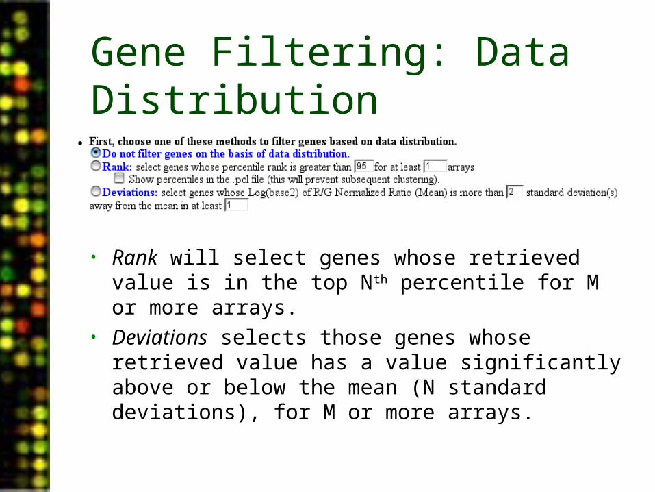
Gene Filtering: Data Distribution
• Rank will select genes whose retrieved value is in the top Nth percentile for M or more arrays.
• Deviations selects those genes whose retrieved value has a value significantly above or below the mean (N standard deviations), for M or more arrays.
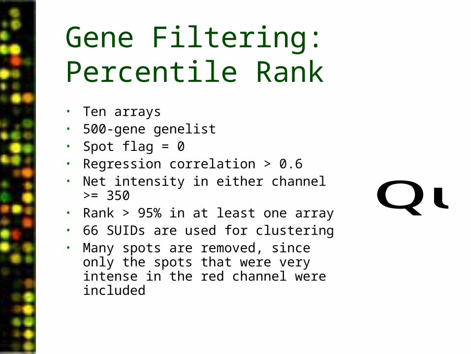
Gene Filtering: Percentile Rank• Ten arrays• 500-gene genelist• Spot flag = 0• Regression correlation > 0.6• Net intensity in either channel >= 350• Rank > 95% in at least one array• 66 SUIDs are used for clustering• Many spots are removed, since only the
spots that were very intense in the red channel were included
QuickTime™ and aTIFF (Uncompressed) decompressorare needed to see this picture.
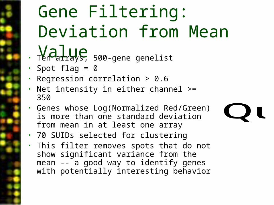
Gene Filtering: Deviation from Mean Value
• Ten arrays, 500-gene genelist• Spot flag = 0• Regression correlation > 0.6• Net intensity in either channel >= 350• Genes whose Log(Normalized Red/Green)
is more than one standard deviation from mean in at least one array
• 70 SUIDs selected for clustering• This filter removes spots that do not show
significant variance from the mean -- a good way to identify genes with potentially interesting behavior
QuickTime™ and aTIFF (Uncompressed) decompressorare needed to see this picture.
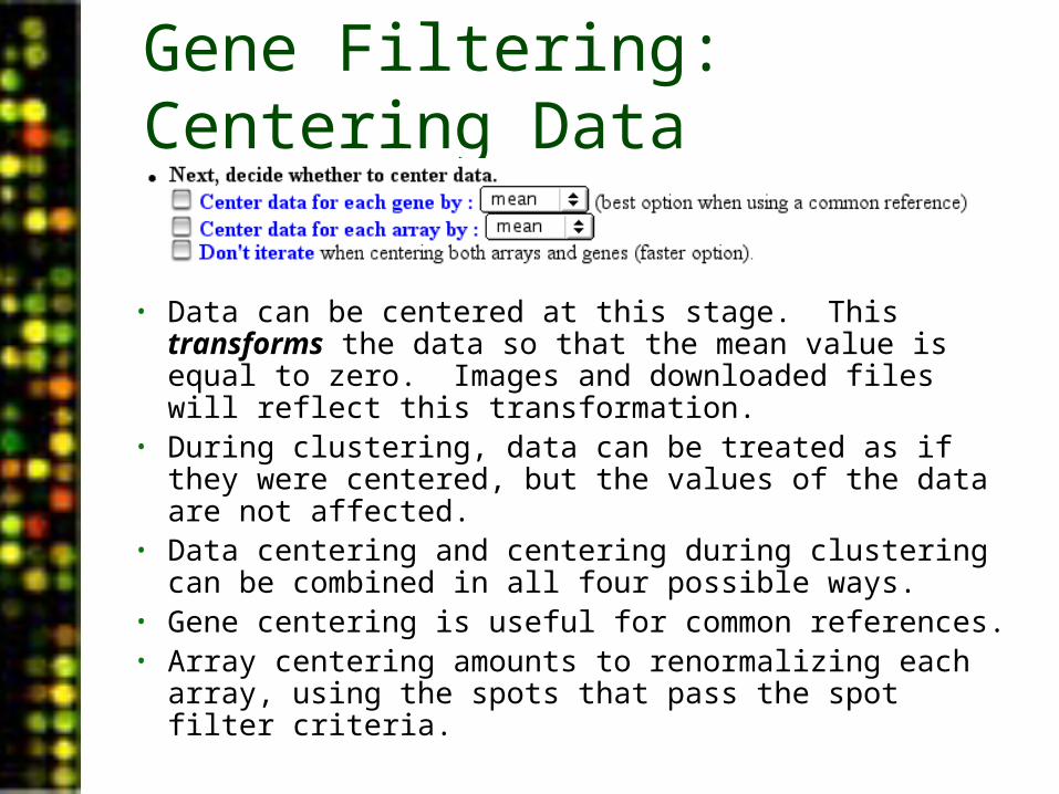
Gene Filtering: Centering Data
• Data can be centered at this stage. This transforms the data so that the mean value is equal to zero. Images and downloaded files will reflect this transformation.
• During clustering, data can be treated as if they were centered, but the values of the data are not affected.
• Data centering and centering during clustering can be combined in all four possible ways.
• Gene centering is useful for common references.• Array centering amounts to renormalizing each array,
using the spots that pass the spot filter criteria.
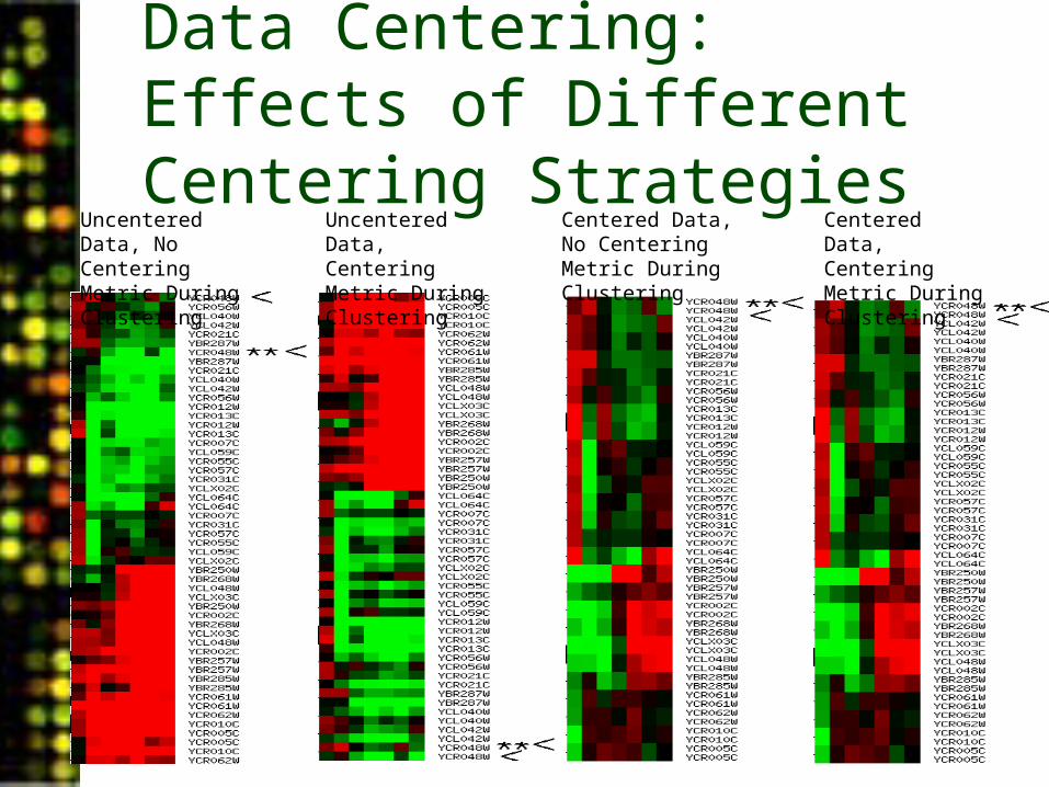
Data Centering: Effects of Different Centering Strategies
Uncentered Data, No Centering Metric During Clustering
Uncentered Data, Centering Metric During Clustering
Centered Data, No Centering Metric During Clustering
Centered Data, Centering Metric During Clustering
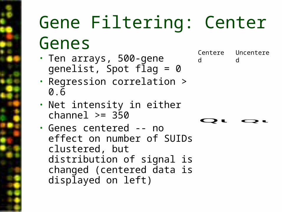
Gene Filtering: Center Genes• Ten arrays, 500-gene
genelist, Spot flag = 0• Regression correlation > 0.6• Net intensity in either channel
>= 350• Genes centered -- no effect
on number of SUIDs clustered, but distribution of signal is changed (centered data is displayed on left)
QuickTime™ and aTIFF (Uncompressed) decompressorare needed to see this picture.QuickTime™ and aTIFF (Uncompressed) decompressorare needed to see this picture.
Centered Uncentered
Gene Filtering: Data Values
• Cutoff requires data to exceed a user-defined value in at least M arrays. This is perhaps our least useful filter. Especially when data are centered, you could be losing important information.
• Distance requires that the length of the gene’s expression vector, across all arrays, be greater than a user-defined value. This is a general measure of response to experimental conditions.– Only available for log ratio data.
Gene Filtering: Values of Log(Red/Green)• Ten arrays, 500-gene genelist, Spot flag = 0• Regression correlation > 0.6• Net intensity in either channel >= 350• Log of Red/GreenNormalized Ratio (Mean) is
absolute value > 2 for at least 1 array• 57 SUIDs selected for clustering• Since this is a filter based on values, caution
should be exercised -- values often change during normalization and centering.
QuickTime™ and aTIFF (Uncompressed) decompressorare needed to see this picture.
Gene Filtering: Spot Filter Criteria
• Genes can be screened out if they do not meet the spot criteria a given percentage of the time, as specified by the user.
• Arrays can be similarly filtered out if they do not meet the spot filter criteria.
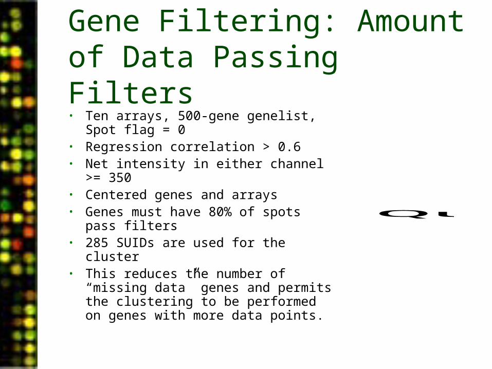
Gene Filtering: Amount of Data Passing Filters• Ten arrays, 500-gene genelist, Spot flag
= 0• Regression correlation > 0.6• Net intensity in either channel >= 350• Centered genes and arrays• Genes must have 80% of spots pass
filters• 285 SUIDs are used for the cluster• This reduces the number of “missing
data” genes and permits the clustering to be performed on genes with more data points.
QuickTime™ and aTIFF (Uncompressed) decompressorare needed to see this picture.
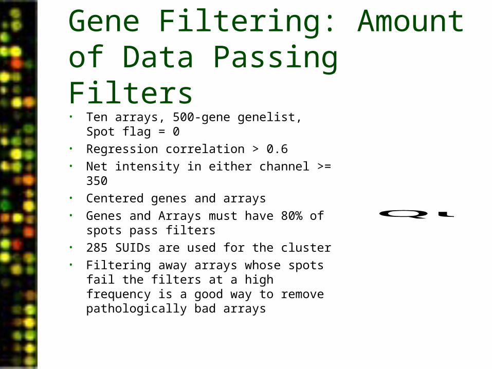
Gene Filtering: Amount of Data Passing Filters• Ten arrays, 500-gene genelist, Spot flag = 0• Regression correlation > 0.6• Net intensity in either channel >= 350• Centered genes and arrays• Genes and Arrays must have 80% of spots
pass filters• 285 SUIDs are used for the cluster• Filtering away arrays whose spots fail the
filters at a high frequency is a good way to remove pathologically bad arrays
QuickTime™ and aTIFF (Uncompressed) decompressorare needed to see this picture.
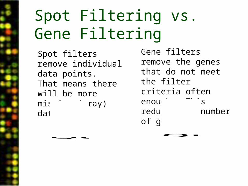
Spot Filtering vs. Gene FilteringSpot filters remove individual data points. That means there will be more missing (gray) data.
Gene filters remove the genes that do not meet the filter criteria often enough. This reduces the number of genes.
QuickTime™ and aTIFF (Uncompressed) decompressorare needed to see this picture.QuickTime™ and aTIFF (Uncompressed) decompressorare needed to see this picture.
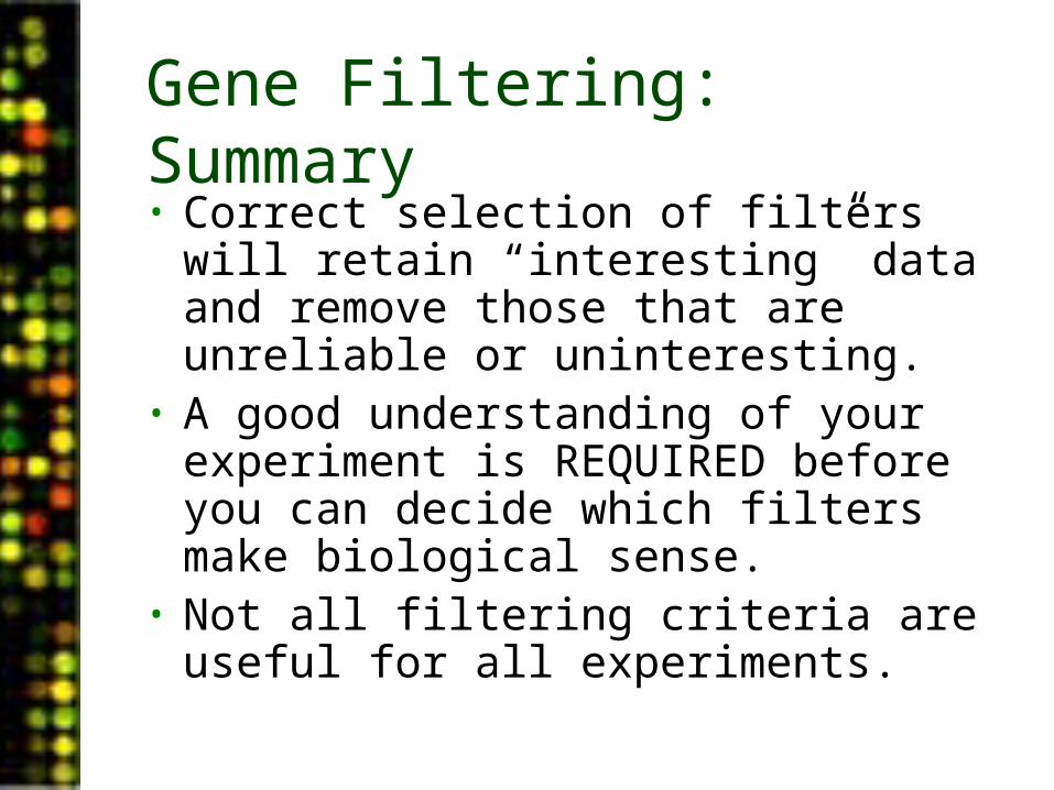
Gene Filtering: Summary• Correct selection of filters will retain
“interesting” data and remove those that are unreliable or uninteresting.
• A good understanding of your experiment is REQUIRED before you can decide which filters make biological sense.
• Not all filtering criteria are useful for all experiments.
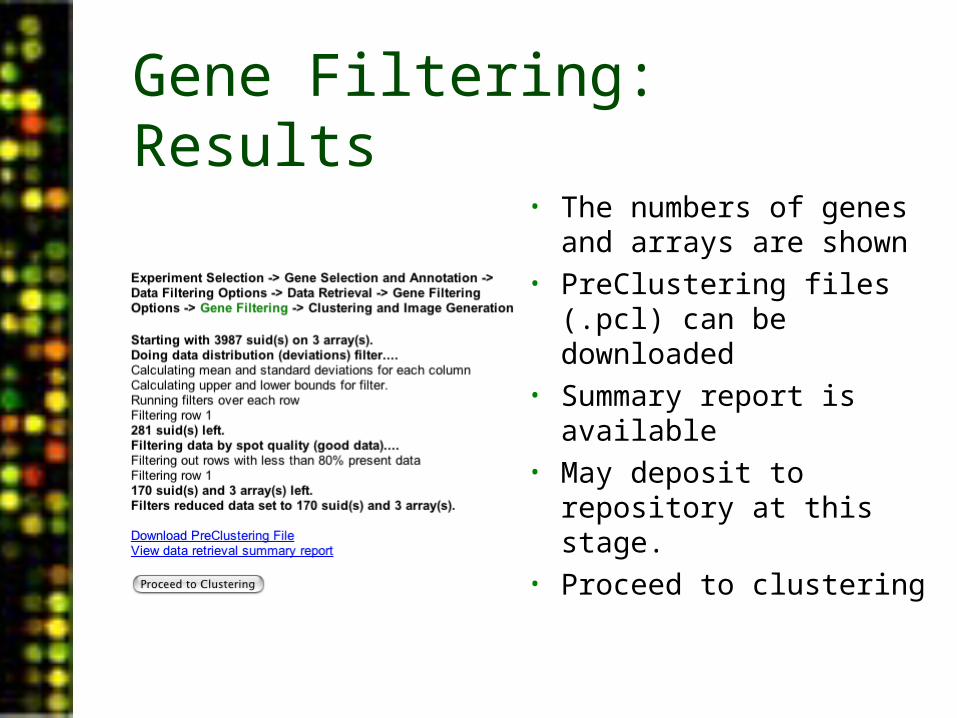
Gene Filtering: Results
• The numbers of genes and arrays are shown
• PreClustering files (.pcl) can be downloaded
• Summary report is available
• May deposit to repository at this stage.
• Proceed to clustering
Gene Filtering: Data Retrieval Summary Report
Gene Filtering Summary
• Transform single-channel data
• Filter genes based on data distribution
• Center data• Filter genes based on
data values• Filter genes and arrays
based on spot filter criteria
PUMAdb Data Analysis• Data Analysis Background
– Data normalization– Clustering algorithms– Data centering
• Using the Database’s Analysis Pipeline
– Gene Selection and Annotation– Data Filtering– Data Retrieval– Gene Filtering– Clustering and Image Generation
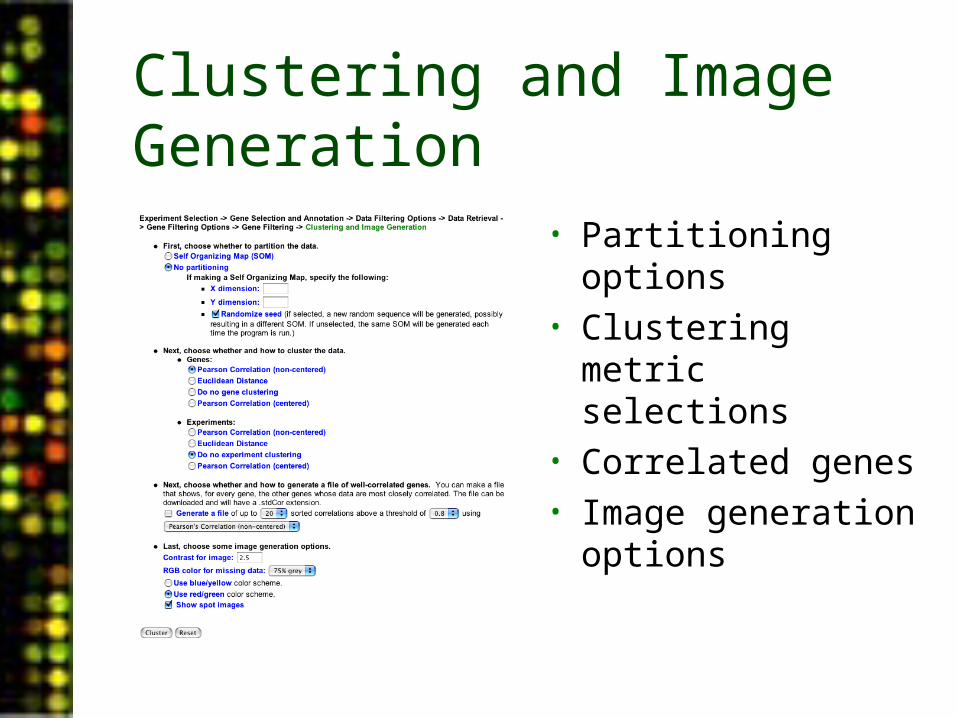
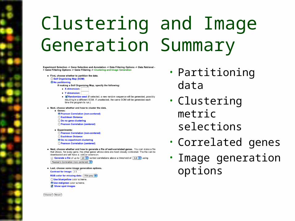
Clustering and Image Generation
• Partitioning options• Clustering metric
selections• Correlated genes• Image generation
options
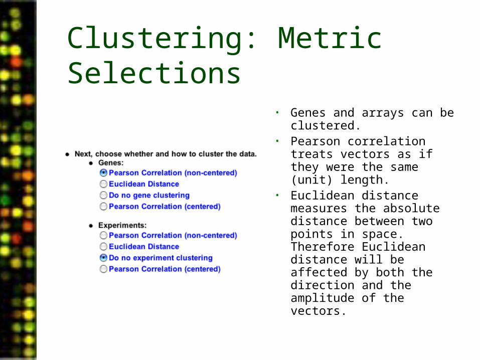
Clustering: Metric Selections
• Genes and arrays can be clustered.
• Pearson correlation treats vectors as if they were the same (unit) length.
• Euclidean distance measures the absolute distance between two points in space. Therefore Euclidean distance will be affected by both the direction and the amplitude of the vectors.
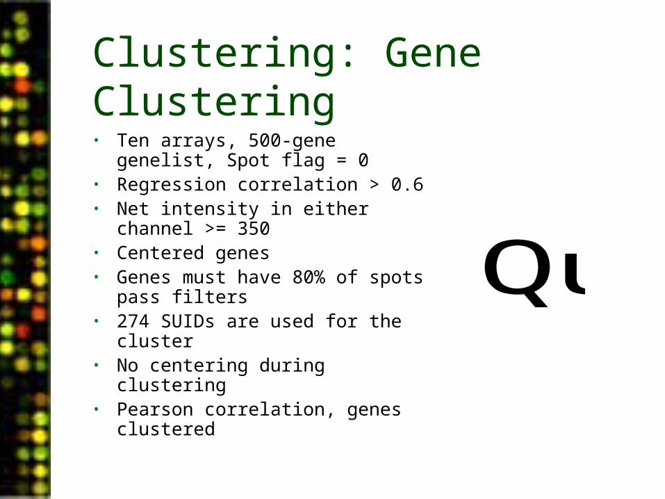
Clustering: Gene Clustering• Ten arrays, 500-gene genelist, Spot
flag = 0• Regression correlation > 0.6• Net intensity in either channel >= 350• Centered genes• Genes must have 80% of spots pass
filters• 274 SUIDs are used for the cluster• No centering during clustering• Pearson correlation, genes clustered
QuickTime™ and aTIFF (Uncompressed) decompressorare needed to see this picture.
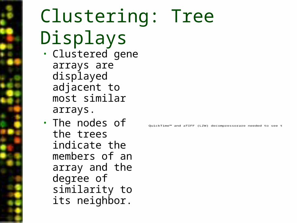
Clustering: Tree Displays• Clustered gene
arrays are displayed adjacent to most similar arrays.
• The nodes of the trees indicate the members of an array and the degree of similarity to its neighbor.
QuickTime™ and aTIFF (LZW) decompressorare needed to see this picture.
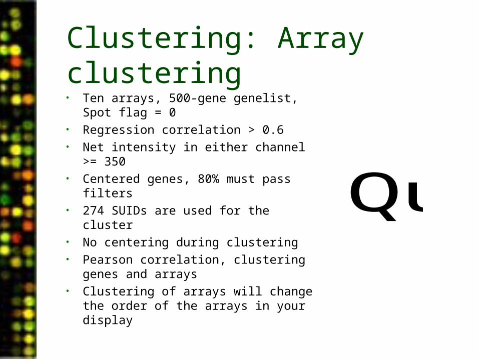
Clustering: Array clustering• Ten arrays, 500-gene genelist, Spot flag = 0• Regression correlation > 0.6• Net intensity in either channel >= 350• Centered genes, 80% must pass filters• 274 SUIDs are used for the cluster• No centering during clustering• Pearson correlation, clustering genes and
arrays• Clustering of arrays will change the order of
the arrays in your display
QuickTime™ and aTIFF (Uncompressed) decompressorare needed to see this picture.
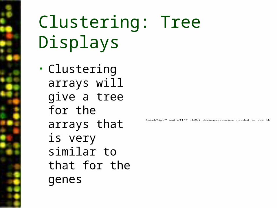
Clustering: Tree Displays
• Clustering arrays will give a tree for the arrays that is very similar to that for the genes
QuickTime™ and aTIFF (LZW) decompressorare needed to see this picture.
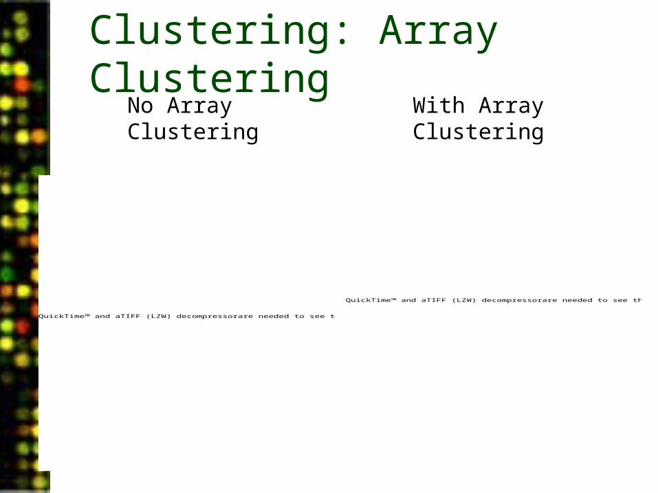
Clustering: Array Clustering
QuickTime™ and aTIFF (LZW) decompressorare needed to see this picture.
QuickTime™ and aTIFF (LZW) decompressorare needed to see this picture.
No Array Clustering
With Array Clustering
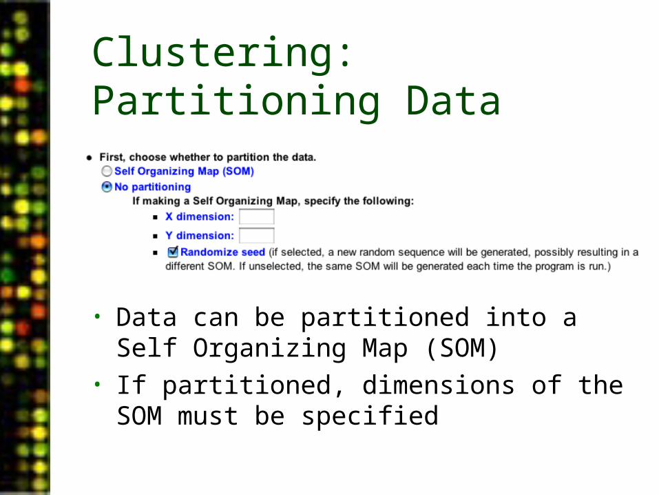
Clustering: Partitioning Data
• Data can be partitioned into a Self Organizing Map (SOM)
• If partitioned, dimensions of the SOM must be specified
Clustering: Self Organizing Maps
• SOMs result in genes being assigned to partitions of most similar genes
• Neighboring partitions are more similar to each other than they are to distant partitions
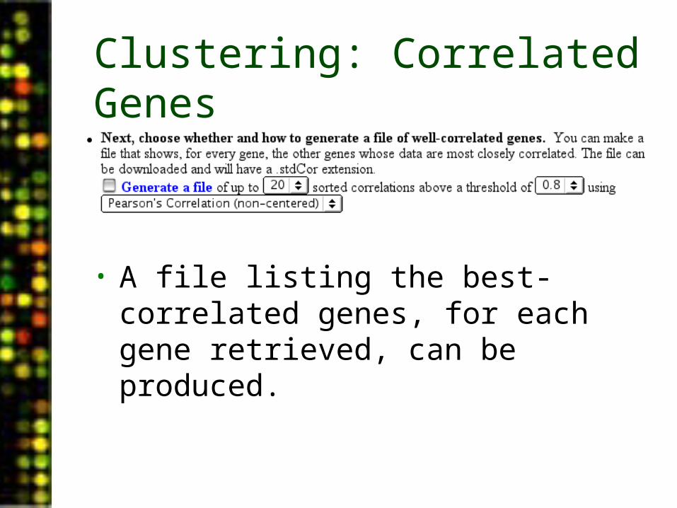
Clustering: Correlated Genes
• A file listing the best-correlated genes, for each gene retrieved, can be produced.
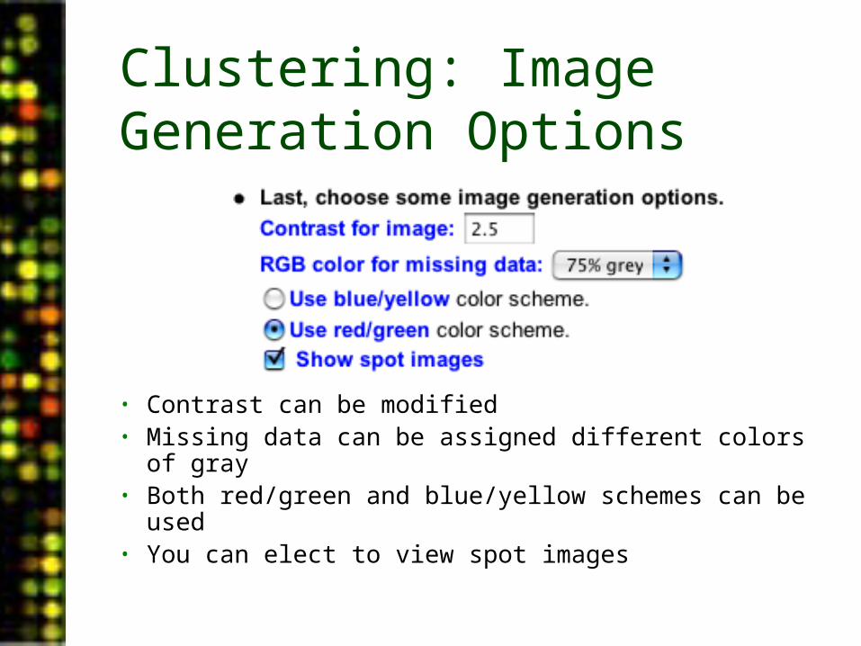
Clustering: Image Generation Options
• Contrast can be modified• Missing data can be assigned different colors of gray• Both red/green and blue/yellow schemes can be used• You can elect to view spot images
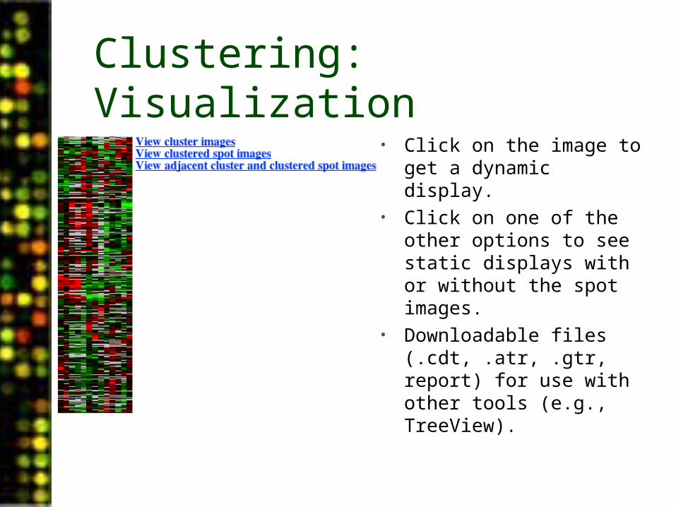
Clustering: Visualization• Click on the image to get a
dynamic display.• Click on one of the other
options to see static displays with or without the spot images.
• Downloadable files (.cdt, .atr, .gtr, report) for use with other tools (e.g., TreeView).
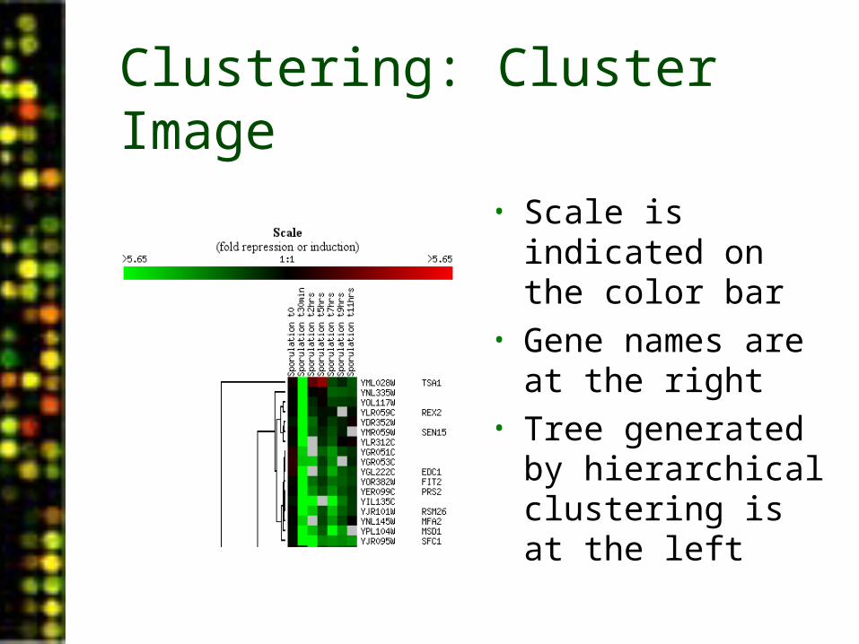
Clustering: Cluster Image
• Scale is indicated on the color bar
• Gene names are at the right
• Tree generated by hierarchical clustering is at the left
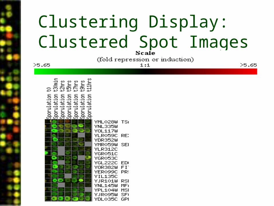
Clustering Display: Clustered Spot Images
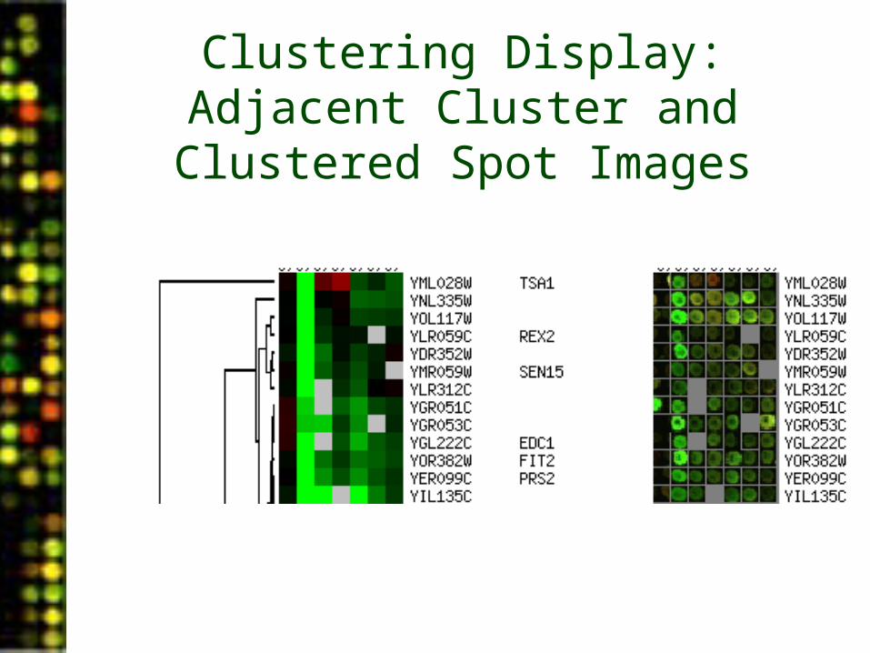
Clustering Display:Adjacent Cluster and Clustered Spot
Images
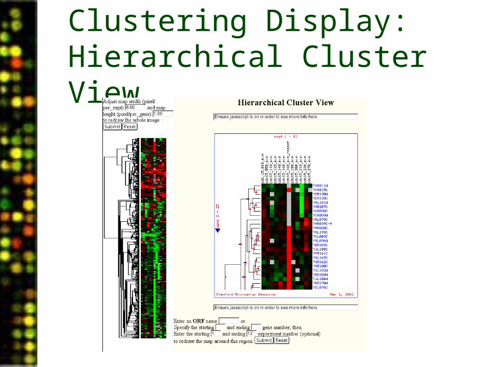
Clustering Display: Hierarchical Cluster View
Clustering and Image Generation Summary
• Partitioning data• Clustering metric
selections• Correlated genes• Image generation
options
PUMAdb Data Analysis• Data Analysis Background
– Data normalization– Clustering algorithms– Data centering
• Using the Database’s Analysis Pipeline
– Gene Selection and Annotation– Data Filtering– Data Retrieval– Gene Filtering– Clustering and Image Generation
User Help: Help, Tutorials and Workshops
• Help & FAQ– http://puma.princeton.edu/help/– http://puma.princeton.edu/help/FAQ.shtml
• Tutorials – regularly scheduled– “Welcome” tutorial– Data analysis, Normalization and Clustering– Interested? Email [email protected]
• Hybridization & Scanning Individual Instruction– Email [email protected]
PUMAdb: Office Hours
• CIL 135• Thursday 9-11 am• Friday 2-4 pm