pr11 production commentary
TRANSCRIPT

Unit 51 Page Layout and Design
Production Commentary
Slide 1: Design Programmes
During making my magazine the only programme I used was Adobe Photoshop for
both my double page spread and front cover. I did use numerous tools while editing my images and text, including; the quick selection tool, the magic wand tool, eyedropper etc. When writing
my article I used word.

Slide 2: FORMATS
• I researched into other gaming magazines, to gain ideas on how I should layout my front cover and double page spread. I looked at a varied mixture and made decisions on what I wanted to do with mine and took inspiration from other gaming magazines.
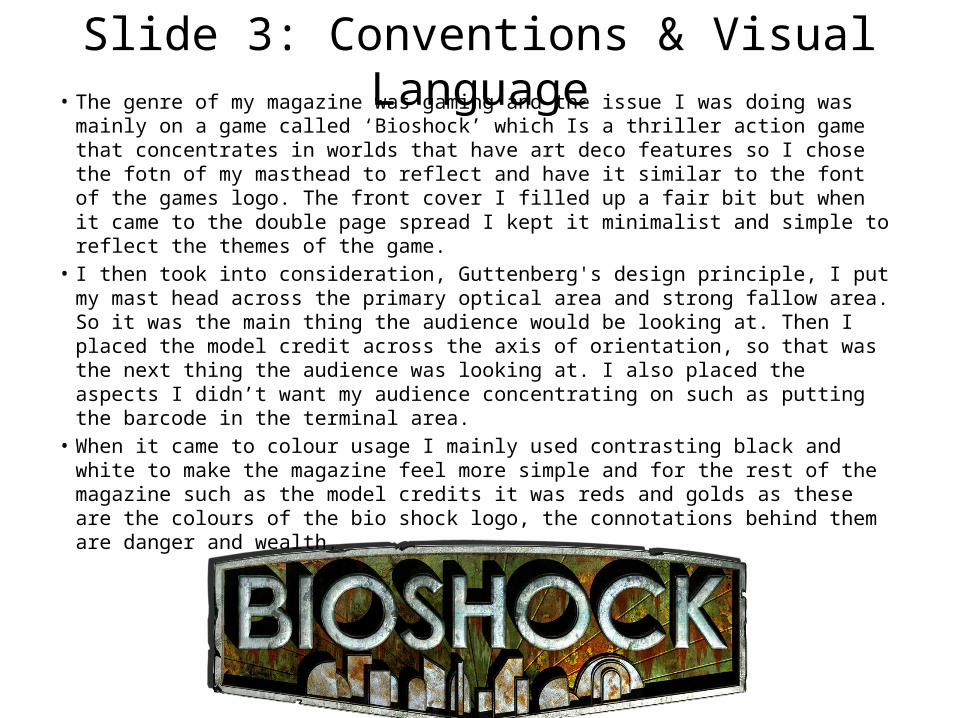
Slide 3: Conventions & Visual Language• The genre of my magazine was gaming and the issue I was doing was mainly on a
game called ‘Bioshock’ which Is a thriller action game that concentrates in worlds that have art deco features so I chose the fotn of my masthead to reflect and have it similar to the font of the games logo. The front cover I filled up a fair bit but when it came to the double page spread I kept it minimalist and simple to reflect the themes of the game.
• I then took into consideration, Guttenberg's design principle, I put my mast head across the primary optical area and strong fallow area. So it was the main thing the audience would be looking at. Then I placed the model credit across the axis of orientation, so that was the next thing the audience was looking at. I also placed the aspects I didn’t want my audience concentrating on such as putting the barcode in the terminal area.
• When it came to colour usage I mainly used contrasting black and white to make the magazine feel more simple and for the rest of the magazine such as the model credits it was reds and golds as these are the colours of the bio shock logo, the connotations behind them are danger and wealth.

Slide 4: Audience
• The target audience for my magazine is mainly young people 15-25, with both genders but mainly male. The audience for my magazine I believe will also be C1 downwards.
• I think my magazine meets this target audience by featuring informal language which would draw that target audience in and I also used popular games that my audience would enjoy.

Primary Optical Area
Weak Fallow Area
Strong Fallow Area
Terminal Area
Axis Of Orientation

Masthead
Main Image
Badge Flash
Model Credit
Barcode
Cover lines