portfolio v2 (toemail)
TRANSCRIPT

Katie ClarkGraphic Designer

Hello! I’m Katie, and thank you for taking an interest in my work.
I am an enthusiastic designer who enjoys in depth research and interactions with my target audience, which helps me create applicable design solutions.
Like all designers I have a keen eye for details, butI also know how to sit back and look at the whole picture from inside out, upside down and every angle possible until I am satisfied I have exhausted the design process.
HELLO.

Weston CollegeBath Spa University FdA 2014 - 2015BA Hons Graphic Design, First class
FdA 2012 - 2014FdA in Graphic Design, Pass
Weston CollegeDiploma 2010 - 2011 Graphic Design, MeritB-Tec 2009 - 2010General Art, Distinction
Worle Community SchoolGCSE 2005-201010 GCSE’s at A* to C grade.
English Literature (B)English Language (A)Maths (D) , Science (A)
Katie ClarkGraphic Designer
I’m a tea-addicted graphic designer witha keen eye for detail.
I am overall a very creative person and although my passion is to pursue a career in Graphic Design I spend all of my free time dabbling in other varying art forms, such as illustration, writing and reading.
CVADOBEPHOTOSHOP
ADOBEILLUSTRATOR
ADOBEINDESIGN
ILLUSTRATION
PHOTOGRAPHY
Ps
Ai
Id
SKILLS
STUDENT OF THE YEAR 2015
AWARDS
EXPERIENCE
IGNITION STRATEGIC DESIGNOctober - March 2015
NORTH SOMERSET DESIGN COUNCILAugust 2015
+MILTONPHARMACY2012 - 2014

For the past three years I have been a student studying Graphic Design at Weston College in partnership with Bath Spa University. I have completed both an FdA degree and a BA Hons, at a high standard. I would say I am a highly motivated, reliable and honest person and after three years of education with design, I feel comfortable in my skill set.
I am a very sociable and confident person, I am always actively seeking new experiences with new people and places, for example in the last few years I have been privileged in being able to attend three academic trips to Barcelona, Berlin and Krakow, as well as a personal road trip across the USA from California to Nevada and then a year later I returned to the states to go to Florida.
I have also worked with ignition Strategic Design, Bath during the last year of my university course, part time. This was for work experience and part of my recommended course criteria. The experience was enriching and helped me learn a lot about real-world Graphic Design.
WHO AM I?

encouraging concept when applied with its tagline ‘MAN UP, let’s talk about it’.
The logo was created to symbolise strength and structure, as well as positivity and optimism.
The orange M shape is meant to have the connotation of moving ‘up’, and the inner shape of the M was removed to abolish the natural downwards arrow of the letter, then it is placed on a strong foundation.
The whole brand has a sense of sleek coolness paired with an urban edge to appeal to teenage boys.
MAN UP is a project that was been created with the intention of encouraging boys between the ages of 12-18 to speak more freely about mental health and to dispel the stigma of weakness that surrounds mental illness, with the intention that doing so would help prevent suicide in later life.
MAN UP focuses on redefining what ‘manly’ means to young boys and provides ways to encourage sharing through a messaging app, interactive campaign and offers them a safe place to go.
The design concept was formed from the idea of turning a negative into a positive, and turns ‘man up’ the phrase into a positive and
MAN UPLet's talk about it


bulletins but also the KEEP UP with MAN UP magazine I created, which is a monthly publication that informs boys on all of the #MANDAY events as well and provides numbers and links for them when/if they need to reach out to someone.
I also created the idea of Mentors, who would be the big brother role modles for the boys, who would run the Hub and put on events, this was all to encourage a safe yet cool place for the boys to feel like they were in a place where the topic of mental health and adolescent struggles were no longer something they couldn’t talk about.
For my project MAN UP, I designed a whole range of products that helped create the brand, and give it a realistic standing.
From posters to mobile apps, I created every single element that you can see.
One of my favourite parts of MAN UP was the hub I created, which gave the boys a safe place to go. I used the current and interesting idea of using an outdoor industrial container as somewhere for the boys to meet up, join in on events and also seek help when they needed it. Through the Hub the boys could gain all the information they needed to know about MAN UP, through posters and event
“
”
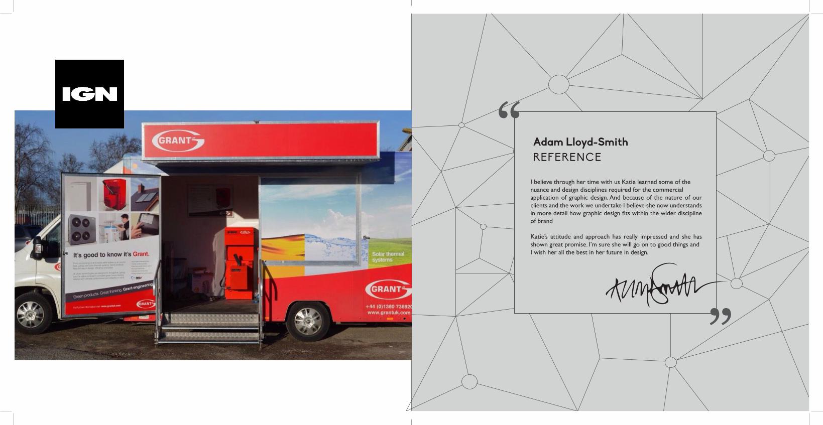
I believe through her time with us Katie learned some of the nuance and design disciplines required for the commercial application of graphic design. And because of the nature of our clients and the work we undertake I believe she now understands in more detail how graphic design fits within the wider discipline of brand
Katie’s attitude and approach has really impressed and she has shown great promise. I’m sure she will go on to good things and I wish her all the best in her future in design.
Adam Lloyd-SmithREFERENCE

So I created ‘Clarity’ a self help pack that provides tips and suggestions for people living with depression. Clarity encourages you to take action and to care about yourself.
The design creates a connection of connections like the links in our brains. This was created with the idea of neurons and brain cells in mind - it was all about making things clear. This was for the purpose of helping the patients to rid themselves of uncertainty and stigma, and bringing them some Clarity.
ClarityMaking things clearer

Abbie gave me free range in terms of font choice and I made the decision to use the fonts that she uses throughout her portfolio and work, so that there is a clear connection between the two.
Once we had settled on a black and white logo we both felt represented her and her artwork I encouraged her to include some colour, as her work is usually very bright and she specialises in children’s book illustration.
The final touch of colour was exactly what the logo needed, and I feel like the final piece was a clear representation of my client and her work.
This project was to help Abbie Cameron re-brand herself for her Graduate Show for Swansea University.
We worked collaboratively on this piece, using her illustrations and my design capability to create a sophisticated logo that showcases her illustrative ability.
I feel like this is a great example of my creative work as I was given a large sheet of illustrations and simply asked to create a logo. The illustrations ranged from the flowers you see used, to giraffes and ducks. This gave me a broad and blank canvas to really experiment and get creative.
Abbie IllustratesFreelance illustrator

This was a project where I was given the challenge to design a news letter for the students. The idea was based off an inter-class messaging system, and I focused on the idea of when kids send notes in class.
This expanded into the idea of sending a message via a paper airplane. The design then escalated from there, a blue colour used to represent the sky, and font chosen to be clean and sleek. The logo is placed central to give it the feel of it being in the sky, and gives the dotted pattern plenty of room to breathe.
PEER PRESSThe Student Newsletter
One of the great parts of this project was that it was a team effort between myself and one other designer on my course. We bounced ideas back and forth, deciding to work on her idea of the paper airplane but ended up using my application and colour for the final submission.
I feel this is a good example of my ability to design a concept in a team and it shows how I am able to expand and develop other people’s original concepts, as well as creating my own.

KRAKOWRoads of Poland
This was my Krakow Journal, which was a self indulgent and creative piece based on my time in Krakow. I designed a travel journal based off my time in Poland, documenting the places and sights I saw.
It was such an incredible trip, spent with fellow designers and through my time thereI created this book.
The design was themed off the cobblestones and floor patterns I found throughout the city. I punctuate each chapter with a small thumbnail of the ground, using the idea of layering, squares and cobble like patterns to create the layouts throughout this journal.

Amanda DeanFreelance Artist
Amanda Dean is a freelance life artist, who wanted something simple and sophisticated. She was not interested in any complicated meanings, she just wanted something that gave a glimpse of her and her work. I used a thumbnail of one of her paintings for the back of the card, putting a black boarder around it to represent the canvas, and then when it came to the logo I recommended she used a vector of her own signature.
I finished it off by using Georgia as her main font, as it is simple and classic, and ties in nicely with her traditional style.

The All Design Show was my third year graduate show that was exhibited in Weston-super-Mare, Bristol and London.
The concept ALL comes from the concept of light diffraction, where wavelengths of light split off from the beam as individuals. This concept resonated with us, maturing as designers within the group and emerging out into the world as individuals. ALL is our point of separation, a time to celebrate our progress and look towards what we can achieve in the future. We used lines and dots to represent our progress as designers and to represent us as individuals.
ALLDESIGNAll a matter of perspective
My role in the exhibition was Assisting Director. I was given this title due to my leadership skills, and my ability to organise and allocate jobs, as well as fulfilling a variety of roles myself.
One of the biggest aspects of design that I provided for this show was the pillar templates and the wall graphics. As a group we decided how we wanted the space to look and then I designed the elements we discussed. Between myself and one other teammate we finalised the tube templates which were then distributed for people to fill in with their own work and information, and the vinyls were applied as a group task.

Here you can see the finished piece that exhibited in London, New Designers.
You can see how the wall vinyl’s I designed interlink between the pillars, and you can also see how the pillars I designed were utilised. There were certain elements on the pillars that could not be moved, some that could be edited to some extent and some that were completely up to the individual designer.
Overall, we ended up with an effective, captivating and unique show and I was proud of the elements that I contributed to the overall exhibition.

I strive to be someone who makes a difference. I want to create work that is seen by hundreds of people, and for that work to be something influential.
I believe that given the right opportunities I can and will do great things in the world of design, I just need to find somewhere to start.
IMPACT.
