optical blending: a comparison of spectrophotometric
TRANSCRIPT

OPTICAL BLENDING: A COMPARISON OF SPECTROPHOTOMETRIC
MEASUREMENTS AND HUMAN VISUAL ASSESSMENTS
OF BLENDED COLOR BLOCKS
By
CAROL P. DAHMS
Under the Direction of Helen Epps
ABSTRACT
This study makes comparisons about optical blending by using woven samples, known
colors. Samples were prepared and instrumental color measurements were taken on those
samples. Human visual assessments of the samples were gathered and compared to the
instrumental measurements.
INDEX WORDS: Optical blending, Color, Natural Colour System, Woven

OPTICAL BLENDING: A COMPARISON OF SPECTROPHOTOMETRIC
MEASUREMENTS AND HUMAN VISUAL ASSESSMENTS
OF BLENDED COLOR BLOCKS
By
CAROL P. DAHMS
B.S., Charleston Southern University, 1973
A Thesis Submitted to the Graduate Faculty of The University of Georgia in Partial Fulfillment
of the Requirements for the Degree
MASTER OF SCIENCE
ATHENS, GEORGIA
2007
i

2007
Carol P. Dahms
All Rights Reserved

OPTICAL BLENDING: A COMPARISON OF SPECTROPHOTOMETRIC
MEASUREMENTS AND HUMAN VISUAL ASSESSMENTS
OF BLENDED COLOR BLOCKS
by
CAROL P. DAHMS
Major Professor: Helen Epps
Committee: Patricia Annis Patricia Hunt-Hurst
Electronic Version Approved: Maureen Grasso Dean of the Graduate School The University of Georgia August 2007
iii

ACKNOWLEDGEMENTS
My thanks go to the following individuals for their assistance. Of course, to Dr. Helen Epps, who
made this step on the degree process easier by her willingness to give support and advice. To the
other committee members, Dr. Patricia Annis, Dr. Patricia Hunt-Hurst and Glen Kaufman,
Lamar Dodd School of Art, my thanks for your participation and comments. Thanks also go to
Jenny and Annette at Jacquard Products, Inc. for help with information about the dyes, and the
staff at the Yarn Barn of Kansas. For allowing me to recruit subjects from their classes, thanks
are extended to Dr. Diann Moorman, Dr. Arthur Grider, Ms. Emily Blalock, and Dr. Jan
Hathcote. I also thank the other TXMI faculty and my fellow students for their moral support.
iv

TABLE OF CONTENTS
Page
ACKNOWLEDGEMENTS........................................................................................................... iv
TABLE OF CONTENTS.................................................................................................................v
LIST OF TABLES........................................................................................................................ vii
LIST OF FIGURES ..................................................................................................................... viii
CHAPTER
1 INTRODUCTION .........................................................................................................1
2 REVIEW OF LITERATURE ........................................................................................3
Color Vision Theories ...............................................................................................3
Color Vision ..............................................................................................................3
Optical Blending........................................................................................................4
Instrumental Color Measurement ..............................................................................7
Natural Colour System ..............................................................................................8
3 METHODS AND PROCEDURES .............................................................................10
Preparation of Samples............................................................................................10
Instrumental Measurements of Blended Color Blocks............................................11
Card Selection Process ............................................................................................12
Human Visual Assessments ....................................................................................14
4 RESULTS ....................................................................................................................17
Analysis of Cards Chosen .......................................................................................17
Analysis of Target Card Elimination.......................................................................22
5 SUMMARY AND RECOMMENDATIONS..............................................................26
v

Analysis of Cards Chosen .......................................................................................26
Analysis of Target Card Elimination.......................................................................28
Recommendations ...................................................................................................28
REFERENCES ..............................................................................................................................30
APPENDICES ...............................................................................................................................32
A Dyes from Jacquard Products ......................................................................................32
B CIE L*a*b* Measurements of Cards Used for Assessments.......................................33
C Comparisons of Blended Color Blocks, Target and Chosen Cards .............................36
D Sample of Recording Sheet..........................................................................................37
vi

LIST OF TABLES
Page
Table 3.1: Card Description and Corresponding Code Numbers ..................................................12
Table 4.1: Number of Times Participants Chose Cards.................................................................18
Table 4.2: Summary of Number of Times Each Card Was Chosen ..............................................19
Table 4.3: Overall Analysis of Card Choices ................................................................................19
Table 4.4: Card Choices by Blended Color Block.........................................................................20
Table 4.5: Elimination of Target Card...........................................................................................23
vii

LIST OF FIGURES
Page
Figure 1.1: Color Blanket Use in Pilot Study ..................................................................................1
Figure 2.1: Georges Seurat’s A Sunday on the La Grande Jatte .....................................................6
Figure 2.2: NCS Colour Space ........................................................................................................8
Figure 2.3: NCS Colour Wheel........................................................................................................8
Figure 2.4: NCS Colour Triangle.....................................................................................................9
Figure 2.5: NCS Notation Description.............................................................................................9
Figure 3.1: Blended Color Blocks Used for Visual Assessments..................................................11
Figure 3.2: Cards Used for Visual Assessments............................................................................13
Figure 3.3: Sample of Card Arrangement Used for Visual Assessments ......................................15
viii

CHAPTER ONE
INTRODUCTION The purpose of this research was to study optical blending by comparing instrumental
color measurements with visual assessments of woven color blocks consisting of known blends
of colored yarn. It is known that human visual assessments and instrumental color
measurements often do not agree. Optical blending further complicates this issue.
The first objective was to analyze the cards that participants chose and how often they
chose those cards. A second objective was to determine at what point in the viewing process the
designated target card was eliminated. For purposes of this study, a standard size of juxtaposed
colors and constant viewing distance were used thereby eliminating any variability that a change
in these two conditions might cause. The methodology used in the pilot study was used in this
study with only slight variation.
Figure 1.1 Color Blanket Used in Pilot Study
1
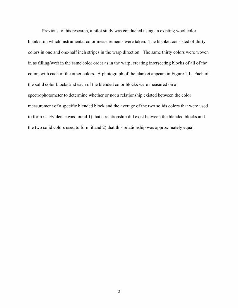
Previous to this research, a pilot study was conducted using an existing wool color
blanket on which instrumental color measurements were taken. The blanket consisted of thirty
colors in one and one-half inch stripes in the warp direction. The same thirty colors were woven
in as filling/weft in the same color order as in the warp, creating intersecting blocks of all of the
colors with each of the other colors. A photograph of the blanket appears in Figure 1.1. Each of
the solid color blocks and each of the blended color blocks were measured on a
spectrophotometer to determine whether or not a relationship existed between the color
measurement of a specific blended block and the average of the two solids colors that were used
to form it. Evidence was found 1) that a relationship did exist between the blended blocks and
the two solid colors used to form it and 2) that this relationship was approximately equal.
2

CHAPTER TWO
REVIEW OF LITERATURE
In order to achieve the stated objectives, the researcher needed to be familiar with the
areas of color vision, theories about color vision, optical blending, instrumental color
measurement, the Natural Colour System and other work performed in these areas. A review of
the existing literature was conducted.
Color Vision Theories
Many theories about how color vision works have been postulated. Important among
those are the works of Thomas Young and Hermann Helmholtz along with that of Ewald Hering.
In 1802, Young postulated what is often referred to as the trichromatic theory. It stated that there
are three different kinds of color receptors in the eye. Each of those receptors has a different
spectral sensitivity. His work was refined by Herman Helmholtz in the 1850s. These two
scientists based their theories on the observation that any color in the visible spectrum can be
matched by mixing three basic colors of light in different proportions.5
Another equally important theory was that of Ewald Hering in 1878. Referred to as the
opponent process theory, it postulated that there were two different groups of cells that
controlled color and a third group that controlled brightness. His theory was based on two
primary factors. One, that blue and yellow could not exist together in the same color nor could
red or green. Secondly, he observed that the afterimage of each color existed and that it was
these opposing colors; red afterimages to green, green to red, yellow to blue, and blue to yellow.
Subsequent research has shown that both theories were correct and that our color vision is a
complex combination of both. 5
3

Color Vision
Light enters the eye and is focused on the retina by the lens and the aqueous humor. The
retina contains rods and cones. Cones contain photopigments and are sensitive to color.
Photoreceptors, which are a specialized type of neuron located in the retina, send signals to
retinal ganglion cells converting light into electrical signals. As these are transferred from the
cones to the retinal ganglion cells, the trichromatic sensations of the cones are converted into the
opponent process system. These impulses travel through the optic nerve and to the brain where
perception of color occurs.7
The rods contain rhodopsin which responds to a single photon of light but are not
sensitive to the wavelengths of that light so rods cannot distinguish color. Cones respond to high
levels of light and are sensitive to a particular wavelength. Cones contain three different light
sensing pigments: ertholable (R cones) which are sensitive to the longer red wavelengths,
chorolabe (G cones) which are sensitive to the medium green wavelengths and cyanolab (B
cones) which are sensitive to the shorter blue wavelengths of light. These cones signals are not
distinct, but are overlapping allowing humans to see discriminate minute differences in color.
Where the cones lie and how their signals blend with each other determine how we see a color.17
Optical Blending
Optical effects occur in a variety of related forms, three of which are: 1) simultaneous
contrast, the effect adjacent color areas have on each other, 2) successive contrast, the afterimage
effect, and 3) optical blending which has a spatial component and causes a blending of colors.
This study focuses on the third. The phenomenon of optical blending occurs when two separate
colors are juxtaposed such that when viewed they are seen as yet another color or variation of the
4

original colors. Optical blending is described by various names: partitive mixing10, optical
mixing3,8,16,18,19, apparent intermixture11 and assimilation effects13.
Chevreul (1854) referred to optical blending as “mixture of colors” and defined it as
follows: “There is a mixture of colours whenever materials of various colours are so divided and
then combined that the eye cannot distinguish these materials from each other: in which case the
eye receives a single impression.”8 What is seen are actually two separate colors, but because
of their size and/or proximity, the eye blends the two colors and the viewer sees yet a third color.
Lambert, Staepelaere and Fry call this phenomenon optical color mixtures. They
describe optical mixtures as being “produced by eye/brain responses to the placement of
colorants rather than the physical mixtures of light or colorants.”16
In a woven fabric, optical blending often occurs when one color is used in the warp
direction and another color in the filling/weft direction. The two colors of the yarns interact with
each other to form another color or color variation. Optical blending also involves a spatial
component. Viewed at close distance the colors appear separate but when viewed from a greater
distance they appear as one color. The size of the juxtaposed colors and the distance from which
they are viewed can influence the color that is observed.
The occurrence of these optical color mixtures is affected by many conditions, variable
with any given media. In a previous study of appearance of woven textiles, Joshi (1982)
addressed the behavior of colored yarns in woven textiles. “The apparent behaviour of coloured
yarns when woven depends upon many factors: (1) the count of the yarn, (2) the size of the
pattern, (3) the type of weave (4) juxtaposition of coloured area (5) the viewing distance (6) the
eye fatigue (7) position of the fabric (8) the type of the material of which the cloth is made (9)
the twist applied to the yarn of which the fabric is made (10) the illumination in which the fabric
5

is viewed (11) the capacity of the eye of the observer (12) planning of coloured areas to improve
the weave effect.”14 Any of these factors can be a variable in a woven fabric. The scope of the
current study was limited to the juxtapositions of the yarns at a specified and constant viewing
distance.
Additional study by Sharavova and Guseva (1998) addressed optical and spatial blending
and concluded that “By using two differently colored fibres and varying the character of the
weave, it is possible to obtain a variety of hues. Changing the type of weave alters not only the
surface finish of the material but also its color characteristics.”22 For the scope of this study, the
character of the weave, i.e. the weave structure, was constant so that comparisons were made
only on the variability of color and no other fabric characteristics.
Optical blending occurs also in other media. The Pointillist painting movement, lead by
Georges Seurat, utilizes the juxtaposition of small dots of paint to create impression of color and
to increase or decrease luminance.6,9 See Figure 2.1. Television and computer screens also
employ optical blending by using small rectangles of colored lights to produce all the colors seen
on the screen.
Figure 2.1 Georges Seurat’s, A Sunday on the La Grande Jatte
6

Instrumental Color Measurement
Instrumental measurement that eliminates the variability of human vision is now
available. Instruments and software are available by which color measurements can be taken.
Spectrophotometers measure light as a function of wavelength. These instruments vary by the
wavelengths measured, techniques used for those measurements, the sources of variation
designed to be measured and how they acquire the spectrum. Most commonly, they measure
absorption or reflectance.
Reflectance spectrophotometers are used to obtain precise color measurements. In this
type of instrument, the electrical signaling is a spectral reflectance factor with wavelength
sampling and bandwidths of 10 nanometers across the visible spectrum from 400 – 700
nanometers; hence, the instrument is designated as a thirty-one point color spectrophotometer.
These measurements quantify color based on a system that simulates what an average observer
sees.
Reflectance is measured and multiplied (wavelength by wavelength) by stored data
representing the standard observer function and the illuminant function. From this calculation,
the instrument produces tristimulus values (the amounts of a set of primary colors). CIE L*a*b*
values are calculated from these data as follows: L* = 903.3(Y/Yn) for Y/Yn ≤ 0.008856,
a* = 500[(X/Xn)1/3 – (Y/Yn)1/3] and b* = 200[(Y/Yn)1/3 – (Z/Zn)1/3], where X, Y & Z are the
tristimulus values with X representing red, Y representing green and Z representing blue. CIE
La*b* values correspond to Hering’s opponent theory of color vision. The three parameters
within the CIE La b system are L*, a* and b*. The L* scale ranges from zero (absolute black) to
100 (absolute white). The a* scale ranges from negative infinity (green) to positive infinity
(red). Similarly, the b* scale ranges from negative infinity (blue) to positive infinity (yellow).5
7

Natural Colour System
Various systems have been created to describe and represent color. The Natural Colour
System (NCS) is a color order system that is based on how human beings perceive color rather
than on relationships between the primary colors and their mixtures. In common with the
opponent theory of Hering, the system has four chromatic colors red (R), blue (B), yellow (Y)
and green (G). The three dimensional color space, a representation of which is shown in Figure
2.2 is double cone shaped and is organized with the elementary colors (hues) on the edges of a
circular plane. The white to black scale (lightness and darkness) is perpendicular to and cuts
through the center of the color plane with the most black and most white being at the tips of the
cone. Intermediate hues are noted by percentages of each elementary hue that composes it
represented in Figure 2.3. An example is Y30R which represents a yellow with 30% red.
Figure 2.2 Figure 2.3 NCS Colour Space NCS Colour Wheel
This color space is based on a principle of similarity referred to as ‘nuance’. Unique to
this system is ability to establish the relationship between equivalent whiteness, blackness and
chromaticity without regard to hue chosen.5,23 An example of one color triangle is represented in
Figure 2.4. A whiteness scale and a blackness scale of 0-100 are established. The same degree
of blackness can be found on a parallel line between W (whiteness) and C (chromaticity). The
same degree of whiteness can be found on a parallel to line between S (blackness) and the C
8
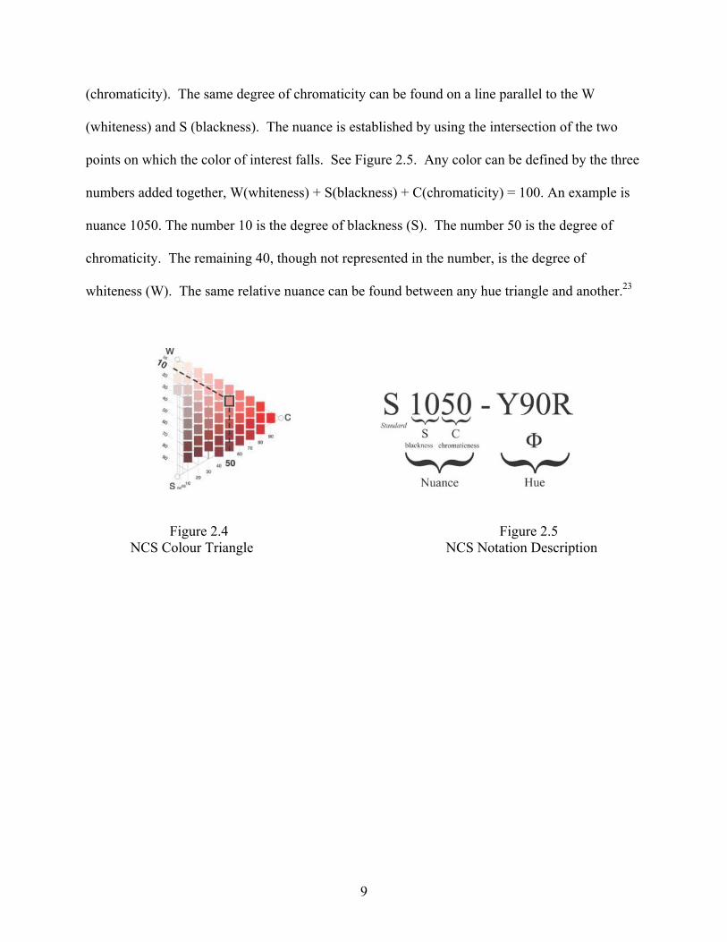
(chromaticity). The same degree of chromaticity can be found on a line parallel to the W
(whiteness) and S (blackness). The nuance is established by using the intersection of the two
points on which the color of interest falls. See Figure 2.5. Any color can be defined by the three
numbers added together, W(whiteness) + S(blackness) + C(chromaticity) = 100. An example is
nuance 1050. The number 10 is the degree of blackness (S). The number 50 is the degree of
chromaticity. The remaining 40, though not represented in the number, is the degree of
whiteness (W). The same relative nuance can be found between any hue triangle and another.23
Figure 2.4 Figure 2.5
NCS Colour Triangle NCS Notation Description
9

CHAPTER THREE
METHODS AND PROCEDURES
For this study samples of blended color blocks of known composition were woven and
used to compare human visual assessments with instrumental color measurements. A standard
size of juxtaposed colors and constant viewing distance were used, thereby eliminating any
variability that a change in these two conditions might cause. The methodology used in the pilot
study was used in this study with only slight variation.
A number of limitations in the pilot study were eliminated in this research as the
researcher had control of the dyes, dyeing process and weaving process. Other limitations will
be discussed in subsequent sections of the Procedures chapter.
Preparation of Samples
Samples were prepared from Henry’s Attic “Pony” yarn purchased from the Yarn Barn of
Kansas. This two-ply wool yarn has a yarn linear density of 2835 yards per pound1 and twist of
5 per inch2. Wool was chosen in order to be consistent with the pilot study and since it was easy
to dye. Acid dyes used were from Jacquard Products. The names, company color numbers,
mixtures and respective Colour Index numbers are described in Appendix A. Yarns were dyed
to match, as closely as possible, colors in the NCS color order system.
A piece was woven that included all four colors in warp and the same four colors in the
weft(filling) It was woven in plain and balanced weave. This was consistent with the pilot
study. Plain and balanced weave provided the most yarn interlacements possible and at equal
increments so that optimum optical blending was achieved. The blocks were woven at
approximately 20 x 20 yarns per inch fabric count. The size of the individual woven color blocks
was four inches square. The fabric was cut into individual color blocks for ease of handling
10

during instrumental and visual testing. This produced six blended color blocks. See Figure 3.1
which is a photograph of the individual woven color blocks that were used.
Figure 3.1 Blended Color Blocks Used for Visual Assessments
The size of the samples in the current study may have been a limitation. Larger samples
may produce different results. Because the samples are handwoven, there is some inevitable
unevenness in the woven structure. This unevenness was definitely a limitation. Some areas of
the blended block were slightly more of one color than the other. To maintain consistency, all of
the blended blocks were shown to each of the participants with the same orientation. The upper
left hand corner was marked and always mounted that direction.
Instrumental Measurement of Color Blocks
The instruments and materials used in this phase of the study were the handwoven color
blocks, the Gretag Macbeth CE-7000A spectrophotometer with spherical geometry, and Gretag
Macbeth Optiview software, version 1.7. CIE L*a*b* measurements were taken using a one-
inch aperture. The 10° observer function (field of view) and the D65 illuminant were used.
Color block samples were presented to the port with the warp oriented in the same
direction for each measurement. A neutral gray fabric was placed behind the block to control for
any transmission through the specimen while measurement was taken. This neutral gray fabric
11

was applied to a stiff cardboard to prevent “pillowing” or deformation while the sample was in
the spectrophotometer port.
Card Selection Process
For the visual assessment portion of the study, participants were asked to compare the
blended color block and a set of NCS color cards. In preparation for this step, NCS color cards
were chosen by the researcher. In order to allow for differences in what participants might
observe, hue and nuances were chosen at increments of one NCS step away in each of the
directions within the NCS color space. The nine cards are described as follows. A “target” card,
i.e., that card whose instrumental measurement most closely matched the instrumental
measurement color block of interest, was selected. Two more cards were chosen, one that was
one step more whiteness and another that was one step more blackness than the target card.
Chroma was considered and cards were selected with one step more in chromaticity and one step
less in chromaticity than the target card with more whiteness and more blackness within each
step. For hue differences, cards were selected at one hue lower and one hue higher than the
target card but at the same nuance. A chart that includes the NCS color cards used and the
CIEL*a*b* measurements associated with those cards appears in Appendix B. Figure 3.2
contains a description of the card with the corresponding code number. Figure 3.3 shows all of
the color cards used in the visual assessments.
Table 3.1 Card Descriptions and Corresponding Code Numbers
Code # Card Description Code # Card Description 1 target 6 less chroma (more white) 2 more white 7 less chroma (more black) 3 more black 8 same nuance, lower hue 4 more chroma (more white) 9 same nuance, higher hue 5 more chroma (more black)
12
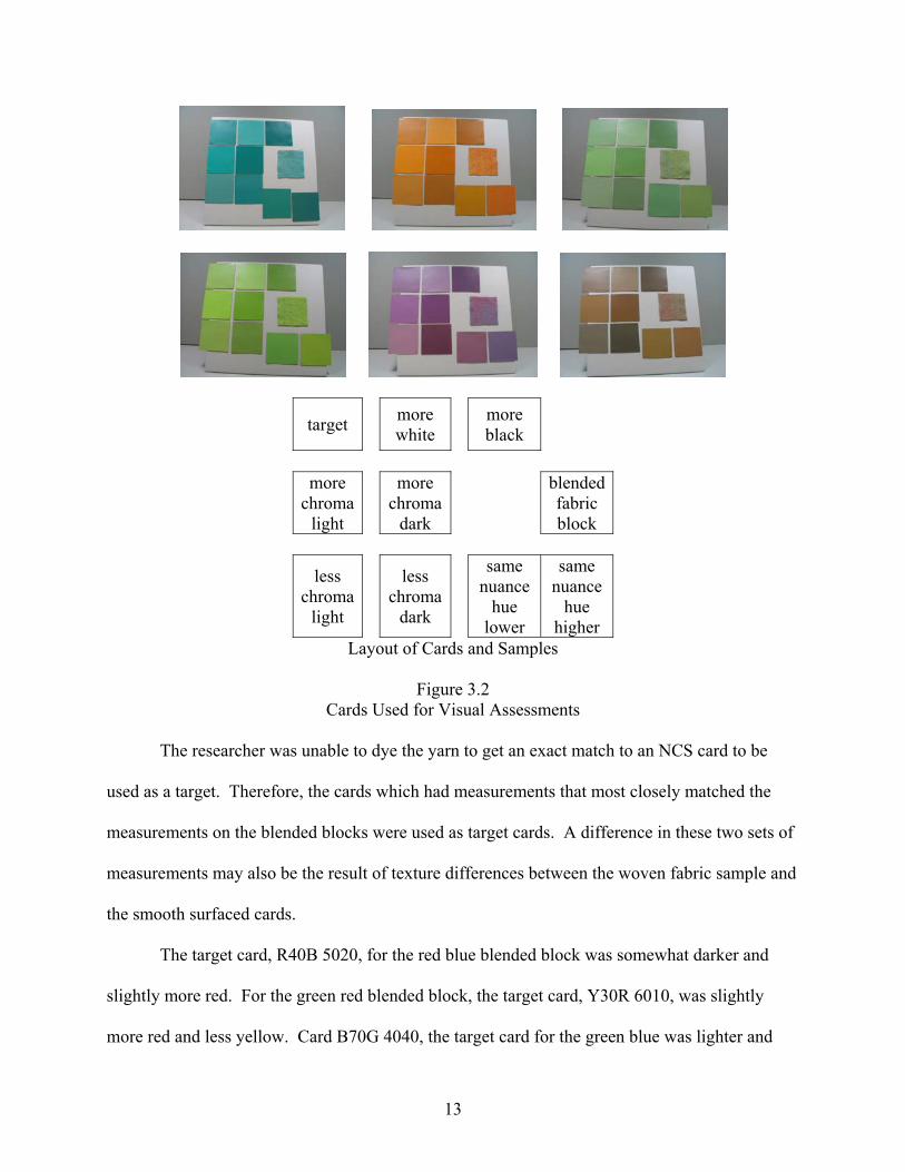
target more white
more black
more
chroma light
more chroma
dark
blendedfabric block
less chroma
light
less chroma
dark
same nuance
hue lower
same nuance
hue higher
Layout of Cards and Samples
Figure 3.2 Cards Used for Visual Assessments
The researcher was unable to dye the yarn to get an exact match to an NCS card to be
used as a target. Therefore, the cards which had measurements that most closely matched the
measurements on the blended blocks were used as target cards. A difference in these two sets of
measurements may also be the result of texture differences between the woven fabric sample and
the smooth surfaced cards.
The target card, R40B 5020, for the red blue blended block was somewhat darker and
slightly more red. For the green red blended block, the target card, Y30R 6010, was slightly
more red and less yellow. Card B70G 4040, the target card for the green blue was lighter and
13

more green. The target card, G30Y 3030, for the blue yellow blended block was somewhat
darker with somewhat more green and less yellow. For the yellow green blended block, the
target card, G40Y 2050, was slightly darker, somewhat less green and more yellow. The target
card, Y30R 3050, the yellow red blended block was slightly lighter, slightly more red and
slightly less yellow. A numerical comparison of the blocks, the target cards, and the
subsequently chosen cards appears in Appendix B.
Human Visual Assessments
Participants were twenty volunteers. They were University of Georgia female students in
their twenties. Since this study was conducted with only one age group and only females, testing
of other age groups and/or a group of males might produce different results. To prevent any
possible bias, students were solicited who had no color training in art or science and did not
already know the researcher, although recent work done by Revels20 suggests that level of
experience and training has no effect on the ability to assess color differences.
Prospective participants were first tested for color discrimination ability and screened for
areas of color confusion that would also have revealed any possibility of colorblindness. This
testing was done using the Farnsworth-Munsell 100 Hue Test in a MacBeth Spectra Light II box
at the daylight setting. Participants with a score of at least average discrimination ability and
with no visual anomalies were asked to participate in the study. Levels of discrimination are pre-
defined with the test.
Within three weeks, participants returned to evaluate the samples. All who volunteered
were eligible to participate. Different results may have been attained if color discrimination
testing and blended blocks card matching had been done in the same session.
14

The room was darkened with all the window blinds closed and all lights off except for the
light box illumination. Participants viewed the fabric blocks and cards in a MacBeth Spectra
Light II box at the daylight setting. Their selections were made from a seated position twenty-
six feet away from the light box. This distance was selected because preliminary evaluation with
two other volunteers demonstrated that for these fabrics, this was the minimum distance at which
optical blending occurred. Fabric blocks were presented with woven fabric block in the center
and one card above, one card to the left, and the third card to the right of the block as in the
Figure 3.3 below.
Figure 3.3 Sample of Card Arrangement Used for Visual Assessments
Preliminary evaluations showed that visual assessment of color differences was more
easily facilitated when there is no separator between the areas being compared; therefore the
researcher eliminated this separation by slightly overlapping the cards onto the fabric block. The
fabric blocks and the cards were the same size and, as previously stated, the fabric blocks were
presented in a consistent orientation.
In total, there were six blended color blocks to evaluate and nine cards from which to
choose for each blended color block. Subjects were shown each of the blended color blocks
separately and presented a set of the selected NCS color cards to view. Participants answered by
saying the letter for the position of the card that they chose. Participants were asked to turn
around and face away from the light box each time the researcher made a change of cards and
15

fabric blocks. These cards were presented in three sets of three cards each. Three cards were
randomly chosen and the participant was asked to choose the card that was “most closely the
same color as the fabric block in the center”. A second set of three more cards were chosen from
the remaining cards and the same instructions were given. The same procedures were followed
for a third set. The three cards selected from each of the three preceding groups were then
presented in the final set and the same instructions were repeated. The participant selected the
card that they felt was most closely the same color as the blended color block. Participants were
not told that the final set of cards included their previously selected cards. The eliminated and the
selected cards in each group were recorded. Each color block and its card sets were presented to
the participants twice and in random order. Other card placement combinations may produce
different results. An example of the sheet used to record participant’s choices is included in
Appendix D.
16

CHAPTER FOUR
RESULTS
The results are separated into two sections. The first section reviews the results of the
human visual assessments and card choices made by the participants. The second section
analyzes the point in the human visual assessments at which the target card was eliminated or
chosen.
Since the distance of viewing was determined to be twenty-six feet from the light box the
use of a two degree observer function (a smaller field of view) for the measurements may have
been more appropriate. The decision was made to continue use of the ten degree observer
function, since it had been used in the pilot study and in the original NCS card measurements. In
most cases, CIE L*a*b* measurements calculated for two degree and ten degree are not
appreciably different.
Table 4.2, a summary of Table 4.1, presents information on the number of times each
card was selected along with identification of the cards most frequently selected for each of the
blended color blocks.
Analysis of Cards Chosen
A tabulation of the cards chosen by each of the participants is presented in Table 4.1.
Overall the participants chose three cards more frequently than the others. There were nine
possible cards from which to choose. Table 4.3 details these results.
17

Table 4.1 Number of Times Participants Chose Cards
Card Number 1 % 2 3 4 5 6 % 7 8 9 %
Total % of 1, 6 & 9
Participant A 4 33 1 2 17 5 42 92 B 4 33 2 1 8 1 4 33 74 C 2 17 3 2 2 17 1 1 1 8 42 D 2 17 1 2 1 2 17 1 3 25 59 E 2 17 1 3 25 2 4 33 75 F 2 17 1 2 17 2 5 42 76 G 3 25 2 2 1 2 0 1 1 8 33 H 3 25 1 2 3 25 3 25 75 I 6 50 4 33 2 17 100 J 4 33 3 2 17 1 2 17 67 K 0 1 7 2 0 2 0 0 L 5 42 2 1 8 1 3 25 75 M 3 25 1 1 1 2 17 4 33 75 N 2 17 2 1 2 17 2 3 25 59 O 3 25 3 25 1 5 42 92 P 4 33 1 2 17 1 4 33 83 Q 3 25 1 2 2 17 4 33 75 R 4 33 1 2 17 1 4 33 83 S 4 33 2 17 6 50 100 T 6 50 1 1 2 17 2 17 84 66 11 10 19 12 39 5 13 65
18

Table 4.2 Summary of Number of Times Each Card Was Chosen
Card # Card Name
Red Blue
Green Red
Green Blue
Yellow Green
Blue Yellow
Yellow Red
Total ofEach
Card #
1 target 15
(38%) 6 5 25
(63%) 4 11
(28%) 66
(28%) 2 more white 2 3 1 0 1 4 11 3 more black 2 1 1 2 3 1 10
4 more chroma (light) 0
10 (25%) 1 1 0 7(18%) 19
5 more chroma (dark) 1 1 0 5 0 5 12
6 less chroma (light) 3 0
27 (68%) 3 2 4
39 (16%)
7 less chroma (dark) 1 1 2 0 1 0 5
8 nuance before 8 (20%) 1 1 0 2 1 13
9 nuance after 8 (20%) 17
(43%) 2 4 27
(68%) 7(18%) 65
(27%) out of 40 possible choices per card 240 total
Table 4.3
Overall Analysis of Card Choices
Card # Description # of Choices % #1 target 66 28% #6 less chroma, lighter 39 16% #9 same nuance, one hue higher 65 27%
Total (out of 240) 170 71%
The participants chose card #1, the target card, for twenty-eight percent of their choices.
This is the card whose instrumental measurements were the closest to the instrumental
measurements of the specified blended color block. Twenty-seven percent of the choices were
19

card #9, the card that was the same nuance as the target but one hue higher. This card has less of
the first color and more of the second color than the target card. Card #6, the lighter card of the
two with less chroma was chosen for sixteen percent of the choices. These cards account for
seventy-one percent of the total cards chosen overall.
The distribution of results was similar when the chosen cards were analyzed for three of
the blended color combinations. Table 4.4 details these results.
Table 4.4 Card Choices by Blended Color Block
Blended Color Block Card # Description %
blue yellow #9 same nuance, one hue higher 68%
green blue #6 less chroma, lighter 68%
yellow green #1 target 63%
green red #9 #4
same nuance, one hue higher more chroma, lighter
43% 25%
red blue #1 #8 #9
target same nuance, one hue lower same nuance, one hue higher
38% 20% 20%
yellow red #1 #4 #9
target more chroma, lighter
same nuance, one hue higher
28% 18% 18%
Three of the blended color blocks and the cards chosen as a match to them have fairly
consistent results. The green blue blended color block was matched by sixty-eight percent of the
20

participants to card #6, B70G 4030, which was the lighter of the two cards with less chroma (less
color). Sixty-three percent of the participants chose card #1, G40Y 2050, the target card as the
match for the yellow green blended color block. Card number #9, G40Y 3030 was chosen as the
match for the blue yellow blended color block sixty-eight percent of the time. This is the card
that is the same nuance as the target but one hue higher (less green and more yellow).
Trends in the results are less clear with the red blue, green red and the yellow red blended
color blocks. For the red/blue blended color block, thirty-eight percent of the participants chose
the target card, card #1, R40B 5020. Another forty percent were evenly split between R30B
5020, the same nuance as the target at one hue lower (less red and more blue) and card #9, R50B
5020, the same nuance one hue higher (less red and more blue). Addition of the choices for card
#1 and #9 totals fifty-eight percent.
Forty-three percent of the participants chose card #9, Y40R 5020 as the closest card for
the green red blended color block. This is the card which is the same nuance as the target but
one hue higher (less yellow and more red). Another twenty-five percent of the participants chose
card #4, Y30R 5020, the lighter of the two cards with more chroma.
The yellow red blended color block had the least clear results. Eleven percent of the
participants chose the target card, Y30R 3050, the card that most closely matches the blended
color block. Another seven percent of the participants chose card #6, Y30R 3040, the lighter
card of the two cards with less chroma. Card #9, Y40R 3050, was chosen by another seven
percent of the participants. This was the card with the same nuance as the target at a higher hue
(less yellow and more red).
Data analyzed by participant appear in Table 4.1. This analysis was consistent with the
findings of the analysis by blended color block. Two of the participants chose Cards #1, #6 and
21

#9 one-hundred percent of the time. Seventy percent of the participants chose those same cards
for, at least, seventy percent of their choices.
Participants did not generally choose cards that had simply more whiteness, simply more
blackness, the darker of the two cards with more chroma or the darker of the two cards with less
chroma. Instrumental color measurements on these cards are detailed in Appendix B.
Analysis of Target Card Elimination
An analysis of the point at which the target card was eliminated or chosen seemed to be
of value. Cards were presented to the participants in three groups of three cards. The choices
from each of those three groups were included in a final viewing group and participants chose
the final card from that group. Table 4.5 contains information as to whether or not the target
card was eliminated in one of the three preliminary viewings, eliminated at the final viewing or
not eliminated, i.e. chosen as the closest match. In each of two rounds of viewing, participants
could eliminate the target in one of the preliminary rounds, in the final viewing or choose the
target.
The cards were coded as follows. Card #1 was the target card, Card #2 was more white,
while Card #3 was more black. Cards #4 and #5 were cards with more chroma, the #4 being an
increment lighter than the target and #5 being an equal increment darker. Cards #6 and #7 were
cards with less chroma and the same increment differences as the more chroma cards. Card #8
was a card that was the same nuance as the target but one hue lower. Card #9 was a card that
was the same nuance as the target card but one hue higher.
22

Table 4.5 Elimination of Target Card
Red Blue
Green Red
Green Blue
Yellow Green
Blue Yellow
Yellow Red
Totals per person
Pers
on
Prel
imin
ary
Vie
win
gs
Fina
l Vie
win
g
Not
Elim
inat
ed
Prel
imin
ary
Vie
win
gs
Fina
l Vie
win
g
Not
Elim
inat
ed
Prel
imin
ary
Vie
win
gs
Fina
l Vie
win
g
Not
Elim
inat
ed
Prel
imin
ary
Vie
win
gs
Fina
l Vie
win
g
Not
Elim
inat
ed
Prel
imin
ary
Vie
win
gs
Fina
l Vie
win
g
Not
Elim
inat
ed
Prel
imin
ary
Vie
win
gs
Fina
l Vie
win
g
Not
Elim
inat
ed
Prel
imin
ary
Vie
win
gs
Fina
l Vie
win
g
Not
Elim
inat
ed
A 2 2 2 1 1 1 1 2 5 3 4B 1 1 2 2 1 1 1 1 2 5 3 4C 1 1 2 1 1 1 1 1 1 1 1 7 3 2D 2 1 1 1 1 2 1 1 1 1 6 4 2E 2 1 1 1 1 2 2 1 1 3 6 3F 2 1 1 1 1 2 1 1 1 1 4 6 2G 1 1 2 2 2 2 2 8 1 3H 1 1 1 1 2 1 1 1 1 2 6 3 3I 2 1 1 2 1 1 1 1 1 1 3 3 6J 1 1 2 1 1 2 2 1 1 4 4 4K 1 1 2 2 2 2 2 9 3 0L 1 1 1 1 1 1 2 2 2 3 4 5M 2 2 1 1 1 1 2 2 6 3 3N 2 2 1 1 1 1 1 1 1 1 5 6 1O 2 1 1 1 1 2 2 1 1 4 5 3P 1 1 1 1 1 1 1 1 2 1 1 4 5 3Q 1 1 2 1 1 2 2 1 1 7 2 3R 1 1 1 1 1 1 2 1 1 2 3 5 4S 1 1 2 1 1 2 2 1 1 2 5 5T 2 1 1 1 1 2 1 1 1 1 3 3 6
Total by
color 8 17 15 25 9 6 22 13 5 9 6 25 16 20 4 17 12 11 97 77 66% of 40 20 43 38 63 23 15 55 33 13 23 15 63 40 50 10 43 30 28 40 32 28
23

Overall, for twenty-eight percent of the choices the target card was the selected card.
Broken down by blended color block combination, the results were as follows. For the red blue
blended color block, twenty percent eliminated the target card in one of the preliminary
viewings, forty-three percent eliminated it at the final viewing and thirty-eight percent selected it
as the “most close”.
A larger percentage, sixty-three percent, eliminated the target card at one of the
preliminary viewings for the green red color block, while another twenty-three percent
eliminated it at the final viewing. Only fifteen percent of the time was it chosen as the card that
was the most close.
For the green blue blended color block, fifty-five percent of the time the target card was
eliminated as the card that was the most close in one of the preliminary viewings. Thirty-three
percent eliminated it in the final viewing, while it was only selected thirteen percent of the
choices.
The yellow green blended color block showed different results. Sixty-three percent chose
the target card as the card that most closely matched the blended color block. Only twenty-three
percent eliminated the target card at one of the preliminary viewings and only fifteen percent
elimination occurred at the final viewing.
For the blue yellow blended color block, forty percent eliminated the target card in one of
the preliminary viewings and for another fifty percent, it was eliminated at the final viewing. For
only ten percent was it selected as the card that most closely matched.
For forty-three percent of the selections, the target card was eliminated in one of the
preliminary viewings as the match for the yellow red blended color block. For another thirty
24

percent, it was eliminated at the final viewing, while it was selected as the card that most closely
matched by twenty-eight percent.
25

CHAPTER FIVE
SUMMARY AND RECOMMENDATIONS
The researcher does not believe that any specific conclusions can be drawn from this
research. Subsequent study would be required. The following paragraphs present information
that can be obtained from this research and recommendations for further study.
Analysis of Cards Chosen
It is noted that none of the three color space directions is totally independent. As one
direction changes, the other two are effected.
In reviewing the results of this study, there is strong evidence to support the following
statement. When asked to choose a card that most closely matches the blended color block, the
participants perceived either the target card, Card#1, the card whose measurements most closely
matched the measurements of the blended color block, or Card #9, the card which was the same
nuance but one hue higher than the target. Some participants also perceived a lighter version of
less chroma, Card #6, as the card that most closely matched.
The choice of target card occurred for twenty-eight percent of the choices indicating the
subjects indeed saw the target as the closest match. By their choice of hue higher card, #9,
participants demonstrated that they perceived that there was a different mix of the two colors
used to form the blended color block than the mix indicated by the target card which was
instrumentally the closest match. Sixteen percent perceived a lighter and less chroma color as
the closest match. These three card choices represented seventy-one percent of the subjects. See
Tables 4.1 and 4.2 for tabulation and summation of choices made by participants.
26
An evaluation was also made by each of the blended color blocks separately. In sixty-
eight percent of the selections, participants chose card #6 as the one that most closely matched
the green blue blended color block. They saw less chroma and more lightness than the target.
For the yellow green blended color block, the participants chose the target card, card #1,
sixty-three percent of the time, even though the target card was more yellow and slightly less
green than the blended color block. Since the target card is somewhat darker, this may account
for these differences.
Card # 9 was chosen to most closely match the blue yellow blended color block in sixty-
eight percent of the selections. The test group perceived the blended color block as having a
different mix of yellow and green than the target card.
When red was used with each of the other colors to form the blended color blocks, the
participants, as a group, made a wider range of choices. Even when the range of choices was
wider, the Card #1 and Card #9 were still chosen more often than the other cards. In the other
three blended colors blocks (the ones without red), Card #1 and Card #9 account for 58 choices
out of 240 possible choices.
For the red blue blended color block, fifty-eight percent of the participants perceived
Card #1 or #9 as the closest matches. They either perceived the target as the best match or they
perceived a card with more blue and less red as a better match.
The subjects had a similar perception for the green red blended color block. Card #9 was
chosen for forty-three percent of the selections. The participants perceived a different mix card
of yellow and red than the target card indicated.
27

Participants, as a group, made the widest range of choices when viewing the yellow red
blended color block. Again, they chose the target card, Card #1 the most frequently, but at only
twenty-eight percent of the choices. As in other colors, they also chose Card #9.
Based on the results, it can be concluded that for the group of subjects who participated
in this study, the card that was most closely the same color as the blended color block was one of
three cards. By twenty-eight percent, they selected the target card, the card whose instrumental
measurements most closely matched the blended color card. Another twenty-seven percent
perceived the blended color block as the same nuance but one hue higher, i.e. they perceived a
different mix of the two colors used to form the blended block. Thirdly, sixteen percent
perceived the blended color block as less chroma and lighter.
Only occasionally did participants see the blended color blocks as simply darker, simply
lighter, with more chroma and darker or with less chroma and darker.
Analysis of Target Card Elimination
Among the blended color blocks, a particular pattern did not emerge. Overall,
approximately one third of the time the target card was eliminated in one of the three preliminary
viewings, while another third of the time it was eliminated in the final viewing. In the last one
third, the target card was the chosen card. When evaluated by individual participant, only five of
the twenty participants varied from this pattern.
Recommendations
Further study could be conducted in this area by simply repeating this experiment with
more precisely dyed colors. Other color combinations and the visual perception of those
combinations could be studied and compared to this research. Other conditions of the study
could be varied such as size of swatch, density of plain weave structure and, therefore viewing
28

distance could be altered to compare results obtained. The 2°observer function could be used in
further study. Visual testing could be performed with males, other age groups or other ethnicities
as they might make different selections.
29

REFERENCES
1. ASTM D 1577-01: Standard Test Method for Linear Density of Textile Fibers 2. ASTM D 1423-02: Standard Test Method for Twist in Yarns by Direct-Counting 3. Albers, Josef, Interaction of Color, Yale University Press, New Haven, 1963, entire text 4. Backhaus, Werner G.K., Kliegl, Reinhold, Werner, John S., Editors, Color Vision, Perspectives from Different Disciplines, Walter de Gruyter, New York, 1998, pages 17-18 5. Berns, Roy S., Billmeyer and Saltzman’s Principles of Color Technology, Third Edition, John Wiley & Sons, Inc., 2000 6. Berns, Roy J., Rejuvenating the Color Palette of Georges Seurat’s A Sunday on the La Grande Jatte, Color Research and Application, Volume 31, Issue 4, August 2006, pages 278-293 7. Carlson, Neil R., Physiology of Behavior, 4th Edition, Allyn and Bacon, Boston, Massachusetts , 1991, pages 178-185 8. Chevreul, M.E. and F. Birren, The principles of harmony and contrast of colors and their applications to the arts, 1967, Reinhold Publications, New York, p. 256. 9. Dunstan, Bernard, Painting Methods of the Impressionists, Watson-Guptill Publications, New York, 1976, p. 129 10. Gerritsen, Frans, Theory and practice of color: a color theory based on laws of perception, Van Nostrand Reinhold, New York, 1975. 11. Eastlake, Charles Lock, translator, Theory of Colours, Johann Wolfgang von Goethe, The MIT Press, Cambridge, Massachusetts and London, England, pages 226-229 12. Grossicki, Z., Watson’s Textile Design and Colour, Revised 1975, original Version 1912, Butterwoth and Co., 1975, pages 138-144 13. Jameson, Dorothea, From Contrast to Assimilation: In Art and in the Eye, Leonardo, Volume 8, Issue 2, Spring 1975, pages 125-131 14. Joshi, R.P., Apparent Change of Colour in Woven Textiles, The Indian Textile Journal, Volume 92, May 1982, p. 71 15. Knutson, Linda, Synthetic Dyes for Natural Fibers, Revised Edition, 1986, Interweave Press, Inc., Loveland, Colorado, p. 12-44 & 101-118
30

16. Lambert, P., B. Staepelaere, and M.G. Fry, Color and Fiber, 1986, West Chester, Pa.: Schiffer Publications, p.57-60 17. Long, Jim and Joy Turner Luke, The Munsell® Student Color Set, Second Edition, Fairchild Publications, New York, 2001, p. 40-49 18. Nassau, Kurt, The Physics and Chemistry of Color, Wiley & Sons, New York, 2001, pages 13-14 19. Osborne, Roy, Lights and Pigments, Colour Principles for Artists, Harper & Row Publishers, New York, 1980, pages 114-120 20. Revels, Carol Tomasino, Describing Color Differences: How Good are Your Color Comments?, AATCC Review, Volume 7, Issue 1, January 2007, pages 40-44 21. Rivlin, Joseph, The Dyeing of Textile Fibers: Theory and Practice, 1992, Philadelphia College of Textiles and Science, p. 84-98 22. Sharavova, N.I. and N.Y. Guseva, Determination of Color Characteristics in Optical Mixing of Colors in Polymer Fibres, Fibre Chemistry, 1998. 30(6): p. 387 23. www.ncscolor.com, Natural Colour System company website, retrieved 10/7/2006
31

APPENDIX A
DYES FROM JACQUARD PRODUCTS
Blue Green Red Yellow
Company Color Name Sky Blue Emerald Crimson Sun Yellow
Company Color Number 621 629 619 601
Mixture **** Turquoise 624 Red 617 ****
Yellow 601 Blue 621
Colour Index numbers Blue 129 Blue 7 Red 266 Yellow 49
Yellow 49 Blue 324
32

APPENDIX B
CIEL*a*b Measurements of Cards Used for Assessments
Yellow Green Blue Yellow CIEL*a*b* CIEL*a*b*
Code # Card Name Hue Nuance L a b Hue Nuance L a b
Blended Color Block 64.89 -20.42 41.05 60.56 -13.55 22.2
1 target G40Y 2050 66.48 -17.86 37.79 G30Y 3030 63.14 -15.47 19.13
2 more white G40Y 1050 75.55 -19.57 39.54 G30Y 2030 71.22 -15.43 19.89
3 more black G40Y 3050 57.32 -16.46 33.62 G30Y 4030 54.72 -13.81 17.21
4
more chroma (more white)
G40Y 1060 73.48 -22.14 47.25 G30Y 2040 68.52 -20.63 26.26
5
more chroma (more black)
G40Y 2060 62.74 -19.28 42.08 G30Y 3040 60.09 -19.04 24.33
6
less chroma (more white)
G40Y 2040 69.29 -15.18 31.46 G30Y 3020 66.49 -10.63 13.46
7
less chroma (more black)
G40Y 3040 61.13 -13.74 27.86 G30Y 4020 58.01 -9.85 12.65
8
same nuance lower hue
G30Y 2050 64.84 -20.93 31.3 G20Y 3030 61.99 -17.47 15.43
9
same nuance higher
hue
G50Y 2050 68.38 -13.44 40.61 G40Y 3030 63.62 -10.35 21.97
33

APPENDIX B CIEL*a*b Measurements of Cards Used for Assessments
Continued
Yellow Red Red Blue CIEL*a*b* CIEL*a*b*
Code #
Card Name Hue Nuance L a b Hue Nuance L a b
Blended Color Block 58374 18.06 39.81 44.75 10.34 -6.37
1 target Y30R 3050 57.23 20.05 38.3 R40B 5020 46.97 11.81 -7.22
2 more white Y30R 2050 66.14 21.03 42.59 R40B 4020 54.99 11.07 -7.34
3 more black Y30R 4050 49.59 18.87 35.19 R40B 6020 36.99 12.52 -7.56
4
more chroma (more white)
Y30R 2060 63.29 23.86 46.79 R40B 4030 49.29 16.89 -10.41
5
more chroma (more black)
Y30R 3060 54.71 23.54 43.24 R40B 5030 39.42 17.18 -10.31
6
less chroma (more white)
Y30R 3040 60.58 16.39 33.36 R30B 4020 54.95 12.69 -3.7
7
less chroma (more black)
Y30R 4040 52.78 15.82 30.82 R30B 6020 37.23 14.15 -4.04
8 same
nuance lower hue
Y20R 3050 59.46 15.28 42.69 R30B 5020 47.52 13.6 -4.04
9 same
nuance higher hue
Y40R 3050 56.57 23.21 36.00 R50B 5020 47.16 8.97 -10.93
34

APPENDIX B CIEL*a*b Measurements of Cards Used for Assessments
Continued
Green Red Green Blue CIEL*a*b* CIEL*a*b*
Code # Card Name Hue Nuance L a b Hue Nuance L a b
Blended Color Block 48.62 4.52 14.49 -23.67 -0.93
1 target Y30R 6010 47.85 5.56 11.91 B70 G 4040 48.12 -27.06 -0.96
2 more white Y30R 5010 53.96 5.39 13.05 B70 G 3040 58.66 -27.65 -1.14
3 more black Y30R 7010 39.11 4.82 9.96 B70 G 5040 38.24 -25.93 -1.39
4
more chroma (more white)
Y30R 5020 50.1 9.11 19.15 B70 G 3050 52.72 -34.86 -0.80
5
more chroma (more black)
Y30R 6020 43.01 8.89 16.77 B70 G 4050 43.13 -34.41 -0.75
6
less chroma (more white)
Y20R 6005 48.94 2.14 7.6 B70 G 4030 54.5 -21.41 -1.23
7
less chroma (more black)
Y20R 7005 40.13 1.63 5.4 B70 G 5030 44.39 -20.72 -1.35
8
same nuance lower hue
Y20R 5020 51.72 7.24 20.69 B60 G 4040 48.66 -27.11 -3.76
9
same nuance higher
hue
Y40R 5020 50.65 10.67 17.58 B80 G 4040 48.77 -28.22 1.88
35

APPENDIX C
Comparison of Blended Color Blocks, Target and Chosen Cards Yellow Green
L* a* b* Blended Color Block Measurement 64.89 -20.42 41.05
Target card, #1, G40Y 2050 66.48 -17.86 37.79 Chosen Card #1, (63%) 66.48 -17.86 37.79
Blue Yellow L* a* b*
Blended Color Block Measurement 60.56 -13.55 22.20 Target card #1, G30Y 3030 63.14 -15.47 19.13
Chosen Card #9, G40Y 3030 (68%) 63.62 -10.35 21.97 Yellow Red
L* a* b* Blended Color Block Measurement 58.74 18.06 39.81
Target card, #1, Y30R 3050 57.23 20.05 38.30 Chosen Card #1 (28%) 57.23 20.05 38.30
Chosen Card #4, Y30R 2060 (18%) 63.29 23.86 46.79 Chosen Card #9, Y40R 3050 (18%) 56.57 23.21 36.00
Red Blue L* a* b*
Blended Color Block Measurement 44.75 10.34 -6.37 Target card, #1, R40B 5020 46.97 11.81 -7.22
Chosen Card #1, (38%) 46.97 11.81 -7.227 Chosen Card #8, R30B 5020, (20%) 47.52 13.60 -4.04 Chosen Card #9, R50B 5020, (20%) 47.16 8.97 -10.93
Green Red L* a* b*
Blended Color Block Measurement 48.62 4.52 14.49 Target card, #1, Y30R 6010 47.85 5.56 11.91
Chosen Card #4, Y30R 5020, 25% 50.10 9.11 19.15 Chosen Card #9, Y40R 5020, (43%) 50.65 10.67 17.58
Green Blue L* a* b*
Blended Color Block Measurement 52.97 -23.67 -0.93 Target card, #1, B70G 4040 48.12 -27.06 -0.96
Chosen Card #6 (68%), B70G 4030 54.50 -21.41 -1.23
36

APPENDIX D
SAMPLE OF RECORDING SHEET Yellow Red
Participant
CODEtarget Y30R 3050 1 more white Y30R 2050 2 more black Y30R 4050 3 more chroma (light) Y30R 2060 4 more chroma (dark) Y30R 3060 5 less chroma (light) Y30R 3040 6 less chroma (dark) Y30R 4040 7 same nuance, lower hue Y20R 3050 8 same nuance, higher hue Y40R 3050 9
Participant Selections
Round 1 Round
2 eliminated eliminated Set 1 choice eliminated eliminated Set 2 choice eliminated eliminated Set 3 choice eliminated eliminated Final choice
37