one of the two - sitka pacific · sitka pacific capital management, llc phone: 425.967.5533 •...
TRANSCRIPT

Sitka Pacific Capital Management, LLC
Phone: 425.967.5533 • Fax: 888.877.1314 • Email: [email protected] www.sitkapacific.com
January 2018
Dear Investor,
The bubble in the U.S. stock market has now grown into one of the two largest bubbles in market
history. We say one of the two largest in history, because each period always has unique facets that
make direct comparisons somewhat tricky. In fact, according to many measures, this one is the
largest, and we can unequivocally say the following: there has not been another time when,
simultaneously, stocks were so overvalued, bond and cash yields were so low, and leverage
throughout the markets and economy was so high. In summary, this is probably the single most
fragile market environment anyone active in the markets today has encountered.
Although it has carried on far longer than expected, this bubble will eventually end, and when it does
the broad U.S. equity market indexes will likely lose more than half of their value in the post-bubble
market environment that follows — as they have each time valuations have climbed as high as they
are today. If this entirely predictable outcome surprises anyone, it will be a testament to how quickly
investors forget lessons from even the recent past. In addition, it is also possible that real, inflation-
adjusted returns from bonds and cash will also be negative in the years ahead. This means that the
vast majority of financial assets in the public markets — stocks, bonds, cash and cash equivalents —
may be poised to lose real value in the years ahead. If history is any guide, a diversified portfolio of
stocks and bonds may take as long as 25 years to recover its real value from the peak.
However, judging by the muted volatility over the past year and the passive acceptance of extremely
high valuations, it appears that none of these risks are on the radar of most investors today. While
investors were scared to death to touch stocks with even a 10-foot pole when prices fell in 2009 to
their lowest valuations in more than 20 years, they are now all in with valuations at three times their
bear market lows. This “sell low, buy high” response speaks to the powerful impact of short-term
negative and positive reinforcement on decision making, and the market’s uncanny ability to push
investors into the untimeliest allocations. In our estimation, the market is doing it again today by
relentlessly encouraging investors to remain invested in stocks at one of the most unattractive
moments in market history, all because they feel there is no alternative.
That stocks, bonds and cash are poised to deliver zero or negative returns in the years ahead is a
sufficient summary of the state of the markets at the end of 2017. Sometimes, the picture really is a
simple one. We’ll fill in the details as we go along through the pages below, but even with all those
details in hand, it leaves unanswered a very important question; arguably, the most important
question: If stocks, bonds and even cash are poised to deliver a negative real return, what is an
investor to do? Our answer to this question, of what to do, and why, is the main topic of this letter.

January 2018 Page 2 of 31
How today’s investment environment feels is strongly associated with each investor’s personal
experience navigating the markets over their lifetime, and their awareness of market history. For
instance, most investors active today have had significant stakes in financial assets only in an
environment of falling interest rates, falling rates of inflation and rising valuations. This has been the
dominant market paradigm for over 35 years, and for most of the past nine years short-term interest
rates have been held near zero. Under these conditions, artificially created by the Federal Reserve,
the most recent generation of investors has had no experience of any true price discovery in the most
economically consequential of all prices: interest rates.
Whether these artificial conditions — near zero percent interest rates, and the near record-high
valuations that they have spawned — leave an investor feeling optimistic or cautious is a good
barometer of how aware they are of just how the markets have arrived at where they are today. It is
also a good barometer of how aware they are of the market chaos which inevitably follows a
monetary-fueled bubble.
We are constitutionally value-oriented, and we are also well aware of the destructive market
environments that have followed monetary bubbles of yore — perhaps too aware for our own good.
Being aware of the impact of the long-term bear markets that inevitably follow bubble valuations
leaves us severely out of step during times such as these, which represents a business risk most
investment managers simply, and sadly, are unwilling to take (even if, from a pure investment
perspective, they know it would be the right thing to do). We have naturally become more bearish
about the market’s prospects as the bubble has inflated, since long-term prospective market returns
are now strongly negative. Whether you feel this is a good or bad quality to see in your investment
manager in today’s market environment likely depends on how much you value rational decision
making, even when it is difficult, versus the excitement, flashing lights and almost certain losses in a
casino.
When the tide finally turns and begins to recede, the high-water mark of this bubble will likely stand
for a decade or longer, during which time a market environment completely different from the last
few years will be ushered in. In all likelihood, the S&P will lose around 2/3 of its real value as that
market environment unfolds, just as it did after the bubble peaks in 1929 and 2000, and after the peak
in 1966. We continue to allocate and invest in ways we think will do well during that long post-
bubble erosion of market value, because it represents a future market environment poised to settle
into the present at any moment. And for many in the baby boom generation, the long fallout from
this bubble may come to define all the years within their investment horizon.
In the pages that follow, we’ll offer our thoughts on why this bubble has inflated, and detail the post-
bubble market environment we think will eventually unfold in its wake. By the end of this letter you
should have a clear idea of where the markets are today, and a clear understanding of the allocations
we think will define our years ahead. We’ll begin this discussion with a little bit of history of why
prices rose so much in the 20th century, which offers an important foundation for an understanding
of today’s markets.

January 2018 Page 3 of 31
The Price Revolution of the 20th Century
In the year 1896, wholesale commodity prices in Britain and the United States reached their lowest level in more
than a century. Then, during the year of the Diamond Jubilee, they began to rise a little – not very much, not
enough for anyone to notice. The increase was only about 1 percent that year, smaller than the range of annual
fluctuations. But we may observe a large significance in that small advance. It marked the beginning of a price-
revolution that would continue for more than a century…
The same inflection-point simultaneously appeared in the price records of many Western nations: Austria-
Hungary (1896-97), Belgium (1895-96), Britain (1896-97), Germany (1896-97), Italy (1897-98), Norway (1897-
98), Spain (1896-97), Sweden (1895-96), and the United States (1896-97). Each of these countries had its own
monetary system. All of them began to experience the price-revolution at the same time.
- David Hackett Fischer, The Great Wave: Price Revolutions and the Rhythm of History
There are few economic concepts now as deeply rooted in our collective psyche as that of inflation.
From the ivory tower of economic academia to those who have never encountered the concept of
supply and demand, these days there is a near universal understanding and acceptance that prices
generally rise over time. We all can remember stories told by our parents and grandparents about
how little things seemed to cost way back when, and we compare those stories to our experience at
the store today and often wonder what on earth happened? The amount of money we need to buy a
new car today is the amount of money people spent on a new home fifty years ago, and the old sign
in the antique store advertising a 5-cent cup of coffee seems like from a long-bygone era. We all seem
to have a firm understanding of the fact that prices generally rise over time, and whether we realize
it or not, that assumption has permeated deep into all the decisions we make, day in and day out.
The assumptions we have about rising prices are now so taken for granted that it is often with some
degree of shock that someone realizes it hasn’t always been this way. In truth, the trend of price
increases we have now collectively accepted as the way things are, is purely an artifact of the 20th
century, as we’ll see below, and there is nothing inherently inevitable about it.
In any given bookstore, there are shelves and shelves of books about investing, but many important
concepts which are useful in navigating the financial markets are actually found in sections other
than finance. For instance, there are a great number of important investment concepts detailed in
Sun Tzu’s The Art of War, which usually sits among books about ancient China, such as the greatest
victory is that which requires no battle. Oftentimes very profitable investments can be made when no
one else is looking at them and there is no battle fought to accumulate them; or, even better is when
people are so desperate to part with some asset that they practically thank you for taking it off their
hands. This single concept from 2300 years ago is more practically useful than a lot of what is covered
in books on investing, yet it’s not even found in the same area of the bookstore.
In that same bucket, of books that aren’t explicitly about investing but which have great value to
investors, is a book entitled The Great Wave: Price Revolutions and the Rhythm of History, by David
Hackett Fischer. A copy of The Great Wave has been on our own bookshelf for more than a decade,
filled with penciled notes and underlines. It is a book that describes and explains four distinct “price
revolutions,” as the author terms them, that have occurred over the past 800 years. These periods of

January 2018 Page 4 of 31
price revolution were periods in which prices began rising for a significant amount of time, often for
a century or more, and often to the bewilderment and detriment of many of those living through
them. The book is also about the periods of relative calm between those price revolutions, which the
author terms periods of “equilibrium.” These are periods when prices generally remained stable,
often for a century or more. The alternating phases of price revolution and equilibrium have been
coincidently seen throughout the reach of modern Western culture, with only minor differences in
timing seen between regions. The chart below gives an overview of the price revolutions and
equilibriums in England from the year 1201 through 1993, shortly before the book was published.
Each of the periods identified above has its own unique story behind it, but it is the few common
threads that underlie all periods of revolution and equilibrium that are of greatest interest. In the
chart above, you can see that there are indeed four periods defined by a long-term rise in prices, and
three periods when prices generally remained the same. Yet when we zoom in we find that the there
is also tremendous short-term “noise” embedded in those broad trends. On such a long-term look at
prices as this, any price changes experienced over, say, a decade will look like one of the noisy
fluctuations on the chart above.
For example, one of the largest sources of noise in the medieval and 16th century price revolutions
came from the failure of the annual grain harvests, with some of the larger spikes in prices, such as
the one seen just after the year 1300 (just beneath “The Medieval Price Revolution” on the chart
above), occurring during periods of extended famine. Between 1314 and 1316, Europe experienced
January 2018 Page 5 of 31
its worst famine on record due to successive crop failures caused by cold and wet weather, and it’s
estimated that Europe lost nearly 10 percent of its population during this time. Food prices soared
during the famine, but the spike in prices during those years fell within the noise of a long-term trend
of rising prices that had begun a century earlier.
If the largest famine in European history can be relegated to noise within a long-term price revolution
of the past, the question immediately arises: What could possibly be a strong enough force to move
prices higher over a century or more? Although there are many factors that influence prices over
time, the strongest influence, and the underlying driver of all price revolutions, is found in changes
in population and demographics.
Famine was not the cause of the long-term rise in prices throughout the 1200s, but the famine of 1314–
1316 did mark the end of the Medieval Price Revolution because it marked the end of a long rise in
Europe’s population. Although estimates are difficult and necessarily come with large error ranges,
Europe’s population grew substantially between the 12th century and the early 14th century, and
England’s population may have doubled during its Medieval Price Revolution. This tremendous
growth in population put tremendous strain on existing resources, and the result was a long rise in
prices: for example, grain and cattle prices more than tripled, and cloth prices doubled. There were
other impacts as well: as population levels rose, a surplus in labor developed, and as a result, wages
began to lag behind rising prices.
Life in Europe became increasingly difficult during the latter decades of the 1200s, and by the early
1300s poverty and wealth inequality had increased substantially. Thus, the population of Europe in
the early 14th century was extremely fragile and susceptible to shocks, and the famine of 1314–1316
was the straw that broke the camel’s back. It’s estimated that Europe’s population didn’t rise above
its early 14th century level until 150 years later, and it’s no coincidence that during that time of
population stability a period of relative price stability unfolded — which is labeled as the Renaissance
Equilibrium on the chart above.
Population isn’t the only factor influencing prices, but it appears to be the dominant factor driving
long-term trends in prices. Long-term increases in population result in large trends higher in prices
of all kinds of consumables and assets, and they also have a dramatic impact on wages. One
conclusion which can be stated categorically is that during every price revolution over the last 800
years, real, inflation-adjusted wages have fallen each time during the revolution’s latter stages a
trend— which is, as you may have already guessed, directly relevant to our present times.
While the Medieval Price Revolution is certainly notable, you can see that it pales in comparison to
the 20th Century Price Revolution shown on the right side of the chart above. While prices of many
commodities and consumables doubled and tripled during the Medieval Price Revolution, prices
have gone up by more than an order of magnitude during the current price revolution; i.e. more than
10 times. Clearly, the 20th Century Price Revolution has been extraordinary, but in essence it has been
the result of the same factors that have driven all prior price revolutions.

January 2018 Page 6 of 31
The quote at the beginning of this passage highlights that the 20th Century Price Revolution got its
start in the 1890s, and that it began nearly everywhere in the Western world at nearly the same time.
Like the price revolutions before it, the major driver appears again to be population growth, but this
time, instead of a large rise in births, the population boom of the 20th century has been driven by a
precipitous fall in mortality and a dramatic lengthening of average life span. From the 1890s onward,
death rates from common diseases such as tuberculosis and diphtheria (among many others) began
to fall dramatically, as modern bacteriology revolutionized medicine. This ushered in a worldwide
population boom, the likes of which has never been seen before, and this boom from the falling
mortality rate exploded even as the birth rate declined.
In 1896, which is the year global commodity prices began what would prove to be the fourth price
revolution since the Middle Ages, the global population is estimated to have been around 1.5 billion.
During the prior century, the global population is estimated to have grown by about 50%, from
around 1 billion to 1.5 billion. This relatively modest rise in population during the 19th century
encompassed a period of relative price stability, termed The Victorian Equilibrium in The Great Wave.
However, in the century after 1896, the global population soared to 6 billion — a staggering 300%
rise. There has never before been a quadrupling in global population within one hundred years, and
the ripple effects from this boom have been reverberating through the global economy just as prior
population booms have — only more so.
In every price revolution over the past 800 years, there has been a clear progression as the growth in
population placed new strains on resources, and we have seen a similar progression over the past
century. It has been the case during every price revolution that returns from capital come to far
exceed the return from labor as prices continue to rise, because labor becomes relatively abundant
while capital becomes relatively scarce. As the returns from capital and labor diverge, wealth
inequality increases, and public deficits and indebtedness begin to grow alarmingly as governments
attempt to mitigate tougher times for the average citizen.

January 2018 Page 7 of 31
Toward the end of the Medieval Price Revolution, for example, Italy was the center of the financial
world, but the early 1300s witnessed the bankruptcy of many of the largest Italian banks — which
had over-lent to the monarchs of Europe, and even to the Pope. The financial crises in the early 14th
century was a symptom of public over-indebtedness, which is a symptom seen during the latter
stages of every price revolution. Centuries later, the end of the 18th Century Price Revolution
coincided with a peak in the price of bread and the peak in indebtedness of the French monarchy,
which was forced into austerity just when life for the average French citizen was at its most difficult.
The French Revolution followed soon thereafter.
In the present price revolution, public indebtedness throughout the Western world began to rise just
when real wages began to fall in the 1970s, and this has coincided with returns from assets (including
equities) remaining high, which has increased wealth inequality. These are all symptoms of labor
becoming increasingly abundant, and capital becoming increasingly scarce, and these symptoms
have been part of every price revolution.
Although the world’s population has continued to climb in the 21st century, the peak rate of
population growth was reached long before the end of the 20th century — in 1962. Since that time,
the rate of population growth has fallen from 2.1% per year to 1.2% per year, and as you can see on
the chart above, this growth rate is expected to continue falling throughout the 21st century. Setting
aside unpredictable events that can impact this trajectory, such as wars and epidemics, the growth of
The peak inflation rate of the second half of the 20th
century was an echo of the global population growth
rate, which peaked in the 1960s at 2.1%. That growth
rate has fallen by almost half over the past 50 years,
and is set to continue falling in the decades ahead back
down to its former range of 0%–0.5%.

January 2018 Page 8 of 31
the world’s population over the next century will be much lower than over the last century. In fact,
it may be similar to the growth rate during the last period of relative price stability — the Victorian
Equilibrium.
In addition, the slowing population growth of the 21st century will likely have an entirely different
impact on prices, due to demographics. While the working-age population grew substantially
relative to other age groups in the decades following World War II, the growth in the working-age
population between 2010 and 2050 is projected to be roughly matched by the growth in the numbers
of those younger than 15 and those older than 65. This demographic shift means that the population
growth of the 21st century will not only be much lower than in the 20th century, it will likely deliver
an entirely different impact on returns from assets versus returns on labor.
The main point we would like to make in this discussion is that the soaring prices of the 20th Century
Price Revolution have unfolded mainly as a response to the growth in the world’s population, but
that all price revolutions go through specific phases, and they all eventually come to an end. It
appears we are in the latter stages of the current price revolution, which necessarily means that the
future trends in prices, as well as returns from capital and labor, will likely look a lot different to what
unfolded over the past century. However, we’ve largely left out of this discussion an important
aspect of the 20th Century Price Revolution, which is especially relevant for investors — the monetary
component.

January 2018 Page 9 of 31
The Last Phase of the 20th Century Price Revolution: Deleveraging and Monetization
Central banking was meant to be about the stability of prices. But today, through its intention to stabilize, it
paradoxically has become a source of great underlying instability and risk.
- Jim Grant, 2017
The history of price revolutions and equilibriums over the past 800 years is a fascinating study of
trends which are, for the most part, hidden just underneath the surface of society’s conscious
awareness. People today are quite aware that prices are rising, but it’s rare to find someone who is
aware of why prices are rising, or aware of the fact that this has not always been the case. Stepping
outside the experience of the price revolution of the 20th century allows one to look at today’s
circumstances with a deeper understanding that the market trends of the 20th century may prove to
be as unique to the times as the general price trends were, and the population boom that fueled them.
Understanding the role of population growth is the key to understanding why prices have risen
during each of the four price revolutions over the last 800 years, and although we did not spend much
time covering it in the pages above, it is also the key to understanding why prices have remained
relatively constant for long periods as well. Yet the role of population is not the entire story — there
are many other factors have that come into play during every price revolution. And the one factor
that ranks just behind population growth in its influence on the 20th Century Price Revolution is the
role that monetary policy has played.
The last vestiges of the gold standard were
abandoned in 1971, which set global currencies
adrift without any stable anchor of value. This
accelerated population-driven price changes.
The Federal Reserve was established
in 1913, and the value of the dollar
has never been the same.

January 2018 Page 10 of 31
In every price revolution of the past, monetary debasement has played a role in the rise of prices,
typically when governments and monarchs have attempted to maintain spending even as tax
revenues begin to sag in the latter stages of a price revolution. However, the 20th Century Price
Revolution has seen the role of monetary debasement taken to an entirely new level.
In the past, countries would systematically devalue their coinage at varying rates during the latter
stages of each price revolution, as increasing poverty fueled social unrest, and monarchs struggled to
hold on to power. However, such devaluations were usually regional in their impact, and they rarely
occurred when neighboring countries were undergoing similar devaluations at the same time. Yet
during the 20th Century Price Revolution, the entire First World transitioned off gold at the same time,
opening the door to the first truly global currency devaluation.
In the decades after Nixon closed the gold window in 1971, leverage in the U.S. and global economy
soared to heights never before seen in our country’s history, and the dollar’s purchasing power
plunged by 83%. This devaluation acted as an accelerant to the population-driven rise in prices that
began at the end of the 19th century. And on the surface, it appears a lot like the devaluations seen
during price revolutions of the past, with one critical difference: the monetary inflation since 1971
fueled a buildup of debt, instead of dissolving it. This means that although the dollar has already lost
most of its value over the past 40 years, the devaluation which will result from the deleveraging of
the U.S. economy, as well as the global economy, still lies ahead of us.
Deleveraging began with the financial crisis in 2008, which
also marked the beginning of debt monetization by the Fed.
It’s likely that monetization will continue, in fits and starts,
until the economy is no longer hampered by deleveraging.

January 2018 Page 11 of 31
The financial crisis in 2008 represented far more than a typical bear market and recession — it
represented the end of the era of debt-fueled growth that unfolded in the wake of the closure of the
gold window in 1971. Although the economy has been growing since 2009, debt levels in the private
economy continue to fall, which is a trend we have not seen since the Great Depression. Without
increasing levels of indebtedness, economic growth has been weaker over the past decade that any
other time in the post-war era: real GDP growth has averaged 1.4% over the past decade, versus 3%
in the decades prior to the financial crisis. The Consumer Price Index has seen a similar slowdown,
from a 3.5% average annual rise in the decades before the financial crisis, to 1.7% over the past decade.
As slow as 1.4% is, this growth rate over the past decade was only achieved with the help of the
massive monetary expansion by the Federal Reserve, along with negative real interest rates. The
Fed’s monetary base grew from $850 billion just before the financial crisis, to $3.9 trillion at the end
of 2017. Although these numbers are a far cry from the $70 billion monetary base that forced a closure
of the gold window in 1971, you can see in the chart above that the current monetary base, while
vastly expanded since 2008, remains entirely overshadowed by public and private U.S. debt.
With aging demographics, the U.S. economy will not grow its way out of debt, but the Fed can inflate
the economy out of debt. This is what the Fed has been doing since 2008, and the impacts of this new
type of growth, powered by central bank debt monetization instead of by private credit creation, can
be seen throughout the markets. The rising value of gold versus the CRB Commodities Index, shown
below, is one such indication. The message of this trend is that the Fed is devaluing the dollar, but
that devaluation is not outweighing the heavy impact of deleveraging on economic growth.
Just as few are aware that prices have not always risen, few appear to be aware that the period since
1971 has been one large monetary experiment. So far, the result of this experiment has been an
explosion of debt, a Minsky-moment of crisis in 2008, and the beginning of deleveraging and the
Fed’s monetization. However, it’s important to realize that this monetary experiment remains
ongoing — we have not reached the end of it. In fact, we are right in the middle of it.
In 2008, gold decoupled from oil and other commodities and
began to trade more in its traditional role as sound money. By
the time the 20th century price revolution and the current
period of deleveraging have both run their course, gold will
likely be valued much higher than it is today.

January 2018 Page 12 of 31
All price revolutions in the past have ended with a series of events which push the pendulum back
the other way, correcting the imbalances that built up during the long rise in prices. The United States
came into being just as the 18th Century Price Revolution was reaching its zenith in the late 1700s,
when the governments of Europe were reeling from the pressures that had built up over 70 years of
rising prices. Between 1730 and 1790, the prices of basic commodities such as oats and firewood rose,
as did the cost of rent. During the same period, the real value of wages fell by more than half. The
pressure resulting from these trends resulted in revolution here in America and in France, and social
reorganizations of various kinds have always marked the end of price revolutions.
The last phase of the 20th Century Price Revolution will be defined by the efforts of the Fed and the
other major central banks to inflate their economies while they deleverage, and what we have seen
over the past decade is just the beginning of this effort. Although the Fed is currently trying to create
some room to maneuver by tightening monetary policy in baby steps, the other major central banks
have continued to expand; the combined balance sheets of the Fed, the Bank of England, the Bank of
Japan and the European Central Bank grew by over $1.5 trillion in 2017. That this global monetary
expansion continues nine years after the financial crisis, while the global economy is growing and
unemployment is low, is testament to just how entrenched we are on the path of monetization.
Yet, as entrenched as we are on a road of monetization, the markets have given no hint that the public
at large understands the long-term implications. The risk-free asset which has proved to be the only
durable safe-haven through all price revolutions now trades at a record low relative to the current
monetary base. By the end of this period of deleveraging, we think gold will no longer be
undervalued, but will trade as if this long monetary experiment is finally coming to an end.
1933
Today
1980
1971

January 2018 Page 13 of 31
The QE/TINA Bubble Will Be Followed by Another Long-Term Bear Market
You pay a very high price in the stock market for a cheery consensus.
- Warren Buffett, 1979
In November, Bank of America Merrill Lynch released a report summarizing the results of its latest
survey of fund managers. The report stated that a net +16% of fund managers were taking higher
than normal risk in their portfolios, which is the highest level going back to the tech bubble. Fund
managers reported they were using less downside protection, and holding less cash, even though
they worried about extremely high valuations. The author of the report, Michael Hartnett, the bank’s
chief investment strategist, summarized his feelings about the survey results: Icarus is flying ever closer
to the sun, and investors’ risk-taking has hit an all-time high. A record-high percentage of investors say equities
are overvalued yet cash levels are simultaneously falling, an indicator of irrational exuberance.
It’s remarkable that even most professional investors find themselves unable to resist the siren song
of the market during a bubble, which, in an ideal world, really should be at the top of their list of
responsibilities as investment managers. We’ll give a few reasons why this happens a little later, but
for now it’s enough to say that at the end of 2017, fund managers as a group were taking more risk
than at any other time in the last 17 years. They were doing so, not when valuations say stocks
represent a tremendous long-term value for their investors, but when valuations strongly suggest
stocks will lose the majority of their value following the peak of this bubble.
From its peak in 1929, the S&P 500 recorded a maximum loss of 81%,
and was still 67% below its peak value 20 years later. From its peak
in 2000, the S&P 500 recorded a maximum loss of 65%, and did not
rise above its peak value until 16 years later. Those holding large-cap
stocks today face the prospect of similar losses.

January 2018 Page 14 of 31
The S&P 500’s 10-year price-to-earnings ratio ended 2017 at 32, which matched the peak valuation
seen in 1929. There has only been one other period of rising prices with a higher 10-year P/E ratio
than we have today, and it was during the last 32 months of the largest speculative bubble of all time,
the tech bubble. Outside of those two and a half years, valuations have never been higher than today.
Other measures of valuation tell us that this bubble is already larger than the tech bubble, as
overvaluation is much more broadly distributed today than it was in 2000. For example, the price-
to-sales ratio of the S&P 500 matched its tech bubble peak at the end of 2017, and the median price-
to-sales ratio of the individual stocks in the S&P 500 rose to over 2.5 at the end of 2017, while it was
at 1.5 in 2000, and only 0.7 in the early 1990s. This tells us that, on a price-to-sales basis, the typical
large cap stock in the U.S. at the end of 2017 was 66% over its valuation at the tech bubble peak.
Whether we look at sales-based valuation measures or earnings-based measures, any discussion of
value should be based on measures which give us useful information about what future returns are
likely to be. Unlike earnings measures which only use the past 12 months of data, or those which
look at analysts’ estimate of the next 12 months of earnings, a price-to-earnings ratio using a long-
term average of earnings tells us what we actually want to know: are stocks expensive or cheap
relative to the highs and lows likely to be seen through the entire business cycle? During the financial
crisis, the tech bust and even the early 1990s bear market, valuation measures based on 12 months of
earnings (forward and backward) gave no hint that there were rough waters ahead. And worse,
those measures indicated the market was more expensive at the bear market lows than it was at the
highs — which is precisely the opposite advice we want from a valuation measure. A simple table
of these numbers, shown below, highlights this.
Any valuation measure that doesn’t show the market being cheaper at the end of a bear market than
it was at the beginning of the bear market isn’t worth that much — and, in fact, can be extremely
misleading. During each of the last three bear markets, a price-to earnings ratio based on the last 12
months of earnings was higher at the end of the bear market than it was at the beginning, and at the
market lows in 2009 it said the market was (literally) off-the-charts expensive, with a P/E ratio of 86.
There is simply no evidence that using valuation measures based on 12 months of earnings gives any
useful information, yet these measures continue to be the ones most often cited.
In contrast, using 10 years of earnings data along with the current price of the S&P 500 provides a
measure of valuation on which we can base practical decision making. Not only does it tell us what
we want to know at cyclical market peaks and troughs, it provides us with an accurate long-term
assessment of just how expensive or cheap the market is at those cyclical peaks and troughs. For
2007-2009
2000-2003
1989-1992
Average % Change
Recent S&P 500 Earnings Recessions
Earnings % Decline S&P 500 % Decline 10-Year P/E (Peak/Trough) 12-Month P/E (Peak/Trough)
-92% -58% 27/13 19/86
-54% -50% 44/21 34/38
Source: Robert Shiller, Sitka Pacific Capital Management, LLC
-61% -42% -39% +109%
-37% -18% 13/1517/15
January 2018 Page 15 of 31
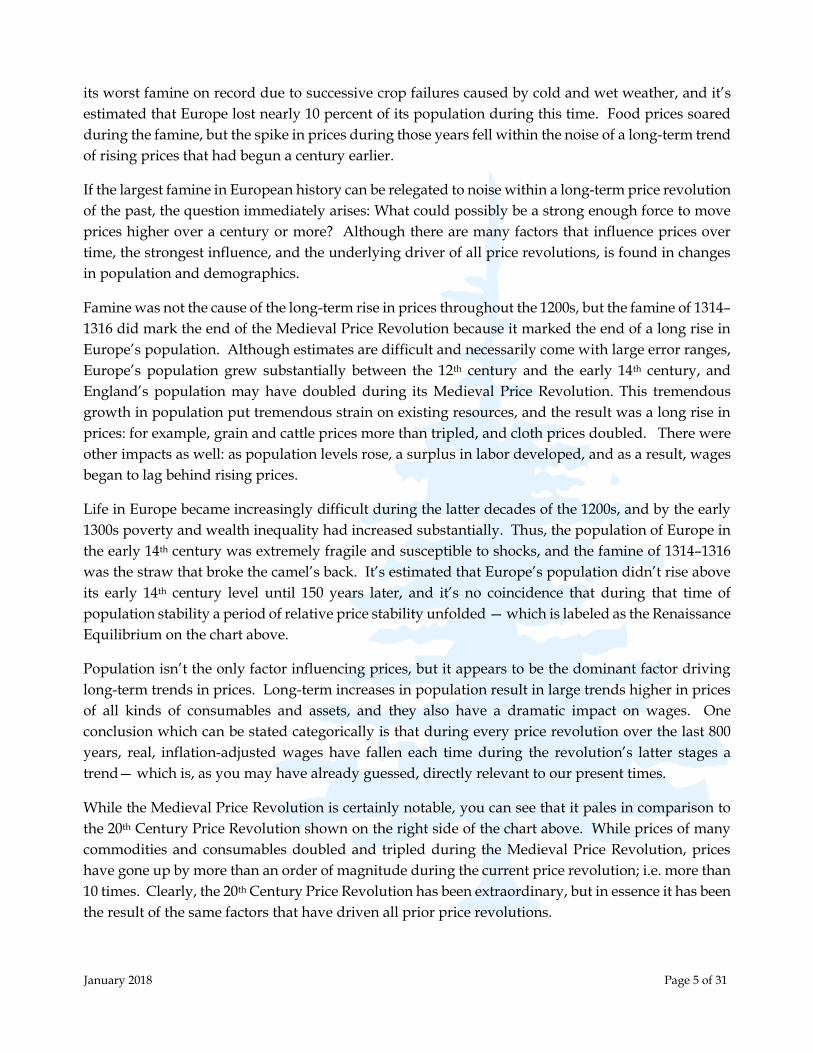
instance, just before the recession in 1990, the 10-year P/E suggested the market was valued just
above its long-term average of 16. With a relatively modest valuation, it suggested any cyclical bear
market would likely be a good long-term buying opportunity, as the risk of a long-term bear market
developing from such a middle-of-the-road valuation was low. A decade later, however, the
situation was different. As it climbed in the late 1990s to a record high of 44, the 10-year P/E
suggested not only that the market was at risk of a severe cyclical decline, it was also at risk of entering
a long-term bear market, which would leave investors saddled with losses for more than a decade.
Without any additional information, this one measure gave an accurate assessment of the potential
risk and potential return in the 1990s and the 2000s, and it has done so for every decade going back
to the beginning of reliable data. While today’s 10-year P/E ratio remains somewhat below the peak
seen during the tech bubble, it is sending the exact same message today as it was then: not only is the
market vulnerable to a severe cyclical bear market, the risk is high that such a cyclical bear market
would be the start of a much longer period of falling prices and valuations.
The reason a long-term bear market becomes likely once valuations climb into what we have referred
to as “bubble territory,” is that extremely high valuations take much longer than one cyclical bear
market to be worked off, and historically it has been very difficult for the market to deliver positive
returns during such a long-term decline in valuations. There have been only two other times that the
market’s 10-year P/E has climbed above 30, and in neither case was the market’s valuation higher a
decade after doing so. In fact, as highlighted in the red box below, the 10-year P/E of the S&P 500
has been the same or lower a decade later every time it has climbed above 25.
There are no “permanently high plateaus” following market
bubbles — valuations have always fallen after rising to these
extremes. A decade from now, the market’s valuation will
almost certainly be lower than today.

January 2018 Page 16 of 31
During a significant fall in the market’s valuation over a decade or more, its price falls faster than its
components’ underlying value rises, and this results in investor losses. This is what happened
following the tech bubble peak: while the book value of the S&P 500 rose from $325 at the end of 2000
to $579 at the end of 2010 (a respectable 78% gain, considering the turmoil of the decade), the 10-year
P/E of the S&P 500 fell 42% over that time. This fall in valuation overwhelmed the rise in the index’s
underlying value, and as a result both the nominal and the real, inflation-adjusted price of the market
was lower in 2010 than it was in 2000. In other words, returns for investors were negative even
though the index’s underlying value grew, and this was due to the long-term decline in valuations.
Once the market’s valuation climbs as high as it is today, the market’s central expected return falls
significantly below zero, and there is little investment value to be had for shareholders. This is not
necessarily a bearish assessment on the potential for large-cap stocks to create shareholder value over
the next decade, but it is a bearish assessment on what price shareholders will see on their holdings.
Based on today’s starting valuation, that market-quoted price of the S&P 500 may fall at an average
real rate of 3%–4% over the next decade, leaving a portfolio of large-cap stocks worth 30% less at the
end of 10 years. And during that time, the cumulative losses at cyclical bear market lows will almost
certainly be greater.
Profits in large-cap stocks in the U.S. have fluctuated wildly over the course of the many business
cycles, but over the course of the 20th Century Price Revolution and the reign of the Federal Reserve,
nominal profits have grown at a nominal exponential rate of 4%. There have been times when
recessions took profits below this trend rate of profit growth, and there have been boom times when

January 2018 Page 17 of 31
profits were higher for a time, but over the long haul the trend rate of nominal growth of corporate
profits has been 4%.
However, the 4% exponential profit growth rate is a nominal rate, which means that a portion of this
growth is due to inflation. Over the same period, from the beginning of the 20th century, the
Consumer Price Index has risen at a 2.6% exponential rate, which means the real, inflation-adjusted
profit growth of large public companies has been around 1.4%. If we take this 1.4% exponential
growth rate of real profits and look at market valuations, not based on a 10-year average of S&P 500
profits, but based on the trend of real earnings growth over the long term, we get the data shown in
the chart below.
As noted above, the S&P 500 was 116% above its trend median valuation at the end of 2017, and this
was higher than any other time outside the final few years of the tech bubble. The trend median
valuation (grey line in the chart) for the S&P 500 during the Fed era will reach 1365 in the year 2023,
which is 50% below its current price. Ten years later, in 2033, the trend median valuation will reach
1653, which is 40% below today’s price. If trading back down at these levels seems fantastically
outside the realm of the possible at those future dates, it’s due solely to today’s astronomically high
valuations — not what simple logic says is a reasonable value for large-cap stocks.
Looking at valuations from a trend earnings perspective is useful, because although using the average
of the past 10 years of earnings gives us a much more useful valuation tool than using a shorter
period, such as 12 months, there is no getting around the fact that there are cycles in economic growth
and inflation that can cause even decade-long periods of corporate profits to veer from their long-
96%
139%
End of 2017: 116%
56%
78%

January 2018 Page 18 of 31
term growth trend. Between 1997 and 2007, there were two large booms in the economy, and this left
a 10-year average of corporate profits unsustainably high at the end of that period; and it so happens
that the inflated 10-year average of earnings declined for the first time in its history between 2007 and
2011 to correct that boom-time deviation. When we look at market valuations based on the long-term
trend in earnings growth, we can see the market’s underlying value clearly through periods of boom
and bust that influence even a 10-year average of earnings.
A similar above-trend deviation of the 10-year average of earnings happened during the 1960s, and
the roots of that period of above-trend earnings growth, and the market over-valuation that
accompanied it (marked by the red 56% on the previous chart), are similar in some ways to the
situation today. In the two decades following World War II, corporate profit margins were high by
historic standards, and wages were still recovering from the Great Depression. As a percentage of
GDP, corporate profits averaged 10.8% between 1947 and 1969, and by the late 1960s this long era of
robust profit margins had lasted long enough to convince investors that stocks were the place to be,
regardless of high valuations. This was the era of the Nifty Fifty bubble, and also the era that spawned
modern portfolio theory, which, among other things, argued that being 100% invested at all times
made the most sense.
It is somewhat ironic, then, that the decade and a half following the late 1960s ranks as the second
worst period on record for a fully invested portfolio of stocks and bonds, as stock market valuations
fell and interest rates soared in the 1970s and early 1980s. Not coincidentally, the pivot in market
performance in the late 1960s coincided with the end of the period of high post-war profit margins.
In the first quarter of 1966, two things happened: corporate profit margins peaked at 12.2%, and the
S&P 500’s valuation also peaked. By the early 1980s, corporate profit margins had fallen by half, and
due to the fall in valuations, the S&P 500 remained at the same nominal price in 1982 as it was in 1968
— but had lost 62% of its real, inflation-adjusted value.
As much as the 1950s and 1960s were defined by high corporate profit margins, the 1970s and 1980s
were defined by lower corporate margins. Between 1970 and 1990, corporate profits averaged 8.3%
of GDP, 2.5% (of GDP) lower than in the two decades prior. Most of those lost profits found their
Corporate Profits (Blue, left scale) and Wages (Red, right scale) as a Percent of GDP
1
2
3

January 2018 Page 19 of 31
way into wages, which averaged 1.9% of GDP higher between 1970 and 1990 than in the decades
prior. This economic tug-of-war between corporate profits and wages has been part of the U.S.
economy going back as far as we have reliable data, and it has been a huge part of the story behind
the market’s high valuation over the past 20 years. This period of high market valuations began in
the mid-1990s, and, not coincidentally, the mid-1990s also marked an end to the trend of falling
corporate profit margins.
From a low of 7% of GDP in 1993, corporate profit margins have surged higher in three successive
waves (marked on the chart above with the numbers 1, 2 and 3), culminating in the rise to 12.6% of
GDP in 2012 and again in 2014. Over the very same period, wages fell dramatically — the 5.6% of
GDP rise in corporate profits over that span mirrored the 5.3% of GDP fall in wages. Although wages
briefly spiked during the tech bubble, they fell from 33% of GDP in 1993 down to a post-war low of
only 27.7% of GDP in the wake of the Great Recession.
The current era of higher corporate profits since the mid-1990s has endured as long as the preceding
era in the 1950s and 1960s, and just like in the late 1960s, a large part of today’s investor euphoria is
implicitly based on the prospect of this trend continuing indefinitely. The passage of the tax bill in
late 2017 changed the corporate tax rate from 35% to 21%, and this change has inflated investor
euphoria into the stratosphere. Although the reduction in the corporate tax rate will undoubtedly
have an impact on the taxes corporations pay, just how much of an impact is remains in the realm of
speculation.
The effective corporate tax rate has fallen steadily from over 50% in the 1950s down to 21% in recent
years, and we may eventually find that the change in the statutory rate may not even offset the impact
of the rise in wages over the past few years. The official unemployment rate hit 4.1% at the end of
2017, and since 2011 the share of GDP going to wages has been rising. This has placed a lid on
corporate profits: wages have increased by 1% of GDP, and corporate profits have fallen by 1% of
GDP. To put this into proper context, corporations only pay around 2% of GDP in taxes, so the impact
of higher wages over just a few years can swamp any impact from a change in tax rates.
For investors, however, the debate over taxes is largely academic, because corporate profits would
have to double over the next few years to justify current valuations — and that simply cannot happen
from any change in the tax code.
* * *
Here at the beginning of 2018, a traditional portfolio of stocks and bonds faces the most hostile market
environment anyone active in the markets today has likely experienced. Not only are equity market
valuations absurdly high, but late last year the Fed began shrinking the base money supply under its
pre-announced plan to begin reducing its balance sheet — which presents a clear and present danger
to equity valuations, as well as to bonds. As we discussed last summer, the Fed has intentionally
shrunk its balance sheet only twice in its history, in 1921 and 1937, and the market turmoil that
followed those episodes left a bad institutional memory in the halls of the Fed that lasted 80 years.
The Fed never again attempted to shrink the base money supply . . . until now.

January 2018 Page 20 of 31
The increase in short-term interest rates over the past few years has been quite modest, though it
represents a huge percent increase from its level near zero, and it has already been enough to have a
strong dampening effect on lending and employment growth. By this past November, the year-over-
year change in employment growth had slowed from 2.3% in 2015 to 1.4%, and the growth rate of
commercial and industrial loans had plummeted from an 11.5% year-over-year growth rate to only
0.9%. That we have seen such a dramatic slowdown in employment and lending growth from a 1%
rise in the Fed Funds rate over two years’ time shows just how fragile our over-indebted,
deleveraging economy is.
However, as the effect of the Fed’s balance sheet reduction began rippling through the markets last
fall, it became clear we had entered a new monetary environment, quite distinct from most of the past
two years — an environment of Quantitative Tightening. The two-year Treasury yield rose more in
the last four months of 2017 than it has since the onset of deleveraging a decade ago, which is a telltale
sign that monetary policy has entered new phase. By the end of 2017, the yield on the 2-year Treasury
bill had risen to 1.89%, which was the highest rate since September 2008.
The current market bubble began as a response to the massive monetary expansion during the Fed’s
quantitative easing programs in the wake of the credit crisis, but it eventually evolved into a bubble
powered by investors who felt that There Is No Alternative (TINA) to buying overvalued assets when
interest rates are near zero. However, the era that spawned this justification for buying stocks at any
valuation ended last year, as the rise in the safest short-term yields rose above the dividend yield of
the S&P 500 for the first time in almost a decade. Along with the 2-year Treasury yield at 1.89%, the
5-year Treasury yield ended 2017 at 2.2%. These yields were both above the year-end dividend yield
on the S&P 500, which had fallen to just 1.8%.
Yet while short-term yields have risen over the past two years, long-term Treasury yields have fallen,
as can be seen at the bottom of the chart above. The combination of rising short-term Treasury yields
and falling long-term Treasury yields produced a dramatic flattening of the yield curve in 2017. At
October 2017: Quantitative Tightening
begins, and short-term yields respond.
December 2015: The Fed begins increasing
the Fed Funds rate in baby steps, and the 2-
year Treasury yield begins to rise.
Long-term Treasury
yields remain lower.

January 2018 Page 21 of 31
the end of the year, the 10-year Treasury Note was yielding only 0.51% more than the 2-year Treasury,
and the 30-year Treasury bond yielded only 0.85% more than the 2-year Treasury. Not only does this
represent the flattest yield curve in a decade, it represents a dramatic disagreement between the Fed,
which influences short-term yields, and the markets, which control long-term yields. If long-term
Treasury yields were to remain where they are, it would likely take only two more 0.25% rate hikes
by the Fed to bring about the first yield curve inversion since 2006 — a traditional sign that the Fed
has already hiked the economy into a recession. (We’ve long thought that a yield curve inversion
would be near impossible in the era of zero-percent interest rates, but the Fed’s hikes in 2017 brought
such an inversion close to reality.)
If we were in a normal post-war economic and market cycle, we would likely be near the ideal time
to buy long-term Treasury bonds ahead of Fed-induced cyclical economic weakness. With the stock
market’s valuation extremely high, with the yield curve having flattened dramatically over the past
three years, and with employment and lending slowing, ordinarily we would be near the moment
when economic momentum slows enough that markets begin to price in a premium on the safest of
safe-haven financial assets.
Yet this has been no normal post-war economic cycle, and it should be clear from our discussions of
monetary policy, demographics, debt and deleveraging over these past few years that the post-war
era ended with the financial crisis in 2008. Thus, many of the cyclical inter-market relationships we
came to depend on during the post-war era may no longer unfold as expected, and a case in point is
the current technical position of long-term Treasuries.
Leading up to the summer of 2007, the trading action in long-term Treasuries, like the 30-year
Treasury bond shown above, was just as one would hope to see in a safe-haven asset during the lead-
up to the peak of a speculative bubble in risk assets: quiet and subdued. In early 2000, just when the
tech bubble was nearing its peak, long-term Treasury bonds were in an even better technical position,
with prices having sold off over the previous year and a half. For those looking for low-risk, safe-
Although long-term Treasury yields remain lower than when the
Fed began tightening, the peak in bond prices in 2016 suggests
bonds aren’t currently the place for cyclical speculation.
January 2018 Page 22 of 31
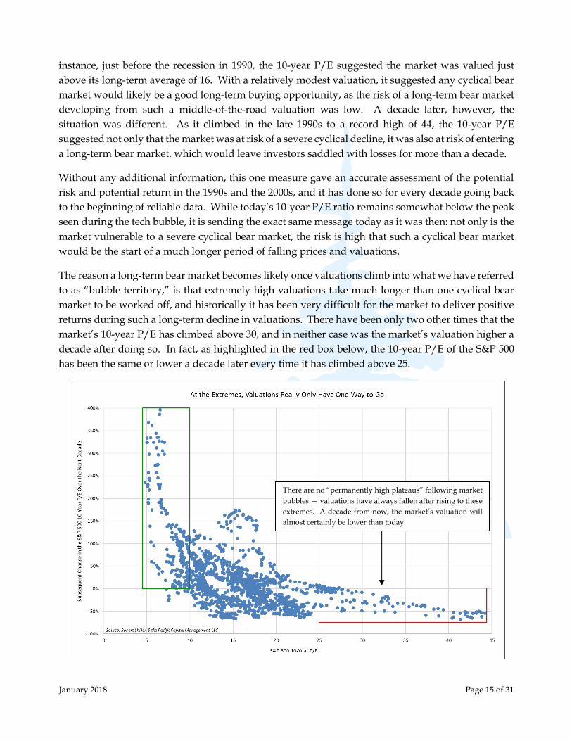
haven assets to seek shelter in to escape the inevitable fallout from the tech bubble and the housing
bubble, long-term Treasuries were not only attractive because of their yields (6% in 2000, and 5% in
2007), but they were in a state of benign neglect that carried with it the opportunity of a solid cyclical
trading opportunity.
Unfortunately, the same cannot be said today. Not only are yields extremely low, but the price action
between 2008 and 2016 carries with it a significant risk that prices for long-term Treasury notes and
bonds will fall instead of rise. The chart above of the 30-year Treasury bond price outlines the
approach to an ideal-looking speculative peak, with the initial breakdown from that speculative peak
in late 2016. Throughout 2017, the market consolidated after that breakdown, and here in early 2018
there is no indication that prices are gearing up for a cyclical bullish run. In fact, as 2017 came to an
end, it appeared long-term Treasury bond prices could be poised for another move lower.
When yields were in the 5%–6% range, and bond prices were poised to rise, the total return expected
from a cyclical investment in long-term Treasuries was significantly positive — which stood in stark
contrast to the negative outlooks for risk assets in 2000 and 2007. Yet the total return outlook today
is entirely different. With yields in the 2%–3% range, it only takes a slight decline in prices to bring
the total return below zero, which would turn this traditional, cyclical safe-haven into another source
of loss when it would be least expected.
The lead-up to the peak in long-term Treasury bond prices in 2016 occurred with a record amount of
global sovereign debt falling to a negative yield, as the major central banks outside the U.S. pressed
on with quantitative easing. Although the European Central Bank’s Mario Draghi has put forth the
most dramatic rhetoric, the most dramatic policy steps have been taken by the Bank of Japan. In 2016,
the BOJ shifted its policy toward maintaining long-term government bond yields at zero, and since
that time the bank has had to commit itself to buying unlimited amounts of bonds at government
auctions in order to prevent yields from rising. This policy has been a success thus far, as the Japanese
government 10-year yield quietly fluctuated near zero throughout 2017.
The dramatic bond market action around the world in
2016 may come to be remembered as the moment the
markets woke up to just how cornered central banks are,
and realize what they intend to do about it.

January 2018 Page 23 of 31
While the Bank of Japan is now controlling the entire yield curve for Japanese government bonds, the
Fed has never intervened in the bond market with enough buying power to control the entire
Treasury yield curve, and it is now actively selling U.S. Treasury securities. This leaves Treasury
yields at the long end entirely in the hands of investors, and, in our opinion, there is no telling how
investors will react during the next downturn in risk assets. They may flood into the Treasury market
in the search for a safe-haven, as they have consistently done since the 1980s, but there are also
reasons to suspect long-term Treasury notes and bonds may eventually lose some of their safe-haven
luster (if they haven’t already). With the U.S. federal debt now above $20 trillion, and that debt
increasing by $671 billion in the past year (Q3 2016 to Q3 2017), we wonder whether investors will
seek out Treasury notes and bonds with the same enthusiasm when the deficit climbs even further
— perhaps over $1 trillion — during the next economic downturn.
It’s important to remember that the only reason for the extraordinary calm in the financial markets
over the past four years is the extraordinary policies of the largest central banks. If the Bank of Japan
were not offering to buy every single government bond issued at auction by the Japanese
government, and doing so at near zero percent interest rates, it’s possible global financial markets
would already be dealing with another debt or currency crisis emanating from Japan. And if the
European Central Bank (ECB) had not initiated its own quantitative easing program and doubled its
balance sheet between 2014 and 2017, it’s difficult to believe the Fed could have ended its own balance
sheet expansion in 2014 without more serious market repercussions.
As it stands, the global financial markets have been bombarded by continuous waves of new central
bank money since 2008, and the only difference over time has been the direction those waves have
been coming from. At times it has been the Fed which has expanded its balance sheet the most, and
at other times it has been the ECB and/or the BOJ. As was just mentioned above, since 2014 the Fed
has been holding its balance sheet relatively steady while the ECB has vastly expanded its balance
sheet, and this divergence of monetary policy was the primary reason for the dollar’s rise against the
euro and other major currencies — a trend which came to an end in 2017.
In 2017, the Dollar Index ended its 5-year bullish trend. This significantly
increases the relative attractiveness of global equity markets versus overvalued
U.S. markets, and has major implications for commodities and precious metals.

January 2018 Page 24 of 31
The end of the dollar’s bullish trend in 2017 has major implications going forward, not just for
currencies, but for stocks and bonds in the U.S. and around the world. The dollar has seen major
peaks and troughs at every major peak and trough of relative performance between U.S. and global
equity markets going back to at least the 1960s. Most recently, when the Dollar Index reached a low
in 2008, it ushered in a decade of outperformance of the S&P 500 versus global equity markets. Before
that, the peak of the Dollar Index in 2000 coincided with the peak of the tech bubble, which was
followed by seven years of global equity market outperformance versus the U.S. between 2001 and
2008.
The breakdown of the Dollar Index over the past year comes at another moment of extreme
overvaluation of U.S. markets and relative undervaluation of equity markets outside the U.S., and
the signal it sends to investors is quite clear: the decade-long period of outperformance for U.S.
financial markets is likely at an end. While it appears today that investors’ appetite for U.S. stocks
knows no limits, it is also clear from the dollar’s breakdown that money has already begun moving
out of the U.S. in search of relative value.
While equity markets outside the U.S. do indeed represent a far better value than those in the U.S., it
is also true that the effects of the end of the asset bubble in the U.S. will almost certainly reverberate
around the globe. This leaves emerging markets and other global equity markets in an attractive
relative position, but one which will most likely be made more attractive during the next global bear
market.
Few markets and asset classes benefit immediately following the peak of a large bubble — most, even
those poised to outperform over the long run, suffer during the bursting of a bubble. This will
probably prove to be the case with more reasonable valued global equity markets. Yet there are a
few exceptions, and gold is one of them. Immediately following the end of the tech bubble, gold
began a bull market that lasted a decade. It was safe to be fully invested in gold during the market’s
. . . equity markets outside the U.S. have fallen by
half relative to the S&P 500 over the past decade.
After rising 68% versus the S&P 500
between 2001 and 2008 . . .

January 2018 Page 25 of 31
last gasps in 1999 and 2000, and at no point in the years that followed did gold revisit its lows — and
we doubt those prices will ever be seen again.
The end of the bubble we are living through today will likely be a similar watershed moment for
gold, and it is possible the low at $1045, recorded in late 2015, will be another price that gold pivots
from, and never visits again. Precious metals bull markets have always begun when equity markets
are overvalued, and they have only ended when equity markets are undervalued. Although gold’s
price has risen modestly over the past two years, this rise likely represents only the very earliest
stages of another bull market; perhaps like the first two outs in the top of the 1st inning of a baseball
game. The other 8 1/3 innings lie ahead.
To summarize our market outlook:
The U.S. stock market is in a massive bubble, which, based on sentiment and valuations, could
come to an end at any time. Valuations strongly suggest the peak of this bubble will be a real,
inflation-adjusted high-water mark that lasts for 15–25 years. In the decade after the peak, a
portfolio of large-cap stocks will likely lose real value at an average rate of 3%–4% per year, with a
maximum loss of 50%–67% at cyclical lows.
The U.S. dollar is likely in the early stages of a new downtrend, and this will have profound effects
on the performance of many markets and sectors. It is a sign money has already begun moving out
of overvalued U.S. financial assets into better values abroad. The bearish trend in the dollar will
likely continue until U.S. financial assets represent a relative value versus global markets.
The outperformance of U.S. equities versus global equities over the past decade will likely come to
an end with the end of the bubble in the U.S. market, after which global equity markets will
During the decade following the tech bubble,
gold rose 560% from its lows. The decade
following the end of the QE/TINA bubble
will likely see another gold bull market.

January 2018 Page 26 of 31
outperform for an extended period of time. Equity market valuations outside the U.S. are relatively
benign, consistent with these markets being near the beginning of a new phase of outperformance.
Although equity markets outside the U.S. represent relative value, and are likely in an attractive
cyclical position with positive prospective returns for dollar-based investors, the end of the U.S.
equity market bubble will likely be a global event, which will drag down equity prices inside and
outside the U.S. More attractive buying opportunities for these markets lie ahead.
The Fed continued to increase short-term interest rates in 2017, and expectations are that there will
be additional increases in 2018. However, long-term Treasury rates remain low, indicating the
market expects the Fed’s campaign to tighten monetary policy ahead of the next economic
downturn will eventually be completely unwound.
Although long-term Treasury rates remain low, the peak in long-term Treasury bond prices in 2016
suggests prices could stagnate or decline in the years ahead. With rates on long-term Treasury
notes and bonds between 2% and 3%, the likelihood of even a modest price decline takes the
expected total return below zero for investors. This means long-term Treasuries may not provide
the safe-haven returns investors have become accustomed to.
Credit spreads beyond Treasuries have been the lowest on record in recent years, and it is possible
that the bust of the stock market bubble will be fueled, in part, by the rapid rise of corporate
indebtedness during this cycle; corporate debt now equals 31% of U.S. GDP, a record high. The
end of the current asset bubble will likely have a negative impact on corporate bonds and municipal
bonds (especially bonds from municipalities with high pension liabilities).
Commodities and other real assets are trading near their lowest inflation-adjusted prices in a
decade. Commodities will eventually benefit from the dollar’s trend change and the ongoing
monetary response to deleveraging, but the end of the current asset bubble will likely have a
negative impact on prices — though this negative impact will likely generate long-term buying
opportunities.
Gold and other precious metals are likely in the early stages of a new bull market, and market
conditions turned more supportive in 2017: the dollar no longer represents a headwind, and the
post-equity-bubble market environment will likely provide a strong tailwind for gold in the decade
following its peak.
Cash has been second only to gold in terms of its unpopularity over the past few years. Numerous
surveys show cash levels in professionally managed funds and retail brokerage accounts hit record
lows in 2017. Yet no other asset class will benefit more directly from the end of the U.S. asset bubble
than cash.

January 2018 Page 27 of 31
The Path Down from a Bubble Is Never a Smooth One, But There Is a Way Forward
Remember that history always repeats itself. Every great bubble in history has broken. There are no exceptions.
- Jeremy Grantham
One of the defining features of speculating on a bubble is that the mentality required to take
advantage of it — ignoring valuations, ignoring technical warnings, and a firm belief that this time is
different — is the very mentality that leads one to eventually give it all back in the bust. This has
happened so often throughout history that it’s amazing we are writing these words again today, but
it’s clear now that investors will have to learn the same lessons yet again.
In a recent commentary, Jeremy Grantham mentioned that one reason professional, institutional
investors were unable to avoid investing in a bubble is because most institutional clients limited
managers to a 2-year window of underperformance. In other words, if a manager failed to keep pace
with market indexes for more than two years, investment committees would vote to move on, and
the they would lose most of their institutional clients. So, if the market were to remain overvalued
for more than two years, and keep gaining during that time, most professional investment managers
would simply have “no choice” but to jump in with both feet, if they wanted to remain in business.
While we certainly understand those pressures, we feel there is a more honest way of staying in
business: instead of throwing caution to the wind and gambling by the rules which will work only
2% of the time, remain invested by the rules which will work 98% of the time — and prepare for the
inevitable fallout when markets become completely disconnected from value, as they are today.

January 2018 Page 28 of 31
The path down from a bubble is never a smooth one, but there is a way forward, and we remain
invested in ways we think will do well through the long, turbulent period that will inevitably follow
the current bubble. This bubble may last another few months, or possibly another year or two, but
the post-bubble environment that follows will likely last for a generation. By our way of thinking, at
this time there is no other prudent course, based on investment merit alone, but to invest in ways that
will generate positive returns during the upcoming 15–25-year post-bubble market environment.
The blow-off we are currently witnessing in the stock market has increased the likelihood that we’ll
see a crash immediately following the peak, to be then followed by a severe cyclical bear market with
a peak-to-trough loss of between 50% and 67% for the broader market. It doesn’t have to end in such
a violent way, but once we see such a euphoric, parabolic rise in prices, as we have over the past year,
the odds of such an end become higher than a more benign market deflation (as happened in the
years after the peak in 1966). Both the bear markets following the peaks in 2000 and 1929 saw some
areas lose more 80% of their value, and as it stands at the beginning of 2018, such an extreme reaction
following the peak of this bubble can’t be ruled out; after all, those are the only comparisons we have
to today’s high valuations.
However this bubble finally comes to an end, our expected long-term returns for major asset classes
over the next decade are outlined below. Based on the valuations and the market conditions we
observe at the beginning of 2018, we estimate the central-expected real return of U.S. large cap stocks
is near negative 4% annualized over the next decade. This negative return may not sound so harsh,
but in fact it is 10% below the long-term average real return, and it is one of only three times in history
similar valuation estimates would project a negative long-term real return.

January 2018 Page 29 of 31
There are few conventional areas in the financial markets which offer the prospect of positive real
returns from where we are today, being, as we are, on the precipice of a long-term bear market.
However, we do feel there is a clear way forward, and the allocations in your account(s) with us
largely reflect the prospective returns outlined in the chart above.
Gold is necessarily a big part of that way forward simply because no other asset has consistently
gained in value during a long-term bear market in stocks and other risk assets. In addition, as we
highlighted earlier, since the 2008 gold has decoupled from other commodities, which shows it has
begun to trade more on its value as sound, risk-free money since the onset of deleveraging. This role
of sound money will likely continue to strengthen in the years ahead, as the final stages of the 20th
Century Price Revolution — deleveraging and monetization — continue to unfold.
Yet if we restrict our view to within the 20th Century Price Revolution, gold gained in value during
the deleveraging of the Great Depression, and if we look at gold’s return just since it began trading
freely in the 1970s, we find that it has gained during every decade-long period when the 10-year P/E
of the S&P 500 has fallen. These gains range from an annualized return of 1% to an annualized return
of 34%, with a median near 15%. And during periods in which the S&P 500’s valuation fell
dramatically over a decade, i.e. more than 30%, which is what happens during a long-term bear
market in stocks, gold had a minimum annualized return of 11.5%.
Although there are many aspects of today’s market which are historically unique, we think 15%
represents a central-expected return for gold in the decade after the current bubble comes to an end,
and this return stands in stark contrast to the negative prospective return of the S&P 500.
A 50% fall in the valuation of the S&P 500 over a decade
has been associated with a 15% or higher annualized
return in gold. In addition, gold has never lost value
when the S&P 500’s valuation has fallen (green box).
January 2018 Page 30 of 31
Equity markets outside the U.S. represent a much more fertile ground for the search for positive
prospective returns, and many of those markets will likely deliver a small positive return from
today’s prices and valuations over the next decade. We remain invested in one of those markets,
Japan, and our outlook for Japanese stocks, hedged of any exposure to the Yen, remains positive in
the long-term. However, there is a high probability that markets outside the U.S. will suffer from the
fallout of today’s bubble in U.S. markets – just as they have during the last two cyclical bear markets.
As a result, the only major asset class we think is poised to deliver both short- and long-term gains is
precious metals, which is why we are invested in precious-metals-related positions in all our
portfolios. However, during the next global market downturn, our equity investing activities will
likely focus heavily on markets outside the U.S. – as we appear to be on the cusp of another extended
period of global equity market outperformance, and U.S. dollar weakness.
We have made many mistakes over the past few years, and while we will undoubtedly make more
mistakes in the future, it’s important to emphasize that most of our mistakes over the past few years
were largely tied to the rarity of the market action. The odds of the market’s valuation soaring 50%
from an already over-valued level three years ago was probably on the order of 1 in 50. Yet that event
rare happened, and many positions that lose directly during a bubble — such as hedges and short
positions — turned from reasonable allocations in an over-valued market, into mistakes. In addition,
assets like gold, which have a negative long-term correlation to stocks when they enter a bubble,
suffer greatly as well. Although we eventually bought back many of the positions we had sold and
lightened up on in 2011 and 2012 at much lower prices during the low prices in 2013-2015, the declines
in precious-metals positions during those years have weighed on our long-term returns.
After going through the South Sea bubble and bust, Isaac Newton said that “he could predict the
motions of the heavenly bodies, but not the madness of people.” Today, after seeing many examples
of bubbles and busts throughout history, we know that markets can continue on a trend for longer
than anyone thinks possible, but it is also true that valuations always eventually revert back from
extremes to more reasonable, middle-of-the-road levels (or lower). Thus, although there is no hope
in predicting just how far today’s madness will carry valuations, we do know that positions which
look like a mistake at a market extreme can quickly turn into the timeliest allocation tomorrow. As
much as any long positions were mistakes leading up to March 9, 2009, the day the market bottomed
during the financial crisis, they represented tremendous potential from their beaten down prices –
and they began realizing that potential the day after the market bottomed. It takes vision and
fortitude to see investments in that light during such extreme market conditions, but this is where a
focus on value can aid the most. It is why we were conservatively positioned in 2007, why we were
aggressively positioned the day the market bottomed in 2009, and why we find ourselves again today
with the hatches firmly battened down.
Although not anticipating the formation of this bubble has been a large error, we have had many
successes over the past decade, and we are well positioned to have many more successes in the future.
Ignoring extreme valuations never leads to success for very long, and although a bubble forming is a
rare event, that bubble bursting is a guaranteed event. As a very different market environment
unfolds in the years ahead, our understanding of value, our understanding of debt, deleveraging,

January 2018 Page 31 of 31
and demographics, and our understanding of the role monetary policy has played in past price
revolutions and periods of deleveraging will likely translate into strongly divergent returns from the
broader market and investments passively indexed to it. As we mentioned at the beginning of this
letter, whether you feel this is a good or bad quality to see in your investment manager in today’s
market environment likely depends on how much you value rational decision making, even when it
is difficult, versus the excitement, flashing lights and almost certain losses in a casino.
In summary, we stand to benefit greatly from the end of the current bubble, both from our existing
positions, and from our flexibility to add allocations to markets and sectors poised to deliver positive
long-term returns, when attractive short-term buying opportunities arise. Although a market bubble
provides the most rigorous test of patience, we continue to be guided solely by value and prospective
market returns — and our patience in sticking with this approach is inexhaustible.
We appreciate your willingness to swim against the tide with us; such an advisor/client relationship
is truly a rare combination in this era, and we very much appreciate your partnering with us. As
always, if you would like to discuss investments in your account, or topics discussed in this letter,
feel free to contact us — we would be happy to talk with you.
Sincerely,
Brian McAuley
Chief Investment Officer
Sitka Pacific Capital Management, LLC
The content of this letter is provided as general information only and is not intended to provide investment or other advice. This material is not to be
construed as a recommendation or solicitation to buy or sell any security, financial product, instrument or to participate in any particular trading
strategy. Sitka Pacific Capital Management provides investment advice solely through the management of its client accounts.