on the presentation of the results of multilevel analysis · on the presentation of the results of...
TRANSCRIPT

1
23rd Biennial Conference of the Society for Multivariate Analysis in theBehavioural Sciences, 1-3 July 2002 Tilburg, The Netherlands
On the presentation of the results of multilevel analysisJohn F Bell
Research and Evaluation DivisionUniversity of Cambridge Local Examinations Syndicate
1 Hills RoadCambridgeCB1 2EU
�01223 553849Fax: 01223 552700
Type: PaperSession: 17 Multilevel AnalysisKeywords: Multilevel analysis, presentation of results, graphics, table layout

2
Abstract
Multilevel analysis is a complex methodology. It is not only necessary to carry out the analysis correctlybut it is also necessary to convey the results of the analysis to the target audience successfully. Byconsidering what is considered to be good practice in the layout of tables and the use of statistical graphics,methods of explaining the results of multilevel models will be explored. This paper will demonstrate � how relative simple changes to the layout of tables ease the interpretation of the results,� the importance of graphics in presenting the relationships between variables and the variation
associated with them,� the use of graphics to present the effects on parameter estimates of changing the model,� the use of parallel co-ordinate plots to investigate the effect of model building on group level
parameters.This paper will tentatively propose some guidelines for the presentation of the results of multilevel analysis.

3
Introduction
In 1987, Chatfield was the first discussant of paper on graphical perception by Cleveland and McGill. Hereported earlier experiences. After attending meetings about the presentation of tables (Ehrenberg, 1977)and graphics (Mahon, 1977), he found that
Afterwards I heard various informal views on these papers ranging from “these topics are trivial”to “How refreshing to have intelligible papers on important practical topics.” A similar range ofviews may also apply to today’s paper so let me make it clear that, in my view, these topics areimportant and they are not trivial.
This paper is written in the hope that Chatfield’s is the majority view. Multilevel modelling is a complexmethodology and there are problems associated with communicating the results of the analysis.Communication of statistical ideas has long been a source of difficulty and this has been worsened by atendency to regard the production of a parameter estimate or a test statistic as an end in itself. This problemcan been found in the early history of statistics. While working at Rothemansted Experimental Station justafter the end World War I, Ronald Fisher invented the analysis of variance at Rothmansted ExperimentalStation. Within 15 years, Rothmansted produced annual reports that summarised the agriculturalexperiments done in that year. The reports reported F-ratios and significance levels. Unfortunately, thereports never included the real outcome of the experiment, for example, whether the fertilizer increased theyield or decreased it, let alone by how much.
The F-ratios and significance levels have the technical purpose of deciding whether the means really differ.Not everybody using experimental results needs to know these technicalities, and especially not only thetechnicalities. It is often assumed that statistics is hard because of its mathematical content. Actually this isnot the hardest part of statistics. The hard part of statistics is to communicate the results and significance ofa statistical analysis to a lay audience. In this paper I shall consider the issue of communicating the resultsof multilevel analyses. In the United Kingdom, there is a problem that some researchers reject the use ofmultilevel models because they consider that the results of the analysis are too difficult to explain. In thispaper, the presentation of the results of multilevel modelling will be explained.
To illustrate some ideas for improved presentation, some analysis results from my recent work will be used.All four examples will consider aspects of progress between National tests at age 14 and examinations atage 16. These examples consider the differential rates of progress of various ethnic groups, the effect ofscience course structure and the effect of school neighbourhood. They were chosen not to highlight mywork but rather because of unease about directly criticising other researchers work.

4
Example I: Ethnic minority pupils
In many presentations of the results of multilevel models, the results are presented in the form of table asillustrated by Table 1. This is the first of series models from a paper investigating the progress of minorityethnic pupils over the 14 –16 age range (Haque and Bell, 2001). It is not at all clear from this dense massof numbers what is actually going on.
Table 1: Multilevel models for performance on SAT scores
Parameter I II III IV VFixedIntercept 12.72 (0.28)** 12.24 (0.30)** 12.84 (0.31)** 12.96 (0.29)** 11.97 (0.47)**Gender -0.13 (0.17) -0.06 (0.16) -0.08 (0.16) -0.09 (0.016)
African -1.56 (0.44)** -1.37 (0.44)** -0.86 (0.43)* -0.60 (0.43)Bangladeshi -1.49 (0.27)** -1.09 (0.29)** -1.05 (0.28)** -0.65 (0.30)Indian -0.18 (0.33) -0.19 (0.32) -0.28 (0.31) -0.05 (0.32)Other -0.80 (0.32)* -0.74 (0.38)* -0.35 (0.37) -0.19 (0.37)Pakistani -1.28 (0.31)** -0.98 (0.30)** -1.01 (0.30)** -0.67 (0.31)**
Recency -3.39 (0.49)** -3.42 (0.48)**
Non-man. 1.43 (0.27)** 1.31 (0.26)** 1.20 (0.26)**Manual 0.60 (0.25)* 0.50 (0.25)* 0.39 (0.25)Unemployed -0.02 (0.26) 0.06 (0.25) 0.04 (0.25)
Mother’s Ed.College 1.08 (0.44)*No school 0.61 (0.45)Junior/prim 0.02 (0.47)Secondary 1.16 (0.42)*
RandomSchool 0.79 (0.38)* 0.42 (0.24) 0.30 (0.19) 0.24 (0.16) 0.23 (0.16)Pupil 6.98 (0.32)** 6.78 (0.31)** 6.56 (0.30)** 6.25 (0.29)** 6.15 (0.28)**
Log-lik. -2303.15 -2285.49 -2270.53 -2244.57 -2235.92
There are a number of faults with this table:
1. The different models have been identified with Roman numerals. This is useful in the subsequentdiscussion but is no help in reading the table.
2. Although dummy variables are used for categorical response, the base categories are not defined.3. The table has not be sufficiently rounded for the purposes of presentation4. The main focus of interest is how the ethnic origin parameters change as other variables are added into
the model. These comparisons are difficult to make because they require the reader to look at alternatecolumns.
5. Because of its, size, it would be difficult to read if it was projected.6. The random variation is presented as variances and is easier to understand when presented as standard
deviations.7. The * are not explained. (Gender is included in this table because it is important in other models
presented in the original paper).
The first problem can be solved by using an equation notation to describe the models, i.e.

5
I = NullII = I+ gender + ethnicityIII = II + classVI = III + recentV = IV + mother’s education
This allows differences between the models to be identified without reference to the table. This isparticularly useful for large tables and when the models are not a simple hierarchy.
The second problem is easy to solve by using appropriate notes. The exact definition of these variables isgiven in the paper but one feature that is not apparent is that ethnic group, social class and mother’seducation are fitted using a series of dummy variables. This means that these exists a baseline group whichis not included in the table and can only be discovered by reading the text of the paper.
Although the table has been rounded it is questionable whether rounding to two decimal places is sufficient.Firstly it is more useful to consider active digits, i.e. the first two in the number than change reading fromleft to right. Active digits can be illustrated as follows:
234572, 234997, 235124
would be rounded as
234600, 235000, 235100
This rounding should also consider the how large a difference is meaningful. For a continuous predictor, itis necessary to multiply the parameter by minimum and maximum values of the predictor and assessing themagnitude of the change in the predicted value. In this case, a difference of 0.01 of a level (the unit of theSAT score) has no real meaning. Results should usually be presented with at most two active digits.Wainer (1997) gives three reasons for this. Firstly, few people can do mental arithmetic with more thantwo digits (see also Ehrenberg (1975) and Chapman (1985). Secondly, unless the sample sizes are huge isdifficult to justify a greater level of accuracy. Finally, small differences do not have a great deal ofmeaning.
There is a problem with heavily rounded tables. Although they are useful for presentation purposes, theyare less satisfactory as a record of the analysis. While it is clear that they are appropriate for a conferencepresentation it is less clear that they are for an academic paper. It would be interest to investigate thereaction of editors and journal reviewers to such heavily rounded tables and whether the reaction wouldvary with the availability of a technical report and/or the original data set. For a report, the rounded tablescan be used in the text and the unrounded tables in appendix.
To consider the fourth point, it is useful to consider the reason for presenting these models. This was toinvestigate how the parameters for the ethnic groups change with the addition of other variables.Unfortunately this is not easy to do because the numbers are arranged in rows rather columns. In additionthey are separated by the standard errors. The obvious solution to this is to transpose the columns. Thishas further advantage: although English is read from left to right, most people read numbers in columnsdownwards from top to bottom. This means that the important comparisons in this table should be arrangedin this direction (If possible with the largest numbers at the top; it is easier to subtract a small number froma large number).
Unfortunately simply transposing the table is unsatisfactory because the resulting table would be too wide.This can be solved by breaking the table into a series of components as in Table 2. This also illustrates the

6
usefulness of the model notation. The obvious solution is to break up the table into a series of sub-tableseach considering a useful subset of the variables. This leads directly on to the fifth problem, which can besolved this because the sub-tables can be projected separately.
The presentation of the variance components in this table is not particular useful. It is more interesting toconsider the magnitude of pupil and school level variation. This is best illustrated by using standarddeviations rather than variance components and in this case it questionable that a high proportion of thereadership can calculate the square root of 0.63, for example. The random variation is presented in aseparate sub-table and the standard deviations are presented. This makes comparison of the school levelvariation with the effects of the other parameters easier.
Finally, the * and ** can be replaced by using bold to indicate significant results and stating this a note atthe foot of the Table. For a heavily rounded table, using ** is superfluous.
Using all this information results in Table 2. For a presentation, it is possible to present the sub-tables as aseries of separate slides.

7
Table 2: Multilevel models of relative progress in Key Stage 4 (Replace with earlier table)
Dependent variable: Total SAT score
Fixed: Intercept, Gender (Base = Male)
Const. GenderModel Est. s.e. Est. s.e.I = Null 12.7 0.3 - -II = I+gender + ethnicity 12.2 0.3 -0.1 0.2III = II + class 12.8 0.3 -0.1 0.2VI = III + recent 13.0 0.3 -0.1 0.2V = IV+mother’s education 12.0 0.5 -0.2 0.2
Fixed (Continued): Ethnicity (Base = UK born).
African Bangladeshi Indian Other PakistaniModel Est. s.e. Est. s.e. Est. s.e. Est. s.e. Est. s.e.II = I+gender + ethnicity -1.6 0.4 -1.5 0.3 -0.2 0.3 -0.8 0.3 -1.3 0.3III = II + class -1.4 0.4 -1.1 0.3 -0.2 0.3 -0.7 0.4 -1.0 0.3VI = III + recent -0.9 0.4 -1.1 0.3 -0.3 0.3 -0.4 0.4 -1.0 0.4V = IV+mother’s education -0.6 0.4 -0.7 0.3 -0.1 0.3 -0.2 0.4 -0.7 0.3
Fixed (Continued): Social Class (Base = missing data/retired), Recent (Base = mother’s arrival > 5years)
Non-man. Manual Unemployed RecentModel Est. s.e. Est. s.e. Est. s.e. Est. s.e.III = II + class 1.4 0.3 0.7 0.3 -0.0 0.2VI = III + recent 1.3 0.3 0.5 0.3 0.1 0.3 -3.4 0.5V = IV+mother’s education 1.2 0.3 0.4 0.3 0.0 0.3 -3.4 0.3
Fixed (Continued): Mother’s education (Base = unknown)
College No School Jun/Prim SecondaryModel Est. s.e. Est. s.e. Est. s.e. Est. s.e.V = IV+mother’s education 1.0 0.4 0.6 0.5 0.0 0.5 1.2 0.4
Random
School Pupil Log-Lik
Model Var. s.e. s.d. Var. s.e. s.dI = Null 0.8 0.4 0.9 7.0 0.3 2.6 -2303.II = I+gender + ethnicity 0.4 0.2 0.6 6.8 0.3 2.6 -2285III = II + class 0.3 0.2 0.5 6.6 0.3 2.6 -2271VI = III + recent 0.2 0.2 0.5 6.3 0.3 2.5 -2244V = IV+mother’s education 0.2 0.2 0.5 6.2 0.3 2.5 -2236
It is also possible to represent the parameters graphically. This allows information about confidenceintervals to be presented. This is illustrated for model V in Figure 1. All the plots in this paper wereprepared using Koichi Yoshioka’s program Kyplot(http://www.qualest.co.jp/Download/KyPlot/kyplot_e.htm). This program was chosen because it is very

8
flexible and allows all elements of the graphs to be edited. This flexibility was very useful whenexperimenting with the formats for the graphics presented in this paper. However, other plotting toolscould be used. In addition, Figure 1 was rotated in Word and the left-hand column was created using theequation editor supplied with Microsoft word. For the fixed part of the model, the parameter estimates and95% confidence interval have been used (if more computer intensive methods of estimation, e.g. bootstrap,are used then appropriate percentiles can be used). The random part of this model has been represented bydashed lines indicating a 95% range for each random effect. It is obvious from this Figure, that recency ofmother’s arrival in the UK has a much greater effect than any other parameter. The low level of schoolvariation is also apparent.
����
�
����
�
�
Ethnicity
��
��
�
Class
�Arrival
���
�
���
�
�
EducationsMother'
���
VariationRandom
AfricanBangladeshi
IndianOther
PakistaniNon-Man
ManualUnemployed
RecentCollege
SecondaryJunior-Primary
No SchoolSchool
Pupil
-5 -4 -3 -2 -1 0 1 2 3 4 5
BasesEthnicity = UKClass =UnknownArrival ofmother’seducation =>5 years atage 16Mother’seducation =unknown
Figure 1: A graphical display of the parameters for Model V

9
Example II: Science Course Followed
In the first example, all the predictor variables were dummy. When there are continuous variables it ismore useful to consider other types of plots (although the parameters could be added to a figure of the sametype as Figure 1). When the relationship is not linear, it is vital that it is plotted to understand therelationship between the variables. This can be demonstrated by considering the results of a study intoscience education. In England, it is possible to study science either as a single subject, a double subject or atreble subject (biology, physics and chemistry) from ages 14 to 16 (full details of this issue can be found inBell, in preparation; Bell and Forster, 2001). The objective of this study was to investigate the long-termimpact of the choice between double award and separate sciences on science performance. The researchquestion associated with the analysis relate to the fact that not all school offer the separate sciences and it isargued that they are a better preparation for post 16 studies in science. A first stage of the analysis foundthat for a given level of performance at 16 there was not much evidence of better progress at 18. However,this is not the whole story because the performance on measures used at 16 could be influenced by thecourse followed. This was investigated using a multilevel model considering progress from age 14 to age16. In this example, only the results for biology are considered and the results for one model are presentedin Table 3.
In the analysis, the mark or score on a biology examination component that was taken by both double andseparate science candidates is predicted. The multilevel analysis resulted in the model given in Table 3.This has been laid out horizontally because only one model is presented. In the table, comments in bracketshave been used to clearly identify the parameters with d: X=1 notation to indicate a dummy variable and itslevel. The model involves random slopes. The parameters are identified using the following convention: asingle name for a variance components, e.g., KS3, and two names separated by a comma for a covariance,e.g. candidate, KS3. All the parameters are significant except two covariance which have been printed in asmaller font. This is possible alternative to using bold to identify the significant terms which seemsinappropriate when nearly everything is significant. Other options include using brackets or changing thefont colour to 50% grey. Table has not been rounded as much as Table 2 because of the quartic term (in allthe graphs, unrounded parameter estimates were used).
Table 3: Relationship between biology component score and total Key Stage 3 score fordouble award and separate science candidates
Parameter Estimate s.e.FixedConstant (female + dbl sci) 56.00 0.38Science course (d: Sep. Sci. = 1) 2.30 0.58Sex (d: male=1) -1.32 0.21Total Key Stage 3 score 5.49 0.11KS32 0.34 0.04KS33 -0.08 0.07KS34 -0.01 0.00Sep*KS3 -0.71 0.14Sex*KS3 0.25 0.10
RandomSchool 24.95 2.43School, KS3KS3 0.21 0.09School, KS32 -0.66 0.13KS3, KS32
KS32 0.02 0.01Candidate 81.91 1.13(grey used for non-significant terms)

10
The model was fitted using polynomial terms. While many people might be able to visualise the generalshape of a quartic equation, it is questionable that anybody can recognise the precise form from theequation in Table 3. Therefore, it is vital that the curves are plotted. If this is done, then this results in theplots produced below. With polynomial regression, it is important that the range of the independentvariable is considered. In this case, the total Key stage 3 score can range from 6 to 24, but for this data setthe lower limit is 12. The results for this model can be presented as in Figure 2. This has the four linesdefined by the model.
12 14 16 18 20 22 24
40
50
60
70
80
Total Key Stage score
Biol
ogy
com
pone
nt m
ark
Double science - femaleSeparate science - femaleDouble science - maleSeparate science female
Figure 2: Predicted Biology Component marks for double and separate science by gender
Although this graph is informative, it does have some shortcomings and is misleading. It illustrates thedifferences between both sex and science curriculum is small for the most able candidates. There are threeproblems with the graph. It is quite hard to judge exactly how the differences between the two types ofscience curriculum vary. There is no indication of the magnitude of school variation in relation todifferences between the two types of science. Cleveland and McGill (1984) carried out experiments thatdemonstrated how difficult is to judge the difference between two curves. Finally, the interpretation of therelationships is strongly dependent on the distribution of the total Key Stage 3.
The plots with the four lines also gives an impression that there is a simple comparison between the sexes.Unfortunately this is rarely the case when considering models of relative progress rather absolute progress.The differences between males and females can vary with tests of different characteristics and thesedifferences are confounded with progress. The question under consideration in this research was whetherpupils made more progress in science if the studied double science rather than the separate sciences.Therefore it is reasonable to present separate plots for each sex.
The second problem with these plots is that they give no information about the school level variation.While it is possible to use separate predicted lines for each school and syllabus combination. This is notsatisfactory. Firstly there would be a very large number of lines. Secondly the predicted lines are based onshrinkage estimates that give a misleading impression of the true level of variation (Bell, 2001). However,it is reasonable to suggest that the information that is needed is how does the difference between thesyllabus vary with prior attainment and how large is this difference relative to the variation betweenschools. For this purpose school level variation can be described using an interval. In other circumstances,there might be interest in the differences in the predicted lines for each school (particularly if there are largerandom slope parameters). It should always be recognised that it may be necessary to use a number ofdifferent displays to illustrate different features of the data.

11
Finally the importance of a difference also depends on the number of candidates involved. In particular,fitted and smoothed lines may not be meaningful at the extremes when the data is sparse.
By using three plots as one figure, it is possible to illustrate these points and give a clearer exposition of theresults. For the purpose of this paper, only the one comparison out of the six that are relevant has beenpresented as Figure 3. The figure includes a trellis of three graphs to communicate the results of the study.Kyplot allows multiple plots to be placed on a single page (it is also possible to paste plots into a table in aMicrosoft Word document. The middle graph consists of a subset of data from Figure 2. On this graph, theschool level variation has been added in the form of error bars (the use of additional lines was consideredbut did not give an easily readable monochrome chart). The addition of information about school levelvariation clearly illustrates that choice of syllabus is less of an issue than school related factors. At thebottom of the graph, frequency polygons have been added. This gives three useful piece of information.The dip in the predicted score for high values of Key Stage 3 score occurs where there only small numbersof pupils. Similarly, when the difference between candidates is large there are not very many. (In fact, theexaminations under consideration are designed for more able candidates. Ideally candidates are expected tobe able to reach a particular level of performance if they sit these examinations. There are others versionfor weaker candidates. This also explains both the shapes of the curves.)
12 14 16 18 20 22 24
20
30
40
50
60
70
80
90
Biol
ogy
com
pone
nt s
core Double Science
Separate Sciences
12 14 16 18 20 22 24-226
Diff
eren
ce
(sep. sci) - (dou. sci)
12 14 16 18 20 22 240
1020
Total Key Stage 3 score
% o
f ent
ry
Double ScienceSeparate Sciences
Difference
Predicted marks
Distributions
School level variationVertical line - Double ScienceRectangle - Separate Sciences
Figure 3: The relationship between biology performance and prior attainment for female candidates
12
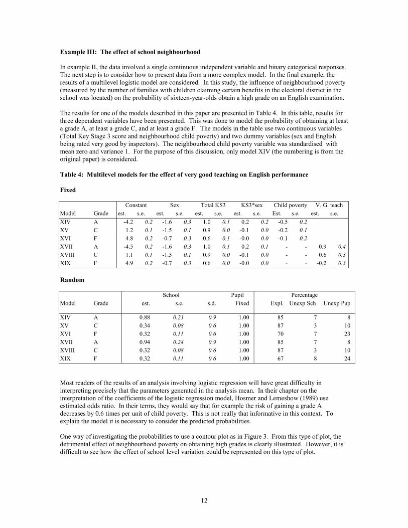
Example III: The effect of school neighbourhood
In example II, the data involved a single continuous independent variable and binary categorical responses.The next step is to consider how to present data from a more complex model. In the final example, theresults of a multilevel logistic model are considered. In this study, the influence of neighbourhood poverty(measured by the number of families with children claiming certain benefits in the electoral district in theschool was located) on the probability of sixteen-year-olds obtain a high grade on an English examination.
The results for one of the models described in this paper are presented in Table 4. In this table, results forthree dependent variables have been presented. This was done to model the probability of obtaining at leasta grade A, at least a grade C, and at least a grade F. The models in the table use two continuous variables(Total Key Stage 3 score and neighbourhood child poverty) and two dummy variables (sex and Englishbeing rated very good by inspectors). The neighbourhood child poverty variable was standardised withmean zero and variance 1. For the purpose of this discussion, only model XIV (the numbering is from theoriginal paper) is considered.
Table 4: Multilevel models for the effect of very good teaching on English performance
Fixed
Constant Sex Total KS3 KS3*sex Child poverty V. G. teachModel Grade est. s.e. est. s.e. est. s.e. est. s.e. Est. s.e. est. s.e.XIV A -4.2 0.2 -1.6 0.3 1.0 0.1 0.2 0.2 -0.5 0.2XV C 1.2 0.1 -1.5 0.1 0.9 0.0 -0.1 0.0 -0.2 0.1XVI F 4.8 0.2 -0.7 0.3 0.6 0.1 -0.0 0.0 -0.1 0.2XVII A -4.5 0.2 -1.6 0.3 1.0 0.1 0.2 0.1 - - 0.9 0.4XVIII C 1.1 0.1 -1.5 0.1 0.9 0.0 -0.1 0.0 - - 0.6 0.3XIX F 4.9 0.2 -0.7 0.3 0.6 0.0 -0.0 0.0 - - -0.2 0.3
Random
School Pupil PercentageModel Grade est. s.e. s.d. Fixed Expl. Unexp Sch Unexp Pup
XIV A 0.88 0.23 0.9 1.00 85 7 8XV C 0.34 0.08 0.6 1.00 87 3 10XVI F 0.32 0.11 0.6 1.00 70 7 23XVII A 0.94 0.24 0.9 1.00 85 7 8XVIII C 0.32 0.08 0.6 1.00 87 3 10XIX F 0.32 0.11 0.6 1.00 67 8 24
Most readers of the results of an analysis involving logistic regression will have great difficulty ininterpreting precisely that the parameters generated in the analysis mean. In their chapter on theinterpretation of the coefficients of the logistic regression model, Hosmer and Lemeshow (1989) useestimated odds ratio. In their terms, they would say that for example the risk of gaining a grade Adecreases by 0.6 times per unit of child poverty. This is not really that informative in this context. Toexplain the model it is necessary to consider the predicted probabilities.
One way of investigating the probabilities to use a contour plot as in Figure 3. From this type of plot, thedetrimental effect of neighbourhood poverty on obtaining high grades is clearly illustrated. However, it isdifficult to see how the effect of school level variation could be represented on this type of plot.

13
6 9 12 15 18 21 240
10
20
30
40
50
60
Total Key Stage 3 score
% o
f poo
r chi
ldre
n in
nei
ghbo
urho
od
0
0.2
0.4
0.6
0.8
1
Prob
abilit
y
Figure 3: Effect of neighbourhood poverty and prior attainment on the probability of obtaining agrade A in GCSE English.
One way of considering school level variation, Key Stage 3 score and neighbourhood child poverty is touse a variant on the trellis display (Cleveland, 1993, 1994; Becker et al. 1996). The variant of the trellisplot is illustrated in Figure 4. However, for this paper, each of the components were created using Kyplotand then placed into the cells of a table in a word document. For the purposes of this example, only fourvalues of the Key Stage 3 score have been used. It is instantly clear that pupils with a Key Stage 3 equal to15 are not predicted as having much chance of obtaining a grade A and that pupils with a Key Stage 3 scoreof 24 are predicted as being virtually certain to obtain a grade A (however as noted earlier such high KeyStage 3 scores are very rare). The other two panels are much more interesting. They indicate not only theserious effects of neighbourhood child poverty but also the large level of school variation.

14
0 10 20 30 40 50 60 700
0.2
0.4
0.6
0.8
1
Neighbourhood Child poverty
Prob
abilit
y of
obt
aini
ng
at le
ast a
gra
de A
FemaleMale
0 10 20 30 40 50 60 700
0.2
0.4
0.6
0.8
1
Neighbourhood Child poverty
Prob
abilit
y of
obt
aini
ng
at le
ast a
gra
de A
FemaleMale
Key Stage 3 =15 Key Stage 3 = 18
0 10 20 30 40 50 60 700
0.2
0.4
0.6
0.8
1
Neighbourhood Child poverty
Prob
abilit
y of
obt
aini
ng
at le
ast a
gra
de A
FemaleMale School level variation
Vertical line – maleRectangle – female
Key Stage 3= 21
Figure 4: Example trellis graph for Key Stage and Neighbourhood poverty
It is questionable that readers with only Table 4 to go would understand the nature of the results that areillustrated in Figure 4. Parameters from a logistic regression are not easier to interpret even whenconverted into the form of a odds-ratio. In contrast, graphs of predicted probabilities clearly illustrate theprocesses involved. Figure 4 could be modified by the addition of frequency polygons and by arranging theplots into columns.

15
Example IV: Use of Parallel co-ordinate plots
When building multilevel models, the group level residuals change. Parallel co-ordinate plots are a usefulmechanism for investigating these relationships. Parallel coordinate plots are a generalisation of two-dimensional scatterplots. The orthogonal axes are replaced by parallel axes, such that a point from ascatterplot is represented by a line in the parallel coordinate plot. One problem with them is that they aresensitive to the order of the axes. However, this is less of a problem in multilevel modelling becausemodels often have a hierarchy that can be used. Figure 5 is an example of this type of plot from theNeighbourhood study described earlier. The first plot is based on the actual values of the school levelresiduals and the second their ranks. This plot was generated with an old version of the program SYSTAT.There is a potential problem with these plots in that they are based on shrunken estimates and so do not surethe true level of variation. In this example, all the school are reasonably large and degree of shrinkage issmall.
MI MV MVIModel
-1.30
-0.78
-0.26
0.26
0.78
1.30
Scho
o l le
vel r
esid
ual
Values
MIR MVR MVIRModel
0
10
20
30
40
50
Ran
k of
sch
ool l
evel
resi
dual
Ranks
Figure 5: Parallel plot of the ranks of the predicted school residuals
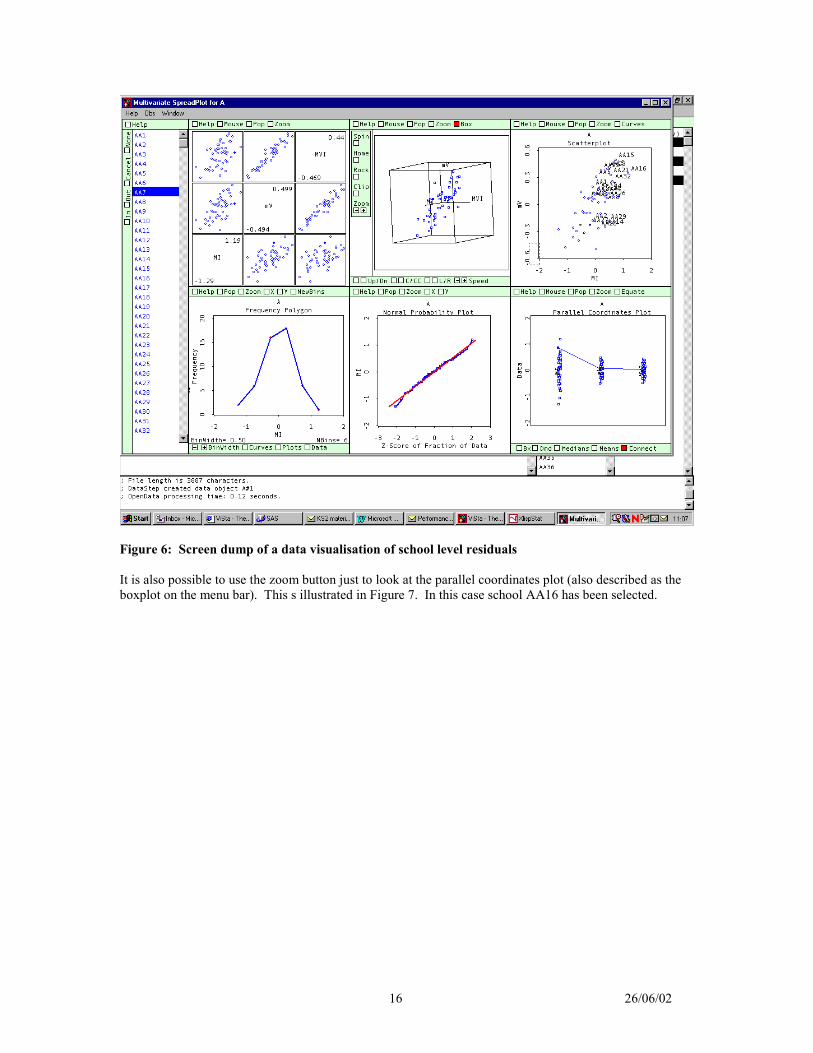
Figure 5 does illustrate the fact that allowing for the Key Stage 3 scores greatly reduces the school levelresiduals (the difference between model null model MI and MV) while adding neighbourhood childpoverty does not (MIV=MV + child poverty). In addition, the ranks show considerable changes in theorder of the school residuals. However, it can be more useful to present this data using dynamic graphics.This can be demonstrated using Forrest Young’s freeware XLISP-STAT package VISTA(http://forrest.psych.unc.edu/research/index.html). A suitable data set was created and converted into therelevant format and the visualise data menu item initiated. After a few minor changes (such as turning ofBox and Equate in boxplot window on the bottom right), it is possible to get a useful display as in thescreen dump in Figure 6. In this case, only school AA7 has been selected. Vista is a highly interactivepackage and it is very hard to describe on paper.
16 26/06/02
Figure 6: Screen dump of a data visualisation of school level residuals
It is also possible to use the zoom button just to look at the parallel coordinates plot (also described as theboxplot on the menu bar). This s illustrated in Figure 7. In this case school AA16 has been selected.

17 26/06/02
Figure 7: Interactive parallel coordinates plot generated with VISTA
This type of interactive graphics could be improved up. Figure 8 is a mock-up of how a dynamic parallelcoordinates plot. This was created from a screen dump from VISTA with some changes and additions madewith a drawing package. In this figure, all the lines are present but shaded light grey and the selected line isdarker. In addition, the confidence intervals for the selected group have been added in the form ofrectangular blocks. These confidence intervals are particular important when the size of the groups varysubstantially.

18 26/06/02
Figure 8: Mock-up of an interactive parallel coordinates plot for displaying group level residuals

19 26/06/02
Conclusion
This paper has considered various ideas that could be used to make the interpretation of multilevel modelseasier. The presentation should be thought of as work in progress and not a series of recommendations. Itis tempting when discussing the presentation of results to develop a set of rules. Different table and figurestructures may well be necessary depending on the circumstances. It is better to think instead of a series oftechniques that assist in deciding how to communicate the results. In 1946, Gerorge Orwell published anessay, Politics and the English Language, which included a set of rules for written English. The last onewas ‘Break any of these rules sooner than say something outright barbarous’. A similar considerationapplies to the presentation of statistical data. There is actually one simple rule: the table or graph shouldpresent the information honestly and clearly.
One of the features of this paper is that it is often useful to present information in the form of a trellis ofplots of either the same or different forms to communicate all the features of a complex data set. Multi-panel plots can help to make clear the complex relationships involved in multilevel models.
The paper has only considered in details to aspects of the presentation of results; the use of tables and theuse of graphs. There are other issues that are important. In particular, the issue of the written descriptionsof the results in papers and reports have not been discussed. These are descriptions are, of course, vital andprobably should be the subject of more consideration and research.
A former colleague, George Peterken had a principle ‘If research is not written up, it might as well not havebeen done.’ There is an obvious corollary: ‘If research is written up badly so nobody reads it orunderstands it, it might as well not have happened.’

20 26/06/02
References
Becker, R.A., Cleveland, W.S., and Shyu, M.-J. (1996) The visual design and control of the Trellis display.Journal of Computational and graphical statistics, 5, 123-155.Bell, J.F. (2001) Visualising multilevel models: the initial analysis of data. Paper presented at the thirdInternational Conference on Multilevel Analysis, Amsterdam, April 10-11. (Available at http://ital-red.cam.ac.uk/bellpaper/vmmodel.html ).Bell, J.F., and Dexter, T. (2000) Using Multilevel Models to Assess the Comparability of Examinations.Paper presented at Fifth International Conference on Social Science Methodology, October 3 - 6, 2000.(Available at http://www.leeds.ac.uk/educol/documents/00001528.htm.)Bell, J.F., and Dexter, T. (2000) Using ordinal multilevel models to assess the comparability ofexaminations. Multilevel modelling newsletter, December, 12, 2, 4-9. (Available athttp://multilevel.ioe.ac.uk/publref/new12-2.pdf).Bell, J.F. & Forster, M. (2001) An investigation into the relative progress of science students from GCSE toA Level. British Educational Research Association, University of Leeds, September. (Available athttp://www.ucles-red.cam.ac.uk/conferencepapers.htm)Chapman, M, and Mahon, B. (1986), Plain Figures. London: HMSO. Chatfield, C. (1995) Problem Solving: A Statistician's Guide. Chapman & Hall, London. Cleveland, W.S. (1993) Visualising data. Hobart Press, Summit, N.J.Cleveland, W.S. (1994) Elements of graphing data. Kluwer, Academic Publishers. New York.Cleveland, W.S. and McGill, R. (1984) Graphical Perception: Theory, experimentation, and application ofthe development of graphical methods. Journal of the American Statistical Association, 79, 387, 531-554.De Leeuw, J. (2001) Reproducible research. The bottom line. Available at.http://preprints.stat.ucla.edu/301/Ehrenberg, A.S.C. (1975) Data reduction. New York: John Wiley.Ehrenberg, A.S.C. (1982) A Primer in Data Reduction. New York: John Wiley.Ehrenberg, A.S.C. (1990) Say what the model says. In the Proceedings of the 1989 Making statistics moreeffective in schools of Business (MSMESB) conference: Statistics applied to marketing management.University of Michigan. Haque, Z. and Bell, J.F. (In Press) Evaluating the Performances of Minority Ethnic Pupils in SecondarySchools. Oxford Review of Education, 27, 3, 357-368Orwell, G. (1946) Politics and the English Language.Schwab, M., Karrenbach, N., Clairbout, J. (2000) Making scientific computations reproducible. Computingin science and engineering, 2, 6, 61-67.Wainer, H. (1997) Visual Revelations: Graphical Tales of Fate and Deception form Napoleon Bonaparte toRoss Perot. Mahwah, New Jersey: Lawrence Erlbaum Associates.