nvl research document
DESCRIPTION
An indepth research study into modernism and post-modernism. Includes idea's and development for New Visual Language magazine. http://issuu.com/katiekershaw/docs/magazine_?e=11386814/7738001TRANSCRIPT

new visual
language
research + developmentby katie kershaw

What is modernism?
Modernism is a term used to embrace a diverse range of art movements and ideas that sparked in the early 20th century during the war. People were traumatised and ready for change. Modernism doesn’t tend to think about the past, more about the present we live in. All forms of creative expression such as art, film, literature, music, graphic design, architecture, poetry and critical thinking inspire it. Artists such as Escher and Dali began to look at the world differently and other artists followed, these were called impressionists. Here also began other styles of ‘isms’ where people began looking at the world in a new modern way. Constructivism, futurism, cubism, Dadaism and expressionism are a few examples of the newborn styles.A strong part of modernism was the inspiration of architecture and technology from the use of glass, steel and concrete. This led them to believe that they could design a better less-divided society from interpreting this in their work. They decided
function should always dictate form and that the creativity and intelligence for radical thinking of mankind should be praised. Some people would argue that modernism is the individual most influential movement of the 21st century, shaping the future of design and had a profound influence on the practice of photography, graphic design and typography. Soon, the movement became a powerful link between art and industrial production, moving away from art nouveau and enabling the production of well-made artefacts and mass consumption and marketing. It encouraged the move towards bold geometric shapes instead, eliminating the use and decoration of asymmetrical layouts. Modernism is in strong favour of sans serif typeface, often without capitol letters. It tends to follow an order, grid or rule and is often combined with typo-photo and abstract based colours and compositions.


Post-Modernism evolved during the mid 1960’s in critical response to the sterility and rule-defined style of modernism. Post modernism believed that less is more is in fact incorrect and that this results in boring outcomes. Post modernisms believed in using a variety of styles and cultures, such as collages, repetition and anarchy, breaking the rules of what modernists believed in. They forced modernists to ask questions. Imagery no longer needed to be related, they rejected the idea of the grid system and other boundaries. They are free to combine any style of art. Post modernism encourages the experimentation of typography and distorting images and lettering. They tend to aim for dramatic design and heightened colour and often attempt to recycle the past to create something new or whimsical.
The rise of mass media was very influential in the taking off
of post-modernism. The world made connections globally like never before. Post-modernism cinema began on television showcasing delight, liberation and dynamic surprises, causing the public to challenge and question why things are the way they are. An example of post-modern art would be the work of Jamie Reid’s cover for the Sex Pistols ‘God Save the Queen’ single in 1977. It portrays a touch of the punk movement in the late seventies, with anonymous randomly placed text, manipulated imagery and livid colour. The post-modernism movement has taught artists to forget the rules traditionally made and to move freely across all disciplines from art, film and music.
What is Post -modernism?


modernism vs post-modernism
Modernism emerged during the first half of the twentieth centuary and was inspired by the development of art, architecture, and design. It tends to follow a set of rules and guides with a cutting edge, fresh outcome. It has a simple and formal approach and shows the care and disaplinary of the artist.
modernism vs post-modernism
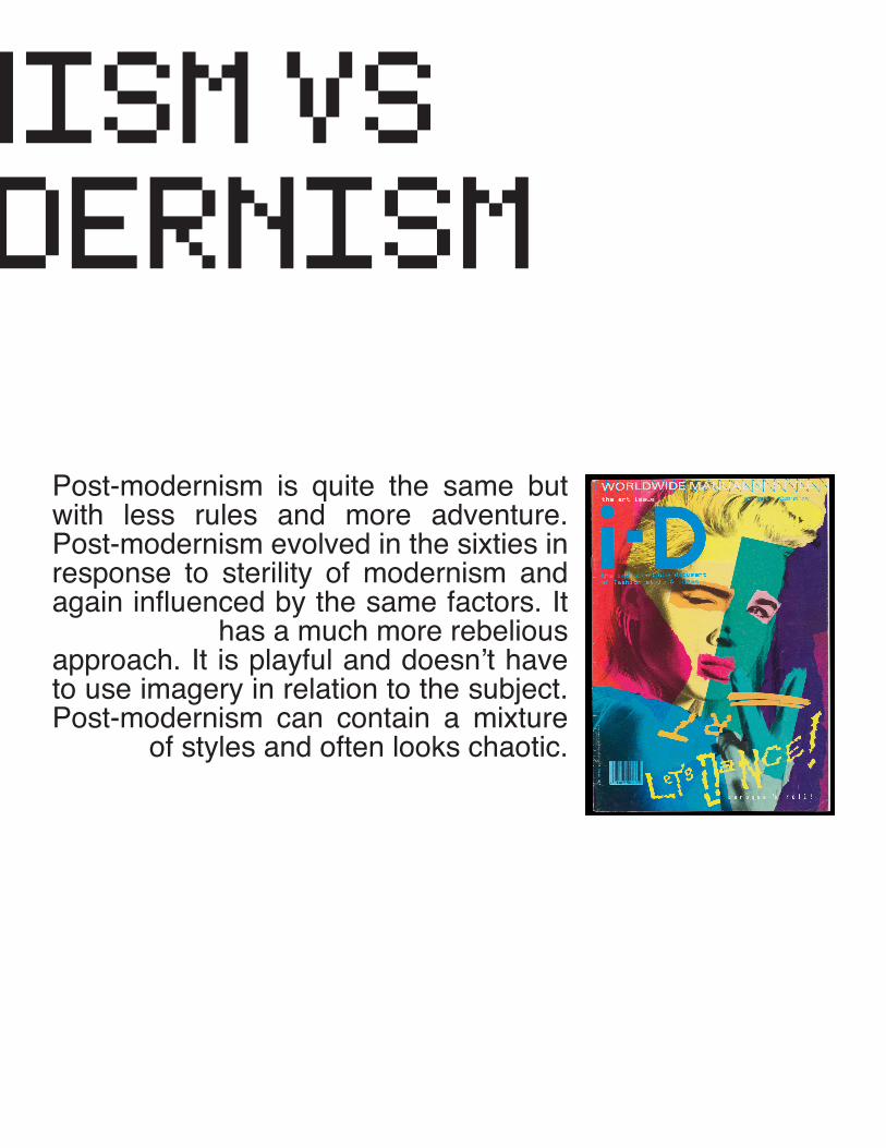
Post-modernism is quite the same but with less rules and more adventure. Post-modernism evolved in the sixties in response to sterility of modernism and again influenced by the same factors. It
has a much more rebelious approach. It is playful and doesn’t have to use imagery in relation to the subject. Post-modernism can contain a mixture
of styles and often looks chaotic.

ar
t m
ov
em
en
ts
ti
me
li
ne _modernism
1880 post impressionismthe movement of emphasism on geometric forms, manipulation of form and colour for expression and the use of unnatural and random colour.
1880 symbolisminvolved some faint tendencies from the romatic tradition which was to stir reaction in favour of imagination, dreams and spirituality
1900 expressionismexpressing the meaning of ‘living’ and emotional feelings rather than the physical existance, usually distorting reality for to show emotions.
1900 fauvismfocused on painting and colour over the representation of realistic values kept by impressionism
1907 cubismimage is divided into small multifaced surfaces, showing various veiwpoints, no logical idea of depth, background and foreground intersect and overlap and objects are simplified into shapes such as spheres and cones.
1909 futurismThis movement focused on the idea of the future, emphasizing the era’s concept of speed, technology, youth, transport, violence and industrialization. They practised with a variety of media and styles ranged from interior design to painting. They embraced the excitement of the world to come .
1910 precisionismmain themes include american industrialization and modernization landscapesm sharply defined with use of geometric shapes and precise lines. this movement was influeced by cubism and futurism.

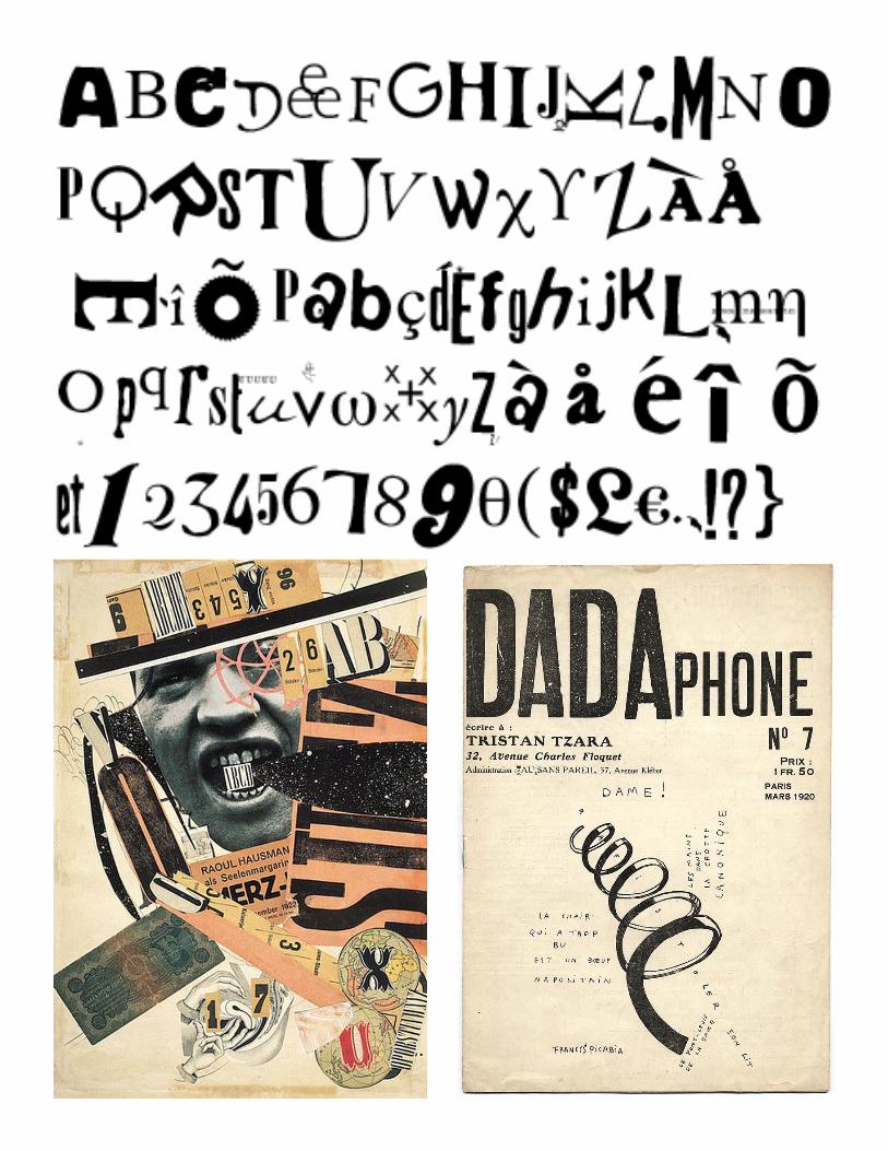
dada 1916dadaists beleived that the logic and meaning of bourgeois capitlist society had led to war. according to it’s people, dada was anti-war not art. it was a movement to represent the opposite. dada ignored the tradional aesthetics of art and culture and intended to offend
rather than appeal to sensibilities, to revolutionise design.
constructivism 1917A movement originating from Russia which focused on architecture and modern technicalities and materials. Work was created in order to carry a fundamental analysis of their surroundings and other art, and the artists rejected the idea of autonomous art.
Constructivism was a strong influence to destijl and bahaus.
de stijl 1917Embraced abstract, geometrics, primary colours and basic visual elements. Usually
consisted of straight lines, squares and rectangles. ‘De Stijl’ is dutch for ‘the style’.
international style 1920Mainly presented through architecture. The movement was characterized through simple
geometric forms, white spaces often without texture, glass , concrete and surfaces.
bahaus 1920Began in the school of art & architecture in germany. bahaus revolutionised art processes
by combining tradional arts with crafts. they beleived design could improve society.
art deco 1920 Used a mixture of geometric motives, curvilinear lines, bold colours, strong defined
outlines and synthetic materials such as plastic. Art Deco later revived in the 1960’s.
harlem renaissance 1920this challenged racism and black rights. african american s rejected imitating european and white american styles and began celebrating the black dignity and creativity instead. they felt it was a way to express their freedom and explore themselves as individuals. it
emerged from slavery and culteral ties to Africa.
surrealism 1920Emerged from the era of dada, cubism, freud and communist beleifs, aiming to connect the conscious with the unconcious to create a hyper-reality. this created an unrealistic
and often illusional effect.

_Post-modernism
1945 abstract expressionismAn american movement influenced by surrealism. Used spontaneous emphasism and automatic or subconscious creations.
1945 contemporary artContemporary art focuses on the time the artist is in. It is very much socially aware and often relates to social issues such as feminism, globalization or even AIDS awareness. It is still a movement existing today.
1960 pop artStrong use of themes and techniques found in popular mass culture such as advertising, comics and television. Emphasised the cliche or kitschy elements of various cultures, often with a sense of irony. This was a reaction to the abstract expressionism movement.
1965 photorealismPhotorealism evolved from pop art. Basically transferring an photograph image onto canvas using projection or the grid system, creating a realism outcome..
1960 minimalismAnother reaction against abstract expressionism and a gate to postmodern art. The subject is stripped down to its most basic fundamental features, focusing on the idea of ‘less is more’. Often had sharp contrast and high subjectivity. Energy flowed from the image.
1960 hard edge paintingsudden transitions found between sections of colour, caused by the abstract expressionism period. Involved an awareness of the placement of colour with certain sharpness and coherence.
1960 New WaveDesigners began to get fed up with the strict rules of design, especially in typography. This became more prominant in the 80s, when designers began to attempt a new era of type. They expressed this through various sized lettering, kerning & boldness, and removing unison. Design became distressed and boundries were broken.

post minimalism 1965Lack of artistic tradions. The outcomes are usually every day objects
and items, using simple materials and formalistic aesthetics.
conceptual art 1965the concept and idea that creational work takes priority over tradional
aesthetics and material concerns.
punk 1970Artwork created in attempt to shock or create a sense of empathy or disgust. This involved charateristics such as cutout letters from magazines assosiated with ransom notes, a collaging effect or distressed look. It showed a sense of rebelion and was strongly influenced and associated
with the music industry.
installation art 1970three-dimensional works based in a specific space, designed to transform
the perception of the area.
performance art 1970Artists began expressing themselves through live performace, often using
a variety of medias.
neo-expressionism 1980A reaction against the conceptual and minimalistic art of the 1970s. It contained strong use of vivid and vibrant primary colour harmonies, and returned to portraying recognisable objects such as the body, in a rough
and violently emotional way.
memphis 1981The Memphis Group was an architecture and italian design group that designed post-modern furniture and materials. Their convensional colours, shapes, texures and patterns were often described at the time as strange and misunderstood. They drew inspiration from the art deco
and pop art periods, including the fifties kitsch and futuristic themes.
ar
t m
ov
em
en
ts
ti
me
li
ne

dadaismDadaism began in 1916 after the first World War as a negative reaction to the social, political and cultural values of the time. Artists began to break the boundaries of traditional art and began the making of what they called ‘anti-art’.Collaging was one of the main techniques used throughout the Dada period. It began during the cubism movement when people began to paste discardeded paper waste onto canvas. The Dada’s wanted to bring these to life rather than them be still objects and began to paste other items such as tickets, sweet wrappers and photographs to show other aspects and bring them together. Finished peices could be 2D on paper of canvas, or 3D such as
an assemblage nailed and screwed together.Artists wanted to create the reaction of shock, and so they began experimenting with bold typography and photomontage too. Type often varied in style and weight size as rejection to the tradional methods of design. They expanded the methods and context of what was considered acceptable art.Dadism’s impact on society overturned and challenged many artists and social conventions, it spurred on the movement of surrealism, pop art, installations and conceptual art.Many popular artists were involved in this movement such as Max Ernst, Kurt Schwitters, El Lissitzky and Man Ray.

art decoArt Deco is a luxurious style of decoration that emerged around 1918-39. It was presented through interiors, fashion, architecture, ceramics and industrial design. The style often featured utilized vibrant, bright colours besides a unique set of floral, geometric or figative motifs. It first began in the early 20th centuary when artists began looking for an alternative to the influence of art nouveau and it’s curvilinear organic forms. Art Deco was much less ornate in graphic design than other practices, but displayed a strong passion towards geometric shapes and patterns. Type faces were often rectilinear and embraced technology, making them clear and ledgible in contrast to the
delicate designs of art noveau. Art Deco focused on been symetrical and been modern as a response to the development of machinary enabling mass production. Nowadays, art deco is usually seen in public areas such as parks and ocean liners, and still remains a strong influece in comptemporary fashion and jewellery design.Popular artists of this period included A.M. Cassandre and E. McKnight, who created original posters involving text carefully intergrated as an important graphic element.


bahausThe Bahaus movement actually began in a German art school. The tutor decided to engage his students in attempting to create a new unity between art and industry, rejecting any division between constructional and decorative techniques. The school began to commit themselves to architecture, encourgaging the exploration of new ideas connected with the de stijl and constructivism. Bahaus beleived typography to be the main and strongest form of communication and so began to look at new modern type. They beleived craft and industry could be combined and so the school specialized in many workshops such as metal working, weaving, pottery, cabinet making, and
wall painting. They beleived in the importance of mass production and so designed with it in mind. Bahaus focused on the study of materials, colour theory and formal relationships to develop in to more specialized skills.Max Bill, Wassily Kandinsky, Otto Lindig and Herbert Bayor were artists closely associated with this movement.

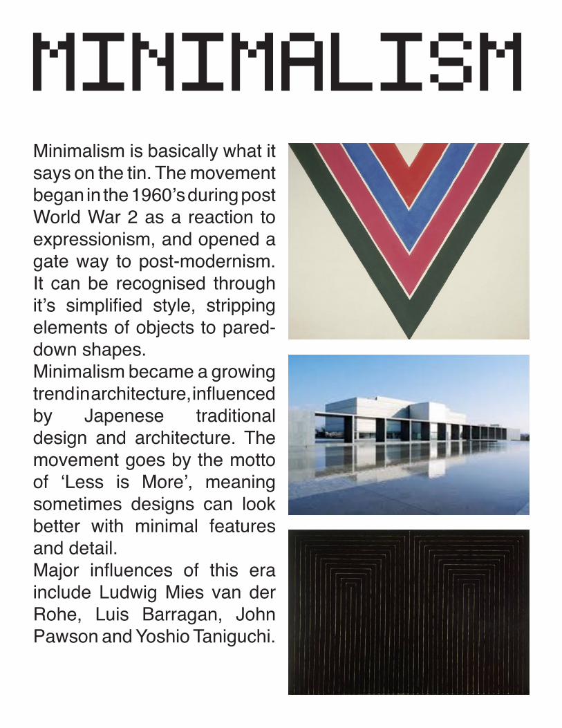
minimalismMinimalism is basically what it says on the tin. The movement began in the 1960’s during post World War 2 as a reaction to expressionism, and opened a gate way to post-modernism. It can be recognised through it’s simplified style, stripping elements of objects to pared-down shapes. Minimalism became a growing trend in architecture, influenced by Japenese traditional design and architecture. The movement goes by the motto of ‘Less is More’, meaning sometimes designs can look better with minimal features and detail. Major influences of this era include Ludwig Mies van der Rohe, Luis Barragan, John Pawson and Yoshio Taniguchi.


new waveThe New Wave movement began in the 1980’s when post modernism began to rapidly rise. A radical era began changing the face of design, moving away from the crisp, neat gridded system into vivid colours, bold statements and impact through exaggeration. From glossy shiny surfaces to worn and distressed, people began to break boundaries and approach new techniques. They reflected the ambition to combine subversive statements with commercial appeal. These were presented through a variety of media but mainly magazines and music delivered this effectively. Popular designers such as Memphis and Studio Alchymia began travelling through world
publications like Domus. During the same period post-pink subculture was broadcaster world wide through strong edged graphics and music videos. New wave was the exciting decade of design when image was everything.Typography is another area in the New Wave period that had a powerful impact. Designers moved away from the gridded unison of lettering and began to defy the rules and experiment. Spacing became irregular, type-weights were inconsistent and text set at unusual angles.

punkPunk was a subversive street culture movement that began in London, UK, in the mid seventies. The style embraced music, fashion and art and potrayed a sense of rebelion and agressive visuals.The idea was to express their indivual freedom and anti-establishment views. They often has strong political veiws which influenced their characterists such as anti-capitalism, environmentalism, animal rights and anarchism.Art of the punk era can be recognised through their messy collage techniques, chaotic bold typography, - often in the anonymous style with various pasted cut out letters, and shocking slogans. Some artists approached work with a minimalistic, iconoclastic
and underground aesthetics. They played a part in reviving stencil art and often their work was in black and white, enabling easy photocopying of zines for mass production.A strong example of this movement would be the Sex Pistols, with their anarchic music, style of fashion by Vivienne Westwood, and album and poster art by Jamie Reid.

the grid systemThe grid system is a technique which emerged in the modernism period and is still used today. It was made popular by the International Typographic Style movement and is used almost like a resource for design.
“ The grid system is an aid, not a guarantee. It permits a number of possible uses and each designer can look for a solution appropriate to his personal style. But one must learn how to use the grid; it is an art that requires practice. ” Josef Müller-Brockmann
The grid system is a two dimensional grid with intersecting horizontal and vertical lines, usually straight linear. It is used to act as a
guide to organise graphic content, whether for easthetics or in relation to the page or shape. It also enables text to be placed in columns to allow it to be more readable and managable. They are used across an array of media from web to publications or even poster design. It gives consistancy to layout. This will be very useful for my magazine as it will allow me to ensure each page has unison and give it a prossional formal look.


emli ruderEmli Ruder is a swiss typographer, graphic designer and educator. He strongly beleived that legibility and clearness in typography was essential for effective visual communication, and was very enthusiastic about the importance of sans-serif typefaces. Sans-serif typefaces and the use of the grid system basically defined the swiss style era. Work around this time often involved these and asymmetrical layouts. Ruder also beleived that combining photography into typography created powerful comminications. Ruder was one of the major influences on swiss design. Noone else since Jan Tschichold was as committed to the discipline of letter press typography.

davidcarsonDavid Carson is an American graphic designer and typographer who radically influenced and challenged the post-modern era. He ignored the tradional methods and began to expierment with design and typography.In 1992, Carson released his own magazine called Ray Gun. Previously he had worked for many other publishes such as Transworld Skateboarding and Surfer. However, Ray Gun managed to present his work internationally, having a big impact on young designers. Carson manages to engage the audience using manipulating methods such as blurring text and image to show content and meaning. He uses assymetrical layouts
and layered elements with altered opacity. His text is often broken, with contrasting pointsizes, weights and styles, giving it his trademark ‘grunge’ appearance.
David Carson has worked with a number of clients, from Nike and Levis, to British Airways and Microsoft. After leaving Ray Gun in 1995, he set up his own company ‘David Carson Design’ in New York.


ray gunRay Gun was an alternative rock magazine published in 1992, California. It is most popular today due to it’s exploration in typography. The magazine was led by David Carson, the founding art director. The text wasn’t always easy to read, it was abstract and messy, giving it a unique appearance. After Carson left, the aesthetics remained the same style. As the magazine flourished in the post modernism era, it wasn’t unusual to see this style. However, Carson was one of the most influencial and well known typographers and designers of this period, changing the face and the way we use typography forever. In total there was 70 issues of Ray Gun published.


armin hofmannArmin Hofmann is a swiss graphic designer and educator. He followed Emli Ruder as head of the graphic design department at the Basel School of Design and helped develop the swiss style. As a teacher, he began setting new standards that became widely known in design industries across the globe, using unorthodox and broad based methods. Hofmann created many work over the years such as books, logotypes, symbols, stage sets, exhibitions, typography and posters. His style was detected through the simplicity and complexity, representation and abstraction.


michael PlaceMichael Place is a graphic designer who went straight into the design industry from college. He worked alongside creatives such as Ian Anderson, Trevor Jackson and The Designers Republic. Place now has his own designing business called ‘Build’ who has produced work for brands such as Nokia and Design Museum. Michael developed along side people who had a more of a care-free punk style which inspired him to use anything he could get hold of to use in his work. He doesn’t use the grid system or follow any rules, but more the opposite of Josef Müller-Brockmann. Place designs seem to all have in common bold contrasting
colours whether it be black and white or a wide range. I think this is one of the main factors which make his graphics so strong. He has a passion for typography in particular and uses this in mainly advertising, whether branding or just creating a poster. I also find his vector illustrations to be striking too as they are smooth and consistant. They are often very simple and ‘child-like’, giving them a positive light hearted note. His eye for colour is something that really helps them to catch the eye, combined with his skill for thinking outside the box and bending the rules.

mastheadsresearch + analysis
After taking a moment to look at existing magazine mastheads, I collected a selection of which caught my eye the most. I have found that I particullary like ones which are very ‘customised’. What I mean by that is typography that has been adapted to the lettering or ones which are specifically designed such as David Carsons designs for Surf and Raygun. They have their own personalised touch to them which makes them unique to others.My two favourite designs are quite different. Raygun has a very grunge appearance to it, with the letters having uneven spacing and thickness, looking very ‘unfinished’. GQ however uses large simple bold
lettering. This makes it easy to read, recognise and also acts as a symbol as it is abbreviated to mean something. As my masthead title is ‘New Visual Language’, I feel it should be shortened into ‘NVL’, as it gives me more freedom to combine the lettering and not use too much space or text. Another design that particullary stood out to me was Surf. The headmast seems to intervien and combine with the cover image, making them work in unison and compliment each other. I think this works really well as it shows how each can be adapted. I will be experimenting with creating my own headmast for my magazine using these images as a spark of inspiration.


pr
od
uc
ti
on
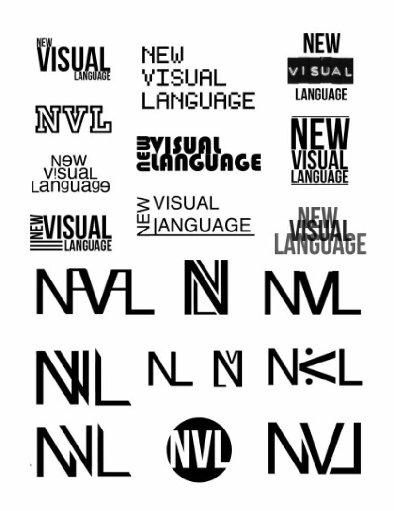
I have created 20 initial ideas for the masthead of New Visual Language. In this project we are required to design a magazine based around the style of modernism or post-modernism. Personally I believe you can mix the two styles together and should not be constricted to either one or the other. I have created 10 of each either using the full title or the initials. Some are quite similar as they have inspired a new design from an idea, however I feel I have come up with quite a range of styles I could use for my mast head.I have quite a few favourites which are very different making it difficult for me to choose. I feel the best ideas are the ones which are quite compact and fit snug in a box such as the 4th, 6th and 7th in the first column, 2nd and 5th in the second column, and in the last column i feel all have potential. The bold, strong lettering seems to work well in all designs as it’s a logo, it needs to have an impact and stand out on a page. However, I think the abreviated head masts would be the most powerful as it is quite a long title. When the headmast is shrunk down to fit on the corner of a page, it will be much easier to read this way. It also has meaning which will want the reader to find out what it is, making it intreguing. I will be asking potential readers which they feel would fit best for a graphic design magazine and using these results and my personal choice, will pick out my top four results.
mastheadsinitial ideas
mastheadsidea analysis
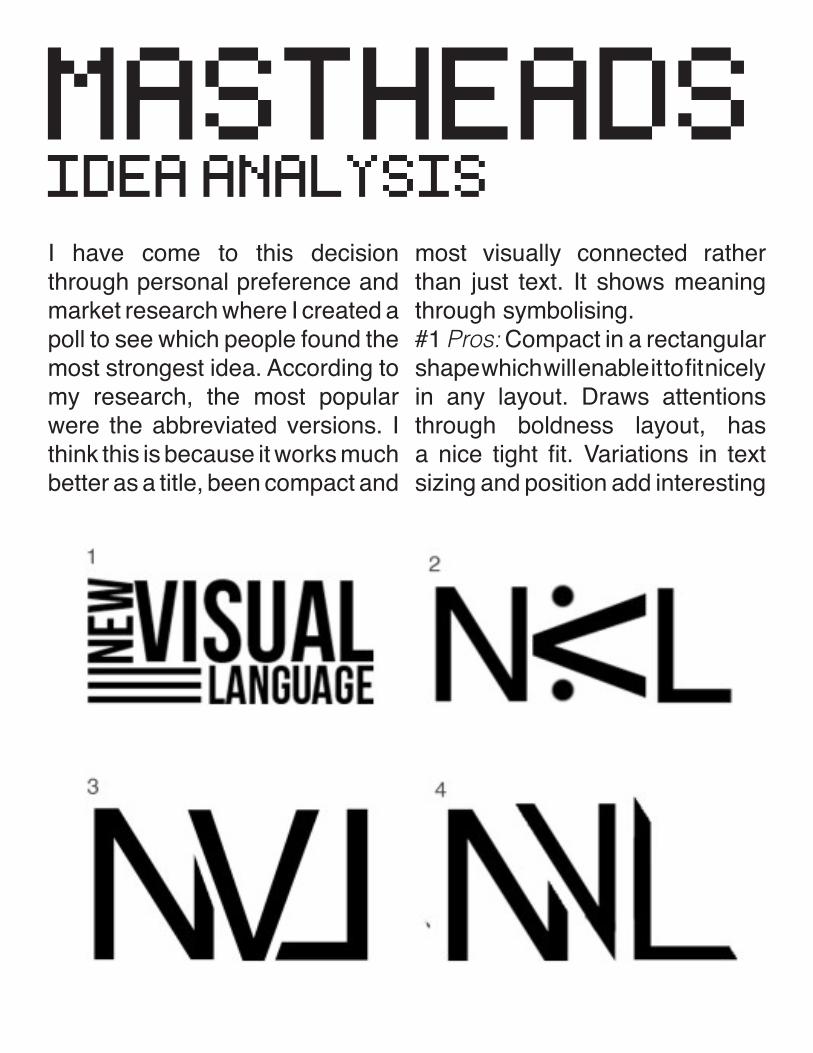
I have come to this decision through personal preference and market research where I created a poll to see which people found the most strongest idea. According to my research, the most popular were the abbreviated versions. I think this is because it works much better as a title, been compact and
most visually connected rather than just text. It shows meaning through symbolising.#1 Pros: Compact in a rectangular shape which will enable it to fit nicely in any layout. Draws attentions through boldness layout, has a nice tight fit. Variations in text sizing and position add interesting
look, making certain works stand out more than others. Fits in with the theme of modernism. Cons: Very simple, not using as much creative skill. Three stripes have no meaning, could be developed into something more related. Not very post-modern.#2 Pros: Short, abbreviated, easy to read. Making viewer question the meaning. post-modern look with misplaced letter, random dot decoration. Cons: Rotated ‘v’ could be mistaken as a ‘c’, making it confusing as to what the letters stand for. Meaningless dots.#3 Pros: Very nice fit, all the letters are connected making it appear like one symbol. Easy to read letters. Good spacing and separation between letters. Nice and compact. Reverse letter has a little post-modernism, while organised placing has a taste of modernism. Cons: Uneven white space, could use a little tweaking.#4 Pros: Letters overlap but have separation to making it more eligible. Connected into one symbol. Cut up lettering reflects post-modernism. Cons: ‘L’ seems a little separated from the other two letters. Has a little roman
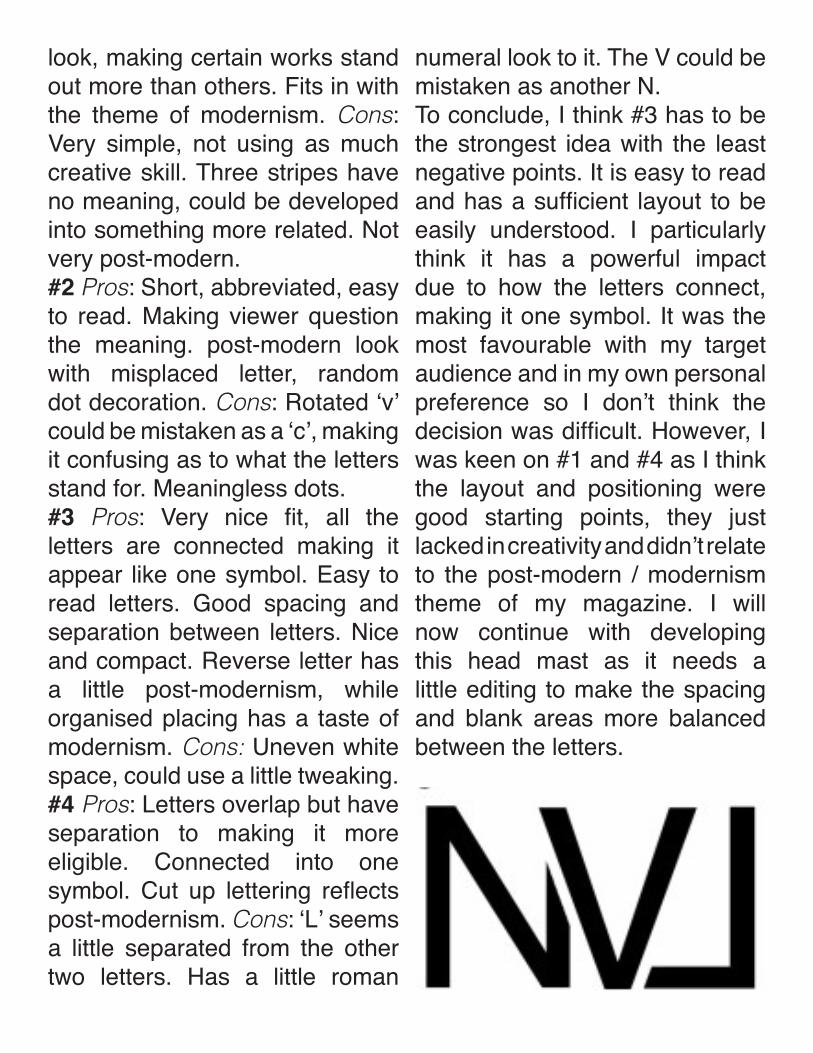
numeral look to it. The V could be mistaken as another N.To conclude, I think #3 has to be the strongest idea with the least negative points. It is easy to read and has a sufficient layout to be easily understood. I particularly think it has a powerful impact due to how the letters connect, making it one symbol. It was the most favourable with my target audience and in my own personal preference so I don’t think the decision was difficult. However, I was keen on #1 and #4 as I think the layout and positioning were good starting points, they just lacked in creativity and didn’t relate to the post-modern / modernism theme of my magazine. I will now continue with developing this head mast as it needs a little editing to make the spacing and blank areas more balanced between the letters.
mastheadsdevelopment + final
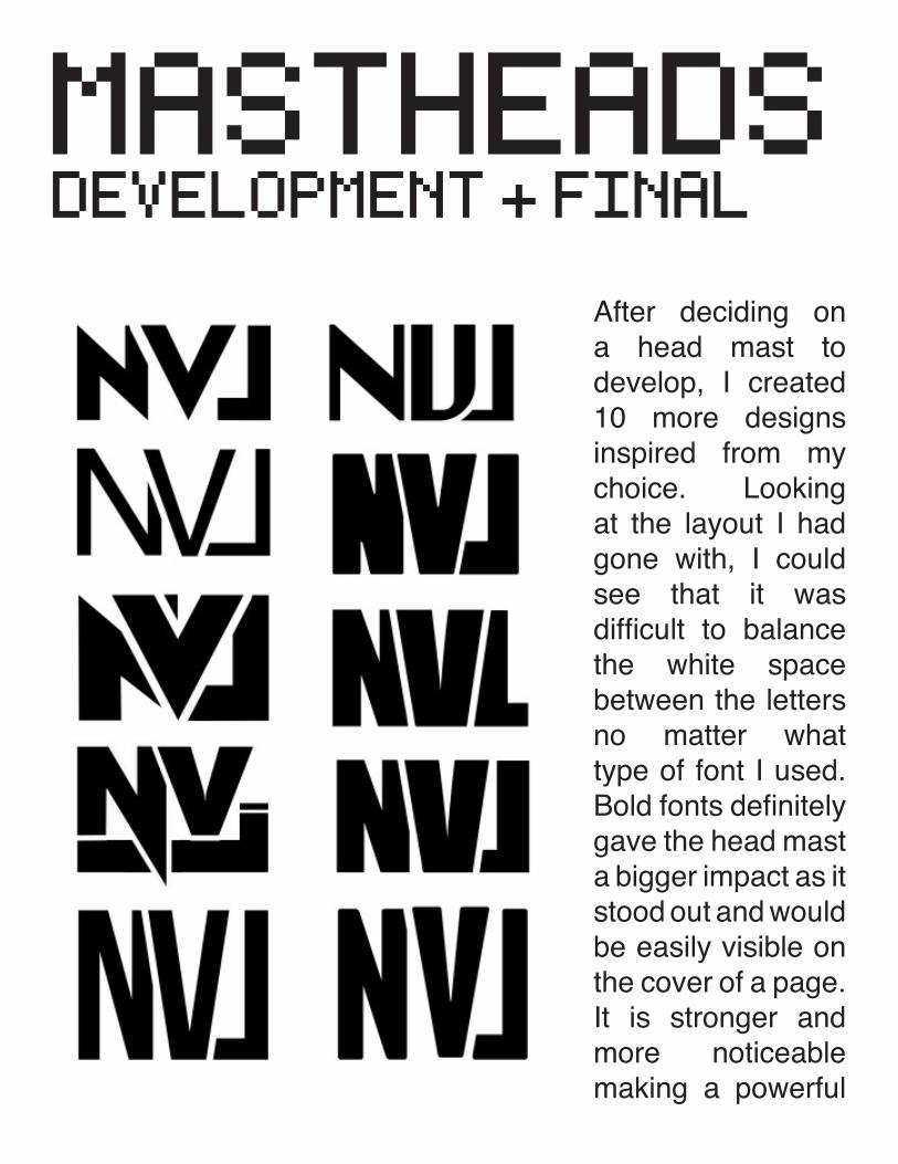
After deciding on a head mast to develop, I created 10 more designs inspired from my choice. Looking at the layout I had gone with, I could see that it was difficult to balance the white space between the letters no matter what type of font I used. Bold fonts definitely gave the head mast a bigger impact as it stood out and would be easily visible on the cover of a page. It is stronger and more noticeable making a powerful
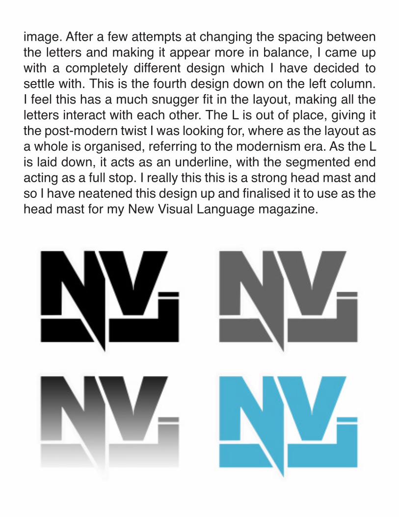
image. After a few attempts at changing the spacing between the letters and making it appear more in balance, I came up with a completely different design which I have decided to settle with. This is the fourth design down on the left column. I feel this has a much snugger fit in the layout, making all the letters interact with each other. The L is out of place, giving it the post-modern twist I was looking for, where as the layout as a whole is organised, referring to the modernism era. As the L is laid down, it acts as an underline, with the segmented end acting as a full stop. I really this this is a strong head mast and so I have neatened this design up and finalised it to use as the head mast for my New Visual Language magazine.

front coverresearch
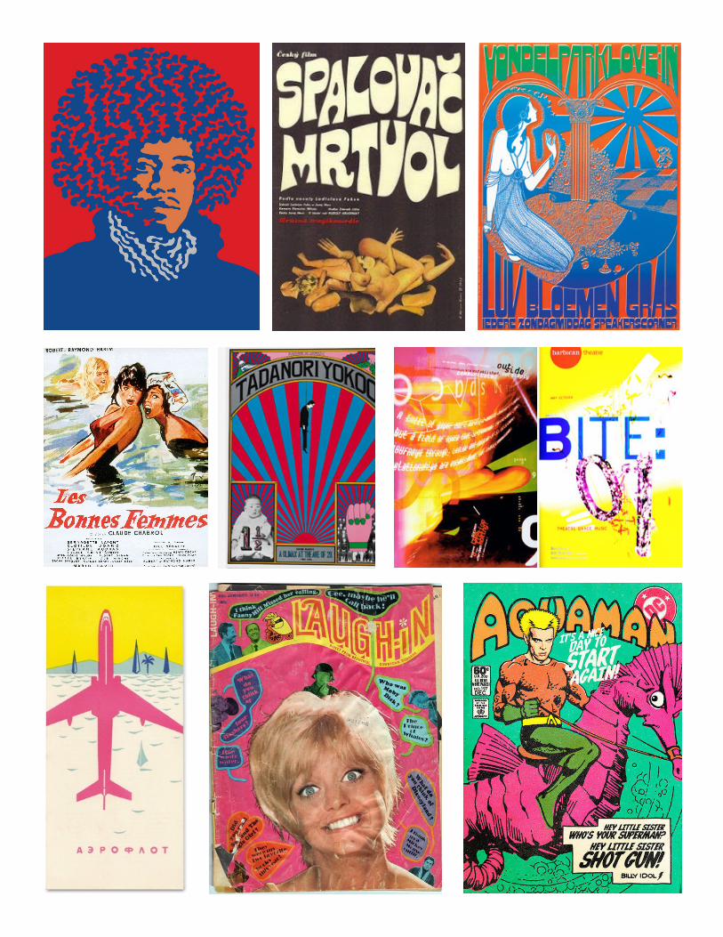
Here I have took the time to look into other existing magazine covers. I have selected a few which are based around the creative industry, from fashion to music and art. This small selection are ones which stood out to me the most, and you can clearly see that they all have common features; bold vivid designs, strong contrasting and bright colours, mainly a post-modern design - relating to the new wave or punk era, and more imagery than text. Although I had been in support of both modernism and post-modernism and feel you can mix the two, I definately feel that post-modernism has a much more powerful and eye catching appearance. My top three favourite designs here are Wired, Eye and Wet. Wired I feel had a very constructivist taste to it, with reference to Rodchenko’s work and following the colour scheme of red black and white. I think it
has a very powerful image and the typography is bold and fits in unison with the design. It makes great use of white space just like the Eye magazine cover. The Eye cover is very simplistic, a little minimalistic. The jaggered edge, black sillhouette and colourful pattern really stands out against the white back ground, also allowing attention to point to the logo and face. Finally, the Wet magazine is just a burst of colour. Definately from the post-modern age in many aspects. You can see a hint of cubism in there aswell as futurism and punk. The design is so busy but no way at all distracting to any area. I feel it all compliments each other very well. I can see that the similarities in my favourite choices are they all feature a pop of colour and portrait photography. I will experiement with my own designs however I still will consider other ideas while using these as inspiration.


front coverinitial layout ideas
Inspired by Jamie Reid and the punk era, this design features a torn effect manipulated image of a featured artist. It also has a hint of constructivism, inspired through Rodchenkos work where the artist will be ‘shouting’ the subheading ‘Form Follows Function’. Outside this area will be white space which will allow
the mast head to stand out.
This design would be divided in the centre, partly inspired by Raygun. However, it would enable me to show the seperate movements of post modernism and modernism and how they compliment each other. The top would be modernism, very simple and organised with strong type, below would be a montage of things, breaking the rules and showing contrast.

Has a sense of Bahaus work with floating shapes such as triangles and rectangles. These could be simple forms or manipulated into cut up photography or designs. The head mast is large allowing it to draw focus on the title and subheading.
Another punk inspired idea which can also be related to the Dada era. This shows the two movements from post modernism and modernism can be combined. Another influence is the Raygun magazine, with manipulated text and grunge aspects. Emerging from the centre will be collaged images of the
contents of the magazine.
Here is a more simplistic and modernist design with a hint of Dada. It would be organised using the grid system with the masthead and subheading top centre. Below would be architectural photography with collaged contents emerged from the top. The barcode could be blended in and
place as a window in the building.

front coverinitial layout ideas
Another idea inspired by the Raygun magazine covers. This cover features a grunge style montage of images and effects. The entire background will be strips of various things that will blend together. The text will have various spaced kerning and broken up areas, with a small organised featured section
at the bottom.
A cover inspired by the Dada movement. This would involve misplaced text and obscure imagery. The masthead and subheading would give a subtle hint of constructivism. The main image would be an artist, upside down, with his head opening up spilling out ‘Form Follows Function’ in the style of Rodchenko. It would involve aspects of collaging, white space and manipulation.

This idea has a strong reference to Jamie Reids ‘God save the Queen’. It will feature a photograph of an artist in the centre which will be manipulated to look worn out. The subheading will cover the mouth and the mast head and barcode will have a grunge effect background such as a strip of paint or torn paper enabling the text to look bold and lift from the page.
This is a more minimalistic design making great use of white space. This should allow the mast head, imagery and subheading to stand out on the page without any distractions. The centre image would be a cut up montage of photography, possibly showing the contents of the magazine. The shapes would also relate to the cubism movement.
Again, Raygun inspired. The background would be entire imagery. Possibly photography that has been manipulated to look grunge like, relating to the punk era. the text would be vibrant, sharp and bold against the background, centred to
provide focus.
front coveridea development
So after a lot of analysing, I decided my favourite idea to develop was my last one. This is because i really liked the punk aesthetics of it. I think it’s quite simple but gives me alot of room to add and make improvements. During my research I found that my favourite designs featured a model photograph in the centre and so I thought this may be something I can work with. Here I have attempted different styles, layouts and incorporated other ideas into the design and I will be analysing to see which i think is the most effective choice. I personally feel that with the headmast in the centre, it provides focus and unison in
the design. It works well with the main image been in the centre as it helps to balance out the white space. Another idea I developed at this stage was the opening of the head. This could represent the thoughts of the artist, or more like shows the contents of the magazine coming out. If I manipulate the head as a fruit, I could use the juicy droplets as previews of the contents. I also think the magazine has more of a Dada twist to it with the head been placed upside down. The text across the mouth draws the eye, with a hint of punk. This would be the subheading. My most popular design here is top right, and so I will be taking this idea further until I acheive an effective magazine cover.


front coverdevelopment
After deciding which idea to take further, I took my design into photoshop to recreate. The main image I found is of Kit Hinrichs, a post-modern artist who I may feature in my magazine. I thought this portrait was the perfect capture to use looking back at my ideas and I was right, as it worked really well with my intentions. Throughout my development, I experiemented with various typefaces, layouts, grid systems and effects. I realised after creating my first version that it was not a very good layout choice for A3, as I couldnt fit the drops of the orange underneath the image, instead I tried to use a more organised and neater approach. I dont think this style worked well as it looked bland, dull and tacky. It had something missing and looked too precise for a punk / post modern style. Next, I decided to try alterning the position of the head. I also experimented using Neville Brodys style of cutting things up and having broken up images and text. This created a grunge look to it and made effective use of the white space. However, I didn’t feel the paper strip and orange drops (which would be filled with content images), looked very professional or suited the theme of the magazine. It just didn’t looked appealling. Finally, I experimented with adding a little colour, more type and various fonts. I was strongly inspired by Raygun covers and felt I should take a page from their book. The third is definately the one I will be finalising.


front coverfinal
After a little tweaking, I decided to use my third design idea for my final cover. I thought it worked really effectively in potraying the post modern movement due to the breaking of boundaries. The image is of Kitt, a graphic designer of todays modern age. I have edited it in a Dada style, as it makes no sense. I thought i’d play with the idea of the head opening up to reveal something unexpected and illogical. I then edited this by cutting it up into slices and adding over layers of doublicated transparent copies and streaks of colour. I think this helps to capture the punk style of the post modern era. I also feel that the grunge twist added in such as dark colour theme, scrawled text and torn paper and paint brushes have added to this style. Raygun was a major influence in my cover outcome. I took inspiration
from Neville Brodys broken typography and overlapping layers and incorporated this into the subheading ‘Form Follows Function’. This really helps it to stand out as its doublicated but also still easy to read. My idea of the type for the projects was to suit each page to the font style. I feel they reflect the style of each project already so this should be an easy talk and help provide a fluent design. The mast head has also complimented the design as it’s strong and powerful without taking away all the attention from the rest of the cover. The price, date and barcode was made small in order to be subtle as they aren’t an important aesthetic. The colour scheme is really basic but it provides great contrast and therefore making it eyecatching with a instant impact.


contentsresearchNext I need to create a contents page. In order to do this, I have researched existed designs so that I can evaluate what would work well and be effective for my magazine.I found it quite difficult to find some interesting designs after looking through magazines in the library and online, however here are a few that caught my eye. My favourites amongst this selection has to be the top right corner and bottom left as I feel they are unique in their own way. The first one has strong imagery with suttle text. Although the text has a blending option which enables it to interact and fade into the back ground, I feel it makes it quite powerful in it’s black and white glory, If I was to find suitable imagery to go with this, I may look at incorporating photography into my backgrounds. However, as my cover page is quite ‘clean’, I think white space layouts would
compliment my theme much more. The bottom left layout has a very modernist approach. I really enjoy how the half boxes of colour allow you to see the number, and the text is wrapped around each section. The numbers are the same colour as the background and so if it wasn’t for the other aspects, they would be invisible. It’s like a play on the eye. This would definately go well with my theme of modernism and post modernism, as it has a nice organised layout with splashes of colour. I want to show you can mix the two movements. The other layouts I have shown are quite simple and what you expect to see in your everyday magazine. I think they are easy to read and organised without distractions. I will be experimenting with layouts for my magazine using these images as inspiration while relating back to my research into the movements.


contentsinitial layout ideas
I really do enjoy the simplistic look and use of white space within the contents pages I have come across, however I am likely to add more grunge effects to it with having my front cover so dark and dada like. I like the idea of the contents been in the centre and using imagery to make it stand out more. It provids focus on the use and will be easy to understand.
This is another layout where the contents are supported by imagery. I think using white space to surround the text would help the text pop out and be easy to read. The imagery would just be aesthetic. This idea of an image shows a hand grabbing hold of a building, this could be to show how we have took architecture as a major influence in design from modernism to
post modernism.

A very simplistic and organised content layout. This would be more modernist than post as it has structure and would make use of the grid system. This would enable the page to be easily ledgible and to follow. I am wanting to show how you can combine both movements and so I could add a twist of punk by using
ransom numbering for the pages.
Here I have tried to combine both post modernism and modernism. The title would be placed vertical, half cut up in the style of Neville Brody. The numbering would be more Dada style, with the use of found objects , - a chain of metal numbers for example here, to represent the page numbers. The text could be placed on an obscure angle, organised but misplaced.
Another quite modernist layout. The bubbles could show an insight as to what is on the page. It may be possible that I would need text and the images can stand for the content. This also led me to the idea that I could just use images, when the numbers placed over the top, almost like a sneak preview to the page.

contentsidea development
Here, the numbers would have an image overlayed which would be like a keyhole insight as to whats on the page. Besides it would be obscurely placed text. I think the idea of it been in a grid and organised would strong bold lettering would reoresent modernism whereas the misplaced text would be post modernism.
After analysing my initial designs, I was inspired to create more layout ideas. I really feel that using imagery from each page to show what to expect would be a great idea. It would have relation to the images and also could replace text. Looking at these three designs, I feel the 2nd and 3rd are definately my strongest ideas. The first is quite plain and doesn’t use much creativity. Where as the other two designs are supported by strong visuals. I feel the third would be most relevent because it gives a breif insight to the pages. while also explaining what it’s all about. However, the second design is more suitable towards my cover. I don’t really fancy having a dark completely grunge like magazine as it doesnt suit all my projects, as so I will be attempting to use a cleaner design that will contrast while still complimenting my front cover. I have chosen to develop my third idea.

This design uses powerful imagery rather than text. The pointing finger could be in the style of constructivism or dada. I would experiment and possibly combine the two movements. The contents would be hanging vertically from the finger in an organised formal manner, with the title at the bottom carrying on the grunge type effect of the cover.
My final idea I have developed is the idea of a modernist look. The cubism shapes in the centre would show aspects of each page through photography, with the numbers largely placed on top. Below would be small text to explain breifly what is in each chapter. I really like this idea as it will contrast with the postmodern front cover.

contentsdevelopmentThis first design definately has the post modern look. Here I have followed the theme of the front cover but made use of the white space rather than been dark and grunge like. I have used the same font style as the subheading and a simple font for the small text making it easy to follow. I think the collage in the centre has a touch of new wave / punk to it while the text has a minimalistic style. The brushes add the punk theme from the cover. I like how colourful this is however it looks a little busy and messy. It will alway draw attention away from my manifesto which will be the opposite page. The numbers on the imagery show what image to expect on the pages.The second design is a little punk mixed with minimalism. The white on black text have that ‘warning’ sense to them, making it seem urgent and important. I like the idea of it been small and compact
as it gives it a modernist look. You can see that it is organised and I have used the grid system to lay it out. I think this simplistic look is my best option as opposite the page will be my manifesto which I don’t want attention taking away from or clashing with other designs. The contents is there to direct

and so I think it should just look simple and easy to follow. I want to show I can combine modernism with post modernism and so the inner pages must have a more calmer approach. After a little more experimentation with type. I decided my best option was to use the type I had create from the
first design as it suited the cover and the style of the magazine. I combined this with the layout of the second image and there’s my final outcome. It is very simplistic and the white space compliments my manifesto.

page layoutresearch
Here I am looking at page layouts for my content of my magazine. I will be creating double page spreads for all except my manifesto and contents page which have already been designed.As my contents page is quite crisp and clean, I am hoping to carry out this style in unison. I have looked at a selection of examples, mainly that I think would work well with my magazine. I found the similarities in these designs are good use of white space and imagery. I feel using smaller bodies of text is more likely to draw people in as sometimes a lot of text can be over whelming and off putting. I particullary think that the top left image is a great design. It is a page from Raygun. The way the images and text interact as they are overlapped and intersected help them work together in harmony. It uses a simple colour theme and you really get a sense of the post modernism era from it.
However, because my magazine will be show casing my coursework, it will be using quite a bit of text but lots of imagery and photography. This leads me to look at the layouts in which the images are laid horizontally across the page with text beneath. I think this would be effective as you are drawn into the images first, rather than the page as a whole. This would introduce my project and have a great impact through visuals instantly. The text would then be there to support and explain through my work after I have already caught their attention. I also like the idea of sticking to a limited colour scheme as my projects will be adding a lot of colour themselves. I still want my pages to compliment the cover and so I am hoping to add a hint of Dada to my layouts, although following the grid system may be the most effective in this case.

page layoutinitial ideas
After experimenting with various layouts for the inner project feature pages, I think my strongest idea would be to create them with specific themes to the type on the front. The type I chose on the cover on the magazine for the prokects was in aid to represent the style of them. I think this should also be reflected on the pages so that it can be fluent through out the magazine and all relate together.Here are my top 8 idea’s i designed for the page layouts which I feel all would work effectively. I’m not sure whether I want the layouts to all be similar or to change them for each page. I particullary think that the designs with large imagery and little text would be effective and the images are likely to have a larger impact and catch immediate attention of the veiwer rather than bodies of text. I also think white space would be effective to provide centre attention to the actual features.
However, I want to carry on the Dada theme I used on my cover while still using the grid system for the inner pages. This would show that modernism and post modernism can be combined. During my research, the layouts which drew my attention the most had compact small bodies of text in obscure layouts or small boxes. Typography also played a bit part in the title, and this is where I can relate it back to the front cover. From this brainstorming of ideas, I think I will start to create my individual pages for the projects and refer back to my ideas. I think it would work better for me to take them further and experiment rather than come to a decision right now. I will start to bring together my magazine and analyse as I go along. This will ensure that it is working effectively as a whole and the theme is running in unison.
