new balance heuristics haley | david | micah | pranay
TRANSCRIPT
New Balance HeuristicsHaley | David | Micah | Pranay
ControllableAre tasks or information a user would reasonably want to
accomplish available?When errors occur, how easily can a user recover?
Are important controls clearly marked?
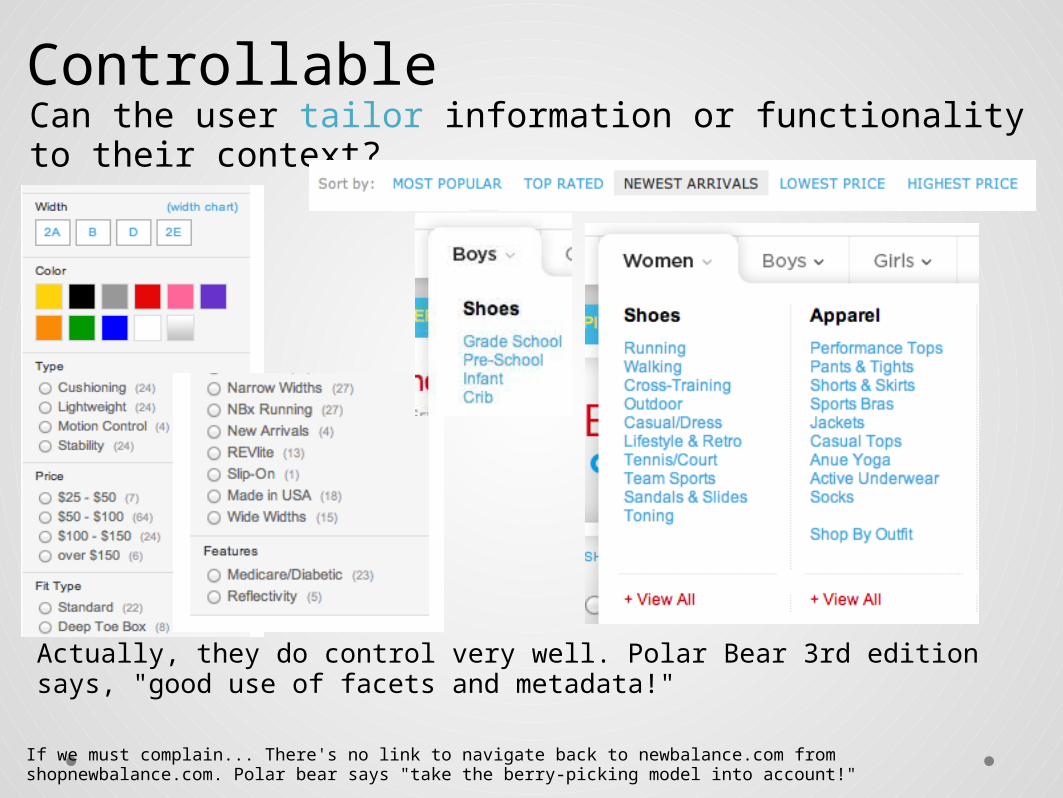
ControllableCan the user tailor information or functionality to their context?
Actually, they do control very well. Polar Bear 3rd edition says, "good use of facets and metadata!"
If we must complain... There's no link to navigate back to newbalance.com from shopnewbalance.com. Polar bear says "take the berry-picking model into account!"

ValuableIs it desirable to the target user?
Does it improve customer satisfaction?

ValuableCan the value it offers be easily described? Does it contribute to the bottom line?
Polar Bear says: It's a labeling/perspective issue. Company may see the value of "lifestyle", but users do not.

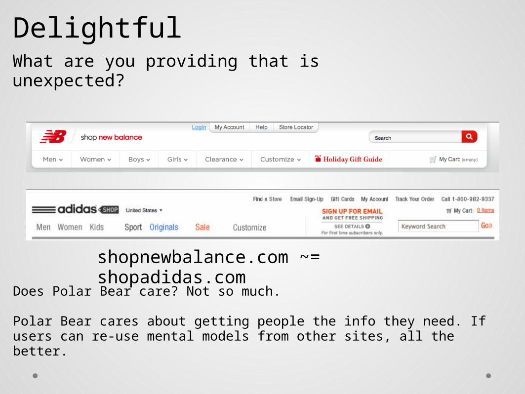
DelightfulWhat are you providing that is unexpected?
What can you take that is ordinary, and make it extraordinary?
DelightfulWhat are you providing that is unexpected?
shopnewbalance.com ~= shopadidas.com
Does Polar Bear care? Not so much.
Polar Bear cares about getting people the info they need. If users can re-use mental models from other sites, all the better.
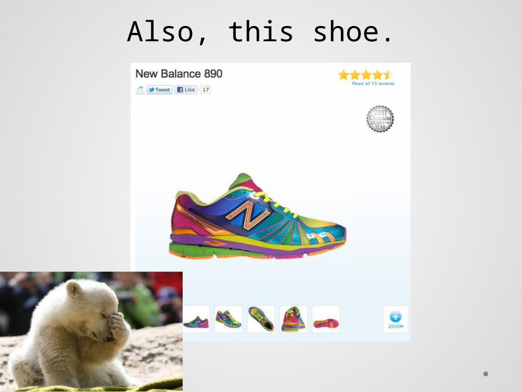
Also, this shoe.
AccessibleCan it be used via all expected channels and devices?
Is it consistent when used via other channels?

AccessiblePeople using text-based browsers cannot use the shopping cart, since the site is not scaleable to users without JavaScript.
Javascript No JavaScript

Accessible
Because of the JavaScript and AJAX, many pages cannot be read by a screen reader. Most visually impaired people use screen readers to navigate.
This is a Polar Bear IA issue because they cannot use the architecture as it was intended, and there is no alternative.

AccessibleThe text looks grainy when magnified for the visually impaired because the font size is set in points (non-scaleable) instead of ems (scaleable).

LearnableIs the task easily duplicated?
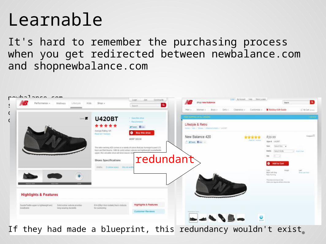
LearnableIt's hard to remember the purchasing process when you get redirected between newbalance.com and shopnewbalance.com
newbalance.com shopnewbalance.comclick "buy this shoe" click "add to cart"
redundant
If they had made a blueprint, this redundancy wouldn't exist

FindableCan the user find what they were looking for
through multiple channels?
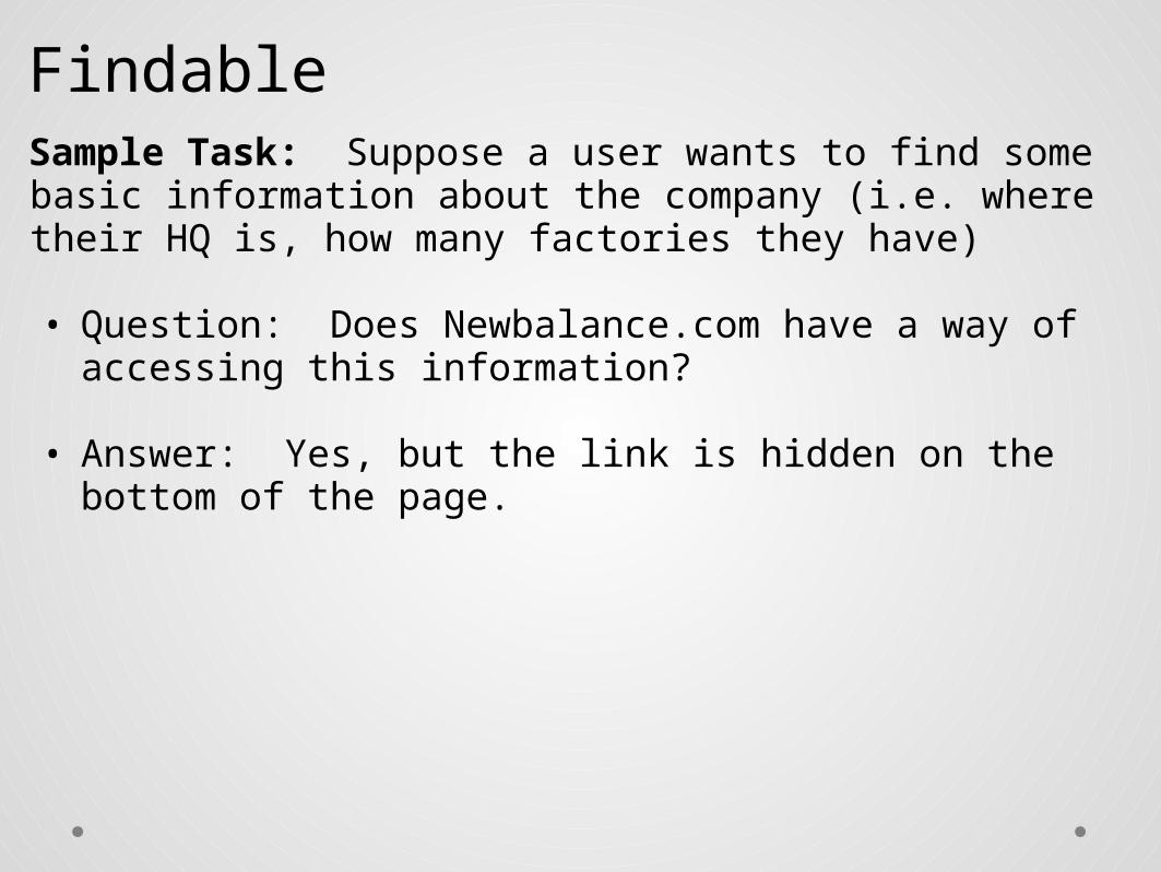
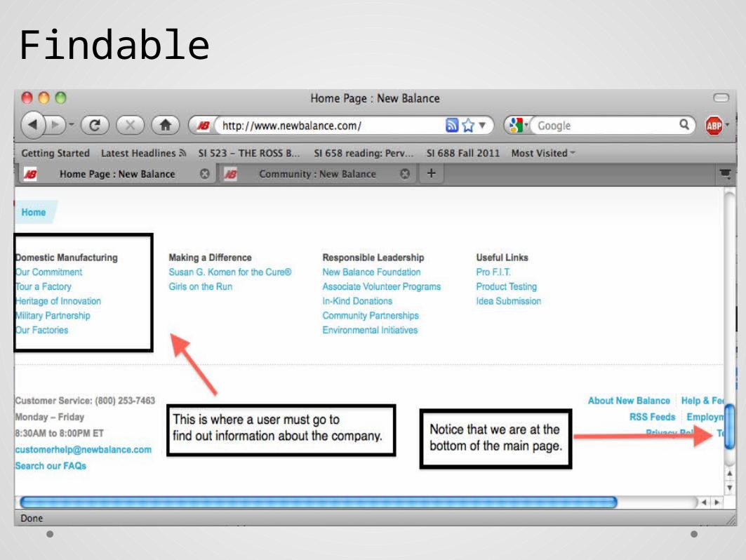
FindableSample Task: Suppose a user wants to find some basic information about the company (i.e. where their HQ is, how many factories they have) • Question: Does Newbalance.com have a way of accessing
this information?
• Answer: Yes, but the link is hidden on the bottom of the page.
Findable
Findable
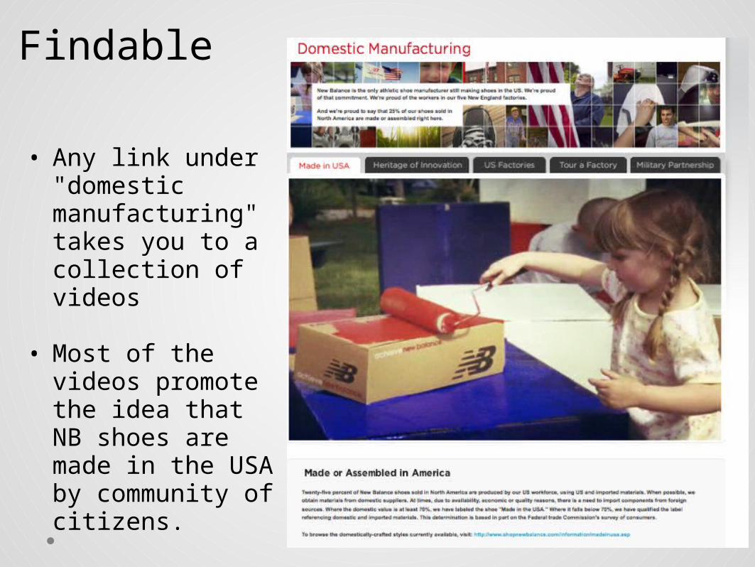
• Any link under "domestic manufacturing" takes you to a collection of videos
• Most of the videos
promote the idea that NB shoes are made in the USA by community of citizens.
Findable
• Searching for info on NB brings up mostly propaganda.o e.g. Girl painting the shoebox. Red, white, and blue in the
background • Is this good? Depends on what information you were trying to
find out about the company.

ClearIs it easy to tell what features on the site do?
Is it easy to tell how one would go about completing a task?
Clear
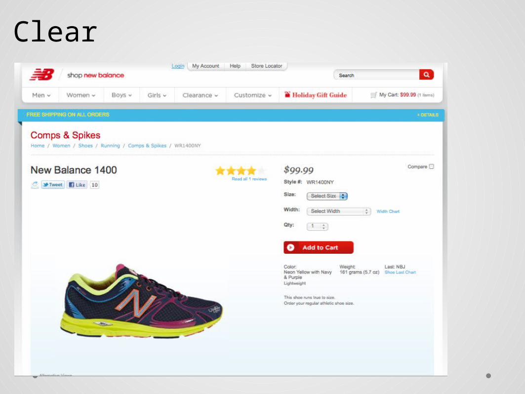
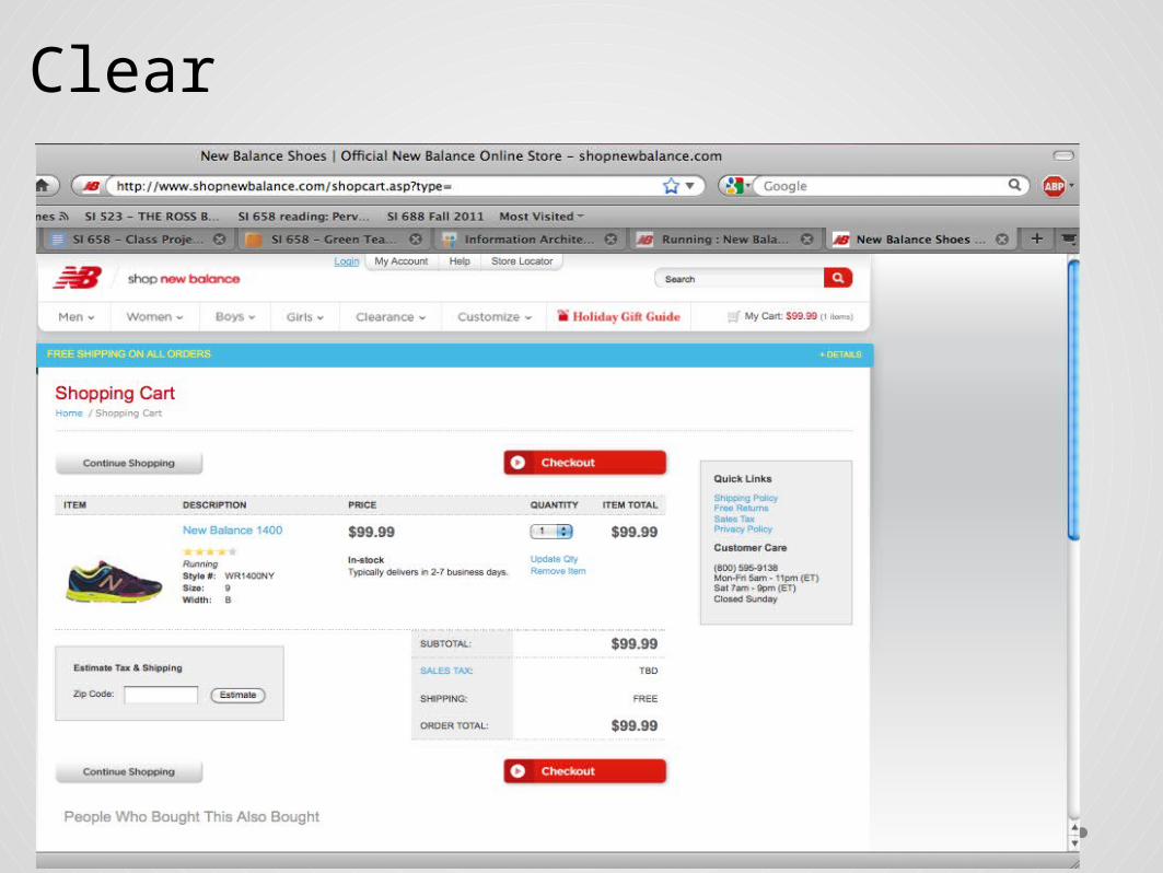
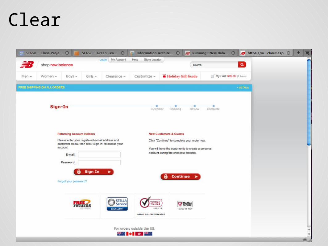
Sample Task: Using NB's online check-out process. • Question: Is the process of buying a shoe clear to a user?
• Answer: Sort of. As you're about to provide billing information out, you unexpectedly hit a page that asks you to sign on.
This requires you to re-calibrate and figure out where you are in the process.
Clear
Clear
Clear
UsefulCan users complete the tasks they originally planned on
completing?
Do the tools and information provided by the site make it easier for the user to complete his task?

Useful
CommunicativeIs the status, location and permissions of the user obvious?
How is messaging used throughout? Is it effective?
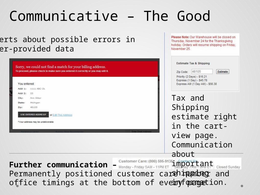
Communicative – The Good
Further communication –Permanently positioned customer care number and office timings at the bottom of every page
Tax and Shipping estimate right in the cart-view page. Communication about important shipping information.
Alerts about possible errors in user-provided data
Communicative – The Bad
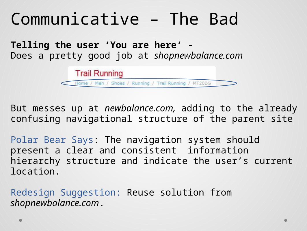
Telling the user ‘You are here’ -Does a pretty good job at shopnewbalance.com
But messes up at newbalance.com, adding to the already confusing navigational structure of the parent site
Polar Bear Says: The navigation system should present a clear and consistent information hierarchy structure and indicate the user’s current location.
Redesign Suggestion: Reuse solution from shopnewbalance.com.
Communicative – The Bad
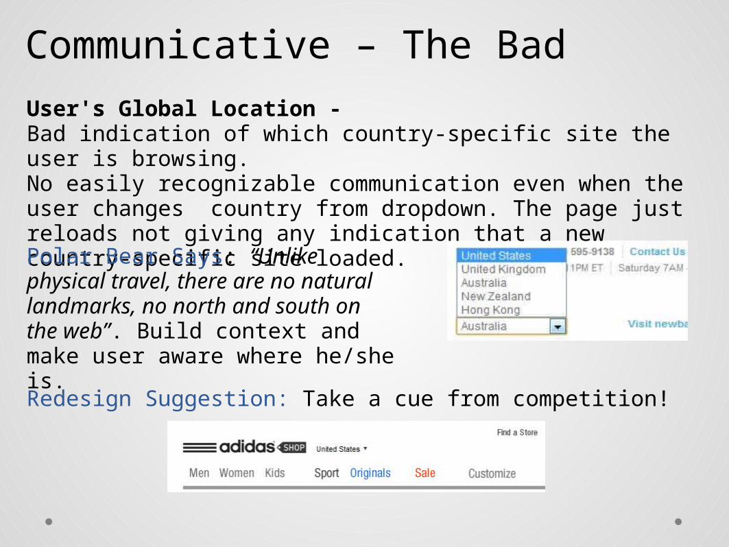
User's Global Location -Bad indication of which country-specific site the user is browsing. No easily recognizable communication even when the user changes country from dropdown. The page just reloads not giving any indication that a new country-specific site loaded.
Polar Bear Says: “Unlike physical travel, there are no natural landmarks, no north and south on the web”. Build context and make user aware where he/she is.
Redesign Suggestion: Take a cue from competition!

CredibleWorthy of confidence? Reliable? Verifiable?
Is the content appropriate, up-to-date, well-explained?Uses restraint with promotional content?
Easy to contact a real person?

Credible – The GoodComprehensive Customer Care section + Contact info on each page = Credibility ('They are genuine‘)
Social Features + Customer Reviews = Confidence

Credible – The Bad
The segregation of 'shopnewbalance' and 'newbalance' plus the lack of clarity on how to switch between one from the other creates confusion and suspicion - 'Is ‘shopnewbalance’ the authorized online retail store, or just a third party store which luckily got an uncannily similar domain name?’
Nitpicking -
... too good to be true?