msau infographic-mobile-sites v1
TRANSCRIPT
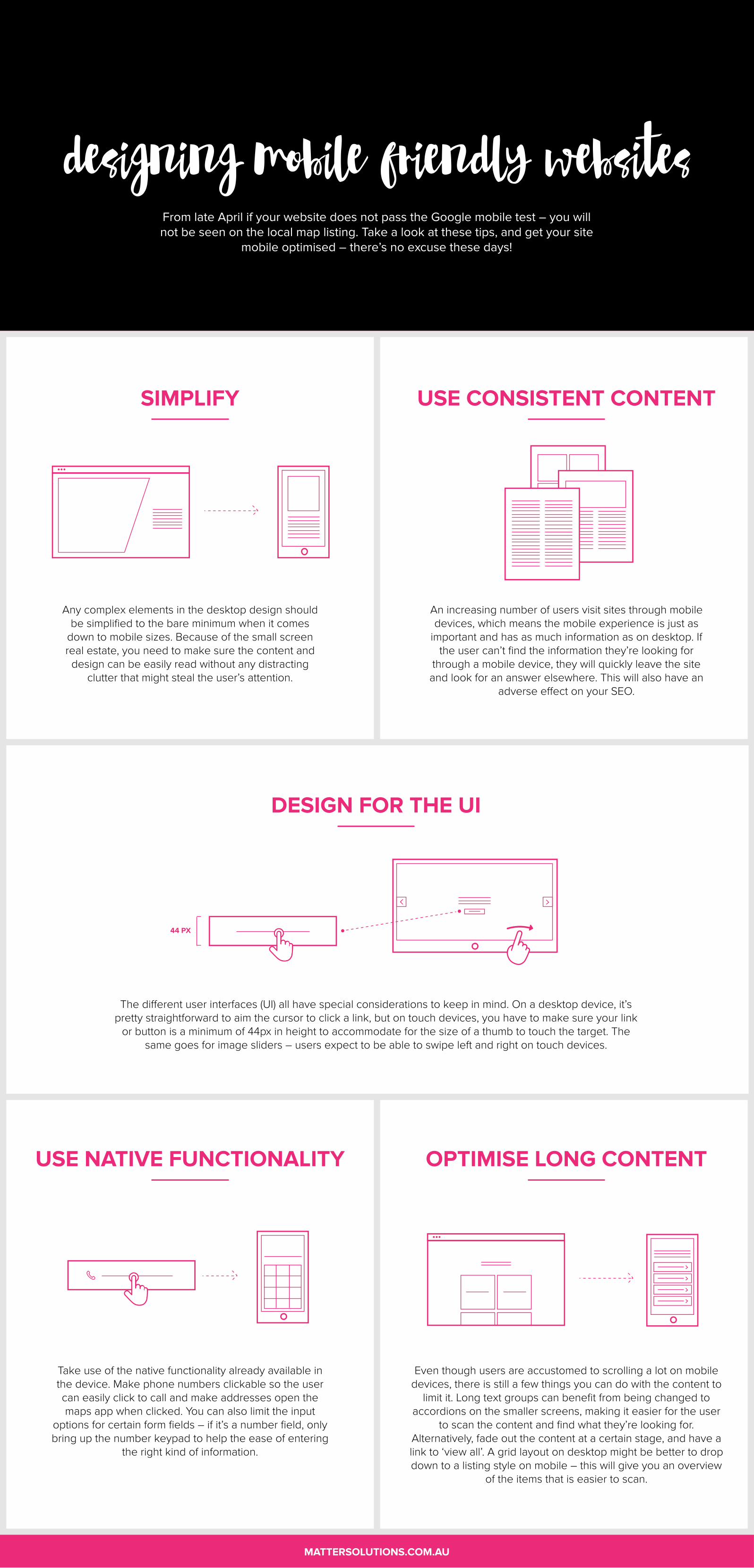
designing mobile friendly website�
SIMPLIFY
Any complex elements in the desktop design should be simplified to the bare minimum when it comes
down to mobile sizes. Because of the small screen real estate, you need to make sure the content and
design can be easily read without any distracting clutter that might steal the user’s attention.
DESIGN FOR THE UI
The di�erent user interfaces (UI) all have special considerations to keep in mind. On a desktop device, it’s pretty straightforward to aim the cursor to click a link, but on touch devices, you have to make sure your link
or button is a minimum of 44px in height to accommodate for the size of a thumb to touch the target. The same goes for image sliders – users expect to be able to swipe left and right on touch devices.
USE CONSISTENT CONTENT
An increasing number of users visit sites through mobile devices, which means the mobile experience is just as
important and has as much information as on desktop. If the user can’t find the information they’re looking for
through a mobile device, they will quickly leave the site and look for an answer elsewhere. This will also have an
adverse e�ect on your SEO.
USE NATIVE FUNCTIONALITY
Take use of the native functionality already available in the device. Make phone numbers clickable so the user can easily click to call and make addresses open the maps app when clicked. You can also limit the input
options for certain form fields – if it’s a number field, only bring up the number keypad to help the ease of entering
the right kind of information.
OPTIMISE LONG CONTENT
Even though users are accustomed to scrolling a lot on mobile devices, there is still a few things you can do with the content to
limit it. Long text groups can benefit from being changed to accordions on the smaller screens, making it easier for the user
to scan the content and find what they’re looking for. Alternatively, fade out the content at a certain stage, and have a link to ‘view all’. A grid layout on desktop might be better to drop down to a listing style on mobile – this will give you an overview
of the items that is easier to scan.
44 PX
MATTERSOLUTIONS.COM.AU
From late April if your website does not pass the Google mobile test – you will not be seen on the local map listing. Take a look at these tips, and get your site
mobile optimised – there’s no excuse these days!