methods of application
TRANSCRIPT

Methods of Application

Drawing over acrylic
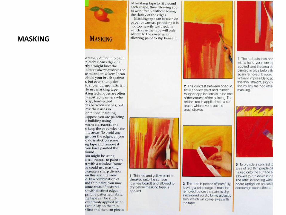
MASKING


Julius Gomez

Alcohol dissolve

Translucent color fields


Plastic wrap


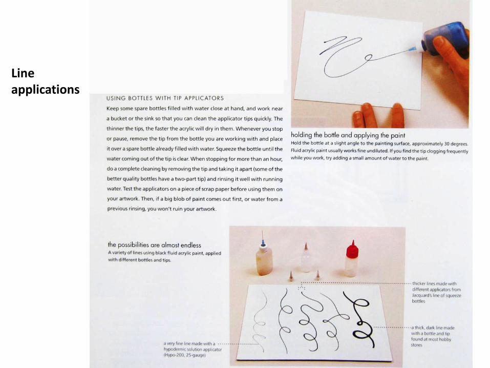
Line applications

Fast drying

Creating a “smooth” surface


Blending to create a gradient


Using retarder

Transparent on absorbent surface

Acrylic wash


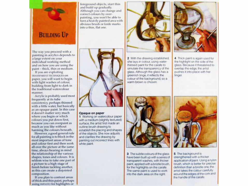


Opaque on canvas


underpainting
• This is the basic sketch for the canvas• When you apply paint as an underpainting,
don't use medium. Thin the pigment with pure distilled Turpentine. As you paint over in subsequent layers, this will lift off a bit and blend seamlessly with the other layers.
• If you have an area that you KNOW will remain exposed, it's best to first do a very light tonal ground to get rid of the stark white canvas. Then apply the under paint with fresh medium and a brush dampened with turpentine. This will bind the pigment adequately.
• If you use a lot of medium in the first layers of a painting; you risk the outer layers cracking and peeling off as it ages. (read about binding in the Scumblingsection).

• Cool transparent purplish- hues are good for warm over-painted layers; Great for
• the shadows in flowers, landscapes, and lonely emotions This color is made from
• Alizarin Crimson and Ultramarine Blue.• A better color is a wine-red purple made
from 1/2 yellow ochre and 1/4 each Alizarin Crimson and Ultramarine Blue. If you add some white to that it makes subtle Mauve and Rose hues that are very different from the Sienna rose tones.
• You will notice from mixing that Cadmium Red really does not make any kind of a good purple. Cerulian Blue also tends to desaturate and grey the color out to a hue that's really flat.
• Blue tonal under paintings look very cold, of course.

• This is straight Yellow Ochre. Yellow as an underpainting makes the climate look
• hot. Ochre is preferable in under layers because it has superior binding properties.
• Yellow under-paintings also look phenomenal for pottery and other still-lifes.
•

• You can create different tonal areas (this is not color blocking; where the color
• matches the local object) Using contrasting colors makes the composition dramatic
• and often edgy. Using analogous colors heightens the presence of objects, but
• appears more stable.

• This is basically a color-blocked underpainting, where the colors match the
• local objects. It's a quick way to rough out the composition and basic color
• scheme; if you find you don't like the hue you can wipe off an offending color with a turpentine rag and replace it.

• This was under-painted with Raw Umber which is one of the best colors for
• foliage backgrounds due to it's subtle green-brown hue.
• Some local color was painted in a second layer on top.


Acrylic glazing
