methods and tools to ensure usability
TRANSCRIPT

IMT Institute for Advanced Studies, Lucca
Lucca, Italy
Methods and tools to ensure Web Usability
PhD Program in
Computer Science and Engineering
XX Cycle
By
Michele Zanda
2008

The dissertation of Michele Zanda is approved.
Program Coordinator:
Prof. Ugo Montanari, Università di Pisa
Supervisors:
Prof. Cosimo Antonio Prete, Prof. Pietro Pietrini, Università di Pisa
Tutor:
Prof. Cosimo Antonio Prete, Università di Pisa
The dissertation of Michele Zanda has been reviewed by:
Prof. Ali Hurson, Missouri University of Science and Technology
Prof. Roberto Giorgi, Università di Siena
Prof. Sandro Bartolini, Università di Siena
ii

To my father and my mother, to my brother and my friends, thank you all for the support and the patience
iii

iv

Table of contents
ACKNOWLEDGMENTS ...................................... VIII
VITA AND PUBLICATIONS ...................................X
ABSTRACT.............................................................. XIII
1. INTRODUCTION ....................................................2
2. INTRODUCING USABILITY................................6
3. WEB DESIGN PATTERNS TO ENSURE USABILITY ..................................................................14
3.1 VISUALIZATION PATTERNS ................................................ 15 3.2 HOMEPAGE PATTERNS........................................................ 21 3.3 NAVIGATION PATTERNS .................................................... 31 3.4 INTERNAL WEB PAGE PATTERNS ....................................... 37 3.5 PATTERNS OF CONTROLS .................................................... 45 3.6 SCANNING PATTERNS ......................................................... 56
4. ADVANCED WEB USABILITY TOPICS ..........60
4.1 FITTS’ LAW ........................................................................... 60 4.2 CARD SORTING ................................................................... 61 4.3 FEEDBACK ............................................................................ 64 4.4 USABLE FORMS .................................................................... 64 4.5 FLASH APPLICATIONS ......................................................... 65 4.6 AUTHENTICATION INTERFACES ......................................... 67 4.7 IMAGES................................................................................. 68 4.8 MOBILE DEVICES AND APPLICATIONS ............................... 69 4.9 COLOURS ............................................................................. 70 4.10 SHAPES ............................................................................... 75 4.11 USAGE FREQUENCY AND TASK COMPLEXITY................... 77
v

5. USER CENTERED DEVELOPMENT PROCESS80
6. MEASURING USABILITY...................................93
6.1 INSPECTIONS BY PROFESSIONALS ...................................... 94 6.2 KEYSTROKE LEVEL MODEL ................................................ 95 6.3 PERFORM AND REPORT USABILITY TESTS .......................... 98 6.4 ANALYZE NUMERICAL RESULTS WITH STATISTICS ......... 102 6.5 HOW MANY USERS TO TEST .............................................. 104
7. INCREASING USERSʹ ATTENTION ON COST, AND ADDING A REPUTATION SYSTEM IN SOFTWARE DOWNLOAD INTERFACES: EFFECTS ON USERSʹ BEHAVIOUR....................108
7.1. INTRODUCTION ................................................................ 108 7.2. EXPERIMENT ..................................................................... 110 7.3. RESULTS ............................................................................ 122 7.4. DISCUSSION AND RESULTS VALIDITY............................ 127 7.5. CONCLUSIONS .................................................................. 128
8. ASSESSING THE IMPACT OF TTS ANIMATED FACES ON THE WEB WITH TRADITIONAL USABILITY METRICS AND GSR SENSOR MEASUREMENTS .......................130
8.1 INTRODUCTION ................................................................. 130 8.2 RESEARCH FRAMEWORK ................................................... 131 8.3. EXPERIMENT DESIGN........................................................ 133 8.4. RESULTS ............................................................................ 143 8.5. DISCUSSION...................................................................... 151 8.6. CONCLUSIONS .................................................................. 154
9. A TOOL TO PROTOTYPE AND DEVELOP WEBSITES ENRICHED WITH TALKING AVATARS..................................................................156
vi

9.1 INTRODUCTION ................................................................. 156 9.2 CURRENT DEVELOPMENT PROCESS .................................. 157 9.3 CLICK‐TO‐SPEECH ............................................................ 158 9.4 CONCLUSIONS ................................................................... 162
10. CONCLUSIONS .................................................163
REFERENCES ............................................................166
vii

Acknowledgments
I would like to thank the people who worked with me or supported my works during my PhD.
I would like to thank Prof. Antonio Prete and Prof. Piero Foglia for their supervision and their thoughtful suggestions, and Prof. Gianluca Dini and Prof. Giovanni Stea for their cooperation in research and teaching activities, respectively.
I would also thank Prof. Pietro Pietrini and Emiliano Ricciardi (M.D.) for their guidance on human perception in the medical field.
I would also appreciate:
The fellows who worked with me through out many years: Fabio Giuntoli (M.Sc.), Rita Sodini (M.Sc.), Marco Solinas (M.Sc.), Alessandro Bardine (M.Sc.), Antonio Raimondo (M.Sc.), Francesco Panicucci (M.Sc.), Federico Galeazzi (M.Sc.), Linda Martorini (M.Sc.), M. Donato (M.Sc.), Caterina Guazzelli (B.Sc.), Antonio Bucchiarone (M.Sc.) and Pietro Carubbi (B.Sc.).
The graduate students: F. Mereu (M.Sc.), A. Marcuccio (M.Sc.), L. Galassi (M.Sc.), A. Oliverio (M.Sc.), G. Molinaro (M.Sc.), A. Carini (B.Sc.), D. Gaias (M.Sc.), P. Paoletti (M.Sc.) and A. Carini.
Silvia Lucchesi, Tania Iannizzi, Caterina Tangheroni, Larissa Zoni for their support at IMT,
viii

and Alessio Botta, Alessandro Erta, Leonardo Badia, Davide Bacciu, Erika Conti, and the other friends at IMT for their support and fun time during coffee breaks and free lunches.
ix

Vita and Publications
VITA April 16, 1980 Born, Lucca, Italy 2002 B.Sc. in Computer Engineering
Final marks: 110/110 cum laude Università di Pisa Pisa, Italy
2002‐2004 M. Sc. in Computer Engineering Final marks: 110/110 cum laude Università di Pisa, Pisa, Italy
2005‐2008 PhD student in Computer Science and Engineering IMT Lucca Institute for Advanced Studies, Lucca, Italy
2005‐2008 Teaching Assistant Web architectures and e‐commerce infrastructures Università di Pisa, Pisa, Italy
PUBLICATIONS P. Foglia, C.A. Prete, M. Zanda (2008). Relating GSR signals to traditional usability metrics: case study with an anthropomorphic Web assistant, IEEE International Instrumentation and Measurement Technology conference (I2MTC), Victoria, Canada.
x

P. Foglia, F. Giuntoli, C.A. Prete, M. Zanda (2007). Assisting E‐Government users with animated talking faces. ACM Interactions, Vol.14(1), pp.:24‐26, ISSN 1072‐5220, ACM Press. P. Foglia, C.A. Prete, M. Zanda (2007). Modelling Public Administration Portals: Requirements, Methodologies and Tools to improve the User Experience. Encyclopaedia of Portal Technology and Applications (ed. Prof. A. Tatnall), Idea Group Inc., PA, USA, 2007. A. Bardine, P. Foglia, A. Prete, M. Zanda (2007). ACA IP SARC project N. 27648. Deliverable D8.2 ‐ Training Activities Evaluation Report and program for the period; Information Societies Technology FP6 Programme – EU; Brussels. G. Dini, P. Foglia, C. A. Prete, M. Zanda (2007). Effects of increasing cost awareness in software download interface on the Internet. IEEE 29th Information Technology Interfaces Conference (ITI2007). Dubrovnik, Croatia. G. Dini, P. Foglia, C. A. Prete, M. Zanda (2006). An Analysis of User Interface Factors influencing the Acceptance of Code Download. IEEE 28th Information Technology Interfaces Conference (ITI2006). Dubrovnik, Croatia. ISSN 1330‐1012. C.A. Prete, P. Foglia, M. Zanda (2005). An Innovative Tool to Easily Get Usable Web Sites, International Conference
xi

on Web Information Systems and Technologies (WEBIST), pp. 20‐24, Miami, USA. C.A. Prete, P. Foglia, M. Zanda (2005). Easily Usable Web Sites, the path to a high conversion rate, Networking and Electronic Commerce Research Conference (NAEC2005), pp. 28‐36, Riva del Garda, Italy.
xii

Abstract
Web usability is a multidisciplinary research area. It bases its foundations on user interface software development, Internet technologies, and cognitive psychology. The purpose of usability is bridging the gap between technology‐oriented developers and actual end users needs.
The usability area is approached in many ways: develop methodologies to ensure usable products, rapid prototyping tools to have user interfaces easy to modify, design of novel interaction paradigms, and measure ease of use with user tests.
This thesis presents many of these approaches applied to the development of Web‐based applications. We introduce both basic and advanced usability principles and theories as well as methods to deliver usable products.
Best practices to develop simple and pleasant Web‐based applications are grouped under ready to use design patterns. The methodology to perform, analyze and report a usability test, with and without end users, is presented in detail. Next, two usability experiments are reported.
The first experiment investigates users’ behaviours while dealing with interfaces for software download. Participants were recruited to analyze the effects of the usual dialog box to download software, and compare it
xiii

with three novel interfaces designed to increase users’ attention level and better communicate trust information to users. Participants’ decisions (download acceptance or refusal) and given motivations are analyzed statistically, and results are discussed.
The second experiment assesses the effects and effectiveness of talking avatars on E‐Government Websites. In the usability experiment the avatar was an animated face. The speech pronounced by the avatar is produced with Text‐To‐Speech (TTS) software. Effects and effectiveness of the face presence are assessed based on traditional usability metrics (completion rate, completion times, error rate, visited pages, questionnaires) as well as physiological analysis techniques (galvanic skin response).
Given that Web applications should be easy to use not only for customers, but also for content administrators, we present a tool (CTS) to prototype Web avatars with no coding. CTS automates many steps of the usual development process, hiding software for both the TTS and the facial morphing.
Finally, conclusions and future works are drawn.
xiv

1

1. Introduction
Usability is becoming more and more a success factor for software applications (Cooper and Reimann, 2003). Usability problems used to be faced with while testing and debugging a software product. Conversely, the user experience should drive the whole software development process, from early stages to late ones. Seminal books on ‘Designing Web Usability’ (Nielsen, 1999) and ‘The Design of Everyday Things’ (Norman, 1990a) highlighted the importance of human factors in technology products. Until recent years, user experience aspects were managed by designers and graphical experts. Now it is broadly accepted that ensuring a high usability is a major non‐functional requirement in every product.
In this thesis we first introduce usability principles (often called heuristics, or guidelines). Effectiveness, efficiency and satisfaction are usual metrics to assess usability, which needs to be evaluated for each single product, within a specified context of use, and users. Usability principles can be contradictory, and often the usability professional finds a trade off between different guidelines. In addition to these principles, the designer
2

exploits performance models such as the Fitts’ law (1954), or investigates directly end users behaviours, following specific methodologies to assess usability: these aspects are treated in Chapters 4 and 6.
The refinement process to have a usable product is iterative (Larman and Basili, 2003), not waterfall‐based. Nonetheless, user interfaces in several application domains have stabilized over the years. As an example, Web user interfaces have become standards de‐facto with common patterns recurring on many Websites (Van Duyne et al., 2002). Web user interfaces ensuring high usability can be classified according to a set of design patterns, which is presented in Chapter 3.
End user behaviours and needs must be assessed for each product and within the context of use. Thus, after having presented methods and techniques to ensure high usability, we report the results of two usability tests to investigate: classical and novel software download interfaces, and effects and effectiveness of Web digital assistants on E‐Government Websites.
Finally, before drawing conclusions, a prototyping tool for Web avatars is presented with the purpose to improve efficiency and ease of use of content management systems coping with avatar‐enriched Websites.
The thesis is structured as follows.
Chapter 2 introduces basic usability concepts, including definitions, design guidelines, and interaction models.
3

Chapter 3 reports a list of Web design patterns, which can be adopted to improve user experience. Web design patterns are a collection of common problems with effective solutions. Similarly to the object‐oriented design patterns, Web design patterns can be exploited by user interface developers.
Chapter 4 reports advanced usability topics, with further patterns, models of interaction, and usability theories.
Chapter 5 presents the usual waterfall software development process, and its refinements to better consider end user needs from the early development phases.
Chapter 6 shows how usability can be quantitatively measured with user tests and statistical analyses.
Chapters 7 and 8 report two usability tests. The former investigates how users behave while dealing with user interfaces for software download on the Internet. The latter investigates the effects of adding a digital assistant on a Public Administration Website with traditional usability metrics and Galvanic Skin Response analysis (a physiological measure).
Chapter 9 presents a prototyping tool for web assistants that speeds up and eases the development process of avatar‐enriched Websites.
Chapter 10 concludes the work, summing up results, and describing future works.
Chapter 2, 3 can be considered a background analysis. Chapters 7, 8 and 9 are original studies.
4

While chapters 4, 5 and 6, contain both related works and original contributions.
5

2. Introducing usability
Usability has been defined in the literature many times by Human‐Computer Interaction researchers and professionals. In this section we present sentences and definitions which we consider most valuable.
ISO 9241‐11 (1998) defines usability as
the extent to which a product can be used by
specified users, to achieve
specified goals, with
effectiveness,
efficiency and
satisfaction, in a
specified context of use.
The ISO definition emphasizes that to assess the usability of a product: the end users, their goals, and the
6

usage context must be specified. Afterwards, effectiveness, efficiency and satisfaction can be measured.
According to Jakob Nielsen (2003), usability is a quality attribute, that assesses how easy user interfaces are to use. The word usability also refers to methods for improving ease of use during the design process. Nielsen affirms that usability can be defined by five quality components:
1. Learnability
How easy is it for users to accomplish basic tasks the first time they encounter the design?
2. Efficiency
Once users have learned the design, how quickly can they perform tasks?
3. Memorability
When users return to the design after a period of not using it, how easily can they reestablish proficiency?
4. Errors
How many errors do users make, how severe are these errors, and how easily can they recover from the errors?
5. Satisfaction
How pleasant is it to use the design?
7

In addition, J. Nielsen (1990; 1994a; 1994b) provides a list of usability heuristics, which should be considered while designing technological products as well as Websites:
• Visibility of system status.
The system should always keep users informed about what is going on, through appropriate feedback within reasonable time.
• Match between system and real world.
The system should speak the users’ language, with words, phrases and concepts familiar to the user, rather than system oriented terms. Follow real world conventions, making information appear in a natural and logical order.
• User control and freedom.
If users chose a system function by accident, they will need a clearly marked “emergency exit” to leave the unwanted state. Support undo and redo.
• Consistency and standards.
Users should not have to wonder whether different words, situations or actions mean the same thing. Follow platform conventions.
• Error prevention.
Even better than good error messages is a careful design which prevents a problem from occurring in the first place. Either eliminate error‐prone conditions or check for them and present users with a confirmation option before they commit to the action.
• Recognition rather than recall.
8

Minimize the users’ memory load by making objects, actions and options visible. The user should not have to remember information from one part of the dialogue to another. Instructions for use of the systems should be visible or easily retrievable whenever appropriate.
• Flexibility and efficiency of use.
Accelerators may often speed up the interaction for the expert user such that the system can cater to both inexperienced and experienced users. Allow users to tailor frequent actions.
• Aesthetic and minimalist design.
Dialogues should not contain information which is irrelevant or rarely needed. Every extra unit of information in a dialogue competes with the relevant units of information and diminishes their relative visibility.
• Help user recognize, diagnose and recover from errors.
Error messages should be expressed in plain language (no codes), precisely indicate the problem, and constructively suggest a solution.
• Help and documentation.
Even though it is better if the system can be used without documentation, it may be necessary to provide help and documentation. Any such information should be easy to search, focused on the user’s task, list concrete steps to be carried out, and not be too large.
9

The above heuristics are useful to assess products usability and should be kept in mind while designing new products. Even though these heuristics are rather intuitive, following all these guidelines can be difficult, and at times tradeoffs have to be made. For instance, “matching between system and real world” can not support “efficiency of use”: a task could be performed with a novel user interface faster than with a user interface that matches perfectly with the real world.
Finally, we conclude this introductory section on usability theories citing the Execution‐Evaluation framework by Don Norman (1990a; 1990b; 2008). Norman identified two gulfs in the man‐machine interaction: the gulf of execution and the gulf of evaluation. An interaction can be divided in two phases: the execution phase in which a user performs actions on the world and the evaluation phase in which the user assesses the state of the world, to evaluate the results of his/her actions. Each gulf can be subdivided in the subactions depicted in the figure 2.1 (Merchant, 1997).
10

Figure 2.1. The gulf of execution and the gulf of evaluation
(Norman, 1990).
The two gulfs must be bridged safely. The first gulf, the gulf of execution, is the difference between the actions that a user intends to take and the actual actions that the system allows the user to perform. The second gulf, the gulf of evaluation, reflects the amount of effort that the person must exert to interpret the physical state of the system and how well the expectations and intentions have been met.
In order to cross safely and comfortably between the two gulfs, the user decides on the basis of his/her previous knowledge, to reduce the required mental load. The user expects to find his mental model in the activity that he/she is going to perform. Though, the user’s mental
11

model cannot be the one of the designer. The larger the difference between the two models, the larger the mental load for the end user who has to understand how the product actually works (Fig. 2.2).
Figure 2.2. The gap between the designer’s conceptual model
of a product and the user’s mental model.
The importance and relevance of usability aspects on the Web are well depicted by Chaparro (2002). 60‐75% of shopping carts are abandoned in e‐commerce sites due to the following reasons:
High shipping prices (72%),
Other cheaper sites (61%),
Mind changed (56%),
Deferred purchase (51%),
Total cost of the cart out of budget (43%).
The above problems cannot be solved by human factors professionals.
Checkout process too long (41%),
12

Checkout process needs too units of information
(35%),
Registration required to pay (34%),
Website unstable or unreliable (31%),
Messy checkout (27%).
These latter reasons are due to usability problems and could be solved with a proper user interface design.
13

3. WEB DESIGN PATTERNS TO ENSURE USABILITY
Design patterns were originally developed by C. Alexander (1977) who inferred them in the architecture field.
Afterwards, design patterns proved effective in identifying common solutions of recurrent problems. Gamma et al. (1994) applied with success the same approach to the software engineering field, describing software design patterns as “descriptions of communicating objects and classes that are customized to solve design problems within a particular context.” Gamma’s patterns consist of object‐oriented design solutions that do not depend on the actual programming language. Each pattern is uniquely identified, and is typically built up of a name, the problem addressed, one or more examples of the solution, usage examples and references to other interacting patterns.
14

This chapter presents major design patterns which have been adopted to solve visualization and presentation problems on Web‐based applications, as well as in desktop‐based ones. The following patterns have been elaborated starting from previous collections by Van Duyne, Landay and Hong (2002), Nielsen and Tahir (2001), Van Welie (2007) and Yahoo! (2008). As a mater of fact, the Web is always evolving, and same holds for Web design patterns (Ivory and Megraw, 2005). In the following sections we are reporting major design patterns for Web interfaces.
3.1 Visualization Patterns
A1 ‐ Page layouts
Problem: the developer must present different sections and different functions on a screen.
Solution: arrange the page scheme in order to have distinct areas.
15

Figure 3.1. Usual page layouts on the Web.
16

Recommendations: in most of the cases, the page layout is a single column, a two‐column or a three column layout, plus a header and a footer area. Page layout is usually enriched with navigation patterns: C1 ‐ tabbed menu, C2 ‐ flyout menu, C3 ‐ internal location, C5 ‐ search.
A2 ‐ Preview strategy
Problem: the user needs to visualize a structure, together with a high level view of current location in the whole structure.
Solution: the application window is enriched with a small high‐level visualization of the structure: a text document, a map ... Common applications that offer previews are Acrobat Reader or Google Maps, as shown in figure 3.2.
17

Figure 3.2. Preview interfaces, shots taken from Adobe Acrobat Reader and Google Maps (maps.google.com).
18

Recommendations: the preview area must be active/clickable. It should be placed at the margin of the working window. The Preview pattern is little used on Web pages: it can be used extensively to notify the user that a page spans vertically and must be scrolled down.
Consider the possibility of using informative controls (pattern E4 ‐ progress bar) with preview purposes.
A3 ‐ Fish‐eye Strategy
Problem: visualize a structure at different degree of detail, depending on a common metric.
Solution: the fisheye strategy is a visualization technique that simulates a zoom lens. Fisheyes are an evolution of file readers with preview. With this strategy, the interaction with the structure is supposed to focus on a single point. The basic assumption is that the most important area is the one closer to the focus, and that area must be zoomed‐in.
19

Figure 3.3. Fisheye visualization for a calendar application. Screenshot taken from the Datelens application (Bederson et
al., 2004).
Discussion: the fisheye strategy is implemented through three properties: the focal point, the distance from the focus, the level of resolution/detail/interest. Briefly, the level of resolution of each point of the structure decreases with distance. By doing that, the area close to the focal point results is maximized relative to the areas further away.
20

3.2 Homepage Patterns
B1 ‐ Corporate site
Problem: a company needs to communicate to both stakeholders and customers.
Solution :a corporate Website must include units of information for the shareholders (if any), for customers, and for business partners. The page layout must be clean and sober, with the same colours of the corporate logo/palette. The message to be communicated is trust.
Figure 3.4. McDonald’s corporate site (www.mcdonalds.com/corp.html).
21

Recommendations: the corporate Website must be live and frequently updated, as it is supposed to present an up and working company.
The following sections are strongly recommended: about us, investors, news, careers, and sections specific for business partners. A news section rarely updated is counterproductive, as well as a careers section with no job vacancies.
B2 ‐ E‐Commerce Website
Problem: a company offers an on‐line shop for retail customers.
Solution: a Website that presents products and allows users to order and purchase them.
Figure 3.5. Apple retail store (store.apple.com).
Recommendations: the Website must show clearly that users can buy items. Nowadays, the shopping cart
22

(pattern D5 – Shopping cart) metaphor is fully understood by users, who understand that they can order products. A B2C (business to consumer) homepage is the window of a shop, therefore all product categories must be presented, together with special offers or brand new items.
Buying products on the Web is not easier than doing it the old way. On the Web, users cannot touch and feel the products offered by an online merchant. However, it is true that you can do it from home or at the office, saving commuting times. Since users cannot touch the online products, the merchant must reduce this drawback by providing previews for the offered products (book excerpts if the merchant is an online book seller), as well as animations and 3D navigations for other product categories (pattern D3 ‐ Product page).
B3 ‐ Community Website
Problem: letting users ask questions and provide answers with little supervision.
Solution: deploy a community website, such as a forum.
23

Figure 3.6. PHP bulletin board.
Recommendations: a community Website can be run with very little supervision. Access can be restricted to registered users. Discussion groups must be grouped significantly. Community Websites are highly dynamic and users are interested in the latest content. Each message must include the author name, submission date, and the discussion it belongs to. In case the message is a reply, show clearly the previous message.
Following the vertical (F1) and the Western (F2) reading pattern, most recent discussions and comments must be placed at the top of the list. A search box (pattern C5) must be provided to let users search among all messages. Consider the inclusion of a reputation system (pattern D4) on a community forum.
24

B4 ‐ Backend Website
Problem: a Website content administrator should manage a Website without programming, using a simple Web interface.
Solution: provide a backend Website to manage all actions such as opening/closing an online shop, tracking user activities, warehouse status, payments, and all related information.
25

Figure 3.7. Screenshots from Microsoft Commerce Server.
Recommendations: the backend Website should hide all coding issues to Website administrators, including issues related to the database and the user interface. The backend Website must have a non‐technical language: it must be designed for novice/intermediate users.
26

B5 ‐ News Website
Problem: users want to read the latest piece of information.
Solution: design a Website to present the latest news.
Figure 3.8. The news box by CBS (www.cbsnews.com). It includes a search facility, latest and most viewed news, and
an RSS feed.
Recommendations: news headlines must be clickable, leading to the full article. Each article can have a community feature, letting users comment the fact. Latest items, as well as the most used ones, must be emphasized. News items must be arranged in a FIFO (first in, first out) ordering stack, also exploiting order reading patterns (F1 and F2).
27

B6 ‐ E‐Government
Problem: a Public Administration office wants to offer its services on the Web.
Solution: a fully accessible E‐Government Website devoted to citizens’ needs.
Figure 3.9. The Finance Department Website of the Italian
Government.
Recommendations: the Website must respect national and international accessibility requirements (Section 508,
28

W3C WCAG2.0). The Italian requirements are grouped on http://www.pubbliaccesso.gov.it/normative/index.htm.
If close deadlines to upload documents are present, they should be emphasized on the Website. Usually, users enter an E‐Government Website because they have to perform a task, such as paying a parking fine. Therefore the Website must not motivate them, they already are. Furthermore, the major driving factor of e‐government Websites is not the market, because a Public Administration has no competitors. What drives the improvement of an e‐government Website are accessibility regulations, and protocols for inter‐office communication and data synchronization.
B7 ‐ E‐Learning Website
Problem: offer learning materials and exams on the Web, possibly with student tracking functions.
Solution: a Website devoted to education, which includes user access control, online questionnaires, as well as community areas to spread knowledge among students.
29

Figure 3.10. A screenshot from WebCT Blackboard.
Recommendations: e‐learning Websites are not a substitute of a traditional classroom setting. They are not supposed to be as much effective as real teachers. E‐learning Websites must provide all features that can motivate users: communities (pattern B3) are fundamental.
The e‐learning Website must support many file formats: textual documents, slides, audios, as well as videos. Bandwidth requirements are not as important as in other Websites: online courses can be complex to render online.
30

3.3 Navigation Patterns
C1 ‐ Tabbed menu
Problem: presenting sections of a Website, and current location at the same time.
Solution: tabbed menus.
Figure 3.11. A tabbed navigation menu (www.news.com).
Recommendations: tabbed menu remind the users of the old directories. The background colour of the active tab must be identical to the background colour of the frame of the current page otherwise the user can hardly infer the active tab.
Other solutions to identify the active tab are the use of borders, or a different colour for the active tab (Figure 3.12).
31

Figure 3.12. A tabbed navigation menu
(www.apple.com/mac).
C2 ‐ Flyout Menu
Problem: users need to navigate directly into subsections, and the space available is limited.
Solution: dropdown menu, either vertical or horizontal.
32

Figure 3.13. Single‐level flyout menus (www.amazon.com,
online.wsj.com)
Recommendations: the use of flyout menus must be wise. Flyout menus with many levels are hard to manage for the user, who has to move carefully the mouse pointer. Furthermore, the structure of a flyout menu is not visible until the user unfolds it, therefore the user cannot see at a glance where the needed link is. In recent years, single‐
33

level flyout menus are well accepted, while multi‐level flyout menu are rather deprecated because usually require high mouse pointer skills that some users might not have.
C3 ‐ Internal location
Problem: provide feedback on current location on a Website.
Solution: the user is shown his/her current Website location with breadcrumbs (a formatted string).
Figure 3.14. Clickable breadcrumbs (www.useit.com).
Recommendations: breadcrumbs should be placed close to the working area of the user, not at the top or bottom of the screen. Every item in the breadcrumb must be clickable, so that the user can navigate backward.
C4 ‐ Sitemap
Problem: the user needs to visualize the tree‐structure of a Website at a glance.
Solution: devote a specific page to present all Website sections and related pages.
34

Figure 3.15. Apple sitemap (a portion) (www.apple.com).
Recommendations: different sections can be grouped with different colours. A sitemap usually does not cover all Web pages, only second order links from the homepage. By doing this, the sitemap page is not overloaded by links, and can be rapidly scanned.
Each item on the sitemap page must be active/clickable.
35

C5 ‐ Search
Problem: the user needs to find an item or specific information
Solution: offer a search facility, usually presented in two ways:
I. Search [text_area] for/in [filter] Go_button
Figure 3.16. Search facility by Apple and Amazon. Amazon also provides the “advanced search” (www.apple.com,
www.amazon.com).
II. [text_area] Go_button
Figure 3.17. Search facility by Google, which also provides
the “advanced search” (www.google.com).
Recommendations: a Website should always include a search facility: users are accustomed to it and use it frequently while navigating.
First of all, Web developers should provide an effective “basic search” with significant results presented in the
36

first or in the second page of the results, or the user will perform another search. If the user does not find what he/she is looking for in the “basic search”, he/she usually believes that what was sought is absent.
The “advanced search” is used only by expert users, it is not used by every day users if they do not find what they want.
The search box can provide search tips to teach users how to perform effective searches.
Concerning the placement of the search box, according to Nielsen & Tahir (2001), it is usually placed at the top right corner of a Web page.
3.4 Internal Web Page Patterns
D1 ‐ Login
Problem: the Website must authenticate users.
Solution: users enter their account and a shared secret. Only when needed, lets users insert the data, usually an email address and a password.
37

Figure 3.18. The registration page by E‐Bay (www.ebay.com).
38

Recommendations: the e‐mail address can be used effectively as login/account. It saves the user from recalling another login.
In a registration form, all optional fields must be clearly tagged. E‐mail confirmations are highly recommended.
The password must be asked twice, to avoid typing errors. It is common practice to ask a secret question and a secret answer to the user, whether the password is forgotten. Even though this solution is familiar to end users, it is rarely used, like the ‘advanced search’.
Finally, user registration must be imposed as little as possible: users do not have to be forced in registering onto a Website to add an item to a shopping cart or buy an article.
D2 ‐ Presenting results
Problem: presenting a list of search results.
Solution: list results according to an effective ranking scheme.
39

Figure 3.19. A results page, with the button to navigate
forward (www.google.com).
Recommendations: list a limited number of results on a single page, letting users navigate back and forward.
Each item must be presented with a title and a short description of about three rows. Include how many hits were found by the current search.
40

D3 ‐ Product page
Problem: users need units of information on a product.
Solution: provide a specific page that gives access to all details.
Figure 3.20. A book product page by Amazon
(www.amazon.com).
Recommendations: the product page must cope with the fact that an online user cannot touch the product. For this reason, rich interactions should be offered, such as previews and 3D visualizations. Product availability must be shown, as well as the possibility of reserving a product not in stock.
Do not show a button labelled “buy” to proceed with the check out, but one labelled “add to cart”. Users at this step only want to collect a product, and maybe buy it afterwards. Consider the inclusion of a reputation system (pattern D4).
41

D4 ‐ Reputation system
Problem: provide feedback to the customers, in order to better manage trust problems on the Web.
Solution: provide a specific forum, in which previous customers express votes and opinions on sellers or products.
Figure 3.21. Feedback Forum: reputation system by E‐Bay
(www.ebay.com).
Recommendations: a reputation system should present, at least, a percentage summary (positive, neutral, negative)
42

of previous votes, together with the total number of voters.
Even though reputation systems should not be very effective theoretically, they proved to work rather well (Resnick et al., 2000).
D5 ‐ Shopping‐cart
Problem: provide a persistent memory across pages to store items to be bought afterwards.
Solution: support persistence with the graphical metaphor of the shopping cart.
Figure 3.22. The shopping cart visualization, with subtotal amount, discounts and delivery options (www.amazon.com).
Recommendations: call the shopping cart a “shopping cart”, avoid other names such as “basket”, “order”, “bag”. Give visual feedback every time an item is added to the cart. Let users personalize their products, if a product is not currently available, allow future reservations.
43

D6 ‐ Check‐out
Problem: users need to insert payment and shipment details.
Solution: in order to make the process as simple as possible, the checkout process is divided into a sequence of pages (wizard).
Figure 3.23. The first step of a check‐out wizard
(www.apple.com).
Recommendations: the wizard must show the current location: what the user has done, what he/she is doing, and what remains to be done. The Wizard offers different pages for the shipping, the billing, and a confirmation of the transaction. E‐mail confirmations are highly recommended.
44

3.5 Patterns of controls Controls are the “active” part in the interface, and provide the basic means of interaction. They can be classified under four groups: imperative, input oriented, selection oriented or informative (Cooper and Reimann, 2003).
E1 ‐ Imperative controls
Problem: provide basic controls for users to submit commands.
Solutions: two major examples are the PushButton and the PushButCon.
Solution 1 (pattern E1.I): the PushButton is a button with no icons.
Solution 2 (pattern E1.II): the PushButCon is a button with an icon that clarifies the button function.
Figure 3.24. A PushButton (on the left) and a PushButCon
(on the right) (www.amazon.com).
Recommendations: the PushButCon, if the icon or image is properly chosen, can be more intuitive. But it can be hard for the developer to iconize the action associated to a PushButton; in addition, space can be limited or
45

bandwidth must be minimized, therefore a PushButCon could not be the better solution.
If a simple PushButton is chosen, its label must be meaningful. Labels “Yes” or “No”, “Ok”, “Cancel” are generally deprecated, as they do not have full meaning on their own. “Yes” and “No” are answers to a previous question, which force the user to read the above text to decide the appropriate answer. Improved labels are those with a clear meaning: “Buy”, “Discard”, “Add”, “Remove”, “Install”. These labels are significant, and do not force the user to read previous text to decide how to behave.
E2 ‐ Input controls
Problem: users need to insert text.
Solutions: textbox, spinner, slider.
Input controls can be either bounded or unbounded. A bounded input control implies that the information asked to the user can be chosen among a finite range interval, or must be provided with a specific format. Conversely, if the input control is unbounded, no assumptions are made on the required information.
Solution 1 (pattern E2.I): a text‐entry field is an unbounded input control.
46

Figure 3.25. A text‐entry field.
A text‐entry field can also be adopted to require a field date insertion. Given that dates can have several formats, the proper format should be suggested close to entry field, like a use invitation, or hint:
Figure 3.26. A date‐entry field with suggestion.
In this case, the text‐entry field can be classified as a bounded input control.
Solution 2 (pattern E2.II): the spinner is an input control that can be used both in a bounded or unbounded way. It allows direct manipulation or through buttons:
47

Figure 3.27. Spinners as input controls.
The spinbox is a bounded input control, which is effective to insert numerical information from a limited interval:
Figure 3.28. Spinbox: constrained input control.
Solution 3 (pattern E2.III): the slider is another bounded input control.
Figure 3.29. Sliders: constrained input controls.
Recommendations 3: it should be implemented in order to provide immediate feedback to the user concerning the chosen values, and the exact numerical values must be shown close to the slider.
48

E3 ‐ Selection controls
Problem: user needs to select among a set of possible choices.
Solution(s): checkboxes for multiple selections, radio buttons for single choices.
Solution 1 (pattern E3.I): a checkbox allows multiple selections.
Figure 3.30. Checkboxes for multiple selections.
Recommendations 1: given that a checkbox can be ticked or blank, the label associated to the checkbox must specify clearly what putting a tick means.
Solution 2 (pattern E3.II): a radio button allows the selection of a single option, mutually excluding the other ones.
49

Figure 3.31. Radio buttons for unique choices.
be visually clustered
Both checkboxes and radio buttons should possibly be aligned vertically. If aligned horizontally, the developer mu ol with the proper label. The following radio buttons are adly designed, as the user does not understand
Recommendations 2: if several radio button groups are present, the various groups mustclearly to identify the mutual exclusions.
Checkboxes and radio buttons are space consuming. In case space is limited, or some options can be partially hidden, other controls should be adopted.
st design them carefully, linking clearly each contr
bimmediately what option is selecting.
Figure 3.32. Radio buttons badly aligned horizontally.
Solution 3 (pattern E3.III): a flip‐flop button simulates a button that can be clicked or released.
50

Figure 3.33. A flip‐flop.
ecommendations 3: given that they are often presented ith no labels nor tooltips, their adoption must be
careful. If possible, immediate feedback must be given to
Rw
the user. Their use in graphical interfaces is generally deprecated.
Solution 4 (pattern E3.IV): the ComboBox is a constrainedselection control.
51
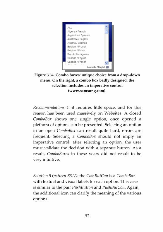
Figure 3.34. Combo boxes: unique choice from a drop‐down menu. On the right, a combo box badly designed: the
selection includes an imperative control (www.samsung.com).
Recommendations 4: it requires little space, and for this d
Selecting a ComboBox should not imply an control: after selecting an option, the user
must validate the decision with a separate button. As a result, ComboBoxes in these years did not result to be very intuitive.
Solution 5 (pattern E3.V): the ComButCon is a ComboBox with textual and visual labels for each option. case
e additional icon can clarify the meaning of the various options.
reason has been used massively on Websites. A closeComboBox shows one single option, once opened aplethora of options can be presented. Selecting an option in an open ComboBox can result quite hard, errors are frequent.imperative
Thisis similar to the pair PushButton and PushButCon. Again, th
52

Figure 3.35. A ComButCon: a ComboBox with visual labels.
Solution 6 (pattern books are used to among the sections of a product. It recalls
isually the tabs in a library.
Recommendations 6: while implementing this control, it is important that the background of the active tab is the one of the active window, otherwise the user has no visual feedback about the active tab.
Other pattern: a safer choice is adopting sliding windows with checkboxes or radio buttons if many options must be presented.
E3.VI): Tabbed Notenavigatev
Figure 3.36. Tabbed menus to arrange Website sections (www.amazon.com).
53

Figure 3.37. Check boxes arranged in a sliding window.
E4 ‐ Informative controls
Problem: system communicates with the user, with little mental effort, and minimizing interruptions.
Solutions: informative controls can be used to provide information about ongoing operations, about system status or about errors made.
Solution 1 (pattern E4.I): a progress bar gives visual feedback on the state of a operation.
54

Figure 3.38. A progress bar to reduce perceived times (on the left), and a Checklist Progress bar with further details (on
the right).
Recommendations 1: Progress bars can also be used to shorten perceived time intervals: users look at the increasing bar and perceive that something is going on. If the user has to complete several steps, then a Checklist Progress bar can be adopted effectively. They can be used with the preview pattern (A2): a percentage bar notifies the user how far is the end of the page.
Solution 2 (pattern E4.II): the status bar is an informative control usually placed horizontally at the bottom of a
55

window, used to provide little units of information on the status of the application.
Figure 3.39. A status bar to provide extra units of
information.
Recommendations 2: in web browsers it is usually used to show the URL of a selected link or debug information on the Javascript code in the web page. Given that the status bar in a browser can be hidden, it must show non‐critical information.
Solution 3 (pattern E4.III): all types of feedback are informative controls too. Feedback in software applications must be clear, immediate and significant. Proper feedback should notify the user when the system is busy, and how long will it be so.
3.6 Scanning patterns Problem: if a common cultural background is inferred in the end users of a software application, it must be exploited to minimize the mental workload.
56

Solutions: vertical and horizontal reading patterns are culture dependant.
Solution 1 (pattern F1): the vertical pattern is common to all cultures: reading scheme is always from top to bottom (Figure 3.40).
Figure 3.40. Pattern F1 ‐ Vertical reading pattern: from top to
bottom.
Solution 2 (pattern F2): conversely, the horizontal pattern is culture‐dependent. For instance, in Western cultures, users scan a textual area from top to bottom, scanning each row from left to right.
57

Figure 3.41. Pattern F2 – Western reading pattern, which
adds horizontal ordering from left to right.
Recommendations: whenever possible, it is convenient to adopt a vertical reading pattern, given that it is adopted in all cultures. The Western reading pattern can be exploited by user interface designers. For instance, in a novel Web page, usual menus and units of information can be placed at the top, while at the bottom of the page the user finds objects to go on with the interaction: forward and backward links, buttons. Given that the gaze scans from the top left corner to the bottom right, the button that the designer would like to privilege should be placed rightward.
58

Figure 4.3. Applying reading patterns in designing user interfaces: the ‘Next’ labelled button indicates rightward
(the opposite for the ‘Back’ button).
The Western reading pattern also suggests a temporal order in a set of items: more recent items are those at the top left corner, while farther ones are those at the bottom right corner. Time intervals are supposed to be growing vertically (from top to bottom), and horizontally (from left to right).
The user thinks that the direction to go forward is from left to right, and to backward from right to left. Thus, a ‘back’ button can have an arrow pointing to the left, while a ‘next’ button can have an arrow pointing to the right.
59

4. Advanced Web Usability topics
4.1 Fitts’ law The Fitts’ law is a model of human psychomotor behaviour developed in 1954 (Fitts, 1954; MacKenzie and Buxton, 1992). According to the Fitts’ law, the time (MT) required to move to and select a target of width W which lies at distance A is:
22log AMT a bW
⎛ ⎞= + ⎜ ⎟⎝ ⎠
Where a and b are coefficients determined through linear regression. W corresponds to accuracy, the required region where an action terminates. The log term is the index of difficulty (ID). Briefly, the Fitts’ law states that the time to acquire a target is a function of the distance to and size of the target. This law should be used widely while designing user interfaces. Although rather trivial, it is powerful, and can show why some designs are better than others.
60

From this law, a set of principles can immediately be derived:
• Objects clicked more often should have a wider area. However, the designer should not harm the consistency of the interface.
• Objects clicked in sequence should be placed close to each other. However, the designer should also consider that users benefit from logical arrangements of objects.
• The screen borders, and in particular screen corners, are highly privileged areas. They can be targeted extremely rapidly, as their width can be considered infinite: the mouse pointer does not go beyond the border.
4.2 Card Sorting Card sorting is a technique for exploring how users group items, and how they would expect items to be categorized: it is a sort of user survey. Human factors professionals perform card sorting to increase reachability of all items.
Card sorting can be either Open or Closed. In an Open Card Sorting users have more freedom: they are given cards to be grouped with no prior categories. Users are asked to group the cards, and afterwards they are asked to name the obtained categories. The Open Sorting is useful if the Website is being designed or redesigned from scratch.
61

Conversely, in a Closed Card Sorting users have to arrange cards in a pre‐defined initial set of categories. Closed Sorting is useful if further items must be added in a Website, or it can be used after an Open Sorting to refine some results. It is useful when the designer already identified the items to be organized.
In addition, it must be considered that the Open Card Sorting requires users to provide the names for all categories. This can be useful for the designer, but it makes the data analysis harder than a Closed Sorting.
The Card Sorting is an exploratory technique, which the designer does not have to follow precisely. It gives hints on how users would arrange some items/objects/products. It can also be used to arrange a set of items/links in a hierarchical menu, and it can be used to define a Website map.
Once end users have been recruited, the card sorting can be performed with real cards or electronically, on a spreadsheet.
The results obtained with an Open or Closed Card Sorting can be analyzed with a spreadsheet, such as those developed by Lamantia (2003) and Maurer (2007).
Prior to inserting data in a spreadsheet, if an Open Card Sorting has been performed, the human factors professional has to reduce the categories identified by the users. Similar categories must be grouped together, assigning significant names. Grouping categories can be the hardest part of the job, and is often done by at least two professionals.
62

The analysis can also be done with stand‐alone tools such as CardZort, EzSort by IBM. These tools perform a cluster analysis, which can be useful to develop hierarchical menus for the items/products under examination. The Figure 4.1 shows a cluster analysis produced by EzSort:
Figure 4.1. Cluster analysis in a Open Card Sorting
experiment. The items are Italian E‐Government services.
63

4.3 Feedback A key topic in Human Computer Interaction is the management of human/system errors (Lindermann and Fried, 2004). The defensive design provides guidelines to prevent errors or showing significant feedback messages.
The feedback shown to the users should properly use colours, icons and, over all, clear error messages.
The feedback for the end user must not be a debugger’s message. The feedback message must be placed close to the error source, so that the user understands immediately what it refers to.
Similar errors should be notified in similar ways; the message must be polite to the user; it must show a solution to the error, or a way to proceed.
The feedback text can be red coloured, as it notifies an error, and the user must understand that something wrong happened.
4.4 Usable forms On the Web, the most error prone controls are the input ones, therefore the interface designer must design carefully the error feedbacks in input forms. In order to develop error‐proof input forms, the professional should follow these simple guidelines:
64

• Show which are compulsory fields and optional ones;
• Accept all common formats (for dates, times, addresses);
• If a specific format is needed, show an example of the correct format next to the input field;
• If there is a constraint on the length of a string, notify this to the user;
• If the user cannot choose an option, do not show a pre‐defined choice;
• Check inputs as soon as possible (e.g.: with Javascript), and double‐check inputs at server side;
• Do not include a ‘Reset’ button: the user could click it by accident;
• Disable ‘Confirm’ once it has been used, to avoid double confirmations (or double purchases);
• Help the user filling out an interrupted form, by saving previous data in a session and also at server side.
4.5 Flash applications
Flash‐based applications on the Web must cope with some problems: graphical aspects emphasized more than actual informative content, long page loading times,
65

users’ attention shifted towards useless aspects1 (Curtis, 2000; Reinhardt and Dowd, 2002).
Once a user enters a Website, he has a task to complete, whether it is watching a video, reading a post, buying a product or simply browsing the Website. The Website navigability is a priority, and a Flash application must include all elements that are familiar to Internet users. Thus, a Flash‐application designer should prioritize the download times for navigation menus and links, so that if a user wants to visit a specific section he does not have to wait for the whole page to be loaded.
Any animated intro should be avoided, unless necessary. If, for any reason, it must be included, users must be allowed to skip it with a skip_intro button.
The developer must provide a logical and interactive navigation scheme, following these guidelines: every link destination must be clear and visible, the whole sitemap must be easy to understand, different Website sections can be identified with different colours, the Back button, familiar to every Internet user, must be present. Furthermore, in order to facilitate users’ navigation, big Flash clips can be divided in separate HTML pages, so that the user can skip some clip portion. Flash clips should include a Back button leading to a previous logical scene. Animations and heavy graphics must be used to reinforce the Website message, to clarify a message or help navigation.
1 The guidelines and suggestions given in this paragraph are not Flash specific, and can be used effectively in similar contexts
66

Sounds must be used wisely. If sound is used properly, it can improve a Website usability: if activated after an onMouseOver() event, it can emphasize the presence of a link or a message. Buttons to activate and regulate audio should always be provided. Clearly, the designer must consider that every piece of audio increases the overall Web page size, increasing download/visualization times. Concerning download times, the first page should be smaller than 40K, while if an internal page results large, it should be included a progress bar to reduce perceived waiting times. A Flash‐based Website must also be tested with low‐bandwidth connections, as still many users have 56Kbps dial‐up connections.
4.6 Authentication interfaces Authentication issues are fundamental on the Web. Phishing and other security breaches are considered extremely dangerous by all Internet users. For this reason, a Website must be trustworthy, and easy to recognize. But usability that proved to influence trust on Website, other aspects need to be addressed to manage authentication. The logo and the visual brand of the company must be consistent through out a Website. Users must be offered the possibility to contact employees directly through email, phone calls, ordinary mail as well as first person contacts.
The logo must be original, easy to remember, and should remind the company. On Websites it is usually placed at the top left corner of a Web page (Nielsen and Tahir, 2001).
67

Figure 4.2. Logos by Sun and by Nero Burning Rom.
The logo by Sun is easy to remember: the word sun is hidden in the logo itself. While the burning software Nero Burning Rom is trivially easy to remember.
4.7 Images Concerning the images management, a few guidelines must be given. Every image must have an alternative text, to follow accessibility requirements and for users who disable images. In order to reduce the loading time of a Web page, whenever feasible, divide a redundant image in many smaller identical images and apply “repeat‐all”. If a graphical element does not add content to a page, or does not ease the visual scanning of the presented contents, it must be removed.
Animations must be limited: disabled users might not see them, a user may not have installed the proper plugin. An animation should not be imposed: if a user has low bandwidth, he should be able to deactivate and animation and proceed to the normal content. Images, textual and visual banners should not exceed the 20% of the Web page. Advertising content must be safely identified by users.
68

4.8 Mobile devices and applications The usability principles presented in the previous chapters are still valid, but they have to be adapted to mobile devices (Lindholm and Keinnonen, 2003).
Concerning the input controls, having large and detached buttons can be effective for elder/very young users. Concerning visualization issues, screens are often minimal; therefore the graphical design must be even more refined than with desktop applications.
Font contrast must be high to increase readability.
Serifs make fonts harder to read. Sans‐serif fonts, such as Arial (Helvetica) in Figure 4.3 , should be adopted, instead of serif fonts, such Times New Roman in figure 4.4.
Figure 4.3. Sans‐serif font.
Figure 4.4. Serif font. Serifs are clearly visible in the A, B
and C characters.
69

Mobile devices can be equipped with touch‐screens. In a touch‐screen, according to the Fitts’ law, the areas easier to reach are the screen borders. In addition, if the device must be used by a single hand, the major controls should be placed on the screen so that they can be easily accessed even with one finger.
Given that mobile devices work with batteries, they have energy consumption problems. The designer can consider fixed the amount of energy exploitable by a device.
A screen with variable brightness can be adopted, together with a light sensor, so that when ambient lights are low, brightness can be reduced without altering screen readability.
Low consumption hardware can also be adopted. A slower memory can be used, in order to save energy: cache minimized, transistor technologies offering low stand‐by consumptions.
4.9 Colours A proper colour palette can be used to communicate information to the user. The meaning of colours is intuitive, it is often related to a common cultural background, a user infers the meaning of a colour with little mental workload. The following table lists major colours together with the associated messages that are usually conveyed by them (Kipperman and McKinstry, 2008).
70

Colour Meaning
Passion, danger, fire, tension
Optimism, freedom
Research, changes, jealously
Respect, nature, hope
Peace, relax, security
Beginning, innocence, cold
Conformism
Darkness, elegance, unknown
Feminine
Magic, Religion
Table 4.1. Main colours and related culture‐based messages.
Colours can be classified among hot and cold ones.
Figure 4.5. The colours wheel, with hot colours (on the left)
and cold ones (on the right).
The wheel of colours groups together all visible colours:
71

Figure 4.6. The colours wheel.
A user interface can have several colour patterns:
Monocromatic: a single colour is shown in several gradients.
Advantage: it is lean and unifying.
Disadvantage: it can bore the user, it does not drive attention.
Triadic: three colours equally spaced on the colour wheel. The strong contrast gives huge visual impact.
Advantage: it is very stable, each colour is emphasized by the other two.
Disadvantage: the strong colour mixture can hide textual contents.
72

Analogous: two or three colours close on the colour wheel.
Advantage: similar colours are harmonic, hue range of combinations.
Disadvantage: the palette must be limited to three colours or the pattern is not effective.
Complementary: it is a two‐colour pattern, with colours that are opposed on the colour wheel.
Advantage: the pattern is very vibrating, even more than a triadic scheme.
Disadvantage: colour combinations are limited, the user might not be surprised by frequent complementary patterns.
Splitted complementary: one of the two complementary colours is split in two close colours.
Advantage: it provides many colour combinations.
Disadvantage: it is softer, and the two split colours can be hard to match pleasantly in the scheme.
Double splitted complementary: both complementary colours are split.
Advantage: it provides even more colour combinations.
73

Disadvantage: it is very soft, colours are even harder to match pleasantly.
Specific colour combinations can be obtained to communicate and emphasize textual contents on a user interface.
Complementary colours reinforce each other.
Saturated colours are reinforced by gray scale colours.
Splitted complementary colours reduce text readability.
Figure 4.7. Colour combinations: complementary (top), saturated and gray (middle), splitted complementary
(bottom).
Colours can also provide visual depth. Depth is important in computer screens: being flat, the user must infer useful information from graphics. For instance, the cursor in a vertical scrollbar must be darker than its track.
Hot colours seem closer than cold ones (Fig. 4.8 left).
Light colours seem closer than dark ones (Fig. 4.8 middle).
Saturated colours seem closer than mixed ones (Fig. 4.8 right).
74

Figure 4.8. Colours combinations: hot & cold (left), light and
dark (middle), saturated and non (right).
A saturated colour seems closer than a light hot colour (Fig. 4.9 left).
High contrast combinations seem closer than low contrast ones (Fig. 4.9 right).
Figure 4.9. Colours combinations: saturated and light hot
(left), high contrast and low (right).
4.10 Shapes In a graphical interfaces the designer must exploit each pixel to simplify the interaction and to communicate with users with little mental load. As shown above, colours are a very effective way of communication requiring little mental load. The same holds for shapes.
Shapes are effective to group similar items and to emphasize specific areas of the screen.
A convex shape drives the attention, and the gaze goes towards its vertexes. An acute angle attracts the gaze, and can emphasize an object. They must be used wisely.
75

Figure 4.10. Convex shapes: gaze directs to the extern.
A concave shape acts like a container. It attracts the gaze in its convex internal area. It can be used to group objects.
Figure 4.11. Concave shapes: gaze is attracted into the
internal area.
Thus, if a frame is used to group internal objects, it should have rounded corners, to communicate that the internal area is built up of objects that are logically linked. A circle drives the gaze towards its center. Buttons should have rounded corners: only the internal area activates a button.
Figure 4.12. Rounded corners used to represent self‐contained interface objects: a page header, and single
buttons (www.alice.it).
76

Shape and colours are two major variables that influence human vision. The following list presents all retinal variables perceived immediately and effortlessly (Mullet and Sano, 1994):
• Size;
• Saturation;
• Orientation;
• Texture;
• Shape;
• Position;
• Hue.
As shown in the Figure below:
Figure 4.13. The seven retinal variables that can be perceived
with little mental workload (Mullet and Sano, 1994).
4.11 Usage frequency and task complexity
77

While designing a Web application, usage frequency and task complexity are variables to be considered.
If a service type is accessed frequently (e.g.: webmail), it is likely that users soon overtake the ‘novice’ state. Thus, a frequently accessed application should be optimized to ensure short completion times, with high efficient interfaces.
Task complexity clearly affects the design: if a task is hard to complete hints and suggestions must be emphasized.
Table 4.2 shows the main metrics to be managed while designing the user interface to perform a task. Complex tasks should emphasize error prevention, whereas simple and non‐frequent tasks should emphasize pleasantness.
Low complexity High complexity
High frequency
Completion time Error prevention
Low frequency
Satisfaction Completion rate
Table 4.2. What to optimize for while designing interfaces for a task: relationship between frequency of use and task complexity.
As an example, see the usability experiment of an E‐Government Website enriched with a digital assistant presented in Chapter 8. Participants are asked to buy a
78

parking fine on‐line: a usual task, never faced by them, hence a low frequent task. According to Table 4.2, in such a context the designer must ensure a high completion rate, providing all possible ways to drive and tutor the user in the payment procedure. In this specific context the digital assistant proved effective, but it would be annoying in everyday tasks: the digital characters embedded in the Microsoft Office suite are a famous example.
79

5. USER CENTERED DEVELOPMENT PROCESS
In order to ensure high usability of a Web application, end users needs must be included in the early phases of the software development process. This chapter presents extensions and refinements to a waterfall‐based development process, built up of the following steps:
1. Feasibility study:
This section includes all details on the management team, the application to be developed, preliminary analyses on the market, the business model, the competitors, market risks. Language is non‐technical, and technological aspects are little considered. With the purpose to raise funds, this part is usually presented to the commissioner.
2. Requirements analysis:
This section presents high‐level development details of the application. The application is described according to the end users who will use the application. For each class
80

of users the software designer lists the required features/functions. Textual description can be supported by use cases. This document is shown to the commissioner before starting the actual development.
3. Requirements specification:
This section specifies in depth the “requirements analysis”. For each class of users, designers list all needed functions and extensions. Textual descriptions are supported by detailed UML diagrams, such as: use cases diagrams, sequence diagrams, state diagrams. Once all users have been detailed, UML class diagrams for the final product are derived by designers. This document is shared among the software developers.
4. Architectural design:
This section specifies development details, including the programming languages and the applications to be adopted/exploited. Hardware dimensioning is coped here too, to ensure scalability and managing concurrency. All software and hardware are chosen and described here.
5. Development:
At this step, software developers implement the application designed in the previous steps.
6. Debug and test:
The application is debugged. It is also tested with a trial database.
7. Training:
A manual is prepared, and end users are trained.
81

8. Deployment:
The application runs. The novel software interacts with the real database and legacy applications as well. Previous releases of the application, if present, are switched‐off.
9. Maintenance:
Software is of course maintained and update continuously.
The steps described above refer to a usual waterfall software development process. The waterfall model usually missed the early inclusion of end user needs. Users are usually surveyed at the beginning of the process, to perform a market analysis, and in the end, during the test phase. In recent years end user needs have been considered broadly, and included during the whole development process. Developing an application that works is useless if users do not use it.
Recently, other development processes have been designed, such as the Capability Maturity Model (CMMI, 2008), Agile development, Extreme Programming, and others (Larman and Basili, 2003). A common trend in software design consists of adopting a user centered approach, in which the design is driven by the user’s needs, utilizing use cases and personas (IBM, 2005; Kruchten, 2003). The use cases diagrams are high level functional specifications, drawn to identify what functions will be required by end users. Use cases are the
82

starting diagram of UML‐based software design. Conversely, personas are representation of a designated end user, that includes an accurate profile, and an accurate description of the context of use. Usually a persona analysis consists of a textual description that describes a usage scenario. The scenario is realistic, and shows how the product under development is supposed to be used, and what features are needed (or not) to make it more usable. Personas are deeply used in designing pervasive applications with mobile devices.
In the two case studies that follow, we are clarifying why identifying users, goals and usage context is important to design a product.
Case Study #1.
An embedded system developer is designing a mobile application to support employees of a commercial warehouse.
As he is designing the application from scratch, he has to choose the screen size, as well as button sizes and their cardinality. As he believes that readability is important and simplifying things is good, he would develop a medium‐large screen with minimum buttons. Had he done this way, he would have not design a usable product. First of all, he should have contacted the end users of the mobile device, asking them how they wanted it to be done, which features were needed, what functions were compulsory or optional. The screen size
83

can be closely related to the battery lifetime. If users state that long battery lifetime is a requirement, then the screen size will have to be as small as possible, maybe with few colours and reduced contrast.
Concerning the button size and cardinality, the designer should have asked again the end users: do they plan to operate the mobile device with a full hand, with two hands or only with a thumb? If the device is supposed to support six functions, the designer must assess if six buttons are feasible, or a touch screen with six areas can be preferred, or if users must operate the device only with a thumb maybe two buttons or a roller should be preferred. A six button design would ensure a shorter navigation path compared to a two button design.
Case Study #2.
A software developer has to implement a way to easily install a software application.
An end user performs the installation only the first time he uses the product. The user wants to complete the installation procedure, he does not care a lot about the completion time. A wizard‐based solution, allowing the user to proceed step‐by‐step, is preferred with respect to open‐ended installation procedures. The wizard does not ensure fast completion times, but it minimizes errors and allows operations to be undone easily.
84

Figure 5.1. A wizard interface.
User centered development process are usually iterative, with early prototypes evaluated by end users and continuous refinements (Figure 5.2).
Figure 5.2. Diagram of an iterative software development
process, with an inner loop to test prototypes.
85

User centered methodologies should include usability factors in the early development phases (Conallen, 2003; IBM, 2005). A lot of methodologies have been developed, as well as many commercial or proprietary products for designing portals (IBM Websphere Portal Enable, Microsoft Site Server, Oracle Portal … ).
Given that an iterative process is heavily based on early prototypes, prototyping tools are fundamental to support it. Prototypes increase complexity and refine as the process unfolds, from low‐fidelity to high‐fidelity prototypes: low‐fi paper prototypes (also on digital support), navigation storyboards (also on digital support), hi‐fi user interface mockups (also on digital support), hi‐fi non‐working prototypes, hi‐fi partially implemented applications. End users drive the prototype refinement.
The simplest way to specify and design web interfaces is paper prototyping (Grady, 2000; Newman and Landay, 2000), despite the technological developments. A web designer sketches web page prototypes on paper to describe the layout and the user interface. This method doesn’t leverage the digital support, but it has specific advantages: an extreme low cost, no learning time, and the implementation details are not taken into account while designing the pages.
The tool DENIM (Newman et al., 2003), considering the common practice of paper prototyping, combines the benefits of such approach with the benefits of the digital support. DENIM consists of an electronic blackboard
86

with pages drawn roughly and connected with arrows (Figure 5.3). The blackboard area has different zoom levels, to visualize different aspects of the site: from a general navigation structure, to storyboards, to single pages. It does not provide support for automatic code generation.
Figure 5.3. A screenshot taken from the DENIM tool.
Web Modeling Language, WebML (Ceri et al., 2002), permits the modelling of data intensive web applications. Its main purpose is the specification of relationships among data and code generation. The tool WebRatio (Ceri et al., 2003) includes the WebML methodology. The web pages are rapidly structured and
87

traversed in a Graphical User Interface (GUI), and then presented by page templates or by XSL descriptions. At the end, with XML and XSL, the pages source code is generated. In the overall process, usability aspects are faced at the end, when the web developer writes or imports the presentation code.
To better model the interaction between web application and final user, Conallen (2003) extends the UML modelling, proposing the Web Application Extension (WAE). It is based on User eXperience diagrams, which model the storyboards and the dynamic information of the web pages. These diagrams show the site structure, an important factor of web usability: a site with a good user interface but with a complex structure results unusable.
The UX modeling adds to usual UML diagrams two new types of diagrams: navigation maps (Figure 5.4) and storyboards (Figure 5.5).
88

Figure 5.4. A Navigation map diagram, according to the WAE specification by J. Conallen.
89

Navigation maps describe the dynamic information in Web pages, without considering the graphical aspects. Each Web page is likely to be mapped into a class running on top of a Web server. These maps are used to infer overall usability, and to coordinate coders, database designers and graphic professionals.
Implementation aspects are not considered in storyboards diagrams, which aim to describe what a user encounters while traversing Web pages. A storyboard diagram can be drawn at different level of detail, in low‐fi or hi‐fi: a sequence of page titles, or a sequence of page mock‐ups. DENIM is a tool to develop storyboards. Sitemaps can be considered low‐fi storyboards.
Figure 5.5. A low‐fi storyboard diagram depicting navigation
scenarios.
90
These methodologies have as their main goal the early inclusion of users needs in the development process. Since they assess the usability towards final users, a prototype of the application must be prepared. The final version of the application is always obtained with refinement iterations.
In Foglia et al. (2007b) we refined the navigation map diagrams by Conallen with the purpose to increase readability. We added constraints on data types, and a richer graphical interface, such as start/end bullets, and icons for Web pages (Figure 5.6).
91

Figure 5.6. An extended navigation map diagram.
92

6. MEASURING USABILITY
While dealing with ease of use, a key issue is identifying criteria to measure the overall usability of a product, a service, or a graphical interface. Several techniques can be used with this purpose. Usability can me measured analyzing end users’ behaviours, assessed by human factors professionals, or investigated by automatic tools or applying heuristics.
ISO 9241‐11 “Ergonomic requirements for office work with visual display terminals – Guidance on usability” lists five usability metrics:
Effectiveness
the degree to which a user completes a task fully and without errors.
Efficiency
the rate or speed at which an interface enables a user to accurately and successfully complete a task.
Usage satisfaction
pleasantness and positive attitude towards a product.
93

Learning time
the amount of time it takes to acquire a new skill or piece of knowledge up to a given level of mastery.
Recalling ease
the degree to which a new skill or piece of knowledge enter the long term memory of the user.
6.1 Inspections by professionals
The heuristic evaluation is performed by professionals, who apply a list of well‐known heuristics to a product. This technique can also be adopted at the design stage. Nielsen and Landauer (1993) showed that the number of usability problems found in a usability test with n users is:
%problems_observed = N(1‐(1‐L)n)
where N is the total number of usability problems in the design, and L is the proportion of usability problems discovered while testing a single user. A reasonable value of L is 0.3. Plotting the curve for L=0.3 gives the following result:
94

Figure 6.1. Empirical curve that related recruited participants
to the usability problems found.
According to Nielsen (2000), it is sufficiently effective when 3÷5 professionals are recruited. This technique presents some problems. The well‐known guidelines are continuously refined and improved, employing 3÷5 professionals might be expensive, the actual users of a product are not tested.
6.2 Keystroke Level Model
The Keystroke Level Model (KLM) is a heuristic technique that gives results without end users. It was proposed by Card, Moran and Newell (1983). Compared to other approaches, it is extremely fast to perform and very cheap. However, it does not provide robust results, and gives little information on the quality of the
95

interaction (John and Kieras, 1996a, 1996b). KLM predicts task execution time from a specified design and specific task scenario. The model requires to analyst to dictate the sequence of actions needed to perform the task of interest. Actions are called Keystroke level if they are at the level of actions like pressing keys, moving the mouse, pressing buttons. Basic actions are called operators. There is a standard set of operators for use in the KLM, whose execution times have been estimated from experimental data.
The operators and the execution times in the KLM are the following:
K –Keystroke (.12÷1.2 sec; .28 recommended for most users). It identifies a key or button pressing on the keyboard. Different experience levels have different times for this operator: expert typist (.12 s), average skilled typist (.20 s), average non secretarial typist (.28 s) and worst typist (1.2 s).
P – Point with mouse to a target on the display (1.1 s). The actual time can be determined by Fitts’ law. For typical situations, it ranges from .8 to 1.5 sec, with an average of 1.1 sec. If great accuracy is not required, this average can be used instead of more precise times.
B – Press or release mouse button (.1 s).
BB – Click mouse button (.2 s). Pushing and releasing a mouse button, counts as two B operators.
H – Home hands to keyboard or mouse (.4 s).
M – Mental act of routine thinking or perception (.6÷1.35 s; recommended 1.2 s). This operator is intended to
96

represent routine thinking, not complex, lengthy, problem solving or creative meditations. According to Olson and Olson (1990) a good estimate of M is 1.2 s.
R(t) – System response time (time t must be determined). It is not exactly the system latency, as the user may overlap some activities while waiting for the system.
Choosing how many Ms are involved, and where they appear, is the hardest part of using the KLM. Including mental operators requires identifying where the user will have to stop and think. As a guideline, the analyst should follow the same rules or philosophy in assigning Ms to each alternative design. An M should be placed when the user is initiating a task, or when he has to decide a strategy to perform the task. An M should also be placed when the user has to recall a piece of information, find something on the screen, or verifying that an action is correct. Furthermore, the analyst should discriminate between the Ms assigned to a novice user and those assigned to an experienced one.
The steps to be followed to calculate estimated completion times with KLM are:
I. Choose a representative scenario;
II. Explode the scenario down to keystroke level operations;
III. List the keystroke level actions;
IV. Add mental latencies where needed;
V. Add up all execution times.
97

6.3 Perform and report usability tests
The Common Industry Format for Usability Test Reports (CIF, 1999) provides a common format for usability professionals to report methods and results of end user tests.
First, the human factors professional describes the methodology adopted in the experiment, to allow other professionals to obtain similar results in a similar context. The professional must report how many users were recruited, and their experience level in goal under test. What are the characteristics, if any, of the recruited group, how it was chosen, and whether it includes users with special needs (users with physical or mental disabilities). Each user must be profiled quite precisely, concerning age, gender, education, professional background, computer experience, knowledge of the context under test.
The usage context of the product under test includes a specification of the assigned task. Such specification must include the reason why the specific task was chosen, and further details, if given. The metrics of the experiment must also be specified, such as how is identified a completed task, how times are calculated. From these measures, usual summative metrics are completion rates, and completion times.
Then, a physical description of the test facility must be given. Whether the experiment was conducted in a lab,
98

at users’ home, in an office, if users were prevented from being interrupted. Among the facilities, it must be listed also a precise description of the computer devices, and further sensor devices, if any. It is common practice to perform test with end users in specific labs, where the user performs the test on his own, and the usability professionals observe his behaviour in another room from a one‐way mirror, as depicted in the following figure:
Figure 6.2. A common usability lab, with two separate rooms for the end users and the observer, divided by a one‐way
mirror.
Among the administration tools, it should be described precisely the questionnaire adopted, if it was a common questionnaire or an ad‐hoc one. If specific hardware or software is used to record activities, they must be listed.
The report of a usability test must include the experiment design, with the parameters under test (independent variables) and the observed effects (dependent variables).
99

The independent variable is not influenced by other parameters, and its effect is under examination, e.g.: the size of a PushButton. The dependent variable, by hypothesis, can be influenced by the independent variable, e.g.: completion time.
The professional must report if the assigned task had any limit, or the users were given a tutorial before the experiment, or were helped/assisted in any way by a supervisor during task execution. Were the participants rewarded for their effort, or were they sufficiently motivated to complete the task?
One important consideration in experimental design is whether each participant participates in more than one experimental condition.
In a between‐groups experiment each participant tests only one experimental condition.
While in a within‐groups experiment each participant test all experimental conditions, in sequence. Of course, a between‐groups requires a higher number of participants, but it does not have learning effect problems. Learning effects problems can be balanced in a within‐groups experiment by mixing the sequence of the experimental conditions. In addition, in a within‐groups experiment the groups of participants should match as much as possible in order to have comparable results, unbiased by recruited users.
Once a group (or groups) of participants completed the experiment, the collected metrics and data must be analyzed. The qualitative usability indexes from ISO
100

9241‐11 effectiveness, efficiency and satisfaction must be related to the collected metrics.
Concerning the effectiveness, it is usually assessed by looking at the completion rate and the error rate.
Efficiency is mainly assessed with the completion time. An advanced measure of efficiency is completion_rate/completion_time, a measure that allows comparisons between fast but error prone interfaces (e.g.: command line) and slow but safer interfaces (e.g.: mouse plus a graphical interface).
Satisfaction is indirectly assessed looking at the questionnaire answers, as well as listening to the participants’ impressions. Over the years, many usability questionnaires have been proposed: ASQ (Lewis, 1991), CUSI and PSSUQ (Lewis, 1995), QUIS (Chin, 1988), SUMI (Kirakowski, 1996) or SUS (Brooke, 1996).
Participants usually give answers on Likert scales (Likert, 1932). A sentence is shown, and participants can choose the degree of agreement:
1. strongly disagree;
2. disagree;
3. neither agree nor disagree;
4. agree;
5. strongly agree.
Usual scales have 5 or 7 items. Scales with odd items are called unforced, because participants are not forced to be positive or negative: they can choose the option in the middle. The advantage of Likert scales is that its results
101

can be analyzed with statistics, treating the five or seven level as interval data.
Satisfaction measures can be supported by physiological data, such as heart rate (HR), blood volume pulse (BVP), galvanic skin response (GSR).
The above metrics are usually score indexes (completion rate, error rate) or time intervals (completion time). Invalid data that has been removed must be reported, if present.
The method adopted in the experiment drives the subsequent statistical analyses.
6.4 Analyze numerical results with statistics
Effectiveness tests, usually utilized to examine medical treatments, assess the error probability of considering valid the null hypothesis. Commonly, the null hypothesis is that the dependent variable is not influenced by the independent variable, while any other hypothesis is called alternative hypothesis. If the usability expert wants to test if a novel interface improves some performances against the old one, the null hypothesis (H0) is that the novel interface has no effect, while the alternative hypothesis (H1) is that the novel interface influences performances (Sauro, 2006).
102

Usability tests are conducted with real end users, even with less than 40 participants. Conducting a user test takes time and is not cheap. Thus, the techniques to be adopted are statistical tests specific for small samples, like those used in the medical field. Given that samples are a few, observing changes in raw data does not mean that the independent variable really influenced the dependent variable. A variation in the dependent variable must be tested for statistical significance in order to be confirmed or rejected.
Most used statistical tests to assess significance in results are the t‐Student test, the chi‐square test and the ANOVA (Analysis of variance) test.
If the sample distribution is supposed to be normal, and the groups are matched, then the expert can use a parametric statistical test, such as t‐test or ANOVA. The former one can be used if only two groups are being investigated with respect to a single independent variable. ANOVA can be used for multiple comparisons between two or more groups, differing always for a single independent variable.
Conversely, when the groups under investigation are
not matched, the chi‐square (χ2) test must be used.
A non‐parametric test, like the Wilcoxon test or the Fischer Exact test, must be used if two groups are being analyzed with respect to a dependent variable that is not supposed to be normally distributed.
These statistical analyses provide a p‐value that discriminates between a significant and a non‐significant test. P indicates the probability of committing an error
103

affirming that the two groups of users differ in the dependent variable. Usually p < 0.05 indicates that the two groups significantly behaved differently with respect to the independent variable under test. In these analyses, due to the small number of samples, two types of errors can be made.
A type I‐error is observing significance (p < 0.05) in the samples, while further tests would lead to accept the null hypothesis.
A type II‐error is observing no‐significance (p > 0.05) in the samples, while further tests would show significant differences.
6.5 How many users to test
A key question in usability studies is “how many users and what type of users do I have to test to identify a high percentage of usability problems”. According to the formula presented above, the probability that a problem arises with n users is:
P=1‐(1‐L)n [1] L, the probability that a user observes a problem, is estimated to be 0.3 in the above sections, but it can be calculated more precisely. One of the several ways to compute L is to divide the number of problem occurrences by the number of participants times the number of problems.
104

# _*# _ _
usability problemLn distinct usability problem
=
To make the discussion clearer, consider the test reported in the following table:
Problem number
User 1 2 3 4 count L
1 1 0 1 0 2 0.5
2 1 0 1 1 3 0.75
3 1 0 0 0 1 0.25
4 0 0 0 0 0 0.0
5 1 0 1 0 2 0.5
6 1 0 0 0 1 0.25
7 1 1 0 0 2 0.5
8 1 0 0 0 1 0.25
Count 7 1 3 1
P 0.875 0.125 0.375 0.125 0.375
Table 6.1. A sample report from a usability test with 8 participants, and 4 usability problems.
If L can be estimated, and the professional needs a Pgoal probability to observe a usability problem, the number of users to be recruited can be derived from [1]:
105

log(1 )log(1 )
PgoalnL
−=
− [2]
Formula [2] is valid if L can be estimated safely, which is rather problematic with small samples as in usability tests. The most accurate formula up‐to‐date to calculate L is (Lewis, 2006):
1 1 1 12 2( )(1 ) est
adj
Lprec est n n GTL L += − − + 1
[3] GTadj is the Good‐Turing adjustment to probability space to account for unseen events: it is the proportion of the number of problems that occurred once divided by the total number of different problems.
Lest is the estimate of L, according to the completed tests.
Lprec will have to be inserted in the formula [2] to calculate the number n of users to be recruited.
Looking at the example reported in Table 6.1, the professional wants to perform a usability test to reach a Pgoal = 90%.
Without the Good‐Turing adjustment after the fourth user: L=0.5, n=3.3 (top rounded => 4). Thus, it seems that 4 users are enough, but problem 2 is actually hidden, and the actual P would be 75%.
Conversely, with the Good‐Turing adjustment: GTadj=1/3, Lest=0.5, hence, Lprec=0.28, n=7. This time, correctly, the n estimate suggests to continue testing 3 more users to have Pgoal = 90%.
106
Clearly, the same procedure must be repeated after 7 users.
107

7. Increasing Usersʹ Attention on Cost, and adding a reputation system in Software Download Interfaces: effects on usersʹ behaviour
7.1. Introduction
User interfaces of Internet authentication procedures are the front‐end of software publishers towards remote users. In such context, the design of these interfaces is critical for both users and publishers. In fact, users can draw unaware or wrong decisions if interfaces are hard to learn and to use (Brustoloni & Brustoloni, 2005; Kormann & Rubin, 2000). On the other hand, publishers can become unable to distribute their products on the Internet, if hard tasks and tricky interfaces reduce usersʹ trust.
In a previous work (Dini et al., 2006), we published results of a user test with the Microsoft Authenticode “Security Warning dialog box“ (SWDB) (figure 7.1). We
108

observed that changing the usual image with an impressive one has no effect on usersʹ attention. In addition, we noted that if the SWDB included a link conveying to software details in an external web page, users almost never used such link. This means that if software details were accessible via the link, users behaved without being aware of them, basing their behavior on their preconceptions in the software publisher. In sum, users accepted download if the software publisher was well‐known (or one believed so). In this sense, the SWDB is not fully usable, little respecting the usability principle “ensure recognition rather than recall“. We concluded our analyses suggesting that a wizard asking feedback from the user could be effective in increasing the usersʹ attention on actual software properties, reducing the influence of the publisher name.
In this work, we designed and tested two novel features in the Security Warning Dialog Box, comparing them with the Authenticode one. The first novel feature is a 3‐step wizard (3SW) designed to make users focus on cost aspects. The second novel feature is the inclusion of a Reputation System (RS) in the dialog box (Resnick et al., 2000).
Experimental results proved that the two novel features (3SW and RS) are effective in increasing user attention on software details (in our tests cost), reducing errors, when the user has to decide whether to accept a software download or not. Contrary to our expectations, the reputation system did not shift acceptance/refusal
109

motivations towards trust aspects, presenting motivations mainly driven by cost details.
7.2. Experiment
We conducted a user test on a classical user interface for software download, and we compared it with innovative ones by means of user tests. The adopted classical interface was the Microsoft Authenticode version released with Internet Explorer 6 SP‐1 (figure 7.1). We chose such an interface due to its wide diffusion: 93.9% of market share (MSIE, 2004).
Figure 7.1. The Security Warning dialog box. This is a layout
without link.
110

Figure 7.2 . The 3SW download interface, built up of 3 steps.
The first novel feature under test is a three‐step wizard (3SW), whose design was driven by our previous study (Dini et al., 2006). 3SW can be navigated backward and forward (figure 7.2).
The first step presents the same information shown by the SWDB. In the second step the 3SW asks for user feedback. In order to check if the user understood the information presented in the first step, the user must insert the software cost (0 if it is free). The third step, in case of correct answer, permits to download the software, or, in the case of wrong answer, allows the user to go back and check the software properties. The feedback was always the software cost, as in Dini et al.
111

(2006), we observed that users did not pay much attention to cost.
The second novel feature under test was the RS presence in the dialog box, as shown in the figures below.
Figure 7.3. The classic Security Warning dialog box (SWDB) enriched with the Reputation System (RS) to better manage
trust aspects.
112

Figure 7.4. The 3‐Step Wizard (3SW) enriched with the
Reputation system (RS).
The RS was inspired by the E‐Bay Feedback Forum, with the purpose to modify the users’ trust beliefs about software publishers while dealing with a software download interface.
Since we performed a differential analysis, final users’ interactions with the SWDB and with the 3SW were compared while dealing with the same software to download. The validity of the obtained results is drawn in the ‘Discussion’ paragraph.
113

7.2.1 Variables and procedure
In order to test the influence of each independent variable and make a comparison between SWDB, the 3SW and the RS, we arranged a set of Internet pages with SWDB, 3SW, also enriched with RS.
• Software publishers were varied according to the following: well‐known software publishers (WK), common name publishers (CN), companies whose name was deceptive (DN).
• Software cost was varied between free and costly.
• In the SWDB we added two more variables: the presence of either code information or a link to an external web page presenting that information, and the type of image (the usual one or an impressive one). The link presence variable was included to better reproduce every day navigation scenarios.
• The RS was varied with this scheme:
o High and positive: at least 400 comments, whose 80% were positive, 10% neutral, 10% negative;
o Low and negative: less than 40 comments, whose 30% were positive, 30% neutral, 40% negative;
o Not supported: the software publisher decides on purpose not to support a Reputation System.
By the looking at the E‐Bay Feedback Forum, we observed that a WK merchants have a high and positive RS, unless they decide not to have a RS at all. Their brand effect (e.g.: Microsoft) is strong, even without the RS support. Conversely, deceptive merchants, in case
114

they provide a RS, present few comments, and mostly negative. Finally, common name merchants tend to support the RS, given that they want their products to be trusted by end users.
Thus, in our experiments the RS type was associated to the type of software publisher: WK publishers have a RS high and positive, or not support it; DN publishers have a RS low and negative, or not support it; CN publishers have a high and positive or a low and negative RS.
We designed a four‐session experiment. In the first session we assessed users’ interactions with the SWDB. In the second session participants interacted with the 3SW, while in the third one users interacted with the SWDB plus RS, and in the last one users interacted with the 3SW plus RS.
We prepared 24 test cases in the first session, since we proposed to each participant a complete permutation of the independent variables (3*2*2*2), 6 test cases in the second session (3*2), 12 test cases in the third and fourth one (3*2*2).
In order to have full attention and not to annoy participants, each participant was prompted a limited set of tests, for a total of 40 test cases of software download. A test case, as shown in Figure 7.5, consists of a web page with software to download, the relative SWDB or 3SW (plus RS in the latter two sessions) interface and the motivation radio‐button. A user, following his/her decision of code acceptance or code refusal, must choose, with a radio‐button, the major motivation that drove his decision.
115

Figure 7.5. A single test case: participants navigate into a Web page, once they download a unit of software the SWDB, 3SW, plus optionally the RS, is shown. After the acceptance or refusal decision, they choose the major
motivation that drove their previous decision.
The motivation radio‐button presents a set of options for participants to choose; the content of such window is described in Table 7.1 (column Motivation). The given motivations helped us to identify which reasons drove users’ decisions. Motivations were also used to identify correct and wrong behaviors by participants. A participant makes an error if he gives an incoherent motivation for his action. In Table 7.1, column Errors shows the behaviors that were considered errors. Given that each user had to complete 40 test cases, we minimized learning effects by not giving participants a feedback on their actions during the whole experiment.
116

At the end of the 40 test cases, participants answered a multiple‐choice questionnaire, with questions on the two interfaces under test.
The dependent variables were the acceptance or refusal of the proposed software, and the awareness level, which we derived from the users’ motivations given in each test case.
The experimental methodology is similar to other usability studies (Hornbaek, 2002; Hourcade et al., 2004).
7.2.2 Participants
The tests were performed by undergraduate students at our Department, or by employed people at their office. Participants were 40, with ages ranging from 23 to 35 years (mean age 28). The group was gender balanced. Participants were not rewarded for their time, but they were told that “they were participating to the design of the next user interface for e‐government web sites”. Actually, this study is in the framework of the Easy.Gov project, which aims to improve the user experience of Italian local Public Administration web sites.
At the beginning of the test session, in the tutorial each participant was told: “... you will navigate through a predefined set of web pages, and you will be prompted to download various software units. Behave as if you were using your laptop”. We run the experiment on our laptop, or on the users’ own PC to better simulate a real scenario.
117

7.2.3 Data analysis
The results of the tests have been logged on a database for subsequent analyses. Results are given reporting percentages data and statistical analyses (ANOVA and Chi‐Square).
Decision Motivation LabelErrors (if
combined with)
I was very interested in the product
I
My interest was not high, but I trust the code publisher
T a deceptive
publisher name
My interest was not high, but the cost was fine
O a free code
My interest was not high, but it was free
F a costly code
I didn’t want to accept it O wrong
Acceptance
Other motivations O
I was not interested in it at all
NI
I could be interested, but I didn’t trust the code publisher
DT
Refusal
I could be interested, but C
free code
118

the cost was high
I could be interested, even if it was free
O a costly code
I didn’t want to refuse it O wrong
Other motivations O
Table 7.1. Motivation options to be chosen in each test case, and related errors. Labels identify specific motivation options, those labeled with O were chosen in minor quantity by participants. All labels are cited in following Tables.
SWDB (1st) 3SW (2nd)
Interface →
Acceptances (%)
Refusals (%)
Acceptances (%)
Refusals (%)
Code type →
Free
Costly
Free
Costly
Free
Costly
Free
Costly
WK 36.6 20.3 13.4 29.7 36.2 5 13.8 45
CN 27.5 8.4 22.5 41.6 37.5 1.3 12.5 48.7
DN 23.4 9.7 26.6 40.3 27.5 5 22.5 45
Table 7.2. Acceptance and refusal rates. Results are given for each code publisher name type.
119

SWDB + RS (3rd) 3SW + RS (4th)
Interface Acceptances (%)
Refusals (%) Acceptances (%)
Refusals (%)
Code type
Free Costly Free Costly Free Costly Free Costly
WK 41.88 9.38 8.12 40.62 43.75 5.63 6.25 44.37
CN 26.88 5 23.12 45 26.25 3.13 23.75 46.87
DN 18.75 5 31.25 45 25 4.38 25 45.62
Table 7.3. Acceptance and refusal rates. Results are given for each code publisher name type.
Acceptance motivations
I T F Os I T F Os
Publisher SWDB (1st) 3SW (2nd)
WK 61% 19% 18% 2% 33% 9% 58% 0%
CN 37% 7% 34% 22% 23% 0% 77% 0%
DN 38% 9% 38% 15% 31% 0% 61% 8%
SWDB + RS (3rd) 3SW + RS (4th)
WK 61% 17% 20% 2% 46% 15% 34% 5%
CN 53% 10% 32% 5% 51% 4% 34% 11%
DN 39% 16% 39% 6% 47% 0% 43% 10%
Table 7.4. Motivations for acceptance or refusal for code downloading. Motivation labels: I (interest), T (trust), F (free
120

code), Os (other reasons). These labels are mapped more precisely in table 7.1.
Refusal motivations
NI DT C Os NI DT C Os
Publisher SWDB (1st) 3SW (2nd)
WK 61% 6% 24% 9% 51% 6% 32% 11%
CN 58% 25% 12% 5% 49% 8% 39% 4%
DN 38% 41% 14% 7% 30% 43% 24% 3%
SWDB + RS (3rd) 3SW + RS (4th)
WK 32% 11% 45% 12% 32% 6% 58% 4%
CN 20% 48% 24% 8% 13% 51% 32% 4%
DN 34% 30% 29% 7% 32% 25% 33% 10%
Table 7.5. Motivations for refusal of code download. Motivation labels: NI (no interest), DT (distrust), C (costly code), Os (other reasons). These labels are mapped more precisely in table 7.1.
Errors LACA
Interface →
SWDB 3SW SWDB + RS
3SW + RS
SWDB
WK 6.3% 0% 6.25% 3.75% 43.1%
CN 7.8% 0% 3.13% 2.5% 43.1%
DN 11.3% 2% 7.5% 4.38% 41.6%
Table 7.6. Errors made, and low aware correct actions (LACA).
121

7.3. Results
7.3.1 SWDB specific results
Out of the four independent variables tested in the first session, only the image type had no effect (ANOVA F(1,40): p>0.05).
Link is almost never used (37 times out of 416). If a link in a SWDB is present, then code details are all in the external web page. We define as a low aware correct action an action taken by a user interacting with the SWDB with link.
7.3.2 Errors and low aware actions
Table 7.6 shows the errors made with the SWDB, the 3SW, the SWDB + RS, the 3SW + RS, and the low aware actions with the SWDB. Errors are wrong behaviors, which were identified from given motivations as shown in Table 7.1..
Table 7.6 shows that the adoption of the 3SW, as well as the inclusion of a Reputation System in the user interface, reduces the errors made. The SWDB suffers from higher error rates than the 3SW. Besides, we observed that all participants always answered correctly to the cost question in the 3SW. Concerning the low aware
122

correct actions (LACA in Table 7.6), they identify behaviors not resulting to be errors in our classification. The LACAs were present only in the SWDB, given that we designed the 3SW without links conveying to external web pages.
7.3.3 Acceptance/refusal analysis
Table 7.2 shows the acceptance and refusal rates for each publisher type and code type, both for the SWDB and the 3SW approach. Table 7.2 shows how users behaved while dealing with free or costly software.
With the 3SW there is a steep reduction in accepted costly software ( χ2 (1,40): p<0.01), and an increase in accepted free software by non‐WK publishers ( χ2 (1,40): p=0.04). With the 3SW, common name (CN) publishers have an increase in free software acceptances ( χ2 (1,40): p=0.03). CN publishers behave similarly to WK ones, both for acceptances and refusals. The 3SW keeps free software acceptances stable, but causes a reduction of accepted costly code (on average from 10.9% to 3.2%).
The same trend is observed in Table 7.3. Even though the RS was designed to influence users’ trust, its macro‐effect was reducing acceptances of costly software. It looks as if the more details and information are included in the download dialog box, the less users accept to download costly software.
123

7.3.4 Motivations analysis
Tables 7.4 and 7.5 show which major motivations were given by participants who accepted or refused the download in the whole experiment. Table 7.4 shows acceptance motivations in the all 4 sessions, while table 7.5 shows the refusal motivations in the 4 sessions. In the following, we first present acceptance motivations, then we present those for refusal.
The SWDB interface causes acceptance motivations for well‐known (WK) publishers to differ from the other publisher names. WK publishers have peaks in motivation of 61% and 19% in interest (I) and trust (T), respectively. Non‐WK publishers (CN, DN) have highly correlated motivations: on average interest (I) was about 36%, trust (T) about 8%, and free cost (F) about 36%.
Interestingly, the variable that mainly shifts acceptance motivations is the 3SW interface. All of the four types of publishers have as their higher motivation the free cost (F) of software, always followed by interest (I). Conversely, in the 3SW (2nd and 4th session) the comparison between WK publishers and non‐WK ones presents many similarities: interest 33% and 45% for WK, 23% and 51% for CN; free cost 58% and 34% for WK, 77% and 34% for CN.
Contrary to our expectations, the RS presence little influenced acceptance motivations related to trust (T) aspects: we observed no significant differences between publisher types across the four tested interfaces.
124

Table 7.5 shows which motivations were given by participants who refused software downloads. The no interest (NI) represents a peak in almost every publisher type for the SWDB and the 3SW, while cost (C) is a peak in almost every publisher for the SWDB + RS and the 3SW + RS. As a further effect, the RS presence influences refusal motivations, keeping distrust (DT) motivations high both for common name publishers (48% and 51%) and publishers whose name was deceptive (30% and 25%).
With the SWDB interface, well‐known (WK) publishers have a distrust (DT) motivation (6%) rate much lower than in the other types of publishers (CN: 25%, DN: 41%). Non‐WK publishers have high distrust (DT) motivations rates, while WK publishers present higher cost details (C) motivation rate (24%).
WK publishers have similar refusal motivations with the SWDB and the 3SW. With 3SW, the CN publishers reduce distrust (DT) and increase cost details (C) motivation rates. These shifts in motivations are particoularly significant in common name (CN) publishers: DT goes from 25% to 8%, C goes from 12% to 39%. Actually, CN publishers present refusal motivations very similar to WK publishers. An interesting, and desirable, effect can be seen in the distrust (DT) motivations related to deceptive publishers (DN): they are the only DT rates that remain high from the SWDB (41%) to the 3SW (43%).
125

In the SWDB + RS, even though the Reputation System is supposed to influence trust aspects, only refusals only to cost details increase steeply. Same phenomenon can be observed in the 3SW + RS. With the 3SW + RS this result is not unexpected: users are forced to read and understand how much an application costs. Conversely, in the SWDB + RS, we observed that usersʹ attention was increased by the Reputation system presence, therefore, increasing their attention, refused costly code, with cost being the major refusal motivation.
In sum, we observed shifts in motivations with users dealing with the four user interfaces proposed. Compared to the SWDB, the other three richer dialog boxes ensured a higher attention level in the users: users major refuse costly code, and at the same time echonomic aspects become very important in both acceptance and refusal motivations. These results increase continously, with the SWDB + RS, 3SW, and are even more significant with the 3SW + RS.
7.3.5 Questionnaire
Answering the questionnaire, participants rated the 3SW instead of the SWDB, on average at 4.1 on a five‐point Likert scale. They also feel safer with the 3SW than with the SWDB at 3.8 on the same scale. Finally, participants agree (on average at 3.9) to be more protected with the 3SW than with the SWDB. The 3SW design was clear and easy to use, as users used the backward button only 14 times.
126

7.4. Discussion and Results Validity
Our results show that, when users have to think explicitly about cost details (as it happens with the 3SW interfaces), cost becomes the driving factor for software acceptace/refusal. In fact, with the 3SW users prefer to download free software, and to download costly software only if they are very interested in it.
The results analyses of the three novel interfaces compared to the SWDB show these trends: a global reduction of accepted costly software, and particularly for WK software producers (Tables 7.2 & 7.3). With the 3SW, SWDB + RS and 3SW + RS, the acceptance ratios of CN publishers become similar to WK ones, showing that users do not base their decisions on previous beliefs (on publishers names) but on actual software cost details.
Concerning the validity of the obtained results, each experiment was built up of four sessions, and it was conducted with in‐house developed software (hence with no real risks for the users). In order to better simulate real‐life scenarios, our softwre was installed in usersʹ PCʹs or laptops: in this way we tried to include security concerns in recruited participants.
The four sessions could have caused a learning effect in the users. We tried to minimize such risk by not giving to the users a feedback on the test cases (ie.: correct/wrong decisions, incoherent motivations). We
127

observed that the actions taken by the users with the three novel interfaces were very conservative: they tried to minimize possible risks (even if they were aware that the experiment could not harm their terminal). Thus, we believe that the secure environment had little impact on our results. Considering the fact that the three interfaces could have caused only a memorization task, our results show that there has been a more complex cognitive process in the users; otherwise the usersʹ decisions (acceptances and refusals) as well as motivations would not have changed. It means that the explicit feedback on cost in the 3SW causes the users to behave differently than with the usual SWDB.
7.5. Conclusions
In a previous user test (Dini et al., 2006), we observed that users, while dealing with the Microsoft Authenticode interface (SWDB) to download software were mainly influenced by the publisher name. Trust in the publisher was a driving factor, but deceptive names were identified rarely. Cost had little influence, even if in the questionnaire users affirmed that cost was an important issue.
In order to better manage trust issues and cost details we modified the user interface, adding a wizard asking explicit cost feedback (3SW), and a reputation system (RS) similar to the one offered by E‐Bay.
128

With 3SW, the user has to think explicitly about cost, and his behavior changes significantly, accepting costly software only if really interested. Thus, the 3SW is an improvement over the SWDB, because the former interface lets users make safer decisions about software downloads (note that in our experiment accepting costly software is the only possible risk). With the 3SW users behave more safely, and affirm to be more protected.
Concerning the adoption of a Reputation System, we believed that adding a reputation system in download interfaces could increase software acceptances (as well as modify acceptance/refusal motivations). Conversely, we did not observe these changes. The RS effect was similar to the 3SW effect: increased attention on cost details. The RS did not shift trust beliefs.
129
8. Assessing the impact of TTS animated faces on the Web with traditional usability metrics and GSR sensor measurements
8.1 Introduction In this usability test, we evaluate the effects and the effectiveness of adding an animated talking face (AF) on e‐government (e‐gov) websites. AFs have been widely adopted by e‐CRM (electronic Customer Relationship Management) and other Websites, with the purpose of helping users interaction (Blaxxun, 2007; Goh and Fung, 2003; Oddcast, 2007; Ross, 2005). E‐gov is the use of information technologies to deliver Government services through Websites. E‐gov is a growing sector of Web usage, driven by the expectation of improving the delivery of public administration services and overall costs reduction (Reis, 2005). Given that citizens use e‐gov services reluctantly, partly due to usability problems (Cullen et al., 2003; Foglia et al., 2007b), the main objective of this study is to investigate techniques to improve user experience on E‐gov Websites.
130

We developed a prototype website offering e‐gov services with and without the support of AFs. We analyze the effectiveness of AFs with traditional usability measures, both objectively and subjectively (completion times, visited pages, questionnaire answers ...), as well as physiological ones (Galvanic Skin Response). We adopted the skin conductivity (GSR) analysis to assess if it can measure emotions, always identified with subjective measurements, in a more objective way. We describe how physiological signals behave and how they should be treated in order to obtain robust information with many participants.
Our results show that the AF proved effective in reducing the number of visited pages when users have specific tasks to perform on a Web site. Contrary to our expectations, the AF introduction did not significantly alter task completion times. We describe how to properly design AFs for the Web. We show the effects of visiting AF‐enriched Web pages on GSR physiological measures; skin conductivity must be analyzed together with traditional usability metrics if precise user emotions must be identified. The GSR sensor provides very subjective metrics. For this reason, in order to analyze the AF effects, we compared skin conductivity signals between users with novel differential analyses.
8.2 Research framework
8.2.1 Motivation
131

We adopted the AF because neurophysiological studies have proven that faces stimulate human attention (Clark et al., 1998; Haxby et al., 2001, 2002), and anthropomorphic agents increase users’ perception of social presence, telepresence and flow (Qiu and Benbasat, 2005). Social presence refers to the feeling of “being with another” (Biocca et al., 2003), telepresence is the sensation of “being there” (Heeter, 1992), and flow is a construct depicting a user’s interaction as playful and exploratory (Trevino and Webster, 1992). Consistent with such multidisciplinary physiological and computer science research on face perception, we conducted user tests to quantitatively measure how adding the AF influences users.
In addition to traditional usability metrics, we investigated the effects of the AF with physiological measures, namely galvanic skin response (GSR). The GSR is an indicator of skin conductivity, and is measured via two electrodes. The GSR is affected when the sympathetic nervous system is active (Abrams, 1973; Picard, 2000), and its use was early documented by Jung (1907) in psychiatric evaluations. We chose GSR because it can be measured non‐invasively, it is a good measure of arousal, and its relationships to usability aspects were described by Lin et al. (2005), while its relationship to the cognitive workload was shown by Shi et al. (2007). We investigated whether the GSR is effective in identifying specific emotions in users interacting with the AF, and if skin conductivity measurements can enrich or substitute the traditional usability metrics.
132

8.2.2 Variables in play
The effects of enriching an e‐gov Website with the AF talking with TTS voice have been investigated in a laboratory experiment. The AF presence is the independent variable, whose effect we investigated in the following dependent variables:
- Visited pages. We analyzed the pages visited by participants. Our hypothesis is that fewer visited pages are related to a better user experience. In line with Zhu et al. (2004), we considered backtracking as if it were a navigation error by the user.
- Task completion rate. We investigated whether the AF alters the task completion rate.
- Task completion time. We investigated whether the AF alters the average completion time of two assigned tasks.
- GSR signal traces. While performing the given tasks, users’ galvanic conductivity was recorded and logged onto a database.
- Pleasantness and usefulness of the AF. Answering questionnaire questions, participants rated its practicality and how much they enjoyed interacting with the AF.
8.3. Experiment design
8.3.1 Website design
133

Our objective is to improve the overall user experience on existing E‐Government websites. In order to perform the experiment, we developed a prototype Web site. The prototype Web site had two fully developed versions, one without and one with the AF. All activities were logged in a database, including the events generated by the AF. The AF was inserted in web pages whose actual content and presentation was not specifically designed to exploit such interaction technique. The AF was placed in the bottom right corner of web pages (figure 8.1).
Figure 8.1. The home page of the e‐gov Web site prototype (version with the AF). “Help” feature on top of the page. Overview of the whole page on the bottom right corner.
134

Figure 8.2. The AF, with the spoken text and the controlling
buttons.
8.3.2 Animated face with TTS voice
Given that an e‐gov web site must be accessible to every citizen (including those with slow Internet connections), short page loading times were needed. Thus, the chosen face was animated from a 2D image (a photograph). Reallusion Crazytalk2 was used as morphing software, synchronous with the TTS voice. The TTS engine was Loquendo TTS3. Crazytalk requires a client‐side plugin, so that the only data the remote web server needs to send is the 2D image and the speech to be pronounced. The spoken text appeared below the AF. Crazy‐talk provides some morphing events (eye movements, facial expressions) that we used to make the speech more communicative. In addition, the spoken text was visualized underneath the AF, and we also provided
2 http://www.reallusion.com/crazytalk 3 http://www.loquendo.com
135

three buttons to control the AF (replay, stop, turn it on/off).
We adopted published guidelines to make the AF pronounce effective text (Nielsen, 2005; Stewart and Huerta, 2006); a previous study (Foglia et al., 2007a) observed that the AF should have given further information with respect to the text in the body of the page. Clearly, in our experiments the pronounced text was neutral with respect to the assigned tasks. In detail, each time a participant visited a web page, the AF briefly introduced the webpage, describing the page structure, classifying and giving information on the page sections. Synchronously, the AF moved the eyes to indicate which area was being described. When participants entered the wizards (namely a sequence of 3‐4 pages traversed to complete a task), the AF still introduced the page contents, and gave suggestions on how to proceed. For instance: “welcome to the registration area of the website, at the centre of the page you can find the input form. You can start by filling out your name”. When participants focused on a textbox, the AF described what kind of information was required and what had to be done next. A critical design choice was choosing which user interface events the AF should have reacted to. In the initial stage of our test, the AF was activated when the mouse pointer focused on page objects (onMouseOver/onMouseOut events with Javascript), and was deactivated if the pointer focused to another active object. However, this approach proved to be rather problematic: pilot tests showed that users use the mouse not only to use links and buttons, but also as a support for their gaze, and they move it very fast. As a
136

consequence, the AF would be continuously activated and deactivated, and speeches could last less than a second. The overall effect results to be quite annoying. These observations are consistent with the work of Hilbert and Redmiles (2000), who identify mouse pointer movements as low‐level events, a sort of noise in extracting relevant information from user interface events. Thus, the AF we designed did not cope with onMouseOver/onMouseOut events.
8.3.3 Participants
43 participants were recruited. The group was gender balanced, with age range 22 ÷ 64 (mean age 37). Given that we wanted to test an e‐gov Web site, the recruited group was heterogeneous to the best of our ability. After completing the second task, participants were asked to fill out a questionnaire: users answered questions on 5‐point Likert scales. They gave further personal details: age, gender, average Internet connection time per week, degree of computer and e‐gov knowledge. Table 8.1 shows the classes of Internet usage: we managed to have participants who use Internet for work as well as others who use it rarely in their free time. Out of the 43 recruited people, only one was not familiar even with logins and passwords: her test was only partially completed, and relative log data have not been considered in our analyses. Other two user tests were discarded due to usual initial set‐up problems. The tests were performed in our Department with a base station, or with a laptop and a handy wireless printer if participants were not from the Department. Participants
137

were not rewarded for their time, but they were told that “they were contributing to the design of the next E‐Government interface”; this given task motivated them.
Percentages of participants Internet connection times per week
31 % < 2 hours
23 % 2 ÷ 6 hours
15 % 7 ÷ 10 hours
31 % > 10 hours
Table 8.1. The table shows that the recruited participants were quite heterogeneous with respect to their Internet usage.
8.3.4 GSR issues
In order to collect GSR signals, we attached the remote electrodes of the GSR sensor to the users’ fingers (fig. 8.3).
Figure 8.3. GSR with finger mounted sensors.
138

In our usability test we have been very careful in using the GSR sensor and its measurements. The GSR is a very subjective signal. It makes little sense to compare two different traces from two different users. Indeed, the raw conductivity value (provided by the sensor) is a very subjective measure, each user has its basis threshold and peaks (fig. 8.4). GSR signal traces are hard to compare for two main reasons: each user has its own skin conductivity, some users can have very flat conductivity traces (fig. 8.5).
Figure 8.4. Typical GSR signal trace. The galvanic skin
conductivity responses are shown in microSiemens. Peaks are related to precise events during task execution.
Figure 8.5. The GSR signal of a flat trace user.
139

However, flat trace users have not been relevant in our experiments (3 out of 40 were flat trace users).
As observed by Picard (2000), emotionally introverted users have peaky GSR traces, while highly extroverted users can generate very flat traces. Physiological signals are quite hard to cope with, they have full meaning only individually and comparisons must be very cautious. GSR traces always follow similar patterns (Picard, 2000):
1. learning effect: an experienced event has less effect than a novel one,
2. summation effect: one single big event can be less powerful than many smaller events,
3. time variant effect: same event can cause different effect on same user at different times,
4. recurrent pattern for emotions: an emotion typically causes a steep increase in the physiological signal (peak) followed by a smooth decrease,
5. subjective effect: same event can cause different effect on different users,
6. relaxation pattern: a user who is relaxing shows a trace that decreases gracefully and continuously.
We observed no differences in GSR signal patterns related to neither gender nor age.
In order to further improve inter‐user comparisons, at the beginning of the test session each participant watched a short clip, which we used to make users relax and better calibrate the GSR.
140

Figure 8.6. The registration form on the Web site (with AF).
Figure 8.7. The parking fine payment form on the e‐gov Web
site (version with the AF).
141

8.3.5 Experiment procedure
During the experiment, participants were told to perform as if they were interacting with a real web site. Each participant was assigned two tasks: registering onto the website (figure 8.6) and then paying a parking fine (figure 8.7).
Half of the participants (group1) completed the first task (task1) without the AF but completed the second task (task2) with the AF; the other half (group2) encountered the opposite situation (Figure 8.8 depicts this). We designed a within‐groups experiment in order to evaluate the effects of the AF in all users. The two tasks were chosen to make users focus during the whole experiment. In the first task, users had to fill out the registration form with their personal details. Once participants completed the registration task, we provided them with a printed fake parking fine ticket with their personal details. In this way participants completed also the second task with full attention. Given that tasks were different, we minimized learning effects.
142

Figure 8.8. Experiment procedure.
At the end of each task, each user was asked to rate the mental effort that they perceived in completing the task. Users rated the required mental effort on the Subjective Mental Effort Questionnaire scale (SMEQ). The SMEQ scale is a single rating scale ranging from 0 to 150 (Zijsltra, 1993). Time was not limited, but on average users completed the whole procedure in less than 25 minutes.
8.4. Results The results taken from the log database are presented reporting raw data, or analyzed with Wilcoxon or t‐Student statistical tests (Glantz, 2005). Results are also presented comparing group1 users with group2 users.
8.4.1 Traditional analyses
143

Participants entering the AF‐enriched home page used the “help” feature more frequently: 15 times out of 21 users with the AF, versus 2 out of 21 with respect to usual textual help ( t(1,42):p<0.01 ). The AF presence significantly reduced the number of visited pages (Table 8.2), hence reducing, as we assumed in paragraph 2.2, wrong navigation decisions by the participants. Such reduction of visited pages is caused by the further information given by the AF, and by the increased use of the “help” feature by the users.
Conversely, the task completion time was not significantly altered (Table 8.2). This result is easy to interpret: participants listened to the AF, and as a consequence their interaction with the website was not faster. In other words, they listened to the AF, and then decided what to do.
144

Hypothesis means (or data)
p‐value
Significance
task118.62 vs 22.8
>0.05 Not signif. a task is rated on the SMEQ harder than the
other one task220.35 vs 23.9
>0.05 Not signif.
task1(20 out of
21) > 0.05 Not signif. AF‐enriched web pages
provide higher task completion rates than
usual ones task2(20 out of
21) > 0.05 Not signif.
task1 5.9 vs 6.3 0.042 Significant AF‐enriched web pages provide fewer visited pages than usual ones task2 8.5 vs 10.2 0.039 Significant
task1305.6 s vs 230.6 s
> 0.05 Not signif. AF‐enriched web pages provide shorter task completion times than
usual ones task2193 s vs 186.3 s
> 0.05 Not signif.
Table 8.2. The hypotheses showing significant results according to the Wilcoxon test. Each hypothesis is tested for both tasks. Roughly, p‐values estimate the likelihood that observed differences are due to chance.
Physiological signals are very subjective and influenced by many aspects, hence for each user we calculated a set of metrics in order to obtain more objective data:
I. Average galvanic skin conductivity on single task
145

II. Average galvanic skin conductivity on single task normalized with the minimum
III. GSR ratio on single task: max min
min
GSR GSRGSRratioGSR
−=
IV. GSR peaks steepness: percentage increase in skin conductivity.
Such metrics are common physiological measurements, adopted in similar studies (Lin et al., 2005; Moore and Dua, 2004; Picard, 2000; Shi et al., 2007)
The first two metrics, average on single task and the normalized average, proved to be very subjective and therefore useless: each user has own GSR conductivity. Even if the latter two metrics (GSRratio and peaks steepness) seemed to be more robust than the former ones, we observed no significant effect of the AF. Comparing group1 and group2 members under each single task with these metrics gave no significant results: GSR signals are very subjective, and comparing them directly makes little sense.
Also concerning the SMEQ ratings (Table 8.2 – first row) in the two tasks, at this first stage we observed no significant effects of the AF.
Finally, we analyzed the first impact in both groups with the AF: in group1 at the beginning of the second task, in group2 at the beginning of the first task. In both groups, the AF presence significantly increased the peaks observed ( t(1,40): p=0.02 ).
146

8.4.2 Differential Analysis
We investigated very subjective metrics, such as SMEQ ratings and GSR signals, with differential analysis (DA). We designed the analysis in order to differentially compare the AF effect on users’ metrics. Each user encountered the AF only in one task. Thanks to the within‐group experiment, for each user we could calculate in the two tasks the metrics variations caused by the AF presence: (metric in task2) – (metric in task1).
Figure 8.9. Procedure to compute the Differential Analysis (DA), and analyze the results with statistics. Adopted
metrics are described in Table 8.3.
The results from the DA are tested for significance comparing metrics from members of group1 with metrics from members of group2 (figure 8.9).
147

Hypothesis Metric for each group member
p ‐value
Significance
Group1 users have a lower DA difference in SMEQ than group2 users
SMEQ task2 – SMEQ task1
0.027 Significant
Group1 users have a higher DA increase in their GSR maximum than group2 users
Max GSR value task2 – Max GSR value task1
0.049 Significant
Group1 users have a smaller DA decrease in the GSR ratio than group2 users
GSRratio task2 – GSRratio task1
0.037 Significant
Group1 users have a higher DA increase in peaks steepness than group2 users
1st GSR peak value task2 – 1st GSR peak value
task1
0.027 Significant
Table 8.3. SMEQ, and GSR, with Differential Analysis (DA). Results are validated with t‐Student tests.
Considering results in table 8.3, group1 users perceive a reduction of the mental effort, from task2 to task1 (on average ‐1.16 SMEQ points), while group2 users perceive an increase (on average +8.9 SMEQ points). Group1 users had AF in task2 and they had a reduction in SMEQ ratings from task2 to task1. The opposite happened for group2 users, who had the AF in task1.
Thus, the AF presence significantly reduces the perceived mental effort in both groups.
148

Other interesting results arise from the DA of the GSR signals. Group1 users (AF in task2) have higher GSR signals (increased max values, smaller decrease of GSR ratios) than group2 users (AF in task1).
The last row in table 8.3 is related to the first time participants interact with the AF. Analyzing GSR peaks at the beginning of tasks with DA, the AF presence provides significantly steeper peaks.
Thus, AF‐enriched web pages provide higher GSR values and peaks than usual web pages.
Previous studies (Picard, 2000; Healey, 2000; Lin et al., 2005) indicated that the GSR can be an indicator of arousal/emotional response, but also an indicator of stress/anxiety. Discriminating among the former two emotions and the latter two can be quite hard. In our test, considering the SMEQ ratings, the questionnaire answers and the users’ attitude towards the AF, the GSR has mainly been an indicator of arousal and emotional response. Questionnaire answers rated the AF (section 4.3) positively. We clearly observed that participants were more relaxed and engaged while visiting an AF‐enriched webpage than a usual one. This finding is in line with face perception studies and avatar mediated interactions, presented in section 2.1. However, we have to report that one user, who was feeling very uncomfortable with the AF, had very high GSR traces, almost beyond the linear working zone of the sensor. For this single user, the GSR signal indicated stress, and she negatively rated the AF in the final questionnaire.
149

8.4.3 Questionnaire answers
Participants, answering the questionnaire, positively rated the AF. On average, the effectiveness and the pleasantness (other answers in Table 8.4) were both rated above 3.6 on a 5‐point Likert scale. Furthermore, only one participant switched off the AF.
Question Answers
Did you pay attention to the AF? 3.8
Was the AF effective? 3.7
Do you prefer to have the AF? 3.6
Table 8.4. Answers to the questionnaire. The table presents the answers averaged from 5‐point Likert scales: 1 (strongly disagree) ÷ 5 (strongly agree).
8.4.4 Further results
The AF was rarely stopped (5 times) and on one occasion was deactivated from a user who did not like it at all. In some cases the AF speech was replayed in order to repeat what was said. The speech most listened to was that which described a hard to find text field in the parking fine. Such speech was listened to twice by 12 out of 20 participants who performed task2 with AF assistance.
The AF proved very effective when participants felt lost and did not know how to proceed. Users who know what to do and how to proceed consider the AF both
150

annoying and time consuming. We observed participants while performing the test, and few of them found the AF useless. Comments from these users were: “the face continues to talk, I had enough”, “sure I know it!” or “Can I go on while she is talking?” They needed little assistance. This result is in line with Nielsen’s (2005) suggestions: keep animations short and avoid using video unless necessary. In fact, Internet users drive their own experience through a continuous set of choices and clicks, and long broadcast videos result boring on the web.
With the purpose to profile website visitors, we analyzed whether the time to visit a second page after entering the home page was correlated with the participants’ questionnaire answers. However, no significant results were derived from multiple linear regression ( p(1,40)=0.19 ). We also used the k‐means algorithm to group users in 3 classes of expertise (according to questionnaire answers) to infer completion times, but outliers were relevant and no safe results could be identified.
8.5. Discussion
8.5.1 Lessons learned
In line with previous studies on facial interactions (section 8.2.1), participants positively rated the AF, preferring to have it on e‐gov websites. The AF presence, together with the way we designed it (section 8.3.2),
151

made the e‐gov interaction more pleasant, as confirmed by the reduced number of visited pages, the SMEQ ratings and the questionnaire answers. We observed that participants were more relaxed and more emotionally involved with the assigned tasks when they interacted with AF‐enriched web pages.
At the same time, the AF presence caused the GSR values to be higher, and caused steeper peaks as well (section 8.4.2). Peaks in skin conductivity are due to users experiencing emotions. The GSR can be adopted as a technique to quantify users’ arousal/emotional response, or stress/anxiety, together with traditional usability analyses, like completion times and questionnaire answers.
However, the results obtained with the GSR must be analyzed with care. The first problem is related to the nature of the emotions measured by the GSR. Future studies will have to discriminate between arousal and stress with orthogonal measures. For this reason, we collected feedback from the users (SMEQ ratings and questionnaire answers) to infer whether the GSR signal was mainly influenced by arousal or stress.
The second problem is that although the majority of users have similar GSR signal patterns (with steep peaks followed by smooth decreases), very extroverted users can have very flat traces. Measuring their skin conductivity is almost pointless in such flat users.
The third issue is how GSR traces from different users can be compared to identify a common effect. Each GSR trace is closely related to a single user. In our test, we
152

approached this issue with a within‐groups experiment and designing the Differential Analysis. As a guideline to cope with physiological analyses in future usability tests, we strongly suggest researchers to perform within‐groups experiments in order to be able to compute a DA.
Given that the skin conductivity (GSR) is influenced by arousal and also by anxiety, its measurement does not provide safe results: if a precise emotion must be identified, GSR must be supported by other investigations for each user, such as questionnaires or user surveys.
Interactions on the Internet can be very fast, and AF‐related interaction methods should assist the users slowing them down as little as possible. Adopting the AF in order to have faster interactions is not effective.
In sum, our research quantitatively shows that the AF as a digital assistant is effective in reducing the visited pages, but it does not provide faster interactions. In addition, the AF reduces perceived mental effort, and it increases the GSR signal, which in our tests was linked to arousal and emotional response.
8.5.2 Results validity and future works
Finally, we acknowledge that the results presented have some limitations. Novelty effects, as users had never interacted on the web with AF, could have influenced the results. We do not know if repeated usage would reduce such threat.
153

An exploration space that would need specific investigations is identifying what text should be pronounced by the AF. We observed that participants at times did not find the spoken text very useful, hence suggesting that in adopting this technique, a special emphasis must be put on choosing the appropriate text to be pronounced by AFs. We saw that users do not want to listen to already known information. The AF must provide details that users ignore and need. Users want to hear additional information that is not inferable at a glance on the page. Further studies should investigate whether more evolved physiological measurements could also be investigated to infer in real time whether the user wants to continue listening to the AF or not.
The AF is being tested on the Website of ‘Comune di San Giuliano Terme’ (http://www.comune.sangiulianoterme.pisa.it/).
8.6. Conclusions With the purpose to improve ease of use on e‐gov web sites, we investigated novel interaction techniques suitable for Web sites. In line with computer science and physiological studies (section 8.2.1), we performed a usability test to analyze the effectiveness and the effects of enriching e‐gov Websites with a Text‐to‐Speech animated face. We described how to properly enrich web pages with a TTS animated face. Then, we showed how physiological signals behave and how they must be treated to obtain meaningful results. The experimental
154

results proved that the AF is effective in reducing the mental effort required to complete a task, and that participants consider the AF interaction pleasant. The GSR signal (a physiological measure), supported by traditional usability metrics, confirmed that participants increased their arousal and emotional response in the presence of the AF.
155

9. A tool to prototype and develop Websites enriched with talking avatars
9.1 Introduction The effectiveness of talking avatars with support or presence‐enriching functions is being investigated by HCI researchers (Foglia et al., 2007a; Qiu & Benbasat, 2005), and also by neurophysiology studies on face perception (Haxby et al., 2002). At the same time they are being more and more adopted by commercial products (Goh & Fung, 2003).
This section presents a tool to design and include talking faces (AFs) animated with Text‐to‐speech voice on Websites. Current products the process of enriching Web pages with AFs is complex and tedious. This issue is solved with Click‐To‐Speech (CTS), a tool that speeds up and simplifies the work for Web programmers and Web administrators. CTS allows to rapidly enrich Web pages with AFs, without coding. Its approach is effective for rapid prototyping, as well as for users who do not want to write code.
156

9.2 Current development process In order to have a working AF, Web developers need to integrate a Text‐To‐Speech (TTS) engine with a face morphing software. Choosing the correct software products, such as a TTS engine with the language you need, is a major decision. Concerning the TTS products, the developer has to discriminate among tools providing a robotic speech or others with a more natural voice. At the time we are reporting, the voices available free of charge are all robotic (e.g.: Microsoft SAM). Given that our aim is providing a high‐level user experience, we do not work with TTSs that offer robotic voices. That means that we have to deal with non‐free products. Providing AFs with proprietary natural voices implies that remote users can not locally install them, as the AF presence is supposed to be free for the end users. Thus, the natural voice speech must first be prepared on the server, and then sent to the remote clients.
The usual development process to enrich a Web page with an AF is depicted in Figure 9.1. Figure 9.1 shows the steps that a content developer must perform in order to insert an AF in a Web page, and make it talk. The Website content developer creates an AF model (Fig. 9.1, step a) with any of the face morphing software presented in the previous section, and exports the AF in HTML‐code (Fig. 9.1, step b) to let the browser include it. Then he has to prepare Javascript code, or other client side code, which is usually stored in a separate file (Fig. 9.1, step c). Such Javascript code lets the AF synchronously
157

handle the audio files or the speech streams. The content developer prepares the speeches for the AF. He inserts the text to be pronounced (Fig. 9.1, step d), and generates the audio file (Fig. 9.1, step f) with a TTS engine (Fig. 9.1, step e). Finally, the content developer adds the tag “object”, associating the speech to the AF in the HTML file (Fig. 9.1, step g). Once the speech is ready, it can be associated to a specific user interface event (Fig. 9.1, step h). Step h, if coding at step c was proper, can be very fast. Finally, at step i, the content developer gets an AF‐enriched Web page.
Figure 9.1. Current development process to add an AF into a
Web page.
9.3 Click‐To‐Speech The tool Click‐To‐Speech (CTS) shortens the development process to design AF interactions. Thanks to CTS, the Web administrator enters the Website backend, and selects the Web page that he wants to
158

manage. On the Web page, he points an element (textarea, link, ...) and inserts some text in the popup window (Figure 9.2).
Figure 9.2. A screenshot of the CTS tool: the Web page and the pop‐up dialog box to insert text for the AF. Page objects non speech enriched are identified by a green frame, while
those with speech have a red frame.
Such text is automatically converted into a speech, and the AF will pronounce it after an onClick() event on that page element. With these simple steps, every visitor of the Website will activate the AF by clicking on that page element. As a consequence, the tool allows non‐computer expert users to prototype and to manage AF‐enriched Web pages, because the AF and its speeches can be inserted with a graphical interface. CTS hides steps a, b, c, e, f, g and h of the usual AF development process from the content developer. The content
159

developer only has to perform few mouse clicks and type the text to be converted into speech (Figure 9.3).
Figure 9.3. The faster development process ensured by CTS
to add an AF into a Web page.
In a previous study (Foglia et al., 2007a) we observed, in line with Hilbert and Redmiles (2000), that mouse pointer movements are a sort of noise in extracting significant information from user interface events. For this reason, CTS does not cope with onFocus()/onBlur() and similar events, but only with onClick() events and the special event onLoad(). The onLoad() event is managed right after the content developer opens a Web page, given that it is not related to any graphical element of the Web page.
9.3.1 User performance evaluation
In order to assess the effectiveness of CTS, we estimated with the Keystroke‐Level Model (KLM) (Card et al., 1980) completion times comparing the usual development process with the one ensured by CTS. The first task (task1) that we assessed was adding the AF on a
160

blank Web page, making it say “Hello World!” in the onLoad() event (steps from a to i). The second task (task2) that we assessed was updating a previously existing speech (steps from d to g). KLM parameters in both development processes were adjusted to an intermediate user and to an expert user as well. We calculated times on Table 8.1 assuming an optimistic scenario: both the intermediate and the expert user perfectly know what to do (we considered minimal mental latencies). Despite these precautions, data reported on Table 9.1 still show that in both tasks CTS ensures much shorter completion times. Furthermore, conversely to the previous development process, CTS allows non‐programmers to develop vocal contents without coding anything.
Task User Usual process
CTS assisted process
Intermediate > 500 s > 15 s Task1
Expert > 242 s > 11 s
Intermediate > 40 s > 15 s Task2
Expert > 26 s > 11 s
Table 9.1. Performance times estimated with KLM for task1 and task2, for an intermediate user and an expert one respectively.
9.3.2 Development details
161

CTS is a Java‐based web application, and is currently a working product, not commercialized. It is built up of several JSP pages managed by Apache Tomcat Server. We chose to adopt Java for several reasons: it is portable, and free of charge, it is Web oriented and supports HTML document parsing, it provides lots of classes with already implemented methods. Among others methods, the JSPs include methods from a HTML parser (HTML, 2008) and from Loquendo TTS JSAPI, and macros to include AF models by Reallusion Crazytalk v.4.5.
9.4 Conclusions The CTS can effectively be adopted to prototype avatars on Websites. CTS manages avatars in usual Web pages: it needs no extra/meta information embedded in the usual HTML code.
It is currently a working prototype, and is still being developed and refined. Compared to the usual development process, the CTS‐based process is easier to perform, taking little time and requiring no coding at all.
162

10. CONCLUSIONS
After introducing usability principles and guidelines, this thesis listed major Web design patterns that can be adopted to develop easy and pleasant to use Web applications. Specific chapters were also devoted to advanced theories of human computer interaction, to the user centered software development process, and to methodologies to quantitatively measure usability.
Chapter 7, 8 and 9 present two usability studies on user interfaces for software download and avatars on e‐government Websites, respectively, while the latter one presents a prototyping tool to simplify the development of avatar‐enriched Websites.
Although nowadays the importance of delivering usable applications is broadly acknowledged, there is still a lot of work ahead to improve current and future applications. Pervasive computing, mobile devices and novel interaction paradigms are new opportunities still to be fully exploited, offering simple and pleasant applications.
163

Concerning future works related to the topics presented in the previous chapters, the following topics are to be further investigated.
The development process of Web applications can be automated by leveraging and combining together Web design patterns: currently design patterns are just a reference list, not a working tool. With a proper prototyping tool, design patterns could become the off‐the‐shelf components of Web developers.
Results show that software applications are hard to disseminate if the publisher is not a well‐known one. Thus, future applications should prevent the installation of executable code at the client side; conversely, they should foster the execution directly at the server side.
Whenever client‐side execution cannot be avoided, the installation wizard of future applications could implement a reputation system, together with richer ways to let users understand and be aware of what they are installing and running on their terminals.
Physiology‐based investigations could be effective to quantitatively measure usability better than with usability questionnaires. Physiology sensors could also be adopted as an orthogonal input space for usual software application, to infer stress or positive feeling towards an application, with no cognitive activities required to the user. Physiology sensors could be effective to develop invisible computers (Norman, 1998). Applicative fields can be entertainment products,
164

automotive devices, or personal communication tools. In addition, physiology sensors could be exploited by real‐time body monitoring applications, to support sports activities (heart rate sensor on skiing devices) or even assist medical patients.
165

References
Abrams, S., 1973. The polygraph in a psychiatric setting, American Journal of Psychiatry, 130(1):94‐98.
Alexander, C., 1977. A pattern language: towns, buildings, construction. Oxford University Press.
Bederson, B. B., Clamage, A. D., Czerwinski, M. P. and Robertson, G. R., 2004. Datelens: a fisheye calendar interface for PDAs, ACM Transactions on Computer‐Human Interaction, v.11(1), pp.:90‐119.
Biocca, F., 1997. The cyborg’s dilemma: progressive embodiment in virtual environment. Journal of computer‐mediated communication, v.3(2), available at http://jcmc.indiana.edu/vol3/issue2/biocca2.html.
Blaxxun, 2007. Blaxxun Technologies, available at http://www.blaxxuntechnologies.com/en/company‐customers.html .
Brooke, J., 1996. SUS: A “quick and dirty” usability scale. Usability Evaluation in Industry. UK, Taylor and Francis.
Brustoloni X. and Brustoloni J.C., 2005. Hardening Web browsers against man‐in‐the‐middle and eavesdropping attacks. 14th Conf. on World Wide Web; ACM Press (2005); Japan; 489‐498.
166

C. Lindholm, T. Keinnonen, 2003. Mobile Usability: how Nokia changed the face of the mobile phone, McGraw‐Hill, USA.
Card S.K., Moran T.P. and Newell A., 1980. The keystroke‐level model for user performance time with interactive systems. Communications of the ACM, v.23(7):396‐410.
Card, S. K., Moran, T. P. and Newell, A., 1983. The psychology of human computer interaction, Hillsdale NJ, Lawrence Erlbaum Associates.
Ceri, S., Fraternali, P., Bongio, A., Brambilla, M., Comai, S. and Matera, M., 2002. Designing Data‐Intensive Web Applications, Morgan‐Kaufmann.
Ceri, S., Fraternali, P. and Bongio, A., 2003. Architectural issues and solutions in the development of data‐intensive web applications, CIDR2003, Asilomar, USA.
Chaparro, B. S., 2002. Top ten mistakes of shopping cart design, Usability News, Feb. 2, 2002.
Chin, J. P., Diehl, V. A., and Norman, K., 1988. Development of an instrument measuring user satisfaction of the human‐computer interface. In the Proceedings of ACM CHI ‘88 Washington D.C., USA.
CIF, 1999. Industry Usability Reporting project. Common Industry Format v1.1, 1999. Retrieved online at: http://zing.ncsl.nist.gov/iusr/documents/cifv1.1b.htm#_Toc467573711
Clark V.P., Maisog J.M. and Haxby J.V., 1998. fMRI study of face perception and memory using random
167

stimulus sequences, Journal of Neurophysiology, v.79(6):3257‐3265, APS.
CMMI, 2008. Capability Maturity Model Integration, 1.2 Overview. Retrieved online Jan. 30, 2008 at: http://www.sei.cmu.edu/cmmi/adoption/pdf/cmmi‐overview07.pdf
Conallen, J., 2003. Building Web Applications with UML, Addison‐Wesley.
Cooper, A. and Reimann R.M., 2003. About face 2.0: the essentials of interaction design, Wiley.
Cullen, R., O’Connor D. and Veritt A., 2003. An Evaluation of Local Government Websites in New Zealand, in The World of E‐Government (ed. Curtin G.C., Sommer M.H., Sommer V.), Haworth Press.
Dini G., Foglia P., Prete C.A. and Zanda M., 2006. An analysis of user interface factors influencing the acceptance of code download. 28th Int. Conf. Information Technology Interfaces (ITI2006), pp.:233‐238, IEEE Press.
Fitts, P. M., 1954. The information capacity of the human motor system in controlling the amplitude of movement. Journal of experimental psychology, 47, pp.:381‐391.
Foglia P., Giuntoli F, Prete C.A. and Zanda M., 2007a. Assisting E‐Government Users with Animated Talking Faces, ACM Interactions, 14(1):24‐26, ACM Press.
Foglia P., Prete C.A. and Zanda M., 2007b. Modelling Public Administration Portals. In Encyclopaedia of Portal Technology and Application (ed. Tatnall A.), Idea Group, USA.
168

Gamma, E., Helm, R., Johnson, R. and Vlissides, J. M., 1994. Design patterns: elements of reusable object‐oriented software, Addison Wesley Professional.
Glantz S.A., 2005. Primer of Biostatistics, McGraw‐Hill Medical Publishing, New York, USA.
Goh O.S. and Fung C.C., 2003. Intelligent agent technology in e‐commerce, Intelligent data engineering and automated learning, LNCS, pp.:10‐17.
Grady, H. M., 2000. Web Site Design: A Case Study in Usability Testing Using Paper Prototypes, Professional Communication Conference. 18th Conf. Computer Documentation, pp.24‐27, Sept..
H. Curtis, 2000. Flash Web Design: the art of motion graphics, New Riders Press.
Haxby J.V., Gobbini M.I., Furey M.L., Ishai A., Schouten, J.L. and Pietrini P., 2001. Distributed and overlapping representations of faces and objects in ventral temporal cortex. Science, Sept. 28; 293(5539):2405‐7.
Haxby J.V., Hoffman E.A. and Gobbini M.I., 2002. Human neural systems for face recognition and social communication, Biological Psychiatry, v. 51(1):59‐67.
Haxby J.V., Hoffman E.A. and Gobbini M.I., 2002. Human neural systems for face recognition and social communication, Biological Psychiatry, v. 51(1):59‐67, Elsevier.
Healey, J.A., 2000. Wearable and automotive system for affect recognition from physiology. PhD Thesis, MIT.
169

Heeter, C., 1992. Being there: the subjective experience of presence, Presence: teleoperators and virtual environments, available at http://commtechlab.msu.edu/randd/research/beingthere.html, MIT Press.
Hilbert D. M. and Redmiles D.F., 2000. Extracting usability information from user interface events. ACM Computing Surveys, v.32(4):384‐421.
Hornbaek K., Bederson B.B. and Plaisant C., 2002. Navigation patterns and usability of zoomable user interfaces with and without an overview. Transactions on Computer Human Interaction; 9(4): 362‐389; ACM Press.
Hourcade J.P., Bederson B.B., Druin A. and Guimbretière F., 2004. Differences in pointing task performance between preschool children and adults using mice. Transactions on Computer Human Interaction; 11(4): 357‐386 ACM Press.
HTML, 2008. Retrieved online Jan. 30, 2008 at: http://htmlparser.sourceforge.net/
IBM, 2005. User‐Centered Design. IBM Ease of Use, retrieved December 10, 2005 from: http://www.ibm.com/easy
ISO 9241‐11:1998, Ergonomic requirements for office work with visual display terminals (VDTs) – Part 11: Guidance on usability.
Ivory, M. Y. and Megraw, R., 2005. Evolution of Web Site design patterns, ACM Transactions on Information Systems, v.23(4), pp.:463‐497.
170

Jarvenpaa S.L, Tractinsky N. and Vitale M., 1999. Consumer Trust in an Internet Store: A Cross‐Cultural Validation. Journal of Computer‐Mediated Communication, Vol. 5 (2).
John, B. E. and Kieras, D. E., 1996a. Using GOMs for user interface design and evaluation: which technique? ACM Transactions on Computer‐Human Interaction, v.3(4), pp.: 287‐319.
John, B. E. and Kieras, D. E., 1996b. The GOMS family of user interface analysis techniques: comparison and contrast. ACM Transactions on Computer‐Human Interaction, v.3(4), pp.: 320‐351.
Jung, C.G., 1907. On the psychophysical relations of the association experiment, Journal of abnormal psychology, 1, pp.:247‐255.
Kipperman, D. and McKinstry, M., 2008. Color design rules, retrieved online Jan. 22, 2008, at: http://www.writedesignonline.com/resources/design/rules/color.html.
Kirakowski, J., 1996. The software usability measurement inventory: Background and usage. In Jordan, P., Thomas, B., and Weerdmeester, B. (Eds.), Usability Evaluation in Industry. UK: Taylor and Francis.
Kormann D.P. and Rubin A.D., 2000. Risks of the Passport single sign‐on protocol. Computer Networks; Elsevier; 33(1‐6): 51‐58.
Kruchten, P., 2003. The Rational Unified Process: An Introduction. Addison Wesley Professional.
171

Lamantia, J., 2003. Analyzing card sorting results with a spreadsheet template. Technical Report retrieved on http://www.boxesandarrows.com, August issue, 2003.
Larman, C. and Basili, V. R., 2003. Iterative and incremental development: a brief history. IEEE Computer, v.36(6), IEEE Press.
Lewis, J. R., 1991. Psychometric Evaluation of an After‐Scenario Questionnaire for Computer Usability Studies: the ASQ. SIGCHI Bulletin, 23(1), 78‐81.
Lewis, J. R., 1995. IBM Computer Usability Satisfaction Questionnaires: Psychometric Evaluation and Instructions for Use. International Journal of Human‐Computer Interaction, 7, 57‐78.
Lewis, J. R., 2006. Sample sizes for usability tests: mostly math, not magic. ACM Interactions, v.13(6), pp.:29‐33, ACM Press.
Likert, R., 1932. A technique for the measurement of attitudes, Archives of Psychology, v.22(1), pp.:40‐55.
Lin T., Omata M., Hu W. and Imamiya A., 2005. Do physiological data relate to traditional usability indexes? Proceedings of OZCHI 2005, pp:1‐10, ACM Press.
Lindermann, M. and Fried, J., 2004. Defensive design for the web: how to improve error messages, help, forms and other crisis points, New Riders Press, USA.
MacKenzie, I. S. and Buxton, W., 1992. Extending Fitts’ law to two‐dimensional tasks. Proceedings of ACM SIGCHI conference on human factors in computer systems, pp.:219‐226, 1992.
172

Maurer, D., 2007. Card sort analysis template. Retrieved online on http://www.rosenfeldmedia.com, 2007.
Merchant, S., 1997. Norman’s philosophy of design for everyday interaction. Retrieved online Jan. 22, 1980, at http://www.cc.gatech.edu/classes/cs6751_97_fall/projects/ms‐squared/ubicomp/sam_essay.html
Molich, R., and Nielsen, J., 1990. Improving a human‐computer dialogue, Communications of the ACM, v.33(3), March, pp.:338‐348.
Moore M.M. and Dua U., 2004. A galvanic skin response interface for people with severe motor disabilities, ACM conference on computers and accessibility assets, pp:48‐54.
MSIE, 2004. Microsoftʹs Internet Explorer global usage share. Retrieved on line at: http://www.onestat.com/html/aboutus_pressbox30.html, OneStat, 28 May 2004.
Mullet, K. and Sano, D., 1994. Designing visual interfaces: communication oriented techniques, Prentice Hall.
Newman, M. W. and Landay, J. A., 2000. Sitemaps, Storyboards, and Specifications: A Sketch of Web Site Design Practice, Conf. Designing Interactive Systems: Processes, Practices, Methods, and Techniques, pp.263‐274.
Newman, M. W., Lin, J., Hong, J. I. and Landay, J., 2003. DENIM: an informal web site design tool inspired by observations of practice. Human‐Computer Interaction, V.18, pp.:259‐324.
173

Nielsen, J., 1999. Designing Web Usability, Peachpit Press.
Nielsen J., 2005. Talking‐Head video is boring online, AlertBox, Dec. 5.
Nielsen, J. and Tahir, M., 2001. Homepage usability: 50 Websites deconstructed, New Riders Press.
Nielsen, J., 1994a. Enhancing the explanatory power of usability heuristics. Proc. ACM CHIʹ94 Conf. (Boston, MA, April 24‐28), pp.:152‐158.
Nielsen, J., 1994b. Heuristic evaluation. In Nielsen, J., and Mack, R.L. (Eds.), Usability Inspection Methods, John Wiley & Sons, New York.
Nielsen, J., 2000. Alertbox, March 19, 2000: Why You Only Need to Test With 5 Users.
Nielsen, J., 2003. Alertbox, August 25, 2003: Usability 101: Introduction to Usability.
Nielsen, J., and Landauer, T. K., 1993. A mathematical model of the finding of usability problems, Proceedings of ACM InterCHIʹ93 Conference, Amsterdam, The Netherlands, 24‐29 April, pp. 206‐213.
Norman, D. A., 1990a. The Design of Everyday Things, Currency.
Norman, D. A., 1990b. Commentary: Human error and the design of computer systems. Communications of the ACM, 33, 4‐7.
Norman, D., 1998. The invisible computer: why good products can fail, the personal computer is so complex, and information appliances are the solution, MIT Press.
174

Norman, D., 2008. Design as Communication. Retrieved online Jan. 22, 2008 at: http://www.jnd.org/dn.mss/design_as_comun.html
Oddcast, 2007. Oddcast, available at http://www.oddcast.com/home/clients .
Olson, J. R. and Olson, G. M., 1990. The growth of cognitive modeling in human‐computer interaction since GOMS. Human‐Computer Interaction, 5, pp.:221‐265.
Picard R.W., 2000. Affective Computing, MIT Press, USA.
Qiu L. and Benbasat I., 2005. An Investigation into the effects of text‐to‐speech voice and 3D avatars on the perception of presence and flow of live help in electronic commerce, ACM TOCHI, 12(4):329‐355.
R. Reinhardt, S. Dowd, 2002. Flash MX Bible, Wiley, New York, USA.
Reis F., 2005. E‐Government: Internet based interaction with the European businesses and citizens; Statistics in Focus; Eurostat press.
Resnick, P., Kuwabara, K., Zeckhauser, R. and Friedman, E., 2000. Reputation systems, Communications of the ACM, v.43(12), pp.:45‐48, USA.
Ross D.F., 2005. E‐CRM from a supply chain management perspective, Information Systems Management, pp.:37‐44, Auerbach.
Sauro, J., 2006. The user is in the numbers, ACM Interactions, v.13(6), pp.:22‐25, ACM Press.
175

Shi Y., Choi E.H.C., Ruiz N., Chen F. and Taib R., 2007. Galvanic Skin Response (GSR) as an index of cognitive workload, ACM CHI Conference Work‐in‐progress.
Stewart O., Huerta J.M., 2006. Transition relevance place: a proposal for adaptive user interface in natural language dialog management systems. ACM CHI Conference Work‐in‐progress.
Trevino L.K. and Webster J., 1992. Flow in computer‐mediated communication: electronic mail and voice mail evaluation and impacts, Communication Research, v. 19(5):539‐573, SAGE.
Van Duyne, D. K., Landay, J. A. And Hong, J. I., 2002. The Design of Sites: Patterns, Principles and Processes for crafting a Customer‐Centered Web Experience, Addison‐Wesley Professional, USA.
Van Welie, M., 2007. Patterns in Interaction Design, retrieved online Jan. 22, 2008 at: http://www.welie.com/patterns/ .
Yahoo!, 2008. Yahoo! Developer Network Design Pattern Library, retrieved online Jan. 22, 2008 at: http://developer.yahoo.com/ypatterns/.
Zhu J., Hong J. and Hughes J.G., 2004. PageCluster: Mining Conceptual Link Hierarchies from Web Log Files for Adaptive Web Site Navigation. Transactions on Internet Technology (TOIT), 4(2):185‐208; ACM Press, USA.
Zijlstra R., 1993. Efficiency in work behaviour. A design approach for modern tools. Delft, Delft University Press, Netherlands.
176

177