media studies - magazine evaluation powerpoint
TRANSCRIPT
As media studies coursework
EVALUATIONBy Rebecca Hardy

1) In what ways does your media product use, develop or challenge
forms and conventions of real media products?Does your project look like a music magazine? Why?
•Yes, I believe that my project does look like a music magazine because I have used music related images throughout and I have based my own magazine around real life music magazines, especially the layout of my contents page as I took inspiration from KERRANG!.What conventions have you used? Does it subvert conventions or conform to magazine conventions?•The conventions of a magazine include the layout and contents. Whilst creating my own music magazine I looked at many other already professional magazines to gain an understanding of the layouts they use and what sort of things they have inside. I took into consideration the layouts of theses professional magazines, such as KERRANG!, NME and a few others, including where they placed the masthead, main text, issue code, date, price and the images they use.•My magazine uses conventions of a real music magazine because the front cover contains a large image telling you what the main story is about inside and I have included the issue number, date and price on the front cover, like most magazines would do; there are also lots of subheadings and I have used a large, bold heading that stands out, just like a real magazine.•The sort of layout I was trying to achieve for my contents page was like KERRANG!’s as I really liked it; my contents page has lots of text and images to show what’s featured inside and I have page numbered each piece of text and every image so that the story can be easily found inside.
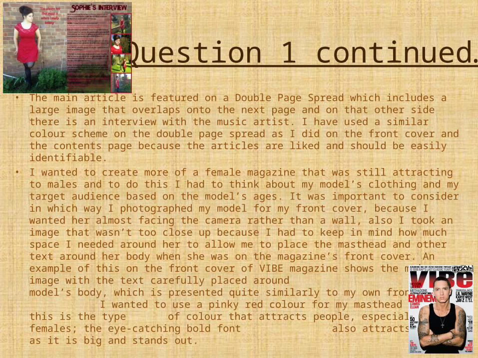
Question 1 continued…• The main article is featured on a Double Page Spread which includes a large image that
overlaps onto the next page and on that other side there is an interview with the music artist. I have used a similar colour scheme on the double page spread as I did on the front cover and the contents page because the articles are liked and should be easily identifiable.
• I wanted to create more of a female magazine that was still attracting to males and to do this I had to think about my model’s clothing and my target audience based on the model’s ages. It was important to consider in which way I photographed my model for my front cover, because I wanted her almost facing the camera rather than a wall, also I took an image that wasn’t too close up because I had to keep in mind how much space I needed around her to allow me to place the masthead and other text around her body when she was on the magazine’s front cover. An example of this on the front cover of VIBE magazine shows the main image with the text carefully placed around the model’s body, which is presented quite similarly to my own front cover.
I wanted to use a pinky red colour for my masthead because this is the type of colour that attracts people, especially females; the eye-catching bold font also attracts readers as it is big and stands out.
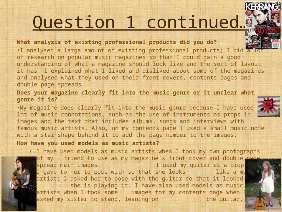
Question 1 continued…What analysis of existing professional products did you do?•I analysed a large amount of existing professional products; I did a lot of research on popular music magazines so that I could gain a good understanding of what a magazine should look like and the sort of layout it has. I explained what I liked and disliked about some of the magazines and analysed what they used on their front covers, contents pages and double page spreads.Does your magazine clearly fit into the music genre or it unclear what genre it is?•My magazine does clearly fit into the music genre because I have used a lot of music connotations, such as the use of instruments as props in images and the text that includes albums, songs and interviews with famous music artists. Also, on my contents page I used a small music note with a star shape behind it to add the page number to the images.How have you used models as music artists?
• I have used models as music artists when I took my own photographs of my friend to use as my magazine’s front cover and double page spread main images.
I used my guitar as a prop which I gave to her to pose with so that she looks like a music artist; I asked her to pose with the guitar so that it looked as if she is playing it. I have also used models as music artists when I took some images for my contents page when I asked my sister to stand, leaning on the guitar.

Question 1 continued…How have you used photography, editing and mise en scene? How have you used layout design?•I have used photography a lot in my magazine to show the audience that the genre of my magazine is music; I have done this by taking images of people singing and with guitars.•I have used my editing skills to create my magazine by editing the images so that they look more professional. I have also edited the magazine’s background by using the different tools on Photoshop, such as the blur tool and the different shaped eraser tool, which I used to create the cool effect on the background for the contents page.•I have used mise en scene to give the effect that this is a real music magazine; I have done this by adding certain things that are related to music, like musical notes, instruments and text.•I have used layout design to make my magazine look professional and creative. I chose to use a similar layout for my contents page to the way KERRANG! lay out theirs so that it looks credible as a real magazine.

2) How does your media product represent particular social groups?
How does your magazine represent the demographic (age, gender, ethnicity, region, class, sexuality, physical ability)?•My magazine represents age because it is aimed at young people aged 16-24. It represents gender by the use of colours and layout because the main target audience is female (70%), but also male (30%); it is swayed to be more suited to females because of the girly colours such as pink and red, but there are a lot of things in the magazine that appeals to both genders, like the artists inside and on the front cover. My magazine isn’t aimed at or representing any specific ethnicity, region, sexuality or physical ability because a music magazine shouldn’t define people in that way, it should be open to all sorts of different people, which I believe mine is. My magazine is represented by middle class/working class people – the ‘normal’ type of people that this country consists of.How do the models, layout design and language combine to represent a particular social group?•My magazine is more of a pop genre, but is also partly rock genre because of the artists featured, so it is aimed at social groups who enjoy this genre of music. The models represent young, care free, social people because the models I have used are young and they are there for the readers to see and look up to; the type of social group that my magazine represents is young middle class people interested in music and fashion. The layout design has a young and fresh feel, using a similar layout to other already popular music magazines, therefore making the younger social groups more attracted to it. I purposely haven’t used big confusing words in my magazine because I wanted it to be easy to read and I have used language, such as “win tickets to V-Festival” to make the younger social groups more inclined to buy my magazine. All of these combine to entice young social groups to read my magazine.
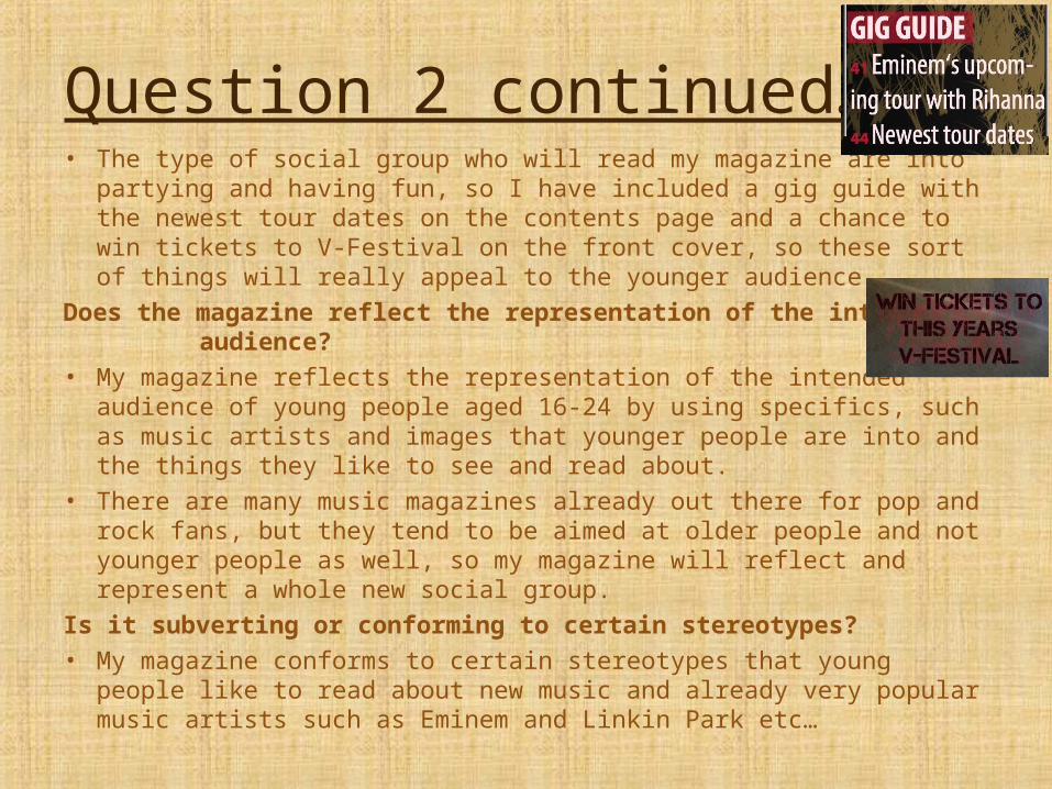
Question 2 continued…• The type of social group who will read my magazine are into partying and
having fun, so I have included a gig guide with the newest tour dates on the contents page and a chance to win tickets to V-Festival on the front cover, so these sort of things will really appeal to the younger audience.
Does the magazine reflect the representation of the intended audience?• My magazine reflects the representation of the intended audience of young
people aged 16-24 by using specifics, such as music artists and images that younger people are into and the things they like to see and read about.
• There are many music magazines already out there for pop and rock fans, but they tend to be aimed at older people and not younger people as well, so my magazine will reflect and represent a whole new social group.
Is it subverting or conforming to certain stereotypes?• My magazine conforms to certain stereotypes that young people like to read
about new music and already very popular music artists such as Eminem and Linkin Park etc…
3) What kind of media institution might distribute your media
product and why?What magazine publishing house might own your magazine?•The magazine publishing house that would own my music magazine is IPC Media. I have done some research on them:
– IPC Media is a large British publishing company that produces over 60 iconic media brands.– IPC Media engages with 26 million UK adults – almost two thirds of UK women and over 40% of UK men.– IPC creates content for multiple platforms, across print, online, mobile, tablets and events.– Their award winning portfolio of websites reaches over 25 million global users every month.(all of the above are according to their website)
•I have chosen IPC Media to own my magazine because it is an already trusted establishment that owns lots of popular magazines such as NME, LOOK, soaplife, Woman’s Own and many more.•The advantages of choosing IPC Media are that they would pay the bills and even if my magazine wasn’t making any or enough profit, IPC would continue distributing it in order for it to build up a fan base.•But there are also some disadvantages of choosing a large company like IPC to own my magazine because it means that they take control of the magazine and they are allowed to make the changes that I may not be happy with.
Question 3 continued…Where might your magazine be distributed?•The majority of people buy their magazines from local shops and newsagents as well as supermarkets. So I would distribute my magazine to all traditional newsagents and supermarkets such as Tesco, Morrisons, Sainsburys and The Cooperative all around the country. I will also make my magazine available online and via an app because my target audience spend a lot of time on the internet and their phones and iPads, etc... so it would be very accessible for them.How frequently will the magazine be circulated?•My magazine will be circulated bi-weekly (every two weeks) like the Rolling Stone magazine. This is so that every issue can be filled with the latest music news and it makes it cheaper for readers as they don’t have to buy it every week.Will it be available through subscription?•My magazine will be available through subscription because this is a good way to keep people reading your magazine’s every issue as it will come straight to their door or will be downloaded straight to their phone/iPad/laptop. On my magazine’s contents page, I have included how readers can get Lyric delivered to their door; this makes it easier for readers to sign up to subscription.
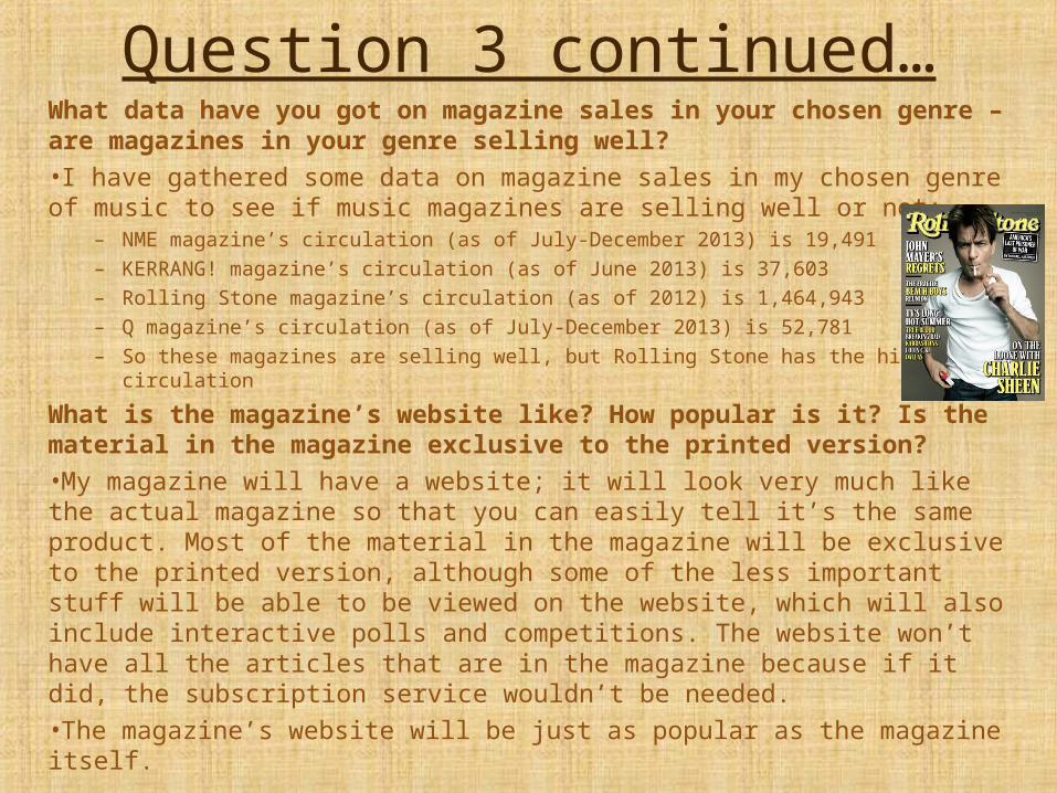
Question 3 continued…What data have you got on magazine sales in your chosen genre – are magazines in your genre selling well?•I have gathered some data on magazine sales in my chosen genre of music to see if music magazines are selling well or not:
– NME magazine’s circulation (as of July-December 2013) is 19,491– KERRANG! magazine’s circulation (as of June 2013) is 37,603– Rolling Stone magazine’s circulation (as of 2012) is 1,464,943– Q magazine’s circulation (as of July-December 2013) is 52,781– So these magazines are selling well, but Rolling Stone has the highest circulation
What is the magazine’s website like? How popular is it? Is the material in the magazine exclusive to the printed version?•My magazine will have a website; it will look very much like the actual magazine so that you can easily tell it’s the same product. Most of the material in the magazine will be exclusive to the printed version, although some of the less important stuff will be able to be viewed on the website, which will also include interactive polls and competitions. The website won’t have all the articles that are in the magazine because if it did, the subscription service wouldn’t be needed.•The magazine’s website will be just as popular as the magazine itself.
4) Who would be the audience for your media
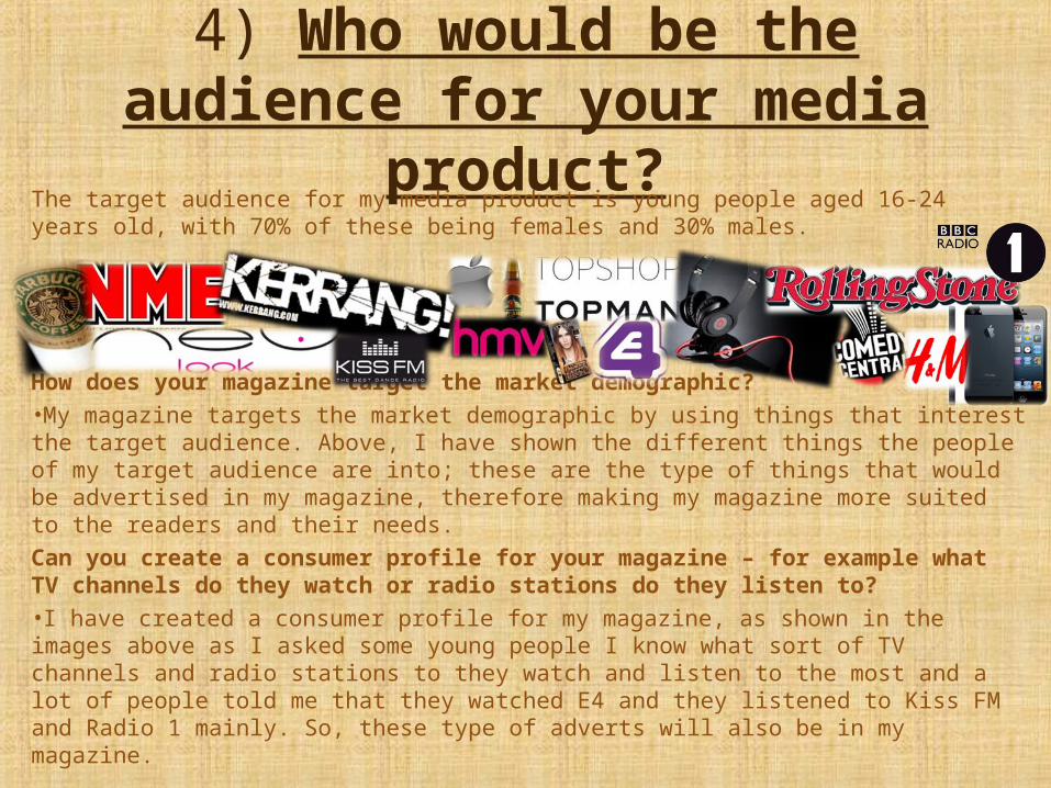
product?The target audience for my media product is young people aged 16-24 years old, with 70% of these being females and 30% males.
How does your magazine target the market demographic?•My magazine targets the market demographic by using things that interest the target audience. Above, I have shown the different things the people of my target audience are into; these are the type of things that would be advertised in my magazine, therefore making my magazine more suited to the readers and their needs.Can you create a consumer profile for your magazine – for example what TV channels do they watch or radio stations do they listen to?•I have created a consumer profile for my magazine, as shown in the images above as I asked some young people I know what sort of TV channels and radio stations to they watch and listen to the most and a lot of people told me that they watched E4 and they listened to Kiss FM and Radio 1 mainly. So, these type of adverts will also be in my magazine.
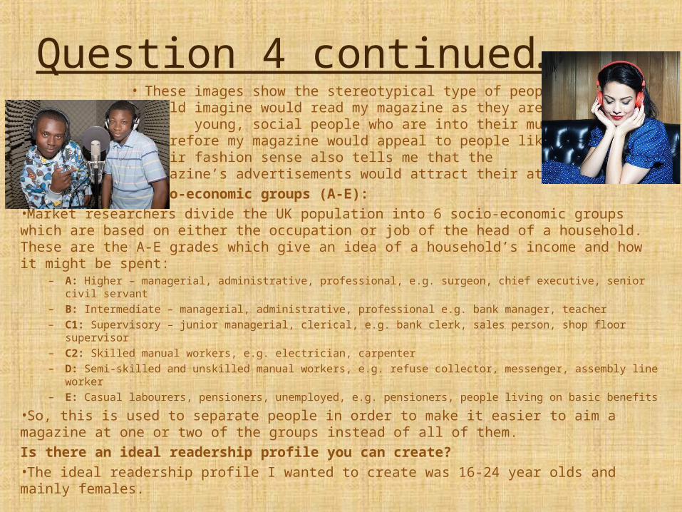
Question 4 continued…• These images show the stereotypical type of people I would
imagine would read my magazine as they are young, social people who are into their music, therefore my magazine would appeal to people like this. Their fashion sense also tells me that the magazine’s advertisements would attract their attention.
Marketing and socio-economic groups (A-E):•Market researchers divide the UK population into 6 socio-economic groups which are based on either the occupation or job of the head of a household. These are the A-E grades which give an idea of a household’s income and how it might be spent:
– A: Higher – managerial, administrative, professional, e.g. surgeon, chief executive, senior civil servant– B: Intermediate – managerial, administrative, professional e.g. bank manager, teacher– C1: Supervisory – junior managerial, clerical, e.g. bank clerk, sales person, shop floor supervisor– C2: Skilled manual workers, e.g. electrician, carpenter– D: Semi-skilled and unskilled manual workers, e.g. refuse collector, messenger, assembly line worker– E: Casual labourers, pensioners, unemployed, e.g. pensioners, people living on basic benefits
•So, this is used to separate people in order to make it easier to aim a magazine at one or two of the groups instead of all of them.Is there an ideal readership profile you can create?•The ideal readership profile I wanted to create was 16-24 year olds and mainly females.
5) How did you attract/address your audience?
• I have attracted and addressed my audience in many ways throughout my magazine, the first way I have addressed my audience is through the masthead on the front cover. It is large and bold and uses a deep red/pink colour to attract my audience and it placed at the top of the page so that it is one of the first things you see, along with the large statement eye-catching main image.
• The overall layout of my magazine will attract my target audience of 16-24 year olds because it is not so cluttered, which is what younger children like to see and it is not too simple that it would look boring towards my target age group.
• My magazine also advertises tickets to win for V-Festival which is a selling point for my magazine and addresses my audience because I know that that is the type of thing they would be interested in. It also attracts my audience because they are intrigued to see how they can win these tickets and it will make them want to see what else is inside the magazine. Free posters are another thing on my front cover that addresses and will attract my audience because a lot of teenagers have their bedroom walls covered in posters of the things they like and my magazine is offering even more posters for them , for free!
• With my target audience being predominantly females, I asked a male student what he thought to the front cover of my magazine; he said that even though it felt a bit “pink” to him, he still liked the overall look of the front cover and he was drawn in by the music artists and the chance to win free tickets to V-Festival because he has always wanted to go.
Question 5 continued…Does your magazine use conventions from other professional magazines
that might help attract an audience? Does your magazine have a USP?•My magazine uses conventions from other professional music magazines such as the masthead and main image, surrounded by text on the front cover. Also, the whole layout of my contents page is based around the way KERRANG! Layout their own contents pages as I felt they looked really good and it drew me in to read what was in their magazine, so I wanted to create the same thing for my own contents page. And for my double page spread, I have used conventions from other professional magazines because I have the masthead at the top of one page with just the main text and smaller images filling it and the main image that acts as the background for both pages.•These conventions might help attract an audience because they might recognise certain things, such as the layout from one of their favourite magazines and that might draw them in to read my magazine too.•My magazines unique selling point (USP) is the interview with the upcoming artist, Sophie, as no other magazine will have this included inside because it is an exclusive interview with Lyric.Did you choose language techniques, layout design, fonts, colours locations, props, costumes and models and in order to communicate particular ideas to your audience?•I chose pop music fonts and deep red and pink colours in order to communicate ideas to my audience. I also chose guitars as props and good looking models in costumes that gave the idea they have quite a bit of money and a good fashion sense in order to communicate particular ideas to my audience such as how it is good to learn to play an instrument and what looks good in fashion right now and also the sort of things they can expect to see inside the magazine.

6) What have you learnt about technologies from the process of constructing the
product?What is the process you went through to create your product?•To create my product, I had to go through the process of researching different types of magazines and the way they are laid out, including the conventions they use and the contents inside the magazines. I also has to go through the process of re-learning how to use Photoshop as I hadn't used it for a couple of years.•I have used two different versions of Adobe Photoshop as I used CS6 whilst I was working at college and CS5 whilst I was working at home. They weren’t all that different to use, they just had different background colours and there were a few extra tools and effects on the updated version of Photoshop; also, each version used some slightly different font styles, which meant that I couldn’t edit certain text boxes when I was using the different version.•Photoshop allowed me to easily create my complete music magazine product as well as my preliminary college magazine. There are many advantages of using Photoshop compared to other forms of media such as Microsoft Word and Publisher because I could use the layers to stop myself from accidentally moving or deleting something that I wanted to keep. I also found Photoshop was a good thing to use because there are so many different filters, tools and effects that can be used and by just exploring what's on there, I came across a really cool way to make my background for my contents page.
Question 6 continued…What websites did you use through the production?•I have used the website, Blogger a lot during the process of creating my product. This way a great way for me to be able to show all of my work as I could record everything that I did and easily upload my work and progress as well as update my posts; I could also give each post a title so that you could easily find a certain post. Before this project I had never used or even heard of Blogger before, so it was completely new to me and it took me a while to get my head around how to use it, especially when trying to place the images in a certain place because it wouldn’t let me move things around to where I wanted them to be placed around the text.•I have also used Google a lot in order to research different magazines and to get some images for my blog.What type of Camera have you used and how have you used it?•To take the photographs for my magazines, I used my iPhone 5 as it has a high resolution camera on it and it made it very easy to upload the images to my blog because I have the app on my phone too. Whilst taking my photographs, I had to carefully think about how I was going to take them and in what position I needed my model to stand in, including how my model held and posed with the props. I also had to think about camera angles and shot types to come out with a suitable image to place on my magazine as I needed enough space around my model’s body to place text boxes and other images. I took my first set of images for my front cover of my music magazine images inside my house and I took the rest of the images outside as I realised that the lighting was much better outside and you come out with a much better picture.

Question 6 continued…What post production programs have you used such as Photoshop or any desk top publishing software?•As I explained earlier, I have used two different versions of Adobe Photoshop – CS5 and CS6 – to create both my college magazine and my music magazine.•But I did also try InDesign, but it didn’t work out very well because it made my images very pixelated and I just found it all very confusing and complicated, so after about half an hour of trying to make things right, I decided to stop using InDesign and go back to using Photoshop, which I found was much better and had a lot more features on it anyway.How have you used web applications and online forums to showcase your research, planning, drafting, final products and evaluation?•I have used quite a few different web applications and online forums to showcase everything I have done throughout this project:•I have used Blogger to showcase my research, planning, drafting and final products by creating a “new post” each time I had something new to add to my project.•I have also used YouTube, but before I could upload to YouTube, I had to create a video on Windows Movie Maker because YouTube would not allow me to upload an audio file, so I had to convert my audio files into .WMV files, which I used aTube Catcher to do so and then I could upload my peer feedback to YouTube as a video.•Finally, I have used SlideShare to showcase my evaluation which I created on a PowerPoint Presentation, which will then be uploaded to SlideShare and embedded into my blog.

7) What have you learnt about the conventions of magazine productions
and what progress have you made from the student magazine?
I have learned a lot about the conventions of magazine productions throughout my project and I feel that I have made a
lot of progress from the beginning when I made my student/college magazine to when I made my music magazine. To show how much progress I have made, I will look at the both
magazines and compare and contrast them by saying what I have improved on and what I still could improve on.
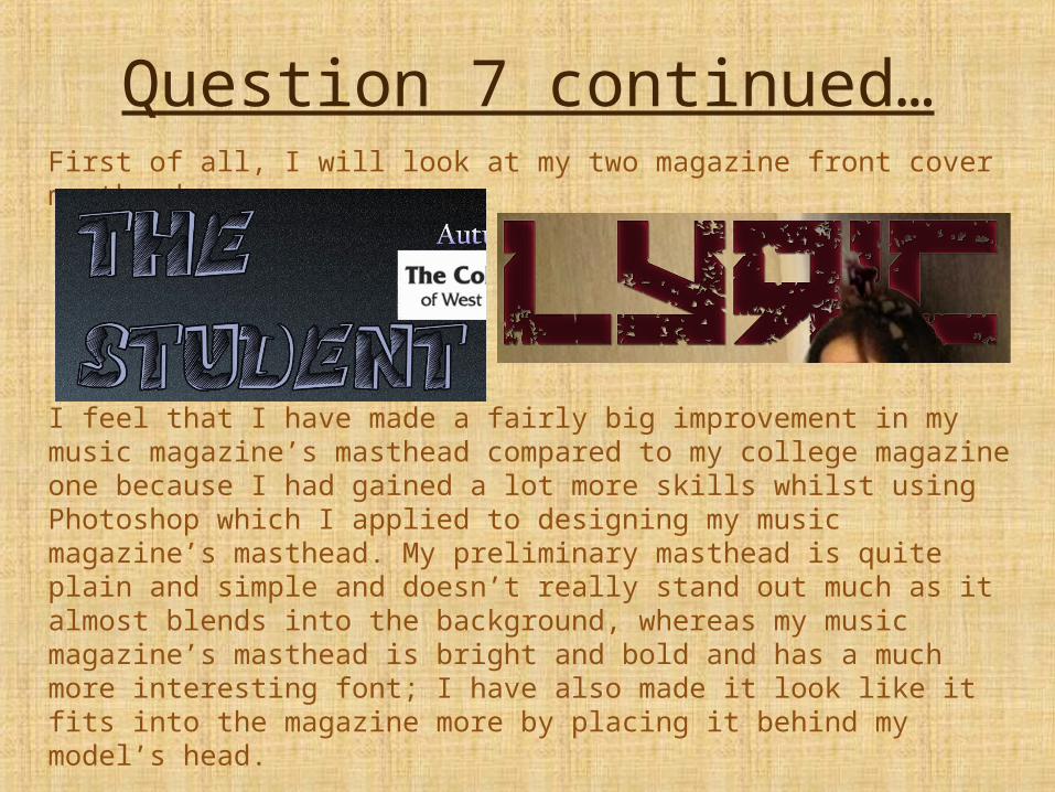
Question 7 continued…First of all, I will look at my two magazine front cover mastheads:
I feel that I have made a fairly big improvement in my music magazine’s masthead compared to my college magazine one because I had gained a lot more skills whilst using Photoshop which I applied to designing my music magazine’s masthead. My preliminary masthead is quite plain and simple and doesn’t really stand out much as it almost blends into the background, whereas my music magazine’s masthead is bright and bold and has a much more interesting font; I have also made it look like it fits into the magazine more by placing it behind my model’s head.
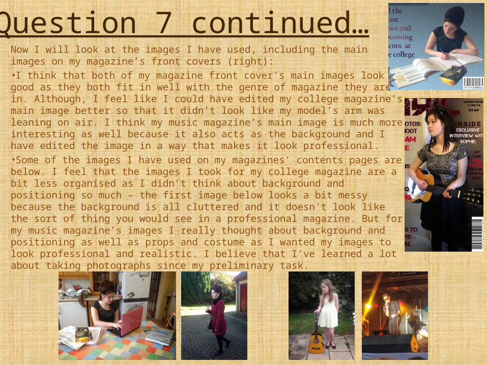
Question 7 continued…Now I will look at the images I have used, including the main images on my magazine’s front covers (right):•I think that both of my magazine front cover’s main images look good as they both fit in well with the genre of magazine they are in. Although, I feel like I could have edited my college magazine’s main image better so that it didn’t look like my model’s arm was leaning on air. I think my music magazine’s main image is much more interesting as well because it also acts as the background and I have edited the image in a way that makes it look professional.•Some of the images I have used on my magazines’ contents pages are below. I feel that the images I took for my college magazine are a bit less organised as I didn’t think about background and positioning so much – the first image below looks a bit messy because the background is all cluttered and it doesn't look like the sort of thing you would see in a professional magazine. But for my music magazine’s images I really thought about background and positioning as well as props and costume as I wanted my images to look professional and realistic. I believe that I‘ve learned a lot about taking photographs since my preliminary task.
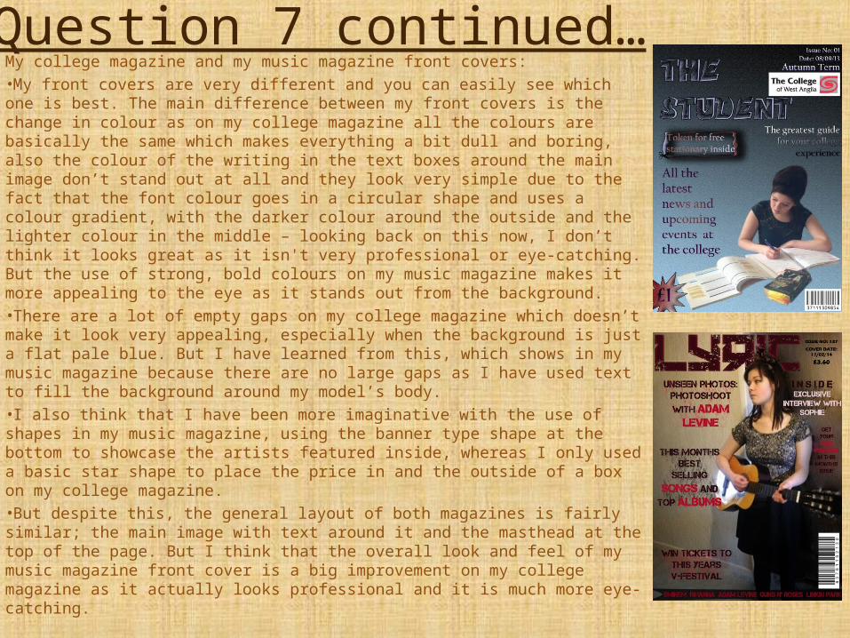
Question 7 continued…My college magazine and my music magazine front covers:•My front covers are very different and you can easily see which one is best. The main difference between my front covers is the change in colour as on my college magazine all the colours are basically the same which makes everything a bit dull and boring, also the colour of the writing in the text boxes around the main image don’t stand out at all and they look very simple due to the fact that the font colour goes in a circular shape and uses a colour gradient, with the darker colour around the outside and the lighter colour in the middle – looking back on this now, I don’t think it looks great as it isn't very professional or eye-catching. But the use of strong, bold colours on my music magazine makes it more appealing to the eye as it stands out from the background.•There are a lot of empty gaps on my college magazine which doesn’t make it look very appealing, especially when the background is just a flat pale blue. But I have learned from this, which shows in my music magazine because there are no large gaps as I have used text to fill the background around my model’s body.•I also think that I have been more imaginative with the use of shapes in my music magazine, using the banner type shape at the bottom to showcase the artists featured inside, whereas I only used a basic star shape to place the price in and the outside of a box on my college magazine.•But despite this, the general layout of both magazines is fairly similar; the main image with text around it and the masthead at the top of the page. But I think that the overall look and feel of my music magazine front cover is a big improvement on my college magazine as it actually looks professional and it is much more eye-catching.
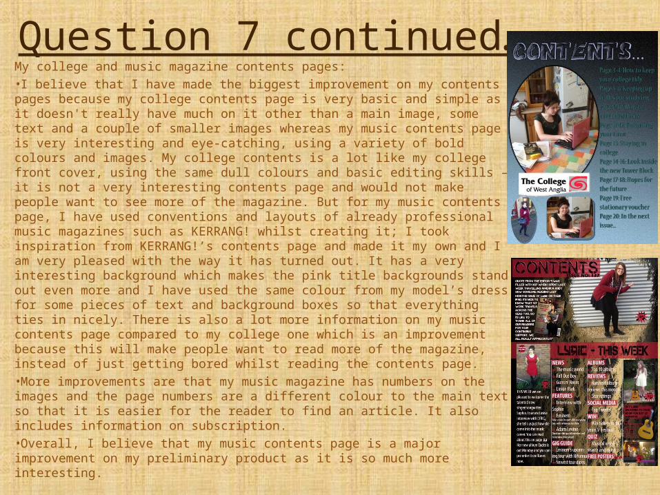
Question 7 continued…My college and music magazine contents pages:•I believe that I have made the biggest improvement on my contents pages because my college contents page is very basic and simple as it doesn't really have much on it other than a main image, some text and a couple of smaller images whereas my music contents page is very interesting and eye-catching, using a variety of bold colours and images. My college contents is a lot like my college front cover, using the same dull colours and basic editing skills – it is not a very interesting contents page and would not make people want to see more of the magazine. But for my music contents page, I have used conventions and layouts of already professional music magazines such as KERRANG! whilst creating it; I took inspiration from KERRANG!’s contents page and made it my own and I am very pleased with the way it has turned out. It has a very interesting background which makes the pink title backgrounds stand out even more and I have used the same colour from my model’s dress for some pieces of text and background boxes so that everything ties in nicely. There is also a lot more information on my music contents page compared to my college one which is an improvement because this will make people want to read more of the magazine, instead of just getting bored whilst reading the contents page.•More improvements are that my music magazine has numbers on the images and the page numbers are a different colour to the main text so that it is easier for the reader to find an article. It also includes information on subscription.•Overall, I believe that my music contents page is a major improvement on my preliminary product as it is so much more interesting.
Question 7 continued…Think about every aspect of both productions and scrutinize every decision you made.Think about the production as a journey from the initial sketching to the final product.•Overall, I feel that I have made a great progress throughout my coursework project from designing and creating my college magazine to my music magazine. In the beginning I had to overcome quite a few obstacles in order to complete my final magazine as I had little knowledge of how to use Photoshop and Blogger and I had no basic knowledge of the forms and conventions of a magazine and the types of things it needed in order to make it relevant to a target audience and become successful around the country. So through research I have learnt a lot about this and it has hugely helped me on my way to finishing my final product.•In my preliminary task, I used some of the information I had gathered from research along with the results from the survey I carried out and although this was helpful, it wasn’t as helpful as looking into and analysing real magazines which is what I did before creating my music magazine.•I have had to think a lot about layout, contents, font, images and positioning whilst creating my magazines in order to come out with a professional looking product.•Looking at the major differences between my college magazine and my music magazine, I can see that I have learned a lot throughout this project and I have really enjoyed the process I have gone through to create my final product. I now have a much better understanding of the forms and conventions a magazine needs to possess and how to make an eye-catching, professional looking magazine.•I am happy that other people who have seen my magazine really liked it, including people of all ages from 11 to 76 – this makes me feel confident about my final product and from doing this, I feel that it is something I would love to do a lot more of in the future.
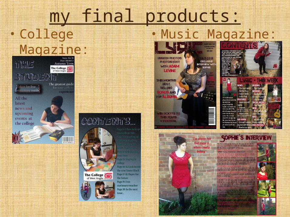
my final products:• College Magazine: • Music Magazine: