martin jarvis journal entries
TRANSCRIPT

8/14/2019 Martin Jarvis Journal Entries
http://slidepdf.com/reader/full/martin-jarvis-journal-entries 1/31
Martin Jarvis
Journal Entries
Visual Literacy Readings:
Bulldog:
The bulldog entry was crazy. So much symbolism can be put into a single
drawing of a little snarling dog. A dog can be perceived as a little “lower than
civilized” piece of culture, or even a “intimidating” aspect. Its interesting to see
companies that utilize animals to represent their products in out culture today
(the American Eagle eagle, the Hollister sea gull, the Abercrombie moose, the
Geico gecko, the Afflac duck, the Fruit Loops toucan, etc). Looking into frosted
flakes. Tony the tiger is used to channel the likes of so many adolescents. He is
a household favorite all over the world, but when you think about the actual
nature of a tiger, which happens to be one of the meanest and aggressiveanimals in the animal kingdom it is interesting that an animal like this was chosen
to appeal to kids. Something like a bird, or a little mouse would be something that
I would pick. But really like it was outlined in the piece, a tiger can be built up to
be something terrifying, or as something happy and jolly depending on how you
position it.
Joe Camel:
Thinking about how a camel can affect so many people is ridiculous. The youngmale crowd is very drawn in by success, and also by women. The camel was
very prominent in each of these aspects. This is just like the day we talked about
“how low one would go” to sell a product. Some graphic designer had to go low
enough to design a marketing tool for a product that eventually would kill its
customers. But that is the difference between work-world and real-world.

8/14/2019 Martin Jarvis Journal Entries
http://slidepdf.com/reader/full/martin-jarvis-journal-entries 2/31
Vogue:
Vogue has an interesting way of designing their cover. Their concept is no white
space. To some this would be a concept that is way too cluttered. I would think
sometimes white space is necessary to keep someones attention. Like whitespace puts a background on an image or word which gives it the ability to stand
out from the norm. But in a way, the fact that they clutter their covers with colors
and pictures also makes them stand out on a different level. Maybe the word on
the cover may at times blend in with the rest of the page, but if you observe the
rest of the shelves, it stands out in that aspect.
Push Pin:
The Push Pin almanac that came out had the great idea of changing their cover
concept with the times. This is great, consumers, I feel, love the idea of change,
versatility, and revitalization. By making all of these changes, it is that much more
interesting when one goes to purchase the almanac every two weeks. The
mindset is, “What could be on it today??”
Things like this that we have today is basically just like the daily newspaper. Or
even to go on a different level the sports page of the news paper. It changes
everyday with the times and the accomplishments of the day, and when
something crazy is going on with the world or simply the sports world, it changes
to fit in with the times.
**
Kandisky:
This is basically showing kind of the essence of where some formal teaching
form of graphic design came from. It’s crazy to think that some people were
getting rid of, and rejecting the idea of this school called Bauhaus. I mean it’salmost like the old timers and how they think that nothing like designers and such
art is necessary. Normally I would go back and delete the word “art” that I used in
the last line, but since this is a journal I am going to leave it. I think that design is
art, just art for a different purpose instead of art as a passion. I feel like designers
are basically the people who have the personalities of putting others before
themselves. They are the nice “people people”.
8/14/2019 Martin Jarvis Journal Entries
http://slidepdf.com/reader/full/martin-jarvis-journal-entries 3/31
Siege of Leningrad:
Looking through this it is a wonder to see how far back some of the ideas really
link, and also how many of the things we observe and the ideas that we learnabout in class link up to each other. Sometimes when I read different articles I
tend to think the concepts found within them are really old and outdated. I think it
is just the tradition of HISTORY being written in text form makes me feel like
almost everything I read is in “ancient history” time span. Looking at this I see the
ideas from the Helvetica video tied in, I see the ideas from the Swiss people tied
in and so much more. And the book company that likes to use images, I have
plenty of their books still, and they are still really big on imaging.
The man with the golden arm:
This article really gives way to the idea that a first impression is the most
influential and lasting impression. This guy made so many titles for plenty of
different films and made a killing. He realized that every aspect of the movie and
what it was about should go into the concept of the title. I personally think that by
doing this you keep an observer engaged and into the movie because they are
now trying to figure how stuff relates back to the title. Whether or not it is a sub-
conscious effort or a conscious effort, when stuff relates to each other it will click
in the observers mind.
Some different movies will even throw in the title into one of the lines of one of
the actors or actresses. In the movie Waist Deep, with singer songwriter Tyrese,
and actress Megan Good, during one of the most high speed chases I noticed
that Megan exclaimed that they were waist deep in trouble. Since I noticed this I
wonder how many other times it was in the script that was simply taken in
subconsciously.
WEINGART:
I think that there is something that Weingart has got and it is modernly known as
swagger aka swag. Weingart has a lot of attitude at the beginning of the piece
and this attitude continues all throughout the piece. I think this along with his skill
and knack for the idea of design is what gives him such an admirable skill that
people even still follow today. So word to the wise in any aspect or task in
life…..NEVER LOSE THE SWAG.

8/14/2019 Martin Jarvis Journal Entries
http://slidepdf.com/reader/full/martin-jarvis-journal-entries 4/31
New York Subway Map:
The ideas that Vignelli spoke of were pretty cool. In the beginning it seems that
he was speaking of how each and every part of a sign, as far down as each letter
had a meaning to it, stressed organization, and if it didn’t it really was notdesigned well. I start to think of different things that are chaotic in the world
around me, and what really has meaning. There are clearly some things that are
around that do not have meaning to me. But at the same time I start to think of
other people and the fact that everything that has meaning to me may not appeal
to anyone else or have meaning to anyone else. Kind of like a pretty girl. I may
think a girl is gorgeous if she fits the description, but another guy may be
attracted to another type of girl (or guy for that matter). When it comes to design
though, (in my opinion any art form) the meaning is ultimately defined by the
artist. At the same time, design is not about the artist, it is about the customer, so
if something does not have meaning to the customer it is also bad design.
Vignelli was a very deep guy. He had some deep thoughts. He once said "I don't
think that type should be expressive at all. I can write the word 'dog' with any
typeface and it doesn't have to look like a dog. But there are people that when
they write 'dog' it should bark." Thus proving his thoughts about meaning. And his
opinions about how important the WAY you design something for someone else.
Even if you don’t need it to bark to read the word dog, someone else may.
I SHOP THEREFORE I AM:
This article helps in proving my point from Vignelli about how art is really how you take
it. At the beginning of this article well into the middle, Kruger is described as a womanwho is one of the best in the design and advertising industry. It also goes on to say how
she opposes and denies this because she feels that her work is art, speaks towards issues,and has definitive meaning. This also shows how ethics and money weigh out. Now onecould get offended when their work is objectified like hers is. Like her “I SHOP
THEREFORE I AM” hand and card that is in the header of the article, but towards the
end it shows that it doesn’t bother her too much that the meaning is getting ripped from
her work because it has been for years and she is not causing too much of a raucus. Shehas actually helped out the field of design by proclaiming her style and sharing it. Some
of her work like the shop therefore I am piece are in museums, and also at the same time

8/14/2019 Martin Jarvis Journal Entries
http://slidepdf.com/reader/full/martin-jarvis-journal-entries 5/31
you can find her piece on the side of shopping bags. Depending on how you look at
something it can have so many different meanings. The true meaning, as I said before,
can only be defined by the artist. Looking at her work she really enjoyed the idea of cutout words on top of pictures almost like the style of the old school serial killers in movies
that leave the ransom note. Examples below.
ÉMIGRÉ:
Émigré in my opinion is like the guy that does not like to just accept what is goingon in society. This magazine by being the rebel it was in the type world is veryrespectable in my book. It is interesting that Vignelli called it “garbage”. At thesame time it is sort of expected. When you look at the works of Vignelli, he hasso much deep rooting in organization and uniformity. His uniform is basically theopposite of something that is in any way influenced by modernism. Most uniformpeople resist change. Considering that this went all the way to MTV getting their name out just proves how modern it is.
Vignelli’s “typographic garbage” comment is not all bad. His reasoning behindthis were the different rules behind type. One of the most important being
legibility. It is important that one is able to decipher what something says thatthey are reading, but at the same time it is beginning to become an art of pictureand images more so than simply leaving it as words. At the same time, it wasVignelli that said that it is most imperative that design has meaning. If this is mostimportant and the works inside émigré have meaning he has no leeway to saythat the type is garbage. Unless he looks into the work to see what the meaningis.
Beach Culture:

8/14/2019 Martin Jarvis Journal Entries
http://slidepdf.com/reader/full/martin-jarvis-journal-entries 6/31
This article which describes the ideas of change and standing out, reflects
directly to the ideas of the age. If you think about the ideas and the history of our
generation, the evolution of the magazines are truly fitting and evolving with the
times as well. In my marketing class it has been said that to channel and appeal
to your audience, one must know thee audience and their characteristics. People
of this generation are very rooted in standing out and being an individual. Peoplein the generation before us were deeply rooted in patriotism and wars. This is
very visual with these magazines. With magazines and design before there were
deep roots in promoting the World Wars. Now days it is all about standing out
and individualism. The fact that the trendy typefaces of émigré were turned down
by the designers of this magazine proves it to the fullest extent. The writers
rejected the “garbage” or émigré because it was too uniform and just like
everything else of the day. Mind you this typeface was just criticized for not being
uniform enough to be considered type. One would wonder what the true and
modernized definition of type is and when (and if) it will ever reach its true peak.
Colors:
Being a fan myself of “awkward”, I would love to take a couple of these
magazines and put them around different places on campus, and observing how
people react to them. I think that the best way to approach an issue is to quit
beating around it and to just bring the issues back out into the public. Many
people are terrified about the idea of speaking on issues such as these but I think
it is important for discussion.
It seems that now days there are plenty magazines with big names around the
country and even around the world that produce different controversial issues.
Many of the magazines result in different disputes and conflicts, but it basically
just keeps America talking, and says and does what most people are scared to
say and do. Time magazine is a popular one that takes advantage of the fact that
their name is so big that they can say and do what they want.

8/14/2019 Martin Jarvis Journal Entries
http://slidepdf.com/reader/full/martin-jarvis-journal-entries 7/31
Cranbook:
So I’m observing this woman named Katherine Mccoy thinking about how she
really just stayed for 24 years in a profession that she did not like. She didn’t
want to do what she is doing but at the same time, she liked it. It is interesting
that someone could love the concept and history of something like design, and
simply due to this they will stay with it. It is also interesting to see how people
such as Mccoy can make it exactly what they want to. No matter what she
decides to teach her class or in which way she decides to go with her plans it
does not really matter because it is one of the most versatile subjects. Producing
qualified people and to place people in professional positions make it good easy
to stay in this profession even if its not your first choice. These are just a few ofthe concepts she taught to her classes.
The Public Theater:
Observing the ideas of type coming from the mouth of the woman in the poster makes me
try to think of any related posters of today that enphasize the same thing. Like the article
says, it is interesting looking at how the words are so big and bold, and how the nature of the words make it look as if the poster is SHOUTING at you instead of just speaking to
you.

8/14/2019 Martin Jarvis Journal Entries
http://slidepdf.com/reader/full/martin-jarvis-journal-entries 8/31
THE BANK READINGS:
Christal Gobblet
This was a very different way of looking at bodies of text comparingthe glass and it being invisible and not thought of to a clear wine glassand the body to the stem. There should be a lot of things in life likethat. Not just text but whole concepts should be like this. When youlook at something like a designed poster, without the person evenknowing they should be channeled to think of the event as somethingthat they need to. I don’t think that the observer should need to dowork to get the desired, it should just flow like wine from a wine glass.
Country/Branding:
I think its crazy how much this article lets out about what people sayand how they feel about our country and just get away with madness. The fact that it was said that someone can “sell uncle bens rice so shecan sell a national branch of government” is ridic. I cannot believepeople also with the propaganda we spoke of in class and such thingsare sent overseas to people at war. It is crazy how much money ourcountry really puts into things that are not necessary when there arepeople on the streets and also we have so much debt. WOW.
Its also Crazy to look at how much money was actually spent innumbers trying to promote and inform the people that were involvedwith the two world wars. LA Times says that on propaganda duringWWI alone there was $4,912,533. One would think that that is a lot butwhen compared to the $500,000,000 spent on the same thing in WWII,you start to think what is REALLY driving this country. Strategy orego…
THINK FIRST DESIGN LATER
DK Holland had a great point about design and how it should be wellthought out before it is done. I was shown how much I didn’t play intothe mind of a designer when we went over this concept in class andhad the idea about the festival. I was shouting ideas out before weeven thought about doing the web analysis. Now I see that designwithout planning is garbage. Just as marketer has to do research,which companies such as neilsen do a lot of help with, so must a

8/14/2019 Martin Jarvis Journal Entries
http://slidepdf.com/reader/full/martin-jarvis-journal-entries 9/31
designer.
CATEGORICAL ENTRIES:
Printed Materials:
When I left the lecture about pictures, type, and the typography we
went through with Meghan’s name in class, I decided to look aroundsome at the different type, font and spacing that I would normally seeduring my everyday reading. I looked at things from my interests suchas my ESPN magazine, all the way down to my Applied Calculus book,which I hate. No matter what the subject of the book it was cool toobserve the different fonts, and spacing that we spoke of in class.
To begin with I will start with my interest, which was ESPNmagazine. Typically the audience that the magazine is guided towardswould be the younger, and middle-aged male crowd. From the firstpage of the magazine this is proven true by the blown up picture of theDallas Cowboys cheerleaders (some of the most attractive and well
known girls for their looks), which exemplifies the “legibility” vs.“readability” tendencies that we discussed. This is the perfect exampleof how designers and authors will capitalize on the physical to intrigueand hook the reader before focusing on the actual information andwords in the article. The slightly more boring articles are simply shownwith words and maybe some color in the title in order to catch thereader’s attention.
To finish I observed the type and the design of my boring AppliedCalculus book. It is not a good read. But surprisingly, due to the boringand not so interesting content I would have expected some coolpictures to be in there, and maybe more diagrams in order to hook and
keep the attention of a reader. The type is pretty old and plain lookingon the inside but on the outside it uses a more modern type which inmy opinion is a false advertisement of what is to come inside the book.Clearly I am a little bias against math (its difficult for me to hide) but itis a direct link to the discussion in class about type and the feelingsassociated with them.

8/14/2019 Martin Jarvis Journal Entries
http://slidepdf.com/reader/full/martin-jarvis-journal-entries 10/31
Sinage
My interests in the following examples are due to one of my bestfriends major, it was something in DAAP, and it had to do with highwaydesign management and the fact that I see these signs on a dailybasis. Especially due to my daily visit to Panera, and I also think it’sinteresting that the idea of a simple typeface that is apparentlyrunning my life.
When we watched the Helvetica video in class I could not believe howmany people actually utilized this. It made me think of how much I sawit and had gotten used to it. It was so much to the point that I wasalmost annoyed with how much it was used in and around society.
Now I look even deeper into the idea of how much I see it around.Simply sitting in the corner at Panera Bread I can see it outside thewindow across the street at UPA, I can see it in front of me on the wallof the hallway, I even see it on this employees apron trying to take myempty trays. I feel like the good signage is that that has meaning andpurpose, and bad signage is that that needs to have purpose andmeaning that doesn’t. The example of needing meaning and having it would be the verystand out colors, readability, and legibility can be found in the styles of street signs and such. They stand out no matter where they are at andgive guidance and warning. Others such as thrown together,photocopied flyers for events and concerts that just fade and blend

8/14/2019 Martin Jarvis Journal Entries
http://slidepdf.com/reader/full/martin-jarvis-journal-entries 11/31
with many others are a example of bad signage. They both inform andhave the same purpose, which is to inform, but only one of the twodoes their given job.
Websites
My interests in the following are simply because I attend the Universityof Cincinnati. There are so many different opinions I have about thedesign of different websites. In my opinion the University of Cincinnatihas a very good web design. It is very organized, It has tabs fororganization, and it really does a good job of showing things in order of what is needed the most and most often at the top. I really like this butironically I think that the UC BEARCATS athletic website is made prettyawful. It is poorly set up. Its hard to find things that are needed. The
ticketing is very confusing. It is really not user friendly in my opinion. The students and the general admission tickets are extremely similarand they look as if they are one and the same until you get to the priceat the check out and you realizing that your credit card is beingcharged $60+ aa opposed to $0.
The ideals I think a website should have is similar to what Vignellibelieves is important to design and type. He stressed how everythingshould have organization, purpose, meaning and basically SHOUT outwhat it represents and means. This is how he decided how to designthe New York subway. Well in my opinion websites should do the exact
same thing. Even if they just made more of the fonts bold or indifferent typefaces in order to catch the eye of the reader, it wouldmake it that much better.
The organization of the University of Cincinnati main website is onethat I think is very efficient, and time saving. I have never had aproblem finding what I need when using it, unlike the countless times Ihave wasted my life away simply attempting to claim a free football

8/14/2019 Martin Jarvis Journal Entries
http://slidepdf.com/reader/full/martin-jarvis-journal-entries 12/31
ticket. These are simply my opinion though.
http://www.uc.edu University of Cincinnati Websitehttp://www.gobearcats.com UC BEARCATS WEBSITE
TIMELINE JOURNALS:
1890’s This decade was one of big booms. There were so manydifferent innovations and big money makers that wereproduced. Two of the majors who made it big were the HenryFor d Automobile and the Tiffany Stained Glass lamp. Thesetwo companies have been very successful for over a centuryand still have prevalent futures now today. The companieshave gone through many changes since their origin. Theirlocation, amount and efficiency of production, and one thingthat stands out in the design major is the logo. Below are
listed some examples of the evolution of Fords logos from itsbeginning in the late 1890s/1900s products.

8/14/2019 Martin Jarvis Journal Entries
http://slidepdf.com/reader/full/martin-jarvis-journal-entries 13/31
1900’s
In the 1900s there were plenty of accomplishments for thegraphic design world in general. There was the founding of the Society of Illustrators, and starting in 1901, well into thenext decade, there was the immergence of a art journal byGustav Stickley called, Craftsman. The book was produced inNew York.Craftsman was known for its homes mainly, but alsocontained some other illustrations. There are still todayvariations of the Stickley Craftsman, which has evolved intoa very professional looking production of today. Here are a
few illustrations from some older versions, Stickley, and anevolved Craftsman.
1910sIt is cool to see how many versatile candies such as the ClarkBar and the Moon Pie were invented in the same year that
The United Stated entered World War I. Thinking could this
be any relation to the soldiers, and maybe a versatile, sweetfood that could be hidden in the barracks or the bunks atboot camp.It is also interesting to look at the propaganda to recruitsoldiers in the past such as the ever popular Uncle Samposter that is scripted with I WANT YOU, and the new waysof recruiting such as sponsorship of the popular Real

8/14/2019 Martin Jarvis Journal Entries
http://slidepdf.com/reader/full/martin-jarvis-journal-entries 14/31
World/Road Rules reality television challenges. Also themany different uplifting commercials that the Army, Marines,Navy, and National Guard have out that stress theadmiration that comes with such a job. Still today the radio
commercials are still happening as they were back in thisday too. Just the same it says a lot about the nature of this decadethat everything that I have said has related to war andmilitary. This was a big influence in the way that countriesand designers marketed products. By challenging theconsumers’ emotions, it made it easier to spark interest.
1920s
Herbert Bayer was well at work during the 1920s. He tried tounify the alphabet and make everything the same anduniversal, but then he also did things that would not hold onas long as some of his better ideas, like eliminating allcapital letters. WHAT?!? Here is some of the work that hehas done that is most popular in the design world. It is veryabstract and has the potential of being very meaningful. Thereason I say “potential” is because you never really knowwhat people are thinking….or if they are even thinking about
anything on a conscious level at all when they write.Sometimes it is the subconscious that does the most work.Also below is a picture of him. The last poster (the blue one)is still $350.00.

8/14/2019 Martin Jarvis Journal Entries
http://slidepdf.com/reader/full/martin-jarvis-journal-entries 15/31
1930s The 30s were an interesting era. It is ironically (or not somuch actually) the decade that the first beer can wasintroduced and also the year that alcohol anonymous was
founded. Its crazy to see the madness that the beer can hasgone through. The different logos that different companieshave gone through have been epic as well considering thesimple and well known beer producers such as miller andbud light. They have used camouflage cans to go along withhunting (which seems like an awful decision to me…drunkand shooting guns!!!), and also designs such as collegiatelogos and colors, Olympic endorsements, and just variationsof the simple logos. Here are a few.
8/14/2019 Martin Jarvis Journal Entries
http://slidepdf.com/reader/full/martin-jarvis-journal-entries 16/31
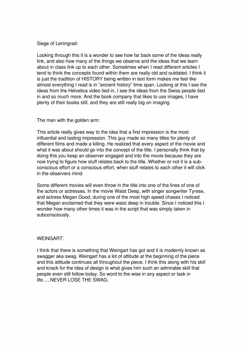
1940s Just as with World War I, during World War II the market andthe design of many products was greatly based on the war.
The very popular children’s toy, “G.I. Joe” was invented
during this decade, along with plenty other war influencedgoods. Abram Games was a very prominent designer thatwas hard at work during this time period. He had twodifferent projects that did very well. Some of his other worksinclude Shell Oil logos, BP oil logos, and plenty more.
Abram Games died not too long ago in the year 1996. He isno longer with us but his work has life for years to come.
1950s
Now there is something called Problems with Design that
was published. It is something that really analyzes the
concepts of design. It was made and written by George
Nelson. He is actually well known for the furniture he has
made than everything else.

8/14/2019 Martin Jarvis Journal Entries
http://slidepdf.com/reader/full/martin-jarvis-journal-entries 17/31
He is known as one of the founders of modernism in the art
world. He has so many different facets of his creative
background and comes from Hartford, Connecticut. Below
are some of the furniture designs that he has come up with
over the times. It is clear just how modern and abstract hisideas are.
1960s
This was the bell at the beginning of the fight for Coke and
Pepsi. This generation was one that really sparked the
competitive edge of design. When looking into the different
companies of today and the design that they use to make
themselves look good and their competition look bad it isclear to see that COMPETITIVE DESIGN is something that will
live on for decades and centuries to come. It is crazy looking
at the many different things that companies have done to
counter eachother that look just like the Coke and Pepsi
influences. If you observe the design and competitiveness
between the very popular phone companies Verizon and
AT&T, it is clear to see that COMPETITIVE DESIGN is very
alive.

8/14/2019 Martin Jarvis Journal Entries
http://slidepdf.com/reader/full/martin-jarvis-journal-entries 18/31
1970s
There were 2 big events that had some big design projects attached to them in this era.The munich Olympics design for the poster was designed by Otl Aicher, and the sinagefor the New York City Ballet Festival by Don Matus. These were two big works thatlooked very good on the side of these two names. Aichers work can be found all over downtown Washington and all over the museums there. It was said in the Washingtonpost “ Just take a walk down any street and you will find some of Aichers work andconcepts”.
LUPTON
Typefaces evolved strongly and are deeply rooted in handwriting. Looking
over the different versions we saw in class it is a wonder to see how much it
has in fact evolved. It is also interesting to see how some of the more
“regurgitated” texts in Microsoft word are now coming into play and lookingmore and more like someone hand wrote them. An example of this is Lucinda
Sans (The font I used to write this). It looks just like handwriting on a piece of
paper. By going back to handwriting looking fonts it seems that we are
working backward. The evolution of typefaces at times can seem like they are
going back to basics and like history once again is repeating itself.
8/14/2019 Martin Jarvis Journal Entries
http://slidepdf.com/reader/full/martin-jarvis-journal-entries 19/31
Another interesting part of this piece is the part about how Geofroy Tory
decided to make the body of his work reflect the body of a human being. He
also introduced ideas of accents, the apostrophe, the cedilla, and also simple
punctuation marks. With all of his accomplishments, there was a title created
by King Francis I called imprimeur du roi, which meant, Printer to the KING!!!
Graphic Journals
Print:
This site is very put together. Its pretty organized and has so much clean lookingfont. It does not have clutter, even though it has plenty of information. The links
are all in order and all have purpose. It reminds me of the UC homepage in thatsense. Many different websites have the tendency to clutter their homepages.
For example GbyGuess.com, is a popular website that I use to look at andoccasionally buy from (only occasionally due to my current pocketbook status.This page, although I keep going back to it, is very cluttered. There is so muchrandom mess going on on the front page. The only think I slightly like are thechoices of type. They are not anything too crazy to the point that you wouldn’t beable to read them. They keep that simple. All and all good time.
How Design
This just like the last one is designed very well. All of the different
blocks of text are aligned and on the same line even more so
than the print.com article. It is impressive to see how much one
can alter professionalism by changing the line on which one will
view a page. It seems that “How Design” pays a lot of attention
to detail and how little intricate lines and spacing will contributeto the full picture. Every piece of this page seems to be will
thought out and in tune. And as we learned before, design
without research is garbage. It is also interesting to think of how I
could potentially alter my pages in reports and assignments and
such in order to make professors, graders, and TA’s enjoy reading
them more.

8/14/2019 Martin Jarvis Journal Entries
http://slidepdf.com/reader/full/martin-jarvis-journal-entries 20/31
AIGA
For this to be a graphic arts website I would think that there
would be more arts of graphics to this page. It is very plain andnot very eye catching. Although the information is all very
organized it is pretty boring. Maybe it is one of the ideas like
channel does where less is more but it seems to me that it could
be done with a little more heart and could be fixed to look a lot
better. Just my personal opinion though.
Interviews :
Bierut:
Bierut in my opinion is CRAZY. But if you think about it that
is just what my perception of crazy is. When I think of
something that is crazy it is out of the ideal norm, it is
organized, it has a set goal and job, start and end, etc. That
is sort of the opposite of the personality of Bierut and also
that of art. He is amazing at what he does and he also has avery different twist on his opinions about graphic design. He
says that design is for people who cannot invent something
out of nothing. Most designers, or any professional in any
field would be livid if they heard someone say that about
what they do only because it in a way makes them sound
inferior. If you look deeper into what he is saying though it in
a way is a compliment to designers because they not only
deal with the imperfections of others, they can make otherspieces better. Others being writers, others being other
designers as well. Designers make success more successful.
In addition to the slightly crazy, messy, unorganized
madness that he can be perceived as…..ITS GREAT TO
KNOW THAT HE IS A BEARCAT!!!!!

8/14/2019 Martin Jarvis Journal Entries
http://slidepdf.com/reader/full/martin-jarvis-journal-entries 21/31
Glaser
Its very cool to observe someone who has so much success
and skill just to see what their thoughts are on life. That was
the most cool thing about Glaser. Things that also interested
me were the style of his works and what could be observed
about his work that maybe trademarked him visually in
comparison to some of the other designers that we haveobserved. I feel that Glaser has a very two sided state of
mind only because when I try to characterize his work, I
always see a highly opposing array of colors. No matter what
his work, from what I observed there was always a large
contrast of very vibrant color alongside a very dark gray or
black. To describe his work in my head is simply HIGLY
CONTRASTED.
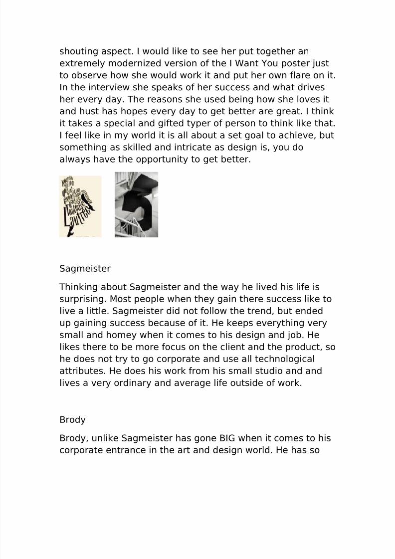
Scher
When looking at the works of Scher, I am reminded in a wayof the 1910 I WANT YOU poster with Uncle Sam on the front.
I feel like her work, just as the Uncle Sam poster screams out
at you and forces you to pay attention. Almost like it grabs
you. I would say her work with the extreme lettering, the use
of a mixture of font sizes, and much more, contributes to the
8/14/2019 Martin Jarvis Journal Entries
http://slidepdf.com/reader/full/martin-jarvis-journal-entries 22/31
shouting aspect. I would like to see her put together an
extremely modernized version of the I Want You poster just
to observe how she would work it and put her own flare on it.
In the interview she speaks of her success and what drives
her every day. The reasons she used being how she loves itand hust has hopes every day to get better are great. I think
it takes a special and gifted typer of person to think like that.
I feel like in my world it is all about a set goal to achieve, but
something as skilled and intricate as design is, you do
always have the opportunity to get better.
Sagmeister
Thinking about Sagmeister and the way he lived his life is
surprising. Most people when they gain there success like to
live a little. Sagmeister did not follow the trend, but ended
up gaining success because of it. He keeps everything very
small and homey when it comes to his design and job. He
likes there to be more focus on the client and the product, so
he does not try to go corporate and use all technological
attributes. He does his work from his small studio and and
lives a very ordinary and average life outside of work.
Brody
Brody, unlike Sagmeister has gone BIG when it comes to his
corporate entrance in the art and design world. He has so
8/14/2019 Martin Jarvis Journal Entries
http://slidepdf.com/reader/full/martin-jarvis-journal-entries 23/31
much success whether it be with magazines (art director for
FACE magazine, working with record companies (Fetish
Records, Cabaret Voltaire, among many others), or simply
founding his own corporate studio, Neville Brody is on a
whole different category than Sagmeister. Below are some of his works.
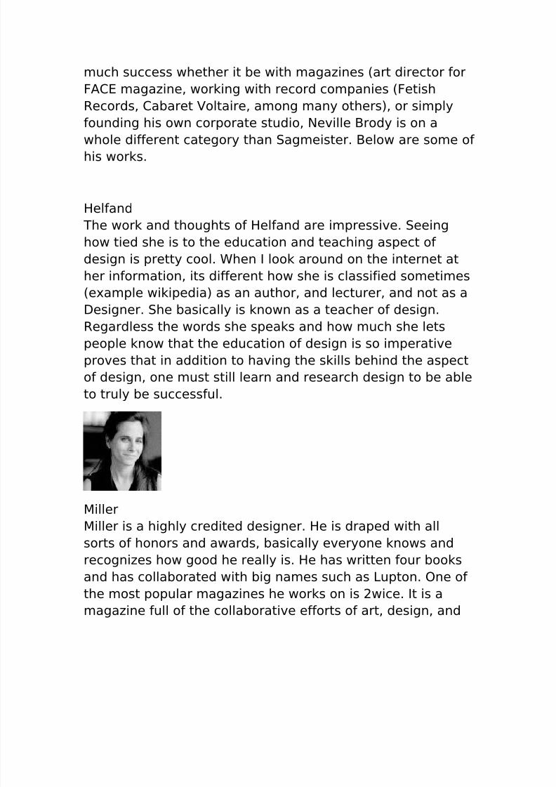
Helfand
The work and thoughts of Helfand are impressive. Seeing
how tied she is to the education and teaching aspect of
design is pretty cool. When I look around on the internet at
her information, its different how she is classified sometimes(example wikipedia) as an author, and lecturer, and not as a
Designer. She basically is known as a teacher of design.
Regardless the words she speaks and how much she lets
people know that the education of design is so imperative
proves that in addition to having the skills behind the aspect
of design, one must still learn and research design to be able
to truly be successful.
Miller
Miller is a highly credited designer. He is draped with all
sorts of honors and awards, basically everyone knows and
recognizes how good he really is. He has written four books
and has collaborated with big names such as Lupton. One of
the most popular magazines he works on is 2wice. It is a
magazine full of the collaborative efforts of art, design, and

8/14/2019 Martin Jarvis Journal Entries
http://slidepdf.com/reader/full/martin-jarvis-journal-entries 24/31
photography, with short editorials on each. Below are just a
few of his many works.
Vignelli
I feel as though I have talked about this Italian Stallion so
much throughout my opinions in some of my earliler journals
and that I constantly revert back to him. Vignelli is someone
who is highly respected in the design world. His passion andexperience combined with his skill is something that can be
admired all around the design world. His design of the New
York Subway being one of his most famous works is just one
example of his brilliance. Like I have said before, Vignelli was
a very deep guy. He had some deep thoughts. He once said
"I don't think that type should be expressive at all. I can
write the word 'dog' with any typeface and it doesn't have to
look like a dog. But there are people that when they write
'dog' it should bark." Thus proving his thoughts about
meaning. And his opinions about how important the WAY you
design something for someone else. He is still alive and
kickin’ today working in New York at his own firm that he
founded with his wife… which is amazing to me. Someone
that starts doing something in their teen years and
continues this long sure does prove the ongoing idea that if
you love something like these designers do, you can
continue it forever.

8/14/2019 Martin Jarvis Journal Entries
http://slidepdf.com/reader/full/martin-jarvis-journal-entries 25/31

8/14/2019 Martin Jarvis Journal Entries
http://slidepdf.com/reader/full/martin-jarvis-journal-entries 26/31
The REFLECTION:
This has been an interesting experience this quarter. I learned so muchabout all of the behind the scenes work and all of the stuff that one
does not see throughout the course of a day. There is so much
intricacy in design that is not respected.
It was crazy thinking about how the lady that came in to talk to us had
all those ideas for UC’s already industrialized campus. Its probably just
the marketer in me, but thinking about all of the money that UC could
take in from putting running ads on the screens of TUC would be
immense.
Additionally to think about all of the designers and workers that had to
come and help when it came to the process of putting something
together like Mainstreet, or even all of the ideas about the walls at the
Children’s Medical Center. All of this has so much more technology
than one would normally think of and its crazy to think about what is
coming in the future.
Companies such as “The Sixth Sense” used many different
technologies that have not necessarily broken into market thatdesigners of all sorts (especially graphic) are needed to launch within
the next decade. Check it out. Product is called “The Sixth Sense”.

8/14/2019 Martin Jarvis Journal Entries
http://slidepdf.com/reader/full/martin-jarvis-journal-entries 27/31
Hello Professor,
Hope your trip was great!
I tried to take into account the tips you gave me on making the journal
entries more about other aspects than that which was found in the article,
while I was writing the remainder of my journal entries. I also left (most of)the ones the same that I turned in before (only about 12) since you had
already graded/read them. I couldn’t resist adding a little bit to a few of my
first entries, but I realize that you already read them when we turned them in
at midterms so that was probably pointless on my part.
Regardless, below is first my old resume, followed by new and revised
resume. I took the “stereotypical business” aspect that we discussed in class
out of the design as much as I could, while still keeping it acceptable in the
business world. It was very “DIFFERENT” considering the business element
that my mind has been coded to think in. If you do have time please give me
some feedback and I hope that we can stay in touch whether it be via email,
or meeting, as I will be sending my final product out to companies in the near
future.
Hope you enjoy.
Thanks for a great Quarter!
-Martin Jarvis
p.s. Resume changed to 2 pages in PDF conversion. Sorry for the
inconvenience

8/14/2019 Martin Jarvis Journal Entries
http://slidepdf.com/reader/full/martin-jarvis-journal-entries 28/31
Martin C. Jarvis33 E. McMillan Street, Apt. E.
Cincinnati, OH 45219
(937) 397-4682 [email protected]
Highly driven results-oriented college student with experience in marketing, customer service and working
in a team environment for not-for-profit and for-profit organizations.
ACADEMIC BACKGROUND
• University of Cincinnati, Cincinnati OH, College of Business (GPA: 3.0/4.0)
Bachelor of Business Administration, International Marketing (Graduation: 2012)
• Chaminade-Julienne High School, Dayton, OH (Graduate: 2007)
National School of Excellence
WORK EXPERIENCE
University of Cincinnati, Orientation Office, Cincinnati, OH 2009 – PresentStudent Orientation Leader
• Key contributor in the organization/design of the University of Cincinnati’s new student orientation.
• Provide supervision, guidance, and introduction of incoming students to the University.
• Coach and assist students in scheduling their first quarter courses.
Champs Sporting Goods, Beavercreek OH/Kenwood, OH 2008
Retail Sales Assistant, Cashier, Shoe Runner (Part Time Position)
• Liaison between manager and customer; ensured customers were able to purchase goods.
• Coordinated team-marketing strategy increasing customer sales; met store sales quotas.
American Eagle Outfitters, Centerville, OH 2007
Retail Sales Assistant, Cashier (Part Time Position)
• Increased credit card applications by using acquired marketing strategies to increase purchases.
• Managed own register; ensured 100% accuracy in sales receipt and cash drawer.
• Ability to work well in a team environment; completed all tasks efficiently.
Urban Plunge Service Trip, Cincinnati, OH Spring 2007
Volunteer
• Serviced the community at various sites including: soup kitchens, house building and city clean up.
REACH Community Service Group, Dayton/Cincinnati, OH 2006 - 2007
Volunteer
• Responsible for the organization, public relations and supervision of the weekly trips for the
students of Chaminade-Julienne to provide volunteer services in the Dayton/Cincinnati areas.
Max and Erma’s Restaurant, Beavercreek, OH 2006 - 2007
Host, Runner, Busboy (Part Time Position)
• Responsible for successfully accomplishing multiple tasks; in charge of hosting, serving and bussing
• Met internal and external customer requests in a demanding fast-paced environment.
SPECIAL SKILLS AND TRAINING

8/14/2019 Martin Jarvis Journal Entries
http://slidepdf.com/reader/full/martin-jarvis-journal-entries 29/31
• MS Word (Level: Intermediate
• MS PowerPoint (Level: Intermediate)
• MS Excel (Level: Beginner)
• Access (Level: Beginner)
• UC’s Professional Practice Program; alternate quarterly between classroom study and work in the
field of Business

8/14/2019 Martin Jarvis Journal Entries
http://slidepdf.com/reader/full/martin-jarvis-journal-entries 30/31
Martin C. Jarvis
2348 Rohs Street.Cincinnati, OH 45219
(937) 397-4682
Highly driven results-oriented college student with experience in marketing,customer service and working in a team environment for not-for-profit and for-profit
organizations.
EDUCATION
University of Cincinnati, Cincinnati OH, College of BusinessBachelor Business Administration, Marketing (GPA 3.0/4.0; Anticipated
Graduation 2011)
Chaminade-Julienne High School, Dayton, OH (Graduated 2007)
WORK EXPERIENCE
Verizon Wireless, Cincinnati, Fall 2009-
Present Retail Sales Assistant (Part Time Position)
Continuously increasing store sales exceptionally by utilizing acquiredmarketing and advertising skills.
Advise individual and small business customers’ contract and device decisions
based on analysis of their needs, demands, and preferences.
Ensured 100% accuracy in sales receipt and cash drawer.
University of Cincinnati, Orientation Office, Cincinnati, OHSummer
2009Student Orientation Leader (Full Time Position)
Key contributor in the organization/design of the University of Cincinnati’snew student orientation by providing supervision, guidance, and introduction
of introduction of theUniversity of Cincinnati to new incoming students and parents.
Coach and assist students in scheduling their first quarter courses.
Champs Sporting Goods, Beavercreek/Kenwood, OHSummer 2008Retail Sales Assistant (Part Time Position)

8/14/2019 Martin Jarvis Journal Entries
http://slidepdf.com/reader/full/martin-jarvis-journal-entries 31/31
Liaison between manager and customer; ensured customers were able topurchase goods.
Coordinated team-marketing strategies and increased customer sales; metstore sales quotas.
SPECIAL SKILLS AND TRAINING
MS Word, MS PowerPoint, MS Excel, and MS AccessGraphic Design Concepts – Beginner Level