logo colors 12 - moen · 12 brand elements logo the moen logo is the primary form of identification...
TRANSCRIPT

12
BRAND ELEMENTS
LOGO
The Moen logo is the primary form of identification across all visual elements.
COLORS
Our brand palette allows for a modern, consistent look for the brand.
TYPOGRAPHY
Our primary brand typeface is Din Pro with Bodoni Italic as our accent font.
a b c d e f g h i j k l m n o p q r s t u v w x y z A B C D E F G H I J K L M N O P Q R S T U V W X Y Z 1 2 3 4 5 6 7 8 9 0 a b c d e f g h i j k l m n o p q r s t u v w x y z A B C D E F G H I J K L M N O P Q R S T U V W X Y Z 1 2 3 4 5 6 7 8 9 0
PHOTOGRAPHY
Our photos are inspired by the world around us. Inspirational and evocative, they reflect the beauty and power of water in thought-provoking ways.

13
PRIMARY LOGO
As part of our brand evolution, we made the decision to evolve our logo. With our newly modernized brand, our new logo reflects our forward-looking, contemporary outlook.

14
PRIMARY LOGO
C L E A R S PA C EIn all visual executions, make sure the logo is free of distracting elements and is surrounded by a generous amount of space. The logo should have a clearance equal to the height and width of the “N” of the Moen logo. When available, greater open space is recommended.
CAP HEIGHT

15
0.75in
PRIMARY LOGO
M I N I M U M S I Z ETo ensure legibility and brand consistency, the Moen logo should always be scaled proportionally and not appear smaller than the values listed below.
MINIMUM SIZE FOR PRINT APPLICATIONS
50px, 72dpi
MINIMUM SIZE FOR DIGITAL APPLICATIONS

16
PRIMARY LOGO
R E G I S T R AT I O N S Y M B O LIn consumer-facing communication, typically, there are no requirements to use the ® symbol, but there are some significant benefits. The benefits are that (i) it helps put counterfeiters and copycats on notice that we have registered rights, and (ii) in many countries, if you give notice of your registration, you are in a better position to get a monetary award against an infringer. In these cases, please follow the below size and clearance requirements. As a rule of thumb, the registration symbol is not treated as a graphical element, so the same clearance and size requirements still apply to the main logo (i.e, the registration symbol is not accounted for in clearance space or size).
0.75in
MINIMUM SIZE FOR PRINT APPLICATIONS
LOGO CLEARANCE WITH REGISTRATION SYMBOL
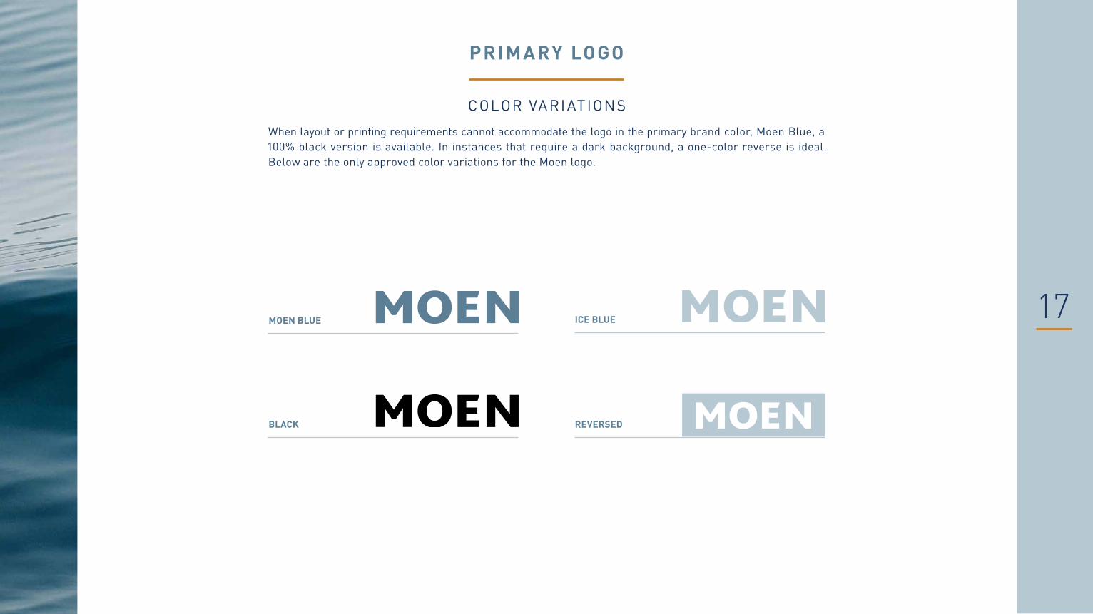
17
PRIMARY LOGO
COLOR VARIATIONSWhen layout or printing requirements cannot accommodate the logo in the primary brand color, Moen Blue, a 100% black version is available. In instances that require a dark background, a one-color reverse is ideal. Below are the only approved color variations for the Moen logo.
MOEN BLUE ICE BLUE
REVERSEDBLACK

18
PRIMARY LOGO
L E G A C Y U S EThe legacy Moen "Water Drop" logo featuring the water drop icon has been an integral part of Moen visual communication for years. Because of the scale of the Moen organization, there will be instances where the Water Drop will still exist (e.g. building signage or current packaging inventory). The use of the Water Drop is not incorrect, but as we move forward with our modernized branding, any new communications with a Moen logo should have the Water Drop logo replaced with the simplified Moen logo (without water drop icon) on page 13.

19Do not set logo in non-approved colors
Do not use logo in non-approved
reversed colors
Do not apply drop shadows The "Inspired By" campaign logo isn't incorrect, but all new materials should leverage the
new Moen brand look
Do not use the logo in Burnt Sienna
Do not resize any of the indiv idual letters or elements of the logo
Do not stretch or distor t logo in any direction
Do not apply outl ines
Do not tilt or rotate logo
PRIMARY LOGO
I N C O R R E C T U S EBelow are some common examples of incorrect usage of the logo. They do not illustrate every violation of the Moen logo. Stay safely within guidelines and represent the brand consistently by not modifying the logo in any way.

20
ADDITIONAL LOGOS
I N N O VAT I O N W O R D M A R K SAs Moen modernizes its visual identity, it is important to create visual consistency across all innovations. Instead of individual product innovation logos that tend to compete with Moen branding, we will now use the Moen logo followed by the name of the innovation in Din Pro Light, treating the Moen logo as an element of the copy, creating a cohesive wordmark. These are to be applied in instances where an innovation is called out and highlighted. In cases where multiple innovations are listed or the Moen logo exists on the communication, the innovation name can be simply spelled.
MAGNETIX™
SPOT RESIST™
POWER CLEAN™HORIZONTAL
MAGNETIX™
STACKED POWER CLEAN™
SPOT RESIST™

21
PRIMARY COLOR
Moen Blue is the primary brand color and should be the dominant color used across all visual materials.
BRAND COLORS
The Moen colors portfolio has been evolved to reflect a new and modern brand direction. And a more premium position in the market. These colors are to replace any uses of prior colors in ALL cases of new communication development, from internal PowerPoint documents to external brand marketing. Pantone and CMYK are to be used for print while RGB and HEX are to be used for digital purposes.
MOEN BLUE
PANTONE PMS 5415 CMYK 56/24/11/34 RGB 91/127/149 HEX 5B7F95
PANTONE PMS 5445 CMYK 21/5/4/8RGB 183/201/211 HEX B7C9D3
PANTONE PMS 534 CMYK 95/74/7/44 RGB 27/54/93HEX 1B365D
PANTONE PMS 7510 CMYK 5/41/77/10 RGB 198/137/63HEX C6893F
ICE BLUE DEEP BLUESECONDARY COLORS
Ice Blue and Deep Blue may be used as lower–hierarchy colors that support the Moen Blue—but never should they overpower the Moen Blue or the content. These colors can also be used as an accent color when necessary.
ACCENT COLOR
Burnt Sienna is strictly used as an accent color and should never be the primary visual color or used for branding.
BURNT SIENNA

22
BRAND T YPOGRAPHY
The Moen brand typeface is the sans serif Din Pro. This typeface creates a distinctive visual impression in our messaging to complement the other design elements in our toolkit. Below are the approved font variations within the Din Pro typeface. Please contact your local IT to install all brand fonts on your local computer.
DIN PRO LIGHTa b c d e f g h i j k l m n o p q r s t u v w x y z A B C D E F G H I J K L M N O P Q R S T U V W X Y Z 1 2 3 4 5 6 7 8 9 0
PRIMARY TYPEFACE
Use for all principal text applications, including messaging, body copy, titles and headlines.
SECONDARY TYPEFACES
Use for all supporting text applications, including captions, body copy below 10pt, text blocks and callouts.
Din Pro Bold should be used when emphasis or additional legibility at smaller sizes is required.
DIN PRO REGUL ARa b c d e f g h i j k l m n o p q r s t u v w x y z A B C D E F G H I J K L M N O P Q R S T U V W X Y Z 1 2 3 4 5 6 7 8 9 0
DIN PRO BOLDa b c d e f g h i j k l m n o p q r s t u v w x y z A B C D E F G H I J K L M N O P Q R S T U V W X Y Z 1 2 3 4 5 6 7 8 9 0
TERTIARY TYPEFACE
Use to complement the Din Pro family fonts and to be used mainly as an accent font.
BODONI LIGHT ITALICa b c d e f g h i j k l m n o p q r s t u v w x y z A B C D E F G H I J K L M N O P Q R S T U V W X Y Z 1 2 3 4 5 6 7 8 9 0

23
BRAND T YPOGRAPHY
A LT E R N AT I V E T Y P E FA C E SIn rare instances where Din Pro cannot be used, please download the Google font, Roboto Condensed as an alternative: https://fonts.google.com/specimen/Roboto+Condensed
R O B OTO C O N D E N S E D L I G H Ta b c d e f g h i j k l m n o p q r s t u v w x y z A B C D E F G H I J K L M N O P Q R S T U V W X Y Z 1 2 3 4 5 6 7 8 9 0
PRIMARY ALT TYPEFACE
Use for all principal text applications, including messaging, body copy, titles and headlines.
SECONDARY ALT TYPEFACES
Use for all supporting text applications, including captions, body copy, text blocks and callouts.
Roboto Condensed Bold should be used when emphasis or additional legibility at smaller sizes is required.
R O B O T O C O N D E N S E D R E G U L A Ra b c d e f g h i j k l m n o p q r s t u v w x y z A B C D E F G H I J K L M N O P Q R S T U V W X Y Z 1 2 3 4 5 6 7 8 9 0
R O B O T O C O N D E N S E D B O L Da b c d e f g h i j k l m n o p q r s t u v w x y z A B C D E F G H I J K L M N O P Q R S T U V W X Y Z 1 2 3 4 5 6 7 8 9 0

24
BRAND T YPOGRAPHY
M A N D A R I N & G L O B A LDFLiHei is a perfect replacement for Din Pro. It has even strokes within the characters and it appears modern and legible. It is available in both Traditional and Simplified character sets.
DFLIHEI LIGHT
DFLIHEI MEDIUM
DFLIHEI BOLD

25
PHOTOGRAPHY
C O R R E C T P H O T O G R A P H Y U S EOur photos are inspired by the world around us. Inspirational and evocative, they reflect the beauty and power of water in thought-provoking ways. While they showcase these attributes, they never depict water's more dangerous aspects. Our images should be simple and free from distracting elements. Because we are celebrating the natural beauty of water, avoid artificial filters, distortions or superfluous objects. The following pages are to serve as a general visual direction for photography.

29
APPLICATIONS
The following pages are not meant to be prescriptive, but rather to serve as a visual guide for how the evolved Moen brand lives across channels and applications.

34
CONTACT INFORMATION
For any questions regarding these brand guidelines, email Andrea Maher at [email protected]