l magazine
DESCRIPTION
A magazine to showcase all the work I have done in ASU's MVCD 2014-2015 Grad studio program.TRANSCRIPT

magazine
vol 1, iss 1, spr 2015
meet a typeface monarchy
16
48standing on the shoulders of giants: a 15 pt manifesto
70thesis abstracts:Lori’s focus forthe next year
L


L magazine
Lori enjoys working on the go. She prefers to be in a different place
every day, gathering materials, photographs, video and insight on
a project and then bringing it all together. If she could chose, she
would only spend 1/3 of her time on her computer designing and the
other 2/3 building, making and experimenting. She enjoys reading
and learning about not only graphic designers but marketing,
industrial design, handmade crafts, and sea life.
Lori admires surreal movies like The Fall, The Science of Sleep
or Eternal Sunshine of the Spotless Mind and loves to peruse Fast
Company, The New Yorker and Eye Magazine.
In time, Lori aims to become an Art or Creative director for editorial media, including magazines or films.
Intro to the Editor
Lori’s acquaintance with Art and Design
originates from learning basic color theory
in Preschool, thanks to her Grandmother.
She studied art and illustration as an
undergraduate, building her drawing and
basic design skills. During this time, she
became very interested in surreal work,
including that of Max Ernst. In a film
about Ernst, he traveled to Arizona to get
inspiration from the landscape and built
his home in the desert. After seeing this
film, she knew she wanted to move to
Arizona to cultivate her creativity.
Her design work explores a vivid color palette, handmade work and other tactile objects
are infused with tried and true typefaces, as well as a new and up and coming typeface,
Homestead. Outside of school, she works with the Tempe Bike
Action Group designing event posters. Lori also sells her illustrative
alcohol ink, collage paintings in Phoenix art shows and shops.
photo credit: Tonya Freeland
0 1

L magazine
contents
04
08
06
Projects10
0 2
this magazine is a collection of projects from my Visual Communication and Design Studio Class during 2014-2015 school year

L magazine
16 22
12
4
5
Roller Coast of aaahHHhh ProcessaaahHHhhaaahHHhh
the birth of an ideaWhat is the idea? This is when I decide or I am given an idea by a client, teacher, or inspiration.
Investigation: search, steal, borrowResearching an idea through Pinterest, Google, Behance, peers. This is when I search for a solution to the problem. I read some, I take some notes, hopefully magic comes from this.
Expectations: Is this cool enough to do? Has someone already done it and can I do it better? Am I on track for myself, my teacher, my client?
Final Concept: all I can search, I think?Usually at this point I have all the research done for my materials, ideas, concepts. First experiments have been done to make sure somethings will work. Development: Can this be done?
This is when the bulk of the experiments and prototypes come with my materials, lighting, colors, typefaces. What combination will they work the best in? Should I redesign some of it?
32
26
Standing on the
Shoulders of Giants:
Stay Content
34 40
Standing on the
Shoulders of Giants:
Stay Content
48
Standing on the
Shoulders of Giants:
Stay Content
79
0 3
Standing on the
Shoulders of Giants:
42
Standing on the
Shoulders of Giants:
Stay Content
68
46
Standing on the
Shoulders of Giants:
Stay Content
70

L magazine
The year started out with some
explorations. Our teacher not only
wanted us to learn about type and color
pallets, she wanted us to chose our own
for the entire year.
I chose some of my favorite artists, film
makers, and designers and started my
exploration. After choosing my colors
so easily, I struggled to pick typefaces
I could use together. The hardest part
is pairing 4 typefaces to live together,
sometimes on the same document.
Color & Font for a Year
studies of artists and designers toolboxes
artist / designer color study taken from well known pieces
El Lissitsky Saul Bass Ralph Steadman
David Carson Roy Lichtenstein Hans Neuburg
0 4

L magazine
artist / designer typography study taken from well known pieces
Christof Gassner
ITC Avant
Garde Gothic
Wes Anderson
Archer
Futura (Bold)
Kyle Steed
Frontage
Futura
Khoi Vinh
Galaxie Polaris
Fort
Paul Rand
Ultra Bodoni
Alternate Gothic
Emily Craig
Kailey
League Gothic
ITC Fat Face
My Colors My Typefaces
HomesteadBodoni STD
AvenirFairview
what I chose for myself after this study
0 5

L magazine
His goal, at this point in his life, was to use design to create a new social structure.
some of Lizitsky’s work
0 6

L magazine
El Lissitzky was an engineer, architect, painter
and designer. His work was highly influenced
by politics and those he worked with. Lissitzky’s
work was created to get others to realize the
major issues artists can engage in. He was open
minded and designed to change perspectives as
well as to design the new world.
El Lissitzky: Designbook review of this original master of design
Next, Lissitzky went on to join Marc Chagall
in teaching architecture and graphic arts
in Vitebsk and collaborating with Kazimir
Malevich who invented Suprematism. Not
long after, Chagall left the Vitebsk Academy
and the school became dedicated to
Suprematism, which Lissitzky fully embraced.
El Lissitzky joined up with the Unovis group
and worked with Kera Ermolaeva, Malevich,
and other coworkers. At this time he was
working on organizing events, teaching,
publications, experimental work with lettering
and geometric forms, and graphic design
for public committees. His work became
constructive in shape, technical in geometry,
with logarithmic curves.
Born in Pochinok, Smolensk district in 1890, El Lissitzky
was a creative artist to many disciplines. From 1909-
1915, Lissitzky studied engineering, drawing, and
architecture in Darmstadt, Paris, Italy, and Moscow.
He created the Soviet flag during 1917 and was an
international social activist that wanted to promote a
political message. Lissitzky was now making paintings
of geometric shapes. Others saw them as just paintings,
to him, he was actually emphasizing that his techniques
were a process; stages in a creative process that
defined new ways to make things like books, the
printed page, or producing propaganda.
important people he worked with
the wonderful cover
He enjoyed using contradictory perspectives with floating
geometric shapes, and 3-D construction. As time continued,
Lissitzky worked on periodicals, design exhibition of his work
and other artists and lithography. He used squares, circles,
elliptical forms, and logarithmic curves. His work grew more
philosophical and practical as he worked with more artists,
designers, and poets. He continued to move between the
places he had been to and learned from. El Lissitzky engaged
in a vast range of creative and social themes throughout his
life. The best things to learn from him are his loyalty and
eagerness to design the future.
0 7

L magazine
To learn more about how my colors interacted together, I got paper,
tape, and string to see what kind of interactions happened. These
were made before I chose to add the magenta color. Doing this
exercise showed me I needed another warm color to finish the pallet.
images of experiments
Color PaletteExpedition
0 8

L magazine
paper, tape, string
Color PaletteExpedition
0 9

L magazine
5 stencils
over 150 photographs taken
10 final photos chosen
stencil sketches
stencil sketches
1 0

L magazine
Handmade Stencils
how my work and I fit into my environment
1 1

L magazine
Starting in class on our first day, my class
and I cut up our syllabus to make stencils.
After sketching
ideas for a while, the
stencils were chosen
and cut. A couple of
people passing by
wanted to be involved
and give it a try.
We went outside with flour, tape, stencils and cameras and made removable graffiti.
The next part of the assignment
was working on the project for two
weeks. We were supposed to try
many different experiments. By the
end of the assignment, no one other
person’s work looked alike. I chose to use
baking soda and then spray paint.
1 2

L magazine
body position sketches

L magazine
I decided to buy a 7 x 4 foot piece of ply
wood to spray paint. This allowed me
to take breaks between working and to
reposition the board
so I could change
the lighting easily. I
initially sprayed the
board black and then
used the stencils and
white paint to make
mandalas. I also
became part of the
photos to bring them
more to life and add
just a little color.
The end result was many images taken while experimenting and thinking about design in a new and different way.
1 4

L magazine 1 5

L magazine1 6
Typeface Monarchy

L magazine
As an artist, I wanted this monarchy to be loud and allow for many experimental opportunities.
the King, Queen and their children
1 7
Typeface Monarchy

L magazineoverlaying all my type
1 8

using as many or few as their artistic direction
warrants. This is unique to Homestead and
one of the biggest draws to me as a designer.
Luke Lisi designed this typeface. He says it was
“Inspired by our desire and need to explore.
Always searching for a place to call home.”
A new graphic designer has to learn about
color theory, composition and the dreaded
concept of typeface pairings. Combining
type is a challenge when you are picking
two typefaces, but I chose to pick four. I
knew this was going to be a challenge, and
I had to have a plan. I needed something
bold and exciting to start out with. The
type that was going to have the dominating
presence among the others was to be
crowned king. I then needed a typeface
that was going to contrast but also
compliment the king, which of course
was to be the Queen. Finally, I needed
to pick two typefaces that agreed
with the King and Queen but had
a lesser presence, their children, the
Prince and Princess. Homestead became
that typeface my others looked to.
This typeface gave me a creative and
artsy feeling most typefaces do not.
Homestead comes in multiple layers,
giving the designer the option of
A King needs to have the means and the motive to effectively govern his surroundings, and Homestead seemed appropriate upon the throne.
Lissi’s type experiments
1 9

L magazine
Bodoni STD was designed as a revival
between 1907 and 1911. Described as a
sturdy and mechanical transitional, Bodoni
STD was designed with inspiration from
Baskerville and Didot. The designer, Morris
Fuller Benton was born in 1872 in Milwaukee,
Wisconsin. After Benton trained as a mechanic
and engineer, he joined the American Type
Founders, and became the type designer.
I have seen Bodoni used in fashion magazines
as the cover title font to give a romantic and
elegant feeling, this is obviously set for a
Queen. I am interested in the thick and thin
lines it uses to compose its letters. I chose
to use this typeface because it has so many
font options: regular, italic, book, book italic
and poster. The width of the font changes
drastically between regular and poster. It
Next, I chose Bodoni as the Queen.
seems the poster version has a wild uppercase “J”
where the stem curves in at the bottom as the curve
pushes in. The uppercase “Q” has a centered tail,
which makes it like a caricature that has a personality.
With the King and Queen set and vibrant, I needed to
chose their children to suit.
Fairview was chosen as the typeface for the Princess.
I needed a sans serif typeface that compliment the
King. Fairview was simple and contrasted Homestead
in weight, width and complexity in texture. Riley
Cran designed this typeface. He described it as a
condensed, industrial sans serif. It is also somewhat
geometrical which matched the King Homestead. It is
much thinner than so it contrasted it well.
Fairview is simple and easy to read. I like that it is
not a typeface that shouts out at the reader but
says its words in a formal way, as a Princess should.
The geometric counters mixed well with those of
homestead typeface
specimen
bodoni std typeface specimen
2 0

L magazine
Avenir, which is French for ‘future,’ was my next choice. Avenir
was designed by Adrian Frutiger, in 1998. It was released by
Linotype-Hell AG and was based on typefaces Futura and
Univers. Avenir is a geometric sans serif but it has a human
touch to it, which is what my typeface options needed and why
Frutiger redesigned Futura. The different fonts have similar
weights, designed for a specific purpose. Interestingly enough,
Avenir has no Italic style and the ‘o’ is not a perfect circle. The
Prince will not always follow in his father’s foot steps. Originally,
I had chosen Futura for the Prince typeface. It is interesting to
learn how similar they are.
As the Prince, he needs to be looking towards the future.
Homestead as well. Though it seems to fit pretty well with
Homestead, it does not mingle as well with my other typeface
choices. She is obviously a daddy’s girl.
fairview typeface specimen
avenir typeface specimen
My typefaces were made during completely
different time periods and locations, but
this reflects my influences and what I am
interested in. I plan to use these typefaces
together in the same poster and show
how their layered time periods can work
together. Before this process started,
type was important to me but not fun or
exhilarating. As the process unfolded, the
subtle nuances in each letter started to
become more apparent. I could tell the
difference between my typefaces after
making type specimen after type specimen.
The beginning of this process was still
rough for me, but has become rewarding.
2 1

L magazine
The Ultimate Design Form
a book by Paul Grushkin about posters from the ‘60s to the early ‘90s about rock & roll
The Art of Rock: Posters from Presley to Punk
2 2

L magazine
Posters are a gateway to design. They are
not just wonderful to those who create them
but also to the collector. During the 60’s in
the U.S., posters were looked at in the same
way as the next Instagram picture posted by
your favorite band today. Paul Grushkin’s The
Art of Rock: Posters from Presley to Punk is
a spectacular and complete visual and oral
history of rock concert posters from the 50’s
to late 80’s. Much can be learned from the
interviews with those involved in the creation
of these posters including the poster artists,
musicians and promoters.
In the world of rock posters or music posters,
the rock promoter Bill Graham is famous.
Graham started out giving away posters.
Soon he realized that he needed to start
charging. It was at this point that Graham and
Family Dog, another poster printer, starting
numbering each poster for historical value.
Nicholas Kouninos’ poster, made in 1967, is part of the Bill Graham
Presents Series (BG). Similar to other BG posters, Kouninos’ poster
is psychedelic. A lion holds an egg up to a mythical griffin’s mouth
while the sun peeks over the silhouette of the lion’s face. Red, dark
purple and mustard yellow vibrate from their positions next to
one another. The type is hand drawn, warped and becomes part of
the illustration. The lion’s mane, tail and decorations on his sleeve
are reminiscent of Art Nouveau. According to Gary Brooker of
Procol Harum, the poster was “...the absolute making of our whole
style.” The mythological griffin and lion additionally alluded to the
band’s British roots.
Another BG poster by Su. Suttle caught my attention because it
featured the Talking Heads and the B-52’s at Freeborn Hall. The
poster uses three different kinds of type but all sans serifs: first a
display font, in all capital letters, which appears to be hand drawn
for the pink text, second, all capital letters in white for the details
of the event and third, a hand drawn, black type. The names of
the bands are oriented so they appear to be at a 30 degree angle,
setting them apart from the details of the venue.
posters from Bill Graham’s series
2 3
L magazine
While somewhat obvious, Suttle had no
graphic design training in her typesetting, the
main parts of this poster are easy to read from
a distance. The poster is heavily influenced by
what would soon become the iconic 80’s style
beginning here. The colors are flat. The type
is very important and the seemingly digitized
texture all start to shout the “80’s!”
The last poster I chose to study was The
New World Hits Oakland at the Leamington
Hotel in 1967 poster. The poster was created
by Stanley Mouse and Alton Kelley. Kelley
originally did collages and Mouse did air
brush paintings on shirts and posters at hot
rod events. The two met as friends and started
working together on 26 of the Family Dog
posters. They described their work together
as the psychedelic style as an expression of
the times.
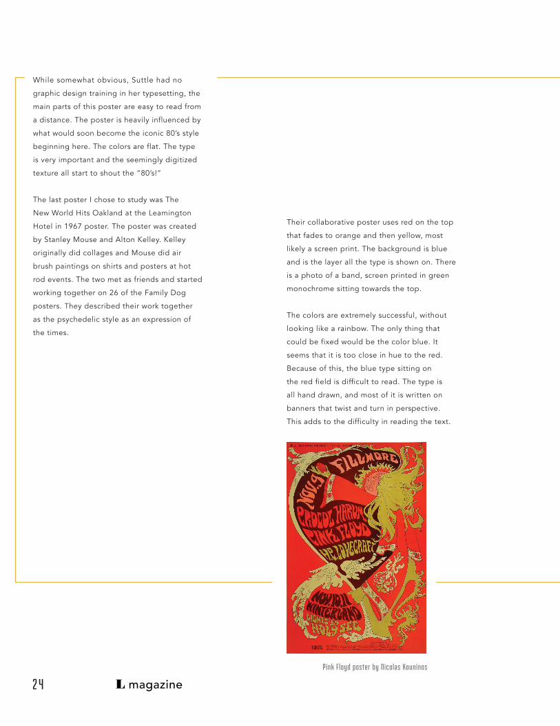
Pink Floyd poster by Nicolas Kouninos
Their collaborative poster uses red on the top
that fades to orange and then yellow, most
likely a screen print. The background is blue
and is the layer all the type is shown on. There
is a photo of a band, screen printed in green
monochrome sitting towards the top.
The colors are extremely successful, without
looking like a rainbow. The only thing that
could be fixed would be the color blue. It
seems that it is too close in hue to the red.
Because of this, the blue type sitting on
the red field is difficult to read. The type is
all hand drawn, and most of it is written on
banners that twist and turn in perspective.
This adds to the difficulty in reading the text.
2 4

L magazine
Stanley Mouse and Alton Kelley’s The Sparrow Poster
There is a texture drawn between the banners that breaks up
the space and makes it inviting to look at while contrasting
the type. Overall, the composition is straightforward but it
manages to draw attention. The golden ratio is employed in
the lower half but changes and swirls the other direction.
These posters combine image, type, color, line and
composition to tell the viewer about an event or happening.
These posters, like posters in general, are an exceedingly
effective vehicle of design. They seemed to have hit their
heyday in the 60’s, but they have continued to be a prominent
part of our music culture still. Band manager, Chris Coyle
explained, “It was enough to just to be obsessed with finding
them and sticking them up where you lived. Posters were
everywhere.” And posters are still everywhere.
2 5
From my study of looking into these
posters, I want to use colors that are similar
in hue to make them vibrate. I am going
to start experimenting with hand drawn
type and I will always take influence from
psychedelic rock posters, as this is what
turned me on to graphic design. I will also
mix other genres like Art Nouveau and the
early 80s, as they have always been a love
of mine. Composition is important to think
about and I will simplify mine to make my
posters more readable.
Su. Suttle’s, Talking Heads, B-52’s , UC Davis Poster

L magazine2 6

L magazine
1 poster24 x 48 inches
laser cut type
A Poster About My Process
2 7
L magazine
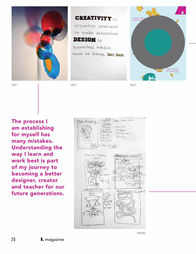
step 1 step 2 step 3
The process I am establishing for myself has many mistakes. Understanding the way I learn and work best is part of my journey to becoming a better designer, creator and teacher for our future generations.
creativity is allowing yourself to make
design is knowing which ones to keep
homehomehome
teadteadtead
bodon
venir
fairviw
Adam Scott
AAAAAAAAAaAAAAAQQQQQqQQQQQQQQQ
GGGG
sketches
2 8

L magazine
Mistakes are as much of a part of success
as they are of failure. Although we are
told that they are a necessary part of the
process of learning, it helps to be reminded
so that we do not feel defeated after we
make one. Instead of feeling defeated, it
is imperative to determine what lesson we
can learn from our mistake so that we can
remember that information when we need
it again.
step 4
sketche from middle of process
We want to aid others by offering our
own experience from errors we have
made, but we must keep in mind that
we often remember best what we
learned from our own mistakes.
AAAAAAAAAaAAAAAQQQQQqQQQQQQQQQ
creativity is allowing
yourself to make
design is knowing which ones to keep
Scott Adams
Bod
oni:
roman
itc an
d ell
egan
t
Aven
ir: fr
ench
for
futu
re, h
uman
touc
h
Fairview: quite, geometric, industrial, sans serifHomestea
d: “inspired by our need
to explore. a
lways searching fo
r a
place t
o call home”
Luke Lisi
GGGGG
2 9

L magazine
This poster titled “Mistakes,” is about
the process I have cultivated in myself
as a Graphic Designer. It was made with
the typeface: Homestead, designed by
Luke Lissi, as an experiment in moveable
type. Dilbert creator Scott Adams said,
“Creativity is allowing yourself to make
mistakes. Design is knowing which ones
to keep.” This spoke to my creative artist
background, which has been colliding
with my more disciplined design learning.
Cast shadows, handmade paper, bits of
string and a lesson in photography all
contribute to a vibrant palette of colors.
Accompanying typefaces consist of Bodoni
Std., Fairview and Avenir. In combination,
these four fonts make up a family unlike
any seen before. Little bits of information
can be found around the poster that name
each and explain why I chose them. Finally,
three sets of letters are seen overlaying
each letter from a specific font family to
show how drastic the different weights are
for that font.
3 0

L magazine 3 1

L magazine
Examining my Process
500 wordsdiagram of written statement
One of the best ways to work better is
to examine how you are working. There
are road blocks and “ah-ha” moments
for everyone but when do they happen?
Can we make them happen more often?
Those were the questions I was asking
myself when doing this assignment. I first
studied other people’s sketches of their
process and then sketched mine.
What I have now is an ever evolving
process that I constantly improvise to
make it work better for me.
wanderlust process sketch madebyshape.com process sketch
3 2

L magazine
Define: the birth of an idea
What is the idea? This is when I
decide or I am given an idea by a
client, teacher, or inspiration.
Investigation: search, steal, borrow
Researching an idea through Pinterest, Google,
Behance, peers. This is when I search for a
solution to the problem. I read some, I take
some notes, hopefully magic comes from this.
Expectations: the questioning stage
Is this cool enough
to take the time
to do? Has
someone already
done it and can I do
it better? Am I on
track for myself, my
teacher, my client?
Development: Can this be done?
Presentation: we are getting close
Spell and grammar check, fix rags, make
sure overlaps and corners are just right in
composition. Final craft is decided now. I
take some final photos and I think about
printing or other final deliverables,
make some test prints.
the Roller Coaster of aaahHHhh Process
This is when the bulk
of the experiments and
prototypes come with my
materials, lighting, colors,
typefaces. What combination
will they work the best in?
Should I redesign some of it?
process poster
3 3
Final Concept: I have searched all I can search, I think?
Usually at this point I have all the
research done for my materials, ideas,
concepts. First experiments have been
done to make sure somethings will work
Delivery: finished!
A final product is ready
for the world, printed,
published online,
whatever is needed for
this project.

L magazine
finding out where I fit into this world of design
sticky notes to brainstorm

L magazine
48 x 24 inch posterexplanationkey
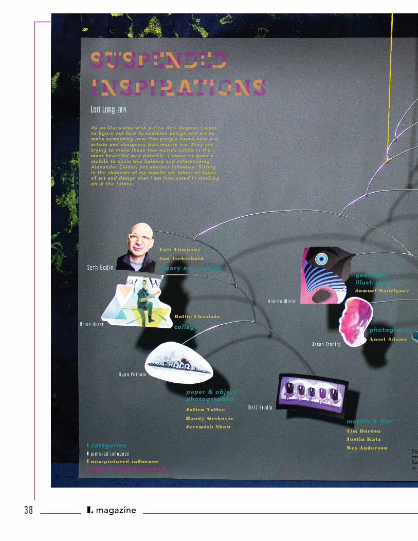
Mapping my Future
3 5
one of the first ideas

L magazine
sketches of mobiles
3 6

L magazine
Mapping out your future. Something every
one does, right? I think most people do
but they do not chose to make something
to understand it better. This project went
from sticky notes of designers and artists
I like and ways I like to work to the visual
inspirations I look toward.
My first idea was cutting the images I used
for inspiration and putting them into my
hair. I was trying to form a type of nest
that cultivated new inspirations. As this did
not work well, I moved on to the idea of a
mobile inspired by Alexandar Calder. I used
my work and wire to do my initial photos
for this idea.
step 2 step 3
3 7
L magazineL magazine3 8

L magazine 3 9
final poster
when in motion, the mobile would sway and intermingle with the other pieces and I could see possible combinations where I did not previously notice them.
I realized that using other designer’s and
artist’s work would give me better ideas
of how to mix different elements of my
work to make something completely
different. The final result was a mobile
with other people’s work and some of my
work. The idea is that,
L magazineL magazine
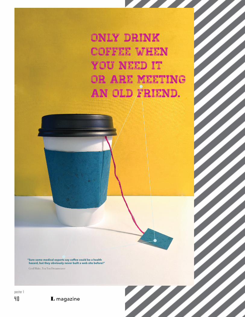
Only drink coffee when you need it or are meeting an old friend.
“Sure some medical experts say coffee could be a health hazard, but they obviously never built a web site before!”
Geoff Blake, Ten Ton Dreamweaver
poster 1
4 0

L magazine
2 Hours2 Posters
2 posters4 typefacescolor pallet
In two hours, without much warning,
we were to sketch, design and print
two posters. We had our tools from last
semester and a manifesto we had started
writing as the subject of the posters. I
was also told that I had to use a triangle
in each poster.
It was, at this time, the beginning of
the second semester. Our class wanted to
make something, to design something! We
had only written papers and done literature
reviews at this point and were bored.
Take another stab at web.
“First, solve the problem. Then, write the code.” John Johnson, Programmer
sketches of 2 manifesto points
poster 2
4 1
L magazine
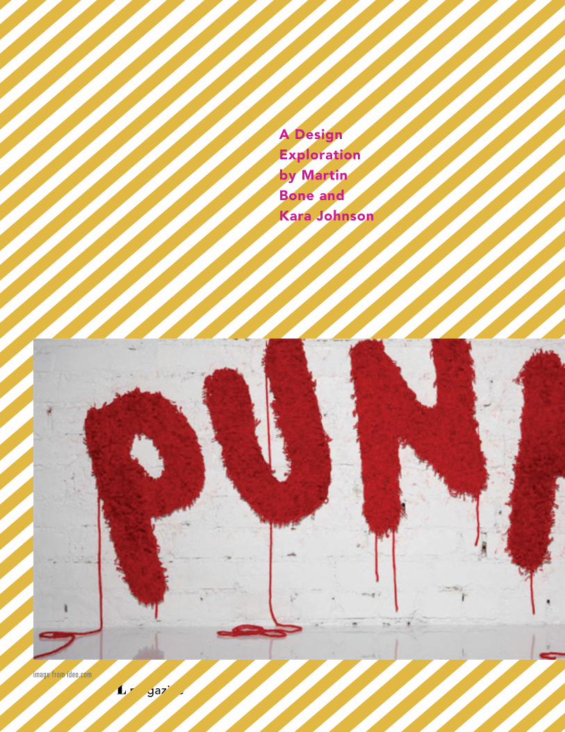
A Design Exploration by Martin Bone and Kara Johnson
image from ideo.com

L magazine
Graphic design research is new. Because of that, I find it helpful to
draw inspiration as well as topical information from other disciplines.
At this point in my studies, I have realized that I want to make
handmade design of many forms and photograph it. Now I need to
figure out how to do it differently.
a book review about industrial designers
Before reading this book, I thought I could imagine the process
Industrial Designers go through when working on a project. Now I
know a more detailed version of it. The next night after reading the
book, I found myself trying to figure out how to stuff chicken breasts
the best way possible from this perspective. It was refreshing to have
a new point of view.
The book is a design exploration between two
Industrial Designers on the opposite sides of
the United States. They talk about projects
they want to make and brainstorm via Instant
Messaging. Vivid images with an entertaining
layout and instant message format sets the
reader on a path of discovery. The book
is written so as to make the reader feel as
though they were part of the process. Each
designer explains the project, experiment and
end result separately and often times with
strikingly opposing views. This gives a very
honest feeling to the journey.
I Miss my Pencil
4 3

L magazine
One of the first chapters is called Aisthetika. Aisthetika are
things that we perceive through our senses, most often a unique
combination of the senses. Smell is the strongest sense and most
often left out of Industrial Design. Smell is also the sense
that helps us remember. A single smell can take you back to the
day when you were hanging out with your grandma. It could
be the smell of cut grass the day you skinned your knee, or it
images from ideo.comw
could be just the way your best friend’s
house smelled. There are also the less
acknowledged senses. The senses of time,
humor, style, balance and rhythm.
The first experiment the designers did was
making a printer less nois. Some people hate
the sound of printers, so they want to simplify
the sense of sound. They figured that they
could cover it in felt. They decided to take
one sense that was annoying and add another
one that could be more enjoyable. The
designers go through many steps of changing
the thickness of the felt, figuring out how to
make the ink accessible and how the paper
would feed through a drawer.
4 4

L magazine
image from ideo.com
Reading this book has helped me open my eyes to other disciplines in design.
In another experiment, a doorbell sprayed a specific scent for each person that rang it
and came into the house. Reading about this experiment made me think about how much
smell really does mean to me. In the book they said, “It smells like
the postman and lavender.” What a peculiar way to identify someone
with an essential oil. Now we want to positively label our friends and
family with jasmine, basil and lemon.
I can see how each experiment contributed to the success of
another, that each experiment is worth the time. Something that I
have been thinking lately, which is mentioned in the text: Design is
stuck on a known path to an expected result. Being a designer is not about getting to the
same place with different means. It is about getting to a different place. My next question
is, how does that poster with a scent and texture become digital?
4 5

L magazine

L magazine
Things I have Learned in my Life so Far
a book review about Stefan Sagmeister
There is no doubt that this book has one of the most attention-
getting covers ever seen. The collection box includes eighteen
books all with separately designed covers. The front of the box
has organic shapes cut into Sagmeister’s face. Each book put
behind the façade makes him look different. Some of the covers
have shapes that coincide with the shapes in the box, while others
disregard the openings altogether.Each booklet tells a story about one or two
projects. The first booklet I read had a black
and white bulls eye on the front, the kind that
is used to create optical illusions. There are
two projects in here: Worrying Solves Nothing
and Over Time I get Used to Everything and
Start Taking it for Granted. The first project
was done with school kids, 25,000 black coat
hangers, and 35,000 white coat hangers. The
children and Sagmeister built cubes out of
the hangers. They used 4 for each side and
then built the cube shape. Each cube became
a pixel and each pixel became part of the
message: “Worry Solves Nothing.” The words
ended up being over 10 feet high and a city
block long.
The second project, Over Time I get Used to Everything and Start
Taking it for Granted, is a series of photos taken throughout New
York City in places Sagmeister had never been to before. Because
of these unique stops, he could not take them for granted. Among
various other things, Sagmeister swam in the Hudson River at 6:00
a.m. with letters painted on his chest, marking a word on a dirty
cop car and hanging out the window of a thirtieth floor window
holding a sign until the police and fire trucks arrive. At this point in
the story, he narrowly misses being arrested.
After reading several other booklets, I realized that Sagmeister
tells a story through type, photography and video. Never does
he tell the story before the viewer can see part of the project.
Sagmeister plans things for his work and does not worry about
repercussions. He seems to live like a 20-year-old boy still with
ideas that are surprising. The most
interesting part of his stories is how he
gets to the idea. As a designer that keeps
trying to write a daily journal, which seems
like a great source to get encouragement.
All of his ideas seem to come from his journals or things that keep him up at night.
4 7
L magazine
Manifesto4 8

L magazine
Stay Diligent:
Take more notes and stay attentive.
Cause your memory’s gonna riot AHHH!”- Animal Collective, Slippi
a 15 point declaration of my design and how I would like to do it
fifteen 11 x 17 inch posters
each with one point
Standing on the Shoulders of Giants
1 “
Manifesto4 9

L magazine
2. Experiment with colors and good typefaces
you are uncomfortable with and use them one
at a time with the toolbox you have.
“Always do what you are afraid of.”- Emerson
3. Figure out what motivates you. Prove the
skeptics wrong.
“If we’re gonna do this,
we’ve got to do it now, while we’re young.
What are you tryin’ to prove, what are you
tryin’ to prove,
who are you tryin’ to prove it to?” -
Department of Eagles
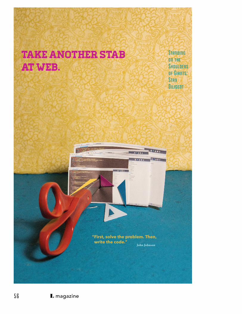
4. Take another stab at web.
“First, solve the problem. Then, write the
code. ” - John Johnson
5. Do not cut corners.
“Never cut corners, or accept anything that’s
second-rate.”- Bruce Oldfield
6. Ask questions, even if they are the dumb
questions.
“There are naive questions, tedious questions,
ill-phrased questions, questions put after
inadequate self-criticism. But every question
is a cry to understand the world. There is no
such thing as a dumb question.”- Carl Sagan
Stay Diligent:
7. Drink coffee when you need it or are
meeting an old friend.
“Sure some medical experts say coffee
could be a health hazard, but they
obviously never built a website before!”-
Geoff Blake, Ten Ton Dreamweaver
8. Research a new designer, writer,
someone professional and/or famous every
week.
“The trick to having good ideas is not to sit
around in glorious isolation and try to think
big thoughts. The trick is to get more parts
on the table.” - Steven Johnson, Where
Good Ideas Come From: The Natural
History of Innovation
9. Read EVERY day to build your social
skills.
For Better Social Skills, Scientists
Recommend a Little Chekhov
http://well.blogs.nytimes.com/2013/10/03/
i-know-how-youre-feeling-i-read-
chekhov/?_r=0
10. Look back at artists and designers you
have already learned about and see if their
work is now relevant to yours.
“Eventually everything connects —
people, ideas, objects...the quality of the
connections is the key to quality per se...I
don’t believe in this ‘gifted few’ concept,
just in people doing things they are really
interested in doing. They have a way of
getting good at whatever it is.”- Charles
Eames
11.Take risks and make mistakes.
“Creativity is allowing yourself to make
mistakes. Design is knowing which ones to
keep.” - Scott Adams
sketches of initial ideas
5 0

L magazine
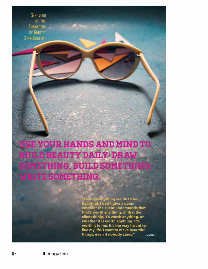
12. Use your hands and mind to build beauty
daily: draw something, build something, write
something.
“I want everything we do to be beautiful.
I don’t give a damn whether the client
understands that that’s worth anything, of
that the client thinks it’s worth anything, or
whether it is worth anything. It’s worth it to
me. It’s the way I want to live my life. I want to
make beautiful things, even it nobody cares.”
- Saul Bass
13. Don’t work for less than you are worth.
“ A successful design career is possible
without forfeiting self-respect as long as you
do not undervalue (or overvalue) your work.”
- Peter Landt
14. Stuck on a project?
“Sometimes you just have to go skiing.” - Al
Sanft
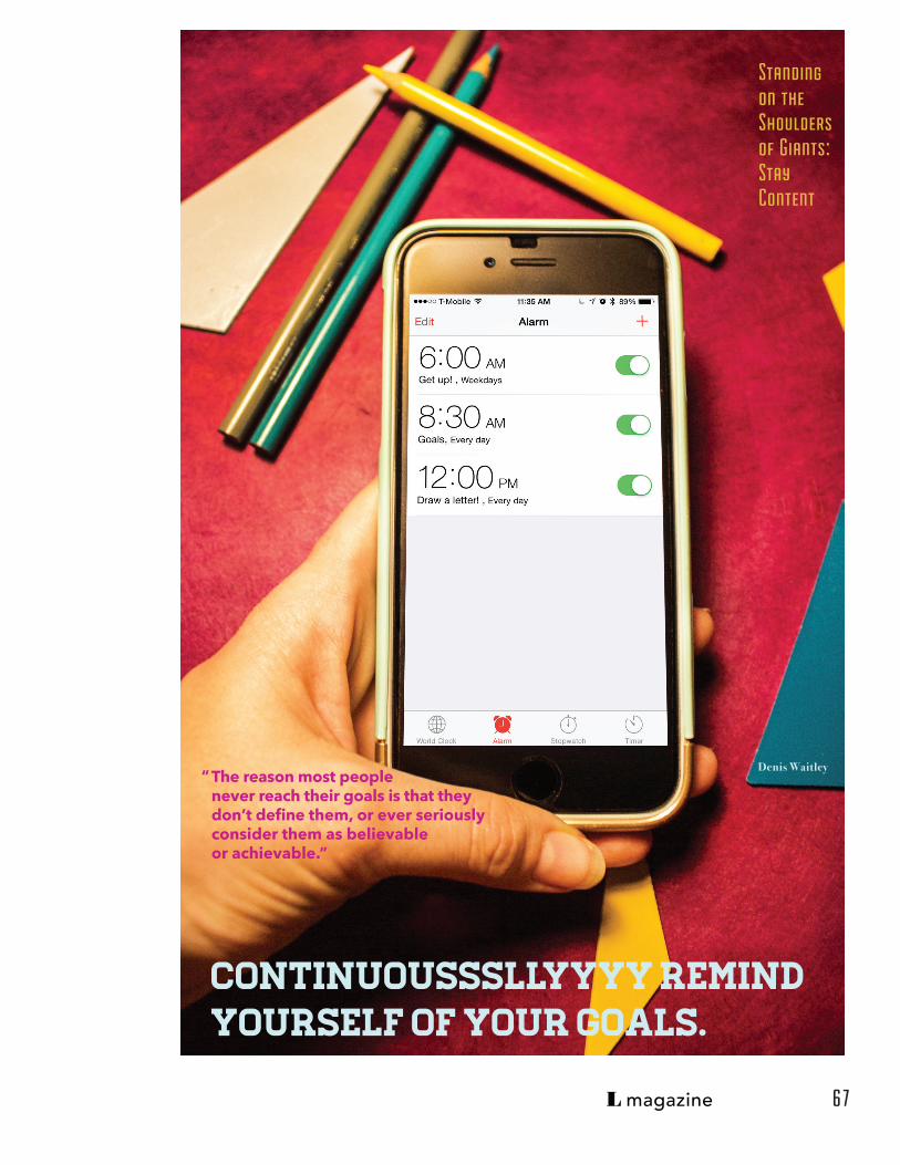
15. Continuousssssssllyyyyyy remind yourself
of your goals.
“The reason most people never reach their
goals is that they don’t define them, or ever
seriously consider them as believable or
achievable.” - Denis Waitley
Stay Content:
5 1

L magazine
The next step in the process was cutting and
painting triangles in my color pallette.
I strung up, arranged, placed, moved,
scattered, and spinkled trangles around my
screens. I had them illustrate the point.
After light
Photoshopping,
I added text for
each point.
5 2

L magazine
Standing on the Shoulders of Giants:Stay Diligent
Take more notes and stay attentive.
“Cause your memory’s gonna rot AHHH!”
Animal Collective, Slippi
5 3

L magazine
Standing on the
Shoulders of Giants:
Stay Diligent
“Always do what you are
and typefaces you are uncomfortable with & use them one at a time with your toolbox.
Emerson afraid of.”
Experiment with colors
54

L magazine
Standing on the Shoulders of Giants:StayDiligent
we’ve got to do it now, while we’re young.What are you tryin’ to prove, what are you tryin’ to prove,who are you tryin’ to prove it to?”
Figure out what motivates you. Prove the skeptics wrong.
Department of Eagles
“If we’re gonna do this,
5 5
L magazine
Take another stab at web.
“First, solve the problem. Then, write the code.”
John Johnson
Standing on the Shoulders of Giants:Stay Diligent
5 6

L magazine
Standing on the Shoulders of Giants:Stay Diligent
“Never cut corners, or accept anything that’s second-rate.”
Do not cut corners.
Bruce Oldfield
57

L magazine
There are naive questions, tedious questions, ill-phrased questions, questions put after inadequate self-criticism. But every question is a cry to understand the world. There is no such thing as a dumb question.”
Standing on the Shoulders of Giants:Stay Diligent
Ask questions, even if they
are the dumb questions.
Carl Sagan“
5 8

L magazine
Sure some medical experts say coffee could be a health hazard, but they obviously never built a web site before!”
“
Geoff Blake
Only drink coffee when you need it or are meeting an old friend.
Standing on the Shoulders of Giants:Stay Diligent
5 9

L magazine
The trick to having good ideas is not to sit around in glorious isolation and try to think big thoughts. The trick is to get more parts on the table.”
Research a new designerwriter, someone professionaland/or famous every week.
Steven Johnson
“
Standing on the Shoulders of Giants:Stay Diligent
6 0

L magazine
For Better Social Skills, Scientists Recommend a Little Chekhov
Read EVERY day to build your social skills.
Standing on the Shoulders of Giants:StayDiligent
6 1

L magazine
Eventually everything connects — people, ideas, objects...the quality of the connections is the key to quality per se...I don’t believe in this ‘gifted few’ concept, just in people doing things they are really interested in doing. They have a way of getting good at whatever it is.”
Look back at artists and designers you have already learned about and see if their work is now relevant to yours.
Charles Eames
“
Standing on the Shoulders of Giants:Stay Diligent
6 2

L magazine
Creativity is allowing yourself to make mistakes. Design is knowing which ones to keep.”
Take risks and make mistakes.
Scott Adams
“
Standing on the Shoulders of Giants:Stay Diligent
6 3
L magazine
“I want everything we do to be beautiful. I don’t give a damn whether the client understands that that’s worth any thing, of that the client thinks it’s worth anything, or whether it is worth anything. It’s worth it to me. It’s the way I want to live my life. I want to make beautiful things, even it nobody cares.”
Standing on the
Shoulders of Giants:
Stay Content
Use your hands and mind to build beauty daily: draw something, build something, write something.
Saul Bass
6 4

L magazine
A successful design career is possible without forfeiting self-respect as long as you do not undervalue (or overvalue) your work.”
Standing on the Shoulders of Giants:Stay Content
Don’t work for less Than you are worth.
Peter Landt
“
6 5

L magazine
“Sometimes you just have to go skiing.”
Standing on the Shoulders of Giants:Stay Content
Take a break.
Al Sanft
6 6
L magazine
The reason most people never reach their goals is that they don’t define them, or ever seriously consider them as believable or achievable.”
Standing on the Shoulders of Giants:Stay Content
Continuousssllyyyy remind yourself of your goals.
Denis Waitley“
6 7

L magazine
Memory is a challenge for most people but for others, it can be impossible.
6 8

L magazine
It is easy to read this article and only understand it at certain points, but at those times,
becoming truly amazed. For example, Proust says that memories under extreme scrutiny
can disappear like a star in the sky looked at too long. This is a simple but humbly
articulate way to describe this experience. He later says “Eyes are just time machines,
telescopes of the invisible.” I have so many images in my head to envision what he meant
by that, all of these images, of course, are from my memory.
This book will be a continued exploration into thinking about memory and how to work
towards my goal of playing with a viewer’s memory and possibly helping them remember
in a different way. From this book I learned that to one writer, memories are experiences,
consciousness, feelings, thought, and ideology connected with food, material
possessions, daily routine, and more. As I go forward, this definition will guide me.
Documents of Contemporary Art a book review
about Memory
I read about Marchel Proust: arguably
the best author in the world. He was an
essayist, critic, and novelist known most for
the novel À la recherché du temps redu, It
was seven volumes, ten in total but three
were never published as he had passed
away before completion, and translates to
Remembrance of Things Past. These books
were about involuntary memory and the
search for lost time.
6 9
Roger Shattuck writes about them and has a discussion with the
reader about what Proust meant in his books. Shattuck refers to
work that Proust did to undertake a transposition of spatial vision
by adding optical figures until it removed our depth perception in
space and re-invents itself in time. In this way, Proust is explaining
memories as images we string together in our heads to create a
story. After such experiments Proust aimed to revolutionize the “here”
and “now.”
As someone that has short-term memory loss, I am regularly
trying to remember where I put my jacket or phone, what the Art
Director’s name is that just introduced themselves to me, or simply
writing a word down after someone has just verbally announced
it to me. Memory loss cannot be seen or really noticed unless it is
severe. As a Graphic Designer with short-term memory loss, I want
to learn all that I can about memory and how I can sew it into my work.
This book is a compilation of documents from various people
talking about memory, how they understand it to work in various
ways and what others have written about it.

L magazine
thesis bstracts
3 abstracts3 different ideas
1 future ahead
7 0
A

L magazine
thesis bstracts
Remembering to Remember or Forgetting to Forget
Handcrafted Type: An Exploration in Typeface Essentials
Blurry Lines: Haptic Learning& Tactile Design for Memory
7 1
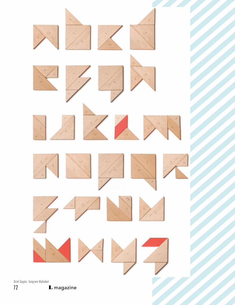
L magazineOriol Gayán, Tangram Alphabet
7 2

L magazine
Haptic Learning & Tactile Design for Memory
Blurry Lines:
In the 21st Century, nearly everyone owns
a computer and has a deceptive freedom
of digital creation. They feel of they can
buy Photoshop or Illustrator, they can be a
“designer.” It seems that trends and fads
continuously cycle in and out of popularity.
I believe tactile and handcrafted work is
coming back into its prime.
Handmade items uncover our real roots
as humans and give haptic learners a
way to understand things. By creating
something that cannot be shrugged off
or clicked out of, it demands the viewer’s
full attention and deliberate commitment.
The mesmerizing and meditative beauty
of extended, focused concentration is
something to celebrate and bring back
to the attention of such computer users.
I see this approach as a refreshing and
reinvigorating way to work.
Now is the time to celebrate the simple joy of something analog in this world obsessed with digital and return to the tangible realm, to physical creations.
Paloma Rincón, Bankia 50
7 3

L magazine
My interest in this area of study is based on
my experience working with tactile graphic
design elements and learning by touch,
therefore encouraging better remembering.
My research on Jeremiah Shaw and Zim
& Zou has helped me frame an area of
tangible design, which interests me. Julien
Vallee’s study and work on handmade
graphic design has helped me see and
understand how I might aid haptic learners
by making tactile design for creating
memories.
My work will seek to expand and articulate
the possibilities of what is expected of
graphic design, what the boundaries of
graphic design are and what the difference
is between digital and tactile design
through a series of experimental interviews.
I will experiment with the following process
and methods: laser cutting wood, paper
folding and light and shadow play because
they will help me better understand how
tactile graphic design shapes memories.
My work could revolutionize the way
design is viewed and how people learn
through touch, having impact on the design
community and haptic learners. My thesis
will help me begin to understand what
makes a person remember a design so that
I may make progress toward my long term
goal of helping others remember my work.
Kevin Steele, The Movable Book of Letterforms
7 4

L magazine
It is easier to have better craftsmanship
when designing in a computer than it is
when designing by hand. Off the computer
is a different world where command-z does
not undo the last thing done and there is no
“undo” shortcut. It is important to go slowly
when designing by hand, some would say
painstakingly slow. Mistakes either turn into
happy mistakes or things that will restart an
entire project. As such, handmade design is
almost a newfound cultural freedom in this
thoroughly digital era. Not everyone has the
patience to withstand such long, laboring
hours. As a designer that enjoys the reaction
of, “How do you have so much patience,”
I want to further test my patience and
thoroughly examine type.
An Exploration in Typeface Essentials
Handcrafted Type:
Jessica Hishe, Starbucks: Fancy Lattes
Letter forms are the heart of graphic
design. There are many types of Designers
but only one who knows what a typeface
is, how to choose it, when to utilize it, etc.
My interest in this area of study is based
on my experience studying and exploring
typefaces. My research on Jessica Hische and
Arm Studio has helped me frame an area in
typeface design which interests me. Victoria
Rushton’s study and work on unique and non-
traditional hand drawn fonts has helped me
see and understand how I might contribute to
graphic design by making work that confronts
typeface design in advertising, books and on
the web.
Type is a big component of design, and learning about different ways to make a letter while studying readability, accessibility and usability is something I would like to explore.
7 5

L magazine
Anna Keville, Panco Sassano & Agustin Nieto, A Gusto
Marmalade Bleue, Love You More
My work will seek to expand and articulate
the possibilities of readability, accessibility
and usability through various experiments
in building letter forms. I will experiment
with foods, naturally occurring objects and
industrially designed objects to create them.
These experiments will help me better
understand how typeface design shapes
readability and human behavior. It will closely
examine the often forgotten or overlooked
parts of a letter form from a slow meditative
work flow.
My work could challenge the boundaries
of what a typefaces is, having impact on
anyone that can read the English language.
My thesis will help me begin to experiment
with typographical forms so that I may
make progress toward my long term goal of
designing typefaces.
Anna Keville, Panco Sassano & Agustin Nieto, A Gusto
7 6

L magazine
Remembering to Remember or Forgetting to Forget
Memory is a challenge for many people, but for others it can be
impossible task. As someone who has short-term memory loss, I
am regularly trying to remember where I put my jacket or phone,
what the Art Director’s name is that just introduced
I hope to inspire further explorations of memory.
himself to me or simply writing a word down after someone has
just verbally announced it to me. Memory loss is considered a
different level of ability from what is “normal” but not one that can
be seen or really noticed unless it is severe.
Tame Impala, Feels Like We Only Go Backwards
7 7

L magazine
As a Graphic Designer with short-term memory loss, I want to learn all that I can about memory and how I can sew it into my work and possibly help others with the same challenges. My research on Marcel Proust has helped me frame an area of memory-driven design. Proust’s study and work on involuntary memory and the search for lost time has helped me see and understand how I might contribute to graphic design. In this thesis, I can make work that explores and expands how we design for people with varying levels of memory retention.
My work will seek to expand and articulate the possibilities of the activation of memory,
haunting memories, rewinding and fast forwarding time, and the act of forgetting through short videos that will remind viewers of past and present times. The videos will be created with experimentation in tactile handmade design. I will experiment with the following processes and methods: repetition, reappearance, grid systems and transparencies. I will explore active forgetting because it will help me better understand how our experiences, consciousness, feelings, thought and ideology transcend to memorable.
My thesis is intended to shape human behavior when referring to practices of memory. My work could evolve into a more artistic approach to design, having impact on those with varying levels of memory retention as well as my peers.
Animal Collective, Bluish Julien Vallee, Hermes Metamorphose
7 8

L magazine
process postermapping my future poster15 manifesto posters
photo credit: Lindsay Kinkade
Posters& Talks
7 9

L magazine
The show consisted of my classes posters
and short talks about local urban design
entrepreneurs and their innovative infill
projects, new business models in residential
renovation, and passion for historic
preservation.
Photo Credit: Shangning Wang
Photo Credit: Lizhou Zhang
8 0

