klingaman creative portfolio samples
TRANSCRIPT
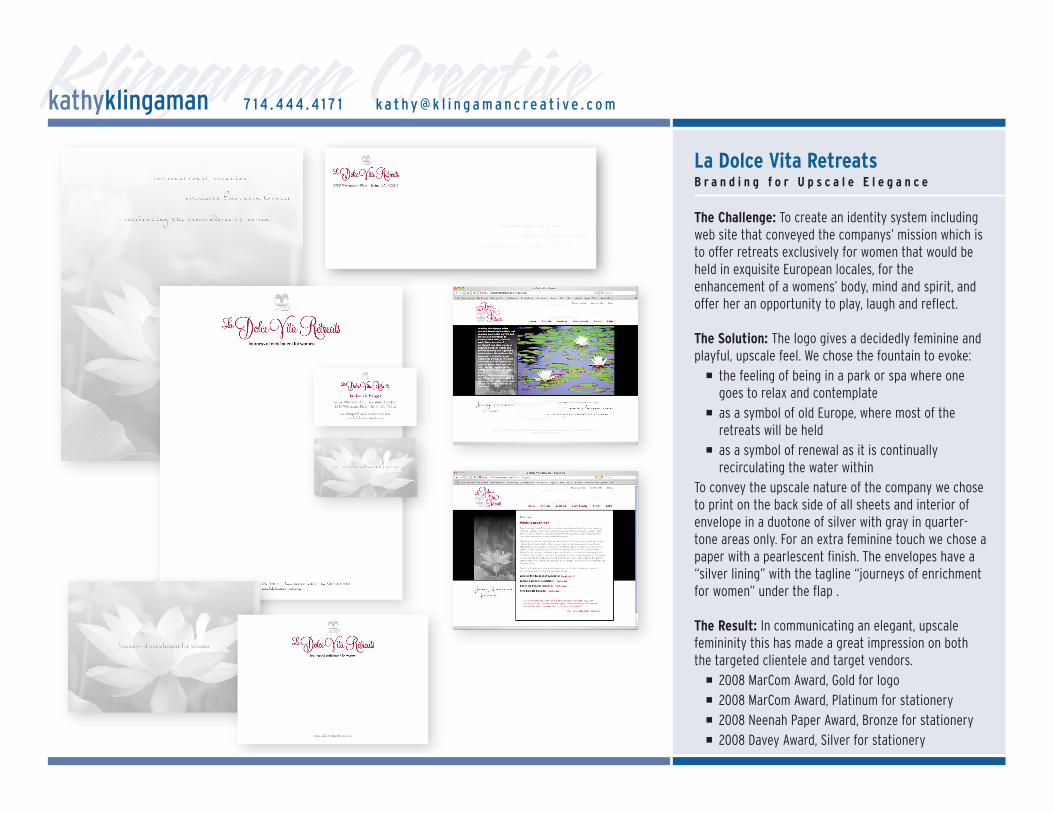
Klingaman CreativeLa Dolce Vita RetreatsB r a n d i n g f o r U p s c a l e E l e g a n c e
The Challenge: To create an identity system includingweb site that conveyed the companys’ mission which isto offer retreats exclusively for women that would beheld in exquisite European locales, for theenhancement of a womens’ body, mind and spirit, andoffer her an opportunity to play, laugh and reflect.
The Solution: The logo gives a decidedly feminine andplayful, upscale feel. We chose the fountain to evoke:
� the feeling of being in a park or spa where onegoes to relax and contemplate
� as a symbol of old Europe, where most of theretreats will be held
� as a symbol of renewal as it is continuallyrecirculating the water within
To convey the upscale nature of the company we choseto print on the back side of all sheets and interior ofenvelope in a duotone of silver with gray in quarter-tone areas only. For an extra feminine touch we chose apaper with a pearlescent finish. The envelopes have a“silver lining” with the tagline “journeys of enrichmentfor women” under the flap .
The Result: In communicating an elegant, upscalefemininity this has made a great impression on boththe targeted clientele and target vendors.
� 2008 MarCom Award, Gold for logo� 2008 MarCom Award, Platinum for stationery� 2008 Neenah Paper Award, Bronze for stationery� 2008 Davey Award, Silver for stationery
kathyklingaman 7 1 4 . 4 4 4 . 4 1 7 1 k a t h y @ k l i n g a m a n c r e a t i v e . c o m
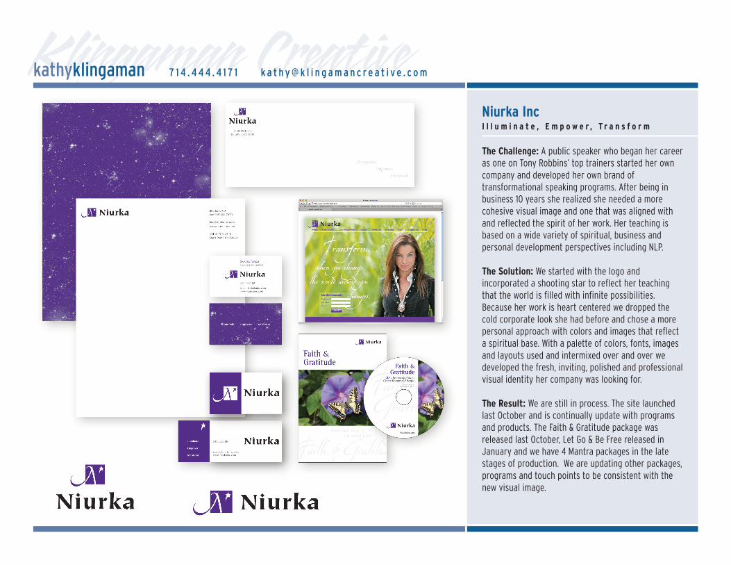
Klingaman CreativeNiurka IncI l l u m i n a t e , E m p o w e r , T r a n s f o r m
The Challenge: A public speaker who began her careeras one on Tony Robbins’ top trainers started her owncompany and developed her own brand oftransformational speaking programs. After being inbusiness 10 years she realized she needed a morecohesive visual image and one that was aligned withand reflected the spirit of her work. Her teaching isbased on a wide variety of spiritual, business andpersonal development perspectives including NLP.
The Solution: We started with the logo andincorporated a shooting star to reflect her teachingthat the world is filled with infinite possibilities.Because her work is heart centered we dropped thecold corporate look she had before and chose a morepersonal approach with colors and images that reflecta spiritual base. With a palette of colors, fonts, imagesand layouts used and intermixed over and over wedeveloped the fresh, inviting, polished and professionalvisual identity her company was looking for.
The Result: We are still in process. The site launchedlast October and is continually update with programsand products. The Faith & Gratitude package wasreleased last October, Let Go & Be Free released inJanuary and we have 4 Mantra packages in the latestages of production. We are updating other packages,programs and touch points to be consistent with thenew visual image.
kathyklingaman 7 1 4 . 4 4 4 . 4 1 7 1 k a t h y @ k l i n g a m a n c r e a t i v e . c o m
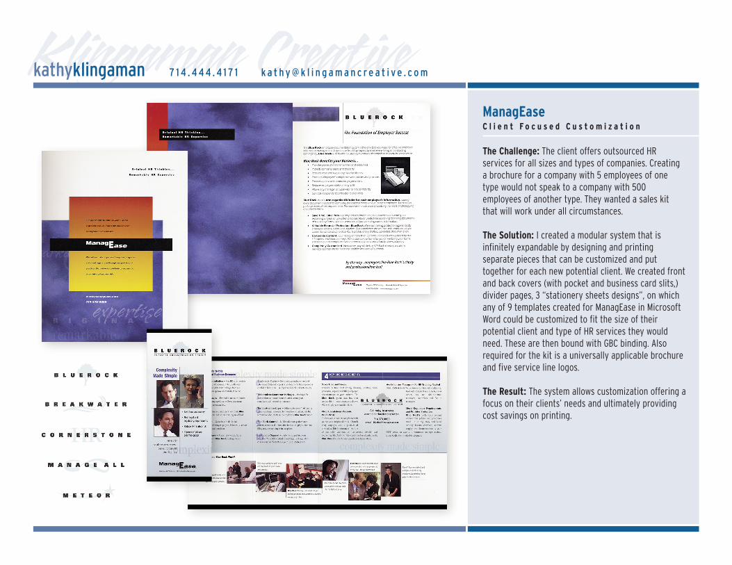
Klingaman CreativeManagEaseC l i e n t F o c u s e d C u s t o m i z a t i o n
The Challenge: The client offers outsourced HRservices for all sizes and types of companies. Creatinga brochure for a company with 5 employees of onetype would not speak to a company with 500employees of another type. They wanted a sales kitthat will work under all circumstances.
The Solution: I created a modular system that isinfinitely expandable by designing and printingseparate pieces that can be customized and puttogether for each new potential client. We created frontand back covers (with pocket and business card slits,)divider pages, 3 “stationery sheets designs”, on whichany of 9 templates created for ManagEase in MicrosoftWord could be customized to fit the size of theirpotential client and type of HR services they wouldneed. These are then bound with GBC binding. Alsorequired for the kit is a universally applicable brochureand five service line logos.
The Result: The system allows customization offering afocus on their clients’ needs and ultimately providingcost savings on printing.
kathyklingaman 7 1 4 . 4 4 4 . 4 1 7 1 k a t h y @ k l i n g a m a n c r e a t i v e . c o m
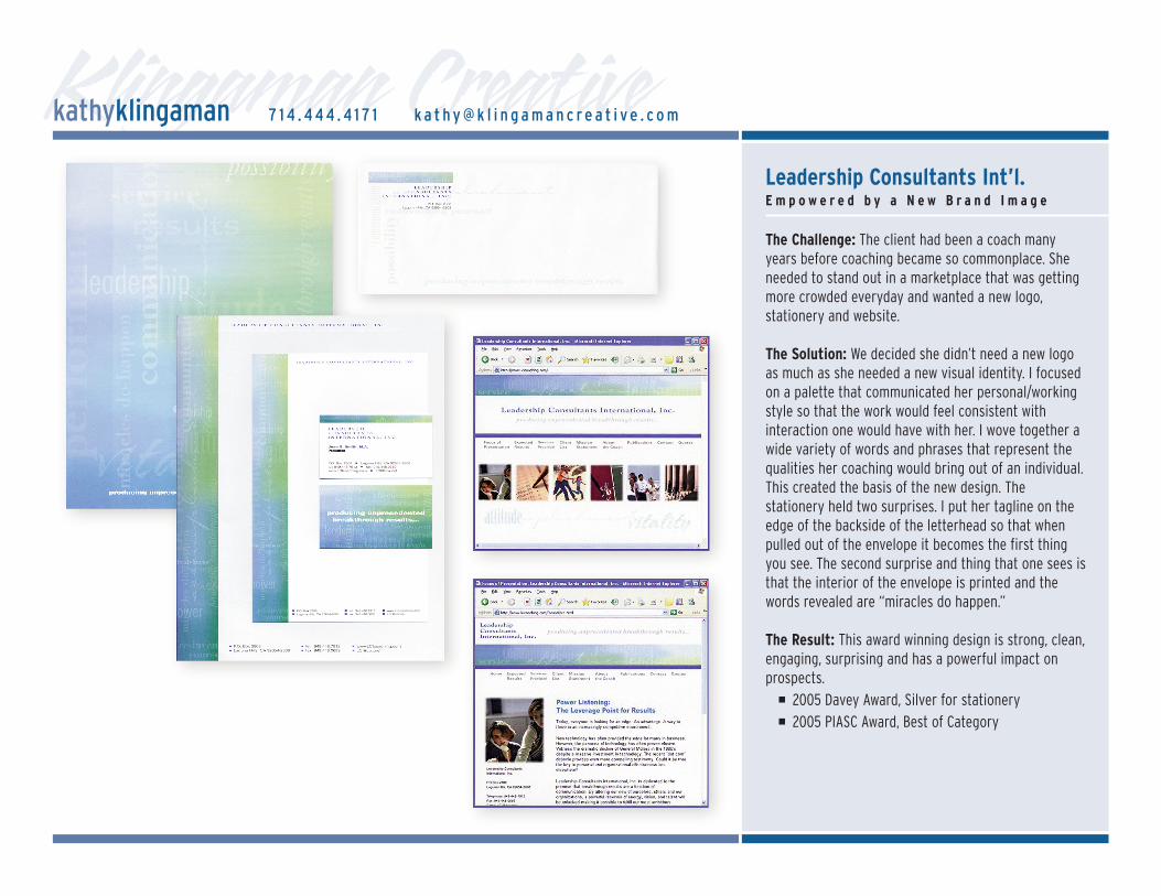
Klingaman CreativeLeadership Consultants Int’l.E m p o w e r e d b y a N e w B r a n d I m a g e
The Challenge: The client had been a coach manyyears before coaching became so commonplace. Sheneeded to stand out in a marketplace that was gettingmore crowded everyday and wanted a new logo,stationery and website.
The Solution: We decided she didn’t need a new logoas much as she needed a new visual identity. I focusedon a palette that communicated her personal/workingstyle so that the work would feel consistent withinteraction one would have with her. I wove together awide variety of words and phrases that represent thequalities her coaching would bring out of an individual.This created the basis of the new design. Thestationery held two surprises. I put her tagline on theedge of the backside of the letterhead so that whenpulled out of the envelope it becomes the first thingyou see. The second surprise and thing that one sees isthat the interior of the envelope is printed and thewords revealed are “miracles do happen.”
The Result: This award winning design is strong, clean,engaging, surprising and has a powerful impact onprospects.
� 2005 Davey Award, Silver for stationery� 2005 PIASC Award, Best of Category
kathyklingaman 7 1 4 . 4 4 4 . 4 1 7 1 k a t h y @ k l i n g a m a n c r e a t i v e . c o m
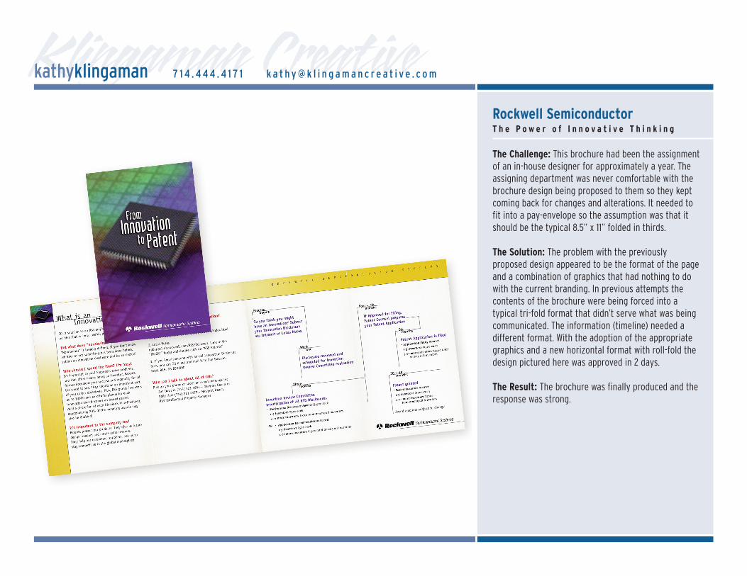
Klingaman CreativeRockwell SemiconductorT h e P o w e r o f I n n o v a t i v e T h i n k i n g
The Challenge: This brochure had been the assignmentof an in-house designer for approximately a year. Theassigning department was never comfortable with thebrochure design being proposed to them so they keptcoming back for changes and alterations. It needed tofit into a pay-envelope so the assumption was that itshould be the typical 8.5” x 11” folded in thirds.
The Solution: The problem with the previouslyproposed design appeared to be the format of the pageand a combination of graphics that had nothing to dowith the current branding. In previous attempts thecontents of the brochure were being forced into atypical tri-fold format that didn’t serve what was beingcommunicated. The information (timeline) needed adifferent format. With the adoption of the appropriategraphics and a new horizontal format with roll-fold thedesign pictured here was approved in 2 days.
The Result: The brochure was finally produced and theresponse was strong.
kathyklingaman 7 1 4 . 4 4 4 . 4 1 7 1 k a t h y @ k l i n g a m a n c r e a t i v e . c o m
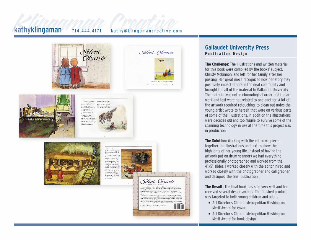
Klingaman CreativeGallaudet University PressP u b l i c a t i o n D e s i g n
The Challenge: The illustrations and written materialfor this book were compiled by the books’ subject,Christy McKinnon, and left for her family after herpassing. Her great niece recognized how her story maypositively impact others in the deaf community andbrought the all of the material to Gallaudet University.The material was not in chronological order and the artwork and text were not related to one another. A lot ofthe artwork required retouching, to clean out notes theyoung artist wrote to herself that were on various partsof some of the illustrations. In addition the illustrationswere decades old and too fragile to survive some of thescanning technology in use at the time this project wasin production.
The Solution: Working with the editor we piecedtogether the illustrations and text to show thehighlights of her young life. Instead of having theartwork put on drum scanners we had everythingprofessionally photographed and worked from the4”x5” slides. I worked closely with the editor, hired andworked closely with the photographer and calligrapher,and designed the final publication.
The Result: The final book has sold very well and hasreceived several design awards. The finished productwas targeted to both young children and adults.
� Art Director’s Club on Metropolitan Washington,Merit Award for cover
� Art Director’s Club on Metropolitan Washington,Merit Award for book design
kathyklingaman 7 1 4 . 4 4 4 . 4 1 7 1 k a t h y @ k l i n g a m a n c r e a t i v e . c o m
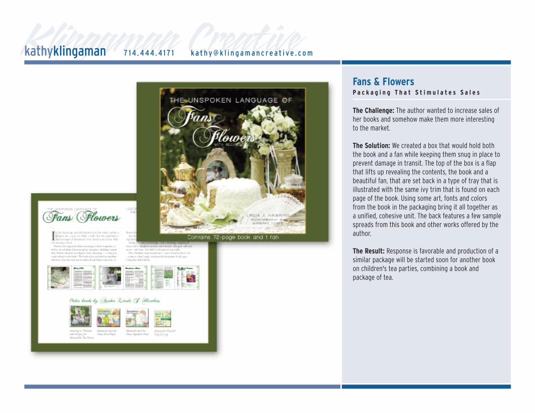
Klingaman CreativeFans & FlowersP a c k a g i n g T h a t S t i m u l a t e s S a l e s
The Challenge: The author wanted to increase sales ofher books and somehow make them more interestingto the market.
The Solution: We created a box that would hold boththe book and a fan while keeping them snug in place toprevent damage in transit. The top of the box is a flapthat lifts up revealing the contents, the book and abeautiful fan, that are set back in a type of tray that isillustrated with the same ivy trim that is found on eachpage of the book. Using some art, fonts and colorsfrom the book in the packaging bring it all together asa unified, cohesive unit. The back features a few samplespreads from this book and other works offered by theauthor.
The Result: Response is favorable and production of asimilar package will be started soon for another bookon children's tea parties, combining a book andpackage of tea.
kathyklingaman 7 1 4 . 4 4 4 . 4 1 7 1 k a t h y @ k l i n g a m a n c r e a t i v e . c o m