into the light catalogue
TRANSCRIPT

JOURNEY INTO THE LIGHT
The Art Treasures of Coventry Cathedral Their Making and Meaning
Geoffrey Clarke, monograph design study for Crown of Thorns
JOU
RNEY
INTO
THE LIG
HT

Contents Catalogue authors 2 Preface by the Bishop of Coventry 31 Introduction 42 Cross and Candlesticks for Undercroft Chapel of the Cross 63 Architect 84 The Swedish Windows 105 High Altar Cross 126 Christ in Glory in the Tetramorph Tapestry 147 Sanctuary Candlesticks 208 Relief for the Chapel of Gethsemane 229 Crown of Thorns, Chapel of Christ the Servant 24 10 Lectern Eagle 26 11 Calligraphy and the Font 28 12 The Sir Jacob Epstein Sculptures 30 13 The Great West Screen 36 14 Baptistry Window 42 15 Chapel of Unity 48 16 Nave Windows 50 17 Kneelers and Vestments 54 Further Reading 59 Acknowledgments 60

2 3
Catalogue authorsJohn Willis (Chapters 1, 2, 5, 7, 9, 10, 12 and 16)John was born in Petts Wood, Kent in 1943, and came to Coventry to study and work in 1961. In 1964 he married Shirley. John started his career at Courtaulds before moving into the motor industry and latterly Peugeot. When early retirement occurred in 2002 a life-long interest in visual arts led to a return to academia and the University of Warwick, where he collected a first class BA in Historical Studies followed by a research masters in the History of Art.John’s introduction to the Cathedral community came when Shirley joined the staff in 1989. In 1995, he was elected Chairman of the Friends of Coventry Cathedral, a post he held until 2004. Meanwhile, Shirley had joined the staff of Coventry Cathedral before moving, as a volunteer, into the cathedral archives. It was during a time when John was helping her in the archives, some two years ago, that the idea for this exhibition emerged.
sARAh WAlFoRD (Chapters 3, 4, 14, 15 and 17)Sarah trained as an archaeologist, but archaeological work gradually led into the recording of standing buildings and she moved to Coventry, in 1989, to join an architect specialising in the conservation of historic buildings and ancient monuments. The move into architecture led to an MA (Dist) in Architectural History, at Keele University, and the realisation that she found 20th-century buildings far more interesting than holes in the ground. It also led to a lasting fascination with Coventry’s role in the development of post-war architecture, particularly the influence of its first City Architect, Donald Gibson. The MA was followed by a decade of involvement in major repair and con-servation works at Holy Trinity Church, Coventry. In 2005, a PhD studentship, with the Sir Basil Spence Archive Research Project, offered the opportunity to return to post-war architecture and to study the lives and careers of Spence and his contemporary Donald Gibson. She compiled the ‘List of Works’ for the recently published Sir Basil Spence: Buildings and Projects (London: RIBA, 2012), and has written about Spence’s school designs for the journal, Architectural Heritage (Edinburgh: EUP, 2011) A practising artist, she has exhibited as far afield as Kent and Caithness. She lives with her family in Coventry, continues her research into the city’s architecture, and is currently a part-time lecturer in the History of Art Depart-ment at Warwick University.
Dianne Morris (Chapters 8, 11 and 13)Dianne was born and educated in Kenilworth, Warwickshire. Whilst working at the University of Warwick for a number of years, she enhanced a long-standing interest in art history by studying for, and being awarded, a BA (Hons) in History of Art. This degree included a dissertation on the theme of the public sculpture which was commissioned by City Architects Donald Gibson and Arthur Ling for Coventry’s city centre during the rebuilding of the damaged city after the Second World War. Subsequent to graduating, she left the University to further pursue her studies. She is now studying for an MA in History of British Art at Warwick. Dianne’s interests include 18th and 19th century British art and architecture, medieval buildings and 20th century American art.Dianne is currently working as an archivist at Coventry Cathedral which combines her interest in research and 20th century architecture. She also works for Compton Verney, in Warwickshire - A renowned art gallery, which has a varied programme of temporary exhibitions, together with an important and diverse permanent collection.
Katherine Margaret Lee (Chapter 6)Katherine was born in Coventry in 1989. Her Catholic upbringing gave her a great interest in cathedrals and places of worship. She attended Saint Thomas More Catholic Primary School and then went on to studying at Bishop Ullathorne Catholic School and Humanities College. As part of her A levels, she studied Fine Art, and her studies included Coventry’s rich heritage, and many visits to the Cathedral and its ruins. In her year out before university, Katherine studied with Warwick Open Studies in the History of Art, gaining an insight into the field and affirming her interest in the topic. Katherine started her undergraduate degree in the History of Art with Italian in 2008, at the University of Warwick, and studied modules such as ‘The Natural World and the Arts of Modernity’, and ‘Classicism and the Arts of Christianity’. As part of her undergraduate dissertation she worked with various authors and institutions including Yale University. She also did various industry placements whilst completing her degree including work at Warwick Arts Centre and the Cartoon Museum in London. After completing her degree , in July 2011, she began studying a part time Masters degree in Global Media and Communication at the Centre for Cultural Policy, University of Warwick. She is also working part time in the Paul Mellon Centre, London, where she is an Archives and Library Assistant.
PrefaceChristopher CoCksworthBishop of Coventry‘A sacred building ought to be one in which we are learning to see, a building that teaches us not only by the words spoken, the written Word of God, the preaching of that Word, the teaching that goes on. It should be a building that helps us see afresh’. So said Rowan Williams, Archbishop of Canterbury, during his remarkable sermon at the Cathedral’s Golden Jubilee Service, 50 years to the day after its consecration in 1962. Uniquely, at least as far as an English Cathedral is concerned – the art work of Coventry Cathedral is integral to the building itself. The art of the architecture includes every aspect of the art which makes it into the sort of religiously arresting building that it is – from windows to candlesticks, from statues to door knobs, from tapestry to calligraphy. In this way, Coventry’s new Cathedral helps us to glimpse God’s new creation. We see a complete vision coming to life before our eyes, every detail of a new world made pos-sible by the triumph of God’s resurrecting love that overcomes the destructive capacities of evil to which humanity, of itself, so easily succumbs. We are deeply indebted to the great artists of the 20th Century who caught this vision and wanted to share in it – often for very modest material reward – and I am delighted that the Cathedral has commissioned this excellent Golden Jubilee Exhibition to celebrate their work. This exhibition gives us in the 21st Century an opportunity not just to focus on the extraordinary skill displayed in each piece of art but also to lift our eyes to see the risen and ascended Christ in and through whom God’s art of perfecting creation is complete.It is great joy to welcome you to this magnificent Cathedral and this Golden Jubilee Exhibition of its ‘Casket of Jewels’.

4 5
When Sir Basil Spence brought together the cream of the country’s artists and crafts-men to decorate his “Casket of Jewels”, they created for Coventry Cathedral a feast of contemporary Christian art that attracted no less than 3 million visitors in its first year. Journey into the Light has been written both as the catalogue to the exhibition of the same name held in the Cathedral during September and October 2012 and as an enduring testimony to the creative journeys followed by Sir Jacob Epstein, Graham Sutherland, John Piper, John Hutton, Geoffrey Clarke, Dame Elisabeth Frink and many more – a testimony we hope will illuminate the making and meaning of Coventry Cathedral’s art treasures for many years to come. Although many of these works are regarded as masterpieces in their own right, even more remarkable is how they combine in a unique expression of the Cathedral’s spiritual personality and mission in a way that is as relevant today as it was in in 1962.On 25 May 1962, the new Coventry Cathedral was consecrated in the presence of the Queen, the Archbishops of Canterbury and York and a congregation of
2,000, including churchmen, dignitaries and diplomats from around the world. The large oil painting (Exhibit 1.01) by Terence Cuneo (1907 – 1996) captures the full drama and magnificence inside the Cathe-dral during the ceremony. In the centre of the composition, facing the altar is the Bishop of Coventry, the Right Reverend Cuthbert Bard-sley, whilst the Archbishop of Canterbury, the Most Reverend and Right Honourable Arthur Michael Ramsey can be seen through the candlesticks on the extreme left. More widely known for his atmospheric depictions of the steam railway, Cuneo was also a celebrated painter of the great ceremonial occasion. In 1953, he was the official artist at the coronation of Her Majesty Queen Elizabeth II in Westminster Abbey. A paint-ing by Charles Cundall RA (1890 – 1971) (Exhibit 1.02) shows the Bishop of Coventry descending the Cathedral steps with Her Majesty the Queen.Basil Spence asserted that artwork should be commissioned as an entity with the Ca-thedral, never as an afterthought, whilst the clergy were determined that it should com-municate theological meaning and work with
5
Terence Cuneo, The Consecration of Coventry Cathedral; 25 May 1962, oil on canvas
the liturgy of the 20th century. The result was a complexity of forces and influences interacting with the artists’ own creativity, which in turn needed to respond to the building as well as the materials in which they were working. Each case was different, usually starting with a brief, sometimes simple, sometimes full and detailed. Provost Howard provided Epstein with a powerful statement on the spiritual values he expected to find in St Michael and the Devil. On the other hand, whilst Spence defined the concept and associated colouring of the Nave Windows, the artists received no guidance from the clergy on theological symbolism. Whatever the brief, the designs needed to be approved by the Reconstruction Committee. Between concept and realisation there were inevitably changes. Graham Sutherland produced three cartoons, each approved by the Reconstruction Committee and therefore each valid as a design for the Tapestry. It is said he made up to two hundred individual sketches and design studies. He had to respond to a changing brief. The original intention was for the lower section, forming the reredos for the Lady Chapel, to be a predella with scenes from the life of the Virgin, before ultimately deciding on a Crucifixion. He also had to respond to changes in the architecture, including the colour of the internal walls and moving the tapestry to the end wall of the Cathedral when the wall behind the altar was eliminated. The majority of changes however, came from the artist’s relentless pursuit of his own aesthetic goals.Other determinants grew out of the mode of realisation, the need to explore revolu-tionary techniques and partnerships between designer and craftsman. One only has to see a John Piper design on paper next to the equivalent panel from the Baptistry Window to see the importance of his partnership with glass artist, Patrick Reyntiens. Conversely, John Hutton was quick to appreciate that conventional glass engraving techniques, in which the designer would pass the realisation over to a traditional engraver, could not deliver the subtleties he was seeking in the West Screen. He developed revolutionary techniques which he worked himself and during the later stages, with help from his sons.By offering the exhibition visitor and the reader of this book the individual stories behind each of the Cathedral’s great art treasures, we hope the cumulative effect will be a greater understanding of how a multitude of relationships and influences combined to give us all that we see today in Spence’s “Casket of Jewels”.
“I saw the old Cathedral as standing clearly for the Sacrifice, one side of the Christian faith, and I knew my task was to design a new one which should stand for the Triumph of the Resurrection” i
The artworks commissioned by Spence cannot be separated from the Cathedral’s architectural form. Together they evolved and together they lead us on a journey from Sacrifice to the Triumph of the Resurrection, and in doing so combine in a unique expression of the Cathedral’s spiritual personality and mission. The title Journey into the Light therefore, not only refers to the creative journey of the artists, but evokes the pilgrimage of visitors as they progress from the Ruins, repre-senting the darkness and destruction of human conflict, into the new Cathedral, delivering the hope of the Resurrection before Christ in Glory, so brilliantly conveyed by Graham Sutherland in the Great Tapestry. For the chapters on the Epstein Sculptures, the West Screen, the Baptistry Window, the Nave Windows, the High Altar Cross and the Tapestry, we have paused to take a closer look at how each of them work within this context. The 20th century saw great changes in the way art speaks to people. Whereas traditional religious art was more often aimed at telling people what to think, modern art invites viewers to think for themselves, perhaps as a starting point for wider meditations. The consequence is the works open themselves to a multitude of interpretations.The interpretations in this book have each been written by the curators of the 2012 exhibition. They will therefore be personal reflections of four art historians, informed by members of the Cathedral community. Incorporating meanings that flow from the personal way in which the artworks speak to each of us as individuals, they may not always strictly follow orthodox theology. Neither are they universal. Each pilgrim, each viewer, each reader will discover inspiration in their own way, and that is how it should be.
A MODERN INTERPRETATION
i Spence, Phoenix at Coventry, p.6.
INTRODUCTION 1
Sir Basil Spence

6 7
After the Second World War, the congregation had been worshiping in a small crypt chapel under the Ruins; from January 1959 until the completion of the new Cathedral in 1962, services were transferred to the Chapel of the Cross, a larger temporary chapel in the recently-completed undercroft. The architect, Sir Basil Spence invited the innovative young artist and sculptor, Geoffrey Clarke to create a cross and candlesticks for the altar. The result was spectacular. The giant cross, over 2.3 metres tall and suspended on wires in front of a gold curtain, was fabricated from narrow strips of nickel-bronze, radiating out from the form of a Latin cross and inset with pieces of crystal, lit-up from within by their own integral lighting system.
CROSS AND CANDLESTICKS FOR UNDERCROFT CHAPEL OF THE CROSS Geoffrey Clarke (b.1924)
2
7
Chapel of the Cross with cross and candlesticks Design for Cross for undercroft Chapel of the Cross, gouache on paper
8 9
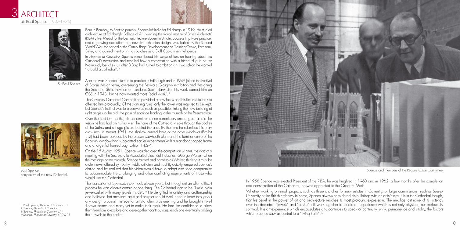
Born in Bombay, to Scottish parents, Spence left India for Edinburgh in 1919. He studied architecture at Edinburgh College of Art, winning the Royal Institute of British Architects’ (RIBA) Silver Medal for the best architecture student in Britain. Success in private practice, and a growing reputation for innovative exhibition design, was halted by the Second World War. He served at the Camouflage Development and Training Centre, Farnham, Surrey and gained mentions in dispatches as a Staff Captain in intelligence. In Phoenix at Coventry, Spence remembered his sense of loss on hearing about the Cathedral’s destruction and recalled how a conversation with a friend, dug in off the Normandy beaches just after D-Day, had turned to ambitions; his was clear, he wanted “to build a cathedral”. i
After the war, Spence returned to practice in Edinburgh and in 1949 joined the Festival of Britain design team, overseeing the Festival’s Glasgow exhibition and designing the Sea and Ships Pavilion on London’s South Bank site. His work earned him an OBE in 1948, but he now wanted more “solid work”. ii The Coventry Cathedral Competition provided a new focus and his first visit to the site affected him profoundly. Of the standing ruins, only the tower was required to be kept, but Spence’s instinct was to preserve as much as possible, linking the new building at right angles to the old; the pain of sacrifice leading to the triumph of the Resurrection. Over the next ten months, his concept remained remarkably unchanged, as did the vision he had had on his first visit: the nave of the Cathedral visible through the bodies of the Saints and a huge picture behind the altar. By the time he submitted his entry drawings, in August 1951, the shallow curved bays of the nave windows (Exhibit 3.2) had been replaced by the present saw-tooth plan, and the familiar curve of the Baptistry window had supplanted earlier experiments with a mandorla-shaped frame and a large flat fronted bay (Exhibit 14.2-4). On the 15 August 1951, Spence was declared the competition winner. He was at a meeting with the Secretary to Associated Electrical Industries, George Walker, when the message came through. Spence fainted and came to as Walker, thinking it must be awful news, offered sympathy. Public criticism and hostility quickly tempered Spence’s elation and he realised that his vision would have to adapt and face compromise to accommodate the challenging and often conflicting requirements of those who would use the Cathedral. The realisation of Spence’s vision took eleven years, but throughout an often difficult process he was always certain of one thing. The Cathedral was to be “like a plain jewel-casket with many jewels inside”. iii He delighted in artistry and craftsmanship and believed that architect, artist and sculptor should work hand in hand throughout any design process. His eye for artistic talent was unerring and he brought in well -known names and many yet to make their mark. He had the confidence to allow them freedom to explore and develop their contributions, each one eventually adding their jewels to the casket.
ARCHITECT Sir Basil Spence (1907-1976)
3
9
Spence and members of the Reconstruction Committee. Basil Spence, perspective of the new Cathedral.
In 1958 Spence was elected President of the RIBA, he was knighted in 1960 and in 1962, a few months after the completion and consecration of the Cathedral, he was appointed to the Order of Merit. Whether working on small projects, such as three churches for new estates in Coventry, or large commissions, such as Sussex University or the British Embassy in Rome, Spence always considered his buildings with an artist’s eye. It is in the Cathedral though, that his belief in the power of art and architecture reaches its most profound expression. The mix has lost none of its potency over the decades; “jewels” and “casket” still work together to create an experience which is not only physical, but profoundly spiritual. It is an experience which encapsulates and continues to speak of continuity, unity, permanence and vitality, the factors which Spence saw as central to a “living Faith”. iv
i Basil Spence, Phoenix at Coventry p.1 ii Spence, Phoenix at Coventry p.1iii Spence, Phoenix at Coventry p.14iv Spence, Phoenix at Coventry p.10 & 13
Sir Basil Spence

10 11
Forseth trained at the Royal Academy, Stockholm, and became well known for his striking work in a range of media including stained glass, wall painting, textiles and notably mosaic. His mosaic decoration for the Golden Hall in Stockholm City Hall, 1921-23, brought wide acclaim and he produced work for many Swedish schools and churches.
In June 1960, Forseth arrived at Spence’s London office. As Spence described the meeting in Phoenix at Coventry, “a dynamic character blazed into the Cathedral orbit: […] like a comet with a trail of fire” i. Forseth wanted to design windows for the Guild Chapel, but that had been put on hold, so Spence suggested he might design the floor for the Chapel of Unity (see Chapter 15). At the presentation of his ideas to the Reconstruction Committee, Forseth also produced a drawing for a stained glass window. This led to two commissions for the ‘Swedish windows’, which were a gift from the Church of Sweden and the Swedish community living in London.For the first three windows, Forseth took as his theme the close ties between the churches of Britain and Sweden, through the British missionaries who first took Christianity to his country.
THE SwEDISH wINDOwS Einar Forseth (1892-1988)
4
11
Drawing of St Sigfrid • TheSwedishWindows
His sketch of the upper part of the left-hand window (Exhibit 4.1) shows St Sigfrid, a English monk, who travelled to Sweden at the end of the 10th century. Sigfrid is shown holding the heads of his three martyred nephews. The window as executed shows a far more grief-stricken Saint than first envisaged by Forseth. The three white flowers at his feet recall the three star-like lights said to have led to his nephews’ remains. An axe, instrument of their martyrdom, is visible and Sigfrid stands on the broken hammer of the Norse god Thor, symbolic of the triumph of Christianity over paganism. The second window represents the baptism of Saint Botvid. Swedish born, Botvid travelled to England on a trade mission and was converted and bap-tised while he was there. The Viking ship alludes to Botvid’s heritage, and his journey. The fishing net recalls a miraculous catch of fish associated with the Saint. In the final window of the group, Forseth depicts Botvid’s martyrdom. He kneels in front of a wooden church, possibly alluding to the one built by Botvid’s brother in 1129 AD to house the Saint’s remains. Sweden’s long history is symbolised by the stones of Ales Stenar, an Iron Age monument near Ystad, and by a broken Viking sword, which also signifies the triumph of Christianity. A freshwater spring is said to have emerged where the Saint’s remains rested; Forseth shows tears from the Saint’s head forming a stream.The second group of windows moves from a nar-rative theme to symbols of Britain and Sweden, and from the predominant red of martyrdom to a lighter, predominantly blue palette. The red rose of England, the Welsh daffodil, the Irish winged harp and the lion of Scotland, together with the Royal coat-of-arms, are visible in the first window. In the second, the three crowns of Sweden’s national coat-of-arms and an inscription record the gift of the windows by the Church of Sweden.
i Spence, Phoenix at Coventry, p. 100

12 13
For many people, the most startling characteristic of the High Altar Cross is that its form bears little resemblance to a traditional cross or anything we might expect. Essentially it cradles the Cross of Nails, but it also dispenses with orthodox sym-bolism, breaking out into organic forms that lead us into new places. This will be discussed more fully when we look at interpretation, but let us start by considering the revolutionary steps of its creation. When an earlier design by Robert Goodden was rejected as too Byzantine, the award in the autumn of 1961 of the commission for the High Altar Cross and Candlesticks to Geoffrey Clarke proved a popular choice. His design for the altar set in the undercroft Chapel of the Cross (Chapter 2) was very much admired. It would, however, be a demanding task. The cross in particular needed to be in sympathy with the Tapestry, yet bold enough to stand out as a focus for the celebra-tion of the Eucharist.The Form UnfoldsEven from the early 1950s, we can detect in Clarke’s work the free use of symbols linking the visual and spiritual. It was very much in evidence in a cross he made for the Goldsmith’s Company in 1958 (Exhibit 5.3) in which we can see nascent features that were to be further developed in the Coventry cross. The traditional geometrical shape of the Latin cross had already given way to more organic forms, but especially noticeable is the protective cowl around the stem, projecting a sense of fragility.A series of early sketches exploring possible forms were produced in monotype. It was a process much favoured by Clarke for its delicate, but lively and sometimes unpredictable results. There are many variations on the technique, but it typically involved an image painted in black ink on a smooth surface such as glass being transferred onto paper by pressing the two together with a roller. By January 1962 his design had advanced to the stage where he was able to construct a small maquette (Exhibit 5.1), clearly recognisable as approaching the high altar set we know today, but also recognisable as a continuation of the ideas given birth in the Goldsmiths’ cross. The maquette was approved by the Reconstruction Committee.Revolutionary Casting TechniquesUsing a relatively new technique, Clarke fabricated a full size model from blocks of expanded polystyrene, carved into shape with a knife and hot wires. The model was then encased in foundry sand to form a mould into which the hot silver was poured. The polystyrene instantly vaporised, leaving a casting with the characteristic textured surface that we see today. Finally the cross was gold-plated. In a recent interview with Dr Judith LeGrove, Clarke picked out developing the polystyrene casting technique as a memorable aspect of his career, explaining that it “was most exciting really, because you could do all sorts of under-cut things, bits and pieces and so on.” We can see such shapes in Coventry’s High Altar Cross.
HIGH ALTAR CROSS Geoffrey Clarke (b.1926)
5
13
Model for Goldsmiths’ Cross
“When looking at the High Altar Cross people sometimes see shapes and textures transforming into a tree, with echoes perhaps of the Charred Cross, or alternatively they see a bird taking to the wing. Clarke’s organic style invites our minds to wander and our imagination to search out living forms. We should never forget however, the principle function of the cross is to provide a focus for the Eucharist. In June 1961, Provost Williams wrote “The joy, the glory, the triumph are in the tapestry: the Cross will express the pain at the cost of which the triumph was won.” i
Clarke’s cross, in turn, leads the eye through a kind of vortex at the centre of which is cradled another cross – the Cross of Nails. As well as symbolising the Cathedral’s mission of Peace and Reconciliation, the three nails are Arma Christi, or Instruments of the Passion.ii Along with the cross itself, the Crown of Thorns and the Lance, they have been used by artists from early times to signify Christ’s victory over death.Clarke has created a work which has at its heart “the pain at the cost of which the triumph was won”, but by surrounding it with physical forms that are at once protective, reminiscent of life and reflecting in three dimensions the joy of the Tapestry, allow us to find personal meanings that a traditional, geometrical cross could never have achieved.
A MODERN INTERPRETATION
High Altar Cross with Tapestry in the background
i Campbell, Coventry Cathedral, p.228. ii By late medieval times, the Arma Christi had greatly multiplied to include many items that might have survived to serve as relics.

14 15
CHRIST IN GLORy IN THE TETRAMORPH Tapestry (78ft x 39ft) Graham Sutherland (1903-1980)
6
15
Sutherland trained briefly as an engineer, but from 1921 he studied at Goldsmith’s College of Art specialising in etching and engraving. Following the collapse of the print market after the Wall Street crash in 1929, Sutherland turned to landscapes focusing on ab-straction of natural forms.i In 1940 he became an official war artist, recording on the home front. Subsequently committing to Catholicism he turned to more religious topics and in 1946 he was commissioned by Walter Hussey, then Vicar of Saint Matthew’s, Northampton, to paint the Crucifixion. Sir Basil Spence had included a tapestry depicting the Crucifixion to be placed behind the altar in his initial designs for the new Cathedral. He had seen and admired Sutherland’s earlier work, in particular his Crucifixion in Northampton and so in 1951 invited him to design the tapestry for Coventry Cathedral.
The Years of Ever-changing DesignIn December 1951, Provost Howard agreed with Bishop Gorton a lengthy and detailed statement on the themes the tapestry should encompass. It would be the dominating feature of the Cathedral and must present the timeless truths of the Christian Faith. The subject would be Christ the Redeemer in the Centre of Heaven. The unity of composition should depict four themes: the Glory of the Father, Christ in the Glory of the Father, the Holy Spirit and the Heavenly Sphere.ii Spence, wanted a design which would speak to the ordinary person and not some-thing highly abstract. He told Sutherland, ‘From the first moment that I conceived this
tapestry I thought of you as its designer.’ Spence visited Sutherland in France in January 1952 taking with him plans, photographs of his perspective drawings and his own painting of his vision of the interior.iii He explained he wanted a ‘majestic Christ figure surrounded by four beasts symbolizing the Evangelists.’iv Lion: St Mark, Eagle: St John, Calf: St Luke and man: St Matthew. (Exhibit 6:10-13)Sutherland had reservations. He thought that the the proposed shape of the tapestry was too square and was concerned with the colour restrictions on his design as a consequence of Spence’s specification of pinky grey sandstone for the interior walls of the Cathedral. After acknowledging Sutherland’s reservations Spence elongated the tapestry to 78 feet by 39 feet; for reasons of cost, the pink stone was also later altered to a white finish. From the beginning Sutherland knew he wanted Christ to be a figure of ‘Great contained vitality.’v His first design used a rather dull palette. With Christ surrounded by the symbols of the Evangelists; between Christ’s feet he placed a small man to to provide human scale and underneath the dragon in a chalice a further symbol of St John. Of the four beasts, Sutherland experienced greatest difficulty with the eagle, feeling he couldn’t
Two studies for the whole tapestry c1952
get the satisfactory form to ‘fit into the given shape.’. In an interview with Andrew Révai, Sutherland sug-gested that the studies had been done from life at Maidstone Zoo. “I drew some flying, with wings folded around the head, others more hieratic in treatment. I was trying to do two things: to get away from a heraldic feeling and to give a certain strangeness and potency to the actual bird.”vi The final version was not based on an eagle, but on an eagle owl. (Exhibit 6:1-6)After meeting Spence in London in July 1953 Sutherland began work on the first cartoon. This was a tenth of the size of the actual tapestry and was painted in oil and gouache. Christ was shown arms extended downwards, within a mandorla, supported by the four beasts. An earlier small maquette (22 x 12 cm) included a predella along the bottom, which would form the reredos to the Lady Chapel. It was divided into three panels, showing scenes from the life of the Virgin. In the cartoon the predella had been reduced to a single frame, perhaps intended as a Deposition. After an inspection by the Bishop, Provost Howard, and members of the Reconstruction committee, Sutherland was told that as a Roman Catholic, he had unwittingly portrayed the Pieta which was not within the tradition of the Anglican Church. When he started work on a second cartoon, there fol-lowed exchanges between Sutherland and Thurston about the lack of progress. Spence was also getting impatient with Sutherland. The second cartoon, finally completed by the end of 1954, depicted Christ with his arms outstretched horizontally. (Exhibit 6:14) The mandorla from the first carton had been replaced by dashes of light around Christ’s waist and ankles. The boxes containing the symbols of the Evangelists were now floating. The Pieta was replaced by a simple crucifixion. This time the com-mittee was impressed by the cartoon, making only small suggestions for changes.
First cartoon c1953 Colour Study for Eagle
Four studies for the Eagle
Head of Eagle

16 17
6
17
In 1957, still not satisfied with the design, Sutherland started work on a third cartoon. Then, in the November Spence wrote to Sutherland saying that he had decided to change the colour of the interior walls from pinky grey sandstone to white or at least a very light colour. This enabled Sutherland to switch to a brighter palette with vivid green background. (Exhibit 6:5-6) Furthermore an anonymous benefactor had given £20,000 for the tapestry. The new design was considered a great improvement. The lower panels were still an issue. Sutherland had been told not to change them without discussing with the Committee. But he had created something resembling the Pieta again. Nine days later the Provost wrote to Sutherland saying that they would accommodate Sutherland’s designs. Sutherland found
this frustrating as he felt they were being confusing and so suggested that he should be paid an additional fee of £300-£400 for extra work caused by ‘differences between the ecclesiastical authorities.’vii The third and final cartoon (Exhibit 6:15) shows a conflation of ele-ments from Sutherland’s previous designs, incorporating much of the initial nature from the first cartoon, bringing back the mandorla, but most importantly showing Christ raising his forearms, with his hands presented in the attitude of blessing. An amended design for the Cruci-fixion, painted onto brown paper was subsequently approved by the Cathedral authorities, and pasted over the version on the cartoon. Its theft at Felletin, possibly by tourists, allows us to look at the differences by comparing the cartoon version with the finished tapestry. As soon as the Committee had agreed that this would be the final design, Sutherland realised he no longer liked it, and continued to work on the design for a further two or three weeks. He finally had to stop when the design was released to the press.
Weaving process It was initially intended that the Edinburgh Weaving Company (previously used by Henry Moore) would produce the tapestry, but trial panels, including the calf and later an eye of Christ were deeply flawed. They also proposed making it in fifteen pieces and stitching them together. Madame Marie Cuttoli, who had previously created work for Matisse and Leger amongst others, persuaded Spence and Sutherland to consider the French factory of Pinton Frères of Felletin, near Aubusson.viii With a loom broad enough to weave it in one piece and the sight of a first rate sample of the eagle, Sutherland and Spence agreed that the tapestry would be made there. The Contract with Pinton Frères, stated that the tapestry would be executed within thirty months for 20,060,000 Francs (£17,000) ‘in exact accordance as to form and colour the painting by Graham Sutherland which is in your possession, and also to the satisfaction of the artists and architect’ who were also to approve samples of weaving. The Coventry Tapestry was woven with a texture of 12 portees (a tapestry measure corresponding to 9 warp threads per inch). In addition to the main colours, threads of varying shades were used to produce more delicate nuances of tone. The number of colours used exceeded 900.ix The wool came from Australia and partly from local French sources was dyed in Pinton Frères’ own dye-workshops of using the water of the River Creuse, using fast dyes, with very high resistance to fading.x In all, twelve weavers were fully occupied over the two years.
Spence with M. Pinton at Pinton Frères. Third cartoon c1957 Second cartoon c1954

18 19
“The first thing this building teaches us is to see Jesus.” Archbishop of Canterbury, Dr Rowan Williams, Coventry Cathedral Golden Jubilee Service 25 May 2012The amazing array of symbolism contained within Graham Sutherland’s great tapestry offers an opportunity for deep reflection. During a period of sabbatical leave in 1991, Michael Sadgrove, then Precentor of Coventry Cathedral, took it as the focus for his own meditations. In his book, “A Picture of Faith” he wrote “… its powerful, often shifting imagery seems to me to have so much to say about the human condition, about our ultimate concerns, about our faith in God.” For the visitor, the impact is of necessity more immediate. Perceptions of the Cathedral can relate to the tapestry’s dominant position so wherever you stand the image of Christ can always be seen. It is as if He is watching over you wherever you are. The eye is always drawn towards the tapestry not only because of its positioning in the Cathedral, but in the way its scale demands our attention. Whatever glories the Cathedral holds they are dwarfed by this central vision which calls for closer examination. The exuberant colours of the tapestry, the green hues surrounding Christ and the transitional fading of grey within the yellow of the mandorla, encompassing his very being, helps to draw the eye inwards. Close up you can see the details of the four Evangelists. The tapestry not only reveals the figure of Christ but through the Evangelists reinforces His message as conveyed in the Gospels.The crucifixion at the base of the tapestry serves as a reredos for the Lady Chapel. It is severe and to many, reminiscent of the tortured images of the crucified Christ expressed by Grunwald (c.1460 – 1528). It is perfectly aligned with the high altar cross as if His suffering has extended out onto the altar and is here for us.In his sermon at the Cathedral’s Golden Jubilee service, Archbishop Rowan Williams gave us a new perspective on the tapestry and the building. Referring to the vision looking back through the Cathedral, as seen by the eyes of Christ and by humanity in the form of the small figure of a man between His feet, Archbishop Williams said the building helps us to see afresh. “Reconciliation does not happen unless we see differently.”
A MODERN INTERPRETATION6
19
Photographic rollAfter Sutherland had finalised his design, the problem occurred of how to recreate it so that each detail could be reproduced when woven. The solution was to photograph the cartoon in horizontal strips and then enlarge them to full size, resulting in twenty four strips, each 39 feet foot by 3 foot. (Exhibit 6:7) The quality of the photographs was not perfect so Sutherland had to draw on them to ensure lines were clear. The final cartoon (Exhibit 6:15) was taken to Pinton Frères so the weavers could see the full design and reference it for colour. They started at the bottom of the tapestry and worked from the back, with the photographic bands underneath the loom to guide them. The story is told of how once the photographic rolls were taken to Pinton Frères they had to be laid out to check the register. With no suitably sized hall avail-able, they were spread out on a farmer’s field – after the cows were cleared out! Sutherland visited the workshops nine times while the weaving was in progress. He had to amend, and then send, each photographic band and several sections had to be redrawn.Sutherland wanted the finished tapestry to go on exhibi-tion in Paris, so that they could be fully checked before leaving France. This was neither feasible nor desirable from the Cathedral’s perspective, so in February 1962, Sutherland checked it on the floor in the Building Trades School at Felletin. After the difficulties that had gone before, this proved the final rift between Sutherland and Spence and the Cathedral authorities. The tapestry arrived in England in March 1962. It took two days to be hung.
Completed Tapestry 1962
i Berthoud R. Graham Sutherland a biography (1982) ii Revai A. Christ in Glory in the Tetramorph. The Genesis of the Great Tapestry in Coventry Cathedral (1964), pp.90 – 93.iii Berthoud (1982) p.203 iv Berthoud (1982) p.203 v Berthoud (1982) p.204 vi Revai (1964) p.52vii Berthoud (1982) p.210 viii Berthoud (1982) p.209 ix Revai (1964) p.85x Revai (1964) p.85

20 21
Lucie Rie was already an accomplished potter when she fled Vienna in 1938 and set up a studio in Albion Mews, Bayswater, whilst Hans Coper, born in Lower Saxony and likewise an émigré from Nazi Europe, began his career in ceramics when he joined Rie’s workshop in 1946. In their own spe-cialities, they each devel-oped to become the most influential ceramicists in post-war Britain.
After his move to Digswell in Hertfordshire in 1959, Coper took an interest in ceramics as architecture, breaking new ground by exploring what might be described as sculptural forms, a step that undoubtedly had a bearing on his commission in early 1962 to make six monumental candlesticks for the Sanctuary of Coventry Cathedral. Seven foot high (nine foot with candles) they were placed three on either side of the High Altar to concentrate attention on the most sacred place in the Cathedral. The two darker ones, finished in black manganese were each hand-thrown in seven pieces, whilst the four lighter ones, finished in white felspatic slip and manganese, were made in six pieces, to be assembled by threading on steel rods set in the floor. The Reconstruction Committee gave their approval for the designs after they had seen a pair of one foot high maquettes. The maquettes were made in two pieces.As well as the Sanctuary Candlesticks, Coper made a pair of candlesticks for the Chapel of Christ the Servant as well as smaller candlestick for the Lady Chapel and the Chapel of Gethsemane.
SANCTUARy CANDLESTICKS Hans Coper (1920 -1981)
7
21
Sanctuary Candlestick Maquettes for Sanctuary Candlesticks

22 23
Steven Sykes was born in 1914 in Formby, Lancashire and studied design at the Royal College of Art from 1933-36, specialising in stained glass. After marriage he took up pottery, learning techniques from his wife. Soon after the outbreak of war, he joined an army camouflage course and was posted with the Royal Engineers to the Middle East. In 1946 Sykes began teaching at Chelsea School of Art where he remained until his retirement in 1979. In 1967 he produced a fountain sculpture for the British Pavilion, Expo 67, London.
Near the high altar in Coventry Cathedral is the chapel for private prayer, the Chapel of Christ in Gethsemane (Exhibit 8.4) where one can see the hand of the angel, which came to strengthen Jesus, so clearly pointing to heaven. (Exhibit 8.2) Basil Spence’s original design placed this chapel next to the Lady Chapel, and in 1959 he and the Provost discussed dedicating the chapel to St Michael and St Chad. Subsequently, Steven Sykes (whom Spence had met in Edinburgh where Sykes taught stained glass at the College of Art) was asked to produce a design based on the theme of the fight against evil. Provost Williams suggested that the name of the chapel be changed from Chapel of Resurrection to the Chapel of Christ in Gethsemane, consequently the design behind the altar not only suggests Christ’s battle with His problems but also the Angel of the Lord strengthening Him. Cor-responding with its name, the reredos depicts the Gethsemane scene; the disciples asleep, the Lord in agony, and the angel with the cup strengthening Him, possibly reminding us as viewers of our struggles in life. As the subject for this relief, the
RELIEF FOR THE GETHSEMANE CHAPEL Steven Sykes (1914-1999)
8
23
Provost had proposed the following passage from Chapter 22 of St Luke’s Gospel:43. And there appeared an angel unto him from heaven, strengthening him.44. And being in agony he prayed more earnestly; and his sweat was as it were great drops of blood falling down to the ground;44. And said unto them, Why sleep ye? Rise and pray, lest ye enter into temptation.The commission consisted of two wall panels in low relief, one behind the altar, cast in ciment fondu depicting an angel holding a chalice and on the right hand panel the image shows the sleeping disciples. The angel is interpreted as St. Michael, and the sleeping disciples are surrounded by darkness. Sykes covered the background with gold leaf and a mosaic of blue tesserae, crystal and other materials which give life and vigour to this wall. With light falling from the side and the top the result is dazzling (Exhibit 8.1).The screen dividing the worshippers from the main groups of visitors was designed by Basil Spence, as a crown of thorns. The design was faithfully made by the Royal Engineers. As Spence himself said “People going into this chapel to pray may be reminded of the Crown of Thorns, that giving and sacrifice is a short cut to peace and tranquility of mind”. i
Chapel of GethsemaneDesign for Altar and Wall Panel
Maquette for Relief of Gethsemane Chapel
i Spence, Phoenix at Coventry, p 102

24 25
Monotype as a design process much favoured by Clarke for its delicate, but lively and sometimes unpredictable results has already been discussed (5. High Altar Cross) and he used it for a number of studies for the Crown of Thorns in the Chapel of Christ the Servant. Cast in aluminium, the Crown of Thorns was to be suspended over the altar, around the base of a large aluminium cross, pierced with three nails.
CROwN OF THORNS CHAPEL OF CHRIST THE SERVANT Geoffrey Clarke (b.1926)
9
25
Geoffrey Clarke, monograph design study for Crown of Thorns
Chapel of Christ the Servant with Crown of Thorns
monotype Design study for Crown of Thorns
26 27
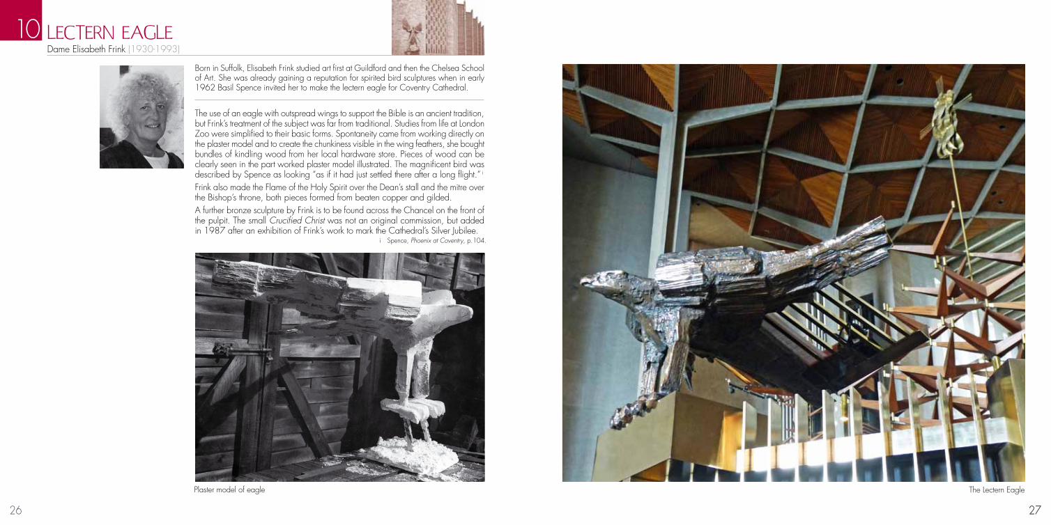
Born in Suffolk, Elisabeth Frink studied art first at Guildford and then the Chelsea School of Art. She was already gaining a reputation for spirited bird sculptures when in early 1962 Basil Spence invited her to make the lectern eagle for Coventry Cathedral.
The use of an eagle with outspread wings to support the Bible is an ancient tradition, but Frink’s treatment of the subject was far from traditional. Studies from life at London Zoo were simplified to their basic forms. Spontaneity came from working directly on the plaster model and to create the chunkiness visible in the wing feathers, she bought bundles of kindling wood from her local hardware store. Pieces of wood can be clearly seen in the part worked plaster model illustrated. The magnificent bird was described by Spence as looking “as if it had just settled there after a long flight.” i Frink also made the Flame of the Holy Spirit over the Dean’s stall and the mitre over the Bishop’s throne, both pieces formed from beaten copper and gilded.A further bronze sculpture by Frink is to be found across the Chancel on the front of the pulpit. The small Crucified Christ was not an original commission, but added in 1987 after an exhibition of Frink’s work to mark the Cathedral’s Silver Jubilee.
LECTERN EAGLE Dame Elisabeth Frink (1930-1993)
10
27
Plaster model of eagle
i Spence, Phoenix at Coventry, p.104.
The Lectern Eagle

28 29
Ralph Beyer was born in Berlin in 1921 and grew up in Germany. His father, Oskar, was a scholar and art historian and family friends included the calligrapher Rudolf Koch and the architect Erich Mendelsohn who both had a great influence on Beyer’s artistic formation. Beyer was introduced to Basil Spence via his friendship with Nikolaus Pevsner which led to a very fruitful 6-year period of work for him, in which he was greatly sup-ported and encouraged by Spence.
CalligraphyA condition of the competition for the design of the new Cathedral called for a series of Hallowing Places. These simple places of worship had featured in the old cathedral and would allow anyone to worship through their daily activities . Spence’s design incorporated eight such places in the window recesses of the nave windows, ideally
placed to catch the sunlight. In accordance with the competition conditions they were intended to represent work, the arts, educa-tion, the home, commerce, healing, government and recreation. In 1956 Spence, on a visit to Switzerland, saw modern, simple interiors which used lettering and symbol inscriptions as art work. On his return he began to discuss with Beyer the possibility of lettered panels instead of relief sculpture in the Hallowing Places. This decision may have resulted partly from the potential visual conflict between relief sculpture within the Cathedral and the magnificent Tapestry.Beyer showed him his father’s book on catacomb inscriptions
which greatly excited Spence, and having seen photographs of his work on the altar of the Chapel of the Royal Foundation of St Katherine in the east end of London, Spence began to realise that panels of lettering, carved by an artist, were the answer to the problem (Exhibit 11.1). Spence believed that beautifully uneven carved letters, some 12 inches high together with simply incised symbols might be the best solution. The Provost agreed with the suggestion and gave Beyer a suitable sentence to carve as a trial stone. Subsequently, Beyer was employed to carve all of the lettering in the nave, including that on the floor by the West Screen. Beyer said that he wanted to make designs which would “echo” and reassert the spirit of the earliest Christian inscriptions. And later went on to say “... to give letters, words and sentences a fresh vitality, greater force and to express their meaning with the utmost urgency - this has been my aim throughout, of planning and cutting in stone.” A small committee of the Provost and Canons Theologian decided the Panels should convey important aspects of Christ’s life and teachings, and be a mirror of the Life of our Lord. The phrases chosen represent many months of discussion and thought, as it is not easy to compress Christ’s message into eight stone panels.Peter Foster, Beyer’s assistant, who worked on the Cathedral carving recollected that “he (Beyer) would rule the lines on the stone and each line of the letters on the full size
CALLIGRAPHy AND THE FONT Ralph Beyer (1921-2008)
11
29
Design of lettering on nave floor
drawing would be folded lengthways and held against the appropriate place on the stone and the position of the letters on the fold marked off onto the stone in pencil. Using the drawing as a visual guide, he would draw in the letters freehand or some-times I would draw them and he would go over them before we began carving. Usually the inscription was not wide enough to allow two people to work together, so we would take it in turn to carve a number of letters”.The FontThe font of the new Coventry Cathedral became linked to the origin of the Chris-tian Faith, when a three ton rock, which had stood outside Bethlehem in the Valley of Barakat for thousands of years, was transported to Coventry to be placed beneath the Baptistry window. Basil Spence had been in conversation with Frankland Dark, an architect who worked in the Middle East regarding Spence’s trip to Iona, an early Christian settlement in Britain to look for a boulder to use as a font for the Cathedral. Dark misunderstood this as Ionia (situated in present day Turkey) and suggested travelling instead to Jordan to bring a boulder from Bethlehem. There followed an incredible journey by sea and land with all of the parties involved (including the Jordanian Government, the British Council, the Syrian and Lebanese Transport System and many more) donating their time and effort to allow the safe passage of this precious cargo (Exhibit 11.4) Arriving into Manchester the boulder was loaded onto a truck of John Laing & Son Ltd, the builders of the Cathedral, who provided transport to Coventry. An unveiling ceremony took place in the ruins of the old Cathedral and ‘the son of a carpenter’ Henry Sumner aged 7, unveiled the boulder on Thursday 22 December 1960. Basil Spence was anxious that the original patina was to be retained on the rock, and the minimum amount of work be done to convert it into a font (Exhibit 11.3). A simple recess was to be carved out of the top to hold the water and Spence suggested a scallop shell to be the model of the form it should take (Exhibit11.5). Beyer’s simple design for the baptismal bowl also describes the image of the scallop shell, the symbol of St. James which was adopted as a badge by pilgrims to Santiago di Compostella.
Design of lettering for Tablet of the Word
Design of shell for baptismal bowl
30 31
Jacob Epstein was born of Jewish parents in New York in 1880. From his arrival in Britain in 1905, he mounted a direct challenge to conventional orthodoxy with the virility, vigour and uncompromising austerity of his sculptural forms. His public and monumental work frequently attracted outright hostility and derision from the establishment and the conservative press. On the other hand, he acquired a reputation as a sensitive sculptor of portrait busts, with numerous studies of friends and family as well as a constant stream of prestigious commissions.By the 1950s, public taste had moved on and admiration for his Madonna and Child at the Convent of the Holy Child Jesus in Cavendish Square, London (1950 – 52) led to further notable commissions, including Christ in Majesty at Llandaff Cathedral (1954 – 55) and St Michael and the Devil at Coventry (1955 – 59).
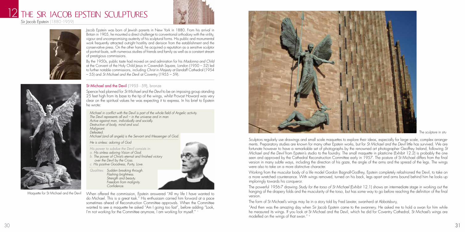
St Michael and the Devil (1955 - 59), bronzeSpence had planned for St Michael and the Devil to be an imposing group standing 25 feet high from its base to the tip of the wings, whilst Provost Howard was very clear on the spiritual values he was expecting it to express. In his brief to Epstein he wrote:
Michael in conflict with the Devil is part of the whole field of Angelic activity.The Devil represents all evil – in the universe and in manActive against man, individually and socially.Destructive of body, mind and soul.Malignant.Defeated.Michael (and all angels) is the Servant and Messenger of God.
He is sinless: adoring of God
His power to subdue the Devil consists in:a. His sinless adoring Vision of God.b. The power of Christ’s eternal and finished victory over the Devil by the Cross.c. His positive Goodness, Purity, Love.
Qualities: Sudden breaking through. Flashing brightness. Strength and beauty. Freedom from malignity. Confidence.
When offered the commission, Epstein answered “All my life I have wanted to do Michael. This is a great task.” His enthusiasm carried him forward at a pace sometimes ahead of Reconstruction Committee approvals. When the Committee wanted to see a maquette he asked “Am I going too fast”, before adding “Look, I’m not working for the Committee anymore, I am working for myself.” i
THE SIR JACOB EPSTEIN SCULPTURESSir Jacob Epstein (1880 -1959)
Sculptors regularly use drawings and small scale maquettes to explore their ideas, especially for large scale, complex arrange-ments. Preparatory studies are known for many other Epstein works, but for St Michael and the Devil little has survived. We are fortunate however to have a remarkable set of photographs by the renowned art photographer Geoffrey Ireland, following St Michael and the Devil from Epstein’s studio to the foundry. The small maquette in plasticine (Exhibit 12.2) is probably the one seen and approved by the Cathedral Reconstruction Committee early in 1957. The posture of St Michael differs from the final version in many subtle ways, including the direction of his gaze, the angle of the arms and the spread of the legs. The wings were also to take on a more distinctive character. Working from the muscular body of a life model Gordon Bagnall-Godfrey, Epstein completely refashioned the Devil, to take on a more wretched countenance. With wings removed, turned on his back, legs apart and arms bound behind him he looks up imploringly towards his conqueror.The powerful 1956-7 drawing Study for the torso of St Michael (Exhibit 12.1) shows an intermediate stage in working out the hanging of the drapery folds and the muscularity of the torso, but has some way to go before reaching the definition of the final version.The form of St Michael’s wings may lie in a story told by Fred Lexster, swanherd at Abbotsbury,“And then was the amazing day when Sir Jacob Epstein came to the swannery. He asked me to hold a swan for him while he measured its wings. If you look at St Michael and the Devil, which he did for Coventry Cathedral, St Michael’s wings are modelled on the wings of that swan.” ii
12
31
Maquette for St Michael and the Devil
The sculpture in situ
32 33
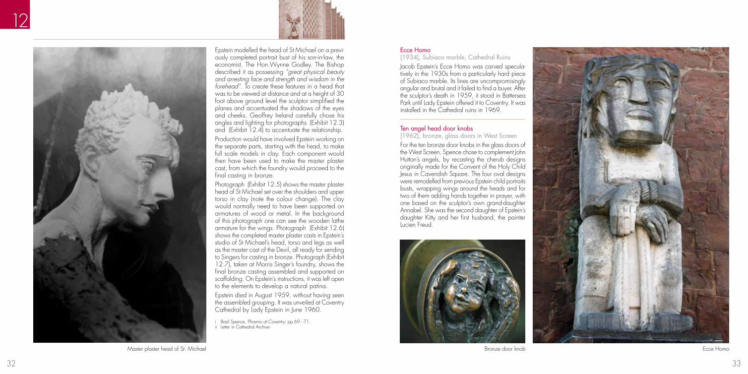
Epstein modelled the head of St Michael on a previ-ously completed portrait bust of his son-in-law, the economist, The Hon.Wynne Godley. The Bishop described it as possessing “great physical beauty and arresting face and strength and wisdom in the forehead”. To create these features in a head that was to be viewed at distance and at a height of 30 foot above ground level the sculptor simplified the planes and accentuated the shadows of the eyes and cheeks. Geoffrey Ireland carefully chose his angles and lighting for photographs (Exhibit 12.3) and (Exhibit 12.4) to accentuate the relationship.Production would have involved Epstein working on the separate parts, starting with the head, to make full scale models in clay. Each component would then have been used to make the master plaster cast, from which the foundry would proceed to the final casting in bronze.Photograph (Exhibit 12.5) shows the master plaster head of St Michael set over the shoulders and upper torso in clay (note the colour change). The clay would normally need to have been supported on armatures of wood or metal. In the background of this photograph one can see the wooden lathe armature for the wings. Photograph (Exhibit 12.6) shows the completed master plaster casts in Epstein’s studio of St Michael’s head, torso and legs as well as the master cast of the Devil, all ready for sending to Singers for casting in bronze. Photograph (Exhibit 12.7), taken at Morris Singer’s foundry, shows the final bronze casting assembled and supported on scaffolding. On Epstein’s instructions, it was left open to the elements to develop a natural patina.Epstein died in August 1959, without having seen the assembled grouping. It was unveiled at Coventry Cathedral by Lady Epstein in June 1960.
Ecce Homo (1934), Subiaco marble, Cathedral RuinsJacob Epstein’s Ecce Homo was carved specula-tively in the 1930s from a particularly hard piece of Subiaco marble. Its lines are uncompromisingly angular and brutal and it failed to find a buyer. After the sculptor’s death in 1959, it stood in Battersea Park until Lady Epstein offered it to Coventry. It was installed in the Cathedral ruins in 1969.
Ten angel head door knobs (1962), bronze, glass doors in West ScreenFor the ten bronze door knobs in the glass doors of the West Screen, Spence chose to complement John Hutton’s angels, by recasting the cherub designs originally made for the Convent of the Holy Child Jesus in Cavendish Square. The four oval designs were remodelled from previous Epstein child portraits busts, wrapping wings around the heads and for two of them adding hands together in prayer, with one based on the sculptor’s own grand-daughter Annabel. She was the second daughter of Epstein’s daughter Kitty and her first husband, the painter Lucien Freud.
12
Master plaster head of St. Michael Ecce Homo
i Basil Spence, Phoenix at Coventry: pp.69 - 71.ii Letter in Cathedral Archive
Bronze door knob
34 35
INTERPRETATION OF THE EPSTEIN SCULPTURES
12
Alec Miller in his studio with his St Michael memorial for Coventry
Cathedral (c.1920)
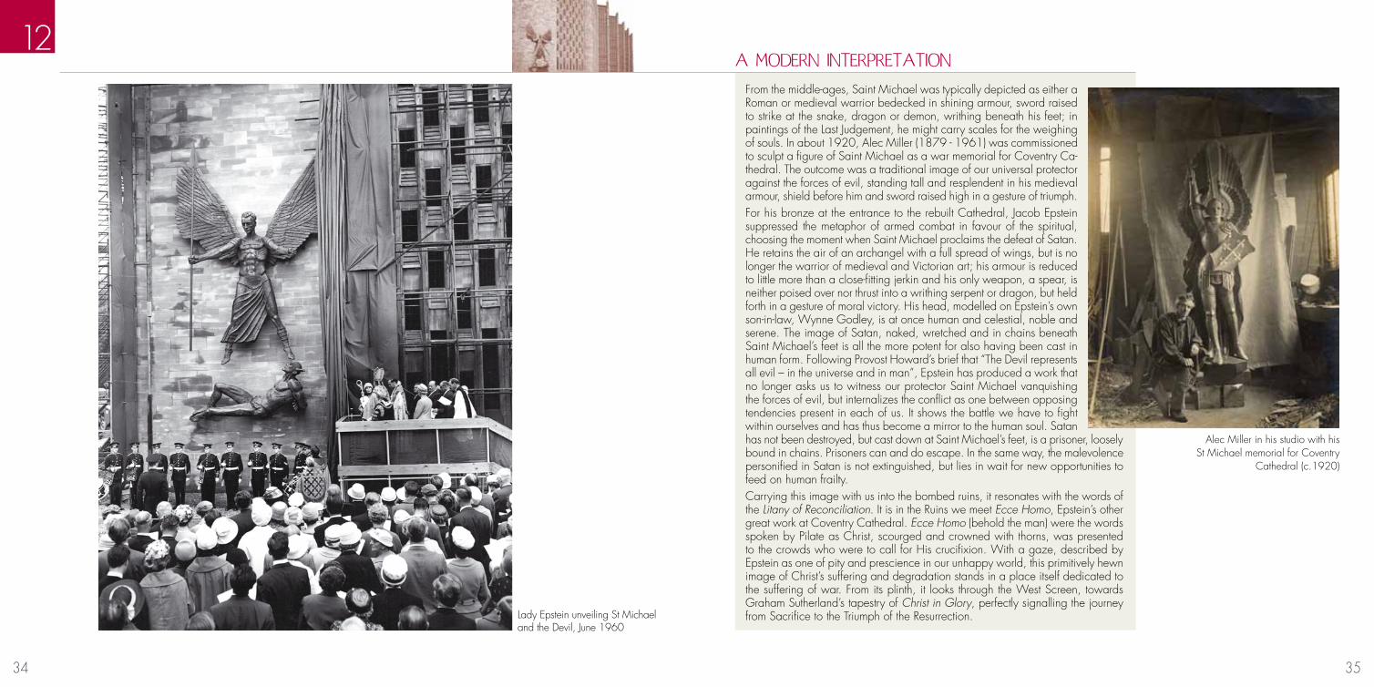
From the middle-ages, Saint Michael was typically depicted as either a Roman or medieval warrior bedecked in shining armour, sword raised to strike at the snake, dragon or demon, writhing beneath his feet; in paintings of the Last Judgement, he might carry scales for the weighing of souls. In about 1920, Alec Miller (1879 - 1961) was commissioned to sculpt a figure of Saint Michael as a war memorial for Coventry Ca-thedral. The outcome was a traditional image of our universal protector against the forces of evil, standing tall and resplendent in his medieval armour, shield before him and sword raised high in a gesture of triumph.For his bronze at the entrance to the rebuilt Cathedral, Jacob Epstein suppressed the metaphor of armed combat in favour of the spiritual, choosing the moment when Saint Michael proclaims the defeat of Satan. He retains the air of an archangel with a full spread of wings, but is no longer the warrior of medieval and Victorian art; his armour is reduced to little more than a close-fitting jerkin and his only weapon, a spear, is neither poised over nor thrust into a writhing serpent or dragon, but held forth in a gesture of moral victory. His head, modelled on Epstein’s own son-in-law, Wynne Godley, is at once human and celestial, noble and serene. The image of Satan, naked, wretched and in chains beneath Saint Michael’s feet is all the more potent for also having been cast in human form. Following Provost Howard’s brief that “The Devil represents all evil – in the universe and in man”, Epstein has produced a work that no longer asks us to witness our protector Saint Michael vanquishing the forces of evil, but internalizes the conflict as one between opposing tendencies present in each of us. It shows the battle we have to fight within ourselves and has thus become a mirror to the human soul. Satan has not been destroyed, but cast down at Saint Michael’s feet, is a prisoner, loosely bound in chains. Prisoners can and do escape. In the same way, the malevolence personified in Satan is not extinguished, but lies in wait for new opportunities to feed on human frailty. Carrying this image with us into the bombed ruins, it resonates with the words of the Litany of Reconciliation. It is in the Ruins we meet Ecce Homo, Epstein’s other great work at Coventry Cathedral. Ecce Homo (behold the man) were the words spoken by Pilate as Christ, scourged and crowned with thorns, was presented to the crowds who were to call for His crucifixion. With a gaze, described by Epstein as one of pity and prescience in our unhappy world, this primitively hewn image of Christ’s suffering and degradation stands in a place itself dedicated to the suffering of war. From its plinth, it looks through the West Screen, towards Graham Sutherland’s tapestry of Christ in Glory, perfectly signalling the journey from Sacrifice to the Triumph of the Resurrection.
A MODERN INTERPRETATION
Lady Epstein unveiling St Michael and the Devil, June 1960

36 37
John Hutton was born in New Zealand, and having received no formal training in art he came to England in 1935 where he worked as a mural painter and met Basil Spence whilst working in the army camouflage unit (21 Army Group Camouflage Pool) during the Second World War.
The competition brief for the new Cathedral specified that only the surviving Tower and crypt chapels needed to be retained. However, the winning architect Basil Spence felt very strongly that most of the remains of the old Cathedral should be incorporated into the new one, and therefore designed a clear glass screen which would stand between the two linking them together. This enabled viewers in the Nave to look through the engraved figures to the ruins of the old cathedral and vice versa.
The original design involved alternate rows of saints on individual panels with the corners of each panel cut diagonally. However, structural reports stressed the necessity for thickened mullions and Hutton realised that this would partly obscure the engravings. His suggestion was to alternate rows of flying angels, which would divert the eye from the mullions, with saints.A decision on the design was agreed with Provost Howard who began compiling a list of saints and pa-triarchs who would occupy the 31 panels. The top row comprises five figures from the Old Testament, followed by a row of flying angels. The next row of nine panels comprises of the most important New Testament saints. Another row of angels is followed by the saints most closely connected with the introduction of Christianity to the British Isles.Hutton was concerned that there were too few women saints and requested the Provost suggest more. The Provost believed that this would be a difficult task since most women saints were believed to be insignificant and unknown. But after further consultation with Canon Moore Darling and Canon Proctor he suggested the following: The Virgin Mary with Christ in her Arms; Saint Osburga (died c. 1018) the first abbess of the Coventry nunnery, which was founded by King Canute; and Saint Margaret of Scotland (c. 1046-93) wife of Malcolm III, who was remembered for her life of piety, generosity and gifts to the church. The final layout that was chosen alternated men with women. (Exhibit 13.2)
THE GREAT wEST SCREEN John Hutton (1906 -1978)
13
37
The artsist posing as John the Baptist
Working practicesEach figure was drawn one quarter size and pasted into a book, one for each row in a concertina style, and when the book was opened the whole row could be viewed and the window seen in its entirety. The proposal was presented to and accepted by the Reconstruction Committee, and thereafter Hutton was able to develop the figures in more detail. Sometimes he would pose himself, on one occasion draped in a bedspread and clutching a copy of the London Telephone Directory when designing John the Baptist, but the model for the drawings which became the angels was Marigold Dodson, who later became John’s second wife. He developed a unique style of design based on French Romanesque carvings which he had seen on a visit to France in 1955. Of particular interest to him was the way in which the shoulders and kneecaps were emphasized by carved whorls. The elongated figures on the West Portal of Chartres Cathedral impressed him too and both of these stylistic interpretations can be identified in Hutton’s preparatory sketches. (Exhibit 13.1)
Original design Marigold Dodson posing for John Hutton
Preparatory sketches

38 39
The drawingsThe development of the designs ran concurrently with Hutton’s experiments and invention of his own engraving technique. Drawings were produced in red or black chalk on sheets of cartridge paper. With each stage of the design of the appearance of the angels, Hutton was able to distance himself from the life model to the ‘other worldly’ ideas of his imagination. The next stage of the drawing process involved enlarging each figure to full height. This was done on sheets of black paper which had to be glued together to the correct size, these Hutton referred to as ‘stick ups’. The usual method of enlarging would be to redraw the design on squared up paper, but Hutton developed a quicker method of photographing the drawing, projecting the negative on to black paper fixed to a wall, and then drawing round the enlarged image roughly with chalk, which would later be defined and completed.
13
39
The engravingEarly experience of glass engraving for the Common-wealth Air Force memorial at Runnymede, Surrey had identified problems with wheel engraving. The subtleties required in the appearance were ill defined and Hutton decided that he would need to invent a new technique for the commission at Coventry Cathedral. He discussed the matter with an engineer at the Royal College of Art who sug-gested experimenting with a grindstone fixed into the handpiece of a flexible drive (similar to a larger version of a dentist’s drill). (Exhibit 13.6) Fired with enthusiasm Hutton purchased a secondhand electric motor and a flexible drive and fitted a grindstone to the handpiece. The initial effects were encour-aging, but when he tried to engrave deeper the wheel ran much slower and juddered, at the risk of overheating. This problem was solved by attaching a piece of sponge to a strip of aluminum, which was then dipped in water to cool the surface. Having engraved the desired image this had to be highly polished to create intermediate tones between, and dense and lighter engraving. Again he developed method of working suitable for this procedure which involved strips of emery paper being attached to a 3 inch rubber wheel, using different grades of emery produced different tonal qualities.
Engraving the panels
Preparing the equipment Full size drawings
40 41
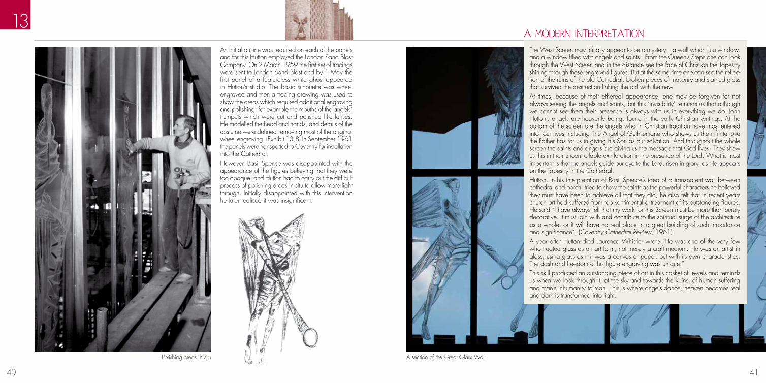
An initial outline was required on each of the panels and for this Hutton employed the London Sand Blast Company. On 2 March 1959 the first set of tracings were sent to London Sand Blast and by 1 May the first panel of a featureless white ghost appeared in Hutton’s studio. The basic silhouette was wheel engraved and then a tracing drawing was used to show the areas which required additional engraving and polishing; for example the mouths of the angels’ trumpets which were cut and polished like lenses. He modelled the head and hands, and details of the costume were defined removing most of the original wheel engraving. (Exhibit 13.8) In September 1961 the panels were transported to Coventry for installation into the Cathedral. However, Basil Spence was disappointed with the appearance of the figures believing that they were too opaque, and Hutton had to carry out the difficult process of polishing areas in situ to allow more light through. Initially disappointed with this intervention he later realised it was insignificant.
13
41
The West Screen may initially appear to be a mystery – a wall which is a window, and a window filled with angels and saints! From the Queen’s Steps one can look through the West Screen and in the distance see the face of Christ on the Tapestry shining through these engraved figures. But at the same time one can see the reflec-tion of the ruins of the old Cathedral, broken pieces of masonry and stained glass that survived the destruction linking the old with the new.At times, because of their ethereal appearance, one may be forgiven for not always seeing the angels and saints, but this ‘invisibility’ reminds us that although we cannot see them their presence is always with us in everything we do. John Hutton’s angels are heavenly beings found in the early Christian writings. At the bottom of the screen are the angels who in Christian tradition have most entered into our lives including The Angel of Gethsemane who shows us the infinite love the Father has for us in giving his Son as our salvation. And throughout the whole screen the saints and angels are giving us the message that God lives. They show us this in their uncontrollable exhilaration in the presence of the Lord. What is most important is that the angels guide our eye to the Lord, risen in glory, as He appears on the Tapestry in the Cathedral.Hutton, in his interpretation of Basil Spence’s idea of a transparent wall between cathedral and porch, tried to show the saints as the powerful characters he believed they must have been to achieve all that they did, he also felt that in recent years church art had suffered from too sentimental a treatment of its outstanding figures. He said “I have always felt that my work for this Screen must be more than purely decorative. It must join with and contribute to the spiritual surge of the architecture as a whole, or it will have no real place in a great building of such importance and significance”. (Coventry Cathedral Review, 1961).A year after Hutton died Laurence Whistler wrote “He was one of the very few who treated glass as an art form, not merely a craft medium. He was an artist in glass, using glass as if it was a canvas or paper, but with its own characteristics. The dash and freedom of his figure engraving was unique.”This skill produced an outstanding piece of art in this casket of jewels and reminds us when we look through it, at the sky and towards the Ruins, of human suffering and man’s inhumanity to man. This is where angels dance, heaven becomes real and dark is transformed into light.
A MODERN INTERPRETATION
Polishing areas in situ A section of the Great Glass Wall

42 43
The son of a solicitor, Piper joined his father’s firm, before studying at the Royal College of Art. His work as a war artist brought him to public attention particularly his 1940 paintings of Coventry’s shattered Cathedral. A prolific artist, Piper also worked with others in a number of creative partnerships including printing, tapestry, ceramics, illustration, textiles, mosaics and notably stained glass. His first commission in this medium was for Oundle School Chapel, in 1954, which he carried out with Patrick Reyntiens.
The son of a diplomat, Reyntiens studied fine art at Edinburgh College of Art and was apprenticed in the stained glass studio of J.E.Nuttgens, High Wycombe. A meeting with Piper in 1954 began three decades of collaboration. Piper valued Reyntiens’ “energy...ingenuity” and “creative intelligence”, and their many projects included Llandaff, Liverpool Metropolitan and Coventry Cathedrals. i Reyntiens’ own commissions include windows in the National Cathedral, Washington DC. In 2009 he collaborated with Graham Jones on a series of windows for St Martin’s Church, Cochem, Germany.
Development of the Baptistry Window’s formThe Cathedral Competition requirements stipulated the inclusion of a Chapel of Unity in the design, but made no comment on its positioning. Spence recognised its fundamental importance within the Cathedral and set it opposite the font and the Baptistry window. He believed that this axis should be the “first important incident” within the building. ii In his entry design, the Baptistry window was the only window which did not shine towards the altar, and the only one visible to people entering the building. It highlighted two of the fundamental aspects of the Cathedral’s purpose: spiritual growth beginning in baptism and the nurturing of unity and reconciliation. Although the new building took its rhythms from the ruins of the old, Spence wanted the structural forms to reflect the modern tools available to the stonemason. The design elements were therefore compatible with modern frame and carborundum saws, rather than chisel and hammer, and Spence saw the Baptistry window as “a child of these parents.” iii With such an important place in the building’s plan, the form of the Baptistry window needed special consideration. Early drawings show Spence experimenting with a range of ideas, including a mandorla shaped window and a large straight fronted, flat-topped bay (Exhibit 14.2-4). By the time he submitted his designs, the window had gained its familiar, gently curving shape, 56 ft wide and 85 ft high, with 198 lights in a chequerboard pattern, curving up to an apex above the centre of the window. Spence had specified pale, almost white glass for the window, with hints of rose and pale blue, but by 1954 he had decided that there should be “designs representing the saints in infancy” and that “clear pure colours of birth and innocence” should be used. iv Although work was in progress on the Nave windows and the West Screen, no artist had yet been commissioned for the Baptistry window.
BAPTISTRy wINDOw John Piper (1903 -1992) Patrick Reyntiens (b.1925)
14
43
Piper and ReyntiensIn July 1955, Spence visited Piper and Reyntiens to see their work for Oundle School Chapel. Piper prepared an estimate for the Baptistry window, but Spence was struggling to cover a large deficit in the budget and the contract was put on hold. Discussions continued, though, between Piper and Provost Howard. Piper suggested symbolising fire and water in four sections; the water of Baptism contrasting with the waters of the Ark and the fire of the burning bush with the fire of Pentecost. Howard could not quite envisage this and put together his own thoughts on baptism as a basis for imagery. At a further meeting a dove with outstretched wings and a flaming sun were discussed.It was evident to Piper and Reyntiens, however, that no matter how large the imagery, the heavy stonework of the window would break it up. They were working with what Piper called a “giant nutmeg grater” and a motif was needed which would work with the lattice-like framing and unify the whole design. v An abstract approach was a logical solution, and following the successful reception of an exhibition of Abstract Expressionism at the Tate in 1956, ac-ceptance of an abstract design seemed more pos-sible. Reyntiens suggested looking for inspiration in Bernini’s handling of the apse of St Peter’s, Rome, where an explosion of golden rays had unified and focussed Michelangelo’s complex design.In 1957, a new estimate was requested. Provost Howard recalled the discussion of a dove and a sun, but Piper now suggested that the design might have to be “a pattern of colour rather than one of line or form.” He produced a sketch showing a central blaze of light which was presented to the Reconstruction Committee. Bishop Bardsley felt that it “expressed faith in an entirely new way with the subject emerging through the glory of the colour.” vii
Cartoon of lower panel Lower panel of window

44 45
A barn at Piper’s home was converted to a studio in which he could prepare the full-size drawings, but he could still only work on a limited number at a time. Spread on the floor for completion, these were not independent works of art, but working drawings and each one shows evidence of the working process; cup-rings, scribbled pencil notes, and drips of paint are visible, shoe-prints and occasional hand marks can be seen along with the dusty footprint of a young child. Work began with the designs for the top of the window. It was essential to keep in mind the relationships between individual panels and the design as a whole, so Reyntiens built a 12 ft high scale model of the window and fitted each of the lights
14
45
Detail of Reyntiens’ interpretation of Cartoonwith a stained glass panel. Piper found the model to ba stimulating and inspiring influence, each section having a “living, excitable quality”. viii A wide variety of techniques were used in the creation of the cartoons. Paint was applied thickly and thinly, dragged and dabbed, sometimes carefully, sometimes with immense vigour. Wax resists appear to have been used to create marbled effects, in other places several layers created striking depth of colour. Collage was applied; painted paper and plain parcel paper, which wrinkled as it was glued on. The cartoons were passed to Reyntiens, who made up each panel according to templates provided by the stonemasons. As well as translating the colours from the
Detail of Piper cartoon
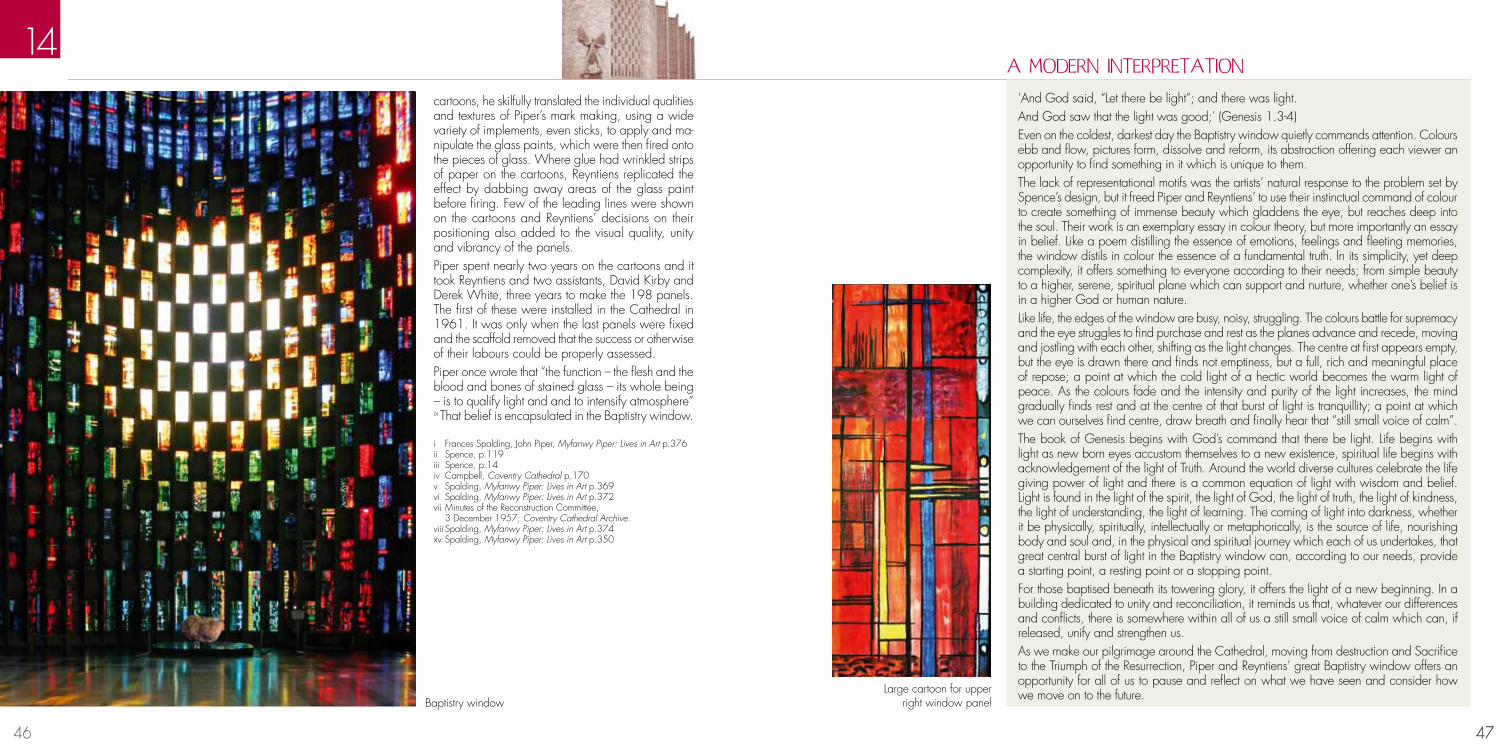
46 47
14
47
’And God said, “Let there be light”; and there was light. And God saw that the light was good;’ (Genesis 1.3-4)Even on the coldest, darkest day the Baptistry window quietly commands attention. Colours ebb and flow, pictures form, dissolve and reform, its abstraction offering each viewer an opportunity to find something in it which is unique to them.The lack of representational motifs was the artists’ natural response to the problem set by Spence’s design, but it freed Piper and Reyntiens’ to use their instinctual command of colour to create something of immense beauty which gladdens the eye, but reaches deep into the soul. Their work is an exemplary essay in colour theory, but more importantly an essay in belief. Like a poem distilling the essence of emotions, feelings and fleeting memories, the window distils in colour the essence of a fundamental truth. In its simplicity, yet deep complexity, it offers something to everyone according to their needs; from simple beauty to a higher, serene, spiritual plane which can support and nurture, whether one’s belief is in a higher God or human nature. Like life, the edges of the window are busy, noisy, struggling. The colours battle for supremacy and the eye struggles to find purchase and rest as the planes advance and recede, moving and jostling with each other, shifting as the light changes. The centre at first appears empty, but the eye is drawn there and finds not emptiness, but a full, rich and meaningful place of repose; a point at which the cold light of a hectic world becomes the warm light of peace. As the colours fade and the intensity and purity of the light increases, the mind gradually finds rest and at the centre of that burst of light is tranquillity; a point at which we can ourselves find centre, draw breath and finally hear that “still small voice of calm”. The book of Genesis begins with God’s command that there be light. Life begins with light as new born eyes accustom themselves to a new existence, spiritual life begins with acknowledgement of the light of Truth. Around the world diverse cultures celebrate the life giving power of light and there is a common equation of light with wisdom and belief. Light is found in the light of the spirit, the light of God, the light of truth, the light of kindness, the light of understanding, the light of learning. The coming of light into darkness, whether it be physically, spiritually, intellectually or metaphorically, is the source of life, nourishing body and soul and, in the physical and spiritual journey which each of us undertakes, that great central burst of light in the Baptistry window can, according to our needs, provide a starting point, a resting point or a stopping point.For those baptised beneath its towering glory, it offers the light of a new beginning. In a building dedicated to unity and reconciliation, it reminds us that, whatever our differences and conflicts, there is somewhere within all of us a still small voice of calm which can, if released, unify and strengthen us. As we make our pilgrimage around the Cathedral, moving from destruction and Sacrifice to the Triumph of the Resurrection, Piper and Reyntiens’ great Baptistry window offers an opportunity for all of us to pause and reflect on what we have seen and consider how we move on to the future.
A MODERN INTERPRETATION
Baptistry window
i Frances Spalding, John Piper, Myfanwy Piper: Lives in Art p.376ii Spence, p.119iii Spence, p.14iv Campbell, Coventry Cathedral p.170v Spalding, Myfanwy Piper: Lives in Art p.369vi Spalding, Myfanwy Piper: Lives in Art p.372vii Minutes of the Reconstruction Committee, 3 December 1957; Coventry Cathedral Archive. viii Spalding, Myfanwy Piper: Lives in Art p.374 xv Spalding, Myfanwy Piper: Lives in Art p.350
cartoons, he skilfully translated the individual qualities and textures of Piper’s mark making, using a wide variety of implements, even sticks, to apply and ma-nipulate the glass paints, which were then fired onto the pieces of glass. Where glue had wrinkled strips of paper on the cartoons, Reyntiens replicated the effect by dabbing away areas of the glass paint before firing. Few of the leading lines were shown on the cartoons and Reyntiens’ decisions on their positioning also added to the visual quality, unity and vibrancy of the panels. Piper spent nearly two years on the cartoons and it took Reyntiens and two assistants, David Kirby and Derek White, three years to make the 198 panels. The first of these were installed in the Cathedral in 1961. It was only when the last panels were fixed and the scaffold removed that the success or otherwise of their labours could be properly assessed.Piper once wrote that “the function – the flesh and the blood and bones of stained glass – its whole being – is to qualify light and and to intensify atmosphere” ix That belief is encapsulated in the Baptistry window.
Large cartoon for upper right window panel

48 49
Margaret Traherne trained at Croydon and Kingston Schools of Art, and studied at the Royal College of Art, specialising in murals, theatre design and stained glass. Her works include windows in Wootton Wawen Church, Warwickshire, Manchester Cathedral and Liverpool Roman Catholic Cathedral. In the 1950s she created panels for devotional rooms in nineteen new schools across Leicestershire.
Forseth trained at the Royal Academy, Stockholm, and became well known for his striking work in a range of media including stained glass, wall painting, textiles and notably mosaic. His mosaic decoration for the Golden Hall in Stockholm City Hall, 1921-23, brought wide acclaim and he produced work for many Swedish schools and churches.
Although physically part of the Cathedral, the Chapel of Unity has a distinct identity and is managed separately by a Commission of Churches Together in Coventry and Warwickshire, on behalf of an ecumenical Joint Council. The Chapel, a “place of intercession for the World Church”, was a new and radical idea: a space, not consecrated as part of the Anglican Church, where Christianity’s many denominations could meet to seek unity and reconciliation. i Spence saw this process as a spiritual journey and designed a structure which would complement that journey; circular in plan, representing unity, its shape “like a Crusader’s tent”. ii The space was enclosed by twenty radiating buttresses with panels of glass between each. The marble floor was dished in shape, with a star pattern radiating from a central mosaic dove . Round objects would roll to the floor’s centre, symbolising people coming together in unity and peace. Despite many alterations to the Chapel’s design, the circular form and dished floor remained constant.The WindowsIn 1956, Spence visited recently built European churches, including Novarina’s Sacré Cœur, Audincourt, France, where the dalle-de-verre windows made a particular impression on him. Unlike traditional stained glass, one inch thick slabs of coloured glass – dalles – were cut to shape, chipped around the edges to enhance the refraction of light and then set into concrete. This produced a structurally strong window with rich, discrete colours, lending it to bold modern designs whilst recalling the richness of early medieval stained glass.Re-thinking the Chapel’s design in 1958, Spence reduced the buttresses to ten, each split to enclose a strip of glass, a foot wide and 52 feet high. Having seen the dalle-de-verre work of Margaret Traherne, Spence contacted her and wrote to Provost Williams that he was “desperately anxious” for her to create the windows for the Chapel. iii Traherne wanted to create “a feeling of elation [...] to be conveyed by the rising and gradually lightening colour scale as the eye travels up the narrow columns of glass.” iv She also sought to organise the colours with Christian symbolism in mind; rising from the dark colours of death and penitence, through the blue of the triumph of heavenly
CHAPEL OF UNITy Margaret Traherne (1919-2006) Einar Forseth (1892-1988)
15
49Detail of window
love, the reds of martyrdom and victory over death, to the golden yellows of divinity and the sun. The general symbolism of the scheme would be “the triumph of Christianity – hence the soaring effect of the whole.” v Thirteen panels were completed for each window and these were installed in the autumn of 1961, the costs being met by a gift from the President of West Germany, Theodor Heuss. The FloorSpence wanted the light from the windows to comple-ment a simple floor pattern, but Forseth’s ideas were more complex: star designs with a phoenix, signs of the zodiac and the four evangelists, or the emblems of the five continents, or a fairly simple design with “old Egyptian style” relief decorations on the walls. Spence knew this would reduce the effects of the windows, but felt that it could reintroduce some of the richness the Cathedral needed. Instead of the phoenix and signs of the zodiac, he suggested the Holy Spirit symbolised by flames of golden mosaic. He also asked for “some representation [...] of the unusual character of the Chapel of Unity. Some hint of all the places of the world should be worked in the star.” vi
Forseth’s final design (Exhibit 15.3), approved early in 1961, retained the dove at the centre of a star, but introduced a chalice, the cross, the water of baptism and the Alpha and Omega, between its points. A ten-pointed star then extended into the buttresses, between its points, the cross, the chalice and crown of thorns, the symbols of the five continents and of the four evangelists. Mosaicist Trata Maria Drescha, of Whiteheads, London, produced a sample panel and then, working to Forseth’s full size, “extremely rough” drawings, she was left to complete the work. vii Over the next six months, with three visits from Forseth, she cut the marbles to shape and then laid them on granite liners. The completed and polished sections of floor were delivered to the Cathedral early in 1962.
Einar Forseth with cartoons of the floor
i Coventry Cathedral: Architectural Competition Conditions and Instructions to Competing Architects, (Coventry, 1950) p.21.ii Spence (1962) p.118iii Campbell (1996) p.219iv Campbell (1987) p. 39v Campbell (1996) p.220vi Campbell (1987) p.40vii Letter, Drescha to Louise Campbell, 7 November 1986.

50 51
“Because there are innumerable things beyond the range of human understanding we constantly use symbolic terms to represent concepts that we cannot define or fully com-prehend. This is one reason why all religions employ symbolic languages or images.” Carl G. Jung i
Sir Basil Spence believed stained glass should be integral to the architecture and not an afterthought. His competition entry envisaged five pairs of nave windows arranged in a zigzag formation, shining their light towards the High Altar. Representing man’s progression through life, the first pair would be in tones of green symbolising Youth, followed by red widows for the first flushes of Adulthood, multi-coloured for the experience of the Middle Years, purple for the wisdom of Maturity and gold for Afterlife. Moving down the Nave, each pair of windows is progressively revealed, but we do not see the full set, including the Afterlife until we look back from the Altar.
In a bold step that was to prove inspired, Spence chose two gifted students from the RCA, Keith New and Geof-frey Clarke, together with the Head of Stained Glass, Law-rence Lee to carry out the com-mission. Lee, himself a former student at the RCA, practiced as an artist and designer and taught at Bromley School of Art. After the Second World War, he became a partner in the stained glass practice of Martin Travers, taking over when Travers died in 1948. In 1950 he was appointed Head of the RCA’s Depart-ment of Stained Glass. Born in Derbyshire, Clarke studied at Preston and Manchester Schools of Art before serving in the RAF. After the War, he returned briefly to Lancashire
NAVE wINDOwS Lawrence Lee (1909-2011) Geoffrey Clarke (b.1924) Keith New (1926-2012)
16
51
Rudolph Koch’s Book of Signs (family sign bottom right)
before joining the RCA in 1948. New, after studying as a graphic designer at the RCA, also saw service in the RAF, returning in 1948 to join Lee’s stained-glass depart-ment. By 1952, he was one of a group of young British sculptors chosen to exhibit at the Venice Biennale, where Herbert Read characterised their work with the phrase “The Geometry of Fear”.Apart from the dimensions and dominance of the heavy, stone framework, their only artistic restriction was the adherence to Spence’s colour progression. The clergy gave no guidance on iconography, but all three drew freely on Rudolph Koch’s “Book of Signs”(Exhibit 16.2) and on their own readings of the scriptures. It is in New’s windows that Koch is most evident. The symbol described in the book as “the Family; man with his wife and children” appears several times in New’s sketchbook (Exhibit 16.1), before springing out from the lower central section of his Man’s side green window, the one representing the creation of man, his childhood and adolescence.
Keith New’s sketchbook
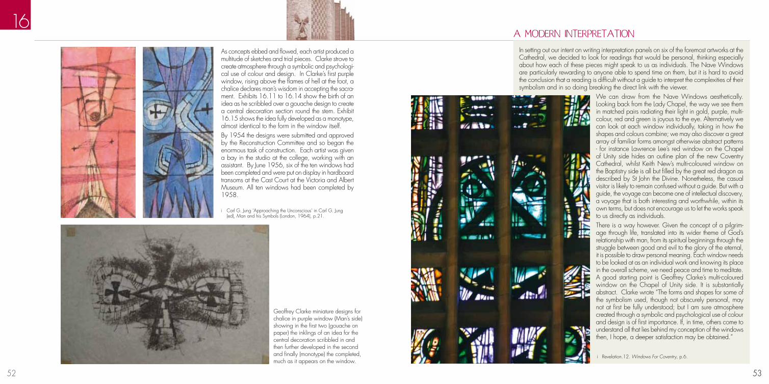
52 53
16
53
In setting out our intent on writing interpretation panels on six of the foremost artworks at the Cathedral, we decided to look for readings that would be personal, thinking especially about how each of these pieces might speak to us as individuals. The Nave Windows are particularly rewarding to anyone able to spend time on them, but it is hard to avoid the conclusion that a reading is difficult without a guide to interpret the complexities of their symbolism and in so doing breaking the direct link with the viewer.
We can draw from the Nave Windows aesthetically. Looking back from the Lady Chapel, the way we see them in matched pairs radiating their light in gold, purple, multi-colour, red and green is joyous to the eye. Alternatively we can look at each window individually, taking in how the shapes and colours combine; we may also discover a great array of familiar forms amongst otherwise abstract patterns - for instance Lawrence Lee’s red window on the Chapel of Unity side hides an outline plan of the new Coventry Cathedral, whilst Keith New’s multi-coloured window on the Baptistry side is all but filled by the great red dragon as described by St John the Divine. Nonetheless, the casual visitor is likely to remain confused without a guide. But with a guide, the voyage can become one of intellectual discovery, a voyage that is both interesting and worthwhile, within its own terms, but does not encourage us to let the works speak to us directly as individuals.There is a way however. Given the concept of a pilgrim-age through life, translated into its wider theme of God’s relationship with man, from its spiritual beginnings through the struggle between good and evil to the glory of the eternal, it is possible to draw personal meaning. Each window needs to be looked at as an individual work and knowing its place in the overall scheme, we need peace and time to meditate. A good starting point is Geoffrey Clarke’s multi-coloured window on the Chapel of Unity side. It is substantially abstract. Clarke wrote “The forms and shapes for some of the symbolism used, though not obscurely personal, may not at first be fully understood; but I am sure atmosphere created through a symbolic and psychological use of colour and design is of first importance. If, in time, others come to understand all that lies behind my conception of the windows then, I hope, a deeper satisfaction may be obtained.”
A MODERN INTERPRETATION
Geoffrey Clarke miniature designs for chalice in purple window (Man’s side) showing in the first two (gouache on paper) the inklings of an idea for the central decoration scribbled in and then further developed in the second and finally (monotype) the completed, much as it appears on the window.
i Carl G. Jung ‘Approaching the Unconscious’ in Carl G. Jung (ed), Man and his Symbols (London, 1964), p.21.
As concepts ebbed and flowed, each artist produced a multitude of sketches and trial pieces. Clarke strove to create atmosphere through a symbolic and psychologi-cal use of colour and design. In Clarke’s first purple window, rising above the flames of hell at the foot, a chalice declares man’s wisdom in accepting the sacra-ment. Exhibits 16.11 to 16.14 show the birth of an idea as he scribbled over a gouache design to create a central decoration section round the stem. Exhibit 16.15 shows the idea fully developed as a monotype, almost identical to the form in the window itself. By 1954 the designs were submitted and approved by the Reconstruction Committee and so began the enormous task of construction. Each artist was given a bay in the studio at the college, working with an assistant. By June 1956, six of the ten windows had been completed and were put on display in hardboard transoms at the Cast Court at the Victoria and Albert Museum. All ten windows had been completed by 1958.
i Revelation.12. Windows For Coventry, p.6.

54 55
Anthony Blee joined Spence’s practice in 1957, and continued to run it after Sir Basil’s death in 1976. In 1959 he and Spence’s daughter Gillian, became the first couple to be married in the undercroft of the unfinished Cathedral. Blee was chief assistant on the Cathedral project and his many contributions include the design of the clergy stalls, collaborative design with Hans Coper of the altar legs in the Chapel of Christ the Servant, and the kneelers.
The son of a solicitor, Piper joined his father’s firm, before studying at the Royal College of Art. His work as a war artist brought him to public attention particularly his 1940 paintings of Coventry’s shattered Cathedral. A prolific artist, Piper also worked with others in a number of creative partnerships including printing, tapestry, ceramics, illustration, textiles, mosaics and notably stained glass. His first commission in this medium was for Oundle School Chapel, in 1954, which he carried out with Patrick Reyntiens
Spence ensured that everything needed to equip the Cathedral was brought to his attention and this included the kneelers, a very visible part of the Cathedral’s fittings. He asked Anthony Blee to create six designs for them based on early Christian symbols from the catacombs in Rome (Exhibit 17.4).
KNEELERS AND VESTMENTS Anthony Blee (b. 1935) John Piper (1903-1992)
17
55 The six kneeler designs
Provost Williams had taken over from Howard in the autumn of 1958, and he wanted the Cathedral environment to support and encourage a modern celebration of the Eucharist. He therefore took a keen interest in the designs being commissioned and was particularly concerned that the congregation should not be faced with symbolism which they could not understand.The kneeler designs were problematic. While the Chi-Rho symbol and the Alpha and Omega were clear (Exhibit 17.1), the other designs - the dove, the fish and the circle of eternity, the fish, and the tree of life with a seven branched candlestick - were not so easily read. Williams expressed his concern at the “very contemporary design” and wrote to Spence that “so much in the new cathedral will be out of the reach of the ordinary person to understand without explanation”.i Despite Williams’ misgivings, the designs were translated into embroidery patterns. Two fairly restricted palettes were selected; a predominantly muted pink, mauve and blue, and a more vibrant dark green, light green and yellow. Tent stitch was chosen for the main designs, with a cross-stitch border in black thread, and rice, or crossed corners, stitch for the sides. Judith Poole, wife of the Precentor, made up a pack for each kneeler containing the pattern, instructions, wools, colour card and canvas, with
Anthony Blee’s design for kneelers
i Campbell (1996) p.208
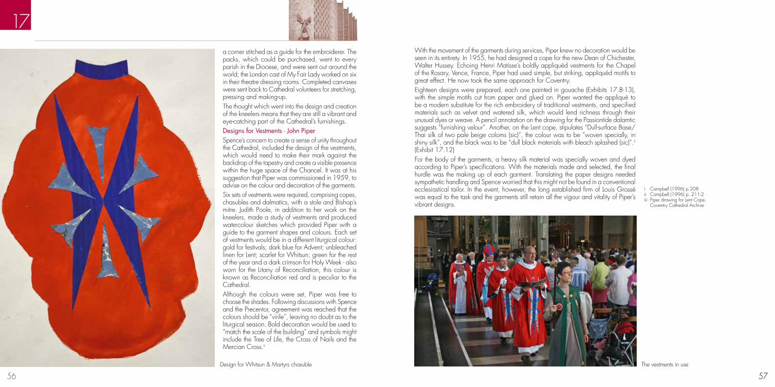
56 57
17
57
a corner stitched as a guide for the embroiderer. The packs, which could be purchased, went to every parish in the Diocese, and were sent out around the world; the London cast of My Fair Lady worked on six in their theatre dressing rooms. Completed canvases were sent back to Cathedral volunteers for stretching, pressing and making-up. The thought which went into the design and creation of the kneelers means that they are still a vibrant and eye-catching part of the Cathedral’s furnishings.Designs for Vestments - John Piper Spence’s concern to create a sense of unity throughout the Cathedral, included the design of the vestments, which would need to make their mark against the backdrop of the tapestry and create a visible presence within the huge space of the Chancel. It was at his suggestion that Piper was commissioned in 1959, to advise on the colour and decoration of the garments. Six sets of vestments were required, comprising copes, chasubles and dalmatics, with a stole and Bishop’s mitre. Judith Poole, in addition to her work on the kneelers, made a study of vestments and produced watercolour sketches which provided Piper with a guide to the garment shapes and colours. Each set of vestments would be in a different liturgical colour: gold for festivals; dark blue for Advent; unbleached linen for Lent; scarlet for Whitsun; green for the rest of the year and a dark crimson for Holy Week - also worn for the Litany of Reconciliation, this colour is known as Reconciliation red and is peculiar to the Cathedral. Although the colours were set, Piper was free to choose the shades. Following discussions with Spence and the Precentor, agreement was reached that the colours should be “virile”, leaving no doubt as to the liturgical season. Bold decoration would be used to “match the scale of the building” and symbols might include the Tree of Life, the Cross of Nails and the Mercian Cross.ii
i Campbell (1996) p.208ii Campbell (1996) p. 211-2iii Piper drawing for Lent Cope, Coventry Cathedral Archive
With the movement of the garments during services, Piper knew no decoration would be seen in its entirety. In 1955, he had designed a cope for the new Dean of Chichester, Walter Hussey. Echoing Henri Matisse’s boldly appliquéd vestments for the Chapel of the Rosary, Vence, France, Piper had used simple, but striking, appliquéd motifs to great effect. He now took the same approach for Coventry.Eighteen designs were prepared, each one painted in gouache (Exhibits 17.8-13), with the simple motifs cut from paper and glued on. Piper wanted the appliqué to be a modern substitute for the rich embroidery of traditional vestments, and specified materials such as velvet and watered silk, which would lend richness through their unusual dyes or weave. A pencil annotation on the drawing for the Passiontide dalamtic suggests “furnishing velour”. Another, on the Lent cope, stipulates “Dull-surface Base/Thai silk of two pale beige coloms (sic)”, the colour was to be “woven specially, in shiny silk”, and the black was to be “dull black materials with bleach splashed (sic)”.ii
(Exhibit 17.12) For the body of the garments, a heavy silk material was specially woven and dyed according to Piper’s specifications. With the materials made and selected, the final hurdle was the making up of each garment. Translating the paper designs needed sympathetic handling and Spence worried that this might not be found in a conventional ecclesiastical tailor. In the event, however, the long established firm of Louis Grossé was equal to the task and the garments still retain all the vigour and vitality of Piper’s vibrant designs.
Design for Whitsun & Martyrs chasuble The vestments in use

58 5959
Louise Campbell, Coventry Cathedral: Art and Architecture in Post-War Britain (Oxford 1996)Miles Glendinning, Jane Thomas and Louise Campbell, Basil Spence: Buildings and Projects (London, 2012)Philip Long and Jane Thomas, Basil Spence Architect (Edinburgh, 2008)Basil Spence, Phoenix at Coventry: The Building of a Cathedral (London, 1962)Margaret Brentnall and Marigold Hutton. John Hutton: Artist and Glass Engraver. (Philadelphia, 1986)Robert Payne, The West Window at Coventry Cathedral, English Counties Periodicals Ltd, (Leamington Spa c.1963)Peter Hutton, The Great West Screen and its Creator, Available at Coventry Cathedral Bookshop (2012)Berthoud, R. Graham Sutherland a biography London, Faber and Faber Ltd 1982Campbell, L. To Build a Cathedral Coventry Cathedral, 1945-1962 Rugby, Jolly and Barber Ltd for the University of Warwick, 1987Patricia Jordan Evans and Joanna Cartwright (eds), John Piper and the Church (The Friends of Dorchester Abbey, 2012)Frances Spalding, John Piper, Myfanwy Piper: Lives in Art (Oxford: OUP, 2009)Hugh Fowler-Wright, John Piper Creative Partnerships (Hereford Museum and Art Gallery, 2011)DVD documentary, From Coventry to Cochem; The Art of Patrick Reyntiens (2011)Christopher A. Lamb (editor), Reconciling People; Coventry Cathedral’s Story (Norwich: Canterbury Press, 2011)Revai, A. Christ in Glory in the Tetramorph - The Genesis of the Great Tapestry in Coventry Cathedral (London:The Pallas Gallery Ltd,1964)Robin Darwin et al, Windows for Coventry (London, The Royal College of Art, 1956)Richard Buckle, Jacob Epstein: sculptor (London, Faber and Faber Ltd, 1963)Richard Cork, Jacob Epstein (London, Tate Gallery Publishing, 1999)Peter Black, Geoffrey Clarke: sculpture, constructions and works on paper, 1949 – 2000 (London, Fine Arts Society, 2000)Margot Coatts (editor), Lucie Rie and Hans Coper: Potters in Parallel (London, Barbican Art Gallery, 1997)
Further readingArtworks added since 1962Both the 2012 exhibition and this book have focussed our attentions on the creative journeys followed by the artists whose works came together to be seen by the world in May 1962. Since then, further pieces have been gifted or commissioned, each in its own way continuing the visual expression of the story of Coventry Cathedral. Dates show when the pieces came to Coventry and, in some cases, vary significantly from the dates they were completed by the artist.• Sir Jacob Epstein, Ecce Homo, marble sculpture (1969), Cathedral Ruins• Josefina de Vasconcellos, Reconciliation, bronze sculpture (1995), Cathedral Ruins• Helmut Heinze, Choir of Survivors, bronze sculpture (2012), Cathedral Ruins• Helen Jennings, Head of Christ Crucified, created out of wrecked motor car (1969), entrance to Chapel of Unity• Elisabeth Frink, Crucified Christ, bronze sculpture (1987), mounted on pulpit • Kurt Reiber, Stalingrad Madonna, replica drawing (1990), now in Millennium Chapel• John Bridgeman, Mater Dolorosa, resin sculpture (1970), Lady Chapel• Clark Fitzgerald, Plumbline and the City, metal fabrication (1971), south aisle• Jindrich Severa, Czechoslovakian Crucifix, wood carving (1968), south aisle• Alma Ramsey-Hosking, Crib, mixed materials (1962), displayed in Baptistry over Christmas period
The story continues

60
The artists, their families and supporters who loaned works and provided background material: Geoffrey Clarke and his son, Jonathan; Judith LeGrove; Yvonne New and her daughter, Clarissa; Marigold Hutton; John Reyntiens; and Anthony Blee.Museums and art galleries which lent objects, provided technical support, and gave valuable advice: The Herbert Art Gallery and Museum, Coventry; Birmingham Museums and Art Gallery; and The New Art Gallery, Walsall.Organisations and companies which generously gave grants and provided sponsorship: Peugeot, The Henry Moore Foundation, The Jerusalem Trust, Ernest Cook Trust, Panelock, Edward and Dorothy Cadbury Trust, Baron Davenport’s Charity, Sir John Sumner’s Trust, The Saintbury Trust, the Ratcliffe Foundation, The Grocers’ Charity and The Coutts Charitable Trust. Financial support was also received from a number of private individuals.Individuals whose professional services were outstanding: Oliver Hutton and Selina Good-fellow.Many members of the Coventry Cathedral Community who have given invaluable support, and in particular: Shirley Willis, Louise Campbell, Richard Chamberlaine-Brothers, Mike Stansbie, Michael Mogan, David Stone, Martin Williams and Ted Hiscocks.In addition to the above we would like the following to be acknowledged for permis-sion to reproduce illustrations on the pages specified:
Douglas Atfield – page 12 Antony Blee – page 17Geoffrey Clarke – page 7, 24, 52Coventry Cathedral Archive – page 6, 9, 13, 18, 31Crafts Study Centre, University College for the Creative Art – page 20Keith New Estate – page 51Jorge Lewinski / TopFoto – page 14New Art Gallery, Walsall – page 30, 32,Oliver Hutton – page 3.The John Hutton Estate – 36, 37, 38, 39, 40, 41Richard Sadler FRPS – page 4, 8.RCAHMS (Sir Basil Spence Archive) – page 10, 11, 22, 23, 26, 49The estate of Graham Sutherland – page 14, 15, 16Sarah Walford – 44, 45, 49Martin R Williams – page 4, 8, 10, 14, 21, 22, 25, 27, 28, 29, 33, 34, 37, 42, 43, 46, 47, 48, 53, 54, 55, 56, 57A large number of people have been involved in all aspects of staging the exhibition and preparing this catalogue. To everyone, particularly those not named, we are enor-mously grateful. Every endeavour has been made to trace copyright holders and seek their permission for reproduction of the images in this catalogue. We apologise for any inadvertent omissions.
Acknowledgments