infovis approaches -...
TRANSCRIPT

InfoVis Approaches
Sheelagh Carpendale
Slides by: Sheelagh Carpendale
Sheelagh Carpendale
Fall 2012
InfoVis Approaches
• Semiotics
• Design
• Perceptual cognitive science
• Data and task
• Usability iteration
• Human activity
• Storytelling
Slides by: Sheelagh Carpendale
• Storytelling

InfoVis and Semiotics
Slides by: Sheelagh Carpendale
Semiotics: basic concepts
• Can be thought of as a linguistic problem
• Meaningful representation of data
• Start with fundamental building blocks
• visual variables
• ‘marks’ meaningless in themselves – organized to create (agreed upon) meaning
• Basic source: Jacques Bertin
Slides by: Sheelagh Carpendale
• Introduction to communication theory (Fiske)

Bertin’s disclaimerhe considers • printable, on white paper, • visible at a glance• reading distance of book or atlas
normal and constant lighting• normal and constant lighting• readily available graphic means
Slides by: Sheelagh Carpendale
Where does one start?with marks!• for us, pixels?
Visual Variables: how can we vary marks?• by where we place them• by how we place them (Bertin calls this ‘implantation’)• by their visual characteristics (Bertin calls these retinal variables)
Slides by: Sheelagh Carpendale

The PlanePoints• “A point represents a location on the plane that has no theoretical length or
area. This signification is independent of the size and character of the mark which renders it visible.”
• a location• a location• marks that indicate points can vary in all visual variables
Lines• “A line signifies a phenomenon on the plane which has measurable length
but no area. This signification is independent of the width and characteristics of the mark which renders it visible.”
• a boundary, a route, a connection
Slides by: Sheelagh Carpendale
Areas • “An area signifies something on the plane that has measurable size. This
signification applies to the entire area covered by the visible mark.”• an area can change in position but not in size, shape or orientation without
making the area itself have a different meaning
Visual Variables
Slides by: Sheelagh Carpendale

Visual Variablesposition
- changes in the x, y, (z) location
size- change in length, area, repetition
shape - infinite number of shapes
value - changes from light to dark
orientation
Slides by: Sheelagh Carpendale
orientation - changes in alignment
colour - changes in hue at a given value
texture - variation in pattern
Characteristics of visual variables can be• selective
is a change in this variable enough to allow us to select it from a group?
Visual Variables
g p
• associativeis a change in this variable enough to allow us to perceive them as a
group?
• quantitative is there a numerical reading obtainable from changes in this variable?
• order
Slides by: Sheelagh Carpendale
are changes in this variable perceived as ordered?
• lengthacross how many changes in this variable are distinctions perceptible?

Semiotics: advantages and challenges
Advantages
• Generative!
Challenges
• Does not in itself include a method for improvement
• In literature, and social science, in general this is done via a critical approach, usually recognized as a sub-di i li ( i i l d )
Slides by: Sheelagh Carpendale
discipline (e.g. critical pedagogy)
InfoVis and Design
Slides by: Sheelagh Carpendale

Design: basic concepts
• Draws upon the whole universe as inspiration (biomimicry is part of this)
E cellence thro gh ol me (at least 10 initial sketches• Excellence through volume (at least 10 initial sketches part of this)
• Guidelines
- Essential to know, limiting to follow
• Critique
- Fundamental for success
Slides by: Sheelagh Carpendale
Fundamental for success
• Main source: Tufte
Tufte’s 1st set of guidelines
What he terms ‘graphical theory’• Show the data
• Induce viewer to think about the substance• Induce viewer to think about the substance
• Avoid distorting the data
• Present many numbers in a small space
• Make large data sets coherent
• Encourage visual comparisons
Slides by: Sheelagh Carpendale
• Reveal data a several levels of details
• Serve a clear purpose (description, explanation, tabulation, decoration)
• Integrate closely with text descriptions

Graphical Excellence
Start with reasonable data
A. New York stock prices
B. Solar radiation inverted,
C. London stock prices
For all months 1929
Slides by: Sheelagh Carpendale
Age-adjusted death rates by cancer type for USA
(each some 21,000 numbers)
Can be considered at many levels from overall pattern to county by county detail
• High death rates in north east and around great lakes
• Low rates in band down middle
Slides by: Sheelagh Carpendale
• Higher rates for men than women in south
• Hot spots; in Minnesota, Iowa, Nebraska, along the Missouri River
• Differences in cancer types by regions
Atlas of Cancer Mortality in the U.S., 1950-94 (Book)
http://www3.cancer.gov/atlasplus/index.html

Data map: 1864 Exports of French Wine
Slides by: Sheelagh Carpendale
E. Tufte “Visual Display of Quantitative Information” p 25,
Time SeriesE. J. Marey. 1885. Train schedules from Paris to Lyon
Stations spaced according to distances, time from left to right
E.J. Marey, “La Methode Graphique,” (Paris 1885), p.20. This method is attributed to the french engineer, Irby (Tufte, 1883, p.31)
Slides by: Sheelagh Carpendale

Time SeriesE. J. Marey. 1885. Train schedules from Paris to Lyon
Stations spaced according to distances, time from left to right
E.J. Marey, “La Methode Graphique,” (Paris 1885), p.20. This method is attributed to the french engineer, Irby (Tufte, 1883, p.31)
1981 – new express train – trip now 3 hours instead of 9
Slides by: Sheelagh Carpendale
Time Series
Diagrams of motion
Using white tape and black velvet, Marey created time series imagescreated time series images.E. J. Marey, (1830 – 1904) E.J. Marey, “Movement,” (London 1895),
p.60 and 61. (Tufte, 1883, p.35-36)
Slides by: Sheelagh Carpendale

Space-time storySmall multiples
Learn once
Invite comparisons
Los Angeles Times, July 22, 1979; based on work of G. McRae, California Institute of technology. (Tufte, 1983, p.42)
Slides by: Sheelagh Carpendale
Relational GraphicsRelationship between temperature and thermal conductivity of copper
Gathers dataGathers data from several laboratories
Makes a clearer and stronger point by the collection
Connected points are from one publication
Different answers
Slides by: Sheelagh Carpendale
Different answers result from different impurities levels

Graphical Excellence - Summary
Designed for the presentation of interesting data – matter of substance, of statistics, and of design.
Graphical excellence consists of complex ideas communicated with clarity, precision and efficiencyprecision and efficiency.
Graphical excellence is that which gives to the viewer the greatest number of ideas in the shortest time with the least ink in the smallest space.
• > ideas• < time• < ink• < space
Slides by: Sheelagh Carpendale
Graphical excellence is nearly always multivariate.
And is all about truth and integrity.
Graphical integrity
• Graphics can be a powerful communication tool
• Lies and falsehoods are possible
• Much focus on this ‘how to lie with maps’ or ‘statistics’
Slides by: Sheelagh Carpendale

Examples of misleading graphics
Slides by: Sheelagh Carpendale
Where is the bottom line? What is happening in 1970?Day Mines, Inc. 1974 Annual Report, p1 (Tufte, 1983, p54)
Misleading graphics New York Times, August 8, 1978, p.D-1 (Tufte, 1983, p54)
What is the first impression of the airlines relative success in 1978?
Pittsburgh Civic Commission, Report on Expenditures of the Department of Charities (Pittsburgh, 1911), p.7 (Tufte, 1983, p54)
Order of numbers?
Magnitude of numbers? Impression?
Slides by: Sheelagh Carpendale

Achieving graphical Integrity
A graphic does not distort if the visual representation is consistent with the numerical representation.
•Is the magnitude of ‘visual representations’ as physically measured on the graphic?graphic?
•Or the perceived magnitude?
Approach
Conduct a study of visual perception of the graphics.
Circles – perceived area grows more slowly than measured area
Slides by: Sheelagh Carpendale
reported perceived area = (actual area)X, where x = 0.8+/-0.3
Lines -
Lie Factors
•‘the representation of numbers, as physically measured on the surface of the graphic itself, should be directly proportional to the numerical quantities represented.’
•‘Clear, detailed and thorough labeling should be used to defeat graphical distortion and ambiguity. Write out explanations of the data on the graphic itself. Label important events in the data.’
Lie Factor = size of effect shown in graphic
Slides by: Sheelagh Carpendale
– Lie factor of 1 – is desirable
– lie factors > 1.05 or < 0.95 go beyond plotting errors
size of effect in data

Fuel economy standards for automobiles18 miles/gallon in 1978 to 27.5 miles/gallon in 1985Increase of 53% = (27.5 – 18.0)/(18.0) x 100
Extreme example
Slides by: Sheelagh Carpendale
Extreme example
Graphic increase
783% = (5.3 – 0.6)/(0.6) x 100
Lie Factor = 783/53 = 14.8
Additional confounding factors
Slides by: Sheelagh Carpendale
gUsually the future is in front of usDates remain same size and fuel factors increase Includes perspective distortion – how to read change in
perspective

Extrapolationa graphic generates visual expectations – deception can
result from incorrect extrapolation of visual expectations
1st seven intervals areintervals are 10 years
The last interval is 4 years
Gives a false sense of decline
Slides by: Sheelagh Carpendale
National Science Foundation, Science Indicators, 1974 (Washington D.C., 1976), p.15, (Tufte, 1983, p60)
Accurate data for the next 10 years
Design Variation vs Data Variation
New York Times, Dec. 19, 1978, p.D-7 (Tufte, 1983, p61)
Slides by: Sheelagh Carpendale

Context is Essential
Different data points would tell a different stories
Graphics must not quote data out of context
a different stories
Slides by: Sheelagh Carpendale
Context is Essential
Graphics must not quote data out of context
Comparisons with adjacent states give more context
Slides by: Sheelagh Carpendale

Graphical Integrity - Summary
• ‘The representation of numbers, as physically measured on the surface of the graphic itself, should be directly proportional to the numerical quantities represented.
• Clear, detailed, and thorough labeling should be used to defeat graphical distortion and ambiguity. Write out explanations of the graphic itself. Label important events.
• Show data variation, not design variation.
• In time-series displays of money, deflated and standardized units of monetary measurement are nearly always better than nominal units.
• The number of information carrying (variable) dimensions depicted
Slides by: Sheelagh Carpendale
• The number of information-carrying (variable) dimensions depicted should not exceed the number of dimensions in the data.
• Graphics must not quote data out of context.’
(Tufte, 1983, p77)
Tufte’s Graphical Theory
Tutfe presents • 1st graphical excellence• 2nd graphical disasters
Then discusses the causes and provides guidelines1. Causes of poor graphics2. Guidelines
1. Minimize ink while maximizing data ink2. Data density3. Avoid chartjunk
Slides by: Sheelagh Carpendale
j4. Create multifunctioning graphics 5. Make use of parallelism (small multiples)6. Consider 3D carefully 7. Consider colour carefully

Causes of Poor Graphics
Question: why are there so few examples of good graphics?
• One possible answer is lack of training
• Another is societal attitudes
Common Attitudes
• Data is boring – in spite of the fact that more and more time, money, and people hours are spent gathering data (fire hoses of data)
• Graphics are for people who can not understand the data
Consequences
• Simplification
Slides by: Sheelagh Carpendale
Simplification
• Decoration
• Unnecessary emphasis
• And LIES
Guidelines: data density
Data density = number of entries in the data matrix / area of the data graphic
Data can be designed to have several viewing depths
1 What is seen from a distance an overall structure usually aggregated from an1. What is seen from a distance, an overall structure usually aggregated from an underlying microstructure• The overall pattern the concentrations
2. What is seen close up and in detail; the fine structure of the data• The size etc. of the cities • The spread in the sparse areas
3. What is seen implicitly – the interrelations between the data • The effect of traffic and landscape corridors
Slides by: Sheelagh Carpendale
The effect of traffic and landscape corridors

Guidelines: data densityNew York Weather History- 1980• Data density - 181 numbers/sq inch
Slides by: Sheelagh Carpendale
New York Times, (Jan. 1981), p.32, (Tufte, 1883, p.30)
Guidelines: Avoid chartjunk
Adding frills does not help
Data graphics get sold on their content
Avoid decoration
Moiré vibration
Over powering grids
Extraneous additions
Slides by: Sheelagh Carpendale

Guidelines: Avoid chartjunk
Cotton production in Brazil, 1927 – vibrating textures
Slides by: Sheelagh Carpendale
Chart Junk: A common error
Information visualization is not just pretty graphics• graphical re-design by amateurs on computers gives us
- “fontitis,” “chart-junk,” etc.
10
5
8
6
8
10Dear Sir; This is a really exciting opportunity! Take advantage of it !
Slides by: Sheelagh Carpendale
2
0
2
4
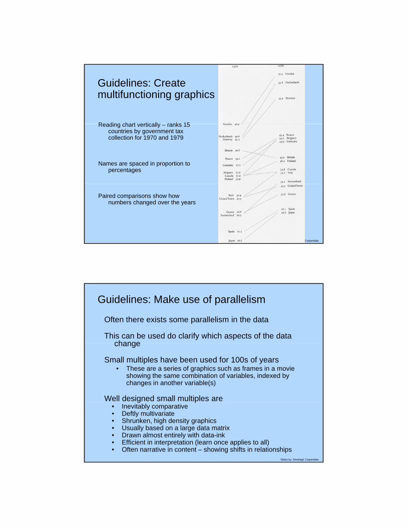
Guidelines: Create multifunctioning graphics
Reading chart vertically ranks 15Reading chart vertically – ranks 15 countries by government tax collection for 1970 and 1979
Names are spaced in proportion to percentages
Slides by: Sheelagh Carpendale
Paired comparisons show how numbers changed over the years
Guidelines: Make use of parallelism
Often there exists some parallelism in the data
This can be used do clarify which aspects of the data changechange
Small multiples have been used for 100s of years• These are a series of graphics such as frames in a movie
showing the same combination of variables, indexed by changes in another variable(s)
Well designed small multiples are
Slides by: Sheelagh Carpendale
g• Inevitably comparative• Deftly multivariate• Shrunken, high density graphics• Usually based on a large data matrix• Drawn almost entirely with data-ink• Efficient in interpretation (learn once applies to all)• Often narrative in content – showing shifts in relationships

Guidelines: Make use of parallelism
Small Multiple from Huygens’ Systema Saturnium 1659.
Slides by: Sheelagh Carpendale
Inner ellipse is earth’s orbit, outer Saturn’s orbit, outer most floating images depict Saturn as viewed from earth, explaining previous idea about Saturn’s shape
Guidelines: Make use of parallelism
Slides by: Sheelagh Carpendale
J. H. Colton
Johnson’s New Illustrated Family Atlas with Physical Geography, 1864

Small Multiples: Showing Time and Change
Slides by: Sheelagh Carpendale
Small Multiples: Showing Time and Change
Slides by: Sheelagh Carpendale

Guidelines: Consider 3D carefully
Why 3D?
• The world is 3D – 2D graphics flatten data
Slides by: Sheelagh Carpendale
Guidelines: Consider 3D carefully
3D graphic excellence
Slides by: Sheelagh Carpendale

Guidelines: Consider 3D carefully 3D graphic excellence
Some 7000 pieces of space debris –points not to scale pbut each at least as big as 8x10 inches – 1987
Micro and macro readings
Slides by: Sheelagh Carpendale
Guidelines: Consider 3D carefully 3D graphic excellence
3D explosion diagram IBM Series III copier
Slides by: Sheelagh Carpendale
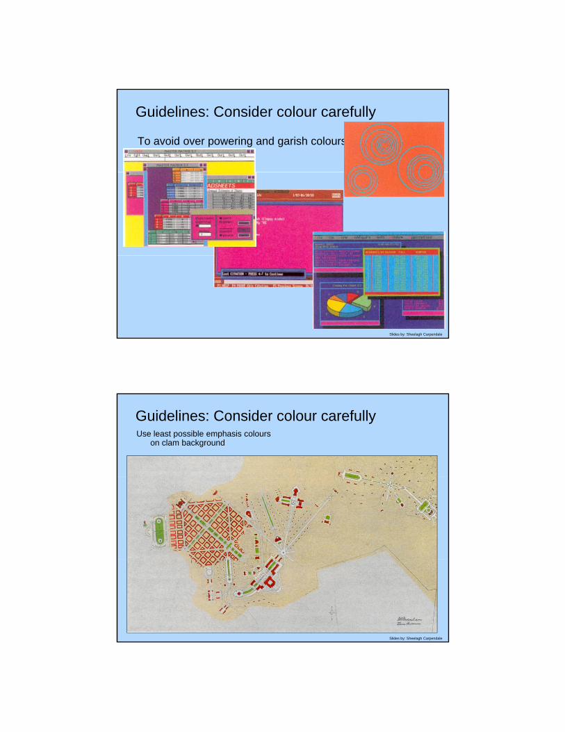
Guidelines: Consider colour carefully
To avoid over powering and garish colours
Slides by: Sheelagh Carpendale
Guidelines: Consider colour carefully Use least possible emphasis colours
on clam background
Slides by: Sheelagh Carpendale

Guidelines: Consider colour carefully
To avoid over powering and garish colours
Use least possible distinguishable difference
Slides by: Sheelagh Carpendale
Guidelines: narratives of space and time Use least possible
distinguishable difference
Slides by: Sheelagh Carpendale

Guidelines: narratives of space and time Use least possible distinguishable
difference
Slides by: Sheelagh Carpendale
Graphical Integrity - Summary
• ‘The representation of numbers, as physically measured on the surface of the graphic itself, should be directly proportional to the numerical quantities represented.
Cl d il d d h h l b li h ld b d d f• Clear, detailed, and thorough labeling should be used to defeat graphical distortion and ambiguity. Write out explanations of the graphic itself. Label important events.
• Show data variation, not design variation.
• In time-series displays of money, deflated and standardized units of monetary measurement are nearly always better than nominal units.
Slides by: Sheelagh Carpendale
• The number of information-carrying (variable) dimensions depicted should not exceed the number of dimensions in the data.
• Graphics must not quote data out of context.’
(Tufte, 1983, p77)

Design: advantages and challenges
Advantages
• Lots of guidelines
• Lots of examples
• A practice of critique
Challenges
• No place to start
Slides by: Sheelagh Carpendale
• No place to start
• Lots of guidelines
• Lots of examples
InfoVis and Perceptual Cognitive Science
Slides by: Sheelagh Carpendale

Perceptual cognitive science: basic concepts
• Understanding perceptual cognitive science
• Well established empirical methods with which to assess percept al iss esassess perceptual issues
• Active research community to monitor
Slides by: Sheelagh Carpendale
ReferencesColin Ware. (2004) Information Visualization: Perception for Design. Morgan
Kaufmann.
Maureen Stone. (2003) A field guide to digital color. AK Peters
S S St (1961) Th P h h i f S F ti SS. S. Stevens. (1961) The Psychophysics of Sensory Function. Sensory Communication, MIT Press, pp 1-33.
William S. Cleveland, Robert McGill. (1984) Graphical Perception: Theory, Experimentation and the Application to the Development of Graphical Models. J. Am. Stat. Assoc. 79:387, pp. 531-554.
Leland Wilkinson. (1993) Comment on Cleveland. Journal of Computational and Graphical Statistics, 2, pp. 355-360.
Slides by: Sheelagh Carpendale
Bernice E. Rogowitz and Lloyd A. Treinish. (1996) How Not to Lie with Visualization. Computers In Physics 10(3), pp 268-273. http://www.research.ibm.com/dx/proceedings/pravda/truevis.htm
C. Brewer. (1999) Color use guidelines for data representation. http://www.personal.psu.edu/faculty/c/a/cab38/ColorSch/ASApaper.html

Field of ViewUseful field of view
varies with tasklow character density - as wide as 15o
high character density - as narrow as 1o to 4o
Slides by: Sheelagh Carpendale
Saccades
Fovea gives small high resolution images
Saccades do rapid scanning
Brain assembles
Vision perceived as continuous
Slides by: Sheelagh Carpendale
Eye movementsSaccadic movements• eye moves rapidly from fixation to fixation• dwell period 200 to 600 msec• saccade takes 20 to 100 msecsaccade takes 20 to 100 msec• peak velocity can be 900 deg/sec• ballistic - cannot be adjusted mid saccade• saccadic suppression - less sensitive visually during a saccade
smooth-pursuit movements• ability to ‘lock-on’ to a smoothly moving object• enables head and/or body movements while maintaining visual
contact
Slides by: Sheelagh Carpendale
contact
convergent movements• towards - eyes converge • away - eyes diverge
accommodation• new target - refocus - 200 msec
d d ti l i ll l d
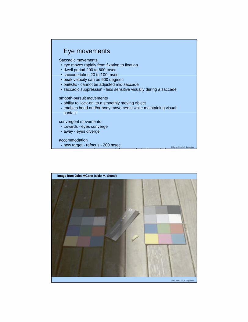
Image from John MCannImage from John MCann (slide M. Stone)Image from John MCann (slide M. Stone)
Slides by: Sheelagh Carpendale

Image from John MCannImage from John MCann
Slides by: Sheelagh Carpendale
Image from John MCann (slide M. Stone)Image from John MCann (slide M. Stone)
Slides by: Sheelagh Carpendale

ConsequencesCrispening
Slides by: Sheelagh Carpendale
ConsequencesCraik-Cornsweet Effect
Slides by: Sheelagh Carpendale

Reading and short term memoryHow many symbols can you remember?
• Usually about 7• 7+ or - 2• short term
memory
as 1o
X?
#
Q
@6$
Slides by: Sheelagh Carpendale
&%
Q
9*F
Pre-attentive processing23589457397568607967524535123465346243562457624572456134523523523523523524351345324716498762987460329587235827653363787213876429876987636409872169653296241392374621639876398712365971245938746387469887126498172649872165971523972356987129721653978216409871298172649872165971523972356987129721653978216409871246478346721898763945089776439821734694649643927643098726342874698649875971523971239764908714698764987243698127346987461435895321456865437
2358945739756860796752453512346534624356245762457245613452352352352352352435134532471649876298746032958723 82 6 3363 8 2 38 6 298 698 636 098 2 696 32962 3
Slides by: Sheelagh Carpendale
235827653363787213876429876987636409872169653296241392374621639876398712365971245938746387469887126498172649872165971523972356987129721653978216409871246478346721898763945089776439821734694649643927643098726342874698649875971523971239764908714698764987243698127346987461435895321456865437

Pre-attentive processing
1000
typical results
X
Response time(milliseconds)
750
500 X X X
Slides by: Sheelagh Carpendale
Number of distracters
250
9 1263pre-attentivenon-pre-attentive
X
Pre-attentive processing
orientation shapecurved/straight
numbersizeshape
Slides by: Sheelagh Carpendale

Position: best for all data typesdata
type
Slides by: Sheelagh Carpendale
Mackinlay, Automating the Design of Graphical Presentations of Relational Information, ACM TOG 5:2, 1986
Based on visual gestalt (perception of ‘wholeness’)
Gestalt Principles: perception
Proximity Similarity
Slides by: Sheelagh Carpendale

Continuity
Gestalt Principles
Slides by: Sheelagh Carpendale
Information Visualization: Perception for Design. Ware, Morgan Kaufmann, 2000
connectedness
Gestalt Principles
Slides by: Sheelagh Carpendale
Information Visualization: Perception for Design. Ware, Morgan Kaufmann, 2000

Closure
Gestalt Principles
Slides by: Sheelagh Carpendale
Closure
O l i it
Gestalt Principles
Overrules proximity, similarity
Slides by: Sheelagh Carpendale
Information Visualization: Perception for Design. Ware, Morgan Kaufmann, 2000

Symmetry
Emphasizes relationships
Gestalt Principles
p p
Slides by: Sheelagh Carpendale
Information Visualization: Perception for Design. Ware, Morgan Kaufmann, 2000
Figure/ground
Gestalt Principles
Slides by: Sheelagh Carpendale
Smaller components seen as objects

Colour The Retina
Slides by: Sheelagh Carpendale
photoreceptors: rods and cones
neurons (receptive fields): intermediate neural layers – image processing
http://school.discovery.com/homeworkhelp/worldbook/atozpictures/lr001100.htmlhttp://www.ccrs.nrcan.gc.ca/ccrs/eduref/sradar/chap2/c2p2_g2e.html
Colour Trichromacy theory
We have 3 types of cones, or colour receptors
Therefore, most colour systems have 3 dimensions :
paint red yellow bluepaint red, yellow, bluetv red, green, blueprinter cyan, magenta, yellow
Slides by: Sheelagh Carpendale

Colour Blindnesssmall-field tritanopia
Slides by: Sheelagh Carpendale
Colour Opponent Process Theory
Late 19th C Ewald Hering
6 elementary coloursy
arranged perceptually as opponent pairs along 3 axes:black – whitered – greenblue – yellow
Slides by: Sheelagh Carpendale
cornerstone of modern colour theory
well established phsyiological basis

Colour Opponent Process Theory - continued
Many lines of scientific evidence worth examining
☼ Namingg
☼ Cross-Cultural naming
☼ Unique Hues
☼ Neurophysiology
☼ Categorical colours
Slides by: Sheelagh Carpendale
colour constancy
colour perception
Slides by: Sheelagh Carpendale

Colouring categorical data
• limited number readily distinct (spatially separate colour patches)
• think about selection, association, and adjacent distinction• Ware’s maximally discriminable colours
Slides by: Sheelagh Carpendale
Colour scales (maps)
Rainbow (hue)No ordering- No ordering
- Good name space
Greyscale/luminance/saturation
- ordered
Slides by: Sheelagh Carpendale
http://www.research.ibm.com/dx/proceedings/pravda/index.htmhttp://www.research.ibm.com/dx/proceedings/pravda/index.htmhttp://www.research.ibm.com/visualanalysis/perception.htmlhttp://www.research.ibm.com/visualanalysis/perception.html

Rainbow scale
- No ordering - Good name space (green part, yellow part ….)
- Jet engine noise simulation
Slides by: Sheelagh Carpendale
http://www.research.ibm.com/dx/proceedings/pravda/index.htmhttp://www.research.ibm.com/dx/proceedings/pravda/index.htmhttp://www.research.ibm.com/visualanalysis/perception.htmlhttp://www.research.ibm.com/visualanalysis/perception.html
Two-Hue scale
- Easier to see small variations
Slides by: Sheelagh Carpendale
http://www.research.ibm.com/dx/proceedings/pravda/index.htmhttp://www.research.ibm.com/dx/proceedings/pravda/index.htmhttp://www.research.ibm.com/visualanalysis/perception.htmlhttp://www.research.ibm.com/visualanalysis/perception.html

Perceptual cognitive science: advantages and challenges
Advantages
• Provides a science on which to base choices• Provides a science on which to base choices
• Provides perceptual guidelines
• Basing choices on human perception
Challenges
• Requires research and extrapolation
Slides by: Sheelagh Carpendale
• Not prescriptive
• Rapidly changing field of research
• Does not consider learning
InfoVis and Data and Task Approach
Slides by: Sheelagh Carpendale

Data and task: basic concepts
• Understand the data
• Understand the tasks
• Work with a subset (perhaps one) of the tasks
• Relates to HCI and requirements engineering approaches
• Best resources
• task-based interface design
Slides by: Sheelagh Carpendale
• Requirements engineering literature
• *** Amar and Stasko’s paper
Data and task: advantages and challenges
Advantages
• Practical approach
• Advice from HCI and SE
Challenges
• Does not include any representational basis
• Stays with the understood
Slides by: Sheelagh Carpendale
• Stays with the understood

InfoVis and Usability Iteration
Slides by: Sheelagh Carpendale
Usability iteration: basic concepts
• Process
- Make something
- Run a usability study
- Improve initial attempt
- iterate
Slides by: Sheelagh Carpendale

Slides by: Sheelagh Carpendale
Early design
Early usability evaluation can kill a promising idea• focus on negative ‘usability problems’
ideaidea idea
idea
Slides by: Sheelagh Carpendale
idea

Early designsIterative testing can promote a mediocre idea
idea1idea1
idea1
idea1
idea1
Slides by: Sheelagh Carpendale
Early designGenerate and vary ideas, then reduce
idea5
idea4
idea3
idea2 idea5
idea6idea7
idea8
idea9
idea5
idea1
Slides by: Sheelagh Carpendale
evaluate the better ideas
idea41

Early designs as sketchesGetting the design right
Getting the right design
idea1idea1
idea1
idea1
idea1
Slides by: Sheelagh Carpendale
idea5
idea4
idea3
idea2 idea5
idea6idea7
idea8
idea9
idea5
idea1
Usability iteration: advantages and challenges
Advantages
• Refines a given piece of software
• Widely accepted
• Belongs in industry
Challenges
• Can kill a brilliant idea
Slides by: Sheelagh Carpendale
• Can kill a brilliant idea
• Can promote mediocrity
• Does not generalize

InfoVis and Human Activity
Slides by: Sheelagh Carpendale
Human activity: basic concepts
• Observation for design
• Ethnographically inspired methodologies available
• Activity theory
• Little practiced currently
Slides by: Sheelagh Carpendale

Observation for design
Motivation – why observe
Observation as a skill – how to learn/teach
Observation for new insight – how to catch that ‘edge’
Slides by: Sheelagh Carpendale
Henry Ford
‘If I had asked people what they wanted, they would have said faster horses’
Slides by: Sheelagh Carpendale

observation for inspiration
Slides by: Sheelagh Carpendale
informed by ethnographic methods
Slides by: Sheelagh Carpendale

ethnographic studies done professionally
Slides by: Sheelagh Carpendale
Ethnographic studies done professionally
not the right settings
no intention for invention
Slides by: Sheelagh Carpendale

we have an
ethnographically inspired approach
Slides by: Sheelagh Carpendale
with intention for invention
Slides by: Sheelagh Carpendale

or possibility intervention
Slides by: Sheelagh Carpendale
heavily based on observation
Slides by: Sheelagh Carpendale

observation is a skill
Slides by: Sheelagh Carpendale
Other observation possible levels
Lower level
Meta level
Finer details
Kinetic level
….
Slides by: Sheelagh Carpendale
Maybe multiple possible ‘levels’

problem is we see what we expect to see
Slides by: Sheelagh Carpendale
relates to change blindness
Slides by: Sheelagh Carpendale

http://www.youtube.com/watch?v=Ahg6qcgoay4&NR=1
http://www.youtube.com/watch?v=diGV83xZwhQ&feature=fvsr
Slides by: Sheelagh Carpendale
Change Blindness
some times changes are not perceived
http://viscog.beckman.uiuc.edu/djs_lab/demos.html
http://www.psych.ubc.ca/~rensink/
Rensink, Ronald A.; O'Regan, J. Kevin & Clark, James J. (1997), To see or not to see: the need for attention to perceive changes in
Slides by: Sheelagh Carpendale
see or not to see: the need for attention to perceive changes in scenes, Psychological Science 8 (5): 368-373.
Silverman, M. & Mack, A. (2006), Priming by change blindness: When it does and does not occur, Consciousness and Cognition 15: 409-422.
Simons, Daniel J. & Levin, Daniel T. (1998), Failure to detect changes to people during a real-world interaction, Psychonomic

the challenge
to see beyond our expectations to reality
Slides by: Sheelagh Carpendale
bottom line
unless we work at it we see what we expect to see
Slides by: Sheelagh Carpendale

Albert Einstein
‘Everything that can be counted does not necessarily count; everything that counts cannot necessarily be counted’
Slides by: Sheelagh Carpendale
Human activity: advantages and challenges
Advantages
• Rich ‘slice’
• New understanding
• Theoretical insight
• Inspiration
Challenges
Slides by: Sheelagh Carpendale
Challenges
• Hard to ‘catch the edge’ – to see beyond the expected
• A lot of work
• Offers insight not design

InfoVis and Storytelling
Slides by: Sheelagh Carpendale
Storytelling: basic concepts
• New direction
• Visualization as a communication medium
• On the web
• In the news
• New perspective based in infographics
Slides by: Sheelagh Carpendale

Storytelling: advantages and challenges
Advantages
• Reaching wider audience
• New perspectives bring new understandings
• Learning from infographics
Challenges
• Shows possibility for bias
Slides by: Sheelagh Carpendale
• Shows possibility for bias
• Requires a critical response
InfoVis Approaches
• Semiotics
• Design
• Perceptual cognitive science
• Data and task
• Usability iteration
• Human activity
• Storytelling
Slides by: Sheelagh Carpendale
• Storytelling