information architecture and web usability - vorlesungen · 13.4 designing web applications ......
TRANSCRIPT

Information Architecture and Web Usability
Course Notes
Version of 17 Jan 2018
Ao.Univ.-Prof. Dr. Keith Andrews
ISDSGraz University of Technology
Inffeldgasse 16cA-8010 Graz
Copyright 2018 Keith Andrews.


Contents
Contents ii
List of Figures iv
List of Tables v
Preface vii
Credits ix
1 Introduction 1
2 User Experience (UX) 52.1 User Experience . . . . . . . . . . . . . . . . . . . . . . . . . . . . . . . . . . . . . . . 5
3 Web Usability 93.1 Three Kinds of Web Site . . . . . . . . . . . . . . . . . . . . . . . . . . . . . . . . . . 103.2 Typical Cost of Building a Web Site . . . . . . . . . . . . . . . . . . . . . . . . . . . . 123.3 Indicators of Web Usability . . . . . . . . . . . . . . . . . . . . . . . . . . . . . . . . . 13
4 Mobile Usability 174.1 Mobile Has Overtaken Desktop . . . . . . . . . . . . . . . . . . . . . . . . . . . . . . . 17
5 Site Objectives and User Needs 195.1 Site Objectives . . . . . . . . . . . . . . . . . . . . . . . . . . . . . . . . . . . . . . . 195.2 Web Site User Needs and Characteristics . . . . . . . . . . . . . . . . . . . . . . . . . . 19
6 Content Strategy 23
7 Information Architecture 257.1 Organisation Schemes . . . . . . . . . . . . . . . . . . . . . . . . . . . . . . . . . . . . 287.2 Taxonomies and Hierarchies . . . . . . . . . . . . . . . . . . . . . . . . . . . . . . . . 347.3 Card Sorting . . . . . . . . . . . . . . . . . . . . . . . . . . . . . . . . . . . . . . . . . 367.4 Tree Testing . . . . . . . . . . . . . . . . . . . . . . . . . . . . . . . . . . . . . . . . . 427.5 Controlled Vocabularies . . . . . . . . . . . . . . . . . . . . . . . . . . . . . . . . . . . 437.6 Faceted Classification . . . . . . . . . . . . . . . . . . . . . . . . . . . . . . . . . . . . 467.7 User-Generated Structures . . . . . . . . . . . . . . . . . . . . . . . . . . . . . . . . . 477.8 Navigation Systems . . . . . . . . . . . . . . . . . . . . . . . . . . . . . . . . . . . . . 497.9 Domain-Driven Design . . . . . . . . . . . . . . . . . . . . . . . . . . . . . . . . . . . 507.10 IA Deliverables . . . . . . . . . . . . . . . . . . . . . . . . . . . . . . . . . . . . . . . 52
i

8 Information and Navigation Design 558.1 Navigation Design . . . . . . . . . . . . . . . . . . . . . . . . . . . . . . . . . . . . . 568.2 Text Design . . . . . . . . . . . . . . . . . . . . . . . . . . . . . . . . . . . . . . . . . 588.3 Image Design . . . . . . . . . . . . . . . . . . . . . . . . . . . . . . . . . . . . . . . . 62
9 Visual Design 679.1 Greeking Test . . . . . . . . . . . . . . . . . . . . . . . . . . . . . . . . . . . . . . . . 67
10 Implementation and Optimisation 7310.1 Tabular Page Layout (“The Old Way”) . . . . . . . . . . . . . . . . . . . . . . . . . . . 7310.2 HTML5 . . . . . . . . . . . . . . . . . . . . . . . . . . . . . . . . . . . . . . . . . . . 8010.3 Polyglot XHTML5 . . . . . . . . . . . . . . . . . . . . . . . . . . . . . . . . . . . . . 8210.4 Building Fault-Tolerant Web Sites . . . . . . . . . . . . . . . . . . . . . . . . . . . . . 8510.5 Responsive Web Design . . . . . . . . . . . . . . . . . . . . . . . . . . . . . . . . . . 8610.6 Design Systems . . . . . . . . . . . . . . . . . . . . . . . . . . . . . . . . . . . . . . . 9110.7 Optimising for Speed . . . . . . . . . . . . . . . . . . . . . . . . . . . . . . . . . . . . 93
11 Conducting a Formal Experiment 9711.1 Experimental Design . . . . . . . . . . . . . . . . . . . . . . . . . . . . . . . . . . . . 9911.2 Statistical Analysis . . . . . . . . . . . . . . . . . . . . . . . . . . . . . . . . . . . . . 10511.3 Examples for Common Situations . . . . . . . . . . . . . . . . . . . . . . . . . . . . . 105
12 Evidence-Based Guidelines 11112.1 Screen Fonts . . . . . . . . . . . . . . . . . . . . . . . . . . . . . . . . . . . . . . . . . 111
13 Web Usability Case Studies 11913.1 SunWeb: User Interface Design for Sun Microsystem’s Internal Web . . . . . . . . . . . 11913.2 SunWWW: User Interface Design for Sun’s Web Site . . . . . . . . . . . . . . . . . . . 12413.3 MSWeb: Microsoft Intranet Site . . . . . . . . . . . . . . . . . . . . . . . . . . . . . . 13613.4 Designing Web Applications . . . . . . . . . . . . . . . . . . . . . . . . . . . . . . . . 136
Bibliography 137
ii

List of Figures
2.1 Five Planes of User Experience . . . . . . . . . . . . . . . . . . . . . . . . . . . . . . . 6
3.1 Three kinds of web site . . . . . . . . . . . . . . . . . . . . . . . . . . . . . . . . . . . 113.2 Mixing Purposes Within a Web Site . . . . . . . . . . . . . . . . . . . . . . . . . . . . 12
7.1 From a Pile of Stuff . . . . . . . . . . . . . . . . . . . . . . . . . . . . . . . . . . . . . 267.2 Three Circles Of Information Architecture . . . . . . . . . . . . . . . . . . . . . . . . . 277.3 Topical Organisation Scheme at ConsumerReports . . . . . . . . . . . . . . . . . . . . 307.4 Task-Based Organisation Scheme at Ebay . . . . . . . . . . . . . . . . . . . . . . . . . 317.5 Dell Web Site . . . . . . . . . . . . . . . . . . . . . . . . . . . . . . . . . . . . . . . . 317.6 Lufthansa Virtual Airport . . . . . . . . . . . . . . . . . . . . . . . . . . . . . . . . . . 327.7 Stanford Web Site . . . . . . . . . . . . . . . . . . . . . . . . . . . . . . . . . . . . . . 337.8 Mixed-Up Libarary . . . . . . . . . . . . . . . . . . . . . . . . . . . . . . . . . . . . . 337.9 Concept Cards Scattered on a Table . . . . . . . . . . . . . . . . . . . . . . . . . . . . 397.10 Test Facilitator Explains Unclear Concepts . . . . . . . . . . . . . . . . . . . . . . . . . 397.11 Grouping Cards into Categories . . . . . . . . . . . . . . . . . . . . . . . . . . . . . . 407.12 Categories Labeled with Post-It Notes . . . . . . . . . . . . . . . . . . . . . . . . . . . 407.13 University Canteen Emergent Path . . . . . . . . . . . . . . . . . . . . . . . . . . . . . 487.14 University Canteen Paved Cowpath . . . . . . . . . . . . . . . . . . . . . . . . . . . . . 487.15 PeopleSoft Home Page . . . . . . . . . . . . . . . . . . . . . . . . . . . . . . . . . . . 507.16 PeopleSoft Site Index . . . . . . . . . . . . . . . . . . . . . . . . . . . . . . . . . . . . 517.17 PeopleSoft Site Map . . . . . . . . . . . . . . . . . . . . . . . . . . . . . . . . . . . . 51
8.1 DENIM Storyboard . . . . . . . . . . . . . . . . . . . . . . . . . . . . . . . . . . . . . 568.2 DENIM Runtime . . . . . . . . . . . . . . . . . . . . . . . . . . . . . . . . . . . . . . 578.3 Balsamiq Mockup Wireframe . . . . . . . . . . . . . . . . . . . . . . . . . . . . . . . . 578.4 Navigational Bar at Top of Each Page . . . . . . . . . . . . . . . . . . . . . . . . . . . 578.5 Link Overload on PICS Pages at W3C . . . . . . . . . . . . . . . . . . . . . . . . . . . 628.6 GIF Interlacing . . . . . . . . . . . . . . . . . . . . . . . . . . . . . . . . . . . . . . . 648.7 Progressive JPEG . . . . . . . . . . . . . . . . . . . . . . . . . . . . . . . . . . . . . . 648.8 Using transparency for non-rectangular images . . . . . . . . . . . . . . . . . . . . . . 658.9 Anti-aliasing a black line . . . . . . . . . . . . . . . . . . . . . . . . . . . . . . . . . . 658.10 Antialiasing a red circle . . . . . . . . . . . . . . . . . . . . . . . . . . . . . . . . . . . 668.11 An antialiased circle against a different background . . . . . . . . . . . . . . . . . . . . 66
9.1 Greeking Test, Template 1 . . . . . . . . . . . . . . . . . . . . . . . . . . . . . . . . . 689.2 Greeking Test, Template 2 . . . . . . . . . . . . . . . . . . . . . . . . . . . . . . . . . 699.3 Greeking Test, Template 3 . . . . . . . . . . . . . . . . . . . . . . . . . . . . . . . . . 69
iii

9.4 Greeking Test, Template 4 . . . . . . . . . . . . . . . . . . . . . . . . . . . . . . . . . 709.5 Greeking Test, Template 5 . . . . . . . . . . . . . . . . . . . . . . . . . . . . . . . . . 709.6 Average Percentage of Correctly Identified Page Elements . . . . . . . . . . . . . . . . 719.7 Preferred Page Templates . . . . . . . . . . . . . . . . . . . . . . . . . . . . . . . . . . 71
10.1 The Virtual Vineyards Site . . . . . . . . . . . . . . . . . . . . . . . . . . . . . . . . . 7510.2 The Virtual Vineyards Site, Table Borders Turned On . . . . . . . . . . . . . . . . . . . 7610.3 Original Look of Keith’s Home Page . . . . . . . . . . . . . . . . . . . . . . . . . . . . 7710.4 Keith’s Redesigned Home Page . . . . . . . . . . . . . . . . . . . . . . . . . . . . . . . 7710.5 Behind the Scenes at Keith’s Redesigned Home Page . . . . . . . . . . . . . . . . . . . 7910.6 Desktop and Mobile Web Sites southwest.com . . . . . . . . . . . . . . . . . . . . . . . 8810.7 Desktop and Mobile Web Sites graz.at . . . . . . . . . . . . . . . . . . . . . . . . . . . 8810.8 A Breakpoint Diagram . . . . . . . . . . . . . . . . . . . . . . . . . . . . . . . . . . . 90
11.1 Simple (Unbalanced) Latin Squares . . . . . . . . . . . . . . . . . . . . . . . . . . . . 10211.2 Simple (Unbalanced) Latin Squares . . . . . . . . . . . . . . . . . . . . . . . . . . . . 10311.3 Balanced Williams Designs (Latin Squares) for 2 to 7 Conditions . . . . . . . . . . . . . 10411.4 Choosing a Statistical Test . . . . . . . . . . . . . . . . . . . . . . . . . . . . . . . . . 106
13.1 SunWeb: Card Distribution to Icons . . . . . . . . . . . . . . . . . . . . . . . . . . . . 12113.2 SunWeb: Main and Second Level Mastheads . . . . . . . . . . . . . . . . . . . . . . . 12213.3 SunWeb: Final Home Page Design . . . . . . . . . . . . . . . . . . . . . . . . . . . . . 12313.4 Usability Lab Setup at Sun . . . . . . . . . . . . . . . . . . . . . . . . . . . . . . . . . 12513.5 SunWWW Button Bar Redesign . . . . . . . . . . . . . . . . . . . . . . . . . . . . . . 12513.6 SunWWW Card Sorting . . . . . . . . . . . . . . . . . . . . . . . . . . . . . . . . . . 12613.7 SunWWW Paper Prototyping . . . . . . . . . . . . . . . . . . . . . . . . . . . . . . . . 12613.8 SunWWW Working Prototype . . . . . . . . . . . . . . . . . . . . . . . . . . . . . . . 12713.9 SunWWW Design 1 . . . . . . . . . . . . . . . . . . . . . . . . . . . . . . . . . . . . 12813.10SunWWW Design 2 . . . . . . . . . . . . . . . . . . . . . . . . . . . . . . . . . . . . 12913.11SunWWW Design 3 . . . . . . . . . . . . . . . . . . . . . . . . . . . . . . . . . . . . 12913.12SunWWW Design 4 . . . . . . . . . . . . . . . . . . . . . . . . . . . . . . . . . . . . 13013.13SunWWW Design 5 . . . . . . . . . . . . . . . . . . . . . . . . . . . . . . . . . . . . 13113.14SunWWW Design 6 . . . . . . . . . . . . . . . . . . . . . . . . . . . . . . . . . . . . 13213.15SunWWW Design 7 . . . . . . . . . . . . . . . . . . . . . . . . . . . . . . . . . . . . 13313.16SunWWW Design 8 . . . . . . . . . . . . . . . . . . . . . . . . . . . . . . . . . . . . 13313.17SunWWW Design 9 . . . . . . . . . . . . . . . . . . . . . . . . . . . . . . . . . . . . 13413.18SunWWW All Nine Iterations . . . . . . . . . . . . . . . . . . . . . . . . . . . . . . . 135
iv

List of Tables
3.1 Typical cost of building a web site . . . . . . . . . . . . . . . . . . . . . . . . . . . . . 133.2 Time Spent on Repeat Visits to Home Page . . . . . . . . . . . . . . . . . . . . . . . . 143.3 Time Spent on Initial Visit Page . . . . . . . . . . . . . . . . . . . . . . . . . . . . . . 143.4 How Long Will Users Wait? . . . . . . . . . . . . . . . . . . . . . . . . . . . . . . . . 153.5 Reasons for Return Visits . . . . . . . . . . . . . . . . . . . . . . . . . . . . . . . . . . 15
8.1 SOWS Linkrot Survey . . . . . . . . . . . . . . . . . . . . . . . . . . . . . . . . . . . 61
10.1 HTML source code for Keith’s new home page . . . . . . . . . . . . . . . . . . . . . . 7810.2 Maximum acceptable page sizes . . . . . . . . . . . . . . . . . . . . . . . . . . . . . . 94
11.1 Simple Repeated Measures Data . . . . . . . . . . . . . . . . . . . . . . . . . . . . . . 10211.2 Task Completion Times . . . . . . . . . . . . . . . . . . . . . . . . . . . . . . . . . . . 10711.3 User Ratings . . . . . . . . . . . . . . . . . . . . . . . . . . . . . . . . . . . . . . . . . 10911.4 User Preference Data . . . . . . . . . . . . . . . . . . . . . . . . . . . . . . . . . . . . 110
13.1 SunWeb: Results of Icon Intuitiveness Study . . . . . . . . . . . . . . . . . . . . . . . . 12113.2 SunWeb: Five Iterations of Specialised Tools Icon . . . . . . . . . . . . . . . . . . . . . 12313.3 User Comments on Design 5 Icons . . . . . . . . . . . . . . . . . . . . . . . . . . . . . 131
v

vi

Preface
I first started teaching Human-Computer Interaction at Graz University of Technology in 1993. Moreand more interesting material came to be integrated into my HCI course notes, until in 2003, I decidedto split them into two. The original HCI course was streamlined into an introductory course coveringusability and the methods of usability engineering.
The more advanced and more web-site specific material moved to a new course, this course on In-formation Architecture and Web Usability, which I first taught in winter semester 2003.
These lecture notes have evolved over many years and have benefitted from my experiences teach-ing courses on user interface design at FH Technikum Kärnten in Villach, web usability and advanceduser interfaces at FH Joanneum in Graz, human-computer interaction at FH Hagenberg near Linz andnumerous intensive courses at conferences and for industry.
I would like to thank all my students past and present for their many suggestions and corrections whichhave helped to massage these notes into their current form.
References in Association with Amazon
References with an ISBN number are linked to amazon.com (or amazon.co.uk or amazon.de) for quick,discounted purchasing. Amazon pay me a small referral fee for each item you purchase after followingsuch a link – the item itself does not cost you any more. If you find these notes useful and would liketo contribute towards their maintenance, please purchase any book you might want after following aspecific ISBN link from here.
Thanks and happy reading,
Keith
vii

viii

Credits
• Figures 9.1, 9.2, 9.3, 9.4, 9.5, 9.6, and 9.7 were kindly provided by Tom Tullis from Fidelity.
• The figures in Sections 13.1 and 13.2 were kindly provided by Jakob Nielsen from Sun Microsys-tems.
ix

x

Chapter 1
Introduction
“ We take stuff, and we sort it into useful categories, and we give it names that peoplerecognise, and we put the stuff someplace where they’re going to find it. ”
[ Eric Reiss, 22 Sept 2011, EuroIA, Prague. ]
References
++ Louis Rosenfeld et al; Information Architecture: For the Web and Beyond; O’Reilly, 4th Edition,11 Oct 2015. ISBN 1491911689 (com, uk) [Rosenfeld, Morville and Arango, 2015]
++ Donna Spencer; A Practical Guide to Information Architecture; 2nd Edition, UX Mastery, 2014.ebook. ISBN 0992538025 (com, uk) [Spencer, 2014]
++ Donna Spencer; Card Sorting: Designing Usable Categories; Rosenfeld Media, 2009. ISBN
1933820020 (com, uk) [Spencer, 2009] http://rosenfeldmedia.com/books/card-sorting/
++ Ethan Marcotte; Responsive Web Design; 2nd Edition, A Book Apart, 02 Dec 2014. ISBN 1937557189
(com, uk) [Marcotte, 2014]
++ Scott Jehl; Responsible Responsive Design; A Book Apart; Dec 2014. [Jehl, 2014]
+ Clay Shirky; Cognitive Surplus: Creativity and Generosity in a Connected Age; Penguin, Jun 2010.ISBN 1594202532 (com, uk) [Shirky, 2010]
+ Clay Shirky; Here Comes Everybody: The Power of Organizing Without Organizations; Penguin,Feb 2008. ISBN 1594201536 (com, uk) [Shirky, 2008]
+ Don Tapscott and Anthony Williams; Wikinomics: How Mass Collaboration Changes Everything;Portfolio, Dec 2006. ISBN 1591841380 (com, uk) [Tapscott and A. D. Williams, 2006]
◦ Don Tapscott; Grown Up Digital: How the Net Generation is Changing Your World; McGraw-Hill,Oct 2008. ISBN 0071508635 (com, uk) [Tapscott, 2008]
+ Mark Hurst; Bit Literacy: Productivity in the Age of Information and E-mail Overload; Good Exper-ience Press, Jun 2007. ISBN 0979368103 (com, uk) [Hurst, 2007]
+ Peter Morville and Jeffery Callender; Search Patterns: Design for Discovery; O’Reilly, Jan 2010.ISBN 0596802277 (com, uk) [Morville and Callender, 2010]
1
2 CHAPTER 1. INTRODUCTION
+ Marti Hearst; Search User Interfaces; Cambridge University Press, Oct 2009. ISBN 0521113792 (com,
uk) [Hearst, 2009]
◦ Peter Morville; Ambient Findability; O’Reilly, 2005. ISBN 0596007655 (com, uk) [Morville, 2005]
◦ William Jones; Keeping Found Things Found: The Study and Practice of Personal Information Man-agement; Morgan Kaufmann, Nov 2007. ISBN 0123708664 (com, uk) [Jones, 2007]
◦ Ryen White and Resa Roth; Exploratory Search: Beyond the Query-Response Paradigm; Morganand Claypool, Mar 2009. ISBN 159829783X (com, uk) [White and Roth, 2009]
◦ Bonnie Nardi and Vicki O’Day; Information Ecologies: Using Technology with Heart; MIT Press,2000. ISBN 0262640422 (com, uk)
Online Resources
++ Boxes and Arrows; boxesandarrows.com
++ A List Apart; alistapart.com
++ Smashing Magazine; smashingmagazine.com
Professional Organisations
+ American Society for Information Science and Technology (ASIS&T) asist.org
◦ Interaction Design Association; ixda.org
◦ User Experience Professionals Association uxpa.org
◦ ACM SIGCHI sigchi.org
◦ The Information Architecture Institute; iainstitute.org
Journals
• Journal of Usability Studies (JUS); Usability Professionals’ Association ISSN 1931-3357 uxpajournal.
org
• Journal of the American Society for Information Science and Technology (JASIST); ISSN 0002-8231
http://asist.org/publications/jasist/
• Journal of Information Architecture; ISSN 1903-7260 journalofia.org
Conferences
• IA Summit; Information Architecture Summit iasummit.org
• EuroIA; European Information Architecture Summit; euroia.org
• IxDA; Interaction; http://ixda.org/events
• ISI; Internationales Symposium der Informationswissenschaft; isi2017.de

3
• WebExpo Prague webexpo.net
• WeAreDevelopers wearedevelopers.com
• Beyond Tellerrand beyondtellerrand.com

4 CHAPTER 1. INTRODUCTION

Chapter 2
User Experience (UX)
“ Users don’t visit Web sites to experience the joy of navigation. ”
[ Jesse James Garrett, The Elements of User Experience, page 36, 2002. ]
References
+ Jesse James Garrett; The Elements of User Experience: User-Centered Design for the Web; 2nd
Edition, New Riders, 2010. ISBN 0321683684 (com, uk) [Garrett, 2010]
Online Resources
+ UXmatters; uxmatters.com
◦ UX Magazine; uxmag.com
◦ UX Booth; uxbooth.com
◦ adaptive path; adaptivepath.org
◦ UX Myths; uxmyths.com
2.1 User Experience
User experience (UX): the entire experience of a user with a product or interface.
An umbrella term which encompasses:
• information architecture
• usability engineering
• graphic design
• interaction design
5

6 CHAPTER 2. USER EXPERIENCE (UX)
ContentStrategy
FunctionalSpecifications
InformationArchitecture
InteractionDesign
SurfacePlane
5.
SkeletonPlane
StructurePlane
ScopePlane
StrategyPlane
Interface Design Navigation Design
Information Design
Site ObjectivesUser Needs
Conception
Completion
Tim
e
Abstract
ConcreteLe
vel o
f Abs
trac
tion
Information Web Site(information-oriented)
Web Application(task-oriented)
Visual Design5
4
3
1
2
4.
3.
2.
1.
Figure 2.1: The five planes of user experience. Adapted from Jesse James Garrett [Garrett, 2010].
The Five Planes of User Experience
• 5: Surface Plane: web pages made up of images and text.
• 4: Skeleton Plane: the placement of buttons, tabs, images, and blocks of text.
• 3: Structure Plane: abstract structure of the site.
• 2: Scope Plane: features and functionality.
• 1: Strategy Plane: what the owners and users of the site want to achieve.
The five planes build from bottom to top.
The planes have slight nuances, depending on whether the (part of the) web site under design is task-oriented or information-oriented.
Stagger Work on Planes
Do not wait for work on one plane to finish before starting on the next. There must be some degree ofiteration (feedback loop).
Work on a particular plane cannot finish before work on lower planes has finished.

2.1. USER EXPERIENCE 7
Web Application Site Design
Task-oriented (parts of) web site:
• 5: Visual Design: visual treatment of interface elements.
• 4b: Interface Design: design of interface elements, widgets, GUI.
• 4a: Information Design: “content design”, wording and presentation of information to facilitateunderstanding.
• 3: Interaction Design: design of application flows to facilitate user tasks.
• 2: Functional Specifications: “feature set”, descriptions of functionality required to meet user needs.
• 1b: User Needs: externally derived goals for the site identified through user research.
• 1a: Site Objectives: business, creative, and other internally derived goals for the site.
Information Web Site Design
Information-oriented (parts of) web site:
• 5: Visual Design: visual treatment of text, graphics, and navigational components.
• 4b: Navigation Design: design of interface elements to facilitate navigation through informationspace.
• 4a: Information Design: “content design”, wording and presentation of information to facilitateunderstanding.
• 3: Information Architecture: structural design of the information space to facilitate intuitive accessto content.
• 2: Content Strategy: definition and management of content elements required to meet user needs.
• 1a: User Needs: externally derived goals for the site identified through user research.
• 1a: Site Objectives: business, creative, and other internally derived goals for the site.
Big Architect, Little Architect
Some people define the field of information architecture (IA) broadly, others more narrowly [Morville,2000].
Defining information architecture (IA):
• “Big IA”: encompassing a broad range of responsibilities (all 5 planes of information site design).
• “Little IA”: narrowly focused on content organization and the structure of information spaces (plane3 above).
I will adopt the convention of Garrett [Garrett, 2002b]:
Whereas an information architect might play many roles, the disicpline of information architecturedeals with the structuring of information spaces to facilitate navigation.

8 CHAPTER 2. USER EXPERIENCE (UX)
Chapter 3
Web Usability
“ Don’t make me think!. . .It means that as far as is humanly possible, when I look at a Web page it should be self-evident. Obvious. Self-explanatory. ”
[ Steve Krug’s first law of usability [Krug, 2000, first edition, page 11]. ]
References
++ Steve Krug; Don’t Make Me Think! Revisited; 3rd Edition, New Riders, 24 Dec 2013. ISBN
0321965515 (com, uk) [Krug, 2013]
+ Jakob Nielsen and Hoa Loranger; Prioritizing Web Usability; New Riders, Apr 2006. ISBN
0321350316 (com, uk) [Nielsen and Loranger, 2006]
+ Jakob Nielsen and Kara Pernice; Eyetracking Web Usability; New Riders, Dec 2009. ISBN 0321498364
(com, uk) [Nielsen and Pernice, 2009]
◦ Nielsen et al; E-Commerce User Experience; Nielsen Norman Group, 2001. http://www.nngroup.com/reports/ecommerce/ ISBN 0970607202 (com, uk) [Nielsen, Molich et al., 2001]
◦ Jakob Nielsen; Designing Web Usability: The Practice of Simplicity; New Riders, 1999. ISBN
156205810X (com, uk) [Nielsen, 1999a]
◦ Mark Pearrow; Web Usability Handbook; Charles River Media, 2nd Edition, 2006. ISBN 1584504692
(com, uk) [Pearrow, 2006]
◦ James Kalbach; Designing Web Navigation: Optimizing the User Experience; O’Reilly, 07 Sept2007. ISBN 0596528108 (com, uk) [Kalbach, 2007]
◦ Tom Brinck, Darren Gergle, and Scott Wood; Usability for the Web: Designing Web Sites that WorkMorgan Kaufmann, 2001. ISBN 1558606580 (com, uk) [Brinck, Gergle and Wood, 2001]
◦ Jared Spool, et al; Web Site Usability: A Designer’s Guide; User Interface Engineering, 1997. http://www.uie.com/ ISBN 0966064100 (com, uk) [Spool et al., 1997]
◦ Jeff Johnson; Web Bloopers; Morgan Kaufman, 2003. ISBN 1558608400 (com, uk) [Johnson, 2003]
◦ Vincent Flanders and Michael Willis; Web Pages That Suck; Sybex, 1998. ISBN 078212187X (com, uk)
[Flanders and Willis, 1998]
9

10 CHAPTER 3. WEB USABILITY
Resources in German
+ Steve Krug; Don’t Make Me Think! Web Usability - Das intuitive Web; 3rd Edition, mitp, 2014. ISBN
3826697057 (com, uk) [Krug, 2014]
◦ Johannes Ippen ; Web Fatale: Wie Du Webseiten und Web-Apps gestaltest, denen niemand wider-stehen kann; Rheinwerk Design, 29 Mar 2016 ISBN 3836238985 (com, uk) [Ippen, 2016]
◦ Alexander Florin; User Interface Design: Usability in Web- und Software-Projekten; Books on De-mand, 09 Jun 2015 ISBN 3738612386 (com, uk) [Florin, 2015]
+ Manhartsberger and Sabine Musil; Web Usability - Das Prinzip des Vertrauens; Galileo Press, 2001.ISBN 3898421872 (com, uk) [Manhartsberger and Musil, 2001]
Online Resources
++ Steve Krug; Advanced Common Sense; sensible.com.
++ Bruce “Tog” Tognazzini; Ask Tog; asktog.com.
++ Jared Spool, User Interface Engineering; uie.com.
+ Nielsen Norman Group; Topic: Web Usability; https://nngroup.com/topic/web-usability/.
+ Jason Grigsby; userfirstweb.com.
◦ Roger Hudson; Web Usability; usability.com.au.
+ David Travis; 247 Web Usability Guidelines; http://userfocus.co.uk/resources/guidelines.html.
3.1 Three Kinds of Web Site
[ This section is loosely based on ideas from Siegel [1995] and Archibald [2012]. ]
There are three different kinds of web site, based on the purpose behind the web site:
a) Information: “get stuff” web sites.
b) Application: “do stuff” web sites.
c) Entertainment: “entertain me” web sites.
See also Figure 3.1.
The design criteria for each of these purposes are different!
Information Web Sites
• “get something” web sites.
• Structured content.
• The basic unit of interaction is the fact.
• Content, publishing.

3.1. THREE KINDS OF WEB SITE 11
Information Application
Entertainment
“get stuff‟ “do stuff”
“entertain me”
Figure 3.1: Three kinds of a web site, based on the purpose behind it.
• Books, papers, articles, reference material, specifications.
• Information sites are often large and are generated or maintained at least semi-automatically.
• The realm of information architects.
• For an information web site, the goal of the designer is to minimise the amount of time a user spendsto find a specific piece of information.
Application Web Sites
• “do something” web sites.
• Structured tasks, dialogues.
• The basic unit of interaction is the task.
• Transactions, ordeing, banking, planning, etc.
• Ordering, booking, form-filling, workflow.
• Web applications usually require some backend processing and often generate pages dynamicallyfrom a database.
• The realm of interaction designers.
• For an application web site, the goal of the designer is to minimise the amount of time a user spendsto complete a specific task.
Entertainment Web Sites
• “be entertained” web sites.
• Enthralling content.
• The basic unit of interaction is the experience.
• Entertainment, marketing, promotion.

12 CHAPTER 3. WEB USABILITY
Promotions,Games,Exhibits
Information
ProductSpecs
OrderProducts
RequestCatalogue
Reviews
PressReleases
Application
Entertainment
Figure 3.2: Larger web sites often mix all three purposes within a single site.
• Image, mindshare, building community.
• Promotion web sites are typically carefully hand-crafted by graphic designers for a specific lookand experience (“form vs. content”).
• The realm of games designers and experience designers.
• For an entertainment web site, the goal of the designer is to maximise the amount of time a userspends on the site.
Mixing Purposes within a Site
Many larger web sites have a mixture of purposes, as shown in Figure3.2.
However, the design criteria remain different for each corresponding area of the site.
3.2 Typical Cost of Building a Web Site
• Clinique, a cosmetics manufacturer, published its web site budget for 1996 (New York Times, 29May 1996): initial development costs of $ 250,000 and annual maintenance of $ 200,000.
• Forrester Research (forrester.com) estimated the cost of web site development in 1995 for an in-formation web site at around $ 1.3 million (see Table 3.1).
• AllBusiness [AllBusiness, 2006] estimated in 2006 that a “larger site with publishing tools, databaseconnectivity and other advanced features” can cost $ 250,000 to build.
• In 2007, Guy Kawasaki described how he built Truemors (truemors.com) for $ 12,107.09 [Kawasaki,2007]
• In 2015, the cost of building a web site can range from around $ 5,000 to $ 30,000 and up, dependingon a whole variety of factors, according to the excellent analysis of Parr [2015].
• Pozin [2013], WebpageFX [2015] and Vyas [2013] provide alternative analyses.
• The student union (HTU) of Graz University of Technology published a breakdown of the € 50,000

3.3. INDICATORS OF WEB USABILITY 13
Purpose of SiteCost Information Promotion TransactionsPlatform 252,000 52,000 675,000Content 813,000 237,000 1.910,000Marketing 247,000 15,000 783,000Total 1,312,000 304,000 3,368,000
Table 3.1: Typical cost of building a web site, in US$, estimated by Forrester Research, Dec, 1995.
or so cost of their 2011–2013 website redesign [Ellmaier and Stachel, 2013], following some criti-cism [Kogelnik, 2014].
• Former Austrian finance minister Karl-Heinz Grasser’s web site karlheinzgrasser.at cost between€ 220,000 and€ 245,948 [APA, 2004] according to an independent expert assessment for the court.
3.3 Indicators of Web Usability
Success Rates
From Nielsen and Loranger [2006, pages 22–25]:
• Ask users to perform specific tasks on a particular web site (which are possible on that web site).
• In the 1990s, success rates of around 40%.
• In 2006, success rates average around 66%.
• Nielsen uses a fuzzy measure, taking partial success into account, rather than a binary measure ofsuccess or failure.
Linger Time
In Nielsen and Loranger [2006, page 27]’s study:
• Given a web-wide task, such as researching a new product.
• Users visited an average of 3.2 sites, in addition to any search engine they may have used.
• Users spent an average of 1 minute 49 seconds visiting a web site, before deciding to move on.
• A site only had a 12% probability of being revisited (for that task).
Time Spent on the Home Page of a Site
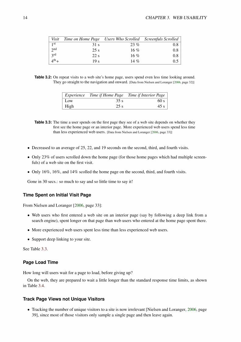
In Nielsen and Loranger [2006, page 32]’s study (see Table 3.2):
• Given a web-wide task, such as researching a new product.
• Users spent an average of only 31 seconds on the home page of a web site on their first visit.
14 CHAPTER 3. WEB USABILITY
Visit Time on Home Page Users Who Scrolled Screenfuls Scrolled1st 31 s 23 % 0.82nd 25 s 16 % 0.83rd 22 s 16 % 0.84th+ 19 s 14 % 0.5
Table 3.2: On repeat visits to a web site’s home page, users spend even less time looking around.They go straight to the navigation and onward. [Data from Nielsen and Loranger [2006, page 32]]
Experience Time if Home Page Time if Interior PageLow 35 s 60 sHigh 25 s 45 s
Table 3.3: The time a user spends on the first page they see of a web site depends on whether theyfirst see the home page or an interior page. More experienced web users spend less timethan less experienced web users. [Data from Nielsen and Loranger [2006, page 33]]
• Decreased to an average of 25, 22, and 19 seconds on the second, third, and fourth visits.
• Only 23% of users scrolled down the home page (for those home pages which had multiple screen-fuls) of a web site on the first visit.
• Only 16%, 16%, and 14% scolled the home page on the second, third, and fourth visits.
Gone in 30 secs.: so much to say and so little time to say it!
Time Spent on Initial Visit Page
From Nielsen and Loranger [2006, page 33]:
• Web users who first entered a web site on an interior page (say by following a deep link from asearch engine), spent longer on that page than web users who entered at the home page spent there.
• More experienced web users spent less time than less experienced web users.
• Support deep linking to your site.
See Table 3.3.
Page Load Time
How long will users wait for a page to load, before giving up?
On the web, they are prepared to wait a little longer than the standard response time limits, as shownin Table 3.4.
Track Page Views not Unique Visitors
• Tracking the number of unique visitors to a site is now irrelevant [Nielsen and Loranger, 2006, page39], since most of those visitors only sample a single page and then leave again.

3.3. INDICATORS OF WEB USABILITY 15
% Still Waiting Load Time (secs.)84 1051 1526 205 30
Table 3.4: The time users are prepared to wait for a web page to load before giving up. Reportedby BrowserNews [Upsdell, 2001], quoting eMarketer (Nov. 1998).
% of Users Factor75 High-quality content66 Ease of use58 Quick to download54 Updated frequently14 Coupons and incentives13 Favourite brands13 Chat and BBS12 Cutting-edge technology12 Games11 Purchasing capabilities10 Customisable content6 Other
Table 3.5: The main reasons users give for returning to a site. Reported by BrowserNews [Upsdell,2001], quoting Forrester Research (Feb. 1999).
• Instead, track the number of page views.
Reasons for Return Visits
Table 3.5 shows what users cite as the main reasons for returning to a site.
Note: never believe entirely what users tell you!

16 CHAPTER 3. WEB USABILITY

Chapter 4
Mobile Usability
References
+ Jakob Nielsen and Raluca Budiu; Mobile Usability; New Riders, 10 Oct 2012. ISBN 0321884485 (com,
uk) [Nielsen and Budiu, 2012]
+ Rachel Hinman; The Mobile Frontier: A Guide for Designing Mobile Experiences; Rosenfeld Media,11 Jun 2012. ISBN 1933820551 (com, uk) [Hinman, 2012]
+ Luke Wroblewski; Mobile First; A Book Apart, 18 Oct 2011. ISBN 1937557022 (com, uk) [Wrob-lewski, 2011]
◦ Adrian Mendoza; Mobile User Experience; Morgan Kaufmann, 31 Oct 2013. ISBN 0124095143 (com,
uk) [Mendoza, 2013]
Online Resources
+ Raluca Budiu; The State of Mobile User Experience; NN Group, 22 Mar 2015. https://nngroup.com/articles/mobile-usability-update/ [Budiu, 2015]
+ Justin Mifsud; Usability Testing Of Mobile Applications: A Step-By-Step Guide; UsabilityGeek,21 Mar 2016. http://usabilitygeek.com/usability-testing-mobile-applications/
+ Christian Holst; Exploring Ten Fundamental Aspects Of M-Commerce Usability; http://
smashingmagazine.com/2013/05/21/recommendations-mobile-commerce-websites/ [Holst, 2013]
+ Tania Lang; Eight Lessons in Mobile Usability Testing; http://uxmag.com/articles/eight-lessons-in-mobile-usability-testing [Lang, 2013]
+ Google; Mobile-Friendly Test; https://google.com/webmasters/tools/mobile-friendly/
4.1 Mobile Has Overtaken Desktop
• Sales of new smartphones overtook sales of new PCs (desktop + laptop) in Q4 2010 [Ferguson,2011].
• As of May 2017 over 2 billion active Android devices [Popper, 2017].
17

18 CHAPTER 4. MOBILE USABILITY
• In 2015, US adults spent on average 2.8 hours per day (51%) on the internet on mobile devices,compared to 2.4 hours per day (42%) on desktop/laptop [Meeker, 2015, slide 14].
• The vast majority of twitter users (82%) in Q2 2016 accessed the service from a mobile device[Yeung, 2016].
• ≈ 70% of page impressions (to ÖWA Basic web sites) in Austria (Aug 2017) are from mobile webbrowsers [ÖWA, 2017]
• See Luke Wroblewski’s talks [Wroblewski, 2016] and book “Mobile First” [Wroblewski, 2011].

Chapter 5
Site Objectives and User Needs
“ We need to design for a world where Google is our home page, Wikipedia [DBpedia] isour content management system, and humans and robots are our users. ”
[ Mike Atherton, talk at City University 06 Mar 2012 [Atherton, 2012, 00:13:48]. ]
5.1 Site Objectives
Site Objectives: business, creative, and other internally derived goals for the site.
5.2 Web Site User Needs and Characteristics
As with any kind of usability engineering, when designing web sites it is imperative to know your targetusers and their typical tasks.
User Needs: externally derived goals for the site identified through user research.
References
+ Bernard Jim Jansen; Understanding User-Web Interactions via Web Analytics; Morgan Claypool,2009. ISBN 1598298518 (com, uk) [Jansen, 2009]
+ Louis Rosenfeld; Search Analytics for Your Site; Rosenfeld Media, 2011. ISBN 1933820209 (com, uk)
[Rosenfeld, 2011]
5.2.1 Web Users in General
Statistics about web users in general. Not specific to any one site.
Browser Statistics
• Wikipedia; Usage Share of Web Browsers; http://en.wikipedia.org/wiki/Usage_share_of_web_browsers
• StatCounter Global Statisticshttp://gs.statcounter.com/
19

20 CHAPTER 5. SITE OBJECTIVES AND USER NEEDS
• NetApplications; Browser Market Share; http://www.netmarketshare.com/
• Charles Upsdell, Browser Newshttp://www.upsdell.com/BrowserNews/stat.htm
Connection Speeds
• Andy King; The Bandwidth Report; http://www.websiteoptimization.com/bw/
• Pew Internet; Home Broadband; http://www.pewinternet.org/
• Akamai; State of the Internet Report; http://www.akamai.com/stateoftheinternet/
• Ookla; Net Index; netindex.com Measured connection speeds, aggregated from millions of users ofspeedtest.net.
Austrian Data
• Austrian Internet Monitor (AIM)http://mediaresearch.orf.at/internet.htm
• IKT-Einsatz in Haushalten 2009http://www.statistik.at/web_de/statistiken/informationsgesellschaft/ikt-einsatz_in_haushalten/
index.html
5.2.2 Know Your Own Users
• Server logs
– Browser demographics:
* OS
* Browser version
* Colours
* Resolution
– Page view logs:
* Most popular pages
* Most frequent paths
– Search logs:
* What is searched for most?
* Which popular searches are unsuccessful?
• Bug reports, feedback
– Problems, issues, and concerns.
• Online survey, competition.
– User demographics
– Connection speed
5.2. WEB SITE USER NEEDS AND CHARACTERISTICS 21
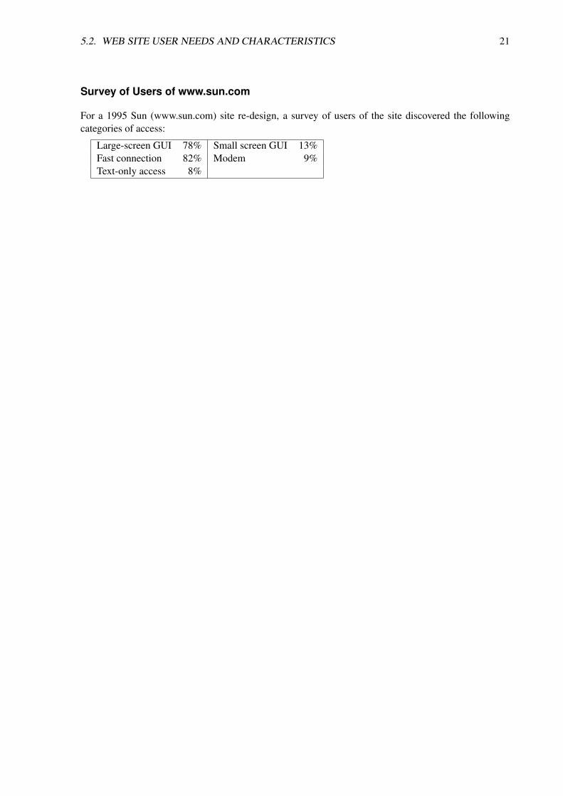
Survey of Users of www.sun.com
For a 1995 Sun (www.sun.com) site re-design, a survey of users of the site discovered the followingcategories of access:
Large-screen GUI 78% Small screen GUI 13%Fast connection 82% Modem 9%Text-only access 8%

22 CHAPTER 5. SITE OBJECTIVES AND USER NEEDS

Chapter 6
Content Strategy
“ Content is King. ”
[ Title of an essay by Bill Gates, 03 Jan 1996. [Gates, 1996] ]
Content Strategy: “Content strategy plans for the creation, publication, and governance of useful,usable content.” [Halvorson, 2008]
References
++ Bailie and Urbina; Content Strategy: Connecting the Dots Between Business, Brand, and Benefits;XML Press, 28 Dec 2012. ISBN 1937434168 (com, uk) [Bailie and Urbina, 2012]
++ Meghan Casey; The Content Strategy Toolkit; New Riders, 18 Jun 2015. ISBN 0134105109 (com, uk)
[Casey, 2015]
++ Margot Bloomstein; Content Strategy at Work; Morgan Kaufmann, 04 Dec 2012. ISBN 0123919223
(com, uk) [Bloomstein, 2012]
+ Erin Kissane; The Elements of Content Strategy; A Book Apart, 08 Mar 2012. ISBN 0984442553 (com,
uk) [Kissane, 2011]
+ Karen McGrane; Content Strategy for Mobile"; A Book Apart, 05 Nov 2012. ISBN 1937557081 (com,
uk) [McGrane, 2012]
++ Sara Wachter-Boettcher; Content Everywhere; Rosenfeld, 12 Dec 2012. ISBN 193382087X (com, uk)
[Wachter-Boettcher, 2012]
References in German
+ Miriam Löffler; Think Content!; Galileo Computing, 24 Feb 2014. ISBN 3836220067 (com, uk) [Löffler,2014] In German.
Online Resources
++ Kristina Halvorson; The Discipline of Content Strategy; A List Apart, 16 Dec 2008. http://
alistapart.com/article/thedisciplineofcontentstrategy [Halvorson, 2008]
23

24 CHAPTER 6. CONTENT STRATEGY
+ Rachel Lovinger; Content Strategy: The Philosophy of Data; Boxes and Arrows, 27 Mar 2007. http://boxesandarrows.com/content-strategy-the-philosophy-of-data/ [Lovinger, 2007]
+ Steve Fisher; Responsive Content Modeling; Republic of Quality, 29 Sept 2014. http://
republicofquality.com/responsive-content-modeling/ [Fisher, 2014]

Chapter 7
Information Architecture
“ IA is the means by which we get from a pile of stuff to a structured experience. ”
[ Adaptive Path, Designing the Complete User Experience, course slides. ]
Information architecture is the structural design of an information space to facilitate intuitive access toits contents. See Figure 7.1.
References
++ Louis Rosenfeld et al; Information Architecture: For the Web and Beyond; O’Reilly, 4th Edition,11 Oct 2015. ISBN 1491911689 (com, uk) [Rosenfeld, Morville and Arango, 2015]
++ Donna Spencer; A Practical Guide to Information Architecture; 2nd Edition, UX Mastery, 2014.ebook. ISBN 0992538025 (com, uk) [Spencer, 2014]
+ Donna Spencer; A Practical Guide to Information Architecture; Five Simple Steps, 08 Jun 2010.ISBN 095617406X (com, uk) [Spencer, 2014]
+ Andrea Resmini and Luca Rosati; Pervasive Information Architecture; Morgan Kaufmann, 13 Apr2011. ISBN 0123820944 (com, uk) [Resmini and Rosati, 2011b]
+ Andrea Resmini and Luca Rosati; A Brief History of Information Architecture; Journal of InformationArchitecture, 2011. [Resmini and Rosati, 2011a]
◦ Abby Covert; How to Make Sense of Any Mess: Information Architecture for Everybody; Cre-ateSpace, 04 Nov 2014. ISBN 1500615994 (com, uk) [Covert, 2014]
◦ Heather Hedden; The Accidental Taxonomist; Information Today, 03 May 2010 ISBN 1573873977
(com, uk) [Hedden, 2010]
◦ Wei Ding and Xia Lin; Information Architecture: The Design and Integration of Informa-tion Spaces; Morgan and Claypool, Nov 2009. ISBN 159829959X (com, uk) doi:10.2200/S00214ED1V01Y200910ICR008 [Ding and Lin, 2009]
++ Daniel Tunkelang; Faceted Search; Morgan Claypool, Jun 2009. ISBN 1598299999 (com, uk) doi:10.2200/S00190ED1V01Y200904ICR005 [Tunkelang, 2009]
+ David Weinberger; Everything Is Miscellaneous; Times Books, May 2007. ISBN 0805080430 (com, uk)
[Weinberger, 2007]
25

26 CHAPTER 7. INFORMATION ARCHITECTURE
Figure 7.1: Information architecture: getting from a pile of stuff to a structured experience.
+ Eric Evans; Domain-Driven Design; Addison-Wesley, 2003. ISBN 0321125215 (com, uk) [E. Evans,2003]
+ Peter Morville and Jeffery Callender; Search Patterns: Design for Discovery; O’Reilly, 2010. ISBN
0596802277 (com, uk) [Morville and Callender, 2010]
+ Peter Van Dijck; Information Architecture for Designers: Structuring Websites for Business Success;Rotovision, 2003. ISBN 2880467314 (com, uk) [van Dijck, 2003]
◦ Christine Wodtke; Information Architecture: Blueprints for the Web; 2nd Edition, New Riders, Feb2009. ISBN 0321600800 (com, uk) [Wodtke, 2009]
◦ Eric Reiss; Practical Information Architecture: A Hands-On Approach to Structuring SuccessfulWebsites; Addison-Wesley, 2000. ISBN 0201725908 (com, uk) [Reiss, 2000]
◦ Shiyali Ranganathan; Colon Classification; First Edition, Madras Library Association, 1933. [Ran-ganathan, 1933]
◦ Shiyali Ranganathan; Colon Classification; Sixth Edition, Ess Ess Publications, 2006. ISBN
8170004233 (com, uk) [Ranganathan, 2006]
◦ Alex Wright; Cataloging the World: Paul Otlet and the Birth of the Information Age; Oxford Uni-versity Press, 04 Jun 2014 ISBN 0199931410 (com, uk) [Wright, 2014]
++ Donna Spencer; Card Sorting: Designing Usable Categories; Rosenfeld Media, 2009. ISBN
1933820020 (com, uk) [Spencer, 2009]
Online Resources
++ Boxes and Arrows; boxesandarrows.com
++ A List Apart; alistapart.com
◦ Anastasios Karafillis; Efficiently Simplifying Navigation, Part 1: Information Architecture; Smash-ing Magazine, 03 Dec 2013. https://smashingmagazine.com/2013/12/efficiently-simplifying-
navigation-information-architecture/

27
Context
Content Users
Business goals, funding, politics,culture, technology, resources, constraints.
Audience, tasks, needs,information seeking behaviour,
experience.
Document and data types,content objects, volume,
existing structure.
Figure 7.2: The three circles of information architecture. Inter-dependent components which forman information ecology. Redrawn from [Rosenfeld, Morville and Arango, 2015, page32].
◦ Pierre Croft; Improving Your Information Architecture With Card Sorting: A Beginner’s Guide;Smashing Magazine, 20 Oct 2014. https://smashingmagazine.com/2014/10/improving-information-architecture-card-sorting-beginners-guide/
◦ Peter Morville; Understanding Information Architecture; Prezi presentation, 27 Jun 2012. https://prezi.com/aafmvya6bk7t/understanding-information-architecture/
The Three Circles Of Information Architecture
An information architect must consider three interdependent factors (a so-called information ecology):
• Users: Audience, tasks, needs, information seeking behaviour, experience.
• Content: Ownership, document and data types, content objects, volume, metadata, existing struc-ture, dynamism.
• Context: Business goals, funding, politics, culture, technology, resources, constraints.
See Figure 7.2.

28 CHAPTER 7. INFORMATION ARCHITECTURE
Information Needs
Users seeking information typically need to satisfy one of four kinds of information need:
• Known-Item Search: The user knows exactly what they are looking for and how to describe it.
• Exploratory Search: The user knows broadly what they are interested in, and hopes to discover afew useful items or pointers.
• Exhaustive Search: The user is looking for everything available on a particular topic.
• Refinding: The users remembers having seen a particular item, but now wants to find it again.
Pace of Change
In traditional architecture, Brand [2010] describes how buildings comprise six layers, which change overtime at different rates (“shearing layers”):
• Site: the geographical location. [changes the slowest]
• Structure: the skeleton of the building, including foundations, columns, support elements.
• Skin: the exterior surface of the building.
• Services: the internal infrastructure, such as heating, ventilation, plumbing, and wiring.
• Space plan: internal layout, room partitions, doors.
• Stuff : furnishings and appliances. [changes the fastest]
Similarly, a website’s visual design may change relatively frequently, while its underlying informationarchitecture remains relatively stable.
7.1 Organisation Schemes
Homogeneity
An old-fashioned library card catalog is fairly homogeneous:
• It organises and provides access to books (and only books).
• It does not provide access to chapters of books or collections of books.
• All the objects are at the same level of granularity.
• Each record (index card) contains the same fields: author, title, and subject.
Heterogeneity
Most web sites, in contrast, are heterogeneous:
• Web sites may provides access to objects of different types in different formats.

7.1. ORGANISATION SCHEMES 29
• Objects might be accessible at different levels of granularity: collections of journals, journals, art-icles.
It does not make sense to classify objects at varying levels of granularity (say, journals and articles)side by side.
Exact Organisation Schemes
Exact organisation schemes divide information up into well-defined, mutually exclusive sections, suchas:
• Alphabetical: for example, residential telephone book (white pages) sorted by surname then firstnames.
• Chronological: for example, press releases sorted by date of announcement.
• Geographical: for example, weather forecasts sorted by country and region.
A facet is an attribute along which items can be organised, for example name of person or date of pressrelease.
Known-item search: if you know the facet value of the item you are looking for, the path to it alongthat facet is unambiguous and obvious.
Ambiguous Organisation Schemes
Sometimes categories are overlapping or items fall into multiple categories.
Common ambiguous organisation schemes include:
• Topical: for example, product categories, newspaper articles, Open Directory.
• Task-based: for example, browse, sell, search, sign in (limited number of high priority tasks).
• Audience-based: for example, novice or expert.
• Metaphor-based: for example, desktop or sketch map.
Often, a selection of organisation schemes is provided.
Topical Organisation Schemes
In a library, you can typically search for books by:
• Author (exact),
• Title (exact), or
• Subject (ambiguous).
Library patrons use subject-based schemes much more often than author or title, because:
• often do not know exactly what they are looking for

30 CHAPTER 7. INFORMATION ARCHITECTURE
Figure 7.3: Topical organisation scheme at ConsumerReports in 2007.
• can browse serendipitously among groups of topically related items.
Examples include the site index at About.com about.com or the product categories at Amazon amazon.com or Geizhals geizhals.at.
Figure 7.3 shows the topical organisation scheme at ConsumerReports consumerreports.org in 2007.
Task-Based Organisation Schemes
• Limited number of high priority tasks.
• For example: Browse, Search, and Sell, and Pay, Register, and Sign In on Ebay http://ebay.com/ in2003, as shown in Figure 7.4.
Audience-Based Organisation Schemes
• Invite customers to self-select which category they fit into.
• Repeat visitors can bookmark their section.
• For example: Home & Home Office, Small & Medium Business, Large Business, and Governmentat Dell dell.com, as shown in Figure 7.5.
• However, research shows that users are not very good at self-identifying and think they are missingout on good content in the other sections.

7.1. ORGANISATION SCHEMES 31
Figure 7.4: Task-based organisation scheme at the Ebay web site in 2003.
Figure 7.5: Audience-based organisation scheme at the Dell web site.

32 CHAPTER 7. INFORMATION ARCHITECTURE
Figure 7.6: Metaphor-based organisation scheme at the Lufthansa web site in 1996.
Metaphor-Based Organisation Schemes
• Hard to get right.
• If it is to succeed, metaphor must be familiar to users.
• Do not stretch or break the metaphor.
• For example: users of a virtual airport might expect a check-in clerk to be on hand to answerquestions.
• In 1996 the Lufthansa web site featured a Virtual Airport with a metaphor-based organisationscheme, as shown in Figure 7.6.
Multiple Organisation Schemes
Where multiple schemes are presented on the same page:
• Preserve the integrity of each organisation scheme.
• Do not mix and match schemes at the same level.
The Stanford University web site provides multiple organisation schemes, as shown in Figure 7.7.
Dell has in fact a geographical, an audience-based, and a topical organisational scheme.

7.1. ORGANISATION SCHEMES 33
Figure 7.7: Multiple organisation schemes at Stanford University web site: topical, audience, andalphabetical.
Mixed Up LibraryAdult audience-basedArts and Humanities topicalCommunity Centre metaphor-basedGet a Library Card task-basedLearn About Our Library task-basedScience topicalSocial Science topicalTeen audience-basedYouth audience-based
Figure 7.8: A mixed-up hybrid organisational scheme. [From Morville and Rosenfeld [2006, page 67]]

34 CHAPTER 7. INFORMATION ARCHITECTURE
Metadata-Based Organisation Schemes (Database Model)
An alternative, bottom-up approach, based on every individual item having structured metadata attributes(records with fields, like in a database), for example:
author: Louis Rosenfeld and Peter Morville and Jorge Arangotitle: Information Architecture: For the Web and Beyond
publisher: O’Reillyedition: 4
date: 2015-10-11isbn: 1491911689
pagetotal: 488
In this example, it is possible to search for and sort items using any (combination) of these fields.
The metadata fields for all items within a particular (sub)collection must be homogeneous and must(largely) be filled out.
7.2 Taxonomies and Hierarchies
A taxonomy (in our sense) is a hierarchical arrangement of categories.
At each level of a hierarchy, categories should be:
• Mutually exclusive: use non-overlapping categories, so users know where to look (scent).
• Comprehensively exhaustive: completely partition the parent category, so users do not suspect acategory is missing.
• Equivalently granular: it is confusung to encounter neighbouring categories which appear to coverdifferent levels of granularity.
Analysts at McKinsey use the MECE (mutually exclusive, collectively exhaustive) rule when they arebreaking down business problems [Rasiel and Friga, 2001].
Category Labels
As far as possible, category labels should be:
• Phrased in the user’s language.
• Unambiguous.
Check your choice of labels by user testing.
Labelling System Audit
An existing web site’s navigation labelling system can be audited:
• Choose a starting point (say, the home page or a representative content page).
• Systematically check every local (within-site) navigation link on the page.

7.2. TAXONOMIES AND HIERARCHIES 35
• For each such link, enter the following into a spreadsheet:
– Label text: the text which the users sees and clicks.
– Destination heading: A (typically bold) main heading in the destination page content.
– Destination <title> text: the text inside the <title> element of the link destination (typic-ally shown in the browser window or tab bar). [Use View Source and search for <title> to determine
the title text.]
– Destination URL: the URL of the page to which the user is taken.
Once the spreadsheet is complete, check the labels for consistency. Sort by Destination URL andcross-check.
An example can be found in Rosenfeld, Morville and Arango [2015, pages 158–160].
Polyhierarchies
If the categories are not mutually exclusive (i.e. if items may appear in multiple places), the taxonomyis polyhierarchical.
Sometimes it makes sense to crosslist items in multiple locations:
• Do tomatoes belong to fruit, vegetable, or berries? Probably all of them [Morville and Rosenfeld,2006, page 56].[The tomato is technically a berry and thus a fruit, although it is usually used as a vegetable.]
• Are toner cartrides best listed under laser printers or printer supplies? Probably both.
Breadth versus Depth
• If a hierarchy is too narrow and deep, users have to click through too many levels.
• If a hierarchy is too broad, users must choose between a large number of subcategories at each level.
• A medium balance of breadth and depth provides the best results, according to Larson and Czerw-inski [1998].
• If you expect the hierarchy to grow, tend towards broad-and-shallow (it is less problematic to additems to secondary levels of the hierarchy).
Note: The famous 7 plus or minus 2 study [Miller, 1956] investigated the number of items retained inshort-term memory. It does not apply to choices which are visible!!
Top-down and Bottom-Up Design
• Top-down: Start with the broadest categories and work down.
• Top-level categories come from user and task analysis.
• Bottom-Up: Start grouping content items into low-level categories and work up.
• Content chunks come from content audit of client and competitive analysis.
• Meet in the middle.

36 CHAPTER 7. INFORMATION ARCHITECTURE
7.3 Card Sorting
Construct a hierarchical structure from the users’ perspective by conducting card sorting tests.
References
++ Donna Spencer; Card Sorting: Designing Usable Categories; Rosenfeld Media, 2009. ISBN
1933820020 (com, uk) [Spencer, 2009]
++ Anthony Coxon; Sorting Data: Collection and Analysis; Sage Publications, 1999. ISBN 0803972377
(com, uk) [Coxon, 1999]
++ William Hudson; Everything You’ve Always Wanted to Know About Card Sorting; http://syntagm.co.uk/design/cardsort.pdf [Hudson, 2005]
Concept Cards
• Make a list of concepts which should be present on your site (brainstorming, user interviews, contentaudit).
• Each concept corresponds to a chunk or set of information.
• Around 50–100 concepts are manageable in practice.
• Make one notecard for each concept. I use cards of size 12cm × 8cm (I print out 4 per sheet of A4card).
• Use a large font, so the label can be read on the video recording.
• Number each card to better keep track of the concepts.
Open Card Sorting
Open card sorting test:
• Users cluster concept cards into their own categories and sub-categories, which they then labelthemseleves.
• Too few concept cards and you will not get two levels of a hierarchy, only one.
• Used in early phases of research to help build a concept hierarchy.
Closed Card Sorting
Closed card sorting test:
• Users sort concept cards into a predefined category hierarchy.
• At the start, you can ask users what they think each category means.
• Once a hierarchy has been built, closed card sorting is used to check where users would placeconcepts.

7.3. CARD SORTING 37
• I am not a fan of closed card sorting: There are better ways to check where users would look forconcepts: build a working prototype and ask users to locate concepts.
[When I say card sorting, I always mean open card sorting, unless otherwise stated.]
Preparation for Face-to-Face Card Sorting
• Prepare the set of numbered concept cards.
• Prepare a small set of demo concept cards.
• Reserve a quiet room with a large table. [The table should have a plain surface, so as not to distract from the
cards. A glass surface or a multi-coloured tablecloth are not ideal. . . ]
• Organise a video camera, tripod, and microphone.
Recipe for Face-to-Face Card Sorting
Thinking aloud usability test with 4 or 5 test users:
• Shuffle both sets of concept cards (random order).
• Start the recording.
• Greet the user.
• Go through the orientation script.
• Ask the user to read and sign the consent form.
• Explain thinking aloud: “I would like you to talk out loud while you are working, so that I canfollow your thought process when I watch the video back later.”
• Give a demo of card sorting while thinking aloud with the small set of demo concepts.
• Ask if the user has any questions at this point.
• Give the user the pack of real concept cards.
• Ask the user to look through the cards to see if any concept is unclear. See Figure 7.9.
• If a concept is unclear, ask the user what they think it means (for feedback), then explain what wasactually intended. See Figure 7.10.
• Ask the user to sort the cards into piles or categories (ideally, not too small and not too large)according to perceived similarity. See Figure 7.11.
• Make sure you prompt and encourage the user to keep talking out loud the whole time.
• Ask the user to name the piles using Post-it notes, as shown in Figure 7.12.
• If there are many fairly small piles, the user should group the piles into larger groups of similarpiles.
• If a single pile contains many (>10–12) cards, ask the user to spilt it into subgroups.

38 CHAPTER 7. INFORMATION ARCHITECTURE
• The user names each group using Post-Its. Use a different colour Post-It for each level of thehierarchy.
• About 30–60 minutes per user.
• Make sure you have understood the names given by the user to each group.
• Ask the user to explain any strategy they used to group the cards (to discover their organisingprinciple): “How did you proceed? Did you have some kind of principle in mind while you weregrouping the cards?”
• Thank the user and escort them to the door.
• Stop the recording. Check the audio quality. Save and rename the video file appropriately.
• Take photographs of this user’s cards and groups for documentation.
• Capture the contents of each pile and group (this user’s two-level hierarchical structure) on paper.[A quick way of doing this is to write the number of each card in a group onto that group’s Post-It.]
• Take more photographs of the groups with Post-Its (after writing down the member card numbers)for documentation.
• Prepare for the next user.
How Many Users for Card Sorting?
• To gain some insight into user thinking, 3 to 5 users are probably enough.
• To discover alternative organising principles and for statistical analysis, 20+ users would be better.
Software Tools to Help Run a Card Sort
Some software tools for running a card sort include:
• SimpleCardSort; simplecardsort.com
• OptimalSort; http://optimalworkshop.com/optimalsort.htm
• WebSort; websort.net
• NetSorting; cardsorting.info
• CardZort; cardzort.com
• USort (part of IBM EZSort); No longer available, but archive copy at http://web.archive.org/web/20040205000418/http://www-3.ibm.com/ibm/easy/eou_ext.nsf/Publish/410
• uzCardSort; http://uzilla.mozdev.org/cardsort.html

7.3. CARD SORTING 39
Figure 7.9: A card sorting test. The concept cards are first scattered randomly over the table.
Figure 7.10: The test facilitator explains any concepts which are unclear. Note the observers sittingin the background.

40 CHAPTER 7. INFORMATION ARCHITECTURE
Figure 7.11: The test user is in the process of grouping the cards into categories.
Figure 7.12: Finally, the categories or piles are labeled with Post-It notes.

7.3. CARD SORTING 41
Categorising Sorts by Mindset
Before you can do any meaningful analysis, you must categorise your sorts by “mindset”, the organisingprinciple each user used to create their groups:
• Different users will often have different ways of grouping concept, using different organising prin-ciples (or mindsets).
• For example, when grouping supermarket items, each of these organising principles may appear:
– Supermarket: by the item’s (shelf) location in a supermarket.
– Recipe: by how the item is used with other items.
– Region: by where the item originates.
– Kitchen: by where the item will be stored at home.
• In face-to-face card sorts, when users are thinking aloud, they can usually explain their organisingprinciple (mindset) to you.
• In online card sorts, you must ask the user to write down their organising principle (mindset) at theend of the sort. You need all the help you can get.
• It makes no sense to aggregate sorts from users who have used different mindsets.
Manual Analysis of Card Sorting Results
• Analyse data using an analysis spreadsheet (see Donna Spencer’s book).
• If users came up with several different names for (more or less) the same group of cards, choose thebest name (even a new name) for that group.
• Come up with an aggregate suggestion for two-level hierarchy of information, the way users wouldexpect to find things organised.
• Also come up with suggestions for naming every group (menus), but treat these only as suggestions,which should then be usability tested.
• Translate this into equivalent web site structure.
• Repeat card sorting at higher or lower levels of granularity.
Statistical Analysis of Card Sorting Results
All of the statistical tools presume a one-level hierarchy as input, i.e. a simple list of groups all at thesame level. [If some users produce a multi-level hierarchy, it has to be flattened before it can be input to the tool.]
The most common measure for similarity between two concepts is based on how often the two conceptcards are placed in the same group:
• Say there were 8 users and hence 8 different groupings.
• For every pair of concepts: count the number of times these two concepts were placed in the samegroup (a number bewteen 0 and 8).

42 CHAPTER 7. INFORMATION ARCHITECTURE
• Normalise by the number of users (i.e. divide by 8).
• That gives a number between 0 (never in the same group, highly dissimilar) and 1 (always in thesame group, highly similar) indicating the similarity between every pair of concepts.
This similarity matrix (triangular matrix) is used as input for the statistical tools (hierarchical cluster-ing).
Statistical Tools for Analysis of Open Card Sorting Results
Some tools to help with for statistical analysis of open card sorting data (hierarchical clustering) include:
• Sortpac; http://methodofsorting.com/sortpac.htm
• SynCaps; http://syntagm.co.uk/design/cardsortdl.shtml
• Web Category Analysis Tool (WebCAT) http://zing.ncsl.nist.gov/WebTools/WebCAT/overview.html
• EZCalc (part of IBM EZSort); No longer available, archive copy at http://web.archive.org/web/20040205000418/http://www-3.ibm.com/ibm/easy/eou_ext.nsf/Publish/410
• Hierarchical Clustering Explorer (HCE); http://cs.umd.edu/hcil/hce/
7.4 Tree Testing
Tree testing (hierarchy validation, or reverse card sorting) is used to validate a navigation hierarchy:
• Take exsiting or candidate navigation hierarchy.
• Ask users where they would look for certain items (known-item search).
Tree testing tests the basic hierarchy, stripping out any influence of visual or navigation design.
Tree Testing Benefits
Tree testing can check the following:
• Are the labels making sense to users?
• Is the content grouped logically?
• Do users look where expected? Why not?
Types of Tree Testing
• Paper-based with index cards.
• Computer-based tree testing tool.
• Simple mock-up web site implementing the candidate hierarchy.

7.5. CONTROLLED VOCABULARIES 43
Paper-Based Tree Testing with Index Cards
Described by Donna Spencer [Spencer, 2003]:
• Model each node in the hierarchy on an index card.
• Number each card within the hierarchy level (e.g. 1.1.2).
• Prepare some task scenarios on separate index cards.
• Arrange for an assistant (scribe) to take notes and/or record the session on video.
• For each test user:
– Place the choices at the top level on the table and ask the user where they would look.
– Place the children of the chosen card on the table and ask the user where they would look, andso forth.
– Repeat for each task.
– Debrief the user.
• Afterwards, transfer the results into a spreadsheet for analysis.
Online Tree Testing
• Treejack treejack.com [OW, 2016; OBrien, 2009].
• Naview naviewapp.com [Volkside, 2016].
• UserZoom Tree Testing; http://userzoom.com/tree-testing/ [UserZoom, 2016].
• C-Inspector c-inspector.com [Schilb, 2016].
7.5 Controlled Vocabularies
A controlled vocabulary (CV) is a set of standard terms to be used on a site.
Different flavours, from simple to complex:
• Synonym ring: simple list of equivalent terms.
• Authority file: list of preferred terms.
• Classification scheme: includes hierarchical relationships (broader, narrower) between terms.
• Thesaurus: includes associative relationships (see related) between terms.
See [Fast, Leise and Steckel, 2002] for more information.

44 CHAPTER 7. INFORMATION ARCHITECTURE
Synonym Rings
food processor = blender = mixer = cuisinart = kitchenaid
• A synonym ring connects phrases which are equivalent for retrieval purposes.
• There may not be a single preferred term.
Authority Files
Strictly speaking, an authority file lists a single preferred term or acceptable value for each concept.
In practice, authority files usually include both a preferred term and a list of variant terms.
AL Alabama..CT Connecticut, Conn, Conneticut, Constitution State..
CT is the preferred term, the others are equivalent terms.
Classifcation Schemes (Taxonomies)
A full blown hierarchy, showing:
• the broader terms (BTs),
• the narrower terms (NTs), and
• the variant terms (most often displayed as UF for Used for).
JeansBT PantsNT LevisNT WranglersUF DungareesUF Waist Overalls
Thesaurus
The “Rolls Royce of controlled vocabularies” (Peter Morville) also including related terms.
JeansBT PantsNT LevisNT WranglersUF DungareesUF Waist OverallsRT DenimRT Overalls

7.5. CONTROLLED VOCABULARIES 45
DenimBT FabricsNT Ring SpunNT Dark IndigoNT StonewashRT Jeans
Using CVs with Search
A CV can be integrated with a web site’s search engine to handle the following situations:
• Synonyms: two words with the same meaning, like “jeans” and “dungarees”.
• Homonyms: words that sound the same, but have different meanings, like “bank” the financialinstitution and “bank” the side of a stream or river.
• Broaden or narrow a search.
• Common misspellings.
• Changes in content: for example, countries that change their name or have multiple spellings.
• “Best Bets”: identifying the most popular pages associated with a certain term.
• Connecting a woman’s married name to her maiden name.
• Connecting abbreviations to the full word: for example, NY and New York, the chemical symbol Siwith the element Silicon.
Internal Use of CVs
As well as helping the user with search, CVs can:
• help keep your categories distinct.
• help establish a site’s navigation.
• be the basis for personalisation.
• help prepare for CMS or knowledge management projects.
• get the organisation using the same language as the users.
• help the organisation (and the user) understand what concepts the site covers. The CV is in fact a“concept map” of what is on the site.
Technology for Maintaining CVs
• Excel spreadsheet.
• Multites multites.com
• Term Tree termtree.com.au

46 CHAPTER 7. INFORMATION ARCHITECTURE
• Protégé protege.stanford.edu
• PoolParty poolparty.biz
See also http://en.wikipedia.org/wiki/Ontology_editor and http://techwiki.openstructs.org/index.php/Ontology_Tools.
7.6 Faceted Classification
Ranganathan [Ranganathan, 1933] introduced faceted classification under the name colon classificationin 1933:
• Originally, five fundamental categories (or facets): personality, matter, energy, space, and time(PMEST).
• Ranganathan called the facets isolates.
• Each facet is hierarchically subdivided.
• The set of allowable values for each facet is determined in advance.
• A compound subject or topic is described (placed) along one or more of the facets (dimensions).
• The facets are notationally separated by colons (:).
Example of Colon classification
To use an example from Tunkelang [2009, page 8], originally found in Ranganathan [1950, pages 35–38]:
L2153:4725:63129:B28
represents the statistical study of the treatment of cancer of the soft palate by radium:
• Medicine (L)→ Digestive System (L2)→Mouth (L21)→ Palate (L215)→ Soft Palate (L2153).
• Disease (4)→ Structural Disease (47)→ Tumour(472)→ Cancer (4725).
• Treatment (6) → Treatment by Chemical Substances (63) → Treatment by a Chemical Element(631)→ Treatment by a Group 2 Chemical Element (6312)→ Treatment by Radium (63129).
• Mathematical Study (B)→ Algebraical Study (B2)→ Statistical Study (B28).
Faceted Navigation
• The user specifies a query progressively, narrowing down along one facet at a time.
• The system can display the remaining number of items matching current facet values.
• Dead-ends can be eliminated by not offering choices which would lead to 0 items.

7.7. USER-GENERATED STRUCTURES 47
Faceted Search
• A full text search generates an initial set of matching items.
• These are then narrowed down using facets.
Faceted Search Examples
• Endeca did much of the early work to popularise faceted search endeca.com.
• K&L Wines; klwines.com.
• Ebags; ebags.com.
• geizhals.at; http://geizhals.at/?cat=dcamsp.
7.7 User-Generated Structures
Sometimes, a workable strategy is to allow users to generate their own structures.
Emergent Paths
• The University of California at Irvine supposedly used a deliberate organic design approach, wherepathways between buildings were only paved after seeing where users were actually walking [Wall,1999].
• This idea of watching user behaviour and then supporting it is also known as “paving the cowpaths”.
• Figure 7.13 shows a well-frequented emergent path to the university canteen (Inffeldgasse) at GrazUniversity of Technology. Users did not want to follow the pre-ordained pathways, so the universityrelented and paved the cowpath, as shown in Figure 7.14.
• Peter Merholz describes another example at UC Berkeley [Merholz, 2003].
Social Tagging
• Web 2.0 [O’Reilly, 2005] and the rise of user-generated content has sparked a new form of emergentstructure: collaborative tagging.
• Also called free tagging, collaborative categorisation, mob indexing.
• Users tag objects with one or more keywords.
• Nothing inherently new in that, simply the difference in scale (the number of people assigning tags).
• The network effect of “harnessing collective intelligence” [O’Reilly, 2006].
Folksonomies
• Thomas Vander suggested in 2004 that a user-created, bottom-up categorical structure be called a“folksonomy” [Morville and Rosenfeld, 2006, page 78].

48 CHAPTER 7. INFORMATION ARCHITECTURE
Figure 7.13: A well-trodden emergent path from the lecture theatres to the canteen at Graz Univer-sity of Technology in Aug 2004. [Photo used with kind permission of Martin Pirker.]
Figure 7.14: The university authorities bowed to the wishes of their users and paved the cowpath.The same scene photographed in Aug 2008.

7.8. NAVIGATION SYSTEMS 49
• In contrast to a specialist maintained, top-down taxonomy.
• Controlled vocabularies (including taxonomies) are too expensive to build and maintain in the ma-jority of cases where tagging is useful.
• “The advantage of folksonomies is not that they are better than controlled vocabularies, it is thatthey are better than nothing.” Clay Shirky, 2005.
7.8 Navigation Systems
• Browsable categories.
• Site-wide search.
• Site map.
• Site index.
Users Like to Search
In Nielsen’s studies [Nielsen, 1997c], most users are task-focused and rely primarily on searching ratherthan link-following to find information:
Search dominant 50%Link dominant 20%Mixed 30%
To facilitate searching:
• Put a search box or button on every page.
• Global search by default (searching whole site, rather than scoped search).
• Relegate boolean queries to a secondary “Advanced Search” page.
But On-Site Searching Reduces Success
In Spool’s studies [Spool, 1997], users who used the on-site search facility, were actually less likely tofind the information they were looking for:
% of successful tasksWithout search 53%With search 30%
A search engine’s results are only as good as the input it receives:
• Users do not know how to formulate queries.
• Search syntax is different from site to site.
• Users rarely change the default search options.
• Users mistype search terms (an analysis of one week’s log files from Netscape’s DevEdge Onlineshowed 3% of searches contained misspelled words).

50 CHAPTER 7. INFORMATION ARCHITECTURE
Figure 7.15: The former PeopleSoft web site home page, showing a topical navigational hierarchyand the local web site search box.
Provide Spectrum of Navigational Aids
• Multiple Taxonomies: categories to browse.
• Search: Attribute and full text search.
• Site map: either graphical or a topical table of contents.
• Site index: alphabetical index of common words and phrases.
The PeopleSoft web site http://www.peoplesoft.com/ used to be a good example of this (PeopleSofthas since been acquired by Oracle). See Figures 7.15, 7.16, and 7.17 and Fox [2002] and Fox [2003].
7.9 Domain-Driven Design
Design based on first modeling the space of the domain:
• Identify and name objects and concepts in the domain of interest.
• Identify and name relationships between objects and concepts.
• Each concept or object becomes a web page and gets its own URI.
• Draw in data from linked open data sources.
See Smethurst [2009] and Atherton [2011] for more details.

7.9. DOMAIN-DRIVEN DESIGN 51
Figure 7.16: The former PeopleSoft web site’s A-Z site index, like the alphabetical index at theback of a book.
Figure 7.17: The former PeopleSoft web site’s Site Map: like a table of contents for the web site.

52 CHAPTER 7. INFORMATION ARCHITECTURE
UK Government Resources
+ UKGovLD; UK Government Linked Data Working Group; https://data.gov.uk/linked-data/UKGovLD
+ CTO Council; Designing URI Sets for the UK Public Sector; Oct 2009. https://www.gov.uk/
government/uploads/system/uploads/attachment_data/file/60975/designing-URI-sets-uk-public-sector.
Example: legislation.gov.uk
UK legislation from 1267 onwards:
• Managing legislation as data.
• Versioning, changes, as in force at a particular time.
• URI naming scheme for documents and parts of documents.
• http://www.legislation.gov.uk/ukpga/1988/48/section/35/2001-01-30
– Copyright, Designs and Patents Act 1988
– Section 35
– as it stood on 30 Jan 2001.
• XML version http://www.legislation.gov.uk/ukpga/1988/48/section/35/data.xml
See the talk by John Sheridan [Sheridan, 2013].
7.10 IA Deliverables
Resources
+ Page Laubheimer; Which UX Deliverables Are Most Commonly Created and Shared?; Nielsen Nor-man Group, 18 Oct 2015. https://nngroup.com/articles/common-ux-deliverables/ [Laubheimer,2015]
+ Nick Babich; An Overview Of The Most Common UX Design Deliverables; Smashing Magazine, 27Sept 2017. https://smashingmagazine.com/2017/09/comprehensive-overview-ux-design-deliverables/[Brown, 2006]
+ Fabricio Teixeira and Caio Braga; UX Design Methods & Deliverables; uxdesign.cc, 30 Apr 2016.https://uxdesign.cc/ux-design-methods-deliverables-657f54ce3c7d [Teixeira and Braga, 2016]
◦ Dan Brown; Communicating Design: Developing Web Site Documentation for Design and Planning;New Riders, 2006. ISBN 0321392353 (com, uk) [Brown, 2006]
7.10.1 Architecture Diagrams
An architecture diagram describes the site structure:

7.10. IA DELIVERABLES 53
• Many people use Visio (Windows), OmniGraffle (Mac), or Adobe Illustrator to draw an architecturediagram.
• Garrett [2002a] provides a set of standardised symbols.
7.10.2 Photoshop Page Mockups
Traditionally, design agencies have used Photoshop to provide their clients with mockups of individualweb pages.
• They look too finished (increased expectancies in the client).
• They are static. It is hard to model interaction in Photoshop.
• For responsive web sites, you need to make photoshop mockups for every screen width.
Hence, there has been a recent move to produce mockups and prototypes directly in HTML5 andCSS3.

54 CHAPTER 7. INFORMATION ARCHITECTURE

Chapter 8
Information and Navigation Design
“ Users rarely look at a web site and exclaim, “Wow, check out this brilliant classificationscheme!” ”
[ Peter Morville, Information Architecture for the World Wide Web, 3rd Edition, Nov 2006 [Morville and Rosenfeld, 2006,
page 12]. ]
Navigation Design: design of navigation elements, placement of navigation blocks.
Information Design: “content design”, placement of content blocks, wording and presentation of in-formation to facilitate understanding.
References
• Edward Tufte; Envisioning Information; Graphics Press, 1990. ISBN 0961392118 (com, uk) [Tufte,1990]
Online Resources
++ Boxes and Arrows; http://boxesandarrows.com/
• Nathan Shedroff; http://nathan.com/
Wireframing Tools
• DENIM; An Informal Tool For Early Stage Web Site and UI Design; http://dub.washington.edu/denim/
• Axure; http://axure.com/
• Balsamiq Mockups; http://balsamiq.com/
• Microsoft Expression SketchFlow;http://www.microsoft.com/expression/products/Sketchflow_Overview.aspx
• HotGloo http://hotgloo.com/
55

56 CHAPTER 8. INFORMATION AND NAVIGATION DESIGN
Figure 8.1: A storyboard of individual page wireframes modeled using DENIM.
Wireframes
• Build wireframe models (low-fi prototypes).
• Test the wireframe model with test users.
• Figure 8.1 shows a web site storyboard in DENIM, composed of individual page wireframes. Fig-ure 8.2 shows a test run through the linked page wireframes.
• Figure 8.3 shows a wireframe of a facebook Group page, modeled using Balsamiq Mockups.
8.1 Navigation Design
Users form a mental model of the structure of a site.
• Convey the site structure clearly and consistently.
• Reflect the structure in the choice of URLs.
• Put a logo or banner on every page to reinforce the sense of place.
• Use colour coding or other distinctions to indicate sub-sites or sub-areas within a site.
The URL is Part of the User Interface
For lack of better orientational feedback, users analyse URLs to form a conceptual model of a site:

8.1. NAVIGATION DESIGN 57
Figure 8.2: Running through a DENIM prototype.
Figure 8.3: A wireframe of a Facebook Group page, modeled using Balsamiq Mockups. [Mockupcontributed to mockupstogo.net by Benjamin A. Wendelboe. Image created by Keith Andrews.]
Figure 8.4: On Jakob Nielsen’s site UseIT (http://www.useit.com/), a clickable hierarchy bar at thetop of each page reflects the full path from the home page.

58 CHAPTER 8. INFORMATION AND NAVIGATION DESIGN
http://www.useit.com/papers/heuristic/heuristic_list.html
• Keep URLs short.
• Use a domain name that is easy to remember and spell.
• Use meaningful names as part of the URL.
• Use easy-to-type URLs, avoiding punctuation and special characters.
• URL should reflect logical structure of site.
• URL should be “hackable”, allowing users to move up the site structure by hacking off the end ofthe URL.
• Use hyphen (“-”) rather than underscore (“_”) to separate word parts in URLs:
– Many URLs are displayed as links, appearing blue and underlined, which means underscoresin the URL are obscured and look like spaces to users.
– The Google indexer treats a hyphen as a word separator, whereas underscore is silently deletedand the word parts are merged [Elshaw, 2011], for example:
“2011-2012” is indexed as “2011” and “2012” (two words)“2011_2012” is indexed as “20112012” (one word)
8.2 Text Design
Users Scan Rather than Read
• Attention is attracted to text first. [Of first three eye fixations on a page, 78% were on text [ThePoynter Institute, 2000; Nielsen, 2000]]
• Users scan for highlighted (bold or blue) terms such as headings, links, and captions [Morkes andNielsen, 1997]. If everything is highlighted, nothing has prominence.
• Users scan paragraphs, often reading only the first sentence. [only 16% read word-by-word[Nielsen, 1997b]]
• Users expect one topic per paragraph. Users will skip over additional ideas, if they are not caughtby the first few words in the paragraph.
• Users do not like reading on screen. Use less than 50% of the word count of an equivalent hardcopyversion.[Reading from screen is more than 25% slower than from paper.]
Short or Long Pages (Scrolling)
In a 1994 study [Nielsen, 1994], only about 10% of users scrolled beyond the first screenful of each page.
In more recent studies, users might say they don’t like scrolling, but are in fact perfectly willing toscroll [UIE, 1998; Nielsen, 1997a].
• Longer pages work better, according to UIE study [UIE, 1998].

8.2. TEXT DESIGN 59
• Place navigation elements and the most important content in the first screenful (“above the fold”, intraditional newspaper jargon).
• Avoid using horizontal rules. Some users think the page is finished and do not scroll down.
Use an Inverted Pyramid Style of Writing
Traditional scholarly writing starts with a foundation and gradually builds to the conclusion, in pyramidstyle:
• Problem statement.
• Related work.
• Methodology.
• Results.
• Conclusions.
Journalists use an inverted pyramid, starting with the main conclusion and becoming progressivelymore detailed.
• Conclusion.
• Supporting information.
• Background.
Since web users typically do not scroll, it is important to make the main point first, then go into moredetail.
Support Deep-Link Users
In hypertext, you never know where your readers are jumping in from:
• Do not assume that users have read “preceding” pages or have followed a particular path.
• For example they may have followed a link from a list of search results.
• Or been sent a URL deep in your site by email.
• Nielsen and Loranger [2006, page 27] found that on web-wide tasks, 60% of initial page views wereof interior pages rather than site home pages.
• Each page must stand on its own and be linked to its context:
– Page content should be self-contained.
– Breadcrumb trail to locate page in the web site’s hierarchy.
– Logo with link to home page in top left corner.
– Search box in top right corner.

60 CHAPTER 8. INFORMATION AND NAVIGATION DESIGN
<META NAME="keywords " CONTENT="vineyard , vineyards , wine , food ,gifts , shopping , mail order , Granoff , Gaiser , Regina , wineries ,vintners , food shop , wine shop , gift shop , order ,gift certificates">
<META NAME="description " CONTENT="Virtual Vineyards : YourPersonal Food & ; Wine Shop . Buy food , wine and gifts allat one convenient stop on the WWW . " >
Listing 8.1: Use of the META tag to convey description and keywords at the old VirtualVineyards site.
Make Page Titles Dinstinctive
• Page titles (the text contained inside the HTML TITLE tag) are encountered by users in a variety ofplaces:
– In the browser window title bar.
– When they save a bookmark to the page.
– In search engine result lists.
– When the browser window is iconified.
• Titles must be distinguishable from one another in a long list:
– “Match Result” is a very bad page title.
– “BBC | Sport | Football | World Cup | Germany 1 - 5 England” is a good page title.
• As an example of what not to do: the site http://penny.at/ uses the same page title “Penny - Kampfdem Preis!” on every page on the site!
• Search engines sometimes give added weight to the words contained in page titles, get yourkeywords in there!
Banner Blindness
Users have become accustomed to ignore what they think might be banner ads [Benway and Lane, 1998;Norman, 1999]:
• Do not place important stuff in frames that look like banner ads!
Use the META Tag
Add meta-information to your pages (at least the main entry pages) using the META tag.
• Search engines pick up “keywords” and “description” attributes.
See the example in Listing 8.1.

8.2. TEXT DESIGN 61
SOWS III SOWS II SOWS IMay 1999 May 1998 Aug. 1997
Pages Sampled 200 213 44Av. Page Size 60 kb 61 kb 44 kbLinkrot Incidence 5.7% 5.9% 3.0%Linkrot Prevalence 28.5% 23.0% 18.0%
Table 8.1: Results from Terry Sullivan’s SOWS Spider [Sullivan, 1999].
Users Hate Broken Links
Another big problem users have with the web is “linkrot” [Wikipedia, 2015; Kille, 2015]:
• Around 5% attrition rate per year of links posted on bookmarking site Pinboard [Ceglowski, 2014a]and [Ceglowski, 2014b, 00:30:07].
• McCown et al. [2005] reported that around half of the URLs cited in D-Lib Magazine articles wereno longer accessible 10 years after publication.
• Around 6% of all links on the web are broken [Nielsen, 1998a],
• Around 30% of pages on the web contain at least one broken link [Nielsen, 1998a].
Regularly check the links on your site for broken links:
• For a small site (few dozen pages and links), check links manually.
• For a larger site, use a spider such as Xenu’s Link Sleuth http://home.snafu.de/tilman/xenulink.html or link checker service such as Online Broken Link Checker brokenlinkcheck.com or the W3CLink Checker http://validator.w3.org/checklink
Avoid Link Overload
If everything is a link, text becomes hard to scan and read.
• Within flowing text, keep link source regions to the minimum words or phrase necessary.
See for example, the passage intended for media consumption on the PICS (Platform for InternetContent Selection) pages at W3C, shown in Figure 8.5.
Within-Page Links Can Confuse Users
Some pages have a table of contents at the top with links pointing further down the page.
Studies have shown that users are often confused by this:
• Users often expect links to take them to new pages entirely.
• When users scroll down such a page, they see the content pointed to by the within-page links, butthe links do not change colour as visited.
See Scanlon [1996] and Nielsen [2006].

62 CHAPTER 8. INFORMATION AND NAVIGATION DESIGN
Figure 8.5: A passage from the PICS pages at W3C showing “link overload”. The text is overloadedwith links making it difficult to read. The first links covers 20 words and spans twosentences, when in fact the simple phrase “press releases” would be an ideal sourceregion!
Use the Link Title Tag
The title attribute for links helps users to predict where they might go, should they click the link:
<a href="http://www.iicm.edu/vrwave"title="The VRwave VRML97 browser.">VRwave</a>
8.3 Image Design
Use The Right Image Format
For vector graphics:
• Use SVG. All modern web browsers support SVG 1.1.
For raster images (pixels):
• Online, use GIF or PNG for small images, line drawings, icons, diagrams, i.e. almost everythingexcept photographs.
• Online, use JPEG for full-size, continuous tone images (photographs).
• For archiving and editing, use PNG, since it is lossless and has excellent compression.
SVG
GIF
• GIF looks row by row for patterns and assigns short codes to represent them (LZW compression).
• It compresses repeating patterns and large block of (exactly) the same colour value very well.
• Lossless (but max. 256 colours).
• Maximum of 256 colours, since GIF uses upto an 8-bit palette !! For more colours dithering isnecessary, which does not compress well (switch to JPEG rather than dithering a GIF).

8.3. IMAGE DESIGN 63
• One colour index can be specified as the transparent colour.
• Sequence of images in one file for animations (animated GIF).
• The LZW patent expired in 2003.
GIF is OK for small (less than say 100 by 100 pixel) thumbnail versions of a photographic image upto256 colours.
JPEG
• JPEG transforms the image into a frequency space, and selectively throws away bits of resolution.
• Lossy (although the new JPEG 2000 supports lossless compression), quality degrades with success-ive editing and saving.
• User can control how much is thrown away – i.e. can trade image quality for space.
• Compresses continuously changing shades very well (photographs).
• Smudges hard edges, lines, and text.
• No provision for transparency.
• One image per file.
PNG
• Lossless.
• Indexed-colour images of up to 256 colours.
• True colour images up to 48 bits per pixel.
• Greyscale images up to 16 bits per pixel.
• Progressive display.
• Transparency.
• Full alpha channel (general transparency masks).
• One image per file.
• Increasing support for PNG in browsers and applications http://www.libpng.org/pub/png/
pngstatus.html
Progressive Display (Interlacing)
Progressive images are displayed initially as an entire but course image.
• As more image data is received, the image is refined and users perceive less delay.
• Use interlaced GIF (see Figure 8.6) and progressive JPEG (see Figure 8.7) for images larger than afew kb.

64 CHAPTER 8. INFORMATION AND NAVIGATION DESIGN
Figure 8.6: GIF interlacing. The image is transmitted in 8 passes. First, rows 1, 9, 17, . . . are sent,then lines 4, 12, 20, . . . , etc. During the first pass, the browser diplays each row of theimage 8 times, i.e. row 1 is repeated in rows 2 to 8 on the screen. During the secondpass row 4 of the image is recieved and displayed in rows 4 to 8, and so on.
Figure 8.7: Progressive JPEG. First the most important (high order) bits of each frequency com-ponent are transmitted, then successively lower order bits. The overall effect is first arough image, where the details are then filled in.

8.3. IMAGE DESIGN 65
Figure 8.8: A GIF image with a transparent background no longer looks rectangular. From the oldVirtual Vineyards home page.
Figure 8.9: The lines on the left illustrate aliasing, they have jaggy steps along the edges. On theright, the black lines are antialiased against a white background by adding intermediate(grey shade) pixels to fade gently from foreground to background.
Transparency
Transparency does away with the blocky, rectangular outlines of images.
• In GIF images, a single colour index can be designated as the transparent colour.
See Figure 8.8.
Anti-Aliasing
Antialiasing removes “jaggies” by fading gently from a foreground to a background.
• Antialiasing must be done again for a each new background, otherwise a “halo” results.
• For this reason, beware of antialiased shapes on a transparent image background – their appearanceis highly dependent on the actual background.
See Figures 8.9, 8.10, and 8.11.
Always Specify Alt Text for Images
Always specify alternative text for images using the alt attribute.
<img src="kandrews.jpg" width="300" height="225"alt="Photo: Keith Andrews." />

66 CHAPTER 8. INFORMATION AND NAVIGATION DESIGN
Figure 8.10: On the left a red circle without antialiasing. The right circle is antialiased against thewhite background.
Figure 8.11: The aliased (jaggy) red circle can be displayed against any background. The anti-aliased circle is only suitable for display on the white background for which it wasantialiased. Displaying it against a purple background makes its pink-white halo vis-ible.
• If an image has moved or for some reason cannot be fetched, the text indicates what would havebeen there.
• alt text is indexed by search engines.
• Specifying alt text is considerate to text-only browser users and sight-impaired users who dependon text-reading software.
Width and Height Attributes for Images
Before responsive web design came along, it made sense to specify the actual width and height of everyinline image using the width and height attributes:
<img src="kandrews.jpg" width="300" height="225"alt="Photo: Keith Andrews." />
• If image sizes are known up front, browsers can display the textual content of a page while graphicsare loading. [Users perceive the site to be faster, since they can begin reading the text.]
• Browsers now have much better sampling and scaling algorithms when dynamically resizing im-ages.
• With responsive web design, it makes sense to scale images using CSS, rather than specify imagesizes in HTML.

Chapter 9
Visual Design
Visual treatment of text, graphics, and navigational components.
9.1 Greeking Test
Greeking Test of Page Templates
Tests the layout of navigational and content elements on a page.
• Technique first proposed by Tom Tullis [Tullis, 1998].
• Mock up several page templates, including navigational and content areas (Photoshop).
• Replace all text with meaningless gibberish (“greek”). [In German “Kauderwelsch”]
• Ask test users to identify standard page elements, by drawing blocks around them on a colourprintout:
– main content
– page title
– person responsible for page
– intranet-wide navigation (home, search)
– site navigation (sections of a site)
– last updated
– intranet identifier
– confidentiality/security info
– site news items
The percentage of correctly identified page elements is a measure of their performance.
• Ask users their subjective preference.
67

68 CHAPTER 9. VISUAL DESIGN
Figure 9.1: Fidelity Investments intranet greeking test, Template 1. [With kind permission of Tom Tullis,Fidelity Investments.]
Greeking Case Study
• Five templates for Fidelity Investments intranet mocked up by web design companies.
• Greeking test with 23 Fidelity employees.
Thanks to Tom Tullis from Fidelity for providing the templates in original size.
Greeking Case Study Results
• Users performed best with Template 3, correctly labeling 67% of the page elements. See Figure 9.6.
• Users liked Template 1 best, but only correctly identified 52% of the page elements. See Figure 9.7.
• A final design combining parts of Templates 1 and 3 was made and tested. Users both preferred itand performed best with it, correctly labeling 72% of the page elements.

9.1. GREEKING TEST 69
Figure 9.2: Fidelity Investments intranet greeking test, Template 2. [With kind permission of Tom Tullis,Fidelity Investments.]
Figure 9.3: Fidelity Investments intranet greeking test, Template 3. [With kind permission of Tom Tullis,Fidelity Investments.]

70 CHAPTER 9. VISUAL DESIGN
Figure 9.4: Fidelity Investments intranet greeking test, Template 4. [With kind permission of Tom Tullis,Fidelity Investments.]
Figure 9.5: Fidelity Investments intranet greeking test, Template 5. [With kind permission of Tom Tullis,Fidelity Investments.]

9.1. GREEKING TEST 71
Figure 9.6: Average percentage of correctly identified page elements. [With kind permission of Tom Tullis,Fidelity Investments.]
Figure 9.7: Average ratings for the five templates on three subjective scales. [With kind permission ofTom Tullis, Fidelity Investments.]

72 CHAPTER 9. VISUAL DESIGN

Chapter 10
Implementation and Optimisation
References
++ John Duckett; HTML & CSS: Design and Build Websites; Wiley, Nov 20118. ISBN 1118008189 (com,
uk) [Duckett, 2011]
++ John Duckett; JavaScript & JQuery: Interactive Front-end Web Development; Wiley, Jun 201430.ISBN 1118531647 (com, uk) [Duckett, 2014]
+ Jeffrey Zeldman; Designing with Web Standards; New Riders, 3rd Edition, Oct 2009. ISBN
0321616952 (com, uk) [Zeldman and Marcotte, 2009]
+ Patrick Griffiths; HTML Dog: The Best-Practice Guide to XHTML and CSS; New Riders, Nov. 2006.ISBN 0321311396 (com, uk)
Online Resources
++ Patrick Griffiths; HTML Dog; htmldog.com
+ Zen Garden: The Beauty of CSS Design; csszengarden.com
++ Smashing Magazine; smashingmagazine.com
++ A List Apart; alistapart.com
10.1 Tabular Page Layout (“The Old Way”)
The “old” way is with nested invisible tables and transparent single-pixel (spacer) GIFs [Siegel, 1996;Siegel, 1997].
The “new” way is with XHTML and CSS style sheets.
Controlling Page Layout with Nested Invisible Tables
Use nested invisible tables to divide up screen space:
• Turn on table borders when debugging, off for final layout.
73
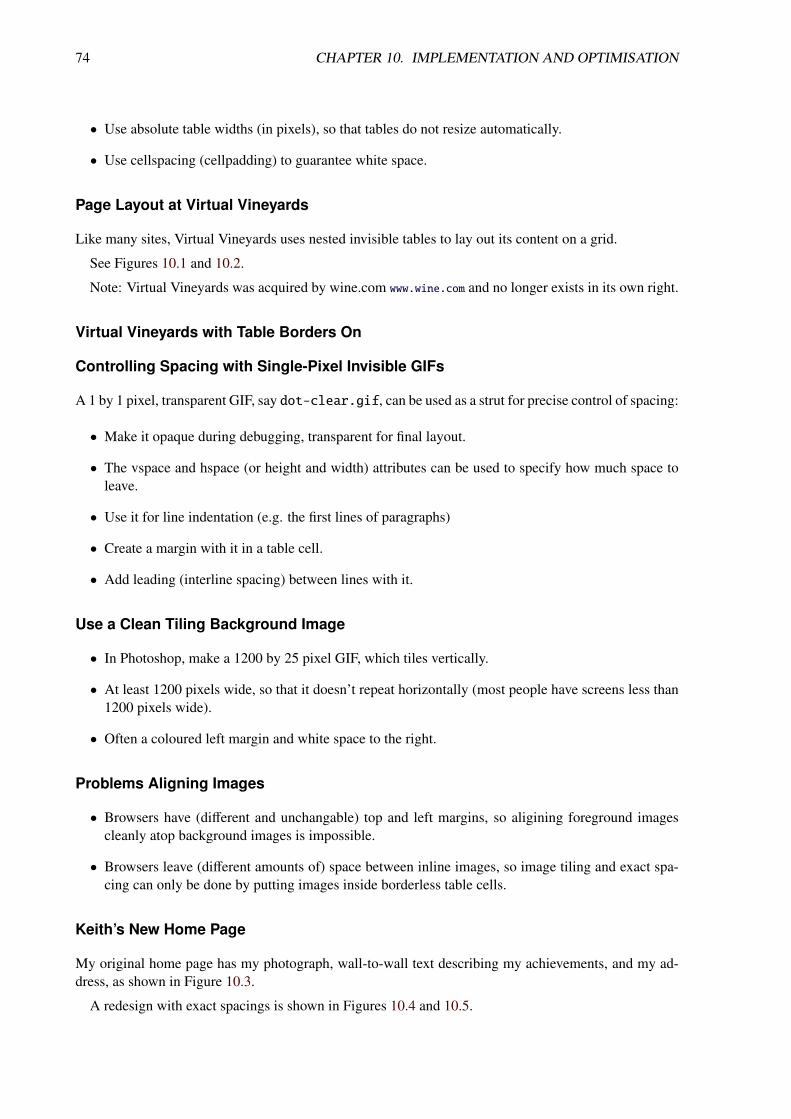
74 CHAPTER 10. IMPLEMENTATION AND OPTIMISATION
• Use absolute table widths (in pixels), so that tables do not resize automatically.
• Use cellspacing (cellpadding) to guarantee white space.
Page Layout at Virtual Vineyards
Like many sites, Virtual Vineyards uses nested invisible tables to lay out its content on a grid.
See Figures 10.1 and 10.2.
Note: Virtual Vineyards was acquired by wine.com www.wine.com and no longer exists in its own right.
Virtual Vineyards with Table Borders On
Controlling Spacing with Single-Pixel Invisible GIFs
A 1 by 1 pixel, transparent GIF, say dot-clear.gif, can be used as a strut for precise control of spacing:
• Make it opaque during debugging, transparent for final layout.
• The vspace and hspace (or height and width) attributes can be used to specify how much space toleave.
• Use it for line indentation (e.g. the first lines of paragraphs)
• Create a margin with it in a table cell.
• Add leading (interline spacing) between lines with it.
Use a Clean Tiling Background Image
• In Photoshop, make a 1200 by 25 pixel GIF, which tiles vertically.
• At least 1200 pixels wide, so that it doesn’t repeat horizontally (most people have screens less than1200 pixels wide).
• Often a coloured left margin and white space to the right.
Problems Aligning Images
• Browsers have (different and unchangable) top and left margins, so aligining foreground imagescleanly atop background images is impossible.
• Browsers leave (different amounts of) space between inline images, so image tiling and exact spa-cing can only be done by putting images inside borderless table cells.
Keith’s New Home Page
My original home page has my photograph, wall-to-wall text describing my achievements, and my ad-dress, as shown in Figure 10.3.
A redesign with exact spacings is shown in Figures 10.4 and 10.5.
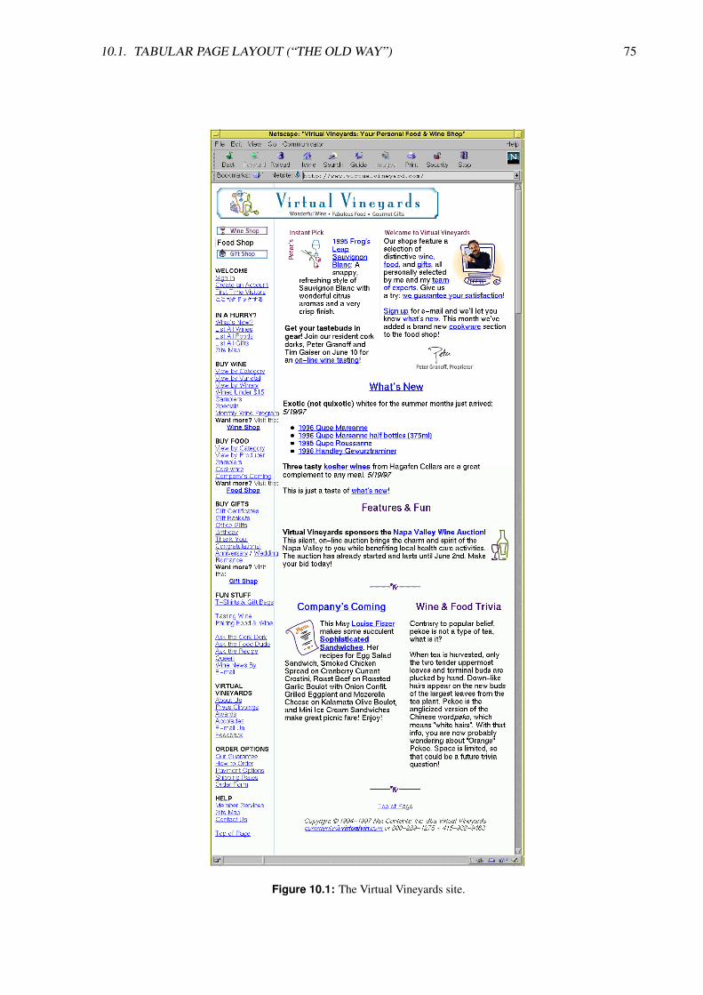
10.1. TABULAR PAGE LAYOUT (“THE OLD WAY”) 75
Figure 10.1: The Virtual Vineyards site.

76 CHAPTER 10. IMPLEMENTATION AND OPTIMISATION
Figure 10.2: The Virtual Vineyards site, with table borders turned on so that nested invisible tablesare displayed.

10.1. TABULAR PAGE LAYOUT (“THE OLD WAY”) 77
Figure 10.3: The original look of Keith’s home page.
Figure 10.4: Keith’s redesigned home page, using invisible tables for layout and transparent GIFsfor spacing.
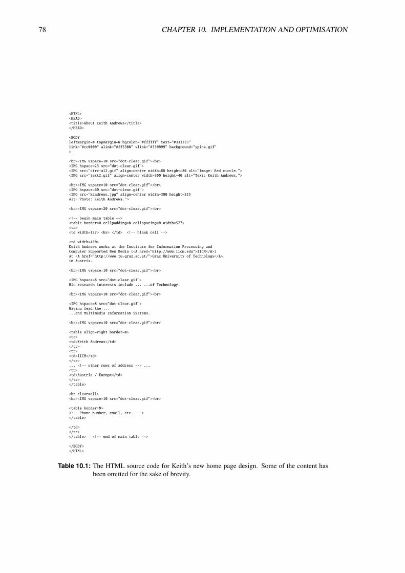
78 CHAPTER 10. IMPLEMENTATION AND OPTIMISATION
<HTML><HEAD><title>About Keith Andrews</title></HEAD>
<BODYleftmargin=0 topmargin=0 bgcolor="#ffffff" text="#333333"link="#cc0000" alink="#ff3300" vlink="#330099" background="spine.gif">
<br><IMG vspace=10 src="dot-clear.gif"><br><IMG hspace=23 src="dot-clear.gif"><IMG src="circ-al2.gif" align=center width=80 height=80 alt="Image: Red circle."><IMG src="text2.gif" align=center width=300 height=40 alt="Text: Keith Andrews.">
<br><IMG vspace=10 src="dot-clear.gif"><br><IMG hspace=60 src="dot-clear.gif"><IMG src="kandrews.jpg" align=center width=300 height=225alt="Photo: Keith Andrews.">
<br><IMG vspace=20 src="dot-clear.gif"><br>
<!-- begin main table --><table border=0 cellpadding=0 cellspacing=0 width=577><tr><td width=127> <br> </td> <!-- blank cell -->
<td width=450>Keith Andrews works at the Institute for Information Processing andComputer Supported New Media (<A href="http://www.iicm.edu">IICM</A>)at <A href="http://www.tu-graz.ac.at/">Graz University of Technology</A>,in Austria.
<br><IMG vspace=10 src="dot-clear.gif"><br>
<IMG hspace=8 src="dot-clear.gif">His research interests include ... ...of Technology.
<br><IMG vspace=10 src="dot-clear.gif"><br>
<IMG hspace=8 src="dot-clear.gif">Having lead the ......and Multimedia Information Systems.
<br><IMG vspace=10 src="dot-clear.gif"><br>
<table align=right border=0><tr><td>Keith Andrews</td></tr><tr><td>IICM</td></tr>... <!-- other rows of address --> ...<tr><td>Austria / Europe</td></tr></table>
<br clear=all><br><IMG vspace=10 src="dot-clear.gif"><br>
<table border=0><!-- Phone number, email, etc. --></table>
</td></tr></table> <!-- end of main table -->
</BODY></HTML>
Table 10.1: The HTML source code for Keith’s new home page design. Some of the content hasbeen omitted for the sake of brevity.

10.1. TABULAR PAGE LAYOUT (“THE OLD WAY”) 79
Figure 10.5: Behind the scenes at Keith’s redesigned home page. Table borders have been turnedon, so that their extent can be seen. Transparent GIFs have been made green and twopixels wide, so their use as struts for spacing is apparent. The red circle was interlacedexplicitly against the split blue and white background used as background image.
80 CHAPTER 10. IMPLEMENTATION AND OPTIMISATION
10.2 HTML5
HTML5 = (X)HTML5 + CSS3 + JS
References
++ Jeremy Keith and Rachel Andrew; HTML5 for Web Designers; A Book Apart, 2nd Editiom, 17 Feb2016. ISBN 1937557243 (com, uk) [Keith and Andrew, 2016]
++ Dan Cederholm; CSS3 for Web Designers; A Book Apart, 2nd Editiom, 24 Feb 2015. ISBN
0984442529 (com, uk) [Cederholm, 2015]
++ Dan Cederholm; Sass for Web Designers; A Book Apart, 13 Nov 2013. ISBN 193755712X (com, uk)
[Cederholm, 2013]
++ Mat Marquis; JavaScript for Web Designers; A Book Apart, 28 Sept 2016. ISBN 1937557464 (com, uk)
[Marquis, 2016]
++ Marijn Haverbeke; Eloquent JavaScript; No Starch Press, 14 Dec 2014. ISBN 1593275846 (com, uk)
[Haverbeke, 2014] Free PDF at eloquentjavascript.net.
++ Chris Coyier; Practical SVG; A Book Apart, 27 Jul 2016. ISBN 1937557421 (com, uk) [Coyier, 2016]
++ David Demaree; Git for Humans; A Book Apart, 28 Jan 2016. ISBN 1937557383 (com, uk) [Demaree,2016]
Online Resources
++ Google; HTML5rocks; html5rocks.com [Google, 2016a]
++ Patrick Griffiths; HTML Dog; htmldog.com [Griffiths, 2016]
+ Marcin Wichary; HTML5 Presentation; http://keithandrews.com/talks/html5rocks-slides/ [Wichary,2016] [Originally at slides.html5rocks.com]
◦ W3C; HTML5: A Vocabulary and Associated APIs for HTML and XHTML; W3C Recommendation,28 Oct 2014. http://w3.org/TR/html5 [W3C, 2014]
◦ W3C; CSS Current Work 20 Oct 2016. http://w3.org/Style/CSS/current-work.en.html [W3C,2016a]
HTML5
• Semantic tags: section, article, figure, header, footer.
• Audio and video tags.
• Inline SVG.
CSS3
• New selectors.

10.2. HTML5 81
• Web fonts.
• Text wrapping.
• Text columns.
• Opacity.
• Rounded corners.
• Colour gradients.
• Shadows.
• Transforms.
JavaScript
• WebSocket: bi-directional transfer of data.
• Native drag + drop.
• Filesystem API.
• Geolocation: ask current location.
• Device orientation: ask current orientation.
• Canvas 2D.
• Canvas 3D (WebGL).

82 CHAPTER 10. IMPLEMENTATION AND OPTIMISATION
10.3 Polyglot XHTML5
Online Resources
+ W3C; Polyglot Markup: HTML-Compatible XHTML Documents; W3C Working Group Note, 29Sept 2015. http://w3.org/TR/html-polyglot/ [W3C, 2015]
+ Jesper Tverskov; Benefits of Polyglot XHTML5; 27 Sept 2012. http://xmlplease.com/xhtml/
xhtml5polyglot/ [Tverskov, 2012]
◦ Total Validator; Total Validator totalvalidator.com
◦ W3C; Nu Markup Validation Service http://validator.w3.org/nu/ [W3C, 2016b]
◦ W3C; CSS Validation Service http://jigsaw.w3.org/css-validator/
XHTML
• XHTML: The Extensible HyperText Markup Language.
• A stricter version of HTML, complient with XML syntax.
• XHTML tags (mark-up) are enclosed between less than (’<’) and greater than (’>’) characters.
• XHTML encodes the structure and content of a web page, CSS then specifies the presentation.
• General information and attributes go between the head tags.
• The actual content goes between the body tags.
Main Differences Between HTML and XHTML
In XHTML (compared to HTML):
• All tags must be in lower case.
• All documents must have a doctype.
• All documents must be properly formed .
• All tags must be closed.
• All attributes must be in quotation marks.
• All tags must be properly nested.
Serving HTML or XML to the Browser
The way a browser parses a (X)HTML file depends on the content type sent with it by the web server:
• text/html: the browser assumes HTML and parses loosely with liberal error handling.
• application/xhtml+xml: the browser assumes XHTML and parses strictly with an XML parser.

10.3. POLYGLOT XHTML5 83
Usually, if your (X)HTML file has the extension:
• .html: the server will send it as text/html.
• .xhtml: the server will send it as application/xhtml+xml.
XHTML5
• HTML5 has an XML serialisation (stricter subset) called XHTML5, which complies with thestricter rules for XML.
• For example, in XHTML5, all tags and attributes must be written entirely in lower case. In HTML5upper case, lower case, or a mixture can be used.
• UTF-8 is the default character encoding for XML. Use UTF-8 for XHTML5 web pages.
• There are only five named character entity references in XML: &, <, >, ', and". Do not use any others.
• Although hex character references (such as ä for ä) are allowed in XML, only use them fornon-printing characters such as non-breaking space ( ). Do not use hex character references.
• For all other characters, for reasons of readability, use the UTF-8 character itself: use Männerinstead of Männer.
• Every XHTML5 file is also an HTML5 file.
Polyglot XHTML5
• Polyglot XHTML5 [W3C, 2015; Tverskov, 2012] takes this a step further: the same file can beserved as either HTML5 (text/html) or XHTML5 (application/xhtml+xml) and works ex-actly the same in the browser.
• For this to work, a few extra rules (conventions) are necessary, so that the DOM created inside thebrowser will be the same in both cases (and thus JavaScript scripts will work the same).
Best practice is to write platform-independent, resolution-independent, polyglot XHTML5.
Extra Rules for Polyglot XHTML5
The following sum up most of the extra rules necessary for Polyglot XHTML5 [W3C, 2015]:
• Use both the lang and xml:lang attribute.
• Use <meta charset="UTF-8"/>.
• Use tbody, thead, or tfoot in tables (at least one of these must be present).
• When col is used in a table, also use colgroup.
• Do not use the noscript element.
• Do not start pre and textarea elements with newline.

84 CHAPTER 10. IMPLEMENTATION AND OPTIMISATION
• Use innerHTML instead of document.write().
• In a script element, wrap JavaScript in a commented-out CDATA section.
• Many names in SVG and one name in MathML use lowerCamelCase.
Separating Content from Form
Separation of content and form (presentation):
• The XHTML specifies the content, a Cascading Style Sheet (CSS) specifies the form.
• The same content (an XHTML file) can be repurposed using different CSS style sheets:
– Extra-large, high-contrast display for sight-impaired users.
– Audio rendering for blind users, or people driving their car.
– etc.
• Since XHTML is also valid XML [Wikipedia, 2012a], the content can be transformed automaticallyinto different formats using XSLT (Extensible Stylesheet Language Transformations) [Wikipedia,2012b]:
– HTML
– plain text
– etc.
Validation Services
Make sure both your XHTML and CSS is valid and that your links all work:
• W3C Nu Markup Validation Service: http://validator.w3.org/nu/ [W3C, 2016b].
To validate XHTML5:
– Use file upload, make sure your file has the extension .xhtml, so that the stricter XML parseris used.
Note that the Nu validator does not check for Polyglot rules, such as the use of at least one of tbody,thead, or tfoot in tables.
• W3C CSS Validation Service: http://jigsaw.w3.org/css-validator/ [W3C, 2008].
• W3C Link checker: http://validator.w3.org/checklink
Browser Validation Extensions
• Total Validator comprises an installable program and an extension for Firefox and Chrome, support-ing within-browser validation totalvalidator.com [Total Validator, 2016].
• Total Validator can also check the rules for valid Polyglot XHTML5.

10.4. BUILDING FAULT-TOLERANT WEB SITES 85
10.4 Building Fault-Tolerant Web Sites
Progressive Enhancement
• At the end of the 1990s, it took about 2 years for a newly released browser version to becomewidespread [Nielsen, 1998b; Nielsen, 1999b].
• Nowadays, browsers typically auto-update themselves, however a significant minority of users stilluse old browser versions.
• Use progressive enhancement: Build with HTML, style with CSS, and enhance with JavaScript[Keith, 2015].
• HTML and CSS are fault-tolerant: Newer enhancements are simply ignored by older browsers.
• JavaScript is not fault-tolerant: Use feature-sniffing to detect support for newer features before use[Ates et al., 2016].
Browser Support for Features
The following web sites show how far particular HTML5 (CSS3 and JS) features are supported byindividual browsers:
++ Can I Use; caniuse.com [Deveria, 2013]
+ Mobile HTML5; mobilehtml5.org [Firtman, 2015]
◦ haz.io; haz.io [Bosch, 2011]
Test on Multiple Browsers and Platforms
Remember to try out your site with a variety of browsers, versions, and platforms:
• Test using different (real) browsers, versions, and platforms (device lab). opendevicelab.at
• Use Browsersync to push design changes automatically to multiple devices. browsersync.io
• Test using different browsers inside a virtual environment:
– BrowserStack; browserstack.com
– Browser Sandbox; https://turbo.net/browsers
• Browsershots will take screenshots of a given web page in multiple browsers. browsershots.org
Test How a Screen Reader Sees Your Pages
• Test with a text-only browser such as Lynx lynx.isc.org to obtain a visual impression of your pagein text-only.
• Try reading your pages with NVDA (free, Windows) nvaccess.org or VoiceOver (free, Apple).

86 CHAPTER 10. IMPLEMENTATION AND OPTIMISATION
10.5 Responsive Web Design
A single web site design which dynamically responds (adapts) to the characteristics (screen width, res-olution, capabilities, . . . ) of the user’s device.
The same web site at the same URL works and provides an appropriate experience across all devices:
• smartphone
• tablet
• laptop
• desktop
• large-screen tv
• car dashboard
Being Responsive
Responsive web design is a combination of:
• Responsive layout: dynamically adjusting the layout to best suit the available window size (reflowat breakpoints, rescale in between).
• Responsive content: dynamically adjusting embedded content (tables, images, videos, charts, ad-verts, etc.) to best suit the device characteristics (space, resolution, etc.).
• Responsive interaction: dynamically adjusting interaction and navigation elements (menus, buttons,search boxes, etc.) to best suit the device characteristics (size, touch, voice, etc.).
• Progressive enhancement: selectively adding support for additional features such as location, ori-entation, tilt, and gestures. [Detect features not devices!]
References
++ Ethan Marcotte; Responsive Web Design; 2nd Edition, A Book Apart, 02 Dec 2014. ISBN 1937557189
(com, uk) [Marcotte, 2014]
++ Scott Jehl; Responsible Responsive Design; A Book Apart; 19 Nov 2014. [Jehl, 2014]
++ Stephen Hay; Responsive Design Workflow; New Riders, 05 Apr 2013. ISBN 0321887867 (com, uk)
[Hay, 2013]
++ Anna Debenham; Front-End Style Guides; Five Simple Steps, 2013. ISBN 1907828508 (com, uk)
[Debenham, 2013]
+ Clarissa Peterson; Learning Responsive Web Design; O’Reilly, 27 Jun 2014. ISBN 144936294X (com,
uk) [Peterson, 2014]
+ Vitaly Friedman (Ed); Real-Life Responsive Web Design; Smashing Book 5, 2015. ISBN 3945749212
(com, uk) [Friedman, 2015]
10.5. RESPONSIVE WEB DESIGN 87
+ Jason Pamental; Responsive Typography; O’Reilly; 25 Sept 2014. ISBN 1491907096 (com, uk) [Pa-mental, 2014]
+ Tim Kadlec; Implementing Responsive Design; New Riders, 31 Jul 2012. ISBN 0321821688 (com, uk)
[Kadlec, 2012]
+ Ben Frain; Responsive Web Design with HTML5 and CSS3; Packt Publishing, 10 Apr 2012. ISBN
9350237881 (com, uk) [Frain, 2012]
◦ Aaron Gustafson; Adaptive Web Design; Easy Readers, 30 May 2011. ISBN 098358950X (com, uk)
[Gustafson, 2011]
◦ Todd Parker et al; Designing with Progressive Enhancement; New Riders, 19 Feb 2010. ISBN
0321658884 (com, uk) [Parker et al., 2010]
+ Guy Podjarny; Responsive & Fast; O’Reilly; 03 Jun 2014. ISBN 1491911611 (com, uk) [Podjarny,2014a]
+ Tom Barker; High Performance Responsive Design; O’Reilly; 01 Dec 2014. ISBN 1491949988 (com,
uk) [Barker, 2014]
Online Resources
+ Brad Frost; This Is Responsive.; http://bradfrost.github.io/this-is-responsive/
+ Brad Frost; WTF Mobile Web; http://wtfmobileweb.com/
++ Anna Debenham; Website Style Guide Resources; styleguides.io
++ Matt Andrews; Responsive Design at the Guardian or How I learned to Stop Worrying and Love theMobile Web; http://mattandrews.info/talks/port80-2013/
+ BBC News; Cutting the Mustard; Responsive News, 08 Mar 2012. http://responsivenews.co.uk/post/18948466399/cutting-the-mustard
++ Karen McGrane and Ethan Marcotte; A Responsive Web Design Podcast; https://responsivewebdesign.com/podcast/
Separate Desktop and Mobile Web (m.) Sites
• Two separate sites under two separate URLs.
• Two separate sites to maintain.
• Redirection is based on UserAgent or device-sniffing (too course).
• Examples include:
– southwest.com vs. m.southwest.com See Figure 10.6.
– graz.at vs. m.graz.at See Figure 10.7.

88 CHAPTER 10. IMPLEMENTATION AND OPTIMISATION
Figure 10.6: Separate desktop and mobile (m.) versions of the Southwest Airlines web sitesouthwest.com.
Figure 10.7: Separate desktop and mobile (m.) versions of the Graz web site graz.at.

10.5. RESPONSIVE WEB DESIGN 89
Examples of Responsive Web Sites
Lists of responsive web sites:
• Eivind Uggedal; mediaqueri.es
• Awwwards; http://awwwards.com/websites/responsive-design/
• DesignModo; http://designmodo.com/responsive-design-examples/
Individual examples of responsive web sites:
• The Boston Globe; bostonglobe.com
• Smashing Magazine; smashingmagazine.com
• Lanyrd; lanyrd.com
• Starbucks; starbucks.com
• TED; ted.com
• engadget; engadget.com
• BBC One; http://bbc.com/sport/
• The Guardian; theguardian.com
• Gov.UK; gov.uk
• City of Surrey; surrey.ca
• Texas State University; txstate.edu
• Andy Clarke; stuffandnonsense.co.uk
• SparkBox; seesparkbox.com
• FoodSense; foodsense.is
• New Adventures in Web Design conference; 2013.newadventuresconf.com
Prevalence of Responsive Sites
• In 2013, around 11% of web sites (in the top 100,000) were responsive [Podjarny, 2014b].
• “Responsive design is Google’s recommended design pattern” [Google, 2016b].
Responsive Layout with CSS3 Media Queries
• First, appropriate breakpoints for the content are determined and specified in a breakpoint diagramas shown in Figure 10.8.
• It is good practice to specify the breakpoints in em or rem rather than in px, so they also respondwhen users set larger fonts (or text zooming). [Anyhow, at the root element, 1 em = 1 rem.]

90 CHAPTER 10. IMPLEMENTATION AND OPTIMISATION
40rem 60rem
header
global-nav
stories
specials
footer
narrow medium wide
Figure 10.8: A breakpoint diagram.
• Most of the CSS code can be shared between all window widths.
• CSS3 media queries are used to distinguish between the different screen widths.
Specifying Breakpoints with CSS3 Media Queries
/* settings for window-width: narrow */@media only all and (max-width: 40rem) {...}
/* settings for window-width: medium */@media only all and (min-width: 40rem) and (max-width: 60rem) {...}
/* settings for window-width: wide */@media only all and (min-width: 60rem) {...}
10.6. DESIGN SYSTEMS 91
10.6 Design Systems
design system = interconnected patterns + shared practices
design pattern = functional pattern or perceptual pattern
functional pattern = components of an interface (buttons, menus, choosers, etc.) [nouns, typically inHTML]
perceptual pattern = styling of an interface (typography, colours, spacing, etc.) [adjectives, typically inCSS]
pattern library = tool to capture, share, and maintain design patterns
Think Components not Pages
• Build a system of components which (re-)arrange themselves according page constraints.
• Build a pattern library (living style guide) to capture, share, and maintain the components.
References
++ Alla Kholmatova; Design Systems; Smashing Media, 2017. ISBN 3945749581 (com, uk) [Kholmatova,2017]
++ Anna Debenham; Front-End Style Guides; http://www.maban.co.uk/projects/front-end-style-guides/
+ Christopher Alexander et al; A Pattern Language; Oxford University Press, 1977. ISBN 0195019199
(com, uk) [Alexander, Ishikawa and Silverstein, 1977]
+ Christopher Alexander; The Timeless Way of Building; Oxford University Press, 1979. ISBN
0195024028 (com, uk) [Alexander, 1979]
+ Donella Meadows; Thinking in Systems; Chelsea Green Publishing, 03 Dec 2008. ISBN 1603580557
(com, uk) [Meadows, 2008]
+ Jenifer Tidwell; Designing Interfaces: Patterns for Effective Interaction Design; 2nd Edition,O’Reilly, 06 Jan 2011. ISBN 1449379702 (com, uk) [Tidwell, 2011]
◦ Bill Scott and Theresa Neil; Designing Web Interfaces: Principles and Patterns for Rich Interactions;O’Reilly, 26 Jan 2009. ISBN 0596516258 (com, uk) [Scott and Neil, 2009]
◦ van Duyne, Landay, and Hong; The Design of Sites: Patterns, Principles, and Processes for Craftinga Customer-Centered Web Experience; 2nd Edition, Prentice Hall, Dec 2006. ISBN 0131345559 (com,
uk) [van Duyne, Landay and Hong, 2006]
Online Resources
++ Anna Debenham; Website Style Guide Resources; http://styleguides.io/
◦ Yahoo! Design Pattern Library; http://boxesandarrows.com/implementing-a-pattern-library-in-the-real-world-a-yahoo-case-study/ https://web.archive.org/web/20150905182317/https://developer.
yahoo.com/ypatterns/everything.html

92 CHAPTER 10. IMPLEMENTATION AND OPTIMISATION
◦ UI Patterns; ui-patterns.com
◦ Interaction Design Pattern Library; http://welie.com/patterns/
10.6.1 Design Patterns in Architecture
Design patterns: sample design solutions based on good practice (Musterlösungen).
A hierarchy of design patterns:
• Knobs
• Doors
• Walls
• Rooms
• Buildings
• Communities
• Regions
Different patterns are available at each level of abstraction.
Design Patterns in Web Design
A hierarchy of design patterns:
• Radio Buttons
• Forms
• Search Interface
• Page Layout
• Navigation System
• Site Architecture
• Site Genre
Different patterns available at each level of abstraction.
A heuristically-derived system of pluggable interface components.
10.6.2 Pattern Library (Living Frontend Style Guide)
• A tool to capture, share, and maintain design patterns.

10.7. OPTIMISING FOR SPEED 93
10.7 Optimising for Speed
References
++ Steve Souders; High Performance Web Sites; O’Reilly, 2007. ISBN 0596529309 (com, uk) [Souders,2007]
+ Steve Souders; Even Faster Web Sites; O’Reilly, 2009. ISBN 0596522304 (com, uk) [Souders, 2009]
++ Maximiliano Firtman; High Performance Mobile Web; O’Reilly, 26 Sept 2016. ISBN 1491912553
(com, uk) [Firtman, 2016]
++ Lara Hogan; Designing for Performance; O’Reilly, 19 Dec 2014. ISBN 1491902515 (com, uk) [Hogan,2014]
++ Scott Jehl; Responsible Responsive Design; A Book Apart, 19 Nov 2014. [Jehl, 2014]
◦ Andrew King; Website Optimization: Speed, Search Engine & Conversion Rate Secrets; O’Reilly,2008. ISBN 0596515081 (com, uk) [King, 2008]
◦ Andrew King; Speed Up Your Site: Web Site Optimization; New Riders, 2003. ISBN 0735713243
(com, uk) [King, 2003]
Online Resources
++ Google; Make the Web Faster; https://developers.google.com/speed/
++ WPO Foundation; WebPagetest; webpagetest.org
++ Steve Souders; stevesouders.com
++ Guy Podjarny; guypo.com
++ Tim Kadlec; Fast Enough; 14 Jan 2014 http://timkadlec.com/2014/01/fast-enough/
++ Scott Jehl; How we make RWD sites load fast as heck; 30 Jul 2014 http://filamentgroup.com/lab/performance-rwd.html
++ Vitaly Friedman; Improving Smashing Magazine’s Performance: A Case Study; 08 Sept 2014 http://smashingmagazine.com/2014/09/08/improving-smashing-magazine-performance-case-study/
++ Jonas Krummenacher; Quick Wins For Improving Performance And Security Of Your Website; 26Oct 2017 https://smashingmagazine.com/2017/10/improving-performance-security/
◦ Brian Jackson; 18 Tips for Website Performance Optimization; 06 Jun 2017 https://keycdn.com/blog/website-performance-optimization/
++ Velocity Conference; velocityconf.com Videos on youtube (search for “Velocity Conference”).
The Need for Speed
• Google: +500 ms→-20% traffic [Mayer, 2006].
• Amazon: +100 ms→-1% sales [Linden, 2006].

94 CHAPTER 10. IMPLEMENTATION AND OPTIMISATION
Response TimeConnection 1 Sec. 10 Secs.Analog Dialup (56 kbps) 4 kb 67 kbUMTS (384 kbps) 28 kb 500 kbADSL (1 mbps) 70 kb 1.3 mbWiFi (10 mbps) 700 kb 13 mb
Table 10.2: Maximum acceptable page sizes for a response time of 1 and 10 seconds, assuming 0.5seconds latency.
• Bing: +500 ms→-1.2% revenue [Schurman and Brutlag, 2009].
• Mobify: -100 ms→ +1.11% conversion
http://bizreport.com/2016/08/mobify-report-reveals-impact-of-mobile-website-speed.html
Podjarny [2010] lists more such statistics.
Response Time Limits
Three limits for response times from classic HCI research:
• 0.1 s: Immediate response.
• 1 s: Uninterrupted flow of thought.
• 10 s: Keeping to the task.
See Nielsen [1993a].
Total Response Time
• The total response time is the time a user has to wait from clicking on a link or typing a URL untilthe whole new page is loaded.
• Latency is the time it takes for the server to receive the request and begin responding. There areseveral potential delays:
– DNS lookup to convert the domain name in the URL to an IP address.
– Routing the request to the appropriate server.
– Waiting in a wait loop until the server services the request.
– Waiting for any dynamic content to be assembled into a HTML page.
• Only after these delays does the server start transmitting the page back to the browser and bandwidthand page size become relevant.

10.7. OPTIMISING FOR SPEED 95
Maximum Page Sizes
• Table 10.2 shows maximum acceptable page sizes (including inline images, css, scripts, etc.) forresponse times of 1 and 10 seconds, assuming 0.5 seconds of latency.
• Latency is the time it takes for the server to receive the input and begin responding).
• For 56 kbit modem users and 1 sec. response time, we should only really be building 4 kb pages!
• For 10 secs. response, maximum total page size is ≈ 60 kb.
Checking Total Download Size of a Page
• Use the Developer Tools - Network tab in Chrome or Firefox.
• Use a web-based service such as webpagetest.org.
• With wget 1.9.1 (https://gnu.org/software/wget/):
wget --proxy=off --page-requisites --convert-links \http://tugraz.at/
Web Site Optimisation
Souders [2007] explains 14 rules for improving the performance of a web site (based on research atYahoo):
1. Make Fewer HTTP Requests.
2. Use a Content Delivery Network.
3. Add an Expires Header.
4. Gzip Components.
5. Put Stylesheets at the Top.
6. Put Scripts at the Bottom.
7. Avoid CSS Expressions.
8. Make JavaScript and CSS External.
9. Reduce DNS Lookups.
10. Minify JavaScript.
11. Avoid Redirects.
12. Remove Duplicate Scripts.
13. Configure ETags (cache expiry over multiple servers).
14. Make Ajax Cacheable.
YSlow [Yahoo!, 2010] was built by the Exceptional Performance team at Yahoo[Yahoo!, 2008].
Google Page Speed https://developers.google.com/speed/pagespeed/.

96 CHAPTER 10. IMPLEMENTATION AND OPTIMISATION
Packet Sniffers
• Web-Sniffer [web-sniffer, 2009] captures request and response headers.
• IBM Page Detailer; http://www.alphaworks.ibm.com/tech/pagedetailer; [IBM, 2006].
• HTTPWatch; httpwatch.com; [Simtec, 2009].
Rendering Performance
• Jake Archibald; Rendering Without the Lumpy Bits; An Event Apart, Boston 2013. https:
//youtube.com/watch?v=oGLkBpIHj4Y
• Ilya Grigorik Optimizing the Critical Rendering Path; Velocity Santa Clara, 2013. https://youtube.com/watch?v=YV1nKLWoARQ
See also http://lukew.com/ff/entry.asp?1740.

Chapter 11
Conducting a Formal Experiment
“ Would you fly in an airplane that hasn’t been flight tested? Of course not. So you shouldn’tbe using software that hasn’t been usability tested. ”
[ Ben Shneiderman, The Front Desk, BBC Video, 1995. ]
Formal Experiment: Controlled experiment, usually in a lab setting, involving quantitative measure-ment of performance of test users and statistical analysis.
References
++ Andy Field; Discovering Statistics Using R; Sage Publications, 31 Mar 2012. ISBN 1446200469 (com,
uk) [A. Field, Miles and Z. Field, 2012]
++ Andy Field; Discovering Statistics Using SPSS; Sage Publications, 3rd Edition, 2009. ISBN
1847879071 (com, uk) [A. Field, 2009]
+ Andy Field and Graham Hole; How to Design and Report Experiments; Sage Publications, 2002.ISBN 0761973834 (com, uk) [A. Field and Hole, 2003]
++ Jeff Sauro and James R. Lewis; Quantifying the User Experience; Morgan Kaufmann, 13 May 2012ISBN 0123849683 (com, uk) [Sauro and Lewis, 2012]
+ James R. Lewis and Jeff Sauro; Excel and R Companion to Quantifying the User Experience; Cre-ateSpace, 01 Mar 2012 ISBN 1470025574 (com, uk) [Lewis and Sauro, 2012]
+ Neil Salkind; Statistics for People Who (Think They) Hate Statistics; Sage Publications, Third Edi-tion, Aug 2007. ISBN 141295150X (com, uk) [Salkind, 2007]
+ Michael Crawley; The R Book; Wiley, 2007. ISBN 0470510242 (com, uk) [Crawley, 2007]
+ David Martin; Doing Psychology Experiments; Sixth Edition, Wadsworth, July 2003. ISBN
053460255X (com, uk) [Martin, 2003]
+ Brace, Kemp, and Snelgar; SPSS for Psychologists; Third Edition, Palgrave, 2006. ISBN 1403987874
(com, uk) [Brace, Kemp and Snelgar, 2006]
◦ Shaughnessy, Zechmeister, and Zechmeister; Research Methods in Psychology Sixth Edition,McGraw-Hill Education, May 2003. ISBN 0071113231 (com, uk) [Shaughnessy, E. B. Zechmeisterand J. S. Zechmeister, 2003]
97

98 CHAPTER 11. CONDUCTING A FORMAL EXPERIMENT
◦ Zechmeister, Zechmeister, and Shaughnessy; Essential Research Methods in Psychology McGraw-Hill Education, May 2003. ISBN 0072932341 (com, uk) [E. B. Zechmeister, J. S. Zechmeister andShaughnessy, 2003]
Online Resources
++ Usabilty News; http://psychology.wichita.edu/surl/usability_news.html
+ Wichita State University, Software Usability Research Lab (SURL); http://psychology.wichita.edu/surl/
+ The R Project for Statistical Computing; http://www.r-project.org/ [TRF, 2016]
◦ Philippe Grosjean; Tinn-R; http://www.sciviews.org/Tinn-R/ [Grosjean, 2009]
◦ Andy Field; Welcome to Statistics Hell; http://www.sussex.ac.uk/Users/andyf/teaching/statistics.htm
◦ I. Scott MacKenzie; Research Note: Within-subjects vs. Between-subjects Designs: Which to Use?;http://www.yorku.ca/mack/RN-Counterbalancing.html
◦ James Brown; EDGAR: Experimental Design Generator And Randomiser; http://www.jic.bbsrc.ac.uk/services/statistics/edgar.htm
◦ Alexander Bogomolny; Latin Squares; http://www.cut-the-knot.org/arithmetic/latin_intro.shtml
◦ Wikipedia; Latin Square; http://en.wikipedia.org/wiki/Latin_square
Formal Experiments
• Summative evaluations which provide bottom-line data (performance measurements).
• Two main uses:
– Objective measurement of performance of a single design.
– Objective comparison of the performance of two or more alternative designs.
• Require a large number of test users (sample size) for statistical accuracy: usually at least 20, often50 or more.
Performance Measurement
Collect objective, quantitative data, e.g.:
• Time to complete specific task(s).
• Number of tasks completed within given time.
• Number of errors.
• Ratio successful interactions : errors.
• Time spent recovering from errors.

11.1. EXPERIMENTAL DESIGN 99
• Number of commands/features used.
• Number of features user can remember after test.
• How often help system used.
• Time spent using help.
• Ratio positive : negative user comments.
• Number of times user sidetracked from real task.
Validity
Validity: is measured data relevant to the usability of the real system in real world conditions?
Typical validity problems include:
• Testing with the wrong kind of user
For example, testing business students instead of managers for a management information system.However, testing business students will generally lead to better results than testing, say, mathematicsstudents.
• Testing the wrong tasks
The results from testing a toy task in a prototype of a few dozen hypermedia documents may not berelevant to a planned system for managing tens of thousands of documents.
• Not including time constraints and social influences
Queues of people waiting in line, noise levels in the working environment, etc.
Running a Formal Experiment
• Record each test on video, to be able to clarify any issues which emerge at a later time.
• Do not take timings with a stopwatch next to the user:
– have the computer automatically log start and end times
– or extract timings afterwards from the video
• Never mix thinking aloud with a formal experiment:
– having to think aloud slows a user down
– having to think aloud loud can change a user’s behaviour
• The facilitator must take care not to influence a user.
11.1 Experimental Design
Null Hypothesis
• The null hypothesis is an assertion about a population parameter.

100 CHAPTER 11. CONDUCTING A FORMAL EXPERIMENT
• The null hypothesis is often the reverse of what the experimenter actually believes. It is put forwardto allow the data to contradict it.
• A typical null hypothesis is that no difference exists between the control and experimental groups(for the variable being compared).
Independent and Dependent Variables
• Independent variable (or factor): variable manipulated by the experimenter. For example, type ofbrowser, or font size.
• Dependent variable: variable measured by the experimenter. For example, task completion time, orreading speed.
Testing Absolute Performance of One Interface
• One interface.
• Run an experiment to objectively determine whether the interface satisfies specific requirements.
• For example: measure how long it takes 20 expert users to perform task X.
• Result: an expert user can on average perform task X in 2 minutes 10 seconds ± 6 seconds.
Comparing Two Alternatives
• Two interfaces, A and B.
• Run an experiment to objectively determine which interface is better, according to some criterion(efficiency, error rate, etc.).
• There is one independent variable (interface) and it has two levels (A and B).
• Two different ways of designing an experiment:
– independent measures: also called between-groups or between-subjects.
– repeated measures: also called within-groups or within-subjects.
Independent Measures (Between-Groups) Experiment
• Two equally-sized groups of test users.
• Randomly assign users to two groups.
• Identical tasks for both groups.
• Group 1 uses only system A, group 2 only system B.
Pros and Cons:
+ no problems with learning effect
- large individual variation in user skills (std. dev. ≈ 50%)

11.1. EXPERIMENTAL DESIGN 101
Repeated Measures (Within-Groups) Experiment
• One group of test users.
• Randomly assign users to two equally-sized pools.
• Users perform equivalent tasks on both systems.
• Pool 1 uses system A first, pool 2 uses system B first.
Pros and Cons:
+ automatically controls for individual variability
- transfer of skill between systems (learning effect)
Example Designs
Independent Measures (Between-Groups)System A System BJohn DaveJames MarielMary AnnStuart PhilKeith TonyGary GordonJeff TedBill Edward. . . . . .Charles ThomasCeline Doug
Repeated Measures (Within-Groups)Participant SequenceElisabeth A, BSven A, BAmanda A, BClaudia A, BTerry A, BNigel A, BBarry A, B. . . . . .Ben B, AMichael B, ARichard B, A
Comparing Multiple Alternative Interfaces
A repeated measures design is usually preferred because:
• Variability between test users is removed, which provides greater statistical power to detect differ-ences.
• Fewer test users are required in total, since each users tries each test condition.
• In the example in Table 11.1, the differences between the two interfaces are very small relative tothe differences among subjects, but repeated measures is still able to detect such differences.
Counterbalancing Presentation Order
One problem with repeated measures designs is the learning effect (or practice effect):
• Users tend to do better later in the test, having accumulated a certain amount of practice and famili-arity with the tasks and interfaces being tested.

102 CHAPTER 11. CONDUCTING A FORMAL EXPERIMENT
Test Person Interface A Interface BTP1 14.00 17.00TP2 22.00 24.00TP3 29.00 31.00TP4 48.00 53.00Av 28.25 31.25StdDev 14.52 15.59
Table 11.1: Data from a simple repeated measures experiment to compare two interfaces for a par-ticular task. The independent variable is interface, with two levels, A and B. The de-pendent variable is task completion time in seconds. Every test user was faster with Athan with B. Even though the differences are small, they are very likely to be real, sincethey are consistent across all four test users.
1 2 33 1 22 3 1
1 2 3 44 1 2 33 4 1 22 3 4 1
1 2 3 4 55 1 2 3 44 5 1 2 33 4 5 1 22 3 4 5 1
Figure 11.1: Three simple (unbalanced) latin squares: 3 × 3, 4 × 4, and 5 × 5. Looking at the rows,each element appears once in each position. Each row corresponds to one test case, orpresentation sequence of the test conditions (interfaces).
• If all test conditions (interfaces) are presented in the same order, later test conditions (interfaces)will gain an unfair advantage.
• The solution is to counterbalance the presentation order of the test conditions.
Latin Squares
• A mathematical construct where, looking at the rows, each element appears once in each position.
• For example, in a 3 × 3 latin square, the element ’1’ appears once in first place, once in secondplace, and once in third place.
• Each row of the latin square represents one sequence of test conditions and is called a test case.
Constructing a Latin Square
• In the simplest construction algorithm, each row is shifted once to the right (or left) to form the nextrow.
• However, the order of the elements within rows remains (more or less) the same.
• For example, in Figure 11.1, element ’2’ comes immediately after element ’1’ in every row exceptthe last.
• Figure 11.1 shows three simple latin squares.

11.1. EXPERIMENTAL DESIGN 103
1 2 4 32 3 1 43 4 2 14 1 3 2
1 2 6 3 5 42 3 1 4 6 53 4 2 5 1 64 5 3 6 2 15 6 4 1 3 26 1 5 2 4 3
Figure 11.2: Two balanced latin squares: 4 × 4 and 6 × 6. Each element appears once in eachposition. Additionally, each element follows every other element exactly once.
Balanced Latin Squares
• In a balanced latin square, each element additionally follows every other element exactly once.
• Balanced latin squares only exist for experiments with an even number of conditions (2 × 2, 4 × 4,6 × 6, etc.).
• See Figure 11.2.
Constructing a Balanced Latin Square
Shaughnessy, E. B. Zechmeister and J. S. Zechmeister [2003, page 250] gives the following procedureto construct a balanced latin square with an even number of conditions:
1. Number the conditions 1 to N.
2. The first row is:
1, 2, N, 3, N − 1, 4, N − 2, 5, . . .
3. To generate the second row, add one to each number in the first row (N + 1 wraps around to 1).
The second row is:
2, 3, 1, 4, N, 5, N − 1, 6, . . .
4. To generate the third row, add one to each number in the second row (again wrapping N + 1 aroundto 1).
5. and so on.
If there is an odd number of conditions, two squares must be constructed. The first according to theprocedure above, the second by reversing the rows of the first. The second is then appended on to thebottom of the first to make an N × 2N square.
Test users must be assigned randomly to each condition.
This procedure derives originally from E. J. Williams [1949]. More details and example squares forup to 26 conditions are given by Pezzullo [2012].

104 CHAPTER 11. CONDUCTING A FORMAL EXPERIMENT
n = 2 1 22 1
n = 3 1 2 32 3 13 1 23 2 11 3 22 1 3
n = 4 1 2 4 32 3 1 43 4 2 14 1 3 2
n = 5 1 2 5 3 42 3 1 4 53 4 2 5 14 5 3 1 25 1 4 2 34 3 5 2 15 4 1 3 21 5 2 4 32 1 3 5 43 2 4 1 5
n = 6 1 2 6 3 5 42 3 1 4 6 53 4 2 5 1 64 5 3 6 2 15 6 4 1 3 26 1 5 2 4 3
n = 7 1 2 7 3 6 4 52 3 1 4 7 5 63 4 2 5 1 6 74 5 3 6 2 7 15 6 4 7 3 1 26 7 5 1 4 2 37 1 6 2 5 3 45 4 6 3 7 2 16 5 7 4 1 3 27 6 1 5 2 4 31 7 2 6 3 5 42 1 3 7 4 6 53 2 4 1 5 7 64 3 5 2 6 1 7
Figure 11.3: Balanced “Williams designs” (latin squares) for 2 to 7 conditions. If the number ofconditions n is even, the Williams design is an n × n balanced latin square. If thenumber of conditions n is odd, the Williams design is a 2n× n rectangle, composed oftwo n × n latin squares.

11.2. STATISTICAL ANALYSIS 105
11.2 Statistical Analysis
The appropriate statistical test depends upon the answers to the following questions:
• What type of data is involved?Frequency or score (interval/ratio).
• How many independent variables are involved?
• What kind of study is involved?Experimental or correlational.
• What kind of experimental design is involved?Independent measures or repeated measures design.
• How many conditions does the independent variable have?
• Are the data parametric or non-parametric?
Figure 11.4 contains a flow diagram to help choose the appropriate statistical test for a given situation.
Sample Size (How Many Test Users?)
• Depends on desired confidence level and confidence interval.
• Confidence level of 95% often used for research, 80% is acceptable for practical development.
• Nielsen: survey of 36 published usability studies came up with a rule of thumb of 16–20 test users[Nielsen, 1993b, pages 166–169].
11.3 Examples for Common Situations
These examples are taken from a study of four different branching factors in a product hierarchy conduc-ted for IAweb in WS 2005/2006.
[For a comparative evaluation of four hierarchy browsers conducted in 2006 by my Master’s studentJanka Kasanicka, see Andrews [2006] and Kasanicka [2006].]
11.3.1 Performance Data (Not Normally Distributed)
Completion times are recorded for each user for each of a set of (equivalent) tasks. The analysis dependson whether the observed data are (near enough) normally distributed.
• In a counterbalanced repeated measures design, the time taken by each of 48 test users to completeequivalent tasks in each of the 4 conditions (branching factors) was recorded.
• The times recorded for the task “Find Product X” are shown in Table 11.2.

106 CHAPTER 11. CONDUCTING A FORMAL EXPERIMENT
Are your data
frequencies or
scores?
How many
independent
variables?
Experimental or
correlational design?
ScoresFrequencies
Chi-Square
Goodness of Fit
Chi-Square Test
of Association
TwoOne
Parametric or
non-parametric
data?
Number of
independent
variables?
Experimental
Correlational
Pearson’s r Spearman’s rho
Parametric Non-Parametric
Independent or
repeated measures?
One
More than one
ANOVA
Repeated
MeasuresMixed
Independent
Measures
How many
groups?
How many
conditions?
Independent
Measures
Repeated
Measures
Independent
measures t-test (if
parametric data)
One-way
independent
measures ANOVA
(if parametric
data)
Two Three or more
Repeated
measures t-test (if
parametric data)
One-way repeated
measures ANOVA
(if parametric
data)
Two Three or more
Mann-Whitney test
(if non-parametric
data)
Kruskal-Wallis test
(if non-parametric
data)
Wilcoxon test (if
non-parametric
data)
Friedman’s test (if
non-parametric
data)
Figure 11.4: A flow chart to help choose the appropriate statistical test. Adapted from A. Field andHole [2003, page 274].

11.3. EXAMPLES FOR COMMON SITUATIONS 107
User Case B4 B7 B16 B241 3 32 26 13 192 15 27 24 28 183 4 30 14 14 94 6 11 14 11 155 11 12 29 18 276 7 13 17 9 347 2 26 19 18 288 14 16 12 28 179 16 15 37 20 13
10 8 18 20 8 4611 1 30 15 41 1612 13 14 12 10 1313 12 38 19 25 2914 5 17 22 19 2915 10 13 12 16 2916 9 23 31 8 3517 5 63 16 19 2518 15 15 17 23 819 14 12 18 11 1120 10 13 13 17 2321 3 13 15 36 1622 12 15 16 13 3523 7 40 33 17 2624 4 15 9 16 925 16 11 18 12 1326 8 13 9 9 2427 9 13 18 29 2328 1 21 26 16 1629 11 55 23 20 2830 2 38 25 33 6131 6 11 13 10 1732 13 15 13 11 7233 7 18 43 14 3534 8 24 24 28 3435 13 18 14 82 1636 10 17 11 14 1237 6 13 30 16 2038 11 25 34 10 1939 9 15 22 19 3540 14 22 11 17 1141 2 28 13 14 7742 3 47 10 6 1043 1 44 20 21 4044 4 49 22 16 1045 16 14 12 14 1346 5 15 17 8 847 15 17 17 21 2848 12 11 15 11 33Av 22.4 19.2 18.5 24.7SD 12.7 7.7 12.1 15.3
Table 11.2: Task completion times in seconds to find a product in each of four product hierarchieswith different branching factors B4, B7, B16, and B24.

108 CHAPTER 11. CONDUCTING A FORMAL EXPERIMENT
11.3.2 Effectiveness Data
Binary or partial measure of success.
11.3.3 Rating Data
Rating data are recorded on a seven-point Likert scale. The data are transformed to a score for eachcondition (branching factor) from 0 points (worst) to 6 points (best) from each user on a variety ofscales.
• Users were asked to rate each of the four conditions (branching factors B4, B7, B16, B24) on aseven-point Likert scale.
• The rating data are shown in Table 11.3.
11.3.4 Preference Data
Each user votes for their overall most preferred condition (branching factor) for a variety of factors (bestoverview, perceived speed, best overall), resulting in a tally of votes for each condition.
• Users were which of the four conditions (branching factors B4, B7, B16, B24) they preferred over-all.
• The preference data are shown in Table 11.4.
Pros and Cons of Formal Experiment
++ collects objective, quantitative data (bottom-line data)
++ allows comparison of alternative designs
– needs significant number of test users (20, 50, or more)
- usable only later in development process
- requires facilitator expertise
- cannot provide why-information (process data)

11.3. EXAMPLES FOR COMMON SITUATIONS 109
User B4 B7 B16 B241 5 5 4 32 3 2 3 23 6 2 3 04 6 6 5 55 5 1 4 36 6 6 6 57 6 5 2 18 5 4 2 49 6 2 6 6
10 2 6 1 411 5 2 4 612 1 5 3 313 0 2 3 414 5 5 4 415 3 3 2 116 5 4 3 517 5 6 5 518 6 5 1 119 5 4 4 420 5 6 3 221 6 5 1 022 4 6 1 023 1 4 3 424 4 4 4 525 6 2 5 026 1 5 2 127 2 5 5 428 6 5 1 029 3 5 5 430 5 5 1 031 6 6 3 132 4 1 6 433 3 1 3 234 2 3 435 3 4 6 636 3 4 2 137 5 1 3 538 3 1 4 439 2 5 4 440 2 5 5 441 5 1 5 242 1 6 6 643 3 5 4 544 2 6 6 245 6 2 5 446 6 5 6 447 5 3 4 148 4 5 5 5Av 4.0 4.0 3.7 3.1SD 1.8 1.7 1.6 1.9
Table 11.3: User ratings for each of four product hierarchies with different branching factors B4,B7, B16, and B24. The data from a seven-point Likert scale was transformed to a scoreof 0 (worst) to 6 (best). User 34 did not give a rating to condition B7.

110 CHAPTER 11. CONDUCTING A FORMAL EXPERIMENT
User B4 B7 B16 B241 12 13 14 15 16 17 18 19 1
10 111 112 113 114 115 116 117 118 119 120 121 122 123 124 125 126 127 128 129 130 131 132 133 134 135 136 137 0.5 0.538 139 140 141 142 143 144 145 146 147 148 1
Total 18 17 5 7
Table 11.4: User overall preference for one of four product hierarchies with different branchingfactors B4, B7, B16, and B24. User 37 could not decide between B4 and B16, so thevote was not counted.

Chapter 12
Evidence-Based Guidelines
“ Nielsen has had a bad habit of presenting personal opinions as research fact. ”
[ George Olsen, Usability News, 31 July 2002 [Olsen, 2002]. ]
Web usability guidelines which are based on evidence from formal experiments.
Online Resources
• U.S. Department of Health and Human Service (HHS); Research-Based Web Design & UsabilityGuidelines; guidelines.usability.gov [HHS, 2006]
• Software Usability Research Laboratory (SURL); surl.org
• Usability News; http://psychology.wichita.edu/surl/newsletter.htm
• Mary Evans; Web Design: An Empiricist’s Guide; Master’s Thesis, University of Washington, 1998.[M. Evans, 1998]
12.1 Screen Fonts
12.1.1 Bernard, Mills, Peterson, and Storrer, 2001
Bernard, Mills et al. [2001] conducted a study comparing 12 different fonts.
Experimental Design
Counterbalanced, repeated measures design.
The independent variable (that which is varied) is font family.
Twelve different fonts (in three categories):
• Sans serif : Agency FB, Arial, Comic Sans MS, Tahoma, Verdana.
• Serif : Courier New, Georgia, Goudy Old Style, Century Schoolbook, Times New Roman.
• Ornate: Bradley Hand ITC, Monotype Corsiva.
111

112 CHAPTER 12. EVIDENCE-BASED GUIDELINES
Participants
• N = 22 participants: 7 male, 15 female.
• Age ranged from 20 to 44 (mean 25, sd = 6) years.
Tasks
• All text set at 12 pt size (≈ 3 mm high). [Agency was set to 14 pt to reach 3 mm height]
• All text was black on a white background.
• 12 passages of text from Encarta of around 1032 words, horizontal margins set at 640 pixels.
• Each passage contained 15 randomly placed substitution words.
• Each user asked to read 12 passages, one for each font.
• Users asked to read “as quickly and as accurately as possible” and flag (read aloud) any wordappearing out of context.
Measures
Objective measures:
• % substitution words detected.
• Reading time in seconds.
• Reading efficiency := % substitution words detected / reading time.
Subjective measures:
• Rating for Perceived Font Legibility (6-point likert scale).
• Also ratings for:
– Font Type Conveyed Personality
– Font Type was Elegant
– Font Type Appeared Youthful & Fun
– Font Type Appeared Business-Like
These are not considered further here.
• Preference ranking of the 12 fonts.
Results
Objective measures:
• Reading time (regardless of accuracy): Tahoma ‹ Corsiva. all other differences not significant.

12.1. SCREEN FONTS 113
• Reading efficiency: no significant differences.
Subjective measures:
• Perceived legibility:
Courier › Agency, Courier › Goudy, Courier › Bradley, Courier › Corsiva.
Comic › Agency, Comic › Goudy, Comic › Bradley, Comic › Corsiva.
Verdana › Agency, Verdana › Goudy, Verdana › Bradley, Verdana › Corsiva.
Georgia › Agency, Georgia › Goudy, Georgia › Bradley, Georgia › Corsiva.
Times › Agency, Times › Goudy, Times › Bradley, Times › Corsiva.
• Preference ranking: % chosen as first or second preference choice, Verdana, Arial, and Comic aremost preferred.
Conclusions
• Almost no objective differences between fonts at 12 pt.
• Based on subjective measures, Verdana is a good choice for a default font.
12.1.2 Bernard, Lida, Riley, Hackler, and Janzen, 2002
Bernard, Lida et al. [2002] conducted a study comparing 8 different fonts at three different sizes.
Experimental Design
Counterbalanced, mixed measures design.
The independent variables were font family (within-subject) and font size (between-subject).
Eight different fonts:
• Sans serif : Arial, Comic Sans MS, Tahoma, Verdana.
• Serif : Century Schoolbook, Courier New, Georgia, Times New Roman.
Three different font sizes: 10 pt, 12 pt, and 14 pt.
Participants
• N = 60 participants: 16 male, 44 female.
• Age ranged from 18 to 55 (mean 24, sd = 7.8) years.
Tasks
• All text was black on a white background.
• 8 passages of text from Encarta of around 1032 words, horizontal margins set at 640 pixels.
• Each passage contained 15 randomly placed substitution words.

114 CHAPTER 12. EVIDENCE-BASED GUIDELINES
• Each user asked to read 8 passages, one for each font.
• 20 users read at 10 pt, 20 users at 12 pt, and 20 users at 14 pt.
• Users asked to read “as quickly and as accurately as possible” and flag (read aloud) any wordappearing out of context.
Measures
Objective measures:
• % substitution words detected.
• Reading time in seconds.
• Reading efficiency := % substitution words detected / reading time.
Subjective measures:
• Rating for Perceived Font Legibility (6-point likert scale).
• Also ratings for Perceived Attractiveness (not considered further here).
• Preference ranking of the 8 fonts.
Results
Objective measures:
• Reading time (regardless of accuracy):
Times ‹ Courier, Times ‹ Schoolbook, Times ‹ Georgia.
Arial ‹ Courier, Arial ‹ Schoolbook, Arial ‹ Georgia.
12 pt ‹ 10 pt.
All other differences not significant.
• Reading efficiency: no significant font family or font size effects.
Fonts which were read faster were also generally read less accurately.
Subjective measures:
• Perceived legibility:
10 pt Tahoma › 12 pt Schoolbook. 10 pt Arial › 12 pt Tahoma.
10 pt Georgia › 12 pt Tahoma, 10 pt Georgia › 12 pt Schoolbook.
12 pt Verdana › 10 pt Comic, 12 pt Verdana › 10 pt Schoolbook, 12 pt Verdana › 10 pt Verdana.
12 pt Courier › 10 pt Comic, 12 pt Courier › 10 pt Schoolbook, 12 pt Courier › 10 pt Verdana.
12 pt Courier › 12 pt Schoolbook, 12 pt Courier › 12 Tahoma, 12 pt Courier › 14 pt Comic.
14 pt Arial › 14 pt Comic.
14 pt Arial › 10 pt Schoolbook, 14 pt Arial › 10 pt Comic.

12.1. SCREEN FONTS 115
• Preference ranking: % chosen as first or second preference choice.
Over all three font sizes:
Times ‹ Arial, Times ‹ Comic, Times ‹ Tahoma,Times ‹ Verdana, Times ‹ Courier, Times ‹ Georgia.
Schoolbook ‹ Verdana.
Conclusions
• There were no significant differences in reading efficiency between font types at any size.
• In terms of pure reading time (regardless of accuracy), Times and Arial were read significantly fasterthan Courier, Schoolbook, and Georgia. Fonts at 12 pt were read significantly faster than fonts at10 pt.
• Arial and Courier were perceived as the most legible fonts (not significantly). Verdana was the mostpreferred font (not significantly).
• Overall, Verdana is recommended as a good choice: it is the most preferred, whilst also being readfairly quickly and perceived as fairly legible.
12.1.3 Boyarski, Neuwirth, Forlizzi, and Regli, 1998
Boyarski et al. [1998] conducted a study comparing 3 pairs of fonts. We consider the first study describedin Part 1 of the paper.
Experimental Design
Three comparison tests, each a counterbalanced, repeated measures design.
Three pairs of fonts compared:
• Georgia vs. Times Roman.
• Georgia vs. Verdana.
• Verdana vs. Verdana Italic.
The independent variable (that which is varied) in each case is font family.
Participants
• Three separate tests, each with N = 16 participants.
• Age (of the 48 users total) ranged from 20 to 53 (mean 30, sd = 7.8) years.
Tasks
• All text was black on a white background.
• Two comparable tests (called Form-E and Form-F) were taken from an established set of readingspeed and comprehension tests, the Nelson-Denny Reading Test.

116 CHAPTER 12. EVIDENCE-BASED GUIDELINES
• Four passages from Form-E and four passages from Form-F were extracted, each consisting of threeto seven paragraphs of text and having four associated comprehension questions.
• Each user was asked to read 4 passages of text for each font.
• All text was set at 10 pt size with 13 pt leading and an average line length of 10 words.
• Texts were presented in Micrsoft Word 6.0 (Windows 95) with the window set at 640 × 480 pixels.
• Users asked to “Work for both speed and accuracy; that is, work rapidly but try not to make mis-takes.”
• After each font, users were asked to rate the font on a 9-point likert scale for each of the dimensions:Hard/Easy to Read, Fuzzy/Sharp, and Illegible/Legible.
• At the end of the test, users were shown both fonts side by side (on two monitors) and asked toexpress a preference for one font on a 9-point likert scale (5 being the neutral point) for each of thedimensions: Easiest to Read, Most Pleasing to Read, and Most Sharp.
Measures
Objective measures:
• Reading time in seconds.
• Score := Number of comprehension questions answered correctly (out of 16).
• Effective reading speed := score / reading time.
Subjective measures:
Indirect ratings (9-point likert scale) for:
• Hard/Easy to Read.
• Fuzzy/Sharp.
• Illegible/Legible.
Direct comparison (9-point likert scale, 5 being neutral point):
• Easiest to Read
• Most Pleasing to Read
• Most Sharp
Results
Objective measures:
• Reading time:
No significant difference between Georgia and Times.No significant difference between Georgia and Verdana.No significant difference between Verdana and Verdana Italic.

12.1. SCREEN FONTS 117
• Score (comprehension):
No significant difference between Georgia and Times.Georgia › VerdanaNo significant difference between Verdana and Verdana Italic.
• Effective reading speed:
No significant difference between Georgia and Times.No significant difference between Georgia and Verdana.No significant difference between Verdana and Verdana Italic.
Subjective measures:
In the indirect comparison:
• Perceived as Easy to Read:
Georgia › TimesNo significant difference between Georgia and Verdana.Verdana › Verdana Italic
• Perceived as Sharp:
Georgia › TimesNo significant difference between Georgia and Verdana.Verdana » Verdana Italic
• Perceived as Legible:
Georgia › TimesNo significant difference between Georgia and Verdana.Verdana » Verdana Italic
Conclusions
• There were no significant differences in (absolute) reading speed or effective reading speed betweenany of the font pairings at 10 pt.
• In the subjective ratings, Georgia is significantly preferred to Times.
• In the subjective ratings, Verdana is significantly preferred to Verdana Italic.

118 CHAPTER 12. EVIDENCE-BASED GUIDELINES

Chapter 13
Web Usability Case Studies
A series of case studies to illustrate how much can be learned from discount usability techniques.
13.1 SunWeb: User Interface Design for Sun Microsystem’s InternalWeb
• Summer of 1994, Sun has large amounts of distributed, internal information.
• 10,000% annual Web growth on Internet, even higher behind Sun’s firewall.
• Tight timeframe in order to get consistent UI within Sun.
• Separate visual identities for internal and external pages.
• SunWeb design lead by Jakob Nielsen and Darrell Sano.
• Most of UI work done in few weeks.
• Note: 1994 design style – many icons and options.
The material in this section is adapted with kind permission from notes by Jakob Nielsen[Nielsen andSano, 1994].
Usability Plan
“Discount Usability Engineering” – four usability studies over a period of two weeks:
• Card sorting to discover categories (4 users).
• Icon intuitiveness testing (4 users).
• Card distribution to icons (4 users).
• Thinking aloud walkthrough of page mock-up (3 users).
Note:
• Participants in last two tests also asked for ratings of icon aesthetics.
• Different users used in each study to avoid learning effects.
119

120 CHAPTER 13. WEB USABILITY CASE STUDIES
Card Sorting
• UI group brainstormed about possible information services/concepts in system (51).
• One notecard for each concept.
• Scattered on desk in random order.
• User sorts cards into piles (not too small or too large) according to similarity.
• Group piles into larger groups.
• Name groups using Post-it notes.
• About 30-40 minutes per user.
• Analyse data by “eyeballing”.[could also use statistical techniques]
Icon Intuitiveness
• Based on results of card sorting study, 15 first-level groupings of information defined for SunWeb.
• Designed icon for each of them.
• Show icons (without titles) to each user and ask what they mean. The results are shown inTable 13.1.
• Redesign of icons which tested poorly.
Card Distribution to Icons
• Test whether users associate correct concepts with icons.
• Mock up of home page design on desk.
• Icons printed in colour at 200% magnification, with labels.
• Post-it tape used to divide table into areas for each icon.
• Users place concept cards under most appropriate icon, as shown in Figure 13.1.
• Approx. 15 minutes per user.
• At end of test, users asked to comment on which icons they liked and disliked.
Thinking Aloud Page Walkthrough (Paper Prototype)
• Magnified color screendump of home page design.
• Test users asked to point to each button and think aloud what information they expected to findthere.
• At end of test, users asked to comment on which icons they liked and disliked.
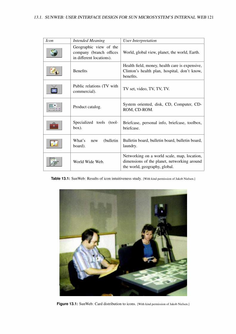
13.1. SUNWEB: USER INTERFACE DESIGN FOR SUN MICROSYSTEM’S INTERNAL WEB 121
Icon Intended Meaning User Interpretation
Geographic view of thecompany (branch officesin different locations).
World, global view, planet, the world, Earth.
BenefitsHealth field, money, health care is expensive,Clinton’s health plan, hospital, don’t know,benefits.
Public relations (TV withcommercial). TV set, video, TV, TV, TV.
Product catalog. System oriented, disk, CD, Computer, CD-ROM, CD-ROM.
Specialized tools (tool-box).
Briefcase, personal info, briefcase, toolbox,briefcase.
What’s new (bulletinboard).
Bulletin board, bulletin board, bulletin board,laundry.
World Wide Web.Networking on a world scale, map, location,dimensions of the planet, networking aroundthe world, geography, global.
Table 13.1: SunWeb: Results of icon intuitiveness study. [With kind permission of Jakob Nielsen.]
Figure 13.1: SunWeb: Card distribution to icons. [With kind permission of Jakob Nielsen.]

122 CHAPTER 13. WEB USABILITY CASE STUDIES
Figure 13.2: SunWeb main homepage masthead (top) and second level masthead (below). [With kindpermission of Jakob Nielsen.]
Remarks
• For web page design, study the information structure.[since interaction techniques are determined by specific Web browser, over which you generallyhave no influence]
• Card sorting and icon intuitiveness studies were the most useful.
Iterative Design
• SunWeb design went through many revisions.
• For example, five main iterations of “Specialised Tools” icon.
Unified Design
• Consistent visual design applied to graphic elements.
• Textual labels in small font beneath each icon.
• Predictable location for information and controls on every page of SunWeb.
• Banner components placed in central repository with usage guidelines to encourage adoption.
• SunWeb banner colours from minimal, 64-colour palette.[reduce colour map problems, leave plenty free]

13.1. SUNWEB: USER INTERFACE DESIGN FOR SUN MICROSYSTEM’S INTERNAL WEB 123
Icon Intended Meaning User Interpretation
Toolbox. Briefcase
Open toolbox, with tool. “Tool”, but almost any concept was con-sidered to be a tool.
Storefront. “Circuit board!”
Storefront. Confused with shopping and product catalog.
Application chest. Final design.
Table 13.2: SunWeb: Five iterations of Specialised Tools icon. [With kind permission of Jakob Nielsen.]
Figure 13.3: SunWeb final home page design. [With kind permission of Jakob Nielsen.]

124 CHAPTER 13. WEB USABILITY CASE STUDIES
13.2 SunWWW: User Interface Design for Sun’s Web Site
Several rounds of usability testing for the 1995 redesign of Sun’s external WWW site:
• Thinking aloud test of exisiting design.
• Competitive tests of other companies’ sites.
• Card sorting.
• Icon intuitiveness.
• Paper prototyping.
• Thinking aloud test of running prototype.
• Usability testing both in usability lab in Sun HQ and at offices around world.
The material in this section is adapted with kind permission from notes by Jakob Nielsen [Nielsen,1995].
Thinking Aloud Test of Existing Design
• Inconsistent header bars.
• Strange image maps.
• Top button-bar did not look enough like buttons – immediately redesigned.
• Redesign resulted in 416% increased use over two-month period (Jan.–Mar. 1995).[overall use of server increased "only" 48% in same period]
Card Sorting for New Design
Card sorting with concepts from Sun’s WWW site, to gain an insight into how users would organiseconcepts:
• Users were asked to sort the cards into piles, such that cards representing similar concepts were inthe same pile.
• Users were also allowed to group piles to indicate looser levels of similarity
• Finally, they were asked to name their piles.
Testing Paper Mock-Up of Home Page
• Homepage designs printed on colour printer and magnified on colour copier.
• Users first asked to comment on their general impression.
• Then asked to point to elements they might want to click on and what they would expect to happen.
• Area of desk marked with masking tape, so user doesn’t pick up the printout.

13.2. SUNWWW: USER INTERFACE DESIGN FOR SUN’S WEB SITE 125
Figure 13.4: Usability lab setup at Sun. [With kind permission of Jakob Nielsen.]
Figure 13.5: The top button bar of Sun’s WWW site before and after redesign. Changing the buttonbar resulted in 416% increase in use over a two-month period! [With kind permission ofJakob Nielsen.]

126 CHAPTER 13. WEB USABILITY CASE STUDIES
Figure 13.6: Card sorting for Sun’s WWW site. Users group concepts into similar categories andname them. [With kind permission of Jakob Nielsen.]
Figure 13.7: Paper prototyping for Sun’s WWW site. [With kind permission of Jakob Nielsen.]

13.2. SUNWWW: USER INTERFACE DESIGN FOR SUN’S WEB SITE 127
Figure 13.8: Thinking aloud test of working prototype of Sun’s WWW site. Note the small tableclock to the left of the computer, so the facilitator does not continually look at theirwristwatch. [With kind permission of Jakob Nielsen.]
Thinking Aloud Testing of Working Prototype
• Mostly in the Sun usability lab in Mountain View.
• Three tests at Sun offices in Europe and Asia.
• With a set series of tasks.
SunWWW Working Prototype
Nine Iterations of Sun’s WWW Home Page
SunWWW Feedback 1
• Users mistook the page to be Adobe’s home page rather than Sun’s!
• Most users’ initial impression was “very busy” or “complicated”.
• Even though beautifully designed, users did not notice the month name (January), negating theregular update message of magazine-style.
• When the month was pointed, users liked it but worried how they would be able to access the coverstory next month.
• Users liked the subtitle “Entertainment for Propellerheads”, but it was removed anyway to enhancethe site’s credibility.
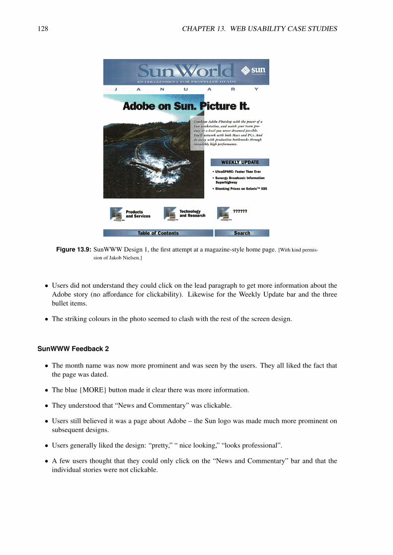
128 CHAPTER 13. WEB USABILITY CASE STUDIES
Figure 13.9: SunWWW Design 1, the first attempt at a magazine-style home page. [With kind permis-sion of Jakob Nielsen.]
• Users did not understand they could click on the lead paragraph to get more information about theAdobe story (no affordance for clickability). Likewise for the Weekly Update bar and the threebullet items.
• The striking colours in the photo seemed to clash with the rest of the screen design.
SunWWW Feedback 2
• The month name was now more prominent and was seen by the users. They all liked the fact thatthe page was dated.
• The blue {MORE} button made it clear there was more information.
• They understood that “News and Commentary” was clickable.
• Users still believed it was a page about Adobe – the Sun logo was made much more prominent onsubsequent designs.
• Users generally liked the design: “pretty,” “ nice looking,” “looks professional”.
• A few users thought that they could only click on the “News and Commentary” bar and that theindividual stories were not clickable.

13.2. SUNWWW: USER INTERFACE DESIGN FOR SUN’S WEB SITE 129
Figure 13.10: SunWWW Design 2. [With kind permission of Jakob Nielsen.]
Figure 13.11: SunWWW Design 3. [With kind permission of Jakob Nielsen.]
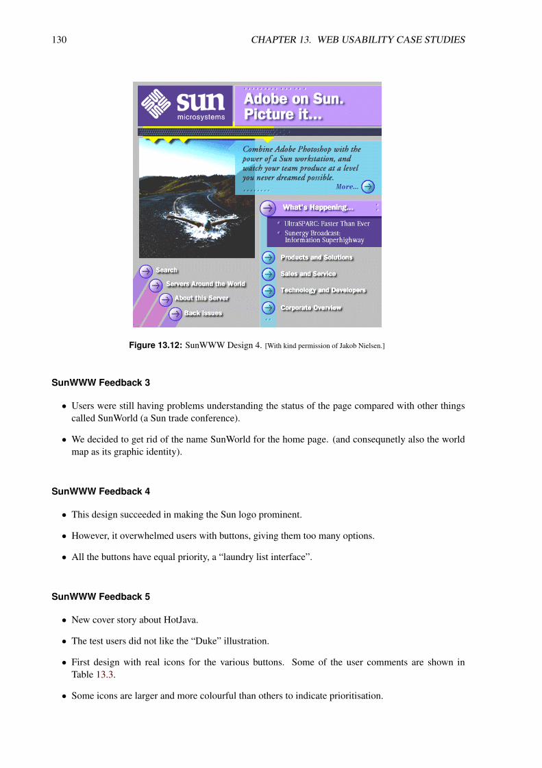
130 CHAPTER 13. WEB USABILITY CASE STUDIES
Figure 13.12: SunWWW Design 4. [With kind permission of Jakob Nielsen.]
SunWWW Feedback 3
• Users were still having problems understanding the status of the page compared with other thingscalled SunWorld (a Sun trade conference).
• We decided to get rid of the name SunWorld for the home page. (and consequnetly also the worldmap as its graphic identity).
SunWWW Feedback 4
• This design succeeded in making the Sun logo prominent.
• However, it overwhelmed users with buttons, giving them too many options.
• All the buttons have equal priority, a “laundry list interface”.
SunWWW Feedback 5
• New cover story about HotJava.
• The test users did not like the “Duke” illustration.
• First design with real icons for the various buttons. Some of the user comments are shown inTable 13.3.
• Some icons are larger and more colourful than others to indicate prioritisation.

13.2. SUNWWW: USER INTERFACE DESIGN FOR SUN’S WEB SITE 131
Figure 13.13: SunWWW Design 5. [With kind permission of Jakob Nielsen.]
Icon Intended Meaning User Interpretation
Sun on the Net
“a punctured balloon”,“a snowman”,“a talking collapsing world”,“an idea coming out of a globe”.
What’s Happening
“a parade”,“people at a Sun launch”,“an intensely ugly logo with people in frontof it”.
Sales and Service
“gas station”,“diner”,“public restroom”,“store to buy Sun equipment”,“fast food”.
Technology and De-velopers
“Thunder and lightning”,“electric - looks painful”,“person being killed by technology”,“dance machine”,“why do Sun developers look bug-eyed?”.
Table 13.3: User comments on Design 5 icons. [With kind permission of Jakob Nielsen.]

132 CHAPTER 13. WEB USABILITY CASE STUDIES
Figure 13.14: SunWWW Design 6. [With kind permission of Jakob Nielsen.]
SunWWW Feedback 6
• New coffee cup design for HotJava.
• No underlay under top three stories for simpler design.
• Blue text and bullets were perceived as clickable.
• However, What’s Happening bar was no longer thought to be clickable!
• “Sun on the Net” icon still not working, decided globe had to be round!
SunWWW Feedback 7
• Adding trianlge to What’s Happening bar made it clickable.
• “Technology and Developers” icon still looking too much like a thunderbolt.
• “Corporate Overview” icon perceived as “Sun’s headquarters suffering earthquake damage” and “afever chart”.
• “Sun on Net” icon now round but still misinterpreted: “astronaut in space suit”, “an olive”, and “agolfer trying to hack his way out of the rough”!
SunWWW Feedback 8
• Triangle on What’s Happening button a bit too dark to really look engraved.

13.2. SUNWWW: USER INTERFACE DESIGN FOR SUN’S WEB SITE 133
Figure 13.15: SunWWW Design 7. [With kind permission of Jakob Nielsen.]
Figure 13.16: SunWWW Design 8. [With kind permission of Jakob Nielsen.]

134 CHAPTER 13. WEB USABILITY CASE STUDIES
Figure 13.17: SunWWW Design 9. [With kind permission of Jakob Nielsen.]
• Also, our first professionally illustrated coffee cup looked too much like a nuclear explosion.
SunWWW Feedback 9
• At last: the perfect home page :-)

13.2. SUNWWW: USER INTERFACE DESIGN FOR SUN’S WEB SITE 135
Figure 13.18: All Nine Iterations. [With kind permission of Jakob Nielsen.]

136 CHAPTER 13. WEB USABILITY CASE STUDIES
13.3 MSWeb: Microsoft Intranet Site
Redesign on Microsoft Intranet site:
• Vivian Bliss; Redesigning the Microsoft Corporate Intranet; http://argus-acia.com/acia_event/bliss_session.html
13.4 Designing Web Applications
Web applications, typically implemented in Java or HTML and Javascript, help users get specific tasksdone, such as accessing their bank account or signing up for health insurance benefits.
Here is the story of one such design effort:
• Bruce Tognazzini; Trials and Tribulations of Web Application Design; http://asktog.com/maxscrns.html

Bibliography
Alexander, Christopher [1979]. The Timeless Way of Building. Oxford University Press, 1979. ISBN
0195024028 (com, uk) (cited on page 91).
Alexander, Christopher, Sara Ishikawa and Murray Silverstein [1977]. A Pattern Language: Towns,Buildings, Construction. Oxford University Press, 25th Aug 1977. ISBN 0195019199 (com, uk) (cited onpage 91).
AllBusiness [2006]. The Cost of Building a Web Site. 2006. http://www.allbusiness.com/technology/internet-web-development/479-1.html (cited on page 12).
Andrews, Keith [2006]. “Evaluating Information Visualisations”. In: Proc. AVI 2006 Workshop on BEy-ond time and errors: novel evaLuation methods for Information Visualization (BELIV’06). Venice,Italy: ACM Press, May 2006, pages 1–5. ISBN 1595935622 (com, uk). doi:10 . 1145 / 1168149 .1168151. http://ftp.iicm.tugraz.at/pub/papers/andrews-beliv2006.pdf (cited on page 105).
APA [2004]. Grasser: Homepage über 220.000 Euro wert – Gerichtsverfahren möglich. Der Standard.31st Aug 2004. http://derstandard.at/1777793/Grasser- Homepage- ueber- 220000- Euro- wert---Gerichtsverfahren-moeglich (cited on page 13).
Archibald, Jake [2012]. Application Cache is a Douchebag. 8th May 2012. http://alistapart.com/article/application-cache-is-a-douchebag (cited on page 10).
Ates, Faruk et al. [2016]. Modernizr. 14th Jan 2016. https://modernizr.com/ (cited on page 85).
Atherton, Michael [2011]. 5 Lessons from Beyond the Polar Bear. redux’d blog. 2011. http://www.reduxd.com/5-lessons-from-beyond-the-polar-bear (cited on page 50).
Atherton, Michael [2012]. Domain Modeling at the BBC. Talk at LighteningUX. 6th Mar 2012. http://www.youtube.com/watch?v=eb-_OoXP4Wo (cited on page 19).
Bailie, Rahel Anne and Noz Urbina [2012]. Content Strategy: Connecting the Dots Between Business,Brand, and Benefits. XML Press, 28th Dec 2012. 306 pages. ISBN 1937434168 (com, uk) (cited onpage 23).
Barker, Tom [2014]. High Performance Responsive Design. O’Reilly, Dec 2014. ISBN 1491949988 (com,
uk) (cited on page 87).
Benway, Jan Panero and David M. Lane [1998]. “Banner Blindness: Web Searchers Often Miss "Obvi-ous" Links”. internetworking [Dec 1998]. http://www.internettg.org/newsletter/dec98/banner_blindness.html (cited on page 60).
Bernard, Michael, Bonnie Lida et al. [2002]. “A Comparison of Popular Online Fonts: Which Size andType is Best?” Usability News 4.1 [Jan 2002]. http://psychology.wichita.edu/surl/usabilitynews/41/onlinetext.htm (cited on page 113).
137

138 BIBLIOGRAPHY
Bernard, Michael, Melissa Mills et al. [2001]. “A Comparison of Popular Online Fonts: Which is Bestand When?” Usability News 3.2 [Jul 2001]. http://psychology.wichita.edu/surl/usabilitynews/3S/font.htm (cited on page 111).
Bloomstein, Margot [2012]. Content Strategy at Work. Morgan Kaufmann, 4th Dec 2012. ISBN
0123919223 (com, uk) (cited on page 23).
Bosch, Philipp [2011]. haz.io. 27th Nov 2011. http://haz.io/ (cited on page 85).
Boyarski, Dan et al. [1998]. “A Study of Fonts Designed for Screen Display”. In: Proc. Conference onHuman Factors in Computing Systems (CHI’98). ACM. Los Angeles, California, USA, Apr 1998,pages 87–94. doi:10.1145/274644.274658 (cited on page 115).
Brace, Nicola, Richard Kemp and Rosemary Snelgar [2006]. SPSS for Psychologists. 3rd Edition. Pal-grave Macmillan, 2006. ISBN 1403987874 (com, uk) (cited on page 97).
Brand, Stewart [2010]. How Buildings Learn: What Happens After They’re Built. Penguin, 20th Jan2010. ISBN 0140139966 (com, uk) (cited on page 28).
Brinck, Tom, Darren Gergle and Scott D. Wood [2001]. Usability for the Web: Designing Web Sites thatWork. Morgan Kaufmann, 2001. ISBN 1558606580 (com, uk) (cited on page 9).
Brown, Dan [2006]. Communicating Design: Developing Web Site Documentation for Design and Plan-ning. New Riders, 2006. ISBN 0321392353 (com, uk) (cited on page 52).
Budiu, Raluca [2015]. The State of Mobile User Experience. NN Group. 22nd Mar 2015. https://nngroup.com/articles/mobile-usability-update/ (cited on page 17).
Casey, Meghan [2015]. The Content Strategy Toolkit: Methods, Guidelines, and Templates for GettingContent Right. New Riders, 18th Jun 2015. 288 pages. ISBN 0134105109 (com, uk) (cited on page 23).
Cederholm, Dan [2013]. Sass for Web Designers. A Book Apart, 13th Nov 2013. 97 pages. ISBN
193755712X (com, uk). https://abookapart.com/products/sass-for-web-designers (cited on page 80).
Cederholm, Dan [2015]. CSS3 for Web Designers. 2nd Edition. A Book Apart, 24th Feb 2015. 139 pages.ISBN 1937557200 (com, uk). https://abookapart.com/products/css3- for- web- designers (cited onpage 80).
Ceglowski, Maciej [2014a]. Web Design: The First 100 Years. idlewords blog. 9th Sep 2014. http ://idlewords.com/talks/web_design_first_100_years.htm (cited on page 61).
Ceglowski, Maciej [2014b]. Web Design: The First 100 Years. HOW Interactive Design Conference2014. 9th Sep 2014. http://youtube.com/watch?v=nwhZ3KEqUlw (cited on page 61).
Covert, Abby [2014]. How to Make Sense of Any Mess: Information Architecture for Everybody. Cre-ateSpace, 4th Nov 2014. 174 pages. ISBN 1500615994 (com, uk) (cited on page 25).
Coxon, Anthony Peter MacMillan [1999]. Sorting Data: Collection and Analysis. Sage Publications,24th Aug 1999. 104 pages. ISBN 0803972377 (com, uk) (cited on page 36).
Coyier, Chris [2016]. Practical SVG. A Book Apart, 27th Jul 2016. 154 pages. ISBN 1937557421 (com, uk).https://abookapart.com/products/practical-svg (cited on page 80).
Crawley, Michael J. [2007]. The R Book. Wiley, Jun 2007. ISBN 0470510242 (com, uk) (cited on page 97).
Debenham, Anna [2013]. Front-End Style Guides. Five Simple Steps, 2013. 69 pages. ISBN 1907828508
(com, uk). http://maban.co.uk/projects/front-end-style-guides/ (cited on page 86).
Demaree, David [2016]. Git for Humans. A Book Apart, 28th Jan 2016. 134 pages. ISBN 1937557383 (com,
uk). https://abookapart.com/products/git-for-humans (cited on page 80).

BIBLIOGRAPHY 139
Deveria, Alexis [2013]. Can I Use... Compatibility tables for support of HTML5, CSS3, SVG and morein desktop and mobile browsers. 15th Oct 2013. http://caniuse.com/ (cited on page 85).
Ding, Wei and Xia Lin [2009]. Information Architecture: The Design and Integration of Inform-ation Spaces. Morgan and Claypool, Nov 2009. ISBN 159829959X (com, uk). doi:10 . 2200 /S00214ED1V01Y200910ICR008 (cited on page 25).
Duckett, John [2011]. HTML & CSS: Design and Build Websites. Wiley, 8th Nov 2011. 490 pages. ISBN
1118008189 (com, uk) (cited on page 73).
Duckett, John [2014]. JavaScript & JQuery: Interactive Front-end Web Development. Wiley, 30th Jun2014. 640 pages. ISBN 1118531647 (com, uk) (cited on page 73).
Ellmaier, Jakob and Andrea Stachel [2013]. Abschlussbericht HTU-Online-Portal. 5th Oct 2013. https://htu.tugraz.at/downloads/berichte/Abschlussbericht_HTU_Homepage_Version2.0_offentlich.pdf
(cited on page 13).
Elshaw, Matthew [2011]. Google’s Advice on Using Underscores or Dashes in Your URLs. ineedhitsBlog. 22nd Aug 2011. http : / / blog . ineedhits . com / tips - advice / googles - advice - on - using -underscores-or-dashes-in-your-urls-22019964.html (cited on page 58).
Evans, Eric [2003]. Domain-Driven Design: Tackling Complexity in the Heart of Software. Addison-Wesley, Aug 2003. ISBN 0321125215 (com, uk) (cited on page 26).
Evans, Mary [1998]. “Web Design: An Empiricist’s Guide”. Master’s Thesis. University of Washington,1998. http : / / web . archive . org / web / 20000815212940 / http : / / response . restoration . noaa . gov /webmastr/webdesgn.pdf (cited on page 111).
Fast, Karl, Fred Leise and Mike Steckel [2002]. All About Facets and Controlled Vocabularies. Dec 2002.http://www.boxesandarrows.com/archives/all_about_facets_controlled_vocabularies.php (cited onpage 43).
Ferguson, Jeremy [2011]. Smartphones Sales Pass PC Sales for the First Time in History! SmartOnline.Feb 2011. http://www.smartonline.com/smarton-products/smarton-mobile/smartphones-pass-pc-sales-for-the-first-time-in-history/ (cited on page 17).
Field, Andy [2009]. Discovering Statistics Using SPSS. 3rd Edition. Sage Publications, 2nd Mar 2009.ISBN 1847879071 (com, uk) (cited on page 97).
Field, Andy and Graham Hole [2003]. How to Design and Report Experiments. Sage Publications, Feb2003. ISBN 0761973834 (com, uk) (cited on pages 97, 106).
Field, Andy, Jeremy Miles and Zoe Field [2012]. Discovering Statistics Using R. Sage Publications,31st Mar 2012. ISBN 1446200469 (com, uk) (cited on page 97).
Firtman, Maximiliano [2015]. Mobile HTML5. 17th Sep 2015. http : / / mobilehtml5 . org/ (cited onpage 85).
Firtman, Maximiliano [2016]. High Performance Mobile Web. O’Reilly, 26th Sep 2016. ISBN 1491912553
(com, uk) (cited on page 93).
Fisher, Steve [2014]. Responsive Content Modeling. Republic of Quality. 29th Sep 2014. http : / /republicofquality.com/responsive-content-modeling/ (cited on page 24).
Flanders, Vincent and Michael Willis [1998]. Web Pages That Suck. Sybex, 1998. ISBN 078212187X (com,
uk). http://webpagesthatsuck.com/ (cited on page 9).
Florin, Alexander [2015]. User Interface Design: Usability in Web- und Software-Projekten. German.Books on Demand, 9th Jun 2015. 380 pages. ISBN 3738612386 (com, uk) (cited on page 10).

140 BIBLIOGRAPHY
Fox, Chiara [2002]. Re-Architecting PeopleSoft.com from the Bottom-Up. Boxes and Arrows. 16th Jun2002. http://www.boxesandarrows.com/view/re_architecting_peoplesoft_com_from_the_bottom_up(cited on page 50).
Fox, Chiara [2003]. Sitemaps and Site Indexes: What They Are and Why You Should Have Them. Boxesand Arrows. 8th Sep 2003. http://www.boxesandarrows.com/view/sitemaps_and_site_indexes_what_they_are_and_why_you_should_have_them (cited on page 50).
Frain, Ben [2012]. Responsive Web Design with HTML5 and CSS3. Packt Publishing, 10th Apr 2012.ISBN 1849693188 (com, uk) (cited on page 87).
Friedman, Vitaly, editor [2015]. Real-Life Responsive Web Design. Smashing Books 5. SmashingMagazine, 2015. ISBN 3945749212 (com, uk). http://smashingmagazine.com/2015/03/real- life-responsive-web-design-smashing-book-5/ (cited on page 86).
Garrett, Jesse James [2002a]. A Visual Vocabulary for Describing Information Architecture and Interac-tion Design. Mar 2002. http://www.jjg.net/ia/visvocab/ (cited on page 53).
Garrett, Jesse James [2002b]. ia/recon. Mar 2002. http://www.jjg.net/ia/recon/ (cited on page 7).
Garrett, Jesse James [2010]. The Elements of User Experience. 2nd Edition. New Riders, 16th Dec 2010.ISBN 0321683684 (com, uk) (cited on pages 5, 6).
Gates, Bill [1996]. Content is King. 3rd Jan 1996. https://web.archive.org/web/20010126005200/http://www.microsoft.com/billgates/columns/1996essay/essay960103.asp (cited on page 23).
Google [2016a]. HTML5rocks. 22nd Oct 2016. http://html5rocks.com/ (cited on page 80).
Google [2016b]. Mobile SEO Overview. 16th May 2016. https://developers.google.com/webmasters/mobile-sites/mobile-seo/ (cited on page 89).
Griffiths, Patrick [2016]. HTML Dog. 23rd Oct 2016. http://htmldog.com/ (cited on page 80).
Grosjean, Philippe [2009]. Tinn-R. 2009. http://www.sciviews.org/Tinn-R/ (cited on page 98).
Gustafson, Aaron [2011]. Adaptive Web Design. Easy Readers, 30th May 2011. 144 pages. ISBN
098358950X (com, uk) (cited on page 87).
Halvorson, Kristina [2008]. The Discipline of Content Strategy. A List Apart. 16th Dec 2008. http://alistapart.com/article/thedisciplineofcontentstrategy (cited on page 23).
Haverbeke, Marijn [2014]. Eloquent JavaScript. 2nd Edition. No Starch Press, 14th Dec 2014. 472 pages.ISBN 1593275846 (com, uk). http://eloquentjavascript.net/ (cited on page 80).
Hay, Stephen [2013]. Responsive Design Workflow. New Riders, 5th Apr 2013. ISBN 0321887867 (com, uk)
(cited on page 86).
Hearst, Marti A. [2009]. Search User Interfaces. Cambridge University Press, Oct 2009. ISBN 0521113792
(com, uk) (cited on page 2).
Hedden, Heather [2010]. The Accidental Taxonomist. Information Today, 3rd May 2010. 472 pages.ISBN 1573873977 (com, uk) (cited on page 25).
HHS [2006]. Research-Based Web Design & Usability Guidelines. U.S. Department of Health and Hu-man Service (HHS), 2006. ISBN 0160762707 (com, uk). http://guidelines.usability.gov/ (cited onpage 111).
Hinman, Rachel [2012]. The Mobile Frontier: A Guide for Designing Mobile Experiences. RosenfeldMedia, 11th Jun 2012. ISBN 1933820551 (com, uk) (cited on page 17).

BIBLIOGRAPHY 141
Hogan, Lara Callender [2014]. Designing for Performance: Weighing Aesthetics and Speed. O’Reilly,19th Dec 2014. 182 pages. ISBN 1491902515 (com, uk) (cited on page 93).
Holst, Christian [2013]. Exploring Ten Fundamental Aspects Of M-Commerce Usability. SmashingMagazine. 21st May 2013. http://smashingmagazine.com/2013/05/21/recommendations- mobile-commerce-websites/ (cited on page 17).
Hudson, William [2005]. Everything You’ve Always Wanted to Know About Card Sorting. Syntagm.2005. http://syntagm.co.uk/design/cardsort.pdf (cited on page 36).
Hurst, Mark [2007]. Bit Literacy: Productivity in the Age of Information and E-mail Overload. GoodExperience Press, Jun 2007. ISBN 0979368103 (com, uk). http://bitliteracy.org/ (cited on page 1).
IBM [2006]. IBM Page Detailer. Dec 2006. http://www.alphaworks.ibm.com/tech/pagedetailer (citedon page 96).
Ippen, Johannes [2016]. Web Fatale: Wie Du Webseiten und Web-Apps gestaltest, denen niemand wider-stehen kann. German. Rheinwerk Design, 29th Mar 2016. 348 pages. ISBN 3836238985 (com, uk) (citedon page 10).
Jansen, Bernard Jim [2009]. Understanding User-Web Interactions via Web Analytics. Morgan Clay-pool, Aug 2009. ISBN 1598298518 (com, uk). doi:10.2200/S00191ED1V01Y200904ICR006 (cited onpage 19).
Jehl, Scott [2014]. Responsible Responsive Design. A Book Apart, 19th Nov 2014. 188 pages. ISBN
1937557162 (com, uk). http://abookapart.com/products/responsible- responsive- design (cited onpages 1, 86, 93).
Johnson, Jeff [2003]. Web Bloopers. Morgan Kaufman, 2003. ISBN 1558608400 (com, uk) (cited on page 9).
Jones, William P. [2007]. Keeping Found Things Found: The Study and Practice of Personal InformationManagement. Morgan Kaufmann, Nov 2007. ISBN 0123708664 (com, uk) (cited on page 2).
Kadlec, Tim [2012]. Implementing Responsive Design. New Riders, 31st Jul 2012. 288 pages. ISBN
0321821688 (com, uk). http://abookapart.com/products/responsive-web-design (cited on page 87).
Kalbach, James [2007]. Designing Web Navigation: Optimizing the User Experience. O’Reilly, 7th Sep2007. 416 pages. ISBN 0596528108 (com, uk) (cited on page 9).
Kasanicka, Janka [2006]. “Comparative Evaluation of Hierarchy Browsers with the Hierarchical Visu-alisation Testing Environment (HVTE)”. Master’s Thesis. Graz University of Technology, Austria,Sep 2006. http://ftp.iicm.tugraz.at/pub/theses/jkasanicka.pdf (cited on page 105).
Kawasaki, Guy [2007]. By the Numbers: How I built a Web 2.0, User-Generated Content, Citizen Journ-alism, Long-Tail, Social Media Site for $ 12,107.09. Jun 2007. http://blog.guykawasaki.com/2007/06/by_the_numbers_.html (cited on page 12).
Keith, Jeremy [2015]. Enhance! beyond tellerrand, Düsseldorf 2015. 11th May 2015. https://adactio.com/articles/9465 (cited on page 85).
Keith, Jeremy and Rachel Andrew [2016]. HTML5 for Web Designers. 2nd Edition. A Book Apart,17th Feb 2016. 92 pages. ISBN 1937557243 (com, uk). https://abookapart.com/products/html5-for-web-designers (cited on page 80).
Kholmatova, Alla [2017]. Design Systems. Smashing Media, 2017. 288 pages. ISBN 3945749581 (com, uk).http://designsystemsbook.com/ (cited on page 91).
Kille, Leighton Walter [2015]. The Growing Problem of Internet “Link Rot” and Best Practices forMedia and Online Publishers. Journalist’s Resource. 9th Oct 2015. http://journalistsresource.

142 BIBLIOGRAPHY
org/studies/society/internet/website-linking-best-practices-media-online-publishers (cited onpage 61).
King, Andrew [2003]. Speed Up Your Site: Web Site Optimization. New Riders, 2003. ISBN 0735713243
(com, uk) (cited on page 93).
King, Andrew [2008]. Website Optimization: Speed, Search Engine & Conversion Rate Secrets. O’Reilly,Jul 2008. ISBN 0596515081 (com, uk) (cited on page 93).
Kissane, Erin [2011]. The Elements of Content Strategy. A Book Apart, 8th Mar 2011. ISBN 0984442553
(com, uk) (cited on page 23).
Kogelnik, Lisa [2014]. 55.000 Euro für Homepage: Ministerium prüft ÖH an TU Graz. Der Standard.18th Dec 2014. http://derstandard.at/2000009536500/55000-Euro-fuer-Homepage-der-OeH-an-TU-Graz (cited on page 13).
Krug, Steve [2000]. Don’t Make Me Think! A Common Sense Approach to Web Usability. 1st Edition.Que, Oct 2000. ISBN 0789723107 (com, uk) (cited on page 9).
Krug, Steve [2013]. Don’t Make Me Think, Revisited A Common Sense Approach to Web Usability.3rd Edition. New Riders, 24th Dec 2013. 216 pages. ISBN 0321965515 (com, uk) (cited on page 9).
Krug, Steve [2014]. Don’t Make Me Think! Revisited - Das intuitive Web. German. 3rd Edition. mitp,1st Oct 2014. ISBN 3826697057 (com, uk) (cited on page 10).
Lang, Tania [2013]. Eight Lessons in Mobile Usability Testing. UX Magazine. 10th Apr 2013. http://uxmag.com/articles/eight-lessons-in-mobile-usability-testing (cited on page 17).
Larson, Kevin and Mary Czerwinski [1998]. “Web Page Design: Implications of Memory, Structure andScent for Information Retrieval”. In: Proc. Conference on Human factors in Computing Systems(CHI’98). ACM. Los Angeles, California, Apr 1998, pages 25–32. doi:10.1145/274644.274649.http://research.microsoft.com/~marycz/p25-larson.pdf (cited on page 35).
Laubheimer, Page [2015]. Which UX Deliverables Are Most Commonly Created and Shared? NielsenNorman Group. 18th Oct 2015. https://nngroup.com/articles/common-ux-deliverables/ (cited onpage 52).
Lewis, James R. and Jeff Sauro [2012]. Excel and R Companion to Quantifying the User Experience.CreateSpace, 1st Mar 2012. ISBN 1470025574 (com, uk) (cited on page 97).
Linden, Greg [2006]. Make Data Useful. Talk at Stanford University. 29th Nov 2006. http://sites.google.com/site/glinden/Home/StanfordDataMining.2006-11-29.ppt (cited on page 93).
Löffler, Miriam [2014]. Think Content!: Content-Strategie, Content-Marketing, Texten fürs Web. German.Galileo Computing, 24th Feb 2014. 627 pages. ISBN 3836220067 (com, uk) (cited on page 23).
Lovinger, Rachel [2007]. Content Strategy: The Philosophy of Data. Boxes and Arrows. 27th Mar 2007.http://boxesandarrows.com/content-strategy-the-philosophy-of-data/ (cited on page 24).
Manhartsberger, Martina and Sabine Musil [2001]. Web Usability. German. Galileo Press, Nov 2001.ISBN 3898421872 (com, uk) (cited on page 10).
Marcotte, Ethan [2014]. Responsive Web Design. 2nd Edition. A Book Apart, 2nd Dec 2014. 153 pages.ISBN 1937557189 (com, uk). http://abookapart.com/products/responsive-web-design (cited on pages 1,86).
Marquis, Mat [2016]. JavaScript for Web Designers. A Book Apart, 28th Sep 2016. 135 pages. ISBN
1937557464 (com, uk). https://abookapart.com/products/javascript- for- web- designers (cited onpage 80).

BIBLIOGRAPHY 143
Martin, David [2003]. Doing Psychology Experiments. 6th Edition. Wadsworth, Jul 2003. ISBN
053460255X (com, uk) (cited on page 97).
Mayer, Marissa [2006]. What Google Knows. Talk at Web 2.0 Summit 2006. 9th Nov 2006. http://conferences.oreillynet.com/presentations/web2con06/mayer.ppt (cited on page 93).
McCown, Frank et al. [2005]. “The Availability and Persistence of Web References in D-Lib Magazine”.In: Proc. 5th International Web Archiving Workshop (IWAW05). (Vienna, Austria). 22nd Sep 2005,pages 323–324. http://arxiv.org/ftp/cs/papers/0511/0511077.pdf (cited on page 61).
McGrane, Karen [2012]. Content Strategy for Mobile. A Book Apart, 5th Nov 2012. ISBN 1937557081
(com, uk) (cited on page 23).
Meadows, Donella [2008]. Thinking in Systems. Chelsea Green Publishing, 3rd Dec 2008. 240 pages.ISBN 1603580557 (com, uk) (cited on page 91).
Meeker, Mary [2015]. Internet Trends 2015. Kleiner Perkins Caufield & Byers (KPCB). 27th May 2015.http://www.kpcb.com/blog/2015-internet-trends (cited on page 18).
Mendoza, Adrian [2013]. Mobile User Experience: Patterns to Make Sense of it All. Morgan Kaufmann,31st Oct 2013. 248 pages. ISBN 0124095143 (com, uk) (cited on page 17).
Merholz, Peter [2003]. Way More About Paths at UC Berkeley Than You’d Ever Want to Read. May 2003.http://www.peterme.com/archives/000073.html (cited on page 47).
Miller, George A. [1956]. “The Magical Number Seven, Plus or Minus Two: Some Limits on Our Ca-pacity for Processing Information”. The Psychological Review 63.2 [Feb 1956], pages 81–97. http://www.well.com/user/smalin/miller.html (cited on page 35).
Morkes, John and Jakob Nielsen [1997]. Concise, SCANNABLE, and Objective: How to Write for theWeb. 1997. http://www.useit.com/papers/webwriting/ (cited on page 58).
Morville, Peter [2000]. Big Architect, Little Architect. Strange Connections. Jul 2000. http://argus-acia.com/strange_connections/strange004.html (cited on page 7).
Morville, Peter [2005]. Ambient Findability: What We Find Changes Who We Become. O’Reilly, Sep2005. ISBN 0596007655 (com, uk) (cited on page 2).
Morville, Peter and Jeffery Callender [2010]. Search Patterns: Design for Discovery. O’Reilly, 2010.ISBN 0596802277 (com, uk) (cited on pages 1, 26).
Morville, Peter and Louis Rosenfeld [2006]. Information Architecture for the World Wide Web. 3rd Edi-tion. O’Reilly, Nov 2006. ISBN 0596527349 (com, uk) (cited on pages 33, 35, 47, 55).
Nielsen, Jakob [1993a]. Response Times: The 3 Important Limits. 1st Jan 1993. https://nngroup.com/articles/response-times-3-important-limits/ (cited on page 94).
Nielsen, Jakob [1993b]. Usability Engineering. Morgan Kaufmann, 23rd Sep 1993. ISBN 0125184069 (com,
uk) (cited on page 105).
Nielsen, Jakob [1994]. Report From a 1994 Web Usability Study. Dec 1994. http://www.useit.com/papers/1994_web_usability_report.html (cited on page 58).
Nielsen, Jakob [1995]. User Interface Design for Sun’s WWW Site. May 1995. http://www.useit.com/papers/sun/ (cited on page 124).
Nielsen, Jakob [1997a]. Changes in Web Usability Since 1994. The Alertbox. Dec 1997. http://www.useit.com/alertbox/9712a.html (cited on page 58).

144 BIBLIOGRAPHY
Nielsen, Jakob [1997b]. How Users Read on the Web. The Alertbox. Oct 1997. http://www.useit.com/alertbox/9710a.html (cited on page 58).
Nielsen, Jakob [1997c]. Search and You May Find. The Alertbox. Jul 1997. http://www.useit.com/alertbox/9707b.html (cited on page 49).
Nielsen, Jakob [1998a]. Fighting Linkrot. The Alertbox. Jun 1998. http://www.useit.com/alertbox/980614.html (cited on page 61).
Nielsen, Jakob [1998b]. The Increasing Conservatism of Web Users. The Alertbox. Mar 1998. http://www.useit.com/alertbox/980322.html (cited on page 85).
Nielsen, Jakob [1999a]. Designing Web Usability: The Practice of Simplicity. New Riders, Dec 1999.ISBN 156205810X (com, uk) (cited on page 9).
Nielsen, Jakob [1999b]. Stuck With Old Browsers Until 2003. The Alertbox. Apr 1999. http://www.useit.com/alertbox/990418.html (cited on page 85).
Nielsen, Jakob [2000]. Eyetracking Study of Web Readers. The Alertbox. May 2000. http://www.useit.com/alertbox/20000514.html (cited on page 58).
Nielsen, Jakob [2006]. Avoid Within-Page Links. The Alertbox. 21st Feb 2006. http://www.useit.com/alertbox/within_page_links.html (cited on page 61).
Nielsen, Jakob and Raluca Budiu [2012]. Mobile Usability. New Riders, 10th Oct 2012. ISBN 0321884485
(com, uk) (cited on page 17).
Nielsen, Jakob and Hoa Loranger [2006]. Prioritizing Web Usability. New Riders, Apr 2006. ISBN
0321350316 (com, uk) (cited on pages 9, 13, 14, 59).
Nielsen, Jakob, Rolf Molich et al. [2001]. E-Commerce User Experience. Nielsen Norman Group, 2001.ISBN 0970607202 (com, uk) (cited on page 9).
Nielsen, Jakob and Kara Pernice [2009]. Eyetracking Web Usability. New Riders, Dec 2009. ISBN
0321498364 (com, uk) (cited on page 9).
Nielsen, Jakob and Darrell Sano [1994]. SunWeb: User Interface Design for Sun’s Internal Web. 1994.http://www.useit.com/papers/sunweb/ (cited on page 119).
Norman, Donald A. [1999]. “Banner Blindness, Human Cognition and Web Design”. internetworking[Mar 1999]. http://www.internettg.org/newsletter/mar99/commentary.html (cited on page 60).
OBrien, Dave [2009]. Tree Testing: A Quick Way to Evaluate Your IA. Boxes and Arrows. 5th Dec 2009.http://boxesandarrows.com/tree-testing/ (cited on page 43).
Olsen, George [2002]. Response: The Backlash against Jakob Nielsen and What it Teaches Us. UsabilityNews. British HCI Group, 31st Jul 2002. http://usabilitynews.bcs.org/content/conWebDoc/47166(cited on page 111).
O’Reilly, Tim [2005]. What is Web 2.0: Design Patterns and Business Models for the Next Generationof Software. Sep 2005. http://www.oreilly.com/pub/a/oreilly/tim/news/2005/09/30/what-is-web-20.html (cited on page 47).
O’Reilly, Tim [2006]. Web 2.0 Compact Definition: Trying Again. Dec 2006. http://radar.oreilly.com/archives/2006/12/web_20_compact.html (cited on page 47).
OW [2016]. Treejack. OptimalWorkshop. 17th Oct 2016. http://treejack.com/ (cited on page 43).
ÖWA [2017]. ÖWA Basic Browserstatistik. Aug 2017. http://oewa.at/basic/browserstatistik (cited onpage 18).

BIBLIOGRAPHY 145
Pamental, Jason [2014]. Responsive Typography. O’Reilly, 25th Sep 2014. 110 pages. ISBN 1491907096
(com, uk) (cited on page 87).
Parker, Todd et al. [2010]. Designing with Progressive Enhancement. New Riders, 19th Feb 2010.456 pages. ISBN 0321658884 (com, uk) (cited on page 87).
Parr, Richard [2015]. How Much Does a Website Cost in 2015? 1st Jun 2015. http://executionists.com/blog/much-website-cost-2015/ (cited on page 12).
Pearrow, Mark [2006]. Web Usability Handbook. 2nd Edition. Charles River Media, 2nd Oct 2006.388 pages. ISBN 1584504692 (com, uk) (cited on page 9).
Peterson, Clarissa [2014]. Learning Responsive Web Design: A Beginner’s Guide. O’Reilly, 27th Jun2014. 412 pages. ISBN 144936294X (com, uk) (cited on page 86).
Pezzullo, John C. [2012]. Latin Squares for Constructing ‘Williams designs”, Balanced for First-OrderCarry-Over (Residual) Effects. StatPages.org. 30th Oct 2012. http://statpages.org/latinsq.html(cited on page 103).
Podjarny, Guy [2010]. 17 Statistics to Sell Web Performance Optimization. 16th Dec 2010. http://guypo.com/17-statistics-to-sell-web-performance-optimization/ (cited on page 94).
Podjarny, Guy [2014a]. Responsive & Fast. O’Reilly, 3rd Jun 2014. 58 pages. ISBN 1491911611 (com, uk)
(cited on page 87).
Podjarny, Guy [2014b]. RWD Ratio in Top 100,000 Websites – Refined. Guy’s Pod blog. 9th Jan 2014.http://guypo.com/rwd-ratio-in-top-100000-websites-refined/ (cited on page 89).
Popper, Ben [2017]. Google announces over 2 billion monthly active devices on Android. The Verge.17th May 2017. https://theverge.com/2017/5/17/15654454/android-reaches-2-billion-monthly-active-users (cited on page 17).
Pozin, Ilya [2013]. How Much Does A Website Cost? 7th Aug 2013. http://forbes.com/sites/ilyapozin/2013/08/07/how-much-does-a-website-cost/ (cited on page 12).
Ranganathan, Shiyali Ramamrita [1933]. Colon Classification. 1st Edition. Madras Library Association,1933 (cited on pages 26, 46).
Ranganathan, Shiyali Ramamrita [1950]. “Classification, Coding, and Machinery for Search”. In: Proc.UNESCO NS/SL/3. UNESCO. Paris, France, Jun 1950. http://unesdoc.unesco.org/images/0013/001333/133325eo.pdf (cited on page 46).
Ranganathan, Shiyali Ramamrita [2006]. Colon Classification. 6th Edition. Ess Ess Publications, Apr2006. ISBN 8170004233 (com, uk) (cited on page 26).
Rasiel, Ethan M. and Paul N. Friga [2001]. The McKinsey Mind. McGraw-Hill, Sep 2001. ISBN
0071374299 (com, uk) (cited on page 34).
Reiss, Eric L. [2000]. Practical Information Architecture: A Hands-On Approach to Structuring Success-ful Websites. Addison-Wesley, Nov 2000. ISBN 0201725908 (com, uk) (cited on page 26).
Resmini, Andrea and Luca Rosati [2011a]. “A Brief History of Information Architecture”. Journal ofInformation Architecture 3.2 [2011], pages 33–45. ISSN 1903-7260. http://journalofia.org/volume3/issue2/03-resmini/ (cited on page 25).
Resmini, Andrea and Luca Rosati [2011b]. Pervasive Information Architecture: Designing Cross-Channel User Experiences. Morgan Kaufmann, 13th Apr 2011. 272 pages. ISBN 0123820944 (com,
uk) (cited on page 25).

146 BIBLIOGRAPHY
Rosenfeld, Louis [2011]. Search Analytics for Your Site. Rosenfeld Media, 6th Jul 2011. ISBN 1933820209
(com, uk) (cited on page 19).
Rosenfeld, Louis, Peter Morville and Jorge Arango [2015]. Information Architecture: For the Web andBeyond. 4th Edition. O’Reilly, 11th Oct 2015. 488 pages. ISBN 1491911689 (com, uk) (cited on pages 1,25, 27, 35).
Salkind, Neil J. [2007]. Statistics for People Who (Think They) Hate Statistics. 3rd Edition. Sage Public-ations, Aug 2007. ISBN 141295150X (com, uk) (cited on page 97).
Sauro, Jeff and James R. Lewis [2012]. Quantifying the User Experience: Practical Statistics for UserResearch. Morgan Kaufmann, 13th May 2012. ISBN 0123849683 (com, uk) (cited on page 97).
Scanlon, Tara [1996]. Surprises on the Web: Results from Usability Testing. UIE. 1st Sep 1996. http://www.uie.com/articles/surprises_on_web/ (cited on page 61).
Schilb, Steffen [2016]. C-Inspector. 17th Oct 2016. http://c-inspector.com/ (cited on page 43).
Schurman, Eric and Jake Brutlag [2009]. The User and Business Impact of Server Delays, Addi-tional Bytes, and HTTP Chunking in Web Search. Talk at Velocity 2009. 23rd Jun 2009. http ://conferences.oreilly.com/velocity/velocity2009/public/schedule/detail/8523 (cited on page 94).
Scott, Bill and Theresa Neil [2009]. Designing Web Interfaces: Principles and Patterns for Rich Interac-tions. O’Reilly, 26th Jan 2009. ISBN 0596516258 (com, uk) (cited on page 91).
Shaughnessy, John J., Eugene B. Zechmeister and Jeanne S. Zechmeister [2003]. Research Methodsin Psychology. 6th Edition. McGraw-Hill Education, May 2003. ISBN 0071113231 (com, uk) (cited onpages 97, 103).
Sheridan, John [2013]. Good Law from Open Data. Talk at European Data Forum 2013. 10th Apr 2013.http://videolectures.net/dataforum2013_sheridan_good_law (cited on page 52).
Shirky, Clay [2008]. Here Comes Everybody: The Power of Organizing Without Organizations. Penguin,Feb 2008. ISBN 1594201536 (com, uk) (cited on page 1).
Shirky, Clay [2010]. Cognitive Surplus: Creativity and Generosity in a Connected Age. Penguin, Jun2010. ISBN 1594202532 (com, uk) (cited on page 1).
Siegel, David [1995]. The Balkanization of the Web. 1995. http://web.archive.org/web/19961103094757/http://dsiegel.com/balkanization/ (cited on page 10).
Siegel, David [1996]. Creating Killer Web Sites. 1st Edition. Hayden Books, 14th Jun 1996. ISBN
1568302894 (com, uk) (cited on page 73).
Siegel, David [1997]. Creating Killer Web Sites. 2nd Edition. Hayden Books, 18th Sep 1997. ISBN
1568304331 (com, uk) (cited on page 73).
Simtec [2009]. HttpWatch. Feb 2009. http://httpwatch.com/ (cited on page 96).
Smethurst, Michael [2009]. How We Make Websites. BBC Radio Labs. 29th Jan 2009. http://www.bbc.co.uk/blogs/radiolabs/2009/01/how_we_make_websites.shtml (cited on page 50).
Souders, Steve [2007]. High Performance Web Sites. O’Reilly, 2007. ISBN 0596529309 (com, uk). http://developer.yahoo.com/performance/ (cited on pages 93, 95).
Souders, Steve [2009]. Even Faster Web Sites: Performance Best Practices for Web Developers. O’Reilly,Jun 2009. ISBN 0596522304 (com, uk). http://stevesouders.com/efws/ (cited on page 93).
Spencer, Donna [2003]. Card-Based Classification Evaluation. Boxes and Arrows. 7th Apr 2003. http://boxesandarrows.com/card-based-classification-evaluation/ (cited on page 43).

BIBLIOGRAPHY 147
Spencer, Donna [2009]. Card Sorting: Designing Usable Categories. Rosenfeld Media, 2009. ISBN
1933820020 (com, uk). http://rosenfeldmedia.com/books/card-sorting/ (cited on pages 1, 26, 36).
Spencer, Donna [2014]. A Practical Guide to Information Architecture. 2nd Edition. ebook. UX Mastery,2014. ISBN 0992538025 (com, uk). http://uxmastery.com/practical-ia/ (cited on pages 1, 25).
Spool, Jared M. [1997]. Why On-Site Searching Stinks. UIE. 1st Sep 1997. http://www.uie.com/articles/search_stinks/ (cited on page 49).
Spool, Jared M. et al. [1997]. Web Site Usability: A Designer’s Guide. User Interface Engineering, 1997.ISBN 0966064100 (com, uk). http://www.uie.com/bookdesc.htm (cited on page 9).
Sullivan, Terry [1999]. How Much Is Too Much? All Things Web. May 1999. http://www.pantos.org/atw/35654.html (cited on page 61).
Tapscott, Don [2008]. Grown Up Digital: How the Net Generation is Changing Your World. McGraw-Hill, Oct 2008. ISBN 0071508635 (com, uk) (cited on page 1).
Tapscott, Don and Anthony D. Williams [2006]. Wikinomics: How Mass Collaboration ChangesEverything. Portfolio, Dec 2006. ISBN 1591841380 (com, uk) (cited on page 1).
Teixeira, Fabricio and Caio Braga [2016]. UX Design Methods & Deliverables. uxdesign.cc. 30th Apr2016. https://uxdesign.cc/ux-design-methods-deliverables-657f54ce3c7d (cited on page 52).
The Poynter Institute [2000]. EyeTracking Online News. 2000. http://www.poynter.org/eyetrack2000/(cited on page 58).
Tidwell, Jenifer [2011]. Designing Interfaces: Patterns for Effective Interaction Design. 2nd Edition.O’Reilly, 6th Jan 2011. ISBN 1449379702 (com, uk) (cited on page 91).
TRF [2016]. The R Project for Statistical Computing. The R Foundation. 31st Oct 2016. http://r-project.org/ (cited on page 98).
Tufte, Edward R. [1990]. Envisioning Information. Graphics Press, 1990. ISBN 0961392118 (com, uk) (citedon page 55).
Tullis, Thomas S. [1998]. “A Method for Evaluating Web Page Design Concepts”. In: CHI’98 Summary.(Los Angeles, California). ACM. Apr 1998, pages 323–324. doi:10.1145/286498.286793 (citedon page 67).
Tunkelang, Daniel [2009]. Faceted Search. Morgan Claypool, Jun 2009. ISBN 1598299999 (com, uk).doi:10.2200/S00190ED1V01Y200904ICR005 (cited on pages 25, 46).
Total Validator [2016]. Total Validator. 10th Aug 2016. http://totalvalidator.com/ (cited on page 84).
Tverskov, Jesper [2012]. Benefits of Polyglot XHTML5. 27th Sep 2012. http://xmlplease.com/xhtml/xhtml5polyglot/ (cited on pages 82, 83).
UIE [1998]. As the Page Scrolls. 1998. http://www.uie.com/articles/page_scrolling/ (cited on page 58).
Upsdell, Charles A. [2001]. BrowserNews: Statistics. 2001. http://www.upsdell.com/BrowserNews/stat.htm (cited on page 15).
UserZoom [2016]. Tree Testing. UserZoom. 17th Oct 2016. http://userzoom.com/tree-testing/ (citedon page 43).
Van Dijck, Peter [2003]. Information Architecture for Designers: Structuring Websites for Business Suc-cess. Rotovision, Sep 2003. ISBN 2880467314 (com, uk) (cited on page 26).
148 BIBLIOGRAPHY
Van Duyne, Douglas K., James A. Landay and Jason I. Hong [2006]. The Design of Sites: Patterns,Principles, and Processes for Crafting a Customer-Centered Web Experience. Prentice Hall, Dec2006. ISBN 0131345559 (com, uk) (cited on page 91).
Volkside [2016]. Naview. Volkside. 17th Oct 2016. http://naviewapp.com/ (cited on page 43).
Vyas, Rahul [2013]. How much does it Cost to Design and Develop a Website? 3rd Jul 2013. http://crispycodes.com/blog/web-design-and-development-guide/cost-to-design-develop-a-website.php
(cited on page 12).
W3C [2008]. The W3C CSS Validation Service. Jan 2008. http://jigsaw.w3.org/css-validator/ (citedon page 84).
W3C [2014]. HTML5: A Vocabulary and Associated APIs for HTML and XHTML. W3C Recommenda-tion. 28th Oct 2014. http://w3.org/TR/html5 (cited on page 80).
W3C [2015]. Polyglot Markup: A Robust Profile of the HTML5 Vocabulary. W3C Working Group Note.29th Sep 2015. http://w3.org/TR/html-polyglot/ (cited on pages 82, 83).
W3C [2016a]. CSS Current Work. 20th Oct 2016. http://w3.org/Style/CSS/current-work.en.html (citedon page 80).
W3C [2016b]. Nu HTML Checker. 20th Oct 2016. http://validator.w3.org/nu/ (cited on pages 82, 84).
Wachter-Boettcher, Sara [2012]. Content Everywhere. Rosenfeld, 12th Dec 2012. ISBN 193382087X (com,
uk) (cited on page 23).
Wall, Larry [1999]. “The Origin of the Camel Lot in the Breakdown of the Bilingual Unix”. Commu-nications of the ACM 42.4 [Apr 1999], pages 40–41. ISSN 0001-0782. doi:10.1145/299157.299166(cited on page 47).
WebpageFX [2015]. How Much Should a Website Cost in 2015? 13th Oct 2015. http://webpagefx.com/How-much-should-web-site-cost.html (cited on page 12).
web-sniffer [2009]. View HTTP Request and Response Header. Oct 2009. http://web- sniffer.net/(cited on page 96).
Weinberger, David [2007]. Everything Is Miscellaneous. Times Books, May 2007. ISBN 0805080430 (com,
uk) (cited on page 25).
White, Ryen and Resa A. Roth [2009]. Exploratory Search: Beyond the Query-Response Paradigm.Morgan and Claypool, Mar 2009. ISBN 159829783X (com, uk) (cited on page 2).
Wichary, Marcin [2016]. HTML5 Presentation. Originally at slides.html5rocks.com, no longer online.23rd Oct 2016. https://github.com/html5rocks/slides.html5rocks.com (cited on page 80).
Wikipedia [2012a]. XML. 9th Nov 2012. http://en.wikipedia.org/wiki/XML (cited on page 84).
Wikipedia [2012b]. XSLT. 7th Nov 2012. http://en.wikipedia.org/wiki/XSLT (cited on page 84).
Wikipedia [2015]. Link Rot. Wikipedia. 27th Oct 2015. https://en.wikipedia.org/wiki/Link_rot (citedon page 61).
Williams, Evan James [1949]. “Experimental Designs Balanced for the Estimation of Residual Effectsof Treatments”. Australian Journal of Scientific Research 2.2 [1949], pages 149–168. doi:10.1071/CH9490149. http://adsabs.harvard.edu/full/1949AuSRA...2..149W (cited on page 103).
Wodtke, Christine [2009]. Information Architecture: Blueprints for the Web. 2nd Edition. New Riders,Feb 2009. ISBN 0321600800 (com, uk) (cited on page 26).

BIBLIOGRAPHY 149
Wright, Alex [2014]. Cataloging the World: Paul Otlet and the Birth of the Information Age. OxfordUniversity Press, 4th Jun 2014. 360 pages. ISBN 0199931410 (com, uk) (cited on page 26).
Wroblewski, Luke [2011]. Mobile First. A Book Apart, 18th Oct 2011. ISBN 1937557022 (com, uk). http://abookapart.com/products/mobile-first (cited on pages 17, 18).
Wroblewski, Luke [2016]. Presentations. 2016. http://lukew.com/presos/ (cited on page 18).
Yahoo! [2008]. Exceptional Performance. Dec 2008. http://developer.yahoo.com/performance/ (citedon page 95).
Yahoo! [2010]. YSlow. Nov 2010. http://developer.yahoo.com/yslow/ (cited on page 95).
Yeung, Ken [2016]. Twitter reports 3 million new users, $ 602 million in revenue 1 year after Dorsey’sreturn. VentureBeat. 26th Jul 2016. http://venturebeat.com/2016/07/26/twitter- reports- 3-million-new-users-602-million-in-revenue-1-year-after-dorseys-return/ (cited on page 18).
Zechmeister, Eugene B., Jeanne S. Zechmeister and John J. Shaughnessy [2003]. Essential ResearchMethods in Psychology. McGraw-Hill Education, May 2003. ISBN 0072932341 (com, uk) (cited onpage 98).
Zeldman, Jeffrey and Ethan Marcotte [2009]. Designing with Web Standards. 3rd Edition. New Riders,Oct 2009. ISBN 0321616952 (com, uk) (cited on page 73).