infographics_book_final
TRANSCRIPT

what are infographics?
infographics
The South Africa I know, the home I understand
what are infographics?
Pali lehohlaStatistician-General
Statistics South Africa, 2014

What the reader reads?
Source: Poynter institute
80%75%
56% 52%
31%25%29%
info
grap
hics
phot
os
head
lines
adve
rtis
ing
brie
fs
outli
nes
text
1
Infographics_book_final.pdf 3 2014/07/03 11:41 AM

Most people tend to have shorter and shorter attention spans, for which (unsurprisingly) looking at a captivating image beats out reading large amounts of text.People are constantly exposed to information overload via our computers, tablets, and smartphones. The key is no longer to get the information out there, but to get attention for it.
Human beings are highly visual and can absorb visual information faster and more easily than other kinds of information.Most people forget a large amount of what they’ve read, but they do remember what they’ve seen.
Infographics are more fun and engaging than plain text.
Infographics, when done right, do not only make it easier to understand complex information, but boost both the creator’s pro�le and website tra�c.
Infographics allow the creator to showcase his or her knowledge about a certain topic.
A good infographic can spread quickly on the Internet, giving other bloggers and writers something to talk about, and the creator backlinks and gets more exposure.
Be sure to include a logo and URL on the image for copyright purposes.
8 Reasons why infographics Work
http://www.forbes.com/sites/allbusiness/2013/08/02/use-infographics-to-boost-your-credibility-and-tra�c
2
Let’s review why data visualisation is so e�ective:
Infographics_book_final.pdf 4 2014/07/03 11:41 AM

There is a crossroad on a priority road ahead - you may have to
stop or yield at the intersection
vs
3
Infographics_book_final.pdf 5 2014/07/03 11:41 AM

Source: Poynter institute
We receive
5x moreinformation
today as we did in 1986.
4
Infographics_book_final.pdf 6 2014/07/03 11:41 AM

Source: Poynter institute
researchers found that
colour visualsto read by increase the willingness
80%5
Infographics_book_final.pdf 7 2014/07/03 11:41 AM

6
Is the design aesthetically pleasing?
Yes
UtilityIs the story clear, useful, engaging, informative and inspiring?
SoundnessIs the content reliable, complete and presented appropriately?
Maintain a structureDo not use more than 2 fonts/ typography.Include sources and references at footer.
Is the design appropriate, given the subject matter?
Yes
Is the design helpful in communicating a
message?
Yes
What makes a good infographic?
Infographics_book_final.pdf 8 2014/07/03 11:41 AM

People following directions with text and illustrations
323% than people following directions
without illustrations.
betterdo
Source: Poynter institute
7
Infographics_book_final.pdf 9 2014/07/03 11:41 AM

8
What makes a good infographic?
Is the design aesthetically pleasing?
Yes
UtilityIs the story clear, useful, engaging, informative and inspiring?
SoundnessIs the content reliable, complete and presented appropriately?
Maintain a structureDo not use more than 2 fonts/ typography.Include sources and references at footer.
Is the design appropriate, given the subject matter?
Yes
Is the design helpful in communicating a
message?
Yes
Infographics_book_final.pdf 10 2014/07/03 11:41 AM

infographicA data-rich visualisation of a story or thesis
De�nition
Information graphics or infographics are graphic visual representations of information, data or knowledge intended to present complex information quickly and clearly.[1][2] They can improve cognition by utilising graphics to enhance the human visual system’s ability to see patterns and trends.[3][4] The process of creating infographics can be referred to as data visualisation, information design, or information architecture.[2]
9
A tool to educate and inform
Infographics_book_final.pdf 11 2014/07/03 11:41 AM

High quality
areinfographics
x30 times more likely to be read than text articles
http://www.educationalimpact.com/resources/VisualTools/pdf/1_research_and_results.pdf
10
Infographics_book_final.pdf 12 2014/07/03 11:41 AM

information transmitted to the brain is visual.
90% of
http://www.psychologicalscience.org/journals/pspi/PSPI_9_3.pdf
11
Infographics_book_final.pdf 13 2014/07/03 11:41 AM

12
Tell a story
An infographic tells a story with illustrations and graphics.
Design infographic in a
way that it tells a story simply by looking at it
Infographics_book_final.pdf 14 2014/07/03 11:41 AM

13
Tell a story
the story is an inherent part of an infographic.
Infographics are notgraphs. charts. lists.
Sure, they can employ graphs, charts, and lists
but
Infographics_book_final.pdf 15 2014/07/03 11:41 AM
14
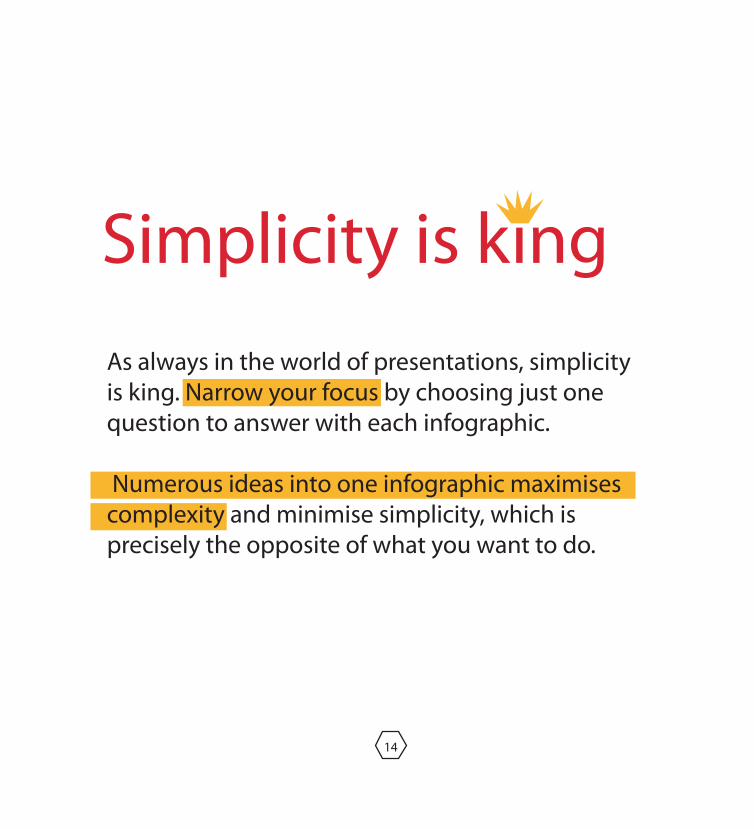
Simplicity is kingAs always in the world of presentations, simplicity is king. Narrow your focus by choosing just one question to answer with each infographic.
Numerous ideas into one infographic maximises complexity and minimise simplicity, which is precisely the opposite of what you want to do.
Infographics_book_final.pdf 16 2014/07/03 11:41 AM

15
The �ow of an infographic
Do not make viewers hunt
for information
should be intuitive.
Infographics_book_final.pdf 17 2014/07/03 11:41 AM

use
16
Less is moreMinimal text is ideal
Take out the excessive or unnecessary data
large font size
so text is easy to read.
Infographics_book_final.pdf 18 2014/07/03 11:41 AM
17
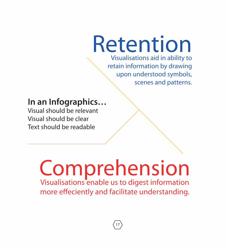
ComprehensionVisualisations enable us to digest information more e�eciently and facilitate understanding.
RetentionVisualisations aid in ability to
retain information by drawing upon understood symbols,
scenes and patterns.
In an Infographics…Visual should be relevantVisual should be clearText should be readable
Infographics_book_final.pdf 19 2014/07/03 11:41 AM

18
Improving visual storytelling.Understanding your audience.
Show an Expert understanding
of a Subject
What do you want to convey ?How will readers connect with the graphics ?
How fast will readers pick the facts ?The impact of visual on reader
Infographics_book_final.pdf 20 2014/07/03 11:41 AM

19
De�ne how stu� works. Step by step. De�ne building a sectional and �oor cover. Building plan. Science poster. Mechanical parts of a car.
people love facts, �gures and statistics.
satisfy the reader’s technical curiosty
Infographics_book_final.pdf 21 2014/07/03 11:41 AM

20
Use only two sets of fonts Upper-lower for subheads in bold font
Avoid ornamental font in graphicsBody copy in sans-serif font
Headline shouldn't be bigger than story headUse sans-serif font for smaller graphic headline
No serif font (in reverse) or over colour backgroundFonts should be from main design family
Do not compress the font to �t, no change in kerning
Text should match the visualUse minimum possible wordsNo long running storiesBullet points or short sentences Divide info in sub-sectionsHighlight �gures and factsGive holding intro once
Basic rule is black & white textAvoid colour in headlines , if possibleUse colour bands for sub-headsBody copy: Black only, if possibleNo four colour combination for small point sizeNo text colour over dark colour background
Use of fonts
Infographics_book_final.pdf 22 2014/07/03 11:41 AM

21
Use only two sets of fonts Upper-lower for subheads in bold font
Avoid ornamental font in graphicsBody copy in sans-serif font
Headline shouldn't be bigger than story headUse sans-serif font for smaller graphic headline
No serif font (in reverse) or over colour backgroundFonts should be from main design family
Do not compress the font to �t, no change in kerning
Text should match the visualUse minimum possible wordsNo long running storiesBullet points or short sentences Divide info in sub-sectionsHighlight �gures and factsGive holding intro once
Basic rule is black & white textAvoid colour in headlines , if possibleUse colour bands for sub-headsBody copy: Black only, if possibleNo four colour combination for small point sizeNo text colour over dark colour background
Amount of information
Infographics_book_final.pdf 23 2014/07/03 11:41 AM

22
Use only two sets of fonts Upper-lower for subheads in bold font
Avoid ornamental font in graphicsBody copy in sans-serif font
Headline shouldn't be bigger than story headUse sans-serif font for smaller graphic headline
No serif font (in reverse) or over colour backgroundFonts should be from main design family
Do not compress the font to �t, no change in kerning
Text should match the visualUse minimum possible wordsNo long running storiesBullet points or short sentences Divide info in sub-sectionsHighlight �gures and factsGive holding intro once
Basic rule is black & white textAvoid colour in headlines , if possibleUse colour bands for sub-headsBody copy: Black only, if possibleNo four colour combination for small point sizeNo text colour over dark colour background
Text Colour
Infographics_book_final.pdf 24 2014/07/03 11:41 AM

23
One family of coloursTry to use natural combinationsAvoid big dark empty patchesAvoid four-colour backgroundMinimum colours in small graphics
colour
Infographics_book_final.pdf 25 2014/07/03 11:41 AM

24
Strategic mapsDirectional mapsComparison‘How’ technical or scienti�c reporting
Platforms (Media) Print - Poster, News, Advertisments, Magazines, PamphletsTelevision - Technical reporting, AdvertisingInternet - Data survey reporting
usesPresenting survey dataExplaining how something works
Infographics_book_final.pdf 26 2014/07/03 11:41 AM

uses
infographics produced by Stats SA
A selection of
Infographics_book_final.pdf 27 2014/07/03 11:41 AM
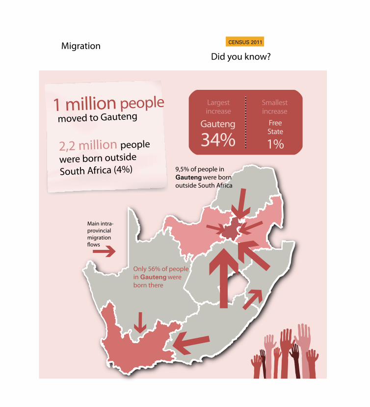
Migration
moved to Gauteng
2,2 million people
were born outside South Africa (4%)
1 million people
Did you know?
Largestincrease
Smallestincrease
FreeState
Gauteng
1%34%
Main intra-provincial migration
Only 56% of people in Gauteng were born there
9,5% of people in Gauteng were born outside South Africa
Infographics_book_final.pdf 28 2014/07/03 11:41 AM

How does my community compare?Comparing Soweto to Gauteng and National numbers
using Census 2011 dataSource: Census 2011
Sow
eto
1 271 628
51% 49%Gau
teng
Sout
h A
fric
a
51 770 560
51% 49%
Access to Electricity
93% 87%
Access to Electricity:Access to Electricity
30 28
Average age
30 29
Average age
30 29
Average age
92%
Access to Cellphones
89%
Access to TV
75%
Access to TV
81%
Access to Cellphones
94%
Access to TV
86%
Access to Cellphones
93%
of the population aged over 20 years
passed matric23% of the population
aged over 20 years passed matric
26% of the population aged over 20 years
passed matric28%
Type of HousingFormal: 78%Informal: 14%
Type of HousingFormal: 79%Informal: 19%
Type of HousingFormal: 84%Informal: 15%
12 272 263
51% 49%
Infographics_book_final.pdf 29 2014/07/03 11:41 AM

28
How does my community compare?
51% 29,8%
22%
Western Cape
Mitchell’s Plain
Cape Metro
South Africa
UnemploymentPopulation
Access to Electricity Access to Toilets ** Access to Cellphones
Education: Matric *
*people 20 years and older
**Flush or chemical toilets
Source: Census 2011
Mitchell’s Plain 27%
Western Cape 27%
Cape Metro 30%
South Africa 28,4%Western Cape 5 822 734
South Africa51 770 560
Mitchell’s Plain 90%
South Africa 89%
Mitchell’s Plain 95%
South Africa 57%
Mitchell’s Plain 99%
South Africa 85%
Western Cape 88%
Cape Metro 91%
Western Cape 89%
Cape Metro 91%
Western Cape 93%
Cape Metro 94%
26%
49% 51% 49%
24%
Cape Town 3 740 026
Mitchell’s Plain 282 042
Comparing Mitchell’s Plain to the Cape Town Metro, Western Cape and National numbersStats SA has released Census 2011 data at community level. This enables you to compare your community with provincial and national numbers.
Infographics_book_final.pdf 30 2014/07/03 11:41 AM

Use Infographics To Boost Your Credibility And Tra�cby Melanie Haselmayr, 2003.
http://www.forbes.com/sites/allbusiness/2013/08/02/use-infographics-to-boost-your-credibility-and-tra�c
“Eyes on the News”, by Dr. Mario Garcia and Dr. Pegie Stark http://www.poynter.org
Bounford, Trevor and Alastair Campbell. Digital Diagrams:How to Design and Present Statistical Information E�ectively.
New York: Watson-Guptill, 2000.http://www.poynter.org:
Why Visual Tools for Literacy Now?Research and Results
http://www.educationalimpact.com/resources/VisualTools/pdf/1_research_and_results.pdf
Learning Styles: Concepts and EvidenceHarold Pashler, Mark McDaniel, Doug Rohrer, and Robert Bjork, 2008.
http://www.psychologicalscience.org/journals/pspi/PSPI_9_3.pdf
PPT for The Institute for the Advancement of Journalism: Infographics training workshopJai Kumar Sharma of Asia Media Design ( AMD)
references
Infographics_book_final.pdf 31 2014/07/03 11:41 AM