improving observability in your observability
TRANSCRIPT

Improving Observability In Your Observability Simple tips for SREs
USENIX SREcon 2021
Dan Shoop<[email protected]>

Presentation Description
Would it surprise you to know that time series data displays date back a thousand years? It shouldn’t when you think about – and it does and it doesn’t, as we’ll see. There are good lessons we can learn from these early days of science, statistics and data collection which we can re-apply to our dashboards and other engineering presentations today.
In this session we’ll discuss some of these practical concepts which engineers can immediately utilize across various practices and at all levels to improve the visual understanding and credibility of their informational presentations of metrics and observability data.
As SREs interested in better presenting our telemetry we'll explore what practical lessons can we learn from works of Galileo, Charles Joesph Minard, and Edward Tufte as well as simple pitfalls to avoid and what we can do to improve the transfer and content density of our dashboards and other engineering graphics.

whoami
Dan Shoop
[email protected]@shoop (slack)@colonelmode (twitter)
Systems Reliability Engineering Manager
Currently managing Infrastructure Reliability at Bluecore, where I evangelize SRE best practices. Previously lead Venmo’s original SRE team, lead SRE teams at HBO, was director of Technical Operations at Sesame Workshop, and Director of Engineering at United States Technical Services.

What are we going to talk about
● Cool history about time series charts, some lessons we can learn, and critical concepts they were original developed to help express Multivariate time series plots to visually tell a narrative
● How to reduce chart-junk and a few common missteps we see presenting data displays
● Increasing data density
● The key concepts to remember for improving analytical observations in our observability data
● Discuss how we can better visually and cognitively observe information out of our observability data
● Look at some great historical examples and talk about some take aways for engineers

Exploring Historic Data Presentations

Early Usage of Time SeriesThe earliest known time series data chart is a plot of the inclinations of planetary orbits as a function of time appearing in a 10 century appendix to commentaries by A. T. Macrobius on Cicero’s In Somnium Scripionus, part of a text used in early monastery schools.
It’s the oldest known example of the attempt to show changing values graphically.
Then seemingly lost for 800 yearsPlanetary inclinations by unknown astronomer, appearing in a 10 century appendix to commentaries by A. T. Macrobius on Cicero’s In Somnium Scripionushttps://commons.wikimedia.org/wiki/File:Mouvement_des_planètes_au_cours_du_temps.png

William Playfair
It was next in 1786 that William Playfair, a “trouble making” Scottish political economist and secret agent, published a book, “The Commercial and Political Atlas”, and contrasted his “new” method of using time series data and graphical methods in visualizations vs what was previously just tabular numbers as data displays.
https://en.wikipedia.org/wiki/William_Playfair
https://www.google.com/books/edition/The_Commercial_and_Political_Atlas/dgRdAAAAcAAJ?hl=en

William Playfair43 of his 44 charts were time series
The odd chart out was the first known example of a bar chart, something he apologized for inventing because year to year data for that plot was missing so he couldn’t produce a time series chart.
He writes that he’s “skeptical” of the usability of his new bar charts as a good method for presenting data.
He also invented use of the pie chart and circle graph.
He was the first to show imports and exports on one chart over time, and shaded the area between the two to indicate the balance of trade between countries and explaining that the intersection of the lines showed a shift in favor of one country over the other.
William Playfair, The Commercial and Political Atlas, London 1786, p ixhttps://www.google.com/books/edition/The_Commercial_and_Political_Atlas/dgRdAAAAcAAJ?hl=en
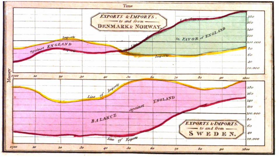

William Playfair
He had to explain this “novel approach” of time series data and using two axes to present time and money together and how time series data can be seen as composed.
“This method has struck several persons as being fallacious because geometrical measurement has not any relation to money or to time; yet here it is made to represent both.”
He combines time, proportion and amount.

Critical to Playfair’s use of time series is that his charts were multivariate, demonstrating multiple different types of values that scaled on one or two axes.
We can use two different Y-axis scales to represent related metrics or SLIs, for example, have a bar chart of one metric, the price of wheat on the right scale plotted as bars vs the wages of a tradesman as a line plot at a different scale to the left.
Playfair liked to tell socio-political stories, here that the price of wheat was effectively cheaper to the worker than at any previous time thanks to agricultural technology. Playfair teaches us to make our displays make a point about the relationship of our key metrics - for SREs our SLIs and SLOs. Data displays should tell tales.
We can also use two disparate Y-axes and plot styles, for example, to show the relationship between of request counts, as a bar chart, and latency, as a line chart in msec to demonstrate how load effects response. We’re not limited to similar scales.
“A Letter on Our Agricultural Distresses, Their Causes and Remedies”, Playfairhttps://www.google.com/books/edition/A_Letter_on_Our_Agricultural_Distresses_/Ywt4gFSlL_EC?hl=en&sa=X&ved=2ahUKEwjd5MmhsI_zAhWQKVkFHXpgA8EQiKUDegQIBBAH


Minard’s Figurative Maps
“May well be the best statistical graphic ever produced.”
— Edward Tufte“The Visual Display of Quantitative Information
Ostensibly a time series graph
Makes extensive use of multivariate data
Like Playfair, Minard’s works form narratives
It’s a wonderful exemplar of analytic design principles
https://upload.wikimedia.org/wikipedia/commons/2/29/Minard.png

Minard’s Figurative Maps
Tells a story of Napoleon’s disastrous march on Moscow in 1812
Figurative Map doesn’t start in France, it begins and ends in Lithuania at the Neman River
Google Maps estimates that the trip from the Neman River to Moscow and back would take 20 days of non-stop walking yet the campaign lasted 174 deadly days, decimating the attacking (and retreating) army.
While some historians debate the multivariate causes of the death toll, including that the Russians burned their fields to prevent the French army from foraging for food so that starvation is often attributed to their losses, Minard’s work focuses on one highly significant factor that was measurable with a metric.
https://upload.wikimedia.org/wikipedia/commons/2/29/Minard.png

Minard’s Figurative MapsMinard illustrates successive losses of the French Army as a time series and the cause of the defeat, the cold, also as time series, in a multivariate data display that incorporates six different variables to tell it’s tale
Size of army in men
Two dimensional location (latitude & longitude)
Distance traveled
Direction of army movement Temperature
Scale here starts at freezing, or zero degrees Reaumur, and drops to -30 degrees (-38C, -36F)
Time / datehttps://upload.wikimedia.org/wikipedia/commons/2/29/Minard.png

https://upload.wikimedia.org/wikipedia/commons/2/29/Minard.png Google: Wikipedia minard.png

Minard’s lessons for SREs and other engineers
Stories are best told through multivariate data presentations
Think of the SLI to SLO narrative you’re trying to convey with your dashboards and let it speak through carefully crafted multivariate metric displays
Demonstrates Tufte’s “Principles of Analytic Design”
“Beautiful Evidence”, pages 122-139
https://upload.wikimedia.org/wikipedia/commons/2/29/Minard.png

Who’s Edward Tufte?Wikipedia:
“American statistician and professor emeritus of political science, statistics, and computer science at Yale University. He is noted for his writings on information design and as a pioneer in the field of data visualization”
He wrote a treatise, the Cognitive Style of Powerpoint, or rather its lack thereof, in which he demonstrates how it contributes to poor information delivery and poor decision making, a case of which he shows lead to the Space Shuttle Challenger disaster.
Author of four of the best books on presenting data & information ● Beautiful Evidence● Visual Explanations● Envisioning Information● The Visual Display of Quantitative Information
Offers an amazing one day course, with pandemic that’s now a video seminair
See http://www.edwardtufte.com
Twitter: @EdwardTuftehttps://www.wired.com/2003/09/ppt2/

Tufte’s Principles of Analytic Design*
Comparisons
Show comparisons
Contrast differences
Here we easily see and cognitively compare the changes in the size of the army as it travels and contrast its size at the start and end of the march
https://upload.wikimedia.org/wikipedia/commons/2/29/Minard.png
*Edward Tufte offers some principles for good analytic design presentations which can be drawn from studying the Minard Map in his book “Beautiful Evidence”, pages 122-139
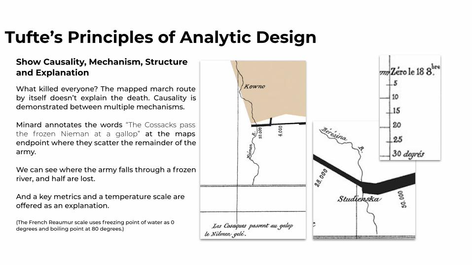
Tufte’s Principles of Analytic DesignShow Causality, Mechanism, Structure and Explanation
What killed everyone? The mapped march route by itself doesn’t explain the death. Causality is demonstrated between multiple mechanisms.
Minard annotates the words “The Cossacks pass the frozen Nieman at a gallop” at the maps endpoint where they scatter the remainder of the army.
We can see where the army falls through a frozen river, and half are lost.
And a key metrics and a temperature scale are offered as an explanation.
(The French Reaumur scale uses freezing point of water as 0 degrees and boiling point at 80 degrees.)

Tufte’s Principles of Analytic Design
Integrate Evidence
Minard uses paragraphs of words, maps, scaling flow lines, a dangling time series graphic, and comments on events.
Words, numbers, pictures, graphics, charts, tables, all belong together and complement each other when used in tandem.
How can we do this?Illustrate enlarged dashboards directly with annotations, circles, arrows, word tags, etc when using them as evidence in analysis reports & incident retrospectives. Make your o11y visually self-evident. https://upload.wikimedia.org/wikipedia/commons/2/29/Minard.png

Tufte’s Principles of Analytic Design
Multivariate Analysis
Nearly everything we look to understand is multivariate in nature
Use multivariate data all on one chart when possible instead of lone metrics plots
How can we do this?Chart multiple related variables, SLIs and metrics together, preferably in the same chart. Use left and right axes to increase the cardinality of the display when metrics have disparate scales
https://upload.wikimedia.org/wikipedia/commons/2/29/Minard.png

Tufte’s Principles of Analytic Design
Documentation
Since evidence presentation credibility is significantly dependent on the quality and integrity of the authors and sources, good documentation is an essential quality control mechanism
Thorough documentation reflects the care and craft of construction
https://upload.wikimedia.org/wikipedia/commons/2/29/Minard.png

Tufte’s Principles of Analytic Design
Documentation
Minard’s map self-documents an essential amount of important information similar to what and how we should include documentation on our dashboards, diagrams and charts, in our incident retrospectives, and analysis reports.
“Thoroughly describe the evidence. Provide a detailed title, indicate the authors and sponsors, document the data sources, show complete measurement scales, point out relevant issues.“ --Tufte
“Beautiful Evidence”, pages 122-139
https://upload.wikimedia.org/wikipedia/commons/2/29/Minard.png

Tufte’s Principles of Analytic Design
DocumentationFigurative Map of the successive losses in men of the French Army in Russian Campaign 1812-1813.
Drawn up by M Minard, Inspector General of Bridges and Roads in retirement. Paris, November 21, 1869
_______
The number is men present are represented by the widths of the colored zones at a rate of one millimeter for every thousand men; they are further written across the zones. The red designates the men who entered into Russia, the black those who leave it. ___ The information which has served to draw up the map has been extracted from the works of M M Theirs, of Ségur, of Fezensac, of Chambray and the unpublished diary of Jacob, pharmacist of the Army since October 28th. In order to better judge with the eye the diminution of the army, I have assumed that the troops of Prince Jèrome and Marshal Davoush who had been detached at Minsk and Moghilev and have rejoined around Orcha and Vitebsk, had always marched with the army.

Tufte’s Principles of Analytic Design
Documentation
What is this?A “Figurative Map”
What is the Figurative Map about?Losses in men of the French Army in the Russian Campaign
Who did the work?Drawn up by Minard
Who’s he, what’s his credentials?Inspector General of Bridges and Roads in retirement
Where and When did he draft this?Paris, November 20, 1869
Figurative Map of the successive losses in men of the French Army in Russian Campaign 1812-1813.
Drawn up by Minard, Inspector General of Bridges and Roads in retirement. Paris, November 21, 1869
_______
The number is men present are represented by the widths of the colored zones at a rate of one millimeter for every thousand men; they are further written across the zones. The red designates the men who entered into Russia, the black this who leave it. ___ The information which has served to draw up the map has been extracted from the works of M M Theirs, of Ségur, of Fezensac, of Chambray and the unpublished diary of Jacob, pharmacist of the Army since October 28th. In order to better judge with the eye the diminution of the army, I have assumed that the troops of Prince Jèrome and Marshal Davoush who had been detached at Minsk and Moghilev and have rejoined around Orcha and Vitebsk, had always marched with the army.

Tufte’s Principles of Analytic DesignDocumentationWhat are the data sources?The information which has served to draw up the map has been extracted from the works of M M Theirs, of Ségur, of Fezensac, of Chambray and the unpublished diary of Jacob, pharmacist of the Army
Assumptions? In order to better judge with the eye the diminution of the army, I have assumed that the troops of Prince Jèrome and Marshal Davoush who had been detached at Minsk and Moghilev and have rejoined around Orcha and Vitebsk, had always marched with the army.
What scales are used?● “One millimeter for every ten thousand men”● Scale of distance on the map in “common
leagues of France” shown from 0 to 30 leagues● Temperature scale: “Degrees of the Réaumur
thermometer below zero” (which closely tracks both degrees Celsius and Fahrenheit at below freezing temperatures)
Figurative Map of the successive losses in men of the French Army in Russian Campaign 1812-1813.
Drawn up by Minard, Inspector General of Bridges and Roads in retirement. Paris, November 21, 1869
_______
The number is men present are represented by the widths of the colored zones at a rate of one millimeter for every thousand men; they are further written across the zones. The red designates the men who entered into Russia, the black this who leave it. ___ The information which has served to draw up the map has been extracted from the works of M M Theirs, of Ségur, of Fezensac, of Chambray and the unpublished diary of Jacob, pharmacist of the Army since October 28th. In order to better judge with the eye the diminution of the army, I have assumed that the troops of Prince Jèrome and Marshal Davoush who had been detached at Minsk and Moghilev and have rejoined around Orcha and Vitebsk, had always marched with the army.

https://upload.wikimedia.org/wikipedia/commons/2/29/Minard.png Google: Wikipedia minard.png

Review of key concepts to remember
Use multivariate data on singular display
Use metric data to tell a story
Make comparisons with your plots
Provide documentation
https://upload.wikimedia.org/wikipedia/commons/2/29/Minard.png

Chartjunk, Distractions and Missteps
Chartjunk and Distractions
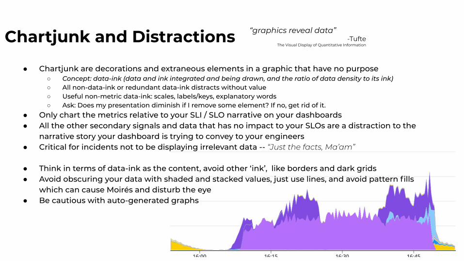
● Chartjunk are decorations and extraneous elements in a graphic that have no purpose○ Concept: data-ink (data and ink integrated and being drawn, and the ratio of data density to its ink)○ All non-data-ink or redundant data-ink distracts without value○ Useful non-metric data-ink: scales, labels/keys, explanatory words○ Ask: Does my presentation diminish if I remove some element? If no, get rid of it.
● Only chart the metrics relative to your SLI / SLO narrative on your dashboards● All the other secondary signals and data that has no impact to your SLOs are a distraction to the
narrative story your dashboard is trying to convey to your engineers● Critical for incidents not to be displaying irrelevant data -- “Just the facts, Ma’am”
● Think in terms of data-ink as the content, avoid other ‘ink’, like borders and dark grids● Avoid obscuring your data with shaded and stacked values, just use lines, and avoid pattern fills
which can cause Moirés and disturb the eye● Be cautious with auto-generated graphs
“graphics reveal data”-Tufte
The Visual Display of Quantitative Information

Missteps Bad Small Multiples: Avoid using inconsistent scales when chart elements are adjacent on dashboards
● The eye naturally follows along expecting similarity
● Here it appears at quick glance that 5xx responses are at the same magnitude as 2xx’s yet they differ by a factor of 1000x
Converse Tip: You can often take advantage of logarithmic scales to demonstrate scale differences on single chart, often revealing data relations that would otherwise get lost in the weeds at the bottom of the scale.

Missteps
Avoid missing scales and data keys when cutting and pasting or just forgetting them as relevant -- Remember the principle from the Minard of documenting measurement scales.
I frequently see posts like in slack from engineers in the heat of an incident:What metric is this charting?What’s the scale? What are the sources in the different bars?
Missing documentation calls into question credibility and changes how we mayneed to account for the data, for instance does the scale start at a non-zero value? Is that reallyIs that a big drop in the middle or just a side effect of a cropped top due to bad scaling?
If we didn’t have Minard’s temperature scale we’d not understand the truenature of the freezing army’s problem.
Improving Data Density

Galileo’s NotebooksIn 1610 in his Sidereus Nuncius, Galileo uses a sort of ASCII art, like I’m using here to express what he saw in the sky when he reports the discovery of Jupiter’s four satellites in motion around the planet. Each row is a “small multiple” expression of observations over time.
ASCII art style graphics are simple, powerful and highly survive even 7 bit email and teletypes.
* O * ** .O * * ** O ** * O *
Check out the original Sidereus Nuncius at:
https://en.wikipedia.org/wiki/Sidereus_Nunciushttps://en.wikipedia.org/wiki/Sidereus_Nuncius#/media/File:Medicean_Stars.png

Galileo’s “Data-Words”In his lectures, Edward Tufte often passes around his prized edition of a work from Galileo, which he believes invents or inspires a concept of “data-words”, in-text symbols, used inline, kinda like emojis in a sentence, yet conveying some data or observation graphically. He shares the same picture with us on his blog, linked here.
Galileo describes Saturn as seen with his telescope (my example here, again w simple ASCII art as data-words:
“The shape of Saturn is thus oOo as shown by perfect instruments, but appears thus { O } where perfection is lacking, the shape and distinction of the three stars being imperfectly seen.”
In textual contexts like this they become just like other sentence elements and words, with little distinction between the text and the imagery, improving the data density and with no distraction of breaking out into a sidelined graphic. https://www.edwardtufte.com/bboard/q-and-a-fetch-msg?msg_id=00004p

Sparklines - Data as “words”Sparklines make it easy to increase data density and use data as words.
“A sparkline is a small intense, simple, word-sized graphic with typographic resolution.”
– Edward Tufte“Beautiful Evidence”
Makes use of the principle of the eye’s ability to capture data differences in shapes at textual font sizes. Our eye can discern a lot of differences and comparisons between these two highly similar yet distinctively different fonts. These visual observations can be used to densely pack large amounts of data values into data-word sized elements.
The Quick Brown DogTimes New Roman
The Quick Brown DogPlayfair

SparklinesTufte’s blog on Sparklines has many excellent exampleshttps://www.edwardtufte.com/bboard/q-and-a-fetch-msg?msg_id=0001OR
SVG-based Sparkline with d3.jshttps://www.tnoda.com/blog/2013-12-19/
Example of Sparklines in angular.jshttp://cmaurer.github.io/angularjs-nvd3-directives/sparkline.chart.html

SparklinesSparkline style data-words allow us to implement small multiples to achieve quick multivariate analysis, to better observe differences and compare our observability data in tables, like seen here in a screenshot from my Coinbase app.
The little lines replace the need for a tables worth of individual price measurements & allow us to immediately observe differences using Tufte’s Principle of Comparisons we discussed with the Minard.

SparklinesWatch how easily they transform a typical dashboard. While colors of this tabular display does little for those red/green color blind it lacks information detail presenting only three data points for each value, requiring a color to indicate above nominal values.
Each row only is expressed as just 3 data points to describe the metric.

SparklinesA sparkline can add thousands of data values to the display and improve the cognition of the underlying information at in table size scale.
They’re available in many tools, like seen here in a Splunk where the key metric “requests” is freed from the fate of a mere current, average and max, which do little as Plairfair would say to imprint on the mind, and we get the key metric expressed as total request volume and a visual distribution of the requests over time that offers hundreds to thousands more data points than a simple three-tuple.

SparklinesThe dashboard has room for more higher density data in less space than the colored tabular values alone, increasing our observable data hundreds fold per row.
Also note that each metric, freed from a common scale and taken together as small multiples, allows us to see the pattern within the normal range for each value — something that would be lost in the weeds if it were plotted all on the same typical multivariable 2D time series plot scale.

Sparklines in Splunk index=_internal | chart count by sourcetype
https://docs.splunk.com/Documentation/Splunk/8.2.2/Search/Addsparklinestosearchresults
index=_internal | chart sparkline count by
sourcetype
index=_internal | chart sparkline count by
sourcetype

Sparklines in GrafanaGrafana has ‘singlestat’ which displays current metric value and it’s sparkline
https://docs.huihoo.com/grafana/2.6/reference/singlestat/index.html

Sparklines in GrafanaBlown up here we can see the single metric with its sparkline showing potentially hundreds of thousands of data points beneath.
Not sure what “hippies” are in this example, yet sure they’d have appreciated getting a sparkline too.
https://docs.huihoo.com/grafana/2.6/reference/singlestat/index.html

CLI sparklinesWhile most sparklines express hundreds to thousands of data-points in the space of a few characters and are the ultimate high data density inline data words, even at low data density they can be effective and easy to generate to incorporate in your text.
Sometimes sparklines can say it better than the text:
“When the Xyzzy service dropped out, on recovery we’ve observed a pattern ▃▃▃▃▃▁▁█▅▃▃ where the queued requests exceed the nominal load for a period as it caught up on work before reverting back to expected stable load pattern.”
% `brew install spark`
% spark -h
USAGE: spark [-h] VALUE,...
EXAMPLES: spark 1 5 22 13 53 ▁▁▃▂█ spark 0,30,55,80,33,150 ▁▂▃▄▂█ echo 9 13 5 17 1 | spark ▄▆▂█▁

Conclusions

Take Aways and Challenges
● Use caution not to forget scales, keys and other information on charts and graphs.... or lose them when cut/pasting
● Present adjacent data displays at similar scales
● Graphing time series data was originally used to tell a story in a way that made the data visually compelling and self evident from merely observing the visualization to support a conclusion.
○ Challenge:
Create dashboards and charts that support your SLI/SLOs as narratives

Take Aways and Challenges
● All interesting analysis of data tends to be multivariate in nature
○ Challenge:
Display multivariate data on a single chart, utilizing both left and right scales to include data of differing cardinality; integrate tables, values, sparklines
(e.g. requests by each request count volume and discrete http status codes as count rates on one axis, latency as msecs on another axis, vs time)

Take Aways and Challenges
● Consider and utilize the Analytic Design Principles when creating charts, incident retrospective reports, and dashboards
○ Make comparisons on plots between SLIs and key signals○ Integrate evidence, data, words, and charts in reports & data displays○ Document your charts, dashboards, & architectural diagrams with words
● Discard extraneous data and non-impacting signals from SLO dashboards, charts, & diagrams to avoid chart junk and distraction from the critical information narrative
● Increase data density in data displays, like you can with sparklines○ Use sparklines as data words in text○ Use sparklines to improve tabular data○ Use sparklines to create small multiples for comparisons

Thank You
Feel free to reach out with questions
@shoop on Usenix [email protected]
@colonelmode on Twitter