identifying, evaluating, and selecting indicators and …...1 identifying, evaluating, and selecting...
TRANSCRIPT

1
Identifying, Evaluating, and Selecting Indicators and Data for Tracking Land Use and Transportation-Related Trends Related to SB 375 Goals
Principal Investigator: Paul M. Ong
Co-Principal Investigator: Gian-Claudia Sciara
With Chhandara Pech, Alycia Cheng, Silvia R. González, Trevor Thomas, Sarah Strand, and Andrew Schouten
UCLA Center for Neighborhood Knowledge
March 28, 2018
CARB Agreement No. 15RD010
Prepared for the California Air Resources Board and the California Environmental Protection Agency by the University of California, Los Angeles.

2
The statements and conclusions in this report are those of the contractor and do not necessarily reflect those of the California Air Resources Board. The mention of commercial products, their source, or their use in connection with material reported herein is not to be construed as actual or implied endorsement of such products.

3
ACKNOWLEDGMENTS
This project is made possible by the generous support of the California Air Resource Board. Paul Ong served as the primary investigator and Gian-Claudia Sciara served as co-principal investigator. We want to especially acknowledge our California Air Resources Board Research contract managers Maggie Witt and Annalisa Schilla. The research team is grateful for the advice of its advisory committee:
Member Affiliation Alyssa Begley California Department of Transportation Christopher Ganson Office of Planning and Research Christopher Thornberg Beacon Economics Coleen Clementson San Diego Association of Governments Dan Sperling UC Davis/California Air Resources Board
Dave Vautin Metropolitan Transportation Commission/Association of Bay Area Governments
Elisa Arias San Diego Association of Governments Elisa Barbour UC Berkeley Garth Hopkins California Transportation Commission Heather Adamson Association of Monterey Bay Area Governments Jonathan Taylor California Air Resources Board (retired) Kate White California State Transportation Agency Kayo Lao California Department of Transportation Lauren Iacobucci California Department of Transportation (formerly) Linda Wheaton California Department of Housing and Community Development Matt Carpenter Sacramento Area Council of Governments Nicole Dolney California Air Resources Board Paul Wessen Employment Development Department Ping Chang Southern California Association of Governments Priscilla Martinez-Velez California Department of Transportation Reza Nevai California Department of Transportation Rhiannon Gonzales California State Transportation Agency Spencer Wong Employment Development Department Steven Cliff California Air Resources Board Susan Handy UC Davis Suzanne Hague California Strategic Growth Council Terry Roberts California Air Resources Board (retired) Tracey Frost California Department of Transportation
The authors are also grateful to C. Aujean Lee, and Sidi Zhao from UCLA’s Center for Neighborhood Knowledge for research and technical assistance. Finally, we would also like to thank UCLA Professors Michael Lens and Paavo Monkkonen for their invaluable inputs on the project.

4
CONTENTS
Abstract ....................................................................................................................................................... 12
Executive Summary .................................................................................................................................... 13
Background ............................................................................................................................................. 13
Objective ................................................................................................................................................. 14
Methods .................................................................................................................................................. 14
Results and Conclusions ......................................................................................................................... 15
Chapter 1 Introduction ................................................................................................................................ 18
Chapter 2 Literature Reviews: Land Use, Spatial Structure, and Travel; Measuring Accessibility ........... 21
Spatial Patterns and Travel ..................................................................................................................... 21
The 5 Ds of Travel Demand ................................................................................................................ 21
Interpretation of Land-Use Effects on VMT ....................................................................................... 27
Measuring Accessibility .......................................................................................................................... 28
Conceptual and Methodological Approaches ..................................................................................... 28
Factors That Influence Accessibility ................................................................................................... 29
Accessibility’s Influence on Other Outcomes..................................................................................... 30
Chapter 3 Process, Scope, and Analytical Approach .................................................................................. 31
Input Process ........................................................................................................................................... 31
Scope and Key Elements ........................................................................................................................ 32
Why Use 2010 as the Baseline Year? ................................................................................................. 32
Why Look at One-Year (2011) and Four-Year (2014) Changes? ....................................................... 32
At What Geographic Level Are Data Analyzed? ................................................................................ 33
What Baseline Indicators Are Evaluated?........................................................................................... 33
Analytical Approach ............................................................................................................................... 33
Constructing the Baseline ................................................................................................................... 33
Measuring Key New Development and Change ..................................................................................... 35
Chapter 4 Los Angeles County Background ............................................................................................... 37
Regional Economy and Population ......................................................................................................... 42
Travel Patterns ........................................................................................................................................ 44
Chapter 5 Baseline Indicators: Assessing Alternative Data and Measurements ......................................... 47
Assessing Street Network Data ............................................................................................................... 48
Comparing Great Circle, Manhattan, and NAVTEQ/HERE Network Distance ................................ 49
Selecting NAVTEQ/HERE Network Time ........................................................................................ 49
Discrepancies/Issues Encountered ...................................................................................................... 50

5
Housing Density...................................................................................................................................... 51
Assessing Alternative Housing Unit Sources ..................................................................................... 51
Selecting Decennial Census for Housing Units .................................................................................. 52
Calculating Housing Unit Density ...................................................................................................... 54
Evaluating Housing Unit Density against Travel Behavior ................................................................ 54
Housing Unit Density Results ............................................................................................................. 55
Access to Employment ........................................................................................................................... 57
Assessing Alternative Jobs Data Sources ........................................................................................... 57
Selecting LEHD Origin-Destination Employment Statistics .............................................................. 57
Calculating the Access to Jobs Indicator ............................................................................................ 59
Evaluating the Access to Jobs Indicator against Actual Travel Behavior ........................................... 61
Results: Access to Jobs in Los Angeles County ................................................................................. 61
Access to Retail....................................................................................................................................... 64
Assessing Alternative Retail Data Sources ......................................................................................... 64
Selecting NETS/D&B ......................................................................................................................... 65
Calculating the Access to Retail Indicator .......................................................................................... 67
Evaluating the Access to Retail Indicator against Actual Travel Behavior ........................................ 69
Results: Access to Retail in Los Angeles County ............................................................................... 70
Access to Transit (Bus) ........................................................................................................................... 72
Assessing Alternative Transit Data Sources ....................................................................................... 72
Selecting General Transit Feed Specification ..................................................................................... 73
Calculating the Access to Transit Indicator ........................................................................................ 78
Evaluating Access to Transit (Bus) Indicator against Actual Travel Behavior .................................. 81
Chapter 6 Benchmarking ............................................................................................................................ 83
Data and Methods ................................................................................................................................... 83
New Housing Units ............................................................................................................................. 83
Net Changes in Employment .............................................................................................................. 85
Net Changes in Retail Revenues ......................................................................................................... 85
General Framework for Benchmarking Los Angeles County ................................................................. 85
Results and Findings ............................................................................................................................... 88
New Housing Development .................................................................................................................... 88
Summary of Key Findings: New Housing Development Benchmarking ........................................... 93
Net Changes in Jobs ................................................................................................................................ 94
Summary of Key Findings: Net Changes in Jobs Benchmarking ....................................................... 99
Net Changes in Retail Revenues ........................................................................................................... 100

6
Summary of Key Findings: Net Changes in Retail Revenues .......................................................... 105
Conclusions ........................................................................................................................................... 106
Chapter 7 Survey of Metropolitan Planning Organization Land Use and Sustainable Community Strategy Implementation ......................................................................................................................................... 107
Overview of the Project and Findings................................................................................................... 107
Motivation ......................................................................................................................................... 107
Methods............................................................................................................................................. 107
Overarching Observations................................................................................................................. 107
The State of the Practice: Metropolitan Planning Organizations and Land-Use Tracking ................... 108
The Advantages of Statewide Monitoring ............................................................................................ 108
Study Findings ...................................................................................................................................... 109
MPO Practices for Learning about and Tracking Land Use and Development in Their Regions .... 109
Notable Practices .............................................................................................................................. 115
Metropolitan Planning Organization Development and Use of Data Systems for Land-Use Tracking 120
Notable Practices .............................................................................................................................. 123
Monitoring Barriers and Opportunities ................................................................................................. 127
Illustrative Practices .......................................................................................................................... 128
Benchmarking New Development against SCS Objective Goals ..................................................... 128
Local Land-Use Authority ................................................................................................................ 130
Dashboards ........................................................................................................................................ 131
Staff Capacity .................................................................................................................................... 131
Implications for Practice ....................................................................................................................... 131
Chapter 8 Conclusions and Recommendations ......................................................................................... 132
Summary ............................................................................................................................................... 132
Short-Term Measures and Benchmarking ........................................................................................ 132
Recommendations ................................................................................................................................. 133
Recommendations for Upscaling Monitoring System to California ................................................. 133
Recommendations for Benchmarking Changes in Jobs and Retail Revenue .................................... 133
Recommendations for Future Enhancements to Monitoring System................................................ 136
References ................................................................................................................................................. 138
Appendices ................................................................................................................................................ 145
Appendix A1: ........................................................................................................................................ 145
Functional Forms of Accessibility Measures .................................................................................... 145
Data Inputs ........................................................................................................................................ 148
Estimation Procedures....................................................................................................................... 149

7
Appendix A2: Source Tables ................................................................................................................ 149
Appendix A2 Contents ...................................................................................................................... 149
Appendix A2.1: Definitions and Operationalizations ....................................................................... 151
Appendix A2.2: Empirical Description ............................................................................................ 160
Appendix A2.3: Enabling Factors ..................................................................................................... 161
Appendix A2.4 Effects of Accessibility ........................................................................................... 163
Appendix B: Process, Scope, and Analytical Approach ....................................................................... 165
Appendix B1: Memo Re: Prioritization of Indicators ....................................................................... 165
Appendix B2: Memo Re: MPO Survey Distribution ........................................................................ 168
Appendix B3: Memo Re: Themes for MPO Survey ......................................................................... 169
Appendix C: Los Angeles County Background .................................................................................... 172
Appendix D: Baseline Indicators .......................................................................................................... 173
Appendix D1: Network Data ............................................................................................................ 173
Appendix D2: Housing Density ........................................................................................................ 177
Appendix D3: Access to Employment .............................................................................................. 178
Appendix D4: Access to Retail ......................................................................................................... 181
Appendix D5: Access to Transit ....................................................................................................... 182
Appendix E: Benchmarking and Measuring Short-Term Changes ....................................................... 185
Short-Term Changes Conceptual Formulations ................................................................................ 185
Alternative Data Sources on New Housing ...................................................................................... 187
Appendix F: Survey of MPOs ............................................................................................................... 188
Appendix F1: Survey Instrument ...................................................................................................... 188
Appendix G: Summary of Data Availability and Costs ........................................................................ 192

8
FIGURES AND TABLES Figure 1-1: The Role of Monitoring in Policy ............................................................................................ 19 Figure 3-1: Short-Term Monitoring ............................................................................................................ 32 Figure 3-2: Process for Evaluating Accessibility Measures ....................................................................... 35 Figure 4-1: LA County and Cities............................................................................................................... 37 Figure 4-2: Population Density by Tract .................................................................................................... 38 Figure 4-3: Job Density by Tract ................................................................................................................ 39 Figure 4-4: Retail Density by Tract ............................................................................................................ 41 Figure 4-5: DVMT in Los Angeles County ................................................................................................ 42 Figure 4-6: Change in Los Angeles County Employment and Personal Income ........................................ 42 Figure 4-7: Total Population, Housing Units, and Vehicles ....................................................................... 43 Figure 4-8: Total Vehicles in Los Angeles County .................................................................................... 44 Figure 4-9: Distribution of Travel by Mode in Los Angeles County.......................................................... 45 Figure 5-1: Calculating and Refining Baseline Indicators .......................................................................... 47 Figure 5-2: Housing Unit Density by Tract ................................................................................................ 56 Figure 5-3: Access to Jobs by Tracts Using Power Decay (with CNK parameter) .................................... 62 Figure 5-4: Access to Jobs by Tracts Using Simple Gravity ...................................................................... 63 Figure 5-5: Access to Retail (using inverse form) ...................................................................................... 71 Figure 5-6: GTFS Coverage ........................................................................................................................ 77 Figure 5-7: Transit Level of Service ........................................................................................................... 79 Figure 6-1: New Housing Development and Housing Unit Density .......................................................... 90 Figure 6-2: Changes in Jobs and Housing Unit Density ............................................................................. 96 Figure 6-3: Changes in Retail Revenue and Housing Unit Density .......................................................... 102 Figure 7-1: MPO Practices for Tracking Land Use and Development ..................................................... 113 Figure 7-2: Screenshots of the User Interface of AMBAG’s Project and Proposal Database .................. 126 Figure 7-3: When Bay Area Cities Will Reach Plan Bay Area 2040 Housing Targets ............................ 129 Figure 8-1: Average Distance from Shopping Location to Residential Location of Customers by Retail Density ...................................................................................................................................................... 135
Table 3-1: Data Assessment Table.............................................................................................................. 34 Table 4-1: Weekday Trip Purpose for Home-Based Trips ......................................................................... 45 Table 4-2: Commute Mode Split for Los Angeles County, 2000 and 2015 ............................................... 46 Table 5-1: Comparing Measures of Time/Distance for Their Similarity to One Another .......................... 50 Table 5-2: ACS Data Characteristics .......................................................................................................... 52 Table 5-3: Decennial Census Data Characteristics ..................................................................................... 53 Table 5-4: Comparing Alternative Measures of Density for Their Similarity to Each Other ..................... 54 Table 5-5: Comparing Density Measures to Mean Miles Traveled for Each Tract .................................... 55 Table 5-6: LEHD/LODES Data Characteristics ......................................................................................... 58 Table 5-7: Comparison of Calculated Access to Jobs Indicators ................................................................ 60 Table 5-8: Comparing Job Accessibility Indicators to Average Commute Miles Traveled ....................... 61 Table 5-9: Assessment of NETS/D&B Data ............................................................................................... 66 Table 5-10: Correlation between D&B Retail Sales and D&B Retail Employment .................................. 67 Table 5-11: Comparing Accessibility Calculated with D&B Retail Revenue versus Accessibility Calculated Using Retail Employment ........................................................................................................................... 68 Table 5-12: Comparing Functional Forms for Access to Retail Indicator .................................................. 69

9
Table 5-13: Comparing Retail Accessibility Indicators to Estimated Shopping Trip Miles ...................... 70 Table 5-14: GTFS Data Characteristics for Los Angeles ........................................................................... 73 Table 5-15: GTFS File Definitions ............................................................................................................. 74 Table 5-16: Transit Agencies with GTFS Service Data Reflected in the Access to Transit Indicator ....... 76 Table 5-17: Share of Census Tracts by Service Level ................................................................................ 80 Table 5-18: Transit Access Correlations between Service Levels .............................................................. 81 Table 5-19: Evaluating Access to Transit (Bus) Indicators against Actual Transit Usage ......................... 82 Table 5-20: Evaluating Distance Buffer Size against Actual Transit Usage for Service Level 4 ............... 82 Table 6-1: LA County Assessor Parcel Data Characteristics ...................................................................... 84 Table 6-2: Approach to Benchmarking Short-Term Measures to Baseline Indicators ............................... 86 Table 6-3: Relationship between Baseline and Short-Term Measures in Promoting SB 375 .................... 86 Table 6-4: Benchmarking New Housing Development against Housing Density Baseline ....................... 89 Table 6-5: Benchmarking New Housing against Access to Jobs Baseline ................................................. 91 Table 6-6: Benchmarking New Housing against Access to Retail Baseline ............................................... 92 Table 6-7: Benchmarking New Housing against Access to Transit Baseline ............................................. 93 Table 6-8: Benchmarking Changes in Jobs against Housing Density Baseline .......................................... 95 Table 6-9: Benchmarking Changes in Jobs against Access to Retail Baseline ........................................... 97 Table 6-10: Benchmarking Changes in Jobs against Access to Retail Baseline ......................................... 98 Table 6-11: Benchmarking Changes in Jobs against Access to transit Baseline ........................................ 99 Table 6-12: Benchmarking Changes in Retail Revenues against Housing Density Baseline ................... 101 Table 6-13: Benchmarking Changes in Retail Revenues against Access to Jobs Baseline ...................... 103 Table 6-14: Benchmarking Changes in Retail Revenues against Access to Retail Baseline .................... 104 Table 6-15: Benchmarking Changes in Retail Revenues against Access to Transit Baseline .................. 105 Table 7-1: Other Data That MPO’s Would Like to Collect (from structured interviews of MPO staff) .. 111 Table 7-2: Factors Influencing the Extent and Frequency of MPOs' Land Use and Development Tracking, Including the Direction of Influence ......................................................................................................... 114 Table 7-3: CEQA Determinants of Regional Significance ....................................................................... 116 Table 7-4: Data Fields Collected in Two MPOs' Land-Use Project Tracking Database .......................... 117 Table 7-5: Organizational and Functional Overlaps of California MPOs ................................................ 119 Table 7-6: Land-Use Data Inputs for the SCS for the Los Angeles Region MPO (SCAG) ..................... 121 Table 7-7: Land-Use Data Inputs for the SCS for the Sacramento Region MPO (SACOG).................... 122 Table 7-8: List of Opportunities and Barriers to Data Sharing from the MPO Perspective ..................... 127 Table 8-1: Assessing Ability to Interpret Baseline and Changes for SB 375* ......................................... 134 Table 8-2: Changes in Retail Benchmarked against Median Commute PMT at Job Site ........................ 134 Table 8-3: Benchmarking Changes in Retail Revenue against Retail Density ......................................... 136

10
ACRONYMS AND ABBREVIATIONS
ACS American Community Survey AMBAG Association of Monterey Bay Area Governments APCD Air Pollution Control District CARB California Air Resources Board CBD central business district CEQA California Environmental Quality Act CHTS California Household Travel Survey COG council of governments CSV comma-separated values CTC County Transportation Commission CTPP Census Transportation Planning Products D&B Dun and Bradstreet DOT Department of Transportation DVMT daily vehicle miles traveled EDD Employment Development Department EIP Environmental Improvement Program EIR environmental impact report FHWA Federal Highways Administration FMMP Farmland Mapping and Monitoring Program GC Great Circle (distance) GHG greenhouse gas GIS geographic information systems GTFS General Transit Feed Specification HCD housing and community development HU housing units HQTA high quality transit area IGR intergovernmental review LAX Los Angeles International Airport LEHD Longitudinal Employer-Household Dynamics LITA Local Index of Transit Availability LODES LEHD Origin-Destination Employment Statistics (see previous for “LEHD”) MAUP modifiable areal unit problem MH Manhattan (distance) MPO metropolitan planning organization NAICS North American Industry Classification System NETS National Establishment Time-Series NETS/D&B NETS version of Dun and Bradstreet NPTS Nationwide Personal Transportation Survey OD origin-destination PMT person miles traveled PUMS Public Use Microdata Sample QCEW Quarterly Census of Employment and Wages RHNA regional housing needs assessment RSWMP Regional Stormwater Monitoring Program RTP Regional Transportation Plan SANDAG San Diego Association of Governments SB 375 Senate Bill 375 SCAG Southern California Association of Governments SJCOG San Joaquin Council of Governments

11
SCS sustainable community strategy SLD Smart Location Database TAZ transportation analysis zone TCQSM Transit Capacity and Quality of Service Manual TDR transfer of development rights TIP Transit Incentive Program TPA transit priority area TRPA Tahoe Regional Planning Agency TWG technical working group VKT vehicle kilometers traveled VMT vehicle miles traveled

12
ABSTRACT To ensure that that SB 375-related greenhouse gas (GHG) emission reductions are achieved, it is critical to assess if real-world changes are occurring in the urban spatial structure to make it easier for Californians to stay mobile and get where they need to go without driving as much or as far. SB 375’s intent was “move the needle” in communities and regions throughout the state by facilitating better land-use and transportation planning via the creation of regional sustainable communities strategies (SCSs). This project establishes a foundation for a future, statewide system for assessing and monitoring changes in the urban spatial structure that typically result in vehicle miles traveled reductions. It achieves this by identifying, evaluating and selecting data, indicators, and indices that can be used to monitor changes relevant to SB 375.
To fully evaluate potential indicators and the data used to construct them, the researchers prototyped a monitoring system for Los Angeles County. This prototype evaluates changes in new housing units, jobs, and retailing on one-year and four-year timescales against 2010 baseline indicators – housing unit density, access to jobs, access to retail, and access to transit (bus). The results from the prototype monitoring system are mixed: some developments are and others are not consistent with SB 375 goals. While the results suggest that new housing units are located in areas with greater transit access, it also shows that housing, jobs, and retailing are becoming more geographically dispersed. This report also examines metropolitan planning organizations’ (MPOs) current practices that may be relevant to monitoring short-term changes in land use. Overall, MPOs conduct limited assessment of recent changes to land-use activities and the built environment. Where such monitoring occurs, the processes are partial and inconsistent across agencies. Consequently, it is not feasible to construct a statewide monitoring system by assembling information from MPOs. Instead, a unified statewide data system should be built on a common database, utilizing the same methodology, and a uniform set of baseline indicators and measurements of short-term changes. This report also includes recommendations for how to refine the Los Angeles prototype monitoring system for upscaling to state-level analysis.

13
EXECUTIVE SUMMARY Background
Senate Bill 375 (SB 375), also known as the Sustainable Communities and Climate Protection Act of 2008, is an integral part of California’s commitment to offset adverse climate change by encouraging coordinated regional land use and transportation to reduce greenhouse gas (GHG) emissions from automobile use. As a result, regions across California are pursuing more compact, transit-oriented development as a key reduction strategy. Monitoring real-world changes in the urban spatial structure is a critical step in achieving SB 375–related emissions reductions, with particular attention paid to changes aimed at reducing travel by automobile. Active monitoring allows for progress to be measured and can guide modifications to policy for better outcomes.
The California Air Resources Board (CARB) pursued the research described in this report as part of a broader effort to develop a system for measuring and tracking real-world GHG reductions and thereby ensuring that the state is on track to meet its goals. In the absence of directly measured vehicle miles traveled (VMT) data at small geographical scale (here, census tracts), the researchers focused on identifying indicators that reflect land use and transportation system changes that translate to per capita VMT reductions.1 CARB is considering several other potential measures of progress and success—particularly given recently passed Senate Bill 150,2 which requires CARB to track SB 375 implementation—but given limited time and resources for the research contract, this report conveys the subset of indicators that UCLA assisted with. For more information on efforts to track progress toward the goals of SB 375 via different metrics and performance measures, readers can consult CARB’s SB 375 Program webpage.3
Report Contents
This report describes and assesses the data that can be used by the State of California to develop a monitoring system to track short-term (one- to four-year) changes in the built environment. This document describes and complements the prototype monitoring system developed to examine recent real-world changes in the spatial structure of Los Angeles County.
In addition to the prototype monitoring system, this project also includes a survey of metropolitan planning organizations (MPOs) undertaken to better understand the type and characteristics of data collected at the regional level that may help to inform the development of a statewide monitoring system. The survey shows that there is wide variation in data practices, information collection, modeling and analytical methods, and application across regions, with larger MPOs generally having more extensive data systems. These variations imply substantial inconsistencies and gaps in data systems across California. As such,
1 While VMT is not directly measured on an individual vehicle basis, methods have been developed to use real-world data to estimate VMT, particularly at state and regional scales. According to the Federal Highway Administration, count-based methods are the most commonly used for forecasting VMT growth, and they are based on traffic count data collected at regular intervals via the Highway Performance Monitoring System (HPMS). While count-based estimates are useful; however, disaggregating into a smaller geographic unit of analysis may lead to a biased estimate of VMT due to poor representation of local conditions and sampling errors.
2 SB 150 requires CARB to prepare reports every 4 years that assess progress made by each metropolitan planning organization in meeting regional greenhouse gas emission reduction targets set by CARB. (This footnote updated March 2019 to reflect the final, signed version of SB 150.) 3 https://www.arb.ca.gov/cc/sb375/sb375.htm

14
comparison of indicators and performance across the regions will be a challenge with currently available MPO metrics. Overall, MPOs do not conduct extensive assessments of recent changes to land-use activities and the built environment relative to sustainable community strategies (SCSs). The Regional Transportation Planning (RTP) process focuses on projected possible future outcomes (based on models), with comparison to a baseline (which, by the end of the planning process can be at least a few years old). For both technical and nontechnical reasons, while MPOs do update baselines every four years or so, MPOs do not systematically compare real-world changes between two periods using observed data (i.e., data from the current year and baseline data from previous years). To the degree that short-term monitoring is done, there is usually no explicit, consistent, or systematic assessment of these changes relative to SCS goals and objectives. Given the conclusions drawn from the MPO survey, there is a need for a more unified statewide data system for monitoring recent, real-world changes in land-use activities and the built environment relative to SCS indicators. Due to inconsistencies and gaps in data, such a system for monitoring and analysis cannot be constructed by simply compiling existing MPO data. Additionally, there is a need for a uniform set of SB 375 indicators that can be used to uniformly evaluate and benchmark recent developments.
Objective
The objective of this project is to identify, evaluate, and select indicators, indices, and data sources that can be used to develop a system for monitoring progress toward achieving the goals of SB 375. A key mechanism toward achieving this objective is the creation of a prototype monitoring system for Los Angeles. This report documents the viability of various data sets in constructing land-use indicators, accessibility index scores, and travel behavior-related metrics. It also details the development of the Los Angeles prototype monitoring system.
What is the Los Angeles County Prototype Monitoring System?
The monitoring system measures short-term (one- and four-year) changes in new housing development, net changes in jobs, and net changes in retailing revenues relative to baselines created for housing unit density, job accessibility, retail accessibility, and transit accessibility. The monitoring system can provide insights into whether development and changes in the level of activity are moving in a direction that is consistent with the goals of SB 375 of lowering VMT and GHG. It can serve as a preliminary indicator of how the urban space is evolving. Furthermore, this assessment could be useful in evaluating policies and programs and in helping with refining and updating SB 375 related policies and programs.
Methods
What are the baseline indicators and how are they calculated?
The baseline indicator represents a pattern of land-use. This project focuses on residential, employment, shopping, and transit patterns. The baseline provides some measures of the level or intensity of these activities in small geographies (e.g. Census tracts). Land-use patterns tend to be stable, although its use can fluctuate over time. These land use patterns are connected to the built environment (e.g. buildings, major infrastructure, and other physical characteristics) and local regulations (e.g. zoning). Through input from the Advisory Committee and CARB, the following baseline indicators were selected for the monitoring system:
1. Housing unit density 2. Access to jobs 3. Access to retail 4. Access to transit
The baseline year agreed on would be 2010. This project compared several possible approaches to the calculation of the baseline indicators. Housing density is calculated simply as the number of housing units

15
in a given census tract divided by the land area of the tract. The construction of access to jobs and retail baselines relies on calculations that consider the relative weighing of opportunities near and far. The selection and refinement of formulas for these calculations draw from current literature. The following formulas/methods were chosen for this prototype because their results were most highly correlated with observed travel patterns/travel behavior outcomes (i.e., in comparisons of access index measures with commute times reported by the census, travel surveys, etc.):
• Access to jobs: Calculated using the power decay method with a parameter customized for Los Angeles, derived by the UCLA Center for Neighborhood Knowledge;
• Access to retail: Calculated using the inverse function, which weighs nearby opportunities more heavily relative to power decay function used for access to jobs; and
• Access to transit: Calculated based on the level of service provided nearby (within the neighborhood’s catchment area).
What are the short-term measures and how are they calculated?
Short-term changes represent either changes in the built environment (e.g. new residential units) or changes in the intensity of use (e.g. employment activity and shopping activity). The Advisory Committee and CARB prioritized the following short-term measures for the monitoring system:
1. New housing development 2. Changes in jobs (employment activity) 3. Changes in retailing sales (shopping activity)
Changes in new housing development, net changes in the number of jobs, and net changes in retail sales revenue are calculated for years after the baseline year (2010). For this project, one-year (2011) and four-years out (2014) from the baseline are calculated.
How Does the Prototype Monitoring System Measure Change Relative to SB 375?
Calculated changes are compared to baseline residential density, access to jobs, access to retail, and access to public transit. The system monitors changes by comparing the distribution of the one- and four-year changes against 2010 distribution. Evaluation of the distribution of these changes against the baseline can help to answer questions like the following (among others): Is new development going in to dense areas or less dense areas? Is it going into areas with high transit service or low transit service? For example, if in 2010 20 percent of housing units are located in high transit accessibility tracts but in 2014 30 percent of new housing units are going into high transit accessibility tracts, this suggests a positive outcome relative to SB 375 goals.
Results and Conclusions
The results from this project can be grouped into three broad categories relating to the project’s major objectives:
1. Assessment of key data sources and methods for construction of baseline indicators relating to VMT and GHG;
2. Measuring short-term changes and interpreting quantitative results as they relate to promoting the goals of SB 375; and
3. Examination of current practices by MPOs as they may or may not relate to monitoring short-term changes in land use and intensity of land-use activity.
The first two are based on efforts to create the Los Angeles prototype and the third is based on interviews and a survey of MPOs throughout California.

16
For constructing a monitoring system, no perfect data or set of indicators for tracking progress toward SB 375 goals exists. However, there are a number of data sets that are useful and robust enough to construct meaningful metrics. In the process of constructing the prototype, assessments of data quality indicate that the Census Decennial Enumeration, LEHD, D&B, GTFS, assessor parcel data, and NAVTEQ/HERE are usable data sets for the construction of measures of progress toward reducing VMT. The most technically and operationally feasible metrics, calculated from these data, include housing unit density, access to jobs, access to shopping, and proximity to transit stops.
Even so, we foresee two major challenges relating to data needs for upscaling. The first is the availability and consistency of data for all regions. GTFS data, for example, may not be available for smaller cities/agencies and for rural areas. Similarly, parcel data, which is kept by counties, may not be consistent across counties. The second challenge relates to costs, which will increase with upscaling. Many of the previously mentioned data sets have significant direct monetary costs associated with them. This includes D&B, assessor parcel data, and NAVTEQ/HERE. The cost of these data sets must be factored in should the California Air Resources Board (CARB) decide to continue updating the monitoring system, particularly for California, where a statewide data set will have increased recurring costs, compared to the funds required, here, for just the Los Angeles prototype.
An assessment of the Los Angeles prototype shows mixed results regarding progress toward SB 375 goals. Additionally, creating the prototype and interpreting results raised questions about what favorable and unfavorable outcomes should look like and about the association between indicators and benchmarking metrics. Table ES-1 below illustrates how some of the relationships explored were clearer than others.
Table ES-1. Relationship between Indicators and Benchmarking Metrics
Evaluation of the relationship between baseline indicators (rows) and benchmarking metrics (columns), as determined via the practice of creating and evaluating the LA County prototype.
Column 1 Column 2 Column 3 Column 4
Relationship between baseline indicators (below) and benchmarking
metrics (right): New housing units Change in jobs Change in retail
sales
Housing unit density Clear Unclear / Ambiguous Unclear / Ambiguous
Access to jobs Clear Unclear / Ambiguous Unclear / Ambiguous
Access to retail Clear Unclear / Ambiguous Unclear / Ambiguous
Access to transit Clear Clear Clear
Interpreting new housing development against baseline indicators was the most straightforward (see Column 2 in Table ES-1). In assessing whether changes were consistent in promoting SB 375 goals, the desired pattern for housing units and transit access were the most clear and intuitive—that is, it is favorable for new housing units and increases in activity (jobs and retail) to be placed in areas with high transit access. The results of the prototype do show that new housing units are being located in areas with greater transit access. Jobs have also been increasingly added to areas with high transit access. The location of more housing units and more jobs in areas with high transit accessibility both contribute positively toward meeting SB 375 goals.
A more challenging interpretation arises when considering where new housing is being located. Results of the prototype suggest that new housing is being disproportionately located in less dense, less job accessible, and less retail accessible neighborhoods. The implications of this are that more people will live in areas that are likely, on average, to generate more VMT. But this interpretation may mislead by not reflecting the

17
efforts of less dense cities to comply with housing-element law and other fair housing laws. Additionally, new development in less-centralized regions like LA could actually result in eventual improvements in jobs-housing balance, and therefore fewer miles traveled for commuting purposes. Additionally, retail-related VMT could be reduced by bringing origins closer to destinations, and more density in less dense areas could enable transit service to expand into areas as population density grows. These outcomes demonstrate that densification of lower-density tracts need not be a bad thing, though there are certainly examples where adding housing in less dense areas—particularly on greenfields—generates new and more VMT.
Other ambiguous and difficult to interpret relationships also emerged when considering changes in jobs and retail. Evaluating change against the baseline is complicated by the uncertain relationship between short-term variables and the use of jobs accessibility and retail accessibility as baselines. For example, it is unclear whether locating more jobs in areas with high job accessibility is likely to increase or decrease VMT, since the metric cannot assess if those new jobs can be served by nearby residents. Additionally, in tracking short-term changes in jobs and retail, some of the observed changes were shown to be influenced by business cycle effects, confounding the measurement of any SB 375–related shifts. The effects of the business cycle will be inherent to any measures of net changes in jobs and in retail revenue. Specifically in the area of retail revenues, the recent and rapid increase in online shopping/e-commerce further confounds any observed declines in revenue for brick-and-mortar establishments. To address the uncertain implications of using an access to jobs and access to retail baseline, we recommend that future efforts evaluate short-term changes against a different baseline, such as person miles traveled (PMT) at the job site for job-related changes, and retail density for retail-related changes. Additionally, given the number of limitations and ambiguities uncovered, although net changes in jobs and in retail revenue were the indicators preferred by the Advisory Committee during initial scoping phases, we recommend that future benchmarking use alternative variables for change, less likely to be affected by the business cycle.
Given these concerns, we recommend that CARB and the Southern California Association of Governments (SCAG), along with the LA County Metropolitan Transportation Authority (LA Metro), and other local land use and transportation agencies consider how these findings may be able to influence policy and adjust accordingly to promote better consistency between on-the-ground developments and SB 375 goals. These recommendations are also important to keep in mind for the second phase of this project whereby, with funding from Caltrans, the researchers will continue to develop indicators and metrics that can be scaled up to the whole state.
Regarding the third major area of focus, the results from the interview and literature survey of California’s 18 MPOs indicate that MPOs vary widely in terms of commitment, capacity, and activities relating to assessments of land use and development changes with respect to the SB 375. Overall, MPOs conduct limited assessment of recent changes to land-use activities and the built environment, relative to their SCSs. Where such monitoring occurs, the process is seldom explicitly, consistently, or systematically oriented toward evaluating SB 375 goals. Given these findings, any statewide picture of SB 375 progress, constructed from the land use and development monitoring information of individual MPOs would inevitably display notable inconsistencies and gaps. The findings suggest that a workable monitoring system requires a unified statewide data system. This system should be built on a common database, utilizing the same methodology and a uniform set of baseline indicators and measurements of short-term changes.

18
Chapter 1
INTRODUCTION This report describes the effort to identify, evaluate, and select indicators, indices, and data that may be used in a future statewide monitoring system. This system would be used to track changes in the built environment that reflect progress in meeting the GHG reduction goals of SB 375. This report documents the viability of data sets to be used in constructing land-use indicators, accessibility indices, and indications of travel behavior changes. It is driven by focusing on major destinations and determinants of daily automobile use, as informed by the literature, which include residential location, the location of employment opportunities and retail opportunities, and the proximity of transit service.
Provided in this report are more detailed information on the prototype monitoring system developed following the selection of indicators, indices, and data for Los Angeles County. The prototype system provides a mechanism by which researchers and others can evaluate a proposed short-term monitoring system on a smaller scale (Los Angeles County) before it is expanded statewide. The Los Angeles County prototype monitoring system examines key elements of recent real-world changes in the spatial structure of LA County to help track whether observable developments and changes are consistent with SB 375 goals.
The SB 375 monitoring system is an integral part of effective practice. Monitoring changes is a crucial step in the successful implementation of any policy. SB 375 and other policies have promoted better coordination of land use and transportation planning as one approach to reducing VMT and thereby lowering GHG emissions. This approach complements other strategies that seek to reduce GHGs and promote transportation sustainability such as improvements in vehicle technology and an increase in the adoption of more efficient vehicles. Without successful implementation strategies, even good policies can fail. Active monitoring can facilitate successful outcomes by providing critical information on progress toward goals and by helping to inform any necessary improvements or changes to policy (see Figure 1-1).
There are multiple dimensions that can be measured and various potential methods for tracking these. Because time and resources are limited, development of the prototype is based on high-priority areas of focus identified through input from an advisory committee, CARB, and Caltrans. Accessibility indicators were identified as the highest priorities for the baseline and include access to jobs, access to retail, access to transit, and housing unit density. The committee further identified short-term measures for monitoring, including new housing units, net changes in employment, and net changes in retailing revenues. The prototype captures changes in the built environment by monitoring new physical developments through new housing units, and captures changes in the intensity of activities by monitoring net changes in employment and revenue. The monitoring system focuses on short-term developments (those occurring one and four years out from the baseline line year) for small geographies (census tracts) within the urban-spatial structure, and uses the timing of initial efforts to formulate SCS plans as a starting point (baseline year of 2010).
The monitoring system complements other tools currently used by public agencies as part of implementing SCSs. For example, MPOS use large-scale regional transportation models (often in conjunction with economic and land-use models) to assess the distant future impacts of major public infrastructure investments. However, although based on some real-world empirical data, these analyses primarily use data to predict what could be expected to occur in the decades ahead. In addition to longer-term modeling, public agencies are becoming increasingly interested in near-term and project- or site-specific analyses and tools that facilitate these analyses, such as Walk Score and Citilabs’s Sugar Access tool.4 While these alternative 4 Both Walk Score and Sugar Access provide measures of accessibility—they convey how easily travelers can reach destinations in the network by different modes of transportation. Walk Score, as the name indicates, was primarily developed to provide measures of walking access for specific addresses that users specify. Currently, the company

19
tools share some commonalities and draw upon similar data sources as the prototype monitoring system discussed here, the details of their approach are not completely transparent. Included in the project of developing the Los Angeles prototype is systematic evaluation, testing, and comparison of data sources and calculation techniques for strength of relevance and validity relating to the specific use of monitoring for SB 375 goals. In the process of developing the prototype, the strengths and weaknesses of alternatives were identified and, based on these assessments, the most cost-effective, appropriate, and technically sound sources and methods were employed.
Figure 1-1: The Role of Monitoring in Policy Active monitoring can promote better policy outcomes by providing critical information
Source: UCLA Center for Neighborhood Knowledge
The remainder of this report is organized by analytic tasks, as follows: Chapter 2 provides a literature review on the conceptual framework and associated metrics of the “5 Ds of Travel Demand” and presents a survey of conceptual and methodological approaches to accessibility measures. Chapter 3 provides an overview of the process, scope, and analytical approach used to construct the baseline and the LA County monitoring system. Chapter 4 presents an overview of the geography and spatial distribution of people, jobs, and retail activity in LA County. Chapter 5 documents the construction and evaluation of 2010 baseline indicators known to be correlated with VMT and GHG- housing unit density, access to jobs, access to retail and access to transit - for the Los Angeles prototype. Chapter 6 focuses on evaluating short-term changes of new housing, net changes in jobs, and net changes in retailing revenues against the baseline indicators. The evaluation seeks to provide insights into whether short-term changes in new housing, jobs, and retailing are moving in the direction of promoting SB 375 goals. Chapter 7 presents the results of a survey of MPOs and
also provides transit and bike score measures. Citilabs’s Sugar Access tool allows users to evaluate the accessibility of destinations based on the amount of time that it takes to reach them. The tool evaluates multi-modal accessibility via the calculation of accessibility scores, and users can also evaluate how changes in the transportation system or land uses might influence accessibility.

20
local governments conducted to learn about their land-use planning activities, particularly as they relate to SCSs. Those efforts cover multiple sites in California, not only Los Angeles. Findings are included in the context of discussing their implications for upscaling for the State of California. The final chapter, Chapter 8, summarizes the major findings, maps out the next stage of the project—scaling up from Los Angeles to the State of California (funded by Caltrans and currently underway), and offers recommendations for possible future refinements.
21
Chapter 2
LITERATURE REVIEWS: LAND USE, SPATIAL STRUCTURE, AND TRAVEL; MEASURING ACCESSIBILITY Achieving a more sustainable transportation system in California is an objective of SB 375. The monitoring system will track changes in land use and in the urban spatial structure to evaluate progress toward this goal. This section includes a review of the literature that conceptualizes the links between land use and transportation as a means to reducing GHG. The literature review includes two parts. The first part presents the “5 Ds” categories of built-environment variables that link spatial patterns and travel demand, the main source of GHG emissions in California. Given that accessibility indicators were prioritized by CARB and the Advisory Committee, the second part examines the conceptual approaches to destination accessibility measures, an important component of travel demand and land-use management. Appendix A details the methodological approach of accessibility measures. Together, the two parts of the literature review provide the conceptual framework for the construction of the monitoring system. One limitation of this framework is that it does not cover issues of equity in this report, sometimes referred to as the “5 Ds + E.”
Spatial Patterns and Travel
Nationally, nearly 30 percent of GHG emissions result from transportation sources (US EPA, 2015). In California, this number is even higher. According to the California GHG Emission Inventory, the transportation sector accounted for 37 percent of GHG emissions in 2015 (California ARB, 2017). Of transportation-related GHG emissions, an estimated 75 percent come from passenger vehicles (California ARB, 2015).
Given the link between automobile use and GHG emissions, there is interest in reducing VMT to lower emissions, protect the environment, and improve public health. State agencies frequently measure VMT and make the data available to the public, though these estimates tend to only be available for large geographies, such as for cities and counties. Estimating VMT for small geographies, such as census tracts (the unit analysis for this project), takes a considerable amount of work because doing so relies on transportation models and trip origin-destination (OD) data, which are cost exorbitant and labor intensive. Additionally, this project intends to collect “on the ground,” empirical data; the use of modeled VMT data from transportation models might not paint an accurate picture of real-world travel behavior changes at small scales.
VMT is nonetheless a convenient proxy to estimate fluctuations in GHG output. Examining changes in VMT alongside other built-environment characteristics can serve as a useful indicator of progress toward GHG emissions goals.
To incorporate SCSs into their RTPs and to ensure appropriate policy objectives, MPOs need to understand how to decrease VMT within their region. Travel is primarily a means to access destinations. Characteristics of travel are thus dependent upon the spatial arrangement of potential destinations and origins, which in turn are a function of the broader built environment. It is critical that MPOs seeking to reduce VMT and associated emissions understand how changes in land use and transportation policy might affect future automobile use through their influence on the built environment. The following literature review summarizes the links between VMT, land use, and transportation, organized around a “5 D” categorization of built-environment variables.
The 5 Ds of Travel Demand
The factors that shape travel demand and subsequent behavior are complex and context dependent. The presence of multiple interrelated individual- and place-level variables complicates the process of isolating

22
specific factors of the urban environment that influence travel behavior patterns. Several decades of research, however, have produced valuable insights into the role of the built environment in generating VMT and associated GHG emissions.
Cervero and Kockelman (1997) initiated the most widely used conceptual framework for studying the relationship between travel behavior and the built environment, categorizing travel-relevant environment variables into the “3 Ds” of density, land-use diversity, and urban design features. They contend that locations with high levels of residential and employment density, diverse patterns of land-use development, and pedestrian-friendly design characteristics will encourage different travel choices than areas with very little population or employment concentration, that are dominated by a single land use, and that are designed to accommodate the private automobile.
Building on Cervero and Kockelman’s (1997) study, Ewing and Cervero (2001) apply a similar categorization to more than 50 built environment and travel behavior studies, grouping this research according to its assessment of place-level activity center design, street-level urban design, land-use density and mix, and transportation network structure. Ewing and Cervero (2001) take the additional step of focusing on travel behavior elasticities either reported directly in or derived from published results. In a subsequent, more rigorous meta-analysis, Ewing and Cervero (2010) returned to Cervero and Kockelman’s (1997) initial 3 Ds to categorize and assess an additional body of more than 50 studies, culled from a pool of more than 200 studies that estimate quantitative relationships between built environment and travel behavior variables.
In addition to combining these results into aggregate estimates of travel behavior elasticities, Ewing and Cervero (2010) expand on the prior 3 D framework by identifying two additional “Ds”—destination accessibility and distance to transit. Stevens (2017) provides an update on the 5 D meta-analysis of Ewing and Cervero (2010), incorporating recent contributions to the literature into a more statistically refined meta-analysis of the effects of the built environment on travel behavior.
The following subsections detail the specific indicators and measures of the 5 Ds, as well as their empirical ties to VMT.
Density
Development density—measured in terms of employment, population, and/or housing units per unit of area—provides an intuitive land-use predictor for VMT. As origins and destinations are brought closer together, less aggregate driving is required. Density measures also have the advantage of being easy to specify—they can be calculated from population and employment data readily available from the US Census Bureau. Not surprisingly, many studies have used residential density, employment density, or both to assess the influence of the built environment on travel patterns (Boarnet, Greenwald, and McMillan, 2008; Boer et al., 2007; Greenwald and Boarnet, 2001; Kockelman, 1997; Targa and Clifton, 2005 Zhang, 2004). While residential density and/or employment density are by far the most common density measures, some studies have used slightly altered density metrics to predict travel behavior. These include parcel density (Fan, 2007), population per mile of street (Chatman, 2009), and activity density – a combination of residential of employment density (Naess, 2006. Perhaps the study that shows the strongest link between density and VMT is that of Zhou and Kockelman (2008), who suggest that those residing in urban neighborhoods with high population densities had significantly lower VMT than their suburban counterparts.
Despite the intuitive relationship between development density and VMT, research has found that while density plays a role in predicting VMT, its effect is relatively small. Using data from the 1995 Nationwide Personal Transportation Survey (NPTS), Chatman (2003) found a clear but moderate association between density and VMT, particularly regarding the effect of workplace employment density on personal

23
commercial travel.5 While the association was quite mild—an increase of 10,000 employees per square mile resulted in a one-half-mile reduction in predicted VMT per commuter—the relationship between density and VMT remained statistically significant. Like Chatman, Pickrell and Schimek (1999) also examined NPTS data, but instead of using an employment density measure, Pickrell and Schimek assessed the connection between household VMT and residential density. Despite their use of a different density metric, Pickrell and Schimek’s results resemble Chatman’s. They predict a very mild 6 percent decrease in VMT with a doubling of residential density. Finally, in her study of the Raleigh-Durham area in North Carolina, Fan (2007) found a similarly modest relationship between parcel density and VMT. Her results showed that the addition of 10 parcels in a one-quarter-mile buffer area surrounding an individual’s residence was associated with a 0.2 percent decrease in daily VMT. Finally, the meta-analyses of both Ewing and Cervero (2010) and Stevens (2017) confirm the assessment of increased density’s significant but very modest effect in reducing VMT. The former authors estimate an average elasticity of -0.04 between household or population density and VMT and 0.00 for employment density, while the latter author estimates an elasticity for housing/population density of between -0.22 and -0.10 and for employment density of between -0.07 and -0.01. Even according to the most optimistic estimate, then, increasing the built density by 50 percent would only be expected to generate a relatively modest 11 percent decrease in VMT.
Diversity
As with density, land-use diversity is intuitively related to travel behavior. In neighborhoods with high levels of land-use diversity—specifically a wide array of land-use types mixed together—residents can meet a range of daily needs within a relatively small area, reducing their potential VMT. In neighborhoods with a narrower range of uses, each errand may require its own trip to various parts of town, hypothetically fostering greater car dependence and higher per-capita VMT.
Despite the close conceptual connection between land-use diversity and VMT, isolating the effect of neighborhood land use on travel patterns can be a challenging task. Much of this difficulty arises from the variety of metrics that have been used in empirical studies to measure land-use diversity. Perhaps the most common measure of diversity is the entropy index (Frank and Bradley, 2008; Frank et al., 2008; Kockelman, 1997; Rajamani et al., 2003; Targa and Clifton, 2005). Entropy indices yield a coefficient ranging from zero to one, and they allow researchers to assess the degree to which a range of land uses exist in proportion to each other in a given neighborhood. A coefficient of zero suggests that a single land use completely dominates an analysis zone, while a coefficient of one indicates a perfect balance between all the various land-use types being examined. A second diversity measure frequently employed in the land use and travel behavior literature is the dissimilarity index (Bento et al., 2003; Cervero and Kockelman, 1997; Kockelman, 1997; Rajamani et al., 2003). Dissimilarity indices, like entropy indices, are also measured on a zero to one scale, but they provide for a more intuitive interpretation: the value of the index is equal to the proportion of a given type of parcel that would have to be shifted between neighborhoods for all neighborhoods to have the same proportion of that parcel type. Finally, some researchers have chosen to disaggregate measures of diversity, focusing on the distance from an individual’s home to a different land use. Perhaps the most common of these is the distance from a residential to a commercial establishment, which has been used as an indicator of diversity in several studies (Cao, Handy, and Mokhtarian, 2006; Cervero and Kockelman, 1997; Handy and Clifton, 2002; Handy, Cao, and Mokhtarian, 2006; Shay et al., 2006).
A good deal of research has examined the effect of land-use diversity on VMT. Like the relationship between density and automobile use, the relationship between diversity and car travel has been shown to be rather modest in empirical analyses. Kockelman (1997), using data from the 1990 San Francisco Bay
5 According to Chatman (2009), personal commercial travel “includes shopping (over half the total), medical/dental, going out to eat, and other social/recreational trips” and “made up 39% of trips in the unweighted national sample.”

24
Area travel surveys, found perhaps the strongest connection between land-use diversity and automobile use. Employing both an entropy index and a dissimilarity index, she calculated the elasticities of vehicle kilometers traveled (VKT) to be -0.3 and -0.17, respectively. Several studies using only entropy indices found statistically significant associations between VMT/VKT and land-use diversity, however the magnitude of this association was generally far weaker than the effects found by Kockelman. For example, Chapman and Frank’s (2004) study of Atlanta, and Bento et al.’s (2003) study of Baltimore both yielded elasticities of less than -0.1 when testing the relationship between land-use mix and either VMT or VKT. In contrast to the aggregate indices used by the preceding studies, Kuzmyak et al. (2006) used a disaggregate measure—the number of “opportunities” (retail outlets, schools, restaurants, etc.) within a half mile of a home—to estimate land-use diversity and its effect on VMT in Baltimore. Despite their use of an alternative land-use diversity measure, Kuzmyak et al. found a similarly weak relationship between diversity and VMT, with the addition of 10 new opportunities being associated with just a 1 percent reduction in household VMT. Finally, combining estimates across a large body of studies, Ewing and Cervero (2010) find an elasticity of -0.09 between land-use entropy and VMT, as well as an elasticity of -0.02 between jobs-housing balance and VMT. Stevens (2017), meanwhile, derives meta-analytic estimates for the same two elasticities, finding land-use mix to have a positive elasticity of 0.11 with respect to VMT, while jobs-housing balance has an elasticity of 0.00.
Design
As was discussed previously, conceptually, the influence of density and land-use diversity on VMT is rather straightforward—higher densities and increased diversity are assumed to make personal vehicle travel less necessary, leading to reductions in VMT. In contrast to the clear conceptual relationship between density, diversity, and VMT, the connection between urban design features and automobile travel is somewhat less obvious. Undoubtedly, certain design characteristics—such as wide sidewalks, short blocks, and well-connected streets—might encourage increased pedestrian travel. However, if these attractive urban design features are not combined with nearby destinations such as shops, schools, and recreational facilities, they may encourage more walking and biking without reducing overall car travel.
Given the diversity of design elements that could potentially exist in a city, it is perhaps not surprising that a wide range of metrics have been selected to assess urban design features. One commonly used indicator is intersection density. This measures the number of intersections per unit area. A higher number of controlled or marked crossings per block can make a street’s destinations more easily accessible to pedestrians. This pedestrian-friendly network can be perceived as somewhat inhospitable to automobile use, where cars may be required to stop at each intersection. As such, a street network with frequent intersections is assumed to impact transportation patterns in favor of nonautomotive modes of travel (Badland, Schofield, and Garrett, 2008; Boarnet et al., 2008; Ewing et al., 2008; Frank et al., 2008). Closely related to intersection density is another street network–related indicator: the proportion of four-way intersections in a given area. Again, like intersection density, the high number of four-way intersections in a given area presumably promotes pedestrian movement by ensuring sidewalks are well connected for pedestrians, while forcing automobiles to stop frequently at controlled crossings (Boer et al., 2007; Cervero and Kockelman, 1997; Hess et al., 1999; Joh, Nguyen, and Boarnet, 2012; Targa and Clifton, 2005). Unlike street-network layout measures, other design indicators deal almost exclusively with pedestrian-centered design elements such as sidewalk length (Fan, 2007), sidewalk width (Cervero and Kockelman, 1997), and the presence of pedestrian plazas (Zegras, 2010).
Although the connection between design and VMT may be more intangible and less obvious, the results of Ewing and Cervero’s (2010) meta-review of the built environment/travel behavior literature suggest that the effect of urban design elements on automobile use is equal, if not greater than, the impact of density or

25
diversity.6 Yet compared to measure of density and diversity, there is a paucity of studies that directly examine how design characteristics affect VMT. This gap in the literature could be the result of a close conceptual connection between urban design features and notions of “walkability.” In other words, because short blocks and frequent intersections are often viewed as encouraging walking, the majority of studies examining urban design elements have focused on their role in mediating walking behavior, rather than on automobile use. Some studies, however, illustrate exceptions to this tendency and find strong associations between certain design characteristics and VMT.7
Destination Accessibility
Like the association between urban design and VMT, the conceptual relationship between destination accessibility on automobile travel defies simple categorization. It is not difficult to imagine how accessibility—loosely defined as the ease with which one can reach desired destinations—might serve to either encourage or discourage automobile travel. On the one hand, destinations in a sprawling city, particularly one with relatively little traffic congestion, might be highly accessible to automobile owners. This accessibility might promote a greater number of trips to these destinations and potentially increase aggregate vehicular travel. On the other hand, in dense and relatively walkable and transit-friendly neighborhoods, where destination accessibilities also tend to be high, vehicular trips are likely to be shorter, and a greater proportion of trips are likely to be taken by modes other than autos.
Given the complex and potentially contradictory effect that destination accessibility could have on VMT, the manner in which destination accessibility is defined and measured becomes particularly important, and researchers have used a variety of potential measures to characterize different levels of accessibility. Employment locations comprise by far the most prominent destination type in the accessibility literature, though some studies take account of general retail locations, food-based retail, medical centers, and so forth. A second primary distinction is between “place-based” measures, those that measure accessibility to destinations from a fixed location in space, and “people-based” measures, those that measure accessibility to destinations that individuals experience as they move through space over the course of a day. This review focuses on place-based measures of accessibility to employment and retail, as these comprise the large majority of access measures in the literature. Even within this subset of measures, however, there exists substantial diversity with respect to how destinations are aggregated into a single metric. Frequently used measures employ three primary techniques (Handy and Niemeier, 1997):
• Nearest-neighbor measures, in which accessibility is calculated according to either the travel time to the nearest potential destination or to the average travel time to some specified number of nearest destinations (e.g., the average travel time by car to the five nearest grocery stores);
• Threshold measures, in which accessibility is calculated according to the total number of potential destinations within a fixed travel time (e.g., the total job sites within a 30-minute transit trip) (Cervero and Duncan, 2003, 2006; Ewing et al., 2008);
• “Gravity” or decay measures, in which accessibility is calculated by taking the sum of all nearby destinations, with each individual destination weighted by its travel time separation (e.g., a retail outlet located in a traveler’s home neighborhood is given full weight, an outlet located in a neighborhood five minutes’ drive away is discounted by a factor of two, an outlet located in a
6 E.g., the design measures that Ewing and Cervero assess—intersection/street density and percent four-way intersection—were both found to have elasticities of -0.12 with respect to travel; Stevens (2017) estimated meta-analytic VMT elasticities for these same two variables of -0.14 and -0.06. 7 Frank and Engelke (2005), Chapman and Frank (2004), and Boarnet, Nesamani, and Smith (2003), e.g., all found elasticities of intersection density and VMT to be at or near -0.1, suggesting an important, if understudied, impact of design in curbing automobile use.

26
neighborhood 15 minutes’ drive away is discounted by a factor of 20, and so forth (Cervero and Kockelman, 1997; Kockelman, 1997; Kuzmyak et al., 2006; Lund, Wilson, and Cervero 2006; Shen, 2000).
A related accessibility measure that appears frequently in travel behavior studies (e.g., Boarnet et al., 2008; Naess, 2006; Pushkar, 2000; Zegras, 2010) is distance to a retail center or central business district (CBD). Potential accessibility measures contain many additional points of variation, such as the specific functional form of decay measures, the specification of model parameters, the travel modes for which accessibility is specified, and the time of day at which travel times and destination availabilities are observed. These details are beyond the scope of the present review.
Despite the variety of destination accessibility measures, and its ambiguous conceptual relationship with VMT, a good deal of the scholarly research on accessibility has found it to be a strong predictor of automobile travel patterns. For example, several studies using the distance from one’s residence to the nearest CBD as an accessibility metric have found substantial reductions in VMT associated with high levels of accessibility. Pushkar et al. (2000), for example, found distance to Toronto’s CBD to be the strongest built-environment predictor of VKT, with a reduction of 10 kilometers distance from the CBD being associated with almost seven fewer kilometers of household vehicle travel. Likewise, Zegras (2010) and Naess (2006) also found similarly significant reductions in VMT and VKT associated with residential proximity to the CBDs of Santiago, Chile, and Copenhagen, Denmark, respectively. Aggregating across distance to CBD measures, Ewing and Cervero (2010) and Stevens (2017) both find this operationalization of accessibility to be the strongest predictor of VMT, with the former authors estimating an elasticity of -0.22 and the latter estimating elasticities of between -0.34 and -0.63.
Other researchers, using somewhat more complex accessibility measures, have found equally strong connections between destination accessibility and automobile use. In a large-scale study of travel behavior in the San Francisco Bay Area, Cervero and Duncan (2006) measured automobile accessibility for jobs and for retail establishments by calculating the total number of opportunities within four miles of an individual’s residence. Their results suggested that a 10 percent increase in the number of accessible jobs was associated with just more than a 3 percent decrease in work-related VMT, while a 10 percent increase in the number of accessible retail destinations was associated with nearly a 2 percent decrease in shopping-related VMT. Studies that employ gravity-based measures of accessibility also predict relatively robust decreases in VMT with increased accessibility. Using automobile travel times to estimate the decreasing accessibility of destinations that are relatively further away, Cervero and Kockelman (1997) found an elasticity of -0.27 for employment opportunities and VMT. Kockelman’s (1997) results suggested a similarly strong role for job accessibility in mediating household VMT. Also using an employment-based gravity measure, her analysis yielded an elasticity of -0.31 for her accessibility index, far stronger than any of the other built-environment variables included in her model.
Finally, looking again at meta-analytic results derived by Ewing and Cervero (2010) and Stevens (2017), the former authors find that job accessibility by car has an elasticity with respect to VMT of -0.20, while job accessibility by transit has a comparable elasticity of -0.05. Stevens (2017) reaches broadly similar conclusions, finding a VMT elasticity of auto access to jobs of -0.20 and a VMT elasticity of transit access to jobs of 0.00.
Distance to Transit
Because public transportation is for many people the most reasonable substitute for private automobile travel, the theoretical relationship between last of the 5 Ds—distance to transit—and VMT is rather straightforward. For someone living near a bus stop or a rail station, public transit could be an attractive alternative to automobile travel, and thus be associated with a reduction in personal VMT. Conversely, for those without convenient access to public transportation, using intra-urban bus or rail might not be a

27
reasonable option, leaving the private car as the only viable transportation choice, particularly for medium- to long-distance trips.
Just as the conceptual relationship between distance to transit and VMT is quite intuitive, so too is the way distance to transit is typically measured. Of the studies that include proximity to public transportation as a predictor of VMT, virtually all of them use some form of network distance between an individual’s residence and the nearest transit stop. The vast majority of these studies use a simple measure of street network distance (Bento et al., 2003; Boarnet et al., 2008; Frank and Engelke, 2005; Naess, 2006; Targa and Clifton, 2005; Zegras, 2010), while one study uses a quadratic transformation to test for nonlinear associations between distance to transit and VMT (Frank et al., 2008. Vance and Hedel (2007), instead of using street network distance to transit, use minutes walked to a transit stop that, given a constant assumed walking speed, is identical to the more commonly used distance metrics. As with destination accessibility, more advanced measures of access to transit exist in the outside literature (see Bhat et al. [2005] for a conceptual review). These measures are meant to provide a more meaningful assessment of a given individual’s accessibility to transit service, and include areal assessments of transit coverage (Delbosc and Currie, 2011; McKenzie, 2013), as well as measures that take more spatially precise estimates of walking distances (Biba, Curtin, and Manca, 2014), transit service availability at different times of day (Chen et al., 2011), and service frequency (Mamun and Lownes, 2011). The travel behavior findings presented here, however, focus exclusively on simpler distance-to-nearest-stop measures.
Compared to studies investigating the impact of density, diversity, design, and destination accessibility on VMT, research exploring the relationship between distance to transit and automobile use is rather sparse. Only a handful of studies have included distance to public transportation stops as a potential predictor of VMT. The studies that have assessed this relationship, however, have generally shown a connection, with decreases in VMT in areas with high levels of access to transit. In their study of 114 different metropolitan areas in the United States, Bento et al. (2003) found statistically significant decreases in per household VMT with shorter distances to transit stops, with a 10 percent increase in distance to a transit stop being associated with an 8 percent increase in VMT. Frank et al.’s (2008) analysis of a Seattle neighborhood yielded statistically significant, yet relatively weak associations between shorter distances to the nearest bus stop and decreased VMT for neighborhood residents. Other studies that examine the effect of distance to transit focus mainly on non-US contexts. Vance and Hedel’s (2007) analysis of German travel diary data yielded a very weak, and only marginally statistically significant, association between shorter walking times to transit and reduced VMT. Likewise, studies in Copenhagen, Denmark (Naess, 2006) and Santiago, Chile (Zegras, 2010) have found similarly modest decreases in automobile use with increased access to transit. Overall, Ewing and Cervero’s (2010) meta-analysis finds an elasticity across studies of -0.05 between distance to nearest transit stop and VMT. Stevens (2017), however, finds a comparable elasticity of 0.00. The null finding here could be an indication of the relative unimportance of transit availability, though it could also reflect the crudeness of nearest-stop measures in capturing service availability. Additionally, considerations must be made for the proximity of both origin and destination to transit because the proximity of both can determine the viability of transit as an option.
Interpretation of Land-Use Effects on VMT
While a great many individual studies have assessed links between the built environment and VMT, as well as several careful meta-analyses, direct inferences about causal effects are difficult to pin down. One major challenge in doing so is to account for “neighborhood self-selection,” the biasing process in which people who are prone to certain travel behaviors differentially sort themselves into different kinds of neighborhoods (Mokhtarian and Cao, 2008). A number of studies have attempted to overcome this bias in various ways, generally finding that true land-use effects remain (in slightly attenuated form) after doing so (Cao, Mokhtarian, and Handy, 2009). A second challenge in determining the true effects of the built environment is to specify the true spatial area over which they exert influence. For instance, Boarnet and Sarmiento (1998) find substantially different effects of the built environment depending on how they

28
specify neighborhood units. Chatman (2008) argues that scales on the order of half a mile or less will have the biggest effect on walking and biking behavior, while one- to three-mile scales will have a greater effect on auto use.
These difficulties notwithstanding, there is consensus that the “5 Ds” of the built environment do exert an effect on VMT, GHG emission, and other pollutant reductions associated with harm to human health, agricultural productivity, and natural habitats. Further, there are potentially substantial cobenefits when utilizing multiple VMT-reduction strategies that span the across 5 D elements. While there may be potential difficulties in introducing radical changes to the built form of existing US cities. As such, the near-term potential for VMT reduction through land-use policy may be limited (“Driving and the built environment,” 2009). However, given the potential for greater longer-term VMT reductions, policies supporting dense, mixed-use development are a critical priority for the committee, especially given the urgency of climate change mitigation and the range of co-benefits that compact development can deliver.
Measuring Accessibility
Travel is largely a derived demand. People typically make trips not for the sake of the trip, but for the purpose of reaching a destination. As such, accessibility measures, which quantify the ease by which some set of destinations can be reached, are fundamental for transportation system analysis. In continuing the analysis of the land use–VMT relationship, this section examines more deeply the accessibility (to destinations) dimension of the broader 5 Ds framework to help inform the calculation of associated metrics.
Accessibility measures can be applied to predict travel behavior within systems or to conduct normative transportation system evaluations. In light of this importance, this review aims to provide a thorough inventory of conceptual and methodological approaches to accessibility, understanding what the measures can provide, and evaluating their specific strengths and weaknesses for transportation analysis. This evaluation considers the theoretical and empirical justifications for given accessibility measures, as well as what these measures imply for both the factors that support higher levels of accessibility and the effects that accessibility levels have on travel behavior and social and economic outcomes.
This section begins by presenting a survey of conceptual and methodological approaches to accessibility measures, including a brief historical overview, a broad summation of different conceptual frameworks, different functional forms that measures can take, different data inputs for these measures, and different estimation procedures for a given functional form and a given set of data inputs. The next major subsection covers the range of predictors that have been empirically tied to higher or lower levels of accessibility. Finally, the last subsection of this review examines the downstream social and economic effects of differential levels of accessibility.
Conceptual and Methodological Approaches
History and Motivation
Stretching back to the mid-twentieth century, transportation scholars have recognized the conceptual importance of accessibility measures, as well as the importance of developing operational measures of accessibility. For instance, Hansen (1959) provided an early account of the role that accessibility to destinations has on land-use patterns, while Wachs and Kumagai (1973) argued for the importance of access to destinations as an indicator of social well-being. In terms of formalizations of accessibility measures, Hansen (1959) specified a relatively simple formulation based on an inverse power of the travel times to a given set of destinations, while Wachs and Kumagai (1973) relied on an even simpler sum of the total destinations within a fixed travel-time threshold. Extending on early specifications of accessibility measures, Wilson (1971) provides a more technical derivation of a family of decay models, with accessibility measures calculated using the summation of destinations that are weighted by negative exponential

29
functions. Similarly, Weibull (1976) sought to add rigor to the specification of accessibility measures by deriving them from a set of axioms that he argued ought to hold for ideal measures of access, based on considerations of the respective roles that distance and destination attractiveness ought to play in determining the magnitude of such measures. See also Handy and Niemeier (1997) for a broad review of early approaches to accessibility measures.
Conceptual Frameworks
Measures of transportation accessibility are premised on the notion of capturing the relative ease with which travelers can physically reach some specified set of destinations. There are myriad potential wrinkles in the specification of such measures. Different measures exhibit several broad, categorical differences, however.
First, accessibility measures can take either a “place-based” or a “people-based” approach. In the former set of measures, a traveler’s ability to reach destinations is defined relative to a fixed point in space, oftentimes the centroid of a traffic analysis zone. In the latter, a traveler’s ability to reach potential destinations is defined relative to that traveler’s location and travel options as they move throughout their day (see Kwan, 2013, for an argument for and review of the use of people-based accessibility measures). This review will focus solely on place-based accessibility measures, due to the preponderance of such measures in the transportation literature, though see Appendix A2H for a broader account of people-based accessibility research.
Second, accessibility measures in the transportation literature can be specified with respect to either accessibility to some set of potential final destinations through a given mode or modes of travel, or to accessibility to that mode of travel. The latter measures occur almost exclusively in assessments of transit provision. For instance, assessments of bus accessibility might focus on the number of bus stops within a quarter mile of a given point, rather than on, say, the number of employments sites reachable by bus from that point. Such measures of access to transit (vs. access using transit) can be useful for several reasons. They generally depend only on service provision variables that are directly under a transit operator’s control, thereby providing a direct measure of agency performance. Additionally, such measures are typically easier to specify than are measures of access to destinations, as they require fewer informational inputs and do not require intensive travel time calculations. See Appendix A3 for a more detailed account of different measures that quantify accessibility to transit in a given location.
Various authors propose additional conceptual taxonomies. Alam et al. (2010) group accessibility measures according to a four-category typology: distance-based measures, cumulative opportunity measures, utility-based measures, and gravity-based measures. Geurs and van Wee (2004) assess measures according to the presence of four components: a land-use component, a transportation component, a temporal component, and an individual component. Páez et al. (2012) specify a general, binary distinction between “positive” measures, which tend to be based on empirical assessments of behavior, and “normative” measures, which tend to be based more on the theoretical valuations of researchers. Cascetta et al. (2013) meanwhile split accessibility measures into eight categories, based on binary splits along three dimensions: behavioral versus nonbehavioral (corresponding roughly to whether measures incorporate activity-based destination selection mechanisms), attractiveness-/cost-based versus opportunity-based (corresponding to whether measures take account of different levels of utility conferred by different destinations), and disaggregate versus aggregate (corresponding to whether measures are specified for active, individual travelers or aggregated for static geographies). Finally, Xu et al. (2016) specify a four-part taxonomy, based on binary distinctions between “potential” versus “realized” measures of accessibility and spatial versus aspatial.
Factors That Influence Accessibility

30
Accessibility researchers have identified a number of policy-relevant factors that predict higher or lower levels of access to destinations, either in a directly causal sense (e.g., the effects of road infrastructure) or in a correlative sense that has strong implications for social well-being (e.g., the distribution of accessibility in low-income communities of color). In terms of causal effects, access to different modes of transportation—namely automobiles—have been shown to have enormous effects on access to destinations, far outstripping intraurban variations in neighborhood characteristics (Grengs, 2010; Kawabata and Shen, 2006; Shen, 2001). In terms of the built environment, however, research at the metro level shows that greater density is a much stronger predictor of higher levels of accessibility than is higher average travel speeds (Grengs et al., 2010; Levine et al., 2012). Along these lines, at intraurban levels, new developments tend to increase accessibility, with the increased proximities outweighing potential travel slowdowns (Levine, Merlin, and Grengs, 2017). Case studies have also shown the potential for meaningful increases in accessibility through mobility-enhancing infrastructure, however (Fan, Guthrie, and Levinson, 2012).
In terms of social distributions of accessibility, research is mixed. Spatially, low-income neighborhoods and neighborhoods of color at times enjoy higher place-level accessibilities (i.e., locations where geographic accessibility to destinations is high), though far from uniformly (Chen and Akar, 2017; Delbosc and Currie, 2011; El-Geneidy et al., 2016; Grengs, 2010, 2012; Hu, 2015; McKenzie, 2013). Rather than being a result of place of residence, social disparities in accessibility levels are likely to have more to do with modal access (i.e., residences may be located centrally; however, access is hampered if convenient access to destinations requires an automobile trip and access to a private vehicle is unreliable) (Grengs, 2010, 2014).
Accessibility’s Influence on Other Outcomes
Just as accessibility has a number of socially and behaviorally relevant predictive factors, accessibility is also predictive of meaningful, downstream effects. These effects range across a variety of behavioral, social welfare, and economic outcomes. First, in terms of behavior, several rigorous meta-analyses have found a modest relationship between greater employment accessibility from one’s home neighborhood and lower rates of car use (Ewing and Cervero, 2010; Stevens, 2017). Additionally, research has shown the ratio of transit access to auto access to be a significant predictor of transit use (Owen and Levinson, 2015).
Moving from behavioral predictors to predictors of substantive individual outcomes, accessibility levels can also exert significant influence on job prospects (Blumenberg and Ong, 1998; Hu, 2014; Korsu and Wenglenski, 2010; Ong and Blumenberg, 1998; Parks, 2004; Raphael, 1998). Beyond relatively narrow employment outcomes, some research has sketched out broader effects of accessibility on interaction potentials and social exclusion (Currie et al., 2010; Farber et al., 2015). In more abstract utilitarian terms, higher levels of accessibility can be linked to greater “surplus” on the part of travelers (e.g., time savings when less time is spent on transportation to and from places) (Geurs et al., 2010). Additionally, some research shows higher accessibility levels to correspond to higher housing and residential land values, as well as stronger retail agglomerations (Giuliano, Gordon, and Park, 2010; Iacono and Levinson, 2015; Piovani, Zachariadis, and Batty, 2016). The substantive importance of accessibility is reflected in its widespread, if imperfect, inclusion as a key metric in metropolitan transportation plans (Boisjoly and El-Geneidy, 2017).
31
Chapter 3
PROCESS, SCOPE, AND ANALYTICAL APPROACH This section documents the process by which the scope and analytical approach for the research project was finalized. The finalized scope and approached were decided on through input from the Advisory Committee (described in further detail in the following text) and from CARB. The process of prioritizing the issues and analytical approach was particularly important because there are various directions in which these could be explored and addressed.
In terms of scope, the project includes the construction of a 2010 baseline and a system of analysis for monitoring new development and other changes at the one- and four-year time scales. The analysis focuses on the distribution of new housing units, changes in jobs, and changes in retail revenues across areas ranked by housing unit density, access to jobs, access to retail, and access to transit. The final products for this project include a data set for the prototype monitoring system, focused on Los Angeles, and this Final Report, which includes assessments of data sources and which describes the process and methods used to construct the monitoring system.
Input Process
The Los Angeles prototype monitoring system represents a prioritized set of focus areas for evaluating changes relating to the SB 375 goals of VMT and GHG reductions from personal automobiles. Given the breadth of potential directions and areas of focus, and given limited time and resources for the CARB project contract, the UCLA Center for Neighborhood Knowledge established an Advisory Committee to provide recommendations on indicators, indices, data sets, and analytical methods. Five Advisory Committee meetings were convened in Sacramento on the following dates: December 9, 2015; February 8, 2016; May 16, 2016; September 9, 2016; and December 5, 2016. The Advisory Committee was comprised of individuals from state agencies directly involved in SB 375 implementation, large and small MPOs, academic and professional experts, and others. Members participated in person or through online meeting platforms. The meetings provided regular opportunities for the research team to report on progress and for the Advisory Committee members and project funders to provide guidance on the direction and methods of research. Additionally, UCLA attended separate consulting meetings with individuals at CARB and Caltrans.
UCLA solicited recommendations from the Advisory Committee on potential indicators relating to VMT and GHG emissions (see Appendix B). The research team compiled, evaluated, and incorporated these recommendations into a comprehensive list of indicators. The UCLA team also compiled a list of metrics, indicators, and performance measures, based on a review of literature on assessing the “5 Ds of Travel Demand” (density, diversity, distance to transit, destination [jobs and retail] access, and design). This inventory draws on peer-reviewed literature; reports from Caltrans, the Federal Highways Administration (FHWA), and Transportation4America; and from completed RTPs and SCSs, which contain MPO-specified performance measures. Combined with recommendations from the Advisory Committee, the researchers sent this extensive list to CARB for the agency to prioritize indicators relating most closely to SB 375 program goals.
At the end of this process, housing unit density and accessibility indicators (to jobs, retail, and transit) were identified as the highest priorities for the construction of the baseline. This 2010 baseline serves as the starting point against which changes are evaluated. For short-term changes to measure, the group prioritized new housing units, net changes in employment, and net changes in retail revenue. Given these selections, the prototype captures changes in the built environment by tracking new housing units (physical developments), and captures changes in the intensity of activities by monitoring net changes in employment and revenue.

32
Figure 3-1: Short-Term Monitoring Short-term monitoring includes an assessment of changes one year out from the 2010 baseline and four years out from the 2010 baseline
Source: UCLA Center for Neighborhood Knowledge
Scope and Key Elements
The monitoring of new developments and of changes in the short term is guided by findings from the assessment of available and viable data. The system includes a baseline, representing the existing overall characteristics of the studied geography at the 2010 baseline year, and includes one-year (2010–11) and four-year (2010–14) changes (Figure 3-1).
Why Use 2010 as the Baseline Year?
The year 2010 was selected as the baseline year, in agreement with CARB, for two primary reasons: (1) 2010 marks a midway point between the passage of SB 375 in 2008 and the release of the first SCS plans in 2012; and (2) the 2010 baseline year allows for the use of the 2010 Decennial Census, which makes available data down to the census block level (necessary for construction of local proximity to transit, which is described in later sections). The 2010 year captures the state of the environment following the passage of SB 375 in 2008 and before the adoption and implementation of plans in 2012. The added advantage of a 2010 baseline is that it coincides with the geographic census boundaries for many data sets used in the construction of the monitoring system—that is, 2010 census tract boundaries are the current boundaries for all data including and after 2010, allowing for smoother comparisons between 2010 and more recent years (2011 and 2014 for short-term changes); using a baseline constructed from data prior to 2010 would require transformation or reallocation of data from old boundaries (2000 census tract boundaries) for comparison to more recent data (which would be in 2010 boundaries).
Why Look at One-Year (2011) and Four-Year (2014) Changes?
SCSs lay out a long-range vision of how housing and transportation plans will support regional GHG emission reductions. SB 375 specifically mandates the creation of SCSs, with a requirement for updates

33
every four years. Measuring a one-year change captures very near-term shifts; while measuring four-year changes coincides with the SB 375–mandated update schedule.
At What Geographic Level Are Data Analyzed?
The primary small geography for calculating accessibility and for reporting figures is the census tract. For transit accessibility, data are calculated for the smaller block-level geography. These are standardized geographic units, for which data is available nationwide. Additionally, geospatial data for census tracts are generally publicly available and easily accessible.
What Baseline Indicators Are Evaluated?
1. Housing density—represents residential origin points for trips; describes the location of new housing development
2. Accessibility to jobs—provides information about the location of jobs and length of work commutes (a major part of routine travel)
3. Accessibility to retail—provides information about the location of commercial activity and length of shopping trips (another major part of routine travel)
4. Accessibility to transit—illuminates opportunities for using alternative modes of transportation (substituting for drive alone car trips) and for providing mobility options for lower income individuals and households
Analytical Approach
Constructing the Baseline
Construction of the Los Angeles prototype requires a considerable amount of data and calculation. Yearly, short-term monitoring requires that data sources satisfy a few key requirements. The team evaluated potential data sets for their consistency and robustness relating to temporal (i.e., are data released frequently enough?) and geographic coverage (i.e., are data available for all Los Angeles, down to the census tract level?). The team also considered the direct (monetary) and indirect (time and labor) costs relating to each data source. Table 3-1 summarizes key considerations and guided the assessment process (see Appendix G) for complete tables for each data set assessed).

34
Table 3-1: Data Assessment Table8 DATA CHARACTERISTICS
Primary Purpose Does the data set contain information that matches the project needs?
Primary Users Who are the primary users of the data (e.g. transporation planners, reseachers, etc.)
Data Source Who are the providers and how accessible? Are the data available to UCLA and ARB and at what cost?
Aggregated/Microlevel Data What is the level of aggregation (e.g. individual records, sub-tract summary, tract summary, or larger than tract summary?
Sample Size for Monitoring System (n)
How many records captured in the data (all Los Angeles census tracts, all commercial establishments, etc.)?
DATA QUALITY
Validity and Reliability Are data reported in detail (e.g. crude category versus continuous multi-digit)?
Accuracy and Precision Does the data contain inherent error (reporting error, recording error)? Are there biases in the data?
GEOGRAPHIC Coverage Are data available for all Los Angeles?
Resolution (Unit of Analysis) Are data available at the census tract level or can it be disaggregated or aggregated into tracts ?
Temporal (In)consistency Are variables and geographic boundary the same across time?
Layer (In)consistency Do boundaries align (e.g. redefine boundary, sylizing boundary)
PRIVACY ISSUES
Confidentiality Are there issues requiring special clearance for researchers?
Public Use Are data readily available to the public?
Legal Restrictions Are there limits on who has access and how data can be used?
TEMPORAL
Date Released When was the data released? What is the release schedule for this data?
Reporting Period What years does this data cover?
Timeliness What is the current year of data available? How often are data released?
8 Also cost assessment, see Appendix G for cost breakdown of primary data used for the monitoring system
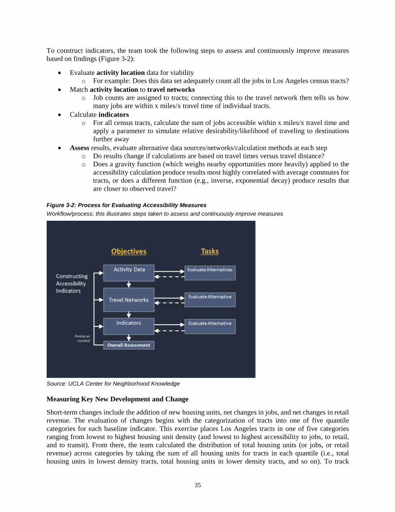
35
To construct indicators, the team took the following steps to assess and continuously improve measures based on findings (Figure 3-2):
• Evaluate activity location data for viability o For example: Does this data set adequately count all the jobs in Los Angeles census tracts?
• Match activity location to travel networks o Job counts are assigned to tracts; connecting this to the travel network then tells us how
many jobs are within x miles/x travel time of individual tracts. • Calculate indicators
o For all census tracts, calculate the sum of jobs accessible within x miles/x travel time and apply a parameter to simulate relative desirability/likelihood of traveling to destinations further away
• Assess results, evaluate alternative data sources/networks/calculation methods at each step o Do results change if calculations are based on travel times versus travel distance? o Does a gravity function (which weighs nearby opportunities more heavily) applied to the
accessibility calculation produce results most highly correlated with average commutes for tracts, or does a different function (e.g., inverse, exponential decay) produce results that are closer to observed travel?
Figure 3-2: Process for Evaluating Accessibility Measures Workflow/process; this illustrates steps taken to assess and continuously improve measures
Source: UCLA Center for Neighborhood Knowledge
Measuring Key New Development and Change
Short-term changes include the addition of new housing units, net changes in jobs, and net changes in retail revenue. The evaluation of changes begins with the categorization of tracts into one of five quantile categories for each baseline indicator. This exercise places Los Angeles tracts in one of five categories ranging from lowest to highest housing unit density (and lowest to highest accessibility to jobs, to retail, and to transit). From there, the team calculated the distribution of total housing units (or jobs, or retail revenue) across categories by taking the sum of all housing units for tracts in each quantile (i.e., total housing units in lowest density tracts, total housing units in lower density tracts, and so on). To track

36
changes, these calculations were repeated using new housing units, net change in jobs, and net change in revenue. The relative distribution of these changes across quantile categories can be compared to the baseline to track the rate at which new developments and other changes are occurring in each quantile group. For example, if the distribution of new housing units is heavily located in high and highest density tracts, this might be characterized as a positive contribution toward SB 375 goals. These evaluations are discussed in further detail in Chapter 6.

37
Chapter 4
LOS ANGELES COUNTY BACKGROUND This section provides an overview of Los Angeles, the region for which the prototype monitoring system is developed and upon which all analysis is based. It begins with an introduction to the geography and population of LA County. This includes a description of the spatial distribution of people, jobs, and retail revenues (representing the level of retail activity occurring) across LA County. In general, people and activities (jobs and retail) are most concentrated in the urbanized areas of Los Angeles, with areas of highest density in and around Downtown, near the coasts, and along major corridors (e.g., Wilshire Corridor running between Santa Monica and Downtown Los Angeles). The last part of this introduction focuses on transportation and travel-related trends across time. Over time, the region has been growing in population and in vehicles. Moreover, the number of single drivers has been increasing faster than the rates for other modes of transportation. The changing nature of modal choices amid larger demographic and economic changes points to the complexity of changing travel and points to possible issues in monitoring short-term changes.
Los Angeles is in Southern California. It is home to approximately 10 million people and covers a land area of approximately 4,000 square miles (Census Quickfacts, 2016). LA County contains 88 cities (Figure 4-1) and is served by at least 70 separate transit agencies.
Figure 4-1: LA County and Cities Los Angeles includes 88 cities and many unincorporated areas

38
Tracts with the highest population are concentrated in areas in and around Downtown Los Angeles, along the hills, and in some coastal areas (Figure 4-2). The most sparsely populated tracts are those lying in less urbanized tracts around forest and wilderness land and in the large tracts in the northern parts of LA County. These tracts, in general, tend to have the lowest population, jobs, and retail density. Subsequent maps exclude these areas and focus on the more highly urbanized areas of Los Angeles.
Figure 4-2: Population Density by Tract 9 Downtown Los Angeles, along the hills, and coastal areas have the highest population density; less urbanized tracts around forest and wilderness lands and those in northern parts of Los Angeles are more sparsely populated
9 Lowest Density = <5,274 persons/sq mi; Low = 5,274 to 8,894 persons/sq mi; Middle = 8,894 to 12,960 persons/sq mi; High = 12,960 to 19,512 persons/sq mi; Highest = >19,512 persons/sq mi
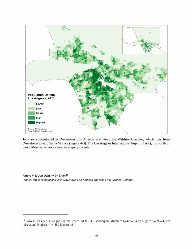
39
Jobs are concentrated in Downtown Los Angeles and along the Wilshire Corridor, which runs from Downtown toward Santa Monica (Figure 4-3). The Los Angeles International Airport (LAX), just south of Santa Monica, serves as another major job center.
Figure 4-3: Job Density by Tract10 Highest job concentrations lie in Downtown Los Angeles and along the Wilshire Corridor
10 Lowest Density = < 651 jobs/sq mi; Low = 651 to 1,412 jobs/sq mi; Middle = 1,412 to 2,479; High = 2,479 to 4,889 jobs/sq mi; Highest = >4,889 jobs/sq mi

40
For retail density, major retail activity follows a similar pattern to the distribution of jobs (see Figure 4-4). Retail density is calculated as total revenue for the tract divided by tract land area. Downtown Los Angeles and the Wilshire Corridor stand out as having tracts with the highest retail density, while less urbanized tracts make up those with the lowest retail density.

41
Figure 4-4: Retail Density by Tract11 Similar to patterns for job density, Downtown Los Angeles and the Wilshire Corridor stand out as having tracts with the highest retail density
Given the spatial distribution of people compared to destinations, Los Angeles County residents cumulatively travel many millions of miles daily. This number has been on the rise since 2010. In 2014, daily vehicle miles traveled (DVMT) reached just more than 217 million miles (Figure 4-5). Of the approximately 4.5 million workers in Los Angeles County, 73 percent drive alone while only 7 percent use transit (2011–15 American Community Survey 5-Year Estimates).
11 Lowest Density = < $11 million/sq mi; Low = $11m to $30m/sq mi; Middle = $30m to $59m/sq mi; High = $59m to $131m/sq mi; Highest = > $131m/sq mi (dollar values are adjusted to 2013 dollars)
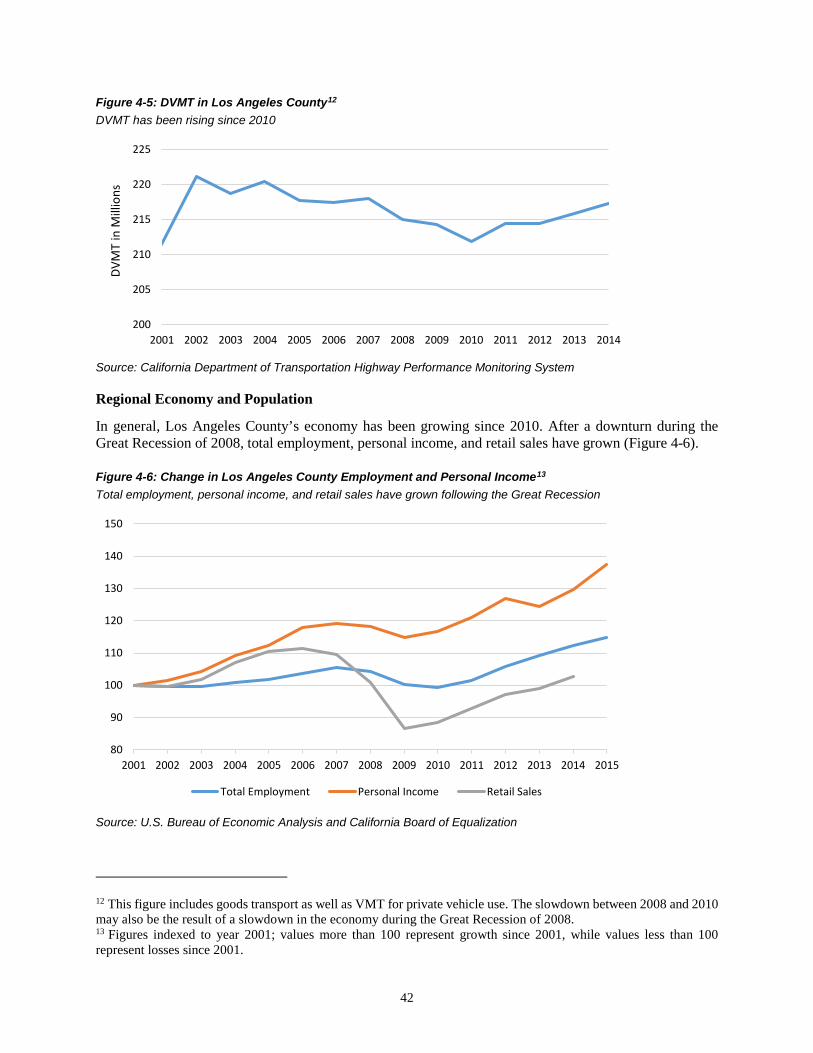
42
Figure 4-5: DVMT in Los Angeles County12 DVMT has been rising since 2010
Source: California Department of Transportation Highway Performance Monitoring System
Regional Economy and Population
In general, Los Angeles County’s economy has been growing since 2010. After a downturn during the Great Recession of 2008, total employment, personal income, and retail sales have grown (Figure 4-6).
Figure 4-6: Change in Los Angeles County Employment and Personal Income13 Total employment, personal income, and retail sales have grown following the Great Recession
Source: U.S. Bureau of Economic Analysis and California Board of Equalization
12 This figure includes goods transport as well as VMT for private vehicle use. The slowdown between 2008 and 2010 may also be the result of a slowdown in the economy during the Great Recession of 2008. 13 Figures indexed to year 2001; values more than 100 represent growth since 2001, while values less than 100 represent losses since 2001.
200
205
210
215
220
225
2001 2002 2003 2004 2005 2006 2007 2008 2009 2010 2011 2012 2013 2014
DVM
T in
Mill
ions
80
90
100
110
120
130
140
150
2001 2002 2003 2004 2005 2006 2007 2008 2009 2010 2011 2012 2013 2014 2015
Total Employment Personal Income Retail Sales
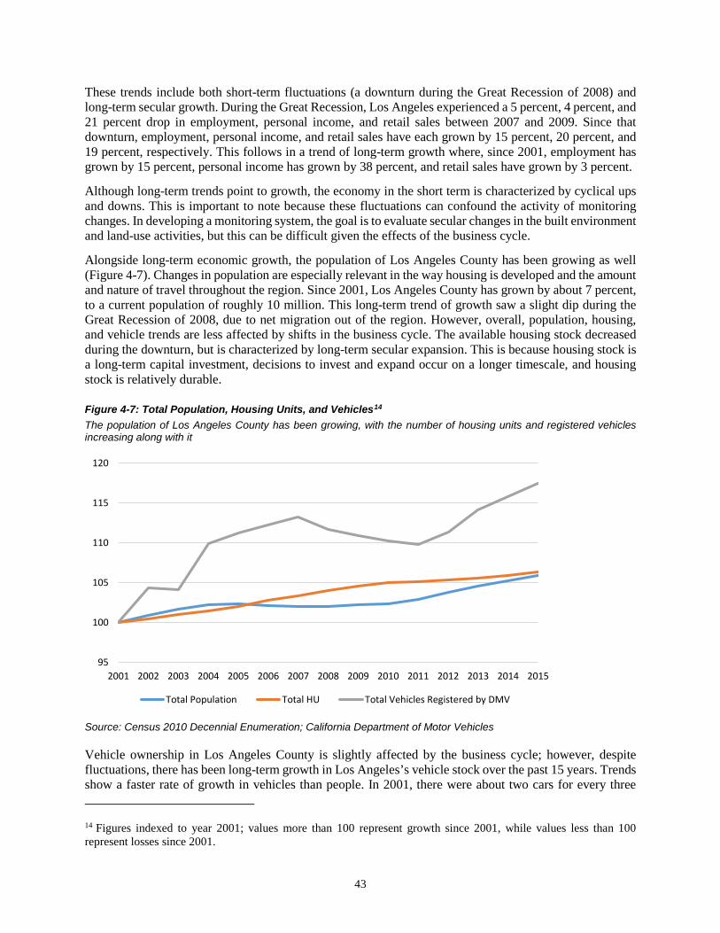
43
These trends include both short-term fluctuations (a downturn during the Great Recession of 2008) and long-term secular growth. During the Great Recession, Los Angeles experienced a 5 percent, 4 percent, and 21 percent drop in employment, personal income, and retail sales between 2007 and 2009. Since that downturn, employment, personal income, and retail sales have each grown by 15 percent, 20 percent, and 19 percent, respectively. This follows in a trend of long-term growth where, since 2001, employment has grown by 15 percent, personal income has grown by 38 percent, and retail sales have grown by 3 percent.
Although long-term trends point to growth, the economy in the short term is characterized by cyclical ups and downs. This is important to note because these fluctuations can confound the activity of monitoring changes. In developing a monitoring system, the goal is to evaluate secular changes in the built environment and land-use activities, but this can be difficult given the effects of the business cycle.
Alongside long-term economic growth, the population of Los Angeles County has been growing as well (Figure 4-7). Changes in population are especially relevant in the way housing is developed and the amount and nature of travel throughout the region. Since 2001, Los Angeles County has grown by about 7 percent, to a current population of roughly 10 million. This long-term trend of growth saw a slight dip during the Great Recession of 2008, due to net migration out of the region. However, overall, population, housing, and vehicle trends are less affected by shifts in the business cycle. The available housing stock decreased during the downturn, but is characterized by long-term secular expansion. This is because housing stock is a long-term capital investment, decisions to invest and expand occur on a longer timescale, and housing stock is relatively durable.
Figure 4-7: Total Population, Housing Units, and Vehicles14 The population of Los Angeles County has been growing, with the number of housing units and registered vehicles increasing along with it
Source: Census 2010 Decennial Enumeration; California Department of Motor Vehicles
Vehicle ownership in Los Angeles County is slightly affected by the business cycle; however, despite fluctuations, there has been long-term growth in Los Angeles’s vehicle stock over the past 15 years. Trends show a faster rate of growth in vehicles than people. In 2001, there were about two cars for every three 14 Figures indexed to year 2001; values more than 100 represent growth since 2001, while values less than 100 represent losses since 2001.
95
100
105
110
115
120
2001 2002 2003 2004 2005 2006 2007 2008 2009 2010 2011 2012 2013 2014 2015
Total Population Total HU Total Vehicles Registered by DMV
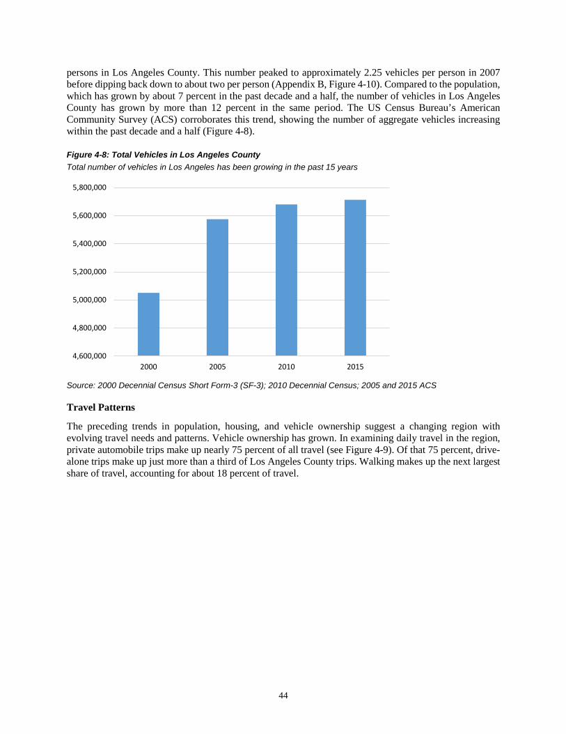
44
persons in Los Angeles County. This number peaked to approximately 2.25 vehicles per person in 2007 before dipping back down to about two per person (Appendix B, Figure 4-10). Compared to the population, which has grown by about 7 percent in the past decade and a half, the number of vehicles in Los Angeles County has grown by more than 12 percent in the same period. The US Census Bureau’s American Community Survey (ACS) corroborates this trend, showing the number of aggregate vehicles increasing within the past decade and a half (Figure 4-8).
Figure 4-8: Total Vehicles in Los Angeles County Total number of vehicles in Los Angeles has been growing in the past 15 years
Source: 2000 Decennial Census Short Form-3 (SF-3); 2010 Decennial Census; 2005 and 2015 ACS
Travel Patterns
The preceding trends in population, housing, and vehicle ownership suggest a changing region with evolving travel needs and patterns. Vehicle ownership has grown. In examining daily travel in the region, private automobile trips make up nearly 75 percent of all travel (see Figure 4-9). Of that 75 percent, drive-alone trips make up just more than a third of Los Angeles County trips. Walking makes up the next largest share of travel, accounting for about 18 percent of travel.
4,600,000
4,800,000
5,000,000
5,200,000
5,400,000
5,600,000
5,800,000
2000 2005 2010 2015

45
Figure 4-9: Distribution of Travel by Mode in Los Angeles County Private automobile trips dominate, with solo drivers making up more than one-third of trips
Source: The Safe Routes to School National Partnership Using 2009 NHTS15
In a breakdown by mode, the private automobile is preferred over all other modes. An examination of weekday trips by purpose shows that work, shopping, and school trips make up a majority of weekday trips (Table 4-1). School trips are not covered in the Los Angeles monitoring system; however, these trips might be included in future enhancements to the monitoring system.
Table 4-1: Weekday Trip Purpose for Home-Based Trips Work, shopping, and school trips make up a majority of weekday trips
Trip Purpose Total Weekday Trips % of Total Weekday Trips
Home Based to Work 10,047,297 28% Home Based to School 4,972,327 14% Home Based to Shop 4,158,094 12% Home Based to Social/Recreation 3,704,547 10% All Other Home Based 12,641,464 36%
TOTAL HOME-BASED 35,523,729 100%
Source: 2000 Post-Census Regional Travel Survey as analyzed by LSA Associates16
Work trips are a major trip category for analysis, as these are trips taken daily and consistently by many. Overtime, the work commute has been changing. Drive-alone trips have grown at a faster rate than nearly all other commute modes (Table 4-2; biking has grown at the fastest rate but makes up the smallest share of commute modes). The proportion of solo drivers increased, with drive-alone commutes accounting for nearly 75 percent of commuters in 2015. At the same time, public transportation has grown, but not by nearly as much. The paltry 14.5 percent growth in transit ridership, compared to the much higher growth in
15 http://travelbehavior.us/Nancy-pdfs/Travel%20in%20-%20LA%20County.pdf 16 ftp://ftp.ci.missoula.mt.us/DEV%20ftp%20files/Transportation/MPO/MODEL_ENHANCEMENT/RFP/Proposals/LSA/Reference/Model%20Documentation/SCAG%20Weekend%20Model/TM6_SCAG_TripPurpose_May08.pdf
17.6%
5.0%1.4%
1.2%
33.8%
41.1%
74.9%
Walk Any Transit Bike Other Drive Alone Shared Ride

46
solo drivers, is not a desirable outcome, from a SB 375 perspective. The remaining modes create a mixed picture of SB 375 outcomes. Walking, biking, and working from home have increased. The rate of biking nearly doubled between 2000 and 2015; however, bike trips still account for less than 1 percent of total trips.
Table 4-2: Commute Mode Split for Los Angeles County, 2000 and 2015 Drive-alone trips have grown at a faster rate than nearly all other commute modes; biking has grown at the fastest rate but makes up the smallest overall share of commute modes
Mode of Transportation 2000 2015 % Change from 2000 to 2015
Total Commuters 3,858,750 4,707,563 22.0% Drive Alone 2,714,944 3,488,304 28.5%
Carpool 582,020 428,388 -26.4% Public Transportation 250,834 287,161 14.5%
Walk 113,004 131,812 16.6% Bike 24,015 47,076 96.0%
Worked from Home 134,643 254,208 88.8% Source: 2000 Decennial Census; 2015 American Community Survey
Overtime, private automobile travel has grown, with solo drivers growing at the faster rate. As a result, transit users seem to make up a smaller share of commuters. The LA County Metropolitan Transportation Authority (Metro) is the largest transit agency in Los Angeles. Metro’s data has shown a slight increase in total ridership in recent years; however, these gains are eclipsed by much larger growth in single drivers.
As described at the start of this section, total VMT in the region has been growing since 2010, along with the number of vehicles in LA County. The growth in VMT does not follow the secular trends in population and vehicle growth and it does not appear to be consistent with transit usage. Some of these inconsistencies may be due to changes in trip distances (although systematic longitudinal data is unavailable), in travel behavior (growing use of Uber, Lyft, and rideshare services with multiple passengers), or in the urban structure that reduces the need to travel. Apparent inconsistencies may also be due, in part, to cyclical effects, which could bias short-term monitoring efforts.
Nevertheless, the growth in vehicles and the increase in driving (and the GHG emissions that accompany it) demonstrate how important it is to monitor the implementation of SCS strategies and to pursue GHG reductions through the full suite of complementary strategies.

47
Chapter 5
BASELINE INDICATORS: ASSESSING ALTERNATIVE DATA AND MEASUREMENTS This part of the report documents the construction of baseline indicators and measures. The baseline serves as the starting point, against which new developments and changes are measured. It consists of data on housing unit density and measures for access to jobs, access to retail, and access to transit for all tracts in Los Angeles.
Construction of the baseline involves the assembly and analysis of multiple data sources. Although the baseline does not need to be updated on a yearly basis, the calculation of one-year and four-year changes requires that the data used is collected and released annually. Annually available data, in addition to a few other considerations, were key requirements for any data source considered. We evaluated potential data sets based on their consistency and coverage (both temporal and geographic), and on their costs for access and use. This section includes an assessment of data and a description of the methods by which each baseline indicator was calculated.
As illustrated by Figure 5-1, the data and calculation process is iterative; the stages of data assembly, cleaning, calculation, and assessment are conducted continuously, with new insight informing improvements along the way. The general process for assembling, analyzing, and assessing data is illustrated in the following text (see Figure 5-1). For each indicator, we assessed sources for activity location data (i.e., job locations, retail activity locations, transit stop locations) to determine whether they would be appropriate for use in the construction of the baseline (and compatible later for monitoring short-term changes). With the use of statistical data management/analysis software, we matched these data with origin-destination (OD) pairs (time/distance measures for travel by Los Angeles tracts) and calculated accessibility measures, experimenting with several different functional forms.
Figure 5-1: Calculating and Refining Baseline Indicators General process for assembling, analyzing, and assessing data is an iterative process that includes evaluation, verification, and adjustment throughout
48
Source: UCLA Center for Neighborhood Knowledge
The final set of baseline indicators for the Los Angeles prototype include housing unit density, access to jobs, access to retail, and access to transit. These were identified by the Advisory Committee as being the most critical for monitoring. Because other important indicators can already be developed in-house by CARB, the indicators included here also represent those for which external assistance would most benefit CARB. Early in the process, we explored many conceptual frameworks, data sets, and methods. As discussed in Chapter 3 of this report, these were presented to the Advisory Committee for comment and feedback. The final set of indicators is based on this input and on all that was technically feasible given available resources.
This section of the report is organized into five major subsections, one discussing the selection of the network data upon which accessibility calculations were based and one for each of the indicators. It begins with an assessment and evaluation of the OD network data used to construct measures, followed by subsections documenting housing unity density, access to jobs, access to retail, and access to transit.
For network data, NAVTEQ/HERE network times are used to calculate the travel time between population-weighted tract centroids. The 2010 Census decennial enumeration is the primary source for housing unit data. LEHD is used for jobs data and the NETS version of D&B is used for retail. The access to transit indicator relies on the GTFS.
Each subsection includes a description and an assessment of the selected data set and alternatives, the methodology for calculating indicators with an evaluation of alternative indicators, and an evaluation of calculated indicators against actual travel behavior.
Assessing Street Network Data
The calculation of accessibility measures requires data for travel between origin points and destination points. This data can take the form of hypothetical/estimated measures of time/distance between points, or

49
can be measured by travel along the actual street network. Because, for this project, census tracts are a primary geography, origin points are represented by population-weighted tract centroids, using the US Census Bureau’s “Center for Population” data set. These points are described by the census as the points at which a tract would be perfectly balanced if equal weights were placed mirroring the spatial distribution of populations in the real world.
We evaluated several alternatives, capturing the range of potential network measures. Distance and time are two categories for measures of travel between places. In the category of distance-based measures, we explored the use of the Great Circle (GC) distance (i.e., the shortest, straight-line distance between a center point and the destination), the Manhattan (MH) distance (i.e., the distance between two points with a 90-degree angle route between the origin and destination), and NAVTEQ/HERE network distances (i.e., travel along the road network given by NAVTEQ/HERE routing tool). In the category of time-based measures, we examined NAVTEQ/HERE travel times and evaluated them by comparing these to the previously described distance measures. In comparisons, all measures showed high correlations with each other, indicating that they may be used interchangeably without creating any significant difference in calculations using this data. In presenting these results to the Advisory Committee, members expressed a preference for time; as such, NAVTEQ/HERE network times are used as the primary network data set. This selection has the advantage of being based on actual travel along the network. Additionally, the use of time (over distance) aligns with how accessibility measures have been calculated by others in the field.
Comparing Great Circle, Manhattan, and NAVTEQ/HERE Network Distance
GC and MH distances represent hypothetical distances. GC distances are calculated “as the crow flies” and represent the shortest distance between points. This ignores street networks and all potential barriers. MH distances are calculated by taking the distance created by joining two points with a 90-degree angle between them. Generally, this represents the longest distance between points.
NAVTEQ/HERE distances are based on travel along actual transportation networks. These were generated in ArcGIS, using the HERE (formerly NAVTEQ) routing tool. The network tool draws from StreetMap Premium to generate travel distances (and time, to be discussed in the next section) between points.
In evaluating the fitness of each measure, the differences between GC, MH, and network distances were very low. All three were highly correlated to one another at the <.0001 level (Table 5-1). The advantage of using network distances is that, conceptually, they represent actual trips while the other measures are based on hypothetical trip lengths. It should be noted that these high correlations may not be the case for other areas, where travel patterns and geography may differ from those of Los Angeles.
This test shows that, for Los Angeles at least, if the NAVTEQ/HERE tool is unavailable, network measures of distance can be substituted with hypothetical MH (or GC) distances without sacrificing too much robustness. In such a scenario, the MH distance is recommended over the GC distance simply because the MH distance more closely creates a route that could exist and be traversed—as opposed to the straight-line GC route, which is less likely to be an available route.
Selecting NAVTEQ/HERE Network Time
The previous paragraphs compared the use of different distance-based measures between points. This section compares NAVTEQ/HERE times with NAVTEQ/HERE distances. Time and distance measures were highly correlated to one another (Table 5-1). Based on common practice in the field, which often use time as the primary cost measure (Levinson et al., 2017, Parks, 2004 etc.), and based on input and feedback from the Advisory Committee, the Los Angeles prototype uses NAVTEQ/HERE time.

50
Table 5-1: Comparing Measures of Time/Distance for Their Similarity to One Another Time and distance measures were highly correlated to one another; informed by common practice, this project will use NAVTEQ/HERE time
NAVTEQ/HERE Distance
NAVTEQ/HERE Time
Great Circle Distance
Manhattan Distance
NAVTEQ/HERE Distance
NAVTEQ/HERE Time
0.9895
<.0001
Great Circle Distance
0.9928 0.9809
<.0001 <.0001
Manhattan Distance 0.9880 0.9758 0.9954
<.0001 <.0001 <.0001
Source: Calculated by CNK using Census Center of Population tract centroids and NAVTEQ/HERE network time and distance
Although there are many advantages to using NAVTEQ/HERE time, this data requires tools that have recurring costs attached to them. The tool is run through ArcGIS, and both ArcGIS and the network analysis extension must be purchased. Additionally, the large amount of data being processed requires considerable computing power and staff time.
Discrepancies/Issues Encountered
Distances/time measures were based on travel between tract centroids. In some cases, the tool was unable to calculate a measure for the OD pair. Often, the solution required manually relocating centroids. The problems with these centroids include the location of the centroid within water bodies, in the middle of other non-traversable areas, or outside the state. Appendix D1 documents discrepancies and issues encountered in further detail.

51
Housing Density
This subsection documents the construction and evaluation of the housing density indicator. SCSs plans include a long-range vision for how a region’s housing and transportation developments will be structured to meet GHG reduction targets. As such, construction of the baseline begins with an examination of housing density. Residences operate as a starting point for many trips, so it is fitting to begin with an examination of where people live. In addition to analyzing housing unit density, a few alternative measures, including population density, the density of larger (10+ unit and 20+ unit) buildings, and vehicle density are also assessed. The first three (housing units, population, and buildings) serve to measure concentrations of people, while vehicle density examines the origin points of the cars used to produce VMT.
The 2010 Decennial Census is the primary data source used for this indicator. In addition to housing unit density, population density, building density, and vehicle density were also tested. The three alternatives showed a moderate to strong correlation with housing unit density. Given initial feedback and following additional assessment, housing unit density is used to construct a baseline for the spatial distribution of trip makers. The results show that housing density in LA County is most dense near Downtown, along the Wilshire Corridor, along the hills running west from Downtown, and along the coast.
Assessing Alternative Housing Unit Sources
Alternatives to housing unit density include population density, building density, and vehicle density. Housing unit and population density come from Decennial Census data while building density and vehicle density figures are drawn from the 2008–12 ACS 5-Year Estimates.
The ACS is a nationwide survey designed to provide communities with timely demographic, social, economic, and housing data every year. It is available in 1-Year and 5-Year samples. The 5-Year sample allows for analysis down to the census block-group level and is based on an approximate 12.5 percent sample of all US households. The 5-Year ACS has a reporting period of five years, but with a data release lag of one to two years. A summary of ACS data characteristics is summarized in Table 5-2.

52
Table 5-2: ACS Data Characteristics DATA CHARACTERISTICS
Primary Purpose The ACS is a nationwide survey designed to provide communities with timely demographic, social, economic, and housing data every year.
Primary Users Multiple users (e.g., researchers, government entities, MPOs, nonprofits)
Data Source Five-year compilation of questions from the ACS
Aggregated/Microlevel Data Aggregated data down to the census block-group level; based on ~12.5% sample of all US households
Sample Size (n) 2,346 (census tracts) DATA QUALITY
Validity and Reliability Some known systematic undercounts; some inconsistency of items over time
Accuracy and Precision Subject to sampling error and undercount biases. At tract level, the standard error can be relatively large.
GEOGRAPHIC Coverage Adequate because it includes data for Los Angeles
Resolution (Unit of Analysis) Census tracts
Temporal (In)consistency Data is an average over a five-year period, so cannot be interpreted for any given narrow point in time. Data are not annual and some variables may be difficult to interpret (e.g., year moved in).
Layer (In)consistency Potential layer inconsistency due to updates/corrections to geographic boundary even if for the same census year (e.g., Census Tract 1370.00 erroneously deleted but reinstated in 2012).
PRIVACY ISSUES
Confidentiality No, for publicly available aggregated data but this is an issue to consider for microlevel data.
Public Use Yes, but only in aggregated form. Public Use Microdata Sample (PUMS) available but no tract-level geographic identifier.
Legal restrictions No TEMPORAL
Date Released December 17, 2013; newly 5-Year ACS data usually release in December of each year
Reporting Period 2008–12 Timeliness 5-Year ACS lags 1–2 years, current five year is 2011–15
Source: US Census Bureau, ACS
Selecting Decennial Census for Housing Units
For counts on the number of housing units, the primary data source is the 2010 Decennial Census. The census is a comprehensive and publicly available source, making this data relatively easy to obtain, reliable, and comprehensive. For housing unit and population data, the Decennial Census is the most comprehensive data source. Because it is an enumeration, rather than a survey, there is a low margin of error. In addition to being prioritized by the Advisory Committee, given the strong relationship between housing density and other alternatives, we are confident using housing unit density because it parallels the spatial distribution of population, as well as vehicles. Table 5-3 summarizes the data characteristics for the Decennial Enumeration.

53
Table 5-3: Decennial Census Data Characteristics DATA CHARACTERISTICS
Primary Purpose The Decennial Enumeration is used primarily for reapportionment (reallocation of congressional seats to account for population shifts) and redistricting (the drawing of electoral boundaries within states, counties, cities).
Primary Users Multiple users (e.g., researchers, government entities, MPOs, nonprofits)
Data Source Census of population conducted every 10 years Aggregated/Microlevel Data Aggregated data available down to the block-level Sample Size (n) 2,346 (census tracts)
DATA QUALITY
Validity and Reliability Some known systematic undercounts; some inconsistency of items over time
Accuracy and Precision Subject to sampling error and undercount biases. GEOGRAPHIC
Coverage Adequate because it includes data for Los Angeles; limited coverage for demographic, socioeconomic, and housing data.
Resolution (Unit of Analysis) Census tracts
Temporal (In)consistency Can be inconsistencies in geographies (changing tract boundaries and names) and in content (e.g., move from race questions requiring one selection only to now being able to select “two or more”).
Layer (In)consistency Potential layer inconsistency due to updates/corrections to geographic boundary even if for the same census year (e.g., Census Tract 1370.00 erroneously deleted but reinstated in 2012).
PRIVACY ISSUES
Confidentiality No, for publicly available aggregated data but yes for microlevel data
Public Use Yes Legal Restrictions No
TEMPORAL Date Released December 21, 2010 Reporting Period 1790–2010 Timeliness Every 10 years, but lags in data based on topic area
Source: US Census Bureau, 2010 Decennial Census
In evaluating alternatives, the relationship between housing unit density and alternative measures was moderate to strong at the < .0001 level, as illustrated by the correlation matrix in the following text (Table 5-4). Housing unit and population density measures are comparable. However, housing unit density does miss some of the variation that is captured by using a building density measure. The correlation between housing unit density is low for buildings with 10 or more units and even lower for those with 20 or more units. In assessing housing unit density against vehicle density, the strong relationship shows that by using housing unit density the density of vehicles in a tract is also largely captured.

54
Table 5-4: Comparing Alternative Measures of Density for Their Similarity to Each Other The relationship between housing unit density and alternative measures was moderate to strong
Housing Unit Density
Population Density
% in Buildings w/
10+ Units Vehicle Density
Housing Unit Density
Population Density 0.89845 <.0001
% Buildings w/ 10+ Units
0.69013 0.56134 <.0001 <.0001
Vehicle Density 0.92618 0.85698 0.56635 <.0001 <.0001 <.0001
Source: Calculated by CNK using Census 2010 Decennial Enumeration for housing units and population and 2008–12 American Community Survey 5-Year Estimates for building density and vehicle density
In addition to the preceding, county parcel data may also be a viable alternative source for density data. These data are available from counties and/or MPOs. Because systematic parcel data for the baseline year (2010) was not available during the development of the prototype, we focused its assessment primarily on the census and ACS.
Calculating Housing Unit Density
Housing unit density is calculated using housing units in the tract per the tract’s land area. For housing units and population, the Decennial Census is the primary data source. Building unit and vehicle density calculations are based on 2008–12 5-Year ACS data. ESRI TIGER/Line shapefiles are the source for geographic data. To calculate density, variables are joined to shapefiles in ArcGIS by their census tract identifiers. Density measures are then calculated by taking the number of housing units (or buildings or vehicles) and dividing that number by the land area17 of each tract.
Evaluating Housing Unit Density against Travel Behavior
In evaluating the density measures against actual travel behavior, housing unit density and vehicle density showed the strongest relationships to mean miles traveled. The initial comparative assessment showed that housing unit density and vehicle density were highly correlated to each other (Table 5-5), and so there is not a significant difference in using one over the other. Based on these findings, the Advisory Committee recommended using housing unit density for this component of the baseline.
17 Excludes areas within the tract attributed to water bodies.

55
Table 5-5: Comparing Density Measures to Mean Miles Traveled for Each Tract Housing unit density and vehicle density were highly correlated to each other
Mean Miles
Housing Unit Density -0.31239 <.0001
Population Density -0.30569 <.0001
% Buildings w/ 10+ Units
-0.23266 <.0001
Vehicle Density -0.35521 <.0001
Source: Calculated by CNK; mean miles from 2010 LEHD flows OD data
Housing Unit Density Results
Housing unit density seems to be highest in areas with the highest land value, which includes areas along the hills and in some coastal areas (Figure 5-2). Areas in the less urbanized northern half of LA County are the least dense, in terms of housing units per square mile.

56
Figure 5-2: Housing Unit Density by Tract18 Housing unit density highest in areas with the highest land value; this includes Downtown and areas along the hills and in some coastal areas
18 Lowest Density = < 1,770 HU/sq mi; Low = 1,770 to 2,868 HU/sq mi; Middle = 2,868 to 4,232 HU/sq mi; High = 4,232 to 6,433 HU/sq mi; Highest = > 6,433 HU/sq mi

57
Access to Employment
This subsection documents the construction and evaluation of the access to employment indicator. The section begins with an overview of the data upon which the analysis is based, and includes an assessment of alternative sources. The section then moves on to discuss the methods by which the job-accessibility indicator was calculated and ends with an evaluation of the resulting measure against behavioral outcomes.
Although the work commute accounts for a quarter or less of regional trips (Crane et al., 2002), work trips are a journey that employed people take regularly. The literature has shown that there are observable changes in VMT related to the number of accessible destinations. Cervero and Duncan (2006), as cited previously, have found that slight decreases in VMT were associated with increases in the number of nearby job opportunities. As a result, jobs accessibility (for drivers) is evaluated as a key indicator for monitoring VMT effects.
The primary data source for jobs data is the LEHD/Origin-Destination Employment Statistics (LEHD/LODES) database. In this analysis, the result show that VMT was indeed negatively correlated to jobs accessibility—that is, as access to jobs increased, work commute miles decreased. In tests, the power decay functional form with a customized parameter was observed to be best suited for calculating jobs access in LA County. The results show high accessibility in Downtown, central, and southeast areas of LA County and low accessibility especially in the less urbanized northern areas of LA County.
Assessing Alternative Jobs Data Sources
The primary source for employment data is LEHD/LODES. D&B is a possible alternative source for employment data. The Census Transportation Planning Products (CTPP) was also considered but was not a viable source due to issues with timeliness and data release lags. D&B is the primary source for access to retail and is evaluated in greater detail in later sections. D&B data is not publicly available and must be purchased yearly. Within the context of the Access to Jobs measure, however, D&B’s shortcomings when compared to LEHD lie in the relative costs of each (public and freely available LEHD data vs. the recurring costs of purchasing D&B data). The benefits of D&B data relative to costs are marginal, especially because LEHD data is rich and reliable enough for the purposes of a monitoring tool. NETS/D&B (the National Establishment Time-Series version of D&B) data also has a few potential shortcomings, which make LEHD the more reliable source. These are discussed in detail in later sections relating to retail accessibility indicators.
Selecting LEHD Origin-Destination Employment Statistics
The LEHD program combines “federal, state, and Census Bureau data on employers and employees” (US Census Bureau Center for Economic Studies). LODES data are collected by the US Census Bureau and reports data on the distribution of jobs by employment location, residential location, and the flows between home and work. It combines administrative data (unemployment insurance earnings data, the Quarterly Census of Employment and Wages [QCEW] data, and others) with census and survey data. These data are combined to “create statistics on employment, earnings, and job flows at detailed levels of geography and industry for different demographic groups” (US Census Bureau, “About Us,” 2017).
Data in LODES is an extract of LEHD data and allows for “spatial, economic, and demographic questions relating to workplaces and home-to-work flows” (Graham, Kutzbach, and McKenzie, 2014). The baseline is established using LEHD jobs data, acquired through LODES to get the number of jobs at workplace sites by tracts in LA County. Table 5-6 summarizes the findings in assessing the LEHD data.

58
Table 5-6: LEHD/LODES Data Characteristics DATA CHARACTERISTICS
Primary Purpose Provides statistics on employment, basic characteristics of workers by residence and workplace and home-to-work commute flows at detailed levels of geography
Primary Users Multiple users (e.g., MPO, researchers)
Data Source Based on administrative records; includes all employment subject to state unemployment insurance and disability insurance programs
Aggregated/Microlevel Data Aggregated data, only down to block level Sample Size for Monitoring
System (n) 2,346 (census tracts)
DATA QUALITY
Validity and Reliability
Subject to both reporting error; possible underreporting by employer; subject to revision to include establishment that report late; subject to possible data input error; magnitude of these are unknown; multiestablishment firms could not accurately report by establishment
Accuracy and Precision
Subject to statistical error due to purposeful efforts by the Census Bureau to protect privacy of workers and firms such that individuals may not be identified, thus adding additional imprecision; fairly to highly precise because not based on a sample but there could be inaccuracy because of inherent biases (e.g., sectors not reported, informal sector, self-employed, government workers—geographic biases)
GEOGRAPHIC
Coverage Adequate because it includes data for Los Angeles and surrounding counties
Resolution (Unit of Analysis) Multiple levels of geography, census blocks, block groups, census tracts, county
Temporal (In)consistency
Could be temporal inconsistency because they have different vintage of the data based on when firms report; potential inconsistencies because of updated data counts; if sectoral definition changes (e.g., SIC to NAICS, NAICS 07 to NAICS 12); salary ranges don’t adjust for inflation
Layer (In)consistency Not necessarily consistent with other data sources like CTPP, which reports similar information
PRIVACY ISSUES
Confidentiality Records are subjected to “disclosure proofing” to protect worker/employer identities
Public Use Yes, only at aggregate level Legal restrictions None for aggregated data
TEMPORAL Date Released Annually since 2002
Reporting Period Currently available for 2002 to 2014 Timeliness Annually, lags 2–3 years (current data is 2014)
Source: US Census Bureau; Longitudinal Employer-Household Dynamics, LEHD Origin-Destination Employment Statistics

59
State LODES data covers approximately 95 percent of formal wage and salary jobs (Graham et al., 2014). LEHD does not limit its coverage to primary jobs, but does exclude data on a few specific classes of workers, including self-employed workers, informally employed persons, military personnel, and federal employees (Federal Employment, 2012).
For the purposes of this project, place-of-work data and the flows between home and work are of particular importance. LODES data has some documented shortcomings in instances of multiple worksite counts (Graham et al., 2014). These include instances where administrative addresses may be used in lieu of actual worksites or when multiple worksites are not reported as such. However, despite any shortcomings, LEHD/LODES data remains, for the purposes of this project, the most robust source of jobs data and the recommended source for ongoing and future analysis.
Calculating the Access to Jobs Indicator
Three different functional forms were used—simple gravity, power decay, and the EPA hybrid form—to create the measures for both time and distance. In evaluating the indicators relative to travel behavior (average commute time and average commute distance), the results show travel behavior as having the strongest relationship with the power decay form using the parameter calculated by the authors.
The functional forms used are as follows (note that t = time):
Simple gravity: 1𝑡𝑡𝑎𝑎
𝑤𝑤ℎ𝑒𝑒𝑒𝑒𝑒𝑒 𝑎𝑎 = 2 Inverse 1
𝑡𝑡
Power decay with author estimated parameter: 1
𝑡𝑡𝑎𝑎𝑤𝑤ℎ𝑒𝑒𝑒𝑒𝑒𝑒 𝑎𝑎 = −0.53
Parks19 exponential decay: 𝑒𝑒−𝑏𝑏𝑡𝑡𝑤𝑤ℎ𝑒𝑒𝑒𝑒𝑒𝑒 𝑏𝑏 = −0.058 Exponential decay with author estimated parameter: 𝑒𝑒−𝑏𝑏𝑡𝑡𝑤𝑤ℎ𝑒𝑒𝑒𝑒𝑒𝑒 𝑏𝑏 = −0.41 EPA hybrid20: 𝑡𝑡−𝑏𝑏𝑒𝑒(−𝑐𝑐𝑡𝑡)𝑤𝑤ℎ𝑒𝑒𝑒𝑒𝑒𝑒 𝑎𝑎 = 0.300 𝑎𝑎𝑎𝑎𝑎𝑎 𝑏𝑏 = 0.070
In evaluating which functional form would best fit Los Angeles, the results show that all were highly correlated to each other at the < .0001 level (Table 5-7). Of those six forms tested, the simple gravity form had the weakest relationship to all other forms. The correlations among the remaining five were strong, indicating that, for Los Angeles at least, there are no significant differences between them.
19 Parks (2004). 20 Ramsey and Bell (2014).

60
Table 5-7: Comparison of Calculated Access to Jobs Indicators Among functional forms tested, all forms were highly correlated to each other; indicating that calculations based on any of these would yield similar results
Jobs Accessibility Indicator Gravity Inverse
Power Decay (CNK Parameter)
Exponential Decay (Parks)
Exponential Decay (CNK Parameter)
EPA Hybrid
Gravity
Inverse 0.8700
<.0001
Power Decay (CNK Parameter)
0.7589 0.9747
<.0001 <.0001
Exponential Decay (Parks)
0.7318 0.9685 0.9942
<.0001 <.0001 <.0001
Exponential Decay (CNK Parameter)
0.7022 0.9536 0.9946 0.9970
<.0001 <.0001 <.0001 <.0001
EPA Hybrid 0.8055 0.9913 0.9831 0.9880 0.9744
<.0001 <.0001 <.0001 <.0001 <.0001
Source: Calculated by CNK using NAVTEQ/HERE ODs and 2010 LODES/LEHD for jobs
The final jobs accessibility indicator is an index score that captures all the job opportunities accessible by a tract, within a reasonable commute time (just more than an hour and a half). We calculated the jobs accessibility indicator by, first, assembling 2010 job counts for each tract, using the LEHD data set. The steps to calculating the indicator include the assembling the data and attaching these to the OD network. Each OD pair has an associated travel time between them. The job counts, the time measure, and a modifying parameter (to simulate the relative likelihood/attractiveness of driving to jobs in some places over others) are the three numbers input into each of the functional forms (collected in Table 5-7) to calculate accessibility. This calculation is conducted for each OD pair for every Los Angeles tract. The accessibility indicator for each tract is a sum of all these calculations, by origin tract (i.e., all values for pairs with the same origin are added together). The resulting figure is an index number, representing the tract’s accessibility to jobs. Excluded from the final indicator measure are all OD pairs with no jobs and all pairs where travel between them was greater than 100 minutes (roughly equivalent to a 100-mile-long commute21).
21 Commutes of 100 miles or so and greater have been defined by many as an “extreme commute.” These are excluded from the calculations.
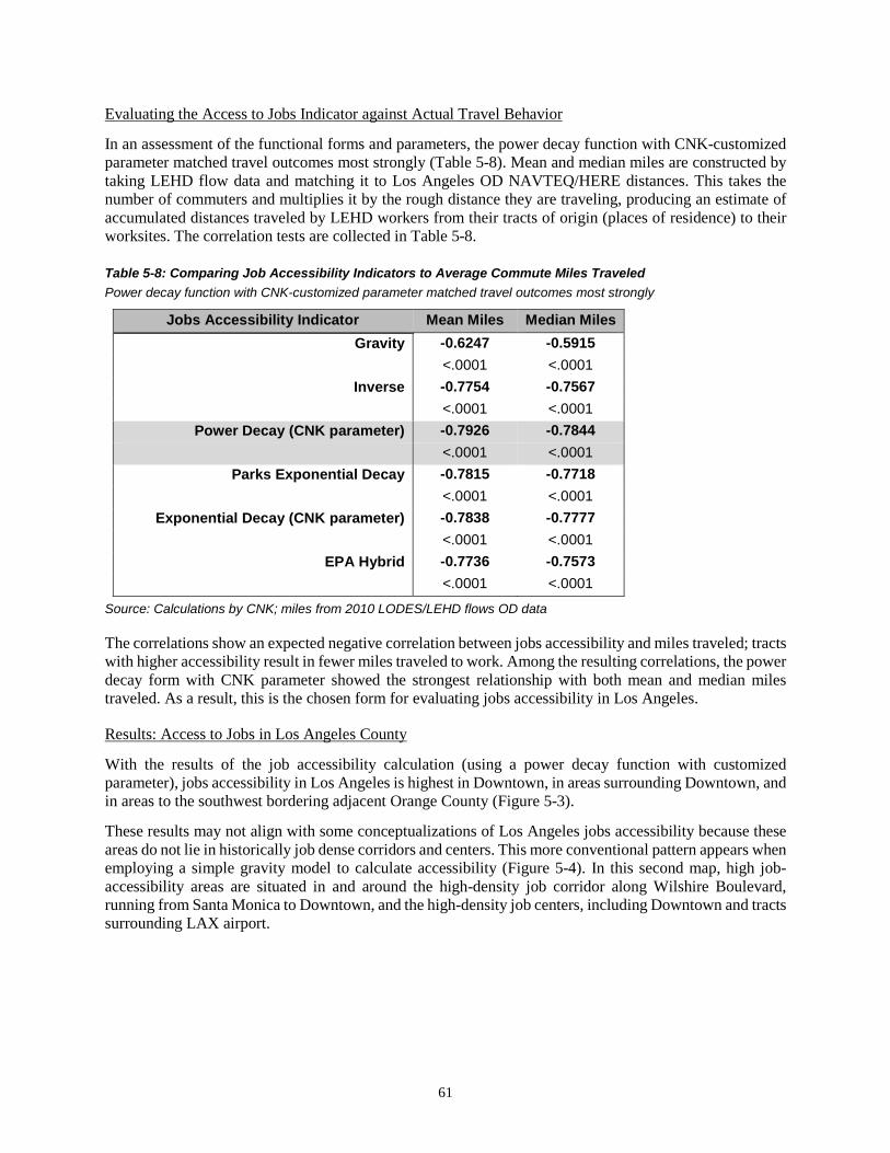
61
Evaluating the Access to Jobs Indicator against Actual Travel Behavior
In an assessment of the functional forms and parameters, the power decay function with CNK-customized parameter matched travel outcomes most strongly (Table 5-8). Mean and median miles are constructed by taking LEHD flow data and matching it to Los Angeles OD NAVTEQ/HERE distances. This takes the number of commuters and multiplies it by the rough distance they are traveling, producing an estimate of accumulated distances traveled by LEHD workers from their tracts of origin (places of residence) to their worksites. The correlation tests are collected in Table 5-8.
Table 5-8: Comparing Job Accessibility Indicators to Average Commute Miles Traveled Power decay function with CNK-customized parameter matched travel outcomes most strongly
Jobs Accessibility Indicator Mean Miles Median Miles Gravity -0.6247 -0.5915
<.0001 <.0001 Inverse -0.7754 -0.7567
<.0001 <.0001 Power Decay (CNK parameter) -0.7926 -0.7844
<.0001 <.0001 Parks Exponential Decay -0.7815 -0.7718
<.0001 <.0001 Exponential Decay (CNK parameter) -0.7838 -0.7777
<.0001 <.0001 EPA Hybrid -0.7736 -0.7573
<.0001 <.0001
Source: Calculations by CNK; miles from 2010 LODES/LEHD flows OD data
The correlations show an expected negative correlation between jobs accessibility and miles traveled; tracts with higher accessibility result in fewer miles traveled to work. Among the resulting correlations, the power decay form with CNK parameter showed the strongest relationship with both mean and median miles traveled. As a result, this is the chosen form for evaluating jobs accessibility in Los Angeles.
Results: Access to Jobs in Los Angeles County
With the results of the job accessibility calculation (using a power decay function with customized parameter), jobs accessibility in Los Angeles is highest in Downtown, in areas surrounding Downtown, and in areas to the southwest bordering adjacent Orange County (Figure 5-3).
These results may not align with some conceptualizations of Los Angeles jobs accessibility because these areas do not lie in historically job dense corridors and centers. This more conventional pattern appears when employing a simple gravity model to calculate accessibility (Figure 5-4). In this second map, high job-accessibility areas are situated in and around the high-density job corridor along Wilshire Boulevard, running from Santa Monica to Downtown, and the high-density job centers, including Downtown and tracts surrounding LAX airport.

62
Figure 5-3: Access to Jobs by Tracts Using Power Decay (with CNK parameter) 22 Jobs accessibility in Los Angeles is highest in Downtown, in areas surrounding Downtown, and in areas to the southwest bordering adjacent Orange County
In the final analysis, the power decay method produces a better indicator of jobs accessibility than the gravity model because the results of using the power decay method are more indicative of those who drive alone to work, as shown in correlation tests. The gravity model, because it weighs the nearest opportunities most heavily, is a better indicator for those who do not drive alone, but instead take transit or walk to work. Because an overwhelming majority of workers in Los Angeles commute by driving alone, the selected power decay with customized parameter method produces a more accurate indicator for accessibility to jobs.
22 Lowest Access = < 1.51 (note: these are index figures scaled by one million); Low = 1.51 to 1.64; Middle = 1.64 to 1.71; High = 1.71 to 1.76; Highest = > 1.76

63
Figure 5-4: Access to Jobs by Tracts Using Simple Gravity23 A more conventional pattern of job accessibility appears when employing a simple gravity mode (high-density job areas show up as areas with highest accessibility); this form is best used for walking and transit trips
23 Lowest Accessibility = <4.93 (note: these are index figures scaled by 10,000); Low = 4.93 to 6.12; Middle = 6.12 to 6.97; High = 6.97 to 8.09; Highest = >8.09
64
Access to Retail
This subsection documents the construction and evaluation of the access to retail indicator. It begins with an evaluation of data sources and describes the process by which the primary data source was chosen. The section then moves on to describe the methods for calculating the indicator, an assessment of alternative indicators, and an evaluation of the results against actual travel behavior.
In the Los Angeles Metropolitan Region, non-work trips make up about half of all regional trips when excluding return-to-home trips (Crane et al., 2002). Non-work trips include trips for shopping, recreation, and other activities. With work trips, the addition of shopping can be taken to represent a large proportion of individuals’ daily and regular VMT accumulation. In addition to seeing decreases in VMT associated with increases in nearby job opportunities, Cervero and Duncan (2006) also observe slight decreases in VMT with increases in nearby shopping opportunities. As such, measuring access to retail opportunities may be essential to monitoring non-commute VMT.
For this project, NETS/D&B data is the primary source for retail revenue, but we also explored LEHD as an alternative. The prototype uses retail revenue as a proxy for retail activity. In comparing functional forms, the gravity form is the strongest functional form for constructing retail accessibility. The results for this show that areas in and around Downtown and areas southwest of Los Angeles (near Orange County) have the highest retail accessibility.
In assessing the primary source for the retail data used, the results indicate that D&B data may have a lag of several years. Further, although D&B is the primary data source for this prototype, results indicate that LEHD jobs may be a better and more reliable source for retail data (using retail jobs, instead of retail revenue, as a proxy for retail activity). The NETS/D&B data set met the desired preference of the Advisory Committee in terms of making analysis of retail revenue possible; however, there are some shortcomings to relying on retail revenue, which are discussed in later sections.
The primary source for retail data is the NETS/D&B data set. The analysis is conducted using D&B sales revenue information as the base for constructing the access to retail indicator. Retail jobs can also be used as a proxy for measuring retail activity in a given area; however, based upon feedback from the Advisory Committee, which stated a preference for retail revenue, revenues instead of retail jobs are used to conduct the analysis.
Assessing Alternative Retail Data Sources
Retail jobs data from LEHD is a reliable alternative to D&B data for measuring retail. This approach would use retail jobs per tract counted by LEHD to represent retail activity in that tract. LEHD, described in previous sections, includes the count of jobs down to the census block level. The data allows for the jobs to be subset by their two-digit industry North American Industry Classification System (NAICS) code (“Introduction to NAICS,” 2016).24 Retail jobs could be found by isolating the set to jobs categorized under NAICS 44-45 (Retail Trade). The advantages of LEHD include all those discussed in the preceding section. However, two requirements, specific to this project, made D&B the best available data set for the Los Angeles prototype. First, revenue became the preferred unit for measurement to better distinguish retail accessibility from the jobs accessibility measure. LEHD does not provide establishment revenue data and so was not a viable source for revenue data. Second, although LEHD provides a NAICS industry code for jobs, it only provides a two-digit number. To capture NAICS codes 44–45, representing shopping retail, this did not pose a problem. However, LEHD does not allow for a NAICS code query beyond these two digits. This can create a challenge if the definition of retail activity requires a more specific selection. The 24 “The North American Industry Classification System (NAICS) is the standard used by Federal statistical agencies in classifying business establishments for the purpose of collecting, analyzing, and publishing statistical data related to the U.S. business economy” (“Introduction to NAICS,” 2016).

65
Los Angeles prototype includes food establishments as a retail establishment. The ability to select “Food Services and Drinking Places” requires the ability to identify establishments down to the third digit of its NAICS code. NAICS code 72 includes all travel and hospitality accommodations (721) and food and restaurant establishments (722). Without the ability to go beyond the first two-digits, LEHD data would not allow for the exclusion of accommodation services (facilities not regularly patronized by neighborhood residents for their daily needs). D&B provides the full six-digit code, allowing for the inclusion of all industries beginning in 44 and 45, and 722 food services industry. If retail jobs is a sufficient proxy for retail activity and if two-digit NAICS codes provide enough granularity, then LEHD is a viable, robust, and less costly alternative to D&B data. The advantages of D&B lie primarily in the level of detail available for retail establishments and the collection of data that may be unavailable in LEHD.
Selecting NETS/D&B
D&B is a proprietary data set. It is one of the major sources of business data. The source for D&B data is the NETS database. NETS data consists of D&B data, which has been “converted into a time-series database of establishment information” (NETS Database, 2012). The database includes a number of characteristics, including business name, industry type, annual revenue, and annual number of employees, among others. A summary of the D&B assessment is collected in Table 5-9.

66
Table 5-9: Assessment of NETS/D&B Data DATA CHARACTERISTICS
Primary Purpose Studying business/employment dynamics, including tracking changes in employment and business patterns over time
Primary Users Multiple users (e.g., researchers)
Data Source Developed by Walls and Associates with data deriving from Dun & Bradstreet's annual register of business
Aggregated/Microlevel Data Microlevel, individual establishment Sample Size for Monitoring
System (n) Varies by year
DATA QUALITY
Validity and Reliability Some data including employment and sales are imputed by Walls and Associates
Accuracy and Precision Potentially subject to overcounting, undercounting, and misclassification of establishments; issues of precision of the establishment geocodes that are provided with NETS (e.g., some establishment geocoded to zip codes and not precise location).
GEOGRAPHIC
Coverage Adequate because it includes data for Los Angeles and surrounding counties; California analysis will require data for surrounding states (e.g., NV, OR, AZ)
Resolution (Unit of Analysis) Establishment’s latitude and longitude that can be joined to multiple levels of geography (e.g., census blocks, block groups, tracts)
Temporal (In)consistency There may be temporal inconsistency because they have different vintage NETS; the entire history of the NETS database is updated each annual release with latest information (e.g., 2010 data from 1990–2014 may differs from 2010 data in 1990–2011 series).
Layer (In)consistency Included latitude longitudes at times place businesses outside of LA County; uncertain, but suspect number of errors likely small
PRIVACY ISSUES Confidentiality Not confidential, but is proprietary.
Public Use No, requires purchasing Legal restrictions No, copyright protected
TEMPORAL Date Released Annually, but lags by roughly 3 years.
Reporting Period 1990–2014
Timeliness Entire NETS data series lags 2–3 years (current series = 1990–2014)
Source: National Establishment Time-Series Database Dun & Bradstreet
The D&B data set includes data for businesses nationwide. The NETS database is built upon annual snapshots taken since January 1990. The 2012 database vintage, which we used in this project, includes 23 snapshots taken between 1990 and 2012. Included with the business data is the latitude and longitude of establishments. With this level of resolution, we were able to produce summaries of business for all other census geographic units (i.e., tract-level summaries and, more geographically specific, block-level summaries).

67
For this project, census block-level IDs and census tract IDs were attached to the establishments for calculation. This was done by geocoding the latitude and longitude from NETS/D&B in ArcGIS. Census TIGER/line shapefiles for either census tracts or census blocks were added to the map. The points were then matched with the ID of the tract or block they spatially intersected.
D&B data is collected annually in late January. As a result, the data “reflects the economic activity of the previous year” (NETS Database, 2012). In assessing the data, by comparing it to recorded trends in other sources, results showed that, in addition to the described one-year lag, data may have an additional lag of two and possibly three years. The issue of a one-year lag can be solved by using data listed for the immediately succeeding year to represent the state of a given year. The multiyear lag, which we observed by comparing D&B trends against revenue, employment, and establishment trends in other sources, points to the necessity of adding a caveat to accessibility calculations and cross-year analysis because they indicate that using retail revenue may leave resulting figures susceptible to changes in the business cycle unrelated to changes in retailing activity. A more in-depth discussion of this issue is included in sections on monitoring one- and four-year changes.
Calculating the Access to Retail Indicator
To construct the retail indicator, we applied four different functional forms—gravity, inverse, power decay, and the EPA hybrid functions. In evaluating the indicators relative to travel behavior (PMT/VMT from the National Household Travel Survey), the results indicate that the inverse form has the strongest relationship to actual travel.
The functional forms tested include:
Simple gravity: 1𝑡𝑡𝑎𝑎
𝑤𝑤ℎ𝑒𝑒𝑒𝑒𝑒𝑒 𝑎𝑎 = 2 Inverse: 1
𝑡𝑡
Parks25 exponential decay: 𝑒𝑒−𝑏𝑏𝑡𝑡𝑤𝑤ℎ𝑒𝑒𝑒𝑒𝑒𝑒 𝑏𝑏 = 0.058 EPA hybrid26: 𝑡𝑡−𝑏𝑏𝑒𝑒(−𝑐𝑐𝑡𝑡) 𝑤𝑤ℎ𝑒𝑒𝑒𝑒𝑒𝑒 𝑎𝑎 = 0.300 𝑎𝑎𝑎𝑎𝑎𝑎 𝑏𝑏 = 0.070
Retail establishments are defined as those establishments with NAICS codes beginning in 44 and 45 (retail trade), and those with NAICS code 722 (food service, full-service restaurants, etc.). Other studies have used retail jobs to model access to retail. D&B retail sales and retail jobs are highly correlated to each other at the <.0001 level (Table 5-10).
Table 5-10: Correlation between D&B Retail Sales and D&B Retail Employment Retail employment numbers, given by D&B, are highly correlated to D&B retail sales figures
D&B 2010 Data Retail Employment
Retail Sales 0.85714 <.0001
Source: 2010 NETS/Dun & Bradstreet
25 Parks (2004). 26 Ramsey and Bell (2014).

68
Table 5-11: Comparing Accessibility Calculated with D&B Retail Revenue versus Accessibility Calculated Using Retail Employment Calculations based on D&B retail sales and D&B retail jobs are highly correlated to each other; this suggests that there is little variation when using sales over employment and vice versa
Retail Accessibility
D&B Retail Sales
Gravity Inverse Exponential
Decay (Parks)
EPA Hybrid
D&B Retail Employment
Gravity 0.8689 0.6299 0.3329 0.4639
<.0001 <.0001 <.0001 <.0001
Inverse 0.6435 0.8600 0.7664 0.8290
<.0001 <.0001 <.0001 <.0001
Exponential Decay (Parks)
0.3404 0.7669 0.8559 0.8319
<.0001 <.0001 <.0001 <.0001
EPA Hybrid 0.4745 0.8299 0.8323 0.8575
<.0001 <.0001 <.0001 <.0001
Source: Calculated by CNK using NAVTEQ/HERE ODs and 2010 NETS/Dun & Bradstreet for retail jobs and retail sales
In testing calculated indicators, the results show that calculations based on D&B retail sales and D&B retail jobs are highly correlated to each other at the < .0001 level (Table 5-11), suggesting that there is little variation when using sales over employment and vice versa. Given the Advisory Committee’s stated preference for revenue, the prototype relies on revenues as the unit for analysis. In calculating the indicator, the four forms used were highly correlated to each other (Table 5-12). Of these, the inverse form had the highest correlation to actual travel behavior, so this is the recommended form for use (Table 5-13).

69
Table 5-12: Comparing Functional Forms for Access to Retail Indicator Access indicators calculated using four different functional forms, based on retail sales, show high correlations to each other
Retail Accessibility Indicator
(Sales Revenue) Gravity Inverse
Exponential Decay (Parks)
EPA Hybrid
Gravity
Inverse 0.8620
<.0001
Exponential Decay (Parks)
0.7821 0.9886
<.0001 <.0001
EPA Hybrid 0.8214 0.9970 0.9963
<.0001 <.0001 <.0001 Source: Calculated by CNK using NAVTEQ/HERE ODs and 2010 NETS/Dun & Bradstreet for retail sales
The D&B data set for businesses is the primary data source for retail data. Using their given latitude and longitude measures, we geocoded retail establishments (those with NAICS codes beginning in 44, 45, and 722), assigning census tract IDs for each establishment. The result is a data set, where each establishment has a unique ID (DUNS), its recorded revenue for 2011, and a tract ID. With this, we calculated total revenue for each Los Angeles tract by taking the sum of revenue for all establishments lying within the same tract. We then repeated the methods described in calculating job accessibility, substituting LEHD jobs for D&B revenue, to calculated retail accessibility.
For each OD pair, the total retail revenue in the destination tract are added together, and this value is multiplied by each of the previously mentioned functional forms, with t equaling the network time between the OD pair. The result is an accessibility calculation for each unique OD pair. After calculating these for every OD pair, we then summarized all resulting figures by origin tract—that is, all indicator values for pairs with the same origin are added together. The result is an index figure representing the tract’s accessibility to retail activity.
Evaluating the Access to Retail Indicator against Actual Travel Behavior
To evaluate the results of the retail indicator, we compared the constructed measures of accessibility against hypothetical distances based on the results of the California Household Transportation Survey (CHTS). The CHTS is a multimodal survey conducted every 10 years to obtain detailed information about the socioeconomic characteristics and travel behavior of households in all California’s 58 counties. This includes trips by purpose. This comparison focuses on “routine shopping” and “eat meal at restaurant diner” trips.
The results of the correlation test show an expected negative correlation between the access to retail measures and distances driven (Table 5-13). Although the R-values are low, this can be expected, given the nature of variables compared. Low R-values do not necessarily reflect the strength of the actual relationship between the indicators and shopping behavior. Shopping-related travel is more complex than work commutes, by comparison. An example of this is that shopping trips do not necessarily follow a strict and fixed day-to-day pattern. Households may also have different destinations depending on the type of shopping and goods they are looking for. Additionally, shopping trips are often linked with other trip

70
purposes, contributing to the more variable nature of shopping trips. In evaluating the access to retail indicators against CHTS data on shopping behavior, results show the inverse calculated indicator as having the strongest relationship to travel. As such, the prototype uses this indicator as part of the baseline.
Table 5-13: Comparing Retail Accessibility Indicators to Estimated Shopping Trip Miles Results show the inverse calculated indicator as having the strongest relationship to travel
Retail Accessibility Indicator Great Circle Distance27
Manhattan Distance
Gravity -0.1546 -0.1544 <.0001 <.0001
Inverse -0.1589 -0.1593 <.0001 <.0001
Parks Exponential Decay -0.1517 -0.1524 <.0001 <.0001
EPA Hybrid -0.1549 -0.1554 <.0001 <.0001
Source: Calculated by CNK; for actual travel, distances generated using 2010–12 CHTS
Results: Access to Retail in Los Angeles County
Using results from the inverse form, areas of highest accessibility to retail lie in areas in and around Downtown and in southwestern areas of Los Angeles (Figure 5-5). For neighborhoods in the southwest, high accessibility measures are likely driven by access to proximate retail concentrations all around in Los Angeles and Orange County (as opposed to coastal areas where available retail is limited to a roughly 180-degree area). Areas along the coast and less urbanized areas of Los Angeles have the lowest accessibility scores.
27 GC and MH distance measures are generated with CHTS data. Based on a review of the literature, nonwork trips comprise up to 50 percent of all travel. For “retail” trips, we use routine shopping trips and meal/dining trips.
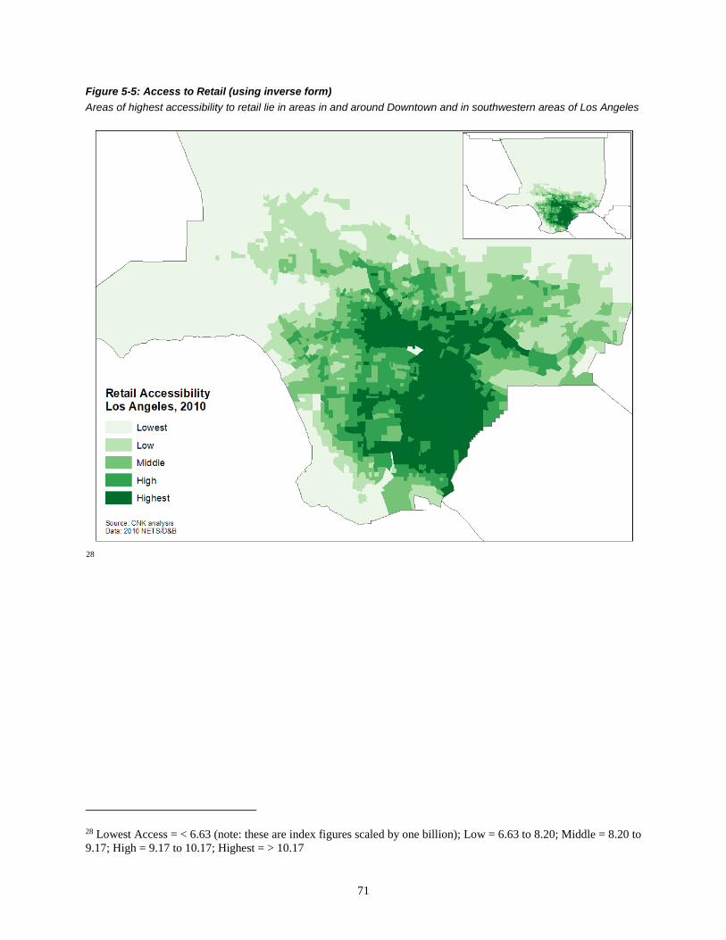
71
Figure 5-5: Access to Retail (using inverse form) Areas of highest accessibility to retail lie in areas in and around Downtown and in southwestern areas of Los Angeles
28
28 Lowest Access = < 6.63 (note: these are index figures scaled by one billion); Low = 6.63 to 8.20; Middle = 8.20 to 9.17; High = 9.17 to 10.17; Highest = > 10.17

72
Access to Transit (Bus)
This subsection documents the construction and evaluation of the access to bus transit indicator. This indicator focuses on bus access only, it does not include rail, because of resource limitations—not because the research team or advisory committee thought that rail was insignificant. It captures the activities that are within a quarter-mile walking distance to bus stops (i.e., the number of housing units falling within the buffer). It does not measure what activities can be reached by transit, that is the number of jobs by different modes of transportation (e.g., transit, auto), within a given amount of time. An example of projects on activities reached by transit is the work being done by the University of Minnesota’s Access Across America project. These types of calculations, however, are beyond the scope and resources of our project.
We construct the access to transit measure using an open data tool, the GTFS. Construction of the measure includes two key dimensions: a quarter-mile geographic catchment area and level of service. Level of service is defined as the number of buses that go through the stop on a given weekday. In this report, we focus on bus only, and do not include rail. We recommend that rail is added in the future, however, given time and resource constraints, we were unable to include this additional layer of analysis in the development of the prototype. This analysis is organized into three major parts. The first part describes the primary data set used to construct the accessibility measure, the GTFS, and includes an assessment of the data set. The second part discusses the methodology used to construct the transit access measures and presents some descriptive statistics. Part three evaluates the transit access measure by assessing the indicators against actual transit usage.
The main finding is that transit usage increases with service levels but tapers off. Furthermore, the rate and nature of this tapering is not constant as distant from transit increases (i.e., it does not follow the patterns of a simple gravity decay).
Assessing Alternative Transit Data Sources
The characteristics of GTFS data are summarized in Table 5-14. Apart from assembling all required information manually (collecting route schedules and entering these individually), no viable alternative sources, to our current knowledge, exist.

73
Table 5-14: GTFS Data Characteristics for Los Angeles DATA CHARACTERISTICS
Primary Purpose
Originally produced by agencies to get their transit information to display on Google Maps; now being adopted by many third-party software applications (e.g., Bing Maps, OpenTripPlanner); additionally, transportation planners and researchers are also finding various use for GTFS (e.g., calculating access to transit)
Primary Users Developers, transportation planner and researchers, transit users for itinerary planning
Data Source Transit agency Aggregated/Microlevel Data Microlevel, individual transit agencies/bus stops
Sample Size (n) 16 GTFS data sets compiled for Los Angeles DATA QUALITY
Validity and Reliability Some known differences in reporting of information across agencies, some inconsistency of key variables
GEOGRAPHIC
Coverage Not adequate, does not cover the entire county; the GTFS feed is voluntarily produced by transit agencies. Mid- to large-sized transit agencies often have more resources to provide transit data in GTFS format than smaller agencies
Resolution (Unit of Analysis) Bus stops
Temporal (In)consistency Date of available GTFS data set varies by agency, difficult to acquire (2010) baseline GTFS for all agency
PRIVACY ISSUES
Confidentiality None, it is information about services that is also published through printed timetables, maps, and fare schedules
Public Use Yes, may require request for data from agency if data is not available on agency or open source websites
Legal Restrictions No, but users must agree to agency's "Terms of Agreement,” which vary by agency.
TEMPORAL Date Released Varies by transit agency, data provided on "as available" basis
Reporting Period Varies by transit agency Timeliness Varies by transit agency
Source: Based on compiled GTFS data for LA County, 16 transit agencies
Selecting General Transit Feed Specification
Information on transit stops and schedules used in this analysis are obtained as GTFS data sets. Developed by Google in partnership with the Tri-County Metropolitan Transportation District of Oregon (TriMet), GTFS defines a common data format for public transportation schedules along with geographic data. The GTFS data set consists of a series of text files that provide information on transit stop locations; scheduled arrivals and departures; vehicle identification and routes; and other relevant information such as transit fare. The primary purpose behind the creation of the GTFS standard was to enable transit agencies to upload their schedules to Google Transit so that transit users could easily plan their transit itineraries through Google Maps. Over the years, GTFS has been adopted and used in number of trip-planning applications outside of Google products (e.g., BingMaps, OpenTripPlanner). Transportation planners and researchers are also realizing the great potential use of GTFS for their own work, particularly around creating transit access measures.

74
The GTFS specification defines six mandatory comma-separated values (CSV) files and seven optional ones, for a total of 13 in a complete data set. Table 5-15 provides a brief description of each of these files, additionally indicating which are required and which are optional.
Table 5-15: GTFS File Definitions Filename Required Defines agency.txt Required One or more transit agencies that provide the data in this feed. stops.txt Required Individual locations where vehicles pick up or drop off passengers.
routes.txt Required Transit routes. A route is a group of trips that are displayed to riders as
a single service.
trips.txt Required Trips for each route. A trip is a sequence of two or more stops that
occurs at specific time.
stop_times.txt Required Times that a vehicle arrives at and departs from individual stops for
each trip.
calendar.txt
Required Dates for service IDs using a weekly schedule. Specify when service starts and ends, as well as days of the week where service is available.
calendar_dates.txt
Optional Exceptions for the service IDs defined in the calendar.txt file. If calendar_dates.txt includes ALL dates of service, this file may be specified instead of calendar.txt.
fare_attributes.txt Optional Fare information for a transit organization's routes. fare_rules.txt Optional Rules for applying fare information for a transit organization's routes.
shapes.txt Optional Rules for drawing lines on a map to represent a transit organization's
routes.
frequencies.txt Optional Headway (time between trips) for routes with variable frequency of
service. transfers.txt Optional Rules for making connections at transfer points between routes.
feed_info.txt Optional Additional information about the feed itself, including publisher,
version, and expiration information. Source: Google Developers, “Static Transit Overview: GTFS”
The GTFS feed is voluntarily produced, and not all agencies share their transit feed data in GTFS format. Generally, larger transit operators, who tend to have more resources and capacity, produce GTFS data while many smaller transit agencies do not. For agencies that do produce GTFS, there is no standard for how the data set is digitally published or shared, with practices varying across transit agencies.29 Some operators upload their data set directly on to their website so that users can easily download the data set. Other agencies generate GTFS, but only release them publicly upon direct requests, oftentimes after submitting a form of agreement and providing the agency with a reason for the request. Additionally, the timing of when GTFS are published also varies across agencies, with some choosing to do so more frequently than others. As such, it is often difficult to compile data sets that are temporally consistent.
There are a number of open source websites that collect and archive GTFS data sets that agencies have used as an alternative platform to share their transit feeds. These sites are among the primary “go to” destination for many users of GTFS. Some of the more popular ones include GTFS Data Exchange, TransitFeeds, and Transitland. These sites are not just restricted to transit agencies, and allow app and web developers to also contribute and edit GTFS feeds. This poses a few challenges. It is difficult to verify whether the data set
29 Owen, Murphy, and Levinson (2014).

75
was originally uploaded by the actual transit agency and not another user. Additionally, it is difficult to tell whether the data set had been modified in some way.30
For this project, GTFS data sets were acquired from both open source websites and directly from agencies. Our first choice was to download the data sets from one of the three open source websites mentioned earlier. There are a few reasons for this. First, the open source sites includes a directory of transit data, allowing users to easily search by transit agency, thereby downloading multiple transit feeds from one place. Second, many of these sites also maintain historical GTFS data sets. Except for a few, most agencies do not maintain historical GTFS data sets on their website, publishing only their most current GTFS data set.
When GTFS data sets were unavailable through one of the open source websites, the next step was to check each agency’s website for GTFS data. Transit agencies without publicly available GTFS feeds were directly contacted to collect the relevant information. Some agencies provided the data in a GTFS format (though the feed had not been released publicly), while others did not publish their feeds in GTFS either format or they did not respond to our request.
In the cases in which the agency did not publish GTFS feeds, they were asked to provide a list of active bus stops managed by the agency, including each stop’s geographic location and digital schedules. This information can be used to manually create the necessary data for this analysis. In some cases, the agency provided a list of bus stops, but no longitude or latitude, which would require manually geocoding each stop using the stop’s location, often between two intersections. In terms of schedules, some agencies provided them in Excel format while others provided the schedules in PDF or paper schedules. The latter would require converting the paper schedules into an Excel format, which can be done with the use of some software (i.e. any software with optical character recognition capabilities, or similar). Because of the considerable amount of time it would take to carefully convert each schedule and ensure that it was done correctly, only agencies with actual GTFS data were included. However, the alternative method should be considered for future work for agencies that do not produce GTFS.
Although the intention was to download GTFS data sets centering around 2010, the baseline year, our internal inventory of publicly available GTFS data sets indicated that 2015 was the most commonly shared year across agencies in LA County where GTFS is available. Despite this, there were occasions where the most recent data, 2016, was downloaded because it was the only year available from the agency/source. In the end, the schedules used in this analysis ranged from 7/20/2015 to 12/28/2016. The schedules selected for each GTFS are for a given weekday. Weekday feeds were selected because transit agencies operate more services during the weekday than they do on the weekend due to higher demand (primarily for work trips).
For the Los Angeles monitoring system, GTFS feeds were collected and analyzed for 16 transit agencies in LA County. Table 5-16 lists these agencies and Figure 5-6 maps out their geographic coverage. The map also identifies “major” areas where GTFS data was not available. These include the cities of Lancaster and Palmdale, both served by the Antelope Valley Transit Authority, the cities of Montebello and Pico Rivera (both by Montebello Bus Lines), La Mirada (La Mirada Transit), and Whittier Norwalk (Norwalk Transit). It should also be noted that in addition to their local transit operator, these areas may also be served by multiple transit agencies. For example, LA Metro, LA County’s public transportation operating agency, may include transit routes that go through these areas but provide minimal service.
30 Ibid.

76
Table 5-16: Transit Agencies with GTFS Service Data Reflected in the Access to Transit Indicator
Transit Agency Source GTFS Data Updated as of:
Burbank Bus Agency's Website 6/17/2016 City of Commerce Municipal Bus Lines Transitland 12/28/2016 City of Gardena Transportation Department (GTrans) Agency's Website 8/1/2016
City of Los Angeles Department of Transportation (LADOT) TransitFeeds 8/18/2015
City of Monterey Park Spirit Bus TransitFeeds 10/26/2016 City of Redondo Beach–Beach Cities Transit Agency's Website 7/26/2016 Culver City Municipal Bus Lines Transitland 12/14/2016 Foothill Transit TransitFeeds 8/31/2015 Glendale Beeline TransitFeeds 4/29/2016 Long Beach Transit TransitFeeds 7/25/2016 LA County Metropolitan Transportation Authority (Metro, MTA, LACMTA) TransitFeeds 8/24/2015
Palos Verdes Peninsula Transit Authority GTFS Data Exchange 12/16/2015 Pasadena Transit Agency's Website 12/20/2016 Santa Clarita Transit Agency 11/22/2016 Santa Monica's Big Blue Bus TransitFeeds 8/21/2015 Torrance Transit System TransitFeeds 7/20/2015
Source: Transit Agency; Transitland; TransitFeeds; GTFS Data Exchange

77
Figure 5-6: GTFS Coverage Transit service coverage from available GTFS data for 16 agencies
Source: General Transit Feed Specification; holes in coverage identified by CNK
Additionally, the data set’s geographic coverage was compared with existing works on transit accessibility, including the works done by the University of Minnesota’s Accessibility Observatory and the EPA’s Smart Location Database (SLD). The Accessibility Observatory includes information on job accessibility by mode (auto and transit) at the census block level for 46 metropolitan areas in the United States. The EPA’s smart location database is a free nationwide web-based tool that includes more than 90 attributes summarizing characteristics such as diversity of land use, neighborhood design, destination accessibility, employment, and demographics at the ccnsus block-group level. Both of these tools include some measures of job accessibility by transit using GTFS data. While job access by transit is not calculated here, the acquired list of GTFS data sets can be compared with these external databases for Los Angeles.
In assessing the extent of coverage, the data set assembled covers a greater geographical area in Los Angeles than these other two databases. For example, the EPA’s smart location database includes GTFS data for six transit agencies in Los Angeles and the Accessibility Observatory includes eight agencies (excluding those that operate from outside LA County). Because the primary objective is to gauge access for those living in Los Angeles, the compiled database does not include transit agencies that operate from outside LA County but bring people in for work and nonrelated work trips (e.g., Orange County Transportation Authority, Riverside Transit).

78
Calculating the Access to Transit Indicator
The transit access measure includes two key dimensions: a quarter-mile geographic catchment area and level of service, which is defined as the frequencies of buses that go through each stop on a given weekday. The former can be modified using walk time and applying a decay function, but this effort takes a considerable amount of time and is costly. Alternatives to service levels can also include reliability and quality (e.g., safety or age) of buses but this information is usually difficult to acquire. Our choice and within our resources is to examine the frequencies of buses that go through each stop.
Two files from the GTFS data sets were used in this analysis—the “stops” file that provides information on bus stop locations and the “stop times” files that were used to calculate service frequency for each stop. Service frequency is defined as the number of times a bus stops at the location on a given weekday. Using these counts, each stop is categorized into different service-level groups ranging from low to very high service levels. The breakdowns are as follows: (1) very low service (at least 1 stop); (2) low service (at least 51 stops); (3) medium service (at least 101 stops); (4) high service (at least 201 service); and (5) very high service (401 stops or more per day) (Figure 5-7).
Once assigned to a service-level group, each bus stop is geocoded on a map and buffered at a distance of quarter mile using ArcGIS. The one-quarter-mile buffer is selected because the distance loosely corresponds to a comfortable walking distance and is widely used to define the catchment area of a transit station in the transportation planning literature.31 The quarter-mile buffer rings are drawn as a Euclidean buffer, which is a straight-line distance. It does not take into account geographic barriers or the actual walking path one may take to get to the bus stop. This can be calculated using a street network data set and should be considered for future works when refining the transit accessibility measure.
31 While the one-quarter mile buffer is well supported by literature, the text of SB 375 defines “transit priority projects” as being “within one-half mile of a major transit stop or high-quality transit corridor.”

79
Figure 5-7: Transit Level of Service Service frequency is defined as the number of times a bus stops at the location on a given weekday; using these counts, each stop is categorized into different service-level groups
Source: 2015–16 General Transit Feed Specification
Each set of service-level buffer are overlaid on top of census blocks polygons to determine the proportion each block is covered by the different service levels. Census blocks are the smallest geographic unit for which the Census Bureau collects and tabulates census information. Given their smaller geographic size, census blocks were used in the analysis because they give a clearer picture of how many actual housing units fall within the buffer rings and are served by the different service levels. Additionally, blocks were used because people’s travel decision, particularly to transit, is usually made at very small scale.
The proportion of the block covered by the different service-level buffers are calculated using the intersect tool in ArcGIS. The tool essentially cuts the census block polygon with the buffer rings boundary. A new area is calculated for each census block polygon and compared to the block’s original area to generate a ratio representing the proportion that the block falls within the buffer area. The ratio ranges from zero to one with zero indicating no coverage (outside of the buffer) and one representing full coverage (completely within the buffer area). This ratio is used to factor information from various data sets, including the number of housing units, which fall in each of the different service-level groups.
In this analysis, housing units are used to determine accessibility because unlike the population occupying, which changes over time, the number of housing units generally remains constant. Once factored at the block level, each of the five service levels is summed up to the census tract level. This step is necessary to

80
evaluate which of the five service-level indicators is more correlated with actual transit usage, namely the proportion of workers who take either bus or rail to work. Derived from the ACS, information on transit usage is not available at the census block level. This is further discussed in the next section on evaluating the indicators, but it is mainly due to sample size. The following formula is used to calculate each of service-level indicators.
𝐼𝐼𝑘𝑘,𝑑𝑑 = � 𝐹𝐹𝑖𝑖,𝑘𝑘𝑑𝑑𝑛𝑛𝑖𝑖=1 ∗ 𝐻𝐻i
Where: • 𝐼𝐼𝑘𝑘,𝑑𝑑 is defined as the number of housing units in the tract, or the total housing units in a buffer
of distance, 𝑎𝑎, from bus stops with service level 𝑘𝑘. • 𝑖𝑖 are blocks 1, 2 ….n. • 𝐻𝐻I is the housing units in blocks 𝑖𝑖. • 𝐹𝐹𝑖𝑖,𝑘𝑘𝑑𝑑 is the proportion of block 𝑖𝑖 within the buffer for service level 𝑘𝑘.
Examined for 𝑎𝑎 = 0.25 miles, 𝑘𝑘 = 1, 2, 3, 4, and 5 Table 5-17 reports the share of tracts that fall in each of the service-level indicators. Not surprisingly, the share of tracts served decreases with increasing levels of services.
Table 5-17: Share of Census Tracts by Service Level Share of tracts served decreases at higher levels of service
Service Level Mean Median Std Dev Level 1 0.77 0.93 0.31 Level 2 0.68 0.82 0.35 Level 3 0.55 0.61 0.40
Level 4 (1/2 Mile) 0.53 0.65 0.45 Level 4 (1/4 Mile) 0.36 0.14 0.40
Level 4 (1/8th Mile) 0.20 0.02 0.28 Level 5 0.16 0.00 0.30
Additionally, each transit access measure is also evaluated for their correlations with one another. This tells us to what degree the measures can be used interchangeably. Table 5-18 reports the correlations and shows positive correlations across the access measures. The correlations ranged from a low of 0.34 to a high of 0.86. If all the transit access measures are highly correlated then it matters less which of the five service levels are selected. The correlations indicate that it makes a difference in which of the five service-level indicators is used to represent our measure of transit accessibility. The next section further evaluates each of the access measures to determine how they compare to actual transit usage.

81
Table 5-18: Transit Access Correlations between Service Levels Measures are positively and highly correlated to each other
Pearson Correlation Coefficients Prob > |r| under H0: Rho=0 Number of Observations
Service Level 1
Service Level 2
Service Level 3
Service Level 4
Service Level 5
Service Level 1 0.8559 0.7147 0.5314 0.3363 <.0001 <.0001 <.0001 <.0001 2332 2332 2332 2332
Service Level 2 0.8559 0.8465 0.6431 0.4139 <.0001 <.0001 <.0001 <.0001 2332 2332 2332 2332
Service Level 3 0.7147 0.8465 0.7809 0.5109 <.0001 <.0001 <.0001 <.0001 2332 2332 2332 2332
Service Level 4 0.5314 0.6431 0.7809 0.6914 <.0001 <.0001 <.0001 <.0001 2332 2332 2332 2332
Service Level 5 0.3363 0.4139 0.5109 0.6914 <.0001 <.0001 <.0001 <.0001 2332 2332 2332 2332
Evaluating Access to Transit (Bus) Indicator against Actual Travel Behavior
This section summarizes the process of evaluating the transit accessibility measure. Our main evaluation includes how the indicators relate to actual transit usage. Data on transit usage comes from the ACS, which is an ongoing representative survey covering about 2.5 percent of all households per year. The ACS replaced the decennial census long-form sample, conducted every 10 years, which provided detailed demographic, social, economic, and housing data for the nation between 1960 and 2000. The ACS was developed to provide more timely data at regular intervals, and it includes a sample of one-year, three-year, or five-year periods, depending on the size of the geographic area. For smaller geographies such as census tracts and block groups, data is only available through the five-year estimate. Census block-level data are not available in the ACS. This analysis uses the 2008–12 five-year ACS estimate data set because it’s average centers around 2010, the baseline year.
Table 5-19 reports the correlations for each of the service-level indicators against actual transit usage. Transit usage includes workers who used a bus, trolley, streetcar, subway, or elevated rail or railroad, and did not work at home. Levels of service show significant positive correlations with transit ridership. Actual transit usage increases with each level of service, peaking at service level 4 or at “high service,” but then declines after this (at very high service levels). The robustness of the correlations are evaluated by excluding census tracts that represent the northern parts of LA County from the analysis, mainly the cities of Palmdale and Lancaster, where GTFS data is unavailable, and find that it produces similar patterns. Given that Service Level 4 correlates highest with actual transit usage, this indicator was selected as our measure of transit accessibility.

82
Table 5-19: Evaluating Access to Transit (Bus) Indicators against Actual Transit Usage Levels of service show significant positive correlations with transit ridership
Pearson Correlation Coefficients Prob > |r| under H0: Rho = 0
Number of Observations Service Lvl 1 Service Lvl 2 Service Lvl 3 Service Lvl 4 Service Lvl 5
% Transit
0.3955 0.4537 0.5191 0.5507 0.3974 <.0001 <.0001 <.0001 <.0001 <.0001 2319 2319 2319 2319 2319
% Bus 0.3848 0.4416 0.5067 0.5370 0.3767 <.0001 <.0001 <.0001 <.0001 <.0001 2319 2319 2319 2319 2319
Source: Calculated by CNK; 2015–16 GTFS; 2008–12 5-year ACS for actual transit usage
Our evaluation of the transit accessibility measures also included examining different buffer sizes. The quarter-mile distance is generally accepted by transportation planners as the standard distance one is willing to walk to local bus services. Using the Level 4 service indicator, which exhibited the highest correlation with actual transit usage, three different buffer sizes were created to be assessed—half-mile, quarter-mile, and one-eighth-mile distances. Each distance measure is evaluated against transit choice and their correlations are reported in Table 5-20. Among Level 4 service, the correlations against actual transit usage increases as buffer sizes gets tighter, with the one-eighth-mile distance generating the highest correlations among the three distance measures. In other words, transit usage is highest the closer one is to a transit stop. While slightly higher, the correlation for the one-eighth-mile distance is not that drastically different from the quarter mile that would cause us to deviate from using the former, which has largely been the accepted measure.
Table 5-20: Evaluating Distance Buffer Size against Actual Transit Usage for Service Level 4 Transit usage is highest when transit stops are near
1/2 mi 1/4 mi 1/8 mi
% Transit 0.4947 0.5507 0.5889 <.0001 <.0001 <.0001 2319 2319 2319
% Bus 0.4802 0.537 0.5747 <.0001 <.0001 <.0001 2319 2319 2319
A final evaluation included running a simple multivariate analysis to see if similar outcomes are produced. Two multivariate regressions, one for levels of service and another for buffer distances, were run. The first model confirms these findings, that is, transit usage increases with service levels but tapers off at higher levels of services. The second regression, controlling for different buffer rings, indicates transit accessibility cannot be measured with a simple decay function.

83
Chapter 6
BENCHMARKING This section focuses on evaluating one-year and four-year changes of new housing, net changes in jobs, and net changes in retailing revenues—relative to baseline indicators known to be correlated with VMT and GHG: residential density, access to jobs, access to retail, and access to public transit. These recent developments are benchmarked against the baseline indicators discussed in the previous section. Benchmarking provide insights into whether short-term changes in new housing, net changes in jobs, and net changes in retailing are moving in the direction of promoting SB 375 goals.
The first analysis looks at the construction of new residential housing units, followed by an evaluation of net changes in jobs (employment activities) and net changes in retail revenue (retailing activities). Recent developments in housing are measured as newly constructed housing units, which captures recent additions to the built environment and land use. These developments can have long-term implications because new housing units are capital investments that have long lives. Recent developments in employment and shopping are measured as net changes in jobs and net retailing revenues, which capture short-term changes in the intensity of land-use activities.Net changes in jobs and retailing revenues are both highly influenced by the business cycle, characterized by cyclical ups and downs. For retail, the problem is compounded by the rapid increase in online shopping or e-commerce, which has led to downward secular trend for brick-and-mortar sales. Measuring net changes in jobs and retailing revenues differs from tracking new additions to the built environment, which may change the capacity of a given activity at a location (i.e., new housing units, new shopping centers, or new job centers). These also differ from changes in allowable activities and allowable intensity of usage (e.g., through rezoning). Initially, these various methods were explored and presented to the Advisory Committee and to CARB. This final selection is based on input from these discussions and includes all that which was technically feasible within available resources.
The prototype monitors change at two time points, one-year out from the baseline and four-years out. In interpreting the difference between these there are a few things to consider. These two time points fall on different parts of the business cycle. Four-year change averages out some of the shortest term variations. One-year change measures developments in the shortest term, but may not always pick up meaningful change, especially if that year is part of a highest peak or lowest trough in activity. For the purposes of analyzing progress toward SB 375 goals, the four-year change is most useful due to lag times commonly observed for land use changes and economic variables to take effect. The measurement and analysis of both these time scales, however, were critical and useful in conducting assessments of data and methods for feasibility.
This chapter is divided into four subsections. Part one briefly describes key data sets used to construct the short-term measures and part two includes a discussion of how these short-term measures can be benchmarked against the baseline indicators that were constructed in the previous chapter. The results and findings from the benchmarking analysis are presented in the third subsection followed by concluding remarks in the last section.
Data and Methods
This subsection describes key data sets used to construct the short-term measures. They include parcel data for new housing developments, LEHD/LODES for net changes in employment, and NETS/D&B for net changes in retailing revenues. Appendix E presents several methods for calculating measures of short-term changes, two of which were selected for the Los Angeles prototype.
New Housing Units

84
Information on new housing development is derived from parcel-level data. Parcel information is collected by each county’s Office of the Assessor and typically includes property tax assessment information such as ownership, status, and value of properties. Information on the location and physical character of individual parcels are also available. Table 6-1 summarizes key characteristics of the parcel data. Alternative data sources for new housing developments were considered for this project, such as building permit and counts of housing units from the ACS but were not selected because of their limitations for the monitoring system. Further discussion of these data sets and their limitations can be found in Appendix G
For the prototype, parcel data was derived from the LA County Assessor’s Office. LA County Assessor’s Office makes available multiple years of parcel data. The 2015 data set was selected for this analysis as it covers all the short-term periods for the monitoring system—housing units built in 2011 (one year from the baseline) and housing units built from 2011 to 2014 (four years from the baseline). Using the parcel’s geographic location, specifically the given longitude and latitude, each parcel was spatially assigned to a geographic unit (either census tract or census block depending on the analysis), and the total number of housing units were summed up for each geographic unit and short-term time frame.
Table 6-1: LA County Assessor Parcel Data Characteristics DATA CHARACTERISTICS
Primary Purpose Generated for parcel records and tax assessment purposes, the data include dozens of attributes such as size, ownership, property value, tax status, land use, characteristics of buildings and improvements, zoning, and development capacity.
Primary Users Multiple users (e.g., local jurisdictions for tax purposes, MPOs, researchers, real estate developers)
Data Source Tax assessor records Aggregated/Microlevel Data Microlevel
Sample Size (n) Roughly 2.3 million parcels in LA County DATA QUALITY
Validity and Reliability Largely reliable, not based on sample; however, subject to possible data input error; some missing data and possible reporting error (e.g., transaction value)
Accuracy and Precision Highly accurate and precise; tax assessor records go through an annual review (when owners receive a tax bill); however, some data may be recorded wrongly into the database
GEOGRAPHIC
Coverage Adequate because it includes coverage for all LA County
Resolution (Unit of Analysis) Parcels, very small geography
Temporal (In)consistency There may be potential temporal inconsistency due to updates/corrections to the same parcel; in terms of spatial accuracy, majority accurate within a couple of feet
Layer (In)consistency We did not assess the geography relative to larger boundary from Tigerline/ESRI because the data did not require us to geocode
PRIVACY ISSUES Confidentiality No, property owners name are excluded from the data set
Public Use Yes

85
Legal Restrictions No TEMPORAL
Date Released Released annually Reporting Period Annual assessor parcel data available for 2006 to 2016
Timeliness It is produced annually in July as the basis for property taxes
Net Changes in Employment
To measure net changes in jobs, data provided by the US Census Bureau through the LEHD/LODES was used. Three years of data sets were selected: 2010, 2011, and 2014. The Workplace Area Characteristics file, which shows where jobs are physically located, was used for this analysis. Using Statistical Analysis System (SAS) software, we were able to organize the LODES data to show employment information down to the census tract and census block level. A more in-depth assessment of LEHD/LODES can be found in Chapter 5.
Net Changes in Retail Revenues
Net changes in retail revenues were calculated using business establishment data from NETS/D&B for the years 2010, 2011, and 2014. Any establishment with the first two-digit NAICS code ranging from 44 to 45 (shopping retail) or industry code 721 (food services) were all incorporated as retail establishments. Each retail establishment was spatially assigned to either census tract or census block (analysis of transit) using the establishment geographic location (longitude and latitude) and revenues were then summed for each geographic unit.
As noted earlier in the assessment of the NETS data set in Chapter 5, the revenues reported in the NETS/D&B represents revenues for the previous year. For example, the revenues reported in the 2010 data set represents 2009, 2011 is 2010, and 2014 is 2013. Yet, our assessment of the data set suggests that the revenues may lag two to three years (see Chapter 5). However, due to limited resources, we were unable to further assess this problem for possible solutions. Instead, the revenues were treated as lagging one year as this was noted in the database’s documentation. To calculate net changes in revenue, 2009 (2010 D&B) and 2010 (2011 D&B) dollars were converted to 2013 (2014 D&B) dollars using an inflation factor based on the Bureau of Labor Statistics’ Consumer Price Index Research Series Using Current Methods (CPI-U-RS).
General Framework for Benchmarking Los Angeles County
This subsection describes methods of benchmarking recent developments and changes against the baseline indicators. The benchmarking approach is meant to provide insights into whether short-term changes are consistent with SB 375 goals. Table 6-2 illustrates an approach to benchmarking new developments and changes to the baseline.
In analyzing new developments and net changes, Los Angeles census tracts are grouped into five quintile groups by each of the baseline indicators. For example, census tracts are grouped into five categories ranging from least housing dense (lowest quintile) to most housing dense (highest quintile). This ranking process is repeated for the remaining baseline indicators (e.g., tracts ordered by those with the most job accessibility to the least accessibility, the most retail accessibility to the least, and the most transit accessibility to the least). Each quintile group represents roughly 20 percent of all census tracts in Los Angeles.
The short-term measures being monitored—new housing units, net changes in jobs, and net changes in retail revenues—are distributed into each of the baseline quintiles. This enables us to determine whether

86
recent developments and changes are over- or underrepresented in each of the quintile categories and how the distribution has changed since 2010, the baseline year. Ideally, we would like to see a disproportionate concentration of new development and changes in the quintile closely associated with promoting SB 375 goals. For example, new housing should be developed in higher density neighborhoods (quintiles), in areas with greater access to jobs and shopping, and in areas with good public transit. These distributions would be consistent with promoting SB 375 goals.
Table 6-2: Approach to Benchmarking Short-Term Measures to Baseline Indicators
Baseline Indicator in 2010 Distribution
of Baseline in 2010
Distribution of New Developments and
Changes in Baseline Quintiles
Housing unit density, access to jobs, access to
retail or access to transit
Share of housing unit, job or retail
revenue
1-year change
4-year change
Lowest Quintile % → ←% ←%
←
Compare distribution of new development/ changes to baseline distribution in each quintile; measure progress relative to promoting SB 375 goals
Low Quintile % → ←% ←% Middle Quintile % → ←% ←%
High Quintile % → ←% ←%
Highest Quintile % → ←% ←%
↑ Each quintile contains roughly 20 percent of all census tracts in LA County
Table 6-3 summarizes how the short-term measures are related to the baseline indicators in promoting SB 375. The matrix is based on our interpretation of the literature and our assessments of how the indicators are related to actual travel behavior. It is not meant to be comprehensive but should be useful in providing insights into whether short-term changes are consistent with SB 375 goals. The columns in the table represent either new development or net changes, and the rows are the baseline indicators. For some, determining whether outcomes are SB 375 desirable is relatively straightforward. For others, the relationship can be less clear. A plus symbol (+) indicates that new developments and changes are disproportionately overrepresented in sustainable neighborhoods and thus consistent with SB 375 goals. The literature does not clearly state how short-term changes in jobs and retail sales are associated with the goals of SB 375. This uncertain relationship is indicated with a question mark (?) symbol.
Table 6-3: Relationship between Baseline and Short-Term Measures in Promoting SB 375 New Housing
Units Net Changes in
Jobs Net Changes in Retail
Sales Higher Housing Unit
Density + ? ?
Greater Access to Jobs + ? ? Greater Access to Retail + ? ?
Greater Access to Transit + + +

87
In general, new housing units in areas with high residential density and high accessibility would be desirable. The literature states that putting housing in denser areas is desirable because on average it tends to lower the need to travel long distances. Increasing housing in job-accessible neighborhoods opens the opportunity for workers to live closer to work and commute shorter distances for work. Likewise, locating new housing in areas that have greater retail accessibility generally lowers the need to travel a long distance for shopping. Finally, promoting new housing in transit-accessible neighborhoods is highly desirable from an SB 375 perspective as it can increase opportunities for people to use transit for different trip purposes (e.g., work, shopping) rather than relying on driving. Evaluating the degree to which changes in jobs and changes in retail sales may be consistent with SB 375 goals is less clear.
In terms of net changes in jobs, it is suspected that more jobs be in denser neighborhoods because employers can draw on workers who are nearby. However, there is also a potential offsetting effect if jobs are placed closer to workers who generally commute long distances, in turn reducing distance traveled. Increasing jobs in areas with high job accessibility can certainly help those who can access these jobs, but it does not help people who live far away and must commute long distances to work. An example in Los Angeles includes workers who live in Riverside or San Bernardino counties for more affordable housing options, but commute to LA County for work. Additionally, within urban areas, lower job-accessible areas generally tend to also be lower income neighborhoods. By putting more jobs into higher job-accessibility neighborhoods, individuals living in lower income neighborhoods may not have the opportunities to access these jobs. Given these offsetting effects, a question mark is given for this relationship.
The literature indicates that people quite often mix their commute to work with shopping (either shopping along the way to work or on their way home). As such, promoting more jobs in high retail-accessible neighborhoods can promote trip chaining and open opportunities for workers to shop nearby work, thereby lowering the amount of travel distance that would have incurred if otherwise. However, it may also have an offsetting effect by increasing distance traveled for people who do not work in these higher retail-accessible areas but may want to access the retail opportunities. A question mark is denoted for this relationship. In looking at jobs and transit, it is highly desirable for SB 375 that more jobs be located near transit that have high levels of services as to promote usage and less reliance on car for work.
The third column examines changes in retail shopping opportunities through net changes in retail revenues. Locating more retail in denser neighborhoods is desirable for SB 375 because it increases opportunities for people to shop near where they live, thus lowering the need to travel long distances for shopping. As with increasing more jobs in higher retail-accessible neighborhoods, promoting more shopping activities in high job-accessibility areas can help workers with trip chaining and bundle their shopping near work. Again, this only benefits those who are commuting to the area for work, but not those who just want to access the retailing opportunities. This relationship is denoted with a question mark.
Increasing more retail shopping opportunity in neighborhoods with higher retail-accessibility can increase the opportunity for one to bundle all their shopping in one place (e.g., grocery, clothing, services). This can minimize the amount of distance traveled, which is desirable for SB 375. Yet, existing evidence shows that increasing new shopping opportunity in low retail-accessibility areas also helps reduce the amount people would have to drive for shopping. A clear example of this is the opening of the first big-box retail store, Target, in Davis, California. Before the Target was built, people in Davis were traveling on average about 18 miles one way from their homes to shopping destinations outside of town (Lovejoy et al., 2013). Since the opening, research shows that there has been a significant reduction in people’s overall VMT for shopping. Given this ambiguity, the relationship is denoted with a question mark. Finally, increasing more retailing opportunities near transit is highly desirable for SB 375 because it can potentially promote more transit usage for shopping-related trips.
In the following section, new housing units and net changes in jobs and retail sales are benchmarked against the baseline indicators, and the results are presented in order of the baseline measures. The comparisons are meant to provide insights into whether short-term changes are consistent with SB 375 goals.
88
Results and Findings
As explained in the previous section, the research team chose to benchmark recent development and changes against the baseline indicators rather than recalculate indicator values at one- and four-year intervals. This is because the baseline indicator is stable from year to year. For example, a high-density census tract in 2010 is likely to still be a high-density tract in 2011 and 2014 unless there are some major changes to the urban spatial structure. Additionally, there are also problems to recalculating the baseline indicators for such a short period due to data availability and data limitations. For example, it is very difficult to assemble data on transit services (as noted in Chapter 5) making it nearly impossible to simply update the transit access measure. Another reason, in terms of housing data used to calculate housing unit density, is that a complete count of housing units only happens every 10 years with the decennial census. Housing unit counts from the ACS, an alternative data set, provide only estimates, not actual counts. These estimates are based on a sample and the weights used to inflate numbers can be problematic.
This section presents the results of this benchmarking exercise for Los Angeles. The one- and four-year changes that are being benchmarked against the baseline indicators include the following, and the results are covered in the following section:
• New housing development, • Net changes in jobs, and • Net changes in retail revenues.
New Housing Development
To understand real-world changes in housing and how these changes support SB 375 goals, the analysis divides all census tracts in Los Angeles into five quintiles based on housing unit density. Doing this makes it easier to understand where new housing units were sited in Los Angeles one and four years after 2010 (the baseline year).
The results are presented in tables and maps on the following pages. Tables, like Table 6-4, illustrate the share of new housing units built in lowest to highest density quintiles; the housing unit density quintiles are designated according to the baseline year (2010). Column 3 illustrates that a larger share of new housing units was built in “lowest”- and “low”-density census tracts compared to “highest”- and “high”-density census tracts in 2011: 43 percent of new housing was built in the lowest- and low-density quintiles (21 percent + 22 percent), and 40 percent in high- and highest-density quintiles (24 percent and 20 percent). By 2014—four years from the baseline year—44 percent of new housing units are built in low/lowest-density tracts and 41 percent of new housing units are built in high/highest-density tracts. A parity index—shown in Columns 5 and 6—is another useful way to interpret these results. The table’s footnote explains how these index values should be interpreted. The parity index values greater than one indicate, as the percentages showed, that a larger share of new housing development occurred in low/lowest-density quintiles one and four years from the baseline year.
Maps can also be used to help visualize where in LA County new development occurs relative to the baseline. Figure 6-1 illustrates that, while there are instances of many new housing units (represented by blue circles) being built in already dense parts of LA County, there are other examples of large quantities of new housing units being built in very low-density areas between 2011 and 2014.

89
Table 6-4: Benchmarking New Housing Development against Housing Density Baseline Share of new housing built one and four years from the baseline (2010) in census tracts grouped by highest to lowest housing unit density
Column 1 Column 2 Column 3 Column 4 Column 5 Column 6
Baseline,
2010 Share of New Housing Units
Parity Index,2 Change Relative to Baseline in
Each Quintile Tract quintiles ranked by housing
unit density1 Share of
All Housing
Units
1-Year Change
4-Year Change
1-Year Change
4-Year Change
Lowest Density (< 1,770 HU/sqmi) 17% 21% 24% 1.24 1.41 Low (1,770–2,868) 19% 22% 20% 1.16 1.05
Middle (2,868–4,232) 20% 16% 15% 0.80 0.75 High (4,232–6,433) 20% 20% 18% 1.00 0.90
Highest Density (> 6,433 HU/sqmi) 24% 20% 23% 0.83 0.96 County Total 3,443,742 5,763 26,405
1 Each category contains roughly 20 percent of all LA County census tracts, 468 or 469 each. 2 A parity index score of 1 means new development/change is proportionately the same as the baseline; a parity index score greater than 1 means new development/change is disproportionately overrepresented relative to the baseline; a parity index score less than 1 means new development/change is disproportionately underrepresented relative to the baseline.
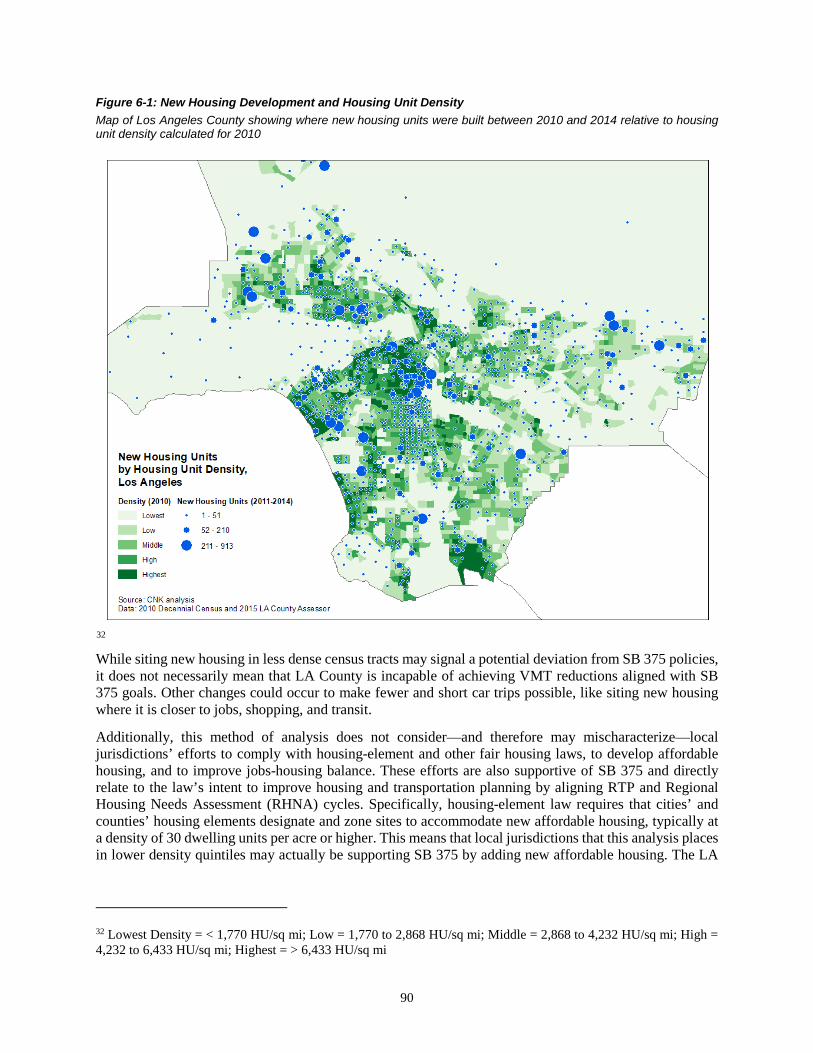
90
Figure 6-1: New Housing Development and Housing Unit Density Map of Los Angeles County showing where new housing units were built between 2010 and 2014 relative to housing unit density calculated for 2010
32 While siting new housing in less dense census tracts may signal a potential deviation from SB 375 policies, it does not necessarily mean that LA County is incapable of achieving VMT reductions aligned with SB 375 goals. Other changes could occur to make fewer and short car trips possible, like siting new housing where it is closer to jobs, shopping, and transit.
Additionally, this method of analysis does not consider—and therefore may mischaracterize—local jurisdictions’ efforts to comply with housing-element and other fair housing laws, to develop affordable housing, and to improve jobs-housing balance. These efforts are also supportive of SB 375 and directly relate to the law’s intent to improve housing and transportation planning by aligning RTP and Regional Housing Needs Assessment (RHNA) cycles. Specifically, housing-element law requires that cities’ and counties’ housing elements designate and zone sites to accommodate new affordable housing, typically at a density of 30 dwelling units per acre or higher. This means that local jurisdictions that this analysis places in lower density quintiles may actually be supporting SB 375 by adding new affordable housing. The LA
32 Lowest Density = < 1,770 HU/sq mi; Low = 1,770 to 2,868 HU/sq mi; Middle = 2,868 to 4,232 HU/sq mi; High = 4,232 to 6,433 HU/sq mi; Highest = > 6,433 HU/sq mi

91
prototype system does not differentiate between this type of development and general sprawl development. As such, results may show this new housing growth as deviating from SB 375 goals.
These issues and concerns are precisely why this project includes a variety of indicators; the Advisory Committee and the researchers acknowledge that—currently—there is no singular data source or metric that perfectly conveys progress toward meeting the goals of SB 375. Tables 6-5 through 6-7 group Los Angeles census tracts according to jobs, retail, and transit access (respectively) to attempt to characterize these other factors that may translate to progress in moving toward the goals of SB 375.
Table 6-5: Benchmarking New Housing against Access to Jobs Baseline Share of new housing built one and four years from the baseline (2010) in census tracts grouped by most to least accessible to transit
Column 1 Column 2 Column 3 Column 4 Column 5 Column 6
Baseline,
2010 Share of New Housing
Units Parity Index,2 Change Relative
to Baseline in Each Quintile Tract quintiles ranked by
access to jobs1 Share of All
Housing Units 1-Year
Change 4-Year
Change 1-Year
Change 4-Year
Change Lowest Access (< 1.51) 3 22% 25% 26% 1.14 1.18
Low (1.51–1.64) 22% 26% 22% 1.18 1.00 Middle (1.64–1.71) 20% 16% 18% 0.80 0.90
High (1.71–1.76) 19% 14% 12% 0.74 0.63 Highest Access (> 1.76) 18% 18% 21% 1.00 1.17
County Total 3,443,742 5,763 26,405 1 Each category contains roughly 20 percent of all LA County census tracts, 468 or 469 each. 2 A parity index score of 1 means new development/change is proportionately the same as the baseline; a parity index score greater than 1 means new development/change is disproportionately overrepresented relative to the baseline; a parity index score less than 1 means new development/change is disproportionately underrepresented relative to the baseline. 3 Accessibility measures are index figures; here, scaled by one million
Interpretation of Table 6-5, new housing relative to baseline job access:
• Change in new housing, one year - The results indicate that a larger share (51 percent) of new housing occurred in census tracts with lower access to jobs; 32 percent of new housing was built in tracts with higher job accessibility. The parity index, however, shows that the new housing in the census tracts with the highest job accessibility were proportional to the baseline and disproportionately overrepresented in low-access tracts relative to the baseline.
• Change in new housing, four years - More new housing occurred over the four years in census tracts with lower job access (48 percent); the parity index (1.17) indicates that new housing is occurring disproportionately more in both the lowest and highest job-accessible tracts relative to the baseline.

92
Table 6-6: Benchmarking New Housing against Access to Retail Baseline Share of new housing built one and four years from the baseline (2010) in census tracts grouped by most to least accessible to retail
Column 1 Column 2 Column 3 Column 4 Column 5 Column 6
Baseline, 2010 Share of New Housing
Units Parity Index,2 Change Relative
to Baseline in Each Quintile Tract quintiles ranked by
access retail1 Share of All
Housing Units 1-Year
Change 4-Year
Change 1-Year
Change 4-Year
Change Lowest Access (< 6.63) 3 21% 24% 26% 1.14 1.24
Low (6.63–8.20) 21% 28% 25% 1.33 1.19 Middle (8.20–9.17) 21% 15% 17% 0.71 0.81 High (9.17–10.17) 19% 16% 12% 0.84 0.63
Highest Access (> 10.17) 18% 17% 20% 0.94 1.11 County Total 3,443,742 5,763 26,405
1Each category contains roughly 20 percent of all LA County census tracts, 468 or 469 each. 2 A parity index score of 1 means new development/change is proportionately the same as the baseline; a parity index score greater than 1 means new development/change is disproportionately overrepresented relative to the baseline; a parity index score less than 1 means new development/change is disproportionately underrepresented relative to the baseline. 3 Accessibility measures are index figures; here, scaled by one billion
Interpretation of Table 6-6, new housing relative to baseline retail access:
• Change in new housing, one year - A larger share (52 percent) of new housing occurred in census tracts with low/lowest access to retail; 33 percent of new housing was built in tracts with high/highest access to retail. The parity index shows the new housing occurred disproportionately in census tracts with low/lowest access to retail (and was proportionately underrepresented in tracts with high/highest access to retail).
• Change in new housing, four years - More new housing continued to occur in the census tracts with lower retail access (51 percent). The parity index for the low (1.19) and lowest (1.24) quintiles indicates that new housing is disproportionately occurring in the lower retail-accessible neighborhoods.
An important consideration to keep in mind when interpreting this data is the possibility that, in some neighborhoods, retail development follows new housing development. Thus, while new housing appears to arrive in neighborhoods with low retail accessibility, mixed use development may nevertheless be underway.
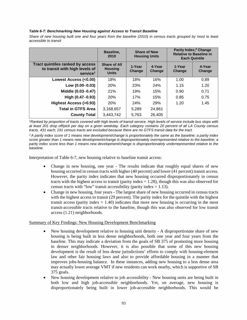
93
Table 6-7: Benchmarking New Housing against Access to Transit Baseline Share of new housing built one and four years from the baseline (2010) in census tracts grouped by most to least accessible to transit
Baseline,
2010 Share of New Housing Units
Parity Index,2 Change Relative to Baseline in
Each Quintile Tract quintiles ranked by access
to transit with high levels of service1
Share of All Housing
Units 1-Year
Change 4-Year
Change 1-Year
Change 4-Year
Change
Lowest Access (<0.00) 18% 18% 16% 1.00 0.89 Low (0.00–0.03) 20% 23% 24% 1.15 1.20
Middle (0.03–0.47) 21% 19% 15% 0.90 0.71 High (0.47–0.93) 20% 17% 15% 0.85 0.75
Highest Access (>0.93) 20% 24% 29% 1.20 1.45 Total in GTFS Area 3,168,657 5,289 24,861
County Total 3,443,742 5,763 26,405 1Ranked by proportion of tracts covered with high levels of transit service. High levels of service include bus stops with at least 201 drop off/pick per day on a given weekday. Each category contains 20 percent of all LA County census tracts, 431 each; 191 census tracts are excluded because there are no GTFS transit data for the tract. 2 A parity index score of 1 means new development/change is proportionately the same as the baseline; a parity index score greater than 1 means new development/change is disproportionately overrepresented relative to the baseline; a parity index score less than 1 means new development/change is disproportionately underrepresented relative to the baseline.
Interpretation of Table 6-7, new housing relative to baseline transit access:
• Change in new housing, one year - The results indicate that roughly equal shares of new housing occurred in census tracts with higher (40 percent) and lower (41 percent) transit access. However, the parity index indicates that new housing occurred disproportionately in census tracts with the highest access to transit (parity index = 1.28), though this was also observed for census tracts with “low” transit accessibility (parity index = 1.13).
• Change in new housing, four years - The largest share of new housing occurred in census tracts with the highest access to transit (29 percent). The parity index for the quintile with the highest transit access (parity index = 1.40) indicates that more new housing is occurring in the most transit-accessible tracts relative to the baseline, though this was also observed for low transit access (1.21) neighborhoods.
Summary of Key Findings: New Housing Development Benchmarking
• New housing development relative to housing unit density - A disproportionate share of new housing is being built in less dense neighborhoods, both one year and four years from the baseline. This may indicate a deviation from the goals of SB 375 of promoting more housing in denser neighborhoods. However, it is also possible that some of this new housing development is the result of less dense jurisdictions’ efforts to comply with housing-element law and other fair housing laws and also to provide affordable housing in a manner that improves jobs-housing balance. In these instances, adding new housing to a less dense area may actually lower average VMT if new residents can work nearby, which is supportive of SB 375 goals.
• New housing development relative to job accessibility - New housing units are being built in both low and high job-accessible neighborhoods. Yet, on average, new housing is disproportionately being built in lower job-accessible neighborhoods. This would be

94
considered a deviation from the goals of SB 375 of promoting more housing closer to jobs to reduce distance traveled to work.
• New housing development relative to retail accessibility - The results are mixed: There is proportionately overrepresentation of new housing units in lower and higher retail-accessible neighborhoods, though most of the concentration is occurring in lower retail-accessible areas neighborhoods. This would be considered a deviation from SB 375 of locating new housing closer to retail. However, this interpretation may miss the common sequencing of mixed use developments, whereby retail is sited after housing development is complete.
• New housing development relative to transit accessibility—Relative to the baseline year, new housing units are proportionately overrepresented in both low and highest transit-accessible neighborhoods, though, on average, more are disproportionately being built in high transit access areas, a pattern consistent with promoting SB 375.
Net Changes in Jobs
This subsection examines how changes in employment activity, as measured through net changes in jobs, support SB 375 goals. As with the previous analysis of measuring short-term changes in new housing units, census tracts in Los Angeles are divided into five quintiles separately for each of the four baseline indicators (housing unit density, access to jobs, access to retail, and access to transit). Short-term changes in jobs are measured across each of these baseline indicators. The results are presented in tables and maps on the following pages.
Table 6-8 reports the baseline distribution of jobs and net changes in jobs, in lowest- to highest-density neighborhoods. Column 3, measuring one-year change from the baseline, illustrates that a larger share of jobs was being located in “high”- and “highest”-density neighborhoods compared to “low” and “lowest” density: 49 percent of the net growth in jobs were located in the high-/highest-density quintiles (11 percent + 38 percent), and 30 percent in low-/lowest-density quintiles (21 percent + 9 percent).
By 2014, this pattern reverses with a higher share of jobs being distributed in lower-density neighborhoods. Fifty-seven percent of the net growth in jobs occurred in low-/lowest-density neighborhoods (17 percent + 40 percent) while 38 percent were in high-/highest-density tracts (36 percent + 2 percent).
Column 5 and 6 reports the parity index. Relative to the baseline, net increases in jobs occurred disproportionately more in the highest-density (parity index = 2.24) neighborhoods, followed by middle- (1.37) and low (1.17)-density areas in the one-year changes. In monitoring four years of change, net growth in jobs occurred disproportionately in both lowest- (1.11) and high-density (2.59) neighborhoods.
Figure 6-2 displays where the changes in jobs are occurring in Los Angeles relative to the housing unit density baseline. The circles on the map are roughly proportional to the size of the change in jobs at the tract level. Blue circles represent net increases in jobs while red indicates net losses.

95
Table 6-8: Benchmarking Changes in Jobs against Housing Density Baseline Share of one- and four-year changes in jobs from the baseline (2010) in census tracts groups by highest to lowest housing unit density
Column 1 Column 2 Column 3 Column 4 Column 5 Column 6
Baseline,
2010 Share of Net
Changes in Jobs Parity Index,2 Change Relative to Baseline
in Each Quintile Tract quintiles ranked by housing unit density1
Share of All Jobs
1-Year Change
4-Year Change
1-Year Change
4-Year Change
Lowest Density (< 1,770 HU/sqmi) 36% 9% 40% 0.26 1.11
Low (1,770–2,868) 18% 21% 17% 1.17 0.95 Middle (2,868–4,232) 15% 21% 5% 1.37 0.32
High (4,232–6,433) 14% 11% 36% 0.79 2.59 Highest Density (> 6,433
HU/sqmi) 17% 38% 2% 2.24 0.13 County Total 4,133,333 45,873 238,219
1 Each category contains roughly 20 percent of all LA County census tracts, 468 or 469 each. 2 A parity index score of 1 means new development/change is proportionately the same as the baseline; a parity index score greater than 1 means new development/change is disproportionately overrepresented relative to the baseline; a parity index score less than 1 means new development/change is disproportionately underrepresented relative to the baseline.

96
Figure 6-2: Changes in Jobs and Housing Unit Density Map of Los Angeles showing the net changes in jobs between 2010 and 2014 relative to housing unit density calculated for 2010
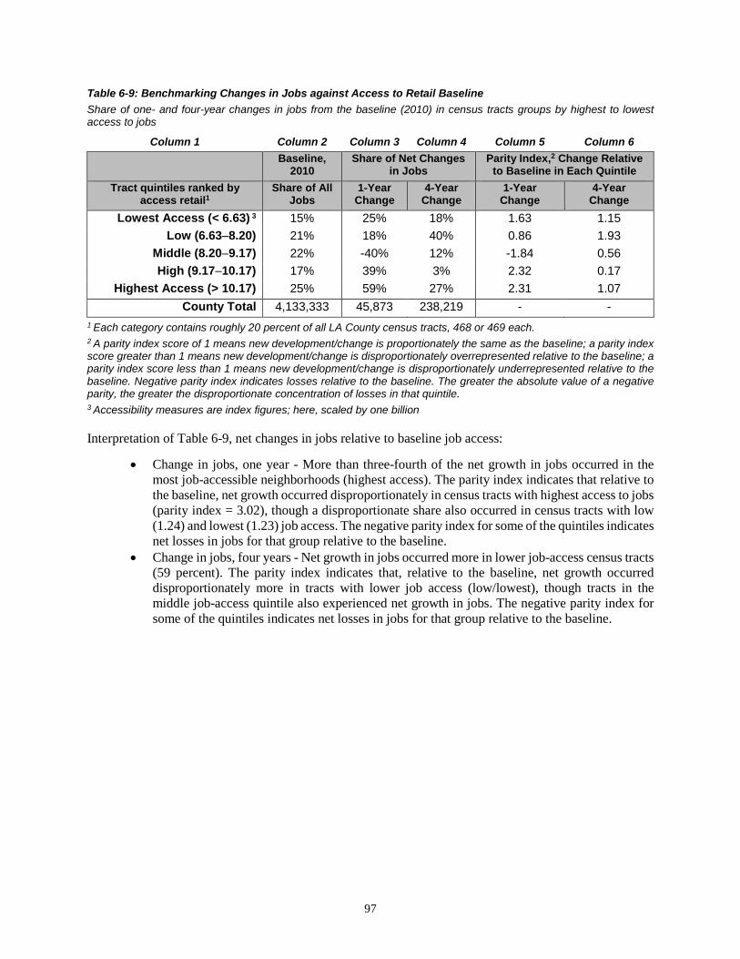
97
Table 6-9: Benchmarking Changes in Jobs against Access to Retail Baseline Share of one- and four-year changes in jobs from the baseline (2010) in census tracts groups by highest to lowest access to jobs
Column 1 Column 2 Column 3 Column 4 Column 5 Column 6
Baseline,
2010 Share of Net Changes
in Jobs Parity Index,2 Change Relative
to Baseline in Each Quintile Tract quintiles ranked by
access retail1 Share of All
Jobs 1-Year
Change 4-Year
Change 1-Year
Change 4-Year
Change Lowest Access (< 6.63) 3 15% 25% 18% 1.63 1.15
Low (6.63–8.20) 21% 18% 40% 0.86 1.93 Middle (8.20–9.17) 22% -40% 12% -1.84 0.56 High (9.17–10.17) 17% 39% 3% 2.32 0.17
Highest Access (> 10.17) 25% 59% 27% 2.31 1.07 County Total 4,133,333 45,873 238,219 - -
1 Each category contains roughly 20 percent of all LA County census tracts, 468 or 469 each. 2 A parity index score of 1 means new development/change is proportionately the same as the baseline; a parity index score greater than 1 means new development/change is disproportionately overrepresented relative to the baseline; a parity index score less than 1 means new development/change is disproportionately underrepresented relative to the baseline. Negative parity index indicates losses relative to the baseline. The greater the absolute value of a negative parity, the greater the disproportionate concentration of losses in that quintile. 3 Accessibility measures are index figures; here, scaled by one billion
Interpretation of Table 6-9, net changes in jobs relative to baseline job access:
• Change in jobs, one year - More than three-fourth of the net growth in jobs occurred in the most job-accessible neighborhoods (highest access). The parity index indicates that relative to the baseline, net growth occurred disproportionately in census tracts with highest access to jobs (parity index = 3.02), though a disproportionate share also occurred in census tracts with low (1.24) and lowest (1.23) job access. The negative parity index for some of the quintiles indicates net losses in jobs for that group relative to the baseline.
• Change in jobs, four years - Net growth in jobs occurred more in lower job-access census tracts (59 percent). The parity index indicates that, relative to the baseline, net growth occurred disproportionately more in tracts with lower job access (low/lowest), though tracts in the middle job-access quintile also experienced net growth in jobs. The negative parity index for some of the quintiles indicates net losses in jobs for that group relative to the baseline.

98
Table 6-10: Benchmarking Changes in Jobs against Access to Retail Baseline Share of one- and four-year changes in jobs from the baseline (2010) in census tracts groups by highest to lowest access to retail
Column 1 Column 2 Column 3 Column 4 Column 5 Column 6
Baseline,
2010 Share of Net Changes
in Jobs Parity Index,2 Change Relative
to Baseline in Each Quintile Tract quintiles ranked by
access retail1 Share of All
Jobs 1-Year
Change 4-Year
Change 1-Year Change 4-Year Change
Lowest Access (< 1.51) 3 17% 20% 22% 1.23 1.32 Low (1.51 - 1.64) 22% 28% 37% 1.24 1.65
Middle (1.64 - 1.71) 17% -2% 33% -0.10 1.99 High (1.71 - 1.76) 19% -23% -14% -1.22 -0.71
Highest Access (> 1.76) 25% 77% 22% 3.02 0.86 County Total 4,133,333 45,873 238,219
1 Each category contains roughly 20 percent of all LA County census tracts, 468, or 469 each. 2 A parity index score of 1 means new development/change is proportionately the same as the baseline; a parity index score greater than 1 means new development/change is disproportionately overrepresented relative to the baseline; a parity index score less than 1 means new development/change is disproportionately underrepresented relative to the baseline. Negative parity index indicates losses relative to the baseline. The greater the absolute value of a negative parity, the greater the disproportionate concentration of losses in that quintile. 3 Accessibility measures are index figures; here, scaled by one billion
Interpretation of Table 6-10, net changes in jobs relative to baseline job access:
• Change in jobs, one year—More than three-fourth of the net growth in jobs occurred in the most job-accessible neighborhoods (highest access). The parity index indicates that relative to the baseline, net growth occurred disproportionately in census tracts with highest access to jobs (parity index = 3.02), though a disproportionate share also occurred in census tracts with low (1.24) and lowest (1.23) job access. The negative parity index for some of the quintiles indicates net losses in jobs for that group relative to the baseline.
• Change in jobs, four years—Net growth in jobs occurred more in lower job-access census tracts (59 percent). The parity index indicates that, relative to the baseline, net growth occurred disproportionately more in tracts with lower job access (low/lowest), though tracts in the middle job-access quintile also experienced net growth in jobs. The negative parity index for some of the quintiles indicates net losses in jobs for that group relative to the baseline.

99
Table 6-11: Benchmarking Changes in Jobs against Access to Transit Baseline Share of one- and four-year changes in jobs from the baseline (2010) in census tracts groups by most to least accessible to transit
Column 1 Column 2 Column 3 Column 4 Column 5 Column 6
Baseline, 2010
Share of Net Changes in Jobs
Parity Index,2 Change Relative to Baseline
in Each Quintile Tract quintiles ranked by access to transit with high levels of service1
Share of All Jobs
1-Year Change
4-Year Change
1-Year Change
4-Year Change
Lowest Access (<0.00) 17% -27% 6% -1.52 0.36 Low (0.00–0.03) 17% 29% 18% 1.67 1.07
Middle (0.03–0.47) 18% 43% 25% 2.38 1.38 High (0.47–0.93) 20% -4% 29% -0.22 1.45
Highest Access (>0.93) 27% 59% 21% 2.19 0.77 Total in GTFS Area 3,873,313 52,525 225,263 - -
County Total 4,133,333 45,873 238,219 - - 1 Ranked by proportion of tracts covered with high levels of transit service. High levels of service include bus stops with at least 201 drop off/pick per day on a given weekday. Each category contains 20 percent of all LA County census tracts, 431 each; 191 census tracts are excluded because there are no GTFS transit data for the tract. 2 A parity index score of 1 means new development/change is proportionately the same as the baseline; a parity index score greater than 1 means new development/change is disproportionately overrepresented relative to the baseline; a parity index score less than 1 means new development/change is disproportionately underrepresented relative to the baseline.
Interpretation of Table 6-11, changes in jobs relative to baseline transit access:
• Change in jobs, one year - The results indicate that more than half of the net growth in jobs occurred in neighborhoods with highest transit access. Net growth in jobs also occurred in the low and middle transit-access census tracts. As indicated by the party index in Column 5, a disproportionate share of the growth in jobs occurred in highest (2.19), middle (2.38), and low (1.67) transit-access neighborhoods relative to the baseline.
• Change in jobs, four years - Similar to the one-year change in jobs, half of the net growth in jobs occurred in neighborhoods with high/highest transit access. Relative to the baseline, the growth in jobs was overrepresented in both highest and low transit-access neighborhoods.
Summary of Key Findings: Net Changes in Jobs Benchmarking
• Net changes in jobs relative to housing unit density - There is proportionately overrepresentation of net growth in jobs in both lower- and higher-density neighborhoods, though on average, denser neighborhoods disproportionately saw greater net growth in jobs. It is unclear from the literature where jobs should be located relative to residential density in terms of promoting SB 375 goals, but the argument can be made for both spectrum. As discussed previously, locating more jobs in less dense neighborhoods in Los Angeles, oftentimes the suburbs, can help reduce distance traveled among workers who often drive a longer distance to work. Likewise, one can make the argument that putting more jobs in dense neighborhoods will allow employers to draw on workers who are nearby.
• Net changes in jobs relative to job access—The patterns of net changes in jobs indicates that net growth occurred disproportionately in both lower and highest job-accessible neighborhoods in the one year following the baseline. By 2014, net growth in jobs was disproportionately overrepresented in lower job-access neighborhoods. As noted earlier, it is less clear from the literature where jobs should be distributed relative to job accessibility in promoting SB 375.

100
However, in our opinion, increasing more job opportunities in neighborhoods with low job access can benefit those who generally have less opportunities to access jobs and may have to commute a longer distance for work.
• Net changes in jobs relative to retail access—Net growth in jobs occurred disproportionately in both lowest and higher retail-access neighborhoods in the one year from the baseline; though higher retail-accessible neighborhoods saw more of the concentration of net growth. In the four years following the baseline, net growth in jobs was overrepresented in lower retail-access neighborhoods relative to the baseline. It is less clear from existing literature where jobs should be placed relative to retail accessibility in promoting SB 375. However, in our opinion, increasing jobs in higher retail-accessible neighborhoods can help reduce the amount of distance workers would have to travel for shopping by promoting trip chaining and increasing more opportunities for workers to shop closer to work.
• Net changes in jobs relative to transit access—The results are mixed: There is proportionately overrepresentation in net growth of jobs at the lower and higher transit-access neighborhoods. To be consistent with SB 375 goals, we would like to see new jobs being added to transit-rich areas to encourage the use of mass transit.
Net Changes in Retail Revenues
To understand real-world changes in retailing activity and how these changes promote SB 375, the analysis examines changes in retail revenues as a proxy of measuring retailing activity. As previously noted, a major limitation of examining changes in retail revenue (as well as net changes in jobs) is that retail is highly susceptible to business cycle influences. The observed fluctuations may be attributed to actual changes or may also simply reflect the economy at the time. For changes in retail revenue, the problem is further compounded by the rapid increase in online shopping or e-commerce, leading to losses in brick-and-mortar store sales; the latter is examined for this project. All these factors can contribute to net losses in retail revenues as indicated by the negative values in the table. Retail sales data from NETS/D&B indicate that Los Angeles, overall, saw net losses in total retail revenues in the one- and four-year changes from the baseline. These losses are evident in the analysis of monitoring short-term changes in retailing activity relative to the baseline indicators.
As with the previous two analyses of short-term changes of new housing and net changes in jobs, this analysis examines changes in retail sales against the baseline indicators of housing unit density, access to jobs, access to retail, and access to transit. The analysis of net changes in retail revenue begins with monitoring net changes relative to housing unit density baseline.
Table 6-12 reports the changes in retail revenue, as a share of the overall changes (losses) in LA County, in lowest- to highest-density neighborhoods. Column 3, measuring the one-year change from the baseline, illustrates that net losses in retail sales occurred nearly equally in both low-/lowest- and high-/highest-density census tracts (-43 percent and -40 percent, respectively). However, relative to the baseline year and indicated by the parity index, higher-density neighborhoods incurred greater losses than lower-density neighborhoods. By 2014, nearly half (-47 percent) of the net losses in retail sales occurred in low-/lowest-density tracts. However, relative to the baseline year, the concentration of losses occurred in both middle- and high-density quintiles, indicated by a parity index of -1.19 and -1.16, respectively.
Figure 6-3 displays where the changes in retail revenues are occurring in Los Angeles relative to the housing unit density baseline. The circles on the map are roughly proportional to the size of the change in revenue at the tract level. Although Los Angeles, overall, exhibited net losses in retail, not all census tracts incurred losses. Blue circles represent net growth in sales and red indicates net losses.

101
Table 6-12: Benchmarking Changes in Retail Revenues against Housing Density Baseline Share of one- and four-year changes in retail revenues from the baseline (2010) in census tracts grouped by highest to lowest housing unit density
Column 1 Column 2 Column 3 Column 4 Column 5 Column 6
Baseline, 2010
Share of Net Changes (Losses) in Retail Sales
Parity Index,2 Change Relative to Baseline in
Each Quintile
Tract quintiles ranked by housing unit density1
Share of All Retail
Sales 1-Year
Change 4-Year
Change 1-Year
Change 4-Year
Change
Lowest Density (< 1,770 HU/sqmi) 30% -21% -28% -0.68 -0.94 Low (1,770–2,868) 21% -22% -19% -1.07 -0.91
Middle (2,868–4,232) 16% -17% -19% -1.05 -1.19 High (4,232–6,433) 17% -20% -20% -1.16 -1.16
Highest Density (> 6,433 HU/sqmi) 16% -20% -14% -1.30 -0.87 County Total (in millions) $99,692 -$19,359 -$16,310 - -
1 Each category contains roughly 20 percent of all LA County census tracts, 468 or 469 each. 2 A parity index score of 1 means new development/change is proportionately the same as the baseline; a parity index score greater than 1 means new development/change is disproportionately overrepresented relative to the baseline; a parity index score less than 1 means new development/change is disproportionately underrepresented relative to the baseline. Negative parity index indicates losses relative to the baseline. The greater the absolute value of a negative parity, the greater the disproportionate concentration of losses in that quintile.

102
Figure 6-3: Changes in Retail Revenue and Housing Unit Density Map of Los Angeles showing the net changes in retail revenue between 2010 and 2014 relative to housing unit density calculated for 2010

103
Table 6-13: Benchmarking Changes in Retail Revenues against Access to Jobs Baseline Share of one- and four-year changes in retail revenues from the baseline (2010) in census tracts grouped by most to least accessible to jobs
Column 1 Column 2 Column 3 Column 4 Column 5 Column 6
Baseline, 2010
Share of Net Changes (Losses) in Retail Sales
Parity Index,2 Change Relative to Baseline in Each
Quintile Tract quintiles ranked by
access to jobs1 Share of All Retail Sales
1-Year Change
4-Year Change
1-Year Change
4-Year Change
Lowest Access (< 1.51) 3 23% -24% -23% -1.01 -0.98 Low (1.51–1.64) 20% -19% -21% -0.92 -1.05
Middle (1.64–1.71) 18% -14% -18% -0.76 -0.99 High (1.71–1.76) 20% -20% -17% -1.01 -0.88
Highest Access (> 1.76) 19% -24% -21% -1.29 -1.11 County Total (in millions) $99,692 -$19,359 -$16,310 - -
1 Each category contains roughly 20 percent of all LA County census tracts, 468 or 469 each. 2 A parity index score of 1 means new development/change is proportionately the same as the baseline; a parity index score greater than 1 means new development/change is disproportionately overrepresented relative to the baseline; a parity index score less than 1 means new development/change is disproportionately underrepresented relative to the baseline. Negative parity index indicates losses relative to the baseline. The greater the absolute value of a negative parity, the greater the disproportionate concentration of losses in that quintile. 3 Accessibility measures are index figures; here, scaled by one million
Interpretation of Table 6-13, changes in retail revenues relative to baseline job access:
• Changes in retail sales, one year - Net losses in retail sales occurred nearly equally in low/lowest and high/highest job-accessible neighborhoods. However, as indicated by the parity index for high (-1.01) and highest (-1.29), greater job-accessible census tracts incurred the greatest net loss in retail activity.
• Changes in retail sales, four years - The results indicate that 44 percent of the net losses in retail sales occurred in lower job-accessible census tracts (-21 percent for low and -23 percent for lowest) compared to 38 percent for higher job accessible neighborhoods (-17 percent for high and -21 percent for highest). The parity index shows that relative to the baseline, net losses occurred disproportionately in low (-1.05) and highest (-1.11) job-accessible tracts.
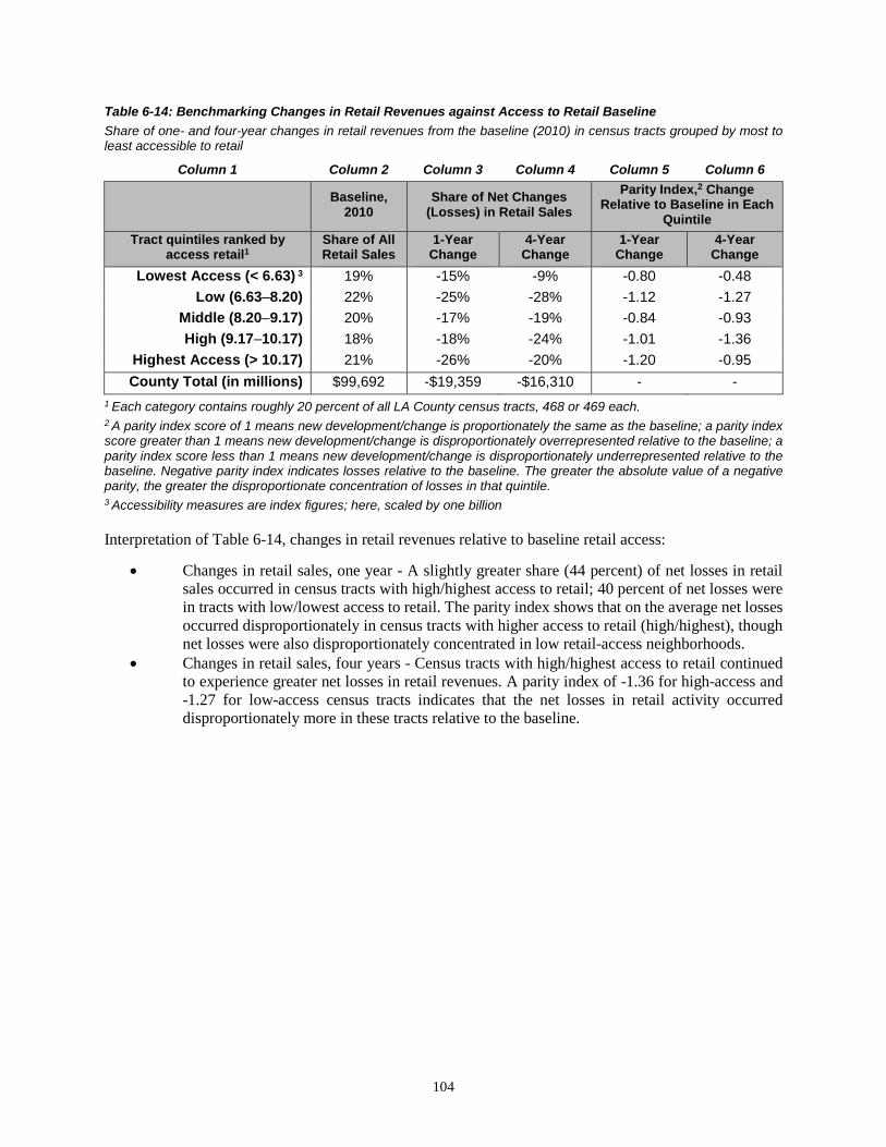
104
Table 6-14: Benchmarking Changes in Retail Revenues against Access to Retail Baseline Share of one- and four-year changes in retail revenues from the baseline (2010) in census tracts grouped by most to least accessible to retail
Column 1 Column 2 Column 3 Column 4 Column 5 Column 6
Baseline, 2010
Share of Net Changes (Losses) in Retail Sales
Parity Index,2 Change Relative to Baseline in Each
Quintile Tract quintiles ranked by
access retail1 Share of All Retail Sales
1-Year Change
4-Year Change
1-Year Change
4-Year Change
Lowest Access (< 6.63) 3 19% -15% -9% -0.80 -0.48 Low (6.63–8.20) 22% -25% -28% -1.12 -1.27
Middle (8.20–9.17) 20% -17% -19% -0.84 -0.93 High (9.17–10.17) 18% -18% -24% -1.01 -1.36
Highest Access (> 10.17) 21% -26% -20% -1.20 -0.95 County Total (in millions) $99,692 -$19,359 -$16,310 - -
1 Each category contains roughly 20 percent of all LA County census tracts, 468 or 469 each. 2 A parity index score of 1 means new development/change is proportionately the same as the baseline; a parity index score greater than 1 means new development/change is disproportionately overrepresented relative to the baseline; a parity index score less than 1 means new development/change is disproportionately underrepresented relative to the baseline. Negative parity index indicates losses relative to the baseline. The greater the absolute value of a negative parity, the greater the disproportionate concentration of losses in that quintile. 3 Accessibility measures are index figures; here, scaled by one billion
Interpretation of Table 6-14, changes in retail revenues relative to baseline retail access:
• Changes in retail sales, one year - A slightly greater share (44 percent) of net losses in retail sales occurred in census tracts with high/highest access to retail; 40 percent of net losses were in tracts with low/lowest access to retail. The parity index shows that on the average net losses occurred disproportionately in census tracts with higher access to retail (high/highest), though net losses were also disproportionately concentrated in low retail-access neighborhoods.
• Changes in retail sales, four years - Census tracts with high/highest access to retail continued to experience greater net losses in retail revenues. A parity index of -1.36 for high-access and -1.27 for low-access census tracts indicates that the net losses in retail activity occurred disproportionately more in these tracts relative to the baseline.

105
Table 6-15: Benchmarking Changes in Retail Revenues against Access to Transit Baseline Share of one- and four-year changes in retail revenues from the baseline (2010) in census tracts grouped by most to least accessible to retail
Column 1 Column 2 Column 3 Column 4 Column 5 Column 6
Baseline, 2010
Share of Net Changes (Losses) in Retail Sales
Parity Index,2 Change Relative to Baseline in
Each Quintile Tract quintiles ranked by access
to transit with high levels of service1
Share of All Retail Sales
1-Year Change
4-Year Change
1-Year Change
4-Year Change
Lowest Access (<0.00) 16% -12% -11% -0.74 -0.69 Low (0.00–0.03) 21% -23% -24% -1.07 -1.12
Middle (0.03–0.47) 22% -19% -24% -0.88 -1.11 High (0.47–0.93) 21% -26% -24% -1.21 -1.14
Highest Access (>0.93) 20% -21% -18% -1.06 -0.90 Total in GTFS Area $91,755 -$11,040 -$15,116 - -
County Total $99,692 -$11,707 -$16,310 - - 1 Ranked by proportion of tracts covered with high levels of transit service. High levels of service include bus stops with at least 201 drop off/pick per day on a given weekday. Each category contains 20 percent of all LA County census tracts, 431 each; 191 census tracts are excluded because there are no GTFS transit data for the tract. 2 A parity index score of 1 means new development/change is proportionately the same as the baseline; a parity index score greater than 1 means new development/change is disproportionately overrepresented relative to the baseline; a parity index score less than 1 means new development/change is disproportionately underrepresented relative to the baseline.
Interpretation of Table 6-15, changes in retail revenues relative to baseline transit access:
• Changes in retail sales, one year - The results indicate that nearly half of net losses in retail activity occurred in census tracts with the high/highest access to retail (47 percent). The parity index for the quintile with low transit access (-1.12), high transit access (-1.01), and highest (-1.20) transit access indicates that net losses in retail activity occurred disproportionately in these neighborhoods relative to the baseline.
• Changes in retail sales, four years - High/highest access to transit neighborhoods, on average, continued to incur most of net losses in retail sales. Although high transit access experienced disproportionately more losses as indicated by the parity index (-1.14), a disproportionate concentration of losses also occurred in low (-1.12) and middle (-1.11) transit-access neighborhoods relative to the baseline.
Summary of Key Findings: Net Changes in Retail Revenues
The findings for net changes in retailing revenues should be viewed with caution because of the influence of the business cycle and secular decrease in brick-and-mortar store sales because of the rapid increase in e-commerce, both of which can contribute to the negative values (losses) exhibited in the analysis of net changes in retailing revenues.
• Net changes in retail revenues relative to housing unit density— across the four years, middle- to high-density neighborhoods incurred disproportionately more losses in retail sales relative to the baseline. This may indicate that residents in these neighborhoods may be traveling elsewhere for their shopping, a deviation from SB 375 of promoting more shopping near where one lives to help reduce distance traveled to shopping. The literature is less clear on where more retailing should be placed relative to residential density.

106
• Net changes in retail revenues relative to job access— the findings indicate that neighborhoods with greater access to jobs saw disproportionately more losses in retailing activity relative to the baseline. Again, the literature is ambiguous about where retailing should go relative to job accessibility. An argument can be made that more retailing should occur in greater job-accessible neighborhoods because it can promote trip chaining and shopping near work, thereby minimizing distance traveled. If this were the case, then seeing more losses in retailing activity in job-accessible neighborhoods would be considered a deviation. The results, in turn, should indicate a net growth in retail sales that is disproportionately greater than the baseline or net losses that are disproportionately less than the baseline.
• Net changes in retail revenues relative to retail access— the results indicate that net losses in retailing, on average, occurred disproportionately in higher retail-accessible neighborhoods. This is pattern is consistent in both one- and four-year changes. Again, the literature does not clearly state where more retailing should go relative to retail accessibility in promoting SB 375. Existing studies, such as the one discussed earlier regarding big-box stores in Davis, California, indicate that adding more retail opportunities into low retail-accessible neighborhoods helped reduced VMT on average.
• Net changes in retail revenues relative to transit access— on average, census tracts with higher access to transit disproportionately saw more losses in retail revenues than lower transit-access neighborhoods. This in, our opinion, would be a deviation from the goals of SB 375 of promoting more retailing activities near transit. Losses should be disproportionately less relative to the baseline or there should instead be a net growth in retail sales in higher transit-accessible neighborhoods to be consistent with SB 375.
Conclusions
The results from the Los Angeles prototype are mixed, but indicate outcomes that are not consistent with SB 375 goals. On the positive side, the analysis finds that new housing units are locating in areas with greater access to transit. However, the spatial distribution of new developments and net changes indicate that housing, jobs, and retailing are becoming more geographically dispersed on the short run. This finding, however, should be viewed with caution because of the potential influence of cyclical fluctuations, which may obscure more promising long-term secular developments. It is also possible that this dispersion is occurring in a way that clusters new developments into neighborhoods with greater mix of land uses. That is, although there is dispersion, it is offset by better linkages across activities, which could mitigate the need to travel for work, shopping, and other activities. Determining whether this is occurring is beyond the scope of this project, but something that may be worth exploring in the future.
Overall, the results provide some insights that may be useful in identifying issues that should be addressed in the immediate future to better guide urban spatial development along a more sustainable path.

107
Chapter 7
SURVEY OF METROPOLITAN PLANNING ORGANIZATION LAND USE AND SUSTAINABLE COMMUNITY STRATEGY IMPLEMENTATION
Overview of the Project and Findings
Motivation
This report section describes the findings of an interview-based study undertaken alongside the development of the prototype monitoring system. We conducted interviews with MPO land-use planning managers to examine MPOs’ experiences with regional land-use planning under SB 375 and with SCS implementation. In particular, we sought to understand how the state’s MPOs track land use and development changes in their respective regions and whether and to what extent MPOs formally monitor such changes.
Methods
We conducted interviews with executive planning managers and senior staff at each of California’s 18 MPOs in the period from January through April 2017. These are the senior MPO leadership who direct the organization’s land-use planning, and thus who work closely with MPO staff and local governments in the region to develop the SCS. Twenty-two individuals participated in the study; a few were interviewed more than once, yielding 25 interviews in total. Interviews lasted 72 minutes on average, though the longest was 121 minutes and the shortest, 51 minutes. We conducted a second interview for three MPOs, usually in cases in which the respondent had more detailed observations to share and the discussion could not be completed in a single interview session.
We conducted structured interviews and asking each respondent the same set of questions, covering the following topics:
• The MPO’s approach to the “forecasted regional development pattern” required by SB 375;
• MPO policies to encourage development in areas prioritized by that forecasted pattern;
• MPO efforts to track land use and development changes, particularly regarding SCS implementation;
• Observations about whether or how regional development is changing under SB 375; and
• Regional factors helping and hindering SCS implementation.
For each MPO we also reviewed the region’s own RTP/SCS in conjunction with the interview. We paid particular attention to the SCS chapter or section and to any technical appendices discussing land use. The RTP/SCS provided important context for the region and the MPO’s planning under SB 375.
Overarching Observations
We draw two sets of conclusions from our conversations with MPOs and our review of their RTP/SCS and supporting documents. The first set summarizes the state of MPO practice with regard to land-use tracking and monitoring, and the second reflects on how these findings lend support to the concept of statewide monitoring to assess SCS implementation and progress under SB 375. Additionally, in the numbered sections that follow we discuss our more detailed study findings.

108
The State of the Practice: Metropolitan Planning Organizations and Land-Use Tracking
We note first that there is wide variation in MPOs’ data-collection practices and the data and information they seek to and are ultimately able to collect about land use and development changes. There is also a range of ways in which MPOs use, model, and analyze data for applications in their regions. Some larger MPOs have more extensive data systems, partly enabled perhaps by greater staff capacity, but other larger MPOs do not. Such variation sums to substantial inconsistencies and gaps in regional data systems across California, ultimately hindering any comparison of indicators and performance across regions that would rely on available MPO metrics.
Second, we note that MPOs on the whole conduct very limited assessment of how recent land-use activities and built-environment changes relate to SB 375. The RTP process focuses on projected (hypothetical) future possible outcomes based on models, with comparison to a present baseline; the baseline may be a couple of years old by the end of the RTP/SCS development process. While all MPOs update the baseline every four years for RTP/SCS development, they seldom systematically assess real-world changes by comparing measures from the current period baseline with the previous baseline using observed (not forecasted) data. There are both technical and nontechnical reasons for this. To the degree monitoring of short-term changes is done, there is usually no explicit, consistent, nor systematic assessment relative to SB 375 goals and objectives. Additionally, each MPO is on its own individual schedule for updating the RTP/SCS, meaning MPOs do not all assess baseline conditions in the same year.
The Advantages of Statewide Monitoring
The preceding two meta-observations suggest that a system that monitors short-term / recent changes but also allows for long-term trends to be observed could be particularly useful in land-use activities and the built environment relative to SB 375 indicators. Such a system cannot simply be constructed by compiling existing data and metrics from the MPOs because of inconsistencies and gaps. There is also a need for a uniform set of SB 375 indicators to bench recent developments.
Advantages and Efficiencies in Statewide Data Collection. For measuring progress toward SB 375 implementation, many regions may be better served by considering a set of standardized state indicators than by conducting their own assessment of local land-use alignment with the regional SCS. We find, as documented in the following sections, that many MPOs struggle to collect and maintain reliable sources of data for tracking local land-use developments. The development of statewide indicators could alleviate the burden that MPOs face in collecting data, a task that falls especially heavily on medium and smaller MPOs with more limited staff capacity. A state-directed data-collection effort could also provide more leverage for acquiring data sources that present collection challenges across the state’s region, such as parcel level assessor data. There are efficiencies to capture as well, where statewide data collection could replace individual efforts by each of the state’s 18 MPOs to get similar data that the state might productively provide instead.
Statewide Monitoring and Indicators Could More Reliably Assess Near-Term Progress on SB 375. Statewide monitoring is one of two conceptual approaches one can imagine for assessing implementation under SB 375. As described in the larger body of this report and in the proposed monitoring prototype, a large-scale statewide approach could assess changes in the urban spatial structure of a region and evaluate in a fundamental way whether such changes improve the accessibility of residences, workplaces, and retail establishments overall, meeting broader long-term SB 375 objectives. A second approach would be to examine region-by-region how land-use development in that region aligns with the development pattern forecasted within that region’s SCS.

109
For many parts of the state, individual MPO-driven monitoring following the first approach is likely to provide a different—and perhaps unclear—picture of progress. For instance, the SCS for many MPOs reflects such abundant future development capacity relative to anticipated demand that a wide range of near-term development (i.e., the locations of residences, workplaces, or retail) will be consistent with the SCS. Embedded in the RTP/SCS regional development forecast are the local General Plans that reflect this ample planned capacity and that often assume longer time horizons than the RTP/SCS. For these reasons, standardized indicators applied statewide may provide a more meaningful and objective measure of progress—particularly in the near term—than would a region’s forecasted development pattern. Further, assessing development changes against a set of statewide indicators rather than against a region-specific SCS indicators allows for assessment of progress across multiple regions and even statewide.
A Statewide Approach to Assessment of SB 375 Implementation May Be More Politically Acceptable Than a MPO-Driven Approach. This study suggests there may be clear advantages to structuring the monitoring of local government land development as a statewide rather than an MPO-driven project. Our interview study clearly demonstrates that few MPOs perceive it is their role to track whether local government land use and development decisions “align” or are “consistent” with the RTP/SCS. Indeed, these very words carry sensitive charge in many regions; MPO managers were uniformly quick to note that their member cities and counties—not the MPO—have ultimate authority over land use and that SB 375 does not require local governments to make choices that would be consistent with or help to realize the SCS development pattern. Several MPO planning managers recounted how during the first SCS they had to overcome significant local government skepticism and resistance toward SB 375; many MPOs’ member cities and counties incorrectly feared the law’s new requirements allowed MPOs to encroach on local land-use authority. We conclude, therefore, that expecting MPOs to critically monitor and assess changes in urban spatial structure without a statewide monitoring approach would place some MPOs in an awkward and uncomfortable position and may be unrealistic. MPO-driven monitoring could place an MPO in an awkward position and ultimately undercut its role as a regional decision-making forum.
Study Findings
The sections that follow discuss our findings from our interview-based study in detail. We organize our findings as follows: (1) MPOs’ practices for learning about and tracking development; (2) MPO efforts to develop or use data systems for land-use tracking; and (3) barriers to and opportunities for enhancing monitoring of land-use change in light of SB 375 objectives.
MPO Practices for Learning about and Tracking Land Use and Development in Their Regions
Data That MPOs Commonly Track
We used our conversations with MPO planning managers to examine how their own MPO learns about and tracks changes in land use and development in their regions. We asked about how the MPO tracks such changes in general and, in particular, how it tracks such changes with respect to the forecasted land-use pattern outlined in their region’s RTP/SCS. We also asked each MPO whether it collects or receives specific types of data from its local governments or other sources. We asked about zoning and land-use maps; development proposals (i.e., tentative maps, development plans, draft environmental impact reports [EIRs]); and proposals for zoning changes, General Plan amendments, or for Local Agency Formation Commission (LAFCo) approval to update a city’s sphere of influence or to annex land.
We find that, for all MPOs, the need to update the RTP is the single most important driver behind their efforts to understand land use and development changes in their region. The four-year RTP cycle is the most common denominator leading MPOs to update their data for and understanding of land use and development among their member cities and counties. Very few MPOs take steps to comprehensively update their land use and development data outside the four-year RTP cycle, although most MPOs do

110
receive an ongoing flow of certain land-use data, irrespective of the RTP cycle. Development proposals that trigger environmental review and even some that do not, for instance, arrive throughout the year.
Among the different kinds of land use and development data that MPOs might receive or collect, we found that land use and zoning maps are data that all MPOs receive or work to collect for their local jurisdictions. This information comes in different forms from different local governments, and the MPO typically must harmonize them in some way to establish a regional picture of zoned capacity. “Integration is key,” said one interviewee working with many local governments, “but very hard.” Almost all MPOs reported tracking General Plan updates or amendments proposed by their member cities. In most instances, the MPOs report receiving notices from cities directly about such proposals or being invited to meetings where proposals would be discussed; many MPOs pay close attention to General Plan updates, in particular. In some cases, MPOs report receiving proposed amendment notices only for significant changes. In some regions, generally medium-sized, MPOs report that their staffs monitor the city council meeting agendas for their local governments to keep informed of such developments. The third most common data MPOs report tracking are development proposals that trigger environmental assessment; many California MPOs must review such proposals in their role as metropolitan area councils of governments, a process also known as “intergovernmental review” (IGR) or a “clearinghouse” function.
Most MPOs do not systematically collect or track information about proposed zoning changes; instead, they may devote attention only to proposed changes deemed significant or regionally significant, or that impact or relate to transportation in some way. One of the state’s largest MPOs with a comprehensive data-collection system reported tracking this only informally, observing that zoning does not change very fast in most places. Almost no MPOs report proactively tracking LAFCo applications for annexations or sphere of influence changes, but they report different reasons for this. Several MPOs said that such applications to LAFCo are rare in their regions. Others reported learning about such applications in other ways, such as regular meetings with local governments.
Other Data That MPOs Track or Would Like to Track
When asked about other data that MPOs use to track land use and development in their regions, several MPOs mention seeking out various data about housing provision. Three MPOs report tracking local government compliance with state requirements to complete General Plan housing elements, and one of these collected the annual housing reports submitted by their local jurisdictions to the state’s Department of Housing and Community Development (HCD). A fourth MPO seeks local jurisdictions’ housing permit data to update the regional travel model. A couple of MPOs report collecting building permit data from local governments, while another purchases these data from the California Homebuilding Foundation—Construction Industry Research Board. Other MPOs named building permits (or certificates of occupancy) among the data they would like to have. Indeed, one larger MPO said:
One of the projects we have been talking about is a permit pipeline database for all local jurisdictions in the region. To date we have worked primarily through…planning staff to engage local jurisdictions regarding…housing development in their community (number of permits, permits by location…, housing type, and other criteria). We are able to gather quite a bit of information, but the general consensus at the staff level is that it’s still kind of clunky. What we’d like to do is to develop a database that communities can access, that we can have on a semi-real time basis, and do a better job tracking where and what type of housing is being built across the region by community.
Listed in Table 7-1 are other kinds of data both collected and desired by MPOs to understand land use and development in their regions. It is worth noting that each MPO appeared to describe its own set of data used for RTP/SCS development, and many of the data items were mentioned only by only one MPO.

111
Table 7-1: Other Data That MPO’s Would Like to Collect (from structured interviews of MPO staff) Other Data Collected
• Aerial imagery (USGS, Google Maps, and Google Earth) • Antidisplacement policies • Apartment rental data—Apartments.com • Bike paths • Building permit data (MPO survey) • Permit data—RAND “California data set” by zip code and cities • Bus routes • California Farmland Mapping and Monitoring Program (FMMP) • Coastal development permits • Community plans • CoStar—commercial real estate data (office retail, industrial, apartments) • Complete Streets resolutions • Business and employment data (Employment Development Department [EDD]; Dun &
Bradstreet; infoUSA) • Geographic Information Systems (GIS) data • Housing elements • Housing reports to HCD • Housing units • LEHD data—US Census • Specific plans • Travel surveys • US Census data/ACS
Other Data Desired • Agricultural/conservation easements • Affordable housing data (deed-restricted properties) • Assessors’ parcel data with land-use characteristics • Assessors’ parcel data with building detail (type, size, year built) • Bicycle-network data (city level) • Bicycling data―STRAVA data • Bicycle counts • Certificates of occupancy • County General Plan with digital maps (updated) • Employment data (employees, sector, location) • Commercial/nonresidential vacancy rates • Business permits (standardized across local governments) • Public lands GIS layer • House price data • Impact fee data (city level, for individual parcels) • Parking inventory data (off-street) • Pedestrian counts • Pedestrian-network data (city level) • Real time traffic data • Rental price data • Transit passenger counts

112
Differences in Tracking Practices among MPOs
The extent to which MPOs track changes in land use and physical development in their region varies widely across MPOs. Analysis of our interview data lead us to characterize MPO tracking practices along two dimensions: extent and frequency.
Some MPOs work systematically to collect and analyze near-comprehensive data inputs and information about land use and development. Indeed, MPOs that track more extensively are likely to collect at least several of the “other data collected” listed in Table 7-1. Further, the data sources they identify as “desired” tend to be specialized, though not exclusively. At the other end of the spectrum, it is not uncommon for MPOs to focus on acquiring only the essential inputs necessary to update their regional travel demand model for the four-year RTP/SCS development.
In between, some MPOs describe developing their own internal data collection or tracking systems, to understand or document development in their region. For instance, the San Luis Obispo Council of Governments (SLOCOG) collaborates with its county Air Pollution Control District (APCD) to survey local governments about building permits, specifically for new residential, nonresidential, and mixed‐use projects that are completed and have received occupancy permits. In general, it appears that where fewer local jurisdictions exist in a region, it is easier for the MPO to proactively collect information, updates, and data from those jurisdictions. In regions with large numbers of local governments, the sheer task of working with so many jurisdictions may lead the MPO to rely more on readily available data from the US Census and other data products.

113
Figure 7-1: MPO Practices for Tracking Land Use and Development
The frequency with which MPOs collect land-use information and data varies as well. At minimum, every four years, MPOs collect the data needed for updating their RTP/SCS baseline measures of regional land use, housing, and transportation and for their regional travel demand and land-use models and forecasts. Many MPOs, especially (but not exclusively) those serving large and complex regions, report that the scale of data inputs required for the RTP/SCS updates and forecast make data collection an ongoing process, and that shortly after RTP/SCS adoption by the MPO board, the staff begin working on updates for the next plan. In regions with a small number of local governments and slow rates of growth, data collection is less frequent.
Our research suggests that many external factors beyond an MPO’s control influence just how extensively and frequently it monitors development. This point is important to emphasize, particularly when considering how MPOs compare with one another in their monitoring practices. For instance, data-collection frequency may have more to do with the pace of growth or development in a region than it does with an MPO’s commitment to tracking that development. Staffing levels matter as well. Consider how one interviewee explained the MPO does not track land-use changes between RTP cycles:
Development doesn’t happen that fast to do that.… To get the cumulative picture, you have to update all of the latest land use plans, the assumptions, the latest growth and forecast information,

114
and General Plan updates. It’s a herculean effort that starts before the adoption of the prior RTP. If we had four times as many staff, we could do it annually. But we don’t have those resources, and there’s also not that much need to do it on that rapid of a cycle. Development doesn’t happen that fast. And we’re one of fastest growing regions in the state.33
Also, specialized data for land-use tracking may be more readily available or applicable in certain regions. Drawing on our discussions with MPO planning managers, we identified a host of factors that influence how often and how extensively an MPO tacks land-use changes around the region.
Table 7-2: Factors Influencing the Extent and Frequency of MPOs' Land Use and Development Tracking, Including the Direction of Influence
As this factor increases… Extent Frequency Regional Factors
Rate of growth in the region Environmental sensitivity of the region Number of local governments in the region
Local Factors Local government General Plan updates Local government staffing/resource levels Local government GIS capacity Local projects submitted for clearinghouse reviews
MPO Factors
MPO staffing/resource levels Overlaps between MPO and other regional functions
MPO–local government communication MPO involvement in clearinghouse reviews
Data Factors Data standardization across local governments – Private ownership of data Data publication frequency – Data quality –
Drawing on interviews with all 18 MPOs and on the MPOs’ RTP/SCS chapters and technical appendices related to land use and development of the forecasted regional development patterns, we developed a general picture that describes the range of land-use tracking practices among the state’s MPOs. Our data 33 Our interviews with MPO managers were conducted early in 2017, prior to the passage of SB 1, The Road Repair and Accountability Act of 2017. The law aims to assist MPOs with planning challenges associated with implementing SB 375. For MPOs and local governments, the law makes new Sustainable Communities Grants available “to support and implement Regional Transportation Plan (RTP) Sustainable Communities Strategies (SCS)” and to achieve the state’s GHG reduction goals. Of the $25 million that Caltrans will administer annually under the program, half will be distributed to MPOs on a formula basis and half will be awarded through a competitive process to MPOs and local governments. http://www.dot.ca.gov/hq/tpp/grants/1718/1_14SEP17_FinalSustainableCommunitiesGrantGuideFY2017-18.pdf

115
sources lead us to characterize both the extent and frequency of tracking by high, medium, and low levels, as described in Figure 7-1. These levels serve roughly to organize the diversity of MPO practices, not to evaluate definitively whether individual MPOs are doing more or less.
In general, we found that the largest, most urban MPOs—the so-called Big Four MPOs serving the Los Angeles, San Diego, Sacramento, and San Francisco regions—tend to track land use and development more extensively and frequently than other MPOs. The MPO for the Lake Tahoe region fits here as well given the special authority it exercises over land use to preserve the fragile natural environment of the Tahoe region. The organizations that track land use largely to complete RTP/SCS updates and to meet the basic needs for plan and forecast development tend to be smaller and located in California’s more rural or agricultural regions. MPOs serving the state’s central coast regions appear to fall somewhere in the middle.
Our decision not to assign individual MPOs to specific boxes reflects the limits of this study. Our discussion with MPOs about their tracking practices was one of many topics covered in the interview and supports general classifications, not precise assignments. Any definitive evaluation or ranking of individual MPO practices would require far more in-depth study for each organization, targeted in many instances toward different staff with specific data collection and analysis responsibilities. For one MPO only, for example, we interviewed the chief staff person for land-use data collection and modeling. The interview focused exclusively on data sources, issues, and practices, and provided in-depth insights into the MPO’s practices, but required more than 90 minutes to cover these topics alone.
Notable Practices
Looking across the state, a number of California’s 18 MPOs employ similar practices that facilitate active and passive tracking of local land use and development. These include intergovernmental review of development proposals and planning, specialized working groups organized around the regional planning process, and maintenance of in-house information systems to track land use and development activity. Additionally, it appears that local government land-use information may flow more naturally to MPOs when they exist within metropolitan or regional councils of government or other organizations that serve multiple planning or analytical functions in a region.
Intergovernmental Review and Clearinghouse Processes
Almost all MPOs we interviewed derive information benefits from their participation in state-sanctioned Intergovernmental Review (IGR) under the California Environmental Quality Act (CEQA) and, perhaps similarly, in regional reviews of applications for federal aid. While it was unclear in some interviews whether a respondent was describing the CEQA-driven review or review of federal grant aid applications, both review processes can deliver MPOs important information about development activity in their regions.
California environmental law designates metropolitan area councils of governments (COGs)—and hence MPOs that housed organizationally within COGs—as the regional CEQA clearinghouse. It tasks them with identifying and reviewing projects deemed significant under CEQA criteria outlined in Table 7-3. Within such reviews, MPOs may comment on a project or its EIR in terms of
any inconsistencies between the proposed project and applicable general plans, specific plans, and regional plans…[including] regional transportation plans, regional housing allocation plans, regional blueprint plans, plans for the reduction of GHG emissions, habitat conservation plans, natural community conservation plans and regional land use plans for the protection of the Coastal Zone, Lake Tahoe Basin, San Francisco Bay, and Santa Monica Mountains. (SB 375 § 15125 (d))
California MPOs may also review local government applications for select federal grants, under a remnant of the 1960s’ A-95 circular process. Presidential Executive Order 12372 allows “States, in consultation with local general purpose governments, [to either] develop…or refine…processes for State and local

116
elected officials to review and coordinate [applications for]…Federal financial assistance.”34 The California Governor’s Office of Planning and Research coordinates state and local review of certain federal grant or loan applications and may consult with MPOs through this process.35
Table 7-3: CEQA Determinants of Regional Significance
• General plan amendments for which an EIR is prepared • Project with significant traffic or impact on state or federal air regulations • Residential developments > 500 units • Shopping centers > 500,000 square feet • Office buildings > 250,000 square feet • Industrial > 40 acres or 650,000 square feet OR employing > 1,000 people
MPOs serving regions with many local governments and with significant development activity to keep track of may derive especial value from such clearinghouse/review processes. The processes increase the likelihood that a local government will share development proposals and environmental documents with the MPO. The manager at one large MPO described the IGR process as “quite helpful,” even though it technically covers only regionally significant projects.
We are a clearinghouse for intergovernmental review, so we get a lot of information. The cities are only required to provide it to us for projects of regional significance, even though we are receiving many, many projects that are not regionally significant…. [W]e see all kinds of development proposals, notices of preparations, draft EIRs.
The manager further described how the IGR information flow has allowed the MPO to learn about warehouse projects planned in the region for the next 10 years and to observe a gradual shift from more single-family to mixed-use developments.
Internal Tracking of Development in the Region
A small minority of MPOs we interviewed described maintaining their own internal spreadsheet, database, or data system for tracking development in the region. Most of these MPOs seem to have developed a straightforward tool to help them monitor the status of residential, commercial, or other land-use projects under development. The following tables show the information tracked by the San Joaquin Council of Governments (SJCOG) and SLOCOG in their respective databases. Such tools help to organize incoming information for MPO review through IGR clearinghouse and federal grant application review processes. The MPO may use the tool to track whether it has commented on the proposal, project, or environmental report.
The information collected in such databases also becomes valuable to the MPOs as it begins to update the RTP/SCS. One small rural MPO, for instance, described receiving information about permit requests, development approvals, and environmental notices. “We get a heads up when environmental analysis is being initiated for new development. We maintain files on that information and that can be reviewed for updating the RTP. We also check in with local jurisdictions about where they are at with various proposals.”
34 https://www.archives.gov/federal-register/codification/executive-order/12372.html 35 https://www.whitehouse.gov/omb/grants_spoc; https://www.opr.ca.gov/s_federalgrantreview.php

117
Table 7-4: Data Fields Collected in Two MPOs' Land-Use Project Tracking Database Application #/Description Document Type Comment Deadline Location CMP Comment APN Project Description ALUC Comment Contact (name, e-mail) Land Use Project (name) Hsg Units: SF (single family) Gross Density (du/ac) Location Hsg Units: MF (multi family) Employment (Y/N) Jurisdiction Total Hsg Units Mixed Use (Y/N) Community Total # Lots/Units New Growth In GIS .shp Built or UC Lots Infill (Proposed Land-Use Projects)
Vacant Lots/New Units Redevelopment
Type of Development Residential sq. ft. Vacant Lots Type of Development (ordinal)
Commercial sq. ft. Project Status
Est. Acreage Proposed Hotel Rooms
Regional Meetings for RTP/SCS Development
In-person communication about land use and development in the state’s cities and regions remains an important way that MPOs keep abreast of changing land use and development. Many interview respondents say that they learn about land-use changes and development projects in local jurisdictions simply by attending regular planning or working group meetings held within the ongoing regional planning process.
For instance, the San Diego Association of Governments (SANDAG), hosts a technical working group (TWG), a monthly standing staff working group, comprised of planning or community development directors from each member jurisdiction and representatives of relevant public agencies and service providers. The TWG advises on development and implementation of the regional plan and SCS, and is clearly a rich forum for information exchange, relevant for developing the regional land-use forecast and beyond.36 MPO staff describe the TWG as:
a forum for all kinds of things: to discuss forecast development, collect land use inputs, to review initial rounds of forecasting results and then again sub-regionally, to update the Smart Growth Concept Map [the region’s forecasted development pattern], and to report on major planning updates in local governments, updates to grant programs. We…ask [members] for a lot of information. They share information with us at the meetings, through surveys, and at policy committee meetings.
At least one MPO, in a less populous county, also mentioned meetings hosted by local governments as an important information source: “Sometimes we go to City Council and Board of Supervisor meetings. We always are invited into the [general] plan update process…and we are one of the agencies they circulate their EIR to, so we are made aware of land use decisions.”
The Benefit of Overlapping Organizational Roles
Our study results suggest that it can be easier for MPOs to remain aware of local land-use developments and residential or commercial projects in their region if the MPOs overlaps in some way with other regional or local agencies or administrative units. For example, 15 of the state’s 18 MPOs are housed within regional councils or associations of governments. The RTP function of these MPO thus unfolds alongside planning
36 http://www.sandag.org/uploads/committeeid/committeeid_57_16907.pdf

118
for other regional issues, potentially ranging from sanitation to workforce development to environmental enhancement and conservation. Many, though not all such councils, are also designated as the regional clearinghouse under CEQA and perform IGR of significant projects, as described in the preceding text.
Such functional overlaps increase the flow of information to the MPO about local land use and development issues, which can help inform development of the RTP/SCS. Observations shared by the San Joaquin MPO illustrate how a variety of organizational roles can reinforce the MPO’s land-use planning efforts.
Because we are a Regional Congestion Management Program [state and federal] and our Airport Land Use Commission [for LA County] as well as our Regional Transportation Impact Fee Program (tied to explicitly our Regional Congestion Management Program and to our [transportation sales tax] measure program), we get most of the development applications for our local jurisdictions. And those are tracked in a database because we provide comment letters. We track development that way, and we are typically aware of what’s going on with the jurisdictions…. Also, because of the ongoing coordination we do around transportation projects, very often there is a tie to specific plan changes or something of that nature….We also administer a habitat conservation program [San Joaquin Multispecies and Habitat Conservation Plan] and we’re aware of land use development through that program, as well. Development pays in to that program for future acquisition of easements for mitigation for habitat and farmland impacts. I will tell you, it really is helpful to us in keeping up with what is going on around the county, and of course, we’re only single-county MPO.
Our research reveals a variety of non-MPO organizational functions and responsibilities that may overlap with a region’s MPO in some way. Open communication channels between the MPO staff and the staff/organizations responsible for these other functions can enhance MPO awareness of development activity in the region. Table 7.5 captures some of this organizational overlap for California MPOs.

119
Table 7-5: Organizational and Functional Overlaps of California MPOs

120
Metropolitan Planning Organization Development and Use of Data Systems for Land-Use Tracking
In considering MPOs’ land-use tracking and monitoring practices, we sought to learn more specifically about their collection and use of data. In particular, we wondered to what extent MPOs have or are developing their own “data systems” to monitor land use and development. We sought to understand whether MPOs have data systems in place or are developing them. Using the concept of a “data system,” we consider:
• The data MPOs are likely to use (data that are readily available data from local and other sources vs. data that are not readily available and that may require working with local jurisdictions and other entities to access or―in some instances―to collect);
• The level of effort, if any, made to assess data quality and/or to correct or improve data; and • The MPO’s use of data to construct indicators for assessing land-use change and performance.
We looked for evidence of these practices in a few ways. First, we consulted the transcripts of our interviews with MPO planning managers. In a series of open-ended interview questions about MPO efforts to track land-use changes, respondents shared observations about the effort required to acquire different data; data quality; and, sometimes, MPO efforts to assess or improve it. We deliberately used open-ended interview questions to prompt conversation around such matters. For instance, we asked:
• How does your MPO learn about or track changes in land use and development? • To what extent is it easy or difficult to do so? • If difficult, what, if any, circumstances or factors make it difficult to collect such data? • What, if any, factors might increase your MPO’s ability to collect/review/monitor such data?
Second, we reviewed each MPO’s most recently adopted RTP/SCS; in particular, we examined the chapters and technical appendices dealing with land use and the region’s forecasted development pattern. The appendices provided detailed accounts of data in some cases. We also visited MPO websites to identify any links to or information about available regional data.
Overall, we find—as with broader MPO efforts to track land-use change and development in their region—that MPOs focus their data efforts first and foremost around development and updating of the RTP/SCS document, namely its baseline estimates for current land use, employment, and housing, and their respective forecasts for later in the planning horizon. Data applications intended to monitor or track current land use with respect to SCS implementation, or even to compare the current baseline with a previous one, are rare. And while MPOs do use data to construct different kinds of performance indicators within the RTP/SCS, such indicators are largely oriented toward the performance of the plan or its planning scenarios, if more than one scenario is used. Performance measurement, in other words, is largely about measuring the planned future, not about measuring changes to date to gauge present progress.
MPOs go to varying lengths to acquire and control the quality of data used to inform the land-use elements of their RTP/SCS planning. Predictably, urban area size and complexity seem to correlate with the collection of more extensive data. Significant data requirements for developing RTP/SCS baselines, forecasts, and models in large urban regions mean that larger MPOs pay attention to a wider variety of data sources and development of a data repository that can serve the needs of RTP/SCS development and updates. Data assembled by the SACOG and SCAG, for example, listed in Table 7-6, are extensive. Similarly, a foundational piece of the land-use model employed by the Bay Area MPO is a complex spatial database, capturing zone, parcel, and building level information, including rich building and parcel attributes and zoning.

121
Table 7-6: Land-Use Data Inputs for the SCS for the Los Angeles Region MPO (SCAG)
• Existing land use • General plan land use and zoning • Resource areas:
All publicly owned parks and open space Protected open space or habitat areas Habitat for species (candidate, fully protected, sensitive or of special status) Lands subject to conservation or agricultural easements Areas designated for open space or agricultural uses Areas containing biological resources Areas subject to flooding
• Farmland • Spheres of influence • High Quality Transit Areas (HQTA) and transit priority areas (TPA) • City/census tract boundary with ID • City/Tier2 TAZ boundary with ID
http://scagrtpscs.net/Documents/2016/final/f2016RTPSCS_SCSBackgroundDocumentation.pdf (p. 79)

122
Table 7-7: Land-Use Data Inputs for the SCS for the Sacramento Region MPO (SACOG) Baseline Data
• Total number of housing units and employees today (2012); • Jobs/housing ratio today (2012); • Percent of regional growth share for housing units and employees today (2012).
Historic Reference Data • Annual, five-year average and 10-year average historic residential building permits; • Percent of regional five-year and 10-year residential permits; • An extrapolation of the five-year and 10-year building permit averages to estimate 2012–36
housing unit growth if those past trends defined the future; • Historic county-level employment estimates from State of California Employment
Development Department; • Employment estimates from past SACOG MTP and MTP/SCS base years (2004 and 2008); • Percent of regional employment estimates from past SACOG MTP and MTP/SCS base years
(2004 and 2008). Capacity Data
• General Plan and specific plan capacity for housing units and employees; • How close existing housing units and employees are to reaching the capacity estimate (how
close the jurisdiction is to build-out today); • Mix of planned employment uses; mix of planned residential uses.
MTP/SCS Data • Housing units and employees assumed in the last MTP/SCS; • Regional share of growth of housing units and employees in the last MTP/SCS; • Job/housing ratio in the last MTP/SCS; • A projection of housing unit and employee growth based on percentage share of growth from
the current MTP/SCS applied to the new regional growth forecast. Sacramento Area Council of Governments (SACOG). (2016). Appendix F-3: Land Use Forecast Background Documentation, Metropolitan Transportation Plan/Sustainable Communities Strategy: Building a Sustainable System. Sacramento, CA. Retrieved from https://www.sacog.org/2016-mtpscs.
MPOs clearly see local jurisdictions as valuable sources of land-use information. Yet, such information is not always in the form of sharable, analyzable data, particularly from smaller regions. This can hamper systematic, regular data collection and transmission one might look for in a “data system.” For instance, one MPO with mostly small cities notes that getting GIS files and layers and other land-use data from jurisdictions can be difficult.
It’s not because they don’t want to share, it’s because they don’t have resources. Some are so small, they don’t even have an in-house planner. They contract it out and don’t have good records to track information. Sometimes [the land-use information] is all in paper, so we have to digitize and geocode it.
Conversely, in a large region, the sheer number of local jurisdictions can require extra effort by the MPO to collect land-use data from individual cities.
Most MPOs work to engage in a back-and-forth discussion with their local jurisdictions when developing a baseline picture and expected future conditions. They work to develop baseline land-use information and maps—ideally, drawn from the cities—and then present this information back to the local jurisdictions in the region, allowing cities to indicate where things have changed or where the data or maps do not

123
correspond with current or expected conditions. Such follow-up may be simpler for an MPO with fewer and smaller local jurisdictions, as one interviewee explained.
We are small enough that we can work through most things [data for RTP update] through direct communication among staff…. Sometimes, for example, they’ll send a shape file with the general plan designations and maybe they won’t match up with what’s in the general plan, and we’ll go back and follow-up with them, but they are very responsive. Due to the manageability of our size, we’re able to work through things fairly efficiently.
Back-and-forth communication often happens through an ongoing working group or technical committee; monthly or quarterly meetings, for instance, bring local government planners and officials together with MPO staff throughout the RTP/SCS process. For instance, the San Diego MPO has a TWG; the Kern MPO, a Regional Planning Advisory Committee; the Monterey Bay area MPO hosts a Planning Directors’ Forum; and the Santa Barbara MPO a Technical Advisory Committee. While not a “data system” per se, these forums provide valuable information flows. One Central Valley MPO described the value of such channels for learning about development:
We do not have a formal data gathering process, so we do not know exactly what is going on. But we do have a close relationship with all our jurisdictions so we can find out, and in fact they tell us generally speaking what is going on. So, we don’t have the hard data, but we have the interpretive situation. And we hear about that fairly regularly. One of our standing committees is local jurisdictional staff and another is city managers and county administration…. [A] fairly regular topic of discussion…[is] the activity that is going on, so we don’t have an actual system to track the numbers.
Such forums provide cities opportunities to weigh in on data updates, correction, or adjustment. In addition, MPOs may take other steps to assess or refine the quality of data informing the plan or its assumptions. The Bay Area RTP/SCS document, for instance, discusses how the MPO drew local jurisdiction development constraints from General Plans, zoning data, and, in some cases specific plans, after assessing which source was “most likely to represent a jurisdiction’s long term expectations for development maximums at each location.”37 Similarly, the Sacramento RTP/SCS SACOG acknowledges that:
local land use plans…are the start, not the end, of the [data collection] process…as the sum of all local policies and regulations never yields a growth pattern exactly consistent with the projected amount of employment and housing growth for the entire region…. [Thus,] for each jurisdiction SACOG gathers and considers a number of other policy, regulatory and market factors that can affect the location or rate of development…. [O]ther data are gathered and used to assess development readiness of specific plans and master plans, which, unless they are under construction, inevitably have some amount of local, state or regional entitlement plus infrastructure improvement required in order to begin construction. This information comes largely from local government planning staff at each SACOG member agency, but can also come from other sources. (Appendix F-3, p. 60)
Notable Practices
We learned about several notable practices that might be described as more formal MPO-driven “data systems” and that are different from the data repositories assembled internally to meet the planning and modeling needs of the RTP/SCS process. Still, none of these is explicitly oriented toward assessment of
37 http://www.planbayarea.org/sites/default/files/pdf/final_supplemental_reports/FINAL_PBA_Predicted_Land_Use_Responses.pdf (pg. 25).

124
current, on-the-ground land-use changes or development in light of the SCS or its forecasted pattern of development.
Regional Councils Acting as Census-Affiliated Data Centers
Several smaller and medium-sized MPOs that are also regional councils of government serve as the US Census–affiliated data center in their respective regions. Examples include the MPO COG serving Kern, San Joaquin, Tulare, and San Luis Obispo. In this role, the regional council maintains a repository for census data, is a key point of contact for census-related activity in the region, and fields inquiries from local governments, businesses, and other entities and the public for basic data and sometimes more extensive data analysis or mapping services. It is unclear if this function is more closely tied to a COG’s identity as the regional council or to its overlapping role as an MPO delivering RTP. Among the councils hosting a census-affiliated data center, none of our interviewees, targeted for their expertise on land-use planning within the transportation planning process, explicitly mentioned this function. Rather, this role became evident from our review of the organization’s web site.
To what extent might a COG’s designation as a census data center yield synergies for the MPO-driven collection or tracking of land-use data, enhancing the MPO’s “data system”? While it is not within the scope of our study to assess this, some promising indications emerge in Kern. Alongside its census data center, Kern COG has since the 1990s also run a GIS-assistance program for its member local governments, helping them to develop and maintain their own GIS. The COG’s contribution on this score is noteworthy in light of the fact smaller and less well-staffed local governments often lack the resources to maintain a GIS or relevant files representing important land-use and zoning information, a fact that several interviewees emphasized. Further, Kern COG has also provided assistance and data to local governments for updating their individual housing elements, important activity under SB 375’s combined RHNA and RTP cycles. The state Department of Housing and Community Development praised the COG for “its tremendous effort to assist local governments in complying with the statutory requirements of housing element law” and making “data and other tools available to streamline preparation and review of housing elements for local governments in the Kern region” (see letter from Glen Campora, HCD, to Ahron Hakimi, Kern COG, 2014).38
MPOs Reporting Regional Trends and Data
Our study finds that MPOs do not explicitly monitor SCS implementation. Yet, we also find that some MPOs do collect information that measures present conditions in the region and, hence, that could be used to evaluate present (as opposed to planned future) performance.
The Vital Signs website of the San Francisco Bay Area MPO is perhaps the best example of such data collection and reporting, unified in a public data center39. The website reports trends observed over time (not forecasted expectations for the future) across the following issue areas: transportation, land and people, the regional economy, the environment, and equity. For each area, the MPO reports regional (multicounty) and county-level performance indicators, accompanied by brief text, charts, and graphics, and links for downloading indicator data. Vital Signs also tracks trends and performance related to “priority development areas”—which are central to its RTP/SCS—in the population indicator.Website indicators including housing growth, housing affordability, greenfield development, and DVMT relate directly to RTP/SCS land-use objectives. Yet, these indicators are reported in a stand-alone, descriptive fashion, without mention of the larger regional planning context or comparisons to plan objectives. For these reasons, Vital Signs
38 http://www.kerncog.org/images/docs/housing/Housing_Data_Report_201410.pdf 39 http://www.vitalsigns.mtc.ca.gov/

125
provides information and data first and foremost; no direct analysis of the MPO’s progress toward achieving the RTP/SCS “forecasted development pattern” is included.
An emphasis on descriptive reporting over performance measurement is also evident in the “Community Pulse” feature of the San Joaquin MPO’s website, under the “Data and Tools” web page. The feature is described as a “regional data and performance indicator measurement center, where you can see graphs, charts, and explore up to date data on our region.” The site reports largely descriptive aggregate (county-wide) snapshots of transportation, employment, and population growth; it provides descriptive text and charts but not data downloads. Data are presented without reference to RTP/SCS goals and without context of the region’s SCS vision. The websites of the Butte and Shasta MPOs report trends and regional data similarly, without relating them to RTP/SCS.
Separately, however, the San Joaquin COG does copublish Regional Analyst with the Eberhardt School of Business Center for Business and Policy Research; the newsletter reports insightfully on regional trends (e.g., in housing, job growth, commuting) and provides analysis that reflects policy issues. It was beyond the scope of our study, however, to examine if the newsletters specifically reference the RTP/SCS and its implementation.40
Project Trackers and Dashboards
We found two examples of MPOs that use a project tracking “data system” that is more extensive than some of the internal spreadsheets described in earlier. First, the Association of Monterey Bay Area Governments (AMBAG) is developing a project database that it reviews through its regional clearinghouse function, and screenshots of this system were obtained for this report (see Figure 7-2). The system tracks projects and proposals, along with associated meetings, notices, and other information, and it appears to be built on the “Transportation Economic Land Use System” software tool, a platform developed with grant support from the Federal Highway Administration and promoted for use by MPOs and DOTs to develop programming documents such as Transportation Incentive Program (TIPs) and deliver transportation planning responsibilities.41 If other California MPOs also use this or a similar system for developing their TIPs, is it possible to adapt these in a way that better supports MPO monitoring of land use and development?
The second example and more robust is in development by the Tahoe MPO, the Tahoe Regional Planning Agency (TRPA). The Tahoe MPO/RPA is also responsible for Lake Tahoe’s protection as an environmental resource and has—atypically—local land-use authority. The MPO is building an online data center/dashboard, Lake Tahoe Info,42 that houses a wealth of real-time data and information across a range of issue areas, many directly related to regional land use and development. It contains and displays information through various subsystems:
• Environmental Improvement Program (EIP) Project Tracker (Lake Tahoe EIP)—project entries for
Watersheds, Water Quality, and Habitat Forest Management Air Quality and Transportation Recreation and Scenic Resources Applied Science Program Support
• Parcel Tracker—entries for the “Transfer of Development Rights” program • Sustainability Dashboard—sustainability indicators for the Lake Tahoe region
40 http://ca-sjcog2.civicplus.com/Archive.aspx?AMID=42 41 http://www.telus-national.org/ 42 www.laketahoeinfo.org

126
• Monitoring Dashboard—for Regional Stormwater Monitoring Program (RSWMP) and other regional monitoring systems
The Lake Tahoe Info site also hosts a data center where one can download for:
• Regional indicators (234, various); • Local and regional plan documents and associated projects; • Watersheds (65 within the Tahoe Basin); • Partnership organizations (131) within the Lake Tahoe EIP; and • Web services to facilitate data sharing.
From a land-use perspective, the “parcel tracker” feature is noteworthy as a tool the MPO is currently building to implement and track its Transfer of Development Rights (TDR) program. The TDR program “seeks to redistribute development away from sensitive parcels into areas more suitable for growth.” Various types of TDR transactions are used to help realize GHG reductions, advance environmental standards, and increase affordable housing and other desirable development. Owners of sensitive property may use the TDR to realize value by selling their development rights.
Figure 7-2: Screenshots of the User Interface of AMBAG’s Project and Proposal Database

127
Monitoring Barriers and Opportunities
In asking MPO representatives about the type of data they collect and the ease by which they do so, we also sought to gain a better understanding of what barriers and opportunities exist that could help improve data sharing among local governments and MPOs. A number of key themes emerged.
Larger MPOs have more formal processes established for monitoring land-use changes, and they tend to have more resources to explore potential solutions to many of the challenges surrounding the issue. Many of the Big Four MPOs have piloted programs to build local staff capacity to facilitate information sharing with some success, or have begun to develop more sophisticated mapping or data systems to track development. In addition to the Big Four, the TRPA, which is the only regional authority in the state to hold land-use authority, is in the process of deploying a highly sophisticated program to track local activity, which will ultimately include real-time updates on building permits and other processes as they are uploaded by local governments.
Generally, most MPOs are utilizing an informal project review process such as an IGR clearinghouse. However, the have little to no control over which projects are sent or formal criteria established to filter what they review. Review and comments on projects with respect to a project’s relationship to the RTP/SCS appears limited.
Given land-use authority, TRPA has the most elaborate tracking and monitoring system in which locals are required to submit building permit and other data directly to a database managed by them. No other MPO compares in the extensiveness of land-use tracking. MTC and SANDAG have both explored GIS tools to help track development, which could also help see cumulative impacts of multiple projects. However, in most regions the recession brought development to a trickle, making the need to conduct extensive development tracking unnecessary. SCAG has provided GIS technical assistance directly to locals and has seen it is in high demand.
In mid-sized and smaller regions, an elaborate system may not be appropriate as it is in complex MPO regions with dozens of jurisdictions to monitor. However, if funding and resources were contributed to improving monitoring and tracking, it seems it would be best utilized by supporting capacity building at the local level, including funding for additional staff, data modernization through access to software, staff training in GIS and other systems, and funding to assist with updates to local General Plans.
At the same time, given the variable nature of development and its uneven distribution across the state, in addition to slow incremental pace of change in most places, it may not be worth the investment to develop such a system unless it was low cost and user friendly. Rather, most MPOs established TWGs or advisory committees consisting of local planning directors that serve as a regular and ongoing source of local land use and development updates. Encouraging MPOs that haven’t yet done so to establish and leverage the group to develop a more formal process for documenting land-use updates provided at such meetings may be a better approach at this time.
Table 7-8: List of Opportunities and Barriers to Data Sharing from the MPO Perspective OPPORTUNITIES BARRIERS Technical assistance and funding to support local General Plan Updates, GIS access, and literacy
Local staff capacity to update General Plans (plans and supporting data may not be current)
Leverage existing TWGs to regularly collect land-use updates
Local staff capacity to manage GIS and data systems
Leverage and formalize IGR processes, including new criteria to assess alignment with SCS, to track development
Data compatibility (different software, versions); variation in how and what is collected locally

128
Make better use of state-collected data process to inform MPOs (i.e., Annual Planning Survey, Housing Element Compliance)
Outdated General Plans slow or prevent SCS implementation progress
Illustrative Practices
San Diego Association of Governments
SANDAG uses a TWG as the chief data-collection mechanism and forum on local land-use and development activities. The TWG meets monthly or more often and consists of planning directors from each jurisdiction. It serves as a forum to discuss forecast development, collect land-use inputs, on updating the priority development areas, reports on major planning updates in local governments, and updates to grant programs. The MPO leverages this group to survey local jurisdictions on planning activities (list of updated plans, other types of plans) and jurisdictions equally utilize the group as a platform to share information with the MPO and other member agencies on local activities.
Southern California Association of Governments
Like other MPOs, SCAG has encountered challenges related to local-level unevenness with respect to GIS capacity.
Not all jurisdictions are using the same GIS system, and a significant number don’t even have any, making it difficult to collect and synthesize data. The other issue certainly is the required staffing resources…. We have an army of several interns and a GIS staff leading this. It is not easy for us to devote that many resources on.
In response, SCAG initiated a “GIS service program” to build local capacity by sending MPO staff to jurisdictions to provide direct technical assistance with GIS issues. The program helps facilitate data sharing at the local level. Jurisdictions provide the MPO with a general scope of their needs and MPO staff works onsite with them for several days or a week. This program has targeted the small- and medium-sized cities, who tend to lack staff capacity the most and SCAG reports that the number of cities requesting this service has been growing significantly.
Madera County Transportation Commission
Madera County Transportation Commission (CTC) talks directly to local agencies about land-use activities to anticipate, and reports receiving updates through informal channels regularly. Usually local jurisdictions will be the one to initiate this communication as part of the project review process. If something hits CEQA thresholds or needs consideration at the MPO level of analysis by looking at the land use and transportation interaction in the regional model, Madera CTC tries to make sure it can analyze the impacts.
Tahoe Regional Planning Agency
TRPA receives specific information about actual development actions being taken that they use in their regional analysis and modeling. Soon, they will receive updates in real time because they will be linked to the local governments’ permitting systems, but right now it is quarterly. They plan to tap into their permitting software, so it will give us a better understanding of what’s going on. They can accomplish this because they have land-use authority and delegate some local planning responsibilities to local governments in exchange for providing data and updates regularly.
Benchmarking New Development against SCS Objective Goals
As California MPOs have nearly all complete their second round of development per SB 375, policy makers have begun to turn an eye toward performance monitoring and measurement. One of the objectives of this

129
study has been to understand whether and how the state’s MPOs are tracking and monitoring local land use and development changes with respect to the objectives and forecasted land-use patterns articulated in the SCS.
We find that California MPOs for the most part refrain from data collection and reporting activities that measure or assess local land use and development activity against the land-use goals, objectives, and forecasted patterns articulated in their RTP/SCS documents. An example of an MPO that is undertaking such an effort is MTC/ABAG, where they analyze real-world housing production versus the SCS pattern on an annual basis (see Figure XX below).
Figure 7-3: When Bay Area Cities Will Reach Plan Bay Area 2040 Housing Targets Annual analysis conducted by MTC/ABAG to characterize real-world housing production and progress toward meeting 2040 housing targets.

130
Source: https://mtc.ca.gov/tools-and-resources/digital-library/map-month-june-2017-when-bay-area-cities-will-reach-plan-bay Regarding our general finding about the lack of data collection and progress tracking, our research suggests a variety of reasons for this; some are practical and logistical, others definitional, and still other philosophical and political.
• MPOs are acutely aware of the ambiguous position they occupy under the SB 375 framework, with its strong affirmations of local land-use authority. Consequently, some MPOs are hesitant to act or communicate in ways that would suggest they should assess whether local land-use decisions are appropriate under the RTP/SCS.
• MPOs that are engaged in more comprehensive data collection and assessment may focus more on being information providers than on arbiters of plan consistency, documenting regional trends rather than calling out developments that do not support the RTP/SCS.
• Some MPOs perceive monitoring as premature. • Practical issues abound for some MPOs, making it difficult to acquire the appropriate data to
undertake land-use monitoring or assessment to have the staff capacity to analyze it. • Regional development capacity/entitlements articulated in some RTP/SCS documents and their
underlying local plans may be so large/generous—and in some cases the demand for development far smaller—that the question of SCS alignment or consistency is (or is perceived to be) moot. There may, in other words, be nothing to monitor.
For these reasons, monitoring and assessment of local land use with respect to the RTP/SCS has been limited at most MPOs throughout the state.
A resounding theme expressed across most respondents was that it is simply too soon for MPOs to be engaged in such monitoring as development in general has been depressed by the Recession since the passage of SB 375 in 2008, which has had clear confounding impacts on the ability to gauge the impacts of the legislation. Rather, they expressed that the focus now should be on measuring the policy shift at the local level through the updates of local plans (i.e., increasing density and focusing growth in the existing urban area) as the interim measure of progress, and that this foundation laid will guide the longer-term development pattern to be measured and assessed over time. We can see how some MPOs are demonstrating this through documents that track local plan updates and show visually how their own RTPs land-use assumptions have concentrated dramatically compared to their assumptions 20 years ago.
In fact, the majority perspective of MPO respondents that not only is it too early to be focused on measuring the effectiveness of this policy, but it is simply not the role of the MPO to do so. The passage of SB 375 created a fever pitch among local governments concerned that the state was encroaching on local sovereignty and authority, despite the inclusion of carefully crafted language ensuring that the local authority of cities and counties would be wholly preserved. As one MPO representative states, “[W]e are tracking on the implementation efforts size. That’s a focus of our performance monitoring and assessment in addition to outcome based. So in the initial stages, tracking the implementation is more important than tracking the outcome because, as we know, the implementation of land use policies takes a somewhat longer time to realize.”
Local Land-Use Authority
Nonetheless, as evidenced by a number of MPO respondents, this has driven MPO to be very cautious in respecting the local land-use authority of jurisdictions in their regions, while also fulfilling their state mandate to coordinate transportation investments with land use to reduce GHG emissions. The stance of MPOs varied on this subject with a select few who believed their role was to monitor local land use despite the statutory language upholding local authority; and close to half describing something of a negotiation process in which they nudge or encourage local jurisdictions to make planning and policy decisions that

131
would better align with the sustainable development goals of the region, but ultimately deferring to local decisions. Many others defer to the precise land-use pattern in existing local General Plans and directly use those assumptions in their SCS documents. In some of these cases, the land-use assumptions result in a level of assumed development capacity that makes it unlikely that any new development would fall outside of the forecasted land-use pattern, which makes benchmarking efforts less meaningful.
Dashboards
The closest activity to benchmarking is seen at the larger MPOs by way of “dashboards” that show how the region is changing in various quantifiable ways. However, not all the dashboard metrics seem to tie directly back to SCS objectives, nor did we assess the quality of the indicators as an actual measure of performance toward implementing those goals (quality of dashboard indicators) within the scope of this study. There are efforts to show progress made in planning, such as living documents showing local progress made toward updating General Plans or other community, specific, or master plans, but less so with on-the-ground implementation.
Staff Capacity
Efforts toward benchmarking, monitoring, and tracking were most apparent at the largest MPOs. Respondent feedback largely attributed this to a lack of funding and staff capacity to engage in such activities. Multiple respondents expressed that much of the work required by SB 375 represented an “unfunded state mandate” for MPOs, and that they would need to hire and train more staff and develop a sophisticated system to rigorously benchmark new development compared to the goals of the SCS. However, particularly in mid-size and smaller MPOs, it was expressed that funding MPOs to track and monitor would be inappropriate as it would place a burden on even smaller jurisdiction with limited staff and resources that would go unmet, as local governments with limited capacity would be unable to deliver the data necessary frequently enough to conduct effective benchmarking.
Implications for Practice
Our interviews with key staff across California’s 18 MPOs indicate overall that MPOs vary widely in terms of their commitment to and capacity and activities for assessing land use and development changes with respect to the SCS. Overall, MPOs conduct very limited assessment of recent changes to land-use activities and the built environment relative to their SCSs. Where such monitoring occurs, there is seldom an explicit, consistent, or systematic assessment relative to SCS goals and objectives. Thus, any statewide picture of SB 375 progress constructed from the land use and developing monitoring information of individual MPOs would inevitably display notable inconsistencies and gaps. Our findings suggest that any meaningful evaluation of statewide progress on SB 375 is likely to require a unified statewide data system and a consistent set of measures against which progress across the state’s diverse regions can be can consistently assessed.

132
Chapter 9
CONCLUSIONS AND RECOMMENDATIONS This final section of the report summarizes the key points in the development of the Los Angeles prototype monitoring system. The section also includes a set of recommendations for the next stage of the project, which includes determining what elements and components can be scaled up to the entire state, and includes a set of recommendations for future development of the monitoring system beyond this project. The objective of the system prototype is to provide a means for monitoring real-world changes in Los Angeles so progress toward SB 375 can be tracked.
Summary
The report accompanies the Los Angeles prototype monitoring system, documenting the steps taken in identifying key factors to consider (based on the literature review and stakeholder input), assessing data sources, and comparing alternative measures. The project evaluated the strength and limitations of data from multiple sources, using criteria related to the quality, accessibility, usability, and cost of the information. Based on these evaluations and on the priorities stated by the Advisory Committee, the project uses data from the census decennial enumeration, LEHD, NETS/D&B, and GTFS. NAVTEQ/HERE was chosen to estimate travel time between points.
These data are used to calculate four key baseline indicators associated with VMT (and, thus GHG) at the tract level. This includes the density of housing units, access to jobs, access to shopping, and proximity to transit stops. For each indicator, the project evaluated alternative calculations. In most cases, the different parameters used were highly correlated to each other. The selection of a final functional form is based on a set of three criteria: how well each alternative was correlated with some observed travel behavior, common practice within the field, and subjective input from stakeholders. Housing density is defined as the total number of units in 2010 per square mile. Job accessibility is based on discounting more distant 2010 jobs using a power decay function. Shopping accessibility is based on discounting more distant shopping activities (measured in 2010 retail revenues) using an inverse function. Access to transit is based on a one-fourth-mile buffer around transit stops with at least a moderate level of service. Due to data limitations, the prototype relies only on current transit data (and not on historical 2010 transit data).
This report also includes the results of a survey of MPO practices relating to SCS planning and implementation. Findings show that there is wide variation in data practices across regions. As such, there is a need for a more unified statewide data system to enable more recent and real-time changes. Given the variations in data collection and data systems this will require more than compiling existing information and metrics from MPOs. Additionally, for evaluation, there is also a need for a uniform set of SCS indicators to benchmark recent developments.
Short-Term Measures and Benchmarking
In evaluating one-year and four-year changes, the prototype examines new housing, net changes in jobs, and net changes in retailing revenues. The distribution of these is benchmarked against residential density, access to jobs, access to retail, and access to public transit, indicators that are known to be correlated with changing VMT. New developments are benchmarked against the established baseline. In comparing the distribution of recent developments to the baseline, the monitoring system is meant to provide insight into whether new developments are consistent with SB 375 goals. In some cases, the distribution of change and its relationship to SB 375 goals is somewhat ambiguous and can have off-setting effects when a change can lead to both negative and positive SCS outcomes.
The results of the Los Angeles prototype monitoring system are mixed, but there is also an indication that many outcomes are not consistent with SB 375 goals. While the analysis does find that new housing units

133
are located in areas with greater transit access, it also shows that housing, jobs, and retailing are becoming more geographically dispersed. Despite this dispersion, the eventual outcome may be that new clusters develop to decrease the need to travel longer distances.
Recommendations
Recommendations for Upscaling Monitoring System to California
It is recommended that upscaling efforts begin with the data sets and indicators used for the Los Angeles prototype. This would involve the assembly, merging, cleaning, and evaluation of each of these data sets at the state level. There may be two major challenges in this effort. The first is the availability and consistency of data for all regions. For example, GTFS data may not be available for smaller cities/agencies and for rural areas. In the same vein, parcel data, if used, maybe not be consistent across counties. Further, problems may arise when attempting to get data for areas outside of California. Jobs and retail data, for example, are needed for adjacent states to calculate the access to jobs and access to retail measures. This will account for travel across state lines for California residents who commute to adjacent states for work or for shopping. For the Los Angeles prototype, travel across the boundaries of LA County was accounted for by including adjacent counties as potential destination points.
If issues and data limitations are uncovered in this process, the upscaling effort must then consider substitutes and/or alternatives when necessary, appropriate, and feasible. It is unclear how much time this may take because this will depend upon the results of the data assessment and evaluation process.
The second major challenge may be in estimating region-specific parameters for calculating the accessibility measures. In the process of developing the Los Angeles prototype, differences in appropriate parameter values were observed between core urban areas and exurbs; despite the observed difference, due to limited time and resources, the prototype treats Los Angeles as a single region using a single parameter at a time for the entire region. While it would be ideal to estimate region-specific parameters, this task may not be feasible given its data and resource-intensive nature. The alternative to region-by-region parameter development might involve instead the identification and classification of region types with common spatial structures and calculating parameters for these region classes.
In the area of upscaling the evaluation of new developments and short-term changes, it is recommended that efforts parallel the Los Angeles prototype efforts, substituting and using alternative data if necessary, appropriate, and feasible. This effort would involve the assembly, merging, cleaning, and evaluation of short-term development data at the state level. With input from the Advisory Committee, CARB, and CalTrans, appropriate geographic regions (e.g., MPO areas) for benchmarking new developments should be defined.
Recommendations for Benchmarking Changes in Jobs and Retail Revenue
In the process of analyzing changes and refining the prototype, we found that the observed trends and the relationship between some changes and baseline indicators could be ambiguous and difficult to interpret in relation to SB 375 goals. This is particularly true for monitoring changes in jobs and retail. Some of the changes recorded are influenced by the businesses cycle. These business cycle effects are an inherent part of the measure of net changes in jobs and net changes in retail revenues, which the Advisory Committee identified as the preferred indicators to measure during the initial process of formulating the analytical approach. For changes in retail revenue, the problem is confounded by the rapid increase in online shopping/e-commerce, leading to secular losses in brick-and-mortar store sales. Retail sales from NETS/D&B represent sales from brick-and-mortar stores. Table 8-1 summarizes what combinations of the short-term measures and baseline indicators are clear in promoting the goals of SB 375 and what combinations are unclear.

134
Table 8-1: Assessing Ability to Interpret Baseline and Changes for SB 375* New Housing
Units Change in Jobs Change in Retail Sales
Higher Housing Unit Density Clear Unclear Unclear Greater Access to Jobs Clear Unclear Unclear
Greater Access to Retail Clear Unclear Unclear Greater Access to Transit Clear Clear Clear
*Focusing on changes in land use pattern and development component of SB 375
After some internal discussion, the researchers have developed an approach based on what was previously proposed to the Advisory Committee at an earlier stage of this project, although the Advisory Committee did not ultimately adopt it. We would like to offer this analytical approach again as a substitute to the benchmarking analysis on net changes in jobs and retail.
As opposed to looking at changes in jobs at the place of residence and evaluating year-to-year changes against the baseline housing unit density and accessibility measures, we propose to examine changes in jobs at the work site evaluating them against median commute PMT at the work site. Median PMT to the work site is a measure of the commute of a typical worker to that work site. In this way, new jobs at a tract can be translated into relative additions/subtractions to travel. The addition of jobs to a work site that generates high average PMT is likely to increase travel at a greater rate than the addition of jobs to a work site where the typical worker has a lower average PMT. Table 8-2 summarizes preliminary results using the proposed method.
Table 8-2: Changes in Retail Benchmarked against Median Commute PMT at Job Site Share of four-year changes in jobs from the baseline (2010) in census tracts group by highest to lowest median commute PMT at job site
Column A Column B Column C
Baseline,
2010 Share of Net
Changes in Jobs Parity Index, Change Relative to
Baseline in Each Quintile Tracts quintiles ranked by
median commute PMT at job site Share of All
Jobs 4-Year Change 4-Year Change
Lowest Median PMT 6% 9% 1.47 Low 11% 10% 0.84
Middle 17% 7% 0.39 High 26% 40% 1.51
Highest Median PMT 39% 35% 0.90 County Total 4,133,333 238,219
The proposed analysis divides all census tracts in Los Angeles into five quintiles by median PMT at the work site, from those falling in the lowest quintile for median commute PMT to those falling in the highest quintile for median commute PMT. The baseline is represented by the distribution of jobs at the worksite across these PMT categories (Column A). Table 8-2 indicates that a majority of jobs are in high and highest median PMT tracts. Column B shows the distribution of net changes in jobs between 2010 and 2014. This column indicates that a third of net growth in jobs were in highest median PMT tracts, while 9 percent of net jobs went into lowest PMT tracts. Column C contains a parity index, which shows the likelihood of new jobs going into each quintile category, relative to the baseline. An index score of 1.00 indicates that jobs are in that quintile (in 2014) at the same rate as the baseline. A score greater than 1.00 indicates that jobs are in that quintile at a greater rate compared to the baseline distribution.

135
Data presented in this way (with comparisons to tracts by median PMT) is easier to interpret than previous comparisons to housing unit density and accessibility measures. To be consistent with SB 375 goals, we would like to see new jobs being added to locations that will generate lower PMT for the typical commuter. Though not included in this memo, we also explored the viability of using job density (rather than median PMT) to construct categories. This analysis indicated that average PMT and job density are positively correlated—that is, highly centralized jobs/jobs in jobs-dense areas are correlated to longer average commutes. That observed pattern is consistent with empirical research.
For changes in retailing, a similar approach can be adopted to the benchmarking approach proposed for changes in jobs, though differences in data sources should be noted. Average PMT at the work site can be calculated for all census tracts using home to work ODs from LEHD/LODES. Such data for home to shopping destinations for all census tracts do not exist. What is available are sample data based on surveys such as the CHTS. Because of small sample sizes, average PMT for shopping cannot be calculated for all census tracts. Instead, average PMT for shopping can be summarized into categories such as by retail density group.
Instead of looking at changes in retailing revenues at the place of residence and comparing it to baseline housing unit and accessibility measures, we propose to examine changes in revenues at the retailing destination compared to retail density (revenues per square mile of the neighborhood). A preliminary analysis of the CHTS indicates that there are differences in average distance from shopping location to residential location of customers by the retail density of a neighborhood. Figure 8-1 shows that higher retail density census tracts generate, on the average, higher PMT. As with the proposed benchmarking approach for changes in jobs, it is better on average to place new retail into neighborhoods that generate lower on average commute distances. As figure 8-1 indicates, this would include lower retail density neighborhoods.
Figure 8-1: Average Distance from Shopping Location to Residential Location of Customers by Retail Density
Source: 2010–12 CHTS, NETS/D&B
Table 8-3 presents some preliminary analysis of this approach. The baseline is represented by the distribution of retail sales at the place of shopping in Column A. As expected, the highest density quintile contains the highest share of retail sales (62 percent). Column B shows the distribution net changes (as a share of all) in retail sales between 2010 and 2014. This column indicates that an overwhelming majority of the net losses in retail sales occurred in the highest retail density tracts, while lower-density neighborhoods experienced net growth in retail sales. The parity index in Column C indicates that the share of losses in retailing was more than one and half times in the highest-density tracts relative to the baseline, while the lowest retail density neighborhoods experienced net growth in retailing activity. This
0.00
0.50
1.00
1.50
2.00
Lowest Low Middle High Highest
Med
ian
PMT
Retail Density

136
preliminary analysis would indicate that losses in retailing activity was occurring in higher retail density neighborhoods, which on the average, generated more PMT. Conversely, more retailing activity was occurring in lowest retail density census, which, on the average, have lower PMT. These patterns would be consistent with promoting the goals of SB 375.
Table 8-3: Benchmarking Changes in Retail Revenue against Retail Density Share of four-year changes in retail revenues from the baseline (2010) in census tracts group by highest to lowest retail density
Column A Column B Column C
Baseline, 2010
Share of Net Changes in Retail
Sales
Parity Index, Change Relative to Baseline in
Each Quintile Tract quintiles ranked by retail
density (revenue/sqmi) at place of shopping
Share of all Retail Sales 4-Year Change 4-Year Change
Lowest Density 3% 5% 1.81 Low 6% 2% 0.38
Middle 10% -1% -0.06 High 20% -11% -0.54
Highest Density 62% -96% -1.56 County Total $99,692 -$16,310 -
If we move forward with the alternative approach described in the preceding text, we propose dropping the original analysis on benchmarking changes in jobs and retailing against housing density and job accessibility. We would, however, continue to benchmark these short-term measures against access to transit, as this approach remains appropriate and straightforward. Placing new jobs and retailing in transit-rich areas is consistent with the goal of encouraging the use of mass transit.
Recommendations for Future Enhancements to Monitoring System
Currently, the Los Angeles prototype evaluates changes by focusing on net changes in jobs and retail revenues. One of the major limitations of this method is that it can be heavily influenced by the business cycle. As a result, observed fluctuations may be attributed to actual changes in accessibility, but they may also simply be a reflection of the economy of the time. Short-term changes in jobs and especially in NETS/D&B retail revenues were observed to be particularly susceptible to business cycle influences. An alternative approach might be considered should the preceding recommendation to modify the benchmarking approach for changes in jobs and changes in retail not be accepted for the monitoring system. The alternative, which was proposed but not prioritized by the Advisory Committee or CARB, is to instead track changes in the built environment associated with the addition of new physical capacity in housing, employment, and retail activities (e.g., new shopping centers). This would be similar to tracking newly constructed housing units, and could be a better indicator of the potential direction of changes in the structure relating to travel to work and for shopping.
The project might also be enhanced by selecting new baseline years. As a short-term monitoring system, the baseline can be considered to be relatively stable over several years. However, over longer periods, cumulative changes can have a noticeable effect on baseline patterns. Consequently, it is critical to update the current baseline with time and resources permitting. An alternative to this would be to update the baseline in parallel with major SCS planning updates, when new data are made available (e.g., the release of the Census Decennial Enumeration), or a combination of both these. SCS plans, for example, are updated every four years, with the next plan to be adopted in 2020. The year 2020 also coincides with the next

137
Census Decennial Enumeration that will allow for an update of the housing unit density baseline. Updating the baseline would also provide an opportunity to examine changes in the urban structure by comparing patterns observed in two or more baseline periods.
Lastly, given the variable nature of GTFS coverage, this data source should be evaluated more comprehensively and systematically to determine its consistency across agencies. While there is a standardized format for reporting data, the process is voluntary for agencies. Currently, there is no known enforcement of practices regarding what data is included and what the quality of that data must be. This recommendation comes as a result of observing geographic patterns in Los Angeles that appear inconsistent for some areas.

138
REFERENCES (2008). SCAG Weekend Travel Model―Technical Memorandum #6―Weekend Trip Purposes. LSA
Associates. ftp://ftp.ci.missoula.mt.us/DEV%20ftp%20files/Transportation/MPO/MODEL_ENHANCEMENT/RFP/Proposals/LSA/Reference/Model%20Documentation/SCAG%20Weekend%20Model/TM6_SCAG_TripPurpose_May08.pdf
-. (2012, May 15). North American Industry Classification System (NAICS) Main Page. Retrieved from https://www.census.gov/eos/www/naics/
Al Mamun, M. S., & Lownes, N. E. (2010, March). An Aggregated Public Transit Accessibility Measure. In Transportation research forum.
Alam, B. M., Thompson, G. L., and Brown, J. R. (2010). Estimating transit accessibility with an alternative method: Evidence form Broward County, Florida. Transportation Research Record: Journal of the Transportation Research Board (2144): 62–71.
Badland, H. M., Schofield, G. M., & Garrett, N. (2008). Travel behavior and objectively measured urban design variables: associations for adults traveling to work. Health & place, 14(1), 85-95.
Bento, A. M., Cropper, M. L., Mobarak, A. M., and Vinha, K. (2003). “The impact of urban spatial structure on travel demand in the United States.” World Bank policy research working paper No. 3007.
Bhat, C. R., Guo, J., Sen, S., and Weston, L. (2005). Measuring access to public transportation services: Review of customer-oriented transit performance measures and methods of transit submarket identification (FHWA/TX08/0-5178-1). Technical report, Center for Transportation Research at The University of Texas at Austin.
Biba, S., Curtin, K. M., and Manca, G. (2014). Who can access transit? Reviewing methods for determining population access to bus transit. Cityscape 16(2): 193–204.
Biba, S., Curtin, K., and Manca, G. (2010). A new method for determining the population with walking access to transit. International Journal of Geographical Information Science 24(3): 347–64.
Blumenberg, E. A. and Ong, P. M. (1998). Job accessibility and welfare usage: Evidence from Los Angeles. Journal of Policy Analysis and Management, 17(4): 639–57.
Boarnet, M. G., and Sarmiento, S. (1998). Can land-use policy really affect travel behaviour? A study of the link between non-work travel and land-use characteristics. Urban Studies 35(7): 1155–69.
Boarnet, M. G., Greenwald, M., and McMillan, T. E. (2008). Walking, urban design, and health toward a cost-benefit analysis framework. Journal of Planning Education and Research 27(3): 341–58. http://doi.org/10.1177/0739456X07311073.
Boarnet, M. G., Hong, A., Lee, J., Wang, X., Wang, W., Houston, D., and Spears, S. (n.d.). The Exposition Light Rail Line study: A before-and-after study of the impact of new light rail transit service. https://priceschool.usc.edu/expo-line-study/ (accessed May 5, 2016).
Boarnet, M. G., Nesamani, K. S., & Smith, S. (2003). Comparing the Influence of Land Use on Nonwork Trip Generation and Vehicle Distance Traveled: An Analysis using Travel Diary Data.
Boer, R., Zheng, Y., Overton, A., Ridgeway, G. K., and Cohen, D. A. (2007). Neighborhood design and walking trips in ten US metropolitan areas. American Journal of Preventive Medicine 32(4): 298–304. http://doi.org/10.1016/j.amepre.2006.12.012.
Boisjoly, G., and El-Geneidy, A. M. (2017). How to get there? A critical assessment of accessibility objectives and indicators in metropolitan transportation plans. Transport Policy 55(July 2016): 38–50.
Bok, J., and Kwon, Y. (2016). Comparable measures of accessibility to public transport using the General Transit Feed Specification. Sustainability 8: 1–13.
California ARB. (2017). California GHG Emission Inventory. Retrieved from: https://www.arb.ca.gov/cc/inventory/pubs/reports/2000_2015/ghg_inventory_trends_00-15.pdf

139
Cao, X. J., Handy, S. L., and Mokhtarian, P. L. (2006). The influences of the built environment and residential self-selection on pedestrian behavior: Evidence from Austin, TX. Transportation 33(1): 1–20. http://doi.org/10.1007/s11116-005-7027-2.
Cao, X. J., Mokhtarian, P. L., and Handy, S. L. (2009). Examining the impacts of residential self-selection on travel behaviour: A focus on empirical findings. Transport Reviews 29(3): 359–95.
Cascetta, E., Cartení, A., and Montanino, M. (2013). A new measure of accessibility based on perceived opportunities. Procedia―Social and Behavioral Sciences 87: 117–32.
Census QuickFacts: Los Angeles County. (n.d.). Retrieved from https://www.census.gov/quickfacts/fact/table/losangelescountycalifornia/PST045216
Cervero, R., and Duncan, M. (2003). Walking, bicycling, and urban landscapes: Evidence from the San Francisco Bay Area. American Journal of Public Health 93(9): 1478–83.
Cervero, R., and Duncan, M. (2006). Which reduces vehicle travel more: Jobs-housing balance or retail-housing mixing? Journal of the American Planning Association 72(4): 475–90. http://doi.org/10.1080/01944360608976767.
Cervero, R., and Kockelman, K. (1997). Travel demand and the 3Ds: Density, diversity, and design. Transportation Research Part D: Transport and Environment 2(3): 199–219. http://doi.org/10.1016/S1361-9209(97)00009-6.
Chapman, J., and Frank, L. (2004). Integrating travel behavior and urban form data to address transportation and air quality problems in Atlanta, Georgia. Research Project No. 9819, Task Order 97-13. Georgia Department of Transportation. http://atl.sites.olt.ubc.ca/files/2011/06/GDOT_final_report.pdf.
Chatman, D. (2003). How density and mixed uses at the workplace affect personal commercial travel and commute mode choice. Transportation Research Record: Journal of the Transportation Research Board 1831: 193–201. http://doi.org/10.3141/1831-22.
Chatman, D. G. (2008). Deconstructing development density: Quality, quantity and price effects on household non-work travel. Transportation Research Part A: Policy and Practice 42(7): 1008–30.
Chatman, D. G. (2009). Residential choice, the built environment, and nonwork travel: Evidence using new data and methods. Environment and Planning A 41(5): 1072–89. http://doi.org/10.1068/a4114.
Chen, N., and Akar, G. (2017). How do socio-demographics and built environment affect individual accessibility based on activity space? Evidence from Greater Cleveland, Ohio. The Journal of Transport and Land Use 10(1): 477–503.
Chen, Y., Ravulaparthy, S. K., Deutsch, K., Dalal, P., Yoon, S. Y., Lei, T., Goulias, K. G., Pendyala, R., Bhat, C. R., and Hu, H.-H. (2011). Development of indicators of opportunity-based accessibility. transportation research record. Journal of the Transportation Research Board 2255: 58–68.
Cheng, J., and Bertolini, L. (2013). Measuring urban job accessibility with distance decay, competition and diversity. Journal of Transport Geography 30: 100–9.
Crane, Randall, et al. (2002). California travel trends and demographics study. University of California, Los Angeles, Institute of Transportation Studies School of Public Policy and Social Research, Final Report 74A0034.
Cui, M., & Levinson, D. (2016). Accessibility and the Ring of Unreliability. Transportmetrica A: Transport Science, 1-18.
Cui, M., & Levinson, D. M. (2016). Full cost analysis of accessibility. Currie, G., Richardson, T., Smyth, P., Vella-Brodrick, D., Hine, J., Lucas, K., Stanley, J. R., Morris, J.,
Kinnear, R., and Stanley, J. K. (2010). Investigating links between transport disadvantage, social exclusion and well-being in Melbourne Updated results. Research in Transportation Economics 29(1): 287–95.
Delafontaine, M., Neutens, T., Schwanen, T., and de Weghe, N. V. (2011). The impact of opening hours on the equity of individual space-time accessibility. Computers, Environment and Urban Systems 35(4): 276–88.
Delbosc, A., and Currie, G. (2011). Using Lorenz curves to assess public transport equity. Journal of Transport Geography 19(6): 1252–9.

140
Department of Housing and Urban Development. (2016). Affirmatively furthering fair housing (AFFH) data documentation. Technical report, Department of Housing and Urban Development, Washington, DC.
El-Geneidy, A., Levinson, D., Diab, E., Boisjoly, G., Verbich, D., & Loong, C. (2016). The cost of equity: Assessing transit accessibility and social disparity using total travel cost. Transportation Research Part A: Policy and Practice, 91, 302-316.
Ewing, R., and Cervero, R. (2001). Travel and the built environment: A synthesis. Transportation Research Record: Journal of the Transportation Research Board 1780: 87–114. http://doi.org/10.3141/1780-10.
Ewing, R., and Cervero, R. (2010). Travel and the built environment. Journal of the American Planning Association 76(3): 265–94. http://doi.org/10.1080/01944361003766766.
Ewing, R., Schmid, T., Killingsworth, R., Zlot, A., & Raudenbush, S. (2008). Relationship between urban sprawl and physical activity, obesity, and morbidity. In Urban Ecology (pp. 567-582). Springer US.
Fan, Y. (2007). The built environment, activity space, and time allocation: An activity-based framework for modeling the land use and travel connection. The University of North Carolina at Chapel Hill.
Fan, Y., Guthrie, A. E., and Levinson, D. M. (2012). Impact of light rail implementation on labor market accessibility: A transportation equity perspective. Journal of Transport and Land Use 5(3): 28–39.
Farber, S., Morang, M. Z., and Widener, M. J. (2014). Temporal variability in transit-based accessibility to supermarkets. Applied Geography 53: 149–59.
Farber, S., O’Kelly, M., Miller, H. J., and Neutens, T. (2015). Measuring segregation using patterns of daily travel behavior: A social interaction based model of exposure. Journal of Transport Geography 49: 26–38.
Fayyaz, S. K., Cathy, X., and Porter, R. J. (2017). Dynamic transit accessibility and transit gap causality analysis. Journal of Transport Geography 59: 27–39.
Federal Employment in LODES/OnTheMap. (2012, May 31). https://lehd.ces.census.gov/doc/help/onthemap/FederalEmploymentInOnTheMap.pdf.
Frank, L. D., and Engelke, P. (2005). Multiple impacts of the built environment on public health: Walkable places and the exposure to air pollution. International Regional Science Review 28(2): 193–216. http://doi.org/10.1177/0160017604273853.
Frank, L., Bradley, M., Kavage, S., Chapman, J., and Lawton, T. (2008). Urban form, travel time, and cost relationships with tour complexity and mode choice. Transportation 35(1): 37–54.
Geurs, K., and van Wee, B. (2004). Accessibility evaluation of land use and transport strategies: Review and research directions. Journal of Transport Geography 12(2): 127–40.
Geurs, K., Zondag, B., de Jong, G., and de Bok, M. (2010). Accessibility appraisal of landuse/transport policy strategies: More than just adding up travel-time savings. Transportation Research Part D: Transport and Environment 15(7): 382–93.
Giuliano, G., Gordon, P., and Park, J. (2010). Accessibility and residential land values: Some tests with new measures. Urban Studies 47(14): 3103–30.
Google Developers. (n.d.). Static Transit Overview: General Transit Feed Specification Reference. Retrieved November 30, 2017, from https://developers.google.com/transit/gtfs/reference/
Graham, M. R., Kutzbach, M. J., and McKenzie, B. (2014). Design comparison of LODES and ACS commuting data products. Working Paper CES-WP-14-38, Center for Economic Studies, US Census Bureau.
Greenwald, M., and Boarnet, M. (2001). Built environment as determinant of walking behavior: Analyzing nonwork pedestrian travel in Portland, Oregon. Transportation Research Record: Journal of the Transportation Research Board 1780: 33–41. http://doi.org/10.3141/1780-05.
Grengs, J. (2010). Job accessibility and the modal mismatch in Detroit. Journal of Transport Geography 18(1): 42–54.
Grengs, J. (2012). Equity and the social distribution of job accessibility in Detroit. Environment and Planning B: Planning and Design 39(5): 785–800.

141
Grengs, J. (2014). Nonwork accessibility as a social equity indicator. International Journal of Sustainable Transportation 9(1): 1–14.
Grengs, J., Levine, J., Shen, Q., and Shen, Q. (2010). Intermetropolitan comparison of transportation accessibility: Sorting out mobility and proximity in San Francisco and Washington, D.C. Journal of Planning Education and Research 29(4): 427–43.
Hägerstraand, T. (1970). What about people in regional science? Papers in Regional Science 24: 7–21. Halás, M., Klapka, P., and Kladivo, P. (2014). Distance-decay functions for daily travel-to-work flows.
Journal of Transport Geography 35: 107–19. Handy, S. L., & Clifton, K. J. (2001). Evaluating neighborhood accessibility: Possibilities and practicalities.
Journal of transportation and statistics, 4(2/3), 67-78. Handy, S. L., and Niemeier, D. (1997). Measuring accessibility: An exploration of issues and alternatives.
Environment and Planning A 29(7): 1175–94. Handy, S., Cao, X., and Mokhtarian, P. L. (2006). Self-selection in the relationship between the built
environment and walking: Empirical evidence from Northern California. Journal of the American Planning Association 72(1): 55–74. http://doi.org/10.1080/01944360608976724.
Hansen, W. G. (1959). How accessibility shapes land use. Journal of the American Institute of Planners 25(2): 73–76.
Hess, D. B. (2009). Access to public transit and its influence on ridership for older adults in two US cities. Journal of Transport and Land Use 2(1): 3–27.
Hess, P., Moudon, A., Snyder, M., and Stanilov, K. (1999). Site design and pedestrian travel. Transportation Research Record: Journal of the Transportation Research Board 1674: 9–19. http://doi.org/10.3141/1674-02.
Horner, M. W. (2008). “Optimal” accessibility landscapes? Development of a new methodology for simulating and assessing jobs–housing relationships in urban regions. Urban Studies 45(8): 1583–1602.
Horner, M. W., & Downs, J. A. (2014). Integrating people and place: A density-based measure for assessing accessibility to opportunities. Journal of Transport and Land Use, 7(2), 23-40.
Horner, M. W., & Murray, A. T. (2002). Excess commuting and the modifiable areal unit problem. Urban Studies, 39(1), 131-139.
Hu, L. (2015). Changing effects of job accessibility on employment and commute: A case study of Los Angeles. The Professional Geographer, 67(2), 154-165.
Hu, L. (2015). Job accessibility of the poor in Los Angeles. Journal of the American Planning Association 81(1): 30–45.
Iacono, M., & Levinson, D. (2017). Accessibility dynamics and location premia: Do land values follow accessibility changes?. Urban Studies, 54(2), 364-381.
Iacono, M., Krizek, K. J., and El-Geneidy, A. M. (2008). Access to destinations: How close is close enough? Estimating accurate distance decay functions for multiple modes and different purposes. Technical report.
Jin, X., Beimborn, E., and Greenwald, M. (2005). Impacts of accessibility, connectivity and mode captivity on transit choice. Technical report. Center for Urban Transportation Studies, University of Wisconsin–Milwaukee.
Joh, K., Nguyen, M. T., and Boarnet, M. G. (2012). Can built and social environmental factors encourage walking among individuals with negative walking attitudes? Journal of Planning Education and Research 32(2): 219–36. http://doi.org/10.1177/0739456X11427914.
Kawabata, M., and Shen, Q. (2006). Job accessibility as an indicator of auto-oriented urban structure: A comparison of Boston and Los Angeles with Tokyo. Environment and Planning B: Planning and Design 33: 115–30.
Kivelä, M., Cambe, J., Saramäki, J., & Karsai, M. (2017). Mapping temporal-network percolation to weighted, static event graphs. arXiv preprint arXiv:1709.05647.

142
Kockelman, K. (1997). Travel behavior as function of accessibility, land use mixing, and land use balance: Evidence from San Francisco Bay Area. Transportation Research Record: Journal of the Transportation Research Board 1607: 116–25. http://doi.org/10.3141/1607-16.
Korsu, E., and Wenglenski, S. (2010). Job accessibility, residential segregation and risk of long-term unemployment in the Paris region. Urban Studies 47(11): 2279–2324.
Krizek, K. J. (2003). Operationalizing neighborhood accessibility for land use-travel behavior research and regional modeling. Journal of Planning Education and Research, 22(3), 270-287.
Kuzmyak, J., Baber, C., and Savory, D. (2006). Use of walk opportunities index to quantify local accessibility. Transportation Research Record: Journal of the Transportation Research Board 1977: 145–53. http://doi.org/10.3141/1977-19.
Kwan, M. P. (2013). Beyond space (as we knew it): Toward temporally integrated geographies of segregation, health, and accessibility. Annals of the Association of American Geographers 103(5): 1078–86.
Kwan, M. P., and Weber, J. (2008). Scale and accessibility: Implications for the analysis of land use travel interaction. Applied Geography 28(2): 110–23.
Lens, M. C. (2014). Employment accessibility among housing subsidy recipients. Housing Policy Debate, 24(4): 671–91.
LeSage, J. P., & Pace, R. K. (2008). SPATIAL ECONOMETRIC MODELING OF ORIGIN‐DESTINATION FLOWS. Journal of Regional Science, 48(5), 941-967.
Levine, J., Grengs, J., Shen, Q., and Shen, Q. (2012). Does accessibility require density or speed? Journal of the American Planning Association 78(2): 157–72.
Levine, J., Merlin, L., and Grengs, J. (2017). Project-level accessibility analysis for land use planning. Transport Policy 53(August 2016): 107–19.
Levinson, D. M., Marion, B., Owen, A., and Cui, M. (2017). The city is flatter: Changing patterns of job and labor access. Cities 60: 124–38.
Li, X., & Farber, S. (2016). Spatial representation in the social interaction potential metric: an analysis of scale and parameter sensitivity. Journal of Geographical Systems, 18(4), 331-357.
Lovejoy, K., Sciara, G.-C., Salon, D., Handy, S., and Mokhtarian, P. (2013). Measuring the impacts of local land use policies on vehicle miles of travel: The case of the first big-box store in Davis, California. The Journal of Transport and Land Use 6(1): 25–39.
Mamun, S. A., and Lownes, N. E. (2011). Measuring service gaps. Transportation Research Record: Journal of the Transportation Research Board 2217: 153–61.
Mamun, S. A., Lownes, N. E., Osleeb, J. P., and Bertolaccini, K. (2013). A method to define public transit opportunity space. Journal of Transport Geography 28: 144–54.
Martínez, L. M., and Viegas, J. M. (2013). A new approach to modelling distance-decay functions for accessibility assessment in transport studies. Journal of Transport Geography 26: 87–96.
Matas, A., Raymond, J.-L., and Roig, J.-L. (2010). Job accessibility and female employment probability: The cases of Barcelona and Madrid. Urban Studies 47(4): 769–87.
McKenzie, B. S. (2013). Neighborhood access to transit by race, ethnicity, and poverty in Portland, OR. City and Community 12(2): 134–55.
Merlin, L. A. (2017). A portrait of accessibility change for four US metropolitan areas. Journal of Transport and Land Use 2: 1–28.
Mokhtarian, P. L., and Cao, X. J. (2008). Examining the impacts of residential self-selection on travel behavior: A focus on methodologies. Transportation Research Part B: Methodological 42(3): 204–28.
Murphy, B., Levinson, D., & Owen, A. (2015). Accessibility and Centrality Based Estimation of Urban Pedestrian Activity.
Næss, P. (2006). Accessibility, activity participation and location of activities: Exploring the links between residential location and travel behaviour. Urban Studies 43(3): 627–52. http://doi.org/10.1080/00420980500534677.

143
Nahmias–Biran, B. H., & Shiftan, Y. (2016). Towards a more equitable distribution of resources: Using activity-based models and subjective well-being measures in transport project evaluation. Transportation Research Part A: Policy and Practice, 94, 672-684.
Nassir, N., Hickman, M., Malekzadeh, A., & Irannezhad, E. (2016). A utility-based travel impedance measure for public transit network accessibility. Transportation Research Part A: Policy and Practice, 88, 26-39.
National Establishment Time-Series (NETS) Database: 2012 Database Description. (2012). http://exceptionalgrowth.org/downloads/NETSDatabaseDescription2013.pdf.
Ong, P. M., and Blumenberg, E. A. (1998). Job access, commute and travel burden among welfare recipients. Urban Studies 35(1): 77–93.
Östh, J., Reggiani, A., & Galiazzo, G. (2014). Novel methods for the estimation of cost–distance decay in potential accessibility models. Accessibility and spatial interaction. Edward Elgar, Cheltenham, 15-37.
Owen, A., and Levinson, D. M. (2015). Modeling the commute mode share of transit using continuous accessibility to jobs. Transportation Research Part A: Policy and Practice 74: 110–22.
Owen, A., Murphy, B., & Levinson, D. (2016). Access Across America: Auto 2015. Owen, A., Murphy, B., & Levinson, D. M. (2016). Access Across America: Transit 2015. Páez, A., Scott, D. M., and Morency, C. (2012). Measuring accessibility: Positive and normative
implementations of various accessibility indicators. Journal of Transport Geography 25: 141–53. Parks, V. (2004). Access to work: The effects of spatial and social accessibility on unemployment for
native-born black and immigrant women in Los Angeles. Economic Geography 80(2): 141–72. Pickrell, D., and Schimek, P. (1999). Growth in motor vehicle ownership and use: Evidence from the
Nationwide Personal Transportation Survey. Journal of Transportation and Statistics 2(1): 1–17. Piovani, D., Zachariadis, V., & Batty, M. (2016). Quantifying Retail Agglomeration using Diverse Spatial
Data. arXiv preprint arXiv:1612.06441. Rajamani, J., Bhat, C., Handy, S., Knaap, G., and Song, Y. (2003). Assessing impact of urban form
measures on nonwork trip mode choice after controlling for demographic and level-of-service effects. Transportation Research Record: Journal of the Transportation Research Board 1831: 158–65. http://doi.org/10.3141/1831-18.
Ramsey, K., and Bell, A. (2014). Smart location database. https://www.epa.gov/sites/production/files/2014-03/documents/sld_userguide.pdf.
Raphael, S. (1998). The spatial mismatch hypothesis and black youth joblessness: Evidence from the San Francisco Bay Area. Journal of Urban Economics 43: 79–111.
Sharkey, J. R., Horel, S., Han, D., & Huber, J. C. (2009). Association between neighborhood need and spatial access to food stores and fast food restaurants in neighborhoods of colonias. International Journal of Health Geographics, 8(1), 9.
Shay, E., Fan, Y., Rodríguez, D., and Khattak, A. (2006). Drive or walk? Utilitarian trips within a neotraditional neighborhood. Transportation Research Record: Journal of the Transportation Research Board 1985: 154–61. http://doi.org/10.3141/1985-17.
Shen, Q. (2000). Spatial and social dimensions of commuting. Journal of the American Planning Association 66(1): 68–82. http://doi.org/10.1080/01944360008976085.
Shen, Q. (2001). A spatial analysis of job openings and access in a US metropolitan area. Journal of the American Planning Association, 67(1), 53-68.
Southern California Association of Governments. Static Transit Overview. (n.d.). Google Transit APIs. Stevens, M. R. (2017). Does compact development make people drive less? Journal of the American
Planning Association 83(1): 7–18. Targa, F., and Clifton, K. (2005). Built environment and nonmotorized travel: Evidence from Baltimore
City using the NHTS. Journal of Transportation and Statistics 8(3): 55–70. United States Environmental Protection Agency. (2015). US transportation sector greenhouse gas
emissions, 1990-2013. No. EPA-420-F-15-032. US Environmental Protection Agency. https://www.epa.gov/sites/production/files/2016-02/documents/420f15032.pdf.

144
US Census Bureau Center for Economic Studies Publications and Reports Page. US Census Bureau, Center for Economic Studies. http://lehd.ces.census.gov/.
US Census Bureau, Center for Economic Studies. (2010, January 01). US Census Bureau Center for Economic Studies Publications and Reports Page. Retrieved from https://lehd.ces.census.gov/
US Census Bureau. North American Industry Classification System (NAICS) Main Page. http://www.census.gov/eos/www/naics/
van Eggermond, M. A. B., and Erath, A. (2016). Pedestrian and transit accessibility on a micro level: Results and challenges. Journal of Transportation and Land Use 9(3): 127–43.
Vance, C., and Hedel, R. (2007). The impact of urban form on automobile travel: Disentangling causation from correlation. Transportation 34(5): 575–88. http://doi.org/10.1007/s11116-007-9128-6.
Venter, C. (2016). Assessing the potential of bus rapid transit-led network restructuring for enhancing affordable access to employment–The case of Johannesburg's Corridors of Freedom. Research in Transportation Economics, 59, 441-449.
Venter, C., and Cross, C. (2014). Access envelopes: A new accessibility mapping technique for transport and settlement planning. Town and Regional Planning 64(1): 43–52.
Wachs, M., and Kumagai, T. G. (1973). Physical accessibility as a social indicator. SocioEconomic Planning Sciences 7(5): 437–56.
Weibull, J. W. (1976). An axiomatic approach to the measurement of accessibility. Regional Science and Urban Economics 6: 357–79.
Widener, M. J., Farber, S., Neutens, T., & Horner, M. (2015). Spatiotemporal accessibility to supermarkets using public transit: an interaction potential approach in Cincinnati, Ohio. Journal of Transport Geography, 42, 72-83.
Wilson, A. G. (1971). A family of spatial interaction models, and associated developments. Environment and Planning 3(January): 1–32.
Xu, W., Li, Y., and Wang, H. (2016). Transit accessibility for commuters considering the demand elasticities of distance and transfer. Journal of Transport Geography 56: 138–56.
Zegras, C. (2010). The built environment and motor vehicle ownership and use: Evidence from Santiago de Chile. Urban Studies 47(8): 1793–1817. http://doi.org/10.1177/0042098009356125.
Zhang, M. (2004). The role of land use in travel mode choice: Evidence from Boston and Hong Kong. Journal of the American Planning Association 70(3): 344–60. http://doi.org/10.1080/01944360408976383.
Zhou, B., and Kockelman, K. (2008). Self-selection in home choice: Use of treatment effects in evaluating relationship between built environment and travel behavior. Transportation Research Record: Journal of the Transportation Research Board 2077: 54–61. http://doi.org/10.3141/2077-08.

145
APPENDICES Appendix A1:
This appendix details the functional forms, data inputs, and estimation procedures of accessibility measures.
Functional Forms of Accessibility Measures
Threshold or Cumulative Opportunity Measures
Threshold measures—in which access to destinations is quantified by the number of destinations of a specified type within a fixed travel time or travel distance from a given location—are one of the most common and likely the simplest form of accessibility measure. For instance, the early study by Wachs and Kumagai (1973) relies on travel time thresholds by automobile of 15, 30, 45, 60, and 90 minutes to assess accessibility to employment and other socially relevant locations. As a more recent example, Owen and Murphy (2015) specify transit-based employment accessibility in terms of the number of employment locations reachable within 30 minutes using transit.
Gravity and Other Decay Measures
Hansen (1959) and Wilson (1971), mentioned previously, provide early examples of accessibility measures that specify a type of travel distance or travel time decay—rather than simply tallying potential destinations within some threshold of travel distance or travel time to derive an accessibility score, these measures apply a discounting weight to each potential destination, with more remote destinations contributing less to the score.
The general formula for such models is as follows:
𝐴𝐴𝑖𝑖 = ∑ 𝑓𝑓�𝑥𝑥𝑖𝑖𝑖𝑖�𝐸𝐸𝑖𝑖𝑁𝑁𝑖𝑖 (1)
where Ai is the accessibility score for some geographical unit of analysis i, Ej is the total number of potential destinations in geographical zone j, and f(xij) is some (generally monotonically decreasing) decay function that takes as an input the travel distance, time, or generalized cost in getting from zone i to zone j.
While gravity/decay models are generally alike in having the basic form shown in Equation 1, the specific function f(dij) takes a number of different forms (see Martínez and Viegas, 2013, p. 92 for a handy summary table). One such functional form, used by Hansen (1959) in his early study, is the simple power function:
𝑓𝑓�𝑥𝑥𝑖𝑖𝑖𝑖� = 𝑥𝑥𝑖𝑖𝑖𝑖𝛽𝛽 (2)
where, β is a parameter to be estimated empirically (or, as is often the case, assumed through reference to existing literature or through the researchers’ intuition), and will take a negative value (i.e., the accessibility contributions of destinations decrease with greater impedance43 xij).
43 “Impedance” describes any measure separating two points; impedance may be measured in the time it takes to travel between two points, or the distance required to reach a destination from some origin.

146
A second frequently observed functional form is the negative exponential:
𝑓𝑓�𝑥𝑥𝑖𝑖𝑖𝑖� = 𝑒𝑒𝛽𝛽𝛽𝛽𝑖𝑖𝑖𝑖 (3)
Other accessibility measures combine power and exponential terms, with these combined functions sometimes referred to as Tanner functions:
𝑓𝑓�𝑥𝑥𝑖𝑖𝑖𝑖� = 𝑥𝑥𝑖𝑖𝑖𝑖𝛽𝛽1𝑒𝑒𝛽𝛽2𝛽𝛽𝑖𝑖𝑖𝑖 (4)
Another, similar functional form is that of the Box-Cox function, used for instance by Piovani et al. (2016) in their study of accessibility and retail agglomeration:
𝑓𝑓�𝑥𝑥𝑖𝑖𝑖𝑖� = �exp (𝛽𝛽𝛽𝛽𝑖𝑖𝑖𝑖𝜆𝜆−1
𝜆𝜆, 𝜆𝜆 ≠ 0
𝑥𝑥𝑖𝑖𝑖𝑖𝜆𝜆 , 𝜆𝜆 = 0 (5)
Here, λ is another parameter that needs to be estimated empirically or theoretically, in addition to β.
Beyond these standard formulas for penalizing travel impedance in accessibility measures, other accessibility researchers have specified more boutique functions. For instance, Martínez and Viegas (2013) adopt a variation of a logistic model from the biological sciences, referred to as a Richards function:
𝑓𝑓�𝑥𝑥𝑖𝑖𝑖𝑖� = 𝐶𝐶 + 𝐾𝐾−𝐶𝐶
(1+𝑄𝑄𝑄𝑄−𝐵𝐵�𝑥𝑥𝑖𝑖𝑖𝑖−𝑀𝑀�)1𝜈𝜈 (6)
Setting C and K to 0 and 1, respectively, the authors estimate values of Q, B, M, and ν that yield the best empirical fit to observed data. Martínez and Viegas (2013) argue for the usefulness of this functional form based on the sigmoid shape that it prescribes—increasing impedance is penalized relatively little for very short and very long potential trips. Finally, Halás et al. (2014) also specify a sigmoid function, using the following form:
𝑓𝑓�𝑥𝑥𝑖𝑖𝑖𝑖� = exp (−𝛼𝛼 × 𝑥𝑥𝑖𝑖𝑖𝑖𝛽𝛽) (7)
Beyond the functional forms that they use to penalize more remote destinations, gravity/decay models of accessibility also differ meaningfully in terms of the data that they use and the methods by which they are estimated and validated.
Utility-Based and Mixed Measures
Utility-based functions comprise a third genre of accessibility measure. Such measures go beyond simple assessments of travel times and generalized travel costs, and incorporate the value as well that travelers are likely to obtain from given destinations. For instance, Geurs et al. (2010) present a framework to evaluate the accessibility benefits of land use and transportation changes, expressing these benefits in terms of aggregate consumer surplus derived from a utility-based model of accessibility. Likewise, Nassir et al. (2016) define a utility-based measure for transit access, used to take account for different degrees of cost associated with time in transit for different individual travelers, empirically assessed and incorporated as an error term in the travel utility function. Finally, along these lines, Venter and Cross (2014) and Venter

147
(2016) develop and apply an “envelope” technique of employment accessibility, examining patterns of bus accessibility in South Africa based on the concept of Net Wage After Commute. From a given location, the wages of surrounding jobs are added, with these wages discounted by a decay function of travel time.
Nearest Neighbor Measures
Less common in the transportation literature than the three foregoing genres of accessibility measure, nearest neighbor measures assess accessibility based on travel times (or generalized travel impedances) to the nearest n potential destinations. For instance, Sharkey et al. (2009) calculate food accessibility as a combination of “proximity”—the network distance to nearest food outlet of a given type—and of “coverage”—the total number of food outlets of a given type over a specified network distance threshold. Also focusing on food retail, Farber et al. (2014) use a time-to-nearest-destination accessibility measure in assessing supermarket access in Cincinnati.
Access to Transit Measures
A fifth type of accessibility measure, mentioned previously, is that of access to a given type of mode, rather than to a set of ultimate destinations. This general sort of measure is seen frequently in the accessibility literature as a means of assessing the availability of transit service in a given location. Many variations exist within this general brand of model. Bhat et al. (2005) provide an overview of such measures, splitting them into three categories: those that focus on (1) local availability of transit, (2) availability of and connectivity through the transit network, and (3) the comfort and convenience of the transit network. Of these categories, connectivity through the transit network (2) essentially reduces to the types of access using transit measures discussed in the preceding subsections, and comfort and convenience (3) are less prominent in the accessibility literature, referring most often to assessments such as average vehicle loading on bus routes.
Measures of local transit availability, however, are common in the literature. They can be as simple as a single distance measure to the nearest transit stop, though they generally incorporate at least some broader measure of spatial coverage, and often incorporate service frequency and duration, as well. Delbosc and Currie (2011), for instance, assess the evenness of transit service provision in Melbourne, Australia by estimating the spatial access to transit for city neighborhoods, defining a “supply index” as the sum across all neighborhood-serving routes of the proportion of the neighborhood’s area that falls within the route’s service buffer multiplied by a function of that route’s service frequency. The authors’ specify service areas as all space within 400 m Euclidean distance of a bus or tram stop and 800 m of a rail station (justified as the distances that are likely to capture 75 to 80 percent of users).
Mamun and Lownes (2010) take a somewhat more involved approach, presenting a composite of three existing access to transit measures:
1. Local Index of Transit Availability (LITA), which considers the spatial coverage and frequency of transit service for a neighborhood unit, the population and employment of that unit, and the capacity of transit vehicles—using this latter input as a means of including the comfort of transit travel in the measure;
2. The Transit Capacity and Quality of Service Manual (TCQSM), which includes both a spatial component of stop coverage and a temporal component of service frequency during different periods; and
3. The Time-of-Day Tool, which accounts for transit service frequency and service coverage at different times of day, as well as estimated transit demands at different times of day.
Finally, in terms of more detailed access to transit specifications, Biba et al. (2010) present a more spatially refined method for estimating the proportion of a geographical unit’s population with access to transit, first allocating population to housing parcels, and then calculating network-based walking distance from each

148
parcel to the nearest transit stop. This method, the authors argue, offers superior estimates compared to simple proportional area calculations based on Euclidean buffers around transit stops.
Various access to transit measures also appear in the context of different social analyses. For instance, Delbosc and Currie (2011) use their measure to assess the spatial equity—defined as evenness—of transit provision. Hess (2009) uses a similar measure, along with more qualitative survey methods, to assess older adults’ access to transit service. Likewise, McKenzie (2013) employs a measure of spatial transit coverage to check for underprovision of transit in majority African American and Latino neighborhoods.
Data Inputs
There are two primary types of data needed to calculate accessibility to destinations: data on the transportation connectivity between points or areal units of analysis, and data on the location and makeup of destinations. In terms of the former, most destination accessibility measures share broadly similar inputs. One source of variation, however, is in the incorporation of temporal variable, especially with respect to travel times. Many recent studies that examine the accessibility of destinations using transit have made use of detailed GTFS data to calculate precise schedule-based trip times, and to reflect variations in these times in aggregate travel impedance measures (see, e.g., Farber et al., 2014; Fayyaz, Cathy, and Porter, 2017; Owen and Levinson, 2015). Another source of additional data, beyond simple point-to-point travel times, is a breakdown of time spent in various segments of a transit trip, as well as number of transfers, which can be utilized to better estimate the perceived cost of a given trip (Alam et al., 2010). Finally, fine-grained walking-path data can exert a large influence on overall trip impedance when considering linked walking-transit trips (van Eggermond and Erath, 2016).
In terms of destination data, accessibility measures vary by the type of destinations that they consider. By far the most common type of destination is employment, either total number of employment positions and/or employment positions by subsector (Fan et al., 2012; Grengs, 2010; Owen and Levinson, 2015; Parks, 2004; Venter, 2016), or number of job openings (Lens, 2014; Shen, 2001). While job sites are the most frequent subject of accessibility analyses, other, nonwork sites receive some attention. These include food retail and retail more broadly (Farber et al., 2014; Piovani et al., 2016; Widener et al., 2015), as well as broader ranges of potential nonwork destinations that include health care, schools, and social services (Grengs, 2014; Iacono, Krizek, and El-Geneidy, 2008; Wachs and Kumagai, 1973).
Another, related data input for some accessibility models is a set of terms for competing job seekers. Weibull (1976) provided an early example for such an inclusion of competition for destinations, which provided the pattern for future researchers. Weibull (1976) started by defining the demand for jobs in analysis zone j:
𝑒𝑒𝑖𝑖 = ∑ �𝑝𝑝1�𝑎𝑎𝑘𝑘𝑖𝑖1 � ∙ ℎ𝑘𝑘1 + 𝑝𝑝2�𝑎𝑎𝑘𝑘𝑖𝑖2 � ∙ ℎ𝑘𝑘2�𝑛𝑛𝑘𝑘==1 (8)
where h1k and h2
k are the number of car-owning and non-car-owning workers, respectively, in zone k, and p1(d1
kj and p2(d2kj are empirically derived demand functions for employment based on the travel time by car
d1kj and by transit d2
kj between zones k and j.
Given the preceding derived employment demand function for zone j, Weibull then specifies the following competition-aware accessibility function for car owners:
𝑓𝑓𝑖𝑖 = ∑ 𝑞𝑞�𝑎𝑎𝑖𝑖𝑖𝑖� ∙ 𝑤𝑤𝑖𝑖
𝑄𝑄𝑖𝑖𝑛𝑛𝑖𝑖==1 (9)

149
where fi is the employment accessibility in zone i, q(dij) is an empirically derived impedance function for travel time by car from zone i to zone j, wj is the number of jobs in zone j, and ej is the previously derived demand for jobs in zone j. Essentially, all the destinations in a given zone (wj) are normalized by all the competing travelers who have access to those destinations (ej). This same pattern of competition normalization is followed closely by Shen (2001) and Grengs (2010), among others.
Finally, data inputs can also vary in terms of geographic units of analysis. This is most obviously the case for people- versus place-based accessibility analyses but there are also potentially meaningful differences in spatial units of analysis within the body of place-based accessibility studies. The geographical units of analysis in accessibility studies range from census blocks and block groups, to substantially larger census tracts and transportation analysis zones (TAZs). Relatively little direct analysis has been done for the role of the modifiable areal unit problem (MAUP)44 in accessibility studies, but social scientific inferences across a range of research have been shown to be sensitive to the specification of geographic unit (Horner and Murray, 2002; Kwan and Weber, 2008; Li and Farber, 2016).
Estimation Procedures
Related to the various functional forms of accessibility measures discussed in this section are the processes of (1) identifying the general functional form that best fits observed travel behavior data, and (2) estimating specific parameter values for a given functional form. With respect to (1), several studies test out different functional forms, generally using zone-to-zone trip data and least squares or maximum likelihood methods to do so. Osth et al. (2014) test exponential and power decay functions with respect to their ability to fit Swedish trip data, finding that a “doubly constrained” power function offers the best fit to observations. Martínez and Viegas (2013) perform a similar task, with survey response data on travel proclivities. These authors find that their sigmoidal logit function offers a better fit to these data than do power, exponential, or hybrid power-exponential functions.
For a given impedance penalty functional form, a number of studies also walk through the process by which they assign values to model parameters (Iacono et al., 2008; Martínez and Viegas, 2013; Osth et al., 2014; Piovani et al., 2016). The methodological process by which this is done is similar to that for discerning among functional forms, with maximum likelihood or least squares procedures to identify parameter values that produce the tightest correspondence to observed travel behavior data. While a number of accessibility studies do work through this process of empirically deriving accessibility functional parameters, it is more common for studies to simply assume parameter values, based on values derived in other studies or on the researchers’ intuitions.
Appendix A2: Source Tables
Appendix A2 Contents
1. Definitions and Operationalizations
(a) Historical roots and conceptual underpinnings
(b) Threshold measures
(c) “Gravity” and other distance decay measures
(d) Utility-based and mixed measures
44 This problem involves the different figures that can result from the ways in which data can be aggregated for an area. E.g., drawing a horizontal boundary through a field of points may result in a different sum of values for each side than drawing a vertical boundary through the same distribution of points might.

150
(e) Travel time to n nearest neighbors
(f) People based versus place based
(g) Identification of destination type
(h) Incorporation of competition for destinations
(i) Geographic units of analysis
(j) Access to destinations versus access to mode
2. Empirical Descriptions
(a) Metro-level distributions
(b) Neighborhood-level distributions
(c) Comparative distributions by mode
(d) Comparative distributions by time of day
(e) Comparative distributions by informational input
(f) Social distributions
3. Enabling Factors
(a) Role of individual/household resources
(b) Role of destination density and travel speeds
(c) Effects of new transportation infrastructure/service
(d) Effects of new land-use development
4. Effects of Accessibility
(a) Behavioral effects
(b) Employment outcomes
(c) Social exclusion measures
(d) Social interaction potentials
(e) Other benefits/outcomes from accessibility

151
Appendix A2.1: Definitions and Operationalizations
Table A2.1a: Historical roots and conceptual underpinnings
Hansen (1959) Early general equation for “gravity” measures of potential destinations: , where aj is the number of destinations in zone j and f(cij) is a
decay function based on the generalized travel costs in going from zone i to zone j.
Wachs and Kumagai (1973)
Authors make early case for shifting attention away from travel speeds and toward accessibility to opportunities. Study focuses on “cumulative opportunity” measures of accessibility, threshold counts of the total potential opportunities of a given type that individuals in a given location have access to.
Handy and Niemeier
(1997)
Authors give overview of accessibility measures, splitting them into three categories of “cumulative opportunity,” “gravity based,” and “utility based.” They also discuss calibration process, namely fitting model parameters to zone-to-zone travel flows (gravity based) and survey-reported destination choices (utility based).
Weibull (1976) Author derives the mathematical structure of an accessibility measure based on six mathematical axioms, summarized in conceptual terms here:
Axiom 1 A technical axiom stating that the ordering of a given set of destinations within an accessibility function should not change the value that the function produces.
Axiom 2 States that “the value of an [accessibility measure] should not increase with increasing distances and not decrease with increasing attractions.”
Axiom 3 Clarifies Axiom 2 for individual opportunities at zero distance, holding that the attraction value for these opportunities is finite.
Axiom 4 A technical axiom that, combined with Axiom 3, implies that as the attractiveness of some destination A increases toward infinity, the attraction of that destination at zero distance either “converges monotonically toward a finite value” or “increases beyond any finite bound.”
Axiom 5 Holds that adding destinations of zero attractiveness to an accessibility measure should not change the value of that measure.
Axiom 6 Holds that, if two configurations of destinations yield the same accessibility values, the two configurations should remain equivalent if an identical configuration of new destinations is added to each.
The resulting formula for accessibility that he derives bears close resemblance to subsequent, widely used measures (see, e.g., Shen [2001], as well as the Weibull [1976] entry in section 1h of this table).
Cascetta et al. (2013)
Authors divide accessibility measures into eight categories, based on binary splits along three dimensions: behavioral versus nonbehavioral, attractiveness/cost based versus opportunity based, disaggregate versus aggregate.

152
Geurs and van Wee
(2004)
Authors discuss a number of conceptual criteria for accessibility components and identify four main components: land use, transportation, a temporal component, and an individual component. The authors also stress the interpretability and communicability of useful measures.
Krizek (2003) Author provides an overview of accessibility measures, identifying three constituent components of neighborhood accessibility: density, land-use framework, and streets/design.
Wilson (1971) Author provides early discussion of “spatial interaction models” focusing on general forms of gravity-based accessibility measures. Conceptually, he treats the
process of calibrating gravity terms as measuring the perceived cost of travel time.
Páez et al. (2012) Authors provide an overview of accessibility measures used in literature. Paying attention to the (non)empirical derivation of terms, they find that “in a large number of applications, the transportation component of accessibility measures is often assumed based on conventions, reasonable expectations on the part of the analyst, or a desire to highlight patterns and less frequently on actual measures of travel behavior.” They relate the presence or absence of empirical grounding of measures to the distinction between “positive” and “normative” conceptions of accessibility.
Alam et al. (2010)
The authors present a typology of different measures of access to destinations using transit: (1) distance-based measures of accessibility (DBMA), (2) cumulative opportunities measure of accessibility (COMA), (3) utility-based measure of accessibility (UBMA), and (4) gravity-based measure of accessibility (BBMA).
Xu et al. (2016) Authors provide alternative conceptual taxonomy of accessibility measures, a four-part classification system along dimensions of potential/realized and spatial/aspatial. The authors also distinguish between transit accessibility measures: accessibility to transit and accessibility by transit.
Table A2.1b: Threshold measures
Owen and Murphy (2015),
many others
Owen and Levinson, as well as many other researchers who seek an accessibility measure that’s both simple to measure and easy to interpret, use simple time threshold destination counts. Owen and Murphy (2015) typically rely on a 30-minute cutoff here and related research.
Table A2.1c: Decay measures
Xu et al. (2016) Authors provide handy summary of common decay functions. They specifically identify and provide general equations for exponential functions, power functions, and combined exponential/power functions.
Iacono et al. (2008)
The authors use a variety of Minnesota-based travel survey data sets to estimate exponential distance decay parameters for observed trip distances for a variety of modes and trip purposes. The authors provide detailed tabular and graphical output for their models, and frame their parameter findings

153
in terms of their implications for neighborhood-level and mode-/purpose-specific accessibility estimates.
Martínez and Viegas (2013)
The authors recognize the behavioral/mechanistic underspecification of gravity parameters in accessibility models. They seek to remedy these by fitting models to survey responses to destination distances that can be labeled as either “near” or “far.” Fore estimates of trip willingness probabilities for near and far (say, p = 0.95 for “near” and p = 0.05 for “far”), the authors then fit gravity functions to the survey responses. The authors also argue for the preferability of a generalized logit function for accessibility, rather than more standard exponential or power functions, given the sigmoidal shape of the former. The authors’ preferred function takes the following general form (referred to as a Richards function), in which the authors set C and K to 0 and 1, respectively, and find the values of Q, B, M, and ν that yield the best fit:
Osth et al. (2014) The authors identify several different specifications for spatial interaction models
(SIMs), based on the general premise of decaying destination attractiveness with greater travel costs/distances. The authors examine exponential decay and power decay estimates of commute flows in Sweden, with both these models specified for mean and median zone-to-zone travel distances, as well as through “unconstrained” and “doubly constrained” estimation procedures. In the contexts the authors modeled, they found the constrained power models to offer the best fits to observed trips.
Piovani et al. (2016)
The authors model retail agglomeration by accounting for the proportion of shoppers who visit a given store. They estimate this proportion by calculating the probability that shopper i will shop at store r, using the following formula:
Here, pi→r is the probability that shopper i will shop at store r, Ar is an attractiveness
factor for store r, calculated as a function of floor space and distance to other stores (taking account of product diversity as a power function of store space, and agglomerative effects of location in retail clusters), β is a constant determining the strength of shopper travel costs, and c(dir) is the travel cost for shopper i to reach store r. The authors define the cost function c() as a Box-Cox transformation
This transformation “maps objective costs into perceived costs. The curve of this
transformation ranges from linear (λ = 1) to logarithmic (λ → 0)” (p. 4). The authors estimate both β and λ empirically, finding that βw = 0.35 and λw
= 0.25 for trips from work to retail, and βh = 0.25 and λw = 0.3 for trips from home to retail (with d being measured in kilometers between shopper and store).
Halás et al. (2014)
The authors examine the fit of distance decay functions for work trips across different locales in the Czech Republic. Similar to Martínez and Viegas (2013), they give preference to a sigmoid function, using the following:
f(d) = exp(−α × dβ)

154
in which f(d) gives the rate of work trips into the city center, d is the distance to city center, and α and β are parameters to be estimated. The authors then come up with a formulation for a fixed β estimate and an α estimate that varies with city size.
Lesage and Pace (2008)
The authors argue that the estimation of gravity functions of OD flows is typically biased by their failure to account for spatially autoregressive effects. The authors provide example calculations of OD flows using a standard least squares method and using a spatial regression with unrestricted spatial weights. They show that parameter inferences are markedly different between the two estimation methods. This finding does not directly imply that different distance/time decay functions would provide best fits under the different estimation methods, however.
Alam et al. (2010)
The authors estimate a gravity function for transit accessibility in, using data in Broward County, Florida, to work through an example. Rather than specify their gravity function as a simple function of transit travel time, the authors specify the following equation for transit access for zone i:
(Note that in the original paper, the authors specify the left-hand side of the
preceding equation as TAij, but the inclusion of j in this subscript appears to be in error.) In the preceding equation, ATTRACTIONj refers to a vector of attraction factors for destination zone j, while FRICTIONij refers to a vector of transit travel friction variables between zones i and j. These friction variables consist of door-to-door transit times, door-to-door highway times, and door-to-door highway distances. The set of exponents a and f are empirically estimated from observed trip tables, with specific parameter estimates listed in the paper. Additionally, the paper provides a formula for calculating door-to-door transit times that weights walk times, wait times, and transit times differently, with additional fixed penalties for waits and transfers.
Table A2.1d: Utility-based and mixed measures
Mamun et al. (2013)
Combine a binary measure of transit connectivity between zones with a logistic decay function accessibility measure to generate a Transit Opportunity Index (TOI). Travel times are calculated in relatively crude way, assuming fixed five-minute walk times at both ends and a wait time equal to half of the scheduled headway.
Xu et al. (2016) Authors examine transit accessibility specifically, developing a “by transit accessibility index,” based on ratios of estimated transit supply to estimated travel demand between pairs of origins and destinations.
Biran and Shiftan (2016)
Authors specify a composite activity-based accessibility measure with income effects to estimate the change in consumer surplus generated from transportation projects.
Cui and Levinson (2016)
Authors propose a general framework for measuring accessibility as the number of destinations reachable for a given generalized travel cost, which can include both internal costs—such as travel time and traveler monetary costs—and external costs—such as increased pollution and increased injury risk.

155
Geurs et al. (2010)
The authors present a framework to evaluate the accessibility benefits of land use and transportation changes, expressing these benefits in terms of aggregate consumer surplus derived from a utility-based model of accessibility.
Nassir et al. (2016)
Authors define a utility-based measure for transit access, used to take account for different degrees of cost associated with time in transit for different individual travelers, empirically assessed and incorporated as an error term in the travel utility function.
Venter and Cross (2014)
Along with Venter (2016), the authors develop and apply an “envelope” technique of employment accessibility, examining patterns of bus accessibility in South Africa based on the concept of Net Wage After Commute. From a given location, the wages of surrounding jobs are added, with these wages discounted by a decay function of travel time.
Table A2.1e: Nearest neighbor measures
Farber et al. (2014)
Authors use a time-to-nearest-destination accessibility measure in assessing supermarket access in Cincinnati.
Sharkey et al. (2009)
Authors calculate food accessibility as a combination of “proximity”—the network distance to nearest food outlet of a given type—and of “coverage”—the total number of food outlets of a given type over a specified network distance threshold.
Table A2.1f: People-based versus place-based based patterns of accessibility
Biran and Shiftan (2016),
others
A number of researchers make use of activity-based measures of accessibility, assessing the ability of travelers to reach certain activities given the time/space constraints of other activities. These measures fall under a “people-based” assessment of accessibility, rather than a “place-based” approach that focuses on potential access to destinations from a fixed point in space.
Kwan (2013) Author makes the general case for shifting focus in accessibility measures from “locational proximity” to “space-time feasibility.” This entails a people-based approach that accounts for the destinations feasibly available to a person as they carry out their daily activities and given their space/time constraints. The author cites research showing substantial differences in accessibility assessments using people- versus place-based measures, arguing that these differences can meaningfully skew planning and policy responses.
Chen et al. (2011)
Authors develop and demonstrate people-/activity-based measures of transportation access to different employment types, applied to the Los Angeles region.
Horner and Downs (2014)
Authors present computational method for estimating dynamic accessibility scores for people passing between known destinations, making use of kernel density approaches to the location of individuals along potential paths between linking destinations.
Hägerstraand (1970)
First developed means of graphing zones of space-time feasibility using three-dimensional cones, often employed in assessing dynamic, people-based patterns of accessibility.
Table A2.1g: Destination type

156
Grengs (2014) Author specifies gravity-based accessibility models for different nonwork destination types, using different empirically derived decay constants for each.
Sharkey et al. (2009)
Authors examine distance-based accessibility to food outlets, separating them into categories of supermarkets, convenience stores, dollar stores, fast food outlets, and so forth.
Table A2.1h: Effects of competition
Weibull (1976) Author provides early formalization of the role of competition in (employment) accessibility. The author does so by specifying the demand for jobs in analysis zone j:
Here, h1
k and h2k are the number of car-owning and non-car-owning workers,
respectively, in zone k, and p1(d1kj and p2(d2
kj are empirically derived demand functions for employment based on the travel time by car d1
kj and by transit d2
kj between zones k and j. Given the preceding derived employment demand function for zone j, Weibull then
specifies the following competition-aware accessibility function for car owners:
Here, fi is the employment accessibility in zone i, q(dij) is an empirically derived
impedance function for travel time by car from zone i to zone j, wj is the number of jobs in zone j, and ej is the previously derived demand for jobs in zone j.
Shen (2001) The author calculates the job accessibility of employment seekers in the Boston region, accounting for both the number of job openings (not just total job sites), and the accessibility of competing job seekers. Following closely the formulae presented by Weibull (1976), the author defines auto and transit accessibility to job openings, respectively, as
and
Here, Aauto
i and Atrani are the accessibility scores for job seekers using
auto and transit in zone i; Oj(t) is the number of job openings in zone j at time t; f(Cij
auto) and f(Cijtran) are impedance functions for drivers and transit
riders, respectively, for the travel costs between zones i and j; αk is the proportion of households in zone k that own a car; and Pk(t) is the number of people looking for a job at time t in zone k. See also, for example, Kawabata and Shen (2006) for similar accessibility formulations with competition.

157
HUD (2016) HUD presents a method of accounting for competing workers in measuring job accessibility that differs qualitatively from the method presented by Shen (2001) and others. HUD uses the equation
where Ai is the job accessibility in neighborhood i, accessibility is assessed over a
region of n neighborhoods, Ej is the employment in neighborhood j, Lj is the number of job seekers in neighborhood j, and di,j is the distance between neighborhoods i and j. This specific manner of dealing with competition is conceptually flawed, however, in that it normalizes job-site access by the number of workers who are proximate to a worker in a given origin neighborhood, rather than the number of workers who are proximate to the job-site neighborhood. A corresponding formulation that follows more closely the logic employed by Weibull (1976), Shen (2001) and others would be
Cheng and Bertolini (2013)
The authors calculate accessibility to jobs, incorporating time impedance to employment by different travel modes, competing job seekers, and diversity of jobs by destination zone. Scheme is applied to Amsterdam.
Table A2.1i: Geographic units of analysis
Kwan and Weber (2008)
The authors argue for the salience of the Modifiable Areal Unit Problem (MAUP) when dealing with zone-based accessibility measures. They identify two primary coping strategies: first, to identify and make use of theoretically justified area boundaries that demarcate geographies for which single accessible values have meaning; and second (preferably), to examine accessibility at the level of individuals as they travel through space over the course of their days. The others specify a multilevel model predicting the latter type of accessibility, and they find that in this context, the specific specification of second-level geographic units mattered little for their inferences.
Horner and Murray (2002)
While not directly studying accessibility, the authors demonstrate that the MAUP can substantially influence the estimation of transportation variables. The authors calculate a measure of “excess commuting” (or the percentage by which observed commute distances exceed their theoretical minimums) in Boise, Idaho, and find that measuring this variable for larger zonal demarcations leads to substantially lower estimates of their outcome variable.
Table A2.1j: Access to destinations versus access to mode
Bhat et al. (2005) The authors provide an extensive review of different measures of transit service provision, classifying these measures according to their focus on (1) local availability of transit, (2) availability of and connectivity through the transit

158
network, and (3) the comfort and convenience of the transit network. Focusing on (1), many studies of local availability focus on local spatial availability, calculating Euclidean or network threshold distances around transit stops, and then estimating the population of some target group within that threshold. The authors also describe measures that account for temporal availability, accounting not just for the spatial coverage of stops, but also for the service frequency of routes on those stops for a given period and the number of periods during which service is offered. Advanced measures of service availability can also account for the demand in both a target zone and across the whole study region, as well as estimates of tolerable wait times. Focusing on (2), measures of network connectivity include measures of accessibility through transit accessibility, and more generally rely on OD travel times throughout the transit network. These travel times can be used to assess the number of destinations accessible using transit, or to compare transit travel times to travel times using other modes. Looking at (3), assessments of travel service account for comfort and convenience primarily through measures of expected headways, deviations from route schedules, and load factors.
McKenzie (2013) The authors assess access to transit in Portland, Oregon, examining variation in baseline values and in trends by block-group socioeconomic variables. The authors measure access to transit according to a detailed spatial coverage measure, counting the number of rail stops within half mile of network distance and the number of bus stops within one-third mile for each household at the parcel level of geographic resolution. The authors count each route that serves a given stop, as well as each direction of travel for a given route. After summing route access, the authors then take a household average of transit accessibility at the block-group level. Accounting for a range of population variables in a Poisson model framework, the authors find an underprovision of accessible transit routes in Latino neighborhoods in Portland (though they find a relatively high provision of transit in African American neighborhoods).
Delbosc and Currie (2011)
The authors assess the evenness of transit service provision in Melbourne, Australia, by estimating the spatial access to transit for city neighborhoods, and then calculating the Gini coefficient for this measure of access. They specified their access measure as a “supply index” defined as the sum across all neighborhood-serving routes of the proportion of the neighborhood’s area that falls within the route’s service buffer multiplied by a function of that route’s service frequency. The author’s specified service areas as all space within 400 m Euclidean distance of a bus or tram stop and 800 m of a rail station (justified as the distances that are likely to capture 75 to 80 percent of users).
Hess (2009) The author performs a case study of access to bus stops among older adults in Buffalo, New York, and San Jose, California. Rather than calculate access to stops based on fixed buffer distances (which are typically set to between 400 m and 800 m), the author surveys residents about both the frequency with which they use transit and their perceived walking times to the nearest stop, thus accounting for potentially mobility limitations among the older respondents. The respondents are also asked about their own specific mobility limitations (e.g., use of a wheelchair) and barriers in the intervening physical environment (e.g., missing sidewalks).

159
Biba et al. (2010) The authors present a method for estimating the proportion of a geographical unit’s population with access to transit, calculated by first allocating population to housing parcels, and then calculating network-based walking distance from each parcel to the nearest transit stop. This method, the authors argue, offers superior estimates compared to simple proportional area calculations based on Euclidean buffers around transit stops.
Chen et al. (2011) In their review of accessibility measures, the authors present a measure of access to transit, comprised by the number of transit stops located in census blocks within 10, 20, and 50 minutes of an origin block at different times of day. The time thresholds here are defined by OD matrices for transit networks.
Mamun and Lownes (2010)
The authors present a detailed discussion of a composite measure of access to transit. Their composite measure makes use of three existing measures: (1) LITA, which considers the spatial coverage and frequency of transit service for a neighborhood unit, the population and employment of that unit, and the capacity of transit vehicles—using this latter input as a means of including the comfort of transit travel in the measure; (2) the TCQSM, which includes both a spatial component of stop coverage and a temporal component of service frequency during different periods; and (3) the Time-of-Day Tool, which accounts for transit service frequency and service coverage at different times of day, as well as estimated transit demands at different times of day. The authors combine these three distinct measures using a variety of weights. The authors also provide a helpful summary table of existing formalized transit access measures.
Mamun and Lownes (2011)
The authors use a measure of accessibility to transit derived in (Mamun and Lownes, 2010) to development a procedure to identifying areas of unmet transit need. The define transit need according to population estimates of “forced car ownership,” “zero car ownership,” “low-income earners,” “people older than 65,” and “disabled individuals.”
Mamun et al. (2013)
The authors demonstrate a hybrid approach to using access to transit and access through transit, considering both the location of neighborhoods within plausible reach of a transit network, as well as the connectivity they experience within the network.
Bok and Kwon (2016)
The authors present a procedure to calculate access to transit based on GTFS data and spatial road-network maps. They derive neighborhood-level measures of access based on service frequencies between 6 a.m. and 8 p.m., along with estimated five-minute walking buffers around bus stops and 10-minute walking buffers around rail stops (corresponding to 330 m and 660 m network distances, respectively).
Biba et al. (2014) The authors present a comparative assessment of measures of transit access, examining the output from a standard measure of road-network ratios (i.e., the ratio of network distances inside and outside of a transit stop catchment area in a given neighborhood) with a more refine parcel-level analysis (corresponding to the parcel-level analysis they provide in Biba et al. [2010]). They find that the parcel-level assessment can offer a substantially more refined set of access estimates.

160
Appendix A2.2: Empirical Description
Table A2.2a: Metro-level distributions
Levine et al. (2012)
Authors calculate aggregate auto accessibility to jobs measures for the largest 50 metro areas in the United States. They assess contributing metro-level factors to accessibility, including net density and transportation infrastructure.
Table A32.2b: Neighborhood-level distributions
Levinson et al. (2017)
The authors examine TAZ-level auto accessibilities to jobs in the Minneapolis region in 1995 and 2005. Using model-estimated zone-to-zone data, they find that patterns of job accessibility smoothed out over the decade, decreasing in the center of the region on account of slower travel speeds and increasing toward the periphery because of faster travel and more disbursed job locations.
Table A2.2c: Distributions by mode
van Eggermond and Erath
(2016)
Authors conduct a microlevel study of pedestrian and transit accessibility, finding that modeling of specific walking paths can make a large difference, and warning researchers away from using Euclidean distances for such studies.
Grengs (2010) Author demonstrates that job accessibility by car is substantially greater than job accessibility by transit in every TAZ in the Detroit metro area.
Kawabata and Shen (2006)
Authors examine job accessibility by auto and by transit for Boston, Los Angeles, and Tokyo. For each modal accessibility calculation, the authors adjust the accessibility score by the auto and transit accessibility of competing workers. The authors find that the much more compact form of the Tokyo metro area results in substantially lower accessibility penalties for transit users relative to drivers.
Shen (2001) Focusing just on Boston, the author finds a vastly disproportionate accessibility advantage to new job openings for drivers compared to transit riders—542 neighborhood units were accessibility-rich by auto, while only two were accessibility rich using transit.
Table A2.2d: Distributions by time of day
Delafontaine et al. (2011)
Authors examine social distribution of travel accessibility to libraries at different times of day, draw out implications for selection of service hours.
Farber et al. (2014)
Authors examine how transit access to supermarkets varies over the course of the day by neighborhood in Cincinnati. Using these data, authors identify locations that have good access (supermarket within 20 minutes) during

161
varying percentages of the day, and compare this measure of temporal access with assessments of transit need.
Table A2.2e: Distributions by informational input
Cui and Levinson (2015)
Authors examine job accessibility levels at zonal level in Minneapolis metro, incorporating varying traffic effects by calculating at different quantile speeds for road segments. The authors find substantial differences in accessibility—interpreted as accessibility volatility—in ring surrounding central core of city.
Table A2.2f: Social distributions
Grengs (2012) Applying a composite transit and auto accessibility index to the Detroit metro area, the author examines the percentile distribution of job access for residents above and below poverty income. Author finds comparable accessibility levels at higher intra-income-group percentiles, but markedly lower accessibility levels for poor people in the bottom 30 percent of accessibility (owing to lack of car ownership).
Grengs (2014) Author maps neighborhood accessibility levels to a variety of nonwork destinations, and examines spatial and aspatial distributions by race.
Appendix A2.3: Enabling Factors
Table A2.3a: Role of individual resources
Grengs (2010) Author demonstrates that job accessibility by car is substantially greater than job accessibility by transit in every TAZ in the Detroit metro area.
Table A2.3b: Role of density and speed
Krizek (2003) The author develops a neighborhood accessibility index, comprised of various measures of density, land-use mix, and street design, and applies this index to the Seattle region.
Grengs et al. (2010)
Authors examine the neighborhood employment accessibility distributions of accessibility in the DC and San Francisco areas and examine the relative effects that the cities get from travel speed and density.
Levine et al. (2012)
Authors examine the tradeoffs between density and travel speeds at the metro level, and their net contribution to job accessibility. Using a path analysis model, they find that greater density acts through lowered travel speeds to reduce job access, but that the positive effect of density acting through job proximity more than outweighs the accessibility loss from slower speeds.
Merlin (2017) Author examines neighborhood-level accessibility changes from 2000 to 2010 in four regions, splitting neighborhoods into region-specific access quintiles,

162
and decomposing changes within quintiles into changes from residential shifts, changes from employment shifts, changes from travel time shifts, and changes from interactions among the preceding terms. There was a great deal of heterogeneity among quintile-specific effects across regions, but the author generally found changes in travel times to have the greatest effect on changes in access.
Table A2.3c: Effects of infrastructure
Fan et al. (2012)
Authors assess the changes in transit accessibility to jobs (number of jobs reachable within 30 minutes) at the neighborhood level in the Minneapolis region after the implementation of a light rail system. The authors find substantial accessibility boosts near rail stations, but modest to no improvements elsewhere in the region.
Table A2.3d: Effects of new development
Levine et al. (2017)
The authors examine the accessibility effects of several recent development projects in the Ann Arbor area. Using a computational technique that relies on calculations of accessibility elasticities (defined as percent change in aggregate accessibility level in a neighborhood, divided by percent change in population), they find that the developments increase aggregate accessibility, despite induced increases in traffic.
Lens (2014) The author examines the accessibility of jobs available to housing assistance recipients, using a measure of accessibility that estimates the number of new job
openings, controls for competition, and employs a distance-based decay function. The author finds that LIHTC residents, public housing residents, and voucher recipients all live relatively nearby low-skill job openings, but that they face disproportionate competition from other unemployed residents.

163
Appendix A2.4 Effects of Accessibility
Table A2.4a: Behavioral effects
Murphy and Levinson
(2015)
Authors use walking and transit accessibility in a road intersection-level model to predict levels of pedestrian intensity, finding that increased accessibility is a strong predictor of increased foot traffic.
Owen and Levinson
(2015)
Authors use neighborhood levels of auto job accessibility and transit job accessibility to predict transit commute mode, finding that average transit accessibility (but not maximum transit accessibility) increases likelihood of transit use, and time-based variance in transit accessibility and average auto accessibility decrease transit mode use.
Jin et al. (2005)
Authors predict transit usage for a given trip based on transit travel time, auto travel time, auto trip costs, parking costs, household vehicles, transit fare, and out-of-vehicle transit trip time. The authors find that their model predicts transit use better when the account for whether a given rider is a choice rider, transit captive, or auto captive, the designation of which they determine through further contextual variables.
Table A2.4b: Employment outcomes
Many authors Many authors have examined the link between job accessibility and employment outcomes such as rates of employment, employment duration and stability, and wage. The authors listed here have examined these outcomes specifically with respect to direct measures of accessibility, though much additional work has examined some of the component features of accessibility, such as the spatial distribution of jobs vis-à-vis workers, access to household vehicles, and the presence of quality transit. Authors: Korsu and Wenglenski (2010); Hu (2014); Matas et al. (2010); Parks (2004); Raphael (1998); Ong and Blumenberg (1998); Blumenberg and Ong (1998).
Table A2.4c: Social exclusion measures
Currie et al. (2010)
Authors draw links between crude measures of transportation accessibility (based on general location attributes and transportation resources), specified measures of social exclusion, and reports of personal well-being.
Table A2.4d: Social interaction potentials
Farber et al. (2015)
Authors use travel diary data in the Detroit metro area to estimate the accessibility-based interaction potential among members of different identity groups. The authors do this by using a computational travel-time geography method that allows them to calculate the degree of overlap in the time geography cones of different travelers.

164
Table A2.4e: Other benefits/outcomes
Geurs et al. (2010)
This paper is characteristic of a number of similar approaches that use utility-based accessibility models to estimate the theoretical consumer surplus benefits of a change in accessibility levels.
Iacono and Levinson
(2015)
Authors examine the effects on employment accessibility on housing price. They find positive cross-sectional effects, but fail to find any effects of accessibility increase on housing price increase.
Giuliano et al. (2010)
Authors study the effects of transportation access to different job types (measured through a negative exponential travel time-based function) on residential land values, to be significantly if not particularly strongly linked to higher values.
Horner (2008) Author sets out to determine “optimal” spatial pattern of employment accessibility to minimize excess commuting. Model is applied to Leon County, Florida.
Piovani et al. (2016)
The authors use a gravity-based accessibility function of shoppers to retail outlets to account for retail agglomeration patterns.

165
Appendix B: Process, Scope, and Analytical Approach
Appendix B1: Memo Re: Prioritization of Indicators
PROJECT MEMORANDUM
TO: ARB ADVISORY BOARD
FROM: UCLA RESEARCH TEAM
SUBJECT: RECOMMENDATIONS AND PRIORITIZATION OF KEY INDICATORS (AND IDENTIFICATION OF ASSOCIATED DATASETS) RELATED TO VEHICLE MILES TRAVELED (VMT) AND GREENHOUSE GASES (GHG)
DATE: 05/20/2016
As the contract specifies, the research team is soliciting recommendations from the Advisory Committee in four key areas: 1) potential sustainable communities strategies (SCS) indicators related to vehicle miles traveled (VMT) and greenhouse gases (GHG), 2) possible datasets containing the required information for the construction of SCS indicators and accessibility indices, 3) analytical methods and techniques to translate data into indicators, and 4) assessment standards to score changes relative to SCS goals. For this specific request, we are asking for recommendations on the first two (indicators and datasets). Requests for input and recommendations for the last two (methods and standards) will come at a later time.
The suggested indicators should be related to VMT and GHG. There are three major classifications of indicators that the research team has identified (the Advisory Committee may suggest others). One is land use, both in terms of regulation (zoning) and actual usage. The other two major classifications are factors related to trip generation and access measures. Under each of these classifications, there could be indicators related to different types of activities such as transit, jobs/employment, shopping, social/recreational and school/educational. Our listing is not meant to be a comprehensive; there may be other types of indicators not covered, and we welcome suggestions from committee members.
We request that each member of the Advisory Committee recommend up to five indicators by rank order (try to be specific in terms of areas and activities). The recommendations will be combined with other input to develop a prioritized list of indicators. The research team will use information from the literature review and other sources to examine how these indicators are related to VMT and GHG (degree of the relationship and timing of impact on VMT). The other assessment is examining whether the underlying variables associated with these indicators are causal (that is, change in the variable causes changes in VMT and GHG) or are they just correlated (e.g., canaries in a mine).
In terms of datasets, we are asking the advisory committee to list no more than 5 datasets (in rank order, could be fewer than five) that would contain the necessary information to generate and operationalize the indicators.
The following matrix provides an example using employment access as an indicator. Four possible datasets are listed in order of priority and feasibility. A couple of things to note: 1) not every column needs to be filled out, and 2) a single dataset can be listed for other indicators listed.

166
Indicators (by priority) Classification Data Source 1 Data Source 2 Data Source 3 Data Source 4 Data Source 5
Ex. Employment
Access
Access
measure45
LEHD46
CTPP47
ACS48
Dun &
Bradstreet49
1.
2.
3.
4.
5.
45 See description on previous page 46 Longitudinal Employer-Household Dynamics from the U.S. Census Bureau 47 Census Transportation Planning Products from the U.S. Department of Transportation Federal Highway Administration & U.S. Census Bureau 48 American Community Survey 5-year estimates from the U.S. Census Bureau 49 Walls and Associates’ historical Dun and Bradstreet (D&B) database called the National Establishment Time-Series (NETS) Note: Up to five datasets for one indicator, but could be fewer. A dataset could be used for more than one indicator.

167
The research team will also be assessing each dataset using the following elements: data quality, privacy issues, geographic dimensions, temporal characteristics and cost. Additional criteria may be incorporated based on the Advisory Committee’s input.
Please list any other criteria to evaluate each dataset.
1.
2.
3.
4.
5.
Please send your responses to Silvia Gonzalez ([email protected]), Chhandara Pech ([email protected]), and Maggie Witt ([email protected]) by Friday, May 27, 2016.

168
Appendix B2: Memo Re: MPO Survey Distribution
PROJECT MEMORANDUM
TO: ARB ADVISORY BOARD
FROM: UCLA RESEARCH TEAM
SUBJECT: MPO SURVEY DISTRIBUTION
DATE: 02/05/2016
The project seeks to identify, evaluate, and select indicators, indices, and data sources that can be used to develop a SCS monitoring system. As part of these efforts, the research team will survey existing land-use monitoring efforts being conducted by MPOs and key state agencies, their access to data sources, and current analytical practices and capabilities (see “Themes for MPO Survey” memo for more detailed information). After developing the instrument, we are looking for feedback on the agencies that we will survey. Below is a list of potential agencies we have identified. However, we are looking for suggestions and revisions, in addition to any input about which agencies should be prioritized in recruitment efforts. We are looking for agencies that either track or are more relevant to efforts to track local development in an SB375 context.
1. California MPOs, Council of Governments, Regional Transportation Planning Agencies: This group could include all 18 California MPOs. However, if so, do you have suggestions on how to prioritize certain agencies? Alternatively, are there specific regions that we should target?
2. Other California State/Regional Agencies: These agencies could include air quality districts, school districts, Employment Development Departments, Housing and Community Development Divisions, Flood Boards, and/or Air Quality Management Districts. These agencies should include those who are more likely to be affected by SB 375 and/or involved with local development. Local Agency Formation Councils (LAFCO) are another potential target entity, as they periodically define or update a city’s “sphere of influence,” which may consequently impact implications for SB 375 and how an LAFCO functions.
3. Other state/regional agencies outside of California:
This group can help potential participants with new, innovative, and effective practices that can help inform or serve as a benchmark to evaluate California agencies. Do you have recommendations of other states with model areas or agencies that would be helpful to target? Additionally, should we limit our sample to only MPOs, or also include Councils of Governments and other state/regional agencies (e.g., Air Quality Management Districts)?
To the degree possible, we hope to build on similar efforts in ARB and other research projects through the survey. We look forward to your feedback on the sampling distribution recruitment list and additional feedback.

169
Appendix B3: Memo Re: Themes for MPO Survey
PROJECT MEMORANDUM
TO: ARB ADVISORY BOARD
FROM: UCLA RESEARCH TEAM
SUBJECT: THEMES FOR MPO SURVEY
DATE: 02/05/2016
The project seeks to identify, evaluate, and select indicators, indices, and data sources that can be used to develop a SCS monitoring system. As part of these efforts, the research team will survey MPOs, key state agencies, and local governments about their existing efforts to monitor land use, their access to data sources, and current analytical practices and capabilities. To guide survey development, we have identified the following list of thematic areas to be addressed and sub-items that may inform discrete questions on the survey instrument. We look to the advisory committee for suggestions and refinements to this list. In particular we welcome feedback where specific information items seem more or less feasible or more or less essential to collect. We will also consider additional suggestions, understanding the survey instrument must ultimately be brief enough to achieve a good response rate. Questions for MPOs What data does the MPO collect / get from other sources to monitor the following:
• Land-use / development o Data showing on-the-ground land use changes (new construction, housing,
employment/activity centers, or other development (permits and completions) o Data showing changes in land-use and activities, or changes in development intensity o General Plan updates / amendments o Zoning code updates / new ordinances o Affordable housing
• Transportation and travel o General transportation, travel, VMT data o Data on VMT impacts of land use changes o Data on long range planning and expected impacts of policies / interventions o New housing / employment / activity centers, and expected VMT impacts o Development “in the pipeline” or anticipated, and expected VMT impacts
• Economic activities (establishments, jobs, sales, etc.) • Demographics, socio-economic status • Equity – race, income groups • Environment

170
For primary and secondary data sources used by the MPO… • How often are data collected / updated? • For what geographic units are data available? • Data management:
o How do MPOs / regional agencies work with local governments to develop standard practices for data collection?
o Use of regional –local data agreements / data working groups? o How do MPOs work with other regional agencies [e.g. COGs/ air quality districts] to
collect / monitor data? If / how MPOs monitor SCS implementation / progress
• The SCS is a range of activities and is not just about land use. How do MPOs track what happens?
• What kind of variation exists among MPOs in collecting and analyzing land use / SCS monitoring data currently? What explains that variation?
• How do MPOs monitor VMT? • In an ideal world, what information would MPOs like to have to monitor local land use /
development? o What data, in general? What data would they like from state agencies? o What specific indicators do MPOs want most to understand land use in light of SB375?
What indicators would they like to see for themselves and then for other MPOs, i.e. to understand trends / patterns in their region in relation to other regions in the state?
• Any data on the location of local development in relation to SCS priority development areas? MPO Perspective on Key stakeholders for SCS implementation
• Identify three to six local governments or other stakeholders in the region whose cooperation you believe is critical to implementation of the SCS’ land use vision? To what degree you think each is in fact committed to the SCS land use vision?
o Which local governments (are specific ones more critical? Why?) o Which other regional or local interests / public or private? o Are local governments committed to the SCS? [likert scale]
Regional – local/other communication
• How do MPOs involve the public in SCS development?
• How do local governments communicate to the MPO / COG what’s happening in their jurisdictions with respect to land use and development? Are some local governments more or less communicative? Which ones? Why?
• Is the MPO involved in the Intergovernmental Review Process required through CEQA? If so, what role does the MPO play? What kind of data/information does it receive through this process? How does the MPO assess this process as a tool for influencing local land use and development decisions?
• From the MPO’s point of view, how committed are local governments in the region to the SCS and the land use vision it contains?
• How would MPO assess level of local leadership on aligning land use with SCS?
MPO interactions and relationship with local governments

171
MPO interactions with others: Within MPO Inter-regional agency With state-agencies
Questions about MPO modeling:
• Approach o Which land use model is in use? Transportation / travel model? o Over what time period? How frequently updated? o Geographic resolution? o Groups tracked? o Activities tracked? o How do land use and transportation modeling interact?
• Assumptions o Economic forecast o Demographic forecast o How do they formulate scenarios? o What projects do they include or exclude?
• Modeling of environment / air pollution/AQ MPO Staffing and Capacity – as they relate to ability to do sustainability analysis (land-use, transportation and GHG related environmental analyses).
o What analytical or staffing capacity would MPO need for monitoring SCS implementation?
Questions for Local Governments Understanding of SCS
• How has the SCS been communicated to your jurisdiction? • What does the SCS mean for your jurisdiction? What is your understanding of the SCS and its
implications for your city? How well do you understand its implications? • What incentives does the jurisdiction see in aligning your land use policies with the SCS?
Assessment of SCS alignment
• How does the regional SCS compare with General Plan? • Does the SCS call for types / levels / intensity of development that does not match the General
Plan? • What is the development culture of the local government?
Land use monitoring / implementation
• How do local governments track implementation of their General Plan? • How do local governments supply initiate / supply information for the Intergovernmental Review
Process under CEQA? Does the local government have staff for this process? Does it understand what is needed for the process?
Interactions w/ MPO / COGs/ others
• What is the general‐purpose local government regional agency (e.g. COG/other) in your region? Is it viewed as strong or weak?

172
Appendix C: Los Angeles County Background
Figure 4-10: Vehicles per Person in Los Angeles County
Source: CA Department of Finance; CA Department of Motor Vehicles
Figure 4-11: Modal Split from 2005 to 2015
Source: 2000 Decennial Census; 2005, 2010, and 2015 ACS
0.650
0.675
0.700
0.725
0.750
2001 2002 2003 2004 2005 2006 2007 2008 2009 2010 2011 2012 2013 2014 2015
74.1%
72.0%
72.7%
70.4%
9.1%
10.8%
12.1%
15.1%
6.1%
7.2%
6.6%
6.5%
10.7%
10.0%
8.7%
8.1%
2 0 1 5
2 0 1 0
2 0 0 5
2 0 0 0
Drive Alone Car Pool Public Transportation Other

173
Appendix D: Baseline Indicators
Appendix D1: Network Data
Discrepancies/Issues Encountered
Blocked Entry Tracts: In constructing model for Los Angeles, we came across one tract that the routing tool was able to include as an origin, but that the tool would not allow as a destination. In running the tool for the whole county, for example, we were able to generate outbound journeys for a tract in Brentwood; however, no other tracts in LA County could enter the tract. We experimented with turning on and off various routing parameters (e.g., avoid gates among others) but with no apparent success.
Solution: Manual relocation of centroids
Problematic Centroid Location: In some cases, the population-weighted centroid places the tract’s point of origin and destination in locations un-traversable by automobile. In one case, the default population centroid was in the middle of a water body (see Figure 5-8). This presented routing difficulties that had to be remedied by manually moving the centroid. We used LEHD’s OntheMap tool to identify population hotspots to inform the placement of these manually defined centroid locations.
There were also cases where California centroids were located outside of California. These also required manual relocation of centroids.
Solution: Manual relocation of centroids
Figure 5-8: Centroid Located on Un-traversable Area
The green point marks the centroid that was generated by default. The point in red is the location of the new, population-weighted centroid.

174
Figure 5-9: Centroids Located Outside California
In some cases, where tracts were on the border of California, the tract centroid was placed outside of California, in Nevada
Origin-Destination Reverse Route Asymmetries
In analyzing routing results, we found that some OD tract pairs were producing different distances for what should be the same outgoing and return journey distances; that is, the distance from A to B was not showing as the same for B to A. The following is an example of the specific reverse distance asymmetry we encountered when using the routing the tool.
To isolate and evaluate the source of the discrepancy, we took problem pair 06037930101 and 06037910811 and ran the routing tool (see Figures 5-10,-11,-12). We found that the discrepancies presented themselves based on how the pairs were fed into the routing tool. If the two points were entered as two separate trips, the resulting distance and time for outgoing and reverse journeys were the same—that is, Point A entered as origin, Point B entered as destination, and then routed would produce the same distance as when Point B was the origin and Point A the destination. However, when this journey was entered into the tool as a pair A-to-B, the cost matrix that would be applied produced results that looked like the following: A-to-A = 0 (good), B-to-B = 0 (good), A-to-B = Distance X, B-to-A = Distance Y. The following are the two alternate routes the tool created (resulting in two different distance measures for a reverse journey that should be equal to the original outgoing journey).
We noticed this discrepancy for 10 pairs in LA County, with five of those pairs having a distance difference greater than 20 miles (Table 3). The following were OD pairs for which the distance between one point and the other showed a difference greater than 20 miles when the pair was routed in the opposite direction of travel (i.e., the distance from Point A to B was vastly different from the distance between B to A).
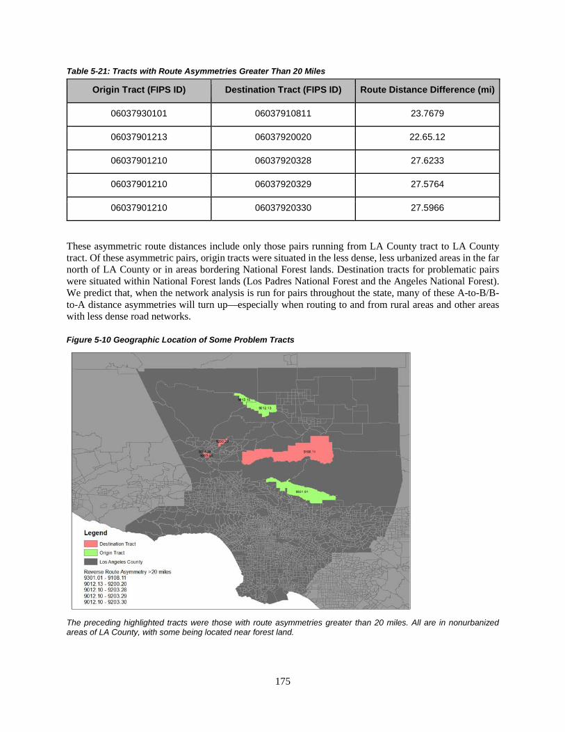
175
Table 5-21: Tracts with Route Asymmetries Greater Than 20 Miles
Origin Tract (FIPS ID) Destination Tract (FIPS ID) Route Distance Difference (mi)
06037930101 06037910811 23.7679
06037901213 06037920020 22.65.12
06037901210 06037920328 27.6233
06037901210 06037920329 27.5764
06037901210 06037920330 27.5966
These asymmetric route distances include only those pairs running from LA County tract to LA County tract. Of these asymmetric pairs, origin tracts were situated in the less dense, less urbanized areas in the far north of LA County or in areas bordering National Forest lands. Destination tracts for problematic pairs were situated within National Forest lands (Los Padres National Forest and the Angeles National Forest). We predict that, when the network analysis is run for pairs throughout the state, many of these A-to-B/B-to-A distance asymmetries will turn up—especially when routing to and from rural areas and other areas with less dense road networks.
Figure 5-10 Geographic Location of Some Problem Tracts
The preceding highlighted tracts were those with route asymmetries greater than 20 miles. All are in nonurbanized areas of LA County, with some being located near forest land.
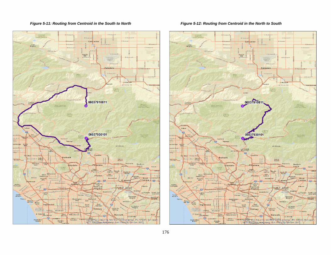
176
Figure 5-11: Routing from Centroid in the South to North Figure 5-12: Routing from Centroid in the North to South

177
Appendix D2: Housing Density
None

178
Appendix D3: Access to Employment
Figure 5-13: Calculating Customized Parameter
To calculate the customized CNK parameter, a combination of ordinary least squares (OLS) and maximum likelihood.
0
2
4
6
8
10
12
14
16
18
20
1 2 3 4 5 6 7 8 9 10 11 12 13 14 15 16 17 18 19 20 21 22 23 24
Share of Jobs in LA County Power Decay with Customized Parameter
Exponential EPA Hybrid

179
Figure 5-14: Example of nonlinear results
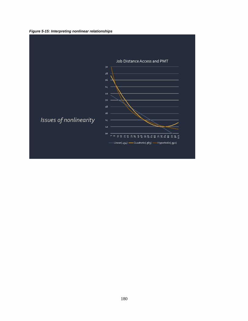
180
Figure 5-15: Interpreting nonlinear relationships

181
Appendix D4: Access to Retail
None

182
Appendix D5: Access to Transit
Table 5-21: Compiled List of Transit Agencies in Los Angeles X = Yes Source
Transit Agency TAP Card Program1
FTA’s National Transit
Database2
LA Tourist3
Google Transit4 LA Almanac5 Go5116
SCAG’s 2007 Route
Shapefile7 Not in LA
Access Services X Alhambra Community Transit X X Antelope Valley Transit Authority X X X X X X Azusa X Baldwin Park Transit X X Bell Gardens Town Trolley X Bellflower Bus X X Burbank Bus X X X X X Carson Circuit X X X Cerritos On Wheels X X X X City of Arcadia Transit X X City of Commerce Municipal Buslines X X X X City of Gardena Transportation Department (GTrans) X X X X X X City of La Mirada Transit X X City of Los Angeles Department of Transportation (LADOT) X X X X X X X City of Monterey Park Spirit Bus X X X City of Redondo Beach–Beach Cities Transit X X X X X Compton Renaissance Transit Systems X X Cudahy Transit X Culver City Municipal Bus Lines X X X X X X X DowneyLINK Public Transit Service X X

183
Duarte Transit System X X El Monte Transit X X El Sol X Foothill Transit X X X X X X X Glendale Beeline X X X X X Glendora Mini Bus X Go West Shuttle Bus X Greyhound X Huntington Park Transit Unlimited X Inglewood Trolley X LA County Department of Public Works X LACMTA–Small Operators X Lawndale Beat X X LAX Flyaway X X Long Beach Transit X X X X X X X LA County Metropolitan Transportation Authority (Metro, MTA, LACMTA) X X X X X X X LA County Shuttles X Los Angeles World Airports (LAWA) X Lynwood Trolley X Mission City Transit X Montebello Bus Lines X X X X X X Norwalk Transit System X X X X X X
Omnitrans X X
X, San Bernardino
Orange County Transportation Authority X X X X X, Orange
County Palos Verdes Peninsula Transit Authority X X X X X Pasadena Transit X X X X X
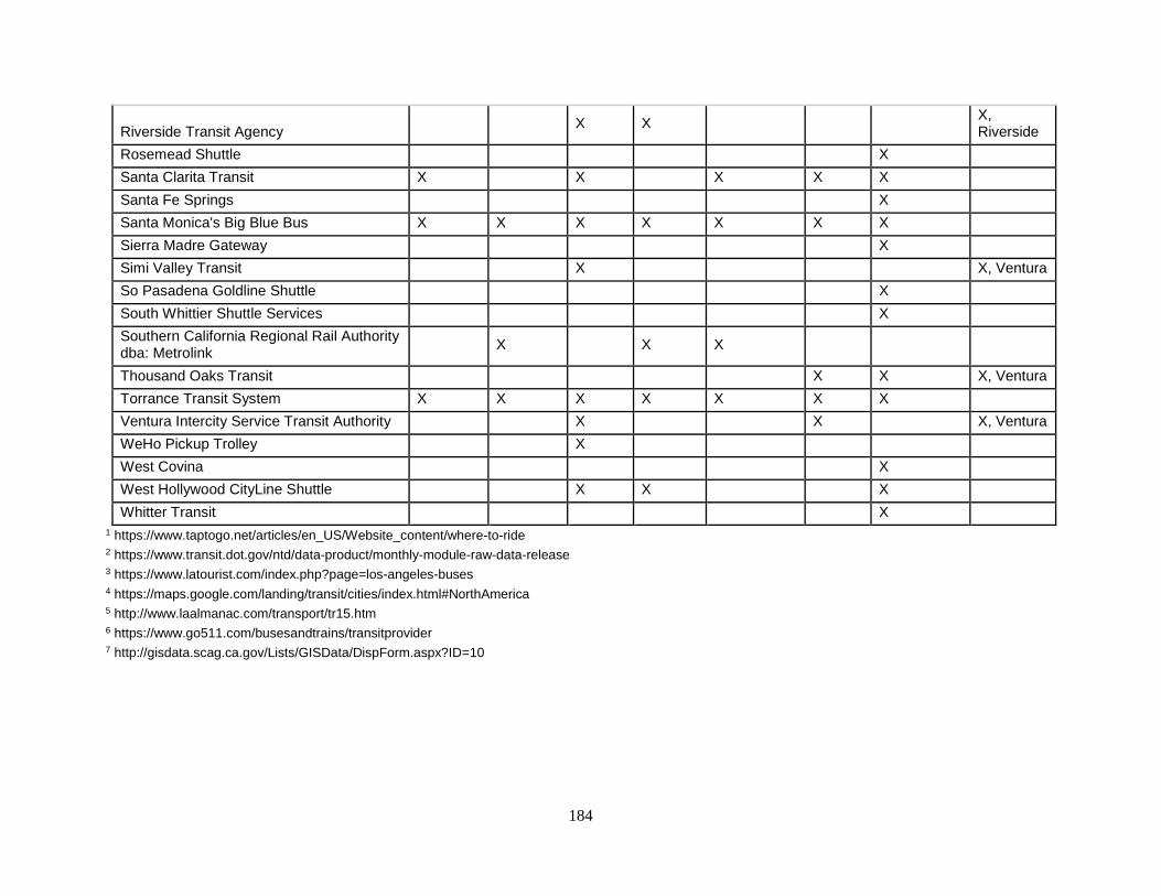
184
Riverside Transit Agency X X X,
Riverside Rosemead Shuttle X Santa Clarita Transit X X X X X Santa Fe Springs X Santa Monica's Big Blue Bus X X X X X X X Sierra Madre Gateway X Simi Valley Transit X X, Ventura So Pasadena Goldline Shuttle X South Whittier Shuttle Services X Southern California Regional Rail Authority dba: Metrolink
X X X
Thousand Oaks Transit X X X, Ventura Torrance Transit System X X X X X X X Ventura Intercity Service Transit Authority X X X, Ventura WeHo Pickup Trolley X West Covina X West Hollywood CityLine Shuttle X X X Whitter Transit X
1 https://www.taptogo.net/articles/en_US/Website_content/where-to-ride 2 https://www.transit.dot.gov/ntd/data-product/monthly-module-raw-data-release 3 https://www.latourist.com/index.php?page=los-angeles-buses 4 https://maps.google.com/landing/transit/cities/index.html#NorthAmerica 5 http://www.laalmanac.com/transport/tr15.htm 6 https://www.go511.com/busesandtrains/transitprovider 7 http://gisdata.scag.ca.gov/Lists/GISData/DispForm.aspx?ID=10

185
Appendix E: Benchmarking and Measuring Short-Term Changes
Short-Term Changes Conceptual Formulations
This section presents several conceptual formulations about alternative ways to calculate measures of short-term developments and changes, two of which are adopted for the Los Angeles prototype. The illustrative formulas used assume a simplistic linear secular growth pattern, although the pattern in the real world can be more complex, including exponential growth.
Formulation One (used for changes in jobs and revenues) In this formulation, change is defined as the difference between two points in time: Net change = current level minus previous level. The following are examples in terms of employment and shopping activities:
𝐽𝐽 = Jobs, one year 𝑇𝑇 = Time
∆ 𝐽𝐽𝑇𝑇,𝑇𝑇+1 = 𝐽𝐽2010 − 𝐽𝐽2011
𝑅𝑅 = Retailing revenues, four years ∆ 𝑅𝑅𝑇𝑇,𝑇𝑇+1 = 𝑅𝑅2010 − 𝑅𝑅2014
A major issue with short-term net change is the confounding role of cyclical change. Ideally, we want to identify long-term or secular change. This problem can be illustrated by assuming that the underlying secular growth is linear:
𝐽𝐽𝑇𝑇 𝑆𝑆 = 𝐽𝐽𝐵𝐵 + ∝ T
Where 𝐽𝐽𝑇𝑇
𝑆𝑆 is the underlying secular level at time T, 𝐽𝐽𝐵𝐵, is the initial level,𝑇𝑇 is years since baseline, and ∝ is the annual growth rate.
Figure 6-4 depicts the hypothetical underlying secular trajectory and the observed levels, and the short-term deviation:
∆𝐽𝐽𝑇𝑇
𝐶𝐶 = cyclical fluctuation from secular level
Figure 6-4: Secular versus Observed Trend

186
The equation can be rewritten to show the two contributing components:
∆𝐽𝐽𝑇𝑇 𝐶𝐶 = 𝐽𝐽𝑇𝑇 - 𝐽𝐽𝑇𝑇
𝑆𝑆 or 𝐽𝐽𝑇𝑇 = 𝐽𝐽𝑇𝑇 𝑆𝑆 + ∆𝐽𝐽𝑇𝑇
𝐶𝐶 ∆ 𝐽𝐽𝑇𝑇,𝑇𝑇+1 = (𝐽𝐽𝑇𝑇+1
𝑆𝑆 + ∆𝐽𝐽𝑇𝑇+1 𝐶𝐶 ) - (𝐽𝐽𝑇𝑇
𝑆𝑆 + ∆𝐽𝐽𝑇𝑇 𝐶𝐶 )
= (𝐽𝐽𝑇𝑇+1
𝑆𝑆 − 𝐽𝐽𝑇𝑇 𝑆𝑆 )���������
Secular ∆
− (∆ 𝐽𝐽𝑇𝑇+1 𝐶𝐶 − ∆ 𝐽𝐽𝑇𝑇
𝐶𝐶 )�����������Cyclical ∆
For short periods, changes in the cyclical component tend to dominate changes in the secular component, and can be negative. Over longer periods, the opposite is true, with growth in the secular component dominating cyclical fluctuations.
Formulation Two (not used) The second formulation defines net change as equal to gross gains minus gross losses. For example, changes in employment level are the number of new hires less the number of terminations.
∆ 𝐽𝐽𝑇𝑇,𝑇𝑇+1 = 𝐻𝐻𝑇𝑇,𝑇𝑇+1 − 𝑇𝑇𝑇𝑇,𝑇𝑇+1 where 𝐻𝐻𝑇𝑇,𝑇𝑇+1 = hires between times 𝑇𝑇 & 𝑇𝑇 + 1
𝑇𝑇𝑇𝑇,𝑇𝑇+1 = termination between 𝑇𝑇 & 𝑇𝑇 + 1 (both layoffs and quits) The same formulation can be applied to revenues. This approach is not used for the monitoring system because none of the available data sets contains gross gains and gross losses. However, it may be possible to do this for jobs using unpublished data from Employment Development Department Labor Market Information Division (EDD/LMID), as discussed in the recommendations in Chapter 8.
Formulation Three (used for new housing units) For phenomena where losses are relatively small, then it is possible to focus on addition to the stock of inventory. This approach applies to housing units. New construction tends to outweigh removal of existing units from housing market; therefore, monitoring newly constructed housing units is a reasonable indication of potential changes in residential patterns.
∆ 𝐻𝐻𝐻𝐻𝑇𝑇,𝑇𝑇+1 = 𝑁𝑁𝐶𝐶𝑇𝑇,𝑇𝑇+1 - 𝑅𝑅𝑇𝑇,𝑇𝑇+1 𝑁𝑁𝐶𝐶 = new construction 𝑅𝑅 = removals If 𝑁𝑁𝐶𝐶 >> 𝑅𝑅, then ∆ 𝐻𝐻𝐻𝐻𝑇𝑇,𝑇𝑇+1 ≈ 𝑁𝑁𝐶𝐶𝑇𝑇,𝑇𝑇+1
Moreover, 𝑁𝑁𝐶𝐶 is directly tied to changes in land use and the built environment.
Formulation Four (not used, extension in changes in land use) It is possible to apply Formulation Three (see previous) to jobs and retailing. For example, newly constructed shopping centers are modifications to the built environment, thus potentially adding new locational opportunities for shopping and modifying retailing accessibility. However, this does not include additions at a smaller scale, but data are not readily available.
187
The Los Angeles prototype uses Formulation One to measure recent changes in employment and shopping, and Formulation Three to measure recent developments in housing.
Alternative Data Sources on New Housing
LA County assessor parcel data was selected for the monitoring system to measure new housing. There are two other commonly used data sets that can be used to track residential development over time—local building permits and housing counts. Both types of data sets were considered for the monitoring system, but none were chosen due to the limitations of each data set. Building permits are issued by local jurisdictions and include information on the type of structure being built and the number of housing units. A major drawback of building permit data is that it is not always an accurate reflection of on-the-ground conditions. Permits may be issued but the project may be delayed or never constructed. Acquiring permit data can take a considerable amount of time. In LA County, which is comprised of 88 different cities, differences in how each jurisdiction collects and disseminate building permit information possess a number of challenges (e.g., harmonizing, reporting periods).
The Bureau of Census, through its Building Permits Survey and Survey of Construction, also collects data on the number of housing units. This information is only reported down to LA County or municipality, which is inadequate for the monitoring system that focuses on small geographies such as census tracts.
Another alternative method of tracking residential development is housing counts, available through the ACS. As discussed in Chapter 5, the ACS is an ongoing representative survey that provides detailed demographic, social, economic, and housing data for the nation. Although rich in information, the ACS is insufficient for tracking short-term changes for small geographies. Tract-level data is only available through the five-year estimates, a five-year pool of individual ACS. As such, housing counts do not represent exact counts but an average of the five years. And while it does report information on when units are built, the information is categorically reported (e.g., built 2010 to 2013), making it difficult to separate out units built one year and four years from the baseline. Because the ACS is based on a sample, it also subject to sampling error and undercount biases. At tract level, the standard error can be relatively large. ACS also tries to estimate total population from the sample. It does not have a complete count (which is done during the decennial enumeration). So, the Bureau of Census estimates population for between years. It updates its estimates, including previous years, every few years. Consequently, there can be discontinuity in year-to-year estimates, manifested as “large jumps.” Housing unit estimates are in part based on population estimates, so it also has a chance of showing unusual jumps.

188
Appendix F: Survey of MPOs
Appendix F1: Survey Instrument
INTERVIEW GUIDE for 18 California Metropolitan Planning Organizations
We are examining MPOs’ and local government experiences with regional land use planning under California’s SB375, the Sustainable Communities and Climate Protection Act of 2008, and with implementation of regional Sustainable Communities Strategies. We would like to learn about how your MPO follows land use and development changes in your region. We are also interested in your view of how development patterns in your region may or may not be evolving under SB375. We want to remind you, as stated in our information sheet, that your responses are confidential. If you give permission for our note‐taking purposes as researchers to audiotape our discussion, we wish to remind you that we will turn off the tape at any time you ask.
Our discussion should take about 45 minutes.
As I explained earlier, I would like to audio‐record our conversation for my own note‐taking purposes. I will turn off the recording at any time that you ask me to. Do I have your permission to record our conversation?
If yes…
Ok, I’ll activate the recording feature now. Bear with me. You should hear a notice saying the recording has started.
*91
Ok. “Bob” are you still there? Did you hear the notice that the recoding has started? Yes? OK, good. And I have your permission to record the call? Great, let’s get started.
First, I’d like to ask your position title and how long you’ve been at the MPO.
Name xxxxxxxxxxxxxx
Position xxxxxxxxxxxxxx
How long at MPO xxxxxxxxxxxxxx
Previous position: Where / how long? xxxxxxxxxxxxxxxxx

189
COMMUNICATION OF FORECASTED REGIONAL DEVELOPMENT PATTERN:
Under SB375, MPO’s regional transportation plans must include a Sustainable Communities Strategy (SCS) that demonstrates how forecasted development patterns will be coordinated with the planned transportation network and other policies to reduce transportation‐related greenhouse gas emissions. We want to learn about the forecasted development pattern in your MPO’s most recently adopted RTP/SCS.
Does your RTP/SCS identify specific geographic areas as high priority areas for development? If so, how? How does it communicate those areas to local jurisdictions?
Does your MPO have specific policies or resolutions that encourage / direct development to these priority development areas?
LAND USE MONITORING & CAPACITY FOR MONITORING
We are interested in understanding how California MPOs learn about and track changes in land use and development in their regions in general and specifically regarding SCS implementation. To what extent is it easy or difficult for your MPO to learn about or track land use planning and development decisions of local governments in your region? MPOs may collect or access various information about local land use and development. Does your MPO receive or collect any of these data from local government or other sources?
• Zoning and land use maps • Development proposals (i.e. tentative maps, development plans, draft EIRs) • Proposed zoning changes • Proposed general plan amendments • LAFCo proposals to update your "sphere of influence" or annex land • Please list any other land use & local
development information you collect from your member jurisdictions.
(Probe: You mentioned your MPO does not collect x, y, z, information we just discussed. We are interested in understanding why your MPO does not collect these information? )
We’re interested in understanding whether there are any circumstances or factors that make it difficult for your MPO to collect relevant data from local jurisdictions about their about land use and development decisions? Please describe any such circumstances or factors. Are there data that your MPO does not receive or collect but that it would like to have to better monitor local land use, development, and SCS implementation? What three data sources would your MPO most like to have?
1) 2) 3)

190
What, if any, factors might increase your MPO's ability to more effectively monitor SCS implementation, e.g. to more effectively collect and review relevant data?
OUTCOMES
We would like to ask a few questions about land use and development activity in your region since SB 375’s passage.
Since your region’s first RTP/SCS, are you aware if any jurisdictions in your region have approved local development(s) that fall outside the RTP/SCS forecasted regional development pattern?
SB375 exempts certain "Transit Priority" projects and "Residential/Mixed‐Use Residential" projects from the California Environmental Quality Act (CEQA). To date, this exemption has been used by relatively few jurisdictions in California. Reflecting on the experience in your region with use of CEQA exemptions for such project(s) since SB 375 was passed. If local jurisdictions have not used the exemption very much, why do you think that is the case?
Are you aware if any jurisdictions in your region have applied to the Local Agency Formation Commission (LAFCo) to annex any adjacent area(s) or to expand their sphere of influence since SB375 was passed?
How likely are local governments in your region to consider the RTP/SCS and its forecasted regional development pattern when making land use/development decisions?
We are interested in whether and how SB375 has affected planning processes and decisions in your region since its passage in 2008. To what extent do you disagree or agree that SB375’s passage….
..has led local governments to participate more in developing and updating the RTP/SCS. ...has led to increased communication among local governments, the MPO, and other stakeholders about future growth in the region. ...has led local jurisdictions to make land use and development decisions that would reduce automobile reliance. ...has increased your MPO's influence over local land use and development decisions. ...has not changed land use planning or development decisions in the region. Factors Critical for SCS Implementation What circumstances or factors in your region are helping SCS implementation the most?
What circumstances or factors in your region are hindering SCS implementation the most?

191
[Maybe after they answer, ask about AHSC, ATP, other grants being important for SCS implementation.] Are you aware if local jurisdictions in your region have sought grants from the following sources to develop plans and projects implementing the RTP/SCS?
AHSC (Affordable Housing and Sustainable Community) ‐Strategic Growth Council
ATP (Active Transportation Program) ‐ California Transportation Commission or MPO
Any other incentive grant programs offered by your MPO / other sources
Relevant federal grants, such as HUD sustainability grants, EPA, Smart Cities Challenge (?), Federal technical assistance programs for planning
List up to three local governments in your region whose land use decisions are most critical for implementing the RTP/SCS? List in order of importance, with the most important first.
(Alt: Think of the jurisdictions in your region that you consider most critical for implementing the RTP/SCS. For each jurisdiction you consider critical in this way, describe the reasons why it is important to RTP/SCS implementation.)
Prompts OK, you named [CITY X]. Why is it important for RTP/SCS implementation? E.g. large size, fast growing, is a regional leader, leadership supports SCS, leadership opposes SCS, land use policies & development supports SCS, land use policies & development hinder SCS
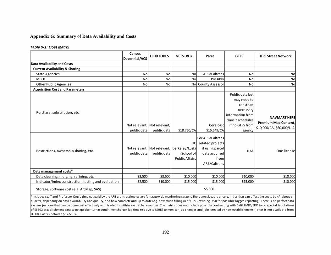
192
Appendix G: Summary of Data Availability and Costs
Table 9-1: Cost Matrix
Census Decennial/ACS
LEHD LODES NETS D&B Parcel GTFS HERE Street Network
Data Availability and Costs Current Availability & Sharing State Agencies No No No ARB/Caltrans No No MPOs No No No Possibly No No Other Public Agencies No No No County Assessor No No Acquisition Cost and Parameters
Purchase, subscription, etc.
Not relevant, public data
Not relevant, public data $18,750/CA
Corelogic $15,549/CA
Public data but may need to
construct necessary
information from transit schedules
if no GTFS from agency
NAVMART HERE Premium Map Content,
$10,000/CA, $50,000/U.S.
Restrictions, ownership sharing, etc.Not relevant,
public dataNot relevant,
public data
UC Berkeley/Luski
n School of Public Affairs
For ARB/Caltrans related projects
if using parcel data acquired
from ARB/Caltrans
N/A One license
Data management costs* Data cleaning, merging, refining, etc. $3,500 $3,500 $10,000 $10,000 $10,000 $10,000 Indicator/index construction, testing and evaluation $2,500 $10,000 $15,000 $15,000 $15,000 $10,000
Storage, software cost (e.g. ArcMap, SAS) $5,500
*Includes staff and Professor Ong`s time not paid by the ARB grant; estimates are for statewide monitoring system. There are sizeable uncertainties that can affect the costs by +/- about a quarter, depending on data availabil ity and quality, and how complete and up to date (e.g. how much fi l l ing in of GTSF, revising D&B for possible lagged reporting). There is no perfect data system, just one that can be done cost effectively with tradeoffs within available resources. The matrix does not include possible contracting with Calif LMID/EDD to do special tabulations of ES202 establishment data to get quicker turnaround time (shorten lag time relative to LEHD) to monitor job changes and jobs created by new establishments (latter is not available from LEHD). Cost is between $5k-$10k.