hannah ungricht portfolio
TRANSCRIPT

PORTFOLIOHannah Ungricht

1 Infographic2 Brochure3 Magazine Cover4 Montage5 Web Page Mockup6 Prezi7 PhotoDesign8 Business Iden� ty (logos, business card, and le� erhead)9 Coding
Hannah Ungricht6212 N Rd 68 #8APasco, WA [email protected]
Contact Table of Contents

Descrip� on:Create an infographic that is aesthe� cally pleasing and gives quick concise informa� on.
Date:November 2, 2016
Course/Instructor:COMM 130:15 / Jason Stucki
Program(s)/Tools:Adobe Illustrator
Objec� ves:Create a graphic for webviewing that has informa� on that is easily and quickly readable. Create 10 icons from scratch in Illustrator, along with a chart and color scheme.
Process:The hardest part was trying to fi gure out what to make the infographic about, so I chose a topic that I happen to know a lot about, adop� on. I then did a lot of research on infographics and diff erent layouts. I made a few sketches and then went to my computer. I then did the layout in Illustrator and made all the icons and placed the text. Then I posted my infographic onto Facebook and sent it to a few friends. I made a few changes on my infographic from the response I got from my friends. I had to redo some of the icons and added more color to them, they were originally all white. I also made the text bigger because one person said it was diffi cult to read.
Infographic
TICKET
1 2
3 4
5 6
7 8
9 10
Start a Crowd-Funding site
Hold aBake Sale!
Have a HUGE Garage Sale!
Spaghetti or Pancake Feed
Raffle, Raffle, Raffle, Raffle!
Have an Auction
Direct Sales Fundraiser
Sell Shirts
Mail Letters to Everyone!
Apply for Grants
Split Complementary || Red Orange, Blue, Yellow Orange
$$
10ADOPTION
fundraising ideas!
Adoption Costs!
$$
$$
$$
$
$
$$
Public Agency $0-2K
Private Adoption $2K-10 , 000
Private Agency $4000-30 , 000+Out of Country Adoption $10 , 000-4 5 , 000+
$$
$
Descrip� on:Design a promo� onal brochure for the show choir Forte!.
Date:November 30, 2016
Course/Instructor:COMM 130:15 / Jason Stucki
Program(s)/Tools:Adobe Indesign; Adobe Photoshop; Adobe Illustrator
Objec� ves:Create a full-bleed folded brochure that contains textwrapping, a logo, high-quality images, and a cutout feature.
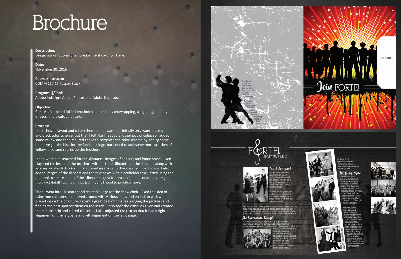
Process:I fi rst chose a layout and color scheme that I wanted. I ini� ally only wanted a red and black color scheme, but then I felt like I needed another pop of color, so I added some yellow and then realized I have to complete the color scheme by adding some blue. I’ve got the blue for the facebook logo, but I need to add some more splashes of yellow, blue, and red inside the brochure.
I then went and searched for the silhoue� e images of dancers and found some I liked. I layered the inside of the brochure with fi rst the silhoue� e of the dancers, along with an overlay of a dark brick. I then placed an image for the cover and back cover. I also added images of the dancers and the text boxes with placeholder text. I tried using the pen tool to create some of the silhoue� es (just for prac� ce), but I couldn’t quite get the exact detail I wanted…that just means I need to prac� ce more.
Then I went into Illustrator and created a logo for the show choir. I liked the idea of using musical notes and played around with various ideas and ended up with what I placed inside the brochure. I spent a great deal of � me rearranging the pictures and fi nding the best spot for them on the inside. I also took the cri� ques given and created the picture strip and edited the fonts. I also adjusted the text so that it had a right alignment on the le� page and le� alignment on the right page.
Brochure

Descrip� on:Design a magazine cover that showcases a self-portrait as well as ar� cles about yourself.
Date:September 28, 2016
Course/Instructor:COMM 130:15 / Jason Stucki
Program(s)/Tools:Adobe Photoshop; Adobe Indesign
Objec� ves:Create a magazine cover using proper typography and image placement.
Process:I fi rst chose a magazine to emulate. I sketched out a few ideas, then chose the sketch I felt was the best and made the layout in InDesign. A� er I made the layout, I did some tweaking and moved a few things around so that there was be� er fl ow. I incorporated various a� ributes from my other sketches and came up with a nice template. I did a li� le research and found that Times New Roman was the closest match to the text of the actual magazine. I also increased the ver� cal scale to 137%, which matched the actual magazine � tle as well. I had chosen to have part of my head cover the text of the magazine � tle. I know that the Na� onal Geographic is a well known magazine and that people would be able to just glance at the magazine and know immediately what it is. So I went to Photoshop and did some light edi� ng on the photo. I fi xed some blemishes and made it more magazine worthy. I placed that picture into my InDesign document, then went back to Photoshop to create another image for the layer that would be placed over the � tle text. I made sure my background was transparent and then placed that Photoshop fi le into InDesign. I had also fl ipped my image horizontally because it didn’t feel right having my head coming from the right side – it looked be� er coming from the le� side. I double checked that there was no text in the picture so that it wasn’t obviously a fl ipped picture.
It took some tweaking again to make sure the ar� cle text was not too close to the edges and the spacing was just right. I also wanted to make sure that the refl ec� on of myself taking the picture was addressed in the ar� cles and realized at this point that I needed to make an ar� cle about that. I swapped out a diff erent ar� cle and added the DSLR selfi e ar� cle. From here I changed the color of the font in the � tle and the main ar� cle. I used the eyedropper and changed the color to the skin of my neck (the part that has the sun shown on it). Once I fi nished my design, I put it onto the facebook page and got the feedback needed from my instructor. He suggested pu� ng a .25 stroke around the text on the text where it lists the website or bolding it slightly. I decided to bold it just like the text to the right (where it has the date).
Magazine Cover

Descrip� on:Design a spiritually powerful poster, while blending 2 or more images and text.
Date:October 19, 2016
Course/Instructor:COMM 130:15 / Jason Stucki
Program(s)/Tools:Adobe Photoshop
Objec� ves:Blend two photographs to create visual fl ow throughout the piece using layer masks and fi lters.
Process:I had created a print for my daughters room with the quote “We can do hard things.” I knew from the moment I read about this assignment that I wanted to use that quote for my spiritual montage.
In Photoshop I made the text “can” and “hard” of my quote, with a clipping mask showing the fl ag I had found on google images. I then looked for an image of a fallen soldiers funeral or police offi cer. I found 2 that I liked the best, but only one fi t with the text and quote the best. I then edited it in Photoshop to make it black and white with a so� sepia overlay. I then added a blue line to the middle stripe of the fl ag on the coffi n. I did this because of the fl ags that are black and white with the blue stripe to memorialize the police offi cers that have been killed in the line of duty.
In Photoshop I then used a blue canvas background that I placed over my en� re picture. I then chose the overlay op� on. I used the eraser tool with a low opacity. I erased most of the overlay from above the li� le boy and the coffi n.
Then I added another overlay of a fl ag waving. I also used the eraser tool again and erased above the boy and the coffi n. I also added another blue line behind the “do”. I then adjusted the kearning on all the words. The font I chose for the “can” and “do”, it has very wide kearning, but I wanted it to appear like handwri� en words, so I spaced it closer together.
Montage

Descrip� on:Design a website using the grid on Photoshop.
Date:November 16, 2016
Course/Instructor:COMM 130:15 / Jason Stucki
Program(s)/Tools:Adobe Photoshop
Objec� ves:Create a webpage mockup using the Photoshop grids.
Process:I chose to con� nue with the business that I had started working on in previous assignments. I sketched out a couple of ideas that were all pre� y similar. I had a vision in mind of having a line of pictures of cats and the same background and color scheme I had used in previous assignments. I then started researching wireframes and downloaded the 16 column grid. It then took me some � me to fi gure out how to layout everything I wanted on the page. A� er I had my wireframe setup, I started inpu� ng all my informa� on into it.
I didn’t want to just s� ck with the sketch I had made, and decided to add another line of pictures (for the total of 2 that I have now). I also liked the idea of going outside the boundaries and made my top middle image a li� le wider than the one below it, but kept it within the grid lines. A� er fi nishing that, I really liked how it felt even more balanced. I also added a dark overlay with an 80% opacity. I also added some text about the cats and a cute li� le icon. My fi nal design was mostly like my sketch, but with a few li� le tweaks here and there. I also made some changes from the cri� ques I received which gave me my fi nal result.
Webpage Mockup
Descrip� on:Design a Prezi presenta� on to showcase how benefi cial the program is for businesses.
Date:October 5, 2016
Course/Instructor:COMM 130:15 / Jason Stucki
Program(s)/Tools:Adobe Photosho; prezi.com | h� ps://prezi.com/i6vdnibcnpek/becoming-a-family/
Objec� ves:Create an eye catching presenta� on that gives quick snipits of informa� on.
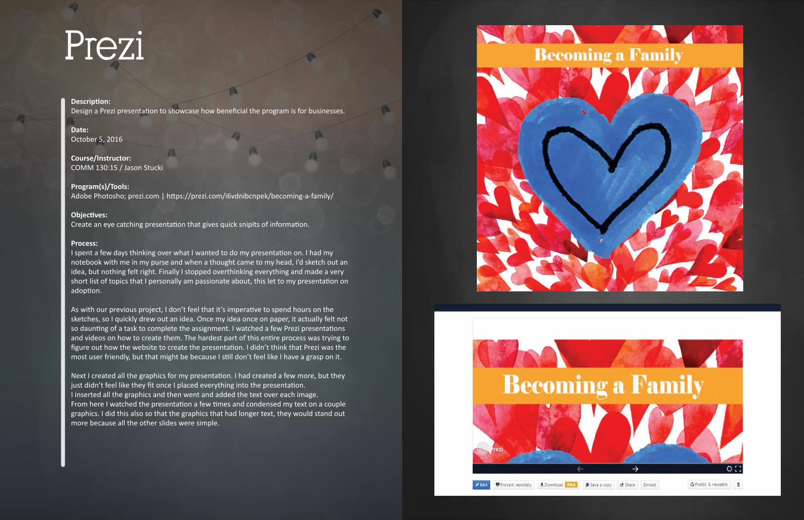
Process:I spent a few days thinking over what I wanted to do my presenta� on on. I had my notebook with me in my purse and when a thought came to my head, I’d sketch out an idea, but nothing felt right. Finally I stopped overthinking everything and made a very short list of topics that I personally am passionate about, this let to my presenta� on on adop� on.
As with our previous project, I don’t feel that it’s impera� ve to spend hours on the sketches, so I quickly drew out an idea. Once my idea once on paper, it actually felt not so daun� ng of a task to complete the assignment. I watched a few Prezi presenta� ons and videos on how to create them. The hardest part of this en� re process was trying to fi gure out how the website to create the presenta� on. I didn’t think that Prezi was the most user friendly, but that might be because I s� ll don’t feel like I have a grasp on it.
Next I created all the graphics for my presenta� on. I had created a few more, but they just didn’t feel like they fi t once I placed everything into the presenta� on.I inserted all the graphics and then went and added the text over each image.From here I watched the presenta� on a few � mes and condensed my text on a couple graphics. I did this also so that the graphics that had longer text, they would stand out more because all the other slides were simple.
Prezi

Descrip� on:By using photography and design skills, create a project that encompasses a consistent color scheme from the image.
Date:October 12, 2016
Course/Instructor:COMM 130:15 / Jason Stucki
Program(s)/Tools:Adobe Photoshop
Objec� ves:Use layers and adjustment layers to coordinate colors and design.
Process:I started off by deciding what color scheme I wanted to do. I kept going between a few, but I really wanted to have a lot of diff erent colors and make something that was vibrant. That is why I chose the big split complementary. From there I actually found a quote that I liked. I wanted something that might be a li� le upli� ing. I’ve been helping with a mental health fi reside for my Stake, so the message of hope has been on my mind. I then went to take my pictures. I wanted my daughter to wear a bright shirt, so I dressed her accordingly. I then posi� oned her into a few diff erent posi� ons.I took all my pictures and looked through them on my computer for the best one for my assignment.
I also found an image of rain clouds that fi t my color scheme. I placed that image over my picture and lowered the opacity to 39%. I also took my lasso tool and lassoed around the space that was covering my daughters body. I set the feathering to 50 px and clicked delete. This allowed a nice fl ow from the rain clouds to the image of my daughter. I then chose my fonts and typed my quote. I knew I wanted a script for the fi rst part and a sans serif for the second body of text. I adjusted some kearning on a few of the le� ers to allow for a nicer fl ow of text.
PhotoDesign
Descrip� on:Create a logo, business cards, and le� erhead for a company/service/organiza� on and establish a visual iden� ty across documents.
Date:October 26, 2016
Course/Instructor:COMM 130:15 / Jason Stucki
Program(s)/Tools:Adobe Illustrator; Adobe Indesign
Objec� ves:Create three logos for a company using basic shape tools that fi t the company name. Finalize the logo and addi� onally create le� erhead and business cards
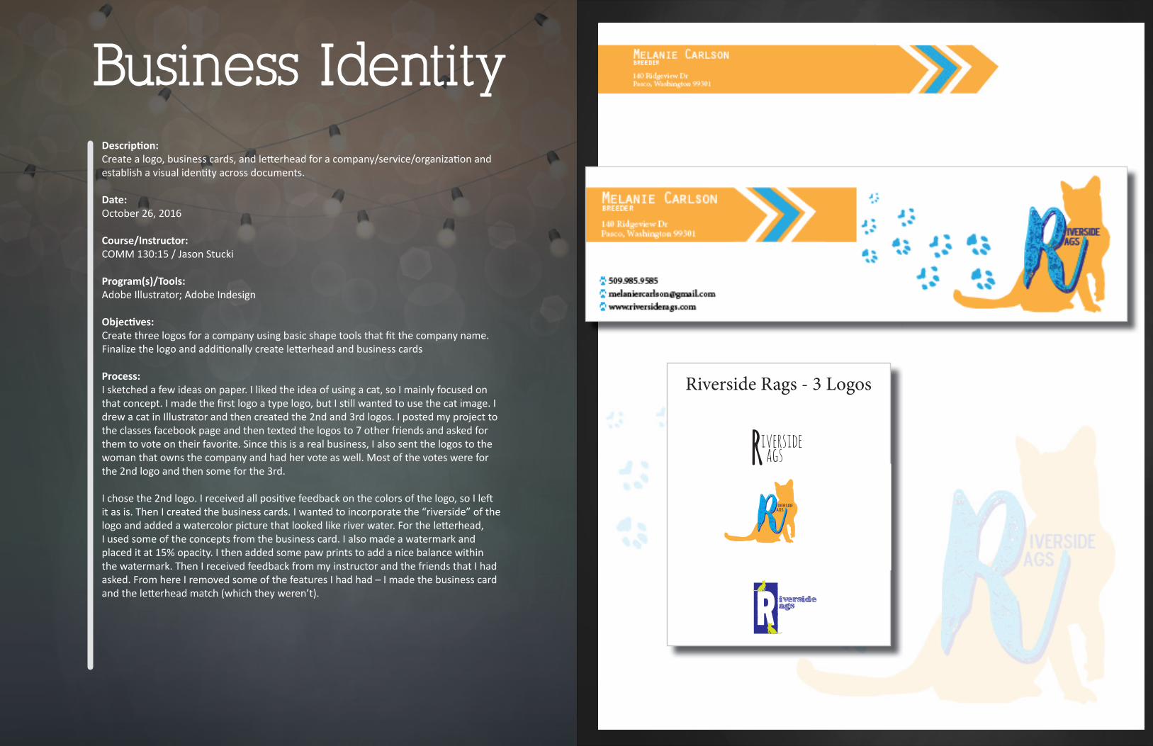
Process:I sketched a few ideas on paper. I liked the idea of using a cat, so I mainly focused on that concept. I made the fi rst logo a type logo, but I s� ll wanted to use the cat image. I drew a cat in Illustrator and then created the 2nd and 3rd logos. I posted my project to the classes facebook page and then texted the logos to 7 other friends and asked for them to vote on their favorite. Since this is a real business, I also sent the logos to the woman that owns the company and had her vote as well. Most of the votes were for the 2nd logo and then some for the 3rd.
I chose the 2nd logo. I received all posi� ve feedback on the colors of the logo, so I le� it as is. Then I created the business cards. I wanted to incorporate the “riverside” of the logo and added a watercolor picture that looked like river water. For the le� erhead, I used some of the concepts from the business card. I also made a watermark and placed it at 15% opacity. I then added some paw prints to add a nice balance within the watermark. Then I received feedback from my instructor and the friends that I had asked. From here I removed some of the features I had had – I made the business card and the le� erhead match (which they weren’t).
Business Identity
Riversideags
RRiversideags
Riverside Rags - 3 Logos
R iversideags

Descrip� on:Code a custom webpage with HTML and CSS.
Date:November 9, 2016
Course/Instructor:COMM 130:15 / Jason Stucki
Program(s)/Tools:Notepad++, Adobe Photoshop
Objec� ves:Use HTML and CSS to design a code with Notepad++ for a website for a business.
Process:I fi rst resized my logo in Illustrator to the dimensions specifi ed by my instructor. I was unable to open some of the fi les for coding the html and CSS, so I had to start from scratch on the website, which actually in the long run helped me to understand be� er what I was learning. I did a lot of research on html and css external fi le sheets. I decided to do the external fi le and that proved to be very benefi cial in forma� ng my various header tags. I created the html and css fi les and made sure they were linked correctly. I verifi ed that everything on the page worked and it did. I added a background of the blue wavy lines that I had originally wanted to use on the business cards, but it didn’t work on the small cards. It really worked on the background though! I was very happy with it. I then went through the CSS coding and adjusted a few things, like I made the box behind the text and rounded the edges. I then validated my code.
Coding