graphing exercise 1. create a pie graph by selecting a...
TRANSCRIPT
Graphing Exercise 1. Create a Pie Graph by Selecting a Data Table
This exercise selects the data in an existing data table and creates a pie graph of the data (Figure
G1-1).
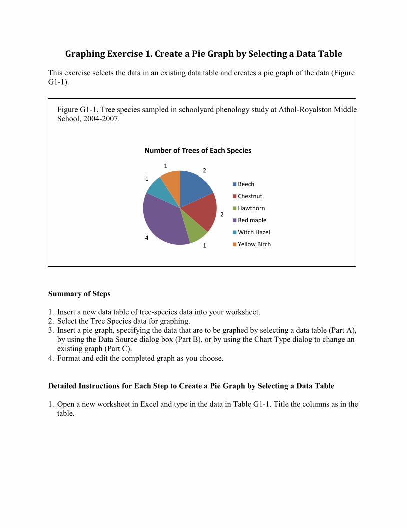
Figure G1-1. Tree species sampled in schoolyard phenology study at Athol-Royalston Middle
School, 2004-2007.
Summary of Steps
1. Insert a new data table of tree-species data into your worksheet.
2. Select the Tree Species data for graphing.
3. Insert a pie graph, specifying the data that are to be graphed by selecting a data table (Part A),
by using the Data Source dialog box (Part B), or by using the Chart Type dialog to change an
existing graph (Part C).
4. Format and edit the completed graph as you choose.
Detailed Instructions for Each Step to Create a Pie Graph by Selecting a Data Table
1. Open a new worksheet in Excel and type in the data in Table G1-1. Title the columns as in the
table.
2
2
14
1
1
Number of Trees of Each Species
Beech
Chestnut
Hawthorn
Red maple
Witch Hazel
Yellow Birch
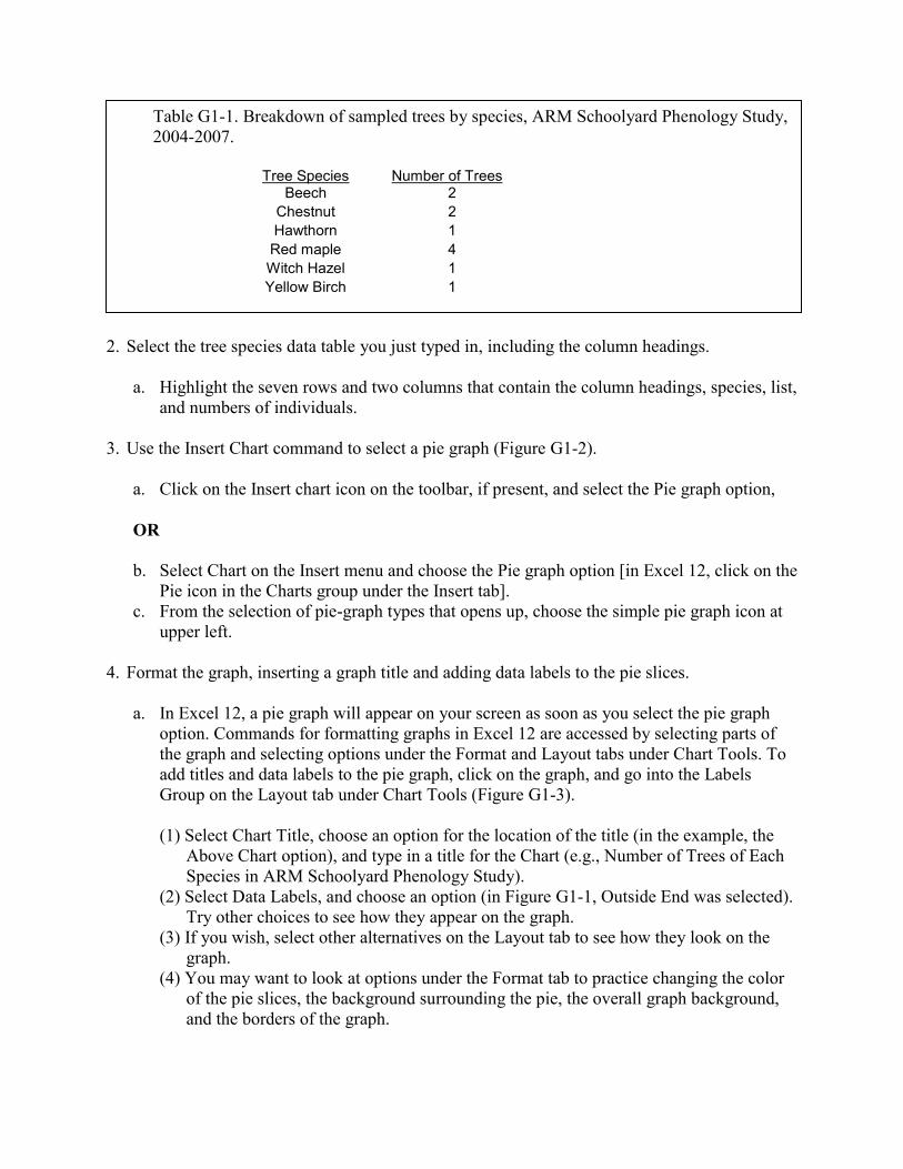
Table G1-1. Breakdown of sampled trees by species, ARM Schoolyard Phenology Study,
2004-2007.
Tree Species
Beech Number of Trees
2
Chestnut 2
Hawthorn 1
Red maple 4
Witch Hazel 1
Yellow Birch 1
2. Select the tree species data table you just typed in, including the column headings.
a. Highlight the seven rows and two columns that contain the column headings, species, list,
and numbers of individuals.
3. Use the Insert Chart command to select a pie graph (Figure G1-2).
a. Click on the Insert chart icon on the toolbar, if present, and select the Pie graph option,
OR
b. Select Chart on the Insert menu and choose the Pie graph option [in Excel 12, click on the
Pie icon in the Charts group under the Insert tab].
c. From the selection of pie-graph types that opens up, choose the simple pie graph icon at
upper left.
4. Format the graph, inserting a graph title and adding data labels to the pie slices.
a. In Excel 12, a pie graph will appear on your screen as soon as you select the pie graph
option. Commands for formatting graphs in Excel 12 are accessed by selecting parts of
the graph and selecting options under the Format and Layout tabs under Chart Tools. To
add titles and data labels to the pie graph, click on the graph, and go into the Labels
Group on the Layout tab under Chart Tools (Figure G1-3).
(1) Select Chart Title, choose an option for the location of the title (in the example, the
Above Chart option), and type in a title for the Chart (e.g., Number of Trees of Each
Species in ARM Schoolyard Phenology Study).
(2) Select Data Labels, and choose an option (in Figure G1-1, Outside End was selected).
Try other choices to see how they appear on the graph.
(3) If you wish, select other alternatives on the Layout tab to see how they look on the
graph.
(4) You may want to look at options under the Format tab to practice changing the color
of the pie slices, the background surrounding the pie, the overall graph background,
and the borders of the graph.
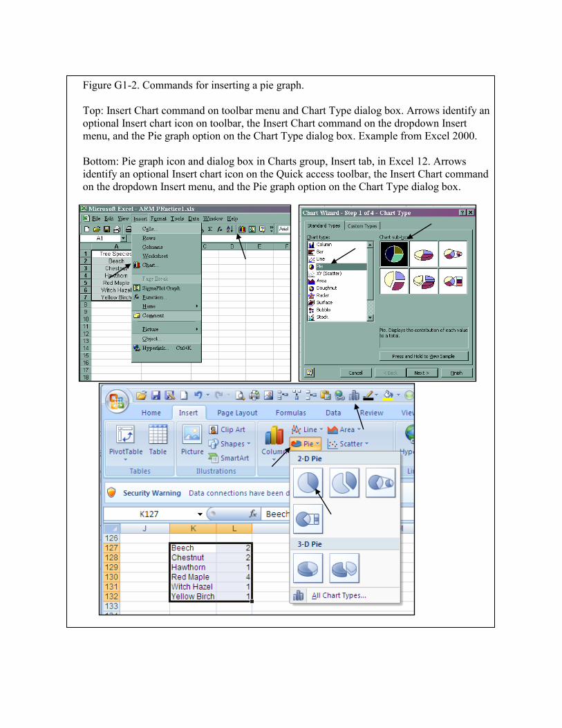
Figure G1-2. Commands for inserting a pie graph.
Top: Insert Chart command on toolbar menu and Chart Type dialog box. Arrows identify an
optional Insert chart icon on toolbar, the Insert Chart command on the dropdown Insert
menu, and the Pie graph option on the Chart Type dialog box. Example from Excel 2000.
Bottom: Pie graph icon and dialog box in Charts group, Insert tab, in Excel 12. Arrows
identify an optional Insert chart icon on the Quick access toolbar, the Insert Chart command
on the dropdown Insert menu, and the Pie graph option on the Chart Type dialog box.
.
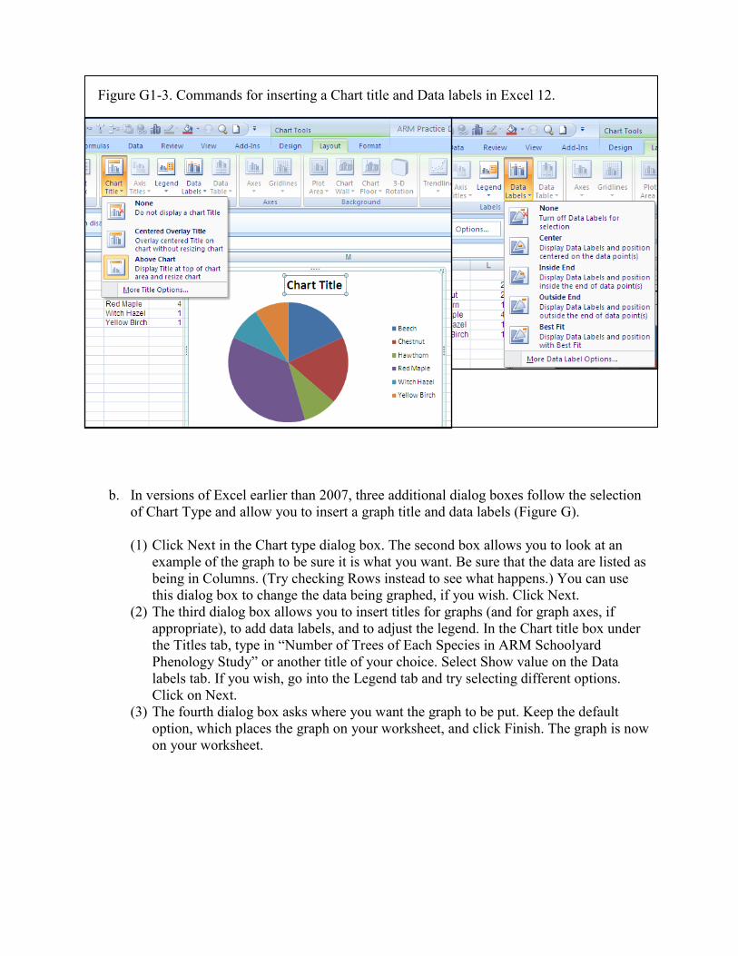
Figure G1-3. Commands for inserting a Chart title and Data labels in Excel 12.
b. In versions of Excel earlier than 2007, three additional dialog boxes follow the selection
of Chart Type and allow you to insert a graph title and data labels (Figure G).
(1) Click Next in the Chart type dialog box. The second box allows you to look at an
example of the graph to be sure it is what you want. Be sure that the data are listed as
being in Columns. (Try checking Rows instead to see what happens.) You can use
this dialog box to change the data being graphed, if you wish. Click Next.
(2) The third dialog box allows you to insert titles for graphs (and for graph axes, if
appropriate), to add data labels, and to adjust the legend. In the Chart title box under
the Titles tab, type in “Number of Trees of Each Species in ARM Schoolyard
Phenology Study” or another title of your choice. Select Show value on the Data
labels tab. If you wish, go into the Legend tab and try selecting different options.
Click on Next.
(3) The fourth dialog box asks where you want the graph to be put. Keep the default
option, which places the graph on your worksheet, and click Finish. The graph is now
on your worksheet.
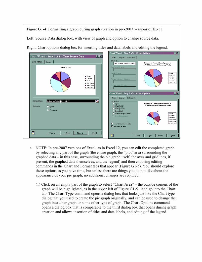
Figure G1-4. Formatting a graph during graph creation in pre-2007 versions of Excel.
Left: Source Data dialog box, with view of graph and option to change source data.
Right: Chart options dialog box for inserting titles and data labels and editing the legend.
(1) Click Next on the Chart type dialog,
and look at the sample graph in Box 2.
Data should be listed as being in
Columns.
c. NOTE: In pre-2007 versions of Excel, as in Excel 12, you can edit the completed graph
by selecting any part of the graph (the entire graph, the “plot” area surrounding the
graphed data – in this case, surrounding the pie graph itself, the axes and gridlines, if
present, the graphed data themselves, and the legend) and then choosing editing
commands in the Chart and Format tabs that appear (Figure G1-5). You should explore
these options as you have time, but unless there are things you do not like about the
appearance of your pie graph, no additional changes are required.
(1) Click on an empty part of the graph to select “Chart Area” – the outside corners of the
graph will be highlighted, as in the upper left of Figure G1-5 – and go into the Chart
tab. The Chart Type command opens a dialog box that looks just like the Chart type
dialog that you used to create the pie graph originally, and can be used to change the
graph into a bar graph or some other type of graph. The Chart Options command
opens a dialog box that is comparable to the third dialog box that opens during graph
creation and allows insertion of titles and data labels, and editing of the legend.
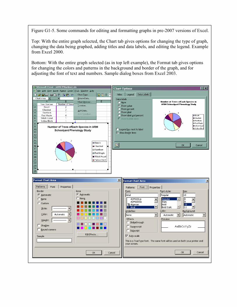
Figure G1-5. Some commands for editing and formatting graphs in pre-2007 versions of Excel.
Top: With the entire graph selected, the Chart tab gives options for changing the type of graph,
changing the data being graphed, adding titles and data labels, and editing the legend. Example
from Excel 2000.
Bottom: With the entire graph selected (as in top left example), the Format tab gives options
for changing the colors and patterns in the background and border of the graph, and for
adjusting the font of text and numbers. Sample dialog boxes from Excel 2003.
(2) Click on the area directly surrounding the pie graph; a box surrounding the pie will be
highlighted. This is the “Plot area.” Commands on the Format tab open dialog boxes
that allow you to change the color and borders in this area, if you so desire.
(3) Double-click on individual pie slices; they will be highlighted. You can choose
commands in the Format menu to change the color and borders of the slices.
(4) Click on the legend. It will be highlighted in a box. You can change the legend
position and size, and the color of the background and border.
When you have finished, you should have a pie graph that is similar to that in Figure G1-1, with
your own (optional) variations on the color scheme, font, and graph title.
NOTE: You can also create a stacked bar graph using the same steps for graph creation as in
the pie-graph exercise. Try the following steps, just for practice, before moving to Graphing
Exercise 2, which creates a stacked bar graph using the Data Source dialog boxes.
1. Select the Tree Species data table, as above.
2. Instead of inserting a pie graph, select a stacked bar graph under the Insert Chart, Chart
Type option. Be sure you select a simple stacked column, and not one that is adjusted to
100%
3. In the second dialog box in pre-2007 Excel versions, be sure the data are listed as being in
rows instead of columns. In Excel 12, you may need to go into the Data group under the
Design Tab and choose Switch Row/column to get a stacked bar, instead of a line of
individual bars (we will make the individual bar graph in Graphing Exercise 3).
4. Format and edit as in the pie-graph exercise to end up with a graph comparable to the
stacked bar graph in Graphing Exercise 2.
5. Sort the data table by Number of trees, instead of alphabetically, and look at what happens
to the graph.
Graphing Exercise 2. Create a Stacked Bar Graph Using the Source Data Dialog Boxes
This exercise introduces the Source Data dialog boxes. These dialog boxes allow you to specify
the data that you are going to graph very precisely. It is easy to create a simple bar graph using
the methods employed above for the pie graph, but the simple nature of the data table lends itself
to use as an example. Once you are familiar with the Source Data dialog boxes, it will save you
time in creating more complex graphs of data on leaf fall, bud burst, water-level changes,
hemlock woolly adelgid infestation, and other field variables you and your students measure over
time for schoolyard ecology studies.
For this exercise we will graph the same tree-species data as in the pie graph in Graphing
Exercise 1, but we will use the Source Data dialog boxes to specify the data we will be using to
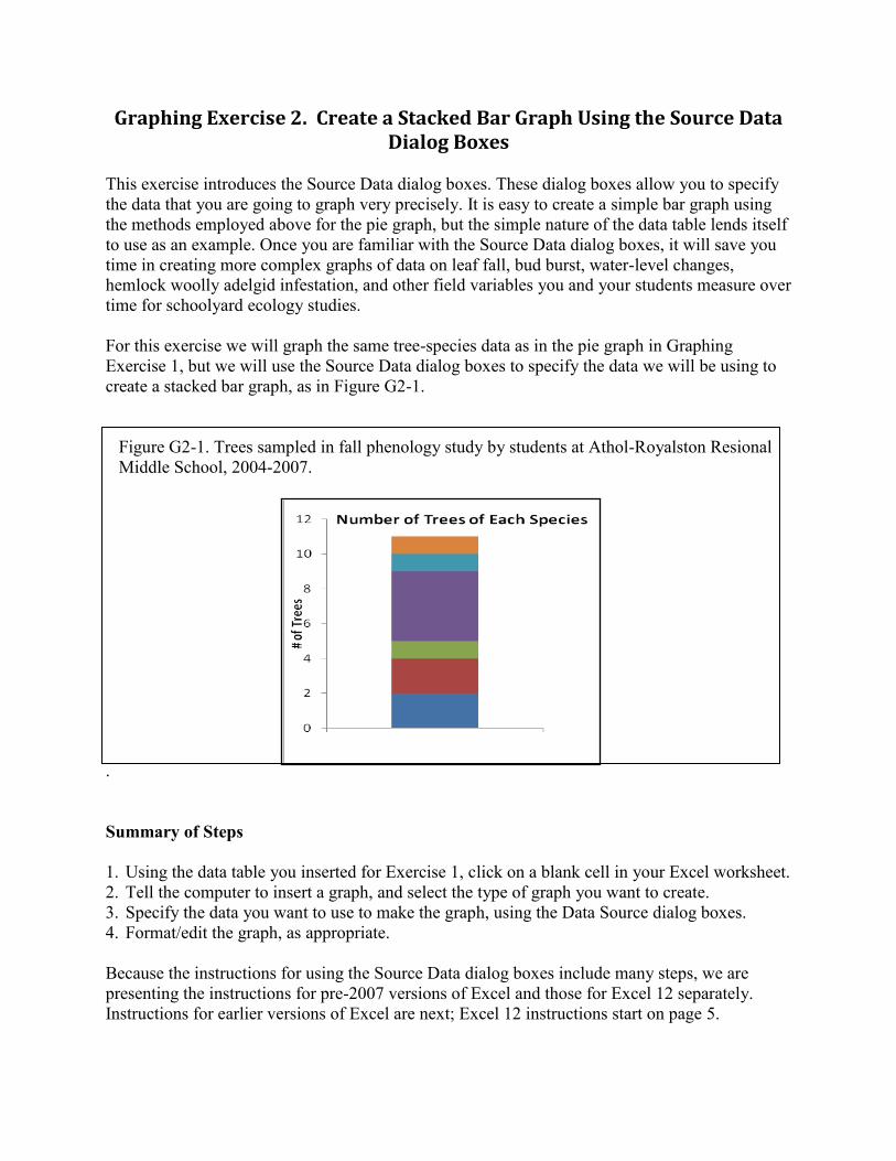
create a stacked bar graph, as in Figure G2-1.
Figure G2-1. Trees sampled in fall phenology study by students at Athol-Royalston Resional
Middle School, 2004-2007.
.
Summary of Steps
1. Using the data table you inserted for Exercise 1, click on a blank cell in your Excel worksheet.
2. Tell the computer to insert a graph, and select the type of graph you want to create.
3. Specify the data you want to use to make the graph, using the Data Source dialog boxes.
4. Format/edit the graph, as appropriate.
Because the instructions for using the Source Data dialog boxes include many steps, we are
presenting the instructions for pre-2007 versions of Excel and those for Excel 12 separately.
Instructions for earlier versions of Excel are next; Excel 12 instructions start on page 5.
Detailed Instructions for Each Step in pre-2007 Versions of Excel
1. Click on a blank cell. This can be anywhere in your Excel worksheet. You may prefer to have
it near the Tree Species data table for convenience, but this is not necessary.
2. As in the previous exercise, tell the computer to insert a graph, and select the type of graph
you want to create. Note that Excel uses the term Column chart for vertical bar graphs, and
Bar chart for horizontal bar graphs.
a. Click on the Insert Chart icon, or go to the Insert menu on the toolbar and select Chart.
b. In the Chart Type dialog box that appears, click on the Column icon, and select the
middle option on the top row – a stacked bar based on the actual numbers (the options to
the right standardizes to a percentage value).
c. Click on Next. A new Chart Source Data dialog box will open.
3. Specify the data to be used to make the graph.
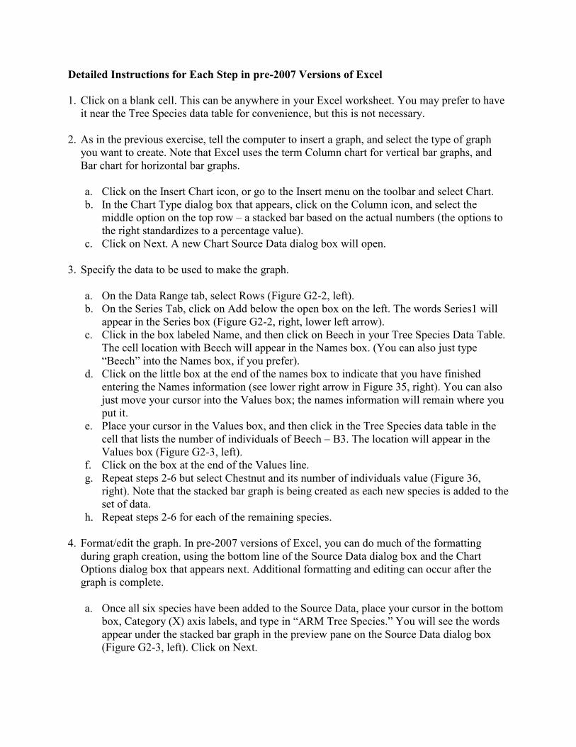
a. On the Data Range tab, select Rows (Figure G2-2, left).
b. On the Series Tab, click on Add below the open box on the left. The words Series1 will
appear in the Series box (Figure G2-2, right, lower left arrow).
c. Click in the box labeled Name, and then click on Beech in your Tree Species Data Table.
The cell location with Beech will appear in the Names box. (You can also just type
“Beech” into the Names box, if you prefer).
d. Click on the little box at the end of the names box to indicate that you have finished
entering the Names information (see lower right arrow in Figure 35, right). You can also
just move your cursor into the Values box; the names information will remain where you
put it.
e. Place your cursor in the Values box, and then click in the Tree Species data table in the
cell that lists the number of individuals of Beech – B3. The location will appear in the
Values box (Figure G2-3, left).
f. Click on the box at the end of the Values line.
g. Repeat steps 2-6 but select Chestnut and its number of individuals value (Figure 36,
right). Note that the stacked bar graph is being created as each new species is added to the
set of data.
h. Repeat steps 2-6 for each of the remaining species.
4. Format/edit the graph. In pre-2007 versions of Excel, you can do much of the formatting
during graph creation, using the bottom line of the Source Data dialog box and the Chart
Options dialog box that appears next. Additional formatting and editing can occur after the
graph is complete.
a. Once all six species have been added to the Source Data, place your cursor in the bottom
box, Category (X) axis labels, and type in “ARM Tree Species.” You will see the words
appear under the stacked bar graph in the preview pane on the Source Data dialog box
(Figure G2-3, left). Click on Next.
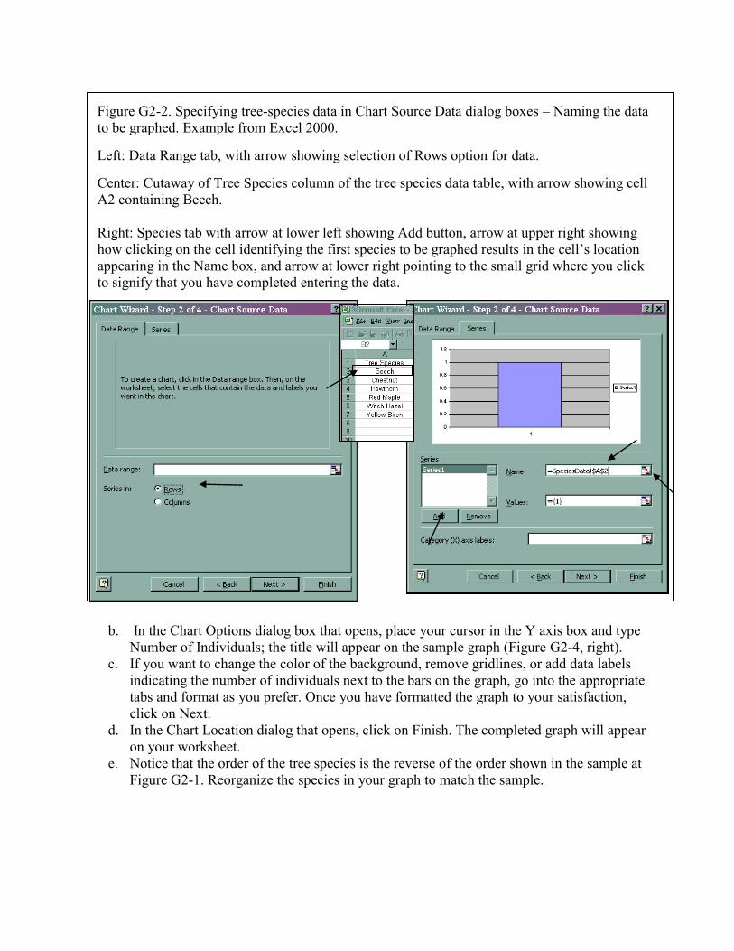
Figure G2-2. Specifying tree-species data in Chart Source Data dialog boxes – Naming the data
to be graphed. Example from Excel 2000.
Left: Data Range tab, with arrow showing selection of Rows option for data.
Center: Cutaway of Tree Species column of the tree species data table, with arrow showing cell
A2 containing Beech.
Right: Species tab with arrow at lower left showing Add button, arrow at upper right showing
how clicking on the cell identifying the first species to be graphed results in the cell’s location
appearing in the Name box, and arrow at lower right pointing to the small grid where you click
to signify that you have completed entering the data.
b. In the Chart Options dialog box that opens, place your cursor in the Y axis box and type
Number of Individuals; the title will appear on the sample graph (Figure G2-4, right).
c. If you want to change the color of the background, remove gridlines, or add data labels
indicating the number of individuals next to the bars on the graph, go into the appropriate
tabs and format as you prefer. Once you have formatted the graph to your satisfaction,
click on Next.
d. In the Chart Location dialog that opens, click on Finish. The completed graph will appear
on your worksheet.
e. Notice that the order of the tree species is the reverse of the order shown in the sample at
Figure G2-1. Reorganize the species in your graph to match the sample.
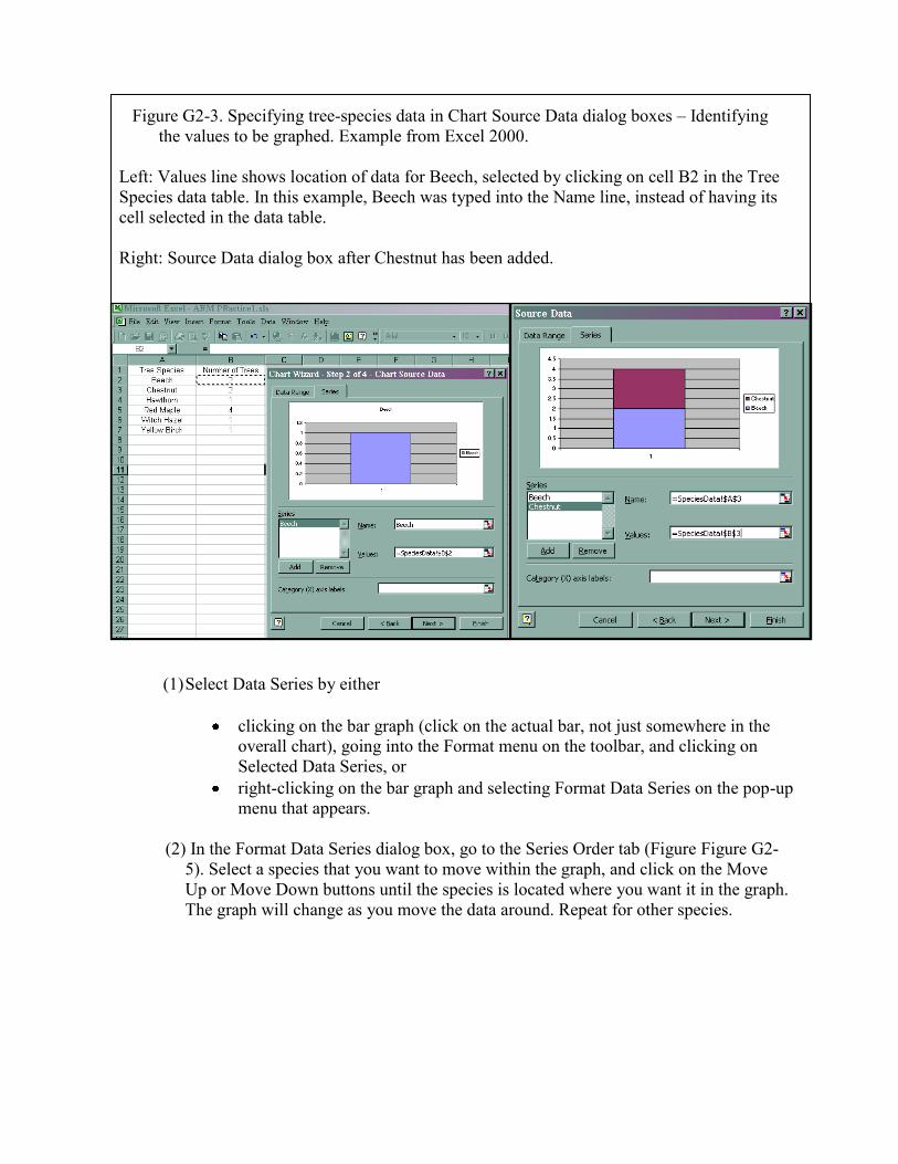
Figure G2-3. Specifying tree-species data in Chart Source Data dialog boxes – Identifying
the values to be graphed. Example from Excel 2000.
Left: Values line shows location of data for Beech, selected by clicking on cell B2 in the Tree
Species data table. In this example, Beech was typed into the Name line, instead of having its
cell selected in the data table.
Right: Source Data dialog box after Chestnut has been added.
(1) Select Data Series by either
clicking on the bar graph (click on the actual bar, not just somewhere in the
overall chart), going into the Format menu on the toolbar, and clicking on
Selected Data Series, or
right-clicking on the bar graph and selecting Format Data Series on the pop-up
menu that appears.
(2) In the Format Data Series dialog box, go to the Series Order tab (Figure Figure G2-
5). Select a species that you want to move within the graph, and click on the Move
Up or Move Down buttons until the species is located where you want it in the graph.
The graph will change as you move the data around. Repeat for other species.
Figure G2-4. Adding labels to the X and Y axes.
Left: Inserting an X-axis label in the Source Data dialog box.
Right: Inserting a title for the Y axis in the Chart options dialog box.
Detailed Instructions for Each Step in Excel 12
1. Click on a blank cell. This can be anywhere in your Excel worksheet. You may prefer to have
it near the Tree Species data table for convenience, but this is not necessary.
2. As in the previous exercise, tell the computer to insert a graph, and select the type of graph
you want to create. Note that Excel uses the term Column chart for vertical bar graphs, and
Bar chart for horizontal bar graphs.
a. Go the Charts group on the Insert tab.
b. Click on the Column graph icon (vertical bar graph), and select the stacked bar option
that is second-from the left at the top of the dialog box that opens. As in the earlier
versions, this stacked bar uses the actual data and does not convert the numbers to a
percentage. A blank graph template will appear on your worksheet.
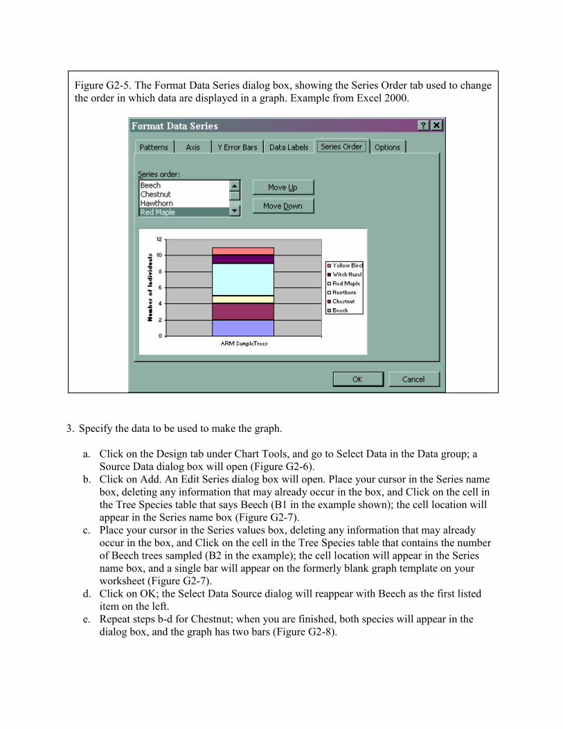
Figure G2-5. The Format Data Series dialog box, showing the Series Order tab used to change
the order in which data are displayed in a graph. Example from Excel 2000.
3. Specify the data to be used to make the graph.
a. Click on the Design tab under Chart Tools, and go to Select Data in the Data group; a
Source Data dialog box will open (Figure G2-6).
b. Click on Add. An Edit Series dialog box will open. Place your cursor in the Series name
box, deleting any information that may already occur in the box, and Click on the cell in
the Tree Species table that says Beech (B1 in the example shown); the cell location will
appear in the Series name box (Figure G2-7).
c. Place your cursor in the Series values box, deleting any information that may already
occur in the box, and Click on the cell in the Tree Species table that contains the number
of Beech trees sampled (B2 in the example); the cell location will appear in the Series
name box, and a single bar will appear on the formerly blank graph template on your
worksheet (Figure G2-7).
d. Click on OK; the Select Data Source dialog will reappear with Beech as the first listed
item on the left.
e. Repeat steps b-d for Chestnut; when you are finished, both species will appear in the
dialog box, and the graph has two bars (Figure G2-8).
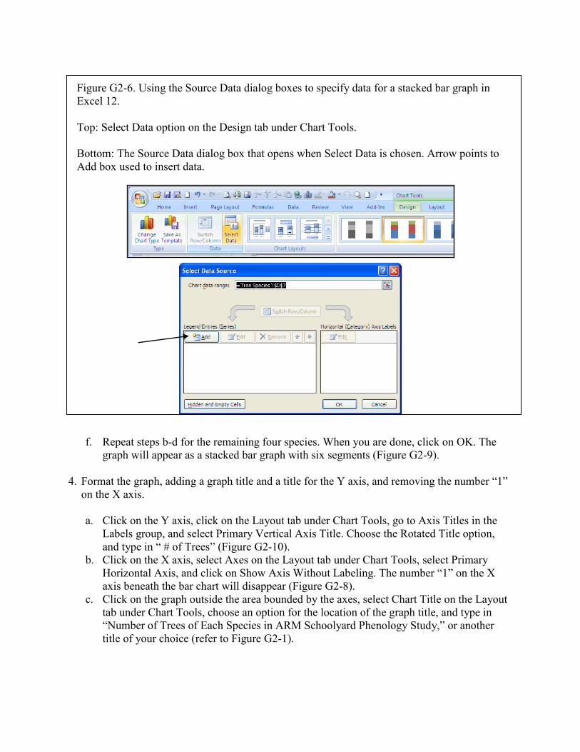
Figure G2-6. Using the Source Data dialog boxes to specify data for a stacked bar graph in
Excel 12.
Top: Select Data option on the Design tab under Chart Tools.
Bottom: The Source Data dialog box that opens when Select Data is chosen. Arrow points to
Add box used to insert data.
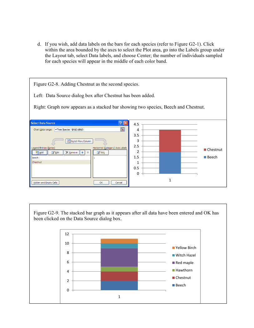
f. Repeat steps b-d for the remaining four species. When you are done, click on OK. The
graph will appear as a stacked bar graph with six segments (Figure G2-9).
4. Format the graph, adding a graph title and a title for the Y axis, and removing the number “1”
on the X axis.
a. Click on the Y axis, click on the Layout tab under Chart Tools, go to Axis Titles in the
Labels group, and select Primary Vertical Axis Title. Choose the Rotated Title option,
and type in “ # of Trees” (Figure G2-10).
b. Click on the X axis, select Axes on the Layout tab under Chart Tools, select Primary
Horizontal Axis, and click on Show Axis Without Labeling. The number “1” on the X
axis beneath the bar chart will disappear (Figure G2-8).
c. Click on the graph outside the area bounded by the axes, select Chart Title on the Layout
tab under Chart Tools, choose an option for the location of the graph title, and type in
“Number of Trees of Each Species in ARM Schoolyard Phenology Study,” or another
title of your choice (refer to Figure G2-1).
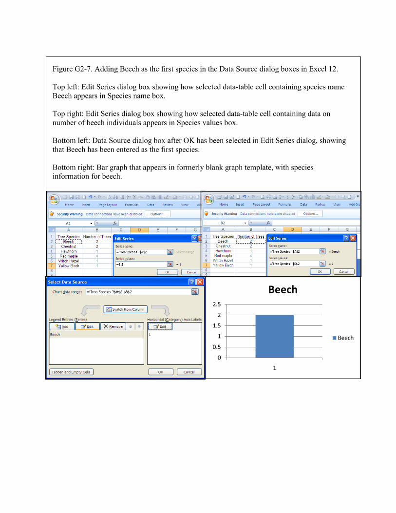
Figure G2-7. Adding Beech as the first species in the Data Source dialog boxes in Excel 12.
Top left: Edit Series dialog box showing how selected data-table cell containing species name
Beech appears in Species name box.
Top right: Edit Series dialog box showing how selected data-table cell containing data on
number of beech individuals appears in Species values box.
Bottom left: Data Source dialog box after OK has been selected in Edit Series dialog, showing
that Beech has been entered as the first species.
Bottom right: Bar graph that appears in formerly blank graph template, with species
information for beech.
0
0.5
1
1.5
2
2.5
1
Beech
Beech
d. If you wish, add data labels on the bars for each species (refer to Figure G2-1). Click
within the area bounded by the axes to select the Plot area, go into the Labels group under
the Layout tab, select Data labels, and choose Center; the number of individuals sampled
for each species will appear in the middle of each color band.
Figure G2-8. Adding Chestnut as the second species.
Left: Data Source dialog box after Chestnut has been added.
Right: Graph now appears as a stacked bar showing two species, Beech and Chestnut.
Figure G2-9. The stacked bar graph as it appears after all data have been entered and OK has
been clicked on the Data Source dialog box.
0
0.5
1
1.5
2
2.5
3
3.5
4
4.5
1
Chestnut
Beech
0
2
4
6
8
10
12
1
Yellow Birch
Witch Hazel
Red maple
Hawthorn
Chestnut
Beech
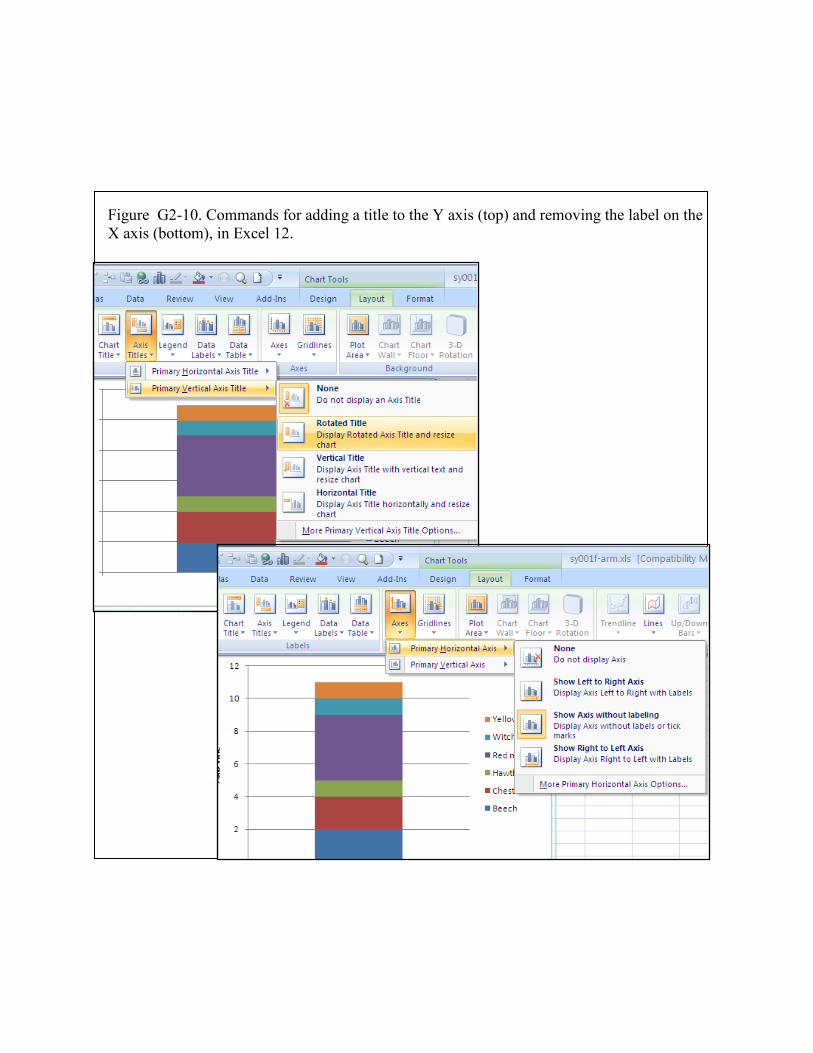
Figure G2-10. Commands for adding a title to the Y axis (top) and removing the label on the
X axis (bottom), in Excel 12.
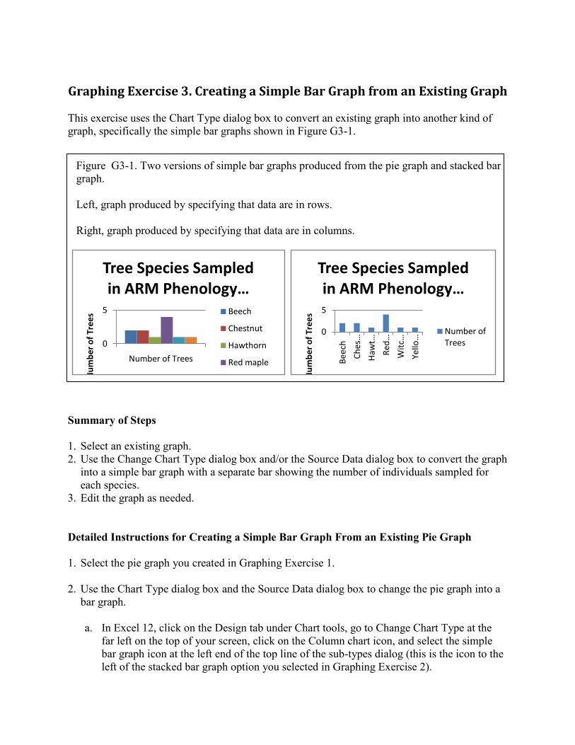
Graphing Exercise 3. Creating a Simple Bar Graph from an Existing Graph
This exercise uses the Chart Type dialog box to convert an existing graph into another kind of
graph, specifically the simple bar graphs shown in Figure G3-1.
Figure G3-1. Two versions of simple bar graphs produced from the pie graph and stacked bar
graph.
Left, graph produced by specifying that data are in rows.
Right, graph produced by specifying that data are in columns.
Summary of Steps
1. Select an existing graph.
2. Use the Change Chart Type dialog box and/or the Source Data dialog box to convert the graph
into a simple bar graph with a separate bar showing the number of individuals sampled for
each species.
3. Edit the graph as needed.
Detailed Instructions for Creating a Simple Bar Graph From an Existing Pie Graph
1. Select the pie graph you created in Graphing Exercise 1.
2. Use the Chart Type dialog box and the Source Data dialog box to change the pie graph into a
bar graph.
a. In Excel 12, click on the Design tab under Chart tools, go to Change Chart Type at the
far left on the top of your screen, click on the Column chart icon, and select the simple
bar graph icon at the left end of the top line of the sub-types dialog (this is the icon to the
left of the stacked bar graph option you selected in Graphing Exercise 2).
0
5
Number of Trees
Nu
mb
er
of
Tre
es
Tree Species Sampled in ARM Phenology …
Beech
Chestnut
Hawthorn
Red maple
0
5
Bee
ch
Ch
es…
Haw
t…
Red
…
Wit
c…
Yello…
Nu
mb
er
of
Tre
es
Tree Species Sampled in ARM Phenology …
Number of Trees
b. In pre-2007 versions of Excel, go into the Chart menu on the toolbar, and select Chart
Type. In the Chart Type dialog box, click on the vertical bar graph icon (Column chart
option), and select the simple bar chart icon at the left end of the top line in the sub-
types dialog box.
The graph appears as a series of individual bars, one for each species in the sample, as in the
right-hand example in Figure G3-1.
c. Change the data source information to specify that the data are in rows instead of
columns. Click on the graph and:
(1) In early versions of Excel, go into the Chart menu on the toolbar, select Data Source,
and select Rows on the Data Range tab (Figure G3-2).
(2) In Excel 12, click on the Design tab under Chart Tools, go to the Data group, and
click on Switch Rows/Columns.
The graph appears as individual bars, each colored as in the original pie graph, as in the left-
hand example in Figure G3-1.
Detailed Instructions for Creating a Simple Bar Graph From an Existing Stacked Bar
Graph
1. Select the stacked bar graph you created in Graphing Exercise 2.
2. Use the Chart Type dialog box and the Source Data dialog box to change the pie graph into a
bar graph.
a. In Excel 12, click on the Design tab under Chart tools, go to Change Chart Type at the
far left on the top of your screen, click on the Column chart icon, and select the simple
bar graph icon at the left end of the top line of the sub-types dialog (this is the icon to the
left of the stacked bar graph option you selected in Graphing Exercise 2).
b. In pre-2007 versions of Excel, go into the Chart menu on the toolbar, and select Chart
Type. In the Chart Type dialog box, click on the vertical bar graph icon (Column chart
option), and select the simple bar chart icon at the left end of the top line in the sub-
types dialog box.
You will find that selecting the simple bar graph icon in the graph sub-type dialog results in
a bar graph that has the individual species shown as separate bars, with each bar colored
individually as in the stacked bar graph, as in the left-hand example in Figure G3-1.
c. Change the data source information to specify that the data are in columns instead of
rows. Click on the graph and:
(1) In early versions of Excel, go into the Chart menu on the toolbar, select Data Source,
and select Columns on the Data Range tab (Figure G3-2).
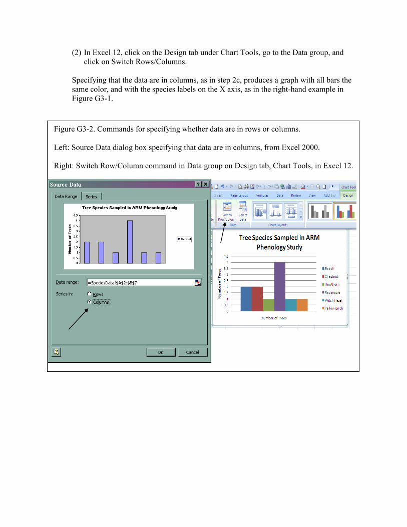
(2) In Excel 12, click on the Design tab under Chart Tools, go to the Data group, and
click on Switch Rows/Columns.
Specifying that the data are in columns, as in step 2c, produces a graph with all bars the
same color, and with the species labels on the X axis, as in the right-hand example in
Figure G3-1.
Figure G3-2. Commands for specifying whether data are in rows or columns.
Left: Source Data dialog box specifying that data are in columns, from Excel 2000.
Right: Switch Row/Column command in Data group on Design tab, Chart Tools, in Excel 12.
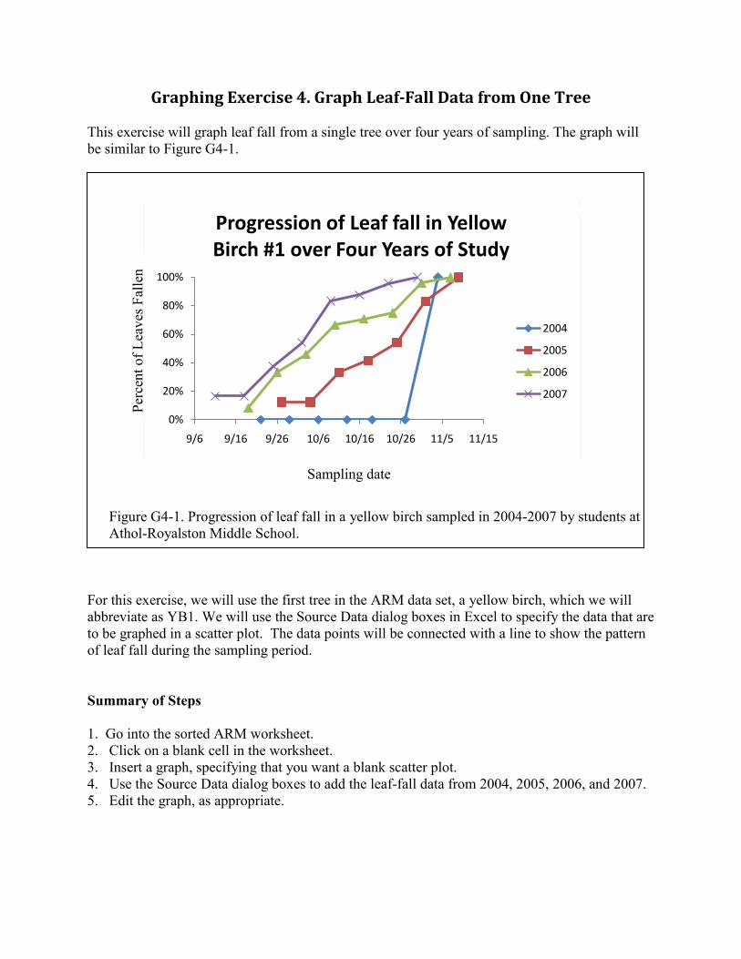
Graphing Exercise 4. Graph Leaf-Fall Data from One Tree
This exercise will graph leaf fall from a single tree over four years of sampling. The graph will
be similar to Figure G4-1.
Figure G4-1. Progression of leaf fall in a yellow birch sampled in 2004-2007 by students at
Athol-Royalston Middle School.
For this exercise, we will use the first tree in the ARM data set, a yellow birch, which we will
abbreviate as YB1. We will use the Source Data dialog boxes in Excel to specify the data that are
to be graphed in a scatter plot. The data points will be connected with a line to show the pattern
of leaf fall during the sampling period.
Summary of Steps
1. Go into the sorted ARM worksheet.
2. Click on a blank cell in the worksheet.
3. Insert a graph, specifying that you want a blank scatter plot.
4. Use the Source Data dialog boxes to add the leaf-fall data from 2004, 2005, 2006, and 2007.
5. Edit the graph, as appropriate.
0%
20%
40%
60%
80%
100%
9/6 9/16 9/26 10/6 10/16 10/26 11/5 11/15
Progression of Leaf fall in Yellow Birch #1 over Four Years of Study
2004
2005
2006
2007
Sampling date
Per
cent
of
Lea
ves
Fal
len
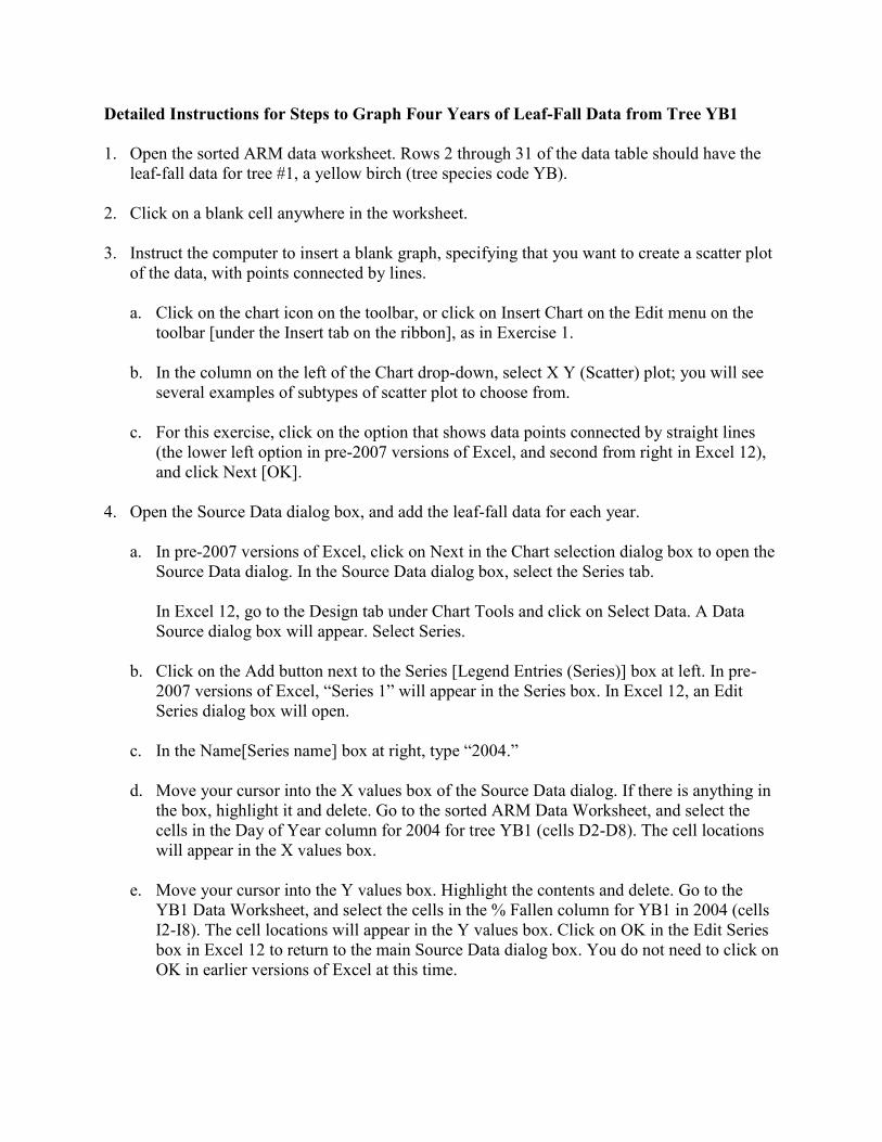
Detailed Instructions for Steps to Graph Four Years of Leaf-Fall Data from Tree YB1
1. Open the sorted ARM data worksheet. Rows 2 through 31 of the data table should have the
leaf-fall data for tree #1, a yellow birch (tree species code YB).
2. Click on a blank cell anywhere in the worksheet.
3. Instruct the computer to insert a blank graph, specifying that you want to create a scatter plot
of the data, with points connected by lines.
a. Click on the chart icon on the toolbar, or click on Insert Chart on the Edit menu on the
toolbar [under the Insert tab on the ribbon], as in Exercise 1.
b. In the column on the left of the Chart drop-down, select X Y (Scatter) plot; you will see
several examples of subtypes of scatter plot to choose from.
c. For this exercise, click on the option that shows data points connected by straight lines
(the lower left option in pre-2007 versions of Excel, and second from right in Excel 12),
and click Next [OK].
4. Open the Source Data dialog box, and add the leaf-fall data for each year.
a. In pre-2007 versions of Excel, click on Next in the Chart selection dialog box to open the
Source Data dialog. In the Source Data dialog box, select the Series tab.
In Excel 12, go to the Design tab under Chart Tools and click on Select Data. A Data
Source dialog box will appear. Select Series.
b. Click on the Add button next to the Series [Legend Entries (Series)] box at left. In pre-
2007 versions of Excel, “Series 1” will appear in the Series box. In Excel 12, an Edit
Series dialog box will open.
c. In the Name[Series name] box at right, type “2004.”
d. Move your cursor into the X values box of the Source Data dialog. If there is anything in
the box, highlight it and delete. Go to the sorted ARM Data Worksheet, and select the
cells in the Day of Year column for 2004 for tree YB1 (cells D2-D8). The cell locations
will appear in the X values box.
e. Move your cursor into the Y values box. Highlight the contents and delete. Go to the
YB1 Data Worksheet, and select the cells in the % Fallen column for YB1 in 2004 (cells
I2-I8). The cell locations will appear in the Y values box. Click on OK in the Edit Series
box in Excel 12 to return to the main Source Data dialog box. You do not need to click on
OK in earlier versions of Excel at this time.
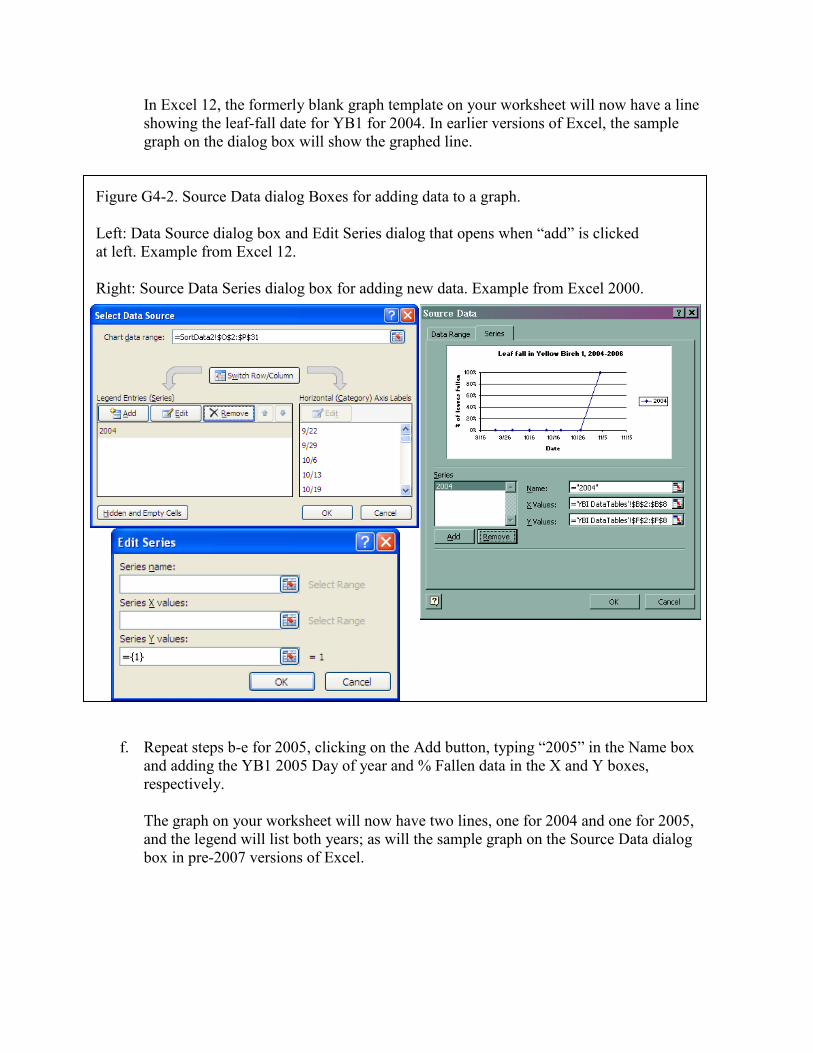
In Excel 12, the formerly blank graph template on your worksheet will now have a line
showing the leaf-fall date for YB1 for 2004. In earlier versions of Excel, the sample
graph on the dialog box will show the graphed line.
Figure G4-2. Source Data dialog Boxes for adding data to a graph.
Left: Data Source dialog box and Edit Series dialog that opens when “add” is clicked
at left. Example from Excel 12.
Right: Source Data Series dialog box for adding new data. Example from Excel 2000.
f. Repeat steps b-e for 2005, clicking on the Add button, typing “2005” in the Name box
and adding the YB1 2005 Day of year and % Fallen data in the X and Y boxes,
respectively.
The graph on your worksheet will now have two lines, one for 2004 and one for 2005,
and the legend will list both years; as will the sample graph on the Source Data dialog
box in pre-2007 versions of Excel.
g. Click on the Add button again, and repeat c., d., and e. for 2006, typing in “2006” as the
Series name, and selecting the 2006 Day of Year data and % fallen data. The graph now
has three lines.
h. Repeat for the 2007 data, and click on OK in the Source Data dialog box.
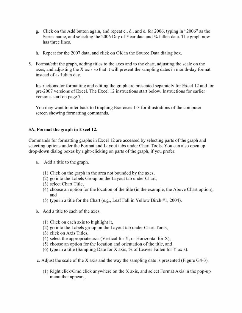
5. Format/edit the graph, adding titles to the axes and to the chart, adjusting the scale on the
axes, and adjusting the X axis so that it will present the sampling dates in month-day format
instead of as Julian day.
Instructions for formatting and editing the graph are presented separately for Excel 12 and for
pre-2007 versions of Excel. The Excel 12 instructions start below. Instructions for earlier
versions start on page 7.
You may want to refer back to Graphing Exercises 1-3 for illustrations of the computer
screen showing formatting commands.
5A. Format the graph in Excel 12.
Commands for formatting graphs in Excel 12 are accessed by selecting parts of the graph and
selecting options under the Format and Layout tabs under Chart Tools. You can also open up
drop-down dialog boxes by right-clicking on parts of the graph, if you prefer.
a. Add a title to the graph.
(1) Click on the graph in the area not bounded by the axes,
(2) go into the Labels Group on the Layout tab under Chart,
(3) select Chart Title,
(4) choose an option for the location of the title (in the example, the Above Chart option),
and
(5) type in a title for the Chart (e.g., Leaf Fall in Yellow Birch #1, 2004).
b. Add a title to each of the axes.
(1) Click on each axis to highlight it,
(2) go into the Labels group on the Layout tab under Chart Tools,
(3) click on Axis Titles,
(4) select the appropriate axis (Vertical for Y, or Horizontal for X),
(5) choose an option for the location and orientation of the title, and
(6) type in a title (Sampling Date for X axis, % of Leaves Fallen for Y axis).
c. Adjust the scale of the X axis and the way the sampling date is presented (Figure G4-3).
(1) Right click/Cmd click anywhere on the X axis, and select Format Axis in the pop-up
menu that appears,
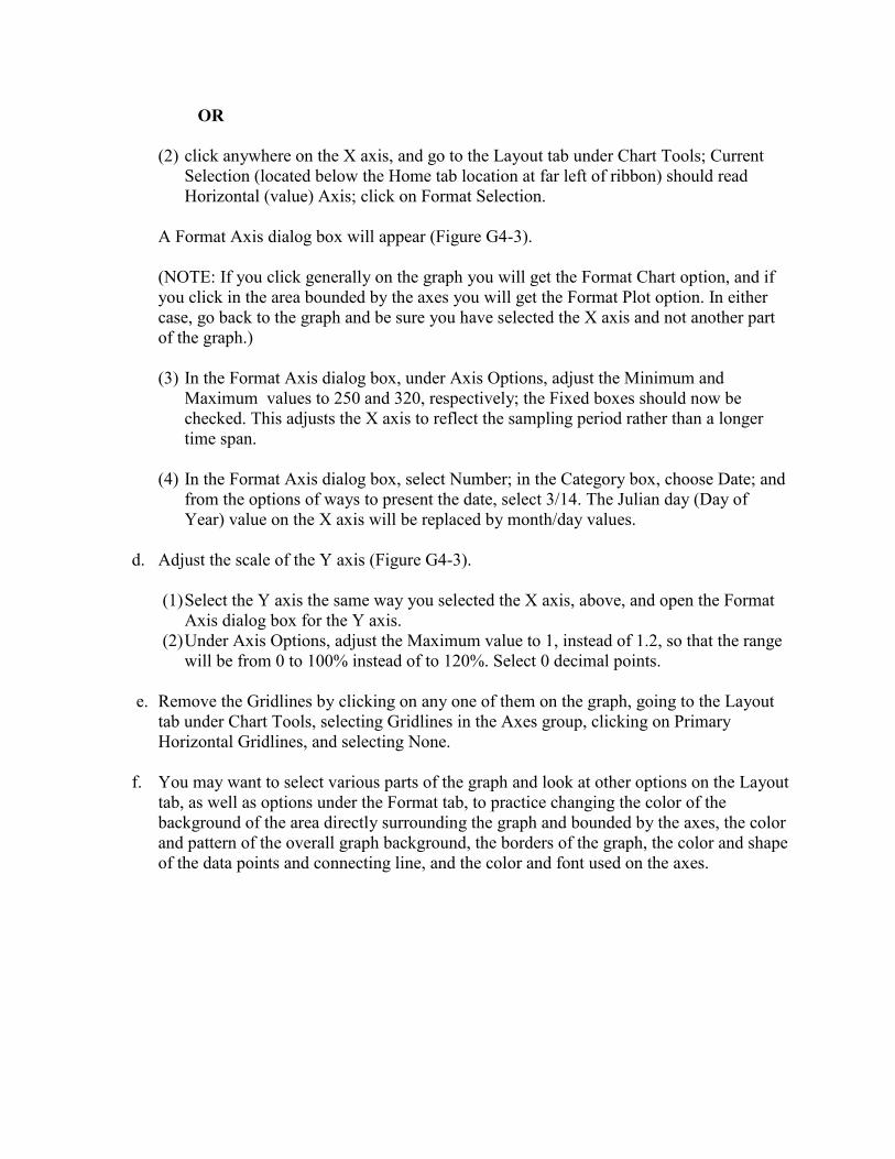
OR
(2) click anywhere on the X axis, and go to the Layout tab under Chart Tools; Current
Selection (located below the Home tab location at far left of ribbon) should read
Horizontal (value) Axis; click on Format Selection.
A Format Axis dialog box will appear (Figure G4-3).
(NOTE: If you click generally on the graph you will get the Format Chart option, and if
you click in the area bounded by the axes you will get the Format Plot option. In either
case, go back to the graph and be sure you have selected the X axis and not another part
of the graph.)
(3) In the Format Axis dialog box, under Axis Options, adjust the Minimum and
Maximum values to 250 and 320, respectively; the Fixed boxes should now be
checked. This adjusts the X axis to reflect the sampling period rather than a longer
time span.
(4) In the Format Axis dialog box, select Number; in the Category box, choose Date; and
from the options of ways to present the date, select 3/14. The Julian day (Day of
Year) value on the X axis will be replaced by month/day values.
d. Adjust the scale of the Y axis (Figure G4-3).
(1) Select the Y axis the same way you selected the X axis, above, and open the Format
Axis dialog box for the Y axis.
(2) Under Axis Options, adjust the Maximum value to 1, instead of 1.2, so that the range
will be from 0 to 100% instead of to 120%. Select 0 decimal points.
e. Remove the Gridlines by clicking on any one of them on the graph, going to the Layout
tab under Chart Tools, selecting Gridlines in the Axes group, clicking on Primary
Horizontal Gridlines, and selecting None.
f. You may want to select various parts of the graph and look at other options on the Layout
tab, as well as options under the Format tab, to practice changing the color of the
background of the area directly surrounding the graph and bounded by the axes, the color
and pattern of the overall graph background, the borders of the graph, the color and shape
of the data points and connecting line, and the color and font used on the axes.
Figure G4-3. Format Axis dialog boxes.
Top Left: Axis Options dialog for adjusting the scale of the X axis to cover the sampling period
instead of a longer time span. Example from Excel 12.
Top Right: Number dialog for specifying that the axis represents a date that is to be presented
in a numerical month/day format. Example from Excel 12.
Bottom: Scale dialog tab for adjusting scale of Y axis so that maximum will be 100% instead
of 120%. Example from Excel 2003.
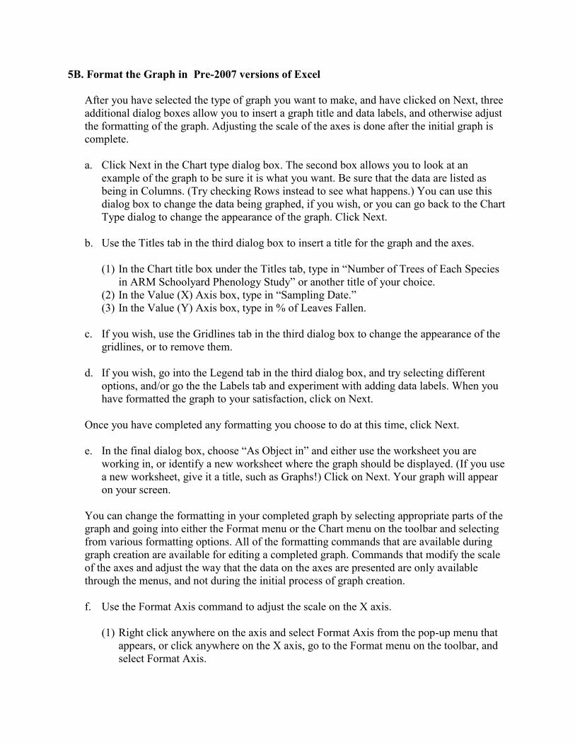
5B. Format the Graph in Pre-2007 versions of Excel
After you have selected the type of graph you want to make, and have clicked on Next, three
additional dialog boxes allow you to insert a graph title and data labels, and otherwise adjust
the formatting of the graph. Adjusting the scale of the axes is done after the initial graph is
complete.
a. Click Next in the Chart type dialog box. The second box allows you to look at an
example of the graph to be sure it is what you want. Be sure that the data are listed as
being in Columns. (Try checking Rows instead to see what happens.) You can use this
dialog box to change the data being graphed, if you wish, or you can go back to the Chart
Type dialog to change the appearance of the graph. Click Next.
b. Use the Titles tab in the third dialog box to insert a title for the graph and the axes.
(1) In the Chart title box under the Titles tab, type in “Number of Trees of Each Species
in ARM Schoolyard Phenology Study” or another title of your choice.
(2) In the Value (X) Axis box, type in “Sampling Date.”
(3) In the Value (Y) Axis box, type in % of Leaves Fallen.
c. If you wish, use the Gridlines tab in the third dialog box to change the appearance of the
gridlines, or to remove them.
d. If you wish, go into the Legend tab in the third dialog box, and try selecting different
options, and/or go the the Labels tab and experiment with adding data labels. When you
have formatted the graph to your satisfaction, click on Next.
Once you have completed any formatting you choose to do at this time, click Next.
e. In the final dialog box, choose “As Object in” and either use the worksheet you are
working in, or identify a new worksheet where the graph should be displayed. (If you use
a new worksheet, give it a title, such as Graphs!) Click on Next. Your graph will appear
on your screen.
You can change the formatting in your completed graph by selecting appropriate parts of the
graph and going into either the Format menu or the Chart menu on the toolbar and selecting
from various formatting options. All of the formatting commands that are available during
graph creation are available for editing a completed graph. Commands that modify the scale
of the axes and adjust the way that the data on the axes are presented are only available
through the menus, and not during the initial process of graph creation.
f. Use the Format Axis command to adjust the scale on the X axis.
(1) Right click anywhere on the axis and select Format Axis from the pop-up menu that
appears, or click anywhere on the X axis, go to the Format menu on the toolbar, and
select Format Axis.

NOTE: If Format Axis is not an option when you go into the Format menu, but instead
Format Plot Area or Format Chart Area appears, you have not selected the axis; go back
to the graph and try clicking on the axis again.
(2) On the Format Axis dialog box, click on the Scale tab.
(3) In the Scale dialog box, select minimum value to be 250, maximum to be 320, and
interval to be 10.
g. Carry out the same process for the Y axis, changing maximum from 1.2 to 1.0, so that the
percent scale does not exceed 100% (see Figure G4-3).
h. Adjust the X axis to show dates instead of the day of the year:
(1) Again, right-click on a number in the X axis and select Format Axis from the drop-
down menu that appears, or click anywhere on the X axis and select Format Axis on
the Format menu on the toolbar.
(2) Click on the Number tab, and select Date.
(3) Specify that you want the month/day option (e.g., 3/14). The computer will now
convert your Day of Year values into dates.
3. Insert titles for the X and Y axes:
a. Right click on the graph, and select Chart Options from the choices that appear, and type
in the axis titles. [In Excel 12, Left click on the graph, click on the Layout tab at the top
of the screen, and select Axis Titles].
b. Select X (horizontal) axis and type in the title. Adjust font type and size, orientation, and
other variables as desired.
c. Repeat for the Y axis.
4. Insert a Title:
a. Right click on the graph, and select Chart Options from the choices that appear, and type
in the desired title for the graph. [In Excel 12, Left click on the graph, click on the Layout
tab at the top of the screen, and select Chart Title].
5. Adjust the shapes of the data points, and the color of the data points and lines, if you wish:
a. Right click on the line that you want to change. The data points should be highlighted
with dots surrounding them.
b. Select Format data series.

c. From the options available, select the line color, marker type, marker outline and its
color, and marker fill.
NOTE: It can be useful to adjust the size of data points, especially if you want to be able to
see points that overlap, as on the far left in Figure 3.
6. Remove gridlines, adjust color of background, gridlines, and axes, etc., if you wish:
a. Right click on any gridline and specify in the dialog box that you do not want the lines.
b. Right click pretty much anywhere in the graph and select Format Area. IF this option
does not appear, try clicking again, somewhere else.
7. Adjust the size and shape of the graph:
a. Click on the graph; the corners and center of the margins will be highlighted with a dot.
b. Move the cursor to one of the highlighted dots until an arrow image appears at the tip.
c. Use the cursor to drag the margins around to increase or decrease the size of the graph.
Be careful not to distort the scales in relation to each other, unless that is your intent.
8. Try different graph types with the data, to see if other ways of presenting the results might be
more effective than the approach you have used.
a Right click anywhere in the graph and select Change Chart Type. If the option does not
appear, try clicking again, somewhere else.
b. In the box that appears, click on a different type of chart, and look at how your graph
changes.
(NOTE: To undo the changes, you can click on Undo in Edit menu [click on the
counterclockwise-facing Undo arrow on the Quick Access toolbar at the top of the screen] or
by pressing Ctrl Z/Cmd Z.)
9. You may also choose to change the color of the lines, the shape and color of the data points,
and other features of the graph. Click on one of the lines of data or one of the data points, and
use the Format Data Series dialogs to look at different options
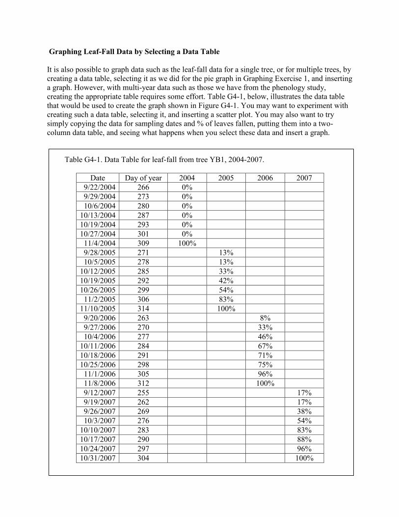
Graphing Leaf-Fall Data by Selecting a Data Table
It is also possible to graph data such as the leaf-fall data for a single tree, or for multiple trees, by
creating a data table, selecting it as we did for the pie graph in Graphing Exercise 1, and inserting
a graph. However, with multi-year data such as those we have from the phenology study,
creating the appropriate table requires some effort. Table G4-1, below, illustrates the data table
that would be used to create the graph shown in Figure G4-1. You may want to experiment with
creating such a data table, selecting it, and inserting a scatter plot. You may also want to try
simply copying the data for sampling dates and % of leaves fallen, putting them into a two-
column data table, and seeing what happens when you select these data and insert a graph.
Table G4-1. Data Table for leaf-fall from tree YB1, 2004-2007.
Date Day of year 2004 2005 2006 2007
9/22/2004 266 0%
9/29/2004 273 0%
10/6/2004 280 0%
10/13/2004 287 0%
10/19/2004 293 0%
10/27/2004 301 0%
11/4/2004 309 100%
9/28/2005 271 13%
10/5/2005 278 13%
10/12/2005 285 33%
10/19/2005 292 42%
10/26/2005 299 54%
11/2/2005 306 83%
11/10/2005 314 100%
9/20/2006 263 8%
9/27/2006 270 33%
10/4/2006 277 46%
10/11/2006 284 67%
10/18/2006 291 71%
10/25/2006 298 75%
11/1/2006 305 96%
11/8/2006 312 100%
9/12/2007 255 17%
9/19/2007 262 17%
9/26/2007 269 38%
10/3/2007 276 54%
10/10/2007 283 83%
10/17/2007 290 88%
10/24/2007 297 96%
10/31/2007 304 100%
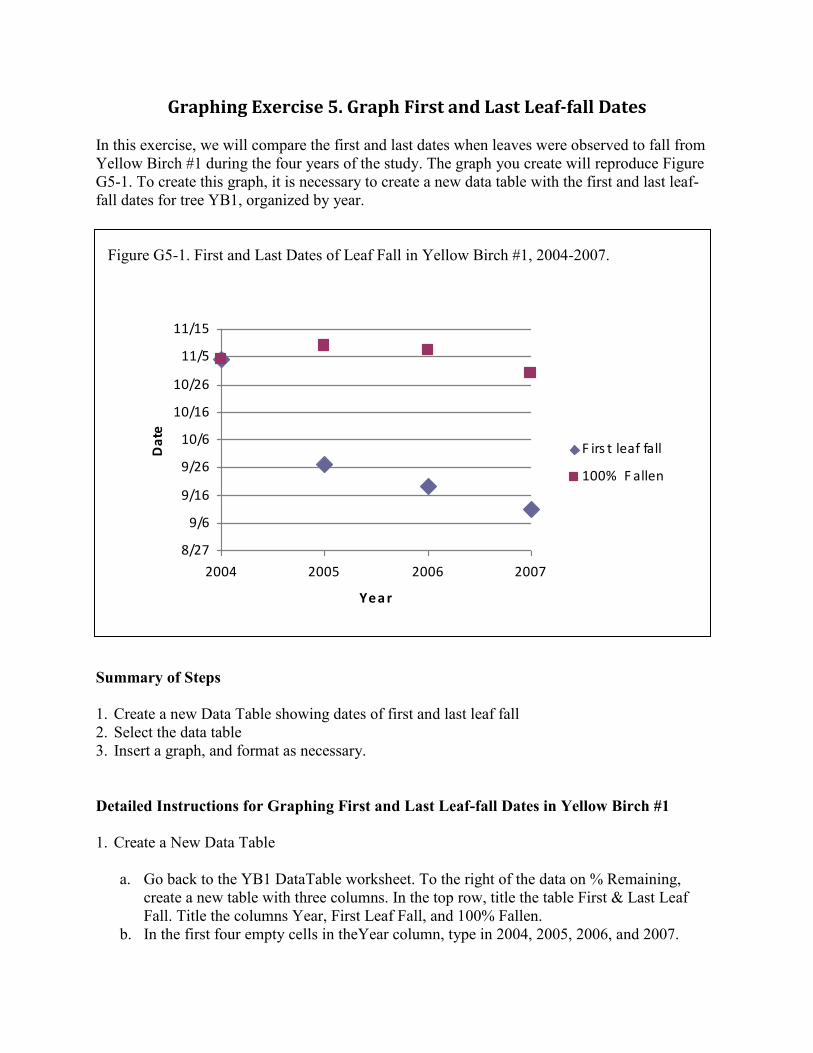
Graphing Exercise 5. Graph First and Last Leaf-fall Dates
In this exercise, we will compare the first and last dates when leaves were observed to fall from
Yellow Birch #1 during the four years of the study. The graph you create will reproduce Figure
G5-1. To create this graph, it is necessary to create a new data table with the first and last leaf-
fall dates for tree YB1, organized by year.
Figure G5-1. First and Last Dates of Leaf Fall in Yellow Birch #1, 2004-2007.
Summary of Steps
1. Create a new Data Table showing dates of first and last leaf fall
2. Select the data table
3. Insert a graph, and format as necessary.
Detailed Instructions for Graphing First and Last Leaf-fall Dates in Yellow Birch #1
1. Create a New Data Table
a. Go back to the YB1 DataTable worksheet. To the right of the data on % Remaining,
create a new table with three columns. In the top row, title the table First & Last Leaf
Fall. Title the columns Year, First Leaf Fall, and 100% Fallen.
b. In the first four empty cells in theYear column, type in 2004, 2005, 2006, and 2007.
8/27
9/6
9/16
9/26
10/6
10/16
10/26
11/5
11/15
2004 2005 2006 2007
Yea r
Da
te
F irs t leaf fall
100% F allen
c. Look at the data in the % Fallen data table, and identify the first date in each year when
leaves were observed to have fallen from tree YB1. Enter the date in the First Leaf Fall
column. Use the Day of Year values.
d. Go back to the % Fallen table, and find the date in each year when 100% of the leaves
had fallen. Enter the values in the 100% fallen column. The data table should look like
Table G5-1.
Table G5-1. Data Table for first and last leaf-fall dates for tree YB1, 2004-2007
Year First leaf fall 100% Fallen
2004 309 309
2005 271 314
2006 263 312
2007 255 304
2. Select all the cells in the Data Table, including the column headings.
3. Graph the data and format the graph as appropriate
a. Following the steps you carried out above, insert a chart, and select X,Y Scatter Plot.
Choose the version that has points, but without lines connecting them.
b. Format the graph, following the steps you carried out above with the graph creation
dialog boxes or with post-creation formatting commands. Adjust the Y-axis scale, insert
titles for the X and Y axes, etc. Use the Format Data Series command to increase the size
of the 2004 First leaf fall label so that it can be seen behind the 100% Fallen data point.
Your graph should look like Figure G5-1.
Optional Variation: Graph the Data as a Bar Graph.
In Figure G5-2, the data in Figure G5-1 are graphed as a bar or column graph comparing
matched pairs of data. As with the initial scatter chart that simply presented the data as points, it
is easy to see how the dates when the students observed the first fallen leaves became earlier
each year over the four years for which data are available. The similar but less consistent trend
in the date of last leaf fall is also visible.
If you wish, use the Chart Type command on the Chart menu on the toolbar [Design tab under
Chart Tools] to change the scatter plot into a bar graph. Select the vertical bar graph (column
chart) option and choose the simple bar graph sub-type at the far left.
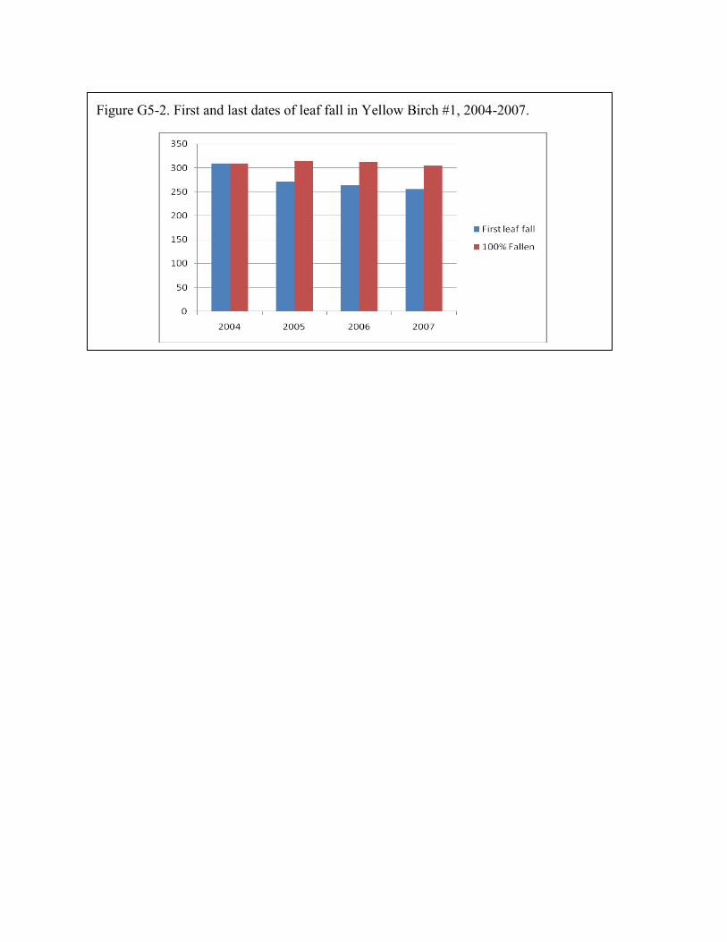
Figure G5-2. First and last dates of leaf fall in Yellow Birch #1, 2004-2007.