gaps + overlaps: collaborative works by ucba faculty
DESCRIPTION
ÂTRANSCRIPT

UCBA Art Gallery | March 27 – May 1, 2015 | University of Cincinnati Blue Ash College
an exhibition cata logue
UC Blue Ash College

Copyright © 2015 by University of CincinnatiAll rights to images and text revert to the individual artists
Published by University of Cincinnati Blue Ash College on the occasion of the exhibition Gaps and Overlaps: Collaborative Works by UCBA Faculty at the UCBA Art Gallery, March 27 – May 1, 2015.
The catalogue was edited by H. Michael Sanders with graphic design by Michael Ziepfel, and was made possible by the UC Office of the Provost,
UCBA Faculty Development Funds Committee, and the UCBA Communications Department.
The UCBA Art Gallery is grateful for support from Dean Cady Short-Thompson and the departments of Art & Visual Communication and Electronic Media Communications.

The exhibition Gaps and Overlaps presents a collection of creative works produced collaboratively by faculty from five different disciplines – Art, English, Foreign Language, Mathematics, and Music. Working in small groups, faculty members thus brought to their project various gaps in knowledge about disciplines not their own, as well as the shared purpose of creating something new. The process of creation varied: some projects required careful planning while others emphasized spontaneous compositions; some projects generated new texts and images while others applied previously created ones; some applied cutting-edge technology while others used scissors and glue. Brains were taxed and genres crossed. The result is an array of works using a broad range of forms or combinations of forms: sculpture, installation, written and musical compositions, audio, video, performance, photography, and collage and other works on paper. These works invite the viewer, as their construction invited the artists, to experience the synergy of artistic collaboration across creative disciplines.
This exhibition is the product of the UCBA Creative Arts Faculty Learning Community (CAFLC), a group devoted to collaborative arts generation and its potential relationship to teaching. CAFLC members include Jamie Albert, Jody Ballah, Matt Bennett, Ted Ferdinand, David Freeman, David Hartz, Rita Kumar, Robert Murdock, Kevin Oberlin, Rhonda Pettit, Mike Roos, H. Michael Sanders, Claudia Skutar, and Sue Sipple. Each member has an established record of scholarly and/or creative publications, presentations, performances, productions, or exhibits in their respective areas.
AcknowledgmentsThe CAFLC acknowledges Pete Bender, William Boyle, and Mandee Logsdon for exhibition preparation and production; Pete Gemmer, Alex Souders and Michael Ziepfel for catalogue, publicity and web production support; and Stefanie Bethuy, Andy Marko, H. Michael Sanders and John Wolfer for UCBA Gallery support. The UCBA Creative Arts Faculty Learning Community would also like to acknowledge the Office of the Provost, University of Cincinnati for exhibition and publication support through the grant of a Collaborative or Interdisciplinary Professional Development Award. Additional funds were provided by the UCBA Faculty Development Funds Committee grant of support for Professional Development.
Online CatalogueA complete catalogue of the exhibition is available on the UCBA Art Gallery website atucblueash.edu/about/community/art-gallery.html. Images of all exhibited works, including links to video and audio projects may be accessed, along with a PDF of this print catalogue.
– 3 –

jamie a lber t kevin oberlin+
Works on exhibit include:Busted, mixed media installation (2015)
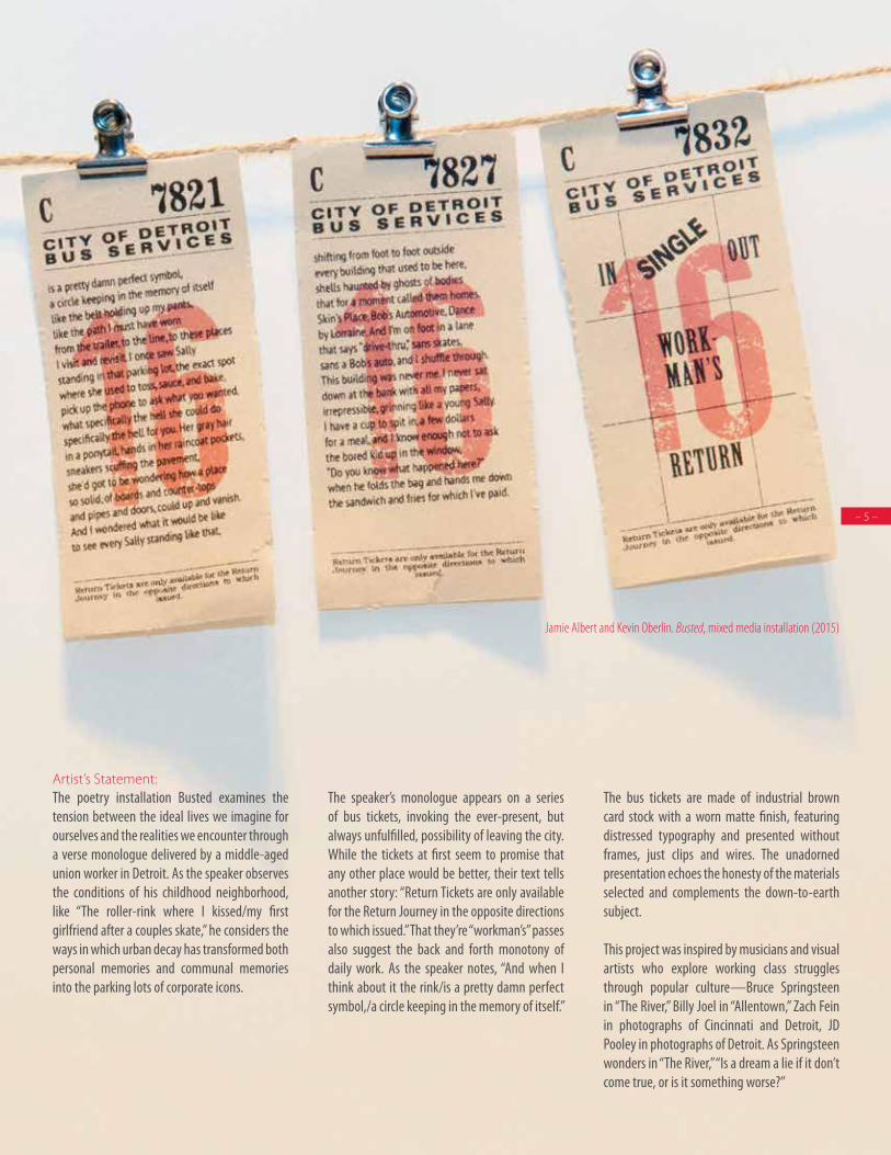
Jamie Albert and Kevin Oberlin. Busted, mixed media installation (2015)
Artist’s Statement:The poetry installation Busted examines the tension between the ideal lives we imagine for ourselves and the realities we encounter through a verse monologue delivered by a middle-aged union worker in Detroit. As the speaker observes the conditions of his childhood neighborhood, like “The roller-rink where I kissed/my first girlfriend after a couples skate,” he considers the ways in which urban decay has transformed both personal memories and communal memories into the parking lots of corporate icons.
The speaker’s monologue appears on a series of bus tickets, invoking the ever-present, but always unfulfilled, possibility of leaving the city. While the tickets at first seem to promise that any other place would be better, their text tells another story: “Return Tickets are only available for the Return Journey in the opposite directions to which issued.” That they’re “workman’s” passes also suggest the back and forth monotony of daily work. As the speaker notes, “And when I think about it the rink/is a pretty damn perfect symbol,/a circle keeping in the memory of itself.”
The bus tickets are made of industrial brown card stock with a worn matte finish, featuring distressed typography and presented without frames, just clips and wires. The unadorned presentation echoes the honesty of the materials selected and complements the down-to-earth subject.
This project was inspired by musicians and visual artists who explore working class struggles through popular culture—Bruce Springsteen in “The River,” Billy Joel in “Allentown,” Zach Fein in photographs of Cincinnati and Detroit, JD Pooley in photographs of Detroit. As Springsteen wonders in “The River,” “Is a dream a lie if it don’t come true, or is it something worse?”
– 5 –

Artist’s Statement:This interactive installation explores the nature of remembering and its power to shape and reshape memories of people, objects, and times lost. By compartmentalizing together disparate textual slivers, tangible objects, and sensory experiences, the exhibit attempts to replicate remembering in order to examine how our act of remembering reshapes the recalled memories to fit our ever-evolving understanding of our “self.” At the center of the installation are two wooden chests surrounded by the shredded paper of discarded ideas, memories lost at the periphery.
Viewers are invited to interact with distinct memory fragments by exploring the contents of each drawer. In addition to interacting with the compartmentalized memories, viewers are invited to engage in a communal process of forgetting and remembering by composing a short memory fragment of their own on a slip of paper and leaving it in a jar. These fragments are intended to be “remembered” and re-contextualized by the artists’ in future explorations of remembering.
jamie a lber trobert murdockk ev in ober l insue sipple
++
+
Works on exhibit include:Should We Keep His Teeth?, mixed media (2015)
Jamie Albert, Robert Murdock and Kevin Oberlin. Interference, photographs with digitally manipulated text overlay (2015)
Jamie
Albe
rt, Ro
bert
Murdo
ck, K
evin
Oberl
in an
d Sue
Sipp
le. Sh
ould
We K
eep H
is Tee
th?, m
ixed m
edia
(201
5)

Artist’s Statement:Recalling fragments as if from the past, these photos seek to challenge different ways we make meaning through visual and written media. Digital interference disrupts the original photographs and is complicated by textual fragments.
jamie a lber trobert murdockk ev in ober l in
++
Works on exhibit include:Interference, photographs digitally manipulated with text overlay, 2015
Artist’s Statement: The exhibit Word into Art comprises a visual and verbal triptych of the process involved in the creation of a particular poem. Through a combination of representative images and words, the triptych moves progressively through the stages of poem genesis to draft to a final version of the writing. The exhibit was collaboratively designed by Peter Bender (photographer) and Claudia Skutar (poet) to make visible what takes place in the mind of an artist who works with words as a poem takes
shape. The artistic collaboration for this exhibit led to some surprising, yet interesting discoveries, not the least of which was that the artists shared a similar vision of the directions in which the collaborative work could develop. The work began with an idea for a triptych of mixed-media images and, through back-and-forth discussion, developed into a more cohesive whole of three photographs used to build an imagistic theme carried through the entire triptych.
pete benderclaudia skutar+
Works on exhibit include: Word into Art, photograph (3 images), 2015
Pete
Bend
er an
d Clau
dia Sk
utar. W
ord in
to Ar
t, pho
tograp
hs (2
015)
Jamie Albert, Robert Murdock and Kevin Oberlin. Interference, photographs with digitally manipulated text overlay (2015)
– 7 –

Artist’s Statement:Within the framework of translation, we have collaborated on three projects looking at the relationship between words and images and how language and visuals translate back and forth to respond, represent and recreate. Jody Ballah is a literary scholar and artist who writes and translates poetry in French and English. Ted Ferdinand is a visual artist who specializes in two-dimensional and digital three-dimensional computer graphics.
Our first piece, titled Red Flowers in Flanders Fields, is a three-dimensional representation of an original poem with accompanying artwork. The poem was written as a response to the hundred-year anniversary commemoration of World War I and in particular, to a poem entitled In Flanders Fields, written by Canadian soldier John McCrae while stationed in Ypres, Belgium.
The second component of our collaboration is called Poetic Response and showcases representative photos of natural subjects. The accompanying poems were written as a response to various themes, images and ideas and function as a translation of the images into words.
The title of our third piece is Poetic Deconstruction/Reconstruction/Translation. The basis of this collage is a series of poems, the Exile poems, written in French by Nobel laureate Saint-John Perse. The poems have been translated into English and certain lines and verses have been selected, individually in each language, to represent images in the chosen photographs.
The prevalent themes of sand, exile, displacement, movement and water run through the words and the photographs as we invite spectators to “reconstruct” their own poetry based on this collage of lines and images.
jody ba l lahted ferdinand+
Works on exhibit include:Red Flowers in Flanders Fields, virtual poem (2015)Poetic Response, photographs with text (2015) Poetic Deconstruction/Reconstruction/Translation, photographs with text (2015)
Jody Ballah and Ted Ferdinand. Red Flowers in Flanders Fields, (Detail)

Jody Ballah and Ted Ferdinand. Red Flowers in Flanders Fields, virtual poem (2015) Jody Ballah and Ted Ferdinand. Poetic Response: One Man’s Treasure (2015)
Jody
Balla
h and
Ted F
erdina
nd. P
oetic
Deco
nstru
ction
s/Reco
nstru
ction
/Tran
slatio
n, ph
otogra
phs w
ith te
xt (2
015)
Jody Ballah and Ted Ferdinand. Poetic Response: A Tapestry Worthy of Bayeux (2015)
Jody Ballah and Ted Ferdinand. Poetic Response: Unexpected Tribute (2015)
– 9 –

matt bennettmike roos+
Works on exhibit include:Rich Man (Venus and Mars), music video, 5:08 (2015)Ship of Fools, music video, 5:12 (2015)
Matt
Benn
ett an
d Mike
Roos
. Ship
of Fo
ols, m
usic
video
(201
5)

Artist’s Statement:Matt Bennett and Mike Roos collaborated to produce two videos for original songs written and performed by Mike Roos: “Ship of Fools” and “Rich Man.” Mike wrote and recorded the songs alone in his home studio over the past year. Then, working together, the two artists selected images and clips from a variety of public domain sources, which Matt then edited to yield an artistic visual and auditory commentary on contemporary culture.
The collaborative pieces produced by these two artists might accurately be described as “collusion,” in the sense of working together subversively. As Mike stated during one meeting of the Creative Arts Faculty Learning Community, “All art should be subversive,” a sensibility shared by Matt, although the two work independently in very different media. Collaboration between the two, however, was an easy partnership since both share an affinity for the act of editing. For Mike, that editing process is directed toward both text and music. For Matt, the editing is directed toward the visual, moving image.
Mike’s lyrics provide evidence of his use of irony and metaphor to tell a vivid, engaging story, while at the same time criticizing cultural, economic, and political conditions. Matt’s art works on much the same level, but employing the visual, rather than the textual and musical, in conducting his critiques. The two artists, in jointly selecting images from which to construct the video pieces, chose to emphasize both the explicit storytelling of Mike’s songwriting and the subversive potential of those songs as contemporary cultural critiques.
Works on exhibit include:Rich Man (Venus and Mars), music video, 5:08 (2015)Ship of Fools, music video, 5:12 (2015)
Matt
Benn
ett an
d Mike
Roos
. Rich
Man
(Ven
us an
d Mars
), mus
ic vid
eo (2
015)
– 11 –

David
Hartz
. Fric
tionle
ss Ob
ject, p
hotog
raph o
f draw
ing, 2
4” x 3
6” (1
999)
Ted Ferdinand and David Hartz. Frictionless Object: Ball Distribution, photo of screenshot (2015)
Ted Ferdinand and David Hartz. Frictionless Object: Maya Interface, photo of screenshot (2015)

Artist’s Statement:We are exploring new techniques in digital printing that do not require any assembly or any further manipulation of the object beyond the printing to be completed.
The sculpture/mechanism we are collaborating on is a three dimensional object that David had conceived and drawn in 1999. David states, “This sculpture/mechanism came to me in a dream. I conceived of this object consisting of a huge solid stainless steel ball bearing approximately seven inches in diameter, surrounded by many smaller ball bearings held against the larger one with a metal sheath with holes for the smaller ball bearings to stick out of. If someone came to pick the object up or catch it from falling, it would be impossible because the hands would just roll off the small ball bearings. In this way it would be frictionless. The original drawing mentions it as, an object to be dropped. When I attempted to physically create the
object, I found that it was near impossible to construct with the means available at that time. The sculpture would have had to be constructed with ball bearings and then those small bearings would need to be held against the larger bearing with a metal sheath. The construction and welding of this metal sheath to hold the small bearings proved impossible to construct. This method also negated the elegance and possible function of the sculpture/mechanism.”
Ted Ferdinand and David Hartz believe that the object could be created using very recent technology in 3D printing and could actually print out a prototype of this sculpture/mechanism. We believe that the prototype could be printed totally functional. This will eliminate the need to attach or weld different parts together.
Ted visualized the concept using 3D using Autodesk Maya to model the
sculpture then to sent the model to an external rendering engines Renderman. Photorealistic renders were created that maximized our ability to see the sculpture as it will exist in the real world. It was discovered that some of the sketches on the original drawing had some interesting relevance to the 3D models. Now that the 2D renders are complete, we will print out an actual prototype using 3D Printing technology.
Currently, there are services that have simplified the process of getting the 3D print into the real world. One such service is called: Shapeways. In this case, a file is sent to the site, the customer picks from over 40+ materials. Shapeways then sends the file to a 3D print shop that outputs in the chosen material. The prototype will be printed in plastic or another inexpensive material. After the prototype is in hand, we will move to a final print in some sort of metal.
Works on exhibit include:Frictionless Object, photograph of drawing, 24” x 36” (1999) Frictionless Object: Ball Distribution, photograph of screenshot, 8” x 10” (2015)Frictionless Object: Maya Interface, photograph of screenshot, 8” x 10” (2015)Frictionless Object: Final Render, photograph of screenshot, 8” x 10” (2015)Frictionless Object: Maquette, 5” x 5” x 5” (2015)
ted ferd inanddavid hartz+
Ted F
erdina
nd an
d Dav
id Ha
rtz. F
rictio
nless
Objec
t: Fina
l Ren
der, p
hoto
of scr
eens
hot (
2015
)
– 13 –

Artist’s StatementThoughts protrude into lifein unexpected ways as we areslowly ground down to nothing. This collaborative work explored rendering poetic text in three-dimensions in such a way that the form interacts with and amplifies the meaning of the words comprising the text. In this case, a short poem written by Sanders, was printed in three-dimensions on the surface of a thick slab of material so that some letters extend varying distances from the surface of the document, while other letters recede beneath the surface of the document. The final word of the poem, “nothing” is formed by essentially leaving a hole in the shape of the word extending through the entire depth of the slab.
An important element of the original design of the work was that the material from which the slab was composed would be paper. This was anticipated as possible through a 3D printing process known informally as “3D paper printing,”
a subtractive process involving the printer cutting and then laminating the three-dimensional design into a stacked ream of common 20 lb. bond paper. Our intent was that the poem would appear on a recognizable white paper surface, including a deckled or scored surface on the four sides of the paper “stack,” out of which various letter forms would extend or recede in three-dimensions. The 3D letter-forms would then cast shadows in hard side lighting to provide a recognizable and legible three-dimensional relief on the pure, white surface.
Ferdinand executed the 3D design to incorporate these desired elements, and consulted with printing specials to finalize the file prior to sending it for execution through a local service bureau with such a 3D paper printer. Unfortunately, the project encountered both process and material limitations rendering the design illegible. In this printing method, there is a step referred to as “weeding,” during which the printing device (or a human hand) cleans out the areas on the surface
previously perforated by the printer to reveal the intended depth of the various characters. No matter which typeface utilized, the process proved both inordinately time-consuming and aesthetically deficient.
Subsequently, the design was revamped for printing through an additive process known as “stereo lithography.” In this approach, a computer-guided laser melts a nylon powder bead to build up the form to full three-dimensionality. We selected a white nylon material, in an effort to simulate the original design in paper, but have added a surface texture to mute the “plastic” quality of the material.
The project effectively demonstrates the collaborative interaction between writer, designer and technician, while underscoring the experimental nature of much collaborative creative work, especially when employing new technologies and materials.
ted ferd inandh. michael sanders+ Works on exhibit include:
Nothing, 3D poem – stereo lithography (2015)
Ted Ferdinand and H. Michael Sanders. Nothing, 3D poem – stereo lithograph (screen render) (2015)

Artist’s Statement:The relationship between art and literature is not new. Both draw on the creative ability to visualize metaphorically though the mediums are different. Our work presents how the power of imagination can be captured in a collaborative work that represents the complementary relationship of art and literature. We wanted to show how the ambiguity of words can be visually expressed while the obscurity of art can be presented through language.
Our effort to depict this intriguing relationship between art and literature began with an in-depth discussion of what we both thought were some central themes and ideas in the story. We talked extensively about how we visualized some of these themes and “what did we see” when we read the story. This exercise led us to a list of visuals that the reading evoked. We used this list to begin brainstorming some concrete ways to substantiate the visual connections. We drew sketches, searched online for images and explored what materials would help us put our ideas together in a visually thoughtful way.
We wanted to capture the central conflict in the narrative in a way that would be artistically appealing and accessible. Using digitally layered artwork including maps, landmarks and overlapping objects we have created a figurative representation of the central theme and ideas of the short narrative. Selectively highlighted text and the incorporation of knotted rope allowed us to depict the tension and cultural clash that characterizes the story.
r i ta kumarsunith narayananjamie a lber t
++
Works on exhibit include:An Uneasy Alliance, mixed media (2015)
Rita K
umar,
Sunit
h Nara
yana
n and
Jami
e Albe
rt. An
Unea
sy All
iance,
mixe
d med
ia (2
015)
– 15 –

David
Free
man a
nd Da
vid Ha
rtz. A
pprox
imati
on 1,
mixe
d med
ia (2
015)
David
Free
man a
nd Da
vid Ha
rtz. A
pprox
imati
on 2,
mixe
d med
ia (2
015)
David
Free
man a
nd Da
vid Ha
rtz. A
pprox
imati
on 4,
mixe
d med
ia (2
015)
David
Free
man a
nd Da
vid Ha
rtz. A
pprox
imati
on 5,
mixe
d med
ia (2
015)
David
Free
man a
nd Da
vid Ha
rtz. A
pprox
imati
on 7,
mixe
d med
ia (2
015)

david f reemandavid hartz+
Works on exhibit include:Approximation 1, mixed media, 6” x 6” (2015)Approximation 2, mixed media, 6” x 6” (2015)Approximation 3, mixed media, 6” x 6” (2015)Approximation 4, mixed media, 42” x 42” (2015)Approximation 5, mixed media, 42” x 42” (2015)Approximation 6, mixed media, 14” x 14” (2015)Approximation 7, mixed media, 14” x 14” (2015)
Artist’s Statement:The notion of “approximation” is ubiquitous within both mathematics and the creative arts. The infinite can be approximated by the finite, the continuous by the discrete, etc. Such approximations are prevalent because there exist many mathematical “ideals” that cannot be fully realized within physical reality as we experience it – they can only be described indirectly by way of a limiting process or by invoking an abstract logical principle (as often occurs with the so-called “Axiom of Choice”). In much the same way, artists create “approximations” to illustrate abstract notions of infinity, time, and space. Abstract ideas and emotions are expressed in art through the use of color, shapes, marks, proximity, repetition, variation, visual representations, and metaphors. These also are “ideals” that cannot be fully physically realized but can be expressed visually for many viewers.
Our works point the viewer beyond the finite into the infinite by highlighting the tension between simplicity and complexity. The patterns in our images consist of modified epitrochoids and hypotrochoids. The geometry of such patterns is completely determined by certain ratios of relatively prime integers. In other words, our images represent a mere handful of fractions. They are manifestly finite. Yet their layered radiance prompts us to contemplate the infinite as their mathematical simplicity is hidden beneath their visual complexity. This should not be surprising – in some sense it ought to be expected. Simple mathematical formulas or frameworks frequently give rise to complex (or even chaotic) systems. Our images are an echo of this fact.
The Spirograph seemed to be the perfect way to mechanically construct mathematical objects (modified epitrochoids and hypotrochoids) while still incorporating the hand and mark making skills. It was important to use various media and color to document the subjectivity of the ‘artist’s hand’ in each work. We delighted in the irony of employing a child’s toy Spirograph as a tool in this collaboration. We believe that the work evokes tremendously more because it was executed by hand and not manipulated by the cold precision of a computer.
Our conceptual collaboration began with discussion and viewing samples of mathematical objects such as the Peano curve and the Hilbert curve. These are two visual ways in which mathematicians encounter the infinite. We began our visual collaboration using models of epitrochoids and hypotrochoids. We brought these visuals into the realm of mixed media using color, shape, line, texture, value, and emotion. David Freeman created various mathematical models on six inch square sheets of paper using a Spirograph. He then handed them over to David Hartz who intuitively interpreted these mathematical ‘approximations’ into illustrative ‘approximations’. David Hartz, using a larger Spirograph, then created his ‘approximations’ on forty-two inch square sheets of paper and handed them over to David Freeman to complete. Finally, the first process was repeated on fourteen inch square sheets of paper. Further revisions to the final works were discussed but quickly dismissed as unnecessary. We started with small six inch square works, quickly moved into large forty-two inch square works and ended with medium fourteen inch square works. The scale change was determined by the person who initiated the work and was not planned out ahead of time. This issue of working on widely different sizes became one of the most interesting and challenging aspects of the collaboration.
David
Free
man a
nd Da
vid Ha
rtz. A
pprox
imati
on 3,
mixe
d med
ia (2
015)
David Freeman and David Hartz. Approximation 6, mixed media (2015)
– 17 –

Artist’s Statement:Call-and-Response: The Poetics of a CollaborationOur contributions to Gaps and Overlaps include collages, poetry, music (with our colleague Mike Roos), and Spoken Word recordings. The source of our collaborative work stems from our shared artistic and intellectual interests: early twentieth-century modernism, film noir, jazz, blues, Beat writers, and Asian philosophies such as Taoism and Zen Buddhism; echoes of Blake and Whitman would also emerge. We both collect objects that possess poetic resonance, odd “keepsakes” that fly in the face of Hallmarketing. Both of us have been writing poetry for years; one of us (Sanders) had been working professionally in the visual arts, while the other (Pettit) is primarily a writer and just beginning to sketch with pencil and pastels. Unexpectedly, each of us has spent more time working in our secondary area than in our professionally established field of expertise for this exhibition. We initially decided to create collages using a combination of written and visual arts to explore collisions between traditional and modern values, but that goal became more of a floater than a targeted vision. We also set up an idea, a plan for our creative process, but the formula never guided our work. As we proceeded, our shared aesthetic stressed spontaneity, and this element of our lived
process gave us enough latitude, in Taoist terms, to let the livestock of our ideas roam freely without escaping their possibilities. The less we thought about our original concepts, the more our work returned to them in one form or another. Verbal and visual themes arose and recurred on their own when we felt compelled to respond to particular pieces. We played with language, writing it down as it arrived, and listened for the internal “logic” it could reveal among its rhythms and apparent nonsense.
How, exactly, do two artists collaborate spontaneously? The triptych Josephine offers a good example of how our creative process worked, and the creative work it allowed us to generate. The initial piece was a collage conceived and constructed primarily by Sanders, featuring the Jazz Age performer Josephine Baker. She holds a mammy doll and is crowned with doll heads from collector catalogs provided by Pettit. On either side of Baker, two Jazz Age performers – later identified as The Dolly Sisters – stand captured in mid-performance. After completing this collage, our individual work seemed to run in tandem. Without planning or discussion, each of us wrote a poem in response to this collage using a call-and-
response structure over the 2014 Christmas break. These poems led to the triptych construction, and also became part of our Spoken Word recordings. In fact, call-and-response serves as a metaphor for an essential part of our process. Each of us continued to create written and visual work individually, and then shared it to see what stuck or what came unglued. Sanders used a form of found poetry, what he terms poetic extractions, to which Pettit contributed writing, leading to collaborative spoken word recordings and her own extractions. Pettit uses the term scatatonics to describe the spontaneous poems and manifestos (scatifestos) she created that inspired collages and writing by Sanders. Poetic objects we photographed early in our work led to photographic triptychs and film by Sanders, and a series of collages by Pettit. We discarded expectations, a challenge in our cultural climate where thinking outside the box had better lead to results that can be used inside the box. And add to that the irony that we are creating this work inside a big box full of little boxes – an institution of higher education – that helped make this work and exhibition possible. We had to let go in order to make.
rhonda pett i th. michael sanders+
Rhon
da Pe
ttit a
nd H
. Mich
ael S
ande
rs. Na
il Ang
el No
. 1, p
hotog
raph,
11” x
14” (
2015
)

Call-and-Response Project, collage/text, audio, photo, and video (2014-2015)
Works on exhibit include:Nail Angel No. 1, photograph (triptych), 11” x 14” (2015)Nan, No. 2, photograph (triptych), 11” x 14” (2015)Josephine, electrostatic print from collage with digital text, 17” x 33” (2015)I Lick My Lips Before I Speak, electrostatic print from collage with digital text, 17” x 33” (2015)Poet Rebus No. 5, electrostatic print from collage with digital text, 17” x 33” (2015)Two Scat Poems, electrostatic print from collage with digital text, 17” x 33” (2015).Whitman: Poetic Extractions, electrostatic print from collage with digital text, 17” x 33” (2015)Spoken Words, audio recording (poetry) with folio of corresponding texts, 60:00, (2015).I Lick My Lips Before I Speak, video, 3:00 (2015).Portfolio of Process and Outcomes, portfolio book (two volumes), 11” x 17” (2015).
Individual works inspired by collaborative activityRhonda Pettit –Name That Tune (Nan Series), electrostatic print from collage, 11” x 17” (2015)Changing Strings (Nan Series), electrostatic print from collage, 11” x 17” (2015)Wave Arpeggio (Nan Series), electrostatic print from collage, 11” x 17” (2015)Save Me? (Nan Series), electrostatic print from collage, 11” x 17” (2015)
H. Michael Sanders –Doll-Head Poet No. 1, electrostatic print from collage, 11” x 17” (2015)Doll-Head Poet No. 2, electrostatic print from collage, 11” x 17” (2015)Doll-Head Poet No. 3, electrostatic print from collage, 11” x 17” (2015)Three Graces, electrostatic print from collage, 11” x 17” (2015)
The artists gratefully acknowledge the artistic and technical contributions of William Boyle and Mandee Logsdon to various aspects oftheir project.
Rhonda Pettit and H. Michael Sanders. Josephine, electrostatic print from collage with digital text, 17” x 33” (2015)
Rhonda Pettit and H. Michael Sanders. I Lick My Lips Before I Speak, electrostatic print from collage with digital text, 17” x 33” (2015)
Rhonda Pettit and H. Michael Sanders. Poet Rebus No. 5, electrostatic print from collage with digital text, 17” x 33” (2015)
Rhonda Pettit and H. Michael Sanders. Two Scat Poems, electrostatic print from collage with digital text, 17” x 33” (2015)
– 19 –

H. Michael Sanders. Black Label Poems, artist’s publication (2014)

Artist’s Statement:The Black Label Poems are designed as a form of pre-packaged, instant “graffiti poetry.” They’re printed labels to be illicitly plastered on walls or other surfaces in public places, or hidden within the covers of circulating books, to gently deface them with the beauty of enigmatic poetic scribbling. The poetry of these scribbles is hopefully amplified through their “directed collision” with my idiosyncratic photographs.
Derived, in part, from the conceptual and mail art aspects of my artistic practice, the label poems are intended to display poetry in completely unexpected and surprising locations. It is further intended that this occur indeterminately through the agency of others. Recipients of this packet participate in the completion of the artwork by disseminating the label poems during their wandering. I encourage collaborators to complete, and mail back to me for exhibition, the included documentation postcard.
This participatory art piece is an enhanced adaptation of the format of my 1984 publication, Seven Poems on Labels, and is conceived as a process to allow poetry readers the opportunity to take art into their own hands and right into the street.
The initial group of collaborators on this project include my colleagues in the UCBA Creative Arts Faculty Learning Community, to whom I am grateful for their participation, and for the opportunity to show the continuing work in a gallery setting for the first time.
h. michael sandersmembers of CAFLC+
Black Label Poem Project, artist’s book and guerrilla poetry installation (2014-2015)
Works on exhibit include:Black Label Poems, artist’s publication of poems on adhesive labels (2014)Black Label Poems Display Panel, photograph, 11” x 14” (2015)Collaborative Responses, postcards and photos, various dimensions (2015)
– 21 –

Jamie Albert teaches Visual Communication at UC Blue Ash College. Her portfolio includes work in publication, packaging, advertising and branding. Her work has appeared in numerous graphic design trade publications.
Jody Ballah teaches French language, literature and film at the University of Cincinnati Blue Ash College. In addition to classroom teaching, Professor Ballah is an advocate for experiential language learning and has created a study abroad program to Québec and a service learning program for students of French. Her research interests include French literature of the Americas, French Cinema and French/English relations during WWI. Creative activities include French literary translation, response poetry and watercolour painting.
Pete Bender is the Electronic Communications Manager at UC Blue Ash College responsible for creating documentary and promotional photography and video projects for the college. Bender also manages the social media channels for the college and is a member of the University’s Social Media Council. He has worked at UC Blue Ash College for over 26 years, beginning his current responsibilities in the Communications office in 2011.
Matt Bennett teaches courses in film studies, media aesthetics, and criticism in Electronic Media Communications at UCBA. His creative work, primarily in video, uses popular culture as a vehicle for ideological and institutional critique. His research and publication interests focus on psychoanalytic and gender/sexuality studies approaches to visual culture. Ted Ferdinand teaches media design foundation and three-dimensional computer graphics classes in the Electronic Media Department at UCBA College. His areas of expertise and research interests include two and three-dimensional imaging, editing and digital character modeling and animation. He is also exploring the new territory of three-dimensional printing and the creation of virtual interactive environments. He exhibits his work locally, regionally and on the Internet. David Freeman, PhD, teaches math at the University of Cincinnati Blue Ash College. Dr. Freeman conducts mathematical research in the fields of Geometric Function Theory and Metric Space Geometry, and has published several articles in international journals. Before obtaining his doctoral degree in math, he obtained a baccalaureate degree in studio art. He is currently exploring connections between his current mathematical research and his background in the visual arts.
David Hartz is an uncommon artist with skills in drawing, painting, sculpture, animation, digital art, illustration, design and filmmaking. He has an extensive international exhibition record. In 2014, David was leader of the USA team in the Second World Fire Sculpture Championship in Riga, Latvia. He has exhibited internationally including such cities as Tallinn, Estonia; Ischgl, Austria; Taipei, Taiwan; Vancouver, British Columbia as well as in many regional galleries. See his diverse oeuvre here: http://uncommonartist.com
Rita Kumar, PhD, teaches composition and literature in the UCBA Department of English and Communication. She is the 2014 recipient of the UCBA Innovative Teaching Award for her inventive use of Problem-Based Learning (PBL) in the classroom. Her scholarship includes articles on PBL, and strategies for developing students’ information literacy skills in journals such as College Teaching and Writing Pedagogy. She is currently working on a creative non-fiction work exploring the experiences of immigrant women.
Robert Murdock is a recipient of an Individual Excellence Award from the Ohio Arts Council. He teaches creative writing, literature, and composition at the University of Cincinnati, Blue Ash College. His poems have appeared in The Boston Review, Michigan Quarterly Review, Antioch Review, Cincinnati Review, and elsewhere.
ar t i s tsbiographies+

Kevin Oberlin teaches English Composition at UC Blue Ash College. His poems have appeared recently in The Centrifugal Eye, Pilgrimage, and Dunes Review. His chapbook Spotlit Girl is available from Kent State University Press.
Rhonda Pettit, Ph.D., teaches writing and literature in the UCBA Department of English and Communication, where she is editor of the Blue Ash Review. Her scholarship includes two books on the writer Dorothy Parker, as well as articles and editorial projects about 19th and 20th century poets. Her own poetry appears in her chapbook, Fetal Waters, and in journals and anthologies. Her poetic drama, The Global Waters, premiered at the 2010 Cincinnati Fringe Festival.
Mike Roos teaches composition, literature, and journalism in the UCBA Department of English and Communication. As a singer-songwriter he has self-produced three collections of original songs. His book of creative non-fiction, One Small Town, One Crazy Coach, was published by Indiana University Press in 2013. He has published scholarly articles on Ernest Hemingway, Bob Dylan, and John Lennon.
H. Michael Sanders is a photographer, media artist and poet focusing on collage and montage approaches to video, sound and print works, as well conceptual/process works and performances that involve chance, indeterminacy and spontaneous collaboration. His media works have been exhibited internationally and his audio collection, Magnetic Resonance, is currently available from Photokinesis. Sanders’ most recent publication is Black Label Poems. He is currently professor and department chair of Electronic Media Communications at UCBA.
Sue Sipple is chair of UCBA’s Department of English and Communication, where she teaches literature and writing. In 2010, she was awarded UC’s Mrs. A.B. (Dolly) Cohen Award for Teaching Excellence. Sipple is a four-time study abroad leader and new co-director of UCBA’s British Study Abroad program, starting fall 2015. Her scholarship includes research on study abroad best practices; instructor feedback methods; and faculty development, including a co-edited book, Developing Faculty Learning Communities in Two-Year Colleges.
Claudia Skutar is an associate professor at the University of Cincinnati Blue Ash College and teaches creative writing, literature, and composition. Her poems and essays have appeared in the Red Cedar Review; Express Cincinnati; a Tupelo Press Perfect Ten chapbook anthology; the essay anthology Fresh Water: Women Writing on the Great Lakes; and elsewhere.
The following media professionals at UCBA provided significant collaborative support to assist members of the Creative Arts Faculty Learning Community with preparation and production for the exhibition:
William Boyle is studio/lab manager and adjunct assistant professor in Electronic Media Communications where he teaches photography, video and the capstone courses. His creative work as a photographer and video producer/editor have been widely exhibited and nationally recognized by such industry awards as MCA-I and Telly. Bill collaborates frequently on media projects with H. Michael Sanders, including sharing an artist’s residency at the Experimental Television Center in Owego, NY.
Amanda Logsdon is a student in Electronic Media Communications at UCBA with advanced skills in graphics and photography. Mandee currently works as a staff production assistant in the department and is working on an extended photographic portfolio merging portraiture and fashion. Her work was recently included in the student exhibition of Cincinnati FotoFocus.
– 23 –

UC Blue Ash College9555 Plainfield RoadBlue Ash, OH 45236
ucblueash.edu