flat plan vs existing magazines (nme)
TRANSCRIPT
Flat Plan Comparison
Katy Marwood
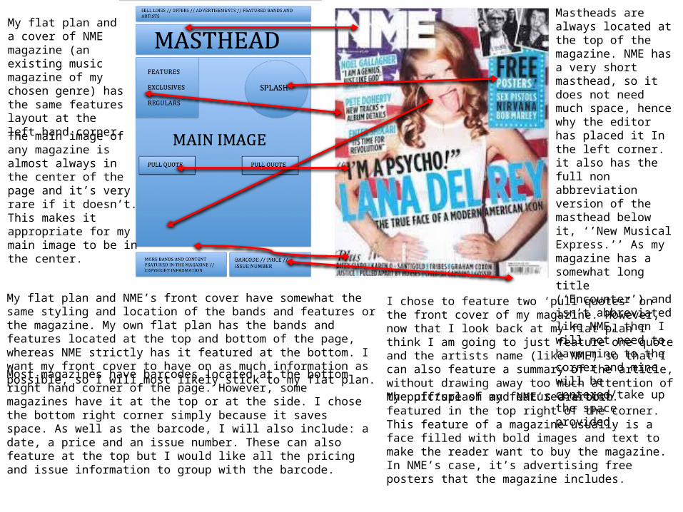
My flat plan and a cover of NME magazine (an existing music magazine of my chosen genre) has the same features layout at the left hand corner.
The main image of any magazine is almost always in the center of the page and it’s very rare if it doesn’t. This makes it appropriate for my main image to be in the center.
Mastheads are always located at the top of the magazine. NME has a very short masthead, so it does not need much space, hence why the editor has placed it In the left corner. it also has the full non abbreviation version of the masthead below it, ‘’New Musical Express.’’ As my magazine has a somewhat long title (‘Encounter’) and isn’t abbreviated like NME, then I will not need to have mine to the corner and mine will be centered/take up the space provided.
My flat plan and NME’s front cover have somewhat the same styling and location of the bands and features or the magazine. My own flat plan has the bands and features located at the top and bottom of the page, whereas NME strictly has it featured at the bottom. I want my front cover to have on as much information as possible, so I will most likely stick to my flat plan.
Most magazines have barcodes located at the bottom right hand corner of the page. However, some magazines have it at the top or at the side. I chose the bottom right corner simply because it saves space. As well as the barcode, I will also include: a date, a price and an issue number. These can also feature at the top but I would like all the pricing and issue information to group with the barcode.
I chose to feature two ‘pull quotes’ on the front cover of my magazine. However, now that I look back at my flat plan I think I am going to just feature one quote and the artists name (like NME) so that I can also feature a summary of the article, without drawing away too much attention of the picture of my featured artist.
My puff/splash and NME’s are both featured in the top right of the corner. This feature of a magazine usually is a face filled with bold images and text to make the reader want to buy the magazine. In NME’s case, it’s advertising free posters that the magazine includes.
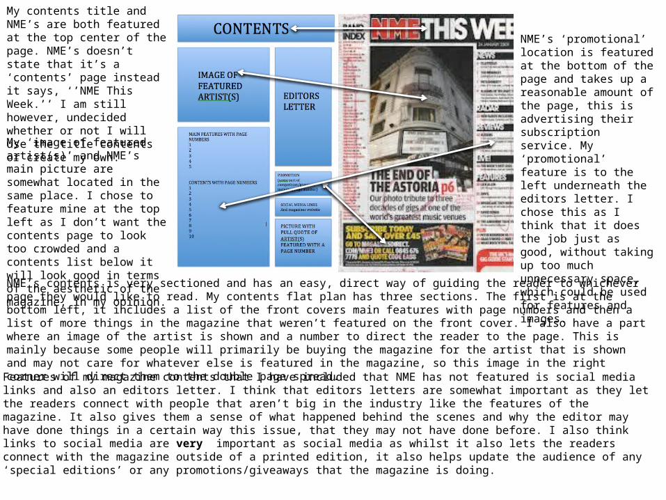
My contents title and NME’s are both featured at the top center of the page. NME’s doesn’t state that it’s a ‘contents’ page instead it says, ‘’NME This Week.’’ I am still however, undecided whether or not I will use the title contents or create my own.
My ‘image of featured artist(s)’ and NME’s main picture are somewhat located in the same place. I chose to feature mine at the top left as I don’t want the contents page to look too crowded and a contents list below it will look good in terms of the aesthetic of the magazine, in my opinion.
NME’s ‘promotional’ location is featured at the bottom of the page and takes up a reasonable amount of the page, this is advertising their subscription service. My ‘promotional’ feature is to the left underneath the editors letter. I chose this as I think that it does the job just as good, without taking up too much unnecessary space, which could be used for features and images.
NME’s contents is very sectioned and has an easy, direct way of guiding the reader to whichever page they would like to read. My contents flat plan has three sections. The first is at the bottom left, it includes a list of the front covers main features with page numbers and then a list of more things in the magazine that weren’t featured on the front cover. I also have a part where an image of the artist is shown and a number to direct the reader to the page. This is mainly because some people will primarily be buying the magazine for the artist that is shown and may not care for whatever else is featured in the magazine, so this image in the right corner will direct them to the double page spread.
Features of my magazine contents that I have included that NME has not featured is social media links and also an editors letter. I think that editors letters are somewhat important as they let the readers connect with people that aren’t big in the industry like the features of the magazine. It also gives them a sense of what happened behind the scenes and why the editor may have done things in a certain way this issue, that they may not have done before. I also think links to social media are very important as social media as whilst it also lets the readers connect with the magazine outside of a printed edition, it also helps update the audience of any ‘special editions’ or any promotions/giveaways that the magazine is doing.
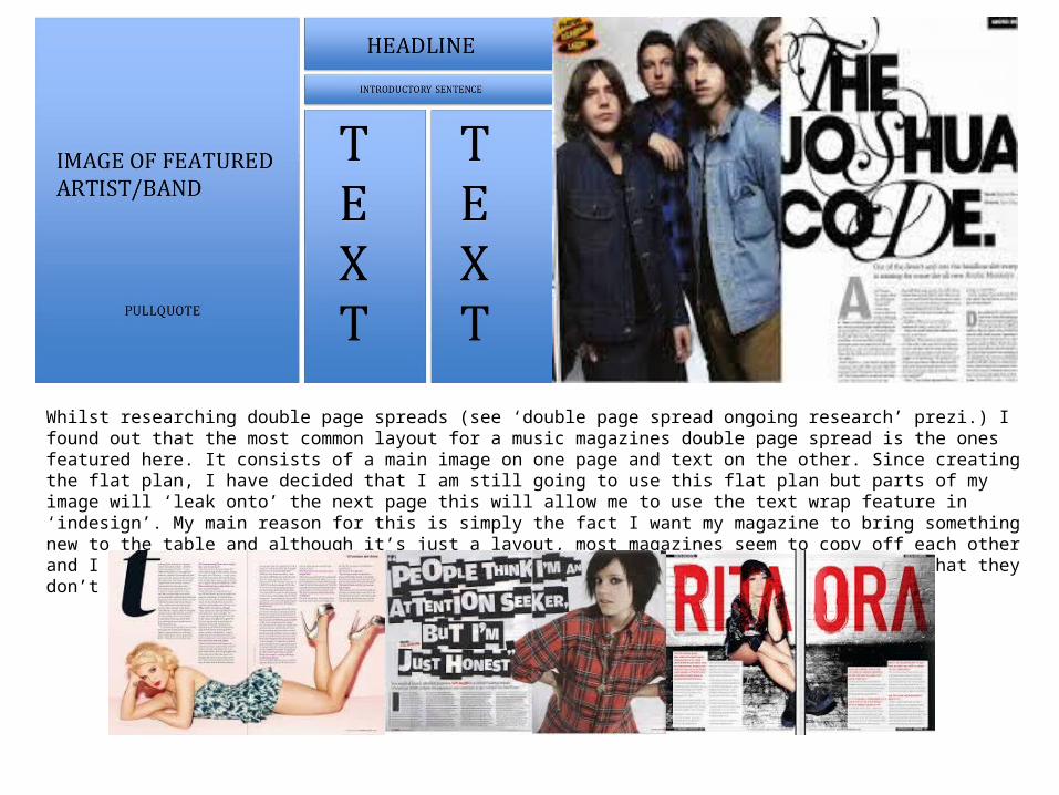
Whilst researching double page spreads (see ‘double page spread ongoing research’ prezi.) I found out that the most common layout for a music magazines double page spread is the ones featured here. It consists of a main image on one page and text on the other. Since creating the flat plan, I have decided that I am still going to use this flat plan but parts of my image will ‘leak onto’ the next page this will allow me to use the text wrap feature in ‘indesign’. My main reason for this is simply the fact I want my magazine to bring something new to the table and although it’s just a layout, most magazines seem to copy off each other and I don’t want to do this. I want to offer the audience something new, something that they don’t see whilst reading other magazines from the same genre.