fashion color report spring 2014
TRANSCRIPT

FASHIONCOLOR REPORTSPRING 2014
NEW YORK FASHION WEEK • SEPTEMBER 5-12, 2013 pantone.com/spring2014
CHRI
STIA
N SI
RIAN
O
FASHIONCOLOR REPORTSPRING 2014
NEW YORK FASHION WEEK • SEPTEMBER 5-12, 2013 pantone.com/spring2014
CHRI
STIA
N SI
RIAN
O
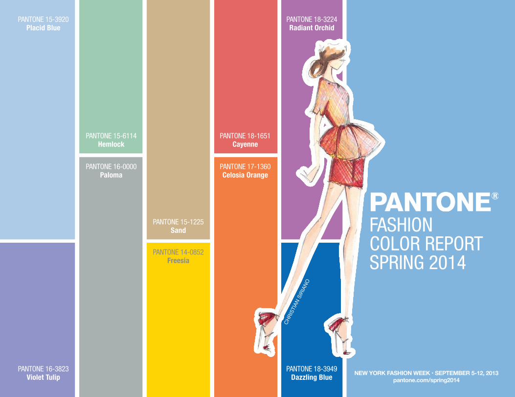
PANTONE 15-3920Placid Blue
PANTONE 15-6114Hemlock
PANTONE 16-0000Paloma
PANTONE 16-3823Violet Tulip
PANTONE 15-1225Sand
PANTONE 18-1651Cayenne
PANTONE 17-1360Celosia Orange
PANTONE 14-0852Freesia
PANTONE 18-3224Radiant Orchid
PANTONE 18-3949Dazzling Blue

SPRING 2014: A SEASON OF COLORFUL EQUILIBRIUM Designers take a modern twist on the traditional for spring 2014 by pairing soft pastels with vivid brights to create a colorful equilibrium. Inspired by a mixture of blooming flowers, travels abroad and strong, confident women, designers use color to refresh, revive and defy conventional wisdom.
Three very adaptable pastels sit on one end of the palette, and, because we are so accustomed to seeing them as nature’s background, they can be creatively combined with any other color in the spectrum. Placid Blue, like a picture-perfect, tranquil and reassuring sky, induces a sense of peaceful calmness, while Violet Tulip, a romantic, vintage purple, evokes wistful nostalgia. Similar to the verdant shade of springtime foliage, Hemlock, a summery, ornamental green, provides a decorative touch that’s very different from the greens of recent seasons. Pair any of these versatile pastels with a bolder hue for an au courant look.
Sand, a lightly toasted and amiable neutral, conjures images of the beach and the carefree days of summer. Try pairing Sand with Hemlock for perfect, natural balance. Paloma serves as a quintessential neutral, interesting enough to be worn alone or combined with any color for sophisticated poise.
Cayenne, a high-pitched red, adds a dash of spicy heat to neutrals, and heightens the excitement when mixed with Freesia, a blazing yellow that is sure to illuminate wardrobes this season. A tropical, floral-inspired shade, Freesia’s warmth and energy help set the stage for Celosia Orange, an optimistic, spontaneous hue. Pair Celosia Orange with Violet Tulip for a captivating vision, much like the setting summer sun.
The palette is brought full circle with Radiant Orchid, a bold counterpart to Violet Tulip, and Dazzling Blue, a scintillating, polar opposite to Placid Blue. Surprisingly, these strong, vibrant colors also pair well across the palette: They are perfect companions to pastels, and add confidence and vivacity when mixed with other bold colors.
For more than 20 years, Pantone, the global authorityon color, has surveyed the designers of New York Fashion Week and beyond to bring you the season’s most important color trends. This report previews the most prominent hues for spring 2014.
~ Leatrice Eiseman, Executive Director of the Pantone Color Institute®
“This season, consumers are looking for a state of
thoughtful, emotional and artistic equilibrium. While
this need for stability is reflected in the composition
of the palette, the inherent versatility of the individual
colors allows for experimentation with new looks and
color combinations.”
PANTONE FASHION COLOR REPORT SPRING 2014 • NEW YORK FASHION WEEK • SEPTEMBER 5–12, 2013 • pantone.com/spring2014

PANTONE 18-3949Dazzling Blue
PANTONE 18-1651Cayenne
TRACY REESE
Website: www.tracyreese.com Facebook: facebook.com/tracyreese Twitter: @tracy_reese
PROMINENT COLORSI love Cyan Blue mixed with Scarlet. It’s classic and always works. Mint Green is mixing beautifully with Lapis Blue and is a wonderful accent to a primary palette. I also like Ochre mixed with all shades of Pink from dusty to shocking.
INSPIRATIONTribal cultures from Africa to the Caribbean and South America.
SIGNATURE COLORMany different shades of Blue, from Indigo to Lapis and Cyan to Sea and Ocean Blues. They anchor every delivery. Our customer is always drawn to warm Blues – they look good on everyone.
MUST-HAVE ITEM FOR SPRING 2014A tropical-print slip dress in a moody Pink floral print.
WHAT COLOR WOULD YOU REPAINT A ROOM OR ACCENT PIECE IN YOUR HOME?I would wallpaper an accent wall in my bedroom with one of our large floral placement prints in shades of Pink and Ochre. It’s bright and melancholy at the same time – very emotional and expressive.
TRACY REESE
PANTONE FASHION COLOR REPORT SPRING 2014 • NEW YORK FASHION WEEK • SEPTEMBER 5–12, 2013 • pantone.com/spring2014

YOANA BARASCHI
Website: www.yoanabaraschi.com Facebook: facebook.com/yoanabaraschiTwitter: @yoanabaraschi Pinterest: pinterest.com/yoanabaraschi
PROMINENT COLORSThe Blue family looked new and fresh again when used tonally from Limoges to Little Boy Blue and Azure Blue, while warm tonalities of Fusion Coral add warmth to the palette, anchored in Black and White. Azalea Pink, Pink Carnation and Sachet Pink are definitely the rising stars of the season, made vibrant when contrasted with Sunny Lime.
INSPIRATIONA desire for freshness, purity and graphic contrast.
SIGNATURE COLORPink! Oh so feminine, so retro, so modern!
MUST-HAVE ITEM FOR SPRING 2014A White textured jacquard blazer – new, versatile and clean.
WHAT COLOR WOULD YOU REPAINT A ROOM OR ACCENT PIECE IN YOUR HOME?Sunny Lime curtains in silk chiffon would look great in my colorful living room.
YOANA BARASCHI
PANTONE 18-3224Radiant Orchid
PANTONE 18-3224Radiant Orchid
PANTONE FASHION COLOR REPORT SPRING 2014 • NEW YORK FASHION WEEK • SEPTEMBER 5–12, 2013 • pantone.com/spring2014

PANTONE 16-3823Violet Tulip
PANTONE 16-3823Violet Tulip
TADASHI SHOJIWebsite: www.tadashishoji.com Facebook: facebook.com/tadashishojiTwitter: @tadashishoji Pinterest: pinterest.com/tadashishojiInstagram: @tadashishojiBlog: blog.tadashishoji.com
PROMINENT COLORSWhite and Lavender Rain, White and Frosted Jade, White and Antique Pink.
INSPIRATIONThe femininity and strength of a woman; a feminine liberation.
SIGNATURE COLORWhite is the most important color for spring 2014. I pair it with almost every color in this collection.
MUST-HAVE ITEM FOR SPRING 2014The Ivory scalloped lace dress with flared skirt. It is a feminine and flirty piece that you can dress up or down.
WHAT COLOR WOULD YOU REPAINT A ROOM OR ACCENT PIECE IN YOUR HOME?I would paint an accent piece in the color Blue Hydrangea. It is a strong, yet serene, shade of Blue.
TADASHI SHOJI
PANTONE FASHION COLOR REPORT SPRING 2014 • NEW YORK FASHION WEEK • SEPTEMBER 5–12, 2013 • pantone.com/spring2014

PAMELLA ROLANDBY PAMELLA DEVOS
Website: www.pamellaroland.com Facebook: facebook.com/pamellarolandTwitter: @pamellarolandPinterest: pinterest.com/pamellarolandInstagram: @pamellarolandBlog: pamellaroland.com/blog
PROMINENT COLORSSpring is a perfect opportunity to wear color, especially after being covered up all winter. For spring 2014, I am using vibrant colors such as Flamingo, Candy Pink, Winter Sky, Peach Whip, Mellow Yellow and highlights of metallic Silver and Gold.
INSPIRATIONWhile attending this year’s Cannes Film Festival, I was inspired by the spirit of the South of France and the glamour that the festival has brought to the French Riviera for decades.
SIGNATURE COLORFlamingo because it perfectly captures the chic essence of Cannes.
MUST-HAVE ITEM FOR SPRING 2014A Flamingo and Candy Pink t-shirt dress with a beaded front is a must have for any occasion.
WHAT COLOR WOULD YOU REPAINT A ROOM OR ACCENT PIECE IN YOUR HOME?I would repaint a bedroom in my apartment Mellow Yellow; waking up every morning surrounded by such joyful color is a perfect way to start the day.
PAMELLA ROLANDBY PAMELLA DEVOS
PANTONE 17-1360Celosia Orange
PANTONE 17-1360Celosia Orange
PANTONE FASHION COLOR REPORT SPRING 2014 • NEW YORK FASHION WEEK • SEPTEMBER 5–12, 2013 • pantone.com/spring2014

PANTONE 18-1651Cayenne
PANTONE 18-1651Cayenne
NANETTE LEPOREWebsite: www.nanettelepore.comFacebook: facebook.com/nanettelepore.fbTwitter: @nanetteleporePinterest: pinterest.com/nanettepinsInstagram: @nanetteleporeTumblr: nanettelepore.tumblr.com
PROMINENT COLORSBombshell Red and a Deep Indigo, bounced off of Boudoir Blush and a splashof Soft Yellow. There is an undertone of a Soft Pink glow in the prints.
INSPIRATIONSupernature.
SIGNATURE COLORBombshell Red – it’s impactful.
MUST-HAVE ITEM FOR SPRING 2014A floaty, long, slip dress – in colors ranging from a Bombshell Red toBoudoir Blush.
WHAT COLOR WOULD YOU REPAINT A ROOM OR ACCENT PIECE IN YOUR HOME?I would paint my bedroom walls Red.
NANETTE LEPORE
PANTONE FASHION COLOR REPORT SPRING 2014 • NEW YORK FASHION WEEK • SEPTEMBER 5–12, 2013 • pantone.com/spring2014

RACHEL ROYWebsite: www.rachelroy.com Facebook: facebook.com/rachelroyTwitter: @rachel_royPinterest: pinterest.com/rachelroyrrInstagram: @rachel_roy Blog: The Life on rachelroy.com
PROMINENT COLORSPrecious Amber and French Blue.
INSPIRATIONThe strength and elegance of women.
SIGNATURE COLORPrecious Amber for its directional beauty.
MUST-HAVE ITEM FOR SPRING 2014A jumpsuit with a dinner jacket in Precious Amber.
WHAT COLOR WOULD YOU REPAINT A ROOM OR ACCENT PIECE IN YOUR HOME?I am painting my in-home office Rose Bud from my spring 2014 collection.
RACHEL ROY
PANTONE 14-0852Freesia
PANTONE 14-0852Freesia
PANTONE FASHION COLOR REPORT SPRING 2014 • NEW YORK FASHION WEEK • SEPTEMBER 5–12, 2013 • pantone.com/spring2014

PANTONE 15-3920Placid Blue
PANTONE 15-3920Placid Blue
ELLA MOSSBY PAMELLA PROTZEL-SCOTT
Website: www.ellamoss.com Facebook: facebook.com/ellamossbrandTwitter: @ellamoss Pinterest: pinterest.com/ellamossInstagram: @ellamoss
PROMINENT COLORSPretty pastels and softer hues mixed with Black to Cool Gray, Classic Blues and lots of White. Colors include Creamy Peach with Chambray Blue, Soft Coral with Cornflower Blue, Cool Mint with Steely Gray, Icy Lavender and Deep Indigo.
INSPIRATIONA sense of feminine confidence and playful attitudes.
SIGNATURE COLORChambray and Indigo Blues – these are Classic Blue shades that pair beautifully with a soft dreamy palette.
MUST-HAVE ITEM FOR SPRING 2014A boxy top done in different fabrics from eyelets to printed poplins. It’s modern, yet playful. Perfect for a fresh take on a classic t-shirt shape.
WHAT COLOR WOULD YOU REPAINT A ROOM OR ACCENT PIECE IN YOUR HOME?I’d love to paint a room in my house Mint Green. It’s vibrant and would look very fresh accenting Gold, neutrals and pops of Pink.
ELLA MOSSBY PAMELLA PROTZEL-SCOTT
PANTONE FASHION COLOR REPORT SPRING 2014 • NEW YORK FASHION WEEK • SEPTEMBER 5–12, 2013 • pantone.com/spring2014

BCBGMAXAZRIASubmission by Lubov Azria,Chief Creative Officer
Website: www.bcbg.com Facebook: facebook.com/BCBGMAXAZRIA Twitter: @BCBGMAXAZRIAPinterest: pinterest/BCBGMAXAZRIAInstagram: @BCBGMAXAZRIABlog: bonchicblog.com
PROMINENT COLORSCool Chambrays and shades of Pink feature prominently in the collection. Black and Light Cool Gray set the backdrop for colorful prints with a mixture of warm and cool tones such as Begonia Pink, Vine Green and Bright Yellow.
INSPIRATIONContemporary art inspired the choice of vivid colors, while more muted tones glean inspiration from watercolors.
SIGNATURE COLORShades of Pink, ranging from Pale Blush to Fuchsia, feel fresh.
MUST-HAVE ITEM FOR SPRING 2014An easy shirt-dress in Chambray Blue or White.
WHAT COLOR WOULD YOU REPAINT A ROOM OR ACCENT PIECE IN YOUR HOME?A classic chair repainted to Begonia Pink – the bright pop of color gives more traditional pieces a modern update that stands out and makes a statement against a neutral backdrop.
BCBGMAXAZRIA
Phot
o co
urte
sy o
f: BC
BGM
AXAZ
RIAG
ROUP
PANTONE 16-0000Paloma
PANTONE 16-0000Paloma
PANTONE FASHION COLOR REPORT SPRING 2014 • NEW YORK FASHION WEEK • SEPTEMBER 5–12, 2013 • pantone.com/spring2014

PANTONE 15-1225Sand
PANTONE 15-1225Sand
ADEAMBY HANAKO MAEDA
Website: www.adeamonline.com Facebook: facebook.com/adeamonlineTwitter: @adeamonlineInstagram: @adeamonlineTumblr: adeamonline.tumblr.com
PROMINENT COLORSAshy pastel colors, such as Glass Green, Silver Peony and Lilac Hint.
INSPIRATIONEarly summer flowers in Japan, especially hydrangeas that come in various shades of Blue and Pink.
SIGNATURE COLORGlass Green because it’s a very unique shade of Pale Yellow with a slight cast of Green. It’s more refreshing than Cream and richer than Pure White.
MUST-HAVE ITEM FOR SPRING 2014A sweatshirt with quilted leather shoulders in one of our original prints, theDecay print, which is inspired by plant cells under a microscope. I paired it witha matching print skirt with hidden chiffon panels for a more sophisticated look.
WHAT COLOR WOULD YOU REPAINT A ROOM OR ACCENT PIECE IN YOUR HOME?Lilac Hint because it’s a perfect shade of Pale Blue that would complement the White furnishings in my bathroom.
ADEAMBY HANAKO MAEDA
PANTONE FASHION COLOR REPORT SPRING 2014 • NEW YORK FASHION WEEK • SEPTEMBER 5–12, 2013 • pantone.com/spring2014

PANTONE 15-6114Hemlock
PANTONE 16-3823Violet Tulip
NICOLE MILLERWebsite: www.nicolemiller.com Facebook: facebook.com/nicolemillerTwitter: @nicolemillernycPinterest: pinterest.com/nicolemillernycInstagram: @nicolemillernycBlog: leblogue.nicolemiller.com
PROMINENT COLORSSwimming Pool Aqua, Boho Blue, Neon Candy Pink, Sunflower Yellow, Fanta® Orange and Plum Navy.
INSPIRATIONThe idea of social unrest in a garden party.
SIGNATURE COLORPool – it is the recurring color that ties all of the season’s prints together.
MUST-HAVE ITEM FOR SPRING 2014An embellished jacket – it is Black, White and Candy Pink.
WHAT COLOR WOULD YOU REPAINT A ROOM OR ACCENT PIECE IN YOUR HOME?Fanta Orange! I would redo my sideboard which is currently Red – it would look so fresh in Orange.
NICOLE MILLER
PANTONE FASHION COLOR REPORT SPRING 2014 • NEW YORK FASHION WEEK • SEPTEMBER 5–12, 2013 • pantone.com/spring2014

PANTONE 18-1651Cayenne
PANTONE 18-1651Cayenne
CHRISTIAN SIRIANO
Website: www.christiansiriano.com Facebook: facebook.com/christiansirianofans Twitter: @csirianoPinterest: pinterest.com/csirianoInstagram: @csiriano
PROMINENT COLORSWe paired bright, exciting colors like Fiesta, Poppy Red and Paradise Pink, with Shell and a sheer Pink color; the bright colors matched with the soft pastels.
INSPIRATIONA recent trip to Mexico’s Isla Mujeres: the “Island of Women.” I took influence from the shapes and imagery of grass-lined huts, picturesque color-blocked residential streets, stonework and the locally abundant dahlia. There are day separates in vibrant Poppy Red and Blazing Yellow floral prints paired with raffia textiles and soft elegant organza for evening in Sand tones. The collection, like the island, is dramatic, powerful, bright, romantic and light.
SIGNATURE COLORIt’s all about mixing prints and colors/textures together.
MUST-HAVE ITEM FOR SPRING 2014A colorful abstract floral print dress is our key item. It’s a mix of Paradise Pink, Blazing Yellow and Poppy Red.
WHAT COLOR WOULD YOU REPAINT A ROOM OR ACCENT PIECE IN YOUR HOME?I would paint a room in Paradise Pink just for something fun and exciting. I love color for spring and this season I will not shy away from it.
CHRISTIAN SIRIANO
PANTONE FASHION COLOR REPORT SPRING 2014 • NEW YORK FASHION WEEK • SEPTEMBER 5–12, 2013 • pantone.com/spring2014
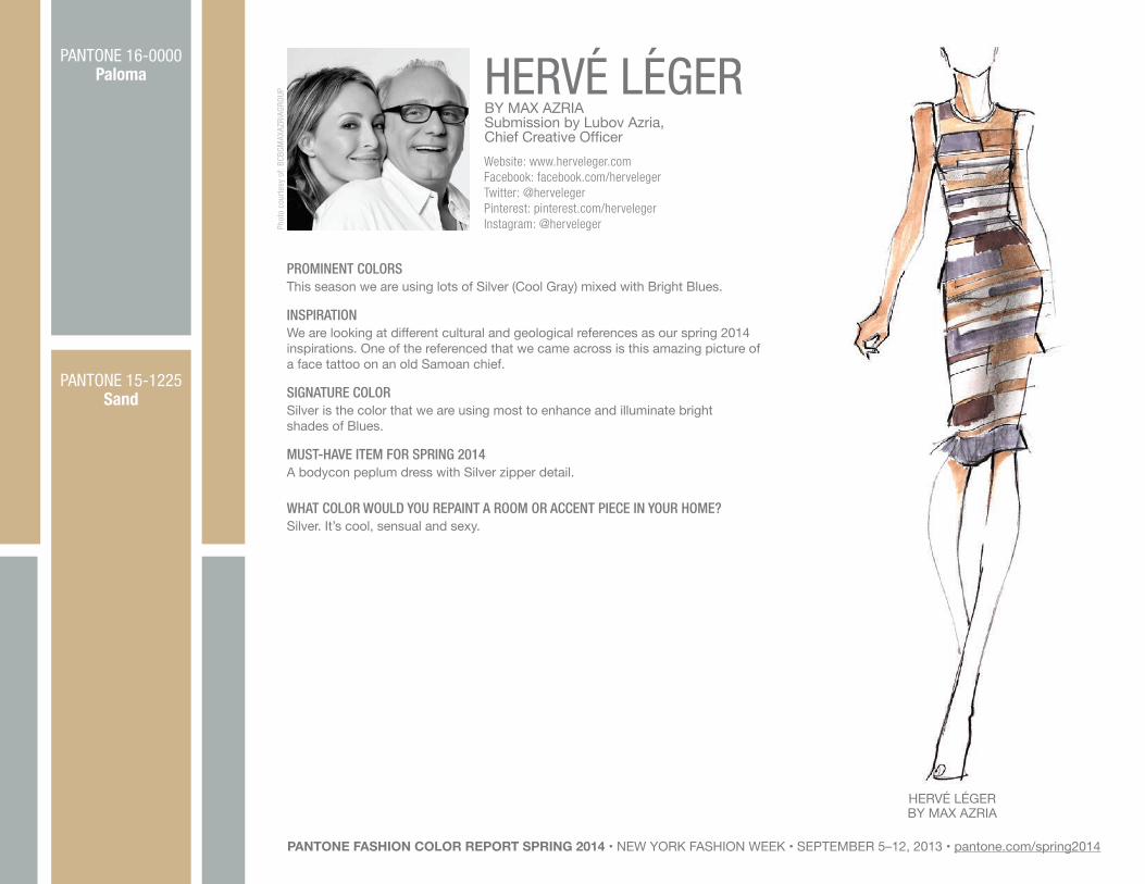
HERVE LEGER BY MAX AZRIASubmission by Lubov Azria,Chief Creative OfficerWebsite: www.herveleger.comFacebook: facebook.com/hervelegerTwitter: @hervelegerPinterest: pinterest.com/hervelegerInstagram: @herveleger
PROMINENT COLORSThis season we are using lots of Silver (Cool Gray) mixed with Bright Blues.
INSPIRATIONWe are looking at different cultural and geological references as our spring 2014 inspirations. One of the referenced that we came across is this amazing picture of a face tattoo on an old Samoan chief.
SIGNATURE COLORSilver is the color that we are using most to enhance and illuminate bright shades of Blues.
MUST-HAVE ITEM FOR SPRING 2014A bodycon peplum dress with Silver zipper detail.
WHAT COLOR WOULD YOU REPAINT A ROOM OR ACCENT PIECE IN YOUR HOME?Silver. It’s cool, sensual and sexy.
HERVÉ LÉGERBY MAX AZRIA
Phot
o co
urte
sy o
f: BC
BGM
AXAZ
RIAG
ROUP
PANTONE 16-0000Paloma
PANTONE 15-1225Sand
PANTONE FASHION COLOR REPORT SPRING 2014 • NEW YORK FASHION WEEK • SEPTEMBER 5–12, 2013 • pantone.com/spring2014
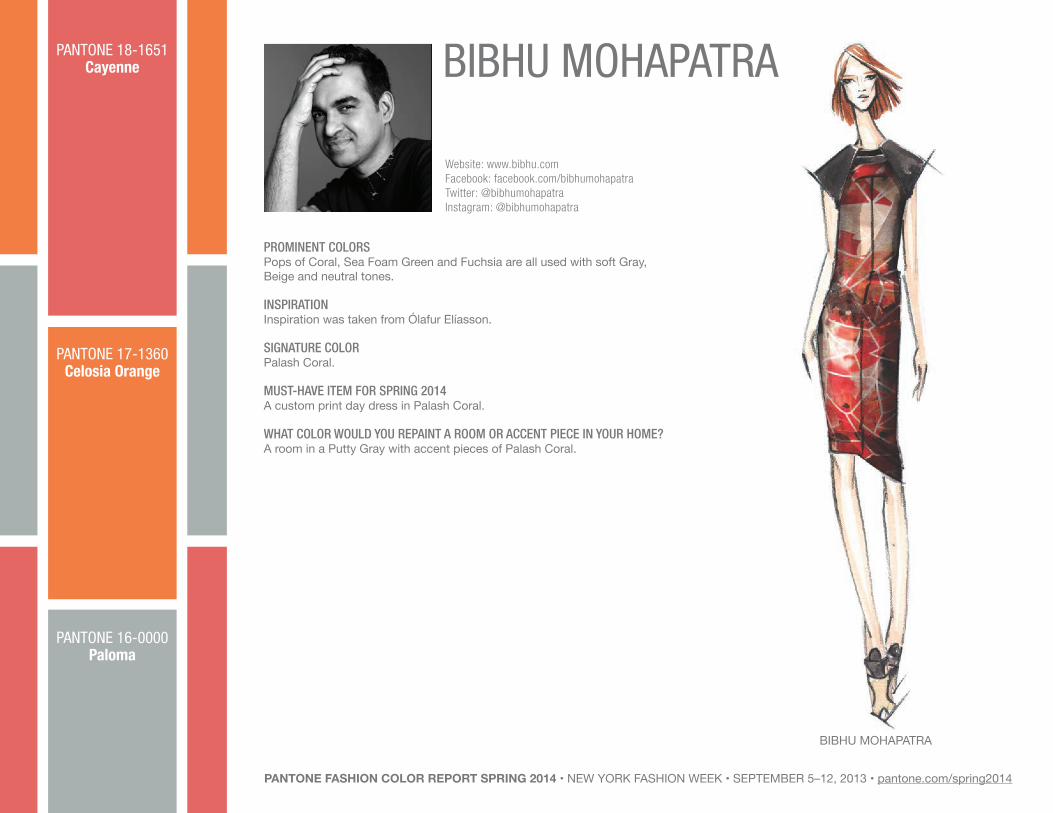
BIBHU MOHAPATRA
Website: www.bibhu.comFacebook: facebook.com/bibhumohapatraTwitter: @bibhumohapatraInstagram: @bibhumohapatra
PROMINENT COLORSPops of Coral, Sea Foam Green and Fuchsia are all used with soft Gray, Beige and neutral tones.
INSPIRATIONInspiration was taken from Ólafur Elíasson.
SIGNATURE COLORPalash Coral.
MUST-HAVE ITEM FOR SPRING 2014A custom print day dress in Palash Coral.
WHAT COLOR WOULD YOU REPAINT A ROOM OR ACCENT PIECE IN YOUR HOME?A room in a Putty Gray with accent pieces of Palash Coral.
BIBHU MOHAPATRA
LINEN PANTONE 12–1OO8PANTONE 18-1651
Cayenne
PANTONE 17-1360Celosia Orange
PANTONE 16-0000Paloma
PANTONE FASHION COLOR REPORT SPRING 2014 • NEW YORK FASHION WEEK • SEPTEMBER 5–12, 2013 • pantone.com/spring2014

PANTONE 15-3920Placid Blue
PANTONE 18-3949Dazzling Blue
M.PATMOSBY MARCIA PATMOS
Website: www.mpatmos.comFacebook: facebook.com/mpatmos Twitter: @MPATMOSPinterest: pinterest.com/marciapatmosInstagram: @MPATMOS
PROMINENT COLORSA combination of Sky Blues with darker Chambray and denim tones. Accents include bold Bright Kelly Greens and Sunshine Yellow, with warmer Gold and Petal Pink.
INSPIRATIONNostalgic ‘60s beach scenes including stills of Anna Karina in Pierrot le Fou, a Jean-Luc Godard film.
SIGNATURE COLORSky Blue that is refreshingly clean.
MUST-HAVE ITEM FOR SPRING 2014Our sleeveless double-faced coat.
WHAT COLOR WOULD YOU REPAINT A ROOM OR ACCENT PIECE IN YOUR HOME?I would repaint the guest room Sky Blue and gather a collection of Blue bottleson the windowsill for when the sun shines through.
M.PATMOSBY MARCIA PATMOS
PANTONE FASHION COLOR REPORT SPRING 2014 • NEW YORK FASHION WEEK • SEPTEMBER 5–12, 2013 • pantone.com/spring2014

LELA ROSEWebsite: www.lelarose.com Facebook: facebook.com/lelarosestudioTwitter: @lela_roseInstagram: @lela_rosePinterest: pinterest.com/lelarosestudioBlog: lelarose.com/stitch-in-time
PROMINENT COLORSIce Blue, Dusted Pink, Coral, Minty Green and Cool Citrine.
INSPIRATIONI am always drawn to saturated, rich tones that excite the eye, and spring 2014 is no exception. In addition to the rich tones, I have added in softer tones like Dusted Pink and Ice Blue, which help give balance to the bolder tones.
SIGNATURE COLORIce Blue splashes throughout the collection in a new and fresh way. It peeks out of a double face trench cape, creates a pop on prints, and colorfully blocks a fil coupe dress. The icy cold tone of this color brings a new cool for springtime.
MUST-HAVE ITEM FOR SPRING 2014A modernist print trouser leg pant with a Beige-colored pleated back trench is a favorite look. The multi-colored pant is blocked with the print and the trench takes you to any event day or night.
WHAT COLOR WOULD YOU REPAINT A ROOM OR ACCENT PIECE IN YOUR HOME?I have always loved Cool Citrine and like to dress myself, my daughter and my home in it. It is too bold to be used in big spaces and is best used as an accent. My daughter’s poster bed is curtained in this color, as is an old coffee table.
LELA ROSE
PANTONE 16-0000Paloma
PANTONE 14-0852Freesia
PANTONE FASHION COLOR REPORT SPRING 2014 • NEW YORK FASHION WEEK • SEPTEMBER 5–12, 2013 • pantone.com/spring2014
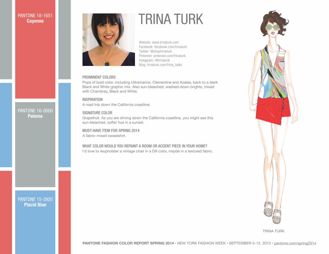
TRINA TURKWebsite: www.trinaturk.com Facebook: facebook.com/trinaturkTwitter: @shoptrinaturkPinterest: pinterest.com/trinaturkInstagram: @trinaturkBlog: trinaturk.com/trina_talks
PROMINENT COLORSPops of bold color, including Ultramarine, Clementine and Azalea, back to a stark Black and White graphic mix. Also sun-bleached, washed-down brights, mixed with Chambray, Black and White.
INSPIRATIONA road trip down the California coastline.
SIGNATURE COLORGrapefruit. As you are driving down the California coastline, you might see this sun-bleached, softer hue in a sunset.
MUST-HAVE ITEM FOR SPRING 2014A fabric-mixed sweatshirt.
WHAT COLOR WOULD YOU REPAINT A ROOM OR ACCENT PIECE IN YOUR HOME?I’d love to reupholster a vintage chair in a Dill color, maybe in a textured fabric.
TRINA TURK
PANTONE 18-1651Cayenne
PANTONE 16-0000Paloma
PANTONE 15-3920Placid Blue
PANTONE FASHION COLOR REPORT SPRING 2014 • NEW YORK FASHION WEEK • SEPTEMBER 5–12, 2013 • pantone.com/spring2014

SAUNDERBY EMILY SAUNDERS
Website: www.thesaunder.com Facebook: facebook.com/saunderTwitter: @thesaunderPinterest: pinterest.com/thesaunderInstagram: @thesaunderTumblr: ishouldcoco.tumblr.com
PROMINENT COLORSWarm Sand, Tangerine, Moroccan Indigo, Oyster, Burnt Honey, Magenta and Sea Foam.
INSPIRATIONThe inspiration was a 1930’s archeological dig in Mesopotamia. The palette is composed of warm neutrals (that evoke the feeling of earth and sand) juxtaposed with bright, saturated colors like Tangerine and Indigo, the types of bright colors one might imagine to have been originally painted on the Assyrian sculptures found on those digs, before time weathered the pigments away.
SIGNATURE COLORTangerine. It’s such a fresh color that it livens up the whole collection, and gives it real vibrancy.
MUST-HAVE ITEM FOR SPRING 2014The brushed twill safari jacket with leopard jacquard inserts in Moroccan Indigo is a must-have spring cover-up.
WHAT COLOR WOULD YOU REPAINT A ROOM OR ACCENT PIECE IN YOUR HOME?I would paint my bathroom Sea Foam so that when I take a bath I would feel like a mermaid.
LINEN PANTONE 12–1OO8PANTONE 15-1225
Sand
PANTONE 14-0852Freesia
PANTONE 18-3949Dazzling Blue
SAUNDER BY EMILY SAUNDERS
PANTONE FASHION COLOR REPORT SPRING 2014 • NEW YORK FASHION WEEK • SEPTEMBER 5–12, 2013 • pantone.com/spring2014

EMERSON BY JACKIE FRASER-SWAN
EMERSONBY JACKIE FRASER-SWAN
Website: www.emersonbyjfs.com Facebook: facebook.com/emerson.collectionTwitter: @emerson_by_jfs & @jackieemersonfsInstagram: @emersonjfs
PROMINENT COLORSDeep Purple, Raspberry Pink, Lime Green, Sky Blue, Lavender, Black, White and Stone Gray.
INSPIRATIONThe clash of two worlds: Punk Rock meets Upper East Side.
SIGNATURE COLORDeep Purple. I always circle back to this color. It works beautifully with this collection, and it looks great on everyone.
MUST-HAVE ITEM FOR SPRING 2014The shift dress. Its print has a variety of colors that pop, including Deep Purple, Raspberry Pink and Lime Green. There are also some undertones of Lavender and Stone Gray. This is a classic silhouette with an edge; it has exposed side zippers on the waist, and a center back two-way zipper.
WHAT COLOR WOULD YOU REPAINT A ROOM OR ACCENT PIECE IN YOUR HOME?I would have to say Deep Purple. I have four daughters and I had their playroom painted this color – they love it!
EMERSONBY JACKIE FRASER-SWAN
LINEN PANTONE 12–1OO8
PANTONE 18-3224Radiant Orchid
PANTONE 16-3823Violet Tulip
PANTONE 15-6114Hemlock
PANTONE FASHION COLOR REPORT SPRING 2014 • NEW YORK FASHION WEEK • SEPTEMBER 5–12, 2013 • pantone.com/spring2014

REBECCA MINKOFFWebsite: www.rebeccaminkoff.com Facebook: facebook.com/rebeccaminkoffTwitter: @rebeccaminkoffPinterest: pinterest.com/rebeccaminkoffInstagram: @rebeccaminkoffBlog: rebeccaminkoff.com/rmedit
PROMINENT COLORSWe have a rich, varied palette of contrasting warm, summer brights offset with fresh cooler tones: Soft Peach, Shell and Blush add warm, sophisticated, feminine tones; the rich, cooler tones are represented by Sea Foam, Aloe and Lake.
INSPIRATIONThe collection is grounded by Classic Chalk White, reminiscent of South American white-washed villas. Warm, rich Terra-Cotta reminds us of artisan tile work.
SIGNATURE COLORVibrant Sun and Tangerine. Both are rich, happy, vibrant tones that are fully represented in terrace-inspired floral prints.
MUST-HAVE ITEM FOR SPRING 2014A shoe that comes in Black and White, with tassels that are Vibrant Sun and Rich Tangerine. It’s a fun shoe that you can’t help but want to put on immediately once you see it!
WHAT COLOR WOULD YOU REPAINT A ROOM OR ACCENT PIECE IN YOUR HOME?I’d love to have a tea set in Vibrant Sun! It’s so happy and refreshing – it could make any day better!
REBECCA MINKOFF
Phot
o co
urte
sy o
f: D
anie
lle K
osan
n Th
e N
ew P
otat
oPANTONE 15-6114Hemlock
PANTONE 14-0852Freesia
PANTONE 17-1360Celosia Orange
PANTONE FASHION COLOR REPORT SPRING 2014 • NEW YORK FASHION WEEK • SEPTEMBER 5–12, 2013 • pantone.com/spring2014

PANTONE 18-1651Cayenne
PANTONE 18-1651Cayenne
CYNTHIA STEFFEBY SUWHA HONG
Website: www.cynthiasteffe.com Facebook: facebook.com/cynthiasteffe123 Twitter: @cynthiasteffe
PROMINENT COLORSWe present a secret garden inspired story featuring all shades of Pink – in both the cool and warm tones. In the cool tones we feature Dark Peony, Cherry Blossom, Peony and Magnolia. In the warm tones we feature more Coral cast Pinks, such as Salmon Rose and Peach Amber.
INSPIRATIONThe shades of blooming spring flowers at Huntington Gardens – from the intense saturated shades of Deep Pink to the delicate hint of Blush. We mixed the two types of shades – both cool and warm – as we would see them in nature.
SIGNATURE COLORPeach Amber. I love this shade of Pink for the subtle blend of warm Coral with a hint of Blush. It is classic and vintage inspired yet unexpected in all its warm tones in an all Pink story.
MUST-HAVE ITEM FOR SPRING 2014Our vintage inspired floral printed cotton dobby pretty dress. The tea length and pleating and shirring details evoke pure classic femininity, while the fabric combination – the sheer illusion organza yoke – is on trend.
WHAT COLOR WOULD YOU REPAINT A ROOM OR ACCENT PIECE IN YOUR HOME?I would paint my bedroom Magnolia – a delicate shade of Blush Pink. It is light, pretty and feminine, yet subtle enough to create a neutral palette to punch upwith darker more saturated Pinks and Blues. I just have some convincing to do with my husband.
CYNTHIA STEFFEBY SUWHA HONG
PANTONE FASHION COLOR REPORT SPRING 2014 • NEW YORK FASHION WEEK • SEPTEMBER 5–12, 2013 • pantone.com/spring2014

WHIT NY
Website: www.whit-ny.com Facebook: facebook.com/pages/whit/290949786586Twitter: @whit_nyPinterest: pinterest.com/whitpozgayInstagram: @whit_ny
PROMINENT COLORSSaturated tropical hues grounded with Indigo. Our warmer colors are drawn from Balinese flora: Orange hanging heliconia flowers and vivid wild Orchid Purples. We pulled a range of deep Blues from natural dyes found in Balinese textiles.
INSPIRATIONA recent trip to Bali. We spent weeks exploring the island and were particularly inspired by the ceremonial offerings during Bali’s Holy Week.
SIGNATURE COLORSea Foam Green – it flows through the collection and tempers the warmer, saturated hues.
MUST-HAVE ITEM FOR SPRING 2014A floral printed dress with a bell-like tier over a long, slim skirt.
WHAT COLOR WOULD YOU REPAINT A ROOM OR ACCENT PIECE IN YOUR HOME?My husband always paints one room Red wherever we live – it adds energy to the home. I love Coral for a boudoir.
WHIT NY
PANTONE 17-1360Celosia Orange
PANTONE 16-3823Violet Tulip
PANTONE FASHION COLOR REPORT SPRING 2014 • NEW YORK FASHION WEEK • SEPTEMBER 5–12, 2013 • pantone.com/spring2014

SACHIN + BABI
Website: www.sachinandbabi.com Facebook: facebook.com/sachinandbabiTwitter: @sachinandbabiPinterest: pinterest.com/sachinandbabiInstagram: @sachinandbabi
PROMINENT COLORSWhite, Cobalt Blue, Kelly Green, Peach and Yellow.
INSPIRATIONBlooms of magnolia against vibrant florals – we wanted to use strong colors.
SIGNATURE COLORCobalt Blue is the most important color as a base. We love the depth and richness of the color – it is the personification of spring and new life.
MUST-HAVE ITEM FOR SPRING 2014A full-length dress and ball skirt, and also the wide-leg cropped trouser.
WHAT COLOR WOULD YOU REPAINT A ROOM OR ACCENT PIECE IN YOUR HOME?We’d repaint an accent wall in the living room. One of our favorite paintings hangs here and it would be fabulous to paint the wall Sky Blue.
SACHIN + BABI
PANTONE 18-3949Dazzling Blue
PANTONE 18-3949Dazzling Blue
PANTONE FASHION COLOR REPORT SPRING 2014 • NEW YORK FASHION WEEK • SEPTEMBER 5–12, 2013 • pantone.com/spring2014

JUICY COUTURE
Website: www.juicycouture.com Facebook: facebook.com/juicycoutureTwitter: @juicycouturePinterest: pinterest.com/juicycouturelaInstagram: @juicycouture
PROMINENT COLORSLuscious Highlighter Pink combined with Fiery Red Ginger and Techno Blue mixed with Mojito Green creates a bold, vibrant palette to kick off the spring season.
INSPIRATIONEach season, we draw inspiration from the iconic Juicy girl and her surroundings. She embraces the new season with a fresh start, taking to the road and exploring her passion for adventure, revitalizing her wardrobe with effortless sportswear in bold yet feminine colors.
SIGNATURE COLORHighlighter Pink – it’s charged with positive emotion that is very feminine, uplifting and vibrant.
MUST-HAVE ITEM FOR SPRING 2014A moto jacket in Black paired with a floral printed maxi dress in Highlighter Pink for the perfect mix of effortless L.A. style.
WHAT COLOR WOULD YOU REPAINT A ROOM OR ACCENT PIECE IN YOUR HOME?Highlighter Pink to create the perfect accent wall in your boudoir, or even revamp an antique dresser or chest for a bold and fun style.
JUICY COUTURE
PANTONE 18-3224Radiant Orchid
PANTONE 18-3224Radiant Orchid
PANTONE FASHION COLOR REPORT SPRING 2014 • NEW YORK FASHION WEEK • SEPTEMBER 5–12, 2013 • pantone.com/spring2014

PANTONE 16-3823Violet Tulip
PANTONE 16-3823Violet Tulip
EMILIO SOSA
Website: www.esosadesign.com Facebook: facebook.com/pages/emilio-sosa/297768920359 Twitter: @esosafashionPinterest: pinterest.com/esosafashionInstagram:@esosafashion
PROMINENT COLORSCool and powdery, influenced by minerals: Dusty Ruellia, Lilac, Mesa Twilight, Aubergine and Desert Mist; Pearly Lavender with Mojave Sage and Sonoran Malachite.
INSPIRATIONA recent trip to Arizona and the sunset’s magical effect onthe landscape.
SIGNATURE COLORDusty Ruellia. It’s a powdery Violet hue with a cool undertone.
MUST-HAVE ITEM FOR SPRING 2014The lace trench dress in Dusty Ruellia.
WHAT COLOR WOULD YOU REPAINT A ROOM OR ACCENT PIECEIN YOUR HOME?I would repaint my foyer Mojave Sage for its calm,soothing quality.
EMILIO SOSA
PANTONE FASHION COLOR REPORT SPRING 2014 • NEW YORK FASHION WEEK • SEPTEMBER 5–12, 2013 • pantone.com/spring2014

ADEAM BY HANAKO MAEDAA sweatshirt with quilted leather shoulders in one of our original prints, the Decay print, which is inspired by plant cells under a microscope. I paired it with a matching print skirt with hidden chiffon panels for a more sophisticated look.
BCBGMAXAZRIA An easy shirt-dress in Chambray Blue or White.
BIBHU MOHAPATRAA custom print day dress in Palash Coral.
CHRISTIAN SIRIANOA colorful abstract floral print dress is our key item. It’s a mix of Paradise Pink, Blazing Yellow and Poppy Red.
CYNTHIA STEFFEBY SUWHA HONGOur vintage inspired floral printed cotton dobby pretty dress. The tea length and pleating and shirring details evoke pure classic femininity, while the fabric combination – the sheer illusion organza yoke – is on trend.
ELLA MOSSBY PAMELLA PROTZEL-SCOTTA boxy top done in different fabrics from eyelets to printed poplins. It’s modern, yet playful. Perfect for a fresh take on a classic t-shirt shape.
EMERSONBY JACKIE FRASER-SWANThe shift dress. Its print has a variety of colors that pop, including Deep Purple, Raspberry Pink and Lime Green. There are also some undertones of Lavender and Stone Gray. This is a classic silhouette with an edge; it has exposed side zippers on the waist, and a center back two-way zipper.
REBECCA MINKOFFA shoe that comes in Black and White, with tassels that are Vibrant Sun and Rich Tangerine. It’s a fun shoe that you can’t help but want to put on immediately once you see it!
SACHIN + BABI A full-length dress and ball skirt, and alsothe wide-leg cropped trouser.
SAUNDERBY EMILY SAUNDERS The brushed twill safari jacket with leopard jacquard inserts in Moroccan Indigo is a must-have spring cover-up.
TADASHI SHOJIThe Ivory scalloped lace dress with flared skirt. It is a feminine and flirty piece that you can dress up or down.
TIMOTHY EVERESTDefinitely the reversible bomber. It’s a contemporary tailored bomber style jacket featuring a wonderful degrade bat pattern, ribbed round collar, waistband and cuff, and reversible zip front and diagonal jet pockets.
TRACY REESEA tropical-print slip dress in a moody Pink floral print.
TRINA TURKA fabric-mixed sweatshirt.
WHIT NYA floral printed dress with a bell-like tier over a long, slim skirt.
YOANA BARASCHIA White textured jacquard blazer – new, versatile and clean.
EMILIO SOSAThe lace trench dress in Dusty Ruellia.
HERVÉ LEGÉR BY MAX AZRIAA bodycon peplum dress with Silver zipper detail.
JUICY COUTUREA moto jacket in Black paired with a floral printed maxi dress in Highlighter Pink for the perfect mix of effortless L.A. style.
LELA ROSEA modernist print trouser leg pant with a Beige-colored pleated back trench is a favorite look. The multi-colored pant is blocked with the print and the trench takes you to any event day or night.
M.PATMOSBY MARCIA PATMOSOur sleeveless double-faced coat.
NANETTE LEPOREA floaty, long, slip dress – in colors ranging from a Bombshell Red to Boudoir Blush.
NICOLE MILLERAn embellished jacket – it is Black, White and Candy Pink.
PAMELLA ROLANDBY PAMELLA DEVOSA Flamingo and Candy Pink t-shirt dresswith a beaded front is a must have for any occasion.
RACHEL ROYA jumpsuit with a dinner jacket in Precious Amber.
MUST HAVES - SPRING 2014
PANTONE FASHION COLOR REPORT SPRING 2014 • NEW YORK FASHION WEEK • SEPTEMBER 5–12, 2013 • pantone.com/spring2014

FASHION INFLUENCERSNINA GARCIACreative Director, Marie ClaireJudge, Project Runway
Website: www.ninagarcia.comFacebook: facebook.com/fashionninagTwitter: @ninagarciaPinterest: pinterest.com/ninagarciaInstagram: @imninagarcia
HOW DO FASHION COLORS INFLUENCE YOUR HOME DÉCOR AND INTERIOR PAINT COLOR CHOICES?It’s not necessarily about choosing the “right” fashion color. It’s more about choosing colors that work together, which is what you have to consider in your home as well. When I was designing my home, I chose a palette of Blue, Beige and Chestnut because I liked the way that they looked together, and I knew they wouldn’t go out of style.
IF YOU COULD MAKEOVER A ROOM OR KEY PIECE OF FURNITUREIN YOUR HOME, WHICH FASHION COLOR WOULD YOU USE AND WHERE?If I could makeover a room, it would be one of my kids’ rooms. They are growing and developing so quickly that it would make sense to redesign. As for the colors, right now they love Yellow and Blue. One of the most efficient ways to incorporate color is in the accessories. For a subtle change, I’d go for colorful pillows or a lamp, and for a larger effect I’d change a rug or a painting.
MARIA DIVARISStylist
Website: www.mariadivaris.comTwitter: @mariadivarisInstagram: @mrshamma
HOW DO FASHION COLORS INFLUENCE YOUR HOME DÉCOR AND INTERIOR PAINT COLOR CHOICES?Well, I am a classic New Yorker at heart and I usually stick to a pretty neutral palette in my wardrobe of Black, White and Gray with the occasional pop of a bright color in a top, jacket, jean or accessory. This definitely carries over into the way that my husband and I have chosento decorate our home. We stick to a neutral palette – although for the home, I opt for warmer neutral tones such as Creams, Beige, Taupe, even a Dove Gray or Chocolate Brown. I feel as though one’s home should always be done in warmer shades to give it a cozier feel. Then we have little pops of contrast with a chosen color.
In our bedroom we have gone with White and Chocolate Brown with some chrome accents and then brilliant pops of Bright Pink. I chose Bright Pink because of an Alexander McQueen clutch bag I fell in love with – it was a Hot Pink and Black patent Union Jack design with the chrome skull clasp. I couldn’t stop thinking about this bag and when my husband and I were trying to decide on bedside tables we used the clutch as inspiration. So we spent days painting side tables in Neon Pink, Black and White Union Jacks. These side tables set the tone for the room and from there we accented the room with little pops of Pink throughout. The great thing is to work tonally as shades of a given color vary from season to season. So the Neon Pink from a few years ago might not match perfectly with what I might add to the room today, but having chosen Bright Pink I can decorate within that color way and it creates more depth and character to the room.
IF YOU COULD MAKEOVER A ROOM OR KEY PIECE OF FURNITURE IN YOUR HOME, WHICH FASHION COLOR WOULD YOU USE AND WHERE?In our bedroom we have a White Le Corbusier chaise lounge, and I have been dying to have it covered in a Bright Pink. Vivacious, from the PANTONE Fashion Color Report Fall 2013, is exactly the shade of fabricI am looking for and would pull the room together perfectly. Perhaps we’ll cover some throw cushions for the bed in the same fabric as well!
BROOKE JAFFEFashion Director for RTW,Bloomingdale’s
Website: www.bloomingdales.com Facebook: facebook.com/bloomingdales Twitter: @bloomingdales Pinterest: pinterest.com/bloomingdales Instagram: @bloomingdales Tumblr: bloomingdales.tumblr.com/
HOW DO FASHION COLORS INFLUENCE YOUR HOME DÉCOR AND INTERIOR PAINT COLOR CHOICES?Fashion colors inspire me in every aspect of my life. In my home, I tend to keep things neutral with pops of bright colors. Right now I love bright shades of Blue into deeper shades of Midnight; it feels fresh to mix several shades of one hue and right now BLUE is it!
IF YOU COULD MAKEOVER A ROOM OR KEY PIECE OF FURNITUREIN YOUR HOME, WHICH FASHION COLOR WOULD YOU USE AND WHERE?I would love to redo my living room and mix shades of Blue. Maybe a rich Midnight Blue for my dream L-shaped sofa with some patterned throw pillows, mixing prints and brighter shades of Blue. I think it would be fun to paint the entire room a Dark Blue, feels clubby and homey. Getting excited just thinking about my imaginary “Blue room.”
PANTONE FASHION COLOR REPORT SPRING 2014 • NEW YORK FASHION WEEK • SEPTEMBER 5–12, 2013 • pantone.com/spring2014

NICOLE FISCHELISGroup Vice President/Fashion Director, Global Forecasting, Macy’s
Website: www.macys.com Facebook: facebook.com/macysTwitter: @macysPinterest: pinterest.com/macysofficial
HOW DO FASHION COLORS INFLUENCE YOUR HOME DÉCOR AND INTERIOR PAINT COLOR CHOICES?Today, the world of color integrates the influences of art, fashion and décor. For me, it is really about fusion and individuality.
IF YOU COULD MAKEOVER A ROOM OR KEY PIECE OF FURNITUREIN YOUR HOME, WHICH FASHION COLOR WOULD YOU USE AND WHERE?Years back, I stripped six of my Louis XV caned chairs and had them entirely Silver foiled. Then, I replaced the Ivory jacquard upholstery with six bright colors in moiré silk – three à la “Lacroix” (in Red, Shocking Pink and Orange) and the other three à la “Saint Laurent” (in Purple, Turquoise and Green). The effect at the time was unexpected, quite whimsical and still relevant today.
KENDRA SCOTTCEO and Founder, KENDRA SCOTT Jewelry
Website: www.kendrascott.com Facebook: facebook.com/kendrascottjewelryTwitter: @kendra_scott Pinterest: pinterest.com/kendra_scottInstagram: @kendra_scottBlog: blog.kendrascott.com
HOW DO FASHION COLORS INFLUENCE YOUR HOME DÉCOR AND INTERIOR PAINT COLOR CHOICES?As a jewelry designer who loves to work with brightly colored gemstones, color plays an integral part in my interior design style. Trends in fashion often infiltrate interior design, and that’s especially true with color. Paint is such a great way to bring unexpected beauty and color into a room, whether through an accent wall or a beautifully painted piece of furniture. While I’ve always been a fan of paint, I’m currently also loving wallpaper in fun, geometric prints and unbelievable colors. Both can create high impact in a room. In the same way that jewelry can take a t-shirt and jeans from drab to fab, paint has the power to completely transform a room and give it a whole new emotion in the way that only color can. If you’re lacking in art or wall décor, paint or wallpaper can also be a great way to completely change the look and feel of a room at an affordable cost. One hot trend in interior design is homes with floor plans that are more open, allowing the rooms and spaces to flow together. Painting one of the rooms or even a single wall is a great way to give a room a dramatic, stand-alone appearance even when everything else is open around it.I recently moved into a new space with a very open floor plan and I painted my dining room a gorgeous, Greenish-Gray, much like PANTONE Deep Lichen Green. It really helps to add drama to my overall space and allows the dining room to feel like a separate, more intimate area.
IF YOU COULD MAKEOVER A ROOM OR KEY PIECE OF FURNITUREIN YOUR HOME, WHICH FASHION COLOR WOULD YOU USE AND WHERE?I currently love bamboo Chippendale chairs. They are so easy to paint and are a great way to add an unexpected pop of color and a bit of whimsy into your home or office. Since Chippendale chairs were really popular in the 1950s and 1960s, you can purchase them at an antique store, but you can also buy them new at many interior décor stores. In my new space,I painted one in a crisp, White lacquer finish for my living room, but I’d love it in a bold Fuchsia color or a stunning Cobalt hue. That’s the great thing about paint – whether painting a piece of furniture or your walls, you’re never making a big commitment. Even if you only keep it that color for six months – repainting is affordable and easy. If you’re ready for a change in your home, don’t be afraid to start with something small like repainting a piece of furniture or the insets of your kitchen cabinets. It’s totally easy, inexpensive and you can always change it back if you get tired of it or don’t like it.
LEATRICE EISEMANExecutive Director, Pantone Color Institute®
Website: www.colorexpert.com Facebook: facebook.com/leatriceeisemanTwitter: @leatriceeisemanPinterest: pinterest.com/leatriceeisemanBlog: eisemancolorblog.com
HOW DO FASHION COLORS INFLUENCE YOUR HOME DÉCOR AND INTERIOR PAINT COLOR CHOICES?I love, love, love Deep Periwinkle as a fashion color that translates beautifully to interiors, especially a bedroom. It brings a bit of calm but with just the right amount of a warm red-purplish undertone to add a bit of excitement. It’s the “happiest” of the Blue family.
IF YOU COULD MAKEOVER A ROOM OR KEY PIECE OF FURNITUREIN YOUR HOME, WHICH FASHION COLOR WOULD YOU USE AND WHERE?The walls are already Deep Periwinkle, but I plan on doing a cabinet and/or an end table in that same color.
FASHION INFLUENCERS continued
Phot
o co
urte
sy o
f: D
avid
Hei
ser
PANTONE FASHION COLOR REPORT SPRING 2014 • NEW YORK FASHION WEEK • SEPTEMBER 5–12, 2013 • pantone.com/spring2014
EFVA ATTLINGJewelry Designer
Website: www.efvaattling.com Facebook: facebook.com/efvaattling;facebook.com/efvaattlingnewyorkTwitter: @efvaattlingInstagram: @efvaattling; @attlingnycBlog: blog.efvaattling.com
HOW DO FASHION COLORS INFLUENCE YOUR HOME DÉCOR AND INTERIOR PAINT COLOR CHOICES?I am a fashion addict, and I often choose colors from the PANTONE Fashion Color Report when I do my walls rather than going to the normal paint store for colors.
IF YOU COULD MAKEOVER A ROOM OR KEY PIECE OF FURNITUREIN YOUR HOME, WHICH FASHION COLOR WOULD YOU USEAND WHERE?I would use Moonbeam for my walls to get an Art Deco feeling and an Amethyst Orchid for my sofa to brighten and power-up the room!
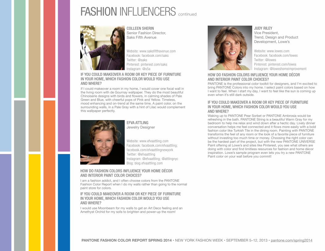
COLLEEN SHERINSenior Fashion Director, Saks Fifth Avenue
Website: www.saksfifthavenue.com Facebook: facebook.com/saksTwitter: @saks Pinterest: pinterest.com/saks Instagram: @s5a
IF YOU COULD MAKEOVER A ROOM OR KEY PIECE OF FURNITUREIN YOUR HOME, WHICH FASHION COLOR WOULD YOU USEAND WHERE?If I could makeover a room in my home, I would cover one focal wall in the living room with de Gournay wallpaper. They do the most beautiful Chinoiserie designs with birds and flowers, in calming shades of Pale Green and Blue, with cheerful pops of Pink and Yellow. Timeless, mood enhancing and on-trend at the same time. A paint color, on the surrounding walls, in a Pale Gray with a hint of Lilac would complement this wallpaper perfectly.
JUDY RILEYVice President,Trend, Design and Product Development, Lowe’s
Website: www.lowes.com Facebook: facebook.com/lowesTwitter: @lowesPinterest: pinterest.com/lowesInstagram: @loweshomeimprovement
HOW DO FASHION COLORS INFLUENCE YOUR HOME DÉCOR AND INTERIOR PAINT COLOR CHOICES?PANTONE is the professional color toolkit for designers, and I’m excited to bring PANTONE Colors into my home. I select paint colors based on how I want to feel. When I start my day, I want to feel like the sun is coming up even when it’s still dark outside.
IF YOU COULD MAKEOVER A ROOM OR KEY PIECE OF FURNITUREIN YOUR HOME, WHICH FASHION COLOR WOULD YOU USE AND WHERE?Waking up to PANTONE Pear Sorbet or PANTONE Ambrosia would be refreshing in the bath. PANTONE String is a beautiful Warm Gray for my bedroom to help me relax and wind down after a hectic day. Lively dinner conversation helps me feel connected and it flows more easily with a bold fashion color like Turkish Tile in the dining room. Painting with PANTONE transforms the feel of any room or the look of a favorite piece of furniture without investing too much time or money. Choosing the right color can be the hardest part of the project, but with the new PANTONE UNIVERSE Paint offering at Lowe’s and sites like Pinterest, you see what others are doing with color and find limitless resources for fashion and home décor inspiration. Lowe’s sample program even lets you try a new PANTONE Paint color on your wall before you commit!
FASHION INFLUENCERS continued
PANTONE FASHION COLOR REPORT SPRING 2014 • NEW YORK FASHION WEEK • SEPTEMBER 5–12, 2013 • pantone.com/spring2014

DALLAS SHAWFashion Illustrator
Website: www.dallasshaw.com Twitter: @dallasshawPinterest: pinterest.com/dallasshawInstagram: @dallasshawFacebook: facebook.com/dallas.shaw.982Blog: dillydallas.blogspot.com
HOW DO FASHION COLORS INFLUENCE YOUR HOME DÉCOR AND INTERIOR PAINT COLOR CHOICES?With the exception of some metallic wallpaper in my closet, the majority of the rooms in my home are painted White. What can I say, I’m an artist and I like a blank canvas. I am constantly adding new prints and switching in accents with bright patterns. You’ll see a lot of small color pops, such as Bright Peach in each room against Rich Gray upholstery. If I want the option to add Deep Green palm-printed curtains to the mix, the minimal White walls help me to have free reign over my bold décor choices.
IF YOU COULD MAKEOVER A ROOM OR KEY PIECE OF FURNITUREIN YOUR HOME, WHICH FASHION COLOR WOULD YOU USEAND WHERE?I am about to redesign my dining room and plan to use a fun Black and White printed wallpaper to play off of the rough lines in my barnwood table. I’ll be adding a masculine Black and Gold chandelier to the mix and the final touch will be piles upon piles of colorful, hand-painted dishware that will act as the colorful accents I can change seasonally.
JAURETSI SAIZARBITORIAChief Curator for The Inside Source, eBay
Website: www.theInsidesource.com Facebook: facebook.com/jauretsiTwitter: @jauretsiPinterest: pinterest.com/jauretsi/Instagram: @jauretsiBlog: sugarbarons.com
HOW DO FASHION COLORS INFLUENCE YOUR HOME DÉCOR AND INTERIOR PAINT COLOR CHOICES?I have always noticed the kitchens that brighten my spirits the most are painted Yellow. It seems that Yellow is a color of spring and sun, a warm message when preparing food for friends and family. It’s also a social color, which invites a gathering in one of the most important rooms in the home (aside from the bedroom). Although there are many shades of Yellow to play with – from Acid Yellow to Sunflower Yellow – my personal pick is a less harsh one, preferably a light Egg Yolk vibe, signifying birth and fresh life.
DANYCE BONEBRAKEHome Department Manager,Mood Fabrics
Website: www.moodfabrics.com Facebook: facebook.com/mood.fabricsTwitter: @mood_fabricsPinterest: pinterest.com/moodfabricsInstagram: @mood_fabricsBlog: www.moodfabrics.com/blog
HOW DO FASHION COLORS INFLUENCE YOUR HOME DÉCOR AND INTERIOR PAINT COLOR CHOICES?I usually turn to fashion colors to inspire the direction I take with accent pieces, such as pillows, window treatments and decorative items, or anything that is easily updated or changed out. I get color-obsessedwith the fashion trends I see on the runways and on the streets. When it comes to bringing fashion color into the home, though, I’m a practical girl. For example, I may fall in love with the neon brights in a collection, butI wouldn’t go so far as to upholster a couch in a neon color. My advice isto bring home the colors you love in fashion, but in manageable dosesthat you can affordably change out when you fall in love with another fashion color.
IF YOU COULD MAKEOVER A ROOM OR KEY PIECE OF FURNITUREIN YOUR HOME, WHICH FASHION COLOR WOULD YOU USE AND WHERE?I am obsessed with all shades of Orange. I’m redoing my bedroom right now – bedding, window treatments and rugs – and it’s going to be filled with colors like Tangerine, Coral Rose and Red Orange, with some touches of Fuchsia Purple thrown in. Orange is one of those colors in both fashion and home décor that appeals to everyone and it’s gender-neutral. At Mood Fabrics we see just as many men choosing fabrics with Orange as we do women.
FASHION INFLUENCERS continued
PANTONE FASHION COLOR REPORT SPRING 2014 • NEW YORK FASHION WEEK • SEPTEMBER 5–12, 2013 • pantone.com/spring2014

SPRING 2014: A CONFIDENT AND VERSATILE PALETTE
NEW YORK FASHION WEEK • SEPTEMBER 5-12, 2013 pantone.com/spring2014
TIM
OTH
Y EV
ERES
T &
HO
RIYO
SHI I
II

PANTONE 15-3920Placid Blue
PANTONE 18-6216Comfrey
PANTONE 16-0000Paloma
PANTONE 18-3718Purple Haze
PANTONE 15-1225Sand
PANTONE 18-1651Cayenne
PANTONE 17-1360Celosia Orange
PANTONE 14-0852Freesia
PANTONE 19-2428Magenta Purple
PANTONE 18-3949Dazzling Blue
Light and airy Placid Blue is a perfect background color for spring, offering another alternative to the classic neutrals. Pair it with Comfrey, a more masculine take on the softer Hemlock green from the women’s palette, to create a fresh, seasonally inspired look. For a modernized vintage feel, pair Purple Haze, a deeper, stronger version of Violet Tulip, with Paloma, a confident and adaptable gray.
Sand, a warm, agreeable neutral, can be coupled with more daring colors in the palette – making them less intimidating. Both Paloma and Sand are perfect complements to fiery Cayenne red, and help to harness the powerful energy that intense Freesia yellow brings to the spectrum. Accessories, including shoes, in bold colors, like Cayenne, Freesia and Celosia Orange, are becoming more popular for men this season, adding a touch of gusto to neutral formal attire.
As the temperatures rise, we are also seeing a lot of vibrant patterning that combines bold and tropical colors in many sectors of menswear. Create a magnetic look by mixing Magenta Purple, a more robust version of Radiant Orchid, with the higher voltage colors in the palette, like Celosia Orange and Dazzling Blue. These three energetic yet versatile hues are sure to be a hit in spring 2014.
SPRING 2014: A CONFIDENT AND VERSATILE PALETTE

PANTONE 18-3949Dazzling Blue
PANTONE 18-3949Dazzling Blue
Website: www.timothyeverest.co.uk & www.thethiiird.com & horiyoshi3tattoo.comFacebook: facebook.com/timothyeverestfinetailoring & facebook.com/horiyoshiIIITwitter: @timothyeverestInstagram: @timothyeverestBlog: timothyeverest.co.uk/blogFilm link: vimeo.com/68607733
PROMINENT COLORSWhite, Navy and Black form the key background colors to the collection with accent colors of Scarlet Red.
INSPIRATIONOur collaborative collection for spring 2014 has drawn inspiration from Japan’s most respected tattoo artist Horiyoshi III, and his symbolic figure, animal and floral motifs. I had the idea to bring together these two worlds in a tailoring context. We have realized some of these designs in jacquard patterns, and others have been printed onto suit and jacket linings and on accompanying accessories.
SIGNATURE COLORI’d say Midnight Blue and Scarlet.
MUST-HAVE ITEM FOR SPRING 2014Definitely the reversible bomber. It’s a contemporary tailored bomber style jacket featuring a wonderful degrade bat pattern, ribbed round collar, waistband and cuff, and reversible zip front and diagonal jet pockets.
WHAT COLOR WOULD YOU REPAINT A ROOM OR ACCENT PIECE IN YOUR HOME?Probably the Off White we used in the bespoke piece within the collection, which we created especially for Tilda Swinton to wear to launch the collection. It’s such a sophisticated luxurious color.
TIMOTHY EVEREST
TIMOTHY EVERESTAND HORIYOSHI III
PANTONE FASHION COLOR REPORT SPRING 2014 • NEW YORK FASHION WEEK • SEPTEMBER 5–12, 2013 • pantone.com/spring2014

PANTONE®
COLOR NAMES AND VALUES
PANTONE Fashion Color Report, Volume 40, September 2013.Pantone LLC, 590 Commerce Blvd., Carlstadt, NJ 07072 Tel: 201.935.5500. PANTONE Colors displayed here may not match PANTONE-identified standards. Consult current PANTONE FASHION+HOME Color System publications for accurate color. PANTONE® and other Pantone LLC trademarks are the property of Pantone LLC. Pantone LLC is a wholly owned subsidiary of X-Rite, Incorporated. All other trademarks are the property of their respective owners. © Pantone LLC, 2013. All rights reserved.
PANTONE COLOR CMYK VALUE
PANTONE 15-3920 Placid Blue 47.17.2.0
PANTONE 16-3823 Violet Tulip 44.39.0.0
PANTONE 15-6114 Hemlock 39.4.35.0
PANTONE 16-0000 Paloma 35.24.27.0
PANTONE 15-1225 Sand 20.27.48.0
PANTONE 14-0852 Freesia 0.14.100.0
PANTONE 18-1651 Cayenne 6.74.56.0
PANTONE 17-1360 Celosia Orange 0.63.80.0
PANTONE 18-3224 Radiant Orchid 32.65.0.0
PANTONE 18-3949 Dazzling Blue 92.57.0.0
PANTONE 18-3718 Purple Haze 56.51.15.0
PANTONE 18-6216 Comfrey 74.28.63.10
PANTONE 19-2428 Magenta Purple 51.94.24.24
Vote for your favorite color at pantone.com/spring2014
Follow Us @pantone #fcrs14
RACH
EL R
OY
PANTONE FASHION COLOR REPORT SPRING 2014 • NEW YORK FASHION WEEK • SEPTEMBER 5–12, 2013 • pantone.com/spring2014