color in fashion chapter 9, clothing, fashion, fabrics & construction
TRANSCRIPT
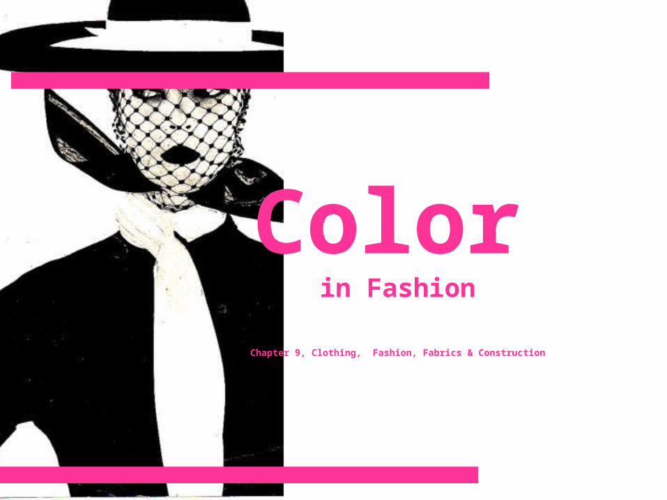
Color in Fashion
Chapter 9, Clothing, Fashion, Fabrics & Construction
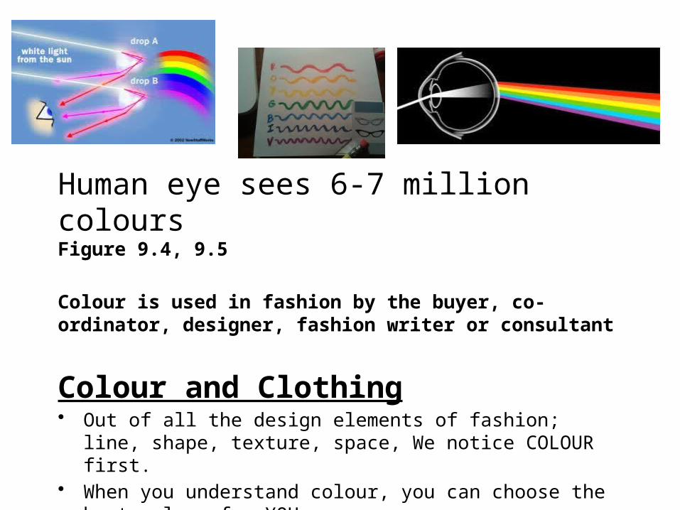
Human eye sees 6-7 million coloursFigure 9.4, 9.5
Colour is used in fashion by the buyer, co-ordinator, designer, fashion writer or consultant
Colour and Clothing• Out of all the design elements of fashion; line, shape, texture, space,
We notice COLOUR first. • When you understand colour, you can choose the best colour for YOU• Designers often pick colour as an integral element of their collection
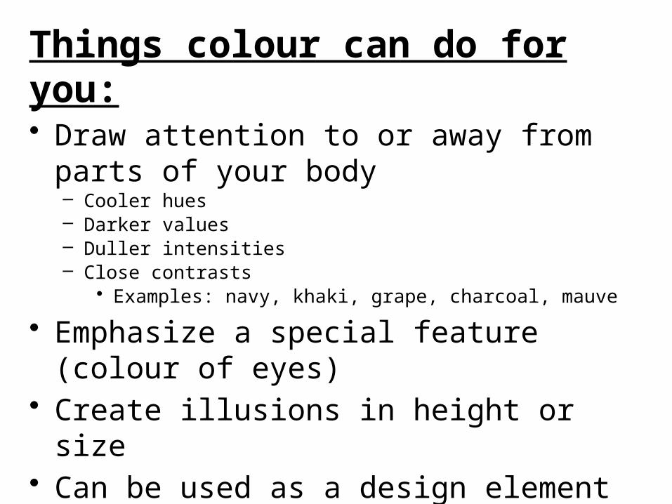
Things colour can do for you:• Draw attention to or away from parts of your
body– Cooler hues– Darker values– Duller intensities– Close contrasts
• Examples: navy, khaki, grape, charcoal, mauve
• Emphasize a special feature (colour of eyes)• Create illusions in height or size• Can be used as a design element• Act as a symbol, communicate feelings, send
messages
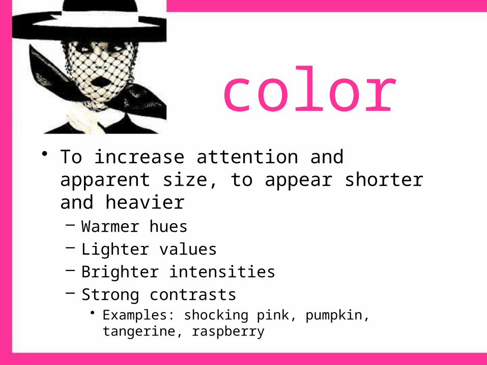
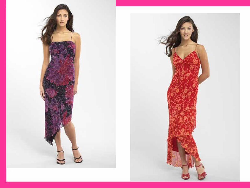
color• To increase attention and apparent size, to appear
shorter and heavier– Warmer hues– Lighter values– Brighter intensities– Strong contrasts
• Examples: shocking pink, pumpkin, tangerine, raspberry
Color personalities!!
• To appear refined, romantic– Warm to cool hues– Lighter values– Dull, muted to medium intensities including
pastels– Close contrasts, subtle
• Examples: shell pink, lavender, misty rose, orchid, blue, peach, all pastels
• To feel and appear happy, youthful, sporty– Warmer hues– Light to dark values– Medium to bright intensities– Strong contrasts, bold
• Examples: coral, red, khaki, ivory, brown, camel, cinnamon, brick
Color Personalities!!!
Color personalities!!!
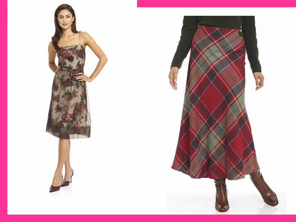
• To appear mature, serious, somber, classic– Cool hues– Dark values– Dull intensities
• Examples: navy blue, taupe, charcoal, maroon, gray, black
Color personalities!!
• To feel and appear dramatic/exotic– Warm to cool hues– Dark values, deep– Bright intensities, rich– Strong contrasts, bold
• Magenta, fuchsia, emerald green, royal blue, regal purple, sapphire, amethyst
• Colours have specific names that identify them, these are called HUES.
• Without light we wouldn’t see these hues. Figure. 9.4
• All objects contain pigments-some aborb light rays, some reflect them. We only see the rays that are REFLECTED.
• Ex. If a fabric looks red, it is only because the red pigments are being reflected.
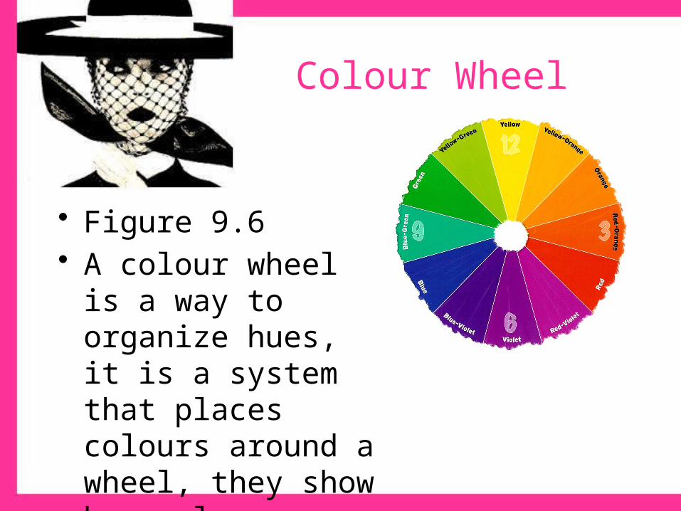
• Figure 9.6• A colour wheel is a way
to organize hues, it is a system that places colours around a wheel, they show how colours relate to one another.
Colour Wheel
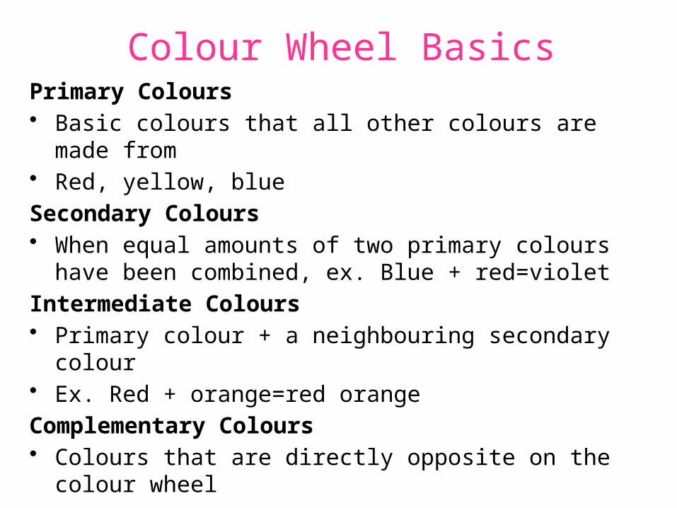
Colour Wheel BasicsPrimary Colours• Basic colours that all other colours are made from• Red, yellow, blue
Secondary Colours• When equal amounts of two primary colours have been
combined, ex. Blue + red=violet
Intermediate Colours• Primary colour + a neighbouring secondary colour• Ex. Red + orange=red orange
Complementary Colours• Colours that are directly opposite on the colour wheel
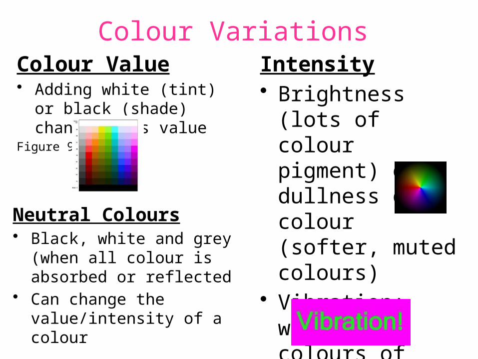
Colour VariationsColour Value• Adding white (tint) or black
(shade) changes it`s valueFigure 9.7
Intensity• Brightness (lots of
colour pigment) or dullness of a colour (softer, muted colours)
• Vibration: when two colours of equal brightness compete
Neutral Colours• Black, white and grey (when all
colour is absorbed or reflected• Can change the value/intensity
of a colour
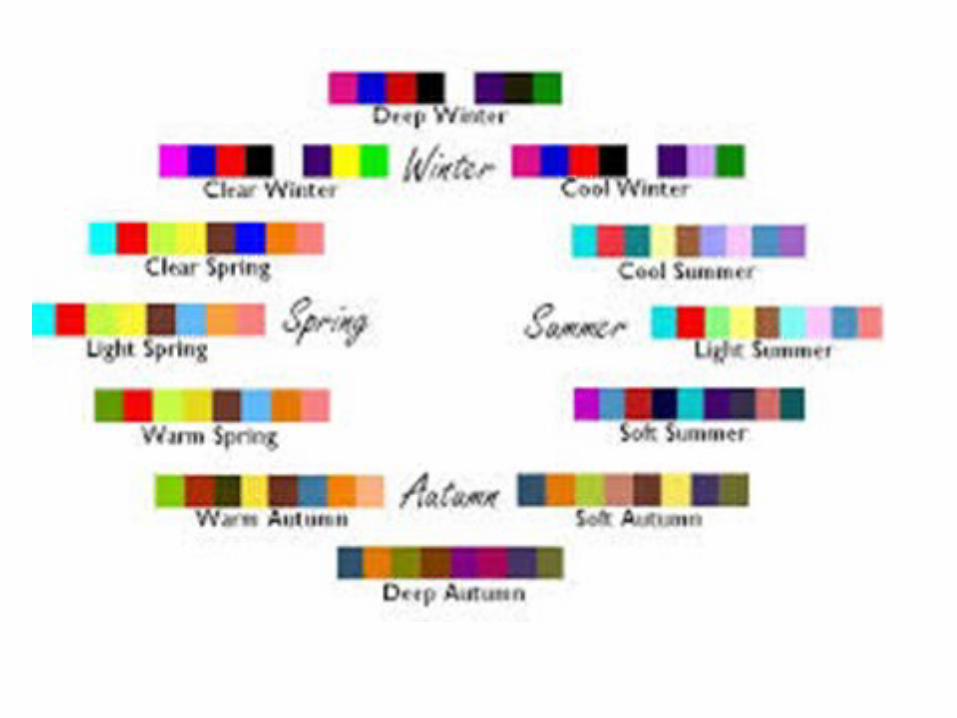
Color Schemes
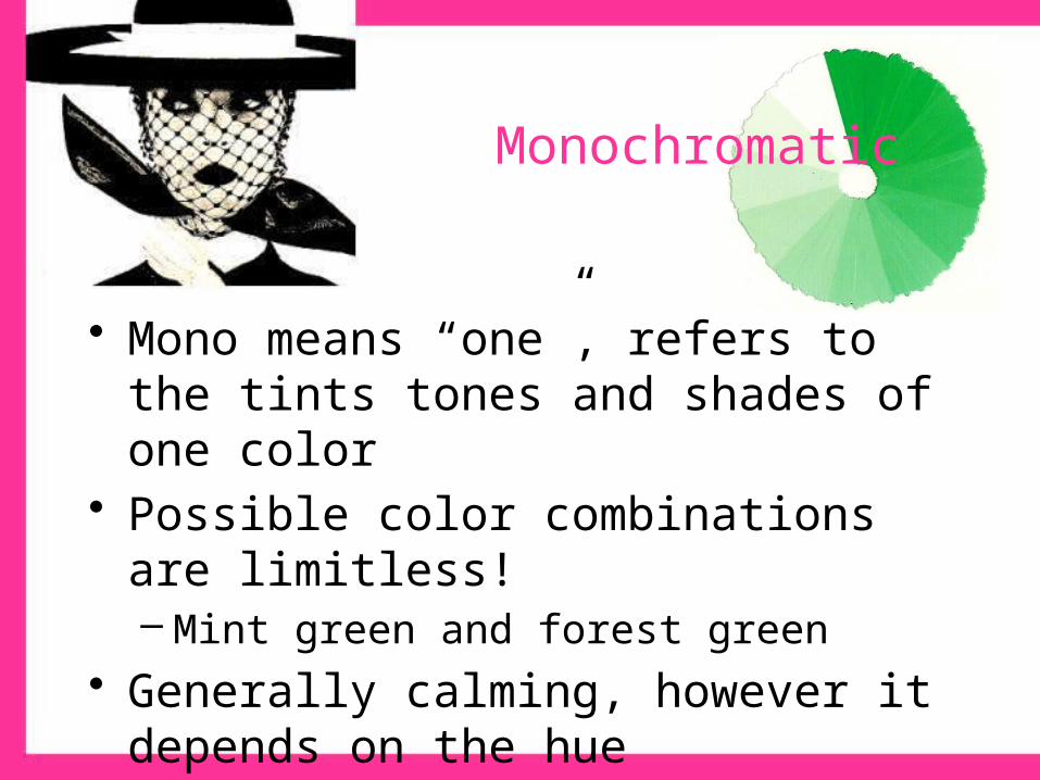
Monochromatic
• Mono means “one”, refers to the tints tones and shades of one color
• Possible color combinations are limitless!– Mint green and forest green
• Generally calming, however it depends on the hue
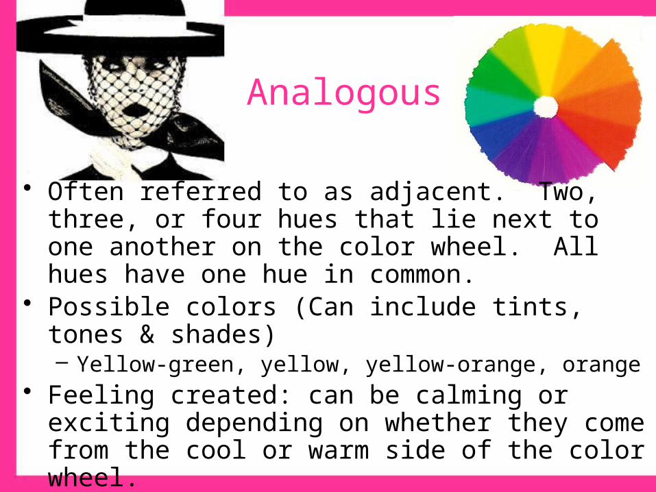
Analogous
• Often referred to as adjacent. Two, three, or four hues that lie next to one another on the color wheel. All hues have one hue in common.
• Possible colors (Can include tints, tones & shades)– Yellow-green, yellow, yellow-orange, orange
• Feeling created: can be calming or exciting depending on whether they come from the cool or warm side of the color wheel.– This color scheme is most effective if one of the hues repeats
some aspect of your personal coloring… eyes, hair…

Complementary
• Combine two colors from the opposite side of the color wheel.
• Possible colors: red & green, blue & orange• Feeling associated: stimulating due to opposite
visual characteristics. By dulling the intensity or value, calming effect may be achieved.– Can be very flattering to personal coloring, and
versatile
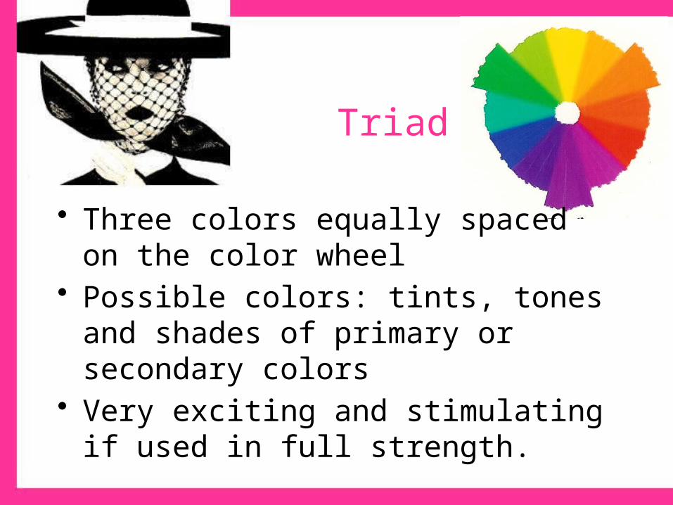
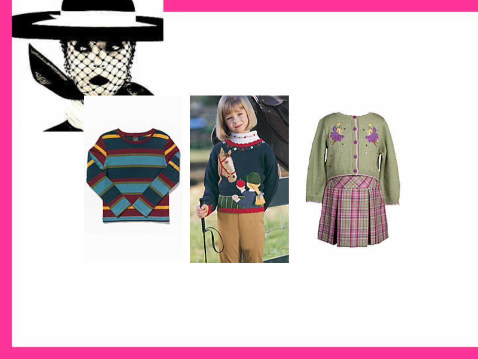
Triad
• Three colors equally spaced on the color wheel
• Possible colors: tints, tones and shades of primary or secondary colors
• Very exciting and stimulating if used in full strength.
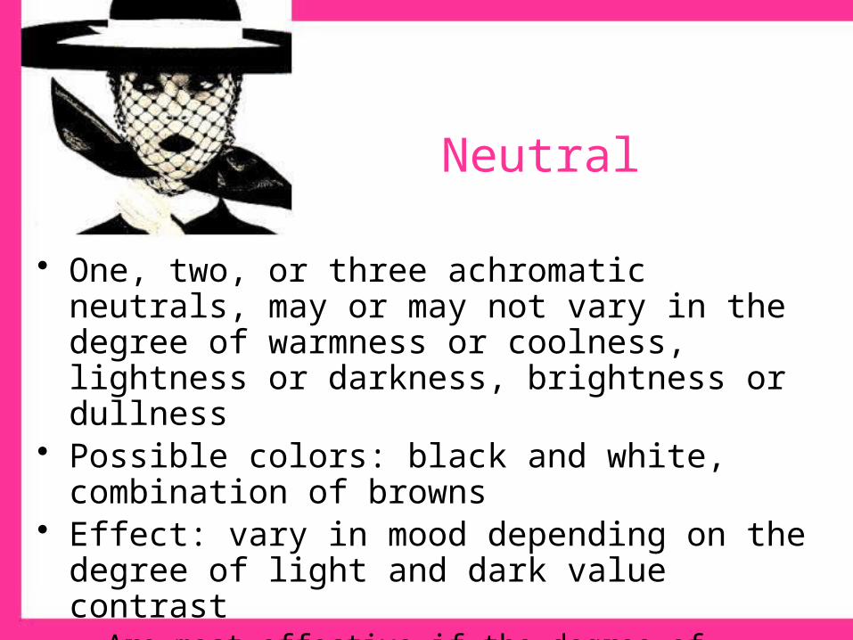
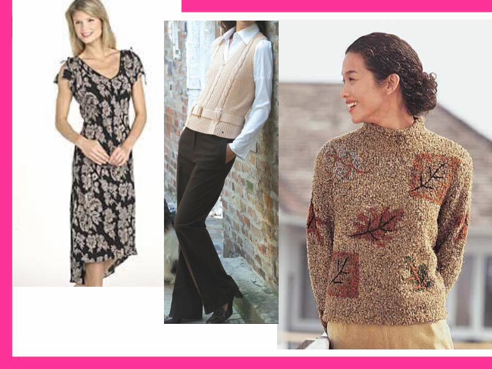
Neutral
• One, two, or three achromatic neutrals, may or may not vary in the degree of warmness or coolness, lightness or darkness, brightness or dullness
• Possible colors: black and white, combination of browns• Effect: vary in mood depending on the degree of light and
dark value contrast– Are most effective if the degree of lightness or darkness in your
hair and/or skin coloring is repeated in the lightness or darkness of the clothing
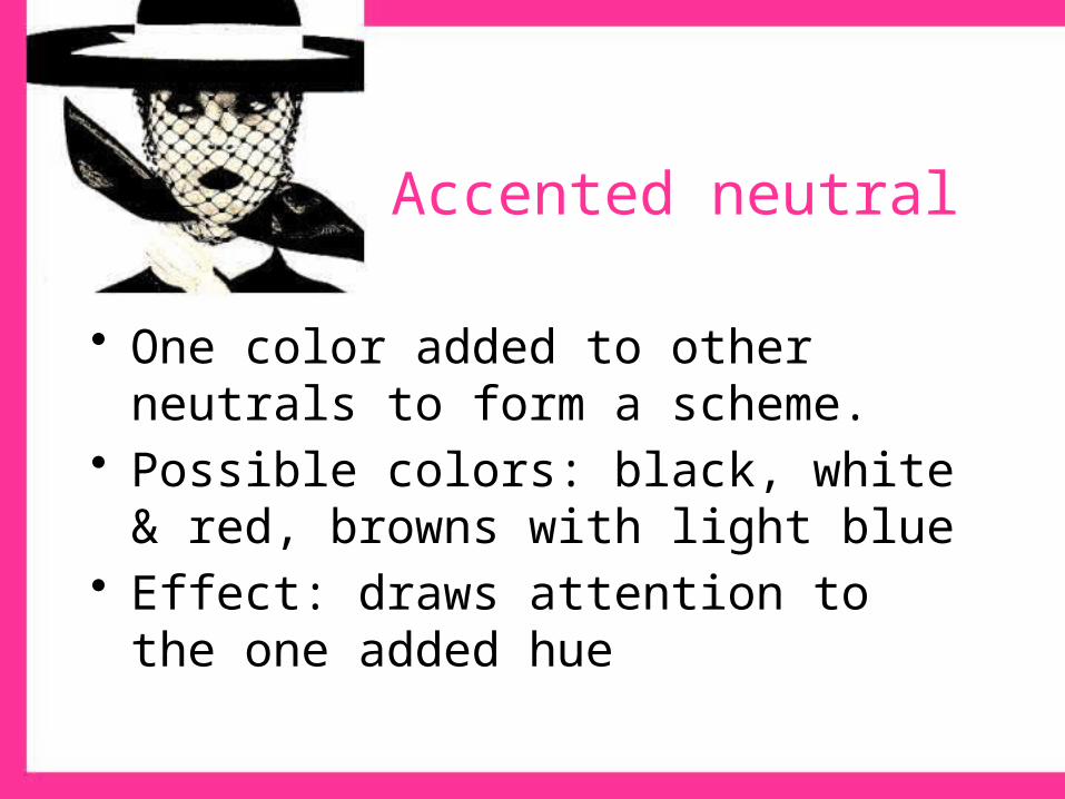
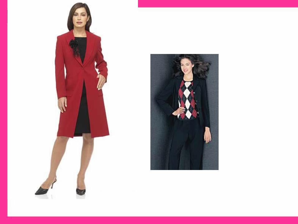
Accented neutral
• One color added to other neutrals to form a scheme.
• Possible colors: black, white & red, browns with light blue
• Effect: draws attention to the one added hue
Selecting colours for you
• Some say you can wear every colour, depending on hue/intensity (they look different on different people)
• Evaluate in natural light• Consider: Height, personal colouring, body
shape (figure 9-17, pg 168)
• Hold against your skin• Switch between a variety of Warm/Cool tones• See page 167 for `How to Choose your colours`

• Activity 19, 20 from Student workbook
• http://www.schwarzkopf.com/sk/en/home/hair_colour/blonde_hair.html
• http://trepanrr.tripod.com/color_analysis_test.htm