excel® 2013 charts and graphs -
TRANSCRIPT
Bill Jelen
Que Publishing
800 East 96th Street,
Indianapolis, Indiana 46240 USA
Excel ® 2013 Charts and Graphs
C o n t e n t s a t a G l a n c e Introduction: Using Excel 2013 to Create Charts ...............................1
1 Introducing Charts in Excel 2013 .......................................................72 Customizing Charts .........................................................................353 Creating Charts That Show Trends ..................................................774 Creating Charts That Show Differences .........................................1135 Creating Charts That Show Relationships .....................................1476 Creating Stock Analysis Charts ......................................................1717 Advanced Chart Techniques ..........................................................1978 Creating Pivot Charts and Power View Dashboards ......................2239 Using Sparklines, Data Visualizations, and Other
Nonchart Methods ...................................................................24910 Presenting Excel Data on a Map ....................................................27511 Using SmartArt Diagrams and Shapes ..........................................28712 Exporting Charts for Use Outside of Excel ......................................31713 Using Excel VBA to Create Charts ..................................................33314 Knowing When Someone Is Lying to You with a Chart .................401
A Charting References ......................................................................411 Index .............................................................................................417
MrExcelLIBRARY

Excel ® 2013 Charts and Graphs Copyright © 2013 by Que Publishing
All rights reserved. No part of this book shall be reproduced, stored in a retrieval system, or transmitted by any means, electronic, mechanical, pho-tocopying, recording, or otherwise, without written permission from the publisher. No patent liability is assumed with respect to the use of the infor-mation contained herein. Although every precaution has been taken in the preparation of this book, the publisher and author assume no responsibility for errors or omissions, nor is any liability assumed for damages resulting from the use of the information contained herein.
ISBN-13: 978-0-7897-4862-1 ISBN-10: 0-7897-4862-2
Library of Congress Cataloging-in-Publication data is on file.
Printed in the United States of America First Printing: February 2013
Trademarks
All terms mentioned in this book that are known to be trademarks or service marks have been appropriately capitalized. Que Publishing cannot attest to the accuracy of this information. Use of a term in this book should not be regarded as affecting the validity of any trademark or service mark.
Warning and Disclaimer
Every effort has been made to make this book as complete and as accurate as possible, but no warranty or fitness is implied. The information provided is on an “as is” basis. The author and the publisher shall have neither liability nor responsibility to any person or entity with respect to any loss or damages aris-ing from the information contained in this book or from the use of the CD or programs accompanying it.
Bulk Sales
Que Publishing offers excellent discounts on this book when ordered in quan-tity for bulk purchases or special sales. For more information, please contact
U.S. Corporate and Government Sales 1-800-382-3419 [email protected]
For sales outside of the U.S., please contact
International Sales [email protected]
Associate Publisher Greg Wiegand
Executive Editor Loretta Yates
Managing Editor Sandra Schroeder
Development Editor Charlotte Kughen
Project Editor Seth Kerney
Copy Editor Barbara Hacha
Indexer Ken Johnson
ProofreaderKathy Ruiz
Technical Editor Bob Umlas
Publishing Coordinator Cindy Teeters
Multimedia Developer Dan Scherf
Interior Designer Anne Jones
Cover Designer Anne Jones
Page Layout Jake McFarland

Contents
Introduction: Using Excel 2013 to Create Charts ............................................................................ 1
Choosing the Right Chart Type ..................................................................................................................................................1
Using Excel as Your Charting Canvas ..........................................................................................................................................2
Topics Covered in This Book .......................................................................................................................................................3
This Book’s Objectives ................................................................................................................................................................4Versions of Excel ..................................................................................................................................................................4Conventions Used in This Book ............................................................................................................................................4Special Elements in This Book ..............................................................................................................................................4
Next Steps..................................................................................................................................................................................5
1 Introducing Charts in Excel 2013 .................................................................................................. 7
What’s New in Excel 2013 Charts ...............................................................................................................................................7
Choosing Among the Three Ways to Create a Chart .................................................................................................................10Creating a Chart from the Quick Analysis Icon ...................................................................................................................10Inserting a Recommended Chart .......................................................................................................................................11Creating a Chart Using the Other Icons on the Insert Tab ..................................................................................................14Creating a Chart Using Alt+F1 ...........................................................................................................................................15
Changing the Chart Title ..........................................................................................................................................................16Editing a Title in the Formula Bar ......................................................................................................................................16Why Can’t Excel Pick Up the Title from the Worksheet? ....................................................................................................17Assigning a Title from a Worksheet Cell ............................................................................................................................18
Handling Special Situations .....................................................................................................................................................19Charting Noncontiguous Data ...........................................................................................................................................19Charting Nonsummarized Data .........................................................................................................................................22Charting Differing Orders of Magnitude Using a Custom Combo Chart ..............................................................................23Reversing the Series and Categories in a Chart ..................................................................................................................24Changing the Data Sequence by Using Select Data ...........................................................................................................25
Using the Charting Tools ..........................................................................................................................................................26Introducing the Three Helper Icons ...................................................................................................................................26Introducing the Format Task Pane .....................................................................................................................................27Using Commands on the Design Tab .................................................................................................................................30Micromanaging Formatting Using the Format Tab ...........................................................................................................31Using Commands on the Home Tab ..................................................................................................................................31Changing the Theme on the Page Layout tab ...................................................................................................................32
Moving Charts ..........................................................................................................................................................................32Moving a Chart Within the Current Worksheet ..................................................................................................................33Moving a Chart to a Different Worksheet ..........................................................................................................................34
Next Steps................................................................................................................................................................................34

Excel 2013 Charts and Graphsiv
2 Customizing Charts ....................................................................................................................35
Accessing Element Formatting Tools .......................................................................................................................................35
Identifying Chart Elements ......................................................................................................................................................37Recognizing Chart Labels and Axes ...................................................................................................................................37Recognizing Analysis Elements ..........................................................................................................................................39Identifying Special Elements in a 3D Chart ........................................................................................................................40
Formatting Chart Elements ......................................................................................................................................................41Moving the Legend ...........................................................................................................................................................41Changing the Arrangement of a Legend ...........................................................................................................................42Formatting Individual Legend Entries ...............................................................................................................................43Adding Data Labels to a Chart ...........................................................................................................................................43Adding a Data Table to a Chart ..........................................................................................................................................46Formatting Axes ................................................................................................................................................................47Displaying and Formatting Gridlines .................................................................................................................................55Formatting the Plot Area and Chart Area ..........................................................................................................................61Controlling 3D Rotation in a 3D Chart ................................................................................................................................65Forecasting with Trendlines ..............................................................................................................................................66Adding Drop Lines to a Line or Area Chart .........................................................................................................................69Adding Up/Down Bars to a Line Chart ...............................................................................................................................70Showing Acceptable Tolerances by Using Error Bars ..........................................................................................................71
Formatting a Series ..................................................................................................................................................................72Formatting a Single Data Point .........................................................................................................................................73Replacing Data Markers with Shapes.................................................................................................................................73Replacing Data Markers with a Picture ..............................................................................................................................73
Changing the Theme Colors on the Page Layout Tab ...............................................................................................................74
Storing Your Favorite Settings in a Chart Template .................................................................................................................75
Next Steps................................................................................................................................................................................75
3 Creating Charts That Show Trends ...............................................................................................77
Choosing a Chart Type .............................................................................................................................................................77Column Charts for Up to 12 Time Periods ..........................................................................................................................77Line Charts for Time Series Beyond 12 Periods ..................................................................................................................77Area Charts to Highlight One Portion of the Line ...............................................................................................................79High-Low-Close Charts for Stock Market Data ...................................................................................................................79Bar Charts for Series with Long Category Labels ................................................................................................................79Pie Charts Make Horrible Time Comparisons .....................................................................................................................80100 Percent Stacked Bar Chart Instead of Pie Charts .........................................................................................................80
Understanding Date-Based Axis Versus Category-Based Axis in Trend Charts .........................................................................80Converting Text Dates to Dates..........................................................................................................................................83Plotting Data by Numeric Year ..........................................................................................................................................88Using Dates Before 1900 ...................................................................................................................................................89Rolling Daily Dates to Months Using a Pivot Chart .............................................................................................................91Using a Workaround to Display a Time-Scale Axis .............................................................................................................93
Communicate Effectively with Charts ......................................................................................................................................96

vContents
Using a Long, Meaningful Title to Explain Your Point ........................................................................................................96Highlighting One Column ................................................................................................................................................100Replacing Columns with Arrows ......................................................................................................................................101Highlighting a Section of a Chart by Adding a Second Series ..........................................................................................102Changing Line Type Midstream .......................................................................................................................................103
Adding an Automatic Trendline to a Chart.............................................................................................................................105
Showing a Trend of Monthly Sales and Year-to-Date Sales ...................................................................................................106
Understanding the Shortcomings of Stacked Column Charts .................................................................................................108
Shortcomings of Showing Many Trends on a Single Chart .....................................................................................................110
Next Steps..............................................................................................................................................................................111
4 Creating Charts That Show Differences ......................................................................................113
Comparing Entities ................................................................................................................................................................113
Using Bar Charts to Illustrate Item Comparisons ....................................................................................................................113Adding a Second Series to Show a Time Comparison ......................................................................................................115Subdividing a Bar to Emphasize One Component ............................................................................................................116
Showing Component Comparisons ........................................................................................................................................117Using Pie Charts ...............................................................................................................................................................120Switching to a 100 Percent Stacked Column Chart ..........................................................................................................126Using a Doughnut Chart to Compare Two Pies ................................................................................................................127Dealing with Data Representation Problems in a Pie Chart .............................................................................................129
Using a Waterfall Chart to Tell the Story of Component Decomposition ................................................................................136Creating a Stacked and Clustered Chart ...........................................................................................................................138
Next Steps..............................................................................................................................................................................145
5 Creating Charts That Show Relationships ..................................................................................147
Using Scatter Charts to Plot Pairs of Data Points ....................................................................................................................148Creating a Scatter Chart ...................................................................................................................................................149Adding Labels to a Scatter Chart in Excel 2013 ................................................................................................................149Showing Scatter Chart Labels in Excel 2010 ....................................................................................................................150Adding a Second Series to a Scatter Chart .......................................................................................................................151Joining the Points in a Scatter Chart with Lines...............................................................................................................153Using a Scatter Chart with Lines to Replace a Line Chart .................................................................................................154Drawing with a Scatter Chart ..........................................................................................................................................155Testing Correlation Using a Scatter Chart ........................................................................................................................157Adding a Third Dimension with a Bubble Chart ...............................................................................................................159
Using Charts to Show Relationships .......................................................................................................................................161Using Paired Bars to Show Relationships .........................................................................................................................161Using a Frequency Distribution to Categorize Thousands of Points .................................................................................163Using Radar Charts to Create Performance Reviews ........................................................................................................166
Using Surface Charts to Show Contrast ..................................................................................................................................167Using the Depth Axis .......................................................................................................................................................168Controlling a Surface Chart Through 3D Rotation ............................................................................................................168
Next Steps..............................................................................................................................................................................169
Excel 2013 Charts and Graphsvi
6 Creating Stock Analysis Charts ..................................................................................................171
Overview of Stock Charts .......................................................................................................................................................171Line Charts .......................................................................................................................................................................171OHLC Charts .....................................................................................................................................................................172Candlestick Charts ...........................................................................................................................................................173
Obtaining Stock Data to Chart ...............................................................................................................................................173Rearranging Columns in the Downloaded Data ...............................................................................................................174Dealing with Splits Using the Adjusted Close Column .....................................................................................................175
Creating a Line Chart to Show Closing Prices .........................................................................................................................177Adding Volume as a Column Chart to the Line Chart .......................................................................................................180
Creating OHLC Charts .............................................................................................................................................................182Producing a High-Low-Close Chart ..................................................................................................................................182Customizing a High-Low-Close Chart ..............................................................................................................................183Creating an OHLC Chart ...................................................................................................................................................184Adding Volume to a High-Low-Close Chart .....................................................................................................................186
Creating Candlestick Charts ...................................................................................................................................................191Changing Colors in a Candlestick Chart ............................................................................................................................191Understanding High-Low Lines and Up-Down Bars ........................................................................................................192
Next Steps..............................................................................................................................................................................196
7 Advanced Chart Techniques ......................................................................................................197
Mixing Two Chart Types on a Single Chart .............................................................................................................................197
Moving Charts from One Worksheet to Another ....................................................................................................................200
Making Columns or Bars Float ...............................................................................................................................................200
Using a Rogue XY Series for Arbitrary Gridlines......................................................................................................................202
Showing Several Charts on One Chart by Using a Rogue XY Series ........................................................................................207
Creating Bullet Charts in Excel 2013 ......................................................................................................................................212
Creating a Thermometer Chart ..............................................................................................................................................217
Creating a Benchmark Chart ..................................................................................................................................................219
Creating a Delta Chart ............................................................................................................................................................220
Next Steps..............................................................................................................................................................................221
8 Creating Pivot Charts and Power View Dashboards ....................................................................223
Creating a PivotChart Using Recommended Charts ...............................................................................................................223Changing the Fields in the Pivot Chart ............................................................................................................................225Sorting the Pivot Chart ....................................................................................................................................................226Grouping Daily Dates in the Pivot Chart ...........................................................................................................................228Filtering Pivot Charts Using the Filter Fly-out Menu ........................................................................................................230Filtering Pivot Charts Using Slicers ..................................................................................................................................230Connecting Multiple Pivot Charts to One Slicer ................................................................................................................231
Using PowerPivot and Power View ........................................................................................................................................232Enabling PowerPivot and Power View.............................................................................................................................233Loading Your Excel Data to PowerPivot ...........................................................................................................................233Adding a Date Lookup Table ............................................................................................................................................234
viiContents
Format Your Data in PowerPivot .....................................................................................................................................235VLOOKUPs? Replacing VLOOKUPs with Relationships ......................................................................................................236Creating a Power View Worksheet ..................................................................................................................................237Every New Dashboard Element Starts as a Table .............................................................................................................238Converting the Table to a Chart .......................................................................................................................................238Creating a New Element by Dragging ..............................................................................................................................240Every Chart Point Is a Slicer for Every Other Element .......................................................................................................240Adding a Real Slicer .........................................................................................................................................................241The Filter Pane Can Be Confusing ....................................................................................................................................242Use Tile Boxes to Filter One or a Group of Charts .............................................................................................................243Replicating Charts Using Multiples ..................................................................................................................................244Animating a Scatter Chart Over Time ..............................................................................................................................245Some Closing Tips on Power View ...................................................................................................................................246
Next Steps..............................................................................................................................................................................247
9 Using Sparklines, Data Visualizations, and Other Nonchart Methods ...........................................249
Fitting a Chart into the Size of a Cell with Sparklines.............................................................................................................250Creating a Group of Sparklines ........................................................................................................................................251Built-in Choices for Customizing Sparklines .....................................................................................................................253Controlling Axis Values for Sparklines ..............................................................................................................................254Setting Up Win/Loss Sparklines .......................................................................................................................................256Showing Detail by Enlarging the Sparkline......................................................................................................................256Labeling a Sparkline ........................................................................................................................................................257
Using Data Bars to Create In-Cell Bar Charts ..........................................................................................................................259Creating Data Bars ...........................................................................................................................................................260Customizing Data Bars .....................................................................................................................................................261Showing Data Bars for a Subset of Cells ...........................................................................................................................262
Using Color Scales to Highlight Extremes...............................................................................................................................263Customizing Color Scales .................................................................................................................................................264
Using Icon Sets to Segregate Data .........................................................................................................................................265Setting Up an Icon Set .....................................................................................................................................................265Moving Numbers Closer to Icons .....................................................................................................................................266Showing an Icon for Only the Best Cells ...........................................................................................................................268Creating a 10-Icon Set Using a Formula ...........................................................................................................................269
Creating a Chart Using Conditional Formatting in Worksheet Cells .......................................................................................271
Creating a Chart Using the REPT Function .............................................................................................................................273
Next Steps..............................................................................................................................................................................274
10 Presenting Excel Data on a Map ................................................................................................275
Plotting Data Geographically .................................................................................................................................................275
Importing Data to MapPoint ..................................................................................................................................................275
Creating a Map in Power View ...............................................................................................................................................279
Creating a Map in GeoFlow ....................................................................................................................................................284
Next Steps..............................................................................................................................................................................286
Excel 2013 Charts and Graphsviii
11 Using SmartArt Diagrams and Shapes .......................................................................................287
Using SmartArt ......................................................................................................................................................................288Elements Common Across Most SmartArt .......................................................................................................................289A Tour of the SmartArt Categories ...................................................................................................................................289Inserting SmartArt ...........................................................................................................................................................291Micromanaging SmartArt Elements ................................................................................................................................294Changing Text Formatting in One Element ......................................................................................................................294Controlling SmartArt Shapes from the Text Pane ............................................................................................................296Adding Images to SmartArt .............................................................................................................................................298Special Considerations for Organization Charts ...............................................................................................................299Using Limited SmartArt ...................................................................................................................................................301
Choosing the Right Layout for Your Message ........................................................................................................................302
Exploring Business Charts That Use SmartArt Graphics ..........................................................................................................303Illustrating a Pro/Con Decision by Using a Balance Chart ................................................................................................304Illustrating Growth by Using an Upward Arrow ...............................................................................................................304Showing an Iterative Process by Using a Basic Cycle Layout ............................................................................................305Showing a Company’s Relationship to External Entities by Using a Diverging Radial Diagram .......................................305Illustrating Departments Within a Company by Using a Table List Diagram ...................................................................306Adjusting Venn Diagrams to Show Relationships ............................................................................................................306Understanding Labeled Hierarchy Charts ........................................................................................................................307Using Other SmartArt Layouts .........................................................................................................................................308
Using Shapes to Display Cell Contents ...................................................................................................................................309Working with Shapes ......................................................................................................................................................311Using the Freeform Shape to Create a Custom Shape ......................................................................................................311
Using WordArt for Interesting Titles and Headlines ...............................................................................................................312
Next Steps..............................................................................................................................................................................315
12 Exporting Charts for Use Outside of Excel ...................................................................................317
Presenting Excel Charts in PowerPoint or Word .....................................................................................................................317Copying a Document from Excel and Pasting to PowerPoint Sets Up an As-Needed Link................................................319Copying and Pasting While Keeping Original Formatting ................................................................................................323Pasting as Link to Capture Future Excel Formatting Changes ..........................................................................................324Embedding the Chart and Workbook in PowerPoint .......................................................................................................325Copying a Chart as a Picture ............................................................................................................................................325Creating a Chart in PowerPoint with Data Pasted from Excel ..........................................................................................327
Presenting Charts on the Web ...............................................................................................................................................328
Exporting Charts to Graphics Using VBA ................................................................................................................................331
Converting to XPS or PDF .......................................................................................................................................................332
Next Steps..............................................................................................................................................................................332
13 Using Excel VBA to Create Charts ...............................................................................................333
Introducing VBA ....................................................................................................................................................................333Enabling VBA in Your Copy of Excel .................................................................................................................................333Enabling the Developer Tab .............................................................................................................................................334Visual Basic Tools .............................................................................................................................................................335

ixContents
The Macro Recorder .........................................................................................................................................................336Understanding Object-Oriented Code ..............................................................................................................................336
Learning Tricks of the VBA Trade ...........................................................................................................................................337Writing Code to Handle a Data Range of Any Size ...........................................................................................................337Using Super-Variables: Object Variables ..........................................................................................................................339Using With and End With When Referring to an Object ..................................................................................................340Continuing a Line of Code ................................................................................................................................................340Adding Comments to Code ..............................................................................................................................................341
Understanding Backward Compatibility ................................................................................................................................341
Referencing Charts and Chart Objects in VBA Code ................................................................................................................342
Understanding the Global Settings ........................................................................................................................................342Specifying a Built-in Chart Type ......................................................................................................................................342Specifying Location and Size of the Chart ........................................................................................................................345Referring to a Specific Chart ............................................................................................................................................345
Creating a Chart in Various Excel Versions .............................................................................................................................346Using the .AddChart2 Method in Excel 2013 ...................................................................................................................346Creating Charts in Excel 2007–2013 ................................................................................................................................348Creating Charts in Excel 2003–2013 ................................................................................................................................349
Customizing a Chart ...............................................................................................................................................................350Specifying a Chart Title ....................................................................................................................................................350Quickly Formatting a Chart Using New Excel 2013 Features ............................................................................................351
Using SetElement to Emulate Changes from the Plus Icon ....................................................................................................358Using the Format Method to Micromanage Formatting Options .....................................................................................363
Formatting a Data Series .......................................................................................................................................................367Controlling Gap Width and Series Separation in Column and Bar Charts .........................................................................368Spinning and Exploding Round Charts.............................................................................................................................369Controlling the Bar of Pie and Pie of Pie Charts ...............................................................................................................371Setting the Bubble Size ...................................................................................................................................................375Controlling Radar and Surface Charts ..............................................................................................................................377
Creating Advanced Charts ......................................................................................................................................................381Creating True Open-High-Low-Close Stock Charts ...........................................................................................................382Creating Bins for a Frequency Chart .................................................................................................................................383Creating a Stacked Area Chart .........................................................................................................................................386
Exporting a Chart as a Graphic ...............................................................................................................................................389
Creating Pivot Charts .............................................................................................................................................................390
Creating Data Bars with VBA .................................................................................................................................................392
Creating Sparklines with VBA ................................................................................................................................................395
Next Steps..............................................................................................................................................................................399
14 Knowing When Someone Is Lying to You with a Chart ................................................................401
Lying with Perspective ...........................................................................................................................................................401
Lying with Shrinking Charts ...................................................................................................................................................402
Lying with Scale .....................................................................................................................................................................403

Excel 2013 Charts and Graphsx
Lying Because Excel Will Not Cooperate ................................................................................................................................405
Avoiding Stacked Surface Charts ............................................................................................................................................406
Asserting a Trend from Two Data Points ................................................................................................................................407
Deliberately Using Charts to Lie .............................................................................................................................................408
Charting Something Else When Numbers Are Too Bad ..........................................................................................................409
Stretching Pictographs ..........................................................................................................................................................409
Next Steps..............................................................................................................................................................................410
A Charting References .................................................................................................................411
Index ......................................................................................................................................417

xiAbout the Author
Dedication To Zeke Jelen
About the Author Bill Jelen, Excel MVP and the host of MrExcel.com, has been using spreadsheets since 1985, and he launched the MrExcel.com website in 1998. Bill was a regular guest on Call for Help with Leo Laporte and has produced more than 1,500 episodes of his daily video podcast, Learn Excel from MrExcel. He is the author of 39 books about Microsoft Excel and writes the monthly Excel column for Strategic Finance magazine. His Excel tips appear regularly in CFO Excel Pro Newsletter and CFO Magazine . Before founding MrExcel.com, Bill Jelen spent 12 years in the trenches—working as a financial analyst for finance, market-ing, accounting, and operations departments of a $500 million public company. He lives near Akron, Ohio, with his wife, Mary Ellen.

Excel 2013 Charts and Graphsxii
Acknowledgments I wish to thank Gene Zelazny of McKinsey & Company. Gene was generous with his time and feedback. He indirectly taught me a lot about charting more than a decade ago, when I did a six-month stint on a McKinsey project team. Kathy Villella and Tom Bunzel also provided advice on presentations. Mala Singh of XLSoft Consulting vetted the chapter on using VBA to create charts.
Mike Alexander, my coauthor on the Pivot Table Data Crunching books, helped outline the table of contents for this book and provided many ideas for Chapter 7 .
I enjoy the visual delight of every Edward Tufte book. I apologize in advance to E.T. for documenting all the chartjunk that Microsoft lets us add to Excel charts.
Dick DeBartolo is the Daily GizWiz and has been writing for Mad magazine for more than 40 years, since he was 15. The pages of Mad were not where I expected to find inspiration for a charting book, but why not? Thanks to Bob D’Amico for illustrating the charts à la Mad . The pie chart in Chapter 4 is a Dick DeBartolo original, created especially for this book. Many thanks to Dick for being a contributor.
I was visiting Keith Bradbury’s office in Toronto. Keith makes the completely awesome PDF-to-Excel utility at InvestInTech.com. Between parking the car and entering Keith’s office, I saw the most amazing store, managed by David Michaelides. SWIPE is a bookstore dedicated to art and design. This is a beautiful store to browse, and if you go in and reveal that you work in Excel all day, they will sympathetically be very nice to you. In a clash of worlds, David has the original 1984 Mac way up above his cash register because it was the start of desktop publishing. I pointed out that the Mac was where Excel 1.0 got its start in 1985, so we had a common thread in our respective backgrounds. Stop by 401 Richmond Street West (two blocks west of Spadina) to take a look the next time you are in Toronto.
Thanks to Jane Liles at Microsoft for guiding the Excel team through Excel 2013. Thanks to Steve Tullis, Dan Battagin, and Melissa MacBeth for making the Excel Web App render charts better every year. Scott Ruble heads up the charting team and was always generous with his time when I ran into a charting quandary. Robin Wakefield provided help with some charting VBA that was eluding me.
At MrExcel.com, thanks to Barb Jelen, Wei Jiang, Tracy Syrstad, Tyler Nash, and Scott Pierson.
The Microsoft MVPs for Excel are always generous with their time and ideas. Over the years, I’ve learned many cool charting tricks from websites maintained by John Peltier, Andy Pope, and Charley Kyd. Turn to the appendix for links to their respective websites. MVP Bob Umlas (the smartest Excel guy I know) served as a great technical editor. I still smile when I recall Bob pointing out that “9. Repeat step 9 for High, Low, and Close lines.” was, in itself, a circular reference.
The great team at Pearson of Loretta Yates, Charlotte Kughen, Barbara Hacha, and Seth Kerney were a pleasure to work with.
Finally, thanks to Zeke Jelen, Dom Grossi, and Mary Ellen Jelen.

xiiiReader Services
We Want to Hear from You!As the reader of this book, you are our most important critic and commentator. We value your opinion and want to know what we’re doing right, what we could do better, what areas you’d like to see us publish in, and any other words of wisdom you’re willing to pass our way.
We welcome your comments. You can email or write to let us know what you did or didn’t like about this book—as well as what we can do to make our books better.
Please note that we cannot help you with technical problems related to the topic of this book.
When you write, please be sure to include this book’s title and author as well as your name and email address. We will carefully review your comments and share them with the author and editors who worked on the book.
Email: [email protected]
Mail: Que PublishingATTN: Reader Feedback800 East 96th StreetIndianapolis, IN 46240 USA
Reader ServicesVisit our website and register this book at quepublishing.com/register for convenient access to any updates, downloads, or errata that might be available for this book.

This page intentionally left blank

IN THIS INTRODUCTION
Choosing the Right Chart Type ........................1
Using Excel as Your Charting Canvas ................2
Topics Covered in This Book ............................3
This Book’s Objectives ....................................4
Next Steps .....................................................5
Introduction: Using Excel
2013 to Create Charts Good charts should both explain data and arouse curiosity. A chart can summarize thousands of data points into a single picture. The arrangement of a chart should explain the underlying data but also enable the reader to isolate trouble spots worthy of further analysis.
Excel makes it easy to create charts. Even though the improvements in Excel 2013 enable you to cre-ate a chart with only a few mouse clicks, it still takes thought to find the best way to present your data.
Choosing the Right Chart Type Suppose you are an analyst for a chain of restau-rants, and you are studying the lunch-hour sales for a restaurant in a location at a distant mall. Corporations surrounding the mall provide a steady lunchtime clientele during the week. The mall does well on weekends during the holiday shopping months but lacks weekend crowds during the rest of the year.
From the data contained in the chart in Figure I.1 , you can spot a periodicity in sales throughout the year. An estimated 50 spikes indicate that the peri-odicity might be based on the day of the week. You can also spot that a general improvement in sales occurs at the end of the year, which you attribute to the holiday shopping season. However, there is an anomaly in the pattern during the summer months that needs further study.

Introduction: Using Excel 2013 to Create Charts2
After studying the data in Figure I.1 , you might decide to plot the sales by weekday to understand the sales better. Figure I.2 shows the same data presented as seven line charts. Each line represents the sales for a particular day of the week. Friday is the dashed line. At the beginning of the year, Friday was the best sales day for this particular restaurant. For some reason, around week 23, Friday sales plummeted.
The chart in Figure I.2 prompts you to make some calls to see what was happening on Fridays at this location. You might discover that the city was hosting free Friday lunchtime concerts from June through August. The restaurant manager was offered a concession at the concert location but thought it would be too much trouble. Using this pair of charts enabled you to isolate a problem and equipped you to make better decisions in the future.
Using Excel as Your Charting Canvas Excel 2007 offered a complete rewrite of the 15-year-old charting engine from legacy ver-sions of Excel. Unfortunately, Excel 2007 introduced too many new bugs to the charting engine. Much of the effort of the charting team in Excel 2010 went to cleaning up the bugs left over from Excel 2007. Now, in Excel 2013, some amazing leaps have been made with
Figure I.1 This chart shows the sales trend for 365 data points.
Figure I.2 When you isolate sales by weekday, you can see a definite problem with Friday sales in the summer.

3Topics Covered in This Book
Recommended Charts and a new set of 153 Chart Styles. Single-series charts no longer get a redundant legend. Chart labels pick up formatting from the source data. Three new helper icons appear to the right of a selected chart, enabling you to add elements, remove totals, and format a chart. A new interface simplifies combo chart creation. Also, data labels can appears as callouts and get their values from cell formulas.
If you have Excel 2013 Pro Plus or Office 365, you also have access to add-ins such as Power View and GeoFlow. Both enable you to use animated charts and maps.
Topics Covered in This Book This book covers the Excel 2013 charting engine and three types of word-sized charts called sparklines . It also covers the Data Visualization and SmartArt Business diagramming tools that were introduced in Excel 2007. If you have Excel 2013 Pro Plus, the new Power View add-in came with your version of Excel and provides animated charts and dashboards.
Besides charts, Excel 2013 offers many other ways to display quantitative data visually. This book explains how to use the new conditional formatting features such as data bars, color scales, and icon sets to add visual elements to regular tables of numbers. In Figure I.3 , con-ditional formatting features make it easy to see that Ontario has the largest population and that Nunavut has the largest land area. You can also add in-cell data bars such as these with a couple of mouse clicks, as described in Chapter 9 , “Using Sparklines, Data Visualizations, and Other Nonchart Methods.”
The three types of word-sized charts in Excel 2013 called sparklines enable you to create tiny line charts, tiny column charts, and win/loss charts. As shown in Figure I.4 , these tiny charts can show win/loss events that paint a better picture than a simple 7–3 record.
Figure I.3 In-cell data bars draw the eye to the largest values in each column.
Figure I.4 The Twins baseball team made the post-season in 2009 because they won 8 of their last 10 games while the Tigers struggled.

Introduction: Using Excel 2013 to Create Charts4
This Book’s Objectives The goal of this book is to make you more efficient and effective in creating visual displays of information using Excel 2013.
In the early chapters of this book, you find out how to use the new Excel 2013 charting interface. Chapters 3 through 6 walk you through all the built-in chart types and talk about when to use each one. Chapter 7 discusses creating unusual charts. Chapter 8 covers pivot charts, and Chapter 9 covers creating visual displays of information right in the worksheet. Chapter 10 covers mapping, and Chapter 11 covers the new SmartArt business graphics and Excel 2013’s shape tools. Chapter 12 covers exporting charts for use outside of Excel. Chapter 13 presents macro tools you can use to automate the production of charts using Excel VBA. Chapter 14 includes several techniques that people can use to stretch the truth with charts. Finally, Appendix A provides a list of resources that will give you additional help with creating charts and graphs.
Versions of Excel Excel charting was largely unchanged for the dozen years leading up to Excel 2003. This book refers to Excel 2003 and earlier collectively as “legacy” versions of Excel.
This book covers new features in Excel 2013. Many of the concepts were possible in Excel 2010 and earlier, but required more steps.
Conventions Used in This Book This book follows certain conventions:
Monospace —Text message you see onscreen or code appears in monospace font.
Bold Monospace —Text you type appears in bold, monospace font.
Italic —New and important terms appear in italics .
Initial Caps—Tab names, dialog box names, and dialog box elements are present with initial capital letters so you can identify them easily.
Special Elements in This Book This book contains the following special elements:
Notes provide additional information outside the main thread of the chapter discussion that might be
useful for you to know.
NO
TE
Tips provide you with quick workarounds and time-saving techniques to help you do your work more
efficiently.
TI
P

5Next Steps
Next Steps Chapter 1 , “Introducing Charts in Excel 2013,” presents the new Excel 2013 interface for creating charts. You discover how to create your first chart and read about the various ele-ments available in a chart.
Cautions warn you about potential pitfalls you might encounter. It is important to pay attention to
Cautions because they alert you to problems that could cause hours of frustration.
C A U T I O N
Case studies provide a real-world look at topics previously introduced in the chapter.
C A S E S T U D Y

This page intentionally left blank

3 I N T H I S C H A P T E R
Choosing a Chart Type .................................. 77
Understanding Date-Based Axis Versus Category-Based Axis in Trend Charts ............. 80
Communicate Effectively with Charts ........... 96
Adding an Automatic Trendline to a Chart ... 105
Showing a Trend of Monthly Sales and Year-to-Date Sales ..................................... 106
Understanding the Shortcomings of Stacked Column Charts ............................... 108
Shortcomings of Showing Many Trends on a Single Chart ........................................ 110
Next Steps ................................................. 111
Creating Charts That
Show Trends
Choosing a Chart Type You have two excellent choices when creating charts that show the progress of some value over time. Because Western cultures are used to seeing time progress from left to right, you are likely to choose a chart where the axis moves from left to right—whether it is a column chart, line chart, or area chart.
Column Charts for Up to 12 Time Periods If you have only a few data points, you can use a col-umn chart because they work well for 4 quarters or 12 months. If your data set contains 12 or fewer data points that represent a time period, choose a column chart to illustrate the trend over time.
Line Charts for Time Series Beyond 12 Periods When you get beyond 12 data points, you should switch to a line chart, which can easily show trends for hundreds of periods. Line charts can be designed to show only the data points as markers, or data points can be connected with a straight or smoothed line.
Figure 3.1 shows a chart with only nine data points, where a column chart is appropriate. Figure 3.2 shows a chart of 100+ data points. With this detail, you should switch to a line chart to show the trend.
The new Sparklines feature is another way to show trends with tiny
charts. See Chapter 9 , “Using Sparklines, Data Visualizations, and Other
Nonchart Methods.”
NO
TE

3
Chapter 3 Creating Charts That Show Trends78
Figure 3.1 With 12 or fewer data points, column charts are viable and informative.
Figure 3.2 When you go beyond 12 data points, it is best to switch to a line chart without individual data points. The middle chart in this figure shows the same data set as a line chart.

79Choosing a Chart Type
3
Area Charts to Highlight One Portion of the Line An area chart is a line chart where the area under the line is filled with a shading or color. This can be appropriate if you want to highlight a particular portion of the time series. If you have fewer data points, adding drop lines can help the reader determine the actual value for each time period.
High-Low-Close Charts for Stock Market Data If you are plotting stock market data, use stock charts to show the trend of stock data over time. You can also use high-low-close charts to show the trend of data that might occur in a range, such as when you need to track a range of quality rankings for each day.
Bar Charts for Series with Long Category Labels Even though bar charts can be used to show time trends, they can be confusing because readers expect time to be represented from left to right. In rare cases, you might use a bar chart to show a time trend. For example, if you have 40 or 50 points that have long cat-egory labels that you need to print legibly to show detail for each point, consider using a bar chart. Another example is shown in Figure 3.3 , which includes sales for 45 daily dates. This bar chart would not work as a PowerPoint slide. However, if it is printed as a full page on letter-size paper, the reader could analyze sales by weekday. In the chart in Figure 3.3 , weekend days are plotted in a different color than weekdays to help delineate the weekly periods.
Figure 3.3 Although time series typi-cally should run across the horizontal axis, this chart allows 45 points to be compared easily.

3
Chapter 3 Creating Charts That Show Trends80
Pie Charts Make Horrible Time Comparisons A pie chart is ideal for showing how components that add up to 100% are broken out. It is difficult to compare a series of pie charts to detect changes from one pie to the next. As you can see in the charts in Figure 3.4 , it is difficult for the reader’s eye to compare the pie wedges from year to year. Did market share increase in 2013? Rather than using a series of pie charts to show changes over time, use a 100 percent stacked column chart.
100 Percent Stacked Bar Chart Instead of Pie Charts In Figure 3.5 , the same data from Figure 3.4 is plotted as a 100 percent stacked bar chart. Series lines guide the reader’s eye from the market share from each year to the next year. The stacked bar chart is a much easier chart to read than the series of pie charts.
Understanding Date-Based Axis Versus Category-Based Axis in Trend Charts
Excel offers two types of horizontal axes in a trend chart. Having the proper setting can ensure that your message is accurate.
Figure 3.4 It is difficult to compare one pie chart to the next.
Figure 3.5 The same data presented in Figure 3.4 is easier to read in a 100 percent stacked bar chart.

81Understanding Date-Based Axis Versus Category-Based Axis in Trend Charts
3
If the spacing of events along the time axis is uniform, it does not matter whether you choose a date-based axis or a text-based axis because the results will be the same. When this occurs, it is fine to allow Excel to choose the type of axis automatically.
However, if the spacing of events along the time axis is haphazard, you definitely want to make sure that Excel uses a date-based axis.
Accurately Representing Data Using a Time-Based Axis Figure 3.6 shows the spot price for a certain component used in your manufacturing plant. To find this data, you down-
loaded past purchase orders for that product. Your company doesn’t purchase the component on the same day every
month; therefore, you have an incomplete data set. In the middle of the data set, a strike closed one of the vendors,
spiking the prices from the other vendors. Your purchasing department had stocked up before the strike, which allowed
your company to slow its purchasing dramatically during the strike.
In the top chart in Figure 3.6 , the horizontal axis is set to a text-based axis, and every data point is plotted an equal
distance apart. Because your purchasing department made only two purchases during the strike, it appears the time
affected by the strike is very narrow. The bottom chart uses a date-based axis. In this axis, you can see that the strike
actually lasted for half of 2013.
Figure 3.6 The top chart uses a text-based horizontal axis: Every event is plotted an equal distance from the next event. This leads to the shaded period being underreported.
To learn how to highlight a portion of a chart as shown in Figure 3.6 , see “Highlighting a Section of
Chart by Adding a Second Series,” later in this chapter.
NO
TE

3
Chapter 3 Creating Charts That Show Trends82
Usually, if your data contains dates, Excel defaults to a date-based axis. However, you should always check to make sure Excel is using the correct type of axis. A number of potential problems force Excel to choose a text-based axis instead of a date-based axis. For example, Excel chooses a text-based axis when dates are stored as text in a spreadsheet and when dates are represented by numeric years. The list following Figure 3.7 summarizes other potential problems.
To explicitly choose an axis type, follow these steps:
1. Right-click the horizontal axis and select Format Axis.
2. In the Format Axis task pane that appears, select the Axis Options at the top, then the chart icon, and then expand the Axis Options category.
3. As appropriate, choose either Text Axis or Date Axis from the Axis Type section (see Figure 3.7 ).
A number of complications that require special handling can occur with date fields. The fol-lowing are some of the problems you might encounter:
Dates stored as text— If dates are stored as text dates instead of real dates, a date-based axis will never work. You have to use date functions to convert the text dates to real dates.
Figure 3.7 You can explicitly choose an axis type rather than letting Excel choose the default.
Axis Type Settings

83Understanding Date-Based Axis Versus Category-Based Axis in Trend Charts
3
Dates represented by numeric years— Trend charts can have category values of 2008, 2009, 2010, and so on. Excel does not naturally recognize these as dates, but you can trick it into doing so. Read “Plotting Data by Numeric Year” near Figure 3.15 in this chapter.
Dates before 1900— If your company is old enough to chart historical trends before January 1, 1900, you will have a problem. In Excel’s world, there are no dates before 1900. For a workaround, read “Using Dates Before 1900” near Figure 3.16 .
Dates that are really time— It is not difficult to imagine charts in which the horizon-tal axis contains periodic times throughout a day. For example, you might use a chart like this to show the number of people entering a bank. For such a chart, you need a time-based axis, but Excel will group all the times from a single day into a single point. See “Using a Workaround to Display a Time-Scale Axis” near Figure 3.19 for the rather complex steps needed to plot data by periods smaller than a day.
Each of these problem situations is discussed in the following sections.
Converting Text Dates to Dates If your cells contain text that looks like dates, the date-based axis does not work. The data in Figure 3.8 came from a legacy computer system. Each date was imported as text instead of as dates.
This is a frustrating problem because text dates look exactly like real dates. You may not notice that they are text dates until you see that changing the axis to a date-based axis has no effect on the axis spacing.
If you select a cell that looks like a date cell, look in the formula bar to see whether there is an apostrophe before the date. If so, you know you have text dates (see Figure 3.8 ). This is Excel’s arcane code to indicate that a date or number should be stored as text instead of a number. Or, if the number format drop-down on the Home tab indicates that the cell is formatted as text, then you might have text dates.
Figure 3.8 These dates are really text, as indicated by the apostrophe before the date in the formula bar.

3
Chapter 3 Creating Charts That Show Trends84
Selecting a new format from the Format Cells dialog does not fix this problem, but it might prevent
you from fixing the problem! If you import data from a .txt file and choose to format that column as
text, Excel changes the numeric format for the range to be text. After a range is formatted as text, you
can never enter a formula, number, or date in the range. People try to select the range, to change the
format from text to numeric or date, hoping this will fix the problem, but it doesn’t. After you change
the format, you still have to use a method described in the “Converting Text Dates to Real Dates” sec-
tion, later in this chapter, to convert the text dates to numeric dates.
However, it is still worth changing the format from a text format to General, Date, or anything else. If
you do not change the format, and then insert a new column to the right of the bad dates, the new
column inherits the text setting from the date column. This causes your new formula (the formula to
convert text to dates) to fail. Therefore, even though it doesn’t solve your current problem, you should
select the range, click the Dialog Launcher icon in the lower-right corner of the Number group on the
Home tab, and change the format from Text to General. Figure 3.9 shows the Dialog Launcher icon.
C A U T I O N
Figure 3.9 Many groups on the ribbon have this tiny Dialog Launcher icon in the lower-right corner. Clicking this icon leads to the legacy dialog box.
Dialog launcher
Complete the following case study to see firsthand how important date systems information really is.
1. Enter the number 1 in cell A1.
2. Select cell A1 and then press Ctrl+1 to access the Format Cells dialog.
3. Change the numeric formatting to display the number as a date, using the *Wednesday, March 14, 2001 type. On a
PC, you see that the number 1 is January 1, 1900.
4. Type 2 in cell A1. The date changes to January 2, 1900.
Now try this:
1. Select cell B5. Press Ctrl+; to enter today’s date in the cell.
C A S E S T U D Y : C O M P A R I N G D A T E S Y S T E M S

85Understanding Date-Based Axis Versus Category-Based Axis in Trend Charts
3
Excel provides a complete complement of functions to deal with dates, including func-tions that convert data from text to dates and back. Excel stores times as decimal frac-tions of days. For example, you can enter noon today as =TODAY()+0.5 and 9:00 a.m. as =TODAY()+0.375 . Again, the number format handles converting the decimals to the appro-priate display.
Converting Text Dates to Real Dates The DATEVALUE function converts text that looks like a date into the equivalent serial num-ber. You can then use the Format Cells dialog to display the number as a date.
The text version of a date can take a number of different formats. For example, your inter-national date settings might call for a month/day/year arrangement of the dates. Figure 3.10 shows a number of valid text formats that can be converted with the DATEVALUE function.
Figure 3.11 shows a column of text dates. Follow these steps to convert the text dates to real dates:
2. Again, select cell B5. Press Ctrl+1 to display the Format Cells dialog.
3. Change the number format from a date to a number. Your date changes to a number in the 40,000 to 42,000
range, assuming you are reading this in the 2013–2015 time period.
This might sound like a hassle, but it is worth it. If you store dates as real dates (that is, numbers formatted to display
as a date), Excel can do all kinds of date math. For example, you can figure out how many days exist between a due
date and today by subtracting one date from another. You can also use the WORKDAY function to figure out how
many workdays have elapsed between a hire date and today.
If you type 60 in cell A1, you see Wednesday, February 29, 1900—a date that did not exist! When Mitch Kapor was
having Lotus 1-2-3 programmed in 1982, the programmers missed the fact that there was not to be a leap year in
1900. Lotus was released with the mistake, and every competing spreadsheet had to reproduce the same mistake to
make sure that the billions of spreadsheets using dates produced the same results. Although the 1900 date system
works fine and reports the right day of the week for the 40,300 days since March 1, 1900, it reports the wrong day of
the week for the 59 days from January 1, 1900, through February 28, 1900.
Figure 3.10 The DATEVALUE function can handle any of the date formats in column A.

3
Chapter 3 Creating Charts That Show Trends86
1. Insert a blank column B by selecting cell B1. Select Home, Insert, Insert Sheet Columns. Alternatively, you can use the legacy shortcut Alt+I+C.
2. In cell B2, enter the formula =DATEVALUE(A2) . Excel displays a number in the 40,000 range in cell B2. You are halfway to the result. You still have to format the result as a date.
3. Double-click the fill handle in the lower-right corner of cell B2. The fill handle is the square dot in the lower-right corner of the active cell indicator. Excel copies the for-mula from cell B2 down to your range of dates.
4. Select Column B2. On the Home tab, select the drop-down at the top of the Number group and choose either Short Date or Long Date. Excel displays the numbers in Column B as a date (see Figure 3.12 ). Alternatively, you can press Ctrl+1 and select any date format from the Number tab. If some of the dates appear as #######, you need to make the column wider. To do so, double-click the border between the column B and column C headings.
5. To convert the live formulas in column B to static values, while the range of dates in Column B is selected, press Ctrl+C to copy. Press Ctrl+V to paste. Press Ctrl to open the Paste Options dialog. Press V to paste as values.
6. Delete the original column A.
There are other methods for converting the data shown in Figure 3.11 to dates. Here are two methods:
Method 1— Select any empty cell. Press Ctrl+C to copy. Select your dates. On the Home tab, select Paste, Paste Special. In the Paste Special dialog, choose Values in the Paste section and Add in the Operation section. Click OK. The text dates convert to dates.
Method 2— Select the text dates, select Text to Columns on the Data tab, and then click Finish.
After converting the text dates to real dates, insert a line chart with markers. Excel auto-matically formats the chart with a date-based axis. In Figure 3.13 , the top chart reflects cells that contain text dates. The bottom chart uses cells in which the text dates have been con-verted to numeric dates.
Figure 3.11 The result of the DATEVALUE function is a serial number.
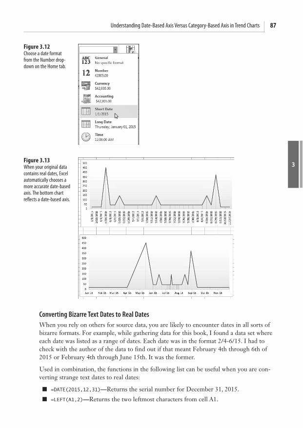
87Understanding Date-Based Axis Versus Category-Based Axis in Trend Charts
3
Converting Bizarre Text Dates to Real Dates When you rely on others for source data, you are likely to encounter dates in all sorts of bizarre formats. For example, while gathering data for this book, I found a data set where each date was listed as a range of dates. Each date was in the format 2/4-6/15. I had to check with the author of the data to find out if that meant February 4th through 6th of 2015 or February 4th through June 15th. It was the former.
Used in combination, the functions in the following list can be useful when you are con-verting strange text dates to real dates:
=DATE(2015,12,31) — Returns the serial number for December 31, 2015.
=LEFT(A1,2) — Returns the two leftmost characters from cell A1.
Figure 3.12 Choose a date format from the Number drop-down on the Home tab.
Figure 3.13 When your original data contains real dates, Excel automatically chooses a more accurate date-based axis. The bottom chart reflects a date-based axis.

3
Chapter 3 Creating Charts That Show Trends88
=RIGHT(A1,2) — Returns the two rightmost characters from cell A1.
=MID(A1,3,2) — Returns the third and fourth characters from cell A2. You read the function as “return the middle characters from A1, starting at character position 3, for a length of 2.”
=FIND("/",A1) — Finds the position number of the first slash within A1.
Follow these steps to convert the text date ranges shown in Figure 3.14 to real dates:
1. Because the year is always the two rightmost characters in column A, enter the formula =RIGHT(A2,2)+2000 in cell B2.
2. Because the month is the leftmost one or two characters in column A, ask Excel to find the first slash and then return the characters to the left of the slash. Enter =FIND(“/”,A2) to indicate that the slash is in second character position. Use =LEFT(A2,FIND("/",A2)-1) to get the proper month number.
3. For the day, either choose to extract the first or last date of the range. To extract the first date, ask for the middle characters, starting one position after the slash. The logic to figure out whether you need one or two characters is a bit more complicated. Find the position of the dash, subtract the position of the slash, and then subtract 1. To see the formula in action, select the cell and choose Formulas, Evaluate Formula, and click Evaluate 10 times. Use this formula in cell D2: =MID(A2,FIND("/",A2)+1,FIND("-",A2)-FIND("/",A2)-1)
4. Use the DATE function as follows in cell E2 to produce an actual date: =DATE(B2,C2,D2)
Plotting Data by Numeric Year If you are plotting data where the only identifier is a numeric year, Excel does not auto-matically recognize this field as a date field.
Figure 3.14 A mix of LEFT , RIGHT , MID , and FIND func-tions parse this text to be used in the DATE function.

89Understanding Date-Based Axis Versus Category-Based Axis in Trend Charts
3
For example, in Figure 3.15 data are plotted once a decade for the past 50 years and then yearly for the past decade. Column A contains four-digit years, such as 1960, 1970, and so on. The default chart shown in the top of the figure does not create a date-based axis. You know this to be true because the distance from 1960 to 1970 is the same as the distance from 2000 to 2001.
Listed here are two solutions to this problem:
Convert the years in column A to dates by using =DATE (A2,12,31) . Format the result-ing value with a yyyy custom number format. Excel displays 2015 but actually stores the serial number for December 31, 2015.
Convert the horizontal axis to a date-based axis. Excel thinks your chart is plotting daily dates from May 13, 1905, through July 2, 1905. Because no date format has been applied to the cells, they show up as the serial numbers 1955 through 2005. Excel dis-plays the chart properly, even though the settings show that the base units are days.
Using Dates Before 1900 In Excel 2013, dates from January 1, 1900 through December 31, 9999 are recognized as valid dates. However, if your company was founded more than a demisesquicentennial before Microsoft was founded, you will potentially have company history going back before 1900.
Figure 3.15 Excel does not recognize years as dates.

3
Chapter 3 Creating Charts That Show Trends90
Figure 3.16 shows a data set stretching from 1787 through 1959. The accompanying chart would lead the reader to believe that the number of states in the United States grew at a constant rate. This inaccurate statement would cause Mr. Kessel, my eighth-grade geogra-phy teacher, to give me an F for this book.
As mentioned previously, formatting the chart to have a date-based axis will not work because Excel does not recognize dates before 1900 as valid dates. Possible workarounds are discussed in the next two subsections.
Using Date-Based Axis with Dates Before 1900 In Figure 3.17 , the dates in Column A are text dates from the 1800s. Excel cannot automat-ically deal with dates from the 1800s, but it can deal with dates from the 1900s.
One solution is to transform the dates to dates in the valid range of dates that Excel can recognize. You can use a date format with two years and a good title on the chart to explain that the dates are from the 1800s. However, keep in mind that this solution fails when you are trying to display more than 100 years of data points.
Figure 3.16 Dates from before 1900 are not valid Excel dates. A date-based axis is not possible in this case.
Figure 3.17 Transforming the 1800s dates to 1900s dates and clever formatting allows Excel to plot this data with a date axis.

91Understanding Date-Based Axis Versus Category-Based Axis in Trend Charts
3
To create the chart in Figure 3.17 , follow these steps:
1. Insert a blank column B to hold the transformed dates.
2. Enter the formula =DATE(100+RIGHT(A4,4),LEFT(A4,2),MID(A4,4,2)) in cell B4. This formula converts the 1836 date to a 1936 date.
3. Select cell B4. Press Ctrl+1 to open the Format Cells dialog. Select the date format 3/14/01 from the Date category on the Number tab. This formats the 1936 date as 6/15/36. Later, you will add a title to indicate that the dates in this column are from the 1800s.
4. Double-click the fill handle in cell B4 to copy the formula down to all cells.
5. Select the range B3:C17.
6. From the Insert tab, open the Line Chart drop-down and choose the first line chart icon.
7. Double-click the vertical axis along the left side of the chart to display the Format Axis task pane.
8. In the task pane, click the Chart icon.
9. For the Minimum value, type a value of 20.
10. Click the dates in the horizontal axis in the chart. Excel automatically switches to for-matting the horizontal axis, and the settings in the Format task pane redraw to show the settings for the horizontal axis. In the Axis Type section, select Date Axis.
11. From the Plus icon to the right of the chart, hover over Chart Title and then click the arrowhead that appears. Select Centered Overlay Title.
12. Click the State Count title. Type the new title Westward Expansion<enter>During 1845-1875 Added 13<enter>New States to the Union . Click outside the title to exit Text Edit mode.
13. Click the title once. You should have a solid selection rectangle around the title. On the Home tab, click the Decrease Font Size button. Click the Left Align button.
14. Carefully click the border of the title. Drag it so the title appears in the top-left corner of the chart.
15. Select the dates in B4:B17. Press Ctrl+1 to access the Format Cells dialog. On the Number tab, click the Custom category. Type the custom number format 'yy . This changes the values shown along the horizontal axis from m/d/yy format to show a two-digit year preceded by an apostrophe.
The result is the chart shown in Figure 3.17 . The reader might believe that the chart is showing dates in the 1800s, but Excel is actually showing dates in the 1900s.
Rolling Daily Dates to Months Using a Pivot Chart Suppose that you have daily data that you would like to summarize by month. You might think that you can use the Units drop-downs in the Format Axis task pane, under the Chart icon, Axis Options to solve the problem. Here you’ll see three settings:

3
Chapter 3 Creating Charts That Show Trends92
Major Units: N Days/Months/Years
Minor Units: N Days/Months/Years
Base: Days/Months/Years
In the first two bullet points, N is the number entered in the text box.
The Major Units setting is useful for controlling the labels along the date axis. The top-left chart in Figure 3.18 is plotting one point per day, but the labels are readable because the Major unit is set to 1 month instead of 1 day.
The lower-left chart is also using a Base of Days, but the Major Unit is 2 Months. Using the Number category at the bottom of the task pane, adjust the date format to mmm and you get month abbreviations instead of individual dates.
If you attempt to change the Base field from Days to Months, the result is not a summary by month, as you might have expected. The-top right chart is a Line with Markers chart where the Line is set to No Line so you can see the points. By rolling the Base field to Months, Excel plots all the points that occurred in January in a single column. This might be interesting for showing the range of daily sales, even perhaps the distribution of daily sales. But it is not a method for summarizing the daily dates.
Excel can roll the daily dates up and summarize by month, but you need to start with a pivot chart instead of a regular chart. Pivot charts are covered in detail in Chapter 8 , “Creating PivotCharts and Power View Dashboards.” Here are the steps to create the bottom-right chart in Figure 3.18 .
1. Select the range of sales by date.
2. Choose Insert, PivotChart.
Figure 3.18 The settings in the Format Axis task pane control the axis labels, but cannot summarize by months.

93Understanding Date-Based Axis Versus Category-Based Axis in Trend Charts
3
3. The Create PivotChart dialog will offer to create the chart on a New Worksheet. Because a pivot chart includes an associated summary pivot table, it is best to build the chart on a new worksheet and then move the chart when it is done. Accept the default settings in the Create PivotChart dialog and click OK.
4. A new worksheet is inserted to the left of the old worksheet. A PivotTable Fields task pane appears with a list of field. Check both the Date and Sales field. You end with a table of daily dates, identical to what you started with.
5. In the Excel worksheet, choose a cell in the new table that contains a date. The ribbon changes to show a tab called PivotTable Tools Analyze. The third group in this ribbon tab is called Group. Choices there include Group Selection and Group Field. Be sure that you have a date cell selected and choose Group Field. Excel displays the Grouping dialog box. You can see this dialog in the inset of the bottom-right chart of Figure 3.18 .
6. Select Months (or Quarters) from the Grouping dialog. If your data spans more than one year, be sure to include years. To group by Week, choose only Days and then use the Number of Days spin button to go to seven-day periods. Click OK.
The pivot table and pivot chart changes to show one column per month instead of daily dates. You can use normal chart formatting to customize the chart. After the chart is format-ted, right-click the chart and choose Move Chart to move to the desired worksheet.
Using a Workaround to Display a Time-Scale Axis The developers who create Microsoft Excel are careful in the Format Axis dialog box to call the option a date axis. However, the technical writers who write Excel Help refer to a time-scale axis. The developers get a point here for accuracy, because Excel absolutely cannot natively handle an axis that is based on time.
A worksheet in the download files is used to analyze queuing times. In the first column, it logs the time that customers entered a busy bank. Times range from when the bank opened at 10:00 a.m. until the bank closed at 4:00 p.m.
Based on the staffing level and the number of customers in the bank, further calculations determine when the customer will move from the queue to an open teller window and when the customer will leave the window, based on an average of three minutes per transac-tion.
A summary range records the number of people in the bank every time someone enters or leaves. This data is definitely not spaced equally. Only a few customers arrive in the 10:00 hour, whereas many customers enter the bank during the lunch hour.
The top chart in Figure 3.19 plots the number of customers on a text-based axis. Because each customer arrival or departure merits a new point, the one hour from noon until 1:00 p.m. takes up 41 percent of the horizontal width of the chart. In reality, this one-hour period merits only 16% of the chart. This sounds like a perfect use for a time-series axis, right? Read on for the answer.

3
Chapter 3 Creating Charts That Show Trends94
The bottom chart is an identical chart where the axis is converted to show the data on a date-based axis. This is a complete disaster. In a date-based axis, all time information is dis-carded. The entire set of 300 points is plotted in a single vertical line.
The solution to this problem involves converting the hours to a different time scale (similar to the 1800s date example in the preceding section). For example, perhaps each hour could be represented by a single year. Using numbers from a 24-hour clock, the 10:00 hour could be represented by 2010 and the 3:00 hour could be represented by 2015.
In this example, you manipulate the labels along the vertical axis using a clever custom number format. A few new settings on the Format Axis dialog ensure that an axis label appears every hour.
Follow these steps to create a chart that appears to have a time-based axis:
1. In cell L2, enter the following formula to translate the time to a date:
=ROUND(DATE(HOUR(I2)+2000,1,1)+MINUTE(I2)/60*365,0)
Because each hour represents a single year, the years argument of the DATE function is =HOUR(I2)+2000 . This returns values from 2010 through 2015. The month and day arguments in the date function are 1 and 1 to return January 1 of the year. Outside the date function, the minute of the time cell is scaled up to show a value from 1 to 365, using MINUTE(I2)/60*365 . The entire formula is rounded to the nearest integer because Excel would normally ignore any time values.
Figure 3.19 Excel cannot show a time-series axis that contains times.

95Understanding Date-Based Axis Versus Category-Based Axis in Trend Charts
3
2. With cell L2 selected, press Ctrl+1 to display the Format Cells dialog. On the Number tab, choose the Custom category. In the Type box, enter yy“:00”. This format displays the year of the date with two digits. Hence, all dates in 2010 display as “10”. Excel appends whatever is in quotes after the year. Because you’ve put :00 after the year, a date in 2010 displays as 10:00. A date in 2015 displays as 15:00. It is up to you to con-vince your manager that you have to use the 24-hour clock.
3. Select cell L2. Double-click the fill handle to copy this formula down to all the data points. The result of this formula ranges from January 1, 2010, which represents the customer who walked in at 10:00 a.m., to 12/25/2015, which represents the customer who walked in at 3:57 p.m. However, thanks to the formatting in step 2, you have a series of cells that all display 10:00, then more cells that display 11:00, and so on.
4. Select cells L1:M303.
5. From the Insert tab, select Recommended Charts, OK. The resulting chart is almost perfect. The only glitch: Each “hour” along the bottom axis appears three times.
6. Double-click the labels along the horizontal axis to display the Format Axis task pane. Choose the Chart icon and then expand the Axis Options category. You see the Major Unit is set to 4 Months. Change the Months to Years. Change the 4 to 1. The chart now displays one label per year, which on the chart looks like one label per hour.
As you see in Figure 3.20 , the chart now allocates one-sixth of the horizontal axis to each hour. This is an improvement in accuracy over either of the charts in Figure 3.19 . The additional chart in Figure 3.20 uses a similar methodology to show the wait time for each customer who enters the bank. If my bank offered 12-minute wait times, I would be finding a new bank.
Figure 3.20 These charts show the number of customers in the bank and their expected wait times.

3
Chapter 3 Creating Charts That Show Trends96
Communicate Effectively with Charts A long time ago, a McKinsey & Company team investigated opportunities for growth at the company where I was employed. I was chosen to be part of the team because I knew how to get the data out of the mainframe.
The consultants at McKinsey & Company knew how to make great charts. Every sheet of grid paper was turned sideways, and a pencil was used to create a landscape chart that was an awesome communication tool. After drawing the charts by hand, they sent off the charts to someone in the home office who generated the charts on a computer. This was a great technique. Long before touching Excel, someone figured out what the message should be.
You should do the same thing today. Even if you have data in Excel, before you start to cre-ate a chart, it’s a good idea to analyze the data to see what message you are trying to pres-ent.
The McKinsey & Company group used a couple of simple techniques to always get the point across:
To help the reader interpret a chart, include the message in the title. Instead of using an Excel-generated title such as “Sales,” you can use a two- or three-line title, such as “Sales have grown every quarter except for Q3, when a strike impacted production.”
If the chart is talking about one particular data point, draw that column in a contrast-ing color. For example, all the columns might be white, but the Q3 bar could be black. This draws the reader’s eye to the bar that you are trying to emphasize. If you are pre-senting data onscreen, use red for negative periods and blue or green for positive peri-ods.
The following sections present some Excel trickery that enables you to highlight a certain section of a line chart or a portion of a column chart. In these examples, you spend some time up front in Excel adding formulas to get your data series looking correct before creat-ing the chart.
Using a Long, Meaningful Title to Explain Your Point If you are a data analyst, you are probably more adept at making sense of numbers and trends than the readers of your chart. Rather than hoping the reader discovers your mes-sage, why not add the message to the title of the chart?
If you would like a great book about the theory of creating charts that communicate well, check out
Gene Zelazny’s Say It with Charts Complete Toolkit (McGraw-Hill, 2006, ISBN: 978-0-07-147470-2).
Gene is the chart guru at McKinsey & Company who trained the consultants and taught me the simple
charting rules. Although Say It with Charts doesn’t discuss computer techniques for producing charts,
it does challenge you to think about the best way to present data with charts and includes numerous
examples of excellent charts at work. Visit www.zelazny.com for more information.
TI
P

97Communicate Effectively with Charts
3
Figure 3.21 shows a default chart in Excel. Because this chart contains a single series, the label “Share” from the original data becomes the title.
Follow these steps to create the chart in Figure 3.22 :
1. Select the data for the chart. Use Insert, Recommended Chart, Column Chart, OK.
2. Use the Paintbrush icon. Choose a Chart Style.
3. Click the Plus icon. Put a check next to Data Labels.
4. Click the title in the chart. Click again to put the title in Edit mode.
5. Backspace to remove the current title. Type Market share has improved , press Enter, and type 13 points since 2012 .
6. To format text while in Edit mode, you would have to select all the characters with the mouse. Instead, click the dotted border around the title. When the border becomes solid, you can use the formatting icons on the Home tab to format the title. Alternatively, right-click the title box and use the Mini toolbar to format the title.
7. On the Home tab, select the icon for Align Text Left and then click the Decrease Font Size button until the title looks right.
8. Click the border of the chart title and drag it so the title is in the upper-left corner of the chart.
The result, shown in Figure 3.22 , provides a message to assist the reader of the chart.
Figure 3.21 By default, Excel uses an unimaginative title taken from the heading of the data series.

3
Chapter 3 Creating Charts That Show Trends98
Resizing a Chart Title The first click on a title selects the title object. A solid bounding box appears around the title. At this point, you can use most of the formatting commands on the Home tab to for-mat the title. Click the Increase/Decrease Font Size buttons to change the font of all the characters. Excel automatically resizes the bounding box around the title. If you do not explicitly have carriage returns in the title where you want the lines to be broken, you are likely to experience frustration at this point.
When you have the solid bounding box around the title, carefully right-click the bounding box and select Edit Text. Alternatively, you can left-click a second time inside the bounding box to also put the title in Text Edit mode. Note that the dashed line in the bounding box indicates the title is in Text Edit mode. Using Text Edit mode, you can select specific char-acters in the title and then move the mouse pointer up and to the right to access the mini toolbar and the available formatting commands. You can edit specific characters within the title to create a larger title and a smaller subtitle, as shown in Figure 3.23 .
You cannot move the title when you are in Text Edit mode. To exit Text Edit mode, right-click the title and select Exit Edit Text, or left-click the bounding box around the title.
Figure 3.22 Use the title to tell the reader the point of the chart.
Figure 3.23 By selecting characters in Text Edit mode, you can create a title/subtitle effect.

99Communicate Effectively with Charts
3
When the bounding box is solid, you can click anywhere on the border except the resizing handles and drag to reposition the title.
When you click a chart title to select it, a bounding box with four resizing handles appears. Actually, they are not resizing handles even though they look like it, which means that you do not have explicit control to resize the title. It feels like you should be able to stretch the title horizontally or vertically, as if it were a text box, but you cannot. The only real control you have to make a text box taller is by inserting carriage returns in the title. Keep in mind that you can insert carriage returns only when you are in Text Edit mode.
Deleting the Title and Using a Text Box If you are frustrated that the title cannot be resized, you can delete the title and use a text box for the title instead. The title in Figure 3.24 is actually a text box. Note the eight resiz-ing handles on the text box instead of the four resizing handles that appear around a title. Thanks to all these resizing handles, you can actually stretch the bounding box horizontally or vertically.
To create the text box shown in Figure 3.24 , follow these steps:
1. Click the Plus (+) icon. Uncheck the box next to Chart Title to remove the title. Excel resizes the plot area to fill the space that the title formerly occupied.
2. Select the plot area by clicking some white space inside the plot area. Eight resizing handles now surround the plot area. Drag the top resizing handle down to make room for the title.
3. Make sure the chart is still selected. On the Insert tab, click the Text Box icon.
4. Click and drag inside the chart area to create a text box.
5. Click inside the text box and type a title. Press the Enter key to begin a new line. If you do not press the Enter key, Excel wordwraps and begins a new line when the text reaches the right side of the text box.
6. Select the characters in the text box that make up the main title and use either the mini
Figure 3.24 Instead of a title, this chart uses a text box for additional flexibility.

3
Chapter 3 Creating Charts That Show Trends100
toolbar or the tools on the Home tab to make the title 18 point, bold, and Times New Roman.
7. Select the remaining text that makes up the subtitle in the text box, and use the tools on the Home tab to make the subtitle 12 point, italic, Times New Roman.
Microsoft advertises that all text can easily be made into WordArt. However, when you use the WordArt drop-downs in a title, you are not allowed to use the Transform commands found under Text Effects on the Drawing Tools Format tab. When you use the WordArt menus on a text box, however, all the Transform commands are available (see Figure 3.25 ).
A text box works perfectly because it is resizable, and you can use WordArt Transform com-mands. If you move or resize the chart, the text box moves with the chart and resizes appro-priately.
Highlighting One Column If your chart title is calling out information about a specific data point, you can highlight that point to help focus the reader’s attention on it, as shown in Figure 3.26 . Although the tools on the Design tab do not allow this, you can achieve the effect quickly by using the Format tab.
Figure 3.25 Using a text box instead of a title allows more formatting options.
Figure 3.26 The column for Friday is highlighted in a contrast-ing color, and it is also identified in the title.

101Communicate Effectively with Charts
3
To create the chart in Figure 3.26 , follow these steps:
1. Create a column chart by selecting Column, Clustered Column from the Insert tab.
2. Click any of the columns to select the entire series.
3. On the Format tab, select Shape Fill, White. At this point, the columns are invisible. Invisible bars are great for creating waterfall charts, which is discussed in Chapter 4 , “Creating Charts That Show Differences.” However, in this case, you want to outline the bars.
4. From the Format tab, select Shape Outline, Black. Select Shape Outline, Weight, 1 point. All your columns are now white with black outline.
5. Click the Friday column in the chart. The first click on the series selects the whole series. A second click selects just one data point. If all the columns have handles, click Friday again.
6. From the Format tab, select Shape Fill, Black.
7. Using the Plus icon, turn off Gridlines.
8. Type a title, as shown in Figure 3.26 , pressing Enter after the first line of the title. On the Home tab, change the title font size to 14 point, left aligned.
The result is a chart that calls attention to Friday sales.
Replacing Columns with Arrows Columns shaped like arrows can be used to make a special point. For example, if you have good news to report about consistent growth, you might want to replace the columns in the chart with arrow shapes to further indicate the positive growth.
Follow these steps to convert columns to arrows:
1. Create a column chart showing a single series.
2. In an empty section of the worksheet, insert a new block arrow shape. From the Insert tab, select Shapes, Block Arrows, Up Arrow. Click and drag in the worksheet to draw the arrow.
3. Select the arrow. Press Ctrl+C to copy the arrow to the Clipboard.
4. Select the chart. Click a column to select all the columns in the data series.
5. Press Ctrl+V to paste the arrow. Excel fills the columns with a picture of the block arrow.
6. If desired, select Format Selection from the Format tab. Reduce the gap setting from 150 percent to 75 percent to make the arrows wider.
The new chart is shown in the bottom half of Figure 3.27 . After creating the chart, you can delete the arrow created in step 2 by clicking the arrow and pressing the Delete key.

3
Chapter 3 Creating Charts That Show Trends102
Highlighting a Section of a Chart by Adding a Second Series The chart in Figure 3.28 shows a sales trend over one year. The business was affected by road construction that diverted traffic flow from the main road in front of the business.
The title calls out the July and August time period, but it would be helpful to highlight that section of the chart. Follow these steps to add an area chart series to the chart:
1. Begin a new series in column C, next to the original data. To highlight July and August, add numbers to column C for the July and August points, plus the previous point, June. In cell C7, enter the formula of =B7 . Copy this formula to July and August.
Figure 3.27 Arrows can be used to emphasize the upward growth of sales.
Figure 3.28 Highlight the road con-struction months in the chart to emphasize the title further.

103Communicate Effectively with Charts
3
2. Click a blank area inside the chart. A blue bounding box appears around B2:B13 in the worksheet. Drag the lower-right corner of the blue bounding box to the right to extend the series to include the three values in Column C. Initially, this line shows up as a red line on top of a portion of the existing blue line.
3. On the Layout tab, use the Current Selection drop-down to select Series 2, which is the series you just added.
4. While Series 2 is selected, select Design, Change Chart Type. Select the first area chart thumbnail. Click OK. Excel draws a red area chart beneath the line segment of June through August.
5. On the Format tab, use the Current Selection drop-down to reselect Series 2. Open the Shape Fill drop-down. Choose a fill color. The fourth row, first column offers a ToolTip of White, Background 1, Darker 25% and is suitable.
The top chart in Figure 3.29 shows the highlight extending from the horizontal axis up to the data line for the two line segments. Alternatively, you can replace the numbers in col-umn C with 70,000 to draw a shaded rectangle behind the months, as shown in the bottom chart in Figure 3.29 .
Changing Line Type Midstream Consider the top chart in Figure 3.30 . The title indicates that cash balances improved after a new management team arrived. This chart initially seems to indicate an impressive turn-around. However, if you study the chart axis carefully, you see that the final Q3 and Q4 numbers are labeled Q3F and Q4F to indicate that they are forecast numbers.
Figure 3.29 A second series with only three points is used to highlight a section of the chart.

3
Chapter 3 Creating Charts That Show Trends104
It is misleading to represent forecast numbers as part of the actual results line. It would be ideal if you change the line type at that point to indicate that the last two data points are forecasts. To do so, follow these steps:
1. Change the heading above column B from Cash Balances to Actual.
2. Add the new heading Forecast in column C.
3. Because the last actual data point is for Q2 of 2014, move the numbers for Q3 and Q4 of 2014 from column B to column C.
4. To force Excel to connect the actual and the forecast line, copy the last actual data point (the 7 for Q2) over to the Forecast column. This one data point—the connecting point for the two lines—will be in both the Forecast and Actual columns.
5. Change the last two labels in column A from Q3F to just Q3 and from Q4F to just Q4.
6. Click the existing chart. A bounding box appears around the data in column B. Grab the lower-right blue handle and drag outward to encompass B & C. A second series is added to the chart as a red line.
7. Click the red line. In the Format tab, you should see that the Current Selection drop-down indicates Series “Forecast.”
8. Select Format, Shape Outline, Dashes and then select the second dash option. The red line changes to a dotted line.
9. While the forecast series is selected, select Design, Change Chart Type. Select a chart type that does not have markers.
Figure 3.30 It is not clear in the top chart that the last two points are forecasts.

105Adding an Automatic Trendline to a Chart
3
10. The chart title indicates that a new management team arrived, but it does not indicate when the team arrived. To fix this, change the title to indicate that the team arrived in Q3 of 2014.
11. On the Insert tab, select Shapes, Line. Draw a vertical line between Q2 and Q3 of 2014, holding down the Shift key while drawing to keep the line vertical.
12. While the line is selected, on the Format tab, select Shape Outline, Dashes and then select the fourth dash option to make the vertical line a dashed line. Note that this line is less prominent than the series line because the weight of the line is only 1.25 points.
The final chart is shown at the bottom of Figure 3.30 .
Adding an Automatic Trendline to a Chart In the previous example, an analyst had created a forecast for the next two quarters. However, sometimes you might want to allow Excel to make a prediction based on past results. In these situations, Excel offers a trendline feature in which Excel draws a straight line that fits the existing data points. You can ask Excel to extrapolate the trendline into the future. If your data series contains blank points that represent the future, Excel can auto-matically add the trendline. I regularly use these charts to track my progress toward a goal.
The easiest way to add a trendline is to build a data series that includes all the days that the project is scheduled to run. In Figure 3.31 , column A contains the days of the month and column B contains 125 for each data point. Therefore, Excel draws a straight line across the chart, showing the goal at the end of the project. Column C shows the writing progress I should make each day. In this particular month, I am assuming that I will write an equal number of pages six days per week. Column D, which is labeled Actual, is where I record the daily progress toward the goal.
The chart is created as a line chart with the gridlines and legend removed. The trendline is formatted as a lighter gray. The actual line is formatted as a thick line. The top chart in Figure 3.31 shows the chart before the trendline is complete. Notice that the thick line is not quite above the progress line.
To add a trendline, follow these steps:
1. Right-click the series line for the Actual column. Select Add Trendline. A default lin-ear trendline is added to the chart. The Format Trendline task pane appears. Your choices in the task pane are for trendlines that use Exponential, Linear, Logarithmic, Polynomial, Power, or Moving Average. Leave the choice at Linear for this example.
2. In the Trendline Name section, either leave the name as Linear (Actual) or enter a cus-tom name such as Forecast.

3
Chapter 3 Creating Charts That Show Trends106
3. When forecasting forward or backward for a certain number of periods, leave both of those settings at 0 because this chart already has data points for the entire month. There are also settings where Excel shows the regression equation on the chart. Add this if you desire.
4. Right-click the trendline to select it. On the Format tab, select Shape Outline, Dashes and then select the fourth dash option. Also, select Shape Outline, Weight, 3/4 point.
The trendline is shown at the bottom of Figure 3.31 . In this particular case, the trendline extrapolates that if I continue writing at the normal pace, I will miss the deadline by 15 pages or so.
Excel’s trendline is not an intelligent forecasting system. It merely fits past points to a straight line and extrapolates that data. It works great as a motivational tool. For example, the current example shows that it would take a few days of above-average production before the trendline would project that the goal would be met.
Showing a Trend of Monthly Sales and Year-to-Date Sales In accounting, sales are generally tracked every month. However, in the big picture you are interested in how 12 months add up to produce annual sales.
The top chart in Figure 3.32 is a poor attempt to show both monthly sales and accumulated year-to-date (YTD) sales. The darker bars are the monthly results, whereas the lighter bars
Figure 3.31 In the top chart, the actual line is running behind the target line, but it seems close.
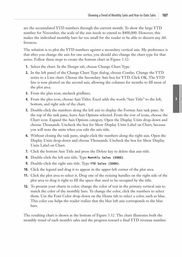
107Showing a Trend of Monthly Sales and Year-to-Date Sales
3
are the accumulated YTD numbers through the current month. To show the large YTD number for November, the scale of the axis needs to extend to $400,000. However, this makes the individual monthly bars far too small for the reader to be able to discern any dif-ferences.
The solution is to plot the YTD numbers against a secondary vertical axis. My preference is that after you change the axis for one series, you should also change the chart type for that series. Follow these steps to create the bottom chart in Figure 3.32 :
1. Select the chart. In the Design tab, choose Change Chart Type.
2. In the left panel of the Change Chart Type dialog, choose Combo. Change the YTD series to a Line chart. Choose the Secondary Axis box for YTD. Click OK. The YTD line is now plotted on the second axis, allowing the columns for months to fill most of the plot area.
3. From the plus icon, uncheck gridlines.
4. From the plus icon, choose Axis Titles. Excel adds the words “Axis Title” to the left, bottom, and right side of the chart.
5. Double-click the numbers along the left axis to display the Format Axis task pane. At the top of the task pane, leave Axis Options selected. From the row of icons, choose the Chart icon. Expand the Axis Options category. Open the Display Units drop-down and choose Thousands. Uncheck the box for Show Display Units Label on Chart, because you will note the units when you edit the axis title.
6. Without closing the task pane, single-click the numbers along the right axis. Open the Display Units drop-down and choose Thousands. Uncheck the box for Show Display Units Label on Chart.
7. Click the bottom Axis Title and press the Delete key to delete that axis title.
8. Double-click the left axis title. Type Monthly Sales ($000) .
9. Double-click the right axis title. Type YTD Sales ($000) .
10. Click the legend and drag it to appear in the upper-left corner of the plot area.
11. Click the plot area to select it. Drag one of the resizing handles on the right side of the plot area to drag it right to fill the space that used to be occupied by the title.
12. To present your charts in color, change the color of text in the primary vertical axis to match the color of the monthly bars. To change the color, click the numbers to select them. Use the Font Color drop-down on the Home tab to select a color, such as blue. This color cue helps the reader realize that the blue left axis corresponds to the blue bars.
The resulting chart is shown at the bottom of Figure 3.32 . The chart illustrates both the monthly trend of each month’s sales and the progress toward a final YTD revenue number.
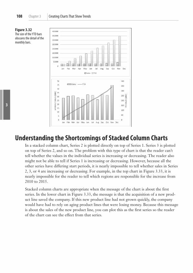
3
Chapter 3 Creating Charts That Show Trends108
Understanding the Shortcomings of Stacked Column Charts In a stacked column chart, Series 2 is plotted directly on top of Series 1. Series 3 is plotted on top of Series 2, and so on. The problem with this type of chart is that the reader can’t tell whether the values in the individual series is increasing or decreasing. The reader also might not be able to tell if Series 1 is increasing or decreasing. However, because all the other series have differing start periods, it is nearly impossible to tell whether sales in Series 2, 3, or 4 are increasing or decreasing. For example, in the top chart in Figure 3.33 , it is nearly impossible for the reader to tell which regions are responsible for the increase from 2010 to 2015.
Stacked column charts are appropriate when the message of the chart is about the first series. In the lower chart in Figure 3.33 , the message is that the acquisition of a new prod-uct line saved the company. If this new product line had not grown quickly, the company would have had to rely on aging product lines that were losing money. Because this message is about the sales of the new product line, you can plot this as the first series so the reader of the chart can see the effect from that series.
Figure 3.32 The size of the YTD bars obscures the detail of the monthly bars.

109Understanding the Shortcomings of Stacked Column Charts
3
Figure 3.33 In the top chart, readers are not able to draw conclusions about the growth of the three regions located at the top of the chart.
The chart in Figure 3.34 uses a combination of a stacked column chart and a line chart. The stacked column chart shows
this year’s sales, broken out into same-store sales and new-store sales. In this case, the same-store sales are plotted as
the first series in white. The new-store sales are the focus and are plotted in black.
The third series, which is plotted as a dotted line chart, shows the prior-year sales. Although the total height of the col-
umn is greater than last year’s sales, some underlying problem exists in the old stores. In many cases, the height of the
white column does not exceed the height of the dotted line, indicating that sales at same store are down. To create this
chart, follow these steps:
1. Set up your data with months in column A, old-store sales for this year in column B, new-store sales for this year in
column C, and last year’s sales in column D.
2. Select cells A1:D13. Choose Insert, Recommended Charts. Click the All Charts tab in the Insert Chart dialog. Choose
Combo chart from the left panel.
3. In the bottom of the Insert Chart dialog, change the Chart Type for Old Stores to Stacked Column. The Chart Type for
New Stores will automatically change as well. Leave Last Year as a Line chart. Do not check Secondary Axis for any
of the charts. Click OK.
4. Use the Format tab to format the third series as a dotted line. Format the colors of the first two series as shown in
Figure 3.34 .
C A S E S T U D Y : U S I N G A S T A C K E D C O L U M N C H A R T T O C O M P A R E C U R R E N T S A L E S T O P R I O R - Y E A R S A L E S

3
Chapter 3 Creating Charts That Show Trends110
Shortcomings of Showing Many Trends on a Single Chart Instead of using a stacked column chart, you might try to show many trendlines on a single line chart, which can be confusing. For example, in the top chart in Figure 3.35 , the sales trends of five companies create a very confusing chart.
If the goal is to compare the sales results of your company against those of each major com-petitor, consider using four individual charts instead, as shown at the bottom of Figure 3.35 . In these charts, the reader can easily see that your company is about to overtake the long-time industry leader MegaCo, but that quick growth from NewCo might still cause you to stay in the second position next year.
Figure 3.34 Current-year sales are shown as a stacked column chart, with last year’s sales as a dotted line.
Figure 3.35 Instead of using a single chart with five confus-ing lines, compare your company to each other competitor in smaller charts.

111
3
Next Steps
Next Steps In Chapter 4 , you discover charts used to make comparisons, including pie, radar, bar, donut, and waterfall charts.

This page intentionally left blank

Symbols #N/A errors, zero values and, 405 - 406
Numbers 2D pie charts, 120
3D charts, 40 - 41
3D column charts, 13 3D pie charts, 120 back walls, 41 column depth, 41 depth, 65 floors, 41 height, 65 perspective, 65 , 401 - 403 rotation, controlling, 65 - 66 side walls, 41 X rotation, 65 Y rotation, 65
3D rotation, surface charts, 168 - 169
10-icon sets, 269 - 271
100% stacked charts, 80
component comparisons, showing, 119 , 126 - 127
thumbnails, 13 1900, dates prior to (date fields), 83 , 89 - 91
Index

418 Accent Process style (SmartArt layouts)
A Accent Process style (SmartArt layouts),
288
Add Chart Element drop-down (Design
tab), 29 , 36
AddChart2 chart creation method,
346 - 348
Alexander, Mike, 413
all caps, titling charts in, 59 - 60
Alt+F1 key combination, creating charts,
15
analysis elements, 39 - 40
drop lines, 40 error bars, 40 trendlines, 40 up/down bars, 40
animating scatter charts via Power View,
245 - 246
Annual Reports, showing years in reverse,
53
An-Sofie Guilbert blog, 414
area charts, 69 , 79
arrows
columns, replacing with arrows, 101 - 102
upward arrows, illustrating growth by, 304
art
charts, exporting as, 331 - 332 , 389 - 390 PowerPoint, copying charts as pic-
tures, 325 - 326 Shapes, 287
converting SmartArt to, 314 - 315 creating, 311 - 312 displaying cell contents, 309 - 311 formatting, 311 Freeform Shapes, 311 - 312
SmartArt, 287 , 288 , 308 - 309 adding art to, 298 - 299
applying styles, 293 balance charts, 304 Basic Cycle layouts, 305 changing color in, 292 - 293 changing Shapes, 295 - 296 changing styles, 293 - 294 choosing layouts, 302 - 303 controlling Shapes from Text
pane, 296 - 298 converting to Shapes, 314 - 315 Cycle category, 289 - 290 Design tab, 294 Divergent Radial layouts, 305 elements in, 289 Equation style, 302 formatting in, 288 , 294 - 296 funnel charts, 302 gear charts, 302 Hierarchy category, 290 inserting, 291 - 292 labeled Hierarchy charts, 307 - 308 Leveraging SmartArt Graphics in the
2007 Microsoft Office System , 303, 308
limitations of, 301 - 302 List category, 289 Matrix category, 290 , 302 Office.com category, 290 organizational charts and, 299 - 301 Picture category, 290 Process category, 289 Pyramid category, 290 , 302 Relationship category, 290 , 302 styles of layouts, 288 - 289 Table List layouts, 306 upward arrows, 304 Venn diagrams, 306 - 307
WordArt, 287 - 288 , 312 - 313
419cells
art lying by stretching pictographs ,
409-410
Attiliis, Andy, 415
automatic trendlines, adding to charts,
105 - 106
axes, 37 - 39
Category axis, 52 category-based axes, 80 - 95 date-based axes, 54 , 80 - 95 depth axis, 168 formatting, 47 - 55 Horizontal (category) axis, 39 Horizontal Axis title, 38 Logarithmic axis, 50 - 52 monthly charts, 54 - 55 sparklines, 254 - 256 text-based axes, 54 time-based axes, 81 time-scale axes, 93 - 95 Values axis, 48 - 50 Vertical (value) axis, 39 Vertical Axis title, 38 Y-axis scale, 143 - 144 years, showing in reverse (Annual
Reports), 53
B back walls (3D charts), 41
backwards compatibility, coding and, 341
bad chart types, 10 - 9
balance charts, 304
bar charts, 79 , 80
in-cell bar charts, 259 - 263 comparisons, illustrating, 113 - 117 ,
115 - 116 data series, 368 - 369 gap width, formatting, 368 - 369 paired bar charts, 161 - 163
subdividing bars for emphasis, 116 - 117
bar of pie charts, 120 , 371 - 374
customizing splits in, 134 using, 134 - 135
Basic Cycle layouts (SmartArt), 305
Basic Process style (SmartArt layouts), 288
Beautiful Evidence , 249, 257, 395, 412
benchmark charts, 219 - 220
Bing maps, 275
bins, creating for frequency charts,
383 - 386
blank series, moving series with (stacked
and clustered charts), 139 - 143
blogs (web resources), 413 - 414
bubble charts, 15 , 147 , 159 - 160 , 375 - 377
bullet charts, 212 - 217
Bunzel, Tom, 413
C callouts (data labels), 8 - 9
candlestick charts, 173
color, changing in, 191 - 192 columns, rearranging downloaded
data in, 175 creating, 191 - 196
caps (capital letters), titling charts in,
59 - 60
categories, reversing, 24 - 25
Category axis, controlling labels, 52
category-based axes, trend charts, 80 - 95
cells
in-cell bar charts, creating via data bars, 259 - 263
cell formulas as data label captions, 356 - 358
charts creating from conditional format-
ting in cells, 271 - 273

420 cells
fitting into cells via sparklines, 250 - 259
contents, displaying via Shapes, 309 - 311
data bars creating in-cell bar charts, 259 - 263 showing for subsets of cells,
262 - 263 icon sets, showing icons only for best
cells, 268 - 269 Change Chart Type (Design tab), 31
Change Color drop-down (Design tab), 31
Chart area, 37 - 38 , 61 - 64
Chart Elements, 26
Add Chart Element drop-down (Design tab), 29
Format Task Pane, icons available per Chart Element table, 30
Chart Filters, 26
chart objects, referencing charts in (VBA
coding), 342
Chart Styles, 26 , 31
Chart title, 38
charting tutorial websites, 413
Charts menu, Quick Analysis icon
creating charts, 10 - 11 previewing charts, 11
closing prices (stocks), showing with line
charts, 177 - 181
clustered charts
creating, 138 - 145 thumbnails, 13
clustered columns, combining with
stacked columns, 138 - 139
Code window (VBA Editor), 335
coding
backwards compatibility, 341 chart objects, referencing, 342
charts referencing, 342 specifying built-in charts, 342 - 344 specifying chart location, 343 specifying chart size, 343
comments, adding to code, 341 data ranges, 337 - 338 End With statements, 340 End+Down Arrow versus End+Up
Arrow, 338 lines of code, continuing, 340 objects
object-oriented coding, 336 - 337 referring to, 340
With statements, 340 super-variables, 339 - 340 VBA coding
AddChart2 chart creation method, 346 - 348
applying chart color, 352 - 355 bar of pie charts, 371 - 374 changing chart fills, 363 - 366 combo charts, 378 - 381 creating bins for frequency charts,
383 - 386 customizing charts, 350 data bars, 392 - 395 Excel 2003-2013 chart creation
method, 349 - 350 Excel 2007-2013 chart creation
method, 348 - 349 exploding round charts, 369 - 371 exporting charts as graphics,
389 - 390 filtering charts, 355 - 356 Format method, 363 - 367 formatting charts, 351 - 358 formatting data series, 367 - 368 formatting data series separations,
368 - 369

421component decomposition, displaying with waterfall charts
formatting gap width, 368 - 369 formatting line settings, 366 - 367 OHLC charts, 382 - 383 pie of pie charts, 371 - 374 pivot charts, 390 - 392 radar charts, 377 referring to specific charts,
343 - 346 SetElement method, 358 - 363 setting bubble size in bubble
charts, 375 - 377 sparklines, 395 - 399 specifying chart styles, 351 - 352 specifying chart titles, 350 - 351 spinning round charts, 369 - 371 stacked area charts, 386 - 389 surface charts, 377
color, 125 - 126
candlestick charts, changing in, 191 - 192
Change Color drop-down (Design tab), 31
color scales, 249 customizing, 264 - 265 showing extremes via, 263 - 265
gradients, Plot area, 61 - 63 highlighting slices in pie charts,
125 - 126 Power View maps, 285 - 284 SmartArt, changing color in, 292 - 293 themes, changing in, 74 VBA coding, applying via, 352 - 355
column charts, data sets up to 12 time
periods, 77
columns
arrows, replacing with, 101 - 102 clustered charts
combining with stacked column charts, 138 - 139
narrowing, 143 data series, formatting separations,
368 - 369 depth (3D charts), 41 floating columns, 200 - 202 gap width, formatting, 368 - 369 highlighting, 100 - 101 sparkcolumns, 250 stacked column charts, 108 - 110
combining with clustered columns, 138 - 139
narrowing, 143 stock charts
adjusted close columns, 175 - 177 rearranging downloaded data in
columns, 174 - 175 combining chart types in a single chart,
197 - 199
combo charts, 8 - 9
creating, 378 - 381 magnitude (order of), charting, 23 monthly sales trend charts, creating,
106 - 108 year-to-date sales charts, creating,
106 - 108 comments, adding to code, 341
communicating effectively with charts,
96 - 105
company relationships, illustrating via
SmartArt, 305
comparisons
bar charts, illustrating with, 113 - 117 , 115 - 116
component comparisons, showing, 117 - 135
compatibility (backwards), coding and,
341
component decomposition, displaying
with waterfall charts, 136 - 145
422 con/pro decisions, illustrating via balance charts
con/pro decisions, illustrating via balance
charts, 304
contrasting components with surface
charts, 167 - 169
converting
charts to PDF, 332 XPS, 332
Power View tables to charts, 238 - 239 SmartArt to Shapes, 314 - 315
copying/pasting
charts creating from pasted Excel data in
PowerPoint, 327 - 328 as pictures in PowerPoint, 325 - 326
sparklines, 259 copying/pasting Excel documents to
PowerPoint , 319-328
correlations, testing in scatter charts,
157 - 158
current sales to prior-year sales compari-
son charts, 110
Current Selection drop-down (Format tab),
formatting chart elements, 36
customizing
charts, VBA coding, 350 color scales, 264 - 265 data bars, 261 - 262 high-low-close charts, 183 - 184 sparklines, 253 - 254
cutting/pasting rows, 33
Cycle category (SmartArt), 289 - 290
D daily dates, rolling to months, 91 - 93
Daily Dose of Excel blog, 414
Daily Giz Wiz podcast, 118
D'Amico, Bob, 414 - 415
dashboard elements, Power View, 238
Dashboard Reporting with Excel, 415
data bars, 249
in-cell bar charts, creating, 259 - 263 creating, 260 - 261 , 392 - 395 customizing, 261 - 262 gradients, 259 negative values, 260 numeric values
formatting, 260 hiding, 260
scale, specifying, 260 showing for subsets of cells, 262 - 263 text in, 260 zero values, 260
Data group icons (Design tab), 31
data labels, 38
callouts (data labels), 8 - 9 cell formulas as data label captions,
356 - 358 charts
adding data labels to, 43 - 46 fitting in, 45 - 46
content of, changing, 45 gridlines, correcting data labels
crossed out by, 44 data markers (series), replacing with
pictures, 73 - 74 Shapes, 73
data points (series)
formatting, 73 trends, asserting from two data points,
407 data sequence, changing with Select Data
icon, 25
data series separations (columns/bar
charts), formatting, 368 - 369
data sets
charts, locating in, 34 unsummarized data sets, 7

423dragging
data tables, 38 - 39 , 46 - 47
data visualizations, 249
color scales, 249 customizing, 264 - 265 showing extremes via, 263 - 265
data bars, 249 in-cell bar charts, 259 - 263 creating, 260 - 261 customizing, 261 - 262 formatting numeric values, 260 gradients, 259 hiding numeric values, 260 negative values, 260 showing for subsets of cells,
262 - 263 specifying scale, 260 text in, 260 zero values, 260
icon sets, 249 10-icon sets, 269 - 271 five-icon sets, 265 four-icon sets, 265 moving numbers closer to icons,
266 - 268 reversing sequence of icons, 268 setting up, 265 - 266 showing icons only for best cells,
268 - 269 three-icon sets, 265
date fields
dates prior to 1900, 83 , 89 - 91 dates represented by numeric years,
81 - 83 dates that are really time, 83 text dates, 81 , 83 - 84
date lookup tables, PowerPivot, 234 - 235
date systems, comparing, 85
date-based axes, 54 , 80 - 95
Debartolo, Dick, 118
decomposition (components), displaying
with waterfall charts , 136-137
Decrease Font Size icon (Home tab), 31
deleting titles, 99 - 100
delta charts, 220 - 221
departments within companies, illustrat-
ing via SmartArt, 306
depth (3D charts), 65
depth axis, surface charts, 168
Design tab (Excel 2013)
Add Chart Element drop-down, 29 , 36
Change Chart Type, 31 Change Color drop-down, 31 Chart Styles Gallery, 31 Data group icons, 31 Move Chart, 31 Quick Layout drop-down, 29 - 30
Design tab (SmartArt), 294
designer websites, 414 - 415
detail, showing via sparklines, 256 - 257
Developer tab, enabling, 334
displaying
cell contents via Shapes, 309 - 311 gridlines, 55 time-scale axes, 93 - 95
Divergent Radial layouts (SmartArt), 305
doughnut charts, 120 , 127 - 128
component comparisons, 119 exploding, 369 - 371 spinning, 369 - 371
down/up bars, adding to line charts, 70
dragging
charts outside visible window, 33 in visible window, 33

424 dragging
Power View elements, creating by, 240
drawing with scatter charts, 155 - 156
drop lines, 40 , 69
E editing, chart titles, 16
elements
analysis elements, 39 - 40 axes, 37 - 39
changing scale of Values axis, 48 - 50
controlling labels on Category axis, 52
date-based axes, 54 formatting, 47 - 55 labeling monthly charts with
JFMAMJJASOND, 54 - 55 Logarithmic axis, 50 - 52 showing years in reverse (Annual
Reports), 53 text-based axes, 54
back walls (3D charts), 41 Chart area, 37 - 38 , 61 - 64 Chart title, 38 column depth (3D charts), 41 data labels, 38
adding to charts, 43 - 46 changing content of, 45 correcting data labels crossed out
by gridlines, 44 fitting in charts, 45 - 46
data tables, 38 - 39 , 46 - 47 drop lines, 40 , 69 error bars, 40 , 71 - 72 floors (3D charts), 41 formatting, 41 - 72
accessing formatting tools, 35 - 36
Add Chart Element drop-down (Design tab), 36
Current Selection drop-down (Format tab), 36
Format Task Pane, 36 Plus icon, 35
gridlines, 39 creating unobtrusive gridlines,
56 - 57 displaying, 55 major gridlines, 55 - 56 , 57 - 58 minor gridlines, 55 - 56
Horizontal (category) axis, 39 Horizontal Axis title, 38 labels, 37 - 39 legends, 38
formatting, 43 moving, 41 - 42 rearranging, 42
Plot area, 38 adding pictures to, 64 formatting, 61 - 64 gradients, 61 - 63 textures, 64
series formatting, 72 - 74 replacing data markers with pic-
tures, 73 - 74 replacing data markers with
Shapes, 73 time comparisons, 115 - 116
side walls (3D charts), 41 SmartArt common elements, 289 trendlines, 40
adding equations to charts, 68 automatic trendlines, 105 - 106 exponential trendlines, 68 forecasting with, 66 - 69

425formatting
formatting, 67 - 68 logarithm trendlines, 68 - 69 moving average trendlines, 69 multiple trendlines on single chart,
110 polynomial trendlines, 69 power trendlines, 69
types of elements table, 37 - 36 up/down bars, 40 , 70 Vertical (value) axis, 39 Vertical Axis title, 38
embedding charts/workbooks in
PowerPoint, 325
emphasis, subdividing bars in bar charts
for, 116 - 117
End With statements, 340
End+Down Arrow versus End+Up Arrow,
338
enlarging sparklines, 256 - 257
Envisioning Information , 412
Equation style (SmartArt), 302
error bars, 40 , 71 - 72
Excel 2003-2013 chart creation method,
349 - 350
Excel 2007-2013 chart creation method,
348 - 349
Excel 2013
cell formulas as data label captions, 356 - 358
charts AddChart2 chart creation method,
346 - 348 filtering, 355 - 356 improvements to charts, 2 - 3
data labels, cell formulas as data label captions, 356 - 358
Developer tab, enabling, 334 new features of, 7 - 9
exploding
doughnut charts, 369 - 371 pie charts, 369 - 371 slices in pie charts, 124
exponential trendlines, 68
exporting, charts as graphics via VBA,
331 - 332 , 389 - 390
extremes, showing via color scales,
263 - 265
F Facebook, chart presentations and, 329
Few, Stephen, 414
fills, changing (VBA coding), 363 - 366
Filter pane (Power View), 242
filtering
Chart Filters, 26 charts in Excel 2013, 355 - 356 data
pivot charts, 230 - 231 tile boxes (Power View), 243 - 244
unwanted rows, 8 finance.yahoo.com website, 171 , 173 , 180
floating columns/bars, 200 - 202
floors (3D charts), 41
fonts
Decrease Font Size icon (Home tab), 31
Font group (Home tab), 31 forecasting, trendlines and, 66 - 69
formatting, 36
Chart area, 61 - 64 charts
changing fills, 363 - 366 data series, 367 - 368 Format method (VBA), 363 - 367 line settings, 366 - 367 VBA coding, 351 - 358
426 formatting
conditional formatting, creating charts, 271 - 273
data in PowerPivot, 235 - 236 data series, 367 - 368 elements, 41 - 72
accessing formatting tools, 35 - 36 Add Chart Element drop-down
(Design tab), 36 Current Selection drop-down
(Format tab), 36 Format Task Pane, 36 Plus icon, 35
Format method (VBA), 363 - 367 Format tab, 31 , 36 Format Task Pane, 27 - 30
formatting chart elements, 36 icons available per Chart Element
table, 30 icons table, 29
legends, 43 line charts
drop lines, 69 up/down bars, 70
numeric values data bars, 260 formatting in labels, 7 - 8
Paintbrush icon, 8 Plot area, 61 - 64 series, 72 - 74 Shapes, 311 SmartArt Format tab, 288 , 294 - 296 task pane commands, 9 - 8 templates, saving changes in, 75 themes, changing color, 74 trendlines, 67 - 68
Formula bar, editing titles, 16
Freeform Shapes, 311 - 312
frequency charts, 163 - 166 , 383 - 386
funnel charts, SmartArt and, 302
Funnel icon, 8 , 26
further reading
Beautiful Evidence , 412 Envisioning Information , 412 Visual Explanations: Images
and Quantities, Evidence and Narrative , 412
G gap width (columns/bar charts), format-
ting, 368 - 369
gear charts, SmartArt and, 302
Gemignani, Chris, 413 - 414
Gemignani, Zach, 413 - 414
GeoFlow mapping software, 275
creating maps, 284 - 286 zoom feature, 285
gradients, Plot area, 61 - 63
graphics, 288 , 289 , 302
exporting charts as, 331 - 332 , 389 - 390 PowerPoint, copying charts as graph-
ics, 325 - 326 Shapes, 287
converting SmartArt to, 314 - 315 creating, 311 - 312 displaying cell contents, 309 - 311 formatting, 311 Freeform Shapes, 311 - 312
SmartArt, 287 , 288 , 308 - 309 adding graphics to, 298 - 299 applying styles, 293 balance charts, 304 Basic Cycle layouts, 305 changing color in, 292 - 293 changing Shapes, 295 - 296

427high-low-close charts
changing styles, 293 - 294 choosing layouts, 302 - 303 controlling Shapes from Text
pane, 296 - 298 converting to Shapes, 314 - 315 Cycle category, 289 - 290 Design tab, 294 Divergent Radial layouts, 305 elements in, 289 Equation style, 302 formatting in, 288 , 294 - 296 funnel charts, 302 gear charts, 302 Hierarchy category, 290 inserting, 291 - 292 labeled Hierarchy charts, 307 - 308 Leveraging SmartArt Graphics in
the 2007 Microsoft Office System , 303, 308
limitations of, 301 - 302 List category, 289 Matrix category, 290 , 302 Office.com category, 290 organizational charts and, 299 - 301 Picture category, 290 Process category, 289 Pyramid category, 290 , 302 Relationship category, 290 , 302 styles of layouts, 288 - 289 Table List layouts, 306 upward arrows, 304 Venn diagrams, 306 - 307
WordArt, 287 - 288 , 312 - 313 graphics lying by stretching pictographs ,
409-410
gridlines, 39
data labels, correcting, 44 displaying, 55
major gridlines, 55 - 58 minor gridlines, 55 - 58 unobtrusive gridlines, creating, 56 - 57
grouping daily dates in pivot charts,
228 - 230
growth, illustrating by upward arrows, 304
guidelines (arbitrary), XY series and,
202 - 206
H height (3D charts), 65
help
charting tutorial websites, 413 Dashboard Reporting with Excel, 415 interactive training, 413 live training, 413 Speedometer Chart Creator, 415 web resources, 411 Xcelsius, 415
Helper icons
Funnel icon, 26 Paintbrush icon, 26 Plus icon, 26
Hierarchy category (SmartArt), 290
Hierarchy charts, labels and, 307 - 308
highlighting
columns, 100 - 101 sections of charts by adding second
series, 102 - 103 slices in pie charts
color, 125 - 126 exploding, 124
high-low lines, 192 - 196
high-low-close charts, 79
columns, rearranging downloaded data in, 175

428 high-low-close charts
creating, 182 - 183 customizing, 183 - 184 volume, adding, 186 - 190
Home tab
commands, 31 Decrease Font Size icon, 31 Font group, 31
Horizontal (category) axis, 39
Horizontal Axis title, 38
Horizontal Multiples (Power View),
244 - 245
I icon sets, 249
10-icon sets, 269 - 271 five-icon sets, 265 four-icon sets, 265 moving numbers closer to icons,
266 - 268 reversing sequence of icons, 268 setting up, 265 - 266 showing icons only for best cells,
268 - 269 three-icon sets, 265
images
exporting charts as, 331 - 332 , 389 - 390 PowerPoint, copying charts as pic-
tures, 325 - 326 Shapes, 287
converting SmartArt to, 314 - 315 creating, 311 - 312 displaying cell contents, 309 - 311 formatting, 311 Freeform Shapes, 311 - 312
SmartArt, 287 - 288 , 308 - 309 adding images to, 298 - 299 applying styles, 293 balance charts, 304
Basic Cycle layouts, 305 changing color in, 292 - 293 changing Shapes, 295 - 296 changing styles, 293 - 294 choosing layouts, 302 - 303 controlling Shapes from Text
pane, 296 - 298 converting to Shapes, 314 - 315 Cycle category, 289 - 290 Design tab, 294 Divergent Radial layouts, 305 elements in, 289 Equation style, 302 formatting in, 288 , 294 - 296 funnel charts, 302 gear charts, 302 Hierarchy category, 290 inserting, 291 - 292 labeled Hierarchy charts, 307 - 308 Leveraging SmartArt Graphics in the
2007 Microsoft Office System , 303, 308
limitations of, 301 - 302 List category, 289 Matrix category, 290 , 302 Office.com category, 290 organizational charts and, 299 - 301 Picture category, 290 Process category, 289 Pyramid category, 290 , 302 Relationship category, 290 , 302 styles of layouts, 288 - 289 Table List layouts, 306 upward arrows, 304 Venn diagrams, 306 - 307
WordArt, 287 - 288 , 312 - 313 images lying by stretching pictographs ,
409-410

429lying, charts and
importing data to MapPoint, 275 - 279
Insert tab, creating charts via, 14 - 15
Instant Cognition blog, 414
interactive training (web resources), 413
Internet presentations, charts and,
328 - 331
iterative processes, showing by Basic Cycle
layouts (SmartArt), 305
J JFMAMJJASOND, labeling monthly charts
with, 54 - 55
Juice Analytics blog, 413 - 414
K Kusleika, Dick, 414
Kyd, Charley, 415
L labels, 37 - 39
arbitrary labels and XY series, 202 - 206
callouts from cell values, 8 - 9 Category axis, controlling on, 52 cell formulas as data label captions,
356 - 358 Data labels, 38 Hierarchy charts, 307 - 308 monthly charts, labeling with
JFMAMJJASOND, 54 - 55 number formatting, 7 - 8 pie charts, 121 - 124 sparklines, 257 - 259
layouts
Page Layout tab, changing themes via, 32 , 74
Quick Layout drop-down (Design tab), 29 - 30
Legend boxes, removing items from
(stacked and clustered charts), 143
legends, 38
formatting, 43 moving, 41 - 42 rearranging, 42 single-series charts, 7
Leveraging SmartArt Graphics in the 2007 Microsoft Office System , 303, 308
line charts, 77 - 78 , 171 - 172
closing prices (stocks), showing with, 177 - 181
columns, rearranging downloaded data in, 175
formatting drop lines, 69 up/down bars, 70
scatter charts, replacing with, 154 - 155 volume as a column, 180 - 182
line charts with volume, rearranging
downloaded data in columns, 175
LinkedIn, chart presentations and, 329
List category (SmartArt), 289
live training (web resources), 413
logarithm trendlines, 68 - 69
Logarithmic axis, showing magnitude of
order, 50 - 52
lying, charts and
charting something else when num-bers are bad, 409
deliberate lying, 408 perspective, 401 - 403 scale, 403 - 405 shrinking charts, 402 - 403 stacked surface charts, 406 - 407 stretching pictographs, 409 - 410 trends, asserting from two data points,
407 zero values and #N/A errors, 405 - 406
430 macro recorder
M macro recorder, 336 - 338
magnitude (order of)
charting, 23 Logarithmic axis, showing order of
magnitude, 50 - 52 major gridlines, 55 - 58
maps
Bing maps, 275 GeoFlow, 275
creating maps, 284 - 286 zoom feature, 285
MapPoint, 275 importing data to, 275 - 279 zoom feature, 278 - 279
Power View, 275 color, 285 - 284 creating maps, 279 - 284 enabling add-ins, 280 loading data into, 280 - 281 zoom feature, 283 - 284
showing data on, 285 - 284 markers (data), replacing with
pictures, 73 - 74 Shapes, 73
Matrix category (SmartArt), 290 , 302
Mehta, Tushar, 413
Michaelides, David, 414
minor gridlines, 55 - 58
misleading charts
charting something else when num-bers are bad, 409
deliberate lying, 408 perspective, 401 - 403 scale, 403 - 405 shrinking charts, 402 - 403 stacked surface charts, 406 - 407
stretching pictographs, 409 - 410 trends, asserting from two data points,
407 zero values and #N/A errors, 405 - 406
mixing chart types in a single chart,
197 - 199
monthly charts, labeling with
JFMAMJJASOND, 54 - 55
monthly sales trend charts, creating,
106 - 108
months, rolling daily dates to, 91 - 93
Move Chart (Design tab), 31
moving
charts within current worksheets, 33 dragging in visible window, 33 dragging outside visible window,
33 between worksheets, 34
charts between worksheets, 200 legends, 41 - 42 rows, cutting and pasting, 33 series with blank series (stacked and
clustered charts), 139 - 143 slice labels in pie charts, 123 - 124
moving average trendlines, 69
Multiples (Power View), replicating charts,
244 - 245
N narrowing columns (stacked and clustered
charts), 143
negative values in data bars, 260
noncontiguous data, charting, 19 - 21
nonsummarized data, charting, 22 - 23
numeric values, 260
data bars formatting in, 260 hiding in, 260
labels, formatting in, 7 - 8

431pictures
numeric years
data, plotting by, 88 - 89 dates represented by (date fields),
81 - 83
O object-oriented coding, 336 - 337 , 339 - 340
object variables, 339 - 340 referrals to objects, 340
Office.com category (SmartArt), 290
OHLC (Open-High-Low-Close) charts,
172 - 173
columns, rearranging downloaded data in, 175
creating, 184 - 186 , 382 - 383 order of magnitude
charting, 23 Logarithmic axis, showing order of
magnitude, 50 - 52 organizational charts, SmartArt and,
299 - 301
Other Customer Summaries, 130
P Page Layout tab, themes
changing, 32 changing color in, 74
Paintbrush icon, 8 , 26
paired bar charts, 161 - 163
Paste Options menu
PowerPoint, 317 Word, 317
pasted Excel data, creating charts from
(PowerPoint), 327 - 328
PDF, converting charts to, 332
Peltier, Jon, 145 , 413
performance reviews, radar charts and,
166 - 167
perspective (3D charts), 65 , 401 - 403
Picture Accent List style (SmartArt lay-
outs), 288
Picture Accent Process style (SmartArt lay-
outs), 288
pictures
charts, exporting as, 331 - 332 , 389 - 390 data markers, replacing with (series),
73 - 74 Plot area, adding to, 64 PowerPoint, copying charts as pic-
tures, 325 - 326 Shapes, 287
converting SmartArt to, 314 - 315 creating, 311 - 312 displaying cell contents, 309 - 311 formatting, 311 Freeform Shapes, 311 - 312
SmartArt, 287 , 288 , 308 - 309 adding pictures to, 298 - 299 applying styles, 293 balance charts, 304 Basic Cycle layouts, 305 changing color in, 292 - 293 changing Shapes, 295 - 296 changing styles, 293 - 294 choosing layouts, 302 - 303 controlling Shapes from Text
pane, 296 - 298 converting to Shapes, 314 - 315 Cycle category, 289 - 290 Design tab, 294 Divergent Radial layouts, 305 elements in, 289 Equation style, 302 formatting in, 288 , 294 - 296 funnel charts, 302 gear charts, 302 Hierarchy category, 290 inserting, 291 - 292

432 pictures
labeled Hierarchy charts, 307 - 308 Leveraging SmartArt Graphics in the
2007 Microsoft Office System ,303, 308
limitations of, 301 - 302 List category, 289 Matrix category, 290 , 302 Office.com category, 290 organizational charts and, 299 - 301 Picture category, 290 Process category, 289 Pyramid category, 290 , 302 Relationship category, 290 , 302 styles of layouts, 288 - 289 Table List layouts, 306 upward arrows, 304 Venn diagrams, 306 - 307
WordArt, 287 - 288 , 312 - 313 pictures lying by stretching pictographs ,
409-410
pie charts, 113
2D pie charts, 120 3D pie charts, 120 bar of pie charts, 120 , 371 - 374
customizing splits in, 134 using, 134 - 135
component comparisons, showing, 117 - 126
data representation in, 129 - 135 exploding, 369 - 371 highlighting slices
color, 125 - 126 exploding, 124
labeling, 121 - 124 Other Customer Summaries, 130 pie of pie charts, 130 - 133 , 135 ,
371 - 374 rotating, 123 slices, moving labels, 123 - 124
spinning, 369 - 371 time comparisons, 80
pivot charts, 22 - 23 , 223
creating, 223 - 225 , 390 - 392 daily dates
grouping, 228 - 230 rolling to months, 91 - 93
data, filtering Filter fly-out menu, 230 Slicers, 230 - 231
fields, changing in, 225 - 226 multiple pivot charts, connecting via
Slicers, 231 - 232 sorting, 226 - 227
Plot area, 38
formatting, 61 - 64 gradients, 61 - 63 pictures in, 64 textures, 64
Plus icon, 26
data labels, adding to charts, 43 elements, adding with, 8 formatting chart elements, 35 SetElement method (VBA), emulating
changes from via, 358 - 363 podcasts, 118
Politikal Arithmetik blog, 414
polynomial trendlines, 69
Pope, Andy, 413
power trendlines, 69
Power View, 232 - 233 , 246 - 247
chart points as Slicers, 240 - 241 dashboard elements, 238 elements, creating by dragging, 240 enabling, 233 Filter pane, 242 maps, 275
color, 285 - 284
433relationship charts
creating, 279 - 284 enabling add-ins, 280 loading data into, 280 - 281 zoom feature, 283 - 284
Multiples, replicating charts via, 244 - 245
scatter charts, animating, 245 - 246 Slicers, adding, 241 - 242 tables, converting to charts, 238 - 239 tile boxes, filtering charts via, 243 - 244 worksheets, creating, 237
PowerFrameworks.com website, 412
PowerPivot, 232 - 233
data formatting, 235 - 236 loading into, 233 - 234
date lookup tables, 234 - 235 enabling, 233 VLOOKUPs, replacing with relation-
ships, 236 - 237 PowerPoint
charts creating with pasted Excel data,
327 - 328 embedding, 325
copying/pasting Excel documents to, 319 - 325
Excel presentations, 317 - 328 Paste Options menu, 317 pictures, copying charts as, 325 - 326 workbooks, embedding, 325
presentations
charts Facebook presentations, 329 LinkedIn presentations, 329 Twitter presentations, 329
PowerPoint, 317 - 328 , 319 - 325
Web presentations, charts and, 328 - 331
Word, 317 - 328 previewing charts, Quick Analysis icon, 11
prior-year sales to current sales compari-
son charts, 110
Process category (SmartArt), 289
pro/con decisions, illustrating via balance
charts, 304
Project Explorer (VBA Editor), 334 - 335
Properties window (VBA Editor), 335
Pyramid category (SmartArt), 290 , 302
Q Quick Analysis icon, charts
creating, 10 - 11 previewing, 11
Quick Layout drop-down (Design tab),
29 - 30
R radar charts, 147 , 161 , 166 - 167 , 377
reading (further)
Beautiful Evidence , 412 Envisioning Information , 412 Visual Explanations: Images and
Quantities, Evidence and Narrative , 412
rearranging legends, 42
Recommended Charts, 7
creating, 11 - 13 pivot charts, creating via, 223 - 225
recording macros, 336
Relationship category (SmartArt), 290 , 302
relationship charts, 168 - 169
bubble charts, 147 , 159 - 160 frequency distribution charts, 163 - 166 paired bar charts, 161 - 163

434 relationship charts
radar charts, 147 , 161 , 166 - 167 scatter charts, 147
adding labels to, 149 - 150 connecting data points with lines,
153 - 154 creating, 149 drawing with, 155 - 156 replacing line charts, 154 - 155 showing labels, 150 - 152 testing correlations, 157 - 158
surface charts, 147 3D rotation, 168 - 169 depth axis, 168 showing contrast with, 167 - 169
relationships (company), illustrating via
SmartArt, 305
removing items from Legend boxes, 143
replicating via Multiples (Power View),
244 - 245
reports (Annual), showing years in reverse,
53
REPT function, creating charts, 273 - 274
resizing titles, 98 - 99
reversing
data sorting order in bar charts, illus-trating comparisons, 115
order of years in Annual Reports, 53 sequence of icons in icon sets, 268 series and categories, 24 - 25
rogue XY series
arbitrary guidelines, 202 - 206 charts, showing several on one chart,
207 - 212 rotating
3D rotation 3D charts, 65 - 66 surface charts, 168 - 169
pie charts, 123
rows
moving rows via cutting/pasting, 33 unwanted rows, filtering, 8
S sales trend charts (monthly), creating,
106 - 108
saving formatting changes in templates,
75
scale
data bars, 260 misleading charts and, 403 - 405
Scatter chart icon, 15 - 14
scatter charts, 147
animating via Power View, 245 - 246 correlations, testing, 157 - 158 creating, 149 drawing with, 155 - 156 labels
adding, 149 - 150 showing, 150 - 152
line charts, replacing, 154 - 155 lines, connecting data points, 153 - 154
Select Data icon, 25
sequence (data), changing, 25
series
blank series, moving with (stacked and clustered charts), 139 - 143
charts adding to bar charts, 115 - 116 highlighting charts by adding sec-
ond series, 102 - 103 data markers, replacing with
pictures, 73 - 74 Shapes, 73
formatting, 72 - 74 reversing, 24 - 25 single data points, formatting, 73

435Smith, Dustin
XY series arbitrary guidelines, 202 - 206 showing several charts on one
chart, 207 - 212 SetElement method (VBA), emulating
changes from Plus icon, 358 - 363
Shapes, 287
cell contents, displaying, 309 - 311 creating, 311 - 312 formatting, 311 Freeform Shapes, 311 - 312 replacing data markers with (series),
73 SmartArt Shapes
changing, 295 - 296 controlling Shapes from Text
pane, 296 - 298 converting to, 314 - 315
shrinking charts, 402 - 403
side walls (3D charts), 41
Singh, Mala, 415
single data points (series), formatting, 73
single-series charts, legends, 7
Slicers
chart points as Slicers in Power View, 240 - 241
pivot charts connecting multiple pivot charts,
231 - 232 filtering data, 230 - 231
Power View, adding Slicers in, 241 - 242
SmartArt, 287 - 288 , 308 - 309
balance charts, 304 Basic Cycle layouts, 305 color, changing in, 292 - 293 Cycle category, 289 - 290 Design tab, 294 Divergent Radial layouts, 305
elements in, 289 Equation style, 302 formatting in, 288 , 294 - 296 funnel charts, 302 gear charts, 302 Hierarchy category, 290 images, adding, 298 - 299 inserting, 291 - 292 labeled Hierarchy charts, 307 - 308 layouts
choosing, 302 - 303 styles of, 288 - 289
Leveraging SmartArt Graphics in the 2007 Microsoft Office System , 303, 308
limitations of, 301 - 302 List category, 289 Matrix category, 290 , 302 Office.com category, 290 organizational charts and, 299 - 301 Picture category, 290 Process category, 289 Pyramid category, 290 , 302 Relationship category, 290 , 302 Shapes
changing, 295 - 296 controlling from Text pane,
296 - 298 converting to, 314 - 315
styles applying, 293 changing, 293 - 294
Table List layouts, 306 Text pane (SmartArt), 296 - 298 upward arrows, illustrating growth
by, 304 Venn diagrams, 306 - 307
Smith, Dustin, 414

436 sorting
sorting
data order in bar charts, illustrating comparisons, 115
pivot charts, 226 - 227 sparkcolumns, 250
sparklines, 3 , 249 - 251
axis values, controlling, 254 - 256 charts, fitting into cells, 250 - 259 copying, 259 creating, 395 - 399 customizing, 253 - 254 detail, showing, 256 - 257 enlarging, 256 - 257 groups, creating, 251 - 252 labeling, 257 - 259 Tufte, Edward, 249 win/loss charts, 250 , 256
Speedometer Chart Creator, 415
spinning
doughnut charts, 369 - 371 pie charts, 369 - 371
splits (stocks), handling in stock charts,
175 - 177
stacked area charts, creating, 386 - 389
stacked charts, 126 - 127
100% stacked charts component comparisons, 119 ,
126 - 127 thumbnails, 13
creating, 138 - 145 stacked surface charts, 406 - 407 thumbnails, 13
stacked column charts, 108 - 110 , 138 - 139
Stock and Surface charts, 15
stock charts
adjusted close columns, 175 - 177 candlestick charts, 173
changing color in, 191 - 192 creating, 191 - 196
rearranging downloaded data in columns, 175
columns, rearranging downloaded data in, 174 - 175
finance.yahoo.com website, 171 , 173 , 180
high-low lines, 192 - 196 high-low-close charts
adding volume, 186 - 190 creating, 182 - 183 customizing, 183 - 184 rearranging downloaded data in
columns, 175 line charts, 171 - 172
rearranging downloaded data in columns, 175
showing closing prices (stocks), 177 - 181
volume as a column, 180 - 182 line charts with volume, rearranging
downloaded data in columns, 175 OHLC charts, 172 - 173
creating, 184 - 186 rearranging downloaded data in
columns, 175 overview of, 171 - 173 stock data, obtaining, 173 - 177 up/down bars, 192 - 196 volume-high-low-close charts,
rearranging downloaded data in columns, 175
Stock Market data, high-low-close charts,
79
stretching pictographs, lying by, 409 - 410
subdividing bars in bar charts for empha-
sis, 116 - 117
super-variables (coding), 339 - 340
surface charts, 147 , 377
3D rotation, 168 - 169 depth axis, 168

437trendlines
showing contrast with, 167 - 169 stacked surface charts, 406 - 407
SWIPE visual design store, 414
T Table List layouts (SmartArt), 306
tables
date lookup tables, PowerPivot, 234 - 235
Power View tables, converting to charts, 238 - 239
task pane, formatting commands, 8 - 9
templates, saving formatting changes in,
75
text
data bars, 260 dates stored as text (date fields), 81
converting to dates, 83 - 84 fonts
Decrease Font Size icon (Home tab), 31
Font group (Home tab), 31 line type, changing midstream,
103 - 105 text boxes versus titles, 99 - 100
Text pane (SmartArt), controlling Shapes
from, 296 - 298
text-based axes, 54
textures, Plot area, 64
themes
color, changing, 74 Page Layout tab, changing themes
in, 32 thermometer charts, 217 - 219
thumbnails
3D column charts, 13 100% stacked charts, 13 clustered charts, 13
stacked charts, 13 tile boxes (Power View), filtering charts
via, 243 - 244
time, dates that are really (date fields), 83
time comparisons, pie charts, 80
time comparisons bar charts, illustrating
with , 115-116
time-based axes, 81
time-scale axes, 93 - 95
titling
Chart title, 38 charts, 16 - 18
all caps, 59 - 60 assigning titles from Worksheet
cells, 18 editing titles, 16 effective communication, 96 - 100 Formula bar, 16 picking up titles from Worksheets,
17 VBA coding, 350 - 351
deleting titles, 99 - 100 resizing titles, 98 - 99 text boxes versus, 99 - 100 WordArt, creating titles and headlines
via, 312 - 313 training
interactive training, 413 live training, 413
trend charts
category-based axes, 80 - 95 date-based axes, 80 - 95
trendlines, 40
automatic trendlines, adding to charts, 105 - 106
charts, adding equations to, 68 exponential trendlines, 68 forecasting with, 66 - 69 formatting, 67 - 68

438 trendlines
logarithm trendlines, 68 - 69 moving average trendlines, 69 multiple trendlines on single chart,
110 polynomial trendlines, 69 power trendlines, 69
trends, asserting from two data points,
407
Tufte, Edward, 249 , 412 - 413
tutorials, charting tutorial websites, 413
Twitter, chart presentations and, 329
U unsummarized data sets, 7
up/down bars, 40
line charts, adding to, 70 stock charts, 192 - 196
upward arrows, illustrating growth by, 304
V Values axis, changing scale of, 48 - 50
VBA, 333 , 395
charts bar of pie charts, 371 - 374 exporting as graphics, 331 - 332
coding AddChart2 chart creation method,
346 - 348 adding comments to code, 341 applying chart color, 352 - 355 backwards compatibility, 341 changing chart fills, 363 - 366 combo charts, 378 - 381 continuing lines of code, 340 creating bins for frequency charts,
383 - 386 customizing charts, 350 data bars, 392 - 395
data ranges, 337 - 338 End With statements, 340 End+Down Arrow versus End+Up
Arrow, 338 Excel 2003-2013 chart creation
method, 349 - 350 Excel 2007-2013 chart creation
method, 348 - 349 exploding round charts, 369 - 371 exporting charts as graphics,
389 - 390 filtering charts, 355 - 356 Format method, 363 - 367 formatting charts, 351 - 358 formatting data series, 367 - 368 formatting data series separations,
368 - 369 formatting gap width, 368 - 369 formatting line settings, 366 - 367 object variables, 339 - 340 OHLC charts, 382 - 383 pie of pie charts, 371 - 374 pivot charts, 390 - 392 radar charts, 377 referencing chart objects, 342 referencing charts, 342 referring to objects, 340 referring to specific charts,
343 - 346 SetElement method, 358 - 363 setting bubble size in bubble
charts, 375 - 377 sparklines, 395 - 399 specifying built-in charts, 342 - 344 specifying chart location, 343 specifying chart size, 343 specifying chart styles, 351 - 352 specifying chart titles, 350 - 351 spinning round charts, 369 - 371

439web resources
stacked area charts, 386 - 389 With statements, 340 super-variables, 339 - 340
Developer tab (Excel 2013), 334 enabling, 333 - 334 tools, 335 - 336 VBA Editor, 334 - 335
Code window, 335 Project Explorer, 334 - 335 Properties window, 335
Venn diagrams, SmartArt and, 306 - 307
Vertical (value) axis, 39
Vertical Axis title, 38
Verticle Multiples (Power View), 244 - 245
visible window
dragging charts inside, 33 outside, 33
zoom, adjusting, 33 Visual Business Intelligence blog, 414
visual design stores, 414
Visual Display of Quantitative Information , 412
Visual Explanations: Images and Quantities, Evidence and Narrative , 412
visualizations (data), 249
color scales, 249 customizing, 264 - 265 showing extremes via, 263 - 265
data bars, 249 in-cell bar charts, 259 - 263 creating, 260 - 261 customizing, 261 - 262 formatting, 260 gradients, 259 hiding numeric values, 260 negative values, 260
showing for subsets of cells, 262 - 263
specifying scale, 260 text in, 260
data labels, zero values, 260 icon sets, 249
10-icon sets, 269 - 271 five-icon sets, 265 four-icon sets, 265 moving numbers closer to icons,
266 - 268 reversing sequence of icons, 268 setting up, 265 - 266 showing icons only for best cells,
268 - 269 three-icon sets, 265
VLOOKUPs, replacing with relationships in
PowerPivot, 236 - 237
volume, high-low-close charts
adding to, 186 - 190 columns, rearranging downloaded
data in, 175
W waterfall charts, 136 - 145
Web (World Wide) presentations, charts
and, 328 - 331
web resources, 411
blogs, 413 - 414 charting tutorial websites, 413 Daily Giz Wiz podcast, 118 Dashboard Reporting with Excel, 415 finance.yahoo.com website, 171 , 173 interactive training, 413 LinkedIn, chart presentations and,
329 live training, 413 PowerFrameworks.com website, 412 professional chart designers, 414 - 415

440 web resources
Speedometer Chart Creator, 415 stock charts, 171 , 180 Twitter, chart presentations and, 329 Xcelsius, 415
web resources Facebook, chart presenta-
tions and , 329
win/loss charts, sparklines and, 250 , 256
With statements, 340
Word
Excel presentations, 317 - 328 Paste Options menu, 317
WordArt, 287 - 288 , 312 - 313
workbooks, embedding in PowerPoint,
325
worksheets
charts creating from conditional format-
ting in cells, 271 - 273 moving between worksheets, 34 ,
200 moving within current worksheets,
33 Power View, creating in, 237
X X rotation (3D charts), 65
Xcelsius, 415
XPS, converting charts to, 332
XY series
arbitrary guidelines, 202 - 206 charts, showing several on one chart,
207 - 212
Y Y rotation (3D charts), 65
Y-axis scale, adjusting (stacked and clus-
tered charts), 143 - 144
years, 88 - 89
current sales to prior-year sales com-parison charts, 110
data, plotting by numeric year, 88 - 89 dates represented by numeric years
(date fields), 81 - 83 reverse, showing in (Annual Reports),
53 year-to-date sales charts, creating,
106 - 108
Z Zelazny, Gene, 411
zero values, #N/A errors and, 405 - 406
zoom
GeoFlow mapping software, 285 MapPoint, 278 - 279 Power View, maps, 283 - 284 visible window, adjusting in, 33