evaluation of practical product
TRANSCRIPT

Evaluation of practical product
Justine Hill S0407

Question 1. In what ways does your
media product use, develop or challenge forms and conventions of real media products?

Title of my film To find a title for my magazine I looked
at magazines that have already been created.
All these have short catchy names. Which is why I chose Buzzed!

Setting I chose to take my photographs in the
studio.This Enabled me to have a white background.
This gives a professional look.
It would also have allowed me to remove the background which allowed me to but the image in front of the name.
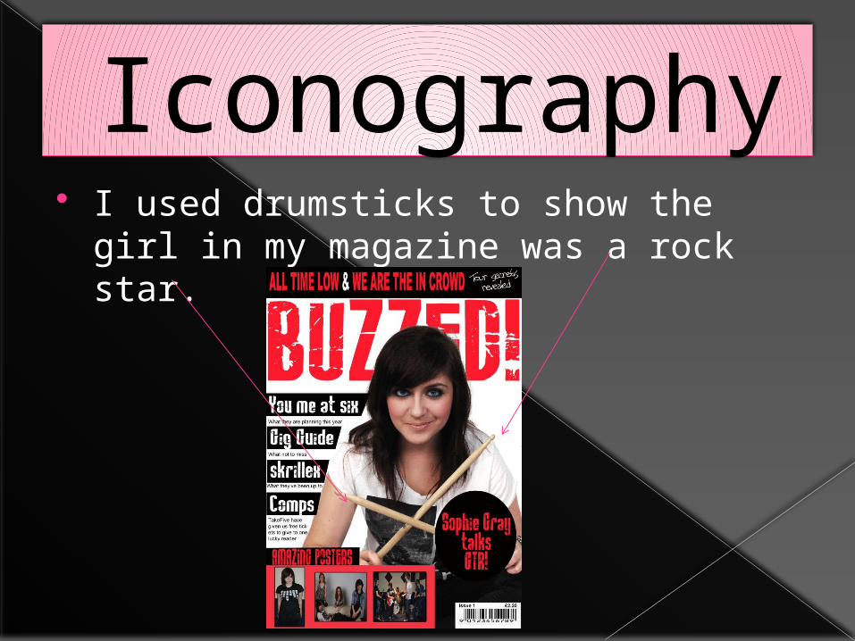
Iconography I used drumsticks to show the girl in
my magazine was a rock star.

The clothes I used were typical of a girl in a rock band - Black skinny Jeans and a white graphic t-shirt.
Iconography

My artist has a mischievous grin on her face and looks like she has a rebellious side this is stereotypical of a rock star.
Iconography

Stereotype I used a teenage girl as my main cover
artist. She belongs to a girl band. This goes against stereotypes as bands
are usually male.

Contents Page
I stuck with the same three colours as this is a convention in magazines
I used a layout similar to that in which you would see in kerrang

Contents PageI found many Contents page contained a big image of a band I decided to replicate this.

Double Page Spread
I found they tended to place text on the right hand side of the page so I replicated this with my own

Double Page Spread
Magazines use Quotations to encourage the audience to read the article. I chose to do this with mine.

Question 2. How does your media product represent particular social groups?

My Magazine is aimed at a teen audience. To show this I:
I used a teenager on the cover – relatable.
Also the font I used for the title was teen friendly.
Age

Class My magazine is aimed at white,
working class Teenagers. This is because of the artist on the front and inside.

Question 3. What kind of media institute might distribute your media product and why?

Institute If my magazine was being published I
would expect to publish my magazine.
This is because they already publish Kerrang!.

Question 4.
Who would be the audience for your media product

My audience is based around teenagers who are into rock music.
This is what I imagine my target audience would look like.
Audience

Question 5.
How would you attract/address your audience

To attract my audience I have used Bold colours which grab attention.
Also I used a model who is very pretty and this will encourage people to buy the magazine because they aspire to look like her.
Audience

Question 6. What have you learnt about technologies from the process of constructing this product?

I used Photoshop for the first time whilst creating my product. These are the most important things I learned.
This is how to set up the page for the front page and the contents page.
For The double page spread I changed this to A3

The text tool was the tool I used the most it is a key factor to making a magazine.
I used the horizontal type tool

The colour replacement tool is important for changing the colour of things. I used this to make my artists eyes brighter.

Theses are the layers. If you want to change something you have to select the layer before you can change it.

Question 7. Looking back at your preliminary task, what do you feel you have learnt in the progression from it to the full programme?

There is more empty space on the prelim task.
I used the same colour scheme.
Preliminary.

More information less empty space.
Main story stands out more.
Better use of colours.Colour scheme more apparent
Preliminary.

Question 8.
How has feedback helped?

feedback said
“the presentation is great, colours make the writing stand out and clearly separates headings articles... genuinely looks like a magazine you'd pick up.. the font of the text is really cool”


