epicenters of climate and security: the … 15, 2017 · epicenters of climate and security: the new...
TRANSCRIPT

EPICENTERS OF CLIMATE AND SECURITY: THE NEW GEOSTRATEGIC LANDSCAPE OF THE ANTHROPOCENE
June 2017
In partnership with:
Sponsored by:
Edited by:Caitlin E. Werrell and Francesco Femia

EPICENTERS OF CLIMATE AND SECURITY The Center for Climate and Security www.climateandsecurity.org 122
Mapping EpicEntErs of cliMatE and sEcurity VulnErabilitiEs1
Joshua Busby2
Understanding where the worst effects of climate change could come to pass and what that means for security is an important issue for policy-makers. Research on potential climate security “hot spots” can inform priorities for foreign assistance, disaster preparedness, and efforts by intelligence and security agencies to anticipate where future missions might be needed.3 Mapping climate security vulnerability is one tool that researchers and policy-makers can use to better understand and prepare for these risks.
The basic goal of vulnerability mapping is to provide decision-makers with a visually intuitive snapshot of likely priority areas in the short- to medium-term. Vulnerability mapping first requires an understanding of what is meant by vulnerability. Vulnerability to what and for whom? Many climate vulnerability studies focus on threats to livelihoods, while much of the climate security literature focuses exclusively on conflict. Mapping vulnerability can also be conducted by emphasizing the risks of large-scale loss of life, including but not limited to conflict.
significancE of Mapping to policy An increasing number of government agencies and nations have demonstrated an active interest in climate change as it relates to security and foreign policy priorities. Although uncertainty remains as to how exactly impacts of climate change will manifest, there is widespread recognition that climate change magnifies existing problems and adds additional stressors to already fragile situations. Environmental factors are being considered for inclusion in early warning systems and assessments of state fragility. Policy-makers generally agree that a major investment in data collection

EPICENTERS OF CLIMATE AND SECURITY The Center for Climate and Security www.climateandsecurity.org 123
and the improvement of early warning systems is needed. Integrating climate change in policy decisions requires understanding complex social interactions and incorporating information from both the natural and social sciences. Policy-makers face the challenge of how to utilize research and analysis for developing sound policies, especially if different mapping efforts produce discordant results.
Maps and indices should provide a clear presentation of research findings and their assumptions while not overstating the case or allowing audiences to take away the wrong message. A single composite map of vulnerability mapping often has many uncertainties that are hard to convey on the map itself. Despite the challenges of creating and using maps, they can provide an important starting point for a dialogue between research and policy-makers. That said, maps on their own may provide insufficient guidance to policy-makers. What is mapped largely depends on what is of interest. Different audiences are likely to need different maps.4 The critical factor is for map-makers to be transparent about their choices and for policy audiences to be critical consumers of whatever maps are put before them.
challEngEs of Mapping VulnErability
Vulnerability is often understood be a combination of different factors, including physical exposure, sensitivity, and adaptive capacity.5 Indicators that can be used to define vulnerability include physical exposure, population, household resilience, and governance. One challenge is that indicators are not always available at the same spatial resolution. Depending on the purpose of the mapping exercise, indicators can be aggregated up to the national level. In other mapping projects, some of the sub-national differences are retained. Global maps often use national level data to compare country-level differences. Regional maps might use more fine-grained data to show sub-national differences within and between countries. More fine-grained data might be available, depending on the region, for more local-scale mapping exercises.
Data can also be combined in different ways for display on a map. Indicators can be overlaid one atop the other. Indicators can be transformed into a common scale and added together, multiplied, or in some combination of different weights. When the maps are displayed, the colors can be stretched on a continuum or divided into different discrete colors based on how the data are distributed and how many colors the map-maker wants to show. Those choices can have major implications for what the final patterns look like. The different indicators chosen and the scale in which they are shown will ultimately paint different pictures of vulnerability that can be tailor made according to the needs of the policy-makers.

EPICENTERS OF CLIMATE AND SECURITY The Center for Climate and Security www.climateandsecurity.org 124
casE study on Mapping cliMatE sEcurity VulnErabilitiEs for policy-MakErs
From 2009 to 2016, the Strauss Center research group developed multiple iterations climate security vulnerability maps at the sub-national level for Africa and for 11 countries in South and Southeast Asia. The Department of Defense’s Minerva Initiative financed both the Climate Change and African Political Stability (CCAPS)6 and the Complex Emergencies and Political Stability in Asia (CEPSA) projects,7 and a wider research group completed a project for USAID, mapping the intersection of global exposure to climate-related hazards and state fragility.8
cliMatE sEcurity VulnErability
Both the CCAPS and CEPSA projects map subnational climate change vulnerability to identify the locations of likely chronic vulnerability. Both models have an explicit security focus, emphasizing situations where large numbers of people could be at risk of death from exposure to climate-related hazards and the follow-on consequences that could result from inadequate responses to climate shocks, including political instability and violent conflict.
While the projects explore conflicts affected by climate processes, the research has a stronger emphasis on humanitarian emergencies and disasters because the mobilization of militaries for cyclone relief, floods, famine, and other climate-related phenomena is seen as the most immediate and consistently pressing challenge. These maps focus on internal threats within states, but it is worth noting that many environmental phenomena traverse borders and have trans-border security implications.9
thE logic and thE MEthod
In the model, vulnerability is seen as driven by a concatenation of four processes, or what are called “baskets,” including (1) physical exposure to climate hazards, (2) population density, (3) household and community resilience, and (4) governance.
The logic is as follows: You cannot have climate vulnerability without physical exposure to climate hazards, but large numbers of people cannot die if a place is unpopulated or only lightly populated. Even in populated areas, some communities are more resilient than others. The first line of defense is the resources and capabilities communities possess. All else equal, better educated and healthier populations will likely fare better. However, some hazards may exceed the capacity of local communities to respond. Whether governments are willing and able to help them in times of need will affect how deadly and destabilizing climate exposure events are.
EPICENTERS OF CLIMATE AND SECURITY The Center for Climate and Security www.climateandsecurity.org 125
Each of the baskets, save population density, is composed of multiple indicators. For example, the physical exposure basket includes historic data on cyclones, wildfires, floods, two indicators related to water scarcity, and low-elevation coastal zones subject to storm surge and sea-level rise. Indicators were selected at the finest spatial resolution possible, with the physical exposure and population baskets having fine-grained spatial resolution and the last two baskets consisting of provincial or national-level data.
The data is normalized on a common scale and then added together to make a composite index, and thus provides a snapshot of the places likely subject to chronic climate security vulnerability.
how to usE thE Maps
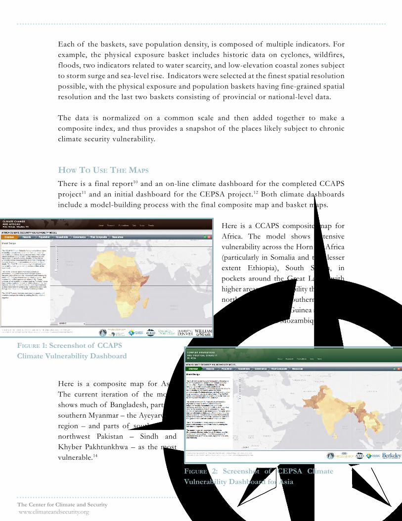
There is a final report10 and an on-line climate dashboard for the completed CCAPS project11 and an initial dashboard for the CEPSA project.12 Both climate dashboards include a model-building process with the final composite map and basket maps.
Here is a CCAPS composite map for Africa. The model shows extensive vulnerability across the Horn of Africa (particularly in Somalia and to a lesser extent Ethiopia), South Sudan, in pockets around the Great Lakes, with higher areas of vulnerability throughout northern Nigeria and southern Niger, as well as West Africa in Guinea and Sierra Leone and coastal Mozambique.13
Here is a composite map for Asia. The current iteration of the model shows much of Bangladesh, parts of southern Myanmar – the Ayeyarwady region – and parts of southern and northwest Pakistan – Sindh and Khyber Pakhtunkhwa – as the most vulnerable.14
figurE 1: Screenshot of CCAPS Climate Vulnerability Dashboard
figurE 2: Screenshot of CEPSA Climate Vulnerability Dashboard for Asia

EPICENTERS OF CLIMATE AND SECURITY The Center for Climate and Security www.climateandsecurity.org 126
The maps show the position of the places relative to all of the other places in the study area. According to the composite map, Somalia is vulnerable relative to the rest of the continent of Africa, and Myanmar is more vulnerable relative to the rest of the countries in South and Southeast Asia.
The online dashboard maps also allow viewers to zoom in to areas of interest to get a more fine-grained picture of specific places and how those locations compare to the rest of the region.
However, map patterns should not be directly compared to each other, as the data are scaled relative to their regions. Forthcoming USAID work will allow the comparison of the relative exposure of different places at the global level, but that is only measuring physical exposure to climate risks.
These dashboards are part of wider projects that look at patterns of foreign aid and conflict. The CCAPSs maps include a set of additional layers that can be placed on top of the base layer of climate vulnerability, including aid, SCAD and ACLED conflict events, and constitutional design.
In the CCAPS project, the team analyzed where World Bank and African Development Bank projects were distributed to see if that corresponded with patterns of climate vulnerability (see Figure 3).15
figurE 3: World Bank and African Development Projects 2009-2010 and Climate Security Vulnerability

EPICENTERS OF CLIMATE AND SECURITY The Center for Climate and Security www.climateandsecurity.org 127
The dashboard maps where climate-related projects from the World Bank were located from the period 2008 to 2012 (see Figure 4). What is notable for both wider development projects and specific climate projects is that vulnerable countries such as Somalia did not receive aid. The absence of a functioning government foreclosed the possibility of spending money there.
The forthcoming CEPSA dashboard will allow for overlaying conflict, disaster response, aid data, as well as related external datasets, including the ability to import layers from ArcGIS Online and to design and compare maps.16
Maps as points of dEparturE
Maps are seductive. They simplify a complex reality. However, if one embraces these maps as “the truth” without questioning their accuracy or their assumptions, this could lead to bad policy choices.
For that reason, these maps are points of departure for further conversation and investigation, including consultation with local experts, comparison with other data sources, and qualitative assessments.
For example, do the patterns of at-risk areas correspond with what we know about the geography of past climate-related disasters or conflict sites? Somalia faced two drought-related famines in the last 20 years, in the early 1990s and again in 2011, with an unfolding famine risk in 2017. Myanmar experienced some of the largest losses in recent memory when 140,000 died after the 2008 Cyclone Nargis.
While that provides some support for the maps, one can do this more systematically by ground-truthing the maps in the field as well as through sensitivity analysis and examining alternative ways of presenting and aggregating the data. Findings can also be compared with data collected by others.
For example, if one looks at the areas facing high climate security vulnerability in the CEPSA model through the perspective of numbers of people or proportion of the population exposed, the vulnerability in India and Vietnam is elevated and Bangladesh remains among the most vulnerable. All three have large numbers of people and/or high proportions of their populace facing high vulnerability.
figurE 4: Screenshot of World Bank Climate-Related Aid Projects and Vulnerability

EPICENTERS OF CLIMATE AND SECURITY The Center for Climate and Security www.climateandsecurity.org 128
coMparing rEsults
One can also compare the CCAPS and CEPSA model results with the geographic patterns of climate-related disasters. To do this, the research team geo-referenced climate-related disasters in the EM-DAT International Disaster Database for Africa and Asia. One can look at this in terms of the number of events, the number of people killed, and the number of people affected. In Asia, these patterns present different patterns than the CEPSA composite map (see Figure 5 for number of events). Are these EM-DAT-based maps, therefore, a more accurate depiction of an underlying reality compared to the CEPSA maps? EM-DAT data on casualties are not very precise and rely on reporting from aid groups and others, but the purpose of such comparisons is not to provide definitive answers but to stress-test the model to see how consistent the patterns are across different data sources and approaches.
The CCAPS and CEPSA maps are based on historic data on physical exposure to climate hazards, not future climate change risk. In collaborative work with climate scientists on Africa, the research team assessed how future hazards are likely to be distributed, namely the number of dry days, heavy-rainfall days, and heat-wave events by the middle of the 21st century.17 For example, the team mapped the difference in dry days – defined as 21-day periods with less than 1 mm of rainfall – between modeled results for the late 20th century and the mid-21st century. The difference map below shows parts of the Sahel are projected to become wetter (in blue below in Figure 6) while much of southern Africa will experience more dry days (in red below).18
figurE 5:Climate Disaster Events in South and Southeast Asia
China
India
Myanmar
Pakistan
Afghanistan
Thailand
Laos
Vietnam
Nepal
Cambodia
Bangladesh
Sri Lanka
Bhutan
0 500 1,000250kmData Source: EM-DAT Database from Center for Research
on the Epidemiology of Disasters (CRED)
Number of Events EMDAT 1998 - 2014
±
Number of Events1 - 7
8 - 16
17 - 28
29 - 45
46 - 65
No Events

EPICENTERS OF CLIMATE AND SECURITY The Center for Climate and Security www.climateandsecurity.org 129
AlgeriaLibya
MaliSudan
Chad
Niger
Egypt
Angola
EthiopiaNigeria
South Africa
Namibia
Mauritania
Zambia
Tanzania
Kenya
Somalia
Botswana
Morocco
South Sudan
Cameroon
Zimbabwe
Gabon
Ghana
Guinea
Democratic Republic
of the Congo
Mozambique Madagascar
Uganda
Tunisia
Central African Republic
Côted'Ivoire
SenegalBurkina
FasoBenin
Eritrea
Rep of Congo
Western Sahara
Liberia
Malawi
TogoSierra Leone
Lesotho
BurundiRwanda
DjiboutiGuinea-Bissau
Swaziland
Gambia
Equatorial Guinea
Mauritius
Comoros
Cape Verde
Sao Tome and Principe
Seychelles
±0 1,000 2,000
km
Data Sources: World Bank World Governance Indicators; Policy IV Project; KOF Index of Globalization; Armed Conflict Location and Event Dataset (ACLED);UNEP/GRID-Europe; Global Precipitation Climatology Centre (GPCC); ViewfinderPanoramas DEM; World Bank World Development Indicators; UNICEF Childinfo;UNICEF Multiple Indicator Cluster Survey (MICS); USAID Demographic andHealth Surveys (DHS); Environmental Indicators and Warnings Project (EIW)USGS: Mineral Operations outside the United States publication 2010Maritime Piracy Data (MPD) 2000-2013; Global Terrorism Database (GTD)World Energy Project (WEP) USGS 2000;2011
Maritime Piracy (2000-2013) & Composite Vulnerability
Missing Data
Vulnerability High
Low
Piracy Events within 25km of Shore
Piracy Events outside 25km of Shore
coMpositE VulnErability and stratEgic significancE
Another consideration is how these findings intersect with the relative strategic importance of different country contexts. Decision-makers bring their own assumptions about what places are strategically significant, but one can surface these assumptions by identifying potential indicators of strategic importance and overlaying these on the vulnerability maps, such as piracy attacks, terrorism, oil reserves, critically important minerals, and embassies. The map below shows the patterns for piracy attacks and climate vulnerability in Africa, which reveal the historic high incidence of piracy attacks off the Gulf of Aden. Such maps tell us nothing about whether climate vulnerability and piracy are causally related, merely that there are locations of overlapping risk, given historic data (see Figure 7).
figurE 6: Projected Difference in Dry Days for Africa from
Late 20th Century to Mid-21st Century
figurE 7:Piracy Attacks and Climate Vulnerability

EPICENTERS OF CLIMATE AND SECURITY The Center for Climate and Security www.climateandsecurity.org 130
bEyond Mapping
These maps are a point of departure for a conversation about climate security vulnerabilities in different regions.
While the past might tell us something about the short-run, future climate change may shift the geographic patterns of exposure and produce climate effects of a magnitude the world has not seen in the recent historical record.
Moreover, these maps are meant to tell a story about chronic places of concern. Different kinds of maps can serve different purposes. The policy community, for example, is often interested in emergent risks for early warning. Programs such as the Famine Early Warning Systems Networks (FEWSNET),19 are critical for this effort. More geographically comprehensive seasonal forecasts of water scarcity and overall water balances are also available from the consultancies such as ISciences.20
Even if we agree that these maps reflect an underlying reality, the policy implications are not straightforward. Should Somalia receive more climate-related aid compared to its peers because of its vulnerability? Or, is it viable to spend aid money in Somalia, given weak governance and the violent threat of al Shabaab? If one examines the last 20-year record more carefully, there were four major drought episodes in Somalia. Only two of them ended in drought. Why is that? Both Ethiopia and Somalia faced major climate shocks in recent years. In Somalia’s case, the drought ended in famine while Ethiopia fared better. Why is that? These are the kinds of questions that the maps can’t answer, but they can start to point us in the right direction as to how to answer them.

EPICENTERS OF CLIMATE AND SECURITY The Center for Climate and Security www.climateandsecurity.org 131
notEs
1 This material is based upon work supported by, or in part by, the U.S. Army Research Laboratory and the U. S. Army Research Office via the U.S. Department of Defense’s Minerva Initiative under grant numbers W911NF-09-10077 and W911NF-14-1-0528.2 LBJ School of Public Affairs, University of Texas-Austin [email protected] Joshua W. Busby et al., “Climate Change and Insecurity: Mapping Vulnerability in Africa,” International Security 37, no. 4 (2013): 132–72; Alex de Sherbinin, “Climate Change Hotspots Mapping: What Have We Learned?,” Climatic Change 123, no. 1 (March 1, 2014): 23–37, doi:10.1007/s10584-013-0900-7.4 For a discussion of these issues, see Joshua W. Busby and Jennifer Hazen, “Mapping and Modeling Climate Security Vulnerability: Workshop Report” (Austin, Texas: Strauss Center for International Security and Law, October 2011), https://www.strausscenter.org/climate-vulnerability-publications?download=47:mapping-and-modeling-climate-security-vulnerability-workshop-report.5 IPCC Working Group II Report, “Climate Change 2014: Impacts, Adaptation, and Vulnerability” (IPCC, 2014), http://ipcc-wg2.gov/AR5/.6 See https://www.strausscenter.org/ccaps7 See https://www.strausscenter.org/cepsa/8 Ashley Moran et al., “The Intersection of Global Climate and Security Risks” (Washington, D.C.: USAID, Forthcoming 2017).9 For an exploration of some implications associated with transboundary water management, see Joshua Busby, “Water and U.S. National Security” (Council on Foreign Relations, 2017), http://www.cfr.org/water-security/water-us-national-security/p38677.10 CCAPS, “CCAPS Final Program Report on ‘Climate, Conflict, and Governance inAfrica’” (Strauss Center for International Security and Law, November 2016), accessed at https://www.strausscenter.org/ccaps-news/ccaps-final-program-report-on-climate-conflict-and-governance-in-africa.html.11 Accessed at http://ccaps.developmentgateway.org/buildingthemodel12 Accessed at http://cepsa.developmentgateway.org/buildingthemodel13 These results are discussed in Joshua W. Busby, Todd G. Smith, and Nisha Krishnan, “Climate Security Vulnerability in Africa Mapping 3.0,” Political Geography, Special Issue: Climate Change and Conflict, 43 (November 2014): 51–67, doi:10.1016/j.polgeo.2014.10.005.14 Joshua W. Busby et al., “Climate Security Vulnerability in Asia 1.0” (Strauss Center for International Security and Law, May 2016), https://www.strausscenter.org/images/cepsa/CEPSA_Vulnerability_Brief-1.pdf.15 These results are discussed in Joshua Busby, Raleigh, Clionadh, and Idean Salehyan, “The Political Geography of Climate Vulnerability, Conflict, and Aid in Africa,” in Peace and Conflict 2014, ed. Paul K. Huth, Jonathan Wilkenfeld, and David A. Backer (Boulder: Routledge, 2014), 71–91.16 Here is one way you should not use the data. Do not overlay conflict on vulnerability. As you will find if you try, the CCAPS vulnerability model includes the ACLED conflict data as an indicator in our governance basket. The CEPSA data includes a similar measure of subnational political violence from the Political Instability Task Force.17 Joshua W. Busby et al., “Identifying Hot Spots of Security Vulnerability Associated with Climate Change in Africa,” Climatic Change 124, no. 4 (2014): 717–31, http://econpapers.repec.org/article/sprclimat/v_3a124_3ay_3a2014_3ai_3a4_3ap_3a717-731.htm.18 CCAPS, “CCAPS Final Program Report on ‘Climate, Conflict, and Governance in Africa’” (Strauss Center for International Security and Law, November 2016), https://www.strausscenter.org/ccaps-news/ccaps-final-program-report-on-climate-conflict-and-governance-in-africa.html.19 See https://www.fews.net/20 See http://www.isciences.com/