effective poster design: a step by step guide
TRANSCRIPT

Step 1. Preparation
Define your audience .........................Distill your message ............................Consider your presentation requirements Decide on your printing method .......Organize your information .................
Step 2. Design for Impact
Using backgrounds and colour effectively Leaving space ......................................Creating legible text ............................Using graphics for impact ..................
Step 3. Poster Construction
CorelDRAW instructions and template PowerPoint instructions and template
Step 4. Assess Your Poster .....................
Where to Print, Laminate & Find Helpful Information on the Web ......
11
112
344
59
12
13
3
Teaching Support Services University of Guelph
������ �� � � � �� � � � � � � � � � �
������ ����������

Define Your AudienceEffective communication starts with knowing who your audience is. At poster sessions there is intense competi-tion for audience attention. In their first 3 seconds your audience will determine whether to stay and explore your content or leave. If they stay you have 30 seconds to secure their attention by conveying an overall under-standing of your subject matter.
Distill Your Message Considering the fact that your audience has only a lim-ited time to view your poster, if there was one thing you could say on the poster, what would it be? Select a state-ment, photograph or diagram that is sure to attract your audience’s attention. This is your 3 second hit. Your focus item should be enlarged so that it will occupy at least 30% of the area of the finished poster. Remember that your audience will not approach you if it is not clear what your topic or theme is from a “safe distance” of 10 feet (3 meters).
Consider Your Presentation Requirements Determine the size of the space provided for you at the conference you are attending. Find out if the confer-ence has any regulations regarding minimum font and graphics sizes.
Decide on Your Printing Method
Single Sheet Poster (Plotter Printed)
Advantages: Large single page laminated posters are attractive, durable and fashionable. A variety of media is available for plotters so you may print your poster on paper, canvas, plastic and photographic type papers.
Disadvantages: Printing at a service bureau can be expensive. Printing generally takes an hour but you may not be the only one printing so it can often take a full working day before your poster is ready for pick-up. Large posters must be carried in tubes which should not be checked in with baggage during air travel.
Multi-Sheet Poster(81/2 x 11 inch pages on Bristol Board)
Advantages: Single 81/2 x 11 inch sheets can be printed on most office printers, reducing the cost and time required to make your poster. Smaller sheets may be packed in luggage easily.
Disadvantages: Assembly may be frustrating. Working within letter size paper can constrain where you place items in your poster.
Printing Handouts
You may wish to print your entire poster one sheet of letter size paper to use as a handout. Posters can be printed on letter size paper by using the FIT TO PAGE function within the print menu.
LaminationLamination significantly reduces the speed at which your poster will fade. Posters printed using non-archival inks (these include those found on most plotters and printers) will significantly fade in the first 6 months if displayed in normal room lighting. If your poster is laminated it may be hung for several years before
noticeable fading occurs.
� � � � � � � � � � �
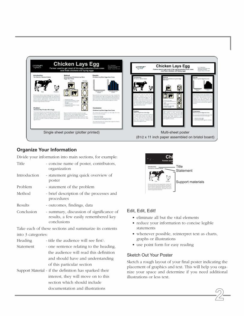
Organize Your Information
Divide your information into main sections, for example:
Title - concise name of poster, contributors, organization
Introduction - statement giving quick overview of poster
Problem - statement of the problem
Method - brief description of the processes and procedures
Results - outcomes, findings, data
Conclusion - summary, discussion of significance of results, a few easily remembered key conclusions
Take each of these sections and summarize its contents
into 3 categories:
Heading - title the audience will see first\
Statement - one sentence relating to the heading,
the audience will read this definition
and should have and understanding
of this particular section
Support Material - if the definition has sparked their
interest, they will move on to this
section which should include
documentation and illustrations
Edit, Edit, Edit!
• eliminate all but the vital elements• reduce your information to concise legible statements
• whenever possible, reinterpret text as charts, graphs or illustrations
• use point form for easy reading
Sketch Out Your Poster
Sketch a rough layout of your final poster indicating the placement of graphics and text. This will help you orga-nize your space and determine if you need additional illustrations or less text.
Single sheet poster (plotter printed) Multi-sheet poster (81/2 x 11 inch paper assembled on bristol board)
TitleStatement
Support materials
������������
��� ��� ��� ������� ������
������� ���� ������ �� ���� ��� ��� ����������� �������� ����
��� ������ ��������� ���� �������� ��� ����� ���� ��� ������� ��
��� ��� �� �������� �� ��� ���������� � ���� ����� ������� ����
������ �� ���� ��� ��� ����������� �������� ���� ��� ������
��������� ���� �������� ��� ����� ���� ��� ������� �� ��� ��� ��
�������� �� ��� ���������� � ���� �����
��� �������

Using Backgrounds and Colour Effectively• Colours and backgrounds should be subtle. Colour
should highlight, separate, define and associate infor-mation, if it begins to compete with your information for attention then it is too strong.
• Colours may look different on your screen than they will in your print. If you are concerned about colour consistency you can consult a Pantone book (found at most printers) to pick your colour.
• Some of your audience may be colour blind so make sure contrasts are high between bars of graphs, lines on charts and backgrounds and text. The most common form of colour blindness effects red and green.
• If you are having trouble choosing colour try one of these: (pick one from each section)
Title Bar Colour: navy blue; forest green; olive green; burgundy; rust; plum (Your colour should be dark enough to use white or cream as your main title text colour.)
Background Colour: solid cream or beige; pale version of title bar colour; any of the previous fading to white; white (Background colours should always be light enough to use black for your main text.)
Highlight boxes and Graph backgrounds: pale ver-sion of title bar colour; white; light cream or beige
Avoid: dark colours if you are laminating; a rainbow effect by using too many colours; using holiday colours; extensive use of watermarks or busy patterns as backgrounds
Leaving Space• effective posters are spacious and easy to follow
• adequate clear space will direct attention to key ele-ments
• remember the eye looks for edges, so align photo-graphs, headings, text materials and axes in groups of graphs
• A column of text should be between 12 inches (30.5 cm) and 16 inches (40.5 cm) wide. A 36 x 48 inch (91.44 x 121.92 cm) poster with a portrait orientation uses two columns. The same size poster with a land-scape orientation requires 3 columns. Leave at least 1 inch (3 cm) between columns.
• leave a minimum of 1.5 inches (4 cm) of clear space around the inside edge of your poster as no plotter prints right to the edge of the paper
• plotter paper comes in rolls, common sizes are 36 inches (91.44 cm) and 52 inches (132.08 cm) wide, find out what size your printer uses and design your poster to fit
Full justify your text
Illustrate your points
You don’t have to fill up every available space
It is o.k. to let sections be different lengths at the bottom
Use point form
Replace extensive data with charts
Leave more space between groups and less between items within a group
� � � � � � � � � � � � � � ���
�������� ����� �� ������
���� ������ �����
������������ ����
������������ �����
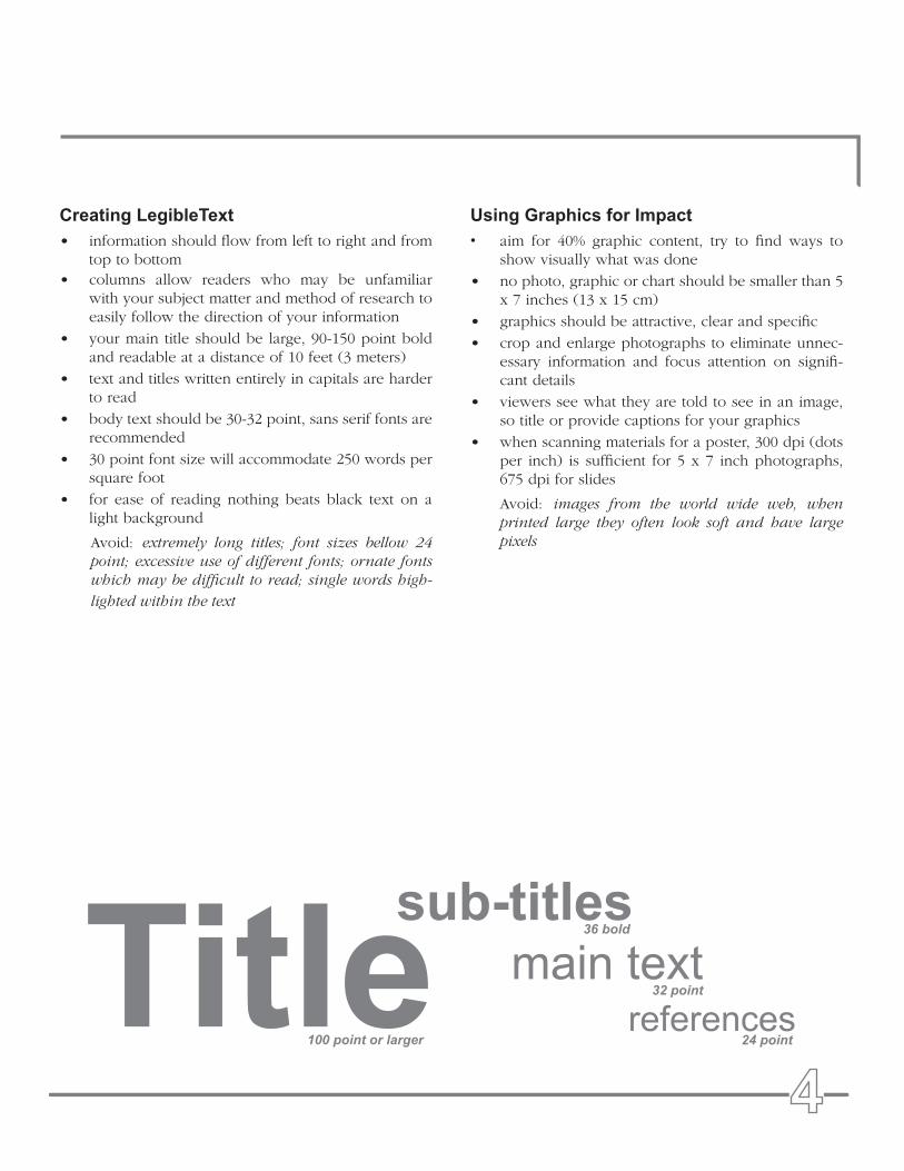
Creating LegibleText• information should flow from left to right and from
top to bottom• columns allow readers who may be unfamiliar
with your subject matter and method of research to easily follow the direction of your information
• your main title should be large, 90-150 point bold and readable at a distance of 10 feet (3 meters)
• text and titles written entirely in capitals are harder to read
• body text should be 30-32 point, sans serif fonts are recommended
• 30 point font size will accommodate 250 words per square foot
• for ease of reading nothing beats black text on a light background
Avoid: extremely long titles; font sizes bellow 24 point; excessive use of different fonts; ornate fonts which may be difficult to read; single words high-
lighted within the text
Using Graphics for Impact• aim for 40% graphic content, try to find ways to
show visually what was done
• no photo, graphic or chart should be smaller than 5 x 7 inches (13 x 15 cm)
• graphics should be attractive, clear and specific
• crop and enlarge photographs to eliminate unnec-essary information and focus attention on signifi-cant details
• viewers see what they are told to see in an image, so title or provide captions for your graphics
• when scanning materials for a poster, 300 dpi (dots per inch) is sufficient for 5 x 7 inch photographs, 675 dpi for slides
Avoid: images from the world wide web, when printed large they often look soft and have large pixels

Stage 1: Preparing Your Document 1. Set your page size and orientation by going to
LAYOUT > PAGE SET UP > SIZE/ ORIENTATION.
2. Create a coloured background by using the rectan-gle tool to draw a box the size of your page. Fill this box with your background colour using the paint tool. You may wish to highlight your title with its own background box, to do so draw an additional colour box and locate it directly behind your title, name, and address.
Pick tool - selects objects & text
Shape tool - alters object shapes
Zoom tool
Freehand tool - draws lines
Rectangle tool - draws rectangles
Ellipse tool - draws ellipses
Polygon tool - creates polygons & more
Text tool - creates paragraph & artistic text
Interactive tools - not necessary for most posters but fun to play with
Eyedropper tool - lets you sample colours
Outline tool - changes line weight and colour, makes arrows
Paint tool - used to fill drawn shapes
Gradient colourSolid colour
CorelDRAW Versions 7,8 & 9Single Sheet Poster Construction
3. Turn on rulers and guides by going to VIEW > RULERS and VIEW > GUIDES. Rulers should appear at the top and left hand side of your document. Using the selection tool CLICK AND DRAG guides from the top or side ruler on to your document. Use these guides to mark off a 1 inch (3 cm) margin of unprintable area around the inside of your docu-ment. You may wish to have your guides snap to a grid, this can be accomplished by going to VIEW > SNAP TO GUIDELINES.
� � � � � � � � � � � � � � � � � �
��
Use guides to mark off columns and edge margins. A column of text should
be between 12 inches (30.5 cm) and 16 inches (40.5 cm) wide.
Create your background and title bar by drawing boxes and
applying a colour fill.

4. A column of text should be between 12 inches (30.5 cm) and 16 inches (40.5 cm) wide. A 36 x 48 inch (91.44 x 121.92 cm) poster with a portrait orientation uses two columns. The same size poster with a landscape orientation requires 3 columns. Use rulers to measure and guides to mark columns, leaving at least 3 cm (1 inch) between columns.
5. Before you insert your text, set your font and point size by using TEXT > FORMAT TEXT. When you do so a dialogue box will ask you if you want to change ARTISTIC TEXT, and / or PARAGRAPH TEXT, select both. This will change all of the text you copy into your document to your set font and point size.
Stage 2: Inserting Text and Graphics
6. To copy text into CorelDraw, select a section of your text from your word document, and copy it. In your CorelDRAW document select EDIT > PASTE SPECIAL> TEXT. Your text will appear in a large box which will cover the entire page. Use the text box handles to adjust your text to fit into your columns. Using PASTE SPECIAL allows your text to wrap.
7. To place graphics into your document use FILE > IMPORT and select the file of the graphic you wish to insert. To maintain proportions when resiz-ing your graphic, click and drag only the corner handles of the selected image. If there are places in which you can put two tables, graphs or graph-ics side by side in a single column, it is generally appropriate to do so as it will save space.
8. To place graphs, tables and charts from Excel, Pow-erPoint or a word processing program, use COPY and PASTE.
CorelDRAW ToolsAligning and Distributing Objects: Select all of the things which you wish to align. Holding SHIFT while selecting with your mouse allows you to select more than one object. To align go to ARRANGE > ALIGN AND DISTRIBUTE.
Moving Objects Forward and Backward: Select the item(s) that you wish to move and go to ARRANGE > ORDER.
Inserting Bullets: In CorelDRAW go to TEXT > FORMAT TEXT > EFFECTS > EFFECT TYPE > BULLET, then change FONT to COMMON BULLET.
Inserting Symbols: When you copy text into Corel-Draw you will loose the symbols, bullets, italics and bold lettering found in your text. To replace the sym-bols in your text use the symbol font. This requires that you type the appropriate letter in your normal font and
change the font type to symbol. The following is a list of letters that correspond to common symbols:
Superscript and Subscript: To change a portion of text to superscript highlight it and go to TEXT > FORMAT TEXT > FONT, followed by POSITION > SUPERSCRIPT / SUBSCRIPT.
A downward pointing triangle at the bottom of a text box
means there is more text which is not showing. Extend the
text box further to reveal the additional text.
When you use EDIT > PASTE SPECIAL > TEXT and you are zoomed out in
CorelDRAW, your text should look like a series of lines.

Trouble SpotsDifficulty Pasting Graphs, Tables and ChartsAlthough graphs, tables and charts should copy per-fectly from your word processing program, Excel or PowerPoint document using straight copy and paste commands, occasionally this doesn’t work. If you run into trouble try using each of the paste options in CorelDRAW. If You continue to have problems you can always fall back on printing out a version of your troubled graphic, scanning it and inserting the scanned image. This last option is often the only way to insert anything created in Sigma Plot, a graph creation pro-gram.
Difficulty Selecting an ObjectOccasionally an object remains visible while it is located under another object, thus it looks like you should be able to select it but you cannot. A frequent example of this would be an empty bottom section of a text box extending over a graphic. Move the upper object away or send it to the back and try selectingthe object you were having difficulty with again.
Check alignment of your columns, text and graphics
Add the Canadian flag or logo of your institu-tion Make sure there is at
least 3 cm (1 inch) of clear space around the edge of your poster.
Insure symbols, italics, bold and superscript characters are correct.
Stage 3. Finishing Touches10. You may wish to full justify your text using TEXT >
FORMAT TEXT> ALIGN.
11. Insure symbols, italics, bold and superscript char-acters are correct.
12. Check the alignment of your columns, text and graphics.
13. Add the Canadian flag and / or the logo of your insti-tution. The Canadian flag can be obtained via most clip art packages. Logos may be scanned from busi-ness cards and letter head. If you are having trouble finding a good quality version of your logo you may wish to contact the company who completes most of your print jobs as they often keep good copies of common logos. Avoid taking logos from the world wide web as they tend to print poorly.
14. If your file has grown very large you may wish to turn your CorelDRAW document into a .pdf file using Adobe Distiller. If you are bringing your CorelDraw file to the printers use FILE > PREPARE FOR SERVICE BUREAU and follow the prompt menus to create a folder containing all of the fonts associated with your document.
15. Make two digital copies of your poster, leave one with a colleague and take the other with you to the conference. If your printed poster is lost or ruined your colleague could courier you another, or you could have one printed at the conference.

1. Follow stages 1-12 from single sheet poster creation in CorelDraw (page 6-8).
2. Draw a 8 x 10 inch box (20.32 x 25.4 cm). This box represents your 81/2 x 11 inch printed page. Copy and paste this box to break your poster up into printable areas.
3. Go to FILE > PRINT, select your printer, change your print size to letter size, landscape orientation paper , then use PRINT PREVIEW. While in the print preview screen you should see only a 81/2 x 11 inch portion of your poster. The portion of your poster centered in your print preview screen is what will print. CLICK and DRAG with your mouse on your poster to change what area is centered in the print preview screen. Locate your first box and print it, then move over to the next box and print it, continue until your entire poster has been printed.
CorelDRAW Versions 7,8 & 9Multi-Sheet Poster Construction, 8 1/2 x 11 inch Pages on Bristol Board
4. Cut each sheet along the grid lines of your 8 x 10 inch boxes. Lay the individual parts of your poster face down on a table top in the correct order. Run masking tape along the seams. You may wish to leave an extra bit of tape at the top and bottom of your poster to use as a tag in which to staple or pin your poster to the dispay area. If you are using spay glue to mount your poster to foamboard in order to make it rigid, do not trim the pages before mounting, instead wait and use an exacto knife to cut them after they are mounted.
������� ���� ��������� ���� �� ��� ���� �� ��� ��� ���������� ���� ����
��� ����� �������� ��� ������ ����
��� �� ���������������� ������� ������������������ �� ������������� �������� ��� ���
��������������� ��� ��� ������� ������
�������
��� � ���� ���� ������� ���� ����
��������� �� �������� ������ ����������� ���� ���� ����� ����
����� ���� ���� �� ���� �������� �� ������� ��� �� ��� ��� � ����
���� ������� ���� ���� ��������� �� �������� ������� ����
���� ���� �����
�������� ��� ������� ���� ����
��� � ���� ���� ������� ���� ���� ��������� �� �������� ������
������� ���� ���� ���� ����� ���� ����� ���� ���� �� ����
�������� �� ������� ��� �� ���
����������������� �� �������� ��� �������� ���� ����
��������������� ��� ���� ���� ���� ����
������������������ ��� ���� ���� ���� ����
��� ������� ���� ���� �������� ��� ���� ���� ���� ����
������� ��������� ��� �����
���� �� ��� ��� ������������� �� ��� ��������� ������� ����� ���� ���� ����������������� ������� ���� ���� ���� �����
��� ������� ���� ���� ���� ������� ����� ���� ���� ��������
������� ��������� ��� �����
�
�
�
�
������� ��� ������������ �����
� � � � � � � � � � � ��
��
��
��
��
��
��
��
��
��� ��� ������������ �����
� � � � � � � � � � � ��
��
��
��
��
��
��
��
��
������� ���� ������ �� ���� ��� ��� ����������� �������� ����
��� ������ ��������� ���� �������� ��� ����� ���� ��� ������� ��
��� ��� �� �������� �� ��� ���������� ����� ����� ������� ����
������ �� ���� ��� ��� ����������� �������� ���� ��� ������
��������� ���� �������� ��� ����� ���� ��� ������� �� ��� ��� ��
�������� �� ��� ���������� ����� �����
��� ���������� �� ���� ��� �������� ��� � ���� �������� ����
���� �������� ����� ���� ���� ��������� ��� ���������� ��
���� ��� �������� ��� � ���� �������� ���� ���� �������� �����
���� ���� ��������� ��� ���������� �� ���� ��� �������� ��� �
���� �������� ���� ���� �������� ����� ���� ���� ���������
��� �������� ���������� ��� �������� ���� �����
�������� �� ����� �������� ���� ���������� ���� ����
������� ����� ���� ���� ��������� ��� ��������
���������� ��� �������� ���� ����� �������� �� �����
�������� ���� ���������� ���� ���� ������� ����� ����
���� ���������
����
�
�
�
�
�
�
�������� ��� ��������� ������ �� ������� �� ���������� ���� ����� ��� ������� ����� ������������ ��� ��������� ������ �� ������� �� ������������� ��� �����
��� �������
��� �������
Copy and paste 8 x 10 inch boxes to divide your poster into a grid of printable areas.
8 x 10 inch box

Stage 1. Preparing Your Document.
1. Set your page size and orientation by going to FILE > PAGE SETUP. The largest size available in Power-Point is 56 x 56 inches. (142.24 x 142.24 cm)
2. Create a coloured background by going to FORMAT > BACKGROUND. You may wish to highlight your title with a distinct coloured background, to do so draw a box in which to put your title, authors names, and addresses. Create a box with the box drawing tool. To colour boxes select the box which you wish to colour and use the colour fill shapes tool.
3. Turn on rulers and guides by going to VIEW > RULERS > GUIDES. Rulers should appear at the top and left hand side of your document. Horizontal and vertical guides should appear in the center of your screen. To create additional guidelines hold down CTRL, click on an existing guideline and drag a new one from it. Use guidelines to mark off a 3 cm (1 inch) margin of unprintable area around the inside of your document.
4. A column of text should be between 12 inches (30.5 cm) and 16 inches (40.5 cm) wide. A 36 x 48 inch (91.44 x 121.92 cm) poster with a portrait orientation uses two columns. The same size poster with a landscape orientation requires 3 columns. Use rulers to measure columns and guides to mark columns, leaving at least 1 inch (3 cm) between columns.
PowerPoint Versions 97, 98, 2000Single Sheet Poster Construction
Draw menu - additional drawing tools
Pick Tool
Rotate
Autoshapes - pre-formed useful shapes
Line drawing tool
Arrow drawing tool
Rectangle drawing tool
Oval drawing tool
Text tool - creates paragraph and artistic text
Word art tool - creates decorative text
Colour fill shapes tool
Colour fill lines tool
Colour fill text tool
Line weight tool
Line style tool
Arrow style tool
Create shadow tool
Create 3D effects tool
� � � � � � � � � � � � � � � � � �
��

Stage 2. Inserting text and Graphics
5. To copy text into your document from a word pro-cessing program, select a section of our text in your word document and copy it. In your PowerPoint document select EDIT > PASTE SPECIAL > FOR-MATTED TEXT (RTF). Use the text box handles to adjust your text to fit into your columns. If you have done this correctly your text should continue to wrap when you adjust its size.
6. To place graphics into your document use INSERT > PICTURE FROM FILE or copy your graphic and use EDIT > PASTE SPECIAL > PICTURE. To main-tain proportions when resizing your graphic, click and drag only the corner handles of the selected image. If there are places in which you can put two tables, graphs or graphics side by side in a single column, it is generally appropriate to do so as it will save space.
7. To place graphs, tables and charts from Excel, or a word processing program, use COPY > PASTE or INSERT > CHART/ OBJECT.
PowerPoint Tools
Aligning and Distributing Objects
Select all of the things which you wish to align. Holding
To create additional guidelines hold CTRL,
click on an existing guideline and drag a
new one from it.
Use guides to mark off columns and edge margins. A column of text should be
between 12 inches (30.5 cm) and 16 inches (40.5 cm) wide.
SHIFT allows you to select more than one object. To align go to DRAW > ALIGN OR DISTRIBUTE.
Moving Objects Forward and Backward
Select the item that you wish to move and go to DRAW > ORDER.
Inserting BulletsIn PowerPoint go to FORMAT > BULLET.
Creating a Chart To create a chart go to INSERT > CHART.
Inserting SymbolsWhen you copy text into PowerPoint you will loose the symbols, bullets, italics and bold lettering found in your text. To replace the symbols in your text use the symbol font. This requires that you type the appropriate letter in your normal font and change the font to symbol. The following is a list of letters that correspond to common symbols:
Superscript and subscriptIn order to change a portion of text to superscript or
subscript highlight it and go to TEXT > FORMAT TEXT > FONT, followed by POSITION > SUPERSCRIPT / SUB-SCRIPT.

1. Use your poster layout sketch (page 2) to deter-mine how many 81/2 x 11 inch pages you will need and what information will fall on each.
2. In FILE > PAGE SETUP make sure your docu-ment is set for 81/2 x 11 inch paper. Use INSERT > NEW SLIDE to add as many pages as you will need and create each information section on a separate page
3. Font size requirements and style recomendations remain the same as those for single sheet post-ers.
4. After printing your 81/2 x 11 inch sections arrange them on a table and determine the size of the bristol board you will need. Use spray glue to attach the printed sheets to the bristol board.
PowerPoint 97, 98 & 2000Mult-Sheet Poster Constuction8 1/2 x 11 inch Pages on Bristol Board
This 36 x 48 inch poster uses 3 pages across and down. The title bar uses 4 pages.
Stage 3. Finishing Touches
9. You may wish to full justify your text using TEXT > FORMAT TEXT> ALIGN.
10. Insure symbols, italics, bold, and superscript characters are correct.
11. Check the alignment of your columns, text and graphics.
12. Add the Canadian Flag and /or the logo of your institution. The Canadian flag can be obtained via most clip art packages. Logos may be scanned from business cards and letter head. Avoid taking logos from the world wide web as they tend to print poorly.
13. If your document contains unusual fonts make sure to bring a copy of those font files with you when you take your poster to the service bureau for printing.
14. Make two digital copies of your poster, leave one with a colleague and take the other with you to the conference. If for some reason your printed poster is lost or ruined your colleague could cou-rier you another, or you could have one printed at the conference.

Have someone from your target audience evaluate your poster.
Attracting Your Target AudienceIf you encountered this poster at a poster session would you stop to look at it?
Is the poster directed to the target audience?
Is the title of the poster concise and does it stand out?
Is the posters subject matter quickly discernible?
Is the poster layout visually pleasing?
If you need help attracting your target audience review “Define Your Audience” and “Distill Your Mes-sage” page 1.
Delivering the MessageIf you stopped to look at this poster, would you read the text on it?
Is the subject matter presented clearly and concisely?
Does the information presented flow logically?
Is the text readable in terms of linguistic difficulty/ scientific language?
Is the text legible in terms of font choice, size, colour and spacing?
Does the title bar include the presenters’ names, and the identifier for the school or institution?
If you need help delivering your message revuew “Organize Your Information” page 3 and “Creating Legible Text” page 5.
Creating Visual Impact Are the graphics large enough to be seen from a distance of 10 feet (3 meters)?
Are the graphics attractive and relevant?
Have legends or captions been used to guide the viewer?
Does the poster have sufficient clear space?
Are sections clearly defined with adequate space around them?
Have items been aligned?
If you need help creating visual impact review “Design for Impact” pages 4-5.
� � � � � � �� � � � � � � � �
��

Places to Print Your Poster
On Campus
College of Biological Sciences Illustration facility, ext. 6192, 102 Axelrod BuildingEnvironmental Biology Graphic Arts Lab, ext. 3583, 1312 Graham Hall (lamination also available)
Off Campus Colt Reproductions, 763-5100, Unit 11, 126 Malcom St.KH&A, 822-1594, 355 Elmira rd. Unit 121 (lamination also available)NC Pestill, 821-1980, 350 Speedvale (lamination also available)
Places to get Poster Tubes
The Business Depot, 763-4205, 370 Stone rd. W.Wyndham Art Supplies, 767-1317, 164 Wyndham St. N.Most office supply stores will carry tubes
���� ������� ����������� �� ��� ���
� � � � � � � � � � � � � � � � � � � � � �