step by step film poster
TRANSCRIPT

STEP BY STEP - FILM POSTER -
Anisah Shah

Firstly, I started by using the brush tool in black to colour the base of the poster so that the billing block (which will be added later) would have a black background.

Background Image
The image I used for the background was a picture that I took when I went on vacation in the summers. I added that as a layer on top of the main background.

Due to the picture not being the right height and not being the appropriate longitude, I cloned the top of the original image and used that to extend the sky so that it looks like one whole image.
From the Toolbox, I chose the Clone Stamp Tool. In the Options bar, I set the tool's tip size and hardness as it was for the Brush Tool. I then pointed the cursor at the image area i wanted to paint with, held down [Alt] key, then mouse-clicked. This selected the source point for cloning

Next I adjusted the contrast and hue’s so that it doesn’t look as vibrant and fresh to go with the sci-fi theme.

Additional layers made using PicMonkeySince I had little knowledge
about Photoshop, I used the online editing software, PicMonkey to construct a few layers using their ‘overlay’ tool that could possibly go on the film poster. These were a few experimental circles that I formed from which I selected the top right one and used it as a layer to go behind my main character. I did this to create a depth and so that it doesn’t look too 2D.
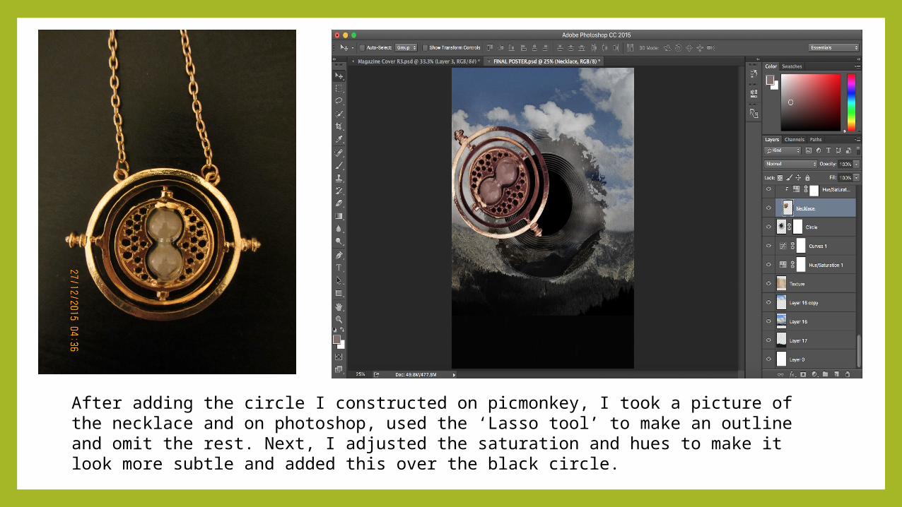
After adding the circle I constructed on picmonkey, I took a picture of the necklace and on photoshop, used the ‘Lasso tool’ to make an outline and omit the rest. Next, I adjusted the saturation and hues to make it look more subtle and added this over the black circle.

Then, I took a picture of the main character and using the ‘magic wand’ and ‘lasso tool’ I defined the edges and got a silhouette of the girl. Then I overlaid it onto the poster. I also adjusted the colours.

I then took a photograph of flowers and added that onto the face as a new layer. I kept the fill and opacity to a minimum so that I could still see the face clearly.

Using another image of flowers that I took, I added it on top of the girls head, somewhat like a crown. The reason I added flowers is because they symbolize innocence and youth. I felt like the main character in my production, Sophie Bradshaw, was in fact very innocent and clean hearted and thus used flowers as symbolism to portray this along with her youth. I also added a shadow under the flower layer to make it look more 3 dimensional. For the flowers on her head, I also kept the opacity and fill low and adjusted the hue and saturation along with the colour balance.

Next, I created dots and lines using the ‘Drawing and Type’ tools. I then created a series of dots and connected them with lines around the main character. This indicates the journey Sophia had to take and the difficulties she had to face.

Using PicMonkey again, I created circles type spheres which looked like bearings. I used these because in ancient clocks, such bearings and nuts were used. I thought it would be good to incorporate them in my poster.

I added these bearings around my main character and adjusted the colours according to my poster. I did this by changing the hues and saturation. I wanted to keep the colour of them subtle but impactful.

Next, I added in the movie name, ‘R3’ using the same letters as I did in the magazine cover. I constructed the title R3 using Adobe Illustrators 3D effect where I used different shapes and made several elements after which I combined them to form the two letters.

I then added the ‘3’ and adjusted the position.

Next, under ‘R3’ I added the full movie name, “Repeat, Relapse, Rewind”

After that I added the billing block which I constructed using Photoshop. Each and every element of the billing block was made using Photoshop.

Here I added the tagline; “For what it’s worth, it’s never too late” at the top of the poster. I chose the top because the billing block at the bottom made it too busy and the top half of the poster was relatively emptier. I also liked how it looked at the top.

I then adjusted the colours (brightness, contrast, hues, saturation etc) I did this because I felt like the colours of the film name; R3 were too stark and sharp so to make it a bit more milder, I adjusted the colours.
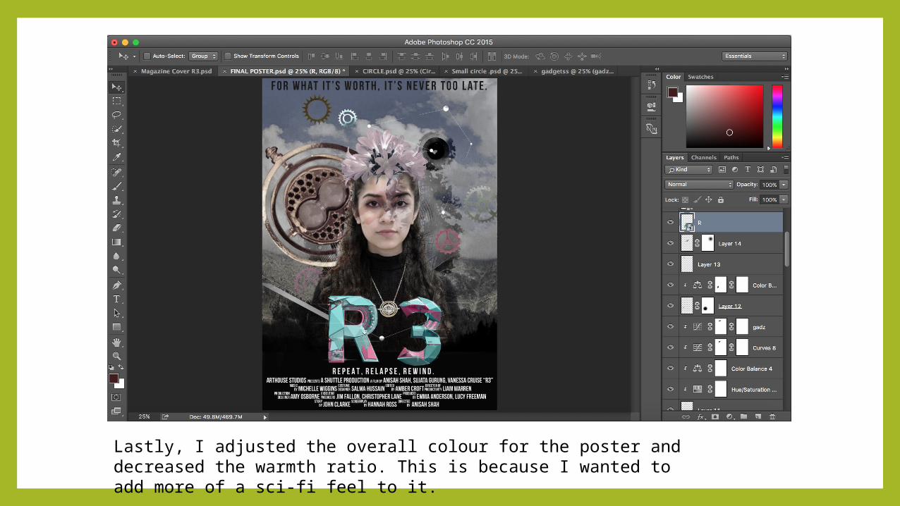
Lastly, I adjusted the overall colour for the poster and decreased the warmth ratio. This is because I wanted to add more of a sci-fi feel to it.

Final Poster