economic insights - philadelphia fed
TRANSCRIPT

First Quarter 2017Volume 2, Issue 1
Making Sense of Urban Patterns
Did the Fiscal Stimulus Work?
Banking Trends
Research Update
ECONOMIC
INSIGHTSFederal reserve Bank oF PhiladelPhia

INSIDEFIRST QUARTER 2017ISSN: 0007-7011
Making Sense of Urban Patterns 1
In cities worldwide, density peaks near city hall and thins out the farther one
travels in all directions. Jeffrey Brinkman explores what drives this pattern,
what sparks big shifts such as the postwar suburban migration and today’s taste
for city life, and why it all matters for urban policy.
Did the Fiscal Stimulus Work? 6
The federal government poured hundreds of billions of dollars into the economy
in an attempt to combat the Great Recession. Gerald A. Carlino examines just
how much bang taxpayers got for their bucks.
Banking Trends:
Credit Unions’ Expanding Footprint 17
New rules expand credit unions’ capacity to make business loans, a key niche for
small banks. James DiSalvo and Ryan Johnston explore whether there is any
evidence the change could cost small banks market share.
Research Update 26
Abstracts of the latest working papers produced by the Federal Reserve Bank
of Philadelphia.
About the cover: On the first attempt to ring it in 1753, the bell that the British colony of Pennsylvania had ordered from a London foundry cracked. Recast by Philadelphia metalsmiths John Pass and John Stow, it pealed from atop the Provincial Assembly (later the Pennsylvania State House, now Independence Hall) to mark such occasions as King George III’s ascension to the throne in 1761, the Battles of Lexington and Concord in 1775, the ratification of the Constitution in 1787, and the deaths of Benjamin Franklin in 1790 and George Washington in 1799. By 1839, antislavery publications had coined the name Liberty Bell, inspired by its inscription from Leviticus 25:10. Likely in the 1840s it acquired the iconic crack that has left it mostly mute yet fully resonant as a worldwide symbol of freedom. The Independence Hall Association offers an account of the Liberty Bell’s history.Photo credit: J. Fusco for Visit Philadelphia.
Economic Insights is published four times
a year by the Research Department of the
Federal Reserve Bank of Philadelphia. The views
expressed by the authors are not necessarily
those of the Federal Reserve. We welcome your
comments at PHIL [email protected].
To receive e-mail notifications of the latest
Economic Insights and other Philadelphia
Fed publications, go to www.philadelphiafed.
org/notifications. Archived articles may be
downloaded at www.philadelphiafed.org/
research-and-data/publications/economic-
insights.
The Federal Reserve Bank of Philadelphia helps
formulate and implement monetary policy,
supervises banks and bank and savings and
loan holding companies, and provides financial
services to depository institutions and the
federal government. It is one of 12 regional
Reserve Banks that, together with the U.S.
Federal Reserve Board of Governors, make up
the Federal Reserve System. The Philadelphia
Fed serves eastern Pennsylvania, southern New
Jersey, and Delaware.
Patrick T. Harker
President and Chief Executive Officer
Michael Dotsey
Executive Vice President and Director of Research
Colleen Gallagher
Research Publications Manager
Brendan Barry
Data Visualization Manager

First Quarter 2017 | Federal reserve Bank oF PhiladelPhia research dePartment | 1
The streets of Philadelphia roll west through a collage of urban environments familiar to city dwellers nearly every-where. From Penn Square, the central site of the iconic stone City Hall, Market Street traverses a canyon of concrete and glass office buildings that gradually give way to commercial and apartment structures and mixed uses. A mile from City Hall, the busy thoroughfare crosses the Schuylkill River, and density again picks up as the University of Pennsylvania anchors a second employment hub.
On tree-lined Baltimore Avenue a few blocks south of the bustling campus, streetcars pass tightly packed Victorian
rowhouses and midrise apartment buildings. Small stores, restaurants, and scattered office structures dot the sidewalks. Farther west on the avenue, the relatively high-rent uni-
versity area transitions into a lower-income neighborhood. Shorter buildings predominate, and some of the neighbor-hoods contain light industrial businesses.
Eventually, the avenue leaves Philadelphia and passes through suburbs marked by detached houses on generally small lots. Some of these communities have commercial main streets, but strip-style development with ample parking is more common. Farther west, houses and yards are larger, fewer streets have sidewalks, and neighborhoods are almost exclusively residential. Beyond the city, houses and businesses become sparser as farms and open space appear.
While details vary, the broad patterns described here are common in and around cities throughout the world. As one travels outward from the downtown areas of most
Making Sense of Urban PatternsWhy do cities everywhere exhibit the same general patterns of density and development?
And how can we explain some striking variations?
BY JEFFREY BRINKMAN
Jeffrey Brinkman is a senior economist at the Federal Reserve Bank of Philadelphia. The views expressed in this article are not necessarily those of the Federal Reserve.
Photos by Rich Wood

2 | Federal reserve Bank oF PhiladelPhia research dePartment | First Quarter 2017
cities, building and population densities decline, residences replace commercial buildings, and open space increases.
From other viewpoints, however, patterns are not so clear. For example, the location and clustering, or sorting, of households by income or education vary among cities and over time, and employment subcenters often emerge outside a city’s core business district. These collective patterns constitute urban spatial structure.
Economists and other social scientists have long sought a deeper understanding of the underlying determinants of the geographic distribution of population, firms, and land use within cities and their suburbs. These factors have important implications for policymakers charged with imple-menting and funding local services or infrastructure and land use planning.
Why do we observe persistent patterns in cities? And what causes these patterns to sometimes undergo big shifts, such as today’s migration of young professionals to the heart of Philadelphia and other large U.S. cities? To shed light on these phenomena, we need a little urban spatial structure theory.
LOCATION, LOCATION, LOCATIONThe relationship between access to cities and land prices has long been studied by economists. Johann Heinrich von Thünen was perhaps the first to generalize about the spatial structure of urban areas, in the early 19th century. The
German economist described a town with a central market surrounded by agricultural land and posited that farmers chose locations based on two considerations: how much land they needed to raise their crops, and how much it cost to transport their crops to the center of town. The farmers’ decisions reflected simple economics. Those whose crops could be grown on small fields or were relatively expensive to transport wanted land close to town, while those whose crops required more acreage and were cheaper to transport were willing to be farther away. The relative advantage of proximity dictated that land prices were higher near the market.
While von Thünen’s application is antiquated, his basic insight remains powerful: Transportation costs and the importance of land in production or consumption drive land prices. This early theory formalized the concept of bid rents. Assuming that land markets function efficiently, the businesses and people that most value a location will pay the most for the property. Therefore, there is always an incentive to move farther from cities — the cost of land — pushing against the incentive to move nearer — the cost of transportation.
Does the Theory Explain Modern Cities?In the 1960s, Edwin Mills and other researchers adapted Von Thünen’s ideas to better understand the urban structure of modern cities by considering a city where firms located in the center are surrounded by housing. Again, the basic trade-off is between access and the price of land. In this case, the access is derived from the cost of commuting to work in the center of the city. The insight is that workers face trade-offs between shorter commuting times on the one hand and larger houses and more open space on the other. For the most part, the organization of a metropolitan area comes down to a tension between the desire for access — to goods, services, amenities, and jobs — and the fixed supply of land in desirable locations.
This theory helps explain one of the most salient features of cities: Population density and land prices decrease as distance from the center increases. Population density as a function of distance to the city center for selected cities is shown in Figure 1. For each city, population density declines
FIGURE 1
Density Drops Off More Steeply Away from Some DowntownsPopulation per square mile.
Source: Census Bureau: 2010 decennial census.
PhiladelphiaChicago
Houston
Atlanta
30,000
25,000
20,000
15,000
10,000
5,000
01 15105
Miles from city center

First Quarter 2017 | Federal reserve Bank oF PhiladelPhia research dePartment | 3
as distance from the center increases. However, the slopes of the lines are quite different. For example, central Philadel-phia’s high population density declines steeply as distance increases from the city center, while Houston, which has a comparable overall population, exhibits a flatter gradient.
One possible explanation is the difference in trans-portation infrastructure in the two cities. Philadelphia has extensive public transit, while Houston has invested heavily in expressways. These two transportation technologies pose different costs for commuters, both in terms of time and money, which could lead to different population patterns. Transit’s lower speeds, for example, could induce people to live closer to work. Car commuting has high fixed costs of owning and maintaining a vehicle but usually is faster, particularly over long distances, and thus encourages the population to spread out.
Known as the monocentric model, this theory remains a workhorse in urban economics because it describes the basic principle driving urban development. Furthermore, the model can help us understand how policies such as Philadelphia’s investment in mass transit will affect popula-tion growth, congestion, incomes, and other economic outcomes. For example, the theory predicts that the creation of additional transportation infrastructure will reduce the time and cost to travel to jobs. As a result, people will be able to move farther from their jobs and take advantage of cheaper land to build larger homes, thereby diffusing the population and reducing density. Research by Nate Baum-Snow confirmed the prediction of the theory and showed that the federal interstate highway construction initiative started in the 1950s reduced central city populations by 25 percent — with significant implications for the economic health of cities and their suburbs.
Firms and Production in CitiesOne additional important feature of metropolitan areas involves the location choices of businesses. Early theories assumed that all employment was located in city cores. This assumption might have been justified by history, given that the main driver of the location of businesses was access to transportation centers such as ports or rail hubs. However, advances in transportation and the transition to a service-oriented economy have made the monocentric model less relevant over time. Indeed, multiple employment subcenters are an important feature of today’s urban-suburban landscape.
Newer theories hold that businesses receive some production benefits by being located close to one another.
Thus, firms that are located in cities confront the trade-off between the cost of land and the production advantages of being located in dense business clusters. These production advantages, referred to as agglomeration externalities, can arise through a number of channels. It is generally accepted that these agglomeration externalities are strong enough to cause businesses to cluster. Gerald Carlino and Jeffrey Lin have discussed the theory and evidence of agglomeration economies in Business Review articles.
CONNECTING THE THEORY TO THE DATAAlthough urban spatial structure theory continues to advance, the field still relies on a number of abstractions that can inhibit empirical work and policy analysis. One feature of urban economies that is not explained easily is why different lots in the same neighborhood might be used for different purposes. While the classic monocentric model is an important approximation of city structure, it predicts an abrupt transition between commercial and residential uses. In reality, there is typically a gradual transition from commercial uses in the center of the city to residential uses farther out and finally to open space at the edge of a city. And there is significant mixing of uses everywhere.
In Philadelphia, for example, commercial uses dominate at the city center but are quickly replaced by high-density residential uses and then by low-density residential uses farther away from the center. In the outskirts, other uses, mainly open space and agriculture, begin to dominate.
In a recent paper, I develop a model that can more real-istically capture complex land uses by allowing for mixing of land uses in neighborhoods throughout a city.1 In addition, I model the role of traffic congestion, which is an important factor that limits the size of cities and the concentration of economic activity. Traffic congestion has well-known negative effects on cities, including lost time for drivers and worsening pollution for everyone. Using data on population, employment, land prices, land uses, and commute times, I calibrate the model and then simulate a real-world conges-tion pricing policy. The idea of a congestion pricing policy is that charging a toll on overcrowded roads will ease some of these negative outcomes by reducing traffic and encouraging drivers to make better decisions in their commuting habits.
However, real-world decisions to implement this policy often fail to recognize the long-run impact on the structure of cities. The results of the research suggest that congestion pricing can hurt a city’s economy. By increasing the cost of transportation into dense business districts, congestion

4 | Federal reserve Bank oF PhiladelPhia research dePartment | First Quarter 2017
pricing has the unintended consequence of dispersing em-ployment away from those areas. In other words, businesses will choose to locate farther away in the long run. Given what we know about agglomeration effects, this flight could lead to a loss of business productivity.
An additional challenge in doing empirical work in eco-nomics is establishing a causal relationship using observed data. Spatial data are no exception. Unlike other fields, social science is hard-pressed to run controlled experiments in labs and thus often relies on using observed patterns in the real world. However, this makes it hard to infer the actual causal effect of policies, given that there are often confounding factors. For example, if we want to know the effect of building a highway on population, we cannot simply look at the increase in population near a new highway because the road probably was built in response to pent-up demand.
Therefore, to identify causal relationships, economists often rely on exogenous shocks to the economy — that is, events that occur for reasons far removed from the economic decisions being investigated but that affect those decisions in an important way. For example, research by Gabriel Ahlfeldt, Stephen Redding, Daniel Sturm, and Nikolaus Wolf examines the rise and fall of the Berlin Wall to identify the magnitude of underlying determinants of city structure. By using a rich model of city structure and looking at the changes in population and employment patterns before and after the wall was constructed and torn down, they are able to measure the importance of agglomeration economies. The authors find that not only are agglomeration economies significant but that they also are very localized. Roughly speaking, the authors find that doubling the employment density increases productivity on the order of 8 percent but that the effects of these production externalities decline by 95 percent after less than a third of a mile.
RECENT TRENDS AND FUTURE RESEARCHMany uncertainties remain about urban spatial structure. One timely question pertains to the increasing concentration of young, educated professionals in the core of large cities. For example, scores of upscale rowhouses and high-rise condominiums are being built in areas surrounding Center City Philadelphia. The development is consistent with U.S. trends in which multifamily construction has driven the housing market recovery since the most recent recession in a way that is unprecedented in recent U.S. history.
Philadelphia’s population peaked at 2.07 million in 1950
and fell to 1.5 million in 2000 before rising to 1.6 million in 2015 (Figure 2). A 2012 U.S. Census Bureau report showed significant population growth near city halls (a good marker of the city center), particularly in large cities, between 2000 and 2010.2
While there are certain robust patterns in cities, the patterns related to income sorting can vary across cities, over time, and across cultures. Thirty years ago, the dominant pattern in the U.S. was that average income increased with distance from the center of the city. However, this pattern was not universal. In many European cities, for example, incomes have traditionally been higher in the central city and remain so today.
Cities in the U.S. are beginning to change, as city centers show notable increases in population, driven by inflows of educated young people. Figure 3 shows the percentage change in the young, educated population for four U.S. cities as a function of distance from the cities’ center. All show large increases close to the city center, with Houston showing a 130 percent increase within a mile of the city center. Outlying areas show no change or even declines in the young, educated population.
Urban spatial theory has the potential to help illuminate the reasons for this change. Although there is currently no consensus on the causes, possible factors could include the perceived value of urban amenities, reductions in crime, transportation costs, the production technologies of firms, and demographics. Two recent studies provide evidence that changing tastes for urban amenities are playing some role in this trend.3
A better understanding of these changes will help policy-makers predict how their decisions will affect their cities’ economies in the future and make better judgments about the provision of services, infrastructure planning, and other urban needs. Whatever the underlying cause, it will be related to the classic trade-off between access and the scarcity of land illuminated nearly 200 years ago by Johann Heinrich von Thünen.
140%
120%
100%
80%
60%
40%
20%
0%
−40%
−20%
Houston
Chicago Philadelphia
Atlanta
1 15105Miles from city center
FIGURE 3
Educated Young People Are Moving DowntownPercent change from 2000–2010 in the share of college-educated residents age 25–44 as a function of distance from the centers of selected cities.
Source: Census Bureau: 2010 decennial census.
FIGURE 2
Historic Population of Philadelphia1790–2010, millions of people.
The city’s population peaked in
1950 at 2.07 million
0.0
0.5
1.0
1.5
2.02.25
Source: Census Bureau.

First Quarter 2017 | Federal reserve Bank oF PhiladelPhia research dePartment | 5
and fell to 1.5 million in 2000 before rising to 1.6 million in 2015 (Figure 2). A 2012 U.S. Census Bureau report showed significant population growth near city halls (a good marker of the city center), particularly in large cities, between 2000 and 2010.2
While there are certain robust patterns in cities, the patterns related to income sorting can vary across cities, over time, and across cultures. Thirty years ago, the dominant pattern in the U.S. was that average income increased with distance from the center of the city. However, this pattern was not universal. In many European cities, for example, incomes have traditionally been higher in the central city and remain so today.
Cities in the U.S. are beginning to change, as city centers show notable increases in population, driven by inflows of educated young people. Figure 3 shows the percentage change in the young, educated population for four U.S. cities as a function of distance from the cities’ center. All show large increases close to the city center, with Houston showing a 130 percent increase within a mile of the city center. Outlying areas show no change or even declines in the young, educated population.
Urban spatial theory has the potential to help illuminate the reasons for this change. Although there is currently no consensus on the causes, possible factors could include the perceived value of urban amenities, reductions in crime, transportation costs, the production technologies of firms, and demographics. Two recent studies provide evidence that changing tastes for urban amenities are playing some role in this trend.3
A better understanding of these changes will help policy-makers predict how their decisions will affect their cities’ economies in the future and make better judgments about the provision of services, infrastructure planning, and other urban needs. Whatever the underlying cause, it will be related to the classic trade-off between access and the scarcity of land illuminated nearly 200 years ago by Johann Heinrich von Thünen.
140%
120%
100%
80%
60%
40%
20%
0%
−40%
−20%
Houston
Chicago Philadelphia
Atlanta
1 15105Miles from city center
FIGURE 3
Educated Young People Are Moving DowntownPercent change from 2000–2010 in the share of college-educated residents age 25–44 as a function of distance from the centers of selected cities.
Source: Census Bureau: 2010 decennial census.
REFERENCESAhlfeldt, Gabriel M., Stephen J. Redding, Daniel M. Sturm, and Nikolaus Wolf.
“The Economics of Density: Evidence from the Berlin Wall,” Econometrica,
83:6 (2015), pp. 2,127–2,189.
Baum-Snow, Nathaniel. “Did Highways Cause Suburbanization?” Quarterly
Journal of Economics, 122 (May 2007), pp. 775–805.
Baum-Snow, Nathaniel, and Daniel A. Hartley. “Accounting for Central
Neighborhood Change, 1980–2010,” Federal Reserve Bank of Chicago
Working Paper 2016–09 (2016).
Brinkman, Jeffrey C. “Congestion, Agglomeration, and the Structure of
Cities,” Journal of Urban Economics, 94 (July 2016), pp. 13–31.
Carlino, Gerald A. “Three Keys to the City: Resources, Agglomeration
Economies, and Sorting,” Federal Reserve Bank of Philadelphia Business
Review (Third Quarter 2011).
Couture, Victor, and Jessie Handbury. “Urban Revival in America, 2000
to 2010,” working paper (2016).
Lin, Jeffrey. “Geography, History, Economies of Density, and the Location of
Cities,” Federal Reserve Bank of Philadelphia Business Review (Third Quarter
2012).
Mills, Edwin S. “An Aggregative Model of Resource Allocation in
a Metropolitan Area,” American Economic Review 57:2, (May 1967),
pp. 197–210.
Von Thünen, Johann Heinrich. Isolated State, ed., Peter Hall. Frankfurt:
Pergamon Press, 1966.
Wilson, Steven G., David A. Plane, Paul J. Mackun, Thomas R. Fischetti, and
Justyna Goworowska (with Darryl T. Cohen, Marc J. Perry, and Geoffrey W.
Hatchard). “Patterns of Metropolitan and Micropolitan Population Change:
2000 to 2010,” 2010 Census Special Reports, September 2012.
NOTES1 See my 2016 article in the Journal of Urban Economics.
2 A press release summarizes the report, https://www.census.gov/newsroom/
releases/archives/2010_census/cb12-181.html.
3 See the 2016 working papers by Victor Couture and Jessie Handbury and by
Nathaniel Baum-Snow and Daniel Hartley.
6 | Federal reserve Bank oF PhiladelPhia research dePartment | First Quarter 2017
More than seven years after the enactment of the American Recovery and Reinvestment Act, economists, legislators, and the American people continue to debate the effective-ness of the measure. The largest U.S. fiscal stimulus since the 1930s, the Recovery Act pumped hundreds of billions of dollars of federal spending and tax cuts into the economy in an effort to stem the massive job losses and steep drop in economic output that characterized the Great Recession. The projected impact of the stimulus on the federal budget through 2019, when the program is set to end, amounts to $832 billion. More than 90 percent of that total was realized by the end of 2011.
Did the Recovery Act work? Answering that question requires knowing more than whether employment and output increased after the stimulus began. It requires quantifying how much of the improvement was the result of the stimulus and determining whether the gains were greater than the cost. The central questions are: How can we know whether the economy surpassed the growth it would have attained in the absence of the stimulus? And even if it did, would it have grown even more with a differ-ent type of stimulus?
For many economists, the most effective fiscal response to a recession remains an open question. The idea that a timely infusion of government assistance can save jobs and shorten a recession gained credence during the Great Depression. Based on the views of the British economist John Maynard Keynes, the theory holds that when private demand slumps, the government can stimulate the economy
Did the Fiscal Stimulus Work?Billions were spent to recover from the Great Recession. How can we know whether taxpayers
got a decent bang for the buck?
BY GERALD A. CARLINO
by spending more on public projects and cutting taxes for households and firms.
Although strict Keynesian theory no longer dominates economic thinking, fiscal policymakers have continued to respond to recessions by passing stimulus packages. Research into how, when, and indeed whether stimulus programs work
has generated a wide range of estimated effects. Economists have sought to calcu-late the fiscal multiplier — the ratio of a change in economic measures to the change in government spending — through three main methods: macroeco-nomic models of the economy, variations in stimulus allocations from state to state known as cross-state studies, and economywide observations of economic data over time, or time series studies.
One reason for the disparate findings is that stimulus measures can take various forms. The Recovery Act, for example, mainly involved three distinct interventions: temporary tax cuts for individuals and businesses, additional federal funding for state and local governments in the form of project and welfare aid transfers, and direct federal expenditures. In order to achieve the maximum economic impact — that is, to generate the largest fiscal multiplier — lawmakers need to know the optimal form, timing, and target of the aid.1
Robert Inman and I have zeroed in more narrowly on the form that stimulus measures have taken, and we find
Gerald A. Carlino is a senior economic advisor and economist at the Federal Reserve Bank of Philadelphia. The views expressed in this article are not necessarily those of the Federal Reserve.
Research into how, when, and whether stimulus programs work has generated a wide range of estimated effects.

First Quarter 2017 | Federal reserve Bank oF PhiladelPhia research dePartment | 7
that it matters greatly who receives the aid. We also find that for federal funds going to the states, it matters greatly what types of programs the money is spent on.
To weigh all this evidence requires a basic grasp of some simple theory behind fiscal multipliers and how these studies can be designed to tease out the role of the stimulus. Armed with this understanding, we will see how a different mix of stimulus forms might have been more effective at helping the economy recover.
RIPPLE EFFECT: THE FISCAL MULTIPLIERThe striking feature of the economic stimulus package passed by Congress and signed into law in February 2009 by President Barack Obama was its size. Recovery Act spending will total an estimated $832 billion through 2019. Excluding a $69 billion patch for the alternative minimum tax, the act provides $763 billion in fiscal support. This support can be grouped into three broad categories — tax incentives for households and businesses, fiscal relief to state and local governments, and direct federal expenditures on infrastruc-ture and other things.
In the first category, the Recovery Act allocated $425
Other
To state & local governments
Transfer payments to state and local governments,more than 90% went to Medicaid and educationGeneral
government spending
Direct federal expenditures on transportation, communication, wastewater and sewer infrastructure improvements; extension of unemployment benefits; scientific research
$425 bn
$208 bn
$130 bn
$144 bn
$48 bn
Alternative minimum tax patch
$69 bn
Fiscal support
$763 bn
Tax cuts for households and firms
FIGURE 1
Structure of the Fiscal Stimulus PackageHow the $832 billion was allocated.
billion for tax incentives, such as tax cuts for households and firms. Second, the act provided $208 billion of general government spending, including $144 billion for state and local governments, more than 90 percent of which went to Medicaid and education transfer payments. The remaining $130 billion was earmarked mainly for direct federal expenditures on projects such as transportation, communi-cation, wastewater and sewer infrastructure improvements; an extension of federal unemployment benefits; and scientific research. Of this $130 billion, $48 billion went to state and local governments.2
Its size notwithstanding, the Recovery Act resembles all fiscal stimulus measures since World War II in that it relies on basic Keynesian macroeconomic theory, which holds that, during economic downturns, the federal government can offset a decline in private spending by increasing public spending or cutting taxes in order to save jobs and stem further economic weakness. Multiplier analysis is at the core of Keynesian theory. The multiplier for a given stimulus program, such as an increase in federal government spending or a cut in federal income taxes, tells us how much gross domestic product (GDP) is increased per stimulus dollar allocated to the program.
To see how multiplier analysis works, assume that when people receive an extra dollar of income they spend 80 cents of that dollar and save 20 cents. This means the marginal propensity to consume out of an extra dollar of income is 0.8. When the government increases spending by $1, this dollar becomes income for household A, which spends 80 cents of it. That 80 cents becomes income for household B, which spends 64 cents (0.8 × 0.8 = 0.64). In turn, the 64 cents becomes income for household C, which spends 51 cents (0.8 × 0.64). This spending process repeats itself over and over, and the resulting change in GDP is the sum of all rounds of spending (1 + 0.8 + 0.64 + 0.51 + all the additional rounds of spending).
Notice that the sum of all the subsequent spending has a larger effect on GDP than the original dollar spent by the government. The sum of this spending follows a geometric series that results in a multiplier of 5 when the marginal pro-pensity to consume is 0.8. That is, a $1 increase in federal spending results in a $5 increase in GDP. This example of the government spending multiplier assumes no taxation of income received by households. If the government imposed a proportional tax equal to 20 percent of every dollar re-ceived by households, the multiplier would fall from a value of 5 to a value of 2.8.

8 | Federal reserve Bank oF PhiladelPhia research dePartment | First Quarter 2017
While traditional thinking held that households would spend a high proportion of the extra money to which they had access through stimulus programs, the ripple effect might be significantly less than basic multiplier theory suggests. Contemporary macroeconomic theory recognizes that many individuals tend to be forward-looking and will save much or all of a tax cut in anticipation of higher future taxes to pay for the increased deficit. For example, the Recovery Act was deficit financed, meaning the government will have to borrow to finance the resulting deficit. In the future, the government will have to repay, with interest, what it borrowed today, implying that taxes will rise in the future.
Many economists believe that people have rational expectations about future economic conditions because they base their expectations on an intelligent examination of all the available economic data. People’s expectations today about their future tax liabilities will lead them to save rather than spend some or all of a tax cut today, counteracting the fiscal initiative to some degree.
Some economists believe in the Ricardian equivalence proposition, which says that the positive effect of a tax cut on income today will be offset entirely by the negative effects of anticipated tax increases on future income and that therefore tax cuts will have no effect on consumption.3 The Ricardian equivalence proposition requires assumptions that have been challenged by economists. For example, lower-income households with little ability to borrow or save will spend much or all of any tax cut they receive today, regardless of whether they anticipate future increases in their tax liabilities. There is some evidence that the Ricardian equivalence proposition may be overstated. Thomas Meissner and Davud Rostam-Afschar tested the proposition in a laboratory-based experiment where a tax cut was imple-mented in early periods, financed by a tax increase of the same size in later periods. They found that the behavior of about two-thirds of the subjects they studied was incon-sistent with the Ricardian hypothesis in that tax changes had a strong and significant effect on consumption.
Contemporary theory also recognizes that fiscal policy and monetary policy can influence one another. The multi-plier might be smaller than the basic model suggests in normal times because monetary policy tends to increase interest rates in an attempt to maintain price stability. But higher interests rates can damp investment spending,
which can counteract the fiscal measure. In severe recessions, however, the multiplier can be larger because consumers and states are less likely to save. Also, when the economy is weak, monetary policymakers might not react to the fiscal stimulus in the same way that they would in normal times.4
At the time the Recovery Act began, policy and aca-demic discussions were rife with disagreements about the size of the federal expenditure and revenue multipliers. In addition, there was little evidence regarding the likely national economic impact of federal transfers to state and local governments. Some of the disputes arose because no single multiplier can summarize the broad economic consequences of fiscal policy. Rather, the impact of policy varies depending on the type of policy being implemented: tax cuts versus direct federal expenditures versus federal
transfers to households and to state and local governments. Multipliers also are affected by, among other things, the stage of the business cycle when a policy is implemented, the stance of monetary policy, and how a deficit is financed. The uncertainty about the size of the relevant multipliers led to a number of new studies comparing what would
happen to GDP and employment under the Recovery Act with what likely would have happened in its absence.5
WHAT’S THE EVIDENCE?The three basic approaches to estimating stimulus effects involve U.S. macroeconomic models, cross-state data, and economywide observations over time, or time series models.
Macroeconomic Model-Based EstimatesMany government agencies use macroeconomic models to estimate the economic effects of the stimulus program. These models consist of a set of equations designed to deliver a quantitative description of the behavior of economic var iables. For example, one equation describes consumer behavior, another describes investment spending, and others separately describe government spending and the govern-ment tax structure. With the model in place, historical data are used to estimate separate multipliers for each cat-egory of spending and tax provisions. The idea is that tax cuts, transfer payments, and direct federal expenditures have different effects on GDP and employment. To forecast the effects of the Recovery Act on GDP, the model- based approach applies a different estimated multiplier to
No single multiplier can summarize the broad economic consequences of fiscal policy.

First Quarter 2017 | Federal reserve Bank oF PhiladelPhia research dePartment | 9
Cross-State EvidenceA number of studies have used state-level data to avoid some of the limitations of the macroeconomic models. This ap-proach evaluates the effects of the stimulus using variations in federal spending across U.S. states. If some states received more stimulus funds than others for reasons unrelated to their economic needs, then those “excess” funds can allow for an evaluation of the effect of the stimulus on employment. Studies at the state level focus on changes in the number of jobs saved or created rather than on the level of output.
Cross-state studies must deal with the chicken-and-egg question of endogeneity — that is, to what extent does the economy respond to the stimulus, and to what extent does
the stimulus respond to the condition of the economy? For example, harder-hit states likely received a disproportionately greater amount of stimulus funding than those with fewer economic troubles. Cross-state studies develop differing ap-proaches to account for endogeneity.
These studies have found a positive impact on state private and public employment in 2010, with the strongest effects coming from support for state Medicaid payments. Gabriel Chodorow-Reich and his colleagues examined
the effects on employment of the Recovery Act’s Medicaid transfers to states. States administer Medicaid but share financing with the federal government. These researchers reported that of the $88 billion dedicated to an increase in Medicaid matching funds, states had received $61 billion by June 30, 2010. The Recovery Act temporarily increased the Medicaid expenditure match rate that the federal government paid to all states by 6.2 percentage points and increased the match rate more for states where unem-ployment rose significantly. The larger payments to states with higher unemployment rates made it difficult to differentiate between the extent to which a state’s economy responded to the stimulus and the extent to which the stimulus responded to the condition of a state’s economy.
Chodorow-Reich and his coauthors responded to the identification challenge by isolating the component of Med-icaid transfers to each state that was unrelated to changes in the state’s economic circumstances. They found that between December 2008 and July 2009, additional Medicaid match-ing funds increased employment by 3.5 jobs per $100,000 of spending, a cost per job of about $29,000 (Figure 2).
the amount of stimulus funds committed to each component of the act.
The Congressional Budget Office (CBO) and the Council of Economic Advisers (CEA) used macroeconomic models to forecast the effects of the stimulus package. The CBO found that national GDP increased by anywhere from 40 cents to $2 for every $1 in income transfers to house-holds or fiscal relief to state and local governments, and by 40 cents to $2.20 for every $1 of infrastructure support to states and localities. The CEA followed the CBO’s approach but used a different model of the national economy and concluded that GDP increased by 80 cents for every $1 in tax cuts and $1.10 for every $1 of state and local fiscal relief. The council estimated that between the fall of 2009 and mid-2011, the act raised the level of GDP by 2 to 2.5 percent over what it would have been in the absence of the act.
The CBO and CEA multipliers suggest that the Recovery Act had a significant effect on GDP, but their model-based approach has a number of important shortcomings. James Feyrer and Bruce Sacerdote point out that model-based approaches provide only a forecast of the effects of policy rather than an evaluation of the actual path of output and employment resulting from the stimulus act. Another shortcoming is that economists disagree about the economic and behavioral relationships that underlie the macro-economic models, such as anticipation of policy actions, and these relationships influence the models’ estimates.
Partly as a response to these weaknesses, economists have developed macroeconomic models based on fundamen-tals such as consumer preferences, production technologies, and government budget constraints. Thorsten Drautzburg and Harald Uhlig developed an approach that relaxes some of the assumptions of the macroeconomic models by taking into account, for example, consumers who can’t borrow or are impatient, and interest rates at the zero lower bound, among other things.6 In their experiment, government spending is increased for six years. They found a government spending multiplier of 0.5 in the short run, during the first year of the spending change, falling to about zero, at best, in the longer run, suggesting that government spending partially crowds out private activity in the early stages and completely crowds out private activity over longer periods.7
To what extent does the economy respond to the stimulus, and to what extent does the stimulus respond to the condition of the economy?

10 | Federal reserve Bank oF PhiladelPhia research dePartment | First Quarter 2017
Other studies have found more modest effects. Feyrer and Sacerdote looked at variations in employment at the state and county levels. Public finance economists believe that states with longer-serving members in Congress receive more government funds per person than other states because senior members of Congress generally have greater influence in decision-making. Feyrer and Sacerdote posited that congressional seniority is unrelated to a state’s economic conditions and therefore that differences in average senior-ity across states can help to identify stimulus spending that is unrelated to a state’s underlying economic conditions. They found that for the 20 months between February 2009 and October 2010, about $100,000 in stimulus spending was needed to create one additional job. They also found that the impact on employment differs by type of program. Spending supporting low-income households created 2.5 jobs per $100,000 spent, a cost per job of $40,000.
Dan Wilson also found moderate effects associated with Recovery Act spending at the state level. Because the stimu-lus funding a state received may depend on its economic conditions, Wilson looked at stimulus spending in 2009 that was allocated to states according to statutory formulas such as the miles of federal highway lanes in a state or the propor-tion of young people in a state’s population. His estimates indicated that an additional $1 million in stimulus funds to a state led to only about eight new jobs a year. The implied
cost was about $125,000 per job. Put another way: Because the median family income in the U.S. was just under $50,000 in 2010, the federal government presumably paid more than twice the typical wage for each job it created.8
It is tempting to conclude from such cross-state studies that the stimulus was not very effective in job creation, at least from a cost perspective. However, this type of analysis fails to account for cross-state spillovers. Job gains in one state most likely produce job gains in neighboring states that are not counted in state-by-state analysis. Such spillover effects could substantially reduce the estimated cost per job, and ignoring the impact of spillovers makes it more difficult to judge the effect of the stimulus on any particular state. The cross-state studies make the heroic assumption that the impact of these spillovers is essentially zero.9
Time Series EvidenceThe starting point for analyzing the effects of fiscal policy actions on the U.S. economy is the formulation of an empirical model. Several considerations come into play. First, as we have noted, it is well known that changes in economic activity in a state spill over and affect activity in other regions, especially neighboring ones. These cross-state effects may arise from interstate input-output linkages — for example, when an industry in one state depends on interme-diate goods or services produced in another state — or from interstate demand relationships in which stimulus spending boosts demand for out-of-state products. Thus, a useful model should account for these interstate spillovers. Second, economic shocks such as fiscal policy actions affect activity immediately but can affect activity in subsequent periods as well. That is, once the policy change occurs, it often takes time for firms, workers, and state government officials to adjust to the new circumstances.
Inman and I used a vector autoregression, or VAR, to estimate the total effects of the fiscal stimulus on real per capita GDP at the national level from 1960 to 2010 using quarterly data. A VAR is a widely used modeling technique for gathering evidence on business cycle dynamics. VARs typically rely on a small number of variables expressed as past values of the dependent variable and past values of the other variables in the model. Each variable in the VAR is considered to be part of a system in which all variables are jointly determined. For example, changes in government spending affect GDP growth, which in turn affects tax revenue. Moreover, after the initial effect, the VAR permits continuing feedback effects among of all variables, with
Wilson
Feyrer & SacerdoteSpending in general
Spending to support low-income households
Chodorow-ReichAdditional Medicaid matching funds
Median family income
$0
$25,000
$50,000
$75,000
$100,000
$125,000
Mo
re ban
g
Less
ban
g
FIGURE 2
Mostly Small Effects Found via Cross-State StudiesCost per job.
Sources: Chodorow-Reich et al. (2012), Feyrer and Sacerdote (2012), Wilson (2012).

First Quarter 2017 | Federal reserve Bank oF PhiladelPhia research dePartment | 11
the subsequent effects becoming smaller and smaller over time and eventually disappearing.10
VARs have been used widely to estimate fiscal multipliers. Standard VAR fiscal modeling typically includes three real per capita variables: U.S. GDP; federal, state, and local government revenue less intergovernmental transfers; and federal, state, and local government expenditures. Thus, the standard approach lumps intergovernmental transfers to state and local governments in with transfers to house-holds and firms. In contrast, in my study with Inman, we count intergovernmental aid as a separate form of stimulus and develop a VAR that includes four variables in real per capita terms: U.S. GDP, federal tax incentives, direct federal expenditures, and federal grants-in-aid transfers to state and local governments.
A typical way to summarize the impact of fiscal policy on per capita GDP — and one that captures all dynamics — is the impulse response, which shows how the level of real per capita GDP changes over time because of a fiscal policy surprise. Such surprises are measured by unanticipated changes in federal expenditures, revenue actions such as tax increases or cuts, and intergovernmental transfers. The Recovery Act is an example of a policy surprise. The Senate version of the bill was introduced on January 6, 2009, and became an amendment to the House version, which was introduced on January 26. The Recovery Act was signed into law on February 17. The remarkably quick legislative process left the public little time to form expectations about
the timing and magnitude of the stimulus package and its possible effect on their lives.11
The federal government used long-standing grant-in-aid programs to transfer the Recovery Act funds to state and local governments. These transfers are funded with federal tax revenue and used to support health care programs, pri-marily Medicaid; income security, such as unemployment benefits; education; and transportation. Federal grants to state and local governments have grown rapidly during the past 50 years (Figure 3). Federal grants-in-aid under the Recovery Act swelled to $2,017 per person at the end of 2009 from $1,631 per person at the end of 2008 — a 24 percent increase.
Inman and I looked at the history to see how these transfers affected economywide GDP.12 Using an impulse response function, we found an economywide GDP multiplier for federal transfers to states and local governments of only about 50 cents for each dollar of general aid during the first quarter that the policy was in effect, increasing to about 70 cents during the first year before declining to about 40 cents over the first three years (shown by the green bars in Figure 4). The implication is that states and
$0
$250
$500
$750
$1,000
$1,250
$1,500
$1,750
$2,000
$2,250
1948 2016201020001990198019701960
24%increase from 2008 to 2009
FIGURE 3
Federal Transfers to States Have Swelled Since 1960sPostwar trend in real federal grants-in-aid to states per capita.
Source: Bureau of Economic Analysis via Haver Analytics.
12 | Federal reserve Bank oF PhiladelPhia research dePartment | First Quarter 2017
helps finance it. The federal government transfers its portion of the cost of Medicaid and other welfare services only after states spend their share. The prior-spending requirement provides an incentive for state governments to spend such funds quickly. Other types of aid, such as for highway and bridge construction, have no similar requirement. One facet of the Recovery Act temporarily increased the federal government’s share of the financing already provided by states. The federal government’s contribution rate was increased by 6.2 percentage points, and the contribution rate was increased further for states with relatively high unemployment rates.
Matching aid transfers will stimulate the economy more quickly than project aid transfers for two reasons: First, states have an incentive to spend matching aid quickly. Second, lower-income households are likely to spend a larger fraction of any transfer payment they receive. It is difficult for lower-income households to maintain their standard of living by borrowing during hard times. We think it’s important to further decompose total aid transfers into project aid — for example, transfers for infrastructure projects and urban renewal — and matching welfare aid — transfers associated with the Medicaid program. Federal welfare aid is indirectly a transfer payment to lower-income households. We find a bigger bang per buck associated with welfare aid (Figure 5). We find that economywide GDP expands by about $1.60 for each $1 of welfare aid during the quarter when the policy is implemented, peaking at around
0
0.5
1.0
1.5
2.0
Project aid transfers
Welfare aid transfers
Multiplier effect
Estimated multipliers for project aid are zero in the first quarter after the policy comes into effect.
Transfer payments for welfare such as Medicaid provide the second-biggest boost for the economy.
Project aid transfer multiplier estimates are not significantly different from zero.
on impactStimulus effect
after: 4 qtrs8 qtrs
12 qtrs
FIGURE 5
Greater Initial Response to Welfare Aid TransfersAverage change in GDP by category of federal transfers, 1960 Q1–2010 Q3.
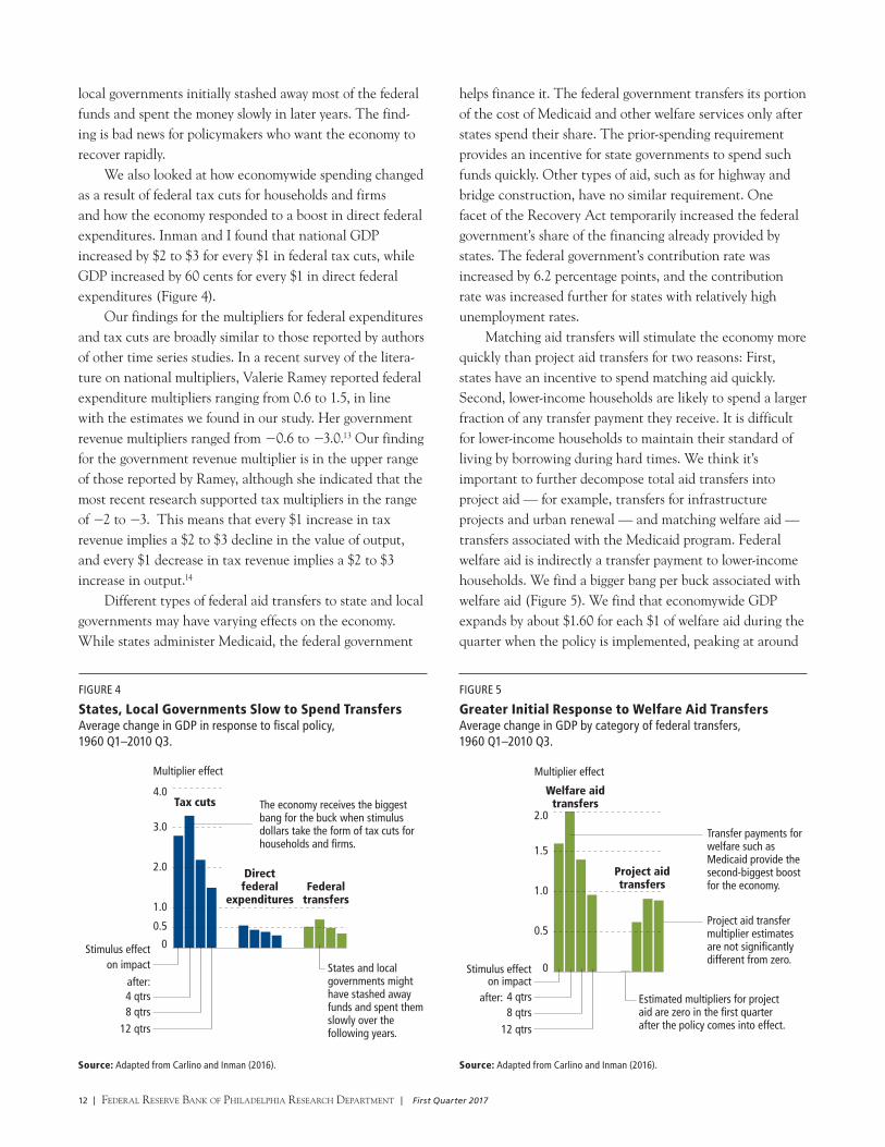
local governments initially stashed away most of the federal funds and spent the money slowly in later years. The find-ing is bad news for policymakers who want the economy to recover rapidly.
We also looked at how economywide spending changed as a result of federal tax cuts for households and firms and how the economy responded to a boost in direct federal expenditures. Inman and I found that national GDP increased by $2 to $3 for every $1 in federal tax cuts, while GDP increased by 60 cents for every $1 in direct federal expenditures (Figure 4).
Our findings for the multipliers for federal expenditures and tax cuts are broadly similar to those reported by authors of other time series studies. In a recent survey of the litera-ture on national multipliers, Valerie Ramey reported federal expenditure multipliers ranging from 0.6 to 1.5, in line with the estimates we found in our study. Her government revenue multipliers ranged from −0.6 to −3.0.13 Our finding for the government revenue multiplier is in the upper range of those reported by Ramey, although she indicated that the most recent research supported tax multipliers in the range of −2 to −3. This means that every $1 increase in tax revenue implies a $2 to $3 decline in the value of output, and every $1 decrease in tax revenue implies a $2 to $3 increase in output.14
Different types of federal aid transfers to state and local governments may have varying effects on the economy. While states administer Medicaid, the federal government
0
1.0
0.5
2.0
3.0
4.0Tax cuts
Multiplier effect
Federal transfers
Direct federal
expenditures
on impactStimulus effect
after:4 qtrs8 qtrs
12 qtrs
States and local governments might have stashed away funds and spent them slowly over the following years.
The economy receives the biggest bang for the buck when stimulus dollars take the form of tax cuts for households and firms.
FIGURE 4
States, Local Governments Slow to Spend TransfersAverage change in GDP in response to fiscal policy, 1960 Q1–2010 Q3.
Source: Adapted from Carlino and Inman (2016). Source: Adapted from Carlino and Inman (2016).

First Quarter 2017 | Federal reserve Bank oF PhiladelPhia research dePartment | 13
This is a 30 percent improvement in GDP growth compared with the actual Recovery Act mix of policies. In contrast, policies that emphasize either direct federal expenditures or project aid transfers to state and local governments would have increased per capita GDP growth by just 0.3 percent by the end of 2009 compared with the growth that resulted from the actual mix of policies.
CONCLUSION Did the Recovery Act work? The evidence suggests the economy did indeed grow more than it would have without the stimulus but likely not as much as it might have with a different type of stimulus. In particular, the evidence suggests that direct measures — tax relief for households and firms, and programs such as Medicaid that target families with low incomes, little wealth, and a limited ability to borrow — have contributed more to GDP growth than direct federal expenditures or project aid to state and local governments.
To the extent that the federal government implements its stimulus spending through transfers to state and local governments, perhaps that aid should target lower-income households and states that bear the brunt of the economic downturn. Emi Nakamura and her coauthor found that local multipliers are largest in areas that have greater slack in their local labor and capital markets. Areas with relatively higher unemployment rates and greater poverty could be targeted to receive more stimulus dollars. However, Christopher Boone and his colleagues found that the Recovery Act’s funds were distributed relatively equally across states. Perhaps the equal distribution of stimulus money
$2 during the first year before declining to about $1 after three years. In contrast, estimated multipliers for project aid range from zero during the first quarter that the policy is in effect to just under $1 and are statistically insignificant (Figure 5).
In sum, the economy receives a bigger boost when federal stimulus dollars take the form of tax cuts to households and firms and when stimulus dollars are earmarked for transfer payments such as Medicaid that benefit lower-income house-holds compared with direct federal expenditures and federal project aid transfers to state and local governments. It’s important to note that these findings only indicate which types of fiscal stimulus programs typically provide the biggest bang per buck and do not speak to the merits of any particular program.
Why does welfare aid to states have a bigger and more immediate effect? Inman and I find that, on average, state governments save about half of the federal project aid they receive but spend all of matching welfare aid on lower-income assistance. As a consequence, welfare aid has a stronger, more immediate, and longer-lasting impact on the private economy.15
Policy Analysis: Is There a Better Way?Our time series framework can be useful for policy analysis. How would GDP have changed without the stimulus package — the counterfactual projected path for GDP — compared with the projected path with the stimulus program? Inman and I re-estimated our time series model using quarterly data for 1960 through the first quarter of 2009. Based on these estimates, we simulated the economy’s performance through the rest of 2009. A comparison of the simulations with the actual mix of Recovery Act pro-grams (the actual allocations shown in Figure 6) suggests that growth in real GDP per person would have been 2 percent higher by the end of 2009 compared with the baseline of no stimulus.
As we have shown, programs vary widely in their effec-tiveness. Would a different mix of fiscal policies be more expeditious? Our research suggests that a mix of fiscal policies, one emphasizing the two most effective programs — direct tax relief to households and intergovernmental transfers to states targeted for assistance to lower-income households (the counterfactual allocation shown in Figure 6) — would have increased per capita GDP growth by 2.6 percent instead of 2.0 percent by the end of 2009 compared with the growth that resulted from the actual mix of policies.
Type of Stimulus Actual* Counterfactual
Tax cuts $45.2 bn $57.0 bn
Direct federal expenditures 11.8 0.0
Project aid transfers 27.5 0.0
Welfare aid transfers 37.0 64.5
Increase in GDP growth** 2.0% 2.6%
*Source: The actual allocations were gathered from Recovery.gov, a website that has since been taken down but whose information persists at least in part at https://web.archive.org/web/20140714154009/http://www.recovery.gov/arra/Pages/default.aspx and https://web.archive.org/web/20140709175719/http://www.recovery.gov/arra/Transparency/RecoveryData/Pages/RecipientSearch.aspx.** Adapted from Carlino and Inman (2016).
FIGURE 6
How Would a Different Mix Affect the Economy?Estimates of GDP’s simulated path under actual vs. counterfactual federal outlays, 1960 Q1–2009 Q1.

14 | Federal reserve Bank oF PhiladelPhia research dePartment | First Quarter 2017
was necessary to gain passage of the legislation. As a result, poorer urban states received additional welfare aid, richer and more rural states got additional infrastructure aid, and all states received more discretionary funding for public
REFERENCESAlesina, Alberto, and Silvia Ardagna. “Large Changes in Fiscal Policy: Taxes
Versus Spending,” Tax Policy and the Economy, 24 (2010) pp. 35–68.
Auerbach, Alan, and Yuriy Gorodnichenko. “Measuring the Output
Responses to Fiscal Policy,” American Economic Journal: Economic Policy, 4:2
(May 2012), pp. 1–27.
Boone, C., A. Dube, and E. Kaplan. “The Political Economy of Discretionary
Spending: Evidence from the American Recovery and Reinvestment Act,”
Brookings Papers on Economic Activity (Spring 2014), pp. 375–428.
Carlino, Gerald A., and Robert Inman. “Fiscal Stimulus in Economic Unions:
What Role for States?” Tax Policy and the Economy, 30 (2016) pp. 1–50.
Carlino, Gerald A., and Robert Inman. “A Narrative Analysis of Post-World
War II Changes in Federal Aid,” Federal Reserve Bank of Philadelphia
Working Paper 12–23/R (May 2013).
Carlino, Gerald A., and Robert Inman. “Local Deficits and Local Jobs: Can
U.S. States Stabilize their Own Economies?” Journal of Monetary Economics,
60, (July 2013), pp. 517–530.
Chodorow-Reich, G., L. Feiveson, Z. Liscow, and W. Woolston. “Does State
Fiscal Relief During Recessions Increase Employment? Evidence from the
American Recovery and Reinvestment Act,” American Economic Journal:
Economic Policy, 4 (August 2012), pp. 118–145.
Council of Economic Advisers. “The Economic Impact of the American
Recovery and Reinvestment Act Five Years Later,” Economic Report of the
President (February 2014), pp. 91–146.
Congressional Budget Office. “Estimated Impact of the American Recovery
and Reinvestment Act on Employment and Economic Output from January
2010 Through March 2010,” (May 2010).
Drautzburg, Thorsten, and Harald Uhlig. “Fiscal Stimulus and Distortionary
Taxation,” Review of Economic Dynamics (forthcoming).
Feyrer, James, and Bruce Sacerdote. “Did the Stimulus Stimulate? Real Time
Estimates of the Effects of the American Recovery and Reinvestment Act,”
unpublished manuscript (June 2012). http://www.dartmouth.edu/~bsacerdo/
Stimulus2012_06_21.pdf.
Johnson, David S., Jonathan A. Parker, and Nicholas S. Souleles. “Household
Expenditure and the Income Tax Rebates of 2001,” American Economic
Review, 96:5 (December 2006), pp. 1,589-1,610.
Meissner, Thomas, and Davud Rostam-Afschar. “Do Tax Cuts Increase
Consumption? An Experimental Test of Ricardian Equivalence,” Free
University Berlin School of Business & Economics Discussion Paper 2014–062
(July 12, 2014).
Mountford, Andrew, and Harald Uhlig. “What Are the Effects of Fiscal Policy
Shocks?” Journal of Applied Econometrics, 24 (2009), pp. 960–992.
Nakamura, Emi, and Jon Steinsson. “Fiscal Stimulus in a Monetary Union:
Evidence from U.S. Regions,” American Economic Review, 104 (March 2014),
pp. 753–792.
Ramey, Valerie. “Identifying Government Spending Shocks: It’s All in the
Timing,” Quarterly Journal of Economics, 126 (February 2011), pp. 1–50.
Shoag, Daniel. “The Impact of Government Spending Shocks: Evidence on the
Multiplier from State Pension Plan Returns,” unpublished manuscript, 2011.
Suárez Serrato, Juan Carlos, and Philippe Wingender. “Estimating Local
Multipliers,” unpublished manuscript, 2014.
Uhlig, Harald. “Some Fiscal Calculus,” American Economic Review Papers
and Proceedings, 100 (May 2010), pp. 30–34.
Wilson, Daniel J. “Fiscal Spending Jobs Multipliers: Evidence from the 2009
American Recovery and Reinvestment Act,” American Economic Journal:
Economic Policy, 4 (August 2012), pp. 251–282.
education. In the case of the Recovery Act, reallocating all the money spent on direct federal expenditures to federal tax relief and all intergovernmental project aid transfers to welfare transfers would have improved GDP growth.

First Quarter 2017 | Federal reserve Bank oF PhiladelPhia research dePartment | 15
NOTES
1 This article focuses only on which types of stimulus programs typically
provide the most impact per dollar spent and not on the merits of any
particular program.
2 For a breakdown of spending reported as of July 9, 2014, see https://
web.archive.org/web/20140709164207/http://www.recovery.gov/arra/
Transparency/fundingoverview/Pages/fundingbreakdown.aspx. For further
information, see related postings by the Bureau of Economic Analysis, “Effect
of the ARRA on Selected Federal Government Sector Transactions,” http://
www.bea.gov/recovery/pdf/arra-table.pdf; the Treasury Department, https://
www.treasury.gov/initiatives/recovery/Pages/recovery-act.aspx; the White
House, https://www.whitehouse.gov/recovery; and the Council of Economic
Advisors, “The Economic Impact of the American Recovery and Reinvestment
Act Five Years Later,” https://www.whitehouse.gov/administration/eop/cea/
factsheets-reports; and https://www.whitehouse.gov/administration/eop/
cea/factsheets-reports.
3 Ricardian equivalence holds only when the government raises revenue
through lump-sum taxation that is a fixed amount. A car registration
fee is an example of a lump-sum tax because it’s the same regardless of
the income of the vehicle owner.
4 Alan Auerbach and Yuriy Gorodnichenko found that fiscal multipliers are
considerably larger during recessions than in expansions, ranging from 0 to
0.5 in economic expansions and between 1.0 and 1.5 during recessions.
The multiplier is larger in contractions than in expansions because there is
more slack in labor and capital markets during downturns than when the
economy is closer to its full potential.
5 Most of the studies discussed in this article calculate short-run multipliers
because they look at changes in GDP in the same period, or within a few
periods, as the change in fiscal policy. Andrew Mountford and Harald
Uhlig in 2009 and Thorsten Drautzburg and Uhlig in a forthcoming article
calculated long-run multipliers as the present value of a stream of changes
in GDP over some horizon relative to the change in fiscal policy over that
horizon. Drautzburg and Uhlig found that long-run multipliers are smaller
or in some cases slightly negative compared with short-run multipliers.
6 The zero lower bound occurs when the short-term nominal policy interest
rate is at or near zero, limiting monetary policymakers’ ability to stimulate
economic growth by lowering short-term rates.
7 Drautzburg and Uhlig calculate the long-run multipliers as the cumulative
effects of policy over time.
8 A number of cross-state studies have estimated local fiscal multipliers using
data unrelated to the Recovery Act stimulus programs. The multipliers from
these studies provide a useful comparison with the findings from the studies
that specifically looked at the effects on local employment associated with
the Recovery Act. For example, Daniel Shoag used cross-state variation in
state government spending and found a cost per job of $35,000, similar to
the cost per job found by James Feyrer and Bruce Sacerdote. See the article
by Gabriel Chodorow-Reich, Laura Feiveson, Zachary Liscow, and William
Woolston for a discussion of the cross-state studies.
9 One exception is the cross-county study by Juan Carlos Suárez Serrato and
Philippe Wingender, who looked at federal spending at the county level.
(Spending related to the Recovery Act was outside their sample period.) They
allowed for economic spillovers among neighboring counties and found
a cost of $25,000 per job created. Similar to Shoag, Suárez Serrato and
Wingender found a cost per job created of $30,000 when they did not
account for these spillovers, suggesting that the spillovers were positive and
economically significant. Robert Inman and I in 2013 used a sample of the 48
contiguous U.S. states for the period 1973–2009 and found interregional
spillovers from local macroeconomic fiscal policies that were significant, both
statistically and quantitatively.
10 There are important differences between a VAR and the macroeconomic
models used by the CBO and the CEA. A VAR does not require as much
knowledge about the forces influencing a variable as does a macroeconomic
model with its many underlying equations. The only prior knowledge
required by a VAR is a list of variables that can be hypothesized to affect
each other over time. Importantly, the Carlino and Inman VAR analyzed
the effects of the types of programs used by the Recovery Act ex post, or
after the economy had responded to those types of Recovery Act programs,
whereas the macroeconomic models produced an ex ante forecast of the
likely effects of the act.

16 | Federal reserve Bank oF PhiladelPhia research dePartment | First Quarter 2017
11 Typically, legislative deliberations about fiscal policy actions are much
more drawn out than the process was for the Recovery Act, and the longer
deliberations have important implications for determining the ultimate
effectiveness of these initiatives. Once an administration has recognized
the need for fiscal policy action, it must propose the appropriate legislation
to Congress. Any legislation must be considered by both branches of
Congress. Congress must approve the legislation and the president must
sign it into law before the policy initiatives can be implemented. The process
can be quite lengthy. The long legislative process provides the public with
clear signals regarding impending changes in fiscal policy. People may
act today in anticipation of future changes in policy. Economists refer to
the anticipation of future fiscal policy initiatives as fiscal foresight. For
example, Valerie Ramey showed that increases in government spending are
anticipated several quarters before they actually occur and that failure to
account for these anticipation effects can lead to biased estimates of fiscal
multipliers. One way researchers have attempted to deal with the problem
of fiscal foresight is by examining the narrative history (using magazines
such as Business Week and other periodicals) of government revenue and
spending news to determine when private agents could have reasonably
anticipated a policy change. This approach has the advantage of isolating the
approximate date at which agents form their expectations of future changes
in government spending. A disadvantage of the narrative approach is that
often there is only a small number of events.
12 Since it is possible for state policymakers to anticipate future changes in
intergovernmental grants, Inman and I in 2013 constructed narrative
measures based on the legislative record of federal grants-in-aid programs
beginning with the Federal Highway Act of 1956 and continuing through
the Recovery Act of 2009. We used the narrative measures of federal grants-
in-aid programs to directly account for fiscal foresight. The findings of our
paper are summarized in this article.
13 Although Figure 4 shows positive or absolute values for the tax revenue
multipliers, the tax multiplier is actually negative, because a tax cut leads to
an increase in GDP.
14 Alberto Alesina and Silvia Ardagna in 2010 looked at fiscal stimulus policy
in 21 advanced economies and found that “fiscal stimuli based on tax cuts
are more likely to increase growth than those based on spending increases.”
15 Instead of using economywide data, a number of studies have used
household-level data and found that federal income tax rebates, especially
to lower-income households, can be an effective way to stimulate consumer
spending. In a 2006 study, David Johnson, Jonathan Parker, and Nicholas S.
Souleles looked at changes in household consumption spending resulting
from the 2001 recession-era federal income tax rebates. They found that
a considerable percentage of the rebates was quickly spent, especially by
lower-income or credit-constrained households.

First Quarter 2017 | Federal reserve Bank oF PhiladelPhia research dePartment | 17
competitive advantage. Credit unions respond that their member-owned, cooperative structure allows them to provide unique financial services that would otherwise not be available, and hence their tax-exempt status is warranted. Taking no stance in this debate, we instead seek to shed light on some central questions: Do small banks and credit unions serve separate clienteles, or do they compete in the same markets with essentially indistinguishable products? What exactly do the new regulations change? What evi-dence can we find that regulatory changes for credit unions might take market share away from small banks?
THE GROWTH OF CREDIT UNIONS In recent decades, the lending industry has undergone major regulatory shifts, particularly in the wake of the 1980s sav-ings and loan crisis and the 2008–2009 financial crisis. The loan business has also been altered by market innovations such as the rise of mortgage-backed securities. Such events and forces have reordered the compet itive positions of banks, credit unions, and thrifts, a cat egory consisting of savings and loans and savings banks.1 As credit unions and large banks have increased their market share, small banks and thrifts have lost market share (Figure 1). Indeed, since 1990, thrifts have shrunk significantly.
Since the financial cri-sis, both credit unions and
BANKING TRENDSCredit Unions’ Expanding FootprintIs there any evidence new rules could cause small banks to lose market share to credit unions?
BY JAMES DISALVO AND RYAN JOHNSTON
Consumers should have options in the financial marketplace. They vote with their feet and wallets. I’ve always believed there should be at least one credit union option available to every American.
— Rick Metsger, chairman, National Credit Union Administration
The “changing face” of the credit union industry should raise serious questions about whether the tax exemption continues to serve a legitimate policy goal. While credit unions were created to serve people of modest means, the benefits of the tax subsidy skew to affluent consumers.
— Rob Nichols, president and CEO, American Bankers Association
One of the main banking stories of the past 25 years has been the dramatic growth of large banks. Less well known is that credit unions have been expanding their market share during this time, too, especially after membership criteria were relaxed in 1998. While credit unions have been increasing their market share, small banks’ market share has declined. And now, legal changes that took effect in January 2017 expanded credit unions’ capacity to make loans to commercial customers, raising further concern among small
banks that they might lose ground to credit unions.
As nonprofit institu-tions, credit unions are largely tax-exempt, a status that for-profit banks argue constitutes an unfair
SMALL VS. LARGEWe define small banks as those not in the top 100 in banking assets in a given year, including assets of only their commercial bank subsidiaries. Large banks are defined as banking organizations such as bank holding companies that are ranked in the top 100 in banking assets in that year, including assets of only their commercial bank subsidiaries.
James DiSalvo is a banking structure specialist and Ryan Johnston is a banking structure associate at the Federal Reserve Bank of Philadelphia. The views expressed in this article are not necessarily those of the Federal Reserve.

18 | Federal reserve Bank oF PhiladelPhia research dePartment | First Quarter 2017
working at the same com- pany or in the same industry or living in the same well-defined neighborhood, community, or rural district. The 1998 law permitted multiple common bonds. For instance, Allegheny Health Services Employees Federal Credit Union in Pittsburgh originally served only the employees of Allegheny General Hospital and their family members. But it later expanded its membership to include other organizations such as Family Services of Western Pennsylvania, Milestone, Inc., and Three Rivers Adoption Council.
HOW CREDIT UNIONS COMPETE WITH SMALL BANKSIn addition to competing for households’ deposits, credit unions compete for borrowers, mainly in the markets for residential real estate loans and consumer loans (Figure 2).
small banks have increased their mortgage lending, although with some interesting differences that we will explore for possible evidence that the two types of lenders serve some-what different types of borrowers. And as we will see, while small banks have pulled back on consumer lending, credit unions have gained ground there (Figure 2).
Despite credit unions’ expansion, they still represent a modest 7.1 percent of all assets and loans of all depository institutions. And while there are a few large credit unions, most are small compared with small banks. The average credit union has about $198.5 million in total assets, compared with $443.6 million for an average small bank.2 Nonetheless, in terms of total assets held, credit unions have expanded at a more rapid pace than small banks and even large banks (Figure 3).
The credit union market is much less concentrated than the commercial banking market. Nationally, the top 10 credit unions control only about 15 percent of the credit union market, compared with the top 10 banks, which control approximately 57 percent of the banking market.
Credit unions have grown significantly since a 1998 law relaxed credit union membership rules. The Credit Union Membership Access Act of 1998 was created in order to ex-pand credit unions’ reach to more citizens as well as improve safety and soundness practices.3 Previously, a credit union’s members all had to share a single common bond, such as
FIGURE 3
Growing Faster Than Small BanksTotal asset growth index, 1984=100.
0
200
100
400
600
800
1,000
1,200
Credit unions
Large banks
Small banks
1984 1990 2015201020001995 2005
Sources: Federal Financial Institutions Examination Council and National Credit Union Administration Call Reports.
0%
5%
10%
15%
20%
25%
30%
Credit unionsThrifts
Small banks
1990 1995 201520102000 2005
Large banks’ market share in 2015
73.1%
FIGURE 1
Gain in Market Share Versus ThriftsShare of total U.S. depository institution assets.
Sources: Federal Financial Institutions Examination Council and National Credit Union Administration Call Reports.
FIGURE 2
Competitive in RRE, Consumer MarketsShares of total loans, loan types, 2015.
Credit unions
0% 35%
Small banksTotal by type
Commercial real estate
Residential real estate
Commercial & industrial
Consumer
Sources: Federal Financial Institutions Examination Council and National Credit Union Administration Call Reports.Note: Shares of total U.S. depository institutions’ loans and shares of loan types. Loan amounts as of December 31, 2015.

First Quarter 2017 | Federal reserve Bank oF PhiladelPhia research dePartment | 19
Residential real estate loans are home loans that are secured by one- to four-family properties, and the consumer loans made by credit unions are predominantly auto loans. While the relative shares of these two categories have changed over time, their combined total has remained roughly the same at 85 percent of credit unions’ loan portfolios since at least 2000 (Figure 4). The main source of growth over the past 20 years has been in residential real estate lending, particularly home mortgages and home equity lines of credit.
Residential Real Estate Lending Credit unions have increased their share of the home loan market continuously since 1990 and at an accelerated pace since the financial crisis. Since the crisis, both credit unions and small banks have been able to increase their market share of the residential real estate market at the expense of the thrift industry as well as the large banks, which had been taking an increasing share of this market in the years leading up to the crisis (Figure 5).
Both credit unions and small banks specialize in a similar market niche: loans that are not intended to be securitized — that is, bundled into securities and sold as single interest-bearing investments. So, these mortgages don’t have to conform to the stricter standards set by the major securitizers, the government-sponsored enterprises (GSEs) Fannie Mae and Freddie Mac.4 Large banks have mostly
0%
10%
20%
30%
40%
50%
60%
Real estate loans
Auto loans
Leases and other loans
Credit cards and other lines of credit
2000 20152005 2010
FIGURE 4
Specialization in RRE and Auto LoansLoan types as shares of credit unions’ total loans.
Source: National Credit Union Administration Call Reports.
stepped back from making nonconforming loans after the financial crisis and now concentrate on making loans that conform to GSE specifications and that are almost always securitized.5
In terms of both loan sizes and borrower incomes, the mortgages for purchasing one- to four-family homes that credit unions and small banks make are similar across all income tracts, according to Home Mortgage Disclosure Act data (Figure 6).6
Furthermore, both small banks and credit unions make the lion’s share of their home loans in middle-income tracts.7 Thus, the data are largely consistent with the contention by the American Bankers Association that small banks and credit unions are competing for similar customers and pro-viding loans on similar terms.8 However, credit unions make a slightly larger portion of their loans in low- and moderate- income tracts than small banks do, providing modest support for the view that credit unions serve some customers that might not have received home loans from banks.
The broad similarities, though, hide a significant difference between the lending policies of credit unions and small banks. Credit unions reject a larger proportion of their home loan applicants, and the difference in rejection rates is greatest in low- and middle-income tracts. Furthermore, credit unions have a smaller average charge-off ratio than both small banks and large banks — 0.071 for credit unions
0%
10%
20%
30%
40%
50%
60%
70%
Credit unions
Large banks
Small banks
Thrifts
1990 1995 201520102000 2005
FIGURE 5
Recent RRE Growth at Expense of Large BanksShare of residential real estate loans, by lender type.
Sources: Federal Financial Institutions Examination Council and National Credit Union Administration Call Reports.Note: Shares are as of total U.S. depository institutions’ residential real estate loans. Loan amounts as of December 31, 2015.

20 | Federal reserve Bank oF PhiladelPhia research dePartment | First Quarter 2017
compared with 0.107 for small banks and 0.224 for large banks as of the end of 2015. Together, their higher rejection rates and lower charge-off rates suggest that credit unions have more stringent credit standards than small banks do.
Why credit unions apparently have more stringent credit policies for home loans is unclear. We examined the share of government-insured loans at small banks and credit unions and found that a larger share of small bank home loans was insured by the Veterans Administration or Federal Housing Administration.9 In principle, having a smaller share of government-insured loans on their books might lead credit unions to be more worried about default, because they are more exposed to loss in the event of default on uninsured loans. This exposure could prompt them to adopt tighter lending standards, resulting in their observed higher rejection rates. Yet, when we restrict our attention to conventional, uninsured loans, rejection rates at both credit unions and small banks remain largely unchanged.
We also examined the median incomes in each tract of those applicants rejected for home loans by banks versus those rejected by credit unions to see whether a higher rejec-tion rate could be explained by a lower-income applicant
pool. But the median incomes of the applicants that credit unions rejected in each tract were actually higher than for those applicants that small banks rejected.10 Another possibility, which unfortunately isn’t possible to explore using the available data, is that small banks may sell a larger share of their loans to the GSEs than credit unions do. If credit unions indeed keep more of the mortgages they make on their own books, they’re more directly exposed than small banks are to the risk that their borrowers will default and arguably have more reason to impose tighter lending criteria as a safeguard.
Consumer Lending Since 1990, credit unions have doubled their share of the consumer loan market, while small banks now have only a small share of consumer loans, having lost market share both to large banks and credit unions (Figure 7).
The vast majority of credit union consumer loans are auto loans. As of the second quarter of 2016, credit unions made up roughly 25 percent of the auto loan market.11 While small banks do make some auto loans, they represent only about 4 percent of the market.
0%
10%
20%
30%
40%
50%
60%
70%
Credit unions
Large banks
Small banksThrifts
1990 1995 201520102000 2005
Sources: Federal Financial Institutions Examination Council and National Credit Union Administration Call Reports.Note: Shares of total U.S. depository institutions’ consumer loans. Loan amounts as of December 31, 2015.
FIGURE 7
Small Banks Slip in Consumer MarketShare of total consumer loans, by lender type.
Share of Loans Percent Rejected Median Loan Amount Median IncomeLow/
Moderate Middle UpperLow/
Moderate Middle UpperLow/
Moderate Middle UpperLow/
Moderate Middle Upper
2011
Credit Unions
11.92% 52.96% 35.12% 34.66% 18.80% 13.99% $96,000 $120,000 $170,000 $60,000 $66,000 $93,000
Small Banks
10.87% 56.88% 32.25% 16.76% 13.69% 9.00% $89,000 $116,000 $175,000 $57,000 $63,000 $90,000
2012
Credit Unions
14.18% 48.36% 37.47% 33.11% 17.74% 13.60% $96,000 $127,000 $180,000 $58,000 $67,000 $94,000
Small Banks
13.10% 49.72% 37.18% 15.57% 13.08% 8.59% $95,000 $123,000 $190,000 $57,000 $65,000 $92,000
2013
Credit Unions
13.89% 48.35% 37.75% 29.04% 16.72% 12.91% $104,000 $133,000 $192,000 $60,000 $69,000 $97,000
Small Banks
12.79% 49.63% 37.59% 14.87% 12.44% 8.47% $102,000 $130,000 $200,000 $60,000 $67,000 $96,000
2014
Credit Unions
13.43% 48.28% 38.30% 26.48% 15.48% 11.39% $108,000 $138,000 $196,000 $61,000 $71,000 $100,000
Small Banks
13.26% 49.71% 37.03% 13.62% 11.70% 8.05% $107,000 $133,000 $206,000 $60,000 $69,000 $98,000
FIGURE 6
Similar Applicants, yet Credit Unions Turn Down a Bigger ShareMedian loan amount and borrower income in each type of census tract between 2011 and 2014.
Source: Home Mortgage Disclosure Act data.Note: A low-income census tract is defined as one where the median family income is less than 60 percent of the median family income of the metropolitan statistical area (MSA) in which it’s located. A moderate-income tract has a median family income between 60 and 80 percent of the MSA median. A middle-income tract has a median family income between 80 and 120 percent of the MSA median, and an upper-income tract has a median family income greater than 120 percent of the MSA median.

First Quarter 2017 | Federal reserve Bank oF PhiladelPhia research dePartment | 21
Credit unions’ main competition in the auto loan market is large banks, which are able to offer indirect loans through auto dealers.12 In contrast, credit unions lend to members applying directly to the credit union rather than arranging financing at the dealership.
Although the available data do not permit a direct com - parison between the terms of auto loans arranged by credit unions and those made by small banks, we can compare the terms from credit unions with those of banks with less than $50 billion in assets, which includes small plus midsize banks. Together, these banks make about 7 percent of all auto loans, for both new and used cars. Car buyers who finance their purchases through a credit union generally have lower credit scores, longer loan maturities, and lower monthly payments compared with those who take out a car loan from a small or medium-size bank. These results are different from our findings for residential real estate lending. In the market for car loans it appears that credit unions provide more flexible lending terms to their borrowers than do banks.
One might expect apparently less stringent credit stan-dards to lead to higher loan losses. But credit unions have a lower aggregate ratio of consumer loan net charge-offs to average consumer loans than banks do. Together, these data suggest that credit unions have some comparative advantage over small banks in auto lending — an advantage whose possible sources we will discuss later.
LIKELY TO EXPAND IN COMMERCIAL LENDING?New regulations that took effect in January 2017 expand credit unions’ capacity to make commercial and industrial loans and commercial real estate loans, together known as member business loans (MBLs).13 (See the timeline, Credit Union Legislation and Regulation.)
The new regulations’ liberalization puts credit unions on closer to level ground with small banks by raising limits on loan size to individual borrowers, relaxing the rules governing collateral requirements for business borrowers, and getting rid of the requirement that borrowers post full and unconditional personal guarantees — that is, a written promise from a majority business owner guaranteeing payment on a loan if the business cannot make the payment.
In addition, the new regulations effectively relax credit unions’ ceiling on business loans, which had been set at 12.25 percent of a credit union’s total assets, by excluding nonmember business loans from the limit. These regulatory changes may not be the end of the line. In 2016, Senators Rand Paul and Sheldon Whitehouse proposed legislation
pool. But the median incomes of the applicants that credit unions rejected in each tract were actually higher than for those applicants that small banks rejected.10 Another possibility, which unfortunately isn’t possible to explore using the available data, is that small banks may sell a larger share of their loans to the GSEs than credit unions do. If credit unions indeed keep more of the mortgages they make on their own books, they’re more directly exposed than small banks are to the risk that their borrowers will default and arguably have more reason to impose tighter lending criteria as a safeguard.
Consumer Lending Since 1990, credit unions have doubled their share of the consumer loan market, while small banks now have only a small share of consumer loans, having lost market share both to large banks and credit unions (Figure 7).
The vast majority of credit union consumer loans are auto loans. As of the second quarter of 2016, credit unions made up roughly 25 percent of the auto loan market.11 While small banks do make some auto loans, they represent only about 4 percent of the market.
0%
10%
20%
30%
40%
50%
60%
70%
Credit unions
Large banks
Small banksThrifts
1990 1995 201520102000 2005
Sources: Federal Financial Institutions Examination Council and National Credit Union Administration Call Reports.Note: Shares of total U.S. depository institutions’ consumer loans. Loan amounts as of December 31, 2015.
FIGURE 7
Small Banks Slip in Consumer MarketShare of total consumer loans, by lender type.
that would raise the ceiling on credit unions’ MBLs to 27.5 percent of assets.
These new regulations have been a source of concern for the banking industry.15 Business lending is important to small banks. Despite losing market share across a range of products to large banks over the past 25 years, small banks have retained a steady share of small business lend-ing.16 Furthermore, commercial real estate loans represent the single largest share of small banks’ loan portfolios.17 The numbers suggest that small banks continue to have some comparative advantage in small business lending and commercial real estate lending vis-à-vis large banks.
So, how can we get a handle on whether the recent and proposed regulatory liberalizations will lead credit unions to ramp up their business lending? We do not have the data about individual loans that would permit us to examine the effects of the liberalized lending standards in the current regulations. But we can shed some light on the potential effects of raising lending limits. One way to shed light on the likelihood of a significant expansion is to gauge the fraction of credit unions for which the current ceiling might already be binding — that is, it might already be a constraint on their underlying capacity to expand their MBL portfolios. In other words, can we get a sense of how many credit unions would already have gotten more heavily into business lending were it not for the current regulatory limit?

22 | Federal reserve Bank oF PhiladelPhia research dePartment | First Quarter 2017
To estimate how many credit unions might be poised to expand their commercial lending, we calculate the share of credit unions in each size category whose MBLs make up between 8 and 12.25 percent of their total assets.18 We find that an increasing number of credit unions — mainly those with assets in excess of $500 million — are near the old ceiling. For example, we see that among credit unions with assets of $1 billion to $5 billion, the 12.25 percent limit might be binding on nearly a quarter of them. About 17 percent of credit unions with assets in the $500 million to $1 billion range might view the 12.25 percent limit as binding (Figures 8 and 9). This suggests that the higher ceiling might prompt these institutions to further increase their business lending activities.19
While this estimate may sound somewhat ominous for small banks, it’s important to keep these numbers in perspective. The number of credit unions that might be ready to increase their business lending above the current limit totals just 228. That number represents about 3.7 percent of all credit unions in the United States. Although this isn’t a trivial number, it also isn’t very large.20
DOES THE SUBSIDY SERVE A PUBLIC PURPOSE?One thing we haven’t yet discussed is how their different tax status could affect the loan terms offered by credit unions versus small banks. While our findings for home loans do not suggest that credit union borrowers benefit from the tax subsidy, our evidence of more flexible terms for auto loans suggests that these borrowers might capture some of the benefit. The credit union industry has argued that their structure as nonprofit, mutually owned institutions enables credit unions to provide flexible, low-cost financial products and services to their members, while the banking industry maintains that the sole difference is that banks pay taxes and credit unions don’t.
How large is this taxpayer subsidy? The total estimated value of the credit union tax subsidy was $1.7 billion in 2015, according to the Office of Management and Budget (Figure 10). This total represents 3 percent of total revenues in 2015, certainly not a negligible number.
Of course, just because credit unions receive this tax benefit does not necessarily mean that it’s passed on to their members, either through higher deposit rates or more attrac-tive loan terms. A 2016 working paper attempted to quantify who actually captures the subsidy. Robert DeYoung and his coauthors compared a sample of credit unions to roughly comparable small banks and estimated that approximately
2020
2010
2000
1990
1980
1970
1960
1950
1930
1940
1920
1910
1900
1909 The first credit union in the United States is formed in New Hampshire with the help of Alphonse Desjardins, who earlier had imported to Canada the European idea of cooperative financial institutions. The first U.S. credit union law — the Massachusetts Credit Union Act of 1909 — was a precursor to future credit union legislation.
1934 The Federal Credit Union Act of 1934 is signed into law by President Franklin D. Roosevelt, authorizing federally chartered credit unions in all states.
1970 The National Credit Union Administration (NCUA) is formed to supervise federal credit unions. The National Credit Union Share Insurance Fund is also formed to insure credit union deposits.
1977 New laws allow credit unions to offer new services to members, including mortgage lending and share (deposit) certificates.
1998 The Credit Union Membership Access Act of 1998 is signed into law by President Bill Clinton, authorizing credit unions to have a multiple common bond charter, establishing new requirements for financial statements and audits, imposing an aggregate limit of 12.25 percent of total assets on MBLs, restricting the NCUA’s authority to regulate conversions by credit unions to savings banks, and setting new capital rules and requirements.
2017 A new NCUA rule takes effect that gives credit unions more flexibility and autonomy in providing MBLs and commercial loans to their members. It replaces prescriptive requirements and limitations — such as collateral and security requirements, equity requirements, and loan limits — with a broader, principle-based approach.
Source: NCUA, “A Brief History of Credit Unions,” https://www.ncua.gov/About/Pages/history.aspx.
Credit Union Legislation and Regulation 14
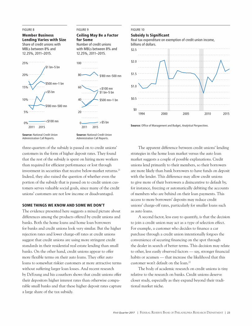
First Quarter 2017 | Federal reserve Bank oF PhiladelPhia research dePartment | 23
three-quarters of the subsidy is passed on to credit unions’ customers in the form of higher deposit rates. They found that the rest of the subsidy is spent on hiring more workers than required for efficient performance or lost through investment in securities that receive below-market returns.21 Indeed, they also raised the question of whether even the portion of the subsidy that is passed on to credit union cus-tomers serves valuable social goals, since many of the credit unions’ customers are not low income or disadvantaged.
SOME THINGS WE KNOW AND SOME WE DON’TThe evidence presented here suggests a mixed picture about differences among the products offered by credit unions and banks. Both the home loans and home loan borrowers for banks and credit unions look very similar. But the higher rejection rates and lower charge-off rates at credit unions suggest that credit unions are using more stringent credit standards in their residential real estate lending than small banks. On the other hand, credit unions appear to offer more flexible terms on their auto loans. They offer auto loans to somewhat riskier customers at more attractive terms without suffering larger loan losses. And recent research by DeYoung and his coauthors shows that credit unions offer their depositors higher interest rates than otherwise compa-rable small banks and that these higher deposit rates capture a large share of the tax subsidy.
The apparent difference between credit unions’ lending strategies in the home loan market versus the auto loan market suggests a couple of possible explanations. Credit unions lend primarily to their members, so their borrowers are more likely than bank borrowers to have funds on deposit with the lender. This difference may allow credit unions to give more of their borrowers a disincentive to default by, for instance, freezing or automatically debiting the accounts of members who are behind on their loan payments. This access to more borrowers’ deposits may reduce credit unions’ charge-off rates, particularly for smaller loans such as auto loans.
A second factor, less easy to quantify, is that the decision to join a credit union may act as a type of selection effect. For example, a customer who decides to finance a car purchase through a credit union intentionally forgoes the convenience of securing financing on the spot through the dealer in search of better terms. This decision may relate to other, less easily observed factors — say, stronger financial habits or acumen — that increase the likelihood that this customer won’t default on the loan.22
The body of academic research on credit unions is tiny relative to the research on banks. Credit unions deserve closer study, especially as they expand beyond their tradi-tional market niche.
FIGURE 8
Member Business Lending Varies with SizeShare of credit unions with MBLs between 8% and 12.25%, 2011–2015.
0%
5%
10%
15%
20%
25%$1 bn–5 bn
$500 mn–1 bn
>$5 bn
$100 mn–500 mn
<$100 mn
2011 2015
Source: National Credit Union Administration Call Reports.
0
20
40
60
80
100
$1 bn–5 bn
$500 mn–1 bn
>$5 bn
$100 mn–500 mn
<$100 mn
2011 2015
FIGURE 9
Ceiling May Be a Factor for SomeNumber of credit unions with MBLs between 8% and 12.25%, 2011–2015.
Source: National Credit Union Administration Call Reports.
$0
$0.5
$1.0
$1.5
$2.0
$2.5
1994 20152000 2005 2010
FIGURE 10
Subsidy Is SignificantReal tax expenditure on exemption of credit union income, billions of dollars.
Source: Office of Management and Budget, Analytical Perspectives.

24 | Federal reserve Bank oF PhiladelPhia research dePartment | First Quarter 2017
NOTES1 Thrifts traditionally specialized in making fixed-rate home loans that they
held on balance sheet — a niche that was significantly eroded by market
forces such as the growth of securitization and regulatory changes such as
the deregulation of deposit rates. The Dodd–Frank Financial Reform
Act abolished thrifts’ most important remaining source of comparative
advantage, a solicitous regulator, the Office of Thrift Supervision.
2 Unless otherwise noted, the data presented here are from Federal Financial
Institutions Examination Council and National Credit Union Administration
Call Reports.
3 Along with new multiple group membership rules, the credit union act
of 1998 also set new rules related to financial statements and audits,
member business loans (MBLs), conversions to savings bank charters,
capitalization and net worth, and the National Credit Union Insurance Fund
equity ratio and premium authority.
4 Nonconforming loans include jumbo loans, loans with smaller down
payments, and adjustable-rate loans. A jumbo loan is a home loan for an
amount that exceeds conforming loan limits established by regulation.
The jumbo loan limit is $417,000 in most of the United States and $625,500
in the highest-cost areas.
5 For a discussion of the differences between small and large bank residential
real estate lending, see our Banking Trends article, “How Dodd–Frank
Affects Small Bank Costs.”
6 Unless otherwise stated, the loan sizes and borrower incomes we discuss
in this article are the median values for accepted mortgage applicants in
a given census tract: A low-income tract is defined as one where the median
family income is less than 60 percent of the median family income of the
metropolitan statistical area (MSA) in which it’s located. A moderate-income
tract has a median family income between 60 and 80 percent of the MSA
median. A middle-income tract has a median family income between 80 and
120 percent of the MSA median, and an upper-income tract has a median
family income greater than 120 percent of the MSA median.
7 Although there are no data that would permit a comparison of loan rates
by income tract, it does appear that credit unions at best charge the same
rate on mortgages. For example, the average rate on a 30-year fixed
mortgage at U.S. credit unions on September 30, 2016, was 3.60 percent,
the exact average rate that U.S. banks were charging on that day. These data
are from the National Credit Union Administration and SNL Securities (now
known as S&P Global Market Intelligence).
8 See the association president’s letter.
9 We also include Farm Security Administration loans and Rural Housing
Service loans.
10 Of course, income is only one indicator of a borrower’s creditworthiness,
but the Home Mortgage Disclosure Act data set does not include other
indicators of creditworthiness for rejected applicants. Without more detailed
information about rejected applicants, we can’t rule out the possibility that
the applicant pool at credit unions is riskier.
REFERENCESDeYoung, Robert, John Goddard, Donald McKollop, and John Wilson. “Who
Consumes the Credit Union Tax Subsidy?” working paper, December 2016.
DiSalvo, James, and Ryan Johnston. “The Growing Role of CRE Lending,”
Federal Reserve Bank of Philadelphia Banking Trends, Third Quarter 2016.
DiSalvo, James, and Ryan Johnston. “How Dodd–Frank Affects Small Bank
Costs,” Federal Reserve Bank of Philadelphia Banking Trends, First
Quarter 2016.
DiSalvo, James, and Ryan Johnston. “How Our Region Differs,” Federal
Reserve Bank of Philadelphia Banking Trends, Third Quarter 2015.
Metsger, Rick. NCUA Report, November 15, 2016, https://www.ncua.
gov/newsroom/Pages/ncua-report/2016/november/modernizing-field-
membership-good-american-consumers.aspx.
Nichols, Rob. Letter from American Bankers Association president to
Kevin Brady, chairman of the House Ways and Means Committee, April
18, 2016, http://www.aba.com/Advocacy/LetterstoCongress/Documents/
TaxLetterKevinBradyWMSF041816.pdf.

First Quarter 2017 | Federal reserve Bank oF PhiladelPhia research dePartment | 25
11 These statistics are calculated using automobile trade line data acquired
from Equifax by the Federal Reserve Bank of Philadelphia. The data on
charge-offs are from the Federal Financial Institutions Examination Council
and National Credit Union Administration Reports of Condition.
12 Anecdotally, unlike large banks, small banks do not have the necessary
scale to bargain with dealers to gain favorable terms.
13 Member business loans (MBLs) consist of construction and land
development loans, loans secured by nonfarm residential property, loans
secured by nonfarm nonresidential property (together, commercial real estate
loans in banking parlance), loans secured by farmland, loans to finance
agricultural production, commercial and industrial (C&I) loans, unsecured
business loans, and unsecured revolving lines of credit granted for business
purposes. The outstanding net aggregate business loan amount per lender
must be over $50,000 to be considered an MBL.
14 For more details and information on the new MBL rule, see https://
www.ncua.gov/regulation-supervision/Documents/Regulations/
FIR2016218member-business-loans.pdf.
15 See for example, a press release from the Independent Community Bankers
of America, https://www.icba.org/news-events/latest-news/2016/11/17/icba-
standing-firm-in-credit-union-lawsuit.
16 See our Banking Trends article, “How Our Region Differs.”
17 See our Banking Trends article, “The Growing Role of CRE Lending.”
18 There are five size categories: credit unions with assets of less than $100
million, $100 million to $500 million, $500 million to $1 billion, $1 billion to
$5 billion, and greater than $5 billion.
19 Before 2017, some credit unions could be given an exemption to make
business loans above the 12.25 percent limit. To qualify for an exemption,
a credit union had to submit a waiver and meet one of three requirements:
They must have a low-income designation, be chartered for the purpose of
making MBLs, or have a history of primarily making MBLs (meaning MBLs are
at least 25 percent of a credit union’s outstanding loans or MBLs comprise
the largest portion of their loan portfolio). As of year-end 2015, 142 credit
unions with total assets of $65.2 billion were over the 12.25 percent asset
limit. These represent 2.3 percent of credit unions and 5.3 percent of total
credit union assets.
20 Our discussion assumes that a credit union that is not near the regulatory
limit is unlikely to be constrained by the regulation. However, for some very
small credit unions, the fixed costs of, for example, hiring a lending officer
might prevent them from making any business loans unless the limit is raised.
21 DeYoung and his coauthors also review the literature on the relative
efficiency of credit unions and other mutually owned intermediaries. Prior
studies had found conflicting results, so DeYoung and his coauthors’ results
are best viewed as a valuable contribution to a still unsettled debate.
22 A third factor that has been noted by some observers is the possibility that
credit unions have what banking economists refer to as “soft information”
about their customers. Perhaps this is related to their deposit account activity
or to the common bond requirement. However, we do not find evidence that
soft information is important for home loan decisions.

26 | Federal reserve Bank oF PhiladelPhia research dePartment | First Quarter 2017
These working papers present preliminary findings of research conducted by Philadelphia Fed economists, analysts, and visiting scholars. Visit our website for more abstracts and papers.
RESEARCH UPDATE
THE PERILS OF NOMINAL TARGETSA monetary authority can be committed to pursuing an in-flation, price-level, or nominal-GDP target yet systematically fail to achieve the prescribed goal. Constrained by the zero lower bound on the policy rate, the monetary authority is unable to implement its objectives when private-sector expectations stray far enough from the target. Low-inflation expectations become self-fulfilling, resulting in an additional Markov equilibrium in which the monetary authority falls short of the nominal target, average output is below its efficient level, and the policy rate is typically low. Introducing a stabilization goal for long-term nominal rates can implement a unique Markov equilibrium without fully compromising stabilization policy.
Working Paper 16–30. Roc Armenter, Federal Reserve Bank of Philadelphia Research Department. Supersedes Working Paper 14–02/R.
REGULATING A MODELThe authors study a situation in which a regulator relies on models produced by banks in order to regulate them. A bank can generate more than one model and choose which models to reveal to the regulator. The regulator can find out the other models by monitoring the bank, but, in equilibrium, monitoring induces the bank to produce less information. The authors show that a high level of monitoring is desirable when the bank’s private gain from producing more information is either sufficiently high or sufficiently low (e.g., when the bank has a very little or very large amount of debt). When public models are more precise, banks produce more information, but the regulator may end up monitoring more.
Working Paper 16–31. Yaron Leitner, Federal Reserve Bank of Philadelphia Research Department; Bilge Yilmaz, University of Pennsylvania Wharton School.
AGGREGATE LIQUIDITY MANAGEMENT It has been largely acknowledged that monetary policy can affect borrowers and lenders differently. This paper
investigates whether the distributional effects of monetary policy are an inherent feature of monetary economies with private credit instruments. In the authors’ framework, both money and credit instruments can potentially be used as media of exchange to overcome trading frictions in de centralized markets. Entrepreneurs have access to productive projects but face credit constraints due to limited pledgeability of their returns. Monetary policy affects the liquidity premium on private credit and thereby influences the cost of borrowing and the level of investment, but any attempt to ease borrowing constraints results in suboptimal decentralized-market trading activity. The authors show that this policy trade-off is not an inherent feature of monetary economies with private credit instruments. If they consider a richer set of aggregate liquidity management instruments, such as the payment of interest on inside money and capital requirements, it is possible to implement an efficient allocation.
Working Paper 16–32. Todd Keister, Rutgers University; Daniel Sanches, Federal Reserve Bank of Philadelphia Research Department.
EXCESS RESERVES AND MONETARY POLICY IMPLEMENTATION In response to the Great Recession, the Federal Reserve resorted to several unconventional policies that drastically altered the landscape of the federal funds market. The cur-rent environment, in which depository institutions are flush with excess reserves, has forced policymakers to design a new operational framework for monetary policy implementation. The authors provide a parsimonious model that captures the key features of the current federal funds market along with the instruments introduced by the Federal Reserve to imple - ment its target for the federal funds rate. They use this model to analyze the factors that determine rates and volumes under the new implementation framework and to study the effects of changes in the policy rates and other shocks to the economic environment. The authors also calibrate the

First Quarter 2017 | Federal reserve Bank oF PhiladelPhia research dePartment | 27
model and use it as a quantitative benchmark for applied analysis, with a particular emphasis on understanding the role of the overnight reverse repurchase agreement facility in supporting the federal funds rate.
Working Paper 16–33. Roc Armenter, Federal Reserve Bank of Philadelphia Research Department; Benjamin Lester, Federal Reserve Bank of Philadelphia Research Department.
Supersedes Working Paper 15–35/R.
FAMILY JOB SEARCH AND WEALTH: THE ADDED WORKER EFFECT REVISITED The authors develop and estimate a model of family job search and wealth accumulation. Individuals’ job finding and job separations depend on their partners’ job turnover and wages as well as common wealth. They fit this model to data from the Survey of Income and Program Participation (SIPP). This dataset reveals a very asymmetric labor market for household members, who share that their job finding is stimulated by their partners’ job separation, particularly during economic downturns. The authors uncover a job search-theoretic basis for this added worker effect and find that this effect is stronger with more children in the house-hold. They also show that excluding wealth and savings from the analysis and estimation leads to underestimating the interdependency between household members. Their analysis shows that the policy goal of supporting job search by increasing unemployment transfers is partially offset by a partner’s lower unemployment and wages.
Working Paper 16–34. J. Ignacio García-Pérez, Universidad Pablo de Olavide and FEDEA; Sílvio Rendon, Federal Reserve Bank of Philadelphia Supervision, Regulation, and Credit.
A TRACTABLE MODEL OF THE DEMAND FOR RESERVES UNDER NONLINEAR REMUNERATION SCHEMES The author proposes a tractable model of the demand for reserves under nonlinear remuneration schemes that can encompass quota systems and voluntary reserve target frameworks, among other possibilities. He shows how such remuneration schemes have several favorable properties re-garding interest-rate control by the central bank. In particular, wider tolerance bands can reduce rate volatility due to variations in the supply of reserves, both large and small, although they may curtail trading in the inter-bank market.
Working Paper 16–35. Roc Armenter, Federal Reserve Bank of Philadelphia Research Department.
INCUMBENCY DISADVANTAGE IN U.S. NATIONAL POLITICSThe authors document that postwar U.S. national elections show a strong pattern of “incumbency disadvantage”: If the presidency has been held by a party for some time, that party tends to lose seats in Congress. A model of partisan politics with policy inertia and elections is presented to explain this finding. The authors also find that the incumbency disadvantage comes sooner for Democrats than Republicans. Based on the observed Democratic bias in Congress (Democrats, on average, hold more seats in the House and Senate than Republicans), the model also offers an explanation for the second finding.
Working Paper 16–36. Satyajit Chatterjee, Federal Reserve Bank of Philadelphia Research Department; Burcu Eyigungor, Federal Reserve Bank of Philadelphia Research Department.
ENDOGENOUS POLITICAL TURNOVER AND FLUCTUATIONS IN SOVEREIGN DEFAULT RISK A sovereign default model in which the sovereign derives private benefits from public office and contests elections to stay in power is developed. The economy’s growth process is modeled as a Markov switching regime, which is shown to be a better description of the data for the authors’ set of emerging economies. In the model, consistent with evidence, the sovereign is less likely to be reelected if economic growth is weak. In the low-growth regime, there is higher probability of loss of private benefits due to turnover, which makes the sovereign behave more myopically. This growth-linked variation in effective discount factor is shown to be important in generating volatility in sovereign spreads.
Working Paper 17–01. Satyajit Chatterjee, Federal Reserve Bank of Philadelphia Research Department; Burcu Eyigungor, Federal Reserve Bank of Philadelphia Research Department.
MODELING THE REVOLVING REVOLUTION: DEBT COLLECTION CHANNEL The authors investigate the role of information technology (IT) in the collection of delinquent consumer debt. They argue that the widespread adoption of IT by the debt collection industry in the 1990s contributed to the observed expansion of unsecured risky lending such as credit cards. The authors’ model stresses the importance of delinquency and private information about borrower solvency. The prevalence of delinquency implies that the costs of debt collection must be borne by lenders to sustain incentives to repay debt. IT mitigates informational asymmetries,

28 | Federal reserve Bank oF PhiladelPhia research dePartment | First Quarter 2017
allowing lenders to concentrate collection efforts on delinquent borrowers who are more likely to repay.
Working Paper 17–02. Lukasz A. Drozd, Federal Reserve Bank of Philadelphia Research Department; Ricardo Serrano-Padial, Drexel University.
Supersedes Working Paper 13–12.
NATURAL AMENITIES, NEIGHBORHOOD DYNAMICS, AND PERSISTENCE IN THE SPATIAL DISTRIBUTION OF INCOME The authors present theory and evidence highlighting the role of natural amenities in neighborhood dynamics, suburbanization, and variation across cities in the persistence of the spatial distribution of income. Their model generates three predictions that they confirm using a novel database of consistent-boundary neighborhoods in U.S. metropolitan areas, 1880–2010, and spatial data for natural features such as coastlines and hills. First, persistent natural amenities anchor neighborhoods to high incomes over time. Second, naturally heterogeneous cities exhibit persistent spatial distributions of income. Third, downtown neighborhoods in coastal cities were less susceptible to the widespread decentralization of income in the mid-20th century and experienced an increase in income more quickly after 1980.
Working Paper 17–03. Sanghoon Lee, University of British Columbia; Jeffrey Lin, Federal Reserve Bank of Philadelphia Research Department.
Supersedes Working Paper 15–46.
OPTIMAL DOMESTIC (AND EXTERNAL) SOVEREIGN DEFAULT Infrequent but turbulent episodes of outright sovereign default on domestic creditors are considered a “forgotten history” in macroeconomics. The authors propose a heterogeneous-agents model in which optimal debt and default on domestic and foreign creditors are driven by distributional incentives and endogenous default costs due to value of debt for self-insurance, liquidity, and risk-sharing. The government’s aim to redistribute resources across agents and through time in response to uninsurable shocks produces a rich dynamic feedback mechanism linking debt issuance, the distribution of government bond holdings, the default decision, and risk premia. Calibrated to Spanish data, the model is consistent with key cyclical comovements and features of debt-crisis dynamics. Debt exhibits protracted fluctuations. Defaults have a low frequency of 0.93 percent, are preceded by surging debt and spreads, and occur with relatively low external debt. Default risk limits the sustainable debt, and yet spreads are zero most of the time.
Working Paper 17–04. Pablo D’Erasmo, Federal Reserve Bank of Philadelphia Research Department; Enrique G. Men-doza, University of Pennsylvania, National Bureau of Economic Research, Penn Institute for Economic Research.

1918 19631942 1989 2015
Sign up to receive e-mail
notifications of every issue
of Economic Insights at
www.philadelphiafed.org/
notifications.
Back issues of the
Business Review remain
available on our website
at www.philadelphiafed.
org/research-and-data/
publications/business-
review.
Second Quarter 2017Volume 2, Issue 2
Taxing the 1 Percent
The Value of Loyal Customers
Regional Spotlight
Research Update
ECONOMIC
INSIGHTSFederal reserve Bank oF PhiladelPhia
2016

Read Economic Insights and other publications online at https://www.philadelphiafed.org/research-and-data/publications/.
Past Business Review articles can be found at https://www.philadelphiafed.org/research-and-data/publications/business-review.
Also on our website: data and analysis on the regional and national economy, resources for teachers, community development
initiatives and research, and more.
www.philadelphiafed.org
ADDRESS SERVICE REQUESTED
Federal reserve Bank oF PhiladelPhia
Ten Independence MallPhiladelphia, Pennsylvania 19106-1574
PRESORTED STANDARDU.S. POSTAGE
PAID
PHILADELPHIA, PAPERMIT #583
E X P L O R E A N D L E A R N