drummond geometry - an introduction
TRANSCRIPT

8/3/2019 Drummond Geometry - An Introduction
http://slidepdf.com/reader/full/drummond-geometry-an-introduction 1/14
WHAT IS DRUMMOND GEOMETRY?
By Ted Hearne
It is a unique form of market analysis developed over a 40-year period by Charles
Drummond, a Canadian trader. Drummond Geometry is both a trend-following and acongestion-action methodology. It leads rather than lags the market, and uses projectedcharts to map future market activity. It foretells the most likely scenario that shows the
highest probability of occurring in the immediate future and can be custom fitted to one’s
personality and trading style.
The key elements of Drummond Geometry include a combination of the following three
basic categories of trading tools and techniques:
1. A series of short-term moving averages.
2. Short-term trend lines.
3. Multiple time-period overlays.
The fundamental concepts of this methodology are simple, but have been worked out to a
high degree of sophistication. In this introduction, we will look at the PLdot, the firstmajor building block of Drummond Geometry. PL stands for Point and Line, two of the
main techniques of Drummond Geometry.
The concept of flow is central to Drummond Geometry. This methodology reflects how
all of life moves from one extreme to another, flowing back and forth in a cyclical or
wave-like manner. The markets also move with a rhythmic flow that traders can learn tosee. By discovering the flow’s underlying form through visualization, traders can monitor
the market's flow and utilize that information to realize a profit. This is one importantfunction of the PLdot.
The PLdot can be applied to any commodity, future, or stock and is a short-term movingaverage based on three bars of data that capture the trend/non-trend activity of the time
frame that is being charted. The PLdot from the last three bars is plotted as a dot or line
on the next bar to appear. The formula for the PLdot is the average of the average of the
high, low, and close of the last three bars.
PLdot= {Avg[H(1),L(1),C(1)] + Avg[H(2),L(2)C(2) + Avg[H(3),L(3),C(3)]] / 3
The PLdot is a series of points which describe the consensus of market activity in amathematical sense. The first thing to note is that the dot bears a constant relationship to
the immediate past—something that captures the recent energy of the hour, of the day, or
of whatever time period the trader is looking at.
Think for a moment about the human activity that lies behind the charted record of
trading. The PLdot is a short-term average and it represents the collective activity of thethree latest bars (or time periods). One could say it is the center, the gut, the solar plexus

8/3/2019 Drummond Geometry - An Introduction
http://slidepdf.com/reader/full/drummond-geometry-an-introduction 2/14
or the heart of all this activity. One can say that it represents the collective opinion,expressed in action, of the current group, crowd, or mob as you may prefer to call it
(depending on the intensity of market activity). This is important, because the concept of
the crowd is one of the key elements of trading, market psychology, and market activity.
We all know that a crowd can be incredibly powerful. When it moves, the crowd wants tomove everything and everyone with it. When it stops, it wants to make everything around
it stop as well. The crowd is collective energy and manifests attractive energy. It is builtout of the need to belong; the need for protection; the need for safety; and the need to
feed, reproduce, and continue in its existence. The crowd has momentum and it has
power. If a trader follows the crowd, or "goes with the flow," he will not be hurt, because
the nature of the crowd is to protect its members.
The crowd does not always go in the same direction-it stops and it changes direction. But
the crowd is always overshooting its goal, because in its wild rush it does not realize that
it has gone too far until it sweeps past the target.
The key point in Drummond Geometry is that the crowd momentum does not stop at
some random point in time and space—it is forced to stop at certain specific areasdictated by larger or smaller energy flows. All energy forces are wave-like in nature and
in their various configurations; energy flows are the root cause of economic conditions,
emotional states, and all collective and most individual actions.
These energy flows can be monitored and acted upon in a wide range of human
endeavors, including trading for profit. But the energy flows that are reflected in the
charts of market activity are not exclusive to the market itself. Similar wave-like energyflows exist throughout the natural universe and can be witnessed in a wide range of
phenomena, from the easily observed waves of ocean surf, to large-scale patterns such assunspot activity to the wave-like cycles of history.
The PLdot moving average has been empirically arrived at and has proven its usefulnessin a multitude of markets. The PLdot moves in a straight line when the market is in a
trend, but moves horizontally across the page in congestions. It is extraordinarily
sensitive to trending markets, and is very quick to register the change of a market out of
congestion into trend. But it is sensitive to a trend that is ending as well

8/3/2019 Drummond Geometry - An Introduction
http://slidepdf.com/reader/full/drummond-geometry-an-introduction 3/14
FIGURE 7.1 The PLdot is a key building block of Drummond Geometry.
Figure 7.1 is a chart of the daily T-Bond futures; we see the PLdot move in a relatively
straight line from bars 1 - 5. Then we see a short move sideways and following that thedots move in a straight line down again for the last 4 bars of the chart. The tendency of
the PLdot to move in a straight line can be very helpful in monitoring a trend.
Many traders find that just one simple observation--trade with the trend if the market ison one side of the dot and in congestion if the market closes on both sides of the dot—is
enough to bring profitable participation in the markets. In Figure 7.1, we see the close of
the bar first on one side of the PLdot and then on the other side of the PLdot in bars 6 and10. This is a sign of the market in congestion. In bars 7.8, and 9, we see closes below the
PLdot, indicating trending activity to the downside. In bars 10 we again see a close
above the PLdot, indicating that the market is again heading into congestion.

8/3/2019 Drummond Geometry - An Introduction
http://slidepdf.com/reader/full/drummond-geometry-an-introduction 4/14
FIGURE 7.2 The PLdot is a sensitive indicator of trend/congestion activity.
In Figure 7.2 of the daily T-Bond futures, we see two trend reversals. In bars 1, 2, and 3
we saw the market in a down-trend and the PLdots were above the close of each bar. The
trading strategy would be to sell resistance. But on bar 5, we saw the market close abovethe PLdot and this marked the end of the down-trend. As the market moved into the up-
trend the PLdot switched sides and we do not see a close on the under side of the dot until
bar 11, when the close moved under the PLdot and the trend is over. From bar 5 until bar10 the strategy is to buy support. Note that the dots move in a straight line until the trend
is over, and then immediately stop moving in a straight line. When the new trend resumes
to the downside, the dots again move in a straight line.
As you examine market activity through the lens of the PLdot, we see that prices will
often veer away from the PLdot, but then come back to it. The pattern in Figure 7.2 is
called the Return to the PLdot. It is a very simple, tradable pattern. When prices get along way away from the PLdot, it is likely that they will return to the PLdot to check out
the warmth, safety, and acceptance of the center of the crowd. The trick is to know
exactly when and where "a long way away from the dot" actually is. The action of the
PLdot along with short-term trend lines, time frame analysis and many other DrummondGeometry tools and techniques can help traders determine when that point is likely to be
occurring with a high degree of certainty. The art of Drummond Geometry as a method of
technical analysis comes in the application of these tools in various combinations under
various market conditions.
In Figure 7.3 we see a number of bars marked with the Return to the PLdot (or PLdot
Refresh) pattern. In this chart every bar manifests some degree of PLdot refresh; we havemarked some of the most dramatic for you. When prices move far away from the dot, the
trader would be alert to signs that the market will turn and return to the PLdot. Thus in
the sixth full bar we see that the market is far away from the PLdot and moves back to it.
The market eventually continued through the PLdot and in the next series of bars we see

8/3/2019 Drummond Geometry - An Introduction
http://slidepdf.com/reader/full/drummond-geometry-an-introduction 5/14
good examples of this tendency for price to return to the vicinity of the PLdot. In each of these situations the trader would take a position against the trend by going short at the
apex of the bar. The exact price at which to take a position would be marked by other
Drummond Geometry tools such as the short-term trend lines and the time frameoverlays. But the tendency of the market to turn and retrace its path when it is far away
from the PLdot and move back to the PLdot is a constant in the market that is enormouslyhelpful to the trader as he or she attempts to anticipate direction.
FIGURE 7.3 The "PLdot Refresh." When the market is a long way away from the PLdot, Drummond Geometry says it will return to it to
"Refresh" its energy.
Another observation based on the PLdot is the PLdot Push. In this pattern, when a trendis underway, the PLdots seem to be pushing the bars in the direction of the trend, either
upwards or downwards, depending on the direction of the move. You can imagine that
the dots are doing the work, that they are pushing the market up. In fact, in DrummondGeometry the trader generally envisions that the dots contain a lot of energy, and that
their energy waxes and wanes depending on the circumstances. If the dots push strongly,
they create a very strong trend; if they sometimes lose energy the trend weakens. This
methodology has created a metaphor for market energy that can reap rich rewards as
these techniques are further developed.
8/3/2019 Drummond Geometry - An Introduction
http://slidepdf.com/reader/full/drummond-geometry-an-introduction 6/14
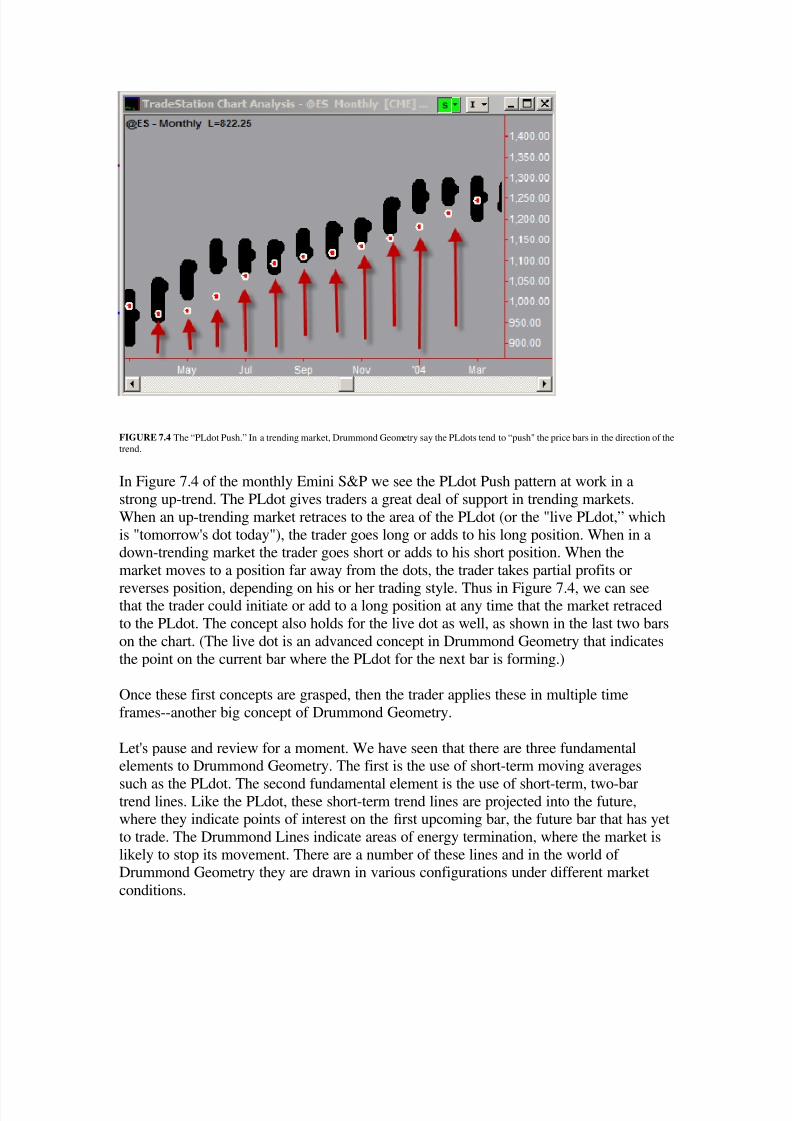
FIGURE 7.4 The “PLdot Push.” In a trending market, Drummond Geometry say the PLdots tend to “push" the price bars in the direction of the
trend.
In Figure 7.4 of the monthly Emini S&P we see the PLdot Push pattern at work in a
strong up-trend. The PLdot gives traders a great deal of support in trending markets.
When an up-trending market retraces to the area of the PLdot (or the "live PLdot,” which
is "tomorrow's dot today"), the trader goes long or adds to his long position. When in adown-trending market the trader goes short or adds to his short position. When the
market moves to a position far away from the dots, the trader takes partial profits or
reverses position, depending on his or her trading style. Thus in Figure 7.4, we can seethat the trader could initiate or add to a long position at any time that the market retraced
to the PLdot. The concept also holds for the live dot as well, as shown in the last two bars
on the chart. (The live dot is an advanced concept in Drummond Geometry that indicates
the point on the current bar where the PLdot for the next bar is forming.)
Once these first concepts are grasped, then the trader applies these in multiple time
frames--another big concept of Drummond Geometry.
Let's pause and review for a moment. We have seen that there are three fundamentalelements to Drummond Geometry. The first is the use of short-term moving averages
such as the PLdot. The second fundamental element is the use of short-term, two-bartrend lines. Like the PLdot, these short-term trend lines are projected into the future,where they indicate points of interest on the first upcoming bar, the future bar that has yet
to trade. The Drummond Lines indicate areas of energy termination, where the market is
likely to stop its movement. There are a number of these lines and in the world of Drummond Geometry they are drawn in various configurations under different market
conditions.

8/3/2019 Drummond Geometry - An Introduction
http://slidepdf.com/reader/full/drummond-geometry-an-introduction 7/14
When used by a trader knowledgeable in Drummond Geometry, these two main sets of tools--the short-term moving averages and the short-term termination trend lines—can
establish support and resistance areas in the near-term future with surprising accuracy.
FIGURE 7.5 Dow Jones Industrial average LAST—Daily.
In Figure 7.5, these two tools are shown in action. The trend is defined and supported by
the PLdots, and the Drummond termination lines forecast the extremes of the bars. Thegreen areas above and below the last bar to the right show the support and resistance
zones. These zones are defined by the Drummond Lines.
Although it is obviously very helpful to know where support and resistance will form in
the upcoming bar, the bar that has not yet traded, this information alone is not enough to
trade successfully.
Success in trading depends not just on knowing where support and resistance is located,
but whether or not that support or resistance will be strong or weak. Strong resistance will
hold, and drive the market back down, whereas weak resistance will break and permit the
market to rise higher. Similarly, strong support will hold, and send the market higher,while weak support will break, and let the market move lower. Knowing when support or
resistance is strong and when it will be weak is the name of the game in trading. Once a
trader can reliably make that determination, then it is possible to trade with confidence.
This challenge has perplexed traders for many decades. The problem is especially thorny
because there is often little if anything on any single time frame chart that will tell a
trader if support or resistance will hold. And yet without question this is the fundamental
problem of trading--will the support or resistance hold, or will it break?

8/3/2019 Drummond Geometry - An Introduction
http://slidepdf.com/reader/full/drummond-geometry-an-introduction 8/14
The trader who wishes to make progress in resolving this question must learn to look atthe market in context. Establishing market context, and showing how market context can
be used to determine if support or resistance will be strong or weak, is accomplished
through time frame coordination. The coordination of support and resistance in different
time frames is the third major tool of Drummond Geometry.
In principle, the concept of time frame coordination is simple and clear. Basically, it is
this: lf you can align support and resistance levels on various time frames and take actionwhen they coincide, and avoid action when they do not reinforce each other, your success
ratio will be much better than if you rely on a single time frame alone.
Charles Drummond came to his understanding of time period interaction empirically,
some 40 years ago, as he was establishing for himself the ways that chart patterns playedout in a single time frame chart. As he was looking at the short-term moving average and
some of the short-term, two-bar trend lines that form the basis of his methodology, he
realized that these patterns existed on any chart. It did not matter if they were hourly,
daily, weekly, monthly, or yearly.
Reflecting on this simple observation, Drummond realized that it would be interesting tosee what happened when the charts were superimposed onto one another. And
furthermore, he thought it might be relevant to see when the support of one time frame
would line up with the support of a higher time frame. Thus he would look at the dailysupport or resistance in the area of weekly support or resistance, and weekly resistance in
the area of monthly resistance, and so forth. When this was done, viola!
The multiple time frame approach has proven to be a fundamental advance in the field of
technical analysis and one that can significantly improve trading results.
Today we find many traders looking at more than one time frame chart when they
analyze the market. But few have developed the approach into a comprehensive,
effective, trading methodology that combines analytical sophistication with tradable rulesand principles. Some technicians have experimented with time frames, others have not.
Yet this area is most probably the most important new direction in contemporary
technical analysis, and will likely be the most fertile ground for exploration in the nextfew years. The current popular approaches related to fractals, chaos, complexity theory,
and the like, are all fiddling with the fundamental concept of time frame analysis.
Let's look at the concept in detail. What is meant by the words time frame anyway? Atime frame is any regular sampling of prices in a time series, from the smallest such as
one minute up to the longest, which might for practical purposes be capped out at in a
ten-year bar chart (each bar representing ten years), although there is no theoretical limit.
A single time frame chart might commonly be hourly, daily, weekly, or monthly.
There is no magic in selecting one time frame over another as a starting point. All timeframes are somewhat arbitrary and are set more by custom than by science. With the
advent of 24-hour global trading even the common sense division into daily and weekly

8/3/2019 Drummond Geometry - An Introduction
http://slidepdf.com/reader/full/drummond-geometry-an-introduction 9/14
charts can be called more arbitrary than not. In purely theoretical terms, there is nodifference in validity between a weekly chart and a nine-day chart, nor any intrinsic
superiority of a 16-hour chart over a daily. ln practical terms, however, Drummond
Geometry analysts generally stick with conventional customary divisions into hourly,
daily, weekly, and the like.
The essential starting point for time frame coordination is to note that the Drummond
support and resistance tools are valid for any chart based on any time frame. Minute,hour, day, week, month—it does not matter, the patterns formed and the termination
points indicated flagged by the tools of Drummond Geometry lines will appear and can
be followed on bar charts in any time frame. Consider:
• The Drummond dot and the Drummond Geometry support and resistance
lines appear on any time frame (e.g., daily, hourly, and 15 minute).
• If market analysis is coordinated to show the interaction of these time
frames, then the trader can monitor what happens when the support and
resistance lines of the different time frames coincide. This is an extremelypowerful concept, because support or resistance on one time period has a
much higher likelihood of holding when it is backed up by support or
resistance on a higher time period.
How does Drummond Geometry approach time period coordination? First, the trader must decide what he or she is trying to do, for that will determine the
arrangement of time frames. lf the trader is trying to take as much as is possible out of a
weekly bar (i.e., to sell the weekly high and buy the weekly low), then the trader has a“weekly focus" and the weekly chart would be the trader’s “focus time period." The focus
time frame creates the bar chart on which the trader is trying to place his or her trades.
If the trader is trying to pick off the daily highs and lows, then he has a "daily focus." If
he is trying to sell the monthly high and buy the monthly low, then he has a "monthly
focus."
Second, to see the market in context, the trader would then select a higher time period. If
the focus time period is daily, then the higher time period would be weekly. If the focus
time period is weekly, than the higher time period would be monthly.
Third, the trader would select a lower time frame. The lower time frame would be used to
monitor the market at key decision points and to determine at the earliest possiblemoment exactly what is occurring at those areas where the market is encountering
significant support or resistance levels.
Let's say that you wish to trade a weekly focus. If this is so, and you would like to see if
the integration of time frames holds potential, then you need to look at both a higher time
frame and s lower time frame. The next higher time frame would be the monthly and the
next lower time frame would be the daily.

8/3/2019 Drummond Geometry - An Introduction
http://slidepdf.com/reader/full/drummond-geometry-an-introduction 10/14
FIGURE 7.6 Dow Jones: Monthly-weekly-daily.
Figure 7.6 shows an example of a coordinated look at three time periods. Now what can
be observed? On the monthly chart we see Drummond Lines that are providing monthly
support. On the weekly chart during the first week in February (the last bar to the right)we see Drummond Lines establishing support for the weekly bar. On the daily chart for
February 2nd (the last bar to the right) we see support areas set up by the Drummond
Lines. This coordination of monthly, weekly, daily support means that the support will
likely be strong.
Note that this powerful technique of time frame coordination combined with the
projection of support and resistance areas permits the trader to accurately and confidentlymake a hypothesis in advance about where the market would react to predicted resistance.
This ability to predict an event and then to monitor it as it occurs is very powerful.

8/3/2019 Drummond Geometry - An Introduction
http://slidepdf.com/reader/full/drummond-geometry-an-introduction 11/14
FIGURE 7.7 Dow Jones: Weekly-daily-60 minute.
Figure 7.7 presents another example. The same principle is in evidence here but it isshown in much faster time frames. The focus is the daily, the higher time frame is the
weekly, and the lower time frame is the hourly.
The situation is very similar to the previous example although the time frames are
different. Support is established on the weekly chart, and in the same area on the dailychart. On the 60-minute chart we see support from the daily area represented by the large
rectangle as well as support from the 60-minute chart. This combination of multi-periodsupport gives the trader a clear indication of a good place to buy.
Note that in these examples the technique works regardless of the time frames used.
8/3/2019 Drummond Geometry - An Introduction
http://slidepdf.com/reader/full/drummond-geometry-an-introduction 12/14
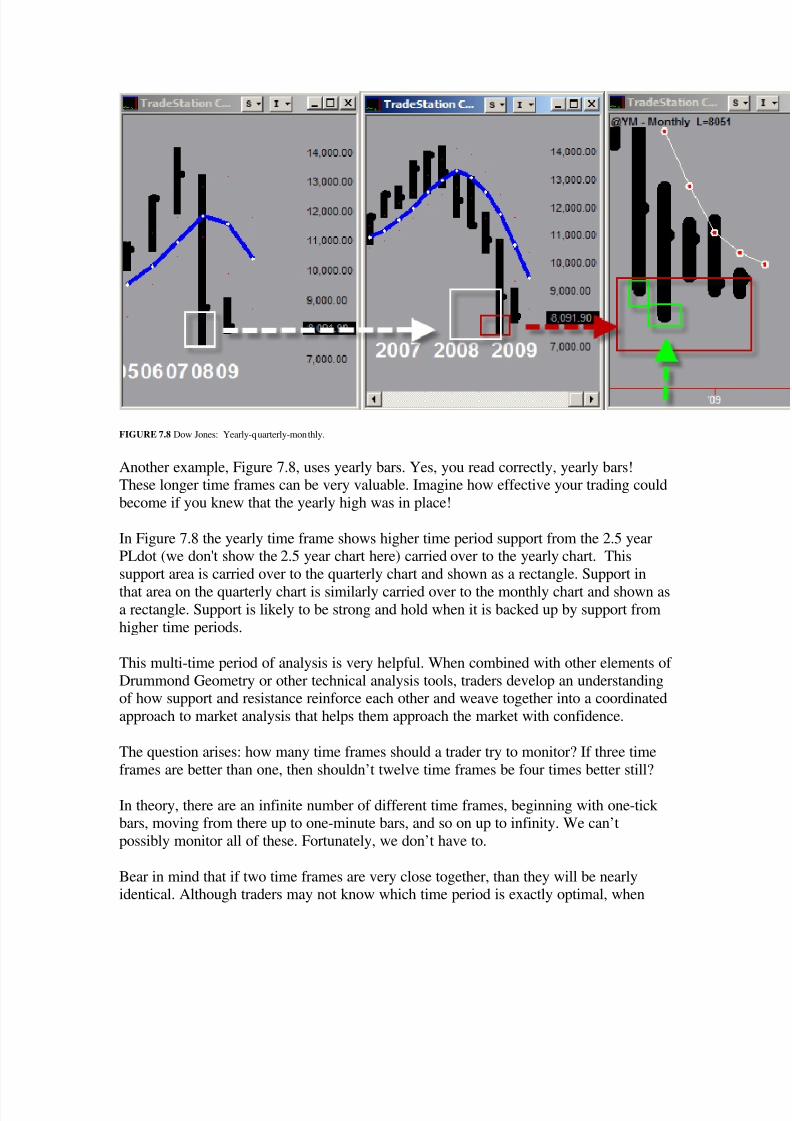
FIGURE 7.8 Dow Jones: Yearly-quarterly-monthly.
Another example, Figure 7.8, uses yearly bars. Yes, you read correctly, yearly bars!These longer time frames can be very valuable. Imagine how effective your trading could
become if you knew that the yearly high was in place!
In Figure 7.8 the yearly time frame shows higher time period support from the 2.5 yearPLdot (we don't show the 2.5 year chart here) carried over to the yearly chart. This
support area is carried over to the quarterly chart and shown as a rectangle. Support in
that area on the quarterly chart is similarly carried over to the monthly chart and shown asa rectangle. Support is likely to be strong and hold when it is backed up by support from
higher time periods.
This multi-time period of analysis is very helpful. When combined with other elements of
Drummond Geometry or other technical analysis tools, traders develop an understandingof how support and resistance reinforce each other and weave together into a coordinated
approach to market analysis that helps them approach the market with confidence.
The question arises: how many time frames should a trader try to monitor? If three time
frames are better than one, then shouldn’t twelve time frames be four times better still?
In theory, there are an infinite number of different time frames, beginning with one-tick bars, moving from there up to one-minute bars, and so on up to infinity. We can’t
possibly monitor all of these. Fortunately, we don’t have to.
Bear in mind that if two time frames are very close together, than they will be nearlyidentical. Although traders may not know which time period is exactly optimal, when

8/3/2019 Drummond Geometry - An Introduction
http://slidepdf.com/reader/full/drummond-geometry-an-introduction 13/14
they are very close together then the information one gets from each time period will be
very similar, and hence of less value.
Should one use the 60 tick chart? Would not a 65 tick chart be better? Why not a 67 tick?
What if everyone used the 60 tick, then maybe a different time period chart would be
better? There is no end to the speculation, and all of these questions are valid. However,one thing that can be said for certain is that it is helpful to have time period charts
separated by a significant amount of time as opposed to being very close to one another.The useful information comes from the major differences and major similarities in
support and resistance as the energy of different time frames is mapped.
The factor-of-five rule helps determine which time frames to select for this type of
analysis. This rule states that the first higher time frame should be roughly five times aslong as the focus time frame. The second higher time frame should be five times as long
as the first higher time frame, and so on. Similarly the first lower time frame would
ideally be five times lower than the focus time frame, and so forth.
This is a rule-of-thumb; there is nothing "magical" about the ratio of five to one. But if
the ratio is nearly 1:1, the trader will see only the fine-tuning of a single energy wave; if
the ratio is 10:1 or 25:1, the trader runs the risk of missing important information.
The intraday minimum can be a factor of two; and when looking at long time frames on
the yearly chart we often look at the 2.5-year chart to establish context.
Here is a representative set of time frames that have worked well empirically over time:
• 5 minute
• 30 minute
• One hour
• Daily
• Weekly
• Monthly
• Quarterly
• Yearly
• Two-and-a-half year
• Five year
• Ten year
Many contemporary charting packages permit the trader to construct price bars based onticks rather than the amount of time that has passed. Each bar is formed after a certain
number of ticks or minimum price changes occur. These tick bars are very helpful as theytend to smooth out periods of slow market activity and result in charts that clearly show
the full range of market energy playing out, and can account for the tick volume
geometrically. A 60-tick chart in T-Bonds is usually about equivalent to a conventionalfifteen-minute chart; a 360-tick chart in T-Bonds is usually equivalent to about an hourly
chart. Tick charts are particularly helpful in revealing the underlying market structure in
8/3/2019 Drummond Geometry - An Introduction
http://slidepdf.com/reader/full/drummond-geometry-an-introduction 14/14
markets that have periods of very thin trading, such as during the overnight hours. A ten-minute chart might show many periods with little or no activity, where as a 100-tick chart
would collect all of that activity into a bar that would be filled with all of the actual
market activity, independent of the time elapsed.
If you have charting software that permits this kind of data manipulation, by all meansexperiment with it and see if you find it of value for your trading style. To get an idea of
the number of ticks to use, do a little experimentation and set up charts with various tick compressions. You will find that a 1000 tick chart in T-Bonds will run between 2 and 15
minutes depending on the volume of trading; 4000 ticks will take approximately an hour
to accumulate. During the slow-trading overnight markets, much more time will be
included in each tick bar. Different symbols have different tick characteristics. SoybeanOil will have many fewer ticks than the S&P E-mini for example. With a little
experimentation you will find the tick volume that is comfortable for your style of
trading.
CONCLUSION
Traders who analyze support and resistance will have much greater success if theycoordinate these support and resistance levels on several time periods. Daily resistance
sold in the area of weekly and/or monthly resistance has up to three times the likelihood
of being strong and holding than does daily resistance taken in places where it exists by
itself. The determination of whether or not resistance is strong or weak can be seen at theearliest by monitoring the trade on a time frame that is lower than the time frame in
which the trade is taken. A trader who understands the context of a market will always be
better off than one who trades by looking only at a single time frame. DrummondGeometry offers a comprehensive methodology of establishing support and resistance
areas in multiple time frames, and then coordinating their locations to determine theirstrength or weakness.
"Drummond Geometry and the PLdot: An Introduction to theFundamentals", by Ted Hearne
From: The Ultimate Trading Guide, by John R. Hill and George Pruitt and Lundy Hill,
New York (Wiley & Sons) Copyright © 2000. All rights reserved. Reprinted bypermission of the author.
Charts created with TradeStation 8.4. Copyright © 2008.