Download - Prelim Task Breakdown
Preliminary Breakdown
By Leeza Ah-wan
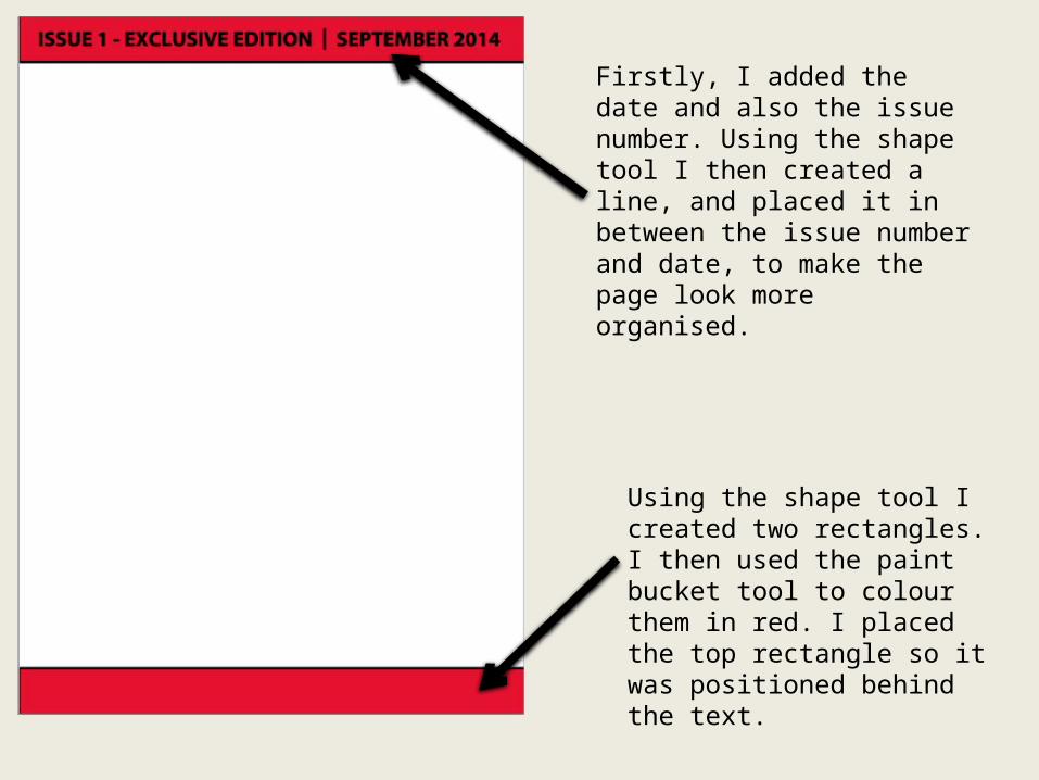
Using the shape tool I created two rectangles. I then used the paint bucket tool to colour them in red. I placed the top rectangle so it was positioned behind the text.
Firstly, I added the date and also the issue number. Using the shape tool I then created a line, and placed it in between the issue number and date, to make the page look more organised.
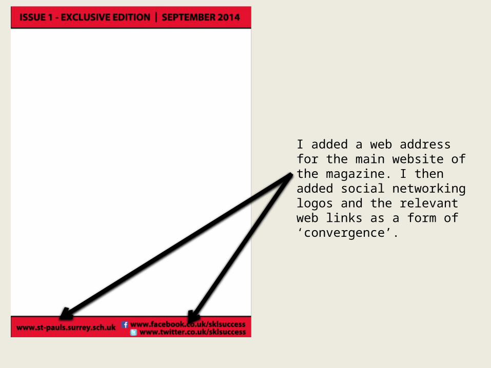
I added a web address for the main website of the magazine. I then added social networking logos and the relevant web links as a form of ‘convergence’.
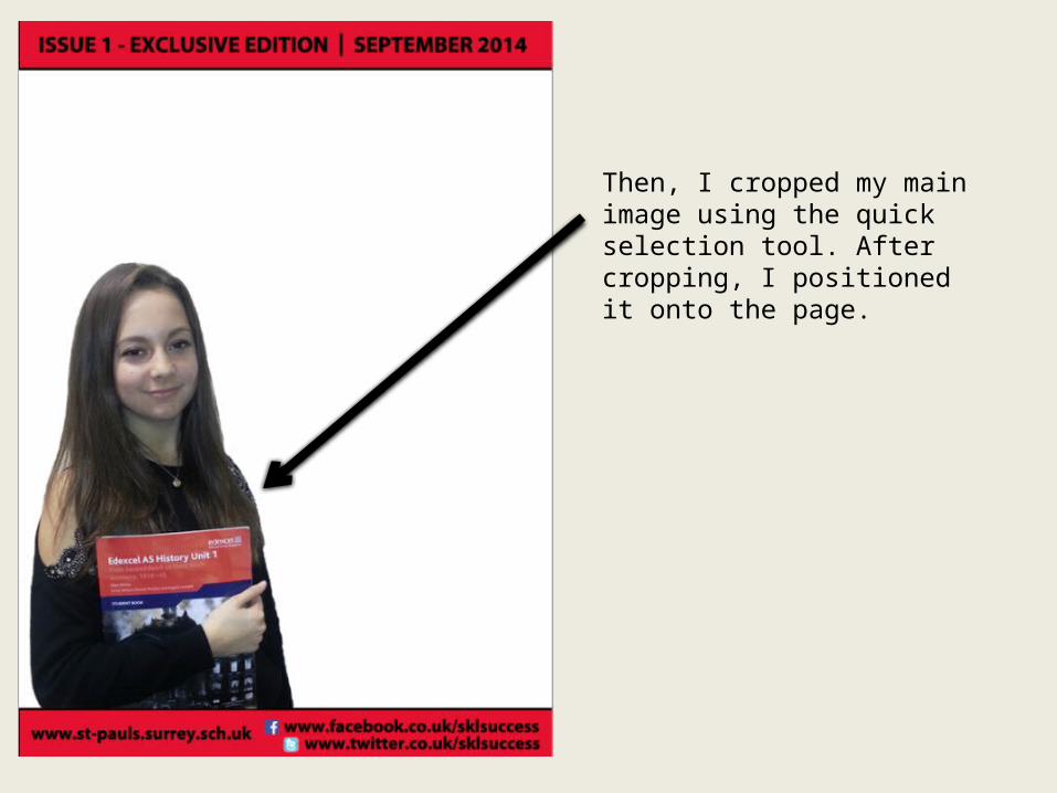
Then, I cropped my main image using the quick selection tool. After cropping, I positioned it onto the page.
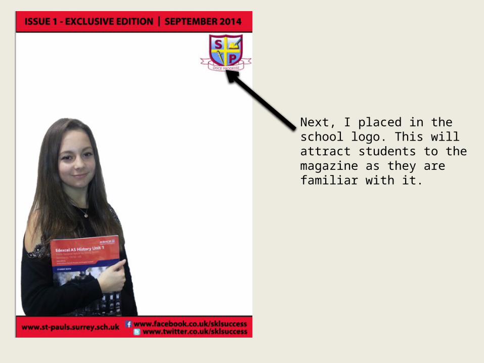
Next, I placed in the school logo. This will attract students to the magazine as they are familiar with it.
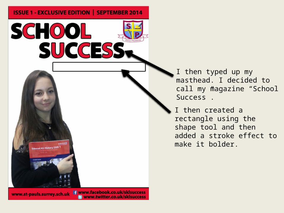
I then typed up my masthead. I decided to call my magazine “School Success”.
I then created a rectangle using the shape tool and then added a stroke effect to make it bolder.
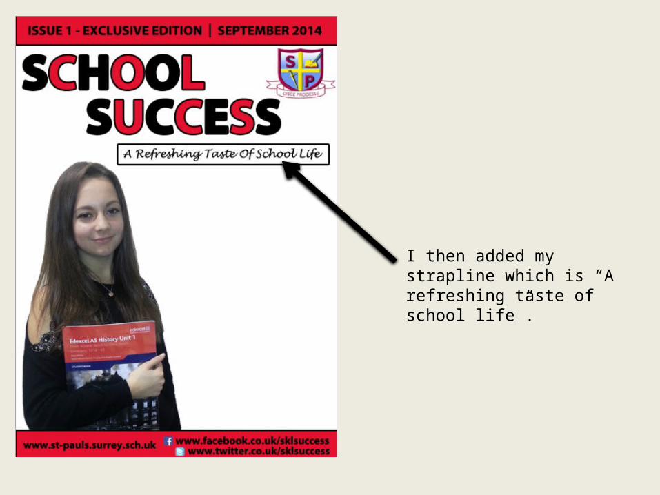
I then added my strapline which is “A refreshing taste of school life”.
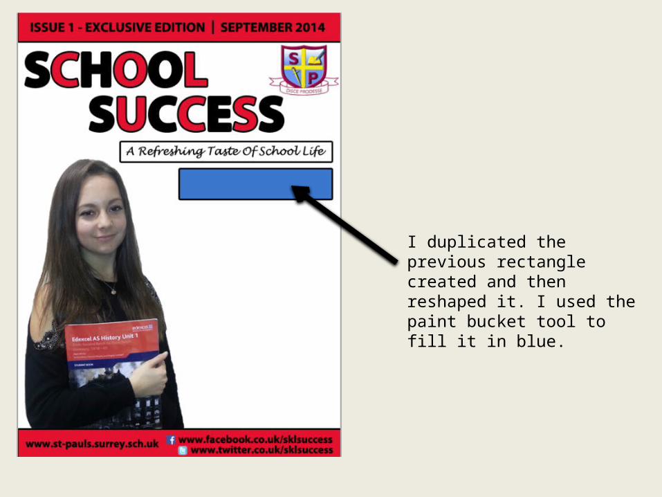
I duplicated the previous rectangle created and then reshaped it. I used the paint bucket tool to fill it in blue.
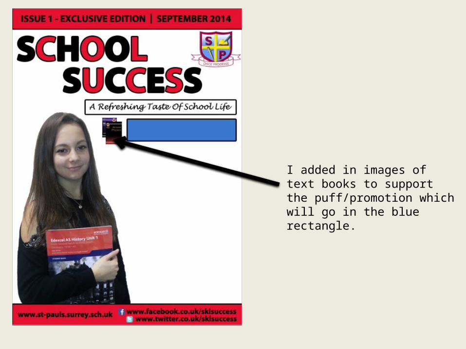
I added in images of text books to support the puff/promotion which will go in the blue rectangle.
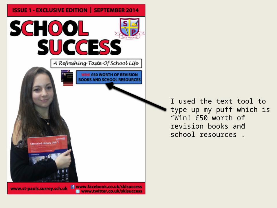
I used the text tool to type up my puff which is “Win! £50 worth of revision books and school resources”.
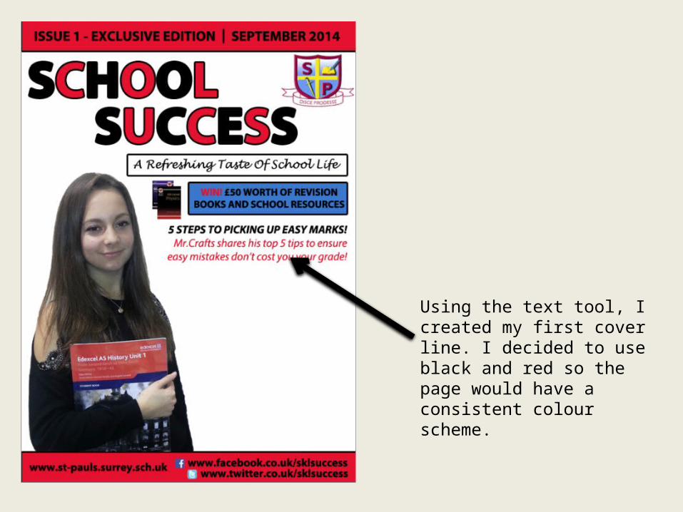
Using the text tool, I created my first cover line. I decided to use black and red so the page would have a consistent colour scheme.
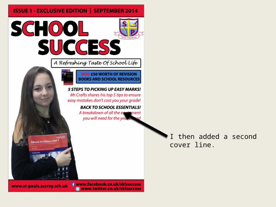
I then added a second cover line.
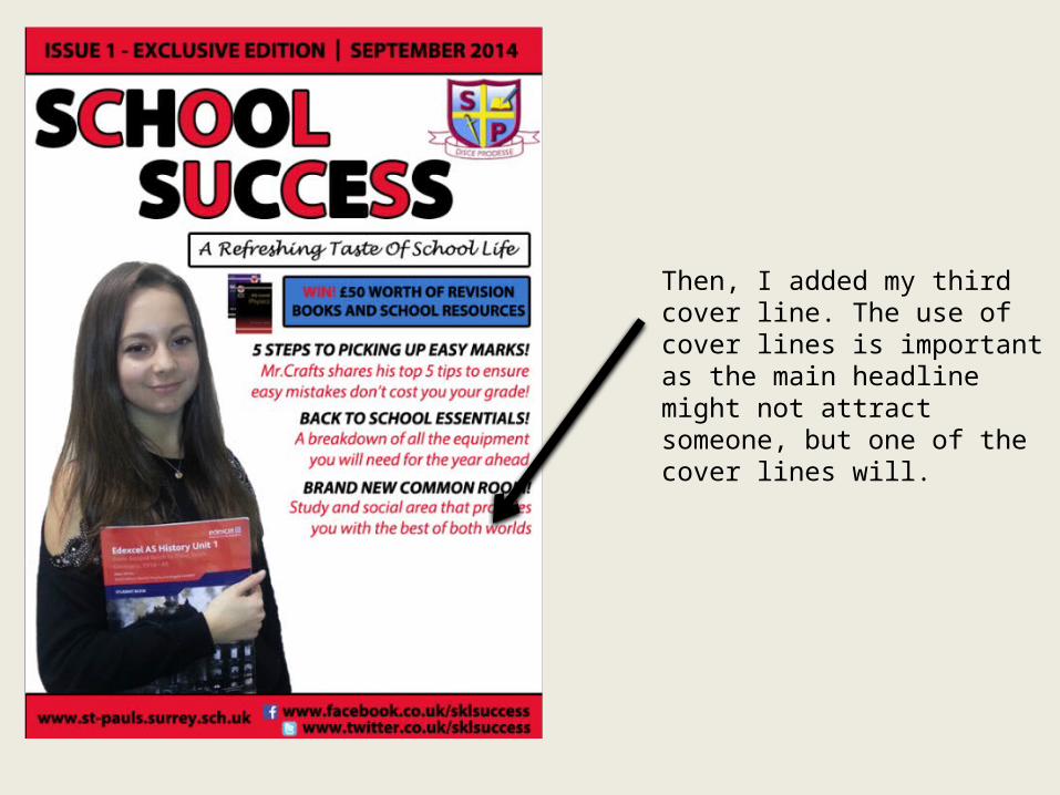
Then, I added my third cover line. The use of cover lines is important as the main headline might not attract someone, but one of the cover lines will.
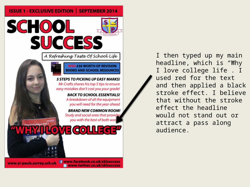
I then typed up my main headline, which is “Why I love college life”. I used red for the text and then applied a black stroke effect. I believe that without the stroke effect the headline would not stand out or attract a pass along audience.
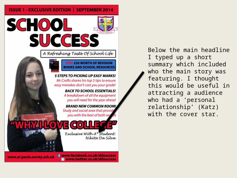
Below the main headline I typed up a short summary which included who the main story was featuring. I thought this would be useful in attracting a audience who had a ‘personal relationship’ (Katz) with the cover star.
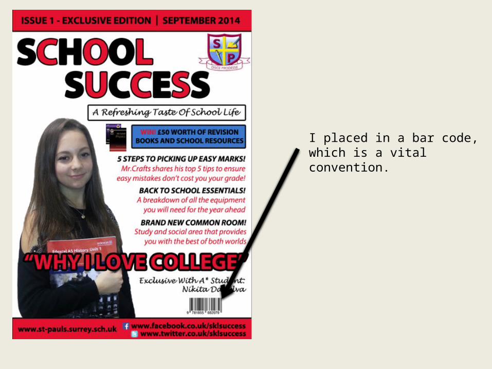
I placed in a bar code, which is a vital convention.
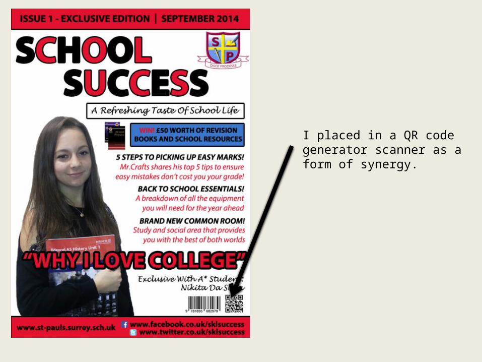
I placed in a QR code generator scanner as a form of synergy.
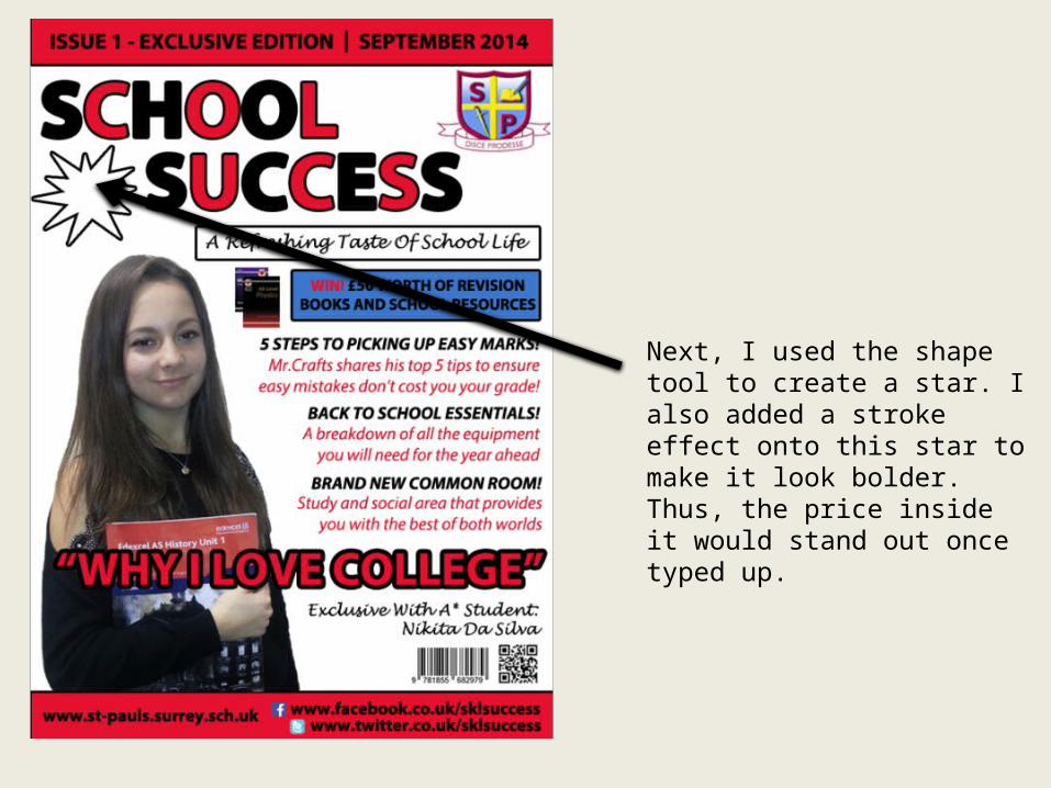
Next, I used the shape tool to create a star. I also added a stroke effect onto this star to make it look bolder. Thus, the price inside it would stand out once typed up.
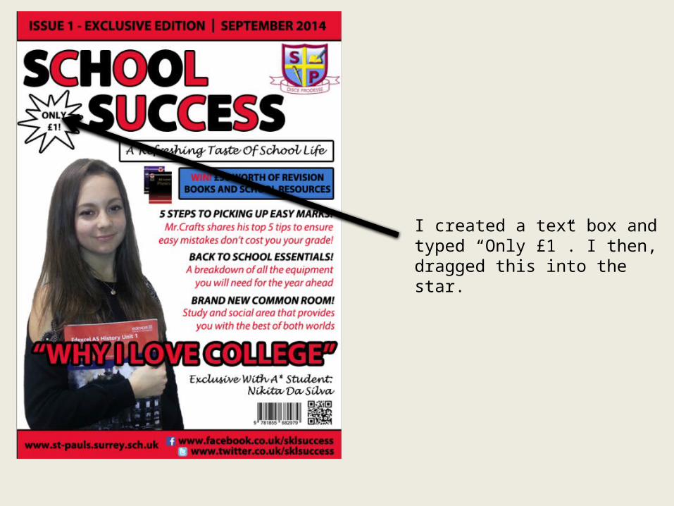
I created a text box and typed “Only £1”. I then, dragged this into the star.
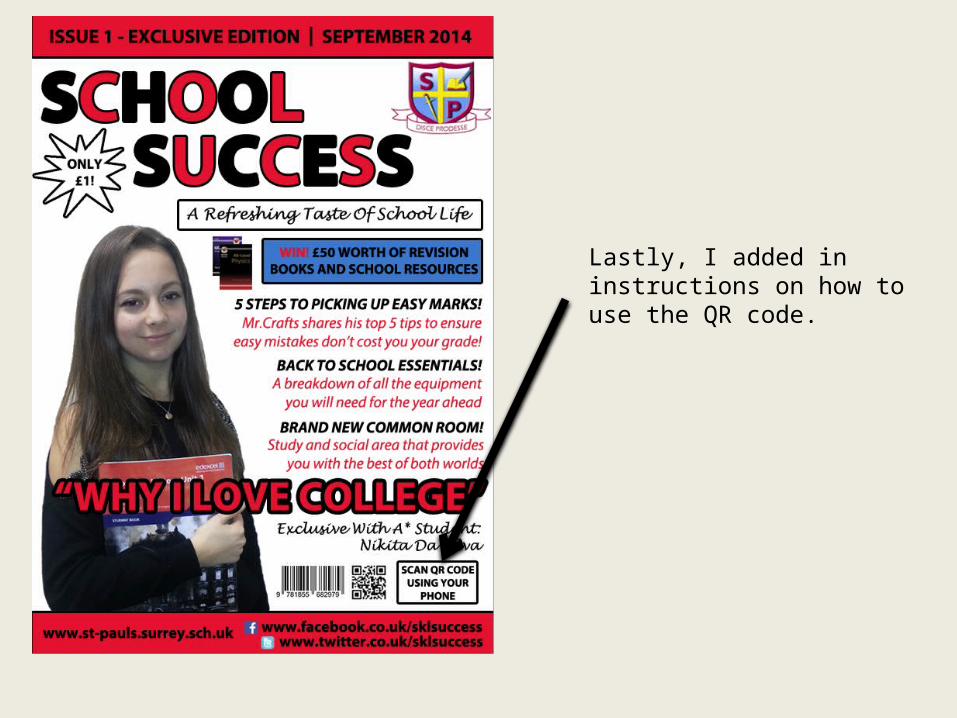
Lastly, I added in instructions on how to use the QR code.
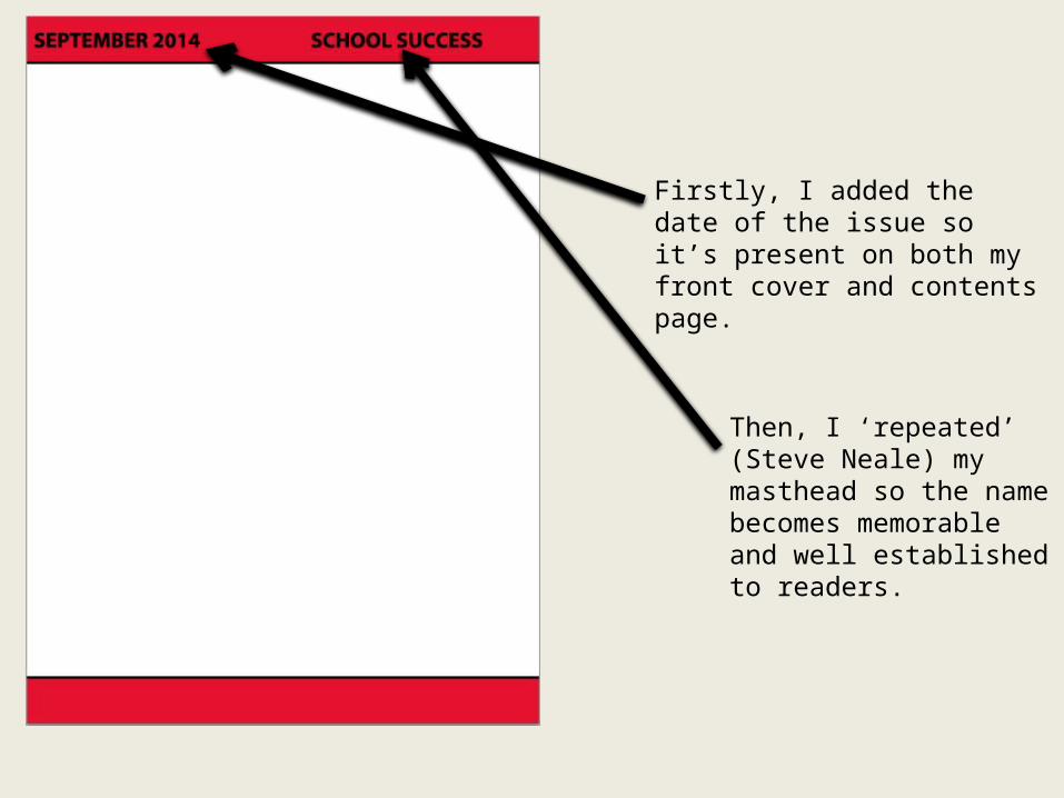
Firstly, I added the date of the issue so it’s present on both my front cover and contents page.
Then, I ‘repeated’ (Steve Neale) my masthead so the name becomes memorable and well established to readers.
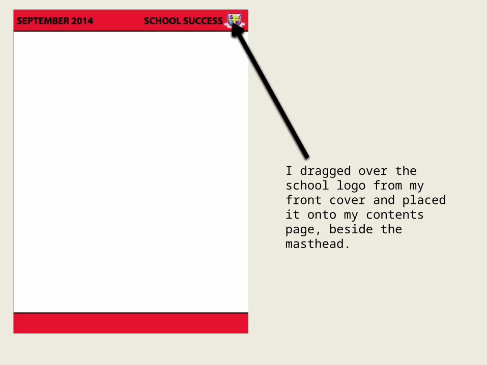
I dragged over the school logo from my front cover and placed it onto my contents page, beside the masthead.
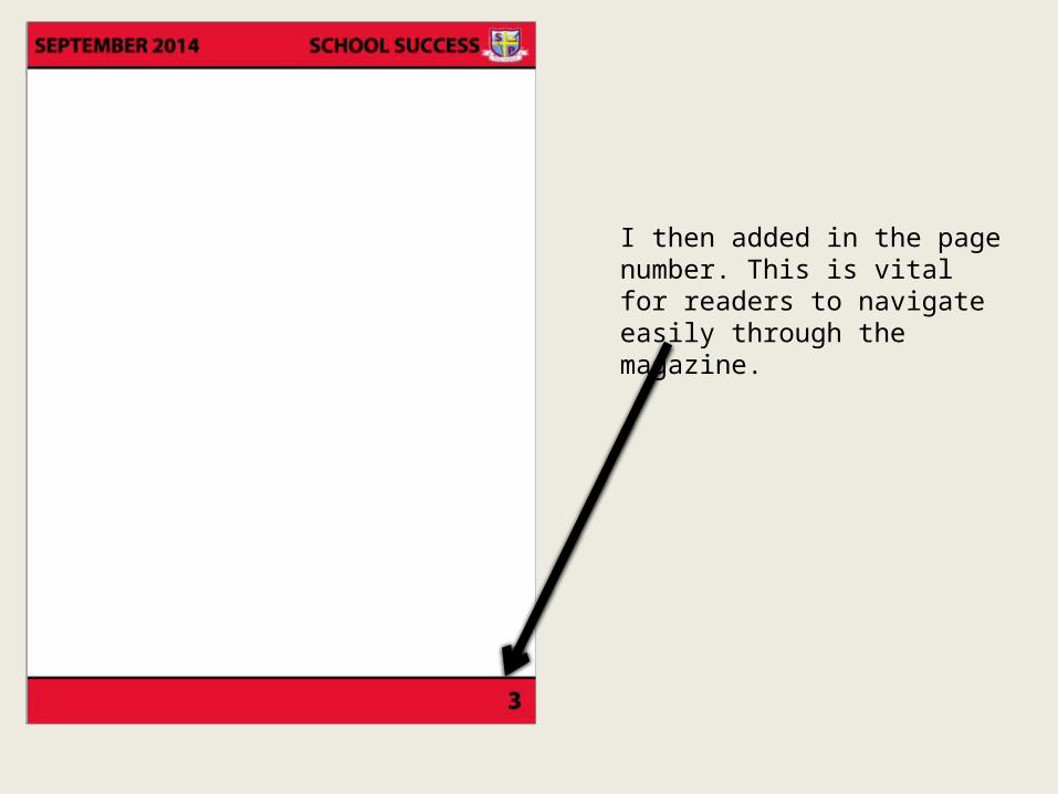
I then added in the page number. This is vital for readers to navigate easily through the magazine.
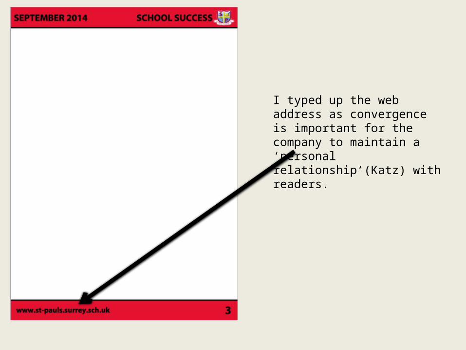
I typed up the web address as convergence is important for the company to maintain a ‘personal relationship’(Katz) with readers.
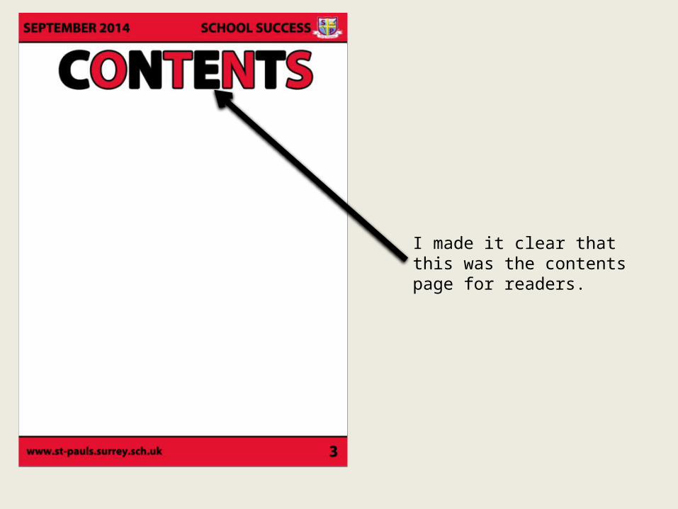
I made it clear that this was the contents page for readers.
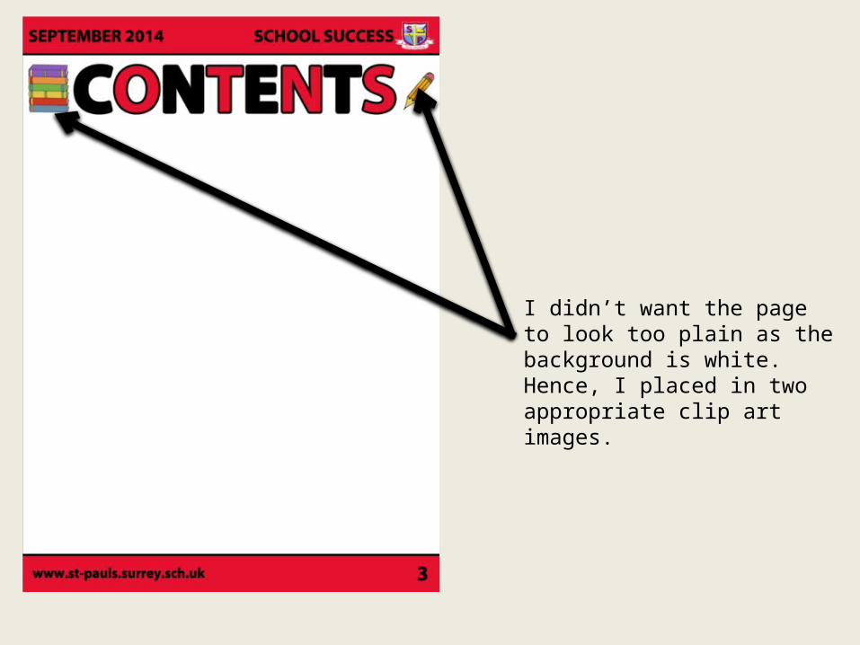
I didn’t want the page to look too plain as the background is white. Hence, I placed in two appropriate clip art images.
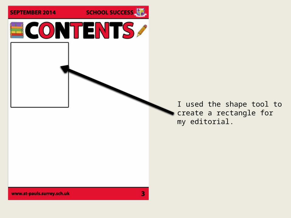
I used the shape tool to create a rectangle for my editorial.
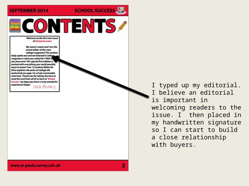
I typed up my editorial. I believe an editorial is important in welcoming readers to the issue. I then placed in my handwritten signature so I can start to build a close relationship with buyers.
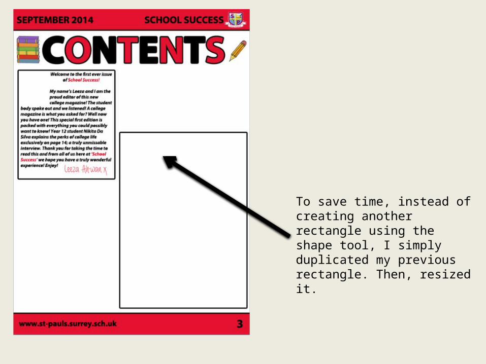
To save time, instead of creating another rectangle using the shape tool, I simply duplicated my previous rectangle. Then, resized it.
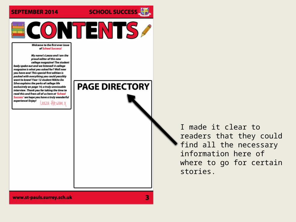
I made it clear to readers that they could find all the necessary information here of where to go for certain stories.
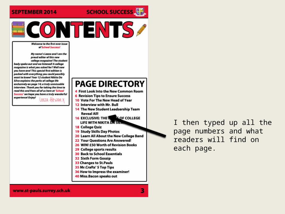
I then typed up all the page numbers and what readers will find on each page.
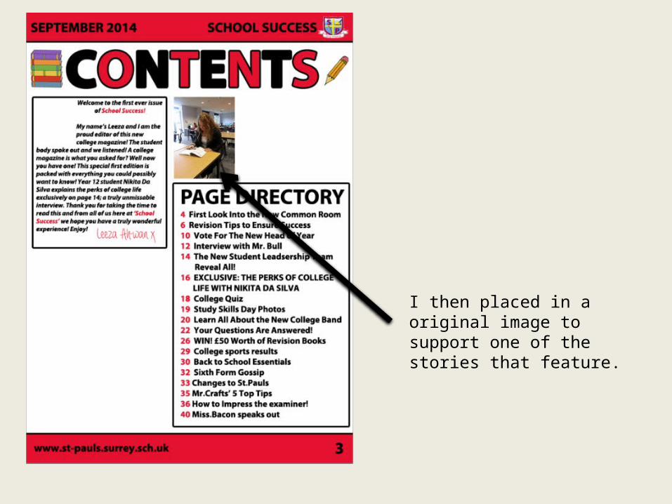
I then placed in a original image to support one of the stories that feature.
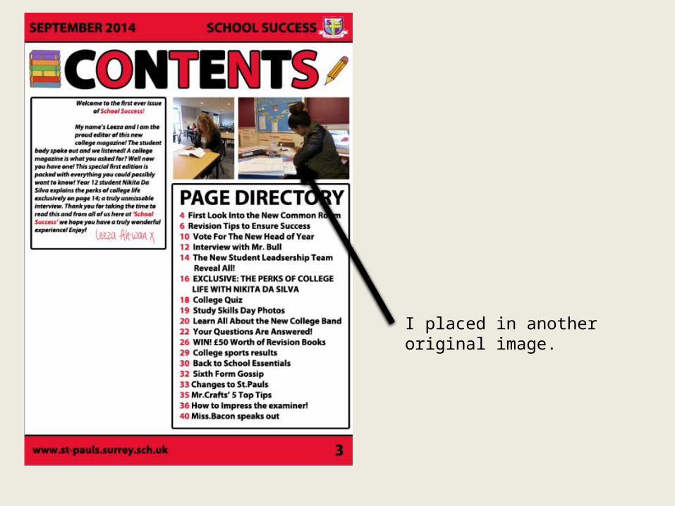
I placed in another original image.
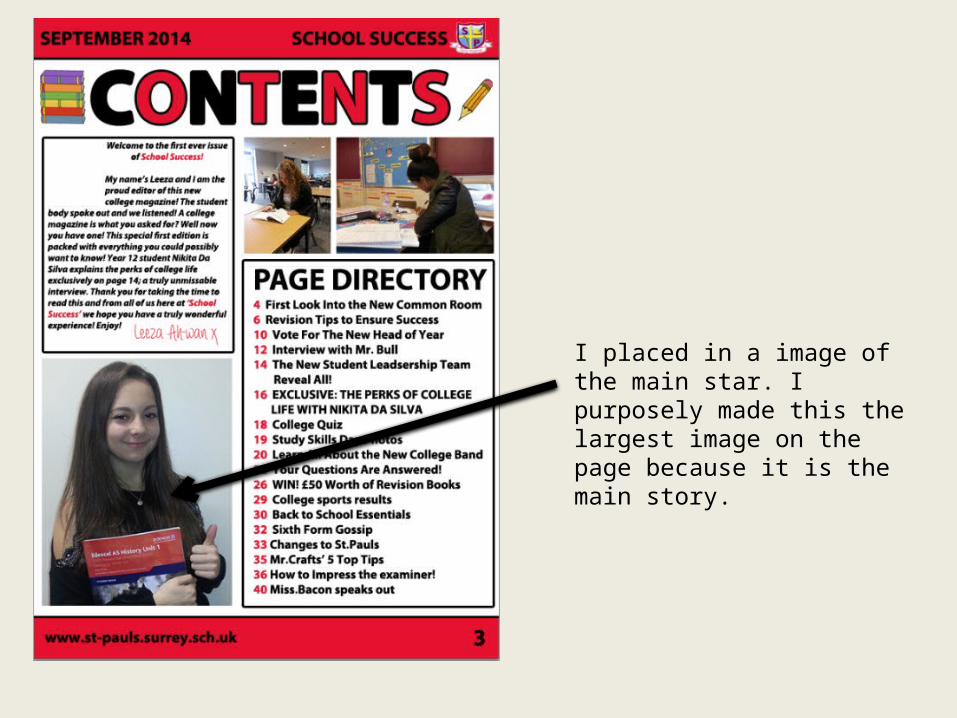
I placed in a image of the main star. I purposely made this the largest image on the page because it is the main story.
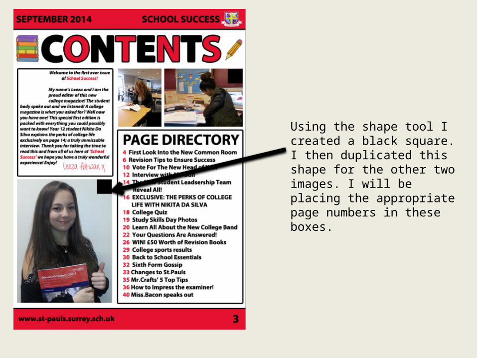
Using the shape tool I created a black square. I then duplicated this shape for the other two images. I will be placing the appropriate page numbers in these boxes.
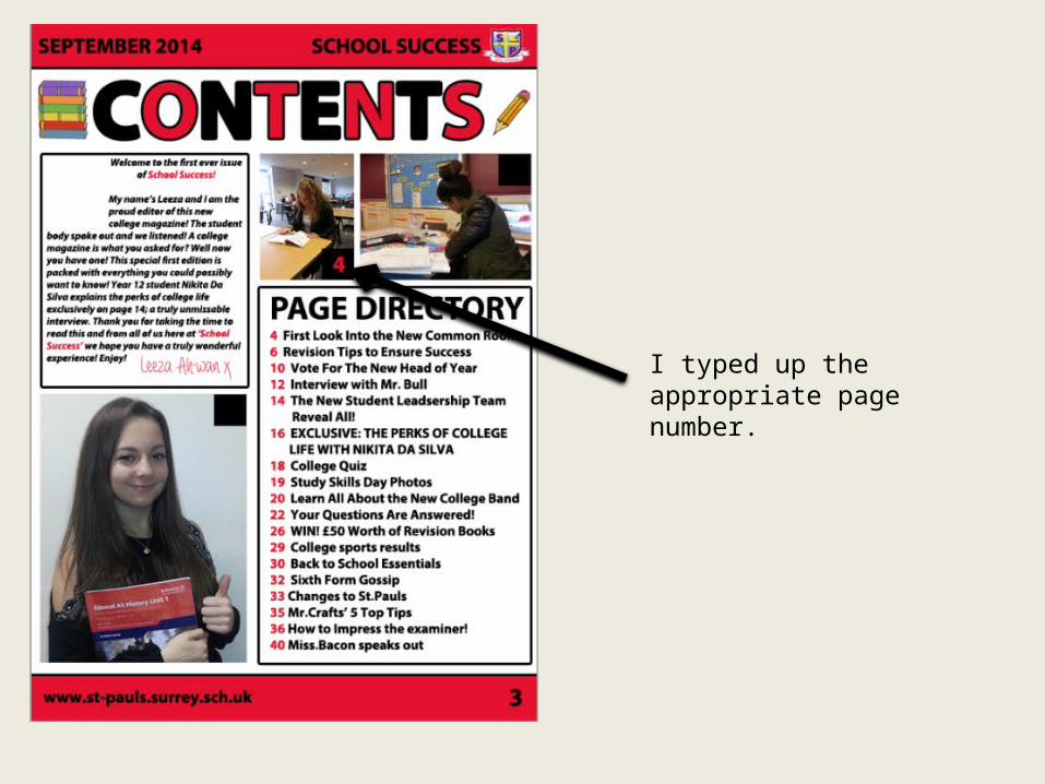
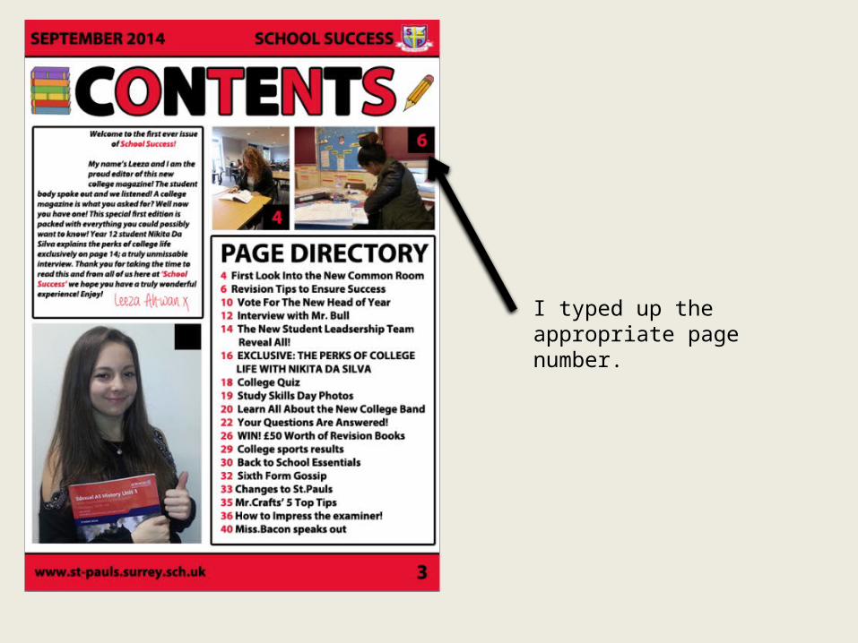
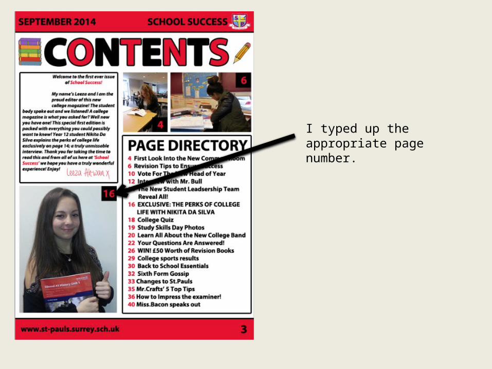
I typed up the appropriate page number.
I typed up the appropriate page number.
I typed up the appropriate page number.
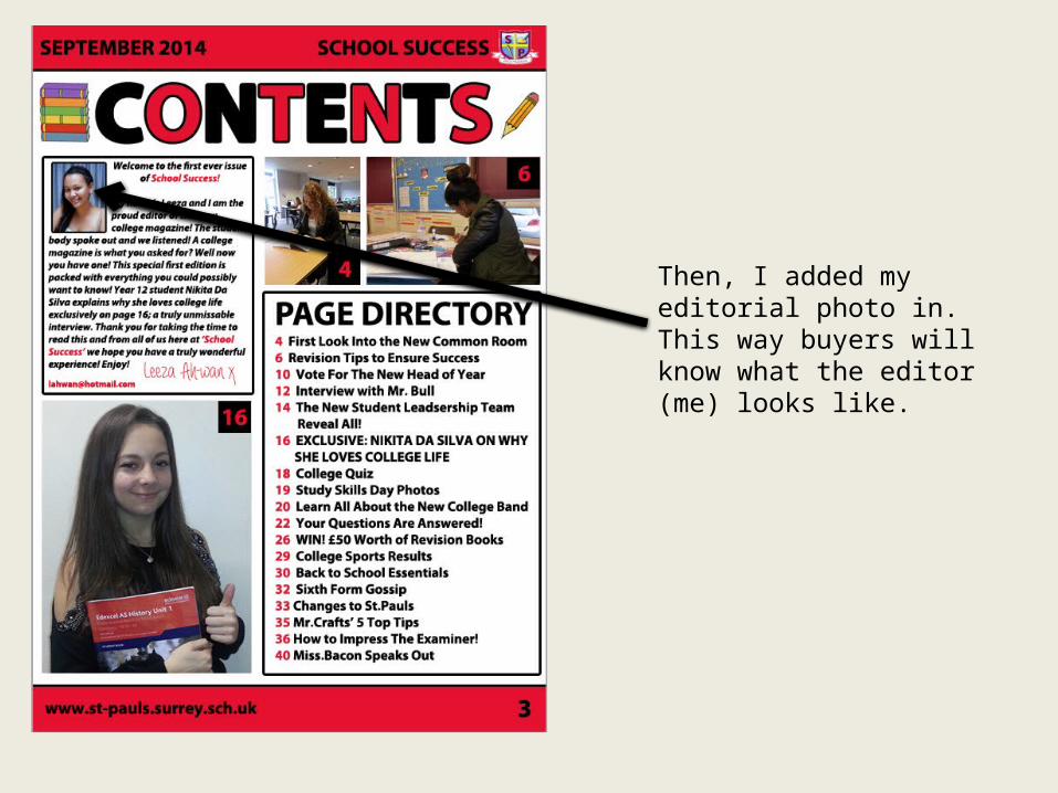
Then, I added my editorial photo in. This way buyers will know what the editor (me) looks like.
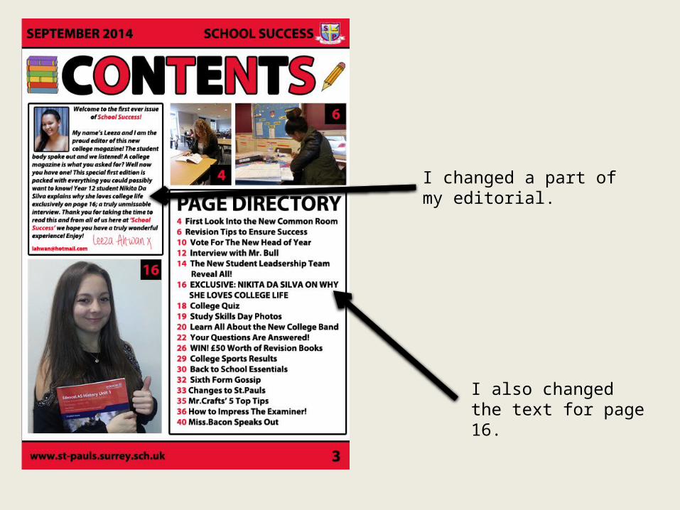
I changed a part of my editorial.
I also changed the text for page 16.
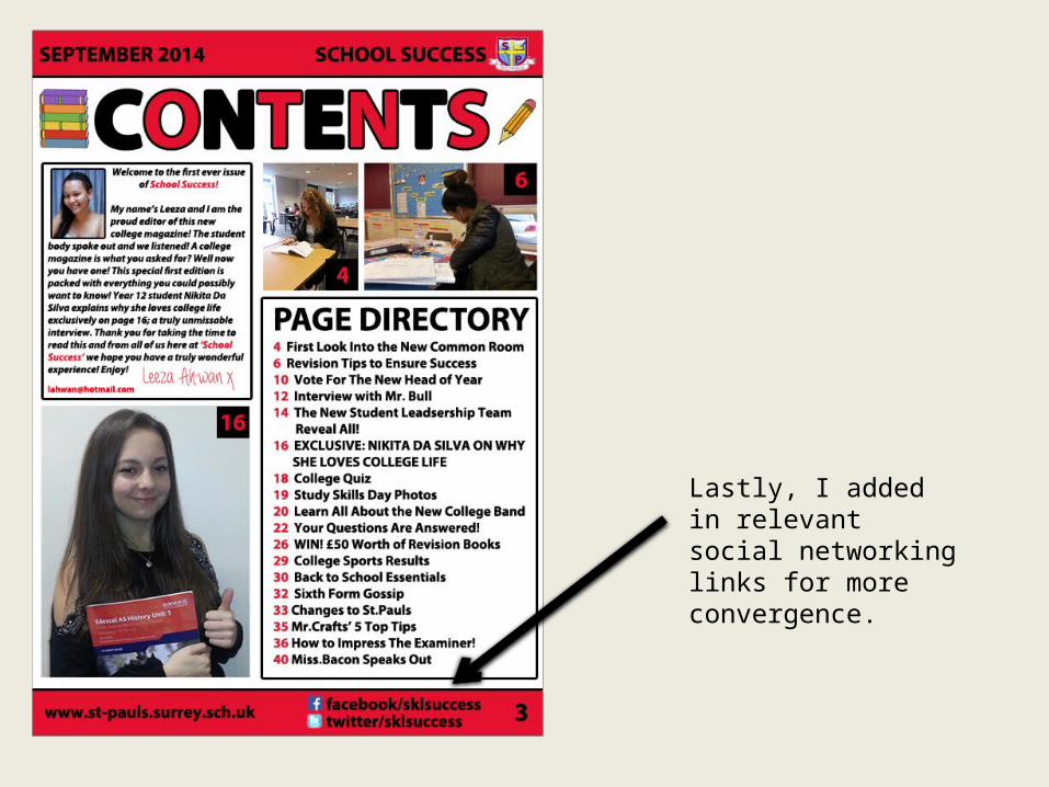
Lastly, I added in relevant social networking links for more convergence.


