Download - Paul Dunn Portfolio
DESIGNPORTFOLIOPaul Dunn
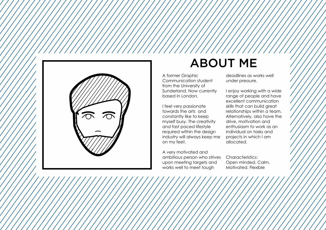
ABOUT MEA former GraphicCommunication student from the University ofSunderland. Now currently based in London.
I feel very passionatetowards the arts andconstantly like to keepmyself busy. The creativity and fast paced lifestyle required within the design industry will always keep me on my feet.
A very motivated andambitious person who strivesupon meeting targets and works well to meet tough
deadlines as works well under pressure.
I enjoy working with a wide range of people and have excellent communication skills that can build great relationships within a team. Alternatively, also have the drive, motivation and enthusiasm to work as an individual on tasks andprojects in which I amallocated.
Characteristics:Open minded. Calm.Motivated. Flexible
AiPs
Id Ae
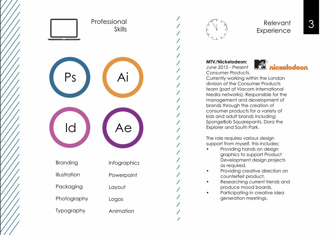
ProfessionalSkills
Branding
Illustration
Packaging
Photography
Typography
EmploymentHistory
ProfessionalSkills
MTV/Nickelodeon:June 2015 - PresentConsumer Products.Currently working within the London division of the Consumer Products team (part of Viacom International Media networks). Responsible for the management and development of brands through the creation ofconsumer products for a variety of kids and adult brands including: SpongeBob Squarepants, Dora the Explorer and South Park.
The role requires various designsupport from myself, this includes:• Providing hands on design graphics to support Product Development design projects as required.• Providing creative direction on counterfeit product.• Researching current trends and produce mood boards.• Participating in creative idea generation meetings.
3ProfessionalSkills
Relevant Experience
AiPs
Id Ae
Branding
Illustration
Packaging
Photography
Typography
Infographics
Powerpoint
Layout
Logos
Animation
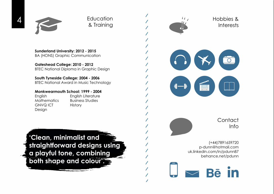
Hobbies &Interests
4
ContactInfo
Education& Training
Sunderland University: 2012 - 2015BA (HONS) Graphic Communication
Gateshead College: 2010 - 2012BTEC National Diploma in Graphic Design
South Tyneside College: 2004 - 2006BTEC National Award in Music Technology
Monkwearmouth School: 1999 - 2004English English LiteratureMathematics Business StudiesGNVQ ICT HistoryDesign
(+44)[email protected]
uk.linkedin.com/in/pdunn87behance.net/pdunn
Education& Training
Hobbies &Interests
ContactInfo
‘Clean, minimalist andstraightforward designs using a playful tone, combining both shape and colour’.
5
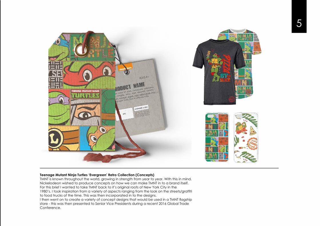
Teenage Mutant Ninja Turtles ‘Evergreen’ Retro Collection (Concepts)TMNT is known throughout the world, growing in strength from year to year. With this in mind, Nickelodeon wished to produce concepts on how we can make TMNT in to a brand itself.For this brief I wanted to take TMNT back to it’s original roots of New York City in the1980’s. I took inspiration from a variety of aspects ranging from the look on the streets/graffitito food trucks of the time. This was then incorporated in to the designs.I then went on to create a variety of concept designs that would be used in a TMNT flagship store - this was then presented to Senior Vice Presidents during a recent 2016 Global Trade Conference.
6
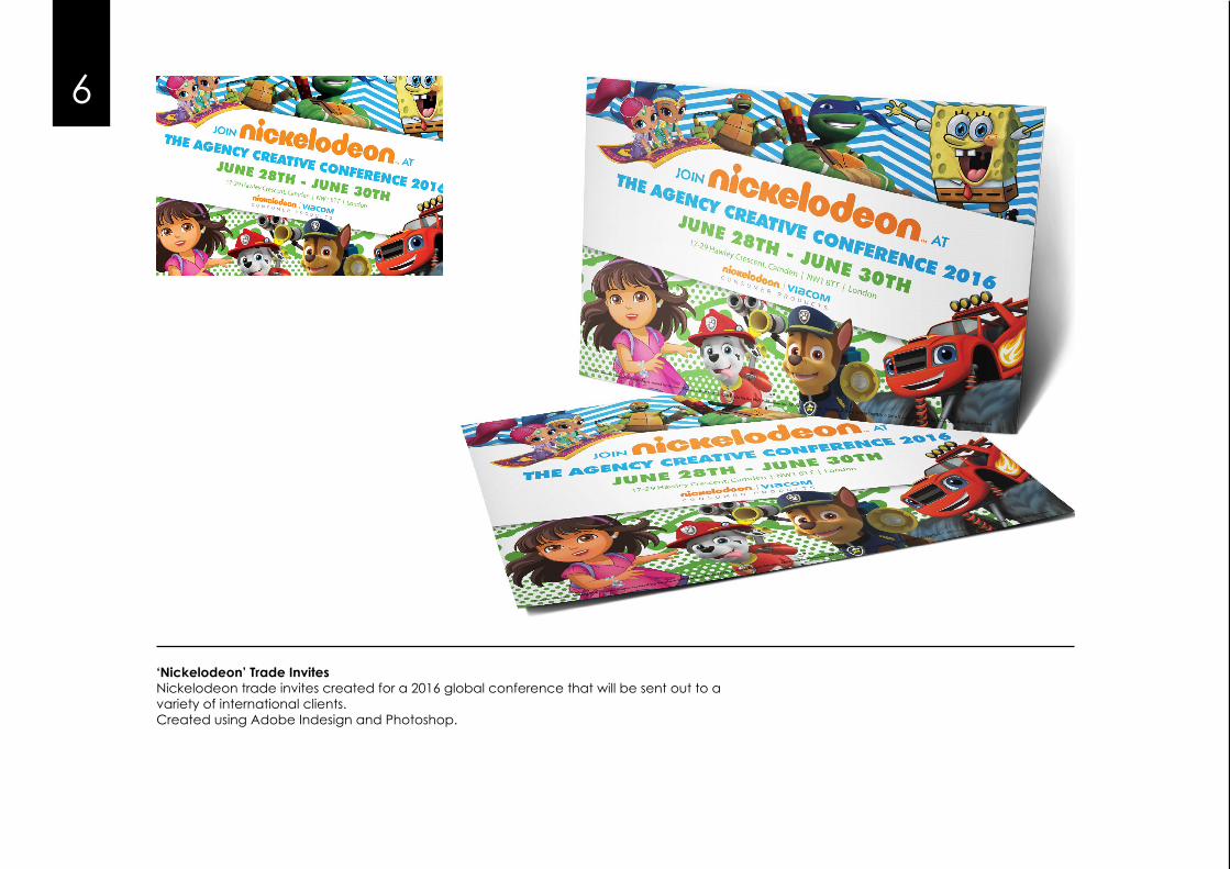
‘Nickelodeon’ Trade InvitesNickelodeon trade invites created for a 2016 global conference that will be sent out to avariety of international clients.Created using Adobe Indesign and Photoshop.
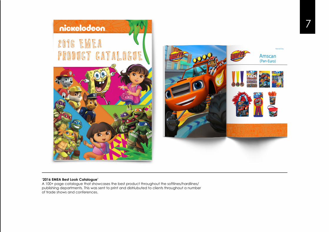
‘2016 EMEA Best Look Catalogue’A 100+ page catalogue that showcases the best product throughout the softlines/hardlines/publishing departments. This was sent to print and distriubuted to clients throughout a number of trade shows and conferences.
7
88
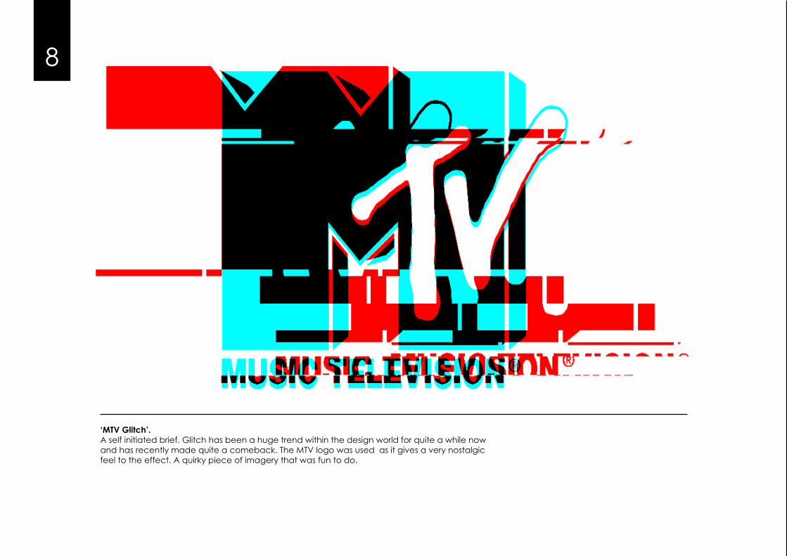
‘MTV Glitch’.A self initiated brief. Glitch has been a huge trend within the design world for quite a while now and has recently made quite a comeback. The MTV logo was used as it gives a very nostalgic feel to the effect. A quirky piece of imagery that was fun to do.
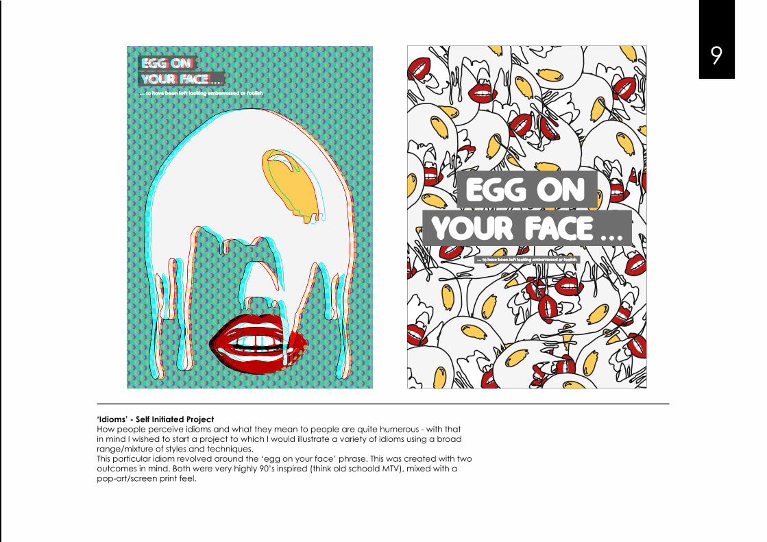
‘Idioms’ - Self Initiated ProjectHow people perceive idioms and what they mean to people are quite humerous - with that in mind I wished to start a project to which I would illustrate a variety of idioms using a broad range/mixture of styles and techniques.This particular idiom revolved around the ‘egg on your face’ phrase. This was created with two outcomes in mind. Both were very highly 90’s inspired (think old schoold MTV), mixed with a pop-art/screen print feel.
9
... to have been left looking embarrassed or foolish
8
‘MTV Glitch’.A self initiated brief. Glitch has been a huge trend within the design world for quite a while now and has recently made quite a comeback. The MTV logo was used as it gives a very nostalgic feel to the effect. A quirky piece of imagery that was fun to do.
10
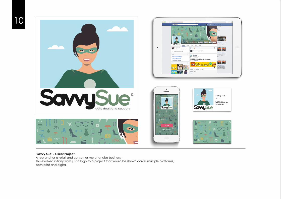
‘Savvy Sue’ - Client ProjectA rebrand for a retail and consumer merchandise business.This evolved initially from just a logo to a project that would be shown across multiple platforms,both print and digital.
11
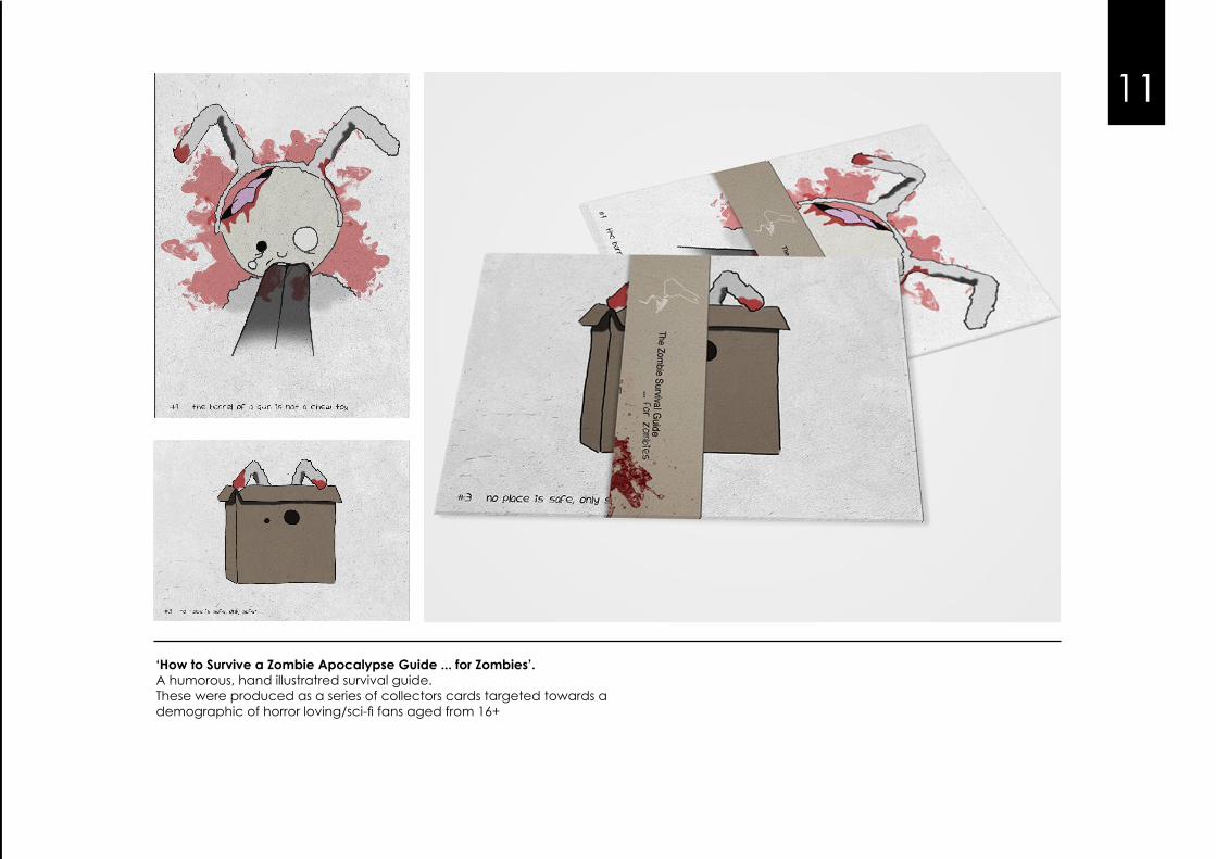
‘How to Survive a Zombie Apocalypse Guide ... for Zombies’.A humorous, hand illustratred survival guide.These were produced as a series of collectors cards targeted towards ademographic of horror loving/sci-fi fans aged from 16+
12
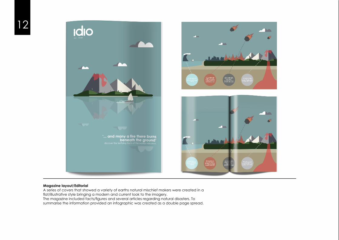
Magazine layout/EditorialA series of covers that showed a variety of earths natural mischief makers were created in a flat/illustrative style bringing a modern and current look to the imagery.The magazine included facts/figures and several articles regarding natural disasters. Tosummarise the information provided an infographic was created as a double page spread.
13
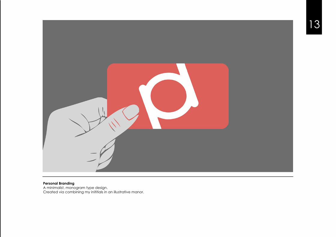
Personal BrandingA minimalist, monogram type design.Created via combining my inititials in an illustrative manor.
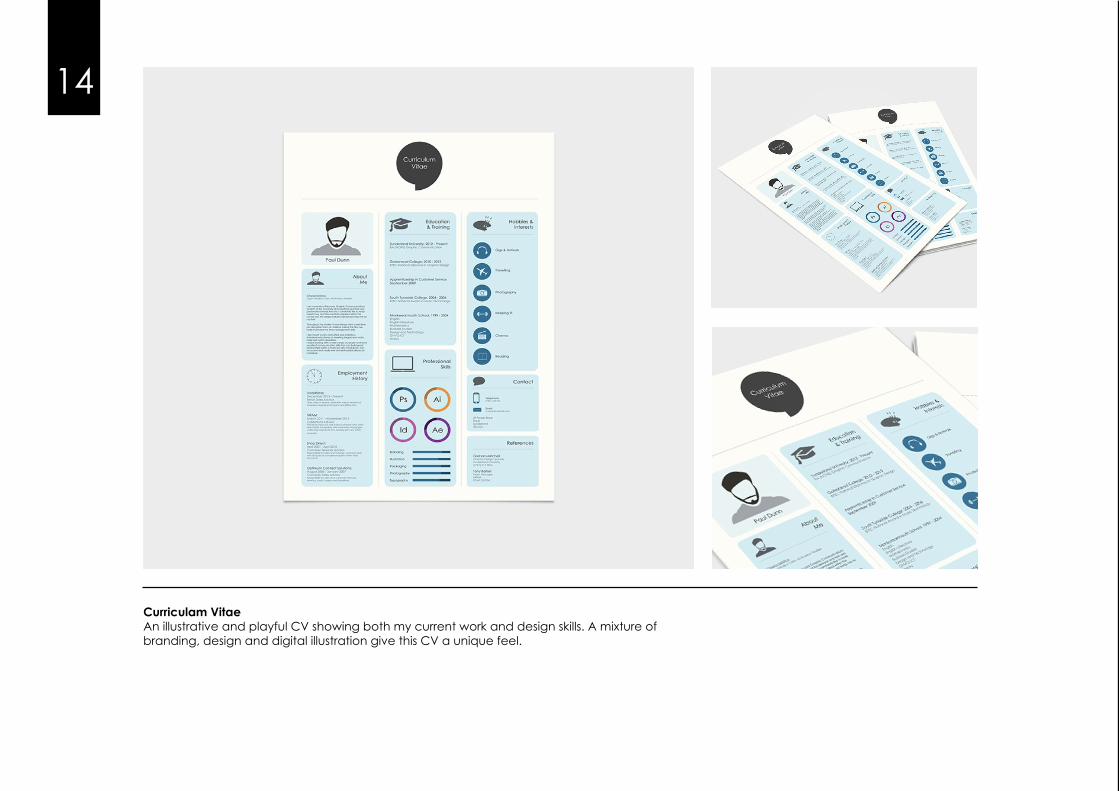
Curriculam VitaeAn illustrative and playful CV showing both my current work and design skills. A mixture of branding, design and digital illustration give this CV a unique feel.
14
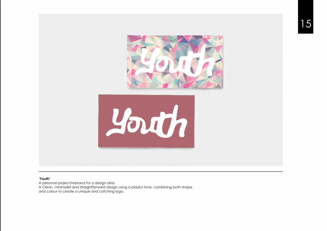
‘Youth’A personal project/rebrand for a design alias.A Clean, minimalist and straightforward design using a playful tone, combining both shape and colour to create a unique and catching logo.
15
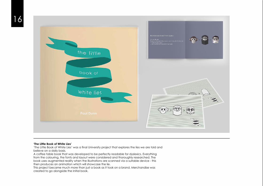
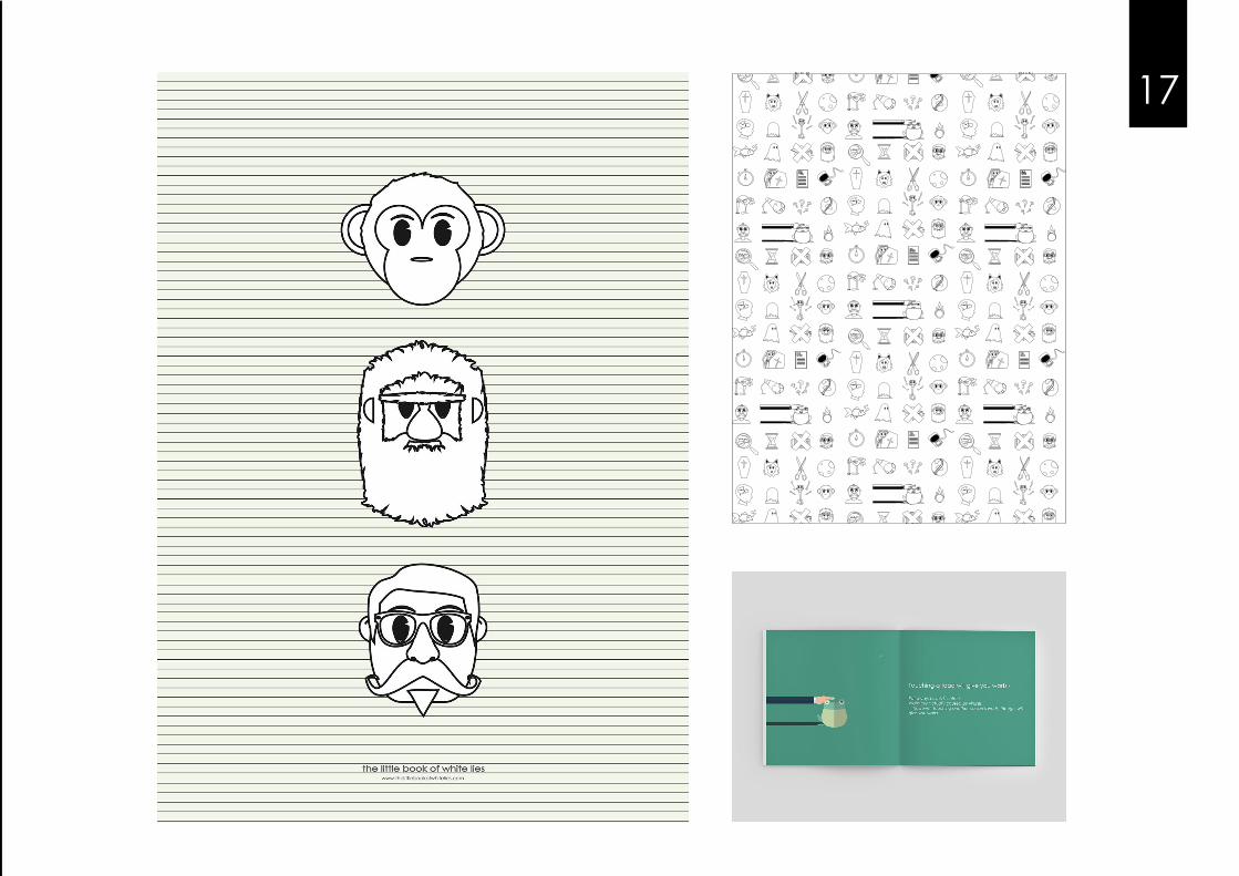
‘The Little Book of White Lies’‘The Little Book of White Lies’ was a final University project that explores the lies we are told and believe on a daily basis.A coffee table book that was developed to be perfectly readable for dyslexics. Everything from the colouring, the fonts and layout were considered and thoroughly researched. The book uses augmented reality when the illustrations are scanned via a suitable device - this then produces an animation which will showcase the lie.This project became much more than just a book as it took on a brand. Merchandise wascreated to go alongside the initial book.
16
17!! !!
URGENTNOTICEURGENTNOTICEFINALNOTICE
£
£
!! !!
URGENTNOTICEURGENTNOTICEFINALNOTICE
£
£
!! !!
!! !!
URGENTNOTICEURGENTNOTICEFINALNOTICE
£
£
!! !!
URGENTNOTICEURGENTNOTICEFINALNOTICE
£
£
!! !!
!! !!
URGENTNOTICEURGENTNOTICEFINALNOTICE
£
£
!! !!
URGENTNOTICEURGENTNOTICEFINALNOTICE
£
£
URGENTNOTICEURGENTNOTICEFINALNOTICE
£
£


