dizzee rascal continued
TRANSCRIPT

7/26/2019 Dizzee Rascal Continued
http://slidepdf.com/reader/full/dizzee-rascal-continued 1/3
The Masthead of themagazine is very loudand bright. The mastheadfollows the colour schemeof the rest of the coverand the red stands out.The red connotes dangerand excitement and this
also relates to the lookwhich can be seen onDizzee Rascals face.Finally the borders aroundthe magazines mastheadmakes it further stand outfrom the rest of the cover.
The backround is an
image of a wall ofgraffiti and this can berelated to dizzeerascals style of musicwhich is very urban.
The main image is of the well known artistand the facial expressions can be linked tothe cover line with the word ‘Joy’ and theword spread can be linked to the pose wherehe is stood with his arms spread out wide.
The barcode is astandard code andconvention of a magazineand reinforces the
magazine selling points.
The Main Coverline thecover line is very largeand strikes across thecentre of the page givingit more attractiveness tothe audience. The name
is significant as itconfirms the artist whomis shown in the image.
Strapline the strapline feauturesthe word tour in which reinforcesthe cover line at the bottomabout ‘spreading around theworld’.
Puff the use of a puff isan excellent way inwhich you can attract
the target audience as itgives something extrato the magazine cover.
Rule of thirds the fact thatthe main image is in the leftthird gives the magazine asense of unevenness whichcould be linked to the music
genre as it defies rules and ismore of an edgey urban look.
Selling Points/Coverlines the
coverlines and the sellingpoints here allow themagazine to furtherattract and audience asit introduces to them thefeatures inside themagazine, giving awayenough to attract but notenough to lose
consumers.
The footer this shows and reinforces the genre
of the magazine as it speaks of artists in a similarfield and this would increase sales.
7/26/2019 Dizzee Rascal Continued
http://slidepdf.com/reader/full/dizzee-rascal-continued 2/3
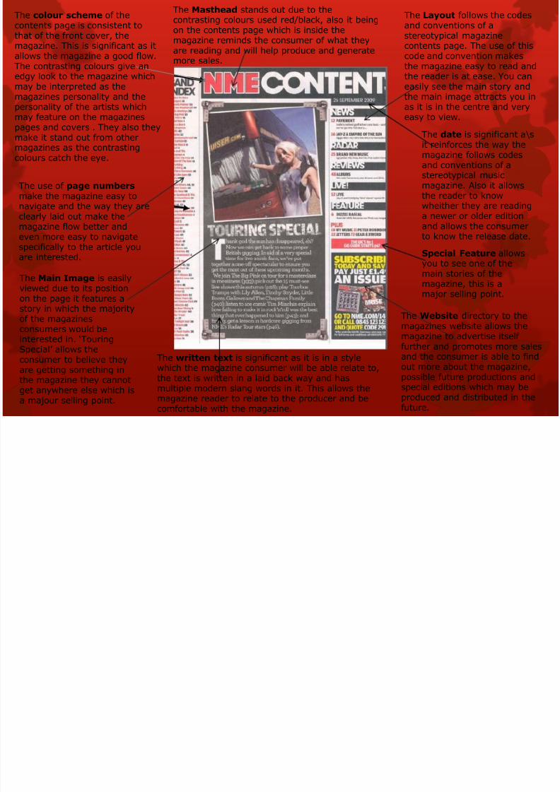
The colour scheme of thecontents page is consistent tothat of the front cover, themagazine. This is significant as itallows the magazine a good flow.The contrasting colours give anedgy look to the magazine whichmay be interpreted as the
magazines personality and thepersonality of the artists whichmay feature on the magazinespages and covers . They also theymake it stand out from othermagazines as the contrastingcolours catch the eye.
The use of page numbers
make the magazine easy tonavigate and the way they areclearly laid out make themagazine flow better andeven more easy to navigatespecifically to the article youare interested.
The Main Image is easily
viewed due to its positionon the page it features astory in which the majorityof the magazinesconsumers would beinterested in. ‘TouringSpecial’ allows theconsumer to believe theyare getting something inthe magazine they cannot
get anywhere else which isa majour selling point.
The Masthead stands out due to thecontrasting colours used red/black, also it beingon the contents page which is inside themagazine reminds the consumer of what theyare reading and will help produce and generatemore sales.
The Website directory to themagazines website allows themagazine to advertise itselffurther and promotes more salesand the consumer is able to findout more about the magazine,possible future productions and
special editions which may beproduced and distributed in thefuture.
The Layout follows the codesand conventions of astereotypical magazinecontents page. The use of thiscode and convention makesthe magazine easy to read andthe reader is at ease. You caneasily see the main story and
the main image attracts you inas it is in the centre and veryeasy to view.
The date is significant a\sit reinforces the way themagazine follows codesand conventions of astereotypical musicmagazine. Also it allows
the reader to knowwheither they are readinga newer or older editionand allows the consumerto know the release date.
Special Feature allowsyou to see one of themain stories of themagazine, this is a
major selling point.
The written text is significant as it is in a stylewhich the magazine consumer will be able relate to,the text is written in a laid back way and has
multiple modern slang words in it. This allows themagazine reader to relate to the producer and becomfortable with the magazine.

7/26/2019 Dizzee Rascal Continued
http://slidepdf.com/reader/full/dizzee-rascal-continued 3/3
The title of this page is significant as it a witty spin on the phrase ‘From Rags To Riches’ this is important as it relates to the artist
and his past. This is also vital as the genre of music is unique andthis can be related to putting a spin on the classic phrase, if theconsumer knows of the artist which is highly likely they wouldknown that he has struggled and this is one of the main topics ofhis music.
The Main Imagereinforces theimportance of dizzeerascal in the article.The artist is alsofeatured on the front
cover and this makessure that theconsumer realises heis one of the mostimportant storieswithin this edition ofthe magazine.
The background ofthe image is related tothe artists music genrewhich is rap/grime.This genre is a newurban genre and can berelated to poverty
which means that thegraffiti can be relatedin as it is a commonthing to see in areaswhich are urban orpoverty driven as it is away to display opinion.
The font used is an solidand edgey and an urbanstyle which can be linkedinto the artists music
genre and style.
The article is about the general background and the artistwhich is a typical code and convention of a musicmagazine and if not they would lack a major selling pointas it is a good interest of the consumers otherwise they
would not purchase the magazine.
The images can belinked into the genre ofmusic as alcohol can belinked to violence whichis a major feature withinthe lyrics of dizzee
ra
scals grimecompositions.
The Mise En-Scene withthe artist reinforce thegrime genre which is themain feature of thisedition of the magazine.This is a significant thingas it gives strength to thegenre and the consumeris actually gaining whatthey thought they wouldgain from the magazineas it all relates back tothe front cover.
Colour scheme links inwith the covers colourscheme and this gives themagazine a sense ofconsistency throughoutthe cover to the article
which is promoted on thecover.