digital principles
DESCRIPTION
Digital Principles: A short guide for digital reading is a concise web project which aims to offer students a practical insight into on-screen reading. This project brings together a number of key principles of typography and also studies on reading to form clear educational guide to how we now read on-screen.TRANSCRIPT
A short users guide which offers students a practical insight into on-screen reading, considering: Reading, Typography, Grid Systems,Usability & Content Planes
E Book Edition

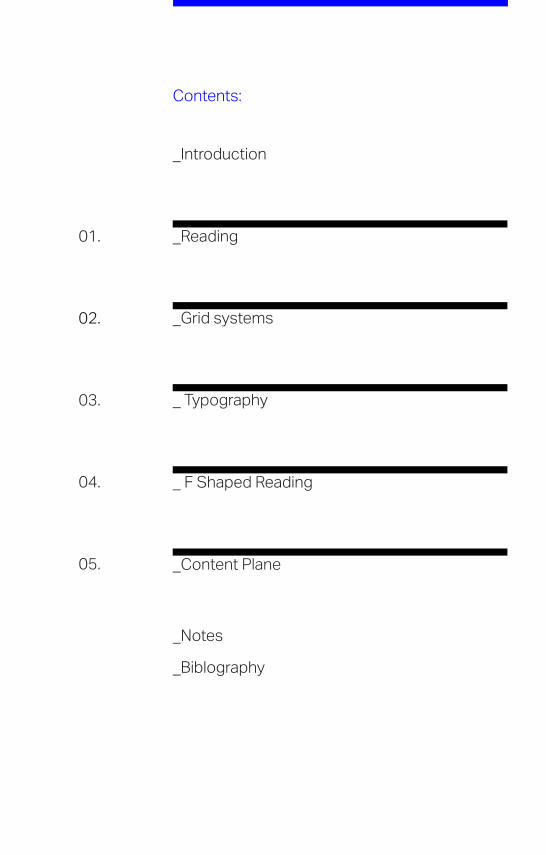
Contents:
01.
02.
03.
04.
05.
_Reading
_Grid systems
_ Typography
_ F Shaped Reading
_Content Plane
_Introduction
_Biblography
_Notes

_Introduction
Digital Principles: A short guide for digital reading is a concise web project which aims to offer students a practical insight into on-screen reading. This book is a companion to the web project but also functions as a stand-alone publication. This project brings together a number of key principles on typography and also studies on reading to form clear educational guide on how we now read on screen. On-screen typography and how we read is a huge topic, this project aims to tackle some areas of on screen reading by focusing on 5 clear principles. The aim of this project is to to give students a good starting point in the field on-screen typography and reading. This guide focuses on the areas of Reading, Typography, Grid Systems, Usability and Content Planes to redefine some traditional aspects of design and also define some clear principles in how we now read and engage with content in the 21st century.
As a development from such seminal publications as Jost Hochuli: Detail in typography, Joseph Muller Brockmann: Grid Systems and Willi Kunz: Macro & Microaesthetics, this book hopes to gather principles and apply them in an age of on-screen typography and reading. This process provides a practical and informative learning experience. The book consists of 5 topics on digital reading [01 Reading, 02 Grid systems, 03 Typography, 04 F Shaped Reading and 05 Content plane’s]. This book is by no means a definitive guide to all things screen but rather a useful insight into how a student would get to grips with the basics of on screen reading. The book hopes to give a clear and concise jump of point for those interested in the area of on screen reading.
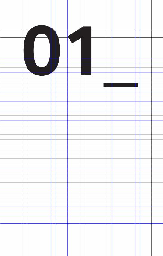
01_
01_ 01. _Reading
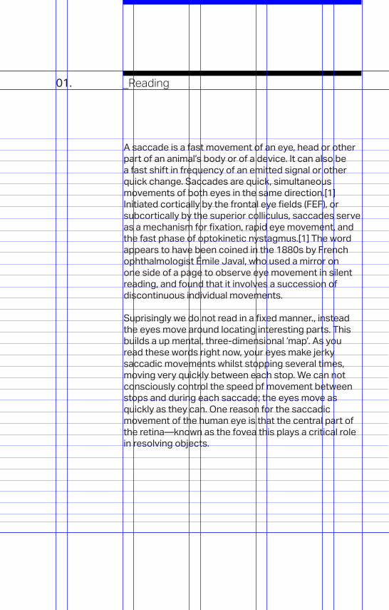
A saccade is a fast movement of an eye, head or other part of an animal’s body or of a device. It can also be a fast shift in frequency of an emitted signal or other quick change. Saccades are quick, simultaneous movements of both eyes in the same direction.[1] Initiated cortically by the frontal eye fields (FEF), or subcortically by the superior colliculus, saccades serve as a mechanism for fixation, rapid eye movement, and the fast phase of optokinetic nystagmus.[1] The word appears to have been coined in the 1880s by French ophthalmologist Émile Javal, who used a mirror on one side of a page to observe eye movement in silent reading, and found that it involves a succession of discontinuous individual movements.
Suprisingly we do not read in a fixed manner., instead the eyes move around locating interesting parts. This builds a up mental, three-dimensional ‘map’. As you read these words right now, your eyes make jerky saccadic movements whilst stopping several times, moving very quickly between each stop. We can not consciously control the speed of movement between stops and during each saccade; the eyes move as quickly as they can. One reason for the saccadic movement of the human eye is that the central part of the retina—known as the fovea this plays a critical role in resolving objects.
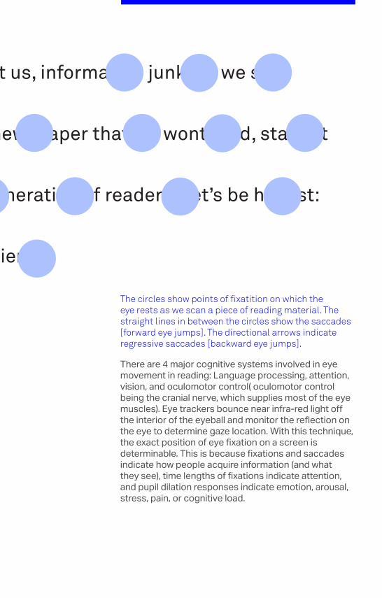
The circles show points of fixatition on which the eye rests as we scan a piece of reading material. The straight lines in between the circles show the saccades [forward eye jumps]. The directional arrows indicate regressive saccades [backward eye jumps].
_The circles show points of fixatition on which the eye rests as we scan a piece of reading material. The straight lines in between the circles the saccades [forward eye jumps]. The directional arrows indicate regressive saccades [backward eye jumps].
There are 4 major cognitive systems involved in eye movement in reading: Language processing, attention, vision, and oculomotor control( oculomotor control being the cranial nerve, which supplies most of the eye muscles). Eye trackers bounce near infra-red light off the interior of the eyeball and monitor the reflection on the eye to determine gaze location. With this technique, the exact position of eye fixation on a screen is determinable. This is because fixations and saccades indicate how people acquire information (and what they see), time lengths of fixations indicate attention, and pupil dilation responses indicate emotion, arousal, stress, pain, or cognitive load.

02_

02_02. _Typography
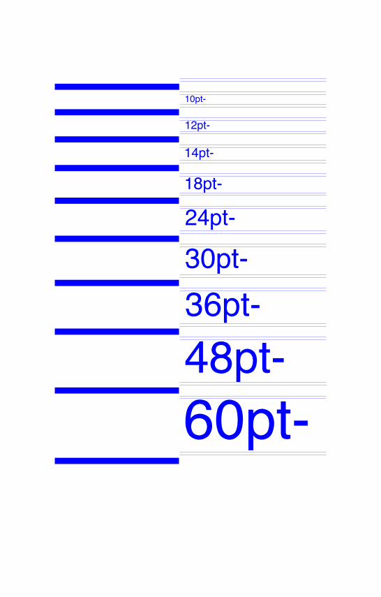
Type theory remains the same ; certain rules and practices apply to print as they do screen. If a type size is too small it cannot be read regardless if it is in print or on screen. The standard sizes for text type are 9,10,11,12 point: the sizes for display are 14, 16, 18, 20, 24, 30, 36, 42, 48 and 60 point. Large sizes are determined as required by a project.We do more reading on the screen today then we ever have before. Designers need to bear in mind the digital reader even more than ever before. We are now in a new age of reading.
Tablets, and portable devices allow us to read any type of publication on the move. With smartphones, we carry our reading material with us and enjoy instant Web access, enabling the reading experience to flow smoothly from one device to another. There is a huge movement toward reading on screen. The general consensus, whether you like it or loath it, is that reading on-screen is where a designer should be designing. Digital Typography It is subject to many unknown and fluctuating parameters, such as operating system, system fonts, the device and screen itself, the viewport and more. Our experience of typography today changes based on how the page is rendered, because typesetting happens in the browser.
60pt-48pt-36pt-30pt-24pt-18pt-
14pt-
12pt-
10pt-
In all of this, the screen is probably the most important part of the screen typography equation. Emerging designers should bear this in mind. We now have the freedom to work with any font we like via the @font-face selector. As designers we no longer have an excuse. The importance of legibility and good typesetting on screen cannot be ignored; it is a must for any designer. The Web is 95% typography. If we break down the amount of reading we do on a daily ba-sis, it mostly takes place on a screen. The responsibility is now on designers to spend equal amount of time crafting typography for the web as we do crafting de-sign for print.

03_
03_03. _Grid Systems
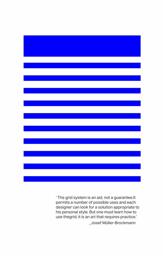
‘ The grid system is an aid, not a guarantee.It permits a number of possible uses and each designer can look for a solution appropriate to his personal style. But one must learn how to use thegrid; it is an art that requires practice. _Josef Müller-Brockmann
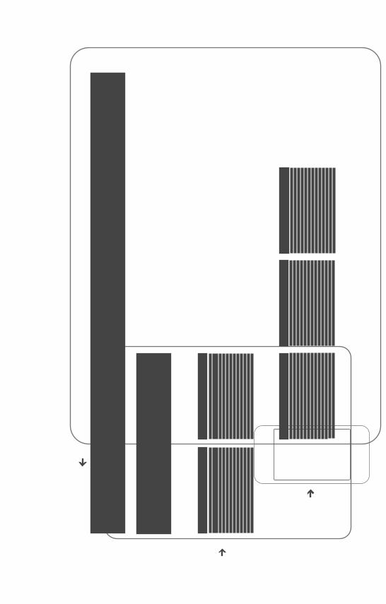
A typographic grid is a structure made up of a series of intersecting vertical and horizontal axes used to structure content. This structuring of content is important whether it be on a page or on-screen. If one was to think of building a house the grid serves as a foundation. Without this solid foundation the house would be structurally unsound. This same principle applies to typography. The grid allows a designer to organize text in a rational, digestable manner.After World War II, a number of graphic designers, including Max Bill, Emil Ruder, and Josef Müller-Brockmann, influenced by the modernist ideas of Jan Tschichold’s Die neue Typographie (The New Typography), began to question the relevance of the conventional page layout of the time. The systems which they designed gave the designer a more flexable way to approach any typographic design problem.
They began to devise a flexible system able to help designers achieve coherency in organizing the page. The result was the modern typographic grid that became associated with the International Typographic Style. Grid systems in graphic design by Müller-Brockmann, helped propagate the use of the grid, and his principles still relevant today.
According to Brockmann a grid should never define a design, it should work with it. To suggest that a grid can hinder creativity is the same as suggesting that a music tempo can as well. Brockmann’s ideals about a grid hold relevance when designing for screen. A Grid should be the basis for every design solution, especially on-screen, as it aids in organizing complex layouts. As we more to more responsive layout whilst reading content on mobile devices, a solid grid can underpin and strengthen any digital project. There are many ways to ways to adopt a solid grid framework for your web projects and using a modular grid framework gives the designer a great starting point on a project. Check the resourses page for links to web design grid systems for more information.
What is a grid system and how is it relevant to the web? A grid system is a grid design which has been designed in such a way that it can be applied to several different uses without altering it’s form. An example of this would be a grid system for a book whereby you have many different page types - part-opening, title, half-title etc. - and would need only one grid to use on all the page types. In the world of responsive web design those same traditional systems apply but the various ways of viewing the content can change. Instead of designing one systems which applies to all the pages of a book, the system can now be a flexible one which some elements the same and others adjustable. In a sense, a web project could entail in designing several systems. Bear in mind some attributes may stay the same but others, such as navigation, image sizes text sizes and other elements must be designed with the viewer in mind.
‘ The grid system is an aid, not a guarantee.It permits a number of possible uses and each designer can look for a solution appropriate to his personal style. But one must learn how to use thegrid; it is an art that requires practice.’ _Josef Müller-Brockmann
The grid as a regulatory system gives a designer a jump-start for the basic formal decisions in the design process. It’s preconditions help in the structuring, division and ordering or content. The stereotype of a designer that loves rules seems appropriate in this instance as it seems designing a grid lowers the variables of decision making when it comes to layout. If a reader is reading on a phone, certain principles change in comparison to when reading on a tablet device. The variable of legibility remains the same. A digital grid must accommodate the reader on any digital device.Graphic designer and writer Ellen Lupton explains:“To say a grid is limiting is to say that language is limiting, or typography is limiting.”
It is important to note the standards achieved in print typography are now also achievable in web design. There are many grid-based css stylings in html, which can be implemented in any web project and a growing number of fluid responsive front-end layouts. Check the resources and links page for more. A well designed responsive grid system will ensure your project will be completed with the reader in mind on all platforms and devices.

04_
04_04. _F Shaped Reading
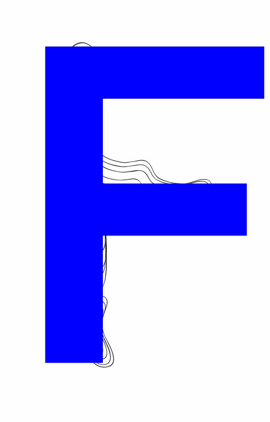
Eye tracking visualizations show that users often read Web pages in an F-shaped pattern: two horizontal stripes followed by a vertical stripe. In a few seconds, their eyes move at amazing speeds across your website’s words in a pattern. In a new eyetracking study, 232 users were recorder whilst looking at thousands of Web pages. They found that users’ main reading behavior was fairly consistent across many different sites and tasks. This dominant reading pattern looks somewhat like an F. Users first read in a horizontal movement, usually across the upper part of the content area. This initial element forms the F’s top bar. Next, users move down the page a bit and then read across in a second horizontal movement that typically covers a shorter area than the previous movement. This additional element forms the F’s lower bar. Finally, users scan the content’s left side in a vertical movement.
Sometimes this is a fairly slow and systematic scan that appears as a solid stripe on an eyetracking heatmap. Other times users move faster, creating a spottier heatmap. This last element forms the F’s stem. Obviously, users’ scan patterns are not always comprised of exactly three parts. Sometimes users will read across a third part of the content, making the pattern look more like an E than an F. Other times they’ll only read across once, making the pattern look like an inverted L (with the crossbar at the top). Generally, however, reading patterns roughly resemble an F, though the distance between the top and lower bar varies.Heatmaps from user eyetracking studies. _Jakob Nielsen April 17, 2006

Sometimes this is a fairly slow and systematic scan that appears as a solid stripe on an eyetracking heatmap. Other times users move faster, creating a spottier heatmap. This last element forms the F’s stem. Obviously, users’ scan patterns are not always comprised of exactly three parts. Sometimes users will read across a third part of the content, making the pattern look more like an E than an F. Other times they’ll only read across once, making the pattern look like an inverted L (with the crossbar at the top). Generally, however, reading patterns roughly resemble an F, though the distance between the top and lower bar varies.Heatmaps from user eyetracking studies. _Jakob Nielsen April 17, 2006

05_
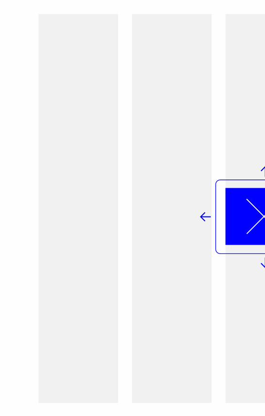
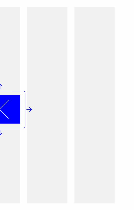
05_05. _Content Plane
Mobile devices are becoming more and more relevant to the way we consume information and typography. As as designer there is a responsibility to be aware of the structuring of content across all platforms in the interest of the reader. A webpage can now be viewed as a content plane upon which a device can view. As the viewing device changes the content must also have a fluidity to be consistent with its execution. Approaching any web-based project now must have the user, and how they wish to read in mind.Fluid grids, flexible images, and media queries are the three technical ingredients for responsive web design, but it also requires a different way of thinking. Rather than quarantining our content into disparate, device-specific experiences, we can use media queries to progressively enhance our work within different viewing contexts. The designer now has the option to make a responsive website. Or the option to design several, tayloring the design to each device at the risk of appearing inconsistant. Responsive web design offers the designer a new set of options.


_Notes

_Notes