digipak adverts
TRANSCRIPT
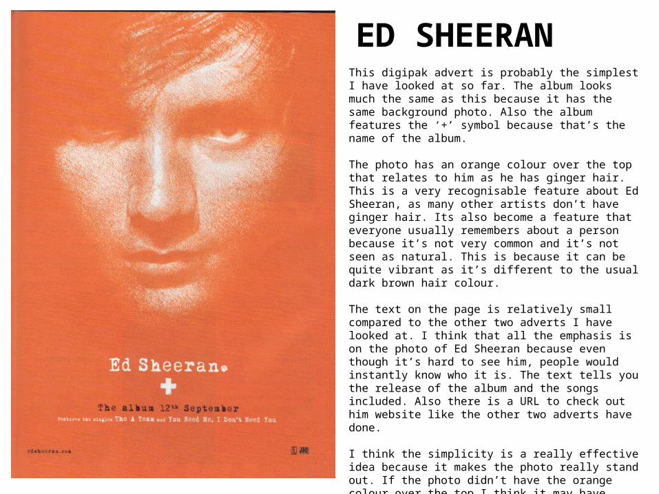
This digipak advert is probably the simplest I have looked at so far. The album looks much the same as this because it has the same background photo. Also the album features the ‘+’ symbol because that’s the name of the album. The photo has an orange colour over the top that relates to him as he has ginger hair. This is a very recognisable feature about Ed Sheeran, as many other artists don’t have ginger hair. Its also become a feature that everyone usually remembers about a person because it’s not very common and it’s not seen as natural. This is because it can be quite vibrant as it’s different to the usual dark brown hair colour. The text on the page is relatively small compared to the other two adverts I have looked at. I think that all the emphasis is on the photo of Ed Sheeran because even though it’s hard to see him, people would instantly know who it is. The text tells you the release of the album and the songs included. Also there is a URL to check out him website like the other two adverts have done. I think the simplicity is a really effective idea because it makes the photo really stand out. If the photo didn’t have the orange colour over the top I think it may have looked empty. However orange is bold and striking to look at which draws you to Ed Sheeran’s face and mostly the white writing afterwards.
ED SHEERAN

The photo is a close up of Jessie J with her hands on her head. It gives a feeling that she is ready to dance by moving her body and arms. Also her mouth is slightly open with looks like she is about to start singing. This body position tells you a lot about her personality and her singing music style because if you hadn’t seen that before, you would think she is a pop artist. The logo for Jessie J is featured among her first albums but has now changed to a black font with a thin writing style. Jessie J is wearing black clothes and black makeup and the only other colour of the advert is gold. The connotations of gold is that it’s seen as quite sophisticated, posh and royal; whereas black gives connotations of death, evil but mostly power which is what is being shown. Also the use of the two colours makes them stand out against each other if you saw this in a shop. Her face is the main point because as soon as I looked at the advert that is what I saw. This is because it takes up a large proportion of the advert along with her name underneath her face, which has the largest text size on the page. This advert is very simple as it contains information about her album, website and what’s featured on the album. If there was lots of information was featured on this advert it would be very unlikely for people to read it as they may give up because of the amount of information. This means that only keys information is included.
JESSIE J

The photo is a mid-long shot of Katy Perry standing with a handbag in a garden with a paddling pool. This makes her look like a teenager even though she is an adult. This gives a very good overall of what her style and personality is like to people who would see this advert. The mid-long shot shows the type of clothes she wears and she is wearing pink, red and purple clothes. This again shows her personality that is very different to Jessie Js’ and other pop artists. This advert is also very minimal just like Jessie J’s advert and contains information about her number one song that is featured on the album. Also it contains a photo of the album that doesn’t look much different to the photo and background on the advert. The logo is also the same one on the advert but has now changed. This makes her easily recognisable to the audience as her house style is the same throughout the album and website. In small font at the bottom there is a URL to her main website which also appears on Jessie J’ advert too. This is good advertisement because people can go on to the website to find out a lot more about the artist. This is a code and convention used on a digipak advert.
KATY PERRY